…<click here> to review
the Report Writing Tips
Part 1, Email Dialog 2010
covering discussions for weeks 1 through 5
<click
here> for Part 2, Email Dialog 2010 covering discussions for
weeks 6 through 10
___________________________
2/11/10
Folks—thanks to Luke I can correct a misstatement that can clear
up some confusion surrounding MapCalc’s calculation of Average Slope. I
stated in class that Average Slope is the “average of all eight
of the individual slopes” in the 3x3 window. The MapCalc Help and Manual
states that it is the “average of the four possible slopes drawn
through the eight neighbors.” In practice both procedures are used, BUT
MapCalc uses the four corner slopes (NE, SE, SW and NW) to calculate the
Average Slope (see graphic below).
As the exercise points out “slope has many computational
faces” and there isn’t a generally accepted algorithm used in different
software packages. It’s “user beware” whenever you encounter a
“slope map” that you didn’t create— there are lots of alternative computational
definitions out there and they can dramatically different.
Joe
___________________________
2/10/10
Question Sir-- on the Covertype
“proportion” operation in question 4, Part 2. I have no idea what the
“proportion” operation does. Some helpful hints possibly? Thanks, Eliot
Eliot—the Scan command summarizes the map
values in a “roving window” that moves cell-by-cell throughout a project
area. When it is centered on a grid cell
location, the values within a specified “reach” (e.g., within a 3 cell radius
of a circle) are mathematically or statistically summarized into a single value
that is assigned to the location. For
example, the procedure could calculate the total number of the houses within
the reach from a Housing map or the Average slope from a slope map.
For example,
if the window was centered on a Forest location (map value 3 on the Covertype
map) and there were no other Forest cells in a 3x3 window (“within 1 square”)
the assigned “proportion similar” value would be 11% ((1/9) * 100) …a very
“edgy” forest location. On the other
hand if all the values in the window were Forest the assigned “proportion
similar” value would be 100% ((9/9) * 100) …a very happy “interior” forest
location.
The other
“less than intuitive” roving window statistics are Deviation (compares
the center position value by subtracting the average of the values in the other
window positions; only works with quantitative map values), Majority
(most frequently occurring value in the window; often referred to as the
“mode”) and Minority (least frequently occurring value).
Joe
___________________________
2/10/10
Joe-- for question 28, on the effective distance part,
would we be calculating the minutes simply by saying the movement from point A
can't go the -0.0 and the impedance in the middle cell (at 3) is higher, so it
will move diagonally to the cell with the value of 2.0 and then diagonally
again to point B (for a final answer of 4 minutes, summing simply 1, 2, and 1
minutes) or are we breaking down the time with the distance to look at the
distance of 1.414 to 2.0 vs. 1.0 to 3 and weight an answer? --Elizabeth
Elizabeth— actually I was hoping you would do the “calculation”
thing and show your work.
Study
Question 28.
Referring to the following diagram, if the cell size is 100 meters, what is the
Simple Distance from point A to point B (in meters)? What is the
Effective Distance (in minutes) considering the relative friction factors
indicated in the upper right corner of each grid cell (friction units in
minutes; -0.0 indicates an absolute barrier)? Be sure to expand you
answer to include a very brief discussion how this procedure is used in
effective distance analysis.
Note:
the numbers will be changed if this question is used.
(Calculations shown below)
For example, the “Simple Distance” calculations
only involve Geographic movement with a cost for an orthogonal
full step of 1.0 grid lengths (half step 1.0/ 2= .500) and for a
diagonal full step is 1.414 (half step 1.414 / 2= .707).
1) Moving from point A to its upper-right cell incurs a cost of
1.414 PLUS the cost 1.414 from that location to B. These calculations can
be summarized to a single equation of [1.414] + [1.414] = 2.828
cell-lengths away using the upper route.
2) The calculations for the direct horizontal route from point A
to point B are [1.0] + [1.0] = 2.000 cell-lengths away.
3) The calculations for the lower route from point A to point B
are [1.414] + [1.414] = 2.828 cell-lengths away.
4) The final step minimizes (2.828, 2.000, 2.828) = 2.000
cell-lengths away that is assigned to point B establishing that the “shortest”
distance between A and B in this constrained example is the direct horizontal
route.
For the “Effective Distance” calculation the
Geographic distance has to be multiplied by the friction Weight assigned to
each cell. Note that the calculations have to involve “half-cell” steps
to account for the differences in friction from cell center to cell center.
1) Moving from point A to its upper-right cell incurs a cost of
(.707 * 1.0) for the step out of A PLUS (.707 * 2.0) for the step into
the cell. Then stepping from that location to point B would incur an
additional (.707 * 2.0) + (.707 * 1.0).
These calculations can be summarized to a single equation of [(.707
* 1.0) + (.707 * 2.0)] + [(.707 * 2.0) + (.707 * 1.0)] = [2.121] + [2.121] = 4.242
minutes away.
2) The calculations for the direct horizontal route from point A
to point B are [(.500 * 1.0) + (.500 * 3.0)] + [(.500 * 3.0) + (.500 * 1.0)]
= [2] + [2] = 4.000 minutes away.
3) Movement cannot pass through the absolute barrier in
the lower route so point B is effectively infinitely far away.
4) The final step minimizes (4.242, 4.000, infinity) = 4.00
minutes away that is assigned to point B establishing that the “shortest”
distance between A and B in this constrained example is the direct horizontal
route.
This would comprise an “A” answer. An “A+”
answer would extend the discussion with a comment on “concerns” about the grid
approach, such as the implications of allowing only sequential orthogonal/diagonal
movements.
Joe
___________________________
2/9/10
Joe-- one quick follow up. The Exercise 5,
Question 5 homework says to “Use Scan and the Covertype map to
identify the proportion of a roving window (3x3) that has the same cover type (Covertype_proportion
map).” For your Covertype_proportion map, it seems you did "within
1 circle". I was interpreting 3x3 as a square (not circle) that is
3 x 3cells (9 cells in total), not one cell radius. Is my interpretation correct? -- Elizabeth
Elizabeth—good point ...your interpretation is correct—a 3x3
roving window is a square. I will
insure that I specify “circle or square” in the exam questions. Exercise
5, Question 5 the plan was to use a “square 3x3 roving window.” --Joe
___________________________
2/9/10
Student
Note:
I thought you might be interested in this exchange with a long-time colleague
who needed a “region-wide overlay” boost in thinking. Could you have solved his problem? …if so, you are GIS Modeling savvy.
Joe— as the graphic below shows, I have created the
following three grid layers in my test environment— Risk zones, Land Use zones
and Population per cell (derived from parcels.)
Dave—here’s a graphic that might help with
your “combined region” coincidence statistics thinking…
In your
case, the Districts and Covertype maps would be replaced by the Land Use
Types and Risk Classes maps in Step 1 above. You would use ESRI’s GridMath to combine the information into a two-digit code similar
to the Compute command in the figure
to derive a map where the first number (“tens” digit) represents the Land Use
type and the second number (“ones” digit) represents the Risk class. This processing identifies the Landuse/Risk
combination as a unique category value (generally termed a “region,” or “zone”
in ESRI) at every grid location in a project area (county in your application)
Step 2 uses
ESRI’s ZonalSum in place of the Composite command to calculate the total
population in each Landuse/Risk combined category. This region-wide summary technique adds all
of the population you allocated to each of the grid cells associated with each
of the vector-based population parcels.
Piece-of-cake,
right? --Joe
P.S.—just in
case your traditional “region-wide” overlay thinking is a bit rusty as well,
the following graphic might be useful—
It sounds like you already have done the “hard part” of
generating a map layer with a population value per cell that has allocated the
population in each parcel to the cells comprising that parcel—your “population
per cell (from parcels)” map you noted above.
Also, my guess is that you have a “classified” Risk map with 3-5
classes (a general rule is no more than 5 classes or you table becomes overly
complex). You can “roll-up the total population summary statistics” for
each Risk zone by using Zonal Sum (and/or Zonal Average or other region-wide
summary statistics)—
OutGrid= ZonalSum(TemplateMap_Risk, DataMap_populationPerCell,…) (or something
close to that; my ESRI Grid skills are rusty)
You can “roll-up population summary statistics” for each Land
Use zone by using Zonal—
OutGrid= ZonalSum(TemplateMap_Landuse, DataMap_populationPerCell,…) (or something
close to that)
It makes sense to report as two separate tables and “composited” maps where the
population for all of the “spatial incidences” (separate groupings or “clumps”
of the same “region” (Risk or Land Use category). But if you feel
compelled to jam both summaries into a single table you could do some off-line
cut/paste into a single Excel table.
However, if you want to go over-the-top and generate a single
table of the “combined regions” you need to follow the guidelines noted above—
first multiply the Land Use types map times 10 (puts information in the “tens”
digit) and then add it to the Risk classes map. This will generate zonal
“regions” with a two digit code representing the coincidence of the two
maps where the first digit represents the Land Use types (“tens” digit)
and the second digit represents the Risk class (“ones” digit). Use this
compound map defining the “template map” zones whose population values will be
summarized—total population within each of the two-digit code coincident
classes. Whew!!!
___________________________
2/8/10
Professor-- I have been working
on the questions in the study guide that were assigned to me. One of them is question 32, part of the Map
Analysis “Mini-Exercise” questions… section.
I have prepared 2 answers, one very short and one very long. I have attached the answers in the document.
Could you please clarify which answer is more along the likes of what you would
like on the test. I have to run to another
question and did not really have time to proof my answer, sorry if it’s not
formatted in the best way. Thank you,
Curtis
Curtis—good
question. If I give a series of
commands, you need not calculate them during the exam. What I am looking for is a brief statement
indicating what information would be created at each step. For example…
32. What information would be generated by the
following MapCalc command sequence—
Radiate Housing Over Elevation Weighted to
100 For Housing_Vexposure …this step creates a visual exposure map indicating the number of
houses (“weighted” option sums the viewer values on the Housing map) seen from
every location in the project area.
Spread Roads to 35 For Road_proximity …this step creates a map indicating the simple distance from every
location to the closest road location.
Renumber Road_proximity Assigning 1 to 0
Thru 5 Assigning 0 to 5 Thru 35 For Mask …this
step creates a binary map identifying all locations that are within 4 cells of
a road (0 to 5) as 1 and locations 5 or more away as 0 (5 to 35).
Compute mask times Housing_Vexposure For
What? …this step “masks” the visual exposure to
houses for locations that are near roads by multiplying the binary masking map
times the visual exposure map (1 * any visual exposure= visual exposure; 0 *
any visual exposure= 0)
--an A answer.
Note: there is a logic error in this processing as the difference
between “0 seen” (no houses see a location) and “0 masked” (too far away).
--an A+ answer.
For this
type of question in Part 3, your answer needs to explain what is accomplished
by the processing—NOT do the processing and document. However, some of the Part 3 type questions DO
require you to solve using MapCalc. For
example…
35. Given base maps of Roads and Covertype
(Tutor25.rgs database) generate a map that assigns a proximity to roads
value for just the forested locations.
Note: use MapCalc to implement and SnagIt to capture your
solution and embed below. Be sure to identify
the input maps, processing procedure, and output map with an interpretation of
the map values. …this “word problem” requires you to
define and implement the command sequence that generates the desired
result. I recommend inserting a “2 rows
by 3 columns” table then grabbing/pasting the input map in the top-left cell,
the command dialog box in the top-middle cell and the output map in the
top-right cell. Use the second row to
enter your short description/explanation under the three graphics. Include a similar table for additional steps
in your solution.
--an A
answer if solved correctly with good descriptions/explanations (clear and
concise).
--an A+ answer if you extend your answer by
noting something that extends the processing or otherwise shows exceptional
understanding..
Bottom
Line: Keep in mind
that you have 120 minutes for the exam with approximately five short answer “Concepts, terminology,…” questions from Part 1
type questions, one “How things
work” question from Part 2 type questions and one “Mini-exercise” question from Part 3 type of questions. This “balance” is not a promise but it is a
good time allocation to keep in mind while studying for the exam. A good allocation of time would be about an hour
for Part 1 type question (60/5= 12 minutes per question), about 30
minutes for the Part 2 type question and about 30 minutes for the
Part 3 type question.
Note: In each of the three exam sections
section I will give you two more questions than you are required to answer
…that means you can “toss” the two questions that you really don’t like. Also, the exam is CLOSED BOOK in terms of you
study sheets …your answers have to come from your brain, NOT cut/paste from
notes. Feel free to use the MapCalc
Manual while working on a solution to a “word problem.”
Joe
___________________________
2/8/10
Folks—how
about this as more “noodle-ing help”
on the trail of fully understanding that there are several ways to calculate
slope. If you have seen a slope map on
the Internet (or downloaded one) do you know how it was calculated? …or worse yet, was it a classified map with
slope intervals like gentle, moderate, steep?
This might make a good-looking graphic but it is rarely sufficient for
decision-making, particularly if there are other map layers involved in the
spatial reasoning supporting a GIS modeling application (versus just
visualizing).
My
“favorite” slope flavor is “fitted” …any thoughts why I might say that? --Joe
___________________________
2/8/10
Joe-- I'm working on calculating the diversity maps. I feel
like I must be doing something wrong because the output isn't what I expect.
I attached two screen shots that show two sets of the maps and their
scripts.
I'm OK with the
“covertype_diversity” map, but when I am renumbering it (Assigning 1 to 3 and 0 to 1 thru 2), it seems
like it favors the higher numbers. It seems to me that just because the
cell value is closer to 3, that doesn't seem to mean it has a higher diversity
(like it is weighted on the diversity), it just means that the forest had a
value of 3 to begin with and that didn't change and it is reflected in the
averaging of the scan, so the averages are higher in the forested area.
The renumbering seems to ignore the change between the open water and the
meadow.
For the “covertype_proportion”
map, as a confirmation, the roving 3x3 cells is created by changing the
within from 1 to 3 cells and the shape from circle to square, correct? My data ranges from 1 to 3, so renumber for
categories 0-50 and 50-100, don't seem to make sense. Can you tell from
the screen shot what I've done incorrectly?
--Elizabeth
Elizabeth— The Covertype map is discrete (nominal, choropleth)
with integer values of 1= Open water, 2= Meadow and 3= Forest. The
command “SCAN Covertype Diversity IGNORE 0.0 WITHIN 1 CIRCLE FOR
Cover_diversity1“ searches in 1-cell radius circular window (actually a
cross considering just the orthogonally adjacent cells), counts the number
of different cover type values it encounters in the window ,then assigns
the count to the center cell and repeats for every location in the project
area. The “circle” or “Square” specifies whether to use the diagonal
adjustment in establishing the window shape/size.
The Renumber to isolate areas of high cover type diversity is
should be straight forward. If you are having Renumber problems, my guess
is that the old MapCalc “got’cha” of not pressing the “Add” button
to place the last assignment phrase in play might have got you…
For the “Covertype_proportion,” the algorithm checks the
values in the window and calculates the proportion that is the same as the
center value. For example, if the map value at the center if 3 (Forest)
and all of the cells in the window are 3, the assigned proportion would be 100
(percent); if there is only one cell the same (the center cell itself) in the
“cross-shaped” 5-cell window, the proportion is computed to be 1/5= 20%.
In looking over your screen grabs it looks like you used
“Average” for all of the scans. Joe
___________________________
2/6/10
Jeremy, et. al.-- does the following
“Fitted minus Average” composite figure help the noodle-ing process
about the different slopes?
…seems like Fitted generally reports higher
slope estimates than Average. When the Average is larger it appears to be
at terrain inflection points (depressions and peaks). Hum, I wonder why? --Joe
___________________________
2/6/10
Jeremy—to follow-up on the slope
visualization thing…
Keep in mind when generating an effective
display of a mapped data surface…
1) ALWAYS use a consistent Legend
if two or maps are to be compared. In
this case, a User Defined color ramp of 14 intervals from 0-1% slope (grey),
then 5% steps to a maximum of 65%.
2) ALWAYS use a consistent Plot Cube Scale
if two or maps are to be compared in 3D.
In this case, the scale (was set to -50 to 100 and the Plot Cube color
set to white (disappeared into the white background) for the 3D surface plot of
Slope_max. In PowerPoint you can make
the 3D plot white background “transparent” by Formatà
Recolorà
Transparency (that way I could superimpose it in the upper-left corner). To create the draped display, make the
Elevation surface active (binoculars icon) then Mapà
Overlayà
Slope_max.
Now all of these “gussied-up graphics”
won’t answer Question 2 but it should get your mind around some very import
cartographic concepts when considering “maps
are numbers first, pictures later.”
As a mental exercise for Question 2, think
of nine balls floating at their respective elevation values in a 3x3
window. Suppose eight of them including
the center elevation are all of the same value (0% slope) but one is
considerably higher (20% slope). How do
think this arrangement would play out as computed Maximum, Minimum,
and Average slope assignments for the location? How do you think it would play out for the Fitted
assignment?
Now make some changes in the relative
positioning of the floating balls, while thinking about how the assigned values
for the computed and fitted plane techniques might change.
Hope the weekend is treating you well. --Joe
___________________________
2/5/10
Dr. Berry-- Well I
may be more confused regarding the question.
Slope_Max – Slope_Avg shows
only positive values indicating that the two layer values are closer in
value, average values of slope being less than max values, but not so different
as to create a negative difference values.
Slope_Max
– Slope_Fitted, on the other hand,
shows positive and negative values indicating that in certain locations
Slope_fitted is larger than Slope_max.
It would seem that Average slope is being affected to a greater extent by Max
slope, as you would expect. I'm assuming
fitted slope is more accurate in terms of a surface
…not a good idea as my Drill Sergeant used to say “assume makes an ass
out of you and me” (of course I thought he was referring to a
donkey).
And, as such, it should be different from the Max Slope. It is a better representation of the slope
surface. Regards, Jeremy
Jeremy—in Exercise 5, Question 2, you must first consider the four maps as
requested in Question 1… a) Slope_Max assigns the maximum value of
the eight computed individual slopes in the window; b) Slope_Avg
assigns the arithmetic average of the eight slopes; c) Slope_fitted assigns the slope of a fitted plane to the nine
elevation values; and, d) Slope_min assigns
the minimum value of the eight computed individual slopes in the window. If you just screen grab the “default”
displays (but NEVER recvommended) they look like this…
|
Slope_avg …maximum value 40.2% |
Slope_fitted …maximum value 64.7% |
|
Slope_max …maximum value 64.7% |
Slope_min …maximum value 17.2% |
…each being
color-ramped into seven intervals from the minimum value (0 in all four cases)
to the maximum value on each of the computed surfaces. But the maximums on the surfaces are
different …40.2% for Slope_avg, 64.7% for the Slope_fitted, 64.7% for Slope_max and 17.2% for Slope_min. That should get you thinking …hum, not all slope algorithms are the same. Also, the location of the computed maximum
slope value isn’t the location …hum, not
all slope algorithms are the same.
However, a
thorough GIS’er who has successfully completed a GIS Modeling course knows the
mantra is “maps are numbers first,
pictures later” would also know the postulate that you can’t visually compare maps that have different legends—the
differences are more often in the color-coding than they are in the actual
data—therefore YOU MUST establish a consistent legend for all four
maps.
This can be
accomplished in MapCalc using the Template Tab in the Shading Manager and a bit
of thinking. How about a “User-defined”
Calculation mode that goes from 0 (green) to 65 (red) in 13 levels with a color
inflection of yellow at the mid range—
Whew …good
preliminary stuff, but it doesn’t address your Question 2 question. Once
you have created map-ematically proper
displays of the four map surfaces (versus cartographically proper displays) for
Question 1 and “noodle” a bit more,
tighten-up your question and resubmit—it is a great one!!! I hope to hear from you soon. --Joe
___________________________
2/5/10
Professor--
I hope you made it to Philly safely. I
have begun working on Exercise 5 this morning.
My question is: the instructions ask us to generate the four maps using
the four different options in the slope command. In the template for Exercise 5, the table you
generated in question 1 also asks for the Slope_xxx map draped over
elevation. The contradiction is that the
instructions do not ask for it but the table you sent does. Could you please clarify? Thank you, Curtis
Curtis— I made to Philly just
before the storm …United cancelled the flight I was supposed to take but
rescheduled with Frontier on the last flight out of Dodge Denver.
I arrived at the hospital just before the first snowflake …now millions of them.
The instructions are a bit
confusing. The plan in Question 5-1 is to generate four slope maps
(Maximum, Minimum, Average and Fitted). The table was presented as a
template. Copy it so you have four tables and then edit the table text to
reflect the other three maps (Slope_ min, Slope_max and Slope_avg).
Hopefully you are having a
great weekend. --Joe
___________________________
2/4/10
Dr.
Berry—In reference to Question 2 in Exercise 5 regarding the difference maps—
Slope_Max - Average - A measure of extreme slopes or differences
in slope; although average or mean is not a good measure of typical values in a
data set.
Slope_Max - Fitted Slope - A more accurate measure of extreme slope
or difference in slope; assuming that fitted_slope represents 'median' values
in the data set.
Are
we assuming the fitted_slope algorithm is representing the median, 50% of data
above and below this value, using "least squares fit"? Regards, Jeremy
Jeremy—we are just using
“Slope_Max” to serve as a consistent base for comparison—subtracting two
variable measurements from the same reference. In this case, the
reference is a surface instead of a constant.
There isn’t an implication that one slope algorithm (option) is “better”
than another.
Yes the “fitted” algorithm
uses a least-squares technique to minimize the deviations from the plane to
each of the 9 elevation values in the roving window. However, you can’t assume
“half above, half below” with such a small sample size and the possibility of
large “outliers” …a good conceptualization image but not a statistical rule
(remember in statistics, “it all depends”).
You are right that the
“Fitted_slope” surface tends to be more “generalized” as the plane that is
fitted sort of smoothes-out any “outlier” elevation value influences in the
window …that is certainly not the case for “maximum” or “minimum”
slope surfaces. The arithmetic “average” option used to derive
“Slope_avg” surface sort of smoothes as well, but is more sensitive to
“outliers” which certainly used to be the case with derived DEMs (now not so
much a problem). The difference is in “fitting a plane” to “calculating
an average.”
Hopefully this babble helps
…we can discuss more during class tonight. Fun question? …or a
completely confusing one?
Joe
___________________________
2/3/10
Joe-- What do I do to accomplish
making the spread command to go about RANCH THROUGH BIKE_HIKING_FRICTION to get
RANCH_PROX? Is this screen grab correct?
Eliot—your solution looks
like mine (see below) that got when I entered…
SPREAD Ranch NULLVALUE PMAP_NULL TO 100 THRU
Bike_hiking_friction Simply FOR Ranch_hikeBikeProx
…now you get to explain what
the numbers mean in terms of relative effective proximity assuming hiking
(off-road) and biking (on-road) movement from the Ranch to everywhere in the
project area (some locations are “infinitely” far away as they are absolute
barriers to hike-bike movement due to drowning). --Joe
Useful
Note: you can Highlight
and Ctrl/C to copy the command statement in a command GUI window and
then Ctrl/V to paste into a document (as I did above). I noticed
that your email-typed what you thought might be the command …but it could not
have been the one MapCalc used to produce the “Newmap” result you sent.
a)
Continuous 2D Grid
Display
b) Continuous 3D Grid Display
Figure
1. Effective
Proximity Surface. The accumulation surface depicts relative
distance from the Ranch to everywhere assuming relative barriers for on- and
off-road movement in the dry land locations and absolute barriers to movement
for open water locations.
___________________________
2/2/10
Hi Joe-- I actually meant the Advanced
Equation Editor - the tool in MapCalc. I
used it to average three layers - I just wanted to double-check that we could
use other tools besides those in the Overlay, Reclassification, etc sets. -Kristina
Kristina—oops …that will teach me to think outside the MapCalc
box. The “unsolicited” advice about using a specialized flowcharting
package still holds (see below) …it just didn’t have anything to do with your
question.
The command…
Analyze ve_roads_sliced with ve_housing_sliced Ignoring
PmapNull mean for Vexposure
…in the
write-up is easy to use when computing an average, and the ANALYZE command (you
used it Exercise 1 for the campground Suitability Model) provides for “weighted
averaging”-- but that’s another story awaiting a future class on Spatial
Statistics.
Hi Joe-- sorry, one more question. Can we use Equation Editor, or do you prefer
we use tools we have covered in lab thus far?
Thanks,
Kristina
Kristina—I assume you are referring to using Equation Editor
for constructing the flowchart …right? You can use what you think is
best. However, keep in mind that it is likely that not all of the folks
on your team have access to special packages.
My suggestion to use “generic” tools keeps the specialized
knowledge at bay—the objective of the exercises isn’t just to “get-it-done” but
to expose folks to “how one can get-it-done” …even if it is a bit pre-Paleolithic
approach to flowcharting, PowerPoint is ubiquitous. If you use Equation Editor for the
flowchart, make sure you show them how it works …we need to keep
everyone riding high on the learning curve.
--Joe
___________________________
2/2/10
Hi Joe-- I wanted to clarify something for question 5
of exercise 4 - the question where we build our own models. I can achieve the
same output map two different ways:
1. Inclusion of extra steps to make the
intermediate maps more polished and more able to standalone
2. Exclusion of extra steps to make a simpler
model
I know that in general, simplicity is key to a good model. However, is there a
preference? Should intermediate maps be a product in their own right? Or is a
simpler model with fewer steps better? Let me know if you need more
clarification. Thanks, Kristina
Kristina—KISS (keep it simple stupid) is usually the best
policy …assuming the result is the same.
I am not sure I understand what you mean by “extra steps to make the intermediate maps more
polished and more able to standalone.” But as a stab…
1) In real-world GIS modeling it is also important to make
the model “generalized.” This usually means bounding input map
ranges, such as a “RENUMBER Slope for Slope_preference” steepest slope isn’t
the value in the prototype data base (e.g., 65%) but an inclusive upper bound
(e.g., 10000% or other big number).
Similarly, the prototype data set may contain frequently derived
maps, such as Slope. However, in the generalized model you don’t assume
its presence and would include the “Slope Elevation for Slope” step—avoid
using stored derived maps. However in the exercise this is unfair as
you haven’t been “officially” introduced to the SLOPE command, so in this case
feel free to start with the stored Slope map.
Finally, sophisticated modeling packages provide for “aliasing”
map names at the start of the model. For example, if your model is
looking for “Elevation” as an input map, and the current user’s convention is
to call it “Elev” they can make the association before executing the
model. This technique applies to any variables and parameters as well,
such as “TO 20” where the 20 parameter can have an alias that the user can
set. In practice this level of model generalization is rarely used except
for the most routine models.
Hopefully I have touched on your question …let me know if I
missed the mark.
Joe
___________________________
2/2/10
Folks—I have heard from Luke, Katie and Jason
expressing an interest in the Biomass Access mini-Project (see blow if
you missed the original announcement). Let me know if there are
“interested others.”
The schematic below depicts some of the map layers and factors that
might be considered in identifying and assessing suitable biomass removal
locations. A follow-on consideration the “client” deems important is to
identify appropriate “staging areas” for collection (termed “landings” in
forester-speak) …you might start thinking about how the DRAIN might be utilized
in this analysis.
A further refinement might be identifying “timber-sheds”
(analogous to the concept of a watershed) that form “operational groupings” of
accessible remediation locations (STREAM on a proximity surface likely would
play a role). Also, visual exposure might be considered.
Otherwise, I suspect you already have some ideas about the basic
processing alluded to in the figure (SPREAD and SCAN play big roles) to
incorporate the “intervening considerations” affecting the relative access from
the roads to the resource …right? --Joe
<Correction—the “scoping” meeting for the
Biomass Access mini-project is scheduled for Friday,
February 12, 12-4 pm (the 11th
is Thursday)>
___________________________
2/1/10
Joe-- Regarding making a "Map" instead of a
"Display", MapCalc does not seem to have much functionality. I could put a north arrow, title and legend
as well as a neat line, but what about a scale bar? Does MapCalc provide this tool? Regards, Jeremy
Jeremy—alas, cartography is not MapCalc’s thing. It has
always been the domain of the instructor, researcher and professional as a
“toolbox” for understanding and utilizing grid-based map analysis and modeling,
not an operational stand-alone package. In fact, I find the
“stripped-down” nature of MapCalc helpful in keeping students focused on the
numbers (map analysis), not the graphics (mapping).
My “feeble attempts” at making “map display keepers” involve
off-line cut and paste. For example, I build a scale bar and north
arrow by— 1) screen-grabbing several (20 in this case) cells on the map, 2)
paste it where I want it alongside the map I want to “gussy-up” in PowerPoint,
3) label the scale bar, 4) then insert a north arrow icon such that it points
toward the top, and 5) group the entire mess along with the map display being
sure that the Object’s Aspect Ratio (Scale) is locked.
Note: you can set the default
display modes in MapCalc by right-clicking on a map display, selecting “Properties”
and then “forcing” your desires through the Display, Title, Legend
and Plot Cube tabs. Your specifications will then be applied to all
current and/or future maps in the database. However, with the exception
of the mini-project, my hope was to keep the “cartographer in all of you” at
bay while we focus on the information content derived by applying map analysis
operations—the information is in the NUMBERS, not the graphic portrayal.
It is this sort of “backward thinking” that keeps us focused on concepts and
theory (educational enlightenment) instead of mechanics and graphics
(vocational training).
___________________________
1/31/10
Hey Joe—a quick question about Question 3a in Exercise
4 - when I run the STREAM operation, I get a discrete, binary output, whereas
in your example (week 4, lecture slide 13) it shows the output as a series of
ascending discrete values from the ranch to the cabin. I have attached
the inputs, operation parameters, and output. Let me know what you
think. Thanks, Jason
Jason—the optional phrase “Incrementally” generates
descending path values (1st step of the path, 2nd step, …)
by selecting it instead of “simply”—
the result “counts the number of cells” along the steepest downhill path
starting from the top and moving down to the bottom.
But I sense that is not what you are after. What you want
is likely the “accumulated distance” along the path from the
Ranch. That information is on the Ranch_hikingProx map.
Hence you need to combine the two maps’ information by multiplying the
binary path map Cabin_route (binary) times the Ranch_hikingProx
map (ratio) to “isolate” just the accumulation proximity values from the
ranch—all other proximity values are forced to zero…
Keep in mind that “rarely does a single map analysis step
achieve all that you want.” In this case it took a two-step “masking” procedure.
And it took the “masking” procedure plus a bunch of other steps (command
sequences) to complete the entire model for identifying the effective
proximity along the optimal route from the cabin to the ranch—1) evaluating the
flowchart in Exercise 4, Question 2 to build the proximity surface, 2) then Stream to identify the optimal path, and
3) finally applying the masking procedure—all map analysis and modeling
involves the sequencing individual commands to form generalized procedures/techniques
that, in turn, form application models.
That’s the beauty of “thinking
with maps” (modeling) instead of just mapping– you use spatial reasoning to
derive what you want, instead of searching for the “right button” (cartography)
to generate a graphic or geo-query.
--Joe
___________________________
1/31/10
Folks—I have been meaning to expand on
Jeremy’s insightful question during class that I embarrassingly completely
blew. He noted that I say “number of
cells” when speaking about distance and proximity (confusing) whereas what I should
say is “number cell length equivalents”
…absolutely right!!!
In the Roads_simpleProx
map you generated in Question 1, Exercise 4 the “farthest away” location is
best expressed as 10.7 cell lengths away
(not 10.7 cells away). The
fractional value resulted by “accumulating” the series of 1.0 and 1.414 cell
length movements of the wave-front that reached that location first. It is not
a count (integer) of the number of cells in the shortest path as “number of
cells away” implies, but the sum (ratio) of a series of cell length
equivalents.
While this seems to be “pretty picky,
picky, picky,” it is particularly important when conceptualizing and reporting
“effective cell lengths” in determining effective distance/proximity—a
geographic cell length/area has no relationship to the assigned values as they
reflect the “accumulated friction” of the intervening cells (geographic cell
length movement of 1.0 or 1.414 times the effective friction weight of
the cell) that forms the twisted and contorted route of the wave-front took to
reach each location in a project area.
–Joe
___________________________
1/31/10
Joe-- could you tell me how I might overlay several
map layers into one display? I haven't had any luck looking in the help
section. –Elizabeth
Elizabeth—I am not too sure what you want to do. With
MapCalc the focus is on the numbers and “analytical overlay” involves
the set of operations in Exercise 2 …creates new map values of the overlay
process that can be used in further map analysis.
However, I suspect you are after “graphical overlay” to
produce a combined display. In MapCalc you can “drape” one map on another
by displaying the “bottom” map (e.g., Elevation) and then selecting Mapà Overlayà Slope
...that’s it—MC isn’t much of a “cartographic” mapping package.
An indirect graphic overlay technique I use a lot is to
screen-grab a display of a map, then assign “transparent” to one of the colors
and paste on top of another map. To set one of the colors on a screen
grab-map (graphics file needs to be .jpg,
.gif or other format that allows
transparency), select the pasted picture in PowerPoint, then select Formatà Recolorà Set
transparent color and then click on the color in the picture and the color
will “disappear.” Click and drag the picture with the “transparent color”
onto the other map.
Hopefully this helps. --Joe
___________________________
1/31/10
Joe-- I'm looking through the Power Point from
Thursday night's class that I missed and I have a few questions (see below). --Elizabeth
Elizabeth—responses embedded below…
1. Are the S, SL, and 2P abbreviations on slide
4 for Set, Straight Line, and 2 Points?
S= Shortest, SL= Straight Line, 2P= two points …the “strikeout”
refers to relaxing the old definition of distance of “shortest, straight line
between two points.”
2. Where might I find the linked slide show DIST (from
slide 5)? (I suppose this question might apply in general since I see another
link for an Itunes Animation of the effective proximity to Kent's store.)
The linked slideshows are in the …GMcourse10\Lecture\Links
folder in the lab. The \Links folder needs to be in the same folder as
the lecture PowerPoint—the lecture slideshows “look” for the \Links folder and
expects it to be there.
3. For the Distance & Connectivity Operations
listed on slide 7, I'm not sure I understand SPAN. I see it doesn't have
an equivalent in ESRI's spatial analyst. I saw the description on slide
22, but I still do not fully understand it. Could you give an example of where
you might use it?
SPAN is the narrowness operation that determines the
“shortest cord connecting opposing edges” within an areal feature, such as the
meadow on the Covertype map. There is an online discussion at http://www.innovativegis.com/basis/MapAnalysis/Topic25/Topic25.htm#Narrowness
(optional reading) …in fact, all of Topic 25 might be helpful in “decoding” the
slides. There isn’t a narrowness operation in ESRI GRID/Spatial Analyst.
This cross-reference between ESRI GRID/Spatial Analyst and MAPCalc might be
helpful…
http://www.innovativegis.com/basis/MapCalc/MCcross_ref.htm#GRID_SA_crossReference
4. Is the starter's map mentioned in slide 9 a map of
points?
Slide 9 illustrates the calculation of simple proximity from a
single point. The important points are that the algorithm moves out from
a location as a series of all inclusive 1-cell concentric steps.
At any location along the “wave-front” there are only two types of movement
possible—orthogonal= 1.0 cell length and diagonal= 1.414 cell
length. These steps are taken from each wave-front cell and the
accumulated distance is calculated as the wave-front calculated distance to
current position plus the proposed step (1.0 or 1.414). Since the next
wave-front locations can be reached by several of the current wave-front
locations the smallest accumulated distance value is retained—shortest
accumulated distance.
See http://www.innovativegis.com/basis/MapAnalysis/Topic25/Topic25.htm#Calculatiing_simple_distance
for simple distance algorithm (slide 9)
http://www.innovativegis.com/basis/MapAnalysis/Topic25/Topic25.htm#Calculating_effective_distance
for effective distance algorithm. In
ESRI’s GRID/Spatial Analyst simple distance is the command Eucdistance and
effective distance is Costdistance.
5. For slide 17, where the SQL query on the
joined database that shows the travel time as being greater than 15 minutes or
80 base cells, how can the cells have a fixed travel time associated with them? …because it is reporting travel-time to a specified
location(s) by the “shortest” (time) distance; from Kent’s Emporium in this
case. Wouldn't the travel time depend on the type of road
(arterial and residential) and the speed limits associated with them (which may
not be considered here, even as a friction rating, and may be part of my
confusion).
The travel-time from Kent’s was computed for each grid location
(Travel-time Map, upper-right inset) as described in the previous slides
by considering rate of movement over Primary and Secondary street to derive an
“accumulation cost (time) surface” where every location is assigned its “lowest
cost (time)” value. The algorithm is very similar to the vector network
solution (ESRI’s Network Analyst) except the irregular line segment lengths
with their cost rates (time) are replaced by regular grid cells with their cost
rates (time). Both approaches start somewhere and move out in a wave-like
pattern incurring friction cost (time) as it moves and retaining the lowest
accumulated cost value for each analysis unit (line segment or grid cell).
The main difference is that the vector solution can only evaluate linear
networks (result is an accumulated cost surface that looks like a
rollercoaster) whereas the grid solution evaluates continuous geographic space
and can consider both on and off-road travel-time.
The link between the grid-based travel-time to Kent’s Emporium
and vector-based database about customers is through the use of a vector
“pseudo grid” construct that uses “address geo-coding” to identify their Lat/Lon
coordinate and then determines the col/row coordinate in the analysis
grid. The travel-time value for the corresponding grid is appended to the
customer record in the attribute table.
See, http://www.innovativegis.com/basis/MapAnalysis/Topic14/Topic14.htm#Travel_time
6.
Is slide 30 "On Your Own" a homework supplement or exercise done
during class? Is it something I should complete?
The “own your own” is Question #5 in Exercise #4 …yep it is part
of the “normal” report.
7.
Did I miss a pop quiz? If so, would it be possible to know the questions
asked? Nope …time ran out. Sometime there might be enough time
to “play” with the pop-quiz.
I
think there may be a typo in slide 23, under radiate. Perhaps bay should
be by. Yep, “bay” should be “by” …thanks, I fixed it.
___________________________
1/28/10
Folks—MapCalc can be fussy about the names
you assign to maps. You can use up to 64 numbers and upper/lower case letters
(maybe more?), but some of the special characters can cause problems. It is best to avoid special characters.
Another problem is there cannot be spaces in a map name ...spaces must be
avoided.
If you want to form a compound map name,
use Upper/lower case or an underscore,
such as—
“UphillDistance” or “Uphill_distance” not
“uphill distance” (MapCalc
“sees” this as two separate “kernels,” not one map name)
The native language form of the MapCalc
command sentences involves 1) the computer reading the entire command string,
2) “parsing” the string into “kernels” using spaces as defining the
kernels, 3) using grammar rules to interpret the kernels, and 4) passing
the interpreted command to the CPU for processing.
___________________________
1/28/10
Dr. Berry-- I have a question
regarding the spread/uphill command in Exercise 4 Q1. I am a little confused as to what it is
measuring.
Looking over the numbers in the cells
is it measuring the Pythagorean distance from a road cell to a cell in an
uphill direction? So calculating the hypotenuse of the triangle made up of a
vertical and horizontal distance from road cell to map cell?
Anything that is flat I'm
assuming is given a value of 20, as it is not in an uphill direction or is of a
lower elevation than for instance the road cell. This would be the lake for
example.
Regards, Jeremy
Jeremy—insightful question …as
well as good timing, as it will be a topic this evening. “Uphill”
distance treats the Elevation surface as a “dynamic barrier” to movement
(means it changes effect depending on the movement). In the exercise, you
enter…
The algorithm involves 1)
identifying one of the cells as a starting location (non-zero value on the
Roads map), 2) the evaluates the eight elevations around that location, 3)
moves to all of the locations with larger elevation values and 4) the distance
from the starting cell is assigned (1.0 for an orthogonal step and 1.414 for a
diagonal step). In turn, the elevation values surrounding those “uphill”
locations are similarly evaluated to identify their “uphill” locations and the
accumulated distance is assigned. The procedure is repeated until there
are no more “uphill” steps from the current starting location. Then the
whole process is repeated for another starter location until all starter locations
have been evaluated.
The procedure generates
increasing distance “waves” from the starting location that only move
uphill. However, the result is rarely a “straight-line Pythagorean”
solution as the waves bend and twist as they move up the irregular terrain
surface. The final result is an effective “uphill” distance value from
the closest Road location (not to be confused with planimetric nearness)
for every location in a project area. If there isn’t any movement path
from the roads to a location (it is “downhill” from all of the Road locations),
the “To” value is assigned to indicate “infinitely” far away (20 in this case).
___________________________
1/28/10
I thought I might post a graded example of
an “excellent” report <click here>.
49.5/50= 99%, A+ …awesome
job. Throughout you report the
discussion is thorough, clear and concise (right on the mark) and the
presentation is consistent and well-organized.
Use of enumeration and underline makes the report very easy to follow—thank
you.
(Note: keep in mind that the yellow highlights
(major points noted) and red text (comments) were added during grading)
…there are some “good pointers” that might
help others. --Joe
___________________________
1/27/10
Hi Joe-- I'm editing our
assignment and ran across a question in construction of the second table in
question 4. The aspect preference for Hugags is Southerly, but the script
instructions say to assign 1 (suitable) to 3 through 7. Class 3 is
easterly and class 7 is westerly. Should these two classes really be
included in the suitable aspect habitat? Would it be more appropriate to
use only classes 4-6 (southeasterly, southerly, and southwesterly)? Thank you, Katie
Katie—“southerly” in this
context is interprerted as “not northerly” (NW, N, and NE). You
bring up a good “real world” point—need to nail down with the “client” and/or
domain expert you are working with exact definitions of criteria.
In another application, the “mushy term southerly” might be defined to not
include E and W or even by a specific range of azimuth degrees. It’s great that you confirmed. --Joe
___________________________
1/26/10
Hello Professor-- Your response to Curtis regarding
choropleth data has caused me some confusion. You state in the lab by
example that “The Covertype map
contains Qualitative data (nominal) that is discretely
distributed in geographic space (isopleth choropleth)”.
Is the Covertype map indeed an isopleth map? …no, it is a choropleth map; my mistake. If it is not then I am confused with the
difference between Choropleth and Isopleth data. What, in this case, is
unclear to me is precisely when a boundary becomes sharp and choropleth. Jeremy VH
Jeremy— RATS …the statement should read “The Covertype map contains Qualitative data
(nominal) that is discretely distributed in geographic space (isopleth
choropleth).” The numerical distribution is nonsensical as the numbers
have no numerical relationship and the geographic distribution forms
sharp, abrupt and unpredictable boundaries. Keep in mind that
there isn’t a hard and firm definition for “abrupt unpredictable” boundaries
(choropleth) versus “smooth predictable” gradients (isopleth). Thank you for catching the error in the lab
write-up ...so much for my infallibility varnish. --Joe
___________________________
1/25/10
Hi— we have run across a question in doing question 2
of the lab … SIZE Coverclumps FOR Coverclump_size.
…how are the resultant data classified?
I feel that the answer should be ratio data because a clump of size 100
is twice as large as a clump of size 50.
There is also an absolute reference point of 0, because 0 area is
possible …not really as something with 0 area doesn’t
exist; lim(0)) is minimum theoretical
value, but the algorithm counts #cells so 1 is the effective minimal value).
However, in the PowerPoint for week 2, slide 20 says that there should be a
constant step between these values. The clump sizes of 4,12, 78, 221, and 310
are not at a constant step however.
Please clarify. Thank you,
Curtis, Eliot, and Lia
Curtis—you’re on the right
track. The SIZE command results in…
1) Continuous numeric distribution where ratio map
values are assigned because the range of the data can be any integer value from
1 to a big number of cells (potentially up to the maximum number of cells in
the project area …just one large clump). The constant step in the
potential data range is “1 cell.” Because it only assigned 4, 12, 78,
221, and 310 doesn’t mean the data type is just five discrete numbers …the
potential range is 1 and up.
2) Choropleth geographic distribution having sharp
boundaries (still the spatial pattern of the Covertype map).
Given that there are only a few actual SIZE values in this case,
it seems best to display as “discrete data type” and add labels noting that the
values indicate the number of cells contained in each region (individual
“clumped” Covertype groupings). Just for fun (it’s all fun, right?) you
might try “forcing” an increasing color ramp by setting colors that increase
along the color continuum as shown below.
--Joe
___________________________
1/24/10
Hey Joe-- I am working
on the second part of question 1(b). Concerning the second surface (2000_Image_8_30_NIR map), I could not
find this dataset in the 'Agdata.rgs', instead it was located in the
'Agdata_all.rgs'. In the assignment, you specify the Agdata.rgs as the source,
the only related surface I can find in that dataset is the 2000-8-30 NDVI
image. I went ahead and used the image located in the Agdata_all dataset,
however, I just saw Jeremy's email and was wondering why NDVI was being
referenced. Which is the correct image to analyze? Thanks, Jason
Jason—oops …my fault. The AgData_all.rgs
has bunches and bunches of additional maps and remote sensing images that I use
in Precision Ag workshops ...avoid using. My hope was to spare you from
wallowing around in this huge database so I copied just the three NDVI map
layers into the smaller AgData.rgs database we will use in
class. Also, always use the data in the class …\MapCalc Data folder, not the
tutorial data installed from the book CD.
Use the August 30th, 2000 z2000_Image_8_30_NIR
map layer for the question (same as in the other overly complex “all”
database). I put “z” in front
of the map name to force the three NDVI maps to be listed at the end. --Joe
___________________________
1/24/10
Jeremy-- great questions ...responses
embedded below. The bottom line is that there are few hard and fast
rules relating numeric and spatial distributions of mapped data—IT DEPENDS,
on the phenomena being mapped and how the characteristics/conditions are
represented as values. --Joe
Joe-- hi there.
I have a few questions regarding the homework...
-
NDVI - does NDVI data create gradients in numerical space?
Tricky NDVI measures vegetation density, but there are inconsistencies in the
index. You cannot say because a cell has a value of 0.2 it is twice as dense in
vegetation as 0.1...however vegetation density is better examined as a
continuous surface as opposed to a grid cell. Also the grid cell is at a lower
resolution than the data, so there will be inaccuracies due to the different
spatial scales.
NDVI is a calculated ratio-based index (NDVI
= (NIR — VIS) / (NIR + VIS), where NIR is near infrared energy from 0.7 to 1.1
µm and VIS is visible energy from 0.4 to 0.7 µm) based on a constrained range
of reflected energy values (often 0 to 255) representing a continuum of
increasing spectral response (photovoltaic sensor reading). Generally
speaking the NDVI index has a continuous numeric distribution (ratio)
and to a lesser degree a continuous geographic distribution (isopleth)
in most agriculture applications, as “patches” of low/high vegetation density
can occur in a field. On the other hand, NDVI’s spatial distribution is
often “patchy” in natural landscapes, such as Colorado forests, when the
spatial resolution is high (10-30m cell size) but usually less “patchy” for
global view maps (1-100km cell size). You’re right that the index can “blow-up” under certain situations,
such non-vegetated areas, but the map values tend to generally
exhibit continuous numeric and geographic tendencies.
-
Choropleth or Isopleth - which is
relevant for nominal data? The exercise says one thing the class power points
another.
You have struck on another one of those
fairly obtuse numeric/geographic relationships. Nominal, ordinal, interval
and ratio describe the numeric distribution of the data, whereas choropleth
and isopleth describes the geographic distribution of the data. For
example, a set of mapped data could represent # of cars per hour
(numeric, ratio) for a Road map (geographic, choropleth). Or that
same set of features could have Road Type values assigned (numeric,
nominal). Or another set of mapped data could represent millibars
of pressure (numeric, ratio) for a Barometric map (geographic,
isopleth). But can you think of an example where the mapped data is nominal
and isopleth? P.S.—Can you screen grab/copy the inconsistency you noted
in the PowerPoint and the exercise and email my way?
-
Clump - Can clump work on continuous values?
I'm assuming yes although you will have a lot of clumps.
Yep, map-ematically possible but
rarely meaningful unless the data is a simple, smooth, consistent spatial
gradient …even then there likely would be a dizzying number of clumps but at
least they would form “sensible” patterns instead of the usual
spit-up/confetti.
-
Nominal/Ordinal Data - If 0 and 1
is nominal. Is 0,1,2,3,4,5 also ? I was under the impression that this is an
ordered numbering system, so it is ordinal ? Or is it just a label and as such has
no numeric value therefore still nominal.
It depends— 0, 1 can be nominal
(just two unrelated values), binary (indicates two opposite states or
conditions) or ordinal (ordered two states). In a similar manner,
the values 1, 2, 3, 4, 5 … can be nominal (just a bunch of
unrelated values), ordinal (ordered sequence of values, such as from
least to most preferred), or even interval (ordered sequence of integer
numbers, such as number of houses per grid location). It’s that old adage
“it depends” at play, as the character of the numbers must be interpreted in
terms of the characteristic/condition being represented.
Regards. Jeremy.
___________________________
1/21/10
Hi Joe-- Our group has come to an
impasse. Is a dataset containing only whole numbers always
discrete? Or, can whole number data be continuous if there is an infinite
(or large finite) number of whole number options?
This question arose in reference
to the derived Flowmap using the drain operation. The Flowmap values
range from 1 to 200. There are too many individual values to display the
map in discrete format, so it is displayed in continuous form. Does this
mean the data is discrete, or is the data continuous because any whole number
value is possible (limited by the number of grid cells)?
Thank you, Katie
Katie—great question ...you
are looking at the numbers—super!!!
Technically, consecutive integer number implying a gradient
(increasing “count” of uphill cells) is only “ordinal” (discrete) as the map values
are not continuous between integer steps (no decimals). Statisticians
have a problem characterizing a 75 acre district with 200 people as having
200/75= 2.666666666 people per acre when allocating the statistic to each
acre—fractional people don’t exist.
Practically, on the other hand, most map analysis purposes integer
strings like the Flow_map gradient
(counts) can be treated as “continuous.”
The real problem isn’t in Display
Data Type but when modelers attempt to proportion fractional statistics to
spatial units— Mean/average, but not median or mode. This is but one
consideration of why spatial statistics “likes the median” …we will discover
more near the end of the term.
Remember that “maps are
numbers first, pictures later.” And when we make human-compatible visuals
of complex spatial data, something has to give—necessary “classification
generalizations” of detailed spatial distributions—otherwise our graphics
look like confetti (see below). --Joe
___________________________
1/21/10
Joe--on the last step of the erosion script, I'm
obviously doing something wrong because I don't get the 33, 32, 31, etc.
classes.
Elizabeth—MapCalc sets the default Display Data Type
to “continuous” when COMPUTE creates a new map layer—this displays a
“color ramp” for the assumed continuous range of values from 11 to 33 (it
doesn’t know that you “tricked” it by computing 2-digit codes).
To display the map as “discrete” you need to push the Data
Type button.
Let me know of any other problems/questions …see you
tonight. --Joe
___________________________
1/21/10
Hi Dr. Berry-- I am working on
question 6 right now and am almost done with the lab, but I don't think I am
renumbering the erosion model correctly. I am attaching a screen capture of the
code, but I know it is not right. I think I need at least 3 statements to make
is so the renumbering works correctly. Were am I going wrong? I can stop by
from 1 until 3 if that is better. Any
hints? Thank you, Luke
Luke—I suspect you are
working on Question 6…
Use the sequence Map
Analysisà Reclassifyà Renumber to generate a map called High_erosion that isolates the areas
of significant erosion potential with the new value of 1 assigned to areas with
significant erosion potential (as noted above) and new value of 0
assigned to all other areas.
The “trick” is that you need
to press the “Add” button to enter the assignment phrases one at
a time as shown below. --Joe
___________________________
1/18/10
Folks—in
grading your Exercise #1 reports I have made numerous “red-line comments”
embedded in your responses. When you get the reports back, PLEASE take
note.
The most flagrant mistake was failing to link
the model logic to the commands and results by thoroughly considering the
map values For example,
“…looking at the
interpretation results shows that the Gentle Slope criterion is the least
selective—just about everywhere is rated as “pretty good.” However,
if the model is moved to another project area that is predominantly
east-facing, the aspect consideration might be the most restrictive. You
missed a chance to comment on which criteria map layer was the most restrictive
and which was least restrictive.” …you
need to “fully digest and think
about” the map values,
as well as simply “completing” the exercise.
Just to reinforce the “deadline
policy” for your reports—
…the “deadline etiquette” spiel in class is part
of the sidebar education opportunities that comes with the course …more bang
for your tuition buck. In the “real-world” there are often a lot of folks
counting on a sequence of progressive steps—if one is missed the procession can
get off kilter. Outside factors are part of reality but a “heads-up” of likely
missing a deadline lessens the impact, as others appreciate the courtesy and,
provided you announce a new expected deadline, they can adjust their schedules
as needed …softens the blow by recognizing others and demonstrates you
are a team player. The opposite reaction occurs if the deadline is
disregarded …hardens the blow by ignoring others and suggests that you
are a soloist.
Also, below is a list of general “report writing
tips” that might be useful in future exercises. Hopefully these tips
will help the “final” polishing of your Exercise #2 reports (and
beyond!!!) --Joe
Underlying Principle: Report writing is all about helping
the “hurried” reader 1) see the organization of you thinking, as well as
2) clearly identify the major points in your discussion.
…Report Writing Tip #1: enumeration is useful in report writing as the
reader usually is in a hurry and wants to “see” points in a list.
…Report Writing Tip #2: when expanding on an enumerated
list you might consider underlining the points to help the hurried
reader “see” your organization of the extended discussion/description.
…Report Writing Tip #3: avoid long paragraphs with several
major points—break large, complex paragraphs into a set smaller ones
with each smaller paragraph containing a single idea with descriptive
sentences all relating to the one thought. Don’t be “afraid” to have a
paragraph with just one sentence.
…Report Writing Tip #4: it is a good idea to use two
spaces in separating sentences as it makes paragraphs less dense …makes it
easier to “see” breaks in your thoughts—goes with the “tip” to break-up long
paragraphs as both are distracting/intimidating to a hurried reader as they
make your writing seem overly complex and difficult to decipher. Most professional reports do not indent
paragraphs—appears more “essay-like” than report-like. A report is not a literary essay.
…Report Writing Tip #5: avoid using personal pronouns (I, we, me, etc.) in a
professional report. A report is not a letter (or a text message).
…Report Writing Tip #6: “In order to…” is a redundant
phase and should be reduced to simply “To…” For example, “In order to
empirically evaluate the results …” is more efficiently/effectively written as
“To empirically evaluate the results…” This and two other points of
grammar are often used to “differentiate” the Ivy scholar from the inferior
educated masses. The other two are 1) the split infinitive ( e.g.,
This thing also is going to be big, not “…is also going to be…”; don’t
stick adjectives or adverbs in the middle of a compound verb) and extraneous
hyperbole (e.g., “That’s a really good map for…” versus “That’s a good map
for…”; avoid using “really”).
…Report Writing Tip #7: need to ALWAYS include a caption
with any embedded graphic or table. Also, it is a general rule is that if
a figure is not discussed in the text it is not needed—therefore, ALWAYS
direct the reader’s attention to the graphic or table with a statement of
its significance to the discussion point(s) you are making.
…Report Writing Tip #8: ALWAYS have Word’s Spelling
and Grammar checkers turned on. When reviewing a document, right click on Red (spelling error) and
Green (grammar error)
underlined text and then correct.
…Report Writing Tip #9: it is easiest/best
to construct (and review) a report in “Web Layout” as page breaks do not
affect the placement of figures (no gaps or “widows”). Once the report is in final form and ready
for printing, you can switch to “Print Layout” and cut/paste figures and
captions as needed.
…Report Writing Tip #10: be sure to use a
consistent font and pitch size throughout the report. Change font only to highlight a special point
you are making or if you insert text from another source (include the copied
section in quotes).
…Report
Writing Tip #11: don’t use “justify” text alignment as it
can cause spacing problems when a window is resized in “Web Layout” view; the
document will not be printed ...it’s the “paperless society,” right? Also, be consistent with line spacing …usually single space
(or 1.5 space) is best …avoid double spacing as it takes up too much
“screen real estate” went viewing a report.
…Report
Writing Tip #12: it is easier (and more professional) to use a table for
the multiple screen gabs and figure #/title/caption as everything is
“relatively anchored” within the table and pieces won’t fly around when
resizing the viewing window—
|
CoverType
map |
CLUMP
dialog box |
CLUMPED
CoverType map |
|
Figure 2-1. Script construction and map output for the CLUMP
operation. The left inset shows the
CLUMP operation settings. The
CoverClumps output map on the right identifying unique map values for each
“contiguous Covertype grouping” is displayed in discrete 2D grid format with
layer mesh turned on. |
||
…the easiest (and
best) way to center items in the table is to click on each item and choose
“Center” from the Paragraph tools; to create upper and lower spacing Select the
entire table and the Table Propertiesà Cell tabà Cell Optionsà uncheck Cell Margins
boxà specify .08 as both top and bottom margins.
___________________________
1/18/10
Professor Berry—in Exercise #2 you ask…
Could you
calculate a slope map from the Districts map? <Insert your answer…>
What, if any,
would be the interpretation of its slope values? <Insert your answer…>
Theoretically, we feel that we should not be able to
create a slope map from the districts map because the Districts map shows
discrete data. However, by using the Map
Analysis in MapCalc, we were able to generate this map
…good thinking to just give it a try (can’t break software, right?):
Curtis, et. al.—your thinking is nearly
right on …just a little bit timid. Slope
is defined as the “change per unit” …in algebra/calculus it is the change in
y-axis value per unit step along the x-axis for a traditional X on Y data
plot.
However, in map analysis a 3-dimensional
slope is calculated as the change in map value (numeric space; Z-axis) per unit
distance (geographic space; X,Y plane).
This “rise over run” relationship makes sense for continuous data like
Elevation, but the Districts map contains discrete, nominal numbers with no
numeric relationship among them. Hence, a
resultant map can be calculated (the program won’t crash) but the resulting
numbers do not have a true mathematical interpretation.
Your interpretation that the interior
District cells will have a “pseudo-slope” of 0 (no value change) and some sort
of “pseudo-slope” value computed for the boundary cells (as there is a change
in district #s) is right on. Good work,
Joe
___________________________
1/18/10
Hi Dr. Berry-- I have a question about number 3 in lab
exercise #2. The question states "Which of the four different thematic
displays do you think “best represents” the map surface? Explain your reasoning."
Looking at the four different thematic maps we made,
“equal range” and “user defined” maps are almost the same (for this data set, but not always the case). They
both divided the data into 7 classes and the difference between each class is
about 300 feet. If this is the case then which one is better because they are
almost the same? Also doesn't it depend on what you are trying to show to
determine the best thematic classification to use? I have not had a statistic course yet so I
might be missing something. Thank you,
Luke
Luke—actually your final thought “…doesn't it depend on what you are trying to show to determine the
best thematic classification to use?” hits
the question right on the head—that’s the critical realization (“ah-ha”
moment of the question). There isn’t a
universally best set of discrete polygons defining the contour intervals that
portray a continuous surface …all of the methods are some sort of a
generalization of the spatially detailed data.
None of the approaches are right, or wrong …it depends.
One needs to define the purpose of the
classification (your choice) then judge which display might be best. For example, if you were a scientist looking
to “best” characterize the response surface of a pollution plume over a city at
a scientific meeting, StDev might be most appropriate as you want your fellow
scientists to quickly differentiate the unusually low and high areas
pollution. However, if you were
presenting the same mapped data on the 6 o’clock news, equal ranges might be
best as the viewers are familiar with the technique.
But what do you think would be the “choice”
of a farmer visualizing spatial patterns in crop yield, a natural resource
manager viewing visual exposure density to roads for a park to help locate a
new parking area, a sales manager presenting a sales density surface to his
boss, a civil engineer looking at an elevation gradient, etc.
In answering this question you need to 1) choose
a display scenario and then 2) suggest the “best” contouring method
(no definitive correct answer) and 3) justify your choice. You might even consider identifying a second
scenario and then discuss your choices and rationales. --Joe
___________________________
1/14/10
Steven and Luke— I thought you might enjoy
this dialog about “Read Only” (XP and
Vista)…
As you two “noodled-out,” the problem in
the Lab seems to be the redirect to the Z: from “My documents” …MapCalc doesn’t
like it…
The solution to get MapCalc working
properly and the Campground script from crashing in the lab is to specify
(select) the Z: drive directly, and then go to your personal workspace for the
…\GISModeling folder. --Joe
___________________________
1/13/10
Hello-- we completed the Exercise
1 (attached) but wanted to make sure it is what
you are looking for (never end a sentence with a
preposition). --Sylvia
Sylvia et. al.— yep …looks
like you have the “essence” of the exercise …at least a B+/A- but when grading
all of the submissions it’s likely that I will make a bunch of substantive,
editorial and helpful comments (as much red comment as your black text).
Relax …you’re in and won the
right to relax until class tomorrow and the next “drop of the drip-drip
torture” of weekly team reports. When I was at Yale, the “Daily Essay” was the most popular course
(like hitting ones’ head with a hammer) and invariably ranked as the most
useful. This course is a partial knock-off of the approach with hopes that not
only do you get a good sense of map analysis and modeling, but ample experience
in report writing (and heaps of comments).
--Joe
___________________________
1/12/10
Hi Joe-- I'm still having a problem registering the
software. I am very confident that the serial number(s) and release
code(s) I entered are correct. I tried both the pair on the sleeve as
well as the two listed in your reply. After, completing the registration
dialog, the message is displayed - "the product is now fully
registered", however, upon re-starting the program at a later time, I
still get the message that the software is in demonstration mode and I have X
number of days to register. Any ideas?
Also, I have a quick question on the homework regarding question 6. When
I run the model and display the 'Potential_masked' surface and reclassify the
cell values, I do not get the same % gridded area as in the screen shot of the
shading manager. Also, when I lock a range of cells, it still continues
to display in the output. Lastly, you say to define the range of values
for 0,4,5,6,7, and 8, however, in the screen shot it looks as though 1,2, and 3
are also user defined as my values do not default to whole numbers. I
guess my question is, is the screen shot an actual picture of the shading
manager from the 'Potential_masked' surface or is it just another
example? Thanks for the insight.
--Jason
Jason—I am not sure what is happening with
the MapCalc registration on your computer …I haven’t heard of anyone having the
problem that it says it registers, but doesn’t. Could it be that you are
not logged in with Administer privileges so it can write to the MS
registry? Another possible fix you might try involves 1) uninstalling
MapCalc, 2) checking for a …\Red Hen Farming or …\Red Hen Systems folder
anywhere on your computer and deleting it if so (most likely in C:\Program
Files), 3) then re-installing MapCalc and 4) re-registering it.
Yep, you’re right …the example in the Exercise
#1 write-up is from an older version of the Campground script ...rats, so much
for simply editing the text to update the exercise. Below are the Shading
Manager settings showing the proper interval statistics. Thanks for
keeping me honest!!! …I’ll “correct” the Exer#1.doc file and re-post to
the class website. --Joe
________________________
Question 7.
Access the Shading Manager while the Potential_masked
map is active (displayed with blue Windows top strip) by clicking on the Shading
Manager button or by double-clicking on the legend of the map display, and
then…
1)
Set the Calculation
Mode to “User Defined ranges.”
2)
Set the Number of
ranges to “9.”
3)
Enter the cutoffs for
each category range by clicking on the “Min” column value and entering the
lower range values of 0, 4, 5, 6, 7 and 8.
Click on the top value of the “Max” column and enter 9.
4)
Click on the Color for
range 0 to 1 set to black; range 1 to 2 set to dark red; range 5
to 6 set to yellow; and range 8 to 9 set to dark green.
Insure that the Toggle On/Off for the color Lock matches the sequence shown
above.
…press “OK” to display the overall
suitability map using the new settings.
___________________________
1/11/10
Hi Joe-- I hope
you're having a good weekend! I want to
make sure I understand the difference between verify and validate. For
example, if I build a classified map based off of Landsat data that shows
habitat suitability and then conduct an accuracy assessment in
the field, then that is
verifying my classified image …yes. But, if I go into the field and make sure
that a pixel that classified as suitable actually is suitable, then that is
validating my classified image …no,
the nature of the result (classified or modeled) doesn’t define the distinction. The type of evaluation determines the
difference …validate is less stringent (results “make reasonable sense”)
than verify (compare classified/modeled result to that actually observed
in the field). Do I understand that correctly? Or do I have
them backwards? Thanks very much. --Kristina
Kristina-- a modeler’s distinction between “verify” and
“validate” is summarized in an email dialog sent this morning (see
below). The important point is that there are two levels for evaluating
model results. One termed Validation, checks to see if the model
executed without error and that the model logic generates “reasonable” results
(this is usually done by the GIS specialist in consultation with the
client). The other, termed Verification, involves going to the
field and measuring or otherwise assessing the accuracy of results (this is
usually done by the client or a subcontractor).
It is essential to verify and validate a GIS model before using
it in an operational context. The trouble is that most users simply
download a modeled map (e.g., retail sales probability, wildlife habitat
suitability, etc) from the Internet and use it in decision-making as if it were
exact. In reality, a modeled map is a “best-guess” of the modeled
characteristic, condition or interpretation (some better than others).
While there aren’t any viable metadata standards for reporting “information
accuracy,” the best approach is to include a flowchart of the model’s logic,
script and any empirical verification expressed as an error matrix (like Remote
Sensing classification accuracy assessment …classified/modeled result versus
actual). Later in the course we will discuss how this “evaluation” might
be reported. --Joe
___________________________
1/11/10
Joe— in regard to the
Shading Manager, I am assuming that double-clicking it should be the only thing
you need to do to bring it up. There are differences in the Shading
Manager summary table for the derived maps and the interpreted maps.
Namely the interpreted maps don't have a section where the range can be
changed. Does this mean we have to
change the script in order to get a representation of the slope preference
similar to the example? Examples of the different shading managers are shown
below. I am assuming that as the interpreted maps are discrete values
this is the reason for the tab-less Shading Manager? Regards. –Jeremy
|
Derived Map Shading
Manager |
Interpreted Map
Shading Manager |
Jeremy D—good questions …keep them
coming. The Shading Manager sets the color assignments for
specified map values (discrete data type) or ranges of map values (continuous
data type). All this will be sorted out next week as we tackle the “Maps
as Data: Map data types and their implications” portion of the class.
You are right—the default map display of
the Slopemap treats the data as a continuous range of numbers from 0 to
65 percent slope (can even include decimal values). The Shading Manager
in this case divided the range into 7 (Number of Ranges) intervals of equal
groupings (Equal Ranges). MapCalc is “trained” to anticipate the data
type that usually results from a particular operation. For example, the
‘Slope” command takes the derivative (change in elevation over the 3x3 roving
window centered at each map location) which results in Continuous Data
type.
The S-pref map, on the other hand,
was derived by simply assigning a user-defined suitability value to certain
ranges of slope values. Since this direct assignment (Reclassify command)
wasn’t the result of a map-ematical algorithm, the computer didn’t
assume it was continuous data (that would be a lot of typing to specify a
suitability value for every slope value between 0 and 65). Instead it
treated the interpreted map values as Discrete Data type and assigned
colors from a default pallet (you can change, as well as add category
labels).
The distinction between Continuous and
Discrete data type for display can be manually controlled using the Data
Type button (ninth button from the left on the lower set of buttons in
MapCalc) …it toggles between the two data type displays of the current
map. Next week we will discuss the interaction among the three “display
considerations” of grid data— Data Type (Discrete or Continuous), Display
Type (Lattice or Grid) and Display Form (2D or 3D).
For this week’s assignment *** DO NOT
CHANGE ANYTHING *** in the script or its output. Simply “enjoy”
the graphic output and focus your attention on the map information content (map
values) generated at each step …understanding of “the information is in the
numbers” (map analysis), less so in the graphic output which visually shows
the spatial distribution of the map values …you have to know what those map
values mean before you can step beyond mapping to map analysis, spatial
reasoning and modeling.
You are right-on to note that the
Continuous range of slope values from 0 to 65 percent slope was converted into
relative “goodness” rating from 1 to 9 (displayed as Discrete values by
default) in map 2D Lattice displays. For that illusive Strong A or
A+ response, you might comment on the data
type of the other four criteria maps and overall final suitability map at
appropriate places in your write-up.
–Joe
P.S.—in sending and replying in emails I
strongly urge you to set your Outlook defaults to Word as your editing
environment and HTML as the Format type as this preserves text
formatting and allows for embedded graphics. If you can’t “see” my
embedded graphics you aren’t in HTML format. Using Plain Text format
is a real pain and doesn’t save an appreciable amount Internet bandwidth
…besides, it just looks crummy and unprofessional.
___________________________
1/11/10
Elizabeth, Paul and Curtis—well done on the
“Problems with the script” description …very clear and well presented (nothing
like Snagit to grab a problem as well as the good stuff). See the
comments embedded below for responses to your questions …good to keep me
working (more bang for your tuition buck; kept to my assertion that there often
will be more Prof-verbage on responses and graded work than Student-answers).
I thought others in the class might be
interested in the dialog below …I’ll post it on the class website under “Email
Dialog” as well. --Joe
Joe--Paul, Curtis, and I are working on Exercise
1. We have a couple questions for you.
1)
For question 1, is the following answer suitable for an 'A' or does it need
some elaboration.
…it’s a good B response as you
correctly listed the five factors, though you needed to indicate what is
preferable. The write-up needs a bit more discussion/explanation for an
A, and an insightful extension to the discussion for an A+ (>97%)
…see below.
When selecting a suitable campground site, there are
several numerous factors to consider. The five factors that will be
considered in this model include:
1. the slope of
the area terrain—prefer
locations selecting for areas of gentle slope,
2. the proximity
to roads—prefer
locations of looking for easy access,
3. proximity to water—prefer locations that are
near but not in open or flowing water,
4. scenic views—prefer locations having
high visual exposure to water (visually connected),
5. westerly orientation—prefer locations that are
westerly oriented.
The Campground Suitability model first
considers each of these criteria independently to establish relative preference
for the range of conditions in each map layer—“Criteria Calibration.”
For example, gently sloped locations are assigned a “goodness” value reflecting
higher preference than are assigned to locations of steeper terrain.
Similar relative preference assignments are made for each of the other
suitability factors. …an A to
this point as the factors are identified and discussed
within the model’s logic.
It is important to note that assignment of
the relative “goodness” ratings is a crucial step. Ideally the
interpretations would be based on scientific study (empirical) or expert
judgment (informed group consensus) but often they are simply the “gut
feelings” of the user. The old adage of “garbage in is garbage out”
usually refers to data, but can be extended to “pristine data in but grabbled
in processing is garbage out.” GIS modeling is both art and science with
stronger models leaning toward more science in the throughput and the graphic
results include a discussion of assumptions, calibration and weighting
parameters (modeling metadata). …a strong A
answer as initial discussion is extended by insightful
comment.
The second phase of the processing
considers the relative importance of each layer by assigning weights when
averaging the calibrated map layers—“Criteria Weighting.” It is
important to note that when assigning the relative “goodness” (Criteria
Calibration) ratings for each map layer is considered independently. It
is analogous to a professor grading an exam …each grade assignment should be
made on responses to the exam questions and not diffused by considering past
exam performance or other factors. The relative importance among the
criteria layers is handled by weighted-averaging in a manner similar to a
professor calculating an overall term grade based on several exams with varying
importance. …an A+ answer as the
extended discussion is further extended through additional insight.
2) For Part 2 of the Question 2,
Suggest how
you might “empirically evaluate” the results of the Derived maps (i.e., confirm
that the derived values are “reasonable” estimates). Extended discussion
might include the difference between model/results Verification versus Validation.
Could you elaborate
on what you mean by empirically evaluate--does that mean just eyeball the
results on the map or is there a more rigorous process involved?
Empirical means “derived from or guided
by experience or experiment.” To “empirically evaluate” a derived map
layer you would go into the field and locate yourself on the derived map and
then determine if it is accurate (different concept from “precision,” but
that’s for next class). For, the Slope Map you could use a clinometers
abney or dumpy-level to measure the actual steepness at a location and then
compare it to the derived slope value. Your “challenge” is to discuss how
you might “empirically evaluate” the other derived maps …measurement best but
if no instruments are available how might you assess a map layer’s
informational accuracy? …good map or bad map (like Dorothy’s concern whether
confronting a “good witch or bad witch”).
The point of the question is to get your
team thinking about accuracy of derived mapped data. Traditional
paper maps were based primarily on field measurement/drafting hence it was
presumed they came “carved in stone” with a bush burning in the
background. Remote Sensing classification does a good job of assessing
accuracy through “ground truth” evaluation summarized into an “error
matrix.” However, the derived maps based on map analysis algorithms are
rarely evaluated for accuracy. Another concern is that the weights used
in combining map layers (weighted average) often reflect value judgments (e.g.,
is slope or proximity to water more important in determining suitability of a
location for a campground?) …how could you “empirically evaluate” interpreted
map results? …sets the stage for Strong A
and A+ extended discussion beyond
the discussion of how you might “empirically evaluate” the derived maps in the
Campground Suitability model.
We currently understand verification to be quality
control on the data at the input stage and validation to be quality assurance
at the end of the analysis. Is this a correct understanding and could
you explain what your understanding as related to the exercise would be?
Generally speaking—
– Verification - does the model do
what we intended? (Internal workings of model/results; often simply did
it compile and generate reasonable “ballpark acceptable” results)
– Validation - how does the model
compare to the real world? (External reality-check of the model
intermediate and final results; go to the field and evaluate by measurement or
experience)
…both concepts are getting at “accuracy” of
the information contained in a derived/interpreted/modeled map layer.
Your challenge is to discuss the concepts within the context of the
Campground Suitability models logic and results.
3) We have a question on the script, which is in the
attached document.
The Potential_average map
layer could not be created because the Exposure_water layer
failed due to the write permission problem. Once you are on a machine
with proper permissions, I am confident things will work …ya, sure.
4) We are also having
some problems with copying and pasting due to macros. We have tried
changing the Word settings to enable all macros, but are still having issues.
Do you have any advice about anything else to change in order be able to copy
and paste both within one document and from one copy of a document to
another?
I am not sure what is going on here …your
“error message” write-up seemed to have bunches of successful screen
grabs.
a) If you want to get
the listing of the script out of the way for a Snagit screen grab,
simply “minimize” the window containing the script (I then move the minimized
bar to the top right of the MapCalc window). To re-activate the script,
“maximize” it. The next time you minimize script it will remember the
upper-right out-of-the-way position. If mistakenly “close” the window,
just
b) Or When the Snagit
Editor pops-up with your captured image, you need to click on the Green Arrow in the upper-right corner
to send the image to your clipboard. This step is needed as later you
will be using some of the editor’s tools to annotate on the original grabbed
image then send it to the clipboard.
c) Or it might be that Snagit
isn’t saving the screen grab to the clipboard as default.
Thanks in advance for
your help! --Elizabeth, Paul, and Curtis
___________________________
1/8/10
Using Snagit – Basic
Procedures
Once
you have downloaded, installed and launched SnagIt, switch the program to
“Compact” mode by selecting menu item Viewà
Compact View.
|
|
The
“Mode” drop-down list is used to set the type of capture. The most common setting is “Image Capture” to generate a screen
grab that is sort of like taking a photo of the screen or portion of the
screen that you can paste into Word documents and PowerPoint slides. The “Video
Capture” mode can be used capture screen animations but the video file
generated has to be hyperlinked into documents and PowerPoint slides. |
|
|
The
“Input” drop-down list sets the type and properties of screen captures. The most commonly used type is “Region” that enables you to
click-and-drag a rectangular box around a portion of the screen. The “Window”
capture type is used to capture windows on the screen that are highlighted as
you move the cursor. The other capture
types are less frequently used. The “Include Cursor” option is used to capture the mouse pointer in an image capture. |
|
|
Under
the “Tools” drop-down select “Program Preferences” and in the “Hotkeys” tab you
can select the key combination to activate SnagIt for capture. This sequence is normally “Ctrl + Shift + P” but can be
changed if it conflicts with another programs hotkeys assignment. |
Now
you are ready to capture screen images.
Simultaneously press the keys “Ctrl/Shift/P”
and the capture cursor will appear. Left
Click-and-Drag a box around a portion of the screen then release the mouse
button and the SnagIt Editor with the captured portion will appear.
|
|
There
are numerous tools for adding text, drawing on the figure and special
effects. But
for your first capture, simply click on the “Green Checkmark” in the upper right corner to transfer the image
to your clipboard. |
For
a professional appearance in a report, Resize
and Center the image, and then add a Centered Caption in italics underneath
it to set the figure apart from the rest of the document. For example, screen captures of Lattice and
Grid displays of Tutor25.rgs Elevation data would appear as—
Figure 1-1. 3D Lattice Display. Note the smooth appearance
of the plot that “stretches” the grid pattern
by pushing up the
intersections of the grid lines.
Figure 1-2. 3D Grid Display. Note the chunky appearance of the plot pushes
up
the “pillars” representing
each grid cell border.
___________________________
1/1/10
Hello there!--my name is Nina
Rogers and I am a grad student in the anthropology department. I am on the archaeology tract and have been
working on my thesis this year. I have been
working at an early Iroquois site in Central New York dated to around
900AD. I used Ground Penetrating Radar,
Magnetometers and Resistivity meters to map different areas at the site. I am also analyzing ceramics found at the
site during excavation. I am very
interested in learning how to use GIS to help me make maps of the entire site
in order to tie in the excavated units and my gpr/mag/resistivity units to the
overall site map. I am very excited about this class as this type of mapping
has been the biggest problem for me so far!
Thanks, Nina Rogers
Nina—it is great to have you in class. Your application is particularly interesting as the geographic extent/scale is so different from most map analysis applications …sort of like micro terrain analysis and precision ag that focuses on a tens of acres instead of tens of square miles. The analytical operations transcend scale as well as disciplinary application …such fun. Also, some of the spatial filters (neighborhood operations; SCAN in MapCalc speak) might be useful in enhancing spatial trends in the data. See you next Thursday, Joe
___________________________
1/1/10
Hi Joe-- my name is Jeremy Dunn a
second year Ms GIS major signed up for your class this winter. I'm interested
in GIS modeling having little knowledge of this but knowledge of mapping in
ArcGIS. I'm interested in Sea Kelp and its changing extent over the last 30
years detected from LandSat TM data. I'd be interested in using some modeling
to examine the future kelp extent in the Pacific from past measurements. Very
much looking forward to meeting you.
Regards, Jeremy Dunn.
Jeremy—it is great to have you in
class. Change detection using RS data is
a powerful application. Of particular
interest might be to extend the point-by-point identification of change into spatial
context analysis, with questions such as “is there a relationship between
‘amount of change’ to proximity to coast line, depth, current flow, or
surrounding water surface temperature?”
The integration of spatial analysis (geographical context) and spatial
statistics (numerical context) provides a foothold for understanding spatial
patterns and relationships. See you soon, Joe
___________________________
12/17/09
Hi— I am a sophomore Geography
Major that acquired an interest in Geography through travel both within and
outside of the state of Colorado. I was
born in Denver. My other interests
include running, swimming, travel and learning languages. I decided to enroll in this course not only
to fulfill the Geography Major requirements but also to help determine whether
I would like to pursue a Master’s degree in GIS. -Curtis Pottle
Curtis—it
is great to have you in class. Geography
is an exciting field as one gets exposed to new places and ideas. The course involves a fair amount of work but
minimal prerequisites beyond an introductory understanding of
Hopefully
you will find Map Analysis an interesting tool for developing and addressing
geographic phenomena in new ways. The GIS side of Geography (quantitative)
starts with the premise that the digital map has fundamentally changed how we
perceive and interact with geographic space.
There is
plenty of "art" in it, but there is also an increasing recognition
that the "science" moves us beyond mapping existing conditions
(“where is what” databases) to visualizing patterns and relationships (why and
so what) that help us address complex spatial problems (what should we do
where?). The premise behind this
transformation is that "maps are numbers first, pictures later"
involving a map-ematics and algebra/statistics that can applied to derive
spatial information from mapped data.
These tools are deeply embedded in the quest to fully incorporate maps
into the decision-making process…
http://www.innovativegis.com/basis/MapAnalysis/Topic27/Topic27.htm,
GIS Evolution and Future Trends
http://www.innovativegis.com/basis/MapAnalysis/MA_Epilog/MA_Epilog.htm,
Technical and Cultural Shifts in the
Joe
___________________________
12/17/09
Mr. Berry— I am looking forward to meeting you as well
as taking your course. This will be my second quarter as a graduate
student in the Department of Geography pursuing a MSGIS.
I
grew up in Fort Collins and went to CSU. I enrolled in the College of
Natural Resources and declared a Major of Forest Management. During my
junior year, I added a minor of Spatial Information Management Systems (a broad
minor which encompassed aspects of GISci, remote sensing, and GPS techniques
and applications). During my senior year I began interning at the
university working for the National Park Service under a collaborative
agreement with the school.
I
graduated at the top of my class and was offered a full-time research associate
position with CSU and the NPS. I accepted and worked for the GRD
(geologic resources division) mapping geologic resources for various national
parks, historic sites, etc. across the county. The vast majority of the
work revolved around developing and maintaining digital geologic databases for
each study area.
I
then decided to move to Denver. I applied with the engineering firm,
Michael Baker, Jr. Inc. and was offered a GIS associate position. I have
been with Baker for a little over 2 years now and perform a wide range of GISci
tasks, although much of my work is centered on FEMA floodplain development and
FIRM (flood insurance rate map) mapping. I currently play a central role
in maintaining and managing several large FEMA databases for Region 8 (CO, WY,
MT, ND, SD). My company also does a large amount of transportation
engineering and accompanying environmental impact statements. I have used
my background in forestry to map forest displacement/impact as a result of
transportation improvements. Currently, my company is one of the
design/build FIRMs developing the RTD light-rail throughout the Denver-metro
area. Since I see your company is located in Fort Collins, it may also be of
interest to you that were are also in the preliminary stages of developing a
dedicated rapid transit bus-way along Mason Street.
I
enrolled in DU last spring completed the first quarter of my masters program
this past fall. My interests revolve
around natural resource mapping:
-
Remote sensing/image analysis techniques for forest classification
- Forest fire mapping
- Ecosystem analysis
- Habitat suitability
- I also have a fascination with Sub-Saharan Africa and the ecosystem
dynamic that occurs there between wildlife, vegetation and the local people
(and using GIS to determine the effectiveness of forest management regimes)
- many, many other things I forgot (that's why I LOVE GISci!)
My
objectives for this course are to add to my knowledge base concerning
effective/efficient ways to accomplish spatial modeling/analysis of natural
resources. I can't wait! Cheers,
Jason Isherwood
Jason—great
to have you onboard. Your background,
experience and interests align with the course very well.
I am fairly
active in wildfire risk mapping…
A
Mapping Firewall: Modeling and Visualizations Assess Wildfire
Threats, Risks and Economic Exposure, invited GeoWorld feature article, Adams Business
Media, Chicago, Illinois, October 2009, 22:10 20-24. David Buckley, J.K. Berry and Jason
Batchelor.
Wildfire
Impact Modeling: Assessing
Threat, Economic Exposure and Return on Investment for Mitigation Planning,
GeoTec
Conference on Geographic Information Systems, Vancouver, British Columbia,
Canada, June 1-4, 2009. D. Buckley, J. Batchelor and J.K. Berry. (PowerPoint,
30MB)
Spatially
Aggregated Reporting: The Probability is Good — discusses
techniques for smoothing “salt and pepper” results and deriving
probability surfaces from aggregated incident records, Beyond Mapping III Topic 26.
Our Sanborn
development team has completed risk maps at 30m or less resolution for nearly
half of the lower 48 states. Recent
enhancements have been extending traditional wildfire risk (low, medium, high…
categories) to probability of loss and economic consequences based on county
assessor data. Current modeling efforts
are focused on improvements in accuracy in interpolating/extrapolating
historical fire records for maps of probable fire occurrence. I hope to get David Buckley the project lead
to stop by DU the next time he is in Colorado.
We share a
CSU College of Natural Resources connection …my doctorate emphasizing remote
sensing was 1972-76 and after a stint back east came back in 1989 to start the
GIS program with Denny Parker. We both
got distracted in the mid-90’s by a bit of entrepreneurship; he as the founder
of GeoWorld and I as head of Spatial Information Systems, Inc. My wife Joyce is the current Dean of the
College, serving her second stint.
Your note
that GIS technology has a broad application horizon is right on the mark. It is difficult to think of a disciple that
doesn’t have some spatial relationships and patterns that benefit from
study. In a short course I taught at
Carlton College for faculty, an art history professor and a math/physics
professor were the standout thinkers …since they weren’t in a “mapping box” it
was easy for them to think outside the box.
-Joe
___________________________
12/15/09
Hello Joe— I am an MS-GISc
student in the Geography Department. My
objectives for taking this course are to expand my knowledge and perspective of
the GIS field. I expect that the
material learned in your class will be applied in my thesis project and in
future career projects.
My interests are in environmental
analysis, forecasting, and modeling. My
educational and work background is in Biology, with some experience in natural
resources, ecology, and molecular biology projects.
My GIS background is not
extensive, but I learn quickly and am highly motivated to study and understand
GIS concepts. I have taken the
Geospatial Data class at DU, the ESRI online Intro to GIS course, and have 8
semester hours of Remote Sensing coursework, which included some ArcGIS work.
I would like to take your class
this quarter because I believe it will lay an excellent foundation for the
remainder of my graduate work at DU.
Thank you, Katie Williams
Katie—
your objectives and background seem ideal for the course. Your limited ArcGIS experience won’t be a
problem as we will be using MapCalc
and Surfer in the exercises with
cross-reference to ESRI Grid/Spatial Analyst tools for the initiated. Our focus is on “spatial reasoning” and a
fundamental understanding of map analysis/model considerations, procedures,
potential and pitfalls …less on mechanics and more on concepts and how things
work (or don’t work).
Natural
resource management was one of the early disciplines to the GIS table in the
1970s …in fact most of the grid-based map analysis procedures and applications
sprang from this early work. Now
Environmental Studies and Biology are taking the reins. While all three disciplines utilize Spatial
Analysis and Spatial Statistics operations, NR tends to rely more on SA, while
ES and Biology tend to use SS a bit more.
As your thesis project takes form I suspect portions of the class will
have direct bearing … analysis, forecasting,
and modeling is the
focus of the course. -Joe
___________________________
12/15/09
Folks—I
have heard from several of you …great to know we are in cyber-connection. Those who haven’t sent a short email briefly outlining your background, interests and
objectives in taking the course, please do so.
I have
posted several of your questions with my responses about the class on the “Email Dialog and Other Helpful Hints”
item on the Class Website at http://www.innovativegis.com/basis/Courses/GMcourse10/ …it is likely that all of you will find the
Q/A useful. I will continue to post
other Q/As as more thoughts “pour in.”
As mentioned earlier, there is more interest
in the course than the 12 seats in the small GIS lab …if you have
second-thoughts about taking the course let me know. Otherwise, the hope is to accommodate all by
either moving to a larger lab or scrunching up a bit with extra seats using
their laptop computers. The first class
meeting should sort it out.
I am traveling on the east coast through
next Tuesday (12/22) but checking email occasionally. December
28 through January 6, however, has me playing in Paris and purposely
avoiding email.
See you on January 7 for the first
class. Have a great set of
holidays!!! -Joe
___________________________
12/15/09
Hi Dr. Berry— my name is Luke
Kaim we have meet in passing before.
Sorry it has taken me so long to get back to you. I am a junior at
the University of Denver. I am majoring in geography. My interests include GIS and remote sensing.
I really like the applied geography courses the department offers. One thing that I am a little worried about is
the fact that I have not taken a statistics course at DU yet.
I am currently working for Indra
USA as a GIS intern while I am home for winter break. The job is mainly using a Trimble GeoXH and
collecting storm water assets. I am
really looking forward to taking your class and being back in the GIS lab
again. I have been away for fall quarter
because I did Field Quarter. I hope to
look at retail store distribution and compare it to human population and
"wilderness areas" as part of this class if possible. I really look forward to taking this class
next quarter.
Thank you, Luke Kaim
Luke—good
to see we are in cyber-contact.
Statistics shouldn’t be a problem provided you are comfortable with very
basic concepts…
-
Number line
-
Histogram (Frequency Plot)
-
Standard Normal Curve (Bell Curve)
-
Mean (or Average)
-
Standard Deviation
-
Variance
-
Coefficient of Variation
-
Skewness and Kurtosis
-
Non-parametric distribution
Checkout
http://www.innovativegis.com/basis/MapAnalysis/Topic7/Topic7.htm
to see if you are comfortable with the discussion. All you need for the
class is a conceptual understanding of the similarities between “numerical”
(non-spatial) and “geographic” (spatial) distributions ...and a healthy
interest in “maps as numbers first, pictures later.”
We won’t
be delving into the underlying theory of statistics, but if you want
sort of a “mini-stat course” you could review look up these terms in the Wikipedia
for more thorough discussion. We will be applying very basic stat techniques
to grid-based mapped data to determine what new information and insight they
bring to the table.
Your
field experience is great ...part of that “garbage in (bad field data), garbage
out (spatial relationships)” that we will ignore as in class we will assume all
of the data we use is “pristine.”
You
might be interested in http://www.innovativegis.com/basis/MapAnalysis/Topic6/Topic6.htm that involves establishing and
analyzing in-store shopping patterns, as well as http://www.innovativegis.com/basis/MapAnalysis/Topic14/Topic14.htm that models travel-time and store
competition. My partner and I both hail from Natural Resources and our
early work in modeling animal movements were translated into “herds of
shoppers” whether inside out away from a store.
You will
likely be interested in the related “wildlife habitat” and “corridor
mapping” applications …substitute animals for shoppers. Of particular
interest might be the work of Dave Theobald with CSU in landscape connectivity
(http://warnercnr.colostate.edu/~davet/LCaP.html). He has given several
seminars at DU and maybe we can entice him for another guest appearance. -Joe
___________________________
12/13/09
Hi Joe— I really enjoyed studying Operations
Management, and liked the statistics side a lot. I'd like to hear more
about the operations research work you did for your Master's. There seems
to be broad implications for GIS in business, and I feel like there are some
great opportunities out there. I took a look at the links you provided on
water modeling and terrain analysis, and it looks very interesting. Will
we be doing those things in the class? Do you remember the name of the
ArcGIS hydrologic group? I would definitely be interested in checking
that out. Thanks for sharing those resources.
Regards, Paul
Paul—My Master’s thesis was “Applications of the Program
Evaluation and Review Technique (PERT) in the Planning Process, Real
Estate Series paper No. 360-5, Colorado State University, 1974. E. Prill,
E. Waples and J. Berry.” I also worked a lot in Goal Programming applications in
production forestry, as well as developed a basic business statistics package
for the Hewitt Packard programmable calculator (yep, a 70s precursor of the
personal computer).
Fun stuff but I found I liked remote sensing a bit more than
business and ended up with a doctorate thesis on “Extracting Intrinsic
Scene Features Through Plant Canopy Reflectance Modeling, using computer
modeling to predict vegetative biomass, composition and structure from
multispectral response; sponsored by NASA and DOD.” Then as a
starving assistant professor I found consulting and software development in GIS
was a great way to augment both my interests and salary …hence back to business
(started two companies) as a healthy split between academia and industry that I
enjoy through today.
We will be covering a broad sweep of “Map Analysis” concepts,
procedures and applications. Digital Terrain Modeling is a keystone in
hydrologic applications of GIS and could be a couple of courses by
itself. For your continued interest, check out—
ArcGIS Hydrologic Users Group…
http://support.esri.com/index.cfm?fa=downloads.datamodels.filteredgateway&dmid=15
Digital Terrain Modeling…
http://proceedings.esri.com/library/userconf/proc03/p1038.pdf
I advise to a pipeline software company on routing and risk
analysis that involves a lot of digital terrain modeling. Checkout—
Incorporating
Grid-based Terrain Modeling Into Linear Infrastructure Analysis, paper for
GITA Conference, Denver, Colorado, March 6-9, 2005. J.K. Berry and N.
Mattie. (PowerPoint
presentation)
…for a discussion micro terrain analysis and overland flow
modeling. Let me know if this aligns with your “hydrology”
interests. -Joe
___________________________
12/13/09
Hi Joe Berry— I'm a PhD student in the department - I
did my MS at DU in GIS, and my BS at Berkeley in Natural Resource Management. I
worked for several years at the Museum of Vertebrate Zoology at Berkeley
working on bioinformatics and GIS. My PhD topic is tentatively using remote
sensing analyses for sea turtle nesting beach characteristics - an extension of
my master's.
I
TA for the department, and last quarter I taught E-Systems for the Women's
College at DU. I also work part-time for the USGS, doing remote sensing projects.
Currently I'm working on soil moisture mapping.
Let's
see, what else? I'm a California native, I'm really interested in using GIS for
things like habitat modeling and wildlife movements, and I have a rusty working
background of forestry from Berkeley.
Thanks! I'm really looking forward to your class! -Kristina
My background is natural
resources with a doctorate in Remote Sensing (RS) …modeling light interaction
in a plant canopy so we could plan sensor design for the first civilian
satellite (ERTS than became LandSat). My undergraduate was in Forestry at
Berkeley in the 60s, then graduate school at CSU and twelve years professor-ing
at the Yale School of Forestry and Environmental Studies. I still do about a third of my consulting and
research in NR management issues …mostly with economics, human dimensions,
routing and wildfire risk mapping.
In the wildfire work the
integration of GIS and RS is inescapable and it might play out the same for
your research. One way to think about it is that in grid-based map
analysis, the GIS layers are akin to spectral bands and feeding a RS classifier
a data sandwich with both RS and GIS layers might boost classification
performance. Another is to introduce proximity and neighborhood operators
we will be studying to strengthen the suitability modeling component.
I realize that the
“beach/shore” is fairly confined environment but modeling the land/sea
interface conditions might be a possibility. Is there good access to land
terrain and vegetation data? …complimentary bathometry and marine “cover”
data?
At a minimum I am sure you will find the course interesting …and hopefully applicable. -Joe
___________________________
12/9/09
Hi Joe— I've heard good things about
your class and I'm looking forward to it. I'm a first year grad student
in the GISc program. I finished the GIS certificate program and then
continued on into the Master's. My bachelor's degree is in Operations
Management from the University of Colorado at Boulder. I work for a land
services company in the GIS department and I do web development for them,
too. I am interested in water resources management, and am considering
doing my Master's project in that area. I am interested in applying
spatial modeling to water resource issues. Anyway, I hope you have a
great Christmas and New Years.
Regards, Paul
Paul—good to see we are
in cyber-contact. I had a brush with an “Operations
Research” emphasis in my MBA studies during the 70’s. In essence, it
involved developing and implementing computer models with a fair amount of
statistics. That experience coupled with my interest in aerial photo
interpretation (pre-cursor to Remote Sensing) feed my doctorate and started my
tumble down the GIS path.
However, it sounds like your business background is taking a turn toward water resources. My tinkering along these lines has been in relation to assessing pipeline risk through overland flow modeling (http://www.innovativegis.com/basis/MapAnalysis/Topic20/Topic20.htm). There is a very active ArcGIS “hydrologic” working group that you might consider joining if your interests tilt that way. In any event, there are a bunch of map analysis operations and procedures that align in water resources management—particularly those that involve micro-terrain characterization (http://www.innovativegis.com/basis/MapAnalysis/Topic11/Topic11.htm). -Joe
___________________________
12/09/09
Folks—I
am delighted that you have enrolled in GIS Modeling for next term…
…we
have a full-house for the small GIS Lab, but hope to find space for a few more
students. It looks like a great group and the course ought to be a lot of
fun (as well work along the way).
Please send an email reply that briefly outlines your background, interests
and objectives in taking the course.
I
encourage you to check out the class syllabus posted at http://www.innovativegis.com/basis/Courses/GMcourse10/Syllabus/Default.htm for more information on the course format and
requirements. Note that homework exercises are completed in 3-person
teams and are completed outside of class. Please send an email to
me with any questions or needed explanation of any aspect of the course …I’ll
share the Q/A with the overly shy in the course.
Since
the class is small and my Blackboard skills limited, I prefer to run the course
through my own server. I was able to get a limited BlackBoard course
outline setup but it simply has links to my server.
Some logistical announcements…
-
The Class Website is posted at http://www.innovativegis.com/basis/Courses/GMcourse10/ and contains all materials supporting the course
including syllabus, schedule, reading assignments, and exercises.
-
The Map Analysis textbook (www.innovativegis.com/basis/Books/MapAnalysis/) will be available at the 1st class meeting for the
author's discount price of $34.64, cash or check payable to Joseph K.
Berry. The companion CD contains the MapCalc, Surfer, and Snagit software
we will use in the course. If you want to get a copy of the book/CD
before the 1st class meeting, check with Will in the Geography
Department office.
-
The online links for the Readings for
the 1st Class are posted on the class website at http://www.innovativegis.com/basis/Courses/GMcourse10/. Be sure to read the http://www.innovativegis.com/basis/Papers/Other/GISmodelingFramework/ paper that presents a conceptual framework for map
analysis/modeling that will be used in the course. As the course kickoff
approaches I will post the PowerPoint on the class website.
-
The BASIS website at http://www.innovativegis.com/basis/ contains additional materials and papers supporting the
course. Of particular importance is the online book Beyond Mapping
posted at http://www.innovativegis.com/basis/MapAnalysis/Default.htm containing extended discussion of material presented in
class and the textbook. The "Chronological Listing" link
identifies articles published since the Map Analysis textbook (2007).
Have
a great set of holidays!!! See you in January. -Joe
___________________________
Course Content and
Who Wants to Be a GIS Modeler?
Joe-- Who do you feel is your ideal
student? Someone who is planning to continue using
Hilary--
students who are interested in learning concepts/procedures/considerations in analyzing
spatial relationships are best served ...be they
The
idea that
We
will not be using ArcGIS directly except for one exercise ...it is a fairly
large and complex system that has and a steep learning curve in mapping,
database development and spatial database management that must be
negotiated to use it in learning concepts, procedures and
considerations underlying grid-based map analysis …this would limit the
class to
All
of the MapCalc and Surfer operations we will be using are cross-referenced to
ArcGIS operations and those with this background should be able
to translate the concepts, procedures and considerations they learn to the
command syntax of the ArcGIS environment (Grid/Spatial Analyst, Geo-statistical
Analyst, Image Analyst and 3D Analyst extensions).
Joe
___________________________
BELOW are a few “Helpful
Hints” in running MapCalc and “solving” the first lab exercise (Exer1.doc)…
Helpful hints in Running MapCalc
Folks—below (and attached) are a couple of
additional slides that might be useful as you tackle the homework exercise
(Exer1.doc).
Keep in mind that for all the lab exercises
you have several of “life lines” if need them—
1)
send me an email with a specific question,
2)
arrange for a phone call via email for tutorial walk-thru (you need to be at a
computer with MapCalc or Surfer),
3)
an arranged eyeball meeting in the GIS Lab on Thursdays between 10:00 am and
3:00 pm, or
4)
open door office hours 3:00 to 5:00 pm
(or as specially arranged for Fridays).
Below is a composite sequence of several
screen grabs that hopefully will get you started with MapCalc and Exercise
#1. -Joe
Short description of the Campground model
Folks— below is a short excerpt from a book
that might help with your write-up for this week’s homework Exercise #1
(Exer1.doc template).
I will put together some additional notes,
hints, advice and scar tissue about running the MapCalc script on Campground
Suitability modeling …by tomorrow morning, as I am heading back to the
hinterlands (Fort Collins) “as we speak”.
Also, there is a set of annotated screen
captures describing the step-by-step processing of the model at…
http://www.innovativegis.com/basis/Senarios/Campground.htm
-Joe
Excerpt from…
GIS
TECHNOLOGY IN ENVIRONMENTAL MANAGEMENT: a Brief History, Trends and Probable
Future
Joseph K. Berry
Berry and Associates
// Spatial Information Systems, Inc.
2000 South College Avenue,
Suite 300, Fort Collins, Colorado USA 80525
Phone: (970)
215-0825 – Email: jberry@innovativegis.com
Web:
http://www.innovativegis.com/basis
[invited book chapter in Handbook of
Global Environmental Policy and Administration, edited by Soden and Steel,
Marcel Dekker, 1999, ISBN:
0-8247-1989-1]
:
:
GIS Modeling Approach
and Structure
Consider
the simple model outlined in the accompanying figure (Figure 3). It identifies the suitable areas for a
residential development considering basic engineering and aesthetic
factors. Like any other model it is a
generalized statement, or abstraction, of the important considerations in a
real-world situation. It is
representative of one of the most common GIS modeling types— a suitability
model. First, note that the model is
depicted as a flowchart with boxes indicating maps, and lines indicating GIS
processing. It is read from left to
right. For example, the top line tells
us that a map of elevation (ELEV) is used to derive a map of relative steepness
(SLOPE), which in turn, is interpreted for slopes that are better for a
campground (S-PREF).
Figure 3. Development
Suitability Model. Flow chart of GIS processing
determining the best areas for a development as gently sloped, near roads, near
water, with good views of water and a westerly aspect.
Next,
note that the flowchart has been subdivided into compartments by dotted
horizontal and vertical lines. The
horizontal lines identify separate sub-models expressing suitability criteria—
the best locations for the campground are 1) on gently sloped terrain, 2) near
existing roads, 3) near flowing water, 4) with good views of water, and 5)
westerly oriented. The first two
criteria reflect engineering preferences, whereas the latter three identify
aesthetic considerations. The criteria
depicted in the flowchart are linked to a sequence of GIS commands (termed a
command macro) which are the domain
of the GIS specialist. The linkage
between the flowchart and the macro is discussed latter; for now concentrate on
the model’s overall structure. The
vertical lines indicate increasing levels of abstraction. The left-most primary maps section
identifies the base maps needed for the application. In most instances, this category defines maps
of physical features described through field surveys— elevation, roads and
water. They are inventories of the
landscape, and are accepted as fact.
The next
group is termed derived maps. Like
primary maps, they are facts, however these descriptors are difficult to
collect and encode, so the computer is used to derive them. For example, slope can be measured with an
Abney hand level, but it is impractical to collect this information for all of
the 2,500 quarter-hectare locations depicted in the project area. Similarly, the distance to roads can be
measured by a survey crew, but it is just too difficult. Note that these first two levels of model
abstraction are concrete descriptions of the landscape. The accuracy of both primary and derived maps
can be empirically verified simply by taking the maps to the field and
measuring.
The next
two levels, however, are an entirely different matter. It is at this juncture that GIS modeling is
moved from fact to judgment—from the description of the landscape (fact) to the
prescription of a proposed land use (judgment).
The interpreted maps are the result of assessing landscape factors
in terms of an intended use. This
involves assigning a relative "goodness value" to each map
condition. For example, gentle slopes
are preferred locations for campgrounds.
However, if proposed ski trails were under consideration, steeper slopes
would be preferred. It is imperative
that a common goodness scale is used for all of the interpreted maps. Interpreting maps is like a professor's
grading of several exams during an academic term. Each test (vis. primary or derived map) is
graded. As you would expect, some
students (vis. map locations) score well on a particular exam, while others
receive low marks.
The final
suitability
map is a composite of the set of interpreted maps, similar to averaging
individual test scores to form an overall semester grade. In the figure, the lower map inset identifies
the best overall scores for locating a development, and is computed as the
simple average of the five individual preference maps. However, what if the concern for good views
(V-PREF map) was considered ten times more important in siting the campground
than the other preferences? The upper
map inset depicts the weighted average of the preference maps showing that the
good locations, under this scenario, are severely cut back to just a few areas
in the western portion of the study area.
But what if gentle slopes (S-PREF map) were considered more
important? Or proximity to water (W-PREF
map)? Where are best locations under
these scenarios? Are there any
consistently good locations?
The
ability to interact with the derivation of a prescriptive map is what
distinguishes GIS modeling from the computer mapping and spatial database
management activities of the earlier eras.
Actually, there are three types of model modifications that can be made—
weighting, calibration and structural. Weighting
modifications affect the combining of the interpreted maps into an overall
suitability map, as described above. Calibration modifications affect the
assignment of the individual "goodness ratings." For example, a different set of ranges
defining slope “goodness” might be assigned, and its impact on the best
locations noted.
Weighting
and calibration simulations are easy and straight forward— edit a model
parameter then resubmit the macro and note the changes in the suitability
map. Through repeated model simulation,
valuable insight is gained into the spatial sensitivity of a proposed plan to
the decision criteria. Structural modifications, on the other
hand, reflect changes in model logic by introducing new criteria. They involve modifications in the structure
of the flowchart and additional programming code to the command macro. For example, a group of decision-makers might
decide that forested areas are better for a development than open terrain. To introduce the new criterion, a new
sequence of primary, derived and interpreted maps must be added to the
"aesthetics" compartment of the model reflecting the group’s
preference. It is this dynamic
interaction with maps and the derivation of new perspectives on a plan that
characterize spatial reasoning and dialogue.
:
: …see http://www.innovativegis.com/basis/present/Global/global3.htm
for and online version of the complete Chapter
___________________________
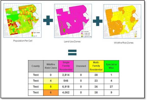
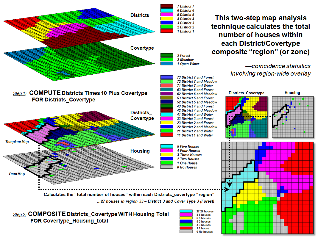