Beyond Mapping III
|
Map
Analysis book with companion CD-ROM
for hands-on exercises and further reading |
Computer Processing Aids Spatial
Neighborhood Analysis — discusses
approaches for calculating slope and profile
Milking Spatial Context Information — describes
a procedure for deriving a customer density surface
Spatially Aggregated Reporting: The Probability is Good — discusses
techniques for smoothing “salt and pepper” results and deriving
probability surfaces from aggregated incident records
Extending Information into No-Data Areas — describes
a technique for “filling-in” information from surrounding data into no-data
locations
Nearby Things Are More Alike — use
of decay functions in weight-averaging surrounding conditions
Filtering for the Good Stuff — investigates
a couple of spatial filters for assessing neighborhood connectivity and
variability
Altering Our Spatial Perspective through
Dynamic Windows — discusses
the three types of roving windows— fixed, weighted and dynamic.
Note: The processing and figures
discussed in this topic were derived using MapCalcTM software.
See www.innovativegis.com to
download a free MapCalc Learner version with tutorial materials for classroom and
self-learning map analysis concepts and procedures.
<Click here>
right-click to download a printer-friendly version of this topic (.pdf).
(Back to the Table of Contents)
______________________________
Computer
Processing Aids Spatial Neighborhood Analysis
(GeoWorld, October 2005, pg. 18-19)
This
and the following sections investigate a set of analytic tools concerned with summarizing
information surrounding a map location.
Technically stated, the processing involves “analysis of spatially
defined neighborhoods for a map location within the context of its neighboring
locations.” Four steps are involved in
neighborhood analysis— 1) define the neighborhood, 2) identify map values
within the neighborhood, 3) summarize the values and 4) assign the summary
statistic to the focus location. Then
repeat the process for every location in a project area.
The
neighborhood values are obtained by a “roving window” moving about a map. To conceptualize the process, imagine a
French window with nine panes looking straight down onto a portion of the
landscape. If your objective was to
summarize terrain steepness from a map of digital elevation values, you would
note the nine elevation values within the window panes, and then summarize the
3-dimensional surface they form.
Now
imagine the nine values become balls floating at their respective
elevation. Drape a sheet over them like
the magician places a sheet over his suspended assistant (who says
Figure 1. At a location,
the eight individual slopes can be calculated for a 3x3 window and then
summarized for the maximum, minimum, median and average slope.
Figure
1 shows a small portion of a typical elevation data set, with each cell
containing a value representing its overall elevation. In the highlighted 3x3 window there are eight
individual slopes, as shown in the calculations on the right side of the
figure. The steepest slope in the window
is 52% formed by the center and the NW neighboring cell. The minimum slope is 11% in the NE
direction.
To get
an appreciation of this processing, shift the window one column to the right
and, on your own, run through the calculations using the focal elevation value
of 459. Now imagine doing that a million
times as the roving window moves an entire project area—whew!!!
But
what about the general slope throughout the entire 3x3 analysis window? One estimate is 29%, the arithmetic average
of the eight individual slopes. Another
general characterization could be 30%, the median of slope values. But let's stretch the thinking a bit
more. Imagine that the nine elevation
values become balls floating above their respective locations, as shown in
Figure 2. Mentally insert a plane and
shift it about until it is positioned to minimize the overall distances from
the plane to the balls. The result is a
"best-fitted plane" summarizing the overall slope in the 3x3
window.
Figure
2. Best-Fitted
Plane and Vector Algebra can be used to calculate overall slope.
Techy-types
will recognize this process as similar to fitting a regression line to a set of
data points in two-dimensional space. In
this case, it’s a plane in three-dimensional space. There is an intimidating set of equations
involved, with a lot of Greek letters and subscripts to "minimize the sum
of the squared deviations" from the plane to the points. Solid geometry calculations, based on the
plane's "direction cosines," are used to determine the slope (and
aspect) of the plane.
Another
procedure for fitting a plane to the elevation data uses vector algebra, as
illustrated in the right portion of Figure 2.
In concept, the mathematics draws each of the eight slopes as a line in
the proper direction and relative length of the slope value (individual
vectors). Now comes the fun part. Starting with the NW line, successively
connect the lines as shown in the figure (cumulative vectors). The civil engineer will recognize this
procedure as similar to the latitude and departure sums in "closing a
survey transect." The length of the
“resultant vector” is the slope (and direction is the aspect).
In
addition to slope and aspect, a map of the surface profiles can be computed
(see figure 3). Imagine the terrain
surface as a loaf of bread, fresh from the oven. Now start slicing the loaf and pull away an
individual slice. Look at it in profile
concentrating on the line formed by the top crust. From left to right, the line goes up and down
in accordance with the valleys and ridges it sliced through.
Use
your arms to mimic the fundamental shapes along the line. A 'V' shape with both arms up for a
valley. An inverted 'V' shape with both
arms down for a ridge. Actually there
are only nine fundamental profile classes (distinct positions for your two
arms). Values one through nine will
serve as our numerical summary of profile.
Figure
3. A 3x1 roving window is used to summarize
surface profile.
The
result of all this arm waving is a profile map— the continuous distribution
terrain profiles viewed from a specified direction. Provided your elevation data is at the proper
resolution, it's a big help in finding ridges and valleys running in a certain
direction. Or, if you look from two
opposing directions (orthogonal) and put the profile maps together, a location
with an inverted 'V' in both directions is likely a peak.
There
is a lot more to neighborhood analysis than just characterizing the lumps and
bumps of the terrain. What would happen
if you created a slope map of a slope map?
Or a slope map of a barometric pressure map? Or of a cost surface? What would happen if the window wasn't a
fixed geometric shape? Say a ten minute
drive window. I wonder what the average
age and income is for the population within such a bazaar window? Keep reading for more on neighborhood
analysis.
Milking Spatial Context
Information
(GeoWorld, November 2005, pg. 18-19)
The
previous discussion focused on procedures for analyzing spatially-defined
neighborhoods to derive maps of slope,
aspect and profile. These techniques
fall into the first of two broad classes of neighborhood
analysis—Characterizing Surface Configuration and Summarizing map values (see
figure 1).
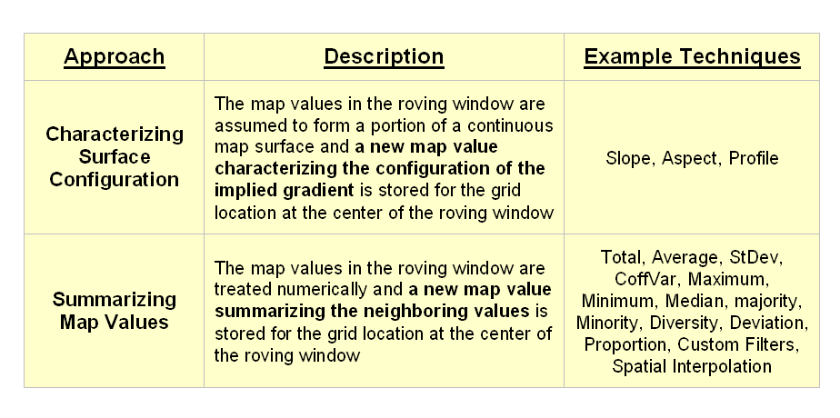
Figure
1. Fundamental classes of neighborhood analysis
operations.
It is
important to note that all neighborhood analyses involve mathematical or
statistical summary of values on an existing map that occur within a roving
window. As the window is moved
throughout a project area, the summary value is stored for the grid location at
the center of the window resulting in a new map layer reflecting neighboring
characteristics or conditions.
The
difference between the two classes of neighborhood analysis techniques is in
the treatment of the values—implied surface
configuration or direct numerical
summary. Figure 2 shows a direct
numerical summary identifying the number of customers within a quarter of a
mile of every location within a project area.
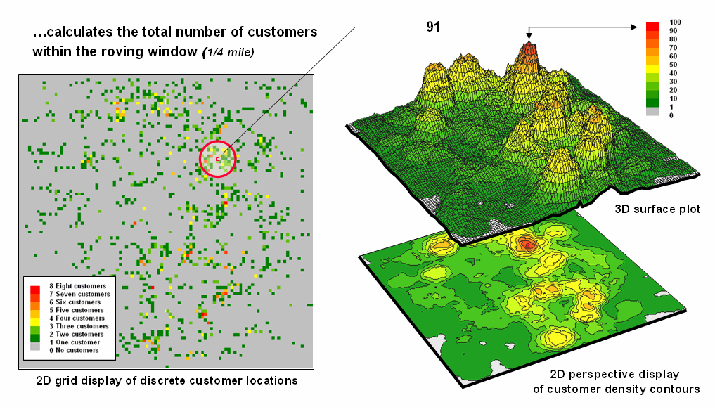
Figure
2. Approach used in deriving a Customer Density
surface from a map of customer locations.
The procedure
uses a “roving window” to collect neighboring map values and compute the total
number of customers in the neighborhood.
In this example, the window is positioned at a location that computes a
total of 91 customers within quarter-mile.
Note that
the input data is a discrete placement of customers while the output is a
continuous surface showing the gradient of customer density. While the example location does not even have
a single customer, it has an extremely high customer density because there are
a lot of customers surrounding it.
The map
displays on the right show the results of the processing for the entire
area. A traditional vector
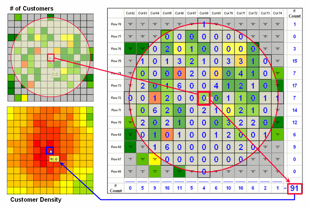
Figure
3. Calculations involved in deriving customer
density.
Figure
3 illustrates how the information was derived.
The upper-right map is a display of the discrete customer locations of
the neighborhood of values surrounding the “focal” cell. The large graphic on the right shows this same
information with the actual map values superimposed. Actually, the values are from an Excel
worksheet with the column and row totals indicated along the right and bottom
margins. The row (and column) sum
identifies the total number off customers within the window—91 total customers
within a quarter-mile radius.
This
value is assigned to the focal cell location as depicted in the lower-left
map. Now imagine moving the “Excel
window” to next cell on the right, determine the total number of customers and
assign the result—then on to the next location, and the next, and the next,
etc. The process is repeated for every
location in the project area to derive the customer density surface.
The
processing summarizes the map values occurring within a location’s neighborhood
(roving window). In this case the
resultant value was the sum of all the values.
But summaries other than Total
can be used—Average, StDev, CoffVar,
Maximum, Minimum, Median, Majority, Minority, Diversity, Deviation, Proportion,
Custom Filters, and Spatial Interpolation.
The remainder of this series will focus on how these techniques can be
used to derive valuable insight into the conditions and characteristics
surrounding locations—analyzing their spatially-defined neighborhoods.
Spatially
Aggregated Reporting: The
Probability is Good
(GeoWorld, January 2006, pg. 16-17)
A couple of the procedures used
in the wildfire modeling warrant “under-the-hood” discussion neighborhood operations—1)
smoothing the results for dominant patterns and 2) deriving wildfire ignition
probability based on historical fire records.
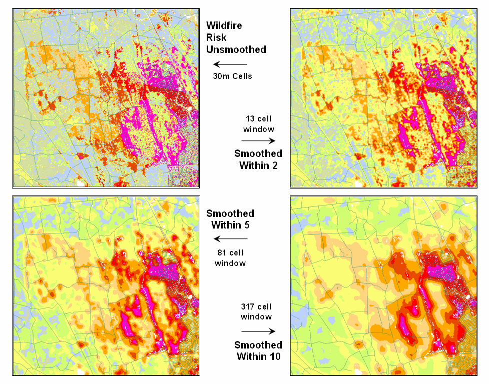
Figure 1. Smoothing eliminates the “salt and pepper”
effect of isolated calculations to uncover dominant patterns useful for
decision-making.
Figure 1 illustrates the effect
smoothing raw calculations of wildfire risk.
The map in the upper-left portion depicts the fragmented nature of the
results calculated for a set individual 30m grid cells. While the results are exacting for each
location, the resulting “salt and pepper” condition is overly detailed and
impractical for decision-making. The
situation is akin to the old adage that “you can’t see the forest for the
trees.”
The remaining three panels show
the effect of using a smoothing window of increasing radius to average the
surrounding conditions. The two-cell
reach averages the wildfire risk within a 13-cell window of slightly more than
2.5 acres. Five and ten-cell reaches
eliminate even more of the salt-and-pepper effect. An eight-cell reach (44 acre) appears best for
wildfire risk modeling as it represents an appropriate resolution for management.
Another use of a neighborhood
operator is establishing fire occurrence probability based on historical fire
records. The first step in solving this
problem is to generate a continuous map surface identifying the number of fires
within a specified window reach from each map location. If the ignition locations of individual fires
are recorded by geographic coordinates (e.g., latitude/longitude) over a
sufficient time period (e.g., 10-20 years) the solution is straightforward. An appropriate window (e.g., 1000 acres) is
moved over the point data and the total number of fires is determined for the
area surrounding each grid cell. The
window is moved over the area to allow for determination of the likelihood of fire
ignition over an area based on the historic ignition location data. The derived fire density surface is divided
by the number of cells in window (fires per cell) and then divided by the
number of years (fires per cell per year).
The result is a continuous map indicating the likelihood (annualized
frequency) that any location will have a wildfire ignition.
The reality of the solution,
however, is much more complex. The
relative precision of recording fires differs for various reporting units from
specific geographic coordinates, to range/township sections, to zip codes, to
entire counties or other administrative groupings. The spatially aggregated data is particularly
aggravating as all fires within the reporting polygon are represented as
occurring at the centroid of a reporting unit.
Since the actual ignition locations can be hundreds of grid cells away
from the centroid, a bit of statistical massaging is needed.
Figure 2
summarizes the steps involved. The
reporting polygon is converted to match the resolution of the grid used by the wildfire
risk model and each location is assigned the total number of fires occurring
within its reporting polygon (#Fires). A
second grid layer is established that assigns the total number of grid cells
within its reporting polygon (#Cells).
Dividing the two layers uniformly distributes the number of fires within
a reporting unit to the each grid cell comprising the unit (Fires/Cell).
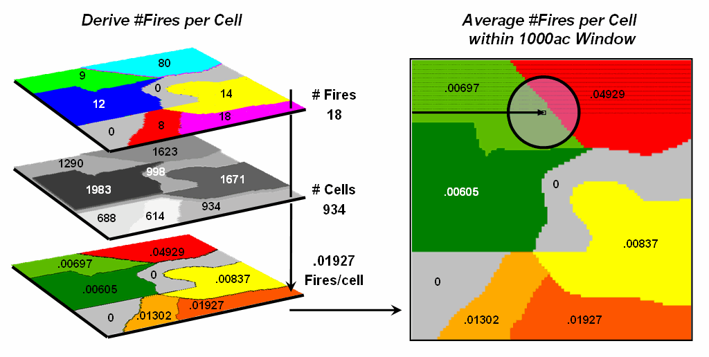
Figure 2.
Fires per cell is calculated for each location within a reporting unit
then a roving window is used to calculate the likelihood of ignition by
averaging the neighboring probabilities.
The
final step moves a roving window over the map to average the fires per cell as
depicted on the right side of the figure.
The result is a density surface of the average number of fires per cell
reflecting the relative size and pattern of the fire incident polygons falling
within the roving window. As the window
moves from a location surrounded by low probability values to one with higher
values the average probability increases as a gradient that tracks the effect
of the area-weighted average.
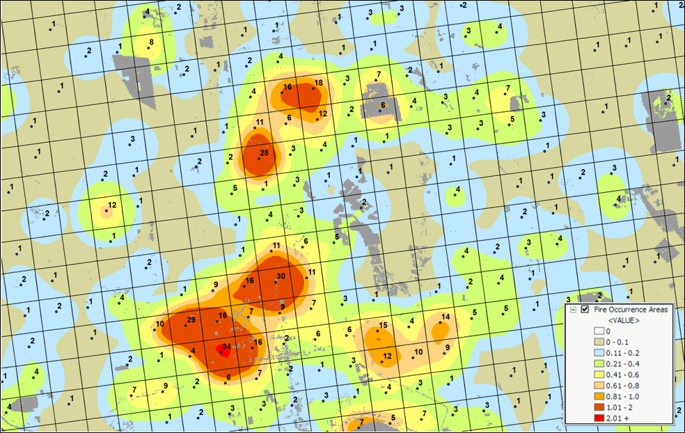
Figure 3. A map of Fire Occurrence frequency identifies
the relative likelihood that a location will ignite based on historical fire
incidence records.
Figure 3
shows the operational results of stratifying the area into areas of uniform
likelihood of fire ignition. The
reference grid identifies PLSS sections used for fire reporting, with the dots indicating
total number of fires for each section.
The dark grey locations identify non-burnable areas, such as open water,
agriculture lands, urbanization, etc.
The tan locations identify burnable areas with a calculated probability
of zero. Since zero probability is a
result of the short time period of the recorded data the zero probability is
raised to a minimum value. The color
ramp indicates increasing fire ignition probability with red being locations
having very high likelihood of ignition.
It is important to note that
interpolation of incident data is inappropriate and simple density function
analysis only works for data that is reported with specific geographic
coordinates. Spatially aggregated
reporting requires the use of the area-weighted frequency technique described
above. This applies to any discrete
incident data reporting and analysis, whether wildfire ignition points, crime
incident reports, product sales. Simply
assigning and mapping the average to reporting polygons just won’t cut it as
geotechnology moves beyond mapping.
______________________________
Author’s Note: Discussion
based on wildfire risk modeling by Sanborn, www.sanborn.com/solutions/fire_management.htm. For more information on wildfire risk
modeling, see GeoWorld, December 2005, Vol.18, No. 12, 34-37, posted online at http://www.geoplace.com/uploads/FeatureArticle/0512ds.asp
or click here for
article with enlarged figures and .pdf hardcopy.
Extending Information into No-Data Areas (GeoWorld, July 2011)
I am increasingly
intrigued by wildfire modeling. For a
spatial analysis enthusiast, it has it all— headlines grabbing impact,
real-world threats to life and property, action hero allure, as well as a
complex mix of geographically dependent “driving variables” (fuels, weather and
topography) and extremely challenging spatial analytics.
However
with all of their sophistication, most wildfire models tend to struggle with
some very practical spatial considerations.
For example, figure 1 identifies an extension that “smoothes” the salt
and pepper pattern of the individual estimates of flame length for individual
30m cells (left side) into a more continuous surface (right side). This is done for more than cartographic
aesthetics as surrounding fire behavior conditions are believed to be
important. It makes sense that an
isolated location with predicted high flame length conditions adjacent to much
lower values is presumed to be less likely to attain the high value than one
surrounded by similarly high flame length values. Also the mixed-pixel and uncertainty effects
at the 30m spatial resolution suggest using a less myopic perspective.
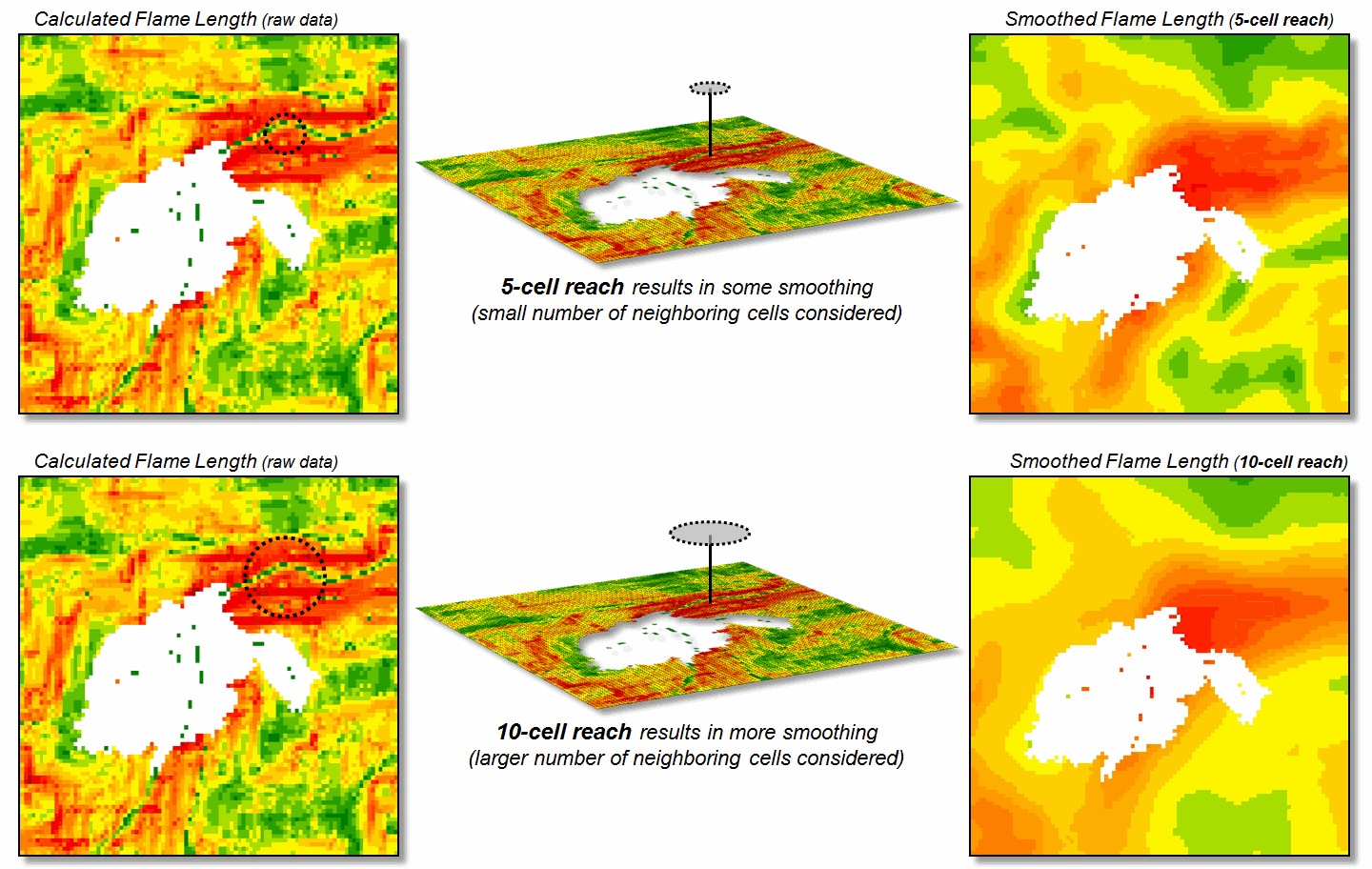
Figure 1. Raw Flame Length values are smoothed to identify
the average calculated lengths within a specified distance of each map
location— from point-specific condition to a localized condition that
incorporates the surrounding information (smoothing).
The
top right portion of the figure shows the result of a simple-average 5-cell
smoothing window (150m radius) while the lower inset shows results of a 10-cell
reach (300m). Wildfire professionals
seem to vary in their expert opinion (often in heated debate—yes, pun intended)
of the amount and type of smoothing required, but invariably they seem to agree
that none (raw data) is too little and a 10-cell reach is too much. The most appropriate reach and the type of smoothing
to use will likely keep fire scientists busy for a decade or more. In the interim, expert opinion prevails.
An
even more troubling limitation of traditional wildfire models is depicted as
the “white region” in figure 1 representing urban areas as “no-data,” meaning
they are areas of “no wildland fuel data” and cannot be simulated with a
wildfire model. The fuel types and
conditions within an urban setting form extremely complex and variable
arrangements of non-burnable to highly flammable conditions. Hence, the wildfire models must ignore urban
areas by assigning no-data to these extremely difficult conditions.
However
all too often, wildfires ignore this artificial boundary and move into the
urban fringe. Modeling the relative
venerability and potential impacts within the “no data” area is a critical and
practical reality.
Figure
2 shows the first step in extending wildfire conditions into an urban
area. A proximity map from the urban
edge is created and then divided into a series of rings. In this example, a 180m overall reach into
the urban “no-data” area uses three 2-cell rings.
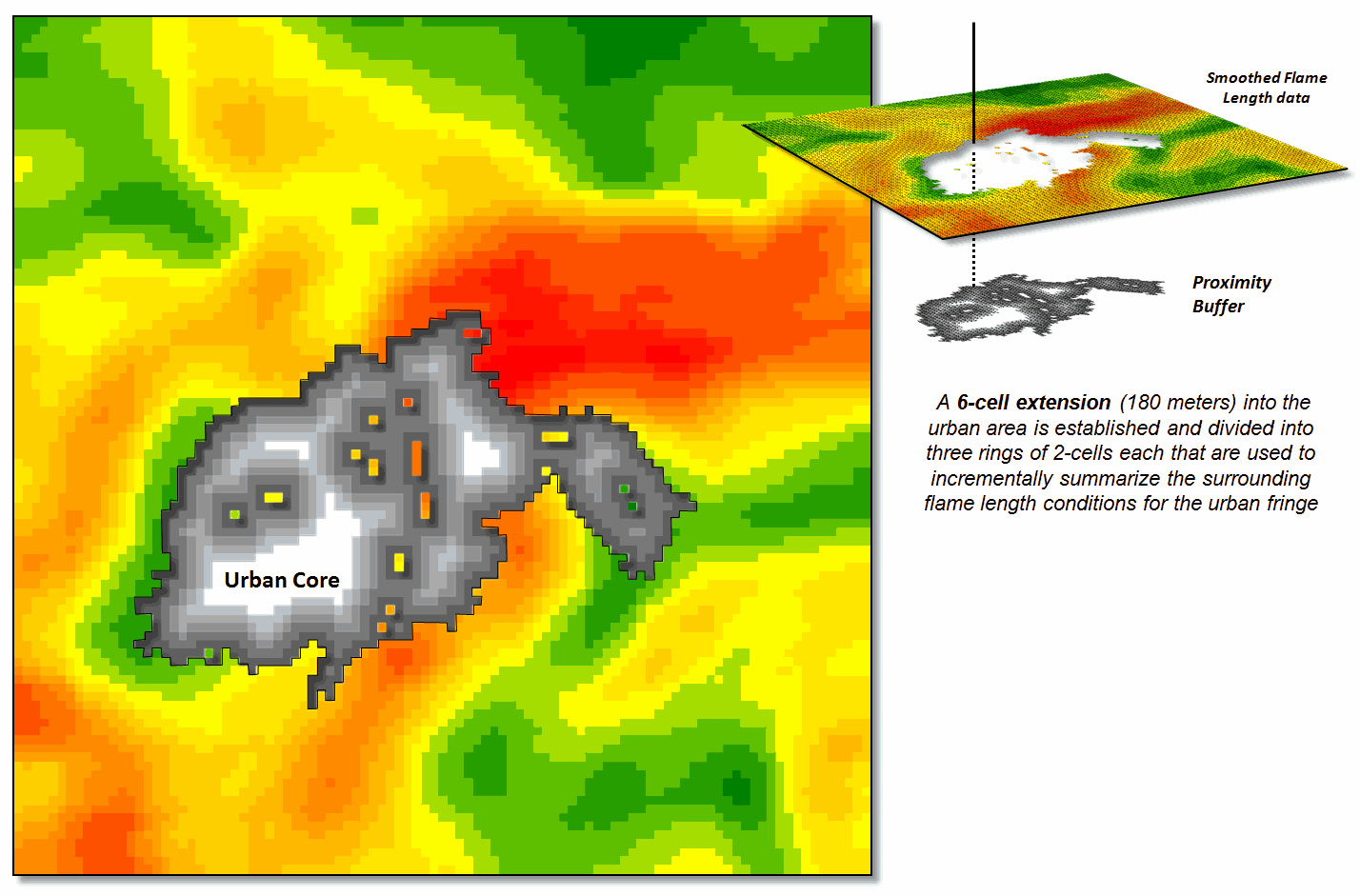
Figure 2. Proximity rings extending into urban areas are
calculated and used to incrementally “step” the flame length information into
the urban area.
A roving window of
4-cells is used to average the neighboring flame lengths for each location
within the First Ring and these data are added to the original data. The result is “oozing” the flame lengths a
little bit into the urban area. In turn,
the Second Ring’s average is computed and added to the Original plus First Ring
data to extend the flame length data a little bit more. The process is repeated for the Third Ring to
“ooze” the original data the full 180 meters (6-cell) into the urban area (see
figure 3).
It is important to note
that this procedure is not estimating flame lengths at each urban location, but
a first-cut at extending the average flame length information into the urban
fringe based on the nearby wildfire behavior conditions. Coupling this information with a response
function implies greater loss of property where the nearby flame lengths are
greater. Locations in red identify
generally high neighboring flame lengths, while green identify generally low
locations—a first-cut at the relative wildfire threat within the urban
fringe.
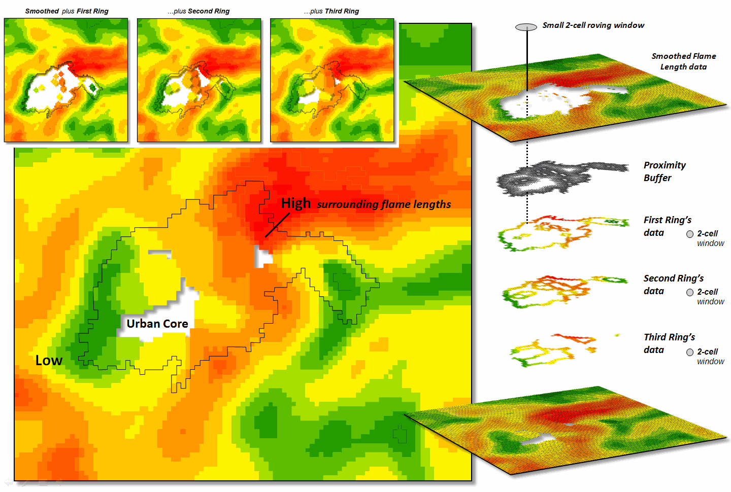
Figure 3. The original smoothed flame length information is
added to the First Ring’s data, and then sequentially to the Second Ring’s and
Third Ring’s data for a final result that extends the flame length
information into the urban area.
What is novel in this
procedure is the iterative use of nested rings to propagate the
information—“oozing” the data into the urban area instead of one large
“gulp.” If a single large roving window
(e.g., a 10-cell radius) were used for the full 180 meter reach inconsistencies
arise. The large window produces far too
much smoothing at the urban outer edge and has too little information at the
inner edge as most of the window will contain “no-data.”
The ability to
“iteratively ooze” the information into an area step-by-step keeps the data
bites small and localized, similar to the brush strokes of an artist.
_____________________________
Author’s Note: For
more discussion of roving windows concepts, see the online book, Beyond
Modeling III, Topic 26, Assessing Spatially-Defined Neighborhoods at www.innovativegis.com/Basis/MapAnalysis/Default.htm.
(GeoWorld, February 2006, pg. 16-17)
Neighborhood
operations summarize the map values surrounding a location based on the implied
Surface Configuration (slope, aspect, profile) or the Statistical Summary of
the values. The summary procedure, as
well as the shape/size of the roving window, greatly affects the results.
The
previous section investigated these effects by changing the window size and the
summary procedure to derive a statistical summary of neighbor conditions. An interesting extension to these discussions
involves using spatial filters that
change the relative weighting of the values within the window based on standard
decay function equations.
Figure
1 shows graphs of several decay functions.
A Uniform function is insensitive to distance with all of the weights in
the window the same (1.0). The other
equations involve the assumption that “nearby things are more alike” and
generate increasingly smaller weights with greater distances. The Inverse Distance Squared function is the
most extreme resulting in nearly zero weighting within less than a 10 cell
reach. The Inverted D^2 function, on the
other hand, is the least limiting function with its weights decreasing at a
much slower rate to a reach of over 35 cells.
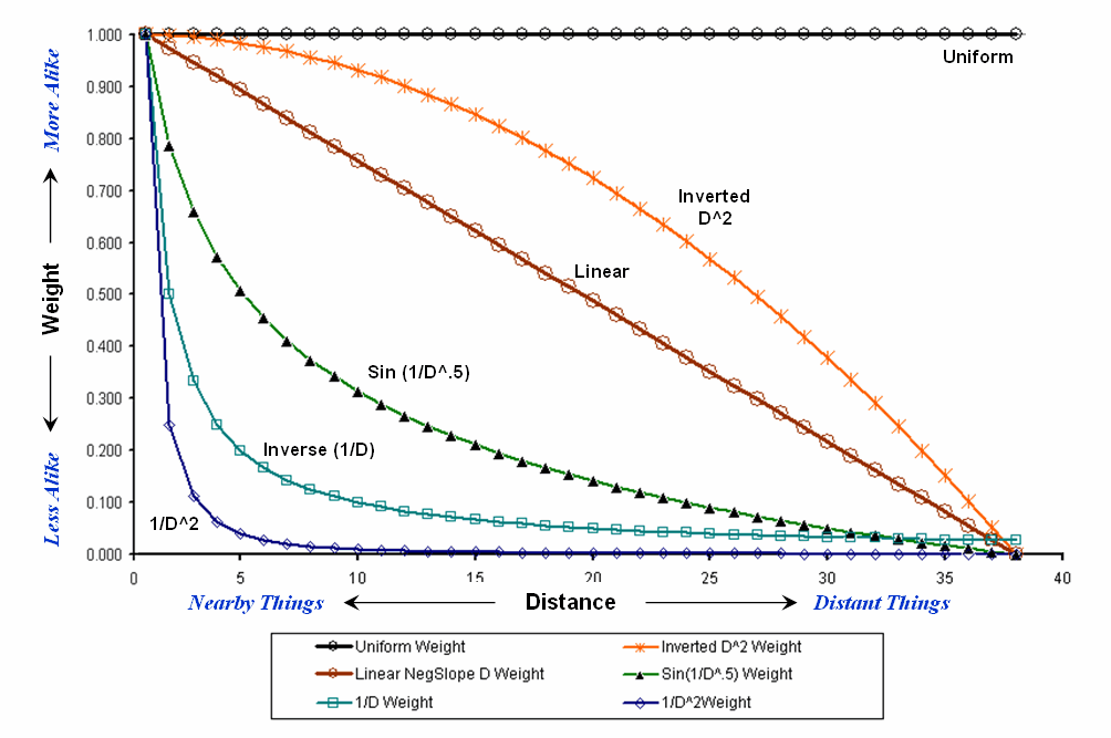
Figure
1.
Standard mathematical decay functions where weights (Y) decrease with
increasing distance (X).
Decay
functions like these often are used by mathematicians to characterize
relationships among variables. The
relationships in a spatial filter require extending the concept to geographical
space. Figure 2 shows 2D and 3D plots of
the results of evaluating the Inverse Distance, Linear Negative-Slope, Inverted
Distance-Squared and Uniform functions to the X,Y coordinates in a grid-based
system. The result is a set of weights
for a roving window (technically referred to as a “kernel”) with a radius of 38
cells.
Note
the sharp peak for the Inverse Distance filter that rapidly declines from a
weight of 1.0 (blue) for the center location to effectively zero (yellow) for
most of the window. The Linear
Negative-Slope filter, on the other hand, decreases at a constant rate forming
a cone of declining weights. The weights
in the Inverted Distance-Squared filter are much more influential throughout
the window with a sharp fall-off toward the edge of the window. The Uniform filter is constant at 1.0
indicating that all values in the window are equally weighted regardless of
their distance from the center location.
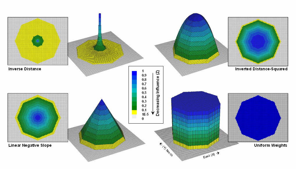
Figure
2. Example spatial filters depicting the
fall-off of weights (Z) as a function of geographic distance (X,Y).
These
spatial filters are the geographic equivalent to the standard mathematical
decay functions shown in figure 1. The
filters can be used to calculate a weighted average by 1) multiplying the map
values times the corresponding weights within a roving window, 2) summing the
products, 3) then dividing by the sum of the weights and 4) assigning the
calculated value to the center cell. The
procedure is repeated for each instance of the roving window as it passes
throughout the project area.
Figure
3 compares the results of weight-averaging using a Uniform spatial filter
(simple average) and a Linear Negative-Slope filter (weighted average) for
smoothing model calculated values. Note
that the general patterns are similar but that the ranges of the smoothed
values are different as the result of the weights used in averaging.
The use
of spatial filters enables a user to control the summarization of neighboring
values. Decay functions that match user
knowledge or empirical research form the basis of distance weighted
averaging. In addition, filters that
affect the shape of the window can be used, such as using direction to
summarize just the values to the north—all 0’s except for a wedge of 1’s
oriented toward the north.
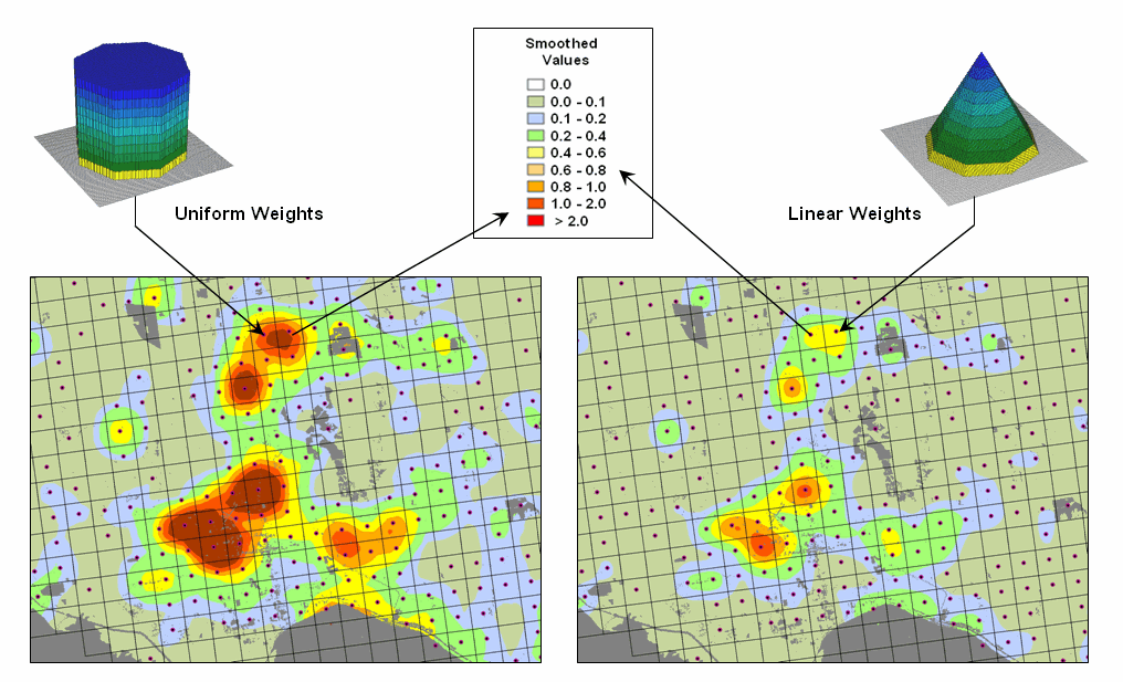
Figure
3. Comparison of simple average (Uniform
weights) and weighted average (Linear weights) smoothing results.
“Dynamic spatial filters” that change with
changing geographic conditions define an active frontier of research in
neighborhood summary techniques. For
example, the shape and weights could be continuously redefined by just
summarizing locations that are uphill as a function of elevation (shape) and
slope (weights) with steep slopes having the most influence in determining
average landslide potential. Another
example might be determining secondary source pollution levels by considering
up-wind locations as a function of wind direction (shape) and speed (weights)
with values at stronger wind locations having the most weight.
The
digital nature of modern maps supporting such map-ematics is taking us well beyond traditional mapping and our paper-map
legacy. As
(GeoWorld, December 2005, pg. 18-19)
The
last couple of sections discussed procedures for analyzing spatially-defined
neighborhoods through the direct numerical summary of values within a roving
window. An interesting group of extended
operators are referred to as spatial
filters.
A
useful example of a spatial filter involves analysis of a Binary Progression Window (BPW) that summarizes the diagonal and
orthogonal connectivity within the window.
The left side of figure 1 shows the binary progression (multiples of 2)
assignment for the cells in a 3 by 3 window that increases left to right, top
to bottom.
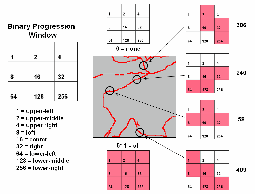
Figure
1. Binary
Progression Window summarizes neighborhood connectivity by summing values in a
roving window.
The
interesting characteristic of the sum of a binary progression of numbers is
that each unique combination of numbers results in a unique value. For example if a condition does not occur in
a window, the sum is zero. If all cells
contain the condition, the sum is 511.
The four example configurations on the right identify the unique sum
that characterizes the patterns shown. The result is that all possible patterns can
be easily recognized by the computer and stored as a map.
A more
sophisticated example of a spatial filter is the Binary Comparison Matrix (
Consider
the 3x3 window in figure 2 where "M" represents meadow classified
locations and "F" represents forest.
The simplest summary of neighborhood variability is to note there are
just two classes. If there was only one
class in the window, you would say there is no variability (boring); if there
were nine classes, there would be a lot of different conditions
(exciting).
The
count of the number of different classes (Diversity) is the broadest measure of
neighborhood variability. The measure of
the relative frequency of occurrence of each class (Interspersion) is a
refinement on the simple diversity count and notes that the window contains
less M’s than F’s. If the example's
three "M's" were more spread out like a checkerboard, you would
probably say there was more variability due to the relative positioning of the
classes (Juxtapositioning). The
final variability measure (Proportion) is two because there are 2 similar cells
of the 8 total adjoining cells.
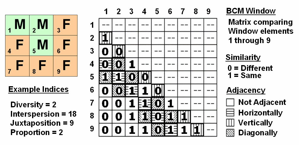
Figure
2. Binary
Comparison Matrix summarizes neighborhood variability by summing various groups
of matrix pairings identified in a roving window.
A
computer simply summarizes the values in a Binary Comparison Matrix to
categorize all variability that you see.
First, "Binary" means it only uses 0's and 1's. "Comparison" says it will compare
each element in the window with every other element. If they are the same, a 1 is assigned; if
different, a 0 is assigned.
"Matrix" dictates how the data the binary data is organized
and summarized.
In
figure 2, the window elements are numbered from one through nine. In the window, is the class for cell 1 the
same as for cell 2? Yes (both are M), so
1 is assigned at the 1,2 position in the table.
How about elements 1 and 3? No,
so assign a 0 in the second position of column one. How about 1 and 4? No, then assign another 0. Repeat until all of the combinations in the
matrix contain a 0 or a 1 as depicted in the figure.
While
you are bored already, the computer enjoys completing the table for every grid
location… thousands and thousands of
Within
the table there are 36 possible comparisons.
In our example, eighteen of these are similar by summing the entire
matrix— Interspersion= 18. Orthogonal
adjacency (side-by-side and top-bottom) is computed by summing the
vertical/horizontal cross-hatched elements in the table— Juxtaposition= 9. Comparison of the center to its neighbors
computes the sum for all pairs involving element 5 having the same condition
(5,1 and 5,2 only)— Proportion= 2.
You can
easily ignore the mechanics of the computations and still be a good user of
While
BPW’s neighborhood connectivity and
______________________________
Author’s Note: This and
other “Beyond Mapping” columns have been compiled into an online book Map
Analysis posted at www.innovativegis.com/basis/. Student and instructor materials with
hands-on exercises including software are available.
Altering Our Spatial Perspective
through Dynamic Windows
(GeoWorld, August 2012)
The use of “roving
windows” to summarize terrain configuration is well established. The position and relative
magnitude of surrounding values at a location on an elevation surface have long
been used to calculate localized terrain steepness/slope and orientation/aspect.
A
search radius and geometric shape of the window are specified, then surface
values within the window are retrieved, a summary technique applied (e.g.,
slope, aspect, average, coefficient of variation, etc.) and the resulting summary
value assigned to the center cell. The
roving window is systematically moved throughout the surface to create a map of
the desired surface summary.
The top
portion of figure 1 illustrates the planimetric configuration of three
locations of a circular fixed window with a radius of ten
grid spaces. When superimposed onto the
surface, the shape is warped to conform to the relative elevation values
occurring within the window. Note that
the first location is moderately sloped toward the south; second location is
steeply sloped toward the west; and the third location is fairly flat with no
discernible orientation.
What
you eye detects is easily summarized by mathematical algorithms with the
resultant values for all of the surface locations creating continuous maps of
landform character, such as surface roughness, tilted area and convexity/concavity,
as well as slope and aspect (see author’s note 1).
A weighted
window is a variant on the simple fixed window that involves preferential
weighting of nearby data values. For
example, inverse distance weighted interpolation uses a fixed shape/size of a
roving window to identify data samples that are weight-averaged to favor nearer
sample values more than distant ones. Or
a user-specified weighting kernel can be specified as a decay function (see
author’s note 2) or any other weighting preference, such as assigning more
importance to easterly conditions to account for strong and dry Santa Ana winds
when modeling wildfire threat in southern California. It is common sense that these easterly
conditions are more influential than just a simple or distance-weighted
average in all directions.
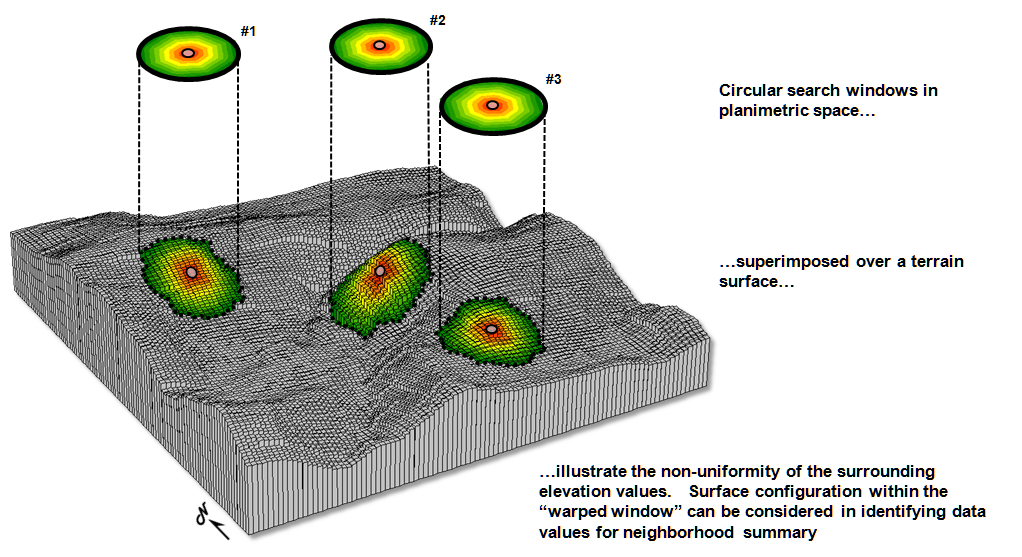
Figure 1. Fixed windows form circles in planimetric space but
become warped when fitted to a three-dimensional surface.
Dynamic
windows
use the same basic processing flow but do not use a fixed reach or consistent
geometric shape in defining a roving window.
Rather, the size and shape is dependent on the conditions at each map
location and varies as the window is moved over a map surface.
For
example, figure 2 depicts a roving window based on uphill, downhill and across
slope movements from the center location.
Lots of spatial processes respond differently to these basic landform
conditions. For example, uphill
conditions can contribute surface runoff to the center cell, downhill locations
can receive flows from the center cell and sediment movement at the across
slope locations is independent of the center cell. Wildfire movement, on the
other hand, is most rapid uphill, particularly in steep terrain, due to
preheating of forest fuels. Hence,
downhill conditions are more important in modeling threat at a location than
either the across or uphill surrounding conditions.
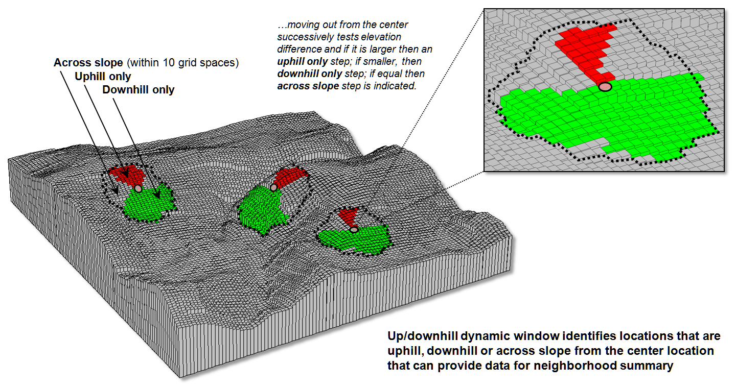
Figure 2. Uphill, downhill and across portions of a roving
window can be determined by considering the relative values on a
three-dimensional surface.
Another
dynamic consideration is effective distance (see author’s note 3). For example, a window’s geographic reach and
direction can be a function of intervening conditions, such as the relative
habitat preference when considering the surroundings in a wildlife model. The window will expand and contract depending
on neighboring conditions forming an ameba-like shape to identify data values
to be summarized—the pseudopods change shape and extent at each instantaneous
location. The result is a localized
summary of data, such as proximity to human activity within preferential reach
of each grid location to characterize animal/human interaction potential.
Or a
combination of window considerations can be applied, such as (1) preferential
weighting of the fuel loadings (2) along downhill locations (3) as a function
of slope with steep areas reaching farther away than gently sloped areas. In a wildfire risk model, the resultant “roving
window” summary would favor the fuel conditions within the elongated pseudopods
of the steeply sloped downhill locations.
A third
type of dynamic consideration involves line-of-sight connectivity where the “viewshed”
of a location within a specified distance is used to define a roving window
(see figure 3). In a military situation,
this type of window might be useful in summarizing the likelihood of enemy
activity that is visually connected to each map location. Areas with high visual exposure levels being
poor places to setup camp, but ideal
places for establishing forward observer outposts.
A less
war-like application of line-of-sight windows involves terrain analysis. Areas not seen are “over the hill” in a
macro-sense for ridge lines and “in a slight depression” in a micro-sense for
potholes. If all locations are seen then
there is minimal macro or micro terrain variations.
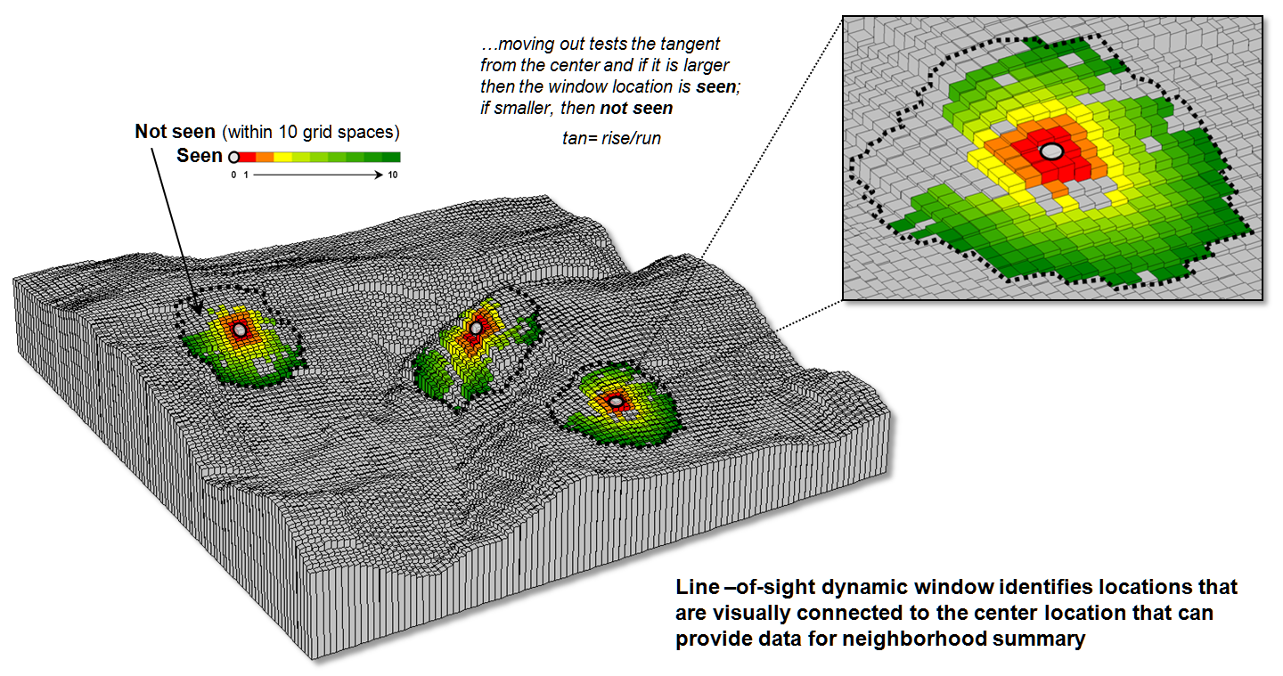
Figure 3. A line-of-sight window identifies locations that
are seen and not seen from the window’s focus.
The rub
is that most of the user community and much of the vector-based GIS’ers are
unaware of even fixed roving windows, much less weighted and dynamic
windows. However, the utility of these
advanced procedures in conceptualizing geographic space within context of its
surroundings is revolutionary. The view
through a dynamic window is as useful as it is initially mind-boggling …see you
on the other side.
_____________________________
Author’s Notes: 1)
See Topic 11, Characterizing Micro-Terrain Features, “Characterizing Local
Terrain Conditions”; 2) Topic 26, Characterizing Micro-Terrain Features, “Nearby
Things Are More Alike”; and 3) Topic 25, Calculating Effective Distance and
Connectivity, “Measuring Distance Is Neither Here
nor There” in the online book Beyond Mapping III posted at www.innovativegis.com/basis/MapAnalysis/.