Beyond Mapping III
|
Map
Analysis book with companion CD-ROM for hands-on exercises and further reading |
GIS Analyzes
In-Store Movement and Sales Patterns
— describes a
procedure using accumulation surface analysis to infer shopper movement from
cash register data
Further Analyzing In-Store
Movement and Sales Patterns
— discusses how
map analysis is used to investigate the relationship between shopper movement
and sales
Continued Analysis of In-Store
Movement and Sales Patterns
— describes the
use of temporal analysis and coincidence mapping to enhance shopping patterns
Note: The
processing and figures discussed in this topic were derived using MapCalcTM
software. See www.innovativegis.com to download a
free MapCalc Learner version with tutorial materials for classroom and
self-learning map analysis concepts and procedures.
<Click here> right-click
to download a printer-friendly version of this topic (.pdf).
(Back to the Table of Contents)
_____________________________
(GeoWorld, February 1998, pg. 30-32)
There are two fundamental types of
people in the world: shoppers and non-shoppers.
Of course, this distinction is a relative one, as all of us are shoppers
to at least some degree. How we perceive
stores and what prompts us to frequent them form a large part of retail
marketing’s
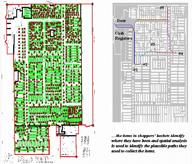
Figure 1. Establishing Shopper Paths. Stepped accumulation surface analysis is used to model shopper movement based on the items in a shopping cart.
The floor plan of a store is a continuous surface with a complex of
array of barriers strewn throughout. The
main aisles are analogous to mainline streets in a city, the congested areas
are like secondary streets, and the fixtures form absolute barriers (can’t
climb over or push aside while maintaining decorum). Added to this mix are the entry doors,
shelves containing the elusive items, cash registers, and finally the exit doors. Like an obstacle race, your challenge is to
survive the course and get out without forgetting too much. The challenge to the retailer is to get as
much information as possible about your visit.
For years, the product flow through the cash registers has been analyzed to
determine what sells and what doesn’t. Data analysis originally focused on
reordering schedules, then extended to descriptive statistics and insight into
which products tend to be purchased together (product affinities). However, mining the data for spatial
relationships, such as shopper movement and sales activity within a store, is
relatively new. The left portion of figure
1 shows a map of a retail superstore with fixtures (green) and shelving nodes
(red). The floor plan was digitized and
the fixtures and shelving spaces were encoded to form map features similar to
buildings and addresses in a city. These
data were gridded at a 1-foot resolution to form a continuous analysis space.
The right portion of figure 1 shows the plausible path a shopper took to
collect the five items in a shopping cart.
It was derived through stepped accumulation surface analysis described
in last month’s column. Recall that this
technique constructs an effective proximity surface from a starting location
(entry door) by spreading out (increasing distance waves) until it encounters
the closest visitation point (one of the items in the shopping cart). The first leg of the shopper’s plausible path
is identified by streaming down the truncated proximity surface (steepest
downhill path). The process is repeated
to the establish the next tier of the surface by spreading from the current
item’s location until another item is encountered, then streaming over that
portion of the surface for the next leg of the path. The spread/stream procedure is continued
until all of the items in the cart have been evaluated. The final leg is delineated by moving to the
checkout and exit doors.
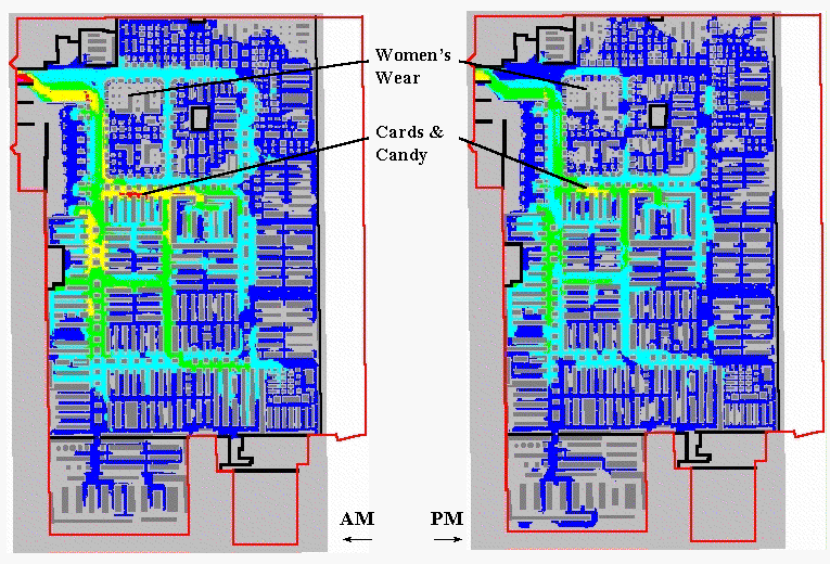
Figure 2. Shopper Movement Patterns. The paths for a set of shoppers are aggregated and smoothed to characterize levels of traffic throughout the store.
Similar paths are derived for additional shopping carts that pass
through the cash registers. The paths
for all of carts during a specified time period are aggregated and smoothed to
generate an accumulated shopper movement surface. Although it is difficult to argue that each
path faithfully tracks actual movement, the aggregate surface tends to identify
relative traffic patterns throughout the store.
Shoppers adhering to “random walk” or “methodical serpentine” modes of
movement confound the process, but their presence near their purchase points
are captured.
The left portion of figure 2 shows an aggregated movement surface for
163 shopping carts during a morning period; the right portion shows the surface
for 94 carts during an evening period of the same day. The cooler colors (blues) indicate lower
levels of traffic, while the warmer colors (yellow and red) indicate higher
levels. Note the similar patterns of
movement with the most traffic occurring in the left-center portion of the
store during both periods. Note the
dramatic falloff in traffic in the top portion.
The levels for two areas are particularly curious. Note the total lack of activity in the
Women’s Wear during both periods. As
suspected, this condition was the result of erroneous codes linking the
shelving nodes to the products.
Initially, the consistently high traffic in the Cards & Candy
department was thought to be a data error as well. But the data links held up. It wasn’t until the client explained that the
sample data was for a period just before Valentine’s Day that the results made
sense. Next month we will explore
extending the analysis to include sales activity surfaces and their link to
shopper movement.
__________________________
Author’s Note:
the analysis reported is part of a pilot project lead by HyperParallel, Inc.,
Further Analyzing In-Store
Movement and Sales Patterns
(GeoWorld, March 1998, pg. 28-30)
The previous section described a procedure for deriving maps of shopper
movement within a store by analyzing the items a shopper purchased. An analogy was drawn between the study of
in-store traffic patterns and those used to connect shoppers from their homes
to a store’s parking lot… aisles are like streets and shelving locations are
like street addresses. The objective of
a shopper is to get from the entry door to the items they want, then through
the cash registers and out the exit. The
objective of the retailer is to present the items shoppers want (and those they
didn’t even know they wanted) in a convenient and logical pattern that insures
sales.
Though conceptually similar, modeling traffic within a store versus
within a town has some substantial differences.
First the vertical component of the shelving addresses is important as
it affects product presentation. Also,
the movement options in and around store fixtures (verging on whimsy) is
extremely complex, as is the characterization of relative sales activity. These factors suggest that surface analysis
(raster) is more appropriate than the traditional network analysis (vector) for
modeling in-store movement and coincidence among maps.
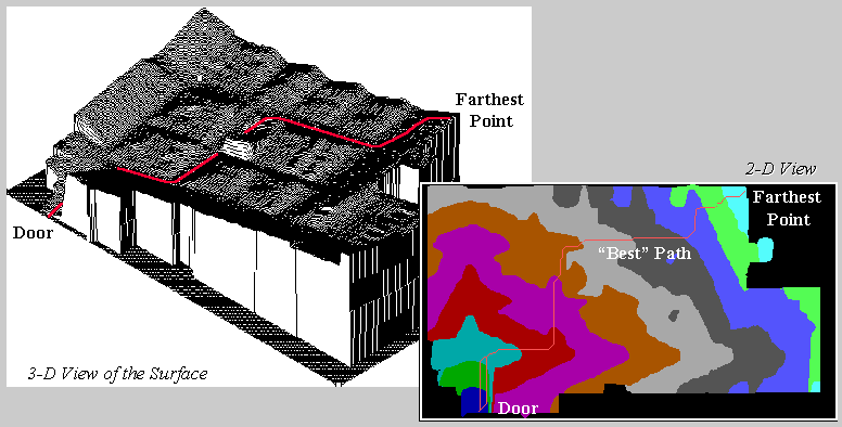
Figure 1. A shopper’s route is the steepest downhill path over a proximity surface.
Path
density analysis develops a “stepped accumulation surface” from the entry door
to each of the items in a shopper’s cart and then establishes the plausible
route used to collect them by connecting the steepest downhill paths along each
of the “facets” of the proximity surface.
The figure 1 illustrates a single path superimposed on 2-D and 3-D plots
of the proximity surface for an item at the far end of the store. The surface acts like mini-staircase guiding
the movement from the door to the item.
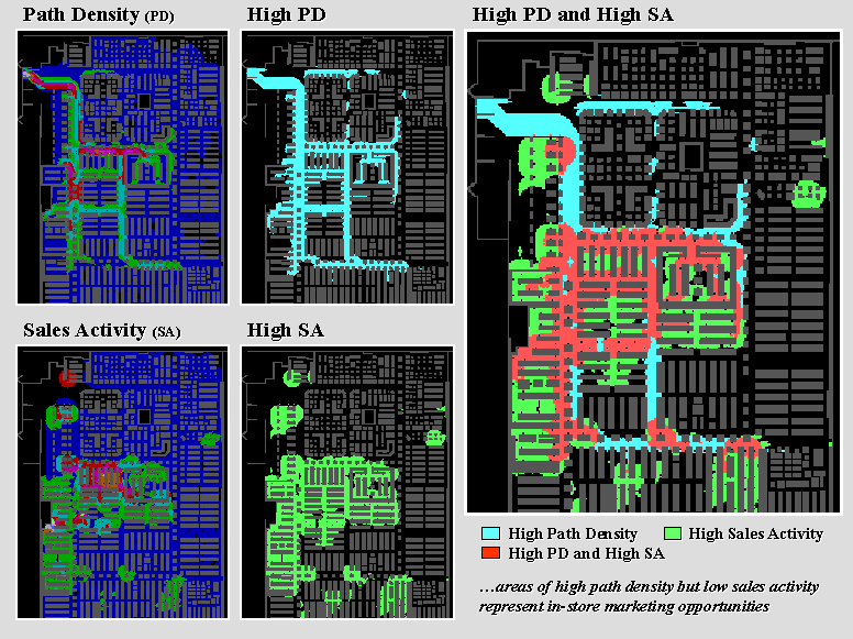
Figure 2. Analyzing coincidence between shopper movement/sales activity surfaces.
The procedure continues from item to item, and finally to the checkout
and exit. Summing and smoothing the
plausible paths for a group of shoppers (e.g., morning period) generates a
continuous surface of shopper movement throughout the store— a space/time
glimpse of in-store traffic. The upper
left inset of figure 2 shows the path density for the morning period described
last time.
OK, so much for review. The lower left
inset identifies sales activity for the same period. It was generated by linking the items in all
of the shopping carts to their appropriate shelving addresses and keeping a
running count of the number of items sold at each location. This map summarizing sales points was
smoothed into a continuous surface by moving a “roving window” around the map
and averaging the number of sales within a ten-foot radius of each analysis
grid cell (1 square foot). The resulting
surface provides another view of the items passing through the checkouts— a
space/time glimpse of in-store sales action.
The maps in the center identify locations of high path density and high sales
activity by isolating areas exceeding the average for each mapped
variable. As you view the maps note
their similarities and differences. Both
seem to be concentrated along the left and center portions of the store,
however, some “outliers” are apparent, such as the pocket of high sales along
the right edge and the strip of high traffic along the top aisle. However, a detailed comparison is difficult
by simply glancing back and forth. The
human brain is good at a lot of things, but summarizing the coincidence of
spatially specific data isn’t one of them.
The enlarged inset on the right is an overlay of the two maps identifying all
combinations. The darker tones show
where the action isn’t (low traffic and low sales). The orange pattern identifies areas of high
path density and high sales activity— what you would expect (and retailer hopes
for). The green areas are a bit more
baffling. High sales, but low traffic
means only shoppers with a mission frequent these locations— a bit
inconvenient, but sales are still high.
The real opportunity lies in the light blue areas indicating high shopper
traffic but low sales. The high/low area
in the upper left can be explained… entry doors and women’s apparel with the
data error discussed last time. But the
strip in the lower center of the store seems to be an “expressway” simply
connecting the high/high areas above and below it. The retailer might consider placing some
end-cap displays for impulse or sale items along the route.
Or maybe not.
It would be silly to make a major decision from analyzing just a few
thousand shopping carts over a couple of days.
Daily, weekly and seasonal influences should be investigated. That’s the beauty of in-store analysis— its based on data that flows
through the checkouts every day. It
allows retailers to gain insight into the unique space/time patterns of their
shoppers without being obtrusive or incurring large data collection expenses.
The raster data structure of the approach facilitates investigation of the relationships
within and among mapped data. For
example, differences in shopper movement between two time periods simply
involve subtracting two maps. If a
percent change map is needed, the difference map is divided by the first map
and then multiplied by 100. If average
sales for areas exceeding 50% increase in activity are desired, the percent
change map is used to isolate these areas, then the
values for the corresponding grid cells on the sales activity map are
averaged. From this perspective, each map
is viewed as a spatially defined variable, each grid cell is analogous to a
sample plot, and each value at a cell is a measurement—all just waiting to
unlock their secrets. Next time we will
investigate more “map-ematical” analyses of these
data.
__________________________
Author’s Note:
the analysis reported is part of a pilot project lead by HyperParallel, Inc.,
Continued Analysis of In-Store
Movement and Sales Patterns
(GeoWorld, April 1998, pg. 26-28)
The first part of this series described a procedure for estimating shopper
movement within a store, based on the items found in their shopping carts. The second part extended the discussion to
mapping sales activity from the same checkout data and introduced some analysis
procedures for investigating spatial relationships between sales and
movement. Recall that the raster data
structure (1-foot grids) facilitated the analysis as it forms a consistent
“parceling” of geographic space. Within
a “map-ematical” context, each value at a grid cell
is a measurement, each cell itself is analogous to a sample plot, and each
gridded map forms a spatially defined variable.
From this perspective, the vast majority of statistical and mathematical
techniques become part of the
The
 \
\
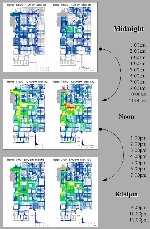
Figure 1. Snapshots from a movie of hourly maps of shopper movement and sales
activity.
The recognition that maps are data as well as pictures fuels this “data
mining” perspective. Cognitive
abstractions of data coupled with physical features for geographic reference
form new and useful views of the spatial relationships within a data set. For example, the insets in figure 1 show
three “snapshots” of an animated sequence of the surfaces depicting shopper
movement (left side) and sales activity (right side). The checkout data for a twenty-four hour
period was divided into hourly segments and the movement and sales surfaces
generated were normalized, and then assigned a consistent color ramp for
display.
When viewed in motion, the warmer tones (reds) of higher activity
appear to roll in and out like wisps of fog under the Golden Gate Bridge. The similarities and miss-matches in the ebb
and flow provide a dramatic view (and new insights) of the spatial/temporal
relationships contained in the data.
Data visualization techniques, such as animation and 3-D datascapes, render complex and colorless tables of numbers
into pictures more appropriate for human consumption.
Although the human brain is good at many things, detailed analysis of mapped
data is not one of them. Visualizing the
hourly changes provides a general impression of the timing and patterns in
shopper movement and sales activity.
However, additional insight results from further map-ematics identifying locations of
“significant” difference at each time step.
This is accomplished by subtracting two surfaces (e.g., movement at
Segmentation of a data set forms the basis of many of the extended data mining
procedures. In addition to time (e.g.,
hourly time steps) the data can be grouped through spatial partitioning. For example, each department’s “footprint” can
be summarized into an index of shopper “yield” as a ratio of its average sales
to its average movement—calculated hourly shows which departments are
performing best at each time step.
A third way to segment a data set is by data characteristics. For example, traditional product “affinity”
analysis that notes which items tended to be purchased together can be extended
to its spatial implications. Common
sense suggests that items with a high product affinity, such as shampoo and
conditioner, should have a high spatial affinity (shelved close together). Proximity analysis is used to determine
effective distance between items, normalized to an affinity index, and then
compared to the pair’s product affinity index.
Miss-matches identify inconveniently shelved items—similar products
shelved far apart, or dissimilar products close together. The affinity information also assists in
optimizing the shelving of impulse and sales items for frequently changed
action aisle and end-cap displays.
Figure 2 shows another data characteristics segmentation analysis. The top left map summarizes all of the
shopper paths that contained items from Department 5 (Electronics delineated by
the dotted rectangle). Note the
concentration of paths within the vicinity of the Department indicating that
purchasers of these items tended not to venture into other departments. The bottom left inset is a similar map for
Department 3 (Card & Candy). Note
the larger number and greater dispersion of paths compared to Department 5.
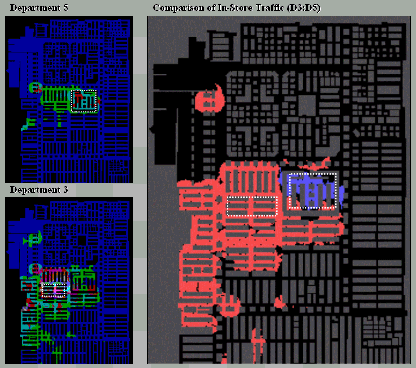
Figure 2. Departmental comparison of shopper movement patterns.
The large map on the right shows areas of large differences in path
density between shopping carts containing items from Departments 3 (orange) and
5 (blue). It is expected that the areas
within the departments (dotted rectangles) show large differences. The blue areas at the top, however, show more
shoppers purchasing electronics traveled to men’s wear that those purchasing
cards & candy… a bit of common sense verified by empirical data. It leads one to wonder what insights might be
gained from analysis of the orange area (more cards & candy traffic) or
other departmental comparisons.
__________________________
Author’s Note:
the analysis reported is part of a pilot project lead by HyperParallel, Inc.,
(Back to the Table of Contents)