|
The Precision Farming Primer |
|
|
|

The Big Picture — reviews the basic steps in the precision farming
process
Visceral
Visions — visually compares yield map
displays
Visualizing
Yield Data — describes the differences
between map data and map displays
Back to Basics
— reviews "normal"
statistical concepts (mean, median and mode)
Sticks and
Stones — discusses data dispersion
measures (standard deviation and coffvar)
Statistically Summarizing Mapped
Data — discusses basic statistics
used to describe mapped data
Assessing
Spatial Dependency — describes a basic procedure
for measuring spatial dependency
Typifying
Atypical Data — discusses
"non-normal" data (skewed and bi-modal)
A
Standardized Map — describes a procedure for
identifying "unusual" locations in mapped data
Mapping
Localized Variation — describes a procedure for
identifying areas of "high variability"
Mapping
the Rate of Change — describes a procedure for
identifying areas of "rapidly changing conditions"
(Back to the Table of Contents)
______________________________
The Big Picture (return to top of Topic
3)
Precision farming involves assessing and reacting to field variability then tailoring management actions to match changing field conditions. It assumes that managing variability leads to cost savings, production increases and better land stewardship. Also, it assumes that field variability can be tracked and that management actions, such as fertilization levels and seeding rates, can be accurately controlled.
Before we continue our discussions of the technical issues and procedures, figure 3.1 reviews and identifies the four steps in precision farming covered in the introduction, "An Overview of Precision Farming:" data logging, point sampling, data analysis and spatial modeling. The graphic on the right side of figure 3.1 shows the processing flow in which maps of yield and field conditions (e.g., soil nutrients) are analyzed for relationships used to derive a map of management actions for another different time or similar location. Topic 1, "Continuous Data Logging," and topic 2, "Point Sampling," have addressed the first two phases.
|
|
|
Fig. 3.1. The four-step process in precision farming. |
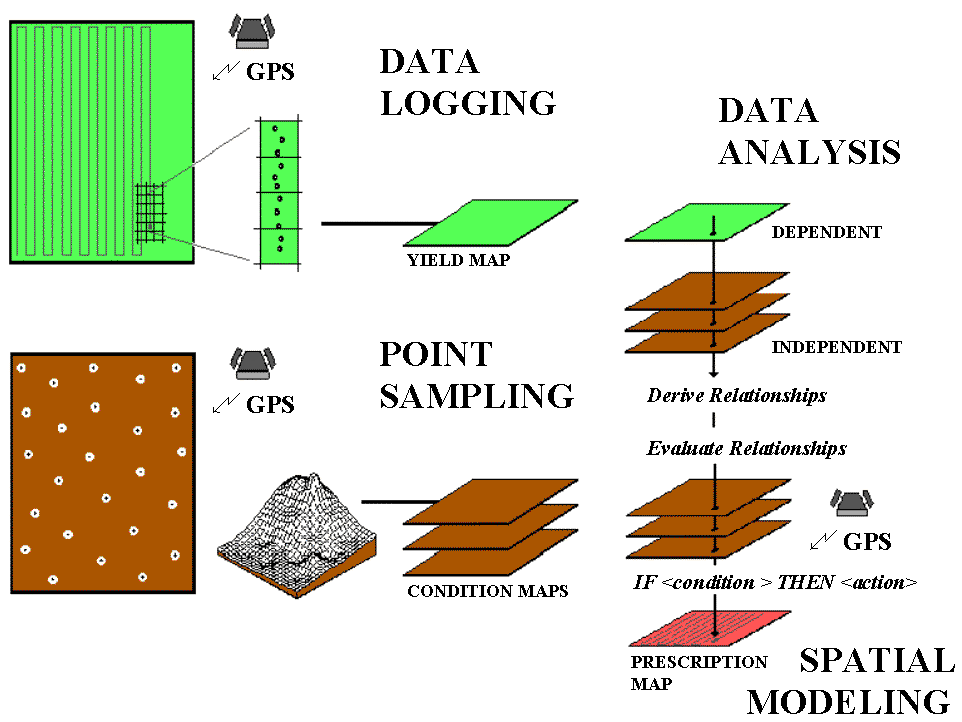
Recall that data logging continuously monitors measurements (i.e., crop yield) as a tractor moves throughout a field. Point sampling, on the other hand, uses a set of dispersed samples to characterize field conditions (i.e., phosphorous levels. Topics 1 and 2 discuss the concerns and considerations in accurately portraying these different mapped data types, their procedures outlined and suggestions made for assessing data reliability. Now we present a similar discussion for the remaining, less familiar processes. To date, the analysis and modeling phases have been constrained to "visceral viewing" of map displays in which recollection, experience and intuition relate variations in yield to field conditions.
Data analysis uses map-ematical techniques to assist farmers in deriving these relationships. In a sense, this phase empowers a sort of "on-farm research," providing a unique crop production function for a farmer's backyard. Once armed with these relationships, spatial modeling evaluates them for new field conditions¾ such as the following year (time) or a nearby field (space)¾ and assists in the formulation of an appropriate set of management actions. Keep in mind that the ability to "derive and evaluate" relationships among factors affecting crop production is the real justification behind precision farming. The use of the computer beyond plotting pretty maps might greatly aid in this process (and significantly increase your return on investment in yield mapping). All this might seem a bit like "technical Oz," but heck, a couple of years ago you probably thought a yield map was reserved for a bad Star Trek episode.
Visceral Visions (return to top of Topic 3)
The first step in precision farming involves the creation of a yield map using GPS for continuous harvester positioning, and a yield monitor for continuously measuring mass flow of the crop. As the harvester moves through a field, the instantaneous yield and its geographic coordinates are written to a disk file every couple of seconds. These data are aggregated into an analysis grid for estimating yield at each grid cell throughout a field. Colors are assigned to ranges of yield and plotted for maps similar to the black-and-white renditions shown in figure 3.2. Note the patterns of the variations in corn yield depicted in the two maps (the lighter tones indicate higher yield). The horizontal "bands" are the result of only one of the combines being instrumented; it seems the one with the yield monitor did most of the work. (I wonder, is there something significant here?) The circular banding effect is caused by central pivot irrigation. The "lazy squiggles" along the edge identifies "turn-abouts" and "meaningful meandering" of the combine.
|
|
|
Fig. 3.2. Yield maps of corn for a central pivot irrigated field. |
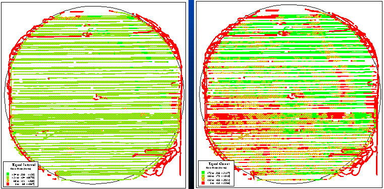
But focus your attention on the patterns within the boundaries. The map on the left in figure 3.2 seems to contain considerably less variation (apparent patterns) and is a consistently good producer of 131 to 194 bushels. The map on the right displays considerable variation throughout the field, with a distinct, low-yield band in the upper-right portion and larger distinct block in the lower-left. What do you think caused these patterns? Differences in drainage? Or corn variety? Or uneven application of fertilizer? How about the previous year's crop? Weeds? Soil type? Or planting irregularities? The mind simply explodes with possible explanations.
Actually, the two maps illustrate the same data set: same field, same yield, same numbers. Yet two radically different maps are formed. The difference is simply in the mapping convention equal interval for the bland one on the left and equal count for the exciting one on the right. Equal interval is similar to an elevation contour map since it divides the data range (5 to 256) into four equal steps of 63 bushels each. Note that the 131 to 194 interval has more than 6,800 samples¾ more than half of the field it's everywhere. Equal count divides the data into four classes, but this time they all have a similar number samples (about 2,100). Note that the "data count" for each grouping is slightly different since the actual samples couldn't be divided evenly into four piles.
Which map is right? You see more patterns in equal interval, but are the patterns "real?" Maybe the left map is "telling the truth?" Or maybe a standard deviation, natural breaks or other mapping scheme is better?
That's the plight of visceral viewing yield data. For a human to "see" the yield, we have to generalize the data set into just a few groupings. However, in so doing we make aggregation assumptions that can radically change our "perspective." The computer, on the other hand, considers all of the "spatial specificity" in the data set as it looks for quantitative relationships in mapped data.
Visualizing Yield Data (return to top of Topic
3)
What appears to be two radically different yield maps actually results from the graphical display of the data. The differences in field patterns are artificial; therefore, any differences in management action based on the "perceived" differences are equally flawed. There are three important factors in displaying yield data:
- aggregating technique,
- selection of colors and
- number of intervals.
|
|
|
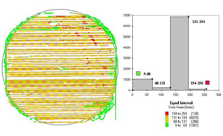
Fig. 3.3. Yield map and equal-interval histogram showing |
|
|
|
Fig.
3.4. Yield map and equal-count histogram showing |
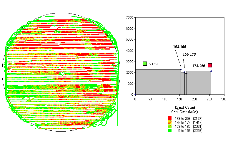
In figure 3.2 the appearances of the maps are attributed to the aggregation technique: equal interval versus equal count. Figures 3.3 and 3.4 show two more renderings of the same data (equal interval in fig. 3.3 and equal count in fig. 3.4). The only difference is that the color selection has been inverted. Darker tones indicated lower yields in figure 3.3, and they indicate higher yields in figure 3.4.
Now there are four radically different visions of the same yield data¾ two aggregating techniques and two color schemes. If the number of intervals (four) used in each display were changed, it's guaranteed that there would be yet another set of radically different maps. The visualization of the data might radically change, but the yield data haven't. So, which rendering is correct? What's going on here? Where's the science?
It's in the numbers, but to see the differences we need a more data-centric view. Figure 3.5 shows a histogram of the data with a "normal" curve superimposed. Note that the yield ranges from 5 to 256 bushels per acre and is broken into 52 intervals of 5 five-bushel acres each.
|
|
|
Fig. 3.5. Histogram of the data with a normal |
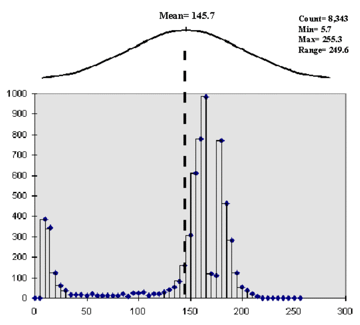
The equal interval aggregation technique (the left side of fig. 3.2) partitions the data into just four intervals with an equal data step of 63. However, the number of data collection points in each are not consistent, with the 131 to 194 range containing more than 80 percent (6,870 points) of the data. That's why the map is dominated by one color (medium-dark gray).
The equal count technique (the right side of fig. 3.2) partitions the data into four intervals with about the same number of points (2,000) in each, resulting in more apparent spatial patterns.
Now the data form two distinct groups and that the "normal" curve is a poor fit. The lower group of yield measurements (centered at about 12) relates to the distinct edge effects depicted in both maps. This group is probably full of bad data consisting of measurement errors from raising or lowering the cutting head, turning, wandering, etc. The upper set of values (centered about 170) forms the bulk of the data on the interior of the field and probably contains good information about spatial patterns. Should the lower group be dropped to fine-tune the display for the good data? Keep in mind that "what you see (map) isn't necessarily what you get (data)" until you spend some time understanding the nature of the data.
Back to Basics (return to top of Topic 3)
The concepts used in data analysis are quite simple, but the terminology and "picky-picky" tests of the theory are intimidating. The most basic concept involves a number that which is like a ruler with tic marks for numbers from small to large. However, in precision farming the units aren't inches but in agronomic units like pounds of potash or bushels of corn per acre. For example, if you placed a dot for each measurement made by your yield monitor (see fig. 3.6), there would be a minimum value on the left (corn yield = 0¾ bah!) and a maximum value on the right (corn yield = 300¾ wow!). The rest of the points would fall on top of each other throughout this range.
|
|
|
Fig. 3.6. Numerically characterizing data distribution. |
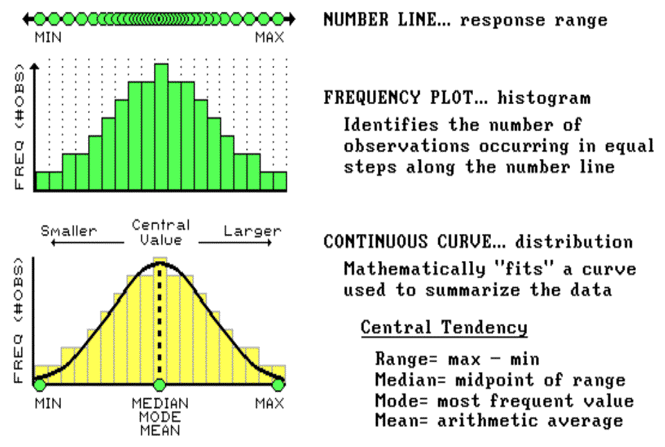
To visualize these data, we can look at the number line from the side and note where the measurements tend to pile up. If the number line is divided into equally spaced "shoots" (like those in a pinball machine), the measurements will pile up to form a histogram. Now you can see easily that most of the yield for the field fell about midrange (corn yield = 150 bushels¾ not bad). In statistics, mean, mode and median describe this plot (neither devious nor spiteful) and its central tendency. The median identifies the value exactly halfway between the minimum and the maximum values; while the mode identifies the most frequently occurring value in the data set. The mean, or average, is a bit trickier as it requires calculation. All of the measurements are added up, then the total is divided by the number of measurements.
Although the arithmetic is easy (for a tireless computer), its implications are theoretically deep. When you calculate the mean you're actually fitting a standard normal curve to the histogram. The bell-shaped curve is symmetrical (the left side is a mirror image of the right) with the mean at the center. For the normally distributed data shown in figure 3.6, the fit is perfect with exactly half of the data on either side. Also, note that the mean, mode and median occur at the same value for this ideal distribution of data.
Some basic concepts in statistics¾ minimum, maximum, median, mode and mean¾ reduce thousands of measurements (i.e., those from a yield monitor) to their typical value, or central tendency. The ideal, "normally distributed" data form a bell-shaped curve with the min/max at either end; and the median, mode and mean aligning at the halfway point (see fig. 3.6).
Now let's turn our attention to the tough stuff: characterizing the data variation about the mean. As I said before, the concepts are easy; the terminology and elegant theory are intimidating.
Sticks and Stones (return to top of Topic
3)
To characterize the variation in a set of data we must confront the concept of a standard deviation (StDev). The standard deviation describes the dispersion, or spread, of the data around the mean. It's a consistent measure of the variation in the data, as one standard deviation on either side of the mean "captures" slightly more than two-thirds of the data (1 StDev = .683 of the area under the curve). Approximately 95 percent of all the measurements are included within the interval +2 to -2 StDevs, and more than 99 percent are covered by 3 StDevs (see fig. 3.7).
|
|
|
Fig. 3.7. Characterizing data dispersion. |
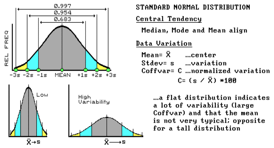
The larger the standard deviation, the more variable is the data, the less useful is the mean as being "typical" for an area. In precision farming, a small standard deviation in yield tells you there isn't much variation in the field, and using whole field averages in decision-making might be OK. However, a large standard deviation indicates a lot of variability and using simple averages might miss the mark more than it hits it.
So, what determines whether the standard deviation is large or small? That's the role of the coefficient of variation (Coffvar). This semantically challenging mouthful simply "normalizes" the variation in the data by expressing the standard deviation as a percent of the mean. If it is lot, say more than 25 percent, then there is a lot of variation and the mean is a really poor estimator of what's happening in the field. Another advantage for using the Coffvar is that it allows you to compare the variation among different data sets. For example, if you had the field in soybeans last year and you wanted to compare its "relative" yield to this year's corn, you can't use the absolute measures. A standard deviation of 15 with an average yield of 150 bushels of corn isn't much variation (15 / 150 * 100 = 10%), but it's a lot for an average of 35 bushels of soybeans (15 / 35 * 100 = 42%). Now we are ready to go into more detail about "normalization" and investigate what to do if the data aren't "normal" (skewed and bimodal distributions).
Statistically Summarizing
Mapped Data (return to top of Topic
3)
Consider the distributions of elevation data shown in figure 3.8. The contour map and 3-D surface on the left depict the geographic distribution (map view) of the data. Note the distinct pattern of the terrain with higher elevations in the northeast and lower ones along the western portion. As is normally the case with mapped data, the elevation values are neither uniformly nor randomly distributed in geographic space. The unique pattern is the result of complex physical processes driven by a host of factors, not spurious, arbitrary, constant or even "normal" events.
|
|
|
Fig. 3.8. Mapped data are characterized by their geographic
distribution (maps on the left) |
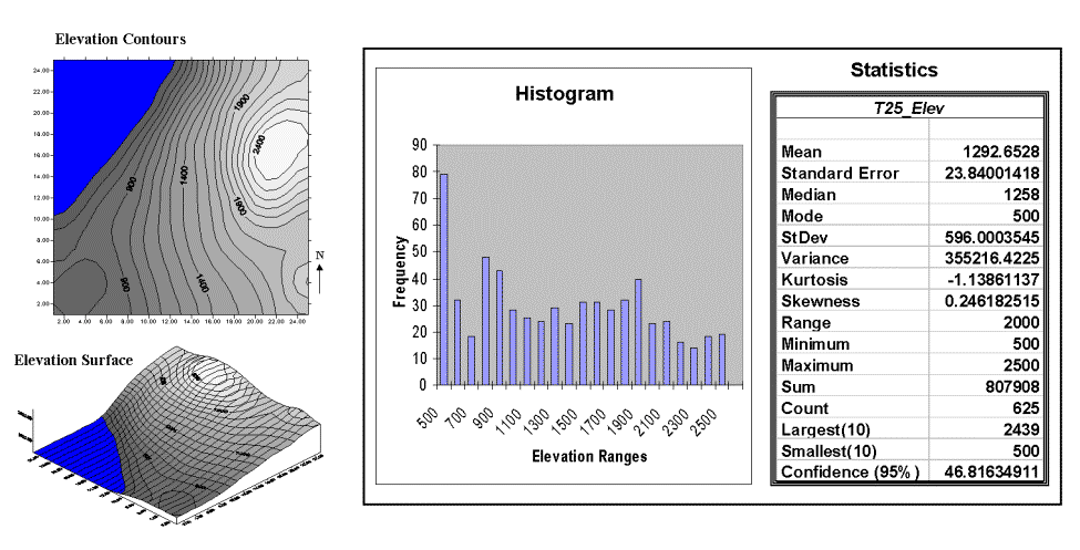
The numeric distribution of the data depicted on the right side of figure 3.8 was generated by simply transferring the gridded elevation values to Excel, then applying the "Histogram" and "Descriptive Statistics" options of the "Data Analysis" add-in tools.
Traditional analysis techniques assume a functional form for the frequency distribution (histogram shape), with the standard normal (bell-shaped) being the most prevalent. In "Back to Basics" and "Sticks and Stones" we describe the "normal" descriptive statistics in Excel's summary table: maximum and minimum range; mode, median and mean (average); variance; standard deviation and an additional one called coefficient of variation. We describe how these statistics portray the central tendency (typical condition) of a data set. In effect, they reduce the complexity of a large number of measurements to just a handful of numbers and provide a foothold for further analysis.
A few additional statistics appearing in Excel's table warrant discussion. The sum and the count should be obvious: the total of all the measurements (sum = 807,908 "total" feet above sea level, which doesn't mean much in this context) and the number of measurements (count = 625 data values, which indicates a fairly big data set as traditional statistics go but fairly small for spatial statistics). The largest/smallest statistic in the table in figure 3.8 identifies the average of a user-specified number of values (10) at the extreme ends of the data set. It is interesting to note that the average of the 10 smallest elevation values (500) is the same as the minimum value, while the average of the 10 largest values (2,439) is well below the maximum value of 2,500.
The standard error (StdError) calculates the average difference between the individual data values and the mean (StdError = sum [[x-mean] * 2] / [n * [n-1]]). If the average deviation is fairly small, then the mean is fairly close to each of the sample measurements. The standard error for the elevation data is 23.84001418 (way too many decimals¾ nothing in statistics is that precise). The statistic indicates that the mean is, on the average (got that?), about 24 feet above or below the 625 individual elevation values comprising the map. This is useful information, but often the attention of most GIS applications is focused on the areas of "unusually" high or low areas (the outliers), not how well the average "fits" the entire data set.
The confidence level is a range on either side of a sample mean that you are fairly sure contains the population (true) average. The elevation data's confidence value of 46.81634911 suggests that we can be fairly sure that the "true" average elevation is between 1,245 and 1,340. But this has a couple of important assumptions: the data represent a good sample and the normal curve is a good representation of the actual distribution.
What if the distribution isn't normal? What if it is just a little abnormal? What if it is a lot? That's the stuff of doctoral theses, but there are some general considerations that ought to be noted.
First, there are some important statistics that provide insight into how normal a data set is. Skewness tells us if the data are lop-sided. Formally speaking, it "characterizes the degree of asymmetry of a distribution around its mean." Positive skewness indicates a distribution shifted to the left, negative skewness indicates a shift to the right and zero skewness indicates perfectly symmetrical data. The larger the value, the more pronounced is the lop-sided shift. In the elevation data, a skewness value of .246182515 indicates a slight shift to the right.
Another measure of abnormality is termed kurtosis. It characterizes the relative "peakedness or flatness" of a distribution compared with the "ideal" bell-shaped distribution. A positive kurtosis indicates a relatively peaked distribution; a negative kurtosis indicates a relatively flat one and a zero one is just the right amount. (This sounds like a Goldilock's sizing of the distribution shape.) The magnitude reports the degree of distortion from a perfect bell-shape. The 1.13861137 kurtosis value for the elevation data denotes a substantial flattening.
All in all, the skewness and kurtosis values don't bode well for the elevation data being normally distributed. In fact, a lot of spatial data, some might say most, aren't very normal. Try "crunching the numbers" with Excel on some of your yield, soil nutrient or other precision farming data. How abnormal are your numbers?
Assessing Spatial Dependency (return to top of Topic
3)
All in all, it appears that the elevation data do not fit traditional statistics assumption of the old "bell-shaped" curve very well. Even more disturbing, however, is the realization that while descriptive statistics might provide insight into the numerical distribution of the data, they provide no information whatsoever about the spatial distribution of the data. As briefly discussed at the end of topic 2, "What's It Like Around Here," spatial dependency is an important consideration in map analysis.
So, how can you tell if there is spatial dependency locked inside a data set? Let's use Excel and some common sense to investigate the underlying assertion that "all things are related, but nearby things are more related than distant things." (Note: The Excel worksheet supporting this discussion is available online; see appendix A, part 2, Excel Worksheets Investigating Spatial Dependency).
The left side of figure 3.9 identifies 16 sample points in a 25-by-25 analysis grid. As shown in the two plots, the position of the samples is identical (horizontal axes), only the measurements vary (vertical axis). The left plot and worksheet depicts sample values that form a constantly increasing plane from the southwest to the northeast; the right side contains a jumbled arrangement of the same measurement values.
|
|
|
|
Fig. 3.9. The spatial dependency in a data set compares the "typical" and "nearest-neighbor" differences. |
|
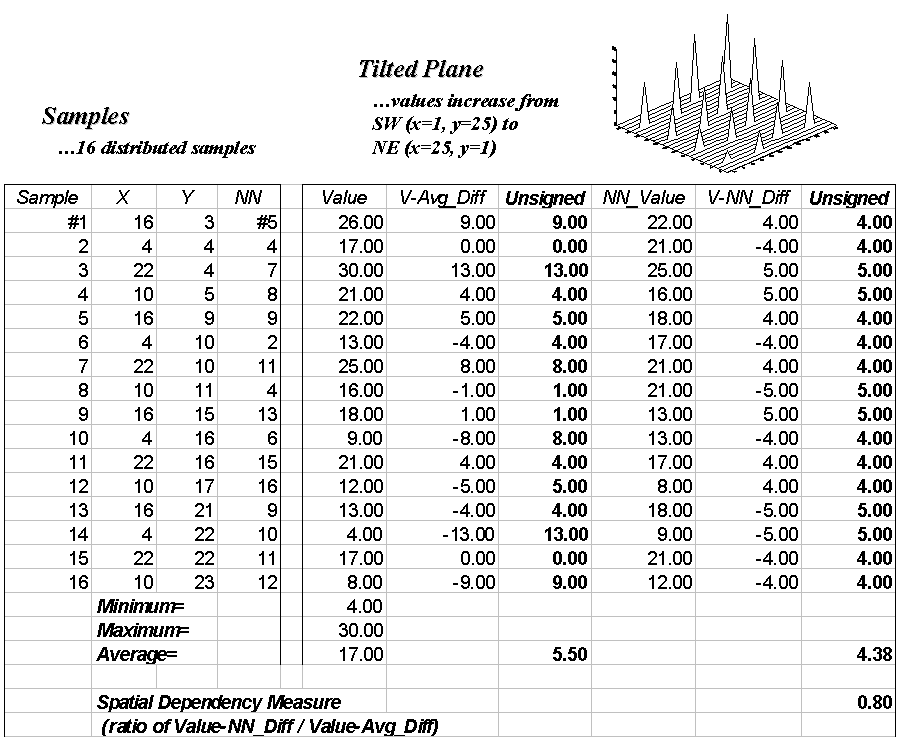
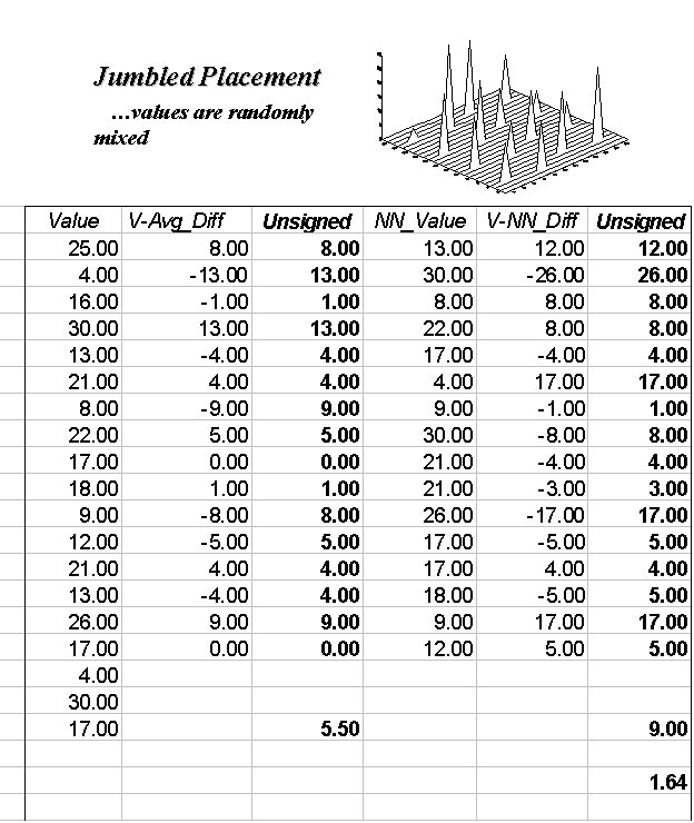
The first column in the "Tilted" and "Jumbled" worksheets (labeled "Value") confirms that the traditional descriptive statistics are identical; they are derived from same values, but they appear in different positions. The second and third columns calculate the unsigned difference, absolute value, between each value and the average of the entire set of samples: absolute (Value - Average). The average of all the unsigned differences summarizes the "typical" difference in the data set. The relatively large number of 5.50 establishes that, overall, the individual samples aren't very similar.
The next three columns in both worksheets provide insight into the spatial dependency in the two data sets. The "NN_Value" column identifies the value for the nearest-neighboring (closest) sample as determined by solving the Pythagorean theorem (c2= a2 + b2) for the distance from each sample location to all of the others, then it assigns the measurement value of the closest sample. The final two columns calculate the unsigned difference between the value at a location and its nearest-neighboring value, then compute the unsigned difference: absolute (Value - NN_Value). Note that the "Tilted" data's nearest-neighbor difference (4.38) is about one-half that of the "Jumbled’ data (9.00).
Common sense should tell you that if the nearest-neighbor differences are less than the typical differences, then the geographical adage, "nearby things are more related than distant things," works. A simple spatial dependency measure is calculated as the ratio of the two differences. If the measure is 1.0, then minimal spatial dependency exists. As the measure gets smaller (e.g., .80 for the "Tilted"), increased positive spatial dependency is indicated. As it gets larger (e.g., 1.64 for the "Jumbled"), increased negative spatial dependency is indicated (nearby things are less similar than distant things).
So, what if the basic set of descriptive statistics can be extended to include a measure of spatial dependency? What does it tell you? How can we use it in precision farming? For soil samples, it provides insight into how well an interpolated map might track the geographic trend in the data or whether you should interpolate at all.
Note:Extended discussion of spatial dependency for the techy-types is available in appendix A, part 2, "More on Spatial Dependency." These discussions describe measures for assessing the effect of distance on spatial dependency and ways to generate maps of spatial dependency from continuous surfaces, such as yield maps.
Typifying Atypical Data (return to top of Topic
3)
Since we have shown that not all data sets are ideal (in fact, most are a bit quirky), you should be squeamish about simply lying two maps side by side and jumping to conclusions about their comparison. The similarities and differences might be just inconsistencies in generalizing the maps (see fig. 3.2 and the related discussion). There are other ways, however, to misinterpret the comparison based on the data's characteristics, such as the failure to normalize and denormalize distributions.
Normalization is just a fancy word for standardizing the data by introducing a common index. The simplest index uses a common goal, such as 300 bushels of corn, and expresses actual measurements from different years or neighboring fields as a percentage of the target. This approach is similar to a financial analyst's use of discounting to a "base year" when comparing relative costs of living.
An alternative approach uses central tendency information to standardize a data set. The standard normal variable (SNV) adjusts each measurement in a data set by determining how different it is from the mean (or what you would typically expect) as a percent of the standard deviation (or typical variation in the data). An adjusted SNV of 0 indicates a measurement that is as typical as it can get (or exactly the same as the mean). An SNV of -100 indicates an unusually low measurement (one StDev below the mean), while a SNV of +100 indicates an unusually high measurement (one StDev above the mean). All other SNVs indicate how typical the measurement is as a percentage of the standard deviation.
|
|
|
Fig. 3.10. Characterizing non-normal distributions of data. |
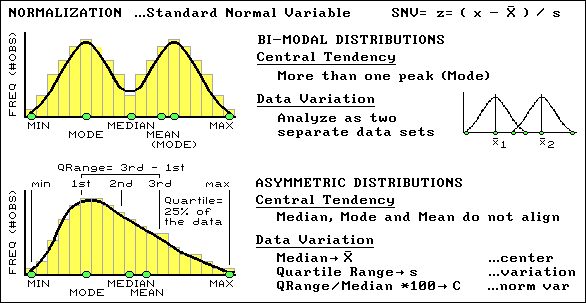
An SNV might be an unfamiliar way of looking at data, but it's an extremely useful normalization technique for comparison among data sets (i.e., soybean yield one year and corn the next). Another "got'cha" in characterizing data involves abnormal distributions. In these cases the histograms of the data do not conform to the symmetrical bell-shaped curve. Sometimes the data can be bimodal with two distinct peaks, which often can be remedied by simply analyzing the measurements as two separate sets of "normal" data. Asymmetrical distributions are a bit trickier because they tend to be "skewed" to one side, which necessitates the use of entirely different central tendency metrics. The median is used in place of the mean for estimating the center, and a new metric, the quartile range, is substituted for the standard deviation in estimating the variation (see fig. 3.13). At this point your patience with this remedial "stat refresher" likely is strained and you would like to just "keep it simple, stupid" (KISS).
A Standardized Map (return to top of Topic
3)
Changes in the aggregation technique, the number of intervals and the color generated dramatically different maps from the same set of data (see figures 3.2 to 3.5). Depending on which map you view, different management actions come to mind¾ sort of "lying with maps." Actually, the confusion is in the image, not the data. A more "data-friendly" way of generalizing a map involves mapping the SNV.
This aggregation technique, depicted in figure 3.12, first sorts through the field data to calculate its average and standard deviation (variation of the data about the typical value). Then, it uses these values to derive a standardized map of the field data by subtracting the average from each data value, dividing the difference by the standard deviation and multiplying the ratio by 100 to translate it into a percent.
|
|
|
Fig. 3.11. Procedures for calculating an SNV map. |
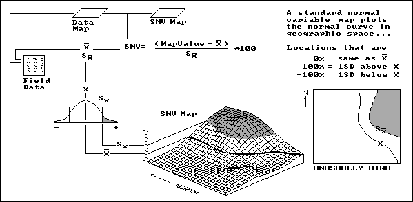
Let’s consider a location in the field that happens to have a map value identical to the average. The difference is 0; therefore, the computed SNV map value for that location is 0 (as typical as typical can get). However, if a location reports a value exactly one standard deviation above the average, the answer would be 100, indicating exactly 100 percent of a standard deviation above the average, "statistically" deemed unusually high.
In figure 3.14, the shaded tone locates this condition on the standard normal curve (the old "bell curve" that haunted you in high-school grading) as the "upper tail." The SNV map translates this statistical concept to the real world, the northeast corner of the field. The "SNVing" data analysis technique works for both continuously sampled data (e.g., yield map) and point sampled data (e.g., soil nutrient maps). It allows you to view statistically how unusual any location is within a set of data. The other views might be more colorful, but they lack the map-ematical rigor demanded by precision farming.
Mapping Localized Variation (return to top of Topic
3)
We have encouraged you to look at maps in a new way: not as simply images but as organized sets of numbers. In the case of a yield map, the data are derived from measurements made at every location in the field. Point sampled map (i.e., soil nutrients) are derived by interpolating a few samples for predictions at every location in the field. Although, they represent radically different data types, both yield and soil maps form map surfaces like the one shown in figure 3.15. The 3-D surface is horizontally "sliced" to produce the familiar 2-D contour maps.
|
|
|
Fig. 3.12. Characterizing local variation in mapped data. |
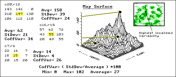
As we have seen, the slicing can be based on several different strategies¾ equal interval, equal count and standard deviations; each produces different "views" of the values forming the map surface. These renderings direct your attention to areas of low or high yield (or soil nutrient levels), but miss a lot of the more subtle information locked in the map. For example, there might be two areas in your field that show similar yield levels, but one is consistent while the other exhibits wild vacillations between high and low levels. A myopic "point-by-point" interpretation of the map misses the pattern of localized variation occurring within portions of a field.
Areas of highly localized variation should grab your attention because they identify rapid fluctuations in yield; areas of low, localized variation should grab your attention because of their consistency. Why would some parts of a field fluctuate widely, while other parts show little variability? Soil conditions? Inconsistent nutrient application? Disease, weeds or pests?
If your goal is the maximum yield potential for each location, you should investigate and manage accordingly. The place to start is a coefficient of variation map. This data analysis technique uses a roving window to compute the average and standard deviation of the neighboring values surrounding a map location. The percent of the average, identified as variation, is calculated and assigned to the map location at the center of the window. The window moves to each map location, summarizing the localized variation as it goes. A Coffvar of 0 percent indicates all of the values within the neighborhood are the same: no variation. Higher values indicate increasing variation. In figure 3.15, the darker tones indicate increasing localized variation with the highest in the center of the northwest portion of the field. The rest of the "stuff" in the figure shows how Coffvar is calculated and is fodder for the techy-types.
Mapping the Rate of Change (return to top of Topic
3)
Recognize the 3-D plot in figure 3.16 as a map surface (crop yield in this case)? The high bumps in the northeast portion of the field identify good productivity; the low areas in the western portion identify poor productivity. The 2-D contour map above it might be a bit more familiar, but the four discrete groupings of yield imply discrete boundaries, aggregate the subtle variations in yield, and totally miss the rate of change your eye detects in the 3-D surface. Sure, the contour map makes a comfortable, colorful paper product; but it glosses over a lot of the information your yield monitor recorded.
|
|
|
|
|
Fig. 3.13. Characterizing the rate of change in mapped data. |
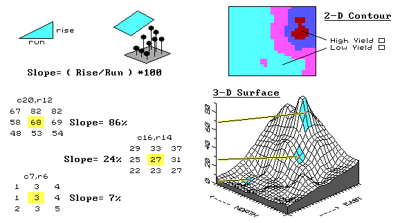
Let's see how we characterize the rate of change as new maps. The first step is to normalize the raw yield data by the target productivity for the field: each yield value is divided by the field's target of 165 bushels, then multiplied times 100 for a percentage of the target. Normalized yield values generate the contour and surface plots in figure 3.13 and range from 0 percent (a complete bust) to 83 percent (pretty good for a tough year), with an average of only 23 percent.
The next step involves moving a roving window around the normalized data to summarize the localized trends in the yield. The math might be a bit complex, but the concept is easy. Imagine the yield surface is like the terrain around your favorite hiking spot in the mountains. If all of the elevation values around you are the same, the ground is perfectly flat and hiking is easy. The steep areas, where your pace slows to a crawl, occurs where the elevation values are rapidly changing.
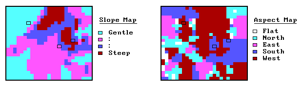
A slope map can be calculated as the change in elevation (rise) over a given horizontal distance (run). An aspect map determines the direction of the slope, or orientation, of each location on the surface. Note that slope and aspect treat the elevation values in relation to other elevation values. That's an important point, especially when we consider the slope and aspect maps derived from a yield surface.
The areas of rapidly hanging yield values are the ones that should attract your attention. Why would yield be rapidly changing? Does it indicate a soil boundary? A fertilization deficiency? An old fence line? Or, simply isolated pockets of disease or pest outbreaks? Does the trend in the data align with the direction of the ridge? Direction of the old drainage tiles?
So, what did this "walk on the wild-side" of yield really prove? In part, it tests your patience to struggle with entirely new map-ematical perspectives of yield data. Also, it should alert you to the limitations of simply looking at a yield map and assuming your eye can see all of the subtle details, patterns and relationships in the data.
______________________________
Endnotes
See appendix A, Part 2, "Spatial
Dependency and Distance," for a discussion on characterizing spatial
dependency as a function of distance.
See appendix A, Part 2, "Mapping Spatial
Dependency," for discussion of assessing spatial dependency in
continuously mapped variables.
See appendix A, Part 2, "Excel Worksheets Investigating Spatial Dependency," for online spreadsheets used in the discussions on spatial dependency.