|
The Precision Farming Primer |
|
|
|

Dirty Stuff —
presents an overview of the sampling process
Sampling
Patterns — discusses sampling patterns
and their implications
From Points
to Maps — describes important factors common
in spatial interpolation
Surf's Up — discusses procedures and results of IDW, Kriging and
MinCurve interpolation
How Good Is My
Map? — describes the Residual Analysis
procedure for assessing interpolation results
A Map of Error
— identifies a procedure for
generating maps of error from Residual Analysis
Justifiable
Interpolation — introduces the important
concept of spatial dependency
What's
It Like Around Here? —
describes the information in a variogram plot of spatial dependency
Zones and
Surfaces — discusses fundamental differences
between Management Zones and Map Surfaces
(Back to the Table of Contents)
______________________________
Dirty Stuff (return to top of Topic
2)
In topic 1. "Four Basic Steps in Precision Farming," the four basic processing steps in precision farming are briefly outlined:
- continuous data logging,
- point sampling,
- mapped data analysis and
- spatial modeling.
Now it’s time to forge ahead into the surrealistic realm of point sampling (i.e., soil mapping). While data logging continuously records measurements (e.g., crop yield) as a tractor moves through a field, point sampling uses a set of dispersed, discrete samples to characterize field conditions (e.g., phosphorous). The nature of the data derived by the two approaches is radically different—a "direct census" for a yield map versus a "statistical estimate" for a phosphorous map. In data logging, issues of accurate measurement, such as GPS positioning and material flow adjustments, are major concerns.
In point sampling, issues of spatial interpolation—estimating between sample points such as sampling frequency/pattern and interpolation technique—are the focus of concern.
Let’s tackle the first area: the sampling design issues of frequency and pattern. There are four distinct considerations in sampling design:
- stratification,
- sample size,
- sampling grid and
- sampling pattern.
|
|
|
Fig. 2.1. Field stratification. |
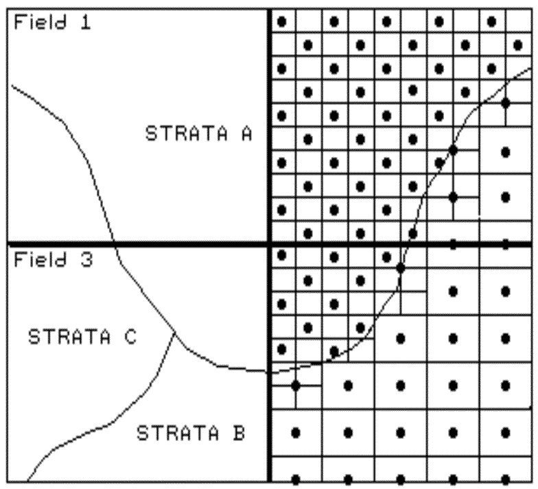
The first three considerations determine the
appropriate groupings for sampling (stratification), the sampling intensity for
each group (sample size) and an appropriate reference grid resolution (sampling
grid). All are closely tied to the spatial variation of the data to be
mapped. For example, if your field splits a couple of soil types, you
might divide the field into two strata. If one is fairly consistent, you
might allocate fewer samples than within the other, more variable soil unit (see
fig. 2.1). Also, you might decide to generate a third strata for even
more intensive sampling around the soil boundary itself. Or, another
stratification possibility is to use your yield map. If you feel the
variations in yield are primarily "driven" by soil conditions, then
that map could be used to divide the field into high, medium and low
productivity areas.
This approach might respond to soil units
that are below the resolution of the traditional soil type map or characterized
by different nutrient levels. In the past, a single sampling frequency
was used throughout an entire state or region. In part, a single
frequency was chosen for ease and consistency of field implementation, as well
as tradition. With the advent of GPS technology, however, variable
sample frequencies is a modern alternative¾ simply navigate to
each sample location.
Sampling Patterns (return to top of Topic
2)
The final step, sampling pattern, identifies
individual sample locations. Traditional statistics tends to emphasize randomized patterns because they ensure maximum independence among
samples, which is critical to calculating the central tendency of a data set
(average for an entire field). However, "the random thing" can
actually hinder spatial statistic’s ability to map field variability.
Arguments supporting such statistical heresy involves the discussion of spatial dependency and autocorrelation,
which mercifully is postponed until topic 2, "What's It Like Around Here,"
topic 3, "Assessing
Spatial Dependency," and appendix A, part 2, "More on
Assessing Spatial Dependency." For the current discussion, let’s
assume sampling patterns other than random are our best candidates.
Figure 2.2 identifies five systematic
patterns, including a completely random one. Note that the regular
pattern is uniformly distributed in geographic space. So is the staggered
start one, except the equally spaced y-axis samples alternate the
starting position at one-half the sampling grid spacing. The result is a
"diamond" pattern rather than a "rectangular" one.
This pattern is better suited for generating maps because it provides more
intersample distances for spatial interpolation.
|
|
|
Fig. 2.2. Systematic sampling patterns. |
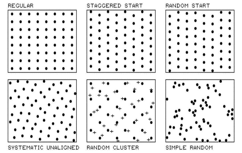
The random-start pattern begins each
column transect at a randomly chosen y coordinate within the first grid
cell, thereby creating even more intersample distances. The result is
nearly a regularly spaced pattern, with "just a hint of randomness."
The systematic unaligned pattern also results in a fairly regularly
spaced pattern, but it exhibits even more randomness as it is not aligned in
either the x or y direction. The pattern is formed by first
placing a random point in the cell in the lower-left corner to establish a pair
of x and y offsets. For rows in the grid, the x offset
is held constant while y is randomly varied. For columns, the y
offset is held constant while x is varied. The result is random
starts in both the x and y axes.
The "dots" in the random
cluster pattern establish an underlying uniform pattern (every other
staggered start sample point). The "crosses" locate a set of
related samples that are randomly chosen within the enlarged grid space
surrounding each dot. Note that the patterned is not as regularly spaced
as the previous techniques; however, it has other advantages. The random
subset of points allows a degree of unbiased statistical inference, such as a
t-test of significance differences among population means. The simple
random pattern allows full use of statistical inference (whole field
statistics), but the "clumping" of the samples makes it the worst for
mapping (site-specific statistics). So which pattern should be used?
Whichever works best with your data and objectives.
From Points to Maps (return to top of Topic
2)
Spatial interpolation refers to the generation of a continuous map surface
from discrete point samples. All spatial interpolation techniques
establish a "roving window" that
- moves to a location in a field,
- calculates an estimate (guess) based on the point samples around it,
- assigns the estimate to the center of the window and
- moves to the next location.
The extent of the window (both size and
shape) affects the result, regardless of the summary technique. In
general, a large window capturing a bunch of values tends to "smooth"
the data. A smaller window tends to result in a "rougher"
surface with abrupt transitions.
Three factors affect the window's extent: its
reach, the number of samples, balancing. The reach, or search
radius, sets a limit on how far the computer will go in collecting data
values. The number of samples establishes how many data values
should be used. If there are more than enough values within a specified
reach, the computer uses just the closest ones. If there aren't enough
values, it uses all that it can find within the reach. Balancing
attempts to eliminate directional bias by ensuring that the values are selected
in all directions around window's center. Once a window is established,
the summary technique comes into play.
|
|
|
Fig. 2.3. Inverse distance interpolation. |
Inverse distance is an easy one to conceptualize (see fig. 2.3).
It estimates the value for a location as an average of the data values within
its vicinity. The average is weighted in a manner that decreases the
influence of the surrounding sample values as the distance increases. In
figure 2.3, the estimate of 19 is the "inverse distance-squared (1/d2)
weighted average" of the nine samples in the window. Sample #11 (the
closest) influences the average a great deal more than sample #6 (the farthest
away). Because this is a static averaging method, the estimated values
can never exceed the range of values in the original field data. Also,
inverse distance tends to "pull-down peaks and pull-up valleys" in
the data. The technique is best suited for data sets with random samples
that are relatively independent of their surrounding locations (i.e., minimal
regional trend).
The right portion of figure 2.3 contains
three-dimensional (3-D) plots of the point sample data and the inverse
distance-squared surface generated. The estimated value in the example
can be conceptualized as "sitting on the surface," 19 units above the
base (zero). Note that the surface generated by the inverse distance
technique is sensitive to sampled locations and tends to put bumps around the
sampled areas.).
Surf’s Up (return to top of Topic
2)
The inverse distance interpolation technique is fairly straight forward—distance
weighted average of nearby sample points. Kriging and minimum curvature
techniques give us two more spatial interpolation tools to explore before we
can consider which is the best technique to determine residual analysis.
Obliquely speaking, the Kriging
interpolation technique uses "regional variable theory based on an
underlying linear variogram." Without immersion into its theory, it is
enough to know that there is a lot of math behind the technique. In
effect, it develops a "custom" window based on the spacing and
directional trends it detects in the sample data. The reach, or size of
the window, is determined by intersample correlation. The summary
technique weights the data values, aligning them along the trend's direction
more than values opposing the trend. This trend-weighted moving average
can result in estimated values that exceed the actual range of the sampled
data. Also, there can be unexpected results in large areas without data
values. The technique is most appropriate for systematically sampled data
exhibiting discernible trends. The center portion of figure 2.4 depicts the
Kriging surface of the sample data described above. In general, it
appears somewhat smoother than the inverse distance plot (left portion)
discussed in the previous section.
|
|
|
Fig. 2.4. Results of Inverse Distance, Kriging vs. Minimum Curvature interpolation. |
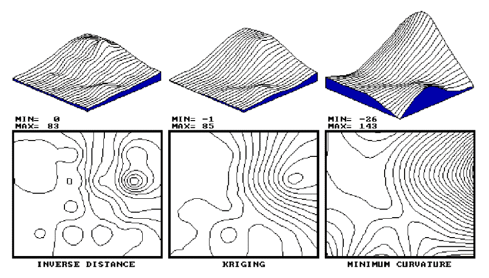
Another technique, minimum curvature
(mincurve), first calculates a set of initial estimates for all map locations
based on localized trends in the sampled data, then repeatedly applies a
smoothing equation to the surface. The smoothing continues until
successive changes at each map location are less than a specified "maximum
absolute deviation," or a maximum number of iterations has been
reached. In practice, the process is done on a coarse map grid and
repeated for finer and finer grid spacing until the desired grid spacing and
smoothness are reached. As with Kriging, the estimated values often
exceed the range of the original data values and things can go berserk in areas
without sample values.
The right portion of figure 2.4 contains the
plots for the minimum curvature technique. Note that it is the smoothest
of the three plots and displays a strong edge effect along the border
areas that do not contain samples. This technique is appropriate for
systematically sampled data and requires samples close to the border.
By now you are likely to concede that spatial
interpolation is a bit overwhelming and it might seem a bit
"fishy." The three plots show radically different renderings
for the same set of data. The actual point sampled data had a range from
0 through 87, but none of the interpolated surfaces matches the actual range.
So, how good are they? Which rendering is best?
How Good Is My Map? (return to top of Topic
2)
The only thing certain is that there isn’t a
single best method that covers all situations. Some rules of thumb and
general considerations have been discussed, but the only good way to determine
the "best" map is to empirically verify the results. This
involves generating several maps then testing the results against known measurements,
aptly termed a test set. As in horseshoes and bocci, the closest
one wins. Residual analysis summarizes the differences between map
estimates and actual measurements.
Figure 2.5 displays a test set containing 16
random samples (#17-32) from the data used in the last two sections. The
"Actual" column lists the measured values for the test locations
identified by the "Col," "Row" coordinates. The
difference between these values and those predicted by various interpolation
techniques form the residuals shown in parentheses. The
"Average" column compares the whole field arithmetic mean of 23
(guess 23 everywhere) for each test location. For example, the first
sample (#17) guesses 23 but was actually 0; therefore, it’s off by 23.
Note the sign of the residual indicates whether the guesses are too high
(positive) or too low (negative). If it were a perfect data world, you
would expect the "Sum of the Residuals" to be 0 (just as many high as
low misses, in other words, balanced). However, in this case there is a
net residual of -17 (indicating a bias to underestimate). The
"Average Unsigned Residual" is simply the average magnitude of
mistakes, regardless whether more or less than. For the
"Average," expect errors of about 22.8 each time you guess. The
"Normalized Residual Index" is simply the ratio of the "Average
Unsigned Residual" to the "Test Set Average." An index of
.81 indicates that the "Average" technique isn’t very good.
|
|
|
Fig. 2.5. Residual analysis table for Average, IDW, Kriging and MinCurve estimates. |
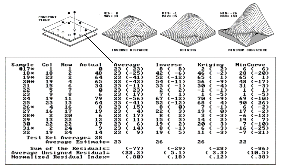
Now take a look at the residual analysis for
the other techniques. All three techniques are considerably better than
the whole field average (indices of .18, .12 and .38, compared to a whopping
.81), with the Kriging technique best, having a 3.3 "Average Unsigned
Residual" and a tendency to underestimate (a "Sum of the
Residuals" of -28). The inverse technique is a close second with an
index of .18 and a nearly identical underestimate bias (-29). The
mincurve technique seems out of the running. However, we haven’t
considered other potential effects. The asterisks identify test measurements
outside the set of samples used for interpolation.
Is there a significant difference between the
various techniques in their estimates for the two different populations? (Get
out your calculator.) I wonder if the conclusions change if the test and
interpolation samples are swapped and another residual analysis
performed? What if different sampling designs were tried? What
would be the effect of different interpolation parameters (window reach, number
of samples and data balancing)? Residual analysis gives us a place to
start looking for answers.
To summarize, we have developed a procedure
for checking the reliability of an interpolated map, such as a map of soil
nitrogen derived from a set of soil samples. It suggests holding back
some of the field samples to "empirically verify" the estimated
values at the sampled locations. If you don’t, then you are simply
accepting the map as perfect. The difference between an interpolated
"guess" (prediction) and "what is" (measurement) is a residual.
A table of all the residuals for a test set is analyzed to determine the
overall accuracy of an interpolated map. The residual analysis determines
that the Kriging interpolation procedure has the closest predictions to the
test set measurements. Its predictions, on average, are only 3.3 units
off, while the other techniques were considerably more (5.1 and 10.5).
The residual table identifies the best interpolated map and just how good it
is, but it fails to identify where in the field the map is likely predicting
too high or too low. That’s the role of an error map.
Note: See appendix A, part 2, "Comparison
of Interpolated and Extrapolated Sets," for a discussion on
interpolation and extrapolation.
A Map of Error (return to top of Topic 2)
Figure 2.6 shows both a 3-D and a 2-D map of
error for the Kriging technique, derived by interpolating its residuals. The
posted values on the 3-D surface locate the residual values used to derive the
map of error. For example, the value 1 posted for the far corner
identifies the residual for test sample #19 at column 23 and row 2; the 4 to
its right identifies the residual for test sample #25 at column 23 and row 13
(see fig. 2.5). The dark lines in both plots locate the zero residual
contour—right on target.
|
|
|
Fig. 2.6. Three- and two-dimensional error maps. |
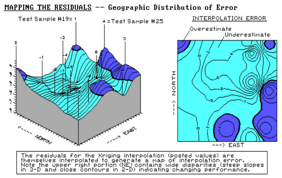
It appears that the Kriging overestimates
occur along the right (east), bottom (south) and the upper-left (northwest)
corner. Underestimates occur toward the center of the field. The
upper-right portion (northeast) of the error map is particularly
interesting. The two -9 "holes" for test samples #20 and #24
quickly rise to the 1 and 4 "peaks" for samples #19 and #25.
These wide disparities within close proximity of each other (steep slopes in
3-D and tight contour lines in 2-D) indicate areas of wildly differing
interpolation performance. When developing a prescription for this area,
the added information on interpolation error might prove extremely
helpful. It certainly takes us beyond simply "pretty maps"
toward the mapped data we need in precision farming.
Note: See appendix A, part 2, "Normalized Map
Comparisons," for discussion on normalizing maps of error. Also,
see "Visually
Comparing Normalized Residual Maps" for a visual comparison of the
error maps for the average, nearest neighbors, Kriging and minimum curvature
interpolated surfaces.
Justifiable Interpolation (return to top of Topic
2)
The reliability of any map based on point
data depends on
- the existence of spatial dependency within the data,
- the sampling design employed and
- the interpolation algorithm applied.
So far we have discussed sampling designs and
interpolation algorithms. Now it’s time to turn our attention to the
general concept of spatial dependency.
Spatial dependency within a data set simply means that "what
happens at one location depends on what is happening around it" (formally
termed positive spatial autocorrelation). This simple concept is
the foundation for all spatial interpolation.
The Geary Index (see the
"Warning" box) calculates the squared difference between neighboring
sample values, then compares their summary to the overall variance for the
entire data set. If the neighboring variance is a lot less than the
overall, then considerable dependency is indicated.
The Moran Index is similar; however,
it uses the products of neighboring values instead of the differences.
Another approach plots a variogram showing the
similarity among locations as a function of the distance between sample
points. Although the calculations themselves vary and arguments abound
about the best approach, all of them are reporting the degree of similarity
among neighboring point samples. If there is a lot, then you can generate
maps from the data; if there isn’t much, then you are wasting your time.
A "pretty map" can be generated regardless of the degree of spatial
dependency, but if dependency is minimal, the map is just colorful gibberish;
don’t bet the farm on it.
|
Warning The following ugly equation is suitable for detailed viewing by only the technically astute (techy-types): c= [
(n-1) SUMi SUMj wij (xi - xj)2 ] / [ 2 * SUMi SUMj wij * SUMi (xi - a)2 ]
(Eq. T2.1) where x =
sample value The rest of us are suitably impressed and recognize that such an index can help to evaluate an interpolated map’s reliability. If c = 1, then neighboring samples vary as much as the overall data set and no spatial dependency exists. Any map generated from the data is pure, dense gibberish. If c < 1, then the neighboring samples are more similar (increasing positive spatial autocorrelation) and interpolation is justified. Not that all of us understand the Geary equation, but as intelligent consumers of precision farming products we are putting the vendors on notice that such tests of map reliability should accompany all "pretty maps" (as well as really neat graphics and vibrant colors). |
What’s It Like Around
Here? (return to top of Topic
2)
If you have survived the previous discussions
about the basics of "traditional" statistics, let’s turn our
attention to spatial statistics. Its basic concept involves spatial
autocorrelation, referring to the degree of similarity among neighboring
points (e.g., soil nutrient samples). If they exhibit a lot similarity,
or spatial dependence, they ought to derive a good map. If they
are spatially independent, then expect a map of pure, dense gibberish.
So how can we measure whether "what happens at one location depends on
what is happening around it?"
Common sense leads us to believe more
similarity exists among the neighboring soil samples (lines in the left side of
fig. 2.7) than among sample points farther away. The Geary and Moran Indices consider the closest neighbors. They compute
the differences in the values between each sample point and its closest
neighbor. If the differences in neighboring values are a lot smaller than
the overall variation among all samples, then a high degree of positive spatial
dependency is indicated. If they are about the same or if the neighbors
variation is larger (a rare "checkerboard-like" condition), then the
assumption of spatial dependence fails. If the dependency test fails, it
means the soil nutrient map is just colorful gibberish. You should ask to
see the Geary and Moran Indices before you accept any soil nutrient map.
|
|
|
Fig. 2.7. Variogram plot. |
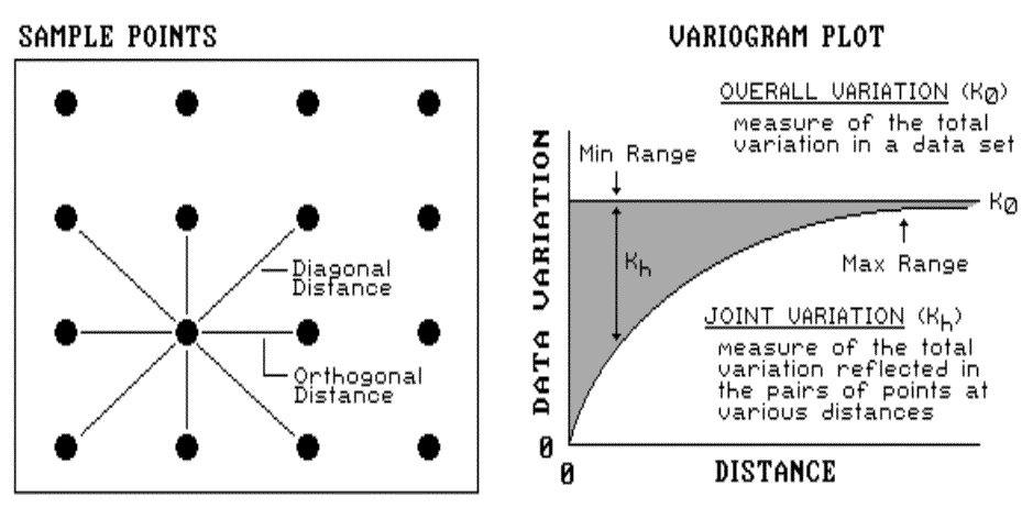
These indices, however, are limited as they
merely assess the closest neighbor, regardless of its distance. That’s
where a variogram comes in. It is a plot (neither devious nor
spiteful) of the similarity among values based on the distance between
them. Instead of simply testing whether close things are related, it
shows how the degree of dependency relates to varying distances between
locations. The origin of the plot at 0,0 is a unique case.
The distance between samples is zero; therefore, the dissimilarity (data
variation = 0) is exactly the same as itself.
As the distance between points increases,
subsets of the data are scrutinized for their dependency. The shaded
portion in the plot shows how quickly the spatial dependency among points
deteriorates with distance. The maximum range position identifies the
distance between points beyond which the data values are considered to be
independent of one another. This tells us that using data values beyond
this distance for interpolation actually can mess-up the interpolation.
The minimum range position identifies the smallest distance actually contained
in the data set. If most of the shaded area falls below this distance, it
tells you there is insufficient spatial dependency in the data set to warrant
interpolation. If you proceed with the interpolation, a nifty colorful
map will be generated, but it’ll be less than worthless.
You should ask to see the variogram plot, as
well as the Geary and Moran Indices, before you bet the farm on any soil
nutrient map. If they are unavailable, then the map is just "a pig
in the poke."
Note: More information on spatial dependency
is contained in topic 3, "Assessing Spatial
Dependency," and appendix A, part 2, "More on
Assessing Spatial Dependency."
Zones and Surfaces (return to top of Topic
2)
Site-specific farming involves
"carving" a field into smaller pieces that better represent the
unique conditions and patterns occurring in the field. Two fundamental
approaches are used: management zones and map surfaces (see fig. 2.8). Management
zones use a farmer’s knowledge, air photos, terrain features, yield maps or
other factors to identify discrete areas considered homogeneous. Sampling,
analysis and management decisions are undertaken for each distinct zone—as if
they were separate, mini-fields.
|
|
|
Fig. 2.8. Comparison of approaches to subdivide the field. |
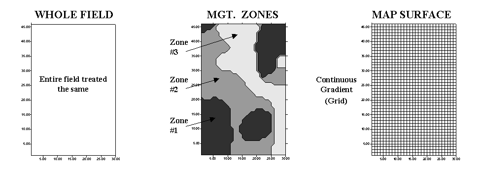
Map surfaces, on the other hand, treat a field as a continuous
surface by partitioning it into thousands of grid cells that track gradual
transitions throughout the field. The resulting grid spaces represent
tiny snippets of the field, and information is assigned to each to track the
pattern of variation.
Both approaches have their advantages, and
disadvantages—management zones are intuitive, require minimal data collection
and are less expensive to implement. Map surfaces, on the other hand,
are not constrained by artificially abrupt boundaries, therefore they better
describe field variability and have greater analysis capabilities.
"Like all things GIS," an understanding of the nature of the
data and the assumptions underlying the approaches provide insight into their
differences.
|
|
|
Fig. 2.9. Comparison of soil data maps generated by the different approaches. |
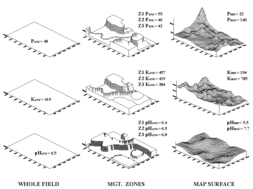
Consider the maps of P, K and pH shown in
figure 2.9. The "Whole Field" representations are characterized
as three horizontal planes "floating" at their average values—the
same throughout the entire field. The "Management Zones"
approach depicts a "plateau" for each of the three zones determined
by their averages—the same throughout each zone. Note that Zone 3 shows
lower P and K (42 and 384) but higher pH (6.8) than the whole field averages
(48, 419 and 6.5, respectively).
Now consider the "Map Surfaces"
that were interpolated from the same soil samples used by the other two
approaches. In a sense, the approach maps the variance in the data
instead of assigning its average everywhere. The maps characterize the
field as a gradient—constantly varying. Note the large phosphorous peak
in the NE portion of the field (maximum = 140) and the low values in the SE
(minimum = 22). The other surfaces also locate areas that are well above
and below the "Whole Field" and "Management Zones"
averages.
|
Table 2.1. Statistical summary of approaches to subdivide the field. |
|
|
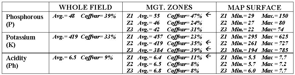
The differences among the approaches also
show up in statistical summaries (see table 2.1). Recall that the coefficient of variation (Coffvar) is a frequently used measure that indicates
the amount of variation in a set of data—with greater numbers indicating more
variation. The "Whole Field" Coffvar’s tell us that, throughout
the field, there is a fair amount of variation in the P and K values (39% and
33%), but not much for pH (9%). Since the "Management Zones"
approach breaks the field into smaller units that are assumed to be more
homogenous, it is expected that the Coffvar’s for the zones would be less than
those of the "Whole Field."
In most cases they are, but the exceptions (identified by arrows in the table) are interesting. They identify zones where the subdividing isn’t very good and the averages of the zones are misleading. Note that the data ranges (minimum to maximum value as depicted by the "Map Surfaces") are very large for these zones. For example, zone 1 with a coffvar of 47% has phosphorous values ranging from 29 to 150 (a five-fold difference). Similarly, the pH range (5.5 to 7.7) for the zone is fairly large. The real problem arises when non-typical conditions align in space, such as the NE corner in zone 1. As both the "Whole Field" and "Management Zones" approaches assume the typical response (average) is everywhere, they miss the combined effects of subtle (and not so subtle) differences from the averages contained in the "Map Surfaces." The result could be significant differences in a prescription for variable rate application of fertilizer. While "Management Zones" is a start toward precision farming and site-specific management, it can fall a fair distance short—it’s all in the data and its spatial coincidence.
Note: See appendix A, part 2, "More on Zones
and Surfaces" and "Last Word
on Zones and Surfaces" for extended discussion of the differences
between Management Zones and Map Surfaces approaches to subdividing a
field. Also, an Excel worksheet supporting these discussions is available
online at appendix A, part 2, "Excel
Worksheet Investigating Zones and Surfaces."