The Precision
Farming Primer
|
|
|
|
Your Position: Where Are You?
— introduces the basic concepts used
in geographic referencing
Your Position: Projecting the
Right Image — discusses map projection
issues
GPS: Basic
Stuff — describes
how GPS technology works
GPS:
Intermediate Stuff — discusses
basic factors affecting GPS accuracy
GPS:
Advanced Stuff — discusses
additional GPS considerations
Remote
Sensing: Basic Stuff — introduces
basic remote sensing principles as applied to imaging vegetation
Remote Sensing: Intermediate Stuff
— investigates important factors
affecting RS signals from plant canopies
Remote
Sensing: Advanced Stuff — discusses
how RS data is analyzed using a computer
IDI: Yield
Monitors — describes how Yield Monitors work (in prep)
IDI:
Variable Rate Technology — describes how Variable Rate Technology works (in prep)
(Back to the Table of Contents)
______________________________
Your Position: Where Are You? (return to top of Topic
7)
All GIS databases require a common coordinate system to identify where in the world the data are and to spatially register various maps. A coordinate system is composed of two elements:
- a spheroid that mathematically describes the three-dimensional shape of the earth and
- a map projection that mathematically converts the spherical representation to two-dimensional coordinates for display on a flat screen or printed on a sheet of paper.
Mentioning the word "mathematically" twice in the same sentence is journalistic suicide, but it should reinforce the idea that maps within a GIS are numbers first, pictures later. As users of the technology you won't be tested on the intellectual elegance of a blackboard full of equations, but need to understand the basic concepts and the coordinate "got'chas" you might encounter.
The first is the choice of the equation of the spheroid. It is similar to enlarging and shrinking a giant balloon in an attempt to "best fit" the earth's surface. Keep in mind that the spinning earth is fatter at the equator so the equation of a simple sphere won't do. Nor is the spheroid with the best overall fit the best fit for all locations on the earth. Hence, there is a multitude of variations to the basic equation; blow up the balloon a bit and a little more squashing at the poles gives North America a better fit but messes up things for Bolivia.
|
|
|
Fig. 7.1. Conceptual design of longitude/latitude coordinate system. |
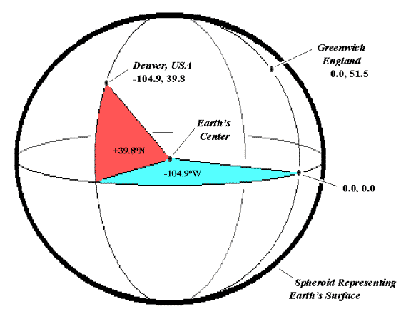
Once an appropriate spheroid is selected, most GISs record positions using latitude/longitude (Lat/Long). As shown in figure 7.1 an imaginary line is drawn from the center of the earth to a point on the earth's surface and two angles are used to describe the line's position: 1) the east-west sweep along the equator, termed longitude and 2) the north-south deflection, termed latitude.
Longitude ranges from 0 at the Prime Meridian passing through Greenwich, England, to +180 toward the east and 0 to -180 toward the west. Latitude ranges from 0 at the equator to +90 at the North Pole and 0 to -90 at the South Pole. For example, Denver's position shown in the figure is -104.9 degrees longitude (west) and +39.8 degrees latitude (north).
|
|
|
Fig. 7.2. Conceptual design for projecting from curved earth to flat plain. |
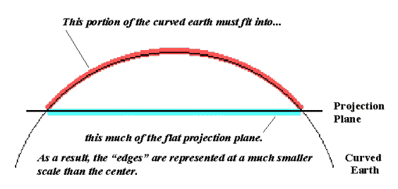
So far things are fairly accurate. However, as shown in the figure 7.2, it is impossible to accurately cram the earth's curved surface onto a flat plane. The result is that 1) all map projections distort shape, area, distance and direction; 2) the distortions increase with larger areas; 3) different projections produce different distortions; and 4) the best projection depends on the application.
The bright spot in this dismal situation is that most GISs use accurate Lat/Long coordinates for internal referencing and handle all of the math for converting to a flat screen or printed page whenever you ask. Your charge is to choose an appropriate coordinate system and stick to it when entering, processing and viewing data.
Your Position: Projecting
the Right Image (return to top of Topic
7)
As we have just discussed, there are two elements defining a GIS coordinate system—the spheroid and the projection. The spheroid describes locations in three-dimensional space (curved earth) while the projection converts them to a two-dimensional rendering for plotting on a screen or sheet of paper (flat map). Changes in either element change the relative positioning of mapped data. For example, locations in the United States "move" nearly 200 feet between the North American Datum established in 1927 (NAD27) and the revised earth surface equations of the World Geodetic Spheroid established in 1983 (WGS83). Major problems arise when your GPS is set to WGS83, but the maps you downloaded from the Internet are NAD27 based; your registration is off more than half a football field from the start. But that's nothing compared to the positioning errors that arise if you mix projections.
|
|
|
Fig. 7.3. Three basic types of map projections. |
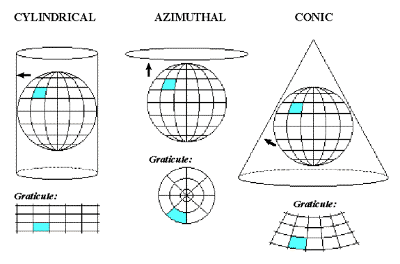
There are three basic types of map projection shown in figure 7.3: 1) cylindrical, 2) azimuthal and 3) conic.
These three projections refer to the shape of the projection surface. A cylindrical projection wraps a "sheet of paper" around the spheroid (earth), then projects each location perpendicular to the cylinder. An azimuthal projection simply projects locations onto the flat sheet of paper. A conic projection twists the paper into a cone before projecting locations onto it.
A projection's graticule depicts the two-dimensional appearance of a regular grid inscribed on a three-dimensional surface. Figure 7.3 shows significant differences in the grid's appearance for the three projections, which can translate into several football fields of movement.
|
|
|
Fig. 7.4. Comparison of two map projections of the United States. |
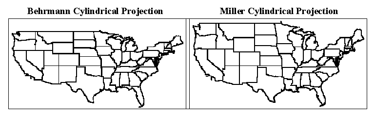
Even within a single projection type, the orientation and placement of the projection surface can introduce dramatic changes as shown in the second figure of two maps of the United States in figure 7.4 by using subtly different cylindrical projection specifications (orientation and placement differences). Note that the map on the left is more compressed in the north-south direction. There are a myriad of differences in the shape, area, distances and directions among the features introduced by changes in the spatial referencing (spheroid and projection) of mapped data. So what can you do about all this "slop" in mapping?
First, choose a suitable spheroid, Since precision farming actively uses GPS data, it makes sense to use the revised WGS83 or NAD84 datum, There are four commonly used map projections in United States (Mercator, Transverse Mercator, Albers equal-area conic, and Lambert conformal conic) and two planer coordinate systems (state plane coordinate system and Universal Transverse Mercator). My personal favorite is Universal Transverse Mercator (UTM) because it is consistent throughout the world and uses the metric system, The state planer system is tailored for each state by dividing it into zones based on geomorphology and uses different projections for east-west and north-south oriented zones.
Actually, any of the above-mentioned systems will do, as most GISs can simply switch from one to another. However, it's like a translator at the United Nations—the basic concepts are easily converted into different languages, but subtle points can be lost, Your safest bet is to insure that your GIS "speaks as one" (whichever one) and immediately convert incoming data to the "official tongue."
GPS: Basic Stuff (return to top of Topic
7)
GIS technology allows you to view maps in the blink of an eye, visualize the spatial patterns in data sets and even model the complex interrelationships among mapped variables. But its abstract renderings (digital maps) require a real-world expression to make GIS a practical tool. For a long time farmers and other "field folk" have been breathing dust and swatting mosquitoes, while all the time lusting for a simple way to figure out where in the world they are and where they might be going. The celestial navigation, used by the early mariners as they gazed to the heavens, eventually gave way to the surveying and mapping sciences. But these solutions still seem beyond the grasp of the average bush-wacker. What was needed was a simple field unit that puts the power of GIS on the kitchen table, in a vehicle, or directly in our hands while standing in a field.
That's where the global positioning system (GPS) comes in. It allows us to link GIS maps and their related data sets to real-world positions and movements. The GPS is based on a constellation of 21 satellites, each of which circles the globe every 12 hours. The system can be thought of as a set of "man-made stars" for an electronic equivalent to celestial navigation. So, how does it work? And will it work for you?
Figure 7.5 shows the important considerations in GPS technology. It uses a space-age update to the same principle of triangulation that you learned in high school geometry. First the space-age stuff. One of the satellites sends a signal toward earth stating the exact time. But when a GPS receiver on the ground checks the time, it's a little off. The time lag times the speed of light that the radio waves travel tells you how far away the satellite is. Knowing the position and distance to a set of satellites allows calculation of the position of GPS receiver.
|
|
|
Fig. 7.5. Conceptual framework for GPS. |
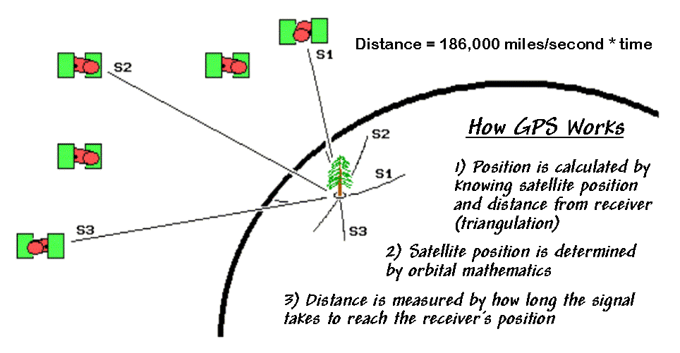
Although the process involves complicated electronics, it uses the same calculations you used in geometry class involving that device with a pencil on one arm and a life-threatening sharp point on the other. Recall that you would stick the point at a known location (satellite position) on a piece of paper then extend the arms for a given distance (satellite to GPS receiver time lag * speed) and make a small arc. Repeat for a second point/distance and where the arcs cross determines where you are—in two-dimensional space.
In three-dimensional space, circles of a calculated distance are mathematically "drawn" about a set of satellites whose precise position are known at any instant in time through orbit mathematics. The intersection of the circles determines the position of the GPS receiver on the earth.
In trigonometric theory, only three channels (satellites) need to be monitored, but in practice four or more are needed for improved accuracy and to cancel receiver clock errors. The world of electronic wizardry (involving technical stuff like pseudo-random code, carrier-phase, ephemeris adjustments, and time hacks) allows accurate timing to one billionth of a second (.0000000001) and can produce extremely accurate distance measurements in three-dimensional space. Generally speaking, averaged stationary measurements (termed static mode) tend to be more accurate than a single reading or sets of readings made while on-the-go (kinematics mode).
GPS: Intermediate Stuff (return to top of Topic
7)
As with everything in the real-world, actual GPS performance depends on several "muddling" factors. First and foremost is GPS's history as a US Department of Defense program. They financed the billions needed to setup the system for military purposes and feel a bit uncomfortable if just anyone (such as terrorists or enemy troops) can simply tap into their system. They purposely degrade the signal using an operational mode called selective availability (S/A) to provide an accuracy of only about 100 meters. With the military muddling turned off, accuracy of about 10 meters is commonplace.
The signal degrading can be overruled by a method termed differential correction. A differential GPS unit uses real-time corrections from a local "reference receiver" whose exact location is known. When the reference receiver gets a satellite signal, it calculates its implied position, then quickly "reverse calculates" a direction and distance correction needed to place it where it should be. The correction is broadcast to the field units, or stored for post-processing of field readings back at the office.
There are several companies offering commercial differential correction signals similar to renting a telephone pager. Areas around navigable waterways can receive free correction signals from "beacons" established and maintained by the US Coast Guard (an interesting "combative" relationship between the USCG and DOD; go figure). However, these "real-time" signals aren't required since you can download fairly accurate corrections for most areas from the Internet and "post-process" your GPS files the next day.
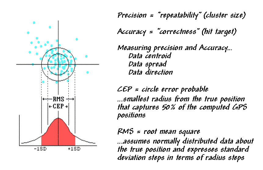
In general, there are two main hurdles in processing GPS signals—jitters and jumps. As with any instrument, inherent error for a set of readings at a fixed location yields a jittery cluster of possible positions, termed the sphere of uncertainty (see fig. 7.6). The cluster is statistically summarized to report the general accuracy of a GPS unit. A frequently used measure, the circle error probable (CEP), identifies the radius of a circle capturing 50 percent of the readings around test locations. Another measure reports a radius of a circle having one standard deviation around the actual location. Both measures assume the cluster of points is evenly distributed around the actual point. The worst kind of jitters has a directional bias.
|
|
|
Fig. 7.6. Characterizing GPS errors. |
Also, satellites come and go over the horizon with time; as one is dropped and another picked up, the calculated position can take a temporary jump. Although four satellites are technically sufficient, multi-channel receivers lock in on several more satellites and instantaneously switch without a sharp jump. Processing software uses running and dampened averages of several readings to cope with the jitters and jumps. Keep in mind that the silicon in all GPS hardware is about the same—it's creative software that separates the best receivers.
A well-tuned differential GPS system in static mode for use on the farm can easily place you within a meter horizontally and five meters vertically. A simple, inexpensive, autonomous system can place you somewhere within a "football field." That is if atmospheric, ground-cover and terrain factors permit—things quickly deteriorate under a dense vegetation canopy and at the bottom of steep canyons. Also, the satellites are not always available in a nicely dispersed pattern in the sky. That means you need to plan to be in the field at the times the satellites' celestial charts dictate—try explaining that one to your field crew.
A GPS's ability to rapidly and accurately locate positions on the earth's surface is a powerful addition to GIS technology. However, it is important to keep in mind that GPS is not intended to fully replace conventional surveys. It augments cadastral records with real-time and real-world positioning. When attached to a vehicle, GPS tracks it better than a hound dog.
The contribution of GPS to generating and updating GIS maps is obvious. Yet, GPS is more than a data collection device—it's a practical tool to navigate GIS results. As GIS matures, more of its applications will involve GIS modeling, such as "variable-width buffers" around streams considering terrain steepness, ground cover and soil erodibility. Although such relationships follow common sense, their spatial expression is extremely complex. The contractions and expansions of a variable-width buffer on a paper map are impossible to see in the field. However, if you download the coordinates of the buffer into your GPS you can navigate the complicated spatial result, in effect, delineating the spatial expression "on-the-go."
GPS: The Advanced Stuff (return to top of Topic
7)
You have a grasp of the basics of GPS—"gal-darn positioning system"—that fires-up every time you go near that new Star Trek tractor. It uses a constellation of satellites and mathematical triangulation to tell you where you are—rather precisely, if all goes well. However, there are several complex considerations involved in accurate positioning.
First, the distance from a satellite to you is determined by the time it takes a radio signal to traverse the space. Your typical stopwatch can't cut it: 1/100th of a second equals 1,860 miles for a radio signal traveling at the speed of light. A timing error of just .01 second could put you on another continent. Clock accuracy has to be in the nanosecond range (.000000001 second) that translates to less than one foot and keeps the precision in precision farming.
While the timing signal is the heart of the system, GPS receivers also monitor other information from the satellite. The almanac for a satellite reports the timetable of the satellite, path of travel, orbital fine-tuning and horizon setting. This information is augmented by ephemeris data identifying the fine-tuning of the satellite's position resulting from small predictable changes in orbit induced by gravitational effects of the sun, moon or other bodies, as well as other effects like the solar wind tugging on the satellite. The almanac information is updated monthly; the ephemeris data get updated every time the satellite passes over a ground control station.
In a sense, the almanac is like a bus schedule's expected position at any time, while the ephemeris data update the estimate tempered by actual conditions. The result is the precise positioning of the satellite every billionth of a second. Knowing the exact location of each satellite and the distance from it to you provides the input to the trigonometry equations that solve for your position—less than a meter if all goes well. All this goes on at speeds, decimal places and minute spacing only electrical engineers and mathematicians truly appreciate.
An even more precise (and concurrently more complex) positioning method isn't based on the measurement of time directly. It counts the number of radio waves between the individual satellites and the receiver. By carefully timing, counting and measuring the arrival of the waves, carrier phase receivers provide deca-meter (one-tenth of a meter) accuracy. However, you won't see these GPSs on tractors for awhile since they have a hefty price tag and are notoriously unstable when moving.
So, what can go wrong? As discussed earlier, the military can muddle civilian use of the system or selectively turn it off during times of crisis. While differential correction usually restores the muddled measurements to within a meter, it requires access to base station corrections. Post-processing of a GPS data file can be made via the Internet; however, the turn-around time is several hours. For the real-time positioning needed in precision farming, you need additional hardware to monitor broadcast corrections and a fancier GPS receiver to make the adjustments "on-the-fly."
Even with differential correction, atomic clocks in the satellites and an extra satellite measurement for calculations, there are other sources of error, more subtle and difficult to deal with. Earth's ionosphere can subtly affect the speed of the radio waves. As the density of charged particles in the ionosphere increases or the path gets closer to the horizon, the waves slow down and the time increases. While equations adjust for speed variation on an average day, under average ionospheric conditions, more advanced GPS receivers can tweak the calculations by measuring subtle changes in the frequency of the signals from two satellites. Weather conditions can disrupt calculations since water vapor affects radio signals in a similar manner. Although this error is almost impossible to correct, fortunately it is usually small.
A localized source of error that can have a significant effect is termed multi-pathing. It occurs when signals bounce off nearby objects before getting to the receiver. The effect is similar to "ghosting" on a TV where the signal takes a circuitous route instead of going directly to the receiver as the equations assume. Advanced signal processing techniques and antenna engineering minimize these problems.
A final consideration is the result of the relative positioning of the satellites. There are currently 21 satellites (plus three spares) circling the earth every 12 hours. They are dispersed so there are about 11 available to each half of the globe at any time. Of these, three are necessary for two-dimensional positioning (x,y) and four are needed for three-dimensional (x,y,z) positioning. However, the relative positioning of the satellites used for the calculations has a significant effect on accuracy.
|
|
|
Figure 7.7. Relative positioning of the satellites can affect accuracy. |
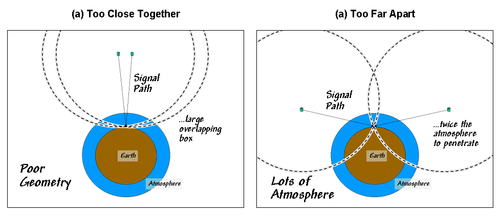
If the satellites are clustered in one part
of the sky the readings are less reliable. Although the orbits are designed to
disperse the pattern, local features, such as a ridge or wind row of trees,
often blots-out some of the paths forcing the selection of an alternate set
satellites that are more bunched. If the satellites are too close together (see
fig. 7.7), the geometry of the overlap of the circles forms a box instead of a
point of intersection. If the satellites are too far apart, the increased atmosphere
and interference from local terrain can muddle things.
Ideally, the three (or four) satellites should be balanced along a circle 45 degrees above the horizon; with minimal ionospheric, weather and multi-pathing effects at play. If that's the case you are operating at peak precision; if not, things start to degrade. Most of the time, however, you can expect to be navigating within a few feet, which is a heck of a lot better than my golf swing's mark from only 100 yards out.
Remote Sensing: Basic Stuff (return to top of Topic
7)
The GIS/GPS technologies position both spatial data and spatial relationships on the landscape. But how to effectively identify, measure and monitor farm conditions is a continuing challenge. A GIS and its closely related field of remote sensing form an alliance that greatly enhances the technical toolkit for mapping. Remote sensing is actually GIS's older brother, having its modern roots in World War II. Camouflage detection film was used to distinguish between healthy vegetation and cut branches piled on top of military equipment. To the human eye and normal film the healthy and cut branches were both green (at least for a few days), but on the new film they showed up as two different colors.
Remote sensing uses relative variations in electromagnetic radiation (EMR) to identify landscape characteristics and conditions. In fact, so do your eyes. Sunlight (the "visible" form of EMR) starts off with fairly equal parts of blue, green and red light. When sunlight interacts with an object, the object’s composition causes it to absorb varying amounts of the different wavelengths of EMR "light." What light isn’t absorbed is reflected to your eyes. Your brain interprets the subtle differences in the amount of blue, green and red in the reflected light to recognize the thousands of colors we relate to our surroundings.
Vegetation is particularly "photogenic" because of its structure, pigments and water content. Since sunlight is a plant’s source of energy, it goes out of its way to present its leaves in the best possible light. When thousands of plants in a field align themselves, their structure forms an excellent receptor and reflector of sunlight.
The physiology of a leaf determines the relative absorption and reflection of light. The equal portions of blue, green and red light from the sun are basically unaffected by the surface of the leaf, but when it encounters the chloroplasts containing chlorophyll A and B it is radically altered (see fig. 7.8). These pigments absorb most of the blue and red light for the energy needed in photosynthesis used in plant growth and maintenance. Other pigments in the leaf (i.e., carotines) absorb lesser amounts of the other wavelengths of light.
|
|
|
Figure 7.8. Plant physiology determines the quality
(color) of reflected light |
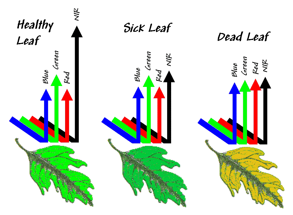
As the pigment-altered light continues deeper into the leaf, it interacts with the spongy mesophyll. This bubble-like structure acts like a mirror and reflects the light back toward the sky. Since the blue and red wavelengths have been diminished, we see a predominance of green in the reflected light—a healthy "green" leaf (because blue and red are usurped by the plant).
An unhealthy leaf, however, looks a lot different, particularly in remote sensing imagery. When water pressure changes (i.e., cutting a branch from its stem), the spongy messophyll in the leaves collapse within hours and this area’s efficiency of reflecting light is greatly reduced. The chloroplasts, on the other hand, keep on working away at photosynthesis for several days. The result is that we "see" a slight change in reflectance (predominantly green) at first, then a slow progression to brown as the chloroplasts eventually quit preferentially absorbing blue and red light.
However, what makes remote sensing’s view different is its ability to look at reflected light beyond visible blue, green and red light. "Invisible" near-infrared light (NIR) is at wavelengths just beyond the red light your eyes can detect. These wavelengths are unaffected by the plant’s pigments and are highly reflected by the spongy mesophyll. When the "bubbles" in this portion of a leaf collapse, there is an immediate and dramatic change in the reflectance of near-infrared light. That’s the principle behind camouflage detection film—we see a branch as green for days; remote sensing imagery detects a dramatic difference in near-infrared light in a matter of hours.
What makes remote sensing data so useful is that it encapsulates biological and physical characteristics into an image. The encrypted variations in reflected light emanating from a field provides information about changing conditions and crop status—important stuff you should keep your eye on.
Remote Sensing: Intermediate Stuff (return to top of Topic
7)
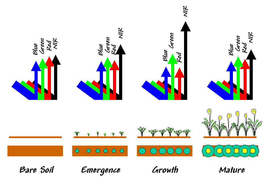
Figure 7.9 extends the discussion of the basic concepts of plant physiology and its interactions with light from a plant to a whole field. From a simplified view, as more biomass is added the reflectance curve for bare soil (similar to a dead leaf) is transformed into a spectral signature that typifies one big green leaf. As the crop matures, the reflectance pattern changes again. How spectral signatures change provide valuable insight into field conditions.
|
|
|
Figure 7.9. Reflectance from various field conditions. |
You now have a basic understanding of what happens to light in a plant canopy, let’s take a loftier view and see how it is translated into a computer image. An aerial camera operates like your eye, except photographic paper replaces the optical nerves in the retina. The image is focused through the lens, with variation in light recorded by a photochemical process on the film.
The scanner in a satellite operates a bit differently—more like your laser printer that "sees" the world through thousands of dots. Its sensor focuses for an instant at a spot on the ground (a few meters in diameter) as shown in figure 7.10. Like your eyes, it records the relative amounts of the different types of light it "sees"—a lot of green for a dense healthy crop; much less green and more blue and red for bare ground. In addition to normal light (termed the visible spectrum), it can record other types that we can’t see, such as near infrared, thermal and radar energy. The sensor sweeps from side to side and the satellite moves forward, recording the relative amounts of light reflected from millions of spots on the ground.
|
|
|
Figure 7.10. Remote sensing data is composed of millions
of numbers |
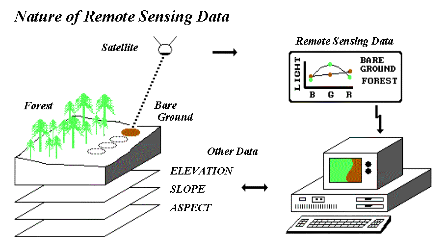
When these spots (termed pixels for "picture elements") are displayed on a computer, they form an image similar to an aerial photograph. In fact, a photograph can be "scanned" to generate a digital image—like pulling the satellite out of the sky and passing it over the photo instead of the actual terrain. The important point is that behind any digital image there are millions of numbers recording the various types of light reflected from each instantaneous spot.
Three factors govern the quality and appropriateness of remote sensing data: 1) spatial, 2) spectral and 3) temporal resolutions.
Spatial resolution identifies the smallest thing (spatial unit) contained in the data. In a photograph, it is a glob of developed crystals embedded in the emulsion; in a digital image it’s the size of the pixel. Up to a point, smaller is better. If there is too much spatial detail, you "can’t see the forest for the trees," nor store the burgeoning file.
Spectral resolution refers to the number and width of the wavelength bands (colors) contained in the data. Again, more is better, up to a point. The human eye and normal film "see" just three broad bands of light—blue, green and red. Optical scanners can record many more narrowly defined bands that can be "tuned" for specific wavelengths to enhance features of interest. The ability to extend the bands beyond our vision (particularly to near infrared energy) and analyze just the important ones allows us to gain a lot more information from the data than simply viewing an image.
The rub is that there is a tradeoff between spatial and spectral resolutions—pushing both of them to the maximum results in too little energy for a sensor’s detector. Early satellite systems required a lot of energy to activate their detectors; therefore, they only had four broad bands and a footprint of about an acre. Modern detectors can record many more narrow bands and commonly have a footprint of only a few meters. At these resolutions (spectral and spatial), even satellite data becomes appropriate for some aspects of site-specific management.
Temporal resolution refers to the time step between images. A series of images collected each week over a field provides far more information than a single image taken at just one point in the crop’s growth. You guessed it; more is better, up to a point. But this time the point isn’t driven by optical physics but your wallet. By its very nature, site-specific management implies small areas, while most remote sensing systems (particularly satellites) are designed to service large areas. Pricing and distribution channels for digital data in smaller bites (and bytes) and turn-around times needed by farmers are just now coming on line.
While the full potential of remote sensing might be just around the corner, an aerial photo backdrop is an essential element of any precision farming system. There’s a growing number of ways you can acquire such an image. If you’re lucky you can download a "rectified" image from the Internet or pick up one from a governmental agency in your locale. Some farmers have struck a deal with the local flight instructor to snap a few frames over their fields a couple of times a month. The 35 mm slides are scanned for a few dollars at growing numbers of photo shops. The digital images can be aligned in most desktop mapping systems using the GPS coordinates of a set of control points visible in the image.
Once the photo backdrop is in place, it immediately adds reality to the abstract lines and colors of a map. Important features and patterns can be encoded by tracing them directly on the screen (termed heads-up digitizing). This ability is an important component to drawing management zones discussed in "topic 2, Zones and Surfaces." Linking a differentially-corrected GPS unit to a portable computer allows you to "walk or drive" on a backdrop-photo (really cool!), encoding a map as you go (termed feet-down digitizing). Before you start drawing on maps, you need to realize that the patterns you see are the result of complex biological and physical interactions; you might "see" something, but be sure you know what it is before you canonize it as a map.
Remote Sensing: Advanced Stuff (return to top of Topic
7)
The organized mountain of numbers forming a digital image can be used to identify both land cover characteristics and their condition. First, the computer is "trained" by locating representative areas of the cover types to be classified—sort of rubbing the computer's nose in what it should know. Then, this information is used to determine the classification of other areas with similar responses.
The first step involves the computer examining the amount of light for each type from training sets (groups of example pixels) you "show" it. In the bare-ground-to-crop example discussed and illustrated in figure 7.9, the computer notes that crops tend to have higher green and lower red responses, while bare ground has low green and just slightly more red. The big dot in the center of the "Crop" and "Bare" data clusters in figure 7.11 indicates the average amount of green and red light—the typical response for that cover type.
|
|
|
Figure 7.11. Classifying remote sensing data. |
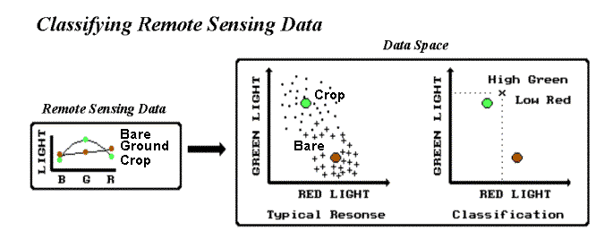
Now the computer can consider the green/red responses for other locations and classify them through "guilt by association" with the training set statistics. In effect, the computer mathematics plots an unknown location's green/red numbers (the "x" in the right graph of fig. 7.11), notes the data distance (see topic 4, "Data Space: The Next Frontier" for an explanation of data distance) to both the typical bare soil and crop responses, then it classifies the location as the closest ("Crop" in this case). It moves from pixel to pixel until the entire area has been classified. As a human you could do this, but your patience ebbs at about the second location for a set of several million in a typical satellite image.
Just as you use more than just color (formally termed a spectral band) in identifying a plant, so can the computer. That's where GIS lends remote sensing a hand in classification. The GIS uses the example locations to check its database to see if there are other typical conditions for a cover type. For example, if two crop types have similar spectral responses, the knowledge that the unknown location is "on a certain soil type with steep southern exposure" might be enough to tip the scales to a correct classification between the two.
In return for its help, the GIS gets a copy of the results of the remote sensing classification—a map indicating crop type and condition. By comparing the maps from two different times, the computer can quickly detect and quantify any changes in a field. Keep in mind that remote sensing and GIS provide "educated guesses" of actual characteristics, conditions and relationships. They are not perfect, but they do provide powerful and compelling insights.
In fact, remote sensing provides an additional element over traditional mapping, certainty assessment. At the moment of classification, the computer not only knows which typical response is closest (i.e., most likely) but also how close it is—a measure of certainty. If it is very close, then you're fairly confident in the classification. As it gets farther away, you're less confident. Relating the closest distance to those of other possible cover types yields even more information—sort of a "probability sandwich" of what a location might be. The next closest typical response identifies a second guess at classification; how much farther away it is indicates the degree of confusion between the two possible classifications.
If an unknown location sits exactly halfway between the typical responses of two cover types, it's a toss-up. As an unknown's response moves closer to a typical response, classification certainty increases— maybe, maybe not. That's where things can get a bit confusing. Note the data patterns (dots for "Crop" and crosses for "Bare" ground) surrounding the typical responses plotted in figure 7.10. In its training set the crop responses are fairly compact and circular, while the bare ground responses are more spread-out and elongated in the direction of the crop responses.
The shape of the data cluster, as well as its positioning, provides even more information about classification accuracy. The more dispersed the pattern is, the less typical the typical response is. If the data has a trend (elongated), it means it is more apt to be confused with other cover types in that direction. All this statistical stuff is contained in the joint mean and covariance matrix derived from the training set—take my word for it, or go back for an advanced degree in multivariate statistics. The upshot is that remote sensing classification not only tells you what it thinks is at a location but also reports honestly how good the guess is. Come to think of it, that’s a lot more than traditional maps provide.
Note: See topic 3, Mapped Data Analysis: Within a Single Map and topic 4, Mapped Data Analysis: Among Several Maps for more information on computer processing of spatial data including remote sensing data.
IDI: Yield Monitors (return to top of Topic
7)
To be completed.
IDI: Variable Rate Technology (return to top of Topic
7)
To be completed.