|
|
|
The Precision Farming Primer |
|
|
|

So, What's the Difference? — discusses differences in information provided by
visual vs. data analysis
Relating Maps — introduces basic concepts used in assessing
relationships between maps
Viewing Maps as Data — describes linkages among traditional maps, data
distributions and map surfaces
Data Space: The Next Frontier — introduces the underlying concept a computer uses to
"see" map patterns
Map Similarity — extends the discussion to a computer procedure for
assessing map similarity
Clustering Map Data — describes how a computer identifies similar "data
zones" within an area
Visualizing Data Groups — discusses clustering
procedures and interpretation of the results
Map Correlation and
Prediction: Part I — introduces
concepts of spatial correlation and predictive modeling
Map Correlation and
Prediction: Part II — discusses
regression procedures and interpretation of the results
Comparing Maps — describes two basic approaches in comparing traditional
maps
Comparing Map Surfaces: Part I — discusses the use of statistical tests in comparing
mapped data
Comparing Map Surfaces: Part II — describes spatially based approaches to comparing
mapped data
On-Farm Testing — investigates the use of GIS for on-farm studies
(in prep)
(Back to the Table of Contents)
______________________________
So, What's the Difference? (return to top of Topic 4)
Visceral viewing of maps forms an overall impression of what's happening in a field, but they're often too complex for detailed analysis—that requires the computer's perspective of "maps as data." For example, the sets of maps in figure 4.1 relate phosphorous levels at different soil depths (0 - 5 cm and 5 - 20 cm). The contour maps in the figure show the 0 - 5 cm depth on the left and the 5 - 20 cm depth on the right. What do your eyes tell you?
|
|
|
Fig. 4.1. Contour plot of phosphorous concentrations within a farmer’s field. |
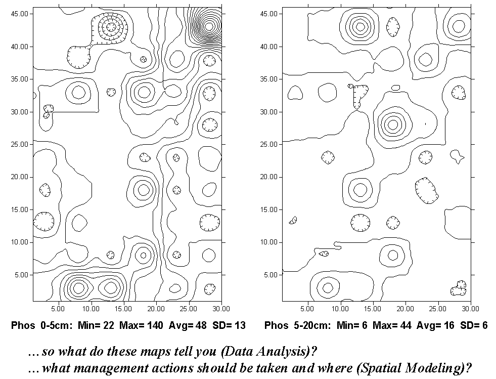
Assuming the contour interval is the same for both, more lines in the two-dimensional map on the left indicate a generally higher range of phosphorous levels (particularly the "peak" in the northeast corner of the field). The hatched lines indicate "depressions" (lower levels than their surroundings). However, even the most experienced pair of eyes would not be capable of telling what the differences in the two surfaces are.
Even if the contour bands were color-filled, you would be hard-pressed to locate all of the areas of small, medium and large differences. Examine the same data illustrated in three-dimensional maps in figure 4.2. The top map contains the higher values for the 0 - 5 cm layer and the lower one for the 5 - 20 cm layer. Now you can more readily "see" the large differences in the southwest portion, as well as the northeast corner. It's the "Difference Surface" map on the right in figure 4.2, however, that should attract your attention.
|
|
|
Fig. 4.2. Three-dimensional surface plots illustrate the data in figure 4.1. |
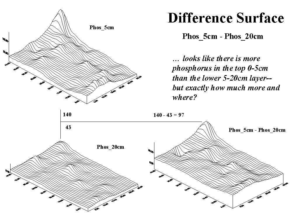
Since the computer's view of the mapped data is a spatially aligned set of numbers, it can go to each grid space (there're 1,380 of them), retrieve the values for the two layers, then subtract them to compute the difference in phosphorous at the two soil depths. For example, the largest absolute difference occurs in the northeast corner where the top layer contains 140 units and the bottom layer contains only 43 units (140 - 43 = 97; 97 / 43 * 100 = 226% more).
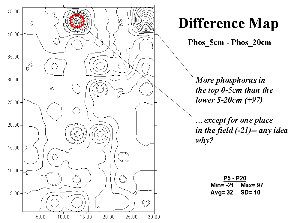
Figure 4.3 is simply a more familiar flat-map rendering of the "Difference Surface" in figure 4.2. It's what you were trying to visualize when simultaneously viewing the two contour maps side by side. However, while glancing back and forth and back and forth, your mind had a hard time assembling a mental picture of the composite map. What's particularly curious is that the largest negative difference the depression in the north central portion (22 - 43 = -21; -21 / 43 * 100 = -49%) occurs in close proximity to the largest positive difference. Any ideas why (data analysis)? Based on your explanation of the relationship, any management recommendations (spatial modeling)? Did the Difference Map help you formulate these thoughts?
|
|
|
Fig. 4.3. Contour plot of the difference in phosphorous concentrations. |
Relating Maps (return to top of Topic
4)
Data visualization combined with data analysis can uncover subtle differences in continuous, mapped data. Simple two-dimensional contour maps form familiar images but "break" the detailed information in a map surface into artificial groupings (contour interval polygons) that are difficult to visually interpret. A three-dimensional surface plot better depicts the information, but it is still limited to qualitative interpretation.
|
|
|
Fig. 4.4. Two- and three-dimensional plots of crop yield. |
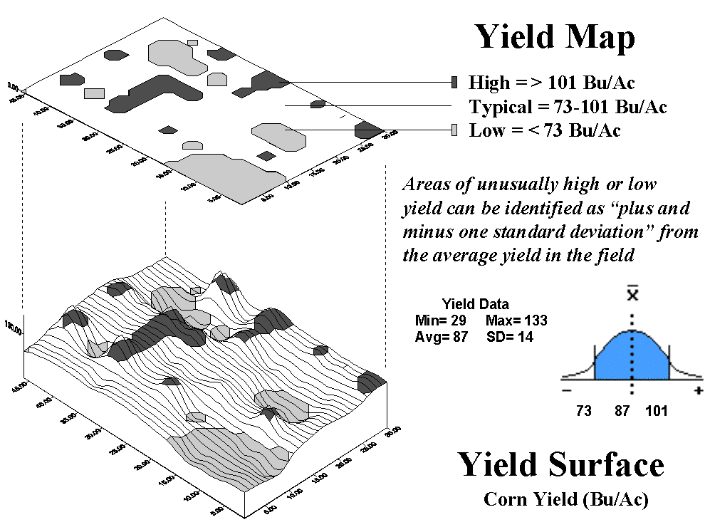
In the figure 4.4 the three-dimensional plot at the bottom tracks the subtle differences in yield with high "bumps" locating areas of high corn yield. The flat-map perspective plot "floating" above the three-dimensional map is a bit "smarter" than an ordinary contour map. It was derived by map-ematics to statistically identify areas of unusually high yield (one standard deviation above the average represented by dark polygons) and unusually low yield values (1 SD below the average represented by light polygons). Now the groupings contain information beyond simply a two-dimensional visualization of a mapped data surface.
|
|
|
Fig. 4.5. Comparing yield to phosphorous concentrations. |
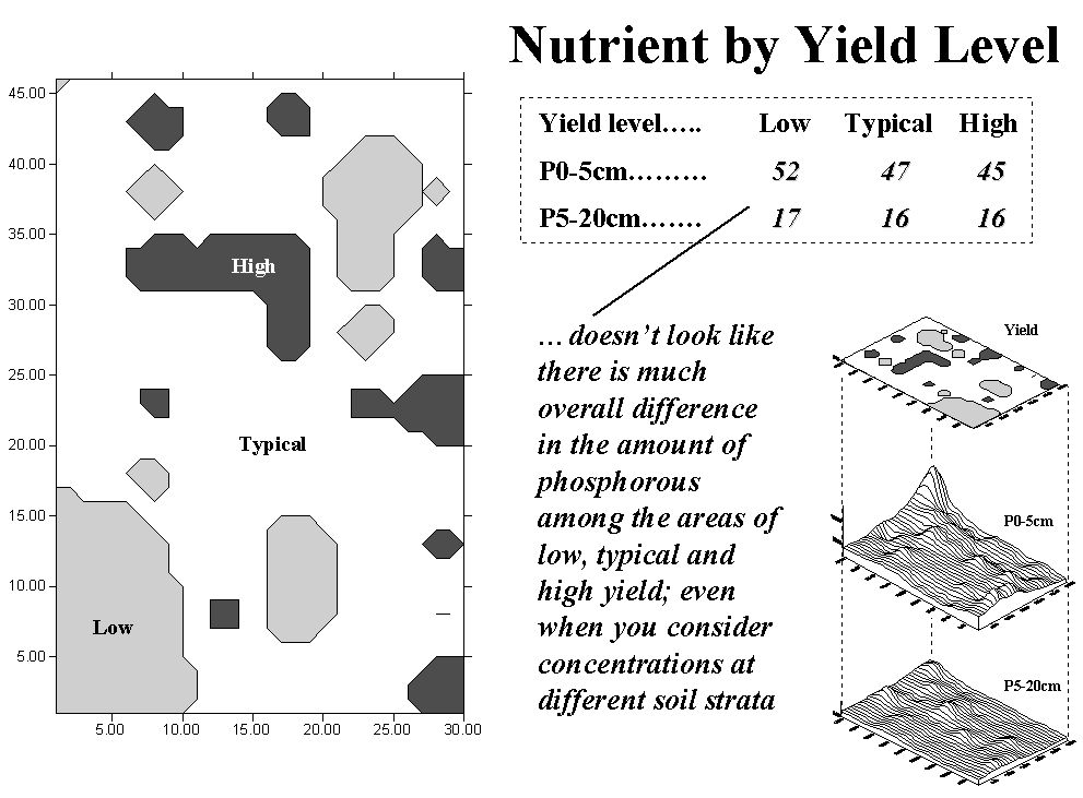
Figure 4.5 shows the results of analyzing the amounts of phosphorous between the top and bottom soil layers within the areas of low, typical and high yield. The summary table, "Nutrient by Yield Level," reports that there isn't much difference. Yet, in the top layer (0 - 5 cm), yield appears to be "inversely" related to phosphorous level—as yield increases (low to typical to high), phosphorous or P levels decrease (52 to 47 to 45). This trend might be real, but you ought to analyze a lot more data before betting the farm on it. What is for sure is that you couldn't "see" the possibility by simply hanging three contour maps (yield, P0-5, P5-20) side by side on the wall.
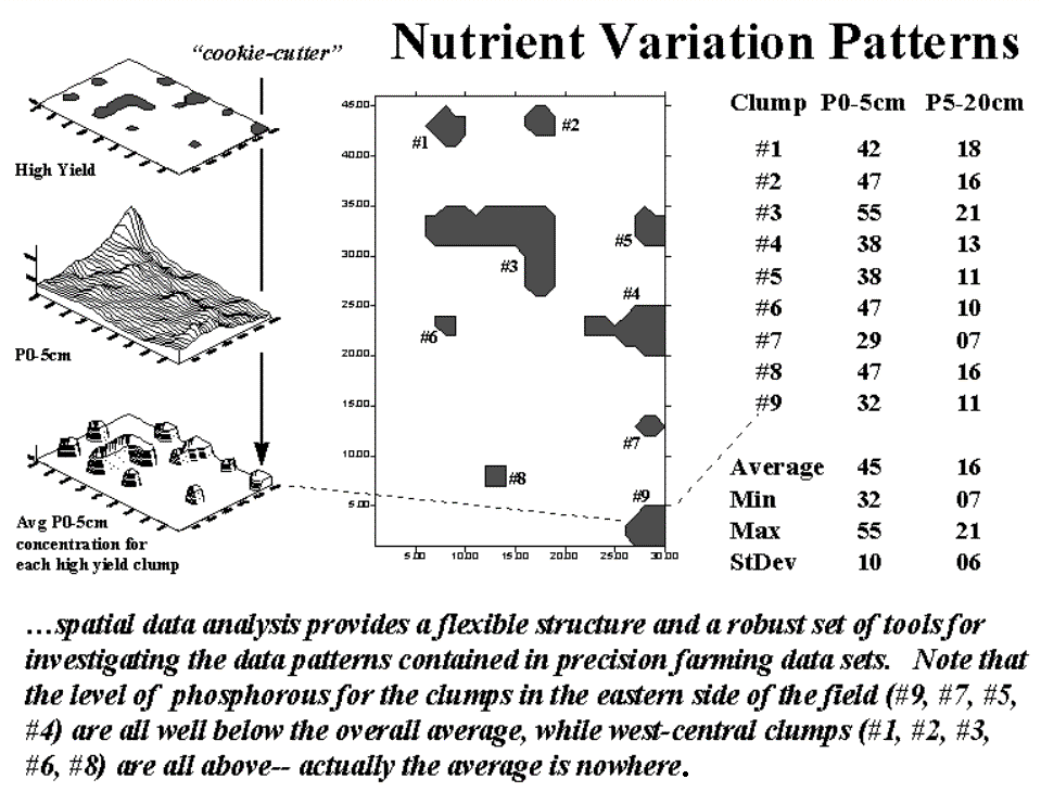
Figure 4.6 looks a bit closer at the relationship between high-yield areas and phosphorous level. In this instance, "cookie-cutter" analysis (formally termed region-wide overlay) computed the average P level for each of the high-yield areas with the results shown in the three-dimensional plot at the bottom of the stack in the table on the right, "Nutrient Variation Patterns." These data contain more information than those based on averages for all yield groupings (spatially aggregated) reported in the center of the figure. For example, close inspection of the data shows the spatial pattern of the differences in P levels with higher levels occurring along the eastern portion of the field. Now, we need to investigate more advanced data analysis techniques that help you "see" relationships among mapped data.
|
|
|
Fig. 4.6. Comparison of average phosphorous levels for areas of high yield. |
Viewing Maps
as Data (return to top of Topic 4)
Mapped data is fundamental to the precision farming process. But maps by their very nature are abstractions of reality. In the past, these abstractions were limited to points, lines and polygons as their building blocks because that's all we could draw. Modern desktop mapping systems extend this perspective by linking the discrete map features to descriptive information about them. This view of maps, as well as the linkage, is as familiar as the map on the wall and the file cabinet beside it. The paradigm also fits nicely into standard office software with only minimal education and training in unfamiliar concepts.
The problem is that the traditional paradigm doesn't fit a lot of reality. Sure the well, fence line and field outside your window are the physical realities of a map's set of points (P), lines (L) and polygons (P). Even very real (legally), though nonphysical, property boundary lines conceptually align with the traditional view. But not everything in space is so discretely defined, nor is it as easily put in its place.
Obviously meteorological gradients, such as temperature and barometric pressure, don't fit the P-L-P mold. They represent phenomena that are constantly changing in geographical space and are inaccurately portrayed by contour lines, regardless how precisely the lines are drawn. By its very nature, a continuous spatial variable is corrupted by artificially imposing abrupt transitions. The contour line is simply a mechanism to visually portray a flat-map rendering of a three-dimensional gradient. It certainly isn't a basic map feature, nor should it be a data structure for storage of spatially complex phenomena.
Full-featured GIS packages extend the basic the P-L-P features to map surfaces that treat geographic space as a continuum. The most familiar surface feature is the terrain you walk on, composed of hills and valleys and everything in between. Less familiar are precision farming's surfaces composed of peaks of high yield and valleys of disappointingly low yield. While a contour map lets your eye assess the variations as a pattern of lines, it leaves the computer without a clue; all it can "see" is a pile of numbers (digital data), not the pattern implied by an organized set of lines (analog image).
Figure 4.7 illustrates the links among the different views of surface data. Keep in mind that the computer doesn't "see" any of the pictures; they're for human viewing enjoyment. The traditional two-dimensional map view chooses a map value, then identifies all of the locations along a line (mathematically implied) having that value.
|
|
|
Fig. 4.7. A histogram (numerical distribution) is linked
to a map surface (geographic distribution) |
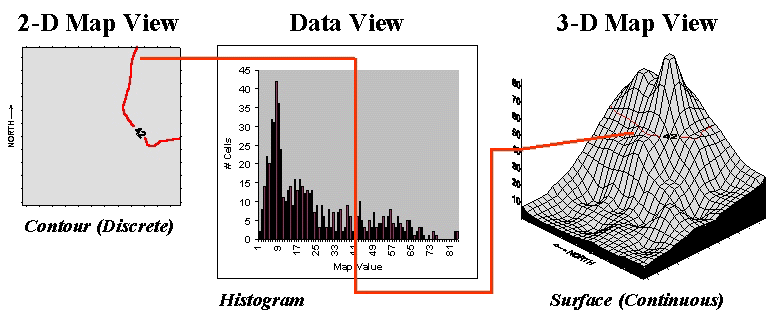
However, it's the discrete nature of a contour map and the irregular features they spawn that restrict the computer’s ability to effectively represent continuous phenomena. The data view uses a histogram to characterize a continuum of map values (i.e., crop yield or soil nutrient level) in "numeric" space. It summarizes the number of times a given value occurs in a data set (relative frequency).
The "3-D Map View" forms a continuous surface in figure 4.7 by introducing a regular grid over an area. The x, y axes position the grid cells in geographic space, while the z axis reports the numeric value at that location. Note that the data and surface views share a common axis—map value. It serves as the link between the two perspectives. For example, the "Data View" shows number of occurrences for the value 42 and the relative numerical frequency considering the occurrences for all other values. Similarly, the "Surface View" identifies all of the locations having a value of 42 and the relative geographic positioning considering the occurrences for all other values.
Both perspectives characterize data dispersal. The numeric distribution of data (a histogram's shape of ups and downs) forms the cornerstone of traditional statistics and determines appropriate data analysis procedures. In a similar fashion, a map surface establishes the geographic distribution of data (a surface's shape of hills and valleys) and is the cornerstone of spatial statistics. The assumptions, linkages, similarities and differences between these two perspectives of data distribution are the fodder for a discussion of mapped data analysis and its applications in production agriculture.
Data Space: The Next Frontier (return to top of Topic 4)
We’ve just discussed a histogram plot as a computer's view of a map. Let’s extend that concept to how a computer "visualizes" several maps at a time. Fundamental to this perspective is the recognition that digital maps are "numbers first, pictures later." In a computer, each map is a long list of numbers, with each value identifying a characteristic or condition at a particular location. For example, a map of phosphorous in the upper layer of the soil (0 to 5 cm) might contain values from 22 to 140 parts per million. These values are assigned to 1,380 cells of a reference grid composed of 30 columns and 36 rows to form a map surface. The map values form the data domain ("Data Space") while the grid cells form the spatial domain ("Geographic Space").
The dull and tedious "Tabular Listing "(fig. 4.8) is the traditional human perspective of data. We can't consume a long list of numbers, so we immediately turn the entire data set into a single "typical" value (average) and use it to make a decision. For the phosphorous data set, the average is 48. A location in the center of the field (column 15, row 23) has a phosphorous level of 46 that is close (in a data sense, not a geographic sense) to the average value. But the data range tells us that somewhere there is at least one location that is less than half (22) and another that is nearly three times the average (140).
|
|
|
Fig. 4.8. The map values for a series of maps can be simultaneously plotted in data space. |
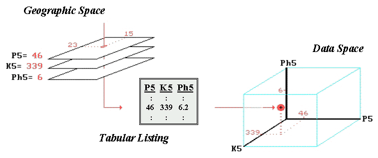
Suppose we have map surfaces of potassium levels (K) and soil acidity (pH), as well as phosphorous (P), for the field. As humans we can "see" the coincidence of these data sets by aligning their long lists of numbers. Specific levels for all of the soil measurements for any location in the field are identified as rows in the table. However, the combined set of data is even more indigestible with the only "humane" view of map coincidence being the assumption that the averages for each are everywhere—48, 419, 6.2 in this example. The center location's data pattern of 46, 339 and 6 is similar to the average pattern, but exactly how similar? Which locations are radically different? Which locations are as different as you can get in terms of soil conditions?
Before we can answer these questions, we need to understand how the computer "sees" similarities and differences in multiple sets of data. It begins with a three-dimensional plot in data space as shown in figure 4.8. The data values along a row of the tabular listing are plotted, resulting in each map location being positioned in the imaginary box based on its data pattern. Similarities among the field's soil response patterns are determined by their relative positioning in the box— locations that plot to the same position in the data space box are identical; those that plot farther away from each other are less similar. Now we will tackle how the computer "measures" the relative distances and a bunch of other nuances.
Map Similarity (return to top of Topic 4)
The multivariate procedure spears a "shishkebab of numbers" for a location in a field (see "Geographic Space" in fig. 4.8), then plots the values in an imaginary box (see "Data Space" in fig. 4.8) based on the pattern of values. For example, a location in the field that has relatively low soil phosphorous, potassium and acidity values will plot near the origin, while a location with high soil values will plot nearer the opposite corner of the data space formed by the axes (see fig. 4.9).
|
|
|
Fig. 4.9. Similarity determined by the data distance
between two locations’ |
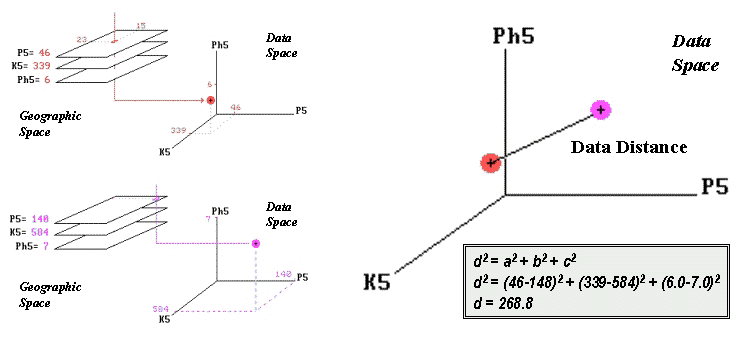
Similarity among soil response patterns at different locations in a field are determined by their relative positioning in the imaginary box: locations that plot to the same position in data space are identical; those that plot farther away from each other are less similar. How the computer measures the relative distance becomes the secret ingredient in assessing map similarity. Actually, it's quite simple if you revisit a bit of high school geometry, but I bet you thought you had put all that academic fluff behind you when you matriculated into the real world.
The left side of figure 4.9 shows the data space plots for soil conditions at two locations in a field. The right side of the figure shows a straight line connecting the data points whose length identifies the data distance between the points. Now for the secret—it's the old Pythagorean theorem, c2 = a2 + b2. (I bet you remember it.) However, in this case it looks like d2 = a2 + b2 + c2; it has to be expanded to three dimensions to accommodate the three maps of phosphorous, potassium and acidity (P5, K5 and pH5 axes in the figure). All that the Wizard of Oz (a.k.a., computer programmer) has to do is subtract the two values for each soil condition between two locations and plug them into the equation. If there are more than three maps, the equation simply keeps expanding into hyper-data space. As humans we can no longer plot or easily conceptualize this, but it’s a piece of cake for a computer to "see" the patterns.
The smaller the data distance, the greater the similarity between map locations. In use, map similarity allows you to click on a location and, within a blink of your eye, the rest of the field is assigned values indicating how similar they are considering any set of map layers. Or you can outline an area to generate a map identifying similar conditions to your glob of interest. While conceptually similar, a similarity map provides a more consistent and palatable view of data layers than rapid head-wrenching between a bunch of maps taped to the wall. That's the basics. The discussion of mapping similarity and clustering data into similar spatial patterns continues about subtle nuances, such as normalizing the axes.
Clustering Map Data (return to top of Topic 4)
So how does the computer identify areas in a field that have similar conditions? Very carefully and with a lot more detail than you or I can conceptualize. We simply tape a bunch of colorful maps on the wall and look back and forth until we think we detect some patterns.
The computer is a bit more methodical. To understand its approach, visualize your old high school geometry class. If you measured the weight and height of the students, each of the paired measurements would plot in x,y data space locating their particular weight (x axis) and height (y axis) combination. A plot of all the data looks like a shotgun blast and is termed a scatter plot (see inset a in fig. 4.10).
|
|
|
Fig. 4.10. Clustering uses repeated data distance
calculations |
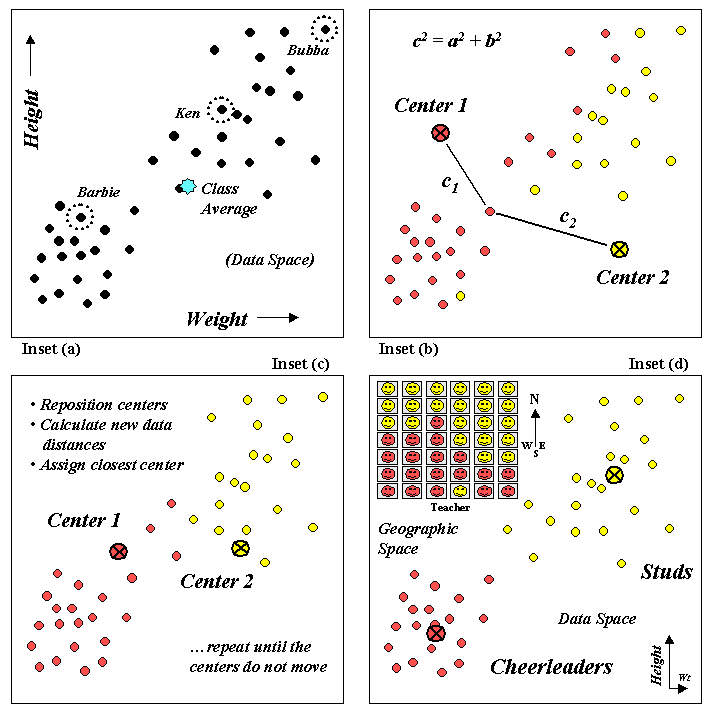
If your geometry class was like mine, two distinct groups might be detected in the data—the demure cheerleaders (low weight and height) and the football studs (high weight and height). Note that all of the students do not have the same weight/height measurements and that many vary widely from the class average. Your eye easily detects the two groups (low/low and high/high) in the plot but the computer just sees a bunch of numbers. How does it identify the groups without seeing the scatter plot?
One approach (k-means clustering) arbitrarily establishes two cluster centers in the data space (inset b in fig. 4.10). The data distance to each weight/height measurement pair is calculated and the point is assigned to the closest cluster center. The Pythagorean theorem, c2 = a2 + b2, can be used to calculate data distance as well as the one you walk. In figure 4.10, c1 is smaller than c2; therefore, that student's measurement pair is assigned to cluster center 1. The remaining student assignments are identified in the scatter plot by their color codes (dark red equals center 1 and light yellow equals center 2).
The next step calculates the average weigh/height of the assigned students and uses these coordinates to reposition the cluster centers (inset c in the figure). Other rounds of data distances, cluster assignments and repositioning are made until the cluster membership does not change (i.e., the centers do not move).
Inset d in figure 4.10 shows the final groupings with the big folks (high/high) differentiated from the smaller folks (low/low). By passing these results to a GIS, the data space pattern (clumps of similar measurements) can be investigated for geographic space patterns.
The positioning of these data in the real world classroom (upper left portion of inset d in fig. 4.10) shows a distinct spatial pattern between the two groups—smaller folks in front and bigger folks in the rear. You simply see these things, but the computer has to derive the relationships (distance to similar neighbor) from a pile of numbers.
Visualizing Data Groups (return to top of Topic 4)
Statistics has long focused on identifying patterns in data. A histogram graphs the distribution of data while metrics, such as the mean and standard deviation, are used to summarize a pattern in quantitative terms. A scatterplot combines the information in two histograms by plotting the joint occurrence of paired measurements collected from each individual instance.
Statistical analysis of the paired values provides insight into relationships locked in the data, such as identifying distinct sub-groupings of similar responses. Prior to GIS technology the data patterns could only be visualized and quantitatively described as abstract numerical patterns. Now the data clusters can be linked to maps to visualize their real-world geographical patterns.
|
|
|
Figure 4.11 Linking numerical and geographical patterns. |
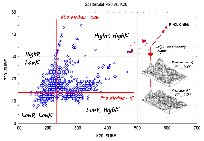
Figure 4.11 is a scatterplot of soil nutrient data in the root zone of a farmer's field (5-20cm deep). The X-axis indicates varying levels of potassium while the Y-axis tracks levels of phosphorous. The map surfaces shown on the right side of the figure were spatially interpolated from 54 soil samples (a 6x9 sampling grid). The interpolation process considers the relative positioning and magnitude of the soil samples to form the peaks and valleys of the two map variables.
What patterns do you see in the scatterplot? If you "blur" your view by squinting, two data groups seem to appear¾ one on the right oriented toward the top right corner, and a larger one on the left more vertically oriented. Note the linear "tentacles" that emanate from the two main clusters. Finally, notice the pronounced horizontal striping.
What do you think caused the patterns in the scatterplot? The appearance of two groups suggests that there are a couple of somewhat distinct "populations" in the data. The difference in orientations suggests that the relationships between phosphorous and potassium are different for the two populations. The tentacles are likely "artifacts" resulting from spatially interpolating unique conditions around some of the sample points at the edge of the field. Finally, the horizontal striping is the result of using different scales for the X and Y-axis while plotting integer values.
What can you learn from the interpretations of the patterns? First, the scaling and range of the axes can bias your view of data patterns. Most analysts "normalize" the raw data based on minimum and maximum values to a common range prior to plotting them at a one-to-one scale. This allows you to more effectively compare the raw data differences of "apples and oranges" from the perspective of a common "mixed-fruit" scale.
Another visual bias is caused by too much reliance on spurious patterns formed by a few points scattered well outside the bulk of the data. In this case, the interpolation procedure's tentacles are most likely deceiving. Most analysts ignore unusual "outliers" and focus their attention on the patterns displayed by the bulk of the data.
But for the moment, focus your attention on the point in the extreme upper right corner of the scatterplot. Note its linkage to the surface maps. Now visualize the eight grid cells surrounding the point and note their positions in the scatterplot as indicated by the dashed lines. The direct linkage between the numerical and geographical representations highlights one of GIS's important contributions to statistics¾ you can outline patterns in the scatterplot and see what geographical pattern they form; conversely, you can "lasso" areas on a map to visualize their data pattern.
|
|
|
Figure 4.12. The median can be used to quickly identify basic data groups. |
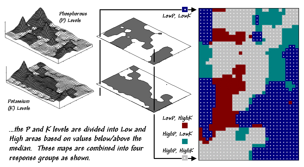
The ability to interact with these perspectives provides a "what's happening" query tool to investigate the numerical and geographical linkages. Figure 4.12 shows the results of dividing the data into four groups based on the median values of P and K (the horizontal and vertical lines in figure 4.11). The dark-tones on the surfaces in the figure 4.12 separate the areas above the median from those below. When combined, the individual "low-high" maps produce a map of the four combinations—LowP-LowK, LowP-HighK, HighP,LowK and HighP-HighK.
It's common sense that applying the same level of phosphorous (P) and potassium (K) across the entire field (termed whole field management) means some locations are going to get more than they need while others will get too little. Repeated applications based on the simple average of the soil samples for the entire field tends to aggravate the disparity. Site specific management, on the other hand, develops "tailored" P and K prescriptions for each of the four data groups and applies them to the field in accordance with the combinations map.
|
|
|
Figure 4.13. Characterizing data groups. |
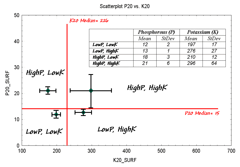
Figure 4.13 shows the graphical summaries of the data within each of the groups. Each "dot" identifies the joint mean that locates the center of the data cluster. The "bars" depict the spread of the data as one standard deviation above and below the mean for each variable.
Generally speaking, the farther apart the dots (termed inter-cluster distance) the greater the difference there is between two groups. Similarly, the larger the bars (termed intra-cluster distance) the greater the disparity there is within a data cluster. For example, there is minimal difference between the two graphs on the right (HighP-HighK and LowP-HighK) as their dots and bars are relatively close together. The diagonal parings appear relatively more distinct as their dots and bars are farther away.
There's a vast set of statistical procedures beyond "median-breaks" that partition the data into more appropriate groups (see author's notes). For example, discussion of how "the eigenvalues and vectors of the covariance matrix" better characterize data dispersion than the simple standard deviation bars is well beyond the scope of this discourse (mercifully). Similarly, consideration of how the data analysis is extended to simultaneous considering more than two variables is left to an advanced stat course.
However, the fundamental concepts in pattern recognition remain the same—always normalize the data, plot on a one-to-one scale, eliminate outliers and attempt to maximize the inter-cluster distance while minimizing the intra-cluster distance. In the final analysis, the linkage between the numerical and geographical perspectives provides a "better view" than simply taping two soil maps side-by-side on a wall or distilling a set of soil samples to just a couple numbers assumed constant across a field.
_______________________
Note: Allow me to apologize for a terse treatise of an enormous topic. My possibly flawed assumption is that a simplified discussion identifies some of the important considerations in linking numerical and geographic patterns and removes some of the mystery surrounding more advanced statistical techniques. See "Clustering Map Data" for more on analyzing data patterns.
Map
Correlation and Prediction: Part I (return to top of Topic
4)
Previous discussions have introduced procedures for identifying similarity and distinct groups within mapped data. That brings us to the next big "bungy-jump" in map analysis¾ correlation and predictive modeling.
In traditional statistics there is a wealth
of procedures for investigating correlation, or "the relationship between
variables." The most basic of these is the scatterplot that provides a
graphical peek at the joint responses of paired data. It can be thought of as
an extension of the histogram used to characterize the data distribution for a
single variable.
|
|
|
Figure 4.14. A scatterplot shows the relation between two variables by
plotting |
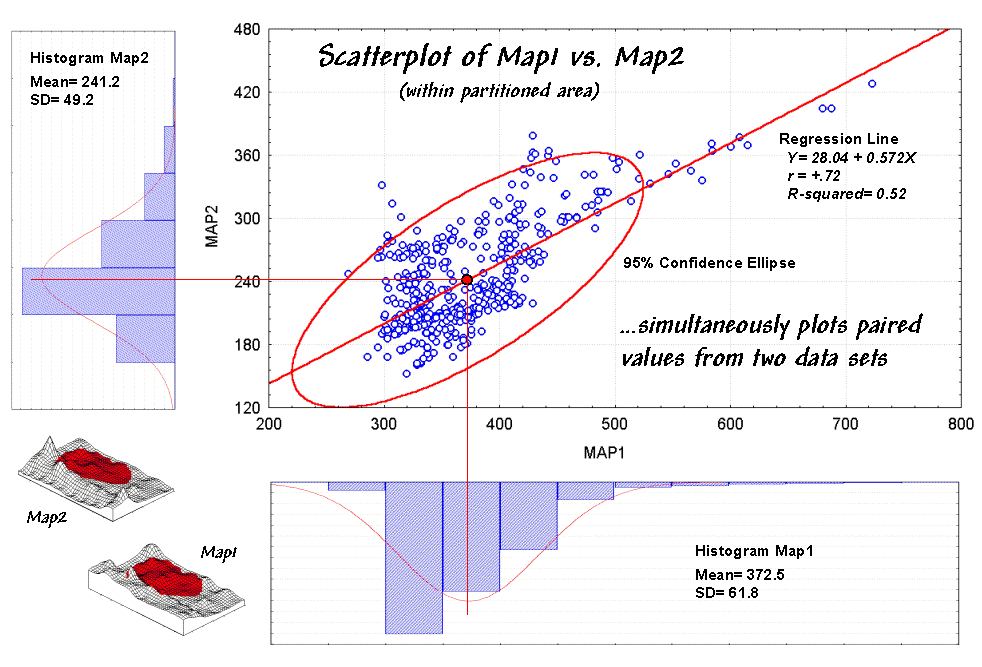
For example, the x- and y-axes in figure 4.14 summarize the soil nutrient data used in the discussions of map comparison (hyper link). Recall that Map1 identifies the spatial distribution of potassium in the topsoil of a farmer's field, while Map2 tracks the concentrations in the root zone.
The histograms and descriptive statistics along the axes show the individual data distributions for the partitioned area (dark red "glob" draped on the map surfaces). It appears the topsoil concentrations in Map1 are generally higher (note the positioning of the histogram peaks; compare the means) and a bit more variable (note the spread of the histograms; compare the standard deviations). But what about the "joint response" considering both variables at the same time? Do higher concentrations in the root zone tend to occur with higher concentrations in the topsoil? Or do they occur with lower concentrations? Or is there no discernable relationship at all?
These questions involve the concept of correlation that tracks the extent that two variables are proportional to each other. At one end of the scale, termed positive correlation, the variables act in unison and as values of one increase, the values for the other make similar increases. The other end, termed negative correlation, the variables are mirrored with increasing values for one matched by decreases in the other. Both cases indicate a strong relationship between the variables just one is harmonious (positive) while the other is opposite (negative). In between the two lies no correlation without a discernable pattern between the changes in one variable and the other.
Now turn your attention to the scatterplot in figure 4.14. Each of the data points (small circle) represents one of the 479 grid locations within the partitioned area. The general pattern of the points provides insight into the joint relationship. If there is an upward linear trend in the data (like in the figure) positive correlation is indicated. If the points spread out in a downward fashion there's a negative correlation. If they seem to form a circular pattern or align parallel to either of the axes, a lack of correlation is noted.
Now let's apply some common sense and observations about a scatterplot. First the "strength" of a correlation can be interpreted by 1) the degree of alignment of the points with an upward (or downward) line and 2) how dispersed the points are around the line. In the example, there appears to be fairly strong positive correlation (tightly clustered points along an upward line), particularly if you include the scattering of points along the right side of the diagonal.
But should you include them? Or are they simply "outliers" (abnormal, infrequent observations) that bias your view of the overall linear trend? Accounting for outliers is more art than science, but most approaches focus on the dispersion in the vicinity of the joint mean (i.e., statistical "balance point" of the data cloud). The joint mean in figure 4.12 is at the intersection of the lines extended from the Map1 and Map2 averages. Now concentrate on the bulk of points in this area and reassess the alignment and dispersion. Doesn't appear as strong, right?
A quantitative approach to identifying outliers involves a confidence ellipse. It is conceptually similar to standard deviation as it identifies "typical" paired responses. In the figure, a 95% confidence ellipse is drawn indicating the area in the plot that accounts for the vast majority of the data. Points outside the ellipse are candidates for exclusion (25 of 479 in this case) in hopes of concentrating on the overall trend in the data. The orientation of the ellipse helps you visualize the linear alignment and its thickness helps you visualize the dispersion (pretty good on both counts).
In addition to assessing alignment, dispersion and outliers you should look for a couple of other conditions in a scatterplot—distinct groups and nonlinear trends. Distinct group bias can result in a high correlation that is entirely due to the arrangement of separate data "clouds" and not the true relationships between the variables within each data group. Nonlinear trends tend to show low "linear" correlation but actually exhibit strong curvilinear relationships (i.e., tightly clustered about a bending line). Neither of these is apparent in the example. The next section looks at some more scatterplots and "sees" how the patterns are quantified into some very useful indices and even predictive models.
Map Correlation and
Prediction: Part II (return to top of Topic 4)
The previous section sets the stage for the tough (more interesting?) stuff—quantitative measures of correlation and predictive modeling. While a full treatise of the subject awaits your acceptance to graduate school, discussion of some basic measures might be helpful.
The correlation coefficient (denoted as
"r") represents the linear relationship between two variables. It
ranges from +1.00 (perfect positive correlation) to -1.00 (perfect negative
correlation), with a value of 0.00 representing no correlation. Calculating
"r" involves finding the "best-fitting line" that minimizes
the sum of the squares of distances from each data point to the line, then
summarizing the deviations to a single value. When the correlation coefficient
is squared (referred to as the "R-squared" value), it identifies the
"proportion of common variation" and measures the overall strength of
the relationship.
|
|
|
Figure 4.15. Example scatterplots depicting different data relationships. |
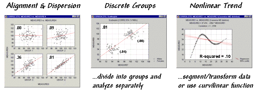
The examples in figure 4.15 match several scatterplots with their R-squared values. The inset on the left shows four scatterplots with increasing correlation (tighter linear alignment in the data clouds). The middle inset depicts data forming two distinct sub-groups. In this instance the high R-squared of .81 is misleading. When the data groups are analyzed separately, the individual R-squared values are much weaker (.00 and .04). The inset on the right is an example of a data pattern that exhibits low linear correlation, but has a strong curvilinear relationship. Unfortunately, dealing with nonlinear patterns is difficult even for the statistically adept. If the curve is continuously increasing or decreasing, you might try a logarithmic transform; if you can identify the specific function, use it as the line to fit; or, if all else fails, break the curve into segments that are better approximated by a series of straight lines.
Regression analysis extends the concept of correlation by focusing on the best-fitted line (solid red line in the examples). The equation of the line serves as a predictive model, while its correlation indicates how good the data fit the model.
In the case of potassium data described last month, the regression equation is Map2(estimated) = 28.04 + 0.572 * Map1, with an R-squared value of .52. That means if you measure a potassium level of 500 in the topsoil (Map1) expect to find about 314 in the root zone (Map2)¾ 28.04 + 0.572 * 500 = 314.04. But how good is that guess in the real world?
|
|
|
Figure 4.16. Results of applying the predictive model identified in Figure 4.11. |
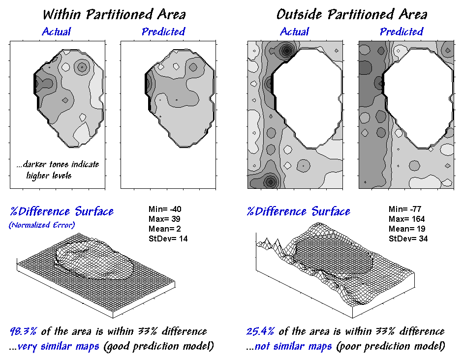
One way to evaluate the model is to "play-it-back" using the original data. The left-side of figure 4.16 shows the results for the partitioned area's data used to build the model. As you would hope, the predicted surface is very similar to the actual data with an average error of only 2% and over 98% of the area within 33% difference.
Model validation involves testing the
prediction model on another set of data. When applied outside the partition it
didn't fair as well—an average error of 19% and only 25% of the area within 33%
difference. The difference surface shows you that the model is pretty good in
most places but really blows it along the western edge (big ridge of over
estimation) and part of the northern edge (big depression of under estimation).
Maybe those areas should be partitioned and separate prediction models
developed for them… or maybe your patience has ebbed?
Note: See appendix A part 4, "Excel Worksheet Investigating Map Correlation and Prediction Models," for a workbook containing the equations and computations supporting discussion in this and the preceding section.
Comparing Maps (return to top of Topic
4)
You have probably seen and heard the
following scenario a thousand times: A speaker waves a laser pointer at a
couple of maps and says, "See how similar the patterns are." But what
determines similarity? Is it a few similarly shaped globs that appear in the
same general area? Do all the globs have to align? Do display factors, such as
color selection, number of classes and thematic break points, affect perceived
similarity? What about areas which don't align?
Like abstract art, patterns formed by map features are subjective. The power of
suggestion plays an important role, and the old adage, "I wouldn't have
seen it if I hadn't believed it," often holds. Suggestion can influence
map interpretation, but it dominates visual map comparison.
So how can people objectively assess map similarity? Like most things GIS, it's
in the numbers. Consider the three maps on the right side of figure 4.17. Are
they similar? Is the top map more similar to the middle or bottom map? If so,
how much more similar?
|
|
|
Figure 4.17. Coincidence Summary and Proximal Alignment can be used to
assess |
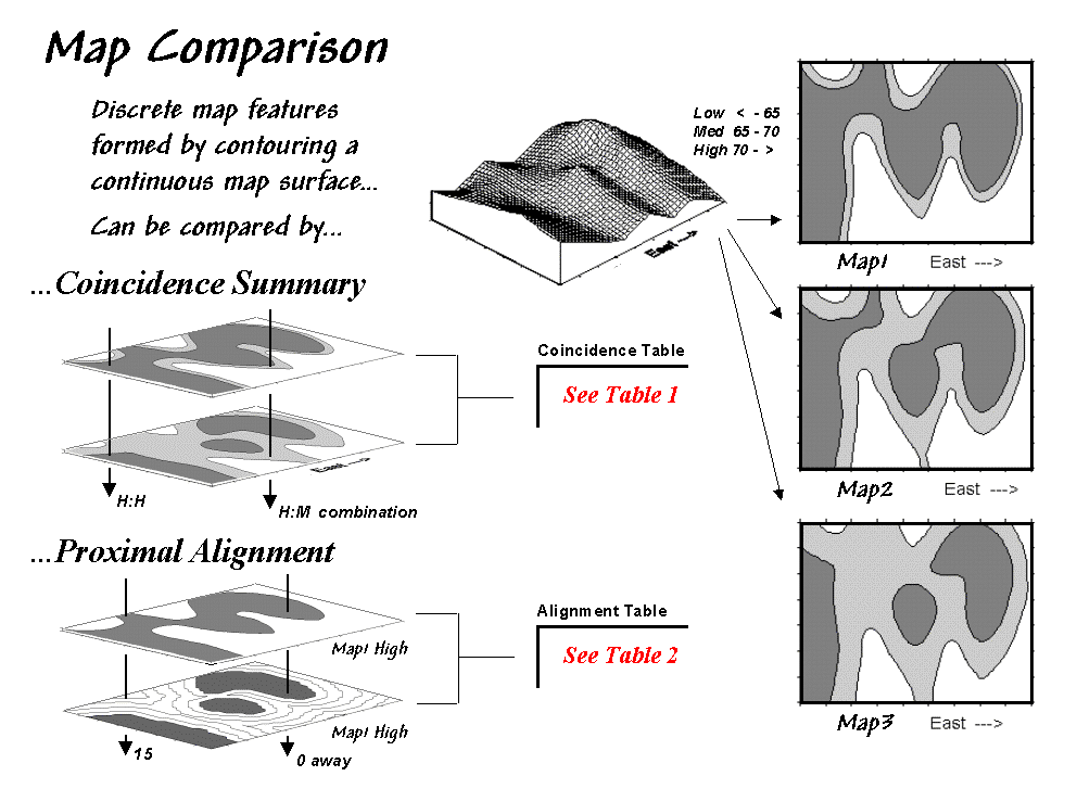
Actually, the three maps were derived from
the same map surface. The top map identifies low response (lightest tone) as
values less than 65, medium response as values 65 through 70 and high response
as values greater than 70 (darkest tone). The middle map extends the mid-range
to 62.5 through 72.5, and the bottom map increases the mid-range further to 60
through 75. In reality, all three maps are supposed to be tracking the same
spatial variable. But the categorized renderings appear radically different. Or
are they surprisingly similar?
One way to find out is to overlay the maps and note where classifications are
the same and where they're different. At one extreme, the maps could perfectly
coincide with the same conditions everywhere (identical). At the other extreme,
conditions may be different everywhere. Somewhere in between extremes, the high
and low areas could be swapped and the pattern inverted (similar but opposite).
Coincidence summary generates a cross-tabular listing of map
intersections. In vector analysis, maps can be "topologically"
overlaid, and areas of that result in "son/daughter" polygons can be
aggregated by joint condition. Another approach establishes a systematic or
random set of points that uses a "point in polygon" overlay to identify/summarize
map conditions.
Raster analysis uses a similar approach, but it counts the number of cells
within each category combination as depicted by the arrows in the figure. In
the example, a 39-by-50 grid was used to generate a comprehensive sample set of
1,950 locations (cells). Table 4.1 reports the coincidence summaries for the
top map with the middle and bottom maps. The highlighted counts along the
diagonals report the number of cells with the same classification on each map.
Off-diagonal counts indicate disagreement, and the percent values in
parentheses report relative coincidence.
|
Table 4.1. Coincidence Summary. |
|
|
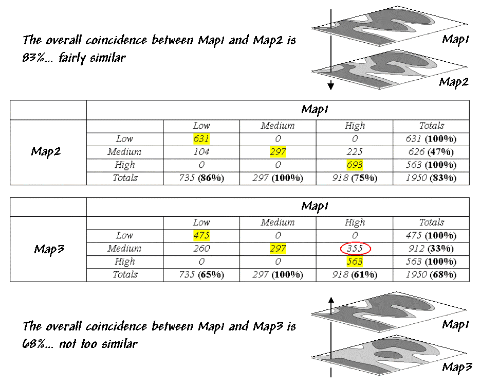
For example, 100% in the first row indicates
that "Low" areas on the middle map coincide with "Low"
areas on the top map. The 86% in the first column, however, notes that not all
"Low" areas on the top map are classified the same as those on the
middle map. The table's lower portion summarizes the coincidence between the
top and middle maps.
So what do the numbers mean (in "user-speak"). First, the
"overall" coincidence
percentage in the lower-right corner
gives users a general idea of how well the maps match; 83% is fairly similar,
and 68% is less similar. Inspection of individual percentages shows users which
categories are lining up.
A perfect match would have 100% for each
percentage, while a complete mismatch would have 0%. Simple coincidence summary,
however, just tells whether things are the same or different. One extension
considers the thematic difference, noting the disparity in mismatched
categories with a "Low/High" combination considered less similar than
a "Low/Medium" match.
Another procedure investigates spatial difference (as shown in table 4.2). The
technique, termed proximal
alignment, isolates one map category
(e.g., the dark-toned areas on the bottom map) and then generates its proximity
map. Proximity values are "masked" for corresponding features on
the other map (e.g., enlarged dark-toned area on the top map). The highlighted
area on the Masked Proximity Map identifies the locations of greatest
misalignment. The relative occurrence is summarized in the lower portion of the
tabular listing.
|
Table 4.2. Proximal Alignment. |
|
|
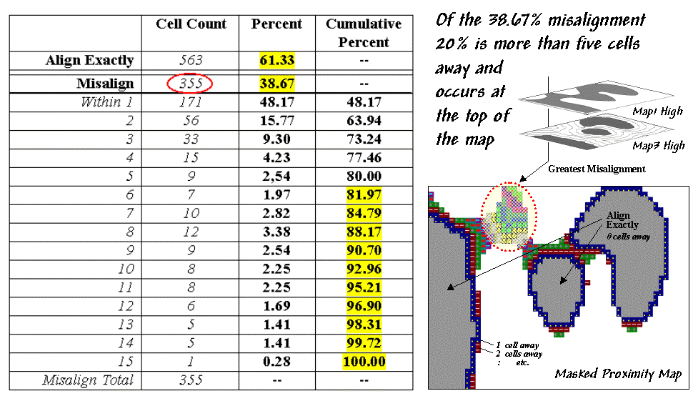
But what does all this mean (in user-speak)?
First, note that 20% of the total mismatches occur more than five cells away
from the nearest corresponding feature, thereby indicating fairly poor overall
alignment. A simple measure of misalignment can be calculated by weight
averaging the proximity information ((1*171 + 2*56 + ...etc.) / 355 = 3.28).
Perfect alignment would result in zero, with larger values indicating
increasing misalignment. Considering the dimensionality of the grid (39 by 50),
a generalized proximal alignment index can be calculated [(3.28 /
(39*50)*0.5 = 0.074].
What's the bottom line? If you're a GIS software provider, you should include
in your next product a "big button" for comparing maps. If you're a
GIS user, you should report coincidence percentages and alignment indices
before passing comparative judgment. If you're a laser-waving presenter, your
days are numbered.
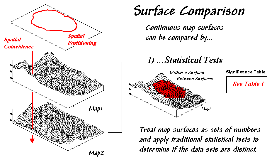
Comparing Map Surfaces: Part I (return to top of Topic 4)
The previous section identified a couple of techniques for comparing maps composed of discrete map "objects"¾ Coincidence Summary and Proximal Alignment. Comparing map "surfaces" involves similar approaches, but employs different techniques taking advantage of the more robust nature of continuous data.
Consider the two map surfaces shown on the left side of figure 4.18. Are they similar, or different? Where are they more similar or different? Where's the greatest difference? How would you know? In visual comparison, your eye looks back-and-forth between the two surfaces attempting to compare the relative "heights" at corresponding locations on the map. After about ten of these eye-flickers your patience wears thin and you form a hedged opinion¾ "not too similar."
|
|
|
Figure 4.18. Comparing Map Surfaces. |
In the computer, the relative
"heights" are stored as individual map values (in this case, 1380
numbers in an analysis grid of 46 rows by 30 columns). One thought might be to
use statistical
tests to analyze whether the data
sets are "significantly different," thereby implying that the maps
are as well.
Since map surfaces are just a bunch of
spatially registered numbers, the sets of data can be compared by spatial
coincidence (comparing corresponding values on two maps) and spatial
partitioning (dividing the mapped data into subsets, then comparing the
partitioned areas within one surface or between two surfaces).
In this approach, GIS is used to
"package" the data and pass it to standard statistical procedures for
analysis of differences within and between data groups. The packaging can be
done in a variety of ways including systematic/random sampling, specified
management zones, or inferred spatial groupings.
|
Table 4.3. Statistical Tests |
|
|
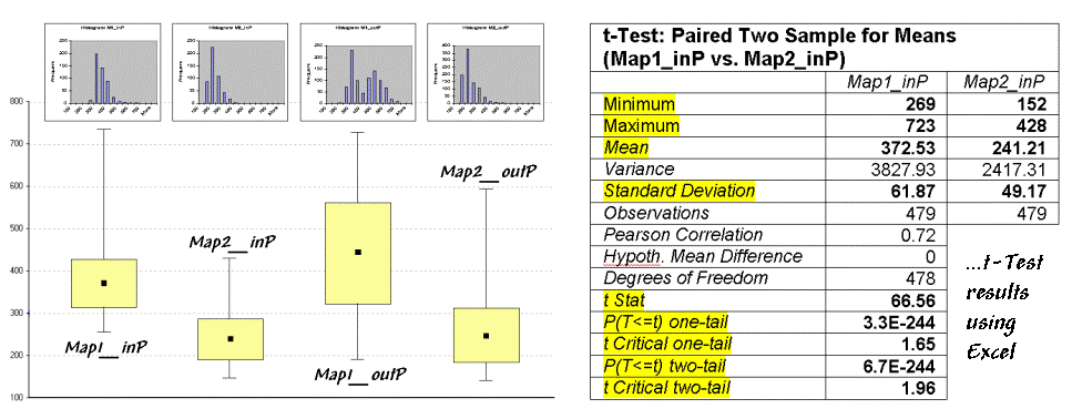
For example, a farmer could test whether
there is a significant difference in the topsoil versus substrata potassium
levels for a portion of a field. This case is depicted in figure 4.19 (Map1 =
topsoil; Map2 = substrata potassium) and summarized in table 4.3. The dark red
area on the surface plot in the figure locates the partitioned area in the
field. The "box-and-whisker" plots in the table identify the mean
(dot), +/- standard deviation (shaded box) and min/max values (whiskers) for
each of the four data sets (Map1_in&out and Map2_in&out of the partition).
Generally speaking, if the boxes tend to align there isn't much of a difference
between data groups (e.g., Map2_inP and Map2_outP surfaces). If they don't
align (e.g., Map1_inP and Map2_inP surfaces), there is a significant
difference.
The most commonly used statistical method for
evaluating the differences in the means of two data groups is the t-test.
The right side of table 4.3 shows the results of a t-test comparing
the partitioned data between Map1_inP and Map2_inP (the first and second
box-whisker plots).
While a full explanation of statistical tests
is beyond the scope of this discussion, it's relative safe to say the larger
the "t stat" value the greater the difference between two
data groups. The values for the "one- and two-tail" tests at the
bottom of the table suggest that "the means of the two groups appear
distinct and there is little chance that there is no difference between the
groups."
As with all things statistical, there's a lot
of preconditions that need to be met before a t-test is appropriate¾ the data must be independent and normally distributed with similar
variance. The problem is that these conditions rarely hold for mapped data.
While the t-test example might serve as a reasonable instance of
"blindly applying" non-spatial, statistical tests to mapped data, it
suggests this approach isn't such a good idea (see author's note below).
The "box-and-whisker" plots provide useful pictures of data distributions and allow you to eyeball the overall differences among a set of map surfaces. The "t stat" provides a useful though somewhat shaky index relating two data groups but seldom provides a reliable test like it does in traditional, non-spatial statistics. The next section investigates a couple of techniques that are more in tune with the spatial context of mapped data… bet'ya can't wait.
Note: See appendix A, part 4, for an extended discussion on the "Validity of Using Statistical Tests with Mapped Data," by William Huber.
Comparing Map Surfaces: Part II (return to top of Topic 4)
Statistical tests attempt to determine the
overall difference between map surfaces. Generally speaking, the approach
provides some useful insight but because of the nature of mapped data falls
short of definitive testing. In addition, statistical tests ignore the explicit
spatial context of the data.
|
|
|
Figure 4.19. Approaches to Map Surface Comparison. |
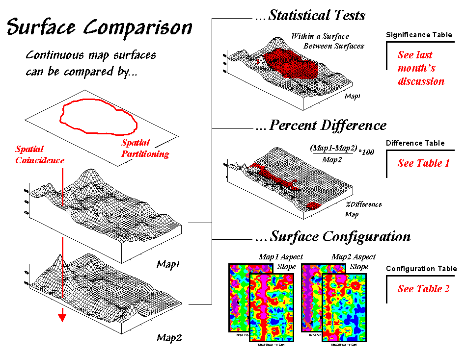
These limitations set the stage for another
couple of approaches-- percent difference and surface configuration (see fig.
4.19). Comparison using percent difference directly
capitalizes on the spatial coincidence between map surfaces. It simply
"goes" to each grid location and compares the corresponding values.
Table 4.4 shows a categorized rendering and
tabular summary of the percent difference between the Map1 and Map2 surfaces.
Note that the average difference is fairly large (76% +/- 49%SD). Two identical
surfaces, on the other hand, would compute to 0% average difference with +/- 0%
standard deviation thereby establishing a benchmark with increasing percent
difference indicating greater difference between surfaces.
|
Table 4.4. Percent Difference |
|
|
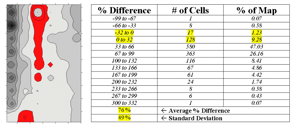
The dark red areas along the center
"crease" of the map correspond to the highlighted rows in the table
identifying areas within +/- 33 percent difference (moderate). That conjures up
the "thirds rule of thumb" for comparing map surfaces¾ if two-thirds of the map area is within one-third (33 percent)
difference, the surfaces are fairly similar; if less than one-third of the area
is within one-third difference, the surfaces are fairly different¾ generally speaking that is. In this case only about 11% of the area
meets the criteria so the surfaces are "considerably" different.
Another approach termed surface configuration, focuses on the differences in the localized trends
between two map surfaces instead of the individual values. Like you, the
computer can "see" the bumps in the surfaces, but it does it with a
couple of derived maps. A slope map indicates the relative steepness while an
aspect map denotes the orientation of locations along the surface. You see a
big bump; it sees an area with large slope values at several aspects. You see a
ridge; it sees an area with large slope values at a single aspect.
So how does the computer see differences in
the "lumpy-bumpy" configurations of two map surfaces? Per usual, it
involves map-ematical analysis, but in this case some fairly ugly trigonometry
is employed. Conceptually speaking, the immediate neighborhood around each grid
location identifies a small plane with steepness and orientation defined by the
slope and aspect maps. The mathematician simply solves for the normalized
difference in slope and aspect angles between the two planes (see the
"Warning" box and author's note below).
For the rest of us, it makes sense that a location that's flat on one map and vertical on the other (Slope_Diff = 90 degrees) with diametrically opposed orientations (Aspect_Diff = 180 degrees) are as different as different can get. Zero differences for both, on the other hand, are as similar as things can get (exactly the same slope and aspect). All other slope/aspect differences fall some where in between on a scale of 0-100.
|
Table 4.5. Surface Configuration |
|
|
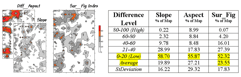
The two superimposed maps at the left side of
table 4.5 show the normalized differences in the slope and aspect angles (dark
red being very different). The map of the overall differences in surface
configuration (Sur_Fig) is the average of the two maps. Note that over half of
the map area is classified as low difference (0-20) suggesting that the
"lumpy-bumpy" areas align fairly well overall. The greatest differences
in surface configuration appear in the northwest portion.
Does all this analysis square with your visual inspection of the Map1 and Map2 surfaces in figure 4.18? Sort of big differences in the relative values (surface height comparison summarized by percent difference analysis) with smaller differences in surface shape (bumpiness comparison summarized by surface configuration analysis). Or am I unfairly leading the "visually malleable" with quantitative analysis that lacks the comfort, artistry and subjective interpretation of laser-waving map comparison?
Note: See appendix A, part 4, "Excel Worksheet Investigating Map Surface Comparison" for an Excel workbook containing the equations and computations leading to the t-test, percent difference and surface configuration analyses.
|
Warning This "secret-decoder message" identifies the calculation steps
(in Excel) leading to the Surface Configuration Index (Sur_Fig) as reported
in Table 4.6. It is only for those whose trigonometry hasn't expired
(techy-types): 1) Calculate the
"normalized" difference in slope: 2) Calculate the
"normalized" difference in azimuth: 3) Calculate the average
"normalized" differences in slope & azimuth (Optional) Interesting
"thought problems"… Acknowledgement: the math is based on recent communication with the author's doctoral advisor of 25 years ago (some grad students never seem to quite get it, nor go away)... Dr. James A. Smith of NASA Goddard Space Flight Center. |
On-Farm Testing (return to top of Topic 4)
To be completed.