This is an original DRAFT (12/2005) of a book chapter
edited and published in…
Manual of Geographic Information
Systems,
edited
by Marguerite Madden, 2009
American Society for Photogrammetry,
Bethesda, Maryland, USA
Section 5, Chapter 29, pages 527-585; ISBN
1-57083-086-X
|
|
This book chapter is
based on selected Beyond Mapping
columns by Joseph K. Berry published in GeoWorld magazine from 1996 through 2007. It is intended
to be used as a self-instructional text or in support of formal academic
courses for study of grid-based map analysis and |

Click here for a
printer-friendly version (.pdf)
___________________________
Joseph K. Berry, W.M.
Keck Visiting Scholar in Geosciences
Geography Department,
University of Denver
2050 East Iliff Avenue, Denver, Colorado 80208-0183
Email jkberry@du.edu; Phone 970-215-0825
Table of Contents
(with
Hyperlinks)
________________________________
GIS Modeling and
Analysis
Joseph K. Berry
W.M. Keck Visiting Scholar in Geosciences
Geography Department, University of Denver, 2050 East Iliff Avenue
Denver, Colorado
80208-0183
Email jkberry@du.edu; Phone 970-215-0825
1.0 Introduction
Although
The early 1970s saw Computer Mapping automate the cartographic process. The points, lines and areas defining geographic
features on a map were represented as organized sets of X,Y
coordinates. In turn these data form
input to a pen plotter that can rapidly update and redraw the connections at a
variety of scales and projections. The
map image, itself, is the focus of this processing.
The early 1980s exploited the change in the format and the computer environment
of mapped data. Spatial Database Management Systems were developed that link
computer mapping techniques to traditional database capabilities. The demand for spatially and thematically
linked data focused attention on data issues.
The result was an integrated processing environment addressing a wide
variety of mapped data and digital map products.
During the 1990s a resurgence of attention
was focused on analytical operations and a comprehensive theory of spatial
analysis began to emerge. This
"map-ematical" processing involves spatial
statistics and spatial analysis. Spatial statistics has been used by
geophysicists and climatologists since the 1950s to characterize the geographic
distribution, or pattern, of mapped data.
The statistics describe the spatial variation in the data, rather than
assuming a typical response occurs everywhere within a project area.
Spatial analysis, on the other hand,
expresses a geographic relationships as a series of
map analysis steps, leading to a solution map in a manner analogous to basic
algebra. Most of the traditional
mathematical capabilities, plus an extensive set of advanced map analysis
operations, are available in contemporary
Several sections and chapters in this manual
address specific analytical and statistical techniques in more detail, as well
as comprehensively describing additional modeling applications. In addition, the online book, Map
Analysis: Procedures and Applications in
1.1 Mapping to Analysis of
Mapped Data
The
evolution (or is it a revolution?) of
Figure
1.1-1 identifies two key trends in the movement from mapping to map
analysis. Traditional
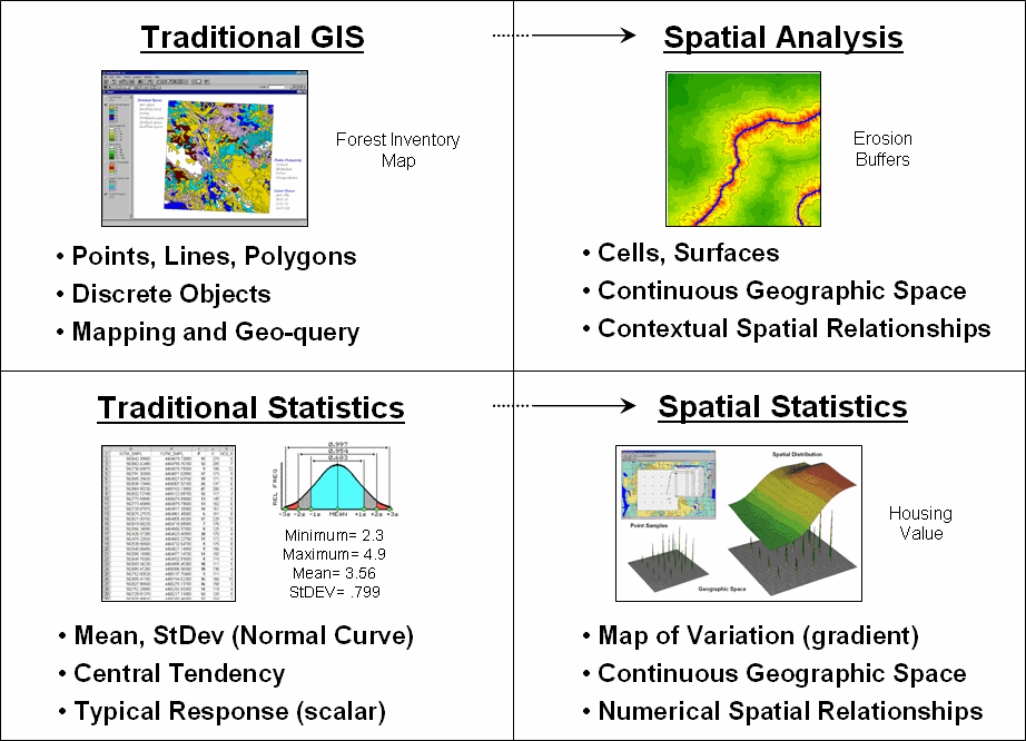
Figure 1.1-1. Spatial Analysis and
Spatial Statistics are extensions of traditional ways of analyzing mapped data.
Spatial Analysis extends the basic set of discrete map
features of points, lines and polygons to map “surfaces” that represent
continuous geographic space as a set of contiguous grid cell values. The consistency of this grid-based
structuring provides the foothold for a wealth of new analytical tools for
characterizing “contextual spatial relationships,” such as identifying the
visual exposure of an entire road network.
In
addition, it provides a mathematical/statistical framework by numerically
representing geographic space. Traditional Statistics is inherently
non-spatial as it seeks to represent a data set by its typical response
regardless of spatial patterns. The
mean, standard deviation and other statistics are computed to describe the
central tendency of the data in abstract numerical space without regard to the
relative positioning of the data in real-world geographic space.
Spatial Statistics, on the other hand, extends
traditional statistics on two fronts.
First, it seeks to map the variation in a data set to show where unusual
responses occur, instead of focusing on a single typical response. Secondly, it can uncover “numerical spatial
relationships” within and among mapped data layers, such as generating a
prediction map identifying where likely customers are within a city based on
existing sales and demographic information.
1.2 Vector-based Mapping versus
Grid-based Analysis
The
close conceptual link of vector-based desktop mapping to manual mapping and
traditional database management has fueled its rapid adoption. In many ways, a database is just picture
waiting to happen. The direct link
between attributes described as database records and their spatial
characterization is easy to conceptualize.
Geo-query enables clicking on a map to pop-up the attribute record for a
location or searching a database then plotting all of the records meeting the
query. Increasing data availability and
Internet access, coupled with decreasing desktop mapping system costs and
complexity, make the adoption of spatial database technology a practical reality.
Maps
in their traditional form of points, lines and polygons identifying discrete
spatial objects align with manual mapping concepts and experiences. Grid-based maps, on the other hand, represent
a different paradigm of geographic space that opens entirely new ways to address
complex issues. Whereas traditional vector
maps emphasize ‘precise placement of physical features,’ grid maps seek to
‘analytically characterize continuous geographic space in both real and
cognitive terms.’
2.0 Fundamental
Map Analysis Approaches
The tools for
mapping database attributes can be extended to analysis of spatial
relationships within and among mapped data layers. Two broad classes of capabilities form this
extension—spatial statistics and spatial analysis.
2.1 Spatial Statistics
Spatial
statistics can be grouped into two broad camps—surface modeling and spatial
data mining. Surface modeling involves the translation of discrete point data
into a continuous surface that represents the geographic distribution of the
data. Traditional non-spatial statistics
involves an analogous process when a numerical distribution (e.g., standard
normal curve) is used to generalize the central tendency of a data set. The derived average and standard deviation
reflects the typical response and provides a measure of how typical it is. This characterization seeks to explain data
variation in terms of the numerical distribution of measurements without
reference to the data’s geographic distribution and patterns.
In
fact, an underlying assumption in most traditional statistical analyses is that
the data is randomly or uniformly distributed in geographic space. If the data exhibits a geographic pattern
(termed spatial autocorrelation) many of the non-spatial analysis techniques
are less valid. Spatial statistics, on
the other hand, utilizes inherent geographic patterns to further explain the
variation in a set of sample data.
There
are numerous techniques for characterizing the spatial distribution inherent in
a data set but they can be categorized into four basic approaches:
- Point Density mapping that aggregates the number of
points within a specified distance (number per acre),
- Spatial Interpolation that weight-averages measurements
within a localized area (e.g., Kriging), and
- Map Generalization that fits a functional form to the
entire data set (e.g., polynomial surface fitting).
- Geometric Facets that
construct a map surface by tessellation
(e.g., fitting a Triangular Irregular Network of facets to the sample data).
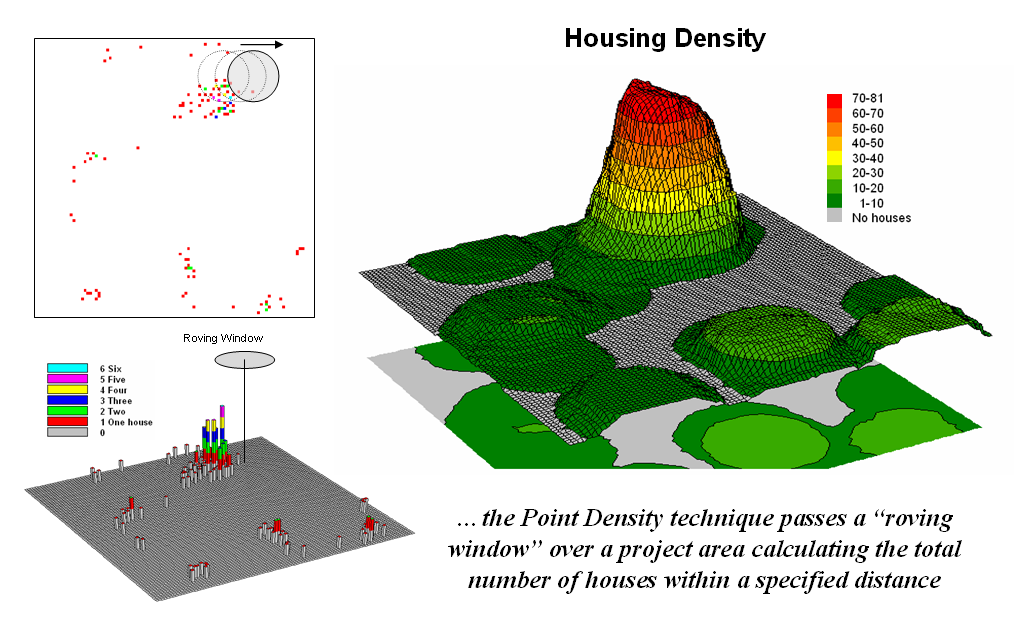
Figure
2.1-1. Calculating the total number of
houses within a specified distance of each map location generates a housing
density surface.
For
example, consider figure 2.1-1 showing a point density map derived from a map
identifying housing locations. The
project area is divided into an analysis frame of 30-meter grid cells (100 columns
x 100 rows = 10,000 grid cells). The
number of houses for each grid space is identified in left portion of the
figure as colored dots in the 2D map and “spikes” in the 3D map.
A
neighborhood summary operation is used to pass a “roving window” over the
project area calculating the total number of houses within a quarter-mile of
each map location. The result is a
continuous map surface indicating the relative density of houses—‘peaks’ where
there is a lot of nearby houses and ‘valleys’ where there are few or none. In essence, the map surface quantifies what
your eye sees in the spiked map—some locations with lots of houses and others
with very few.
While
surface modeling is used to derive continuous surfaces, spatial data mining seeks to uncover numerical relationships within
and among mapped data. Some of the
techniques include coincidence summary, proximal alignment, statistical tests,
percent difference, surface configuration, level-slicing, and clustering that
is used in comparing maps and assessing similarities in data patterns.
Another group of spatial data mining
techniques focuses on developing predictive models. For example, one of the earliest uses of
predictive modeling was in extending a test market project for a phone company
(figure 2.1-2). Customers’ address were
used to “geo-code” map coordinates for sales of a new product enabling
distinctly different rings to be assigned to a single phone line—one for the
kids and one for the parents. Like
pushpins on a map, the pattern of sales throughout the test market area emerged
with some areas doing very well, while other areas sales were few and far
between.
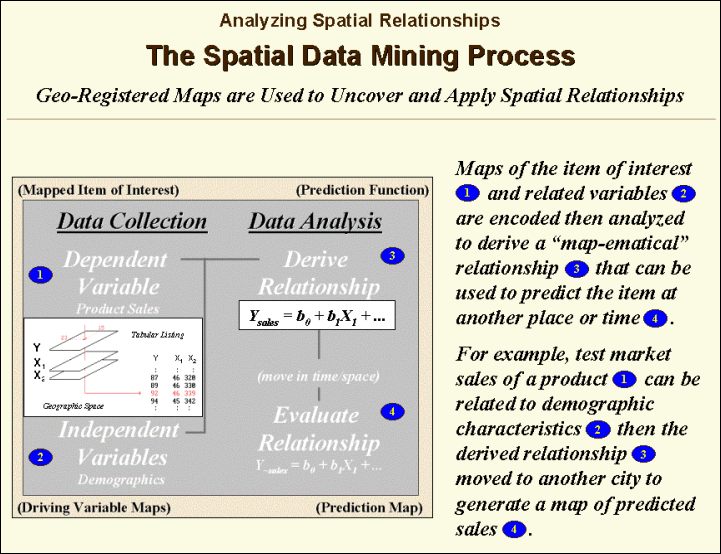
Figure 2.1-2. Spatial Data Mining
techniques can be used to derive predictive models of the relationships among
mapped data.
The demographic data for the city was
analyzed to calculate a prediction equation between product sales and census
block data. The prediction equation
derived from the test market sales was applied to another city by evaluating
exiting demographics to “solve the equation” for a predicted sales map. In turn the predicted map was combined with a
wire-exchange map to identify switching facilities that required upgrading
before release of the product in the new city.
2.2 Spatial Analysis
Whereas spatial data mining responds to
‘numerical’ relationships in mapped data, spatial
analysis investigates the ‘contextual’ relationships. Tools such as slope/aspect, buffers,
effective proximity, optimal path, visual exposure and shape analysis, fall
into this class of spatial operators.
Rather than statistical analysis of mapped data, these techniques
examine geographic patterns, vicinity characteristics and connectivity among
features.
One of the most frequently used map analysis
techniques is Suitability Modeling. These applications seek to map the relative
appropriateness of map locations for particular uses. For example, a map of the best locations for
a campground might be modeled by preferences for being on gentle slopes, near
roads, near water, good views of water and a southerly aspect.
These spatial criteria can be organized into
a flowchart of processing (see figure 2.2-1) where boxes identify maps and
lines identify map analysis operations.
Note that the rows of the flowchart identify decision criteria with
boxes representing maps and lines representing map analysis operations. For example, the top row evaluates the
preference to locate the campground on gentle slopes.
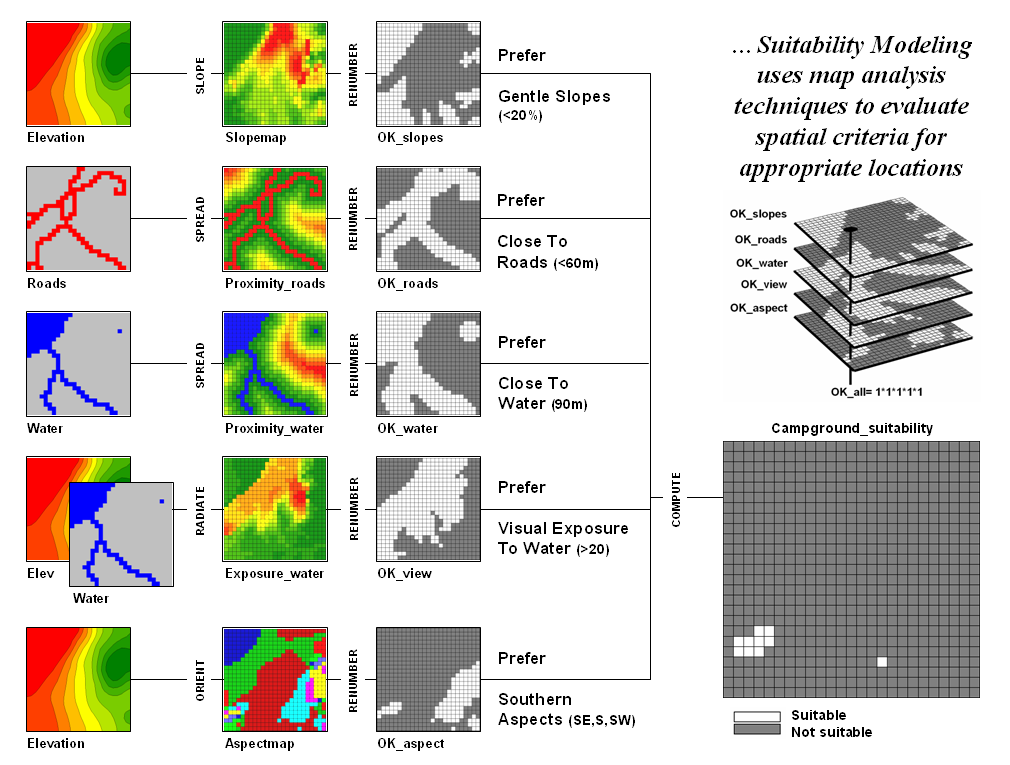
Figure 2.2-1. Map Analysis
techniques can be used to identify suitable places for a management activity.
The first step calculates a slope map from
the base map of elevation by entering the command—
SLOPE Elevation Fitted FOR Slopemap
The derived slope values are then
reclassified to identify locations of acceptable slopes by assigning 1 to
slopes from 0 to 20 percent—
RENUMBER Slopemap
ASSIGNING 1 TO 0 THRU 20
ASSIGNING 0 TO 20 THRU 1000 FOR OK_slope
—and assigning 0 to unacceptably steep slopes
that are greater than 20 percent.
In a similar manner, the other criteria are
evaluated and represented by maps with a value of 1 assigned to acceptable
areas (white) and 0 assigned to unacceptable areas (dark grey). The individual preference maps are combined
by entering the command—
CALCULATE OK_slope
* OK_road * OK_water * OK_view * OK_aspect
FOR Campground_suitability
The map analysis procedure depicted in figure
2.2-1 simply substitutes values of 1 and 0 for suitable and non-suitable
areas. The multiplication of the digital
preference maps simulates stacking manual map overlays on a light-table. A location that computes to 1 (1*1*1*1*1= 1)
corresponds to acceptable. Any numeric
pattern with the value 0 will result in a product of 0 indicating an
unacceptable area.
While some map analysis techniques are rooted
in manual map processing, most are departures from traditional procedures. For example, the calculation of slope is much
more exacting than ocular estimates of contour line spacing. And the calculation of visual exposure to
water presents a completely new and useful concept in natural resources
planning. Other procedures, such as
optimal path routing, landscape fragmentation indices and variable-width
buffers, offer a valuable new toolbox of analytical capabilities.
3.0 Data
Structure Implications
Points,
lines and polygons have long been used to depict map features. With the stroke of a pen a cartographer could
outline a continent, delineate a road or identify a specific building’s
location. With the advent of the
computer, manual drafting of these data has been replaced by stored coordinates
and the cold steel of the plotter.
In
digital form these spatial data have been linked to attribute tables that
describe characteristics and conditions of the map features. Desktop mapping exploits this linkage to
provide tremendously useful database management procedures, such as address
matching and driving directions from you house to a store along an organized
set of city street line segments. Vector-based data forms the foundation
of these processing techniques and directly builds on our historical
perspective of maps and map analysis.
Grid-based data, on the other hand, is a
relatively new way to describe geographic space and its relationships. At the heart of this digital format is a new
map feature that extends traditional points, lines and polygons (discrete
objects) to continuous map surfaces.
The
rolling hills and valleys in our everyday world is a good example of a
geographic surface. The elevation values
constantly change as you move from one place to another forming a continuous
spatial gradient. The left-side of
figure 3.0-1 shows the grid data structure and a sub-set of values used to
depict the terrain surface shown on the right-side. Note that the shaded zones ignore the subtle
elevation differences within the contour polygons (vector representation).
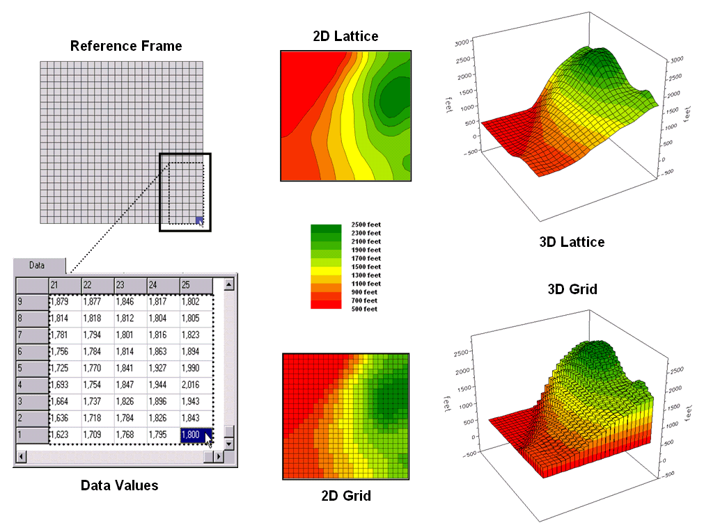
Figure 3.0-1. Grid-based data can be displayed in 2D/3D
lattice or grid forms.
Grid
data are stored as a continuous organized set of values in a matrix that is geo-registered
over the terrain. Each grid cell
identifies a specific location and contains a map value representing its
average elevation. For example, the grid
cell in the lower-right corner of the map is 1800 feet above sea level (falling
within the 1700 to 1900 contour interval).
The relative heights of surrounding elevation values characterize the
subtle changes of the undulating terrain of the area.
3.1 Grid Data Organization
Map
features in a vector-based mapping system identify discrete, irregular spatial
objects with sharp abrupt boundaries.
Other data types—raster images and raster grids—treat space in entirely
different manner forming a spatially continuous data structure.
For
example, a raster image is composed
of thousands of ‘pixels’ (picture elements) that are analogous to the dots on a
computer screen. In a geo-registered
B&W aerial photo, the dots are assigned a grayscale color from black (no
reflected light) to white (lots of reflected light). The eye interprets the patterns of gray as
forming the forests, fields, buildings and roads of the actual landscape. While raster maps contain tremendous amounts
of information that are easily “seen” and computer classified using remote
sensing software, the data values reference color codes reflecting
electromagnetic response that are too limited to support the full suite of map
analysis operations involving relationships within and among maps.
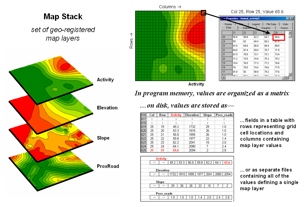
Figure 3.1-1. A map stack of individual grid layers can be
stored as separate files or in a multi-grid table.
Raster grids, on the other hand, contain a robust
range of values and organizational structure amenable to map analysis and
modeling. As depicted on the left side
of figure 3.1-1, this organization enables the computer to identify any or all
of the data for a particular location by simply accessing the values for a
given column/row position (spatial coincidence used in point-by-point overlay
operations). Similarly, the immediate or
extended neighborhood around a point can be readily accessed by selecting the
values at neighboring column/row positions (zonal groupings used in region-wide
overlay operations). The relative
proximity of one location to any other location is calculated by considering
the respective column/row positions of two or more locations (proximal
relationships used in distance and connectivity operations).
There
are two fundamental approaches in storing grid-based data—individual “flat”
files and “multiple-grid” tables (right side of figure 3.1-1). Flat files store map values as one long list,
most often starting with the upper-left cell, then sequenced left to right
along rows ordered from top to bottom.
Multi-grid tables have a similar ordering of values but contain the data
for many maps as separate field in a single table.
Generally
speaking the flat file organization is best for applications that create and
delete a lot of maps during processing as table maintenance can affect
performance. However, a multi-gird table
structure has inherent efficiencies useful in relatively non-dynamic
applications. In either case, the
implicit ordering of the grid cells over continuous geographic space provides
the topological structure required for advanced map analysis.
3.2 Grid Data Types
Understanding
that a digital map is first and foremost an organized set of numbers is
fundamental to analyzing mapped data.
The location of map features are translated into computer form as
organized sets of X,Y coordinates (vector) or grid
cells (raster). Considerable attention
is given data structure considerations and their relative advantages in storage
efficiency and system performance.
However
this geo-centric view rarely explains the full nature of digital maps. For example, consider the numbers themselves
that comprise the X,Y coordinates—how does number type
and size effect precision? A general
feel for the precision ingrained in a “single precision floating point”
representation of Latitude/Longitude in decimal degrees is—
1.31477E+08 ft = equatorial
circumference of the earth
1.31477E+08 ft / 360 degrees = 365214
ft per degree of Longitude
A
single precision number carries six decimal places, so—
365214
ft/degree * 0.000001= .365214 ft *12 = 4.38257 inch precision
In
analyzing mapped data however, the characteristics of the attribute values are
just as critical as precision in positioning.
While textual descriptions can be stored with map features they can only
be used in geo-query. Figure 3.2-1 lists
the data types by two important categories—numeric and geographic. Nominal
numbers do not imply ordering. A value
of 3 isn’t bigger, tastier or smellier than a 1, it is
just not a 1. In the figure these data
are schematically represented as scattered and independent pieces of wood.
Ordinal numbers, on the other hand, imply a
definite ordering and can be conceptualized as a ladder, however with varying
spaces between rungs. The numbers form a
progression, such as smallest to largest, but there isn’t a consistent
step. For example you might rank
different five different soil types by their relative crop productivity (1=
worst to 5= best) but it doesn’t mean that soil type 5 is exactly five times
more productive than soil type 1.
When
a constant step is applied, Interval
numbers result. For example, a 60o
Fahrenheit spring day is consistently/incrementally warmer than a 30o winter
day. In this case one “degree” forms a
consistent reference step analogous to typical ladder with uniform spacing
between rungs.
A
ratio number introduces yet another
condition—an absolute reference—that is analogous to a consistent footing or
starting point for the ladder, analogous to zero degrees Kelvin temperature
scale that defines when all molecular movement ceases. A final type of numeric data is termed Binary.
In this instance the value range is constrained to just two states, such
as forested/non-forested or suitable/not-suitable.
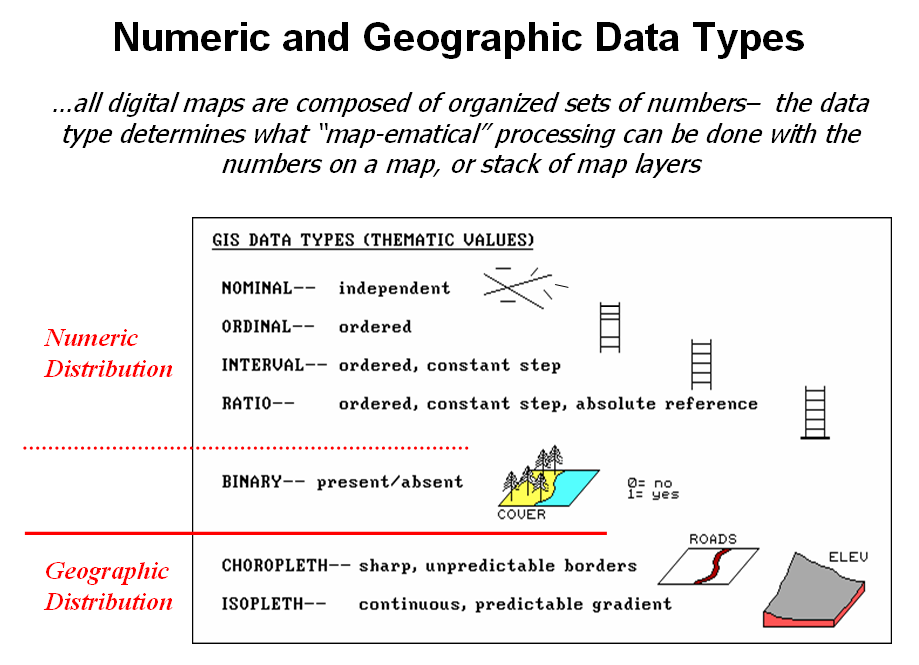
Figure 3.2-1. Map values are characterized from two broad
perspectives—numeric and geographic—then further refined by specific data
types.
So
what does all of this have to do with analyzing digital maps? The type of number dictates the variety of
analytical procedures that can be applied.
Nominal data, for example, do not support direct mathematical or statistical
analysis. Ordinal data support only a
limited set of statistical procedures, such as maximum and minimum. These two data types are often referred to as
Qualitative Data. Interval and ratio
data, on the other hand, support a full set mathematics and statistics and are
considered Quantitative Data. Binary
maps support special mathematical operators, such as .
The
geographic characteristics of the numbers are less familiar. From this perspective there are two types of
numbers. Choropleth numbers form sharp and unpredictable boundaries in space
such as the values on a road or cover type map.
Isopleth numbers, on the other
hand, form continuous and often predictable gradients in geographic space, such
as the values on an elevation or temperature surface.
Figure
3.2-2 puts it all together. Discrete
maps identify mapped data with independent numbers (nominal) forming sharp
abrupt boundaries (choropleth), such as a cover type map. Continuous maps contain a range of values
(ratio) that form spatial gradients (isopleth), such as an elevation
surface.
The
clean dichotomy of discrete/continuous is muddled by cross-over data such as
speed limits (ratio) assigned to the features on a road map (choropleth). Understanding the data type, both numerical
and geographic, is critical to applying appropriate analytical procedures and
construction of sound
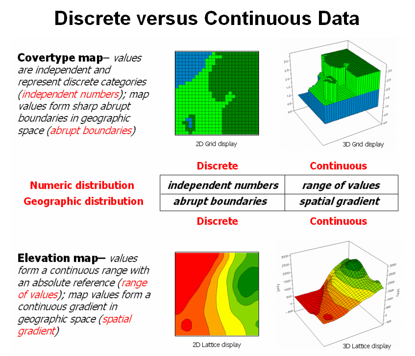
Figure 3.2-2. Discrete and Continuous map types combine the
numeric and geographic characteristics of mapped data.
3.3 Grid Data Display
Two
basic approaches can be used to display grid data— grid and lattice. The Grid
display form uses cells to convey surface configuration. The 2D version simply fills each cell with
the contour interval color, while the 3D version pushes up each cell to its relative
height. The Lattice display form uses lines to convey surface
configuration. The contour lines in the
2D version identify the breakpoints for equal intervals of increasing
elevation. In the 3D version the
intersections of the lines are “pushed-up” to the relative height of the
elevation value stored for each location.
Figure
3.3-1 shows how 3D plots are generated.
Placing the viewpoint at different look-angles and distances creates
different perspectives of the reference frame.
For a 3D grid display entire cells are pushed to the relative height of
their map values. The grid cells retain
their projected shape forming blocky extruded columns. The 3D lattice display pushes up each
intersection node to its relative height.
In doing so the four lines connected to it are stretched
proportionally. The result is a smooth
wire-frame that expands and contracts with the rolling hills and valleys.
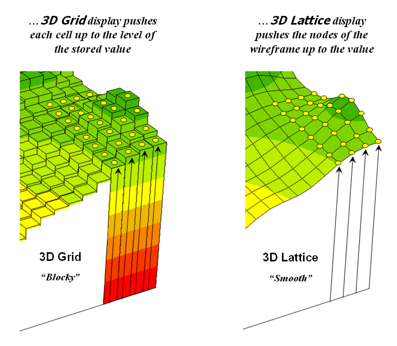
Figure 3.3-1. 3D display “pushes-up” the grid or lattice
reference frame to the relative height of the stored map values.
Generally
speaking, lattice displays create more pleasing maps and knock-your-socks-off
graphics when you spin and twist the plots.
However, grid displays provide a more honest picture of the underlying
mapped data—a chunky matrix of stored values.
In either case, one must recognize that a 3-D display is not the sole
province of elevation data. Often a
3-dimensional plot of data such as effective proximity is extremely useful in
understanding the subtle differences in distances.
3.4 Visualizing Grid Values
In
a
The
display tools are both a boon and a bane as they require minimal skills to use
but considerable thought and experience to use correctly. The interplay among map projection, scale,
resolution, shading and symbols can dramatically change a map’s appearance and
thereby the information it graphically conveys to the viewer.
While
this is true for the points, lines and areas comprising traditional maps, the
potential for cartographic effects are even more pronounced for contour maps of
surface data. For example, consider the
mapped data of animal activity levels from 0.0 to 85.2 animals in a 24-hour
period shown in figure 3.4-1. The map on
the left uses an Equal Ranges display
with contours derived by dividing the data range into nine equal steps. The flat area at the foot of the hill skews
the data distribution toward lower values.
The result is significantly more map locations contained in the lower
contour intervals— first interval from 0 to 9.5 = 39% of the map area. The spatial effect is portrayed by the
radically different areal extent of the contours.
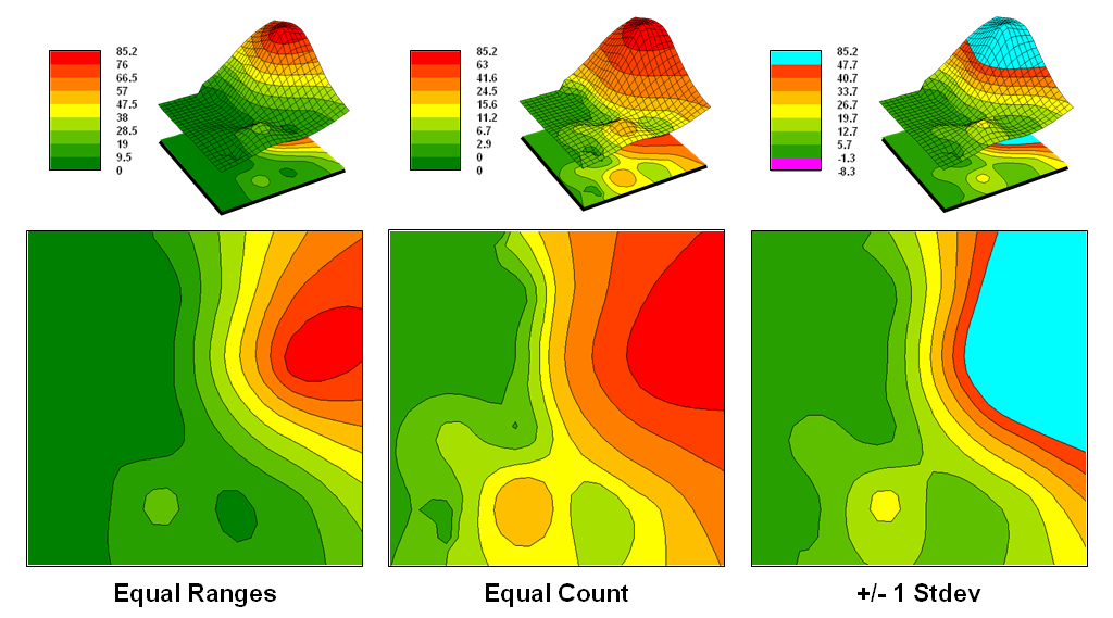
Figure 3.4-1. Comparison of different
2D contour displays using Equal ranges, Equal Count and +/-1 Standard deviation
contouring techniques.
The
middle map in the figure shows the same data displayed as Equal Counts with contours that divide the data range into intervals
that represent equal amounts of the total map area. Notice the unequal spacing of the breakpoints
in the data range but the balanced area of the color bands—the opposite effect
as equal ranges.
The
map on the right depicts yet another procedure for assigning contour
breaks. This approach divides the data
into groups based on the calculated mean and Standard Deviation. The
standard deviation is added to the mean to identify the breakpoint for the
upper contour interval and subtracted to set the lower interval. In this case, the lower breakpoint calculated
is below the actual minimum so no values are assigned to the first interval
(highly skewed data). In statistical
terms the low and high contours are termed the “tails” of the distribution and
locate data values that are outside the bulk of the data— identifying
“unusually” lower and higher values than you normally might expect. The other five contour intervals in the
middle are formed by equal ranges within the lower and upper contours. The result is a map display that highlights
areas of unusually low and high values and shows the bulk of the data as
gradient of increasing values.
The
bottom line of visual analysis is that the same surface data generated
dramatically different map products. All
three displays contain nine intervals but the methods of assigning the
breakpoints to the contours employ radically different approaches that generate
fundamentally different map displays.
So
which display is correct? Actually all
three displays are proper, they just reflect different perspectives of the same
data distribution—a bit of the art in the art and science of
4.0 Spatial
Statistics Techniques
As outlined in section 2.1, Spatial Statistics can be grouped into
two broad camps—surface modeling and spatial data mining. Surface
Modeling involves the translation of discrete point data into a continuous
surface that represents the geographic distribution of the data. Spatial
Data Mining, on the other hand, seeks to uncover numerical relationships
within and among sets of mapped data.
4.1 Surface Modeling
The
conversion of a set of point samples into its implied geographic distribution
involves several considerations—an understanding of the procedures themselves,
the underlying assumptions, techniques for benchmarking the derived map
surfaces and methods for assessing the results and characterizing
accuracy.
4.1.1 Point Samples to
Map Surfaces
Soil
sampling has long been at the core of agricultural research and practice. Traditionally point-sampled data were
analyzed by non-spatial statistics to identify the typical nutrient level
throughout an entire field. Considerable
effort was expended to determine the best single estimate and assess just how
good the average estimate was in typifying a field.
However
non-spatial techniques fail to make use of the geographic patterns inherent in
the data to refine the estimate—the typical level is assumed everywhere the
same within a field. The computed
standard deviation indicates just how good this assumption is—the larger the
standard deviation the less valid is the assumption “…everywhere the same.”
Surface Modeling utilizes the spatial patterns in a
data set to generate localized estimates throughout a field. Conceptually it maps the variance by using
geographic position to help explain the differences in the sample values. In practice, it simply fits a continuous
surface to the point data spikes as depicted in figure 4.1.1-1.
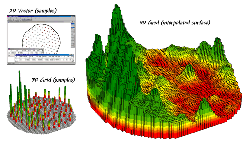
Figure 4.1.1-1. Spatial interpolation involves fitting a
continuous surface to sample points.
While
the extension from non-spatial to spatial statistics is quite a theoretical
leap, the practical steps are relatively easy.
The left side of the figure shows 2D and 3D point maps of phosphorous
soil samples collected throughout the field.
This highlights the primary difference from traditional soil
sampling—each sample must be geo-referenced
as it is collected. In addition, the sampling pattern and intensity are
often different than traditional grid sampling to maximize spatial information
within the data collected.
The
surface map on the right side of the figure depicts the continuous spatial
distribution derived from the point data.
Note that the high spikes in the left portion of the field and the
relatively low measurements in the center are translated into the peaks and
valleys of the surface map.
When
mapped, the traditional, non-spatial approach forms a flat plane (average
phosphorous level) aligned within the bright yellow zone. Its “…everywhere the same” assumption fails
to recognize the patterns of larger levels and smaller levels captured in the
surface map of the data’s geographic distribution. A fertilization plan for phosphorous based on
the average level (22ppm) would be ideal for very few locations and be
inappropriate for most of the field as the sample data varies from 5 to 102ppm
phosphorous.
4.1.2 Spatial Autocorrelation
Spatial
Interpolation’s basic concept involves Spatial Autocorrelation,
referring to the degree of similarity among neighboring points (e.g., soil
nutrient samples). If they exhibit a lot similarity, termed spatial dependence, they ought to
derive a good map. If they are spatially independent, then expect a map
of pure, dense gibberish. So how can we measure whether “what happens at
one location depends on what is happening around it?"
Common
sense leads us to believe more similarity exists among the neighboring soil
samples (lines in the left side of figure 4.1.2-1) than among sample points
farther away. Computing the differences in the values between each sample
point and its closest neighbor provides a test of the assertion as nearby
differences should be less than the overall difference among the values of all
sample locations.
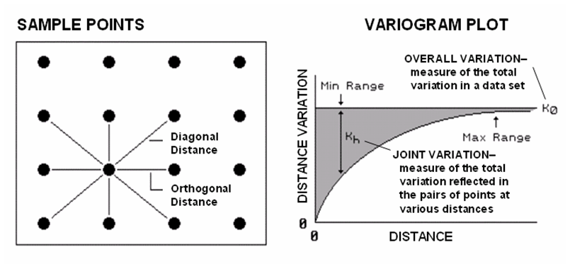
Figure 4.1.2-1. Variogram plot depicts
the relationship between distance and measurement similarity (spatial
autocorrelation).
If
the differences in neighboring values are a lot smaller than the overall
variation, then a high degree of positive spatial dependency is
indicated. If they are about the same or if the neighbors variation is
larger (indicating a rare checkerboard-like condition), then the assumption of
spatial dependence fails. If the dependency test fails, it means an
interpolated soil nutrient map likely is just colorful gibberish.
The
difference test however, is limited as it merely assesses the closest neighbor,
regardless of its distance. A Variogram (right side of figure 4-2)
is a plot of the similarity among values based on the distance between
them. Instead of simply testing whether close things are related, it
shows how the degree of dependency relates to varying distances between
locations. The origin of the plot at 0,0 is a unique case where the distance
between samples is zero and there is no dissimilarity (data variation = 0) indicating that a location is
exactly the same as itself.
As
the distance between points increase, subsets of the data are scrutinized for
their dependency. The shaded portion in the idealized plot shows how
quickly the spatial dependency among points deteriorates with distance.
The maximum range (Max Range) position identifies the distance between points
beyond which the data values are considered independent. This tells us that using data values beyond
this distance for interpolation actually can mess-up the interpolation.
The
minimum range (Min Range) position identifies the smallest distance contained
in the actual data set and is determined by the sampling design used to collect
the data. If a large portion of the shaded area falls below this
distance, it tells you there is insufficient spatial dependency in the data set
to warrant interpolation. If you proceed with the interpolation, a nifty
colorful map will be generated, but likely of questionable accuracy. Worse yet, if the sample data plots as a
straight line or circle, no spatial dependency exists and the map will be of no
value.
Analysis
of the degree of spatial autocorrelation in a set of point samples is mandatory
before spatially interpolating any data. This step is not required to
mechanically perform the analysis as the procedure will always generate a
map. However, it is the initial step in
determining if the map generated is likely to be a good one.
4.1.3
Benchmarking Interpolation
Approaches
For
some, the previous discussion on generating maps from soil samples might have
been too simplistic—enter a few things then click on a data file and, in a few moments you have a soil
nutrient surface. Actually, it is that
easy to create one. The harder part is
figuring out if the map generated makes sense and whether it is something you
ought to use for subsequent analysis and important management decisions.
The
following discussion investigates the relative amounts of spatial information
provided by comparing a whole-field average to interpolated map surfaces
generated from the same data set. The
top-left portion in figure 4.1.3-3 shows the map of the average phosphorous
level in the field. It forms a flat
surface as there isn’t any information about spatial variability in an average
value.
The
non-spatial estimate simply adds up all of the sample measurements and divides
by the number of samples to get 22ppm. Since
the procedure didn’t consider the relative position of the different samples,
it is unable to map the variations in the measurements. The assumption is that the average is
everywhere, plus or minus the standard deviation. But there is no spatial guidance where
phosphorous levels might be higher, or where they might be lower than the
average.
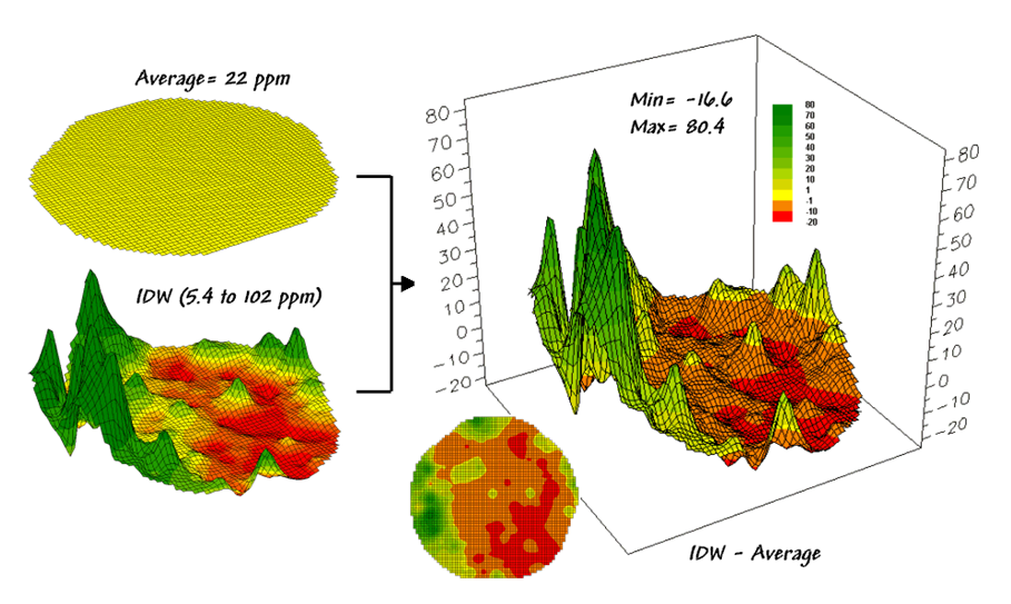
Figure 4.1.3-1. Spatial comparison of a whole-field average
and an IDW interpolated map.
The
spatially based estimates are shown in the interpolated map surface below the
average plane. As described in the
previous section 4.1.2, spatial interpolation looks at the relative positioning
of the soil samples as well as their measure phosphorous levels. In this instance the big bumps were
influenced by high measurements in that vicinity while the low areas responded
to surrounding low values.
The
map surface in the right portion of figure 4.1.3-1 compares the two maps simply
by subtracting them. The color ramp was
chosen to emphasize the differences between the whole-field average estimates
and the interpolated ones. The center
yellow band indicates the average level while the progression of green tones
locates areas where the interpolated map estimated that there was more
phosphorous than the whole field average.
The higher locations identify where the average value is less than the
interpolated ones. The lower locations
identify the opposite condition where the average value is more than the
interpolated ones. Note the dramatic
differences between the two maps.
Now
turn your attention to figure 4.1.3-2 that compares maps derived by two
different interpolation techniques—IDW (inverse distance-weighted) and Krig. Note the
similarity in the peaks and valleys of the two surfaces. While subtle differences are visible the
general trends in the spatial distribution of the data are identical.
The
difference map on the right confirms the coincident trends. The broad band of yellow identifies areas
that are +/- 1 ppm.
The brown color identifies areas that are within 10 ppm
with the IDW surface estimates a bit more than the Krig
ones. Applying the same assumption about
+/- 10 ppm difference being negligible in a
fertilization program the maps are effectively identical.
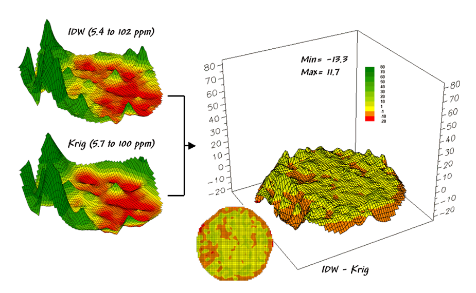
Figure 4.1.3-2. Spatial comparison of IDW and Krig interpolated maps.
So
what’s the bottom line? That there often
are substantial differences between a whole field average and any interpolated
surface. It suggests that finding the
best interpolation technique isn’t as important as using an interpolated
surface over the whole field average.
This general observation holds most mapped data exhibiting spatial
autocorrelation.
4.1.4 Assessing Interpolation
Results
The
previous discussion compared the assumption of the field average with map
surfaces generated by two different interpolation techniques for phosphorous
levels throughout a field. While there
was considerable differences between the average and the derived surfaces (from
-20 to +80ppm), there was relatively little difference between the two surfaces
(+/- 10ppm).
But
which surface best characterizes the spatial distribution of the sampled
data? The answer to this question lies
in Residual Analysis—a
technique that investigates the differences between estimated and measured
values throughout a field. It is common
sense that one should not simply accept an interpolated map without assessing
its accuracy. Ideally, one designs an
appropriate sampling pattern and then randomly locates a number of test points
to evaluate interpolation performance.
So
which surface, IDW or Krig, did a better job in
estimating the measured phosphorous levels for a test set of measurements? The table in figure 4.1.4-1 reports the
results for twelve randomly positioned test samples. The first column identifies the sample ID and
the second column reports the actual measured value for that location.
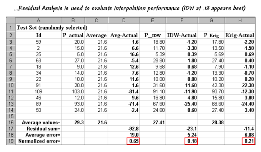
Figure 4.1.4-1. A residual analysis table identifies the
relative performance of average, IDW and Krig
estimates.
Column
C simply depicts estimating the whole-field average (21.6) at each of the test
locations. Column D computes the difference
of the estimated value minus actual measured value for the test set—formally
termed the residual. For example,
the first test point (ID#59) estimated the average of 21.6 but was actually
measured as 20.0, so the residual is 1.6 (21.6-20.0= 1.6ppm) …very close. However, test point #109 is way off
(21.6-103.0= -81.4ppm) …nearly 400% under-estimate error.
The
residuals for the IDW and Krig maps are similarly
calculated to form columns F and H, respectively. First note that the residuals for the whole-field
average are generally larger than either those for the IDW or Krig estimates. Next
note that the residual patterns between the IDW and Krig
are very similar—when one is way off, so is the other and usually by about the
same amount. A notable exception is for
test point #91 where Krig dramatically
over-estimates.
The
rows at the bottom of the table summarize the residual analysis results. The Residual
sum row characterizes any bias in the estimates—a negative value indicates
a tendency to underestimate with the magnitude of the value indicating how
much. The –92.8 value for the
whole-field average indicates a relatively strong bias to underestimate.
The
Average error row reports how
typically far off the estimates were.
The 19.0ppm average error for the whole-field average is three times
worse than Krig’s estimated error (6.08) and nearly
four times worse than IDW’s (5.24).
Comparing
the figures to the assumption that +/-10ppm is negligible in a fertilization
program it is readily apparent that the whole-field estimate is inappropriate
to use and that the accuracy differences between IDW and Krig
are minor.
The
Normalized error row simply
calculates the average error as a proportion of the average value for the test
set of samples (5.24/29.3= .18 for IDW).
This index is the most useful as it enables the comparison of the
relative map accuracies between different maps.
Generally speaking, maps with normalized errors of more than .30 are
suspect and one might not want to make important decisions using them.
The
bottom line is that Residual Analysis is an important consideration when
spatially interpolating data. Without an
understanding of the relative accuracy and interpolation error of the base
maps, one can’t be sure of any modeling results using the data. The investment in a few extra sampling points
for testing and residual analysis of these data provides a sound foundation for
site-specific management. Without it,
the process can become one of blind faith and wishful thinking.
4.2 Spatial
Data Mining
Spatial data mining involves procedures for uncovering
numerical relationships within and among sets of mapped data. The underlying concept links a map’s
geographic distribution to its corresponding numeric distribution through the
coordinates and map values stored at each location. This ‘data space’ and ‘geographic space’
linkage provides a framework for calculating map similarity, identifying data
zones, mapping data clusters, deriving prediction maps and refining analysis
techniques.
4.2.1 Calculating Map
Similarity
While visual analysis of
a set of maps might identify broad relationships, it takes quantitative map
analysis to handle a detailed scrutiny.
Consider the three maps shown in figure 4.2.1-1— what areas identify
similar patterns? If you focus your attention
on a location in the lower right portion how similar is the data pattern to all
of the other locations in the field?
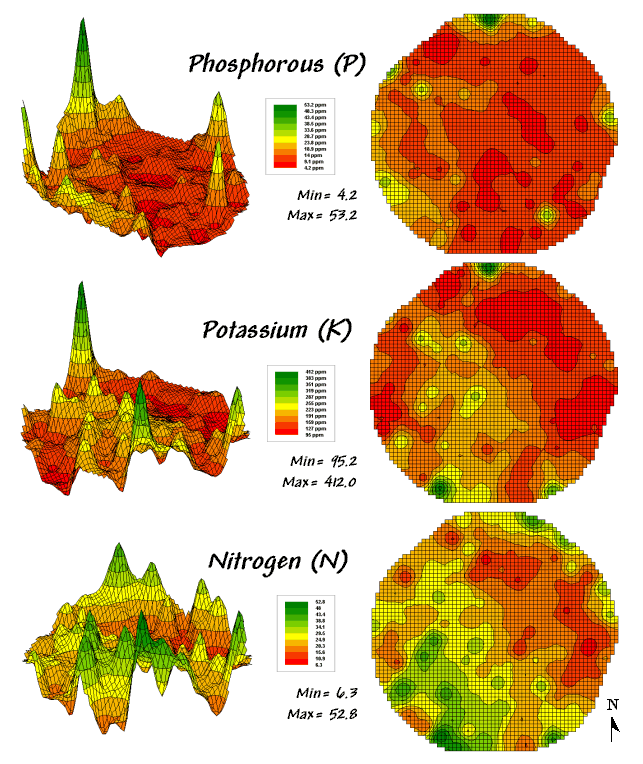
Figure
4.2.1-1. Map surfaces identifying the
spatial distribution of P,K and N throughout a field.
The answers to these
questions are much too complex for visual analysis and certainly beyond the
geo-query and display procedures of standard desktop mapping packages. While the data in the example shows the
relative amounts of phosphorous, potassium and nitrogen throughout a field, it
could as easily be demographic data representing income, education and property
values; or sales data tracking three different products; or public health maps
representing different disease incidences; or crime statistics representing
different types of felonies or misdemeanors.
Regardless of the data
and application arena, a multivariate procedure for assessing similarity often
is used to analyze the relationships. In
visual analysis you move your eye among the maps to summarize the color
assignments at different locations. The
difficulty in this approach is two-fold— remembering the color patterns and
calculating the difference. The map
analysis procedure does the same thing except it uses map values in place of
the colors. In addition, the computer
doesn’t tire as easily and completes the comparison for all of the locations
throughout the map window (3289 in this example) in a couple of seconds.
The upper-left portion of
figure 4.2.1-2 illustrates capturing the data patterns of two locations for
comparison. The “data spear” at map
location 45column, 18row identifies that the P-level as 11.0ppm, the K-level as
177.0 and N-level as 32.9. This step is
analogous to your eye noting a color pattern of dark-red, dark-orange and
light-green. The other location for
comparison (32c, 62r) has a data pattern of P= 53.2, K= 412.0 and N= 27.9; or
as your eye sees it, a color pattern of dark-green, dark-green and yellow.
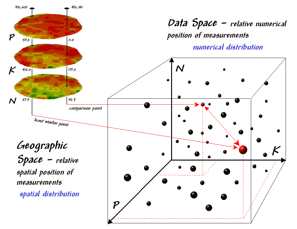
Figure 4.2.1-2. Geographic space and
data space can be conceptually linked.
The right side of the
figure conceptually depicts how the computer calculates a similarity value for
the two response patterns. The
realization that mapped data can be expressed in both geographic space and data
space is a key element to understanding the procedure.
Geographic space
uses coordinates, such latitude and longitude, to locate things in the real
world—such as the southeast and extreme north points identified in the
example. The geographic expression of
the complete set of measurements depicts their spatial distribution in familiar
map form.
Data space, on the other hand, is a
bit less familiar but can be conceptualized as a box with balls floating within
it. In the example, the three axes
defining the extent of the box correspond to the P, K and N levels measured in
the field. The floating balls represent
grid cells defining the geographic space—one for each grid cell. The coordinates locating the floating balls
extend from the data axes—11.0, 177.0 and 32.9 for the comparison point. The other point has considerably higher
values in P and K with slightly lower N (53.2, 412.0, 27.9) so it plots at a
different location in data space.
The bottom line is that
the position of any point in data space identifies its numerical pattern—low,
low, low is in the back-left corner, while high, high, high is in the upper-right
corner. Points that plot in data space
close to each other are similar; those that plot farther away are less
similar.
In the example, the
floating ball in the foreground is the farthest one (least similar) from the
comparison point’s data pattern. This
distance becomes the reference for ‘most different’ and sets the bottom value
of the similarity scale (0%). A point
with an identical data pattern plots at exactly the same position in data space
resulting in a data distance of 0 that equates to the highest similarity value
(100%).
The similarity map shown
in figure 4.2.1-3 applies the similarity scale to the data distances calculated
between the comparison point and all of the other points in data space. The green tones indicate field locations with
fairly similar P, K and N levels. The
red tones indicate dissimilar areas. It
is interesting to note that most of the very similar locations are in the left
portion of the field.
Figure 4.2.1-3. A similarity map identifies how related the
data patterns are for all other locations to the pattern of a given comparison
location.
Map Similarity can
be an invaluable tool for investigating spatial patterns in any complex set of
mapped data. Humans are unable to
conceptualize more than three variables (the data space box); however a
similarity index can handle any number of input maps. In addition, the different layers can be
weighted to reflect relative importance in determining overall similarity.
In effect, a similarity
map replaces a lot of laser-pointer waving and subjective suggestions of how
similar/dissimilar locations are with a concrete, quantitative measurement for
each map location.
4.2.2 Identifying Data Zones
The preceding section introduced the concept of ‘data distance’ as a means to
measure similarity within a map. One
simply mouse-clicks a location and all of the other locations are assigned a
similarity value from 0 (zero percent similar) to 100 (identical) based on a
set of specified maps. The statistic
replaces difficult visual interpretation of map displays with an exact
quantitative measure at each location.
Figure 4.2.2-1 depicts
level slicing for areas that are unusually high in P, K and N (nitrogen). In this instance the data pattern coincidence
is a box in 3-dimensional data space.
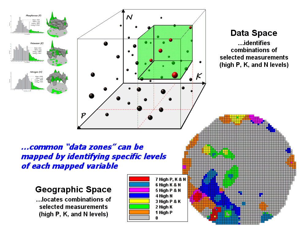
Figure 4.2.2-1. Level-slice
classification can be used to map sub-groups of similar data patterns.
A mathematical trick was
employed to get the map solution shown in the figure. On the individual maps, high areas were set
to P=1, K= 2 and N=4, then the maps were added together. The result is a range of coincidence values
from zero (0+0+0= 0; gray= no high areas) to seven (1+2+4= 7; red= high P, high
K, high N). The map values between these
extremes identify the individual map layers having high measurements. For example, the yellow areas with the value
3 have high P and K but not N (1+2+0= 3).
If four or more maps are combined, the areas of interest are assigned
increasing binary progression values (…8, 16, 32, etc)—the sum will always
uniquely identify the combinations.
While Level Slicing
is not a sophisticated classifier, it illustrates the useful link between data
space and geographic space. This
fundamental concept forms the basis for most geo-statistical analysis including
map clustering and regression.
4.2.3 Mapping Data Clusters
While both Map Similarity
and Level Slicing techniques are useful in examining spatial relationships,
they require the user to specify data analysis parameters. But what if you don’t know what level slice
intervals to use or which locations in the field warrant map similarity
investigation? Can the computer on its
own identify groups of similar data? How
would such a classification work? How
well would it work?
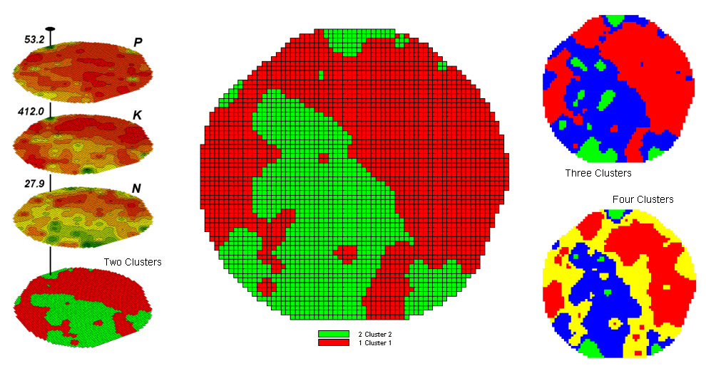
Figure 4.2.3-1. Map clustering
identifies inherent groupings of data patterns in geographic space.
Figure 4.2.3-1 shows some
examples derived from Map Clustering.
The map stack on the left shows the input maps used for the cluster
analysis. The maps are the same P, K,
and N maps identifying phosphorous, potassium and nitrogen levels used in the
previous discussions in this section.
However, keep in mind that the input maps could be crime, pollution or
sales data—any set of application related data.
Clustering simply looks at the numerical pattern at each map location
and sorts them into discrete groups regardless of the nature of the data or its
application.
The map in the center of
the figure shows the results of classifying the P, K and N map stack into two
clusters. The data pattern for each cell
location is used to partition the field into two groups that meet the criteria
as being 1) as different as possible between groups and 2) as similar
as possible within a group.
The two smaller maps at
the right show the division of the data set into three and four clusters. In all three of the cluster maps red is
assigned to the cluster with relatively low responses and green to the one with
relatively high responses. Note the
encroachment on these marginal groups by the added clusters that are formed by
data patterns at the boundaries.
The mechanics of
generating cluster maps are quite simple.
Simply specify the input maps and the number of clusters you want then
miraculously a map appears with discrete data groupings. So how is this miracle performed? What happens inside cluster’s black box?
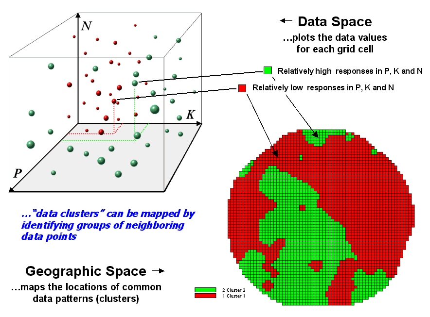
Figure 4.2.3-2. Data patterns for map
locations are depicted as floating balls in data space.
The schematic in figure
4.2.3-2 depicts the process. The
floating balls identify the data patterns for each map location (geographic
space) plotted against the P, K and N axes (data space). For example, the large ball appearing closest
to you depicts a location with high values on all three input maps. The tiny ball in the opposite corner (near
the plot origin) depicts a map location with small map values. It seems sensible that these two extreme
responses would belong to different data groupings.
While the specific algorithm
used in clustering is beyond the scope of this chapter, it suffices to note
that ‘data distances’ between the floating balls are used to identify cluster
membership—groups of floating balls that are relatively far from other groups
and relatively close to each other form separate data clusters. In this example, the red balls identify
relatively low responses while green ones have relatively high responses. The geographic pattern of the classification
is shown in the map in the lower right portion of the figure.
Identifying groups of
neighboring data points to form clusters can be tricky business. Ideally, the clusters will form distinct
clouds in data space. But that rarely
happens and the clustering technique has to enforce decision rules that slice a
boundary between nearly identical responses.
Also, extended techniques can be used to impose weighted boundaries
based on data trends or expert knowledge.
Treatment of categorical data and leveraging spatial autocorrelation are
other considerations.
So how do know if the
clustering results are acceptable? Most
statisticians would respond, “…you can’t tell for sure.” While there are some elaborate procedures
focusing on the cluster assignments at the boundaries, the most frequently used
benchmarks use standard statistical indices.
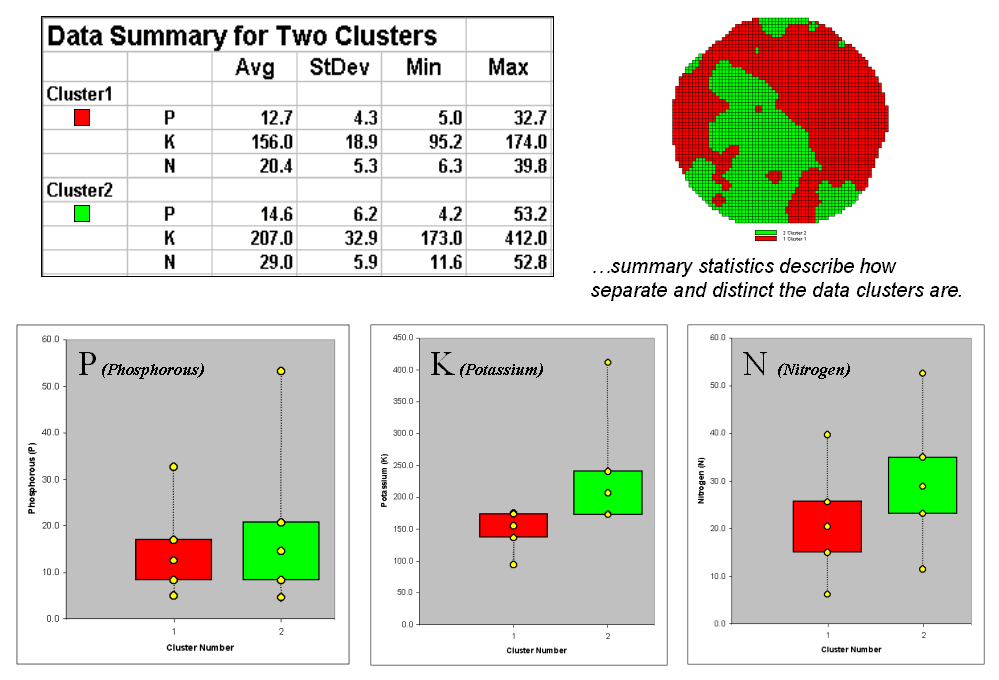
Figure 4.2.3-3. Clustering results can
be roughly evaluated using basic statistics.
Figure 4.2.3-3 shows the
performance table and box-and-whisker plots for the map containing two clusters. The average, standard deviation, minimum and
maximum values within each cluster are calculated. Ideally the averages would be radically
different and the standard deviations small—large difference between groups and
small differences within groups.
Box-and-whisker plots
enable a visualize assessment of the differences. The box is centered on the average (position)
and extends above and below one standard deviation (width) with the whiskers
drawn to the minimum and maximum values to provide a visual sense of the data
range. When the diagrams for the two
clusters overlap, as they do for the phosphorous responses, it suggests that
the clusters are not distinct along this data axis.
The separation between
the boxes for the K and N axes suggests greater distinction between the
clusters. Given the results a practical
user would likely accept the classification results. And statisticians hopefully will accept in
advance apologies for such a conceptual and terse treatment of a complex
spatial statistics topic.
4.2.4 Deriving Prediction
Maps
For years non-spatial statistics has been predicting things by analyzing a
sample set of data for a numerical relationship (equation) then applying the
relationship to another set of data. The
drawbacks are that the non-approach doesn’t account for geographic
relationships and the result is just a table of numbers. Extending predictive analysis to mapped data
seems logical; after all, maps are just organized sets of numbers. And
To illustrate the data
mining procedure, the approach can be applied to the same field that has been
the focus for the previous discussion.
The top portion of figure 4.2.4-1 shows the yield pattern of corn for
the field varying from a low of 39 bushels per acre (red) to a high of 279
(green). The corn yield map is termed
the dependent map variable and identifies the phenomena to be predicted.
The independent map
variables depicted in the bottom portion of the figure are used to uncover
the spatial relationship used for prediction— prediction equation. In this instance, digital aerial imagery will
be used to explain the corn yield patterns.
The map on the left indicates the relative reflectance of red light off
the plant canopy while the map on the right shows the near-infrared response (a
form of light just beyond what we can see).
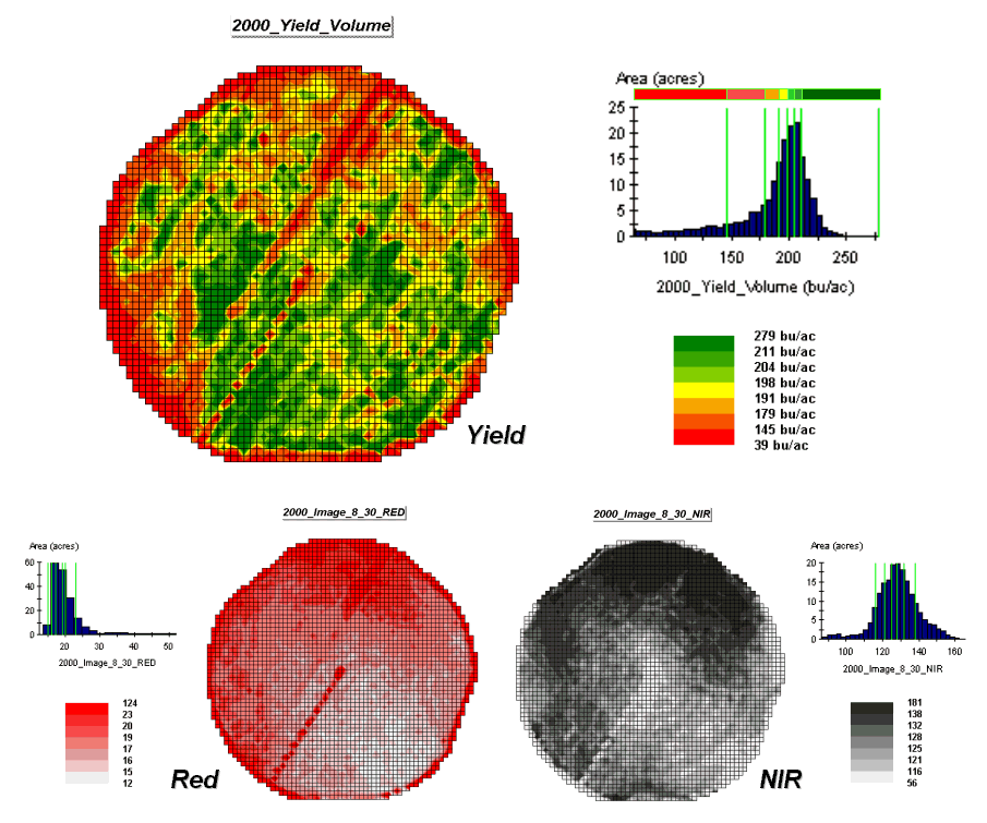
Figure 4.2.4-1. The corn yield map
(top) identifies the pattern to predict; the red and near-infrared maps
(bottom) are used to build the spatial relationship.
While it is difficult to visually
assess the subtle relationships between corn yield and the red and
near-infrared images, the computer “sees” the relationship quantitatively. Each grid location in the analysis frame has
a value for each of the map layers— 3,287 values defining each geo-registered
map covering the 189-acre field.
For example, top portion
of figure 4.2.4-2 identifies that the example location has a ‘joint’ condition
of red band equals 14.7 and yield equals 218.
The lines parallel to axes in the scatter plot on the right identifies
the precise position of the pair of map values—X= 14.7 and Y= 218. Similarly, the near-infrared and yield values
for the same location are shown in the bottom portion of the figure.
The set of dots in both
of the scatter plots represents all of the data pairs for each grid
location. The slanted lines through the
dots represent the prediction equations derived through regression
analysis. While the mathematics is a bit
complex, the effect is to identify a line that ‘best fits the data’— just as
many data points above as below the regression line.
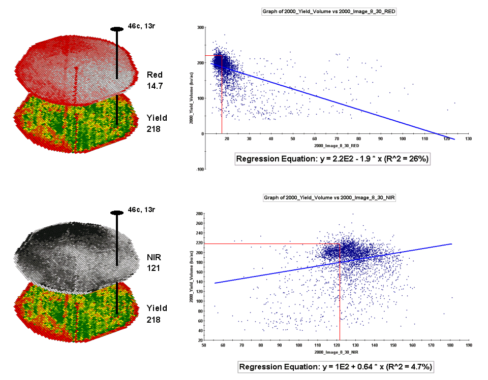
Figure 4.2.4-2. The joint conditions
for the spectral response and corn yield maps are summarized in the scatter
plots shown on the right.
In a sense, the line
identifies the average yield for each step along the X-axis for the red and
near-infrared bands and a reasonable guess of the corn yield for each level of
spectral response. That’s how a
regression prediction is used— a value for the red band (or near-infrared band)
in another field is entered and the equation for the line calculates a
predicted corn yield. Repeating the
calculation for all of the locations in the field generates a prediction map of
yield from remotely sensed data.
A major problem is that
the R-squared statistic summarizing the residuals for both of the prediction
equations is fairly small (R^2= 26% and 4.7% respectively) which suggests that
the prediction lines do not fit the data very well. One way to improve the predictive model might
be to combine the information in both of the images. The Normalized Density Vegetation Index
(NDVI) does just that by calculating a new value that indicates plant density
and vigor— NDVI= ((NIR – Red) / (NIR + Red)).
Figure 4.2.4-3 shows the
process for calculating NDVI for the sample grid location— ((121-14.7) / (121 +
14.7)) = 106.3 / 135.7 = .783. The scatter
plot on the right shows the yield versus NDVI plot and regression line for all
of the field locations. Note that the
R^2 value is a higher at 30% indicating that the combined index is a better
predictor of yield.
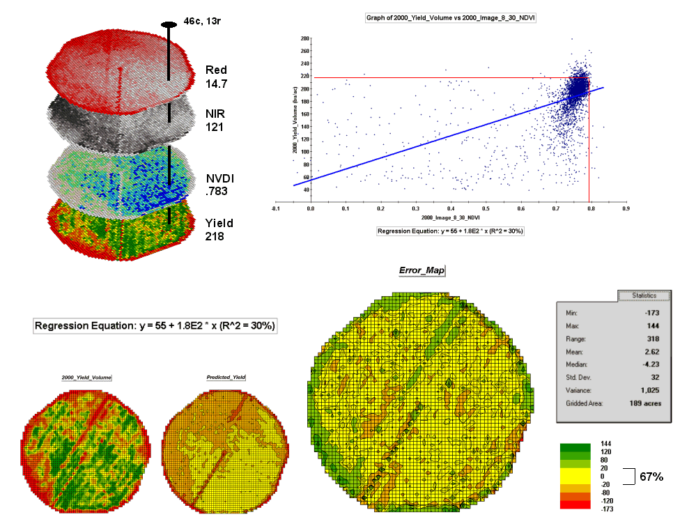
Figure 4.2.4-3. The red and NIR maps
are combined for NDVI value that is a better predictor of yield.
The bottom portion of the
figure evaluates the prediction equation’s performance over the field. The two smaller maps show the actual yield
(left) and predicted yield (right). As
you would expect the prediction map doesn’t contain the extreme high and low
values actually measured.
The larger map on the
right calculates the error of the estimates by simply subtracting the actual
measurement from the predicted value at each map location. The error map suggests that overall the yield
estimates are not too bad— average error is a 2.62 bu/ac
over estimate and 67% of the field is within +/- 20 bu/ac. Also
note the geographic pattern of the errors with most of the over estimates
occurring along the edge of the field, while most of the under
estimates are scattered along NE-SW strips.
Evaluating a prediction
equation on the data that generated it is not validation; however the procedure
provides at least some empirical verification of the technique. It suggests hope that with some refinement
the prediction model might be useful in predicting yield from remotely sensed
data well before harvest.
4.2.5 Stratifying Maps for
Better Predictions
The preceding section described a procedure for predictive analysis of mapped
data. While the underlying theory,
concerns and considerations can be quite complex, the procedure itself is quite
simple. The grid-based processing
preconditions the maps so each location (grid cell) contains the appropriate
data. The ‘shishkebab’
of numbers for each location within a stack of maps are analyzed for a
prediction equation that summarizes the relationships.
The left side of figure
4.2.5-1 shows the evaluation procedure for regression analysis and error map
used to relate a map of NDVI to a map of corn yield for a farmer’s field. One way to improve the predictions is to
stratify the data set by breaking it into groups of similar
characteristics. The idea is that set of
prediction equations tailored to each stratum will result in better predictions
than a single equation for an entire area.
The technique is commonly used in non-spatial statistics where a data
set might be grouped by age, income, and/or education prior to analysis. Additional factors for stratifying, such as
neighboring conditions, data clustering and/or proximity can be used as well.
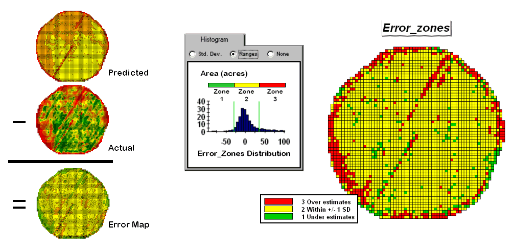
Figure 4.2.5-1. A project area can be
stratified based on prediction errors.
While there are numerous
alternatives for stratifying, subdividing the error map will serve to
illustrate the conceptual approach. The
histogram in the center of figure 4.2.5-1 shows the distribution of values on
the Error Map. The vertical bars
identify the breakpoints at +/- 1 standard deviation and divide the map values
into three strata—zone 1 of unusually high under-estimates (red), zone 2 of
typical error (yellow) and zone 3 of unusually high over-estimates
(green). The map on the right of the figure
maps the three strata throughout the field.
The rationale behind the
stratification is that the whole-field prediction equation works fairly well
for zone 2 but not so well for zones 1 and 3.
The assumption is that conditions within zone 1 make the equation under
estimate while conditions within zone 3 cause it to over
estimate. If the assumption holds
one would expect a tailored equation for each zone would be better at
predicting corn yield than a single overall equation.
Figure 4.2.5-2 summarizes
the results of deriving and applying a set of three prediction equations. The left side of the figure illustrates the
procedure. The Error Zones map is used
as a template to identify the NDVI and Yield values used to calculate three
separate prediction equations. For each
map location, the algorithm first checks the value on the Error Zones map then
sends the data to the appropriate group for analysis. Once the data has been grouped a regression
equation is generated for each zone.
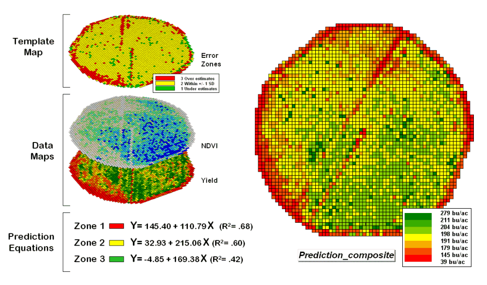
Figure 4.2.5-2. After stratification,
prediction equations can be derived for each element.
The R^2 statistic for all
three equations (.68, .60, and .42 respectively) suggests that the equations
fit the data fairly well and ought to be good predictors. The right side of figure 4.2.5-2 shows a
composite prediction map generated by applying the equations to the NDVI data
respecting the zones identified on the template map.
The left side of figure
4.2.5-3 provides a visual comparison between the actual yield and predicted
maps. The stratified prediction shows
detailed estimates that more closely align with the actual yield pattern than
the ‘whole-field’ derived prediction map using a single equation. The error map for the stratified prediction
shows that eighty percent of the estimates are within +/- 20 bushels per
acre. The average error is only 4 bu/ac and having maximum
under/over estimates of –81.2 and 113, respectively. All in all, fairly good yield estimates based
on a remote sensing data collected nearly a month before the field was
harvested.
A couple of things should
be noted from this example of spatial data mining. First, that there is a myriad of other ways
to stratify mapped data—1) Geographic Zones, such as proximity to the field
edge; 2) Dependent Map Zones, such as areas of low, medium and high yield; 3)
Data Zones, such as areas of similar soil nutrient levels; and 4) Correlated
Map Zones, such as micro terrain features identifying small ridges and
depressions. The process of identifying
useful and consistent stratification schemes is an emerging research frontier
in the spatial sciences.
Second, the error map is
a key part in evaluating and refining prediction equations. This point is particularly important if the
equations are to be extended in space and time.
The technique of using the same data set to develop and evaluate the
prediction equations isn’t always adequate.
The results need to be tried at other locations and dates to verify
performance. While spatial data mining
methodology might be at hand, good science is imperative.
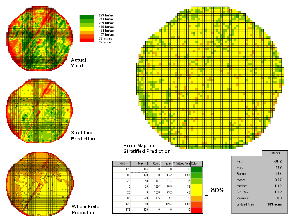
Figure 4.2.5-3. Stratified and
whole-field predictions can be compared using statistical techniques.
Finally, one needs to
recognize that spatial data mining is not restricted to precision agriculture
but has potential for analyzing relationships within almost any set of mapped
data. For example, prediction models can
be developed for geo-coded sales from demographic data or timber production
estimates from soil/terrain patterns.
The bottom line is that maps are increasingly seen as organized sets of
data that can be map-ematically analyzed for spatial
relationships— we have only scratched the surface.
5.0 Spatial
Analysis Techniques
While
map analysis tools might at first seem uncomfortable they simply are extensions
of traditional analysis procedures brought on by the digital nature of modern
maps. The previous section 6.0 described
a conceptual framework and some example procedures that extend traditional
statistics to a spatial statistics that investigates numerical relationships
within and among mapped data layers.
Similarly,
a mathematical framework can be used to organize spatial analysis
operations. Like basic math, this
approach uses sequential processing of mathematical operations to perform a
wide variety of complex map analyses. By
controlling the order that the operations are executed, and using a common
database to store the intermediate results, a mathematical-like processing structure
is developed.
This
‘map algebra’ is similar to traditional algebra where basic operations, such as
addition, subtraction and exponentiation, are logically sequenced for specific
variables to form equations—however, in map algebra the variables represent
entire maps consisting of thousands of individual grid values. Most of traditional mathematical
capabilities, plus extensive set of advanced map processing operations,
comprise the map analysis toolbox.
As
with matrix algebra (a mathematics operating on sets of numbers) new operations
emerge that are based on the nature of the data. Matrix algebra’s transposition, inversion and
diagonalization are examples of the extended set of
techniques in matrix algebra.
In
grid-based map analysis, the spatial coincidence and juxtaposition of values
among and within maps create new analytical operation, such as coincidence,
proximity, visual exposure and optimal routes.
These operators are accessed through general purpose map analysis
software available in most
There
are two fundamental conditions required by any spatial analysis package—a consistent data structure and an iterative processing environment. The earlier section 3.0 described the
characteristics of the grid-based data structure by introducing the concepts of
an analysis frame, map stack, data types and display forms. The traditional discrete set of map features
(points, lines and polygons) where extended to map surfaces that characterize
geographic space as a continuum of uniformly-spaced grid cells. This structure forms a framework for the map-ematics
underlying
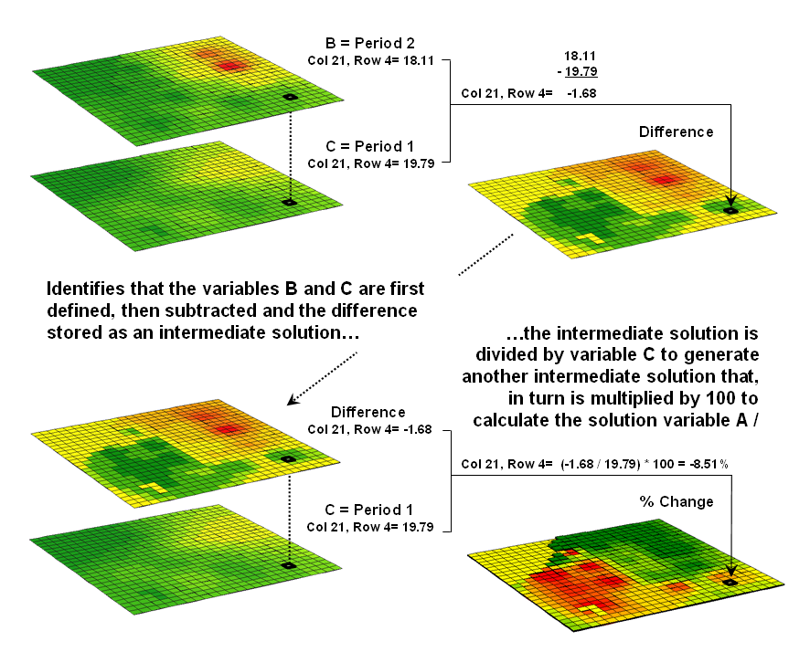
Figure 5.0-1. An iterative processing environment,
analogous to basic math, is used to derive new map variables.
The
second condition of map analysis provides an iterative processing environment
by logically sequencing map analysis operations. This involves:
- retrieval of one or more map layers from the
database,
- processing that data as specified by the user,
- creation of a new map containing the
processing results, and
- storage of the new map for subsequent
processing.
Each
new map derived as processing continues aligns with the analysis frame so it is
automatically geo-registered to the other maps in the database. The values comprising the derived maps are a
function of the processing specified for the input maps. This cyclical processing provides an
extremely flexible structure similar to “evaluating nested parentheses” in
traditional math. Within this structure,
one first defines the values for each variable and then solves the equation by
performing the mathematical operations on those numbers in the order prescribed
by the equation.
This
same basic mathematical structure provides the framework for computer-assisted
map analysis. The only difference is
that the variables are represented by mapped data composed of thousands of
organized values. Figure 5.0-1 shows a
solution for calculating the percent change in animal activity.
The
processing steps shown in the figure are identical to the algebraic formula for
percent change except the calculations are performed for each grid cell in the study
area and the result is a map that identifies the percent change at each
location. Map analysis identifies what
kind of change (thematic attribute) occurred where (spatial attribute). The characterization of “what and where”
provides information needed for continued
5.1 Spatial Analysis
Framework
Within
this iterative processing structure, four fundamental classes of map analysis
operations can be identified. These
include:
- Reclassifying Maps – involving the reassignment of the
values of an existing map as a function of its initial value, position, size,
shape or contiguity of the spatial configuration associated with each map
category.
- Overlaying Maps – resulting in the creation of a new
map where the value assigned to every location is computed as a function of the
independent values associated with that location on two or more maps.
- Measuring Distance and Connectivity – involving the creation of a new map
expressing the distance and route between locations as straight-line length
(simple proximity) or as a function of absolute or relative barriers (effective
proximity).
- Summarizing Neighbors – resulting in the creation of a new
map based on the consideration of values within the general vicinity of target
locations.
Reclassification
operations merely repackage existing information on a single map. Overlay operations, on the other hand,
involve two or more maps and result in the delineation of new boundaries. Distance and connectivity operations are more
advanced techniques that generate entirely new information by characterizing
the relative positioning of map features.
Neighborhood operations summarize the conditions occurring in the
general vicinity of a location.
The
reclassifying and overlaying operations based on point processing are the
backbone of current
The
mathematical structure and classification scheme of Reclassify, Overlay, Distance
and Neighbors form a conceptual framework that is easily adapted to modeling
spatial relationships in both physical and abstract systems. A major advantage is flexibility. For example, a model for siting
a new highway could be developed as a series of processing steps. The analysis likely would consider economic
and social concerns (e.g., proximity to high housing density, visual exposure
to houses), as well as purely engineering ones (e.g., steep slopes, water
bodies). The combined expression of both
physical and non-physical concerns within a quantified spatial context is a
major benefit.
However,
the ability to simulate various scenarios (e.g., steepness is twice as
important as visual exposure and proximity to housing is four times more important
than all other considerations) provides an opportunity to fully integrate
spatial information into the decision-making process. By noting how often and where the proposed
route changes as successive runs are made under varying assumptions, information
on the unique sensitivity to siting a highway in a
particular locale is described.
In
addition to flexibility, there are several other advantages in developing a
generalized analytical structure for map analysis. The systematic rigor of a mathematical
approach forces both theorist and user to carefully consider the nature of the
data being processed. Also it provides a
comprehensive format for learning that is independent of specific disciplines
or applications. Furthermore the
flowchart of processing succinctly describes the components and weightings
capsulated in an analysis.
This
communication enables decision-makers to more fully understand the analytic
process and actually interact with weightings, incomplete considerations and/or
erroneous assumptions. These comments,
in most cases, can be incorporated and new results generated in a timely
manner. From a decision-maker’s point of view, traditional manual techniques for
analyzing maps are a distinct and separate task from the decision itself. They require considerable time to perform and
many of the considerations are subjective in their evaluation.
In
the old environment, decision-makers attempt to interpret results, bounded by
vague assumptions and system expressions of the technician. Computer-assisted map analysis, on the other
hand, engages decision-makers in the analytic process. In a sense, it both documents the thought
process and encourages interaction—sort of like a “spatial spreadsheet.”
5.2 Reclassifying Maps
The
first, and in many ways the most fundamental class of analytical operations,
involves the reclassification of map categories. Each operation involves the creation of a new
map by assigning thematic values to the categories of an existing map. These values may be assigned as a function of
the initial value, position, contiguity,
size, or shape of the spatial configuration of the individual
categories. Each of the reclassification
operations involves the simple repackaging of information on a single map, and
results in no new boundary delineation.
Such operations can be thought of as the purposeful "re-coloring of
maps.”
Figure
5.2-1 shows the result of simply reclassifying a map as a function of its
initial thematic values. For display, a
unique symbol is associated with each value.
In the figure, the Cover Type map has categories of Open Water, Meadow
and Forest. These features are stored as
thematic values 1, 2 and 3, respectively, and displayed as separate
colors. A binary map that isolates the
Open Water locations can be created by simply assigning 0 to the areas of
Meadow and Forest. While the operation
seems trivial by itself, it has map analysis implications far beyond simply
re-coloring the map categories as well soon be apparent.
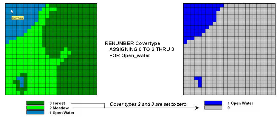
Figure 5.2-1. Areas of meadow and forest on a cover type
map can be reclassified to isolate large areas of open water.
A
similar reclassification operation might involve the ranking or weighing of
qualitative map categories to generate a new map with quantitative values. For example, a map of soil types might be
assigned values that indicate the relative suitability of each soil type for
residential development.
Quantitative
values may also be reclassified to yield new quantitative values. This might involve a specified reordering of
map categories (e.g., given a map of soil moisture content, generate a map of
suitability levels for plant growth).
Or, it could involve the application of a generalized reclassifying
function, such as "level slicing," which splits a continuous range of
map category values into discrete intervals (e.g., derivation of a contour map
of just ten contour intervals from an elevation surface composed of thousands
of specific elevation values).
Other
quantitative reclassification functions include a variety of arithmetic
operations involving map category values and a specified or computed constant. Among these operations are addition,
subtraction, multiplication, division, exponentiation, maximization,
minimization, normalization and other scalar mathematical and statistical
operators. For example, an elevation
surface expressed in feet might be converted to meters by multiplying each map
value by the appropriate conversion factor of 3.28083 feet per meter.
Reclassification
operations can also relate to location, as well as purely thematic attributes
associated with a map. One such
characteristic is position. An overlay
category represented by a single location, for example, might be reclassified
according to its latitude and longitude.
Similarly, a line segment or area feature could be reassigned values
indicating its center or general orientation.
A
related operation, termed parceling, characterizes category contiguity. This procedure identifies individual clumps
of one or more points having the same numerical value and spatially contiguous (e.g.,
generation of a map identifying each lake as a unique value from a generalized
map of water representing all lakes as a single category).
Another
location characteristic is size. In the
case of map categories associated with linear features or point locations,
overall length or number of points might be used as the basis for reclassifying
those categories. Similarly, an overlay
category associated with a planar area might be reclassified according to its total
acreage or the length of its perimeter.
For example, a map of water types might be reassigned values to indicate
the area of individual lakes or the length of stream channels. The same sort of technique might also be used
to deal with volume. Given a map of
depth to bottom for a group of lakes, for example, each lake might be assigned
a value indicating total water volume based on the area of each depth
category.
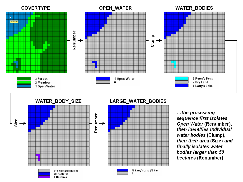
Figure 5.2-2. A sequence of reclassification operations
(renumber, clump, size and renumber) can be used to isolate large water bodies
from a cover type map.
Figure
5.2-2 identifies a similar processing sequence using the information derived in
the previous figure 5.2-1. While your
eye sees two distinct blobs of water on the open water map the computer only
‘sees’ distinctions by different map category values. Since both water bodies are assigned the same
value of 1 there isn’t a categorical distinction and the computer cannot easily
differentiate.
The
Clump operation is used to identify
the contiguous features as separate values—clump #1, #2 and #3. The Size
operation is used to calculate the size of each clump—clump #1= 78 hectares,
clump #2= 543 ha and clump#3= 4 ha. The
final step uses the Renumber
operation to isolate the large water body in the northwest portion of the
project area.
In
addition to the initial value, position, contiguity, and size of features,
shape characteristics also can be used as the basis for reclassifying map
categories. Shape characteristics
associated with linear forms identify the patterns formed by multiple line
segments (e.g., dendritic stream pattern). The primary shape characteristics associated
with polygonal forms include feature integrity, boundary convexity, and nature
of edge.
Feature
integrity relates to “intact-ness” of an area. A category that is broken into numerous
‘fragments’ and/or contains several interior ‘holes’ is said to have less
spatial integrity than ones without such violations. Feature integrity can be summarized as the
Euler Number that is computed as the number of holes within a feature less one
short of the number of fragments which make up the entire feature. An Euler Number of zero indicates features
that are spatially balanced, whereas larger negative or positive numbers
indicate less spatial integrity.
Convexity
and edge are other shape indices that relate to the configuration of boundaries
of polygonal features. Convexity is the
measure of the extent to which an area is enclosed by its background, relative
to the extent to which the area encloses this background. The Convexity Index for a feature is computed
by the ratio of its perimeter to its area.
The most regular configuration is that of a circle which is totally
convex and, therefore, not enclosed by the background at any point along its
boundary.
Comparison
of a feature's computed convexity to a circle of the same area, results in a
standard measure of boundary regularity. The nature of the boundary at each point can
be used for a detailed description of boundary configuration. At some locations the boundary might be an
entirely concave intrusion, whereas others might be at entirely convex
protrusions. Depending on the "degree
of edginess," each point can be assigned a value indicating the actual
boundary convexity at that location.
This
explicit use of cartographic shape as an analytic parameter is unfamiliar to
most
5.3 Overlaying Maps
The
general class of overlay operations can be characterized as "light‑table gymnastics." These involve the creation of a new map where
the value assigned to every point, or set of points, is a function of the
independent values associated with that location on two or more existing map
layers. In location‑specific
overlaying, the value assigned is a function of the point‑by‑point
coincidence of the existing maps. In category‑wide
composites, values are assigned to entire thematic regions as a function of the
values on other overlays that are associated with the categories. Whereas the first overlay approach conceptually
involves the vertical spearing of a set of map layers, the latter approach uses
one map to identify boundaries by which information is extracted from other
maps.
Figure
5.3-1 shows an example of location‑specific
overlaying. Here, maps of cover type and
topographic slope classes are combined to create a new map identifying the
particular cover/slope combination at each map location. A specific function used to compute new
category values from those of existing maps being overlaid can vary according
to the nature of the data being processed and the specific use of that data
within a modeling context. Environmental
analyses typically involve the manipulation of quantitative values to generate
new values that are likewise quantitative in nature. Among these are the basic arithmetic
operations such as addition, subtraction, multiplication, division, roots, and
exponentials.
Functions
that relate to simple statistical parameters such as maximum, minimum, median,
mode, majority, standard deviation or weighted average also can be
applied. The type of data being
manipulated dictates the appropriateness of the mathematical or statistical
procedure used. For example, the addition
of qualitative maps such as soils and land use would result in mathematically
meaningless sums, since their thematic values have no numerical
relationship. Other map overlay
techniques include several that might be used to process either quantitative or
qualitative data and generate values which can likewise take either form. Among these are masking, comparison,
calculation of diversity, and permutations of map categories.
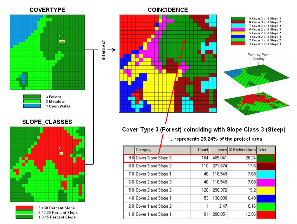
Figure 5.3-1. Point-by point overlaying operations
summarize the coincidence of two or more maps, such as assigning a unique value
identifying the cover type and slope class conditions at each location.
More
complex statistical techniques can be applied in this manner, assuming that the
inherent interdependence among spatial observations can be taken into
account. This approach treats each map
as a variable, each point as a case, and each value as an observation. A predictive statistical model can then be
evaluated for each location, resulting in a spatially continuous surface of
predicted values. The mapped predictions
contain additional information over traditional non‑spatial
procedures, such as direct consideration of coincidence among regression
variables and the ability to spatially locate areas of a given level of
prediction. Sections 4.24 and 4.2.5
discussed considerations involved in spatial data mining derived by
statistically overlaying mapped data.
An
entirely different approach to overlaying maps involves category‑wide
summarization of values. Rather than
combining information on a point‑by‑point
basis, this group summarizes the spatial coincidence of entire categories shown
on one map with the values contained on another map(s). Figure 5.3-2 contains an example of a category‑wide overlay operation. In this example, the categories of the cover
type map are used to define an area over which the coincidental values of the
slope map are averaged. The computed
values of average slope within each category area are then assigned to each of
the cover type categories.
Summary
statistics which can be used in this way include the total, average, maximum,
minimum, median, mode, or minority value; the standard deviation, variance, or
diversity of values; and the correlation, deviation, or uniqueness of
particular value combinations. For
example, a map indicating the proportion of undeveloped land within each of
several counties could be generated by superimposing a map of county boundaries
on a map of land use and computing the ratio of undeveloped land to the total
land area for each county. Or a map of
zip code boundaries could be superimposed over maps of demographic data to
determine the average income, average age, and dominant ethnic group within
each zip code.
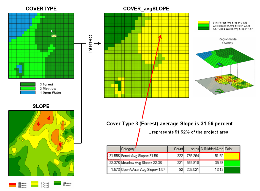
Figure 5.3-2. Category-wide overlay operations summarize
the spatial coincidence of map categories, such as generating the average slope
for each cover type category.
As
with location‑specific overlay techniques, data
types must be consistent with the summary procedure used. Also of concern is the order of data
processing. Operations such as addition
and multiplication are independent of the order of processing. Other operations, such as subtraction and
division, however, yield different results depending on the order in which a
group of numbers is processed. This
latter type of operations, termed non‑commutative,
cannot be used for category‑wide
summaries.
5.4 Establishing Distance and
Connectivity
Measuring
distance is one of the most basic map analysis techniques. Historically, distance is defined as the shortest straight-line
between two points. While
this three-part definition is both easily conceptualized and implemented with a
ruler, it is frequently insufficient for decision-making. A straight-line route might indicate the
distance “as the crow flies,” but offer little information for the walking crow
or other flightless creature. It is
equally important to most travelers to have the measurement of distance
expressed in more relevant terms, such as time or cost.
Proximity
establishes the distance to all locations surrounding a point— the set of shortest straight-lines
among groups of points.
Rather than sequentially computing the distance between pairs of
locations, concentric equidistance zones are established around a location or
set of locations (figure 5.4-1). This
procedure is similar to the wave pattern generated when a rock is thrown into a
still pond. Each ring indicates one unit
farther away— increasing distance as the wave moves away. Another way to conceptualize the process is
nailing one end of a ruler at a point and spinning it around. The result is a series of data zones
emanating from a location and aligning with the ruler’s tic marks.
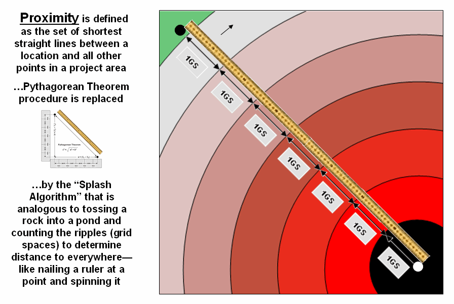
Figure
5.4-1.
Proximity identifies the set of shortest straight-lines among groups of
points (distance zones).
However,
nothing says proximity must be measured from a single point. A more complex proximity map would be
generated if, for example, all locations with houses (set of points) are
simultaneously considered target locations (left side of figure 5.4-2).
In effect,
the procedure is like throwing a handful of rocks into pond. Each set of concentric rings grows until the
wave fronts from other locations meet; then they stop. The result is a map indicating the shortest
straight-line distance to the nearest target area (house) for each non-target
area. In the figure, the red tones
indicate locations that are close to a house, while the green tones identify
areas that are far from a house.
In a
similar fashion, a proximity map to roads is generated by establishing data
zones emanating from the road network—sort of like tossing a wire frame into a
pond to generate a concentric pattern of ripples (middle portion of figure
5.4-2). The same result is generated for
a set of areal features, such as sensitive habitat parcels (right side of figure
5.4-2).
It is
important to note that proximity is not the same as a buffer. A buffer is a discrete spatial object that
identifies areas that are within a specified distance of map feature; all
locations within a buffer are considered the same. Proximity is a continuous surface that identifies
the distance to a map feature(s) for every location in a project area. It forms a gradient of distances away
composed of many map values; not a single spatial object with one
characteristic distance away.
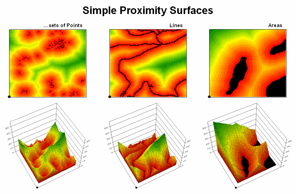
Figure
5.4-2.
Proximity surfaces can be generated for groups of points, lines or
polygons identifying the shortest distance from all location to the closest
occurrence.
The 3D
plots of the proximity surfaces in figure 5.4-2 show detailed gradient data and
are termed accumulated surfaces. They contain increasing distance values from
the target point, line or area locations displayed as colors from red (close)
to green (far). The starting features
are the lowest locations (black= 0) with hillsides of increasing distance and
forming ridges that are equidistant from starting locations.
In many
applications, however, the shortest route between two locations might not
always be a straight-line (or even a slightly wiggling set of grid steps). And even if it is straight, its geographic
length may not always reflect a traditional measure of distance. Rather, distance in these applications is
best defined in terms of “movement” expressed as travel-time, cost or energy
that is consumed at rates that vary over time and space. Distance modifying effects involve weights
and/or barriers— concepts that imply the relative ease of movement through
geographic space might not always constant.
Effective
proximity responds to intervening conditions or barriers. There are two types
of barriers that are identified by their effects— absolute and relative. Absolute
barriers are those completely restricting movement and therefore imply an
infinite distance between the points they separate. A river might be regarded as an absolute
barrier to a non-swimmer. To a swimmer
or a boater, however, the same river might be regarded as a relative barrier identifying areas that
are passable, but only at a cost which can be equated to an increase in
geographical distance. For example, it
might take five times longer to row a hundred meters than to walk that same
distance.
In the
conceptual framework of tossing a rock into a pond, the waves can crash and
dissipate against a jetty extending into the pond (absolute barrier; no
movement through the grid spaces). Or
they can proceed, but at a reduced wavelength through an oil slick (relative
barrier; higher cost of movement through the grid spaces). The waves move both around the jetty and
through the oil slick with the ones reaching each location first identifying the set of shortest, but not
necessarily straight-lines among groups of points.
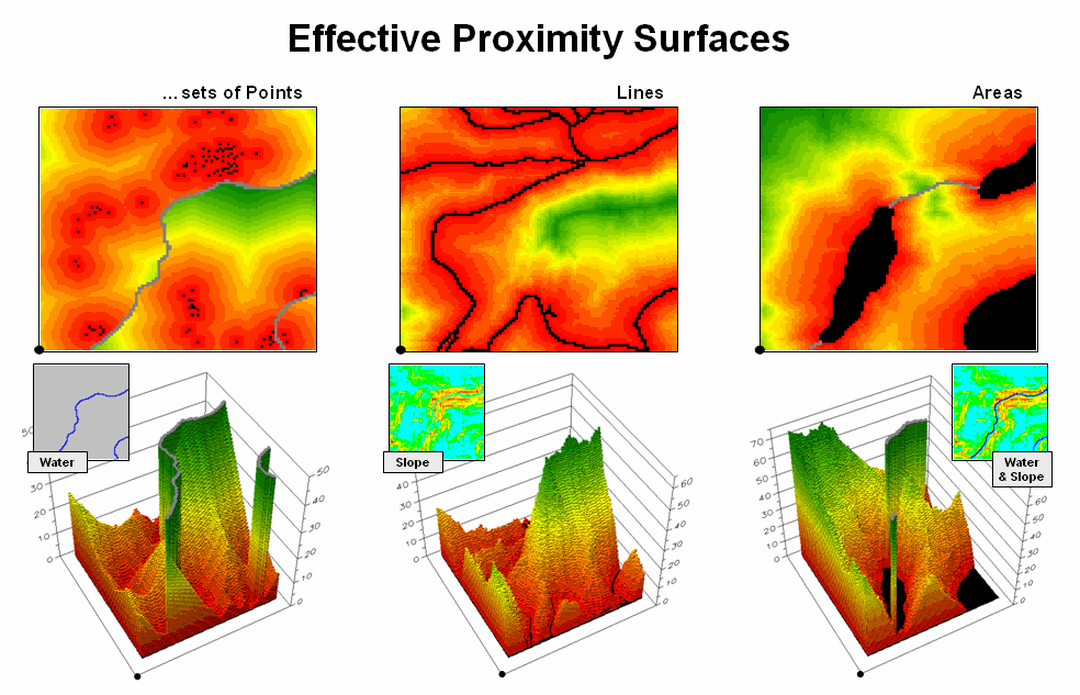
Figure
5.4-3.
Effective Proximity surfaces consider the characteristics and conditions
of movement throughout a project area.
The
shortest routes respecting these barriers are often twisted paths around and
through the barriers. The
The point
features in the left inset respond to treating flowing water as an absolute
barrier to movement. Note that the
distance to the nearest house is very large in the center-right portion of the
project area (green) although there is a large cluster of houses just to the
north. Since the water feature can’t be
crossed, the closest houses are a long distance to the south.
Terrain
steepness is used in the middle inset to illustrate the effects of a relative
barrier. Increasing slope is coded into
a friction map of increasing impedance values that make movement through steep
grid cells effectively farther away than movement through gently sloped
locations. Both absolute and relative
barriers are applied in determining effective proximity sensitive areas in the
right inset.
Compare
these results in figures 5.4-2 and 5.4-3 and note the dramatic differences
between the concept of distance “as the crow flies” (simple proximity) and “as
the crow walks” (effective proximity).
In many practical applications, the assumption that all movement occurs
in straight lines disregards reality.
When traveling by trains, planes, automobiles, and feet there are plenty
of bends, twists, accelerations and decelerations due to characteristics
(weights) and conditions (barriers) of the movement.
Figure
5.4-4 illustrates how the splash algorithm propagates distance waves to
generate an effective proximity surface.
The Friction Map locates the absolute (blue/water) and relative (light
blue= gentle/easy through red= steep/hard) barriers. As the distance wave encounters the barriers
their effects on movement are incorporated and distort the symmetric pattern of
simple proximity waves. The result
identifies the “shortest, but not necessarily straight” distance connecting the
starting location with all other locations in a project area.
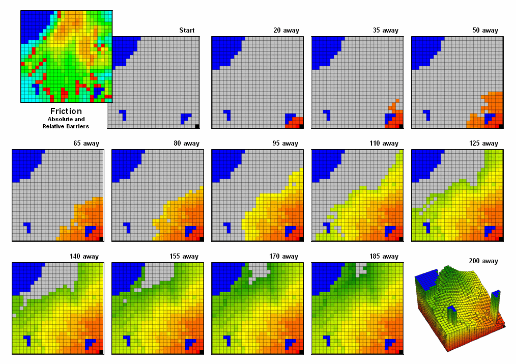
Figure
5.4-4. Effective Distance waves are
distorted as they encounter absolute and relative barriers, advancing faster
under easy conditions and slower in difficult areas.
Note that
the absolute barrier locations (blue) are set to infinitely far away and appear
as pillars in the 3-D display of the final proximity surface. As with simple proximity, the effective
distance values form a bowl-like surface with the starting location at the
lowest point (zero away from itself) and then ever-increasing distances away
(upward slope). With effective
proximity, however, the bowl is not symmetrical and is warped with bumps and
ridges that reflect intervening conditions— the greater the impedance the
greater the upward slope of the bowl. In
addition, there can never be a depression as that would indicate a location
that is closer to the starting location than everywhere around it. Such a situation would violate the
ever-increasing concentric rings theory and is impossible.
The
past series of four sections have focused on how simple distance is extended to
effective proximity and movement in a modern
While
the computations of simple and effective proximity might be unfamiliar and
appear complex, once programmed they are easily and quickly performed by modern
computers. In addition, there is a
rapidly growing wealth of digital data describing conditions that impact
movement in the real world. It seems
that all is in place for a radical rethinking and expression of
distance—computers, programs and data are poised.
However,
what seems to be the major hurdle for adoption of this new way of spatial
thinking lies in the experience base of potential users. Our paper map legacy suggests that the shortest
straight line between two points is the only way to investigate spatial context
relationships and anything else is wrong (or at least uncomfortable).
This
restricted perspective has lead most contemporary
The
first portion of figure 5.4-5 identifies the basic operations described in the
previous sections. These procedures have
set the stage for even more advanced distance operations, as outlined in the
lower portion of the figure. For
example, a Guiding Surface can be
used to constrain movement up, down or across a surface. For example, the algorithm can check an
elevation surface and only proceed to downhill locations from a feature such as
roads to identify areas potentially affected by the wash of surface chemicals
applied.
The
simplest Directional Effect involves
compass directions, such as only establishing proximity in the direction of a
prevailing wind. A more complex
directional effect is consideration of the movement with respect to an
elevation surface—a steep uphill movement might be considered a higher friction
value than movement across a slope or downhill.
This consideration involves a dynamic barrier that the algorithm must
evaluate for each point along the wave front as it propagates.
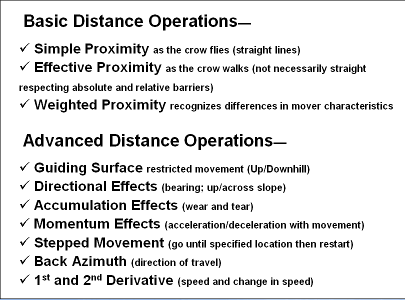
Figure 5.4-5. The basic set of distance operations can be
extended by considering the dynamic nature of the implied movement.
Accumulation Effects account for wear and tear as movement
continues. For example, a hiker might
easily proceed through a fairly steep uphill slope at the start of a hike but
balk and pitch a tent at the same slope encountered ten hours into a hike. In this case, the algorithm merely “carries”
an equation that increases the static/dynamic friction values as the movement
wave front progresses. A natural
application is to have a user enter their gas tank size and average mileage so
it would automatically suggest refilling stops along a proposed route.
A
related consideration, Momentum Effects,
tracks the total effective distance but in this instance it calculates the net
effect of up/downhill conditions that are encountered. It is similar to a marble rolling over an
undulating surface—it picks up speed on the downhill stretches and slows down
on the uphill ones.
The
remaining three advanced operations interact with the accumulation surface
derived by the wave front’s movement.
Recall that this surface is analogous to football stadium with each tier
of seats being assigned a distance value indicating increasing distance from
the field. In practice, an accumulation
surface is a twisted bowl that is always increasing but at different rates that
reflect the differences in the spatial patterns of relative and absolute
barriers.
Stepped Movement allows the proximity wave to grow
until it reaches a specified location, and then restart at that location until
another specified location and so on.
This generates a series of effective proximity facets from the closest
to the farthest location. The steepest
downhill path over each facet, as you might recall, identifies the optimal path
for that segment. The set of segments
for all of the facets forms the optimal path network connecting the specified
points.
The
direction of optimal travel through any location in a project area can be
derived by calculating the Back Azimuth
of the location on the accumulation surface.
Recall that the wave front potentially can step to any of its eight
neighboring cells and keeps track of the one with the least friction to
movement. The aspect of the steepest
downhill step (N, NE, E, SE, S, SW, W or NW) at any location on the
accumulation surface therefore indicates the direction of the best path through
that location. In practice there are two
directions—one in and one out for each location.
An
even more bazaar extension is the interpretation of the 1st and 2nd Derivative of an accumulation
surface. The 1st derivative
(rise over run) identifies the change in accumulated value (friction value) per
unit of geographic change (cell size).
On a travel-time surface, the result is the speed of optimal travel
across the cell. The second derivative
generates values whether the movement at each location is accelerating or
decelerating.
Chances
are these extensions to distance operations seem a bit confusing,
uncomfortable, esoteric and bordering on heresy. While the old “straight line” procedure from
our paper map legacy may be straight forward, it fails to recognize the reality
that most things rarely move in straight lines.
Effective
distance recognizes the complexity of realistic movement by utilizing a
procedure of propagating proximity waves that interact with a map indicating
relative ease of movement. Assigning
values to relative and absolute barriers to travel enable the algorithm to
consider locations to favor or avoid as movement proceeds. The basic distance operations assume static
conditions, whereas the advanced ones account for dynamic conditions that vary
with the nature of the movement.
So
what’s the take home from the discussions involving effective distance? Two points seem to define the bottom
line. First, that the digital map is revolutionizing
how we perceive distance, as well as how calculate it. It is the first radical change since
Pythagoras came up with his theorem a couple of thousand years ago. Secondly, the ability to quantify effective
distance isn’t limited by computational power or available data; rather it is
most limited by difficulties in understanding accepting the concept.
5.5 Summarizing Neighbors
Analysis
of spatially defined neighborhoods involves summarizing the context of surrounding
locations. Four steps are involved in
neighborhood analysis— 1) define the neighborhood, 2) identify map values
within the neighborhood, 3) summarize the values and 4) assign the summary
statistic to the focus location. The
process is then repeated for every location in a project area.
Summarizing
Neighbors techniques fall into two broad classes of analysis—Characterizing Surface Configuration and
Summarizing Map Values (see figure
5.5-1). It is important to note that all
neighborhood analyses involve mathematical or statistical summary of values on
an existing map that occur within a roving window. As the window is moved throughout a project
area, the summary value is stored for the grid location at the center of the
window resulting in a new map layer reflecting neighboring characteristics or
conditions.
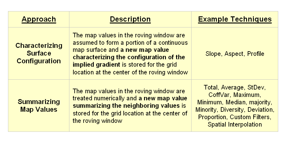
Figure 5.5-1. The two fundamental classes of neighborhood
analysis operations involve Characterizing Surface Configuration and
Summarizing Map Values.
The
difference between the two classes is in the treatment of the values—implied
surface configuration or direct numerical summary. For example, figure 5.5-2 shows a small portion
of a typical elevation data set, with each cell containing a value representing
its overall elevation. In the
highlighted 3x3 window there are eight individual slopes, as shown in the
calculations on the right side of the figure.
The steepest slope in the window is 52% formed by the center and the NW
neighboring cell. The minimum slope is
11% in the NE direction.
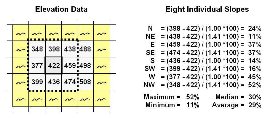
Figure 5.5-2.
At a location, the eight
individual slopes can be calculated for a 3x3 window and then summarized for
the maximum, minimum, median and average slope.
But
what about the general slope throughout the entire 3x3 analysis window? One estimate is 29%, the arithmetic average
of the eight individual slopes. Another
general characterization could be 30%, the median of slope values. But let's stretch the thinking a bit more. Imagine that the nine elevation values become
balls floating above their respective locations, as shown in Figure 5.5-3. Mentally insert a plane and shift it about
until it is positioned to minimize the overall distances from the plane to the
balls. The result is a "best-fitted
plane" summarizing the overall slope in the 3x3 window.
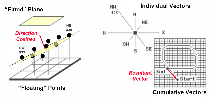
Figure 5.5-3. Best-Fitted
Plane and Vector Algebra can be used to calculate overall slope.
The
algorithm is similar to fitting a regression line to a set of data points in
two-dimensional space. However in this
case, it’s a plane in three-dimensional space.
There is an intimidating set of equations involved, with a lot of Greek
letters and subscripts to "minimize the sum of the squared deviations"
from the plane to the points. Solid
geometry calculations, based on the plane's "direction cosines," are
used to determine the slope (and aspect) of the plane.
Another
procedure for fitting a plane to the elevation data uses vector algebra, as
illustrated in the right portion of figure 5.5-3. In concept, the mathematics draws each of the
eight slopes as a line in the proper direction and relative length of the slope
value (individual vectors). Now comes
the fun part. Starting with the NW line,
successively connect the lines as shown in the figure (cumulative
vectors). The civil engineer will
recognize this procedure as similar to the latitude and departure sums in
"closing a survey transect."
The length of the “resultant vector” is the slope (and direction is the
aspect).
There
is a lot more to neighborhood analysis than just characterizing the lumps and
bumps of the terrain. Figure 5.5-4 shows
a direct numerical summary identifying the number of customers within a quarter
of a mile of every location within a project area.
The
procedure uses a roving window to collect neighboring map values and compute
the total number of customers in the neighborhood. In this example, the window is positioned at
a location that computes a total of 91 customers within quarter-mile.
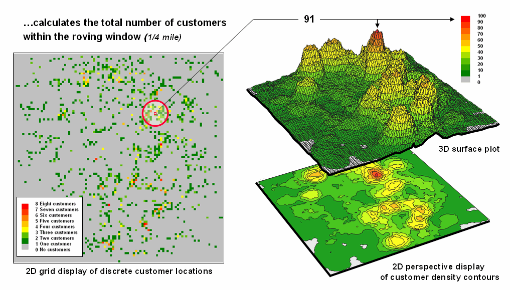
Figure 5.5-4 Approach
used in deriving a Customer Density surface from a map of customer locations.
Note
that the input data is a discrete placement of customers while the output is a
continuous surface showing the gradient of customer density. While the example location does not even have
a single customer, it has an extremely high customer density because there are
a lot of customers surrounding it.
The
map displays on the right of the figure show the results of the processing for
the entire area. A traditional vector
Figure
5.5-5 illustrates how the information was derived. The upper-right map is a display of the
discrete customer locations of the neighborhood of values surrounding the
“focal” cell. The large graphic on the
right shows this same information with the actual map values superimposed. Actually, the values are from an Excel
worksheet with the column and row totals indicated along the right and bottom
margins. The row (and column) sum
identifies the total number off customers within the
window—91 total customers within a quarter-mile radius.
This
value is assigned to the focal cell location as depicted in the lower-left
map. Now imagine moving the ‘Excel
window’ to next cell on the right, determine the total number of customers and
assign the result—then on to the next location, and the next, and the next,
etc. The process is repeated for every
location in the project area to derive the customer density surface.
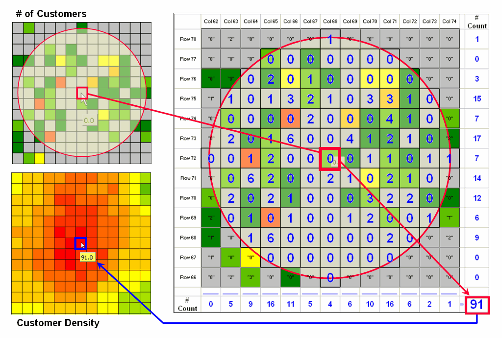
Figure 5.5-5. Calculations
involved in deriving customer density.
The
processing summarizes the map values occurring within a location’s neighborhood
(roving window). In this case the
resultant value was the sum of all the values.
But summaries other than Total
can be used—Average, StDev,
CoffVar, Maximum, Minimum, Median, Majority,
Minority, Diversity, Deviation, Proportion, Custom Filters, and Spatial
Interpolation. The remainder of this
series will focus on how these techniques can be used to derive valuable insight
into the conditions and characteristics surrounding locations—analyzing their
spatially-defined neighborhoods.
6.0
It
is commonly recognized that there are three essential elements to
In
the early years, data and software development dominated the developing
field. As
6.1 Suitability Modeling
A
simple habitat model can be developed using only reclassify and overlay
operations. For example, a Hugag is a curious mythical beast with strong preferences
for terrain configuration: prefers low
elevations, prefers gentle slopes,
and prefers southerly aspects.
6.1.1
Binary Model
A
binary habitat model of Hugag preferences is the
simplest to conceptualize and implement.
It is analogous to the manual procedures for map analysis popularized in
the landmark book Design with Nature,
by Ian L. McHarg, first published in 1969. This seminal work was the forbearer of modern
map analysis by describing an overlay procedure involving paper maps,
transparent sheets and pens.
For
example, if avoiding steep slopes was an important decision criterion, a
draftsperson would tape a transparent sheet over a topographic map, delineate
areas of steep slopes (contour lines close together) and fill-in the
precipitous areas with an opaque color.
The process is repeated for other criteria, such as the Hugag’s preference to avoid areas that are
northerly-oriented and at high altitudes.
The annotated transparencies then are aligned on a light-table and the
transparent areas showing through identify acceptable habitat for the
animal.
An
analogous procedure can be implemented in a computer by using the value 0 to
represent the unacceptable areas (opaque) and 1 to represent acceptable habit
(clear). As shown in figure 6.1-1, an Elevation map is used to derive a map of
terrain steepness (Slope_map)
and orientation (Aspect_map). A value of 0 is assigned to locations Hugags want to avoid—
- Greater than 1800 feet elevation =
0 …too high
- Greater than 30% slope = 0 …too steep
- North, northeast and northwest =
0 …to northerly
All
other locations are assigned a value of 1 to indicate acceptable areas. The individual binary habit maps are shown
displays on the right side of the figure.
The dark red portions identify unacceptable areas that are analogous to McHarg’s opaque colored areas delineated on otherwise clear
transparencies.
A
Binary Suitability map of Hugag habitat is generated by multiplying the three
individual binary preference maps. If a
zero is encountered on any of the map layers, the solution is sent to zero (bad
habitat). For the example location on
the right side of the figure, the preference string of values is 1 * 1 * 0 = 0
(Bad). Only locations with 1 * 1 * 1 = 1
(Good) identify areas without any limiting factors—good elevations, good slopes
and good orientation. These areas are
analogous to the clear areas showing through the stack of transparencies on a
light-table.
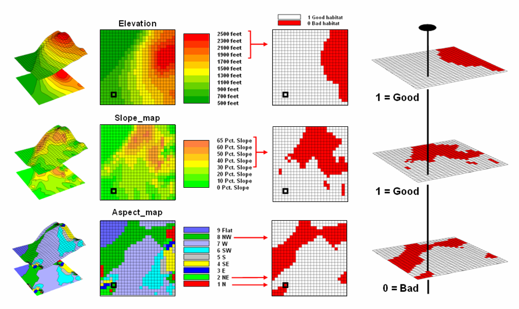
Figure 6.1-1. Binary maps representing Hugag
habitat preferences are coded as 1= good and 0= bad.
While
this procedure mimics manual map processing, it is limited in the information
it generates. The solution is binary and
only differentiates acceptable and unacceptable locations. But an area that is totally bad (0 * 0 * 0 =
0) is significantly different from one that is just limited by one factor (1 *
1 * 0 = 0) as two factors are acceptable, thus making it nearly good.
6.1.2
Ranking Model
The
right side of figure 6.1.2-1 shows a Ranking
Suitability map of Hugag habitat. In this instance the individual binary maps
are simply added together for a count of the number of acceptable
locations. Note that the areas of
perfectly acceptable habitat (light grey) on both the binary and ranking
suitability maps have the same geographic pattern. However, the unacceptable area on the ranking
suitability map contains values 0 through 2 indicating how many acceptable
factors occur at each location. The zero
value for the area in the northeastern portion of the map identifies very bad
conditions (0 + 0 + 0= 0). The example
location, on the other hand, is nearly good (1 + 1 + 0= 2).
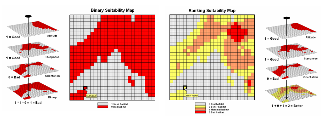
Figure
6.1.2-1. The binary habitat maps are
multiplied together to create a Binary Suitability map (good or bad) or added
together to create a Ranking Suitability map (bad, marginal, better or best).
The
ability to report the degree of suitability stimulated a lot of research into
using additive colors for the manual process.
Physics suggests that if blue, green and red are used as semi-opaque
colors on the transparencies, the resulting color combinations should be those
indicated in the left side of the table in figure 6.1.2-2. However, in practice the technique collapses
to an indistinguishable brownish-purple glob of colors when three or more map
layers are overlaid.
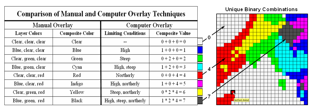
Figure
6.1.2-2. The sum of a binary progression
of values on individual map layers results in a unique value for each
combination.
Computer
overlay, on the other hand, can accurately differentiate all possible
combinations as shown on the right side of the figure. The trick is characterizing the unacceptable
areas on each map layer as a binary progression of values—1, 2, 4, 8, 16, 32,
etc. In the example in the figure, 1 is
assigned to areas that are too high, 2 assigned to areas that are too steep and
4 assigned to areas that are too northerly oriented. Adding a binary progression of values each
combination of values results in a unique sum.
The result is termed a Ranking
Combination suitability map.
In
the three-map example, all possible combinations are contained in the number
range 0 (best) to 7 (bad) as indicated.
A value of 4 can only result from a map layer sequence of 0 + 0 + 4 that
corresponds to OK Elevation, OK Steepness and Bad Aspect. If a fourth map was added to the stack, its
individual binary map value for unacceptable areas would be 8 and the resulting
range of values for the four map-stack would be from 0 (best) to 15 (bad) with
a unique value for each combination of habitat conditions.
6.1.3
Rating Model
The
binary, ranking and ranking
combinations approaches to suitability mapping share a common
assumption—that each habitat criterion can be discretely classified as either
acceptable or unacceptable. However,
suppose Hugags are complex animals and actually
perceive a continuum of preference. For
example, their distain for high elevations isn’t a
sharp boundary at 1800 feet. Rather they
might strongly prefer low land areas, venture sometimes into transition
elevations but absolutely detest the higher altitudes.
Figure
6.1.3-1 shows a Rating Suitability
map of Hugag habitat.
In this case the three criteria maps are graded on a scale of 1 (bad) to
9 (best). For example, the
elevation-based conditions are calibrated as—
- 1 (bad) = > 1800 feet
- 3 (marginal) = 1400-1800 feet
- 5 (OK) = 1250-1400 feet
- 7 (better) = 900-1250 feet
- 9 (best) = 0-900 feet
The
other two criteria of slope and orientation are similarly graded on the same
scale as shown in the figure.
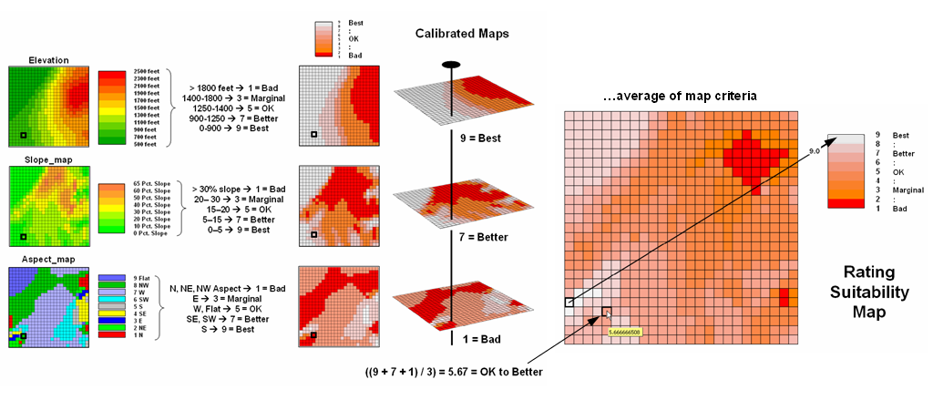
Figure
6.1.3-1. A Rating Suitability map is
derived by averaging a series of “graded” maps representing individual habitat
criteria.
This
process is analogous to a professor grading student exams for an overall course
grade. Each map layer is like a test,
each grid cell is like a student and each map value at a location is like the
grade for test. To determine the overall
grade for a semester a professor averages the individual test scores. An overall habitat score is calculated in a
similar manner—take the average of the three calibrated map layers.
The
example location in the example is assigned an average habitat value of 5.67
that is somewhere between OK and Better habitat conditions on the 1 (bad) to 9
(best) suitability scale. The rating was
derived by averaging the three calibrated values of—
9 …9 assigned “Best” elevation condition of
between 0 and 900 feet
7 …7 assigned “Better” steepness condition of
between 5 and 15 %
1 …1 (northwest)
assigned “Bad” aspect condition
17 / 3 = 5.67 average habitat rating ...slightly better than OK
Note
the increased information provided by a rating suitability map. All three of the extended techniques
(ranking, ranking combination and rating) consistently identify the completely
bad area in the northeast and southeast.
What changes with the different techniques is the information about
subtle differences in the marginal through better areas. The rating suitability map contains the most
information as it uses a consistent scale and reports habitat “goodness” values
to the decimal point.
That
brings the discussion full circle and reinforces the concept of a map-ematical framework for analyzing spatial
relationships. Generally speaking, map
analysis procedures such as Suitability Modeling take full advantage of the
digital nature of maps to provide more information than traditional manual
techniques supporting better decision-making.
6.2 Decision Support
Modeling
In
the past, electric transmission line siting required
thousands of hours around paper maps, sketching hundreds of possible paths, and
then assessing their feasibility by ‘eyeballing the best route.’ The tools of
the trade were a straight edge and professional experience. This manual approach capitalizes on expert
interpretation and judgment, but it is often criticized as a closed process
that lacks a defendable procedure and fails to engage the perspectives of
external stakeholders in what constitutes a preferred route.
6.2.1 Routing Procedure
The
use of the Least Cost Path (
Figure
6.2.1-1 schematically shows a flowchart of the
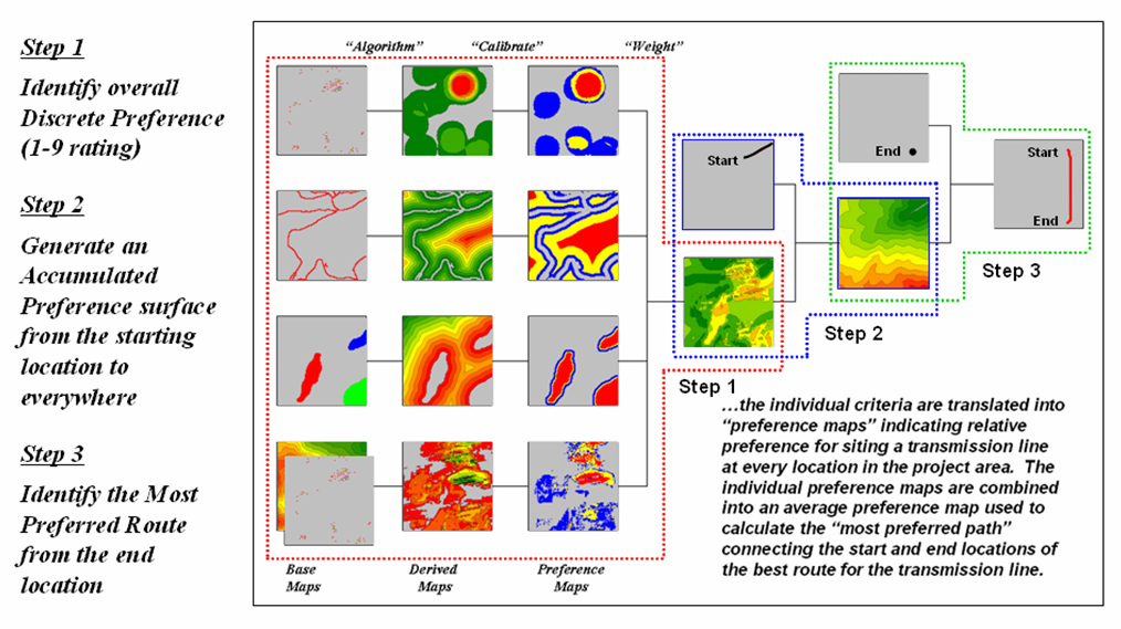
Figure
6.2.1-1.
These
four criteria are shown as rows in the left portion of the flowchart in the
figure. The Base Maps are field collected data such as elevation, sensitive
areas, roads and houses. Derived Maps use computer processing to
calculate information that is too difficult or even impossible to collect, such
as visual exposure, proximity and density.
The discrete Preference Maps
translate this information into decision criteria. The calibration forms maps that are scaled
from 1 (most preferred—favor siting, grey areas) to 9
(least preferred—avoid siting, red areas) for each of
the decision criteria.
The
individual cost maps are combined into a single map by averaging the individual
layers. For example, if a grid location
is rated 1 in each of the four cost maps, its average is 1 indicating an area
strongly preferred for siting. As the average increases for other locations
it increasingly encourages routing away from them. If there are areas that are impossible or
illegal to cross these locations are identified with a “null value” that
instructs the computer to never traverse these locations under any
circumstances.
6.2.2 Identifying Corridors
The
technique generates accumulation surfaces from both the Start and End locations
of the proposed power line. For any
given location in the project area one surface identifies the best route to the
start and the other surface identifies the best route to the end. Adding the two surfaces together identifies
the total cost of forcing a route through every location in the project area.
The
series of lowest values on the total accumulation surface (valley bottom)
identifies the best route. The valley
walls depict increasingly less optimal routes.
The red areas in figure 6.2.2-1 identify all of locations that within
five percent of the optimal path. The
green areas indicate ten percent sub-optimality.
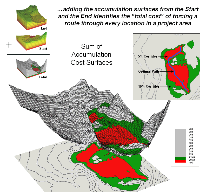
Figure
6.2.2-1. The sum of accumulated surfaces
is used to identify siting corridors as low points on
the total accumulated surface.
The
corridors are useful in delineating boundaries for detailed data collection,
such as high resolution aerial photography and ownership records. The detailed data within the macro-corridor
is helpful in making slight adjustments in centerline design, or as we will see
next month in generating and assessing alternative routes.
6.2.3 Calibrating Routing Criteria
Implementation
of the
The
answers to these questions are what tailor a model to the specific circumstances
of its application and the understanding and values of the decision
participants. The tailoring involves two
related categories of parameterization—calibration and weighting.
Calibration
refers to establishing a consistent scale from 1 (most preferred) to 9 (least
preferred) for rating each map layer used in the solution. Figure 6.2.3-1 shows the result for the four
decision criteria used in the routing example.
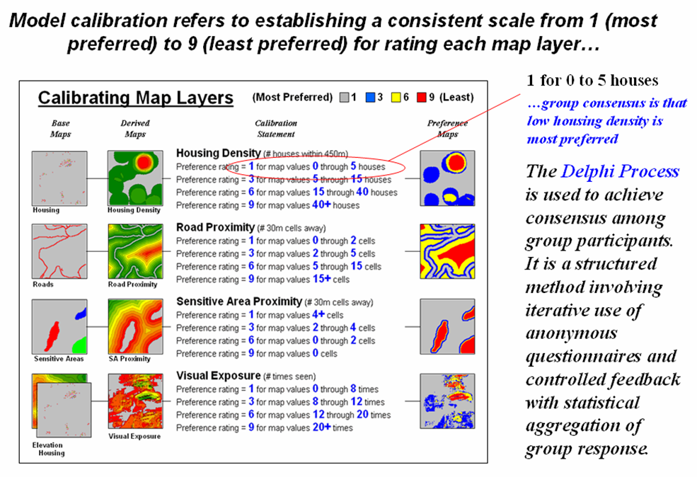
Figure
6.2.3-1. The Delphi Process uses
structured group interaction to establish a consistent rating for each map
layer.
The
Delphi Process, developed in the 1950s
by the Rand Corporation, is designed to achieve consensus among a group of
experts. It involves directed group
interaction consisting of at least three rounds. The first round is completely unstructured,
asking participants to express any opinions they have on calibrating the map
layers in question. In the next round
the participants complete a questionnaire designed to rank the criteria from 1
to 9. In the third round participants
re-rank the criteria based on a statistical summary of the questionnaires. “Outlier” opinions are discussed and
consensus sought.
The
development and summary of the questionnaire is critical to Delphi. In the case of continuous maps, participants
are asked to indicate cut-off values for the nine rating steps. For example, a cutoff of 4 (implying 0-4
houses) might be recorded by a respondent for Housing Density preference level
1 (most preferred); a cut-off of 12 (implying a range of 4-12) for preference
level 2; and so forth. For discrete
maps, responses from 1 to 9 are assigned to each category value. The same preference value can be assigned to
more than one category, however there has to be at least one condition rated 1
and another rated 9. In both continuous
and discrete map calibration, the median, mean, standard deviation and
coefficient of variation for group responses are computed for each question and
used to assess group consensus and guide follow-up discussion.
6.2.4 Weighting Criteria Maps
Weighting
of the map layers is achieved using a portion of the Analytical Hierarchy Process (
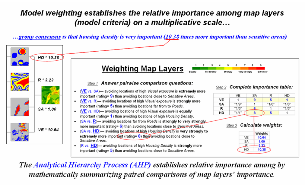
Figure
6.2.4-1. The Analytical Hierarchy Process
uses direct comparison of map layers to derive their relative importance.
In
the routing example, there are four map layers that define the six direct
comparison statements identified in figure 51 (#pairs = (N * (N – 1) / 2) = 4 *
3 / 2= 6 statements) as shown in figure 6.2.4-1. Members of the group independently order the
statements so they are true, then record the relative level of importance
implied in each statement. The
importance scale is from 1 (equally important) to 9 (extremely more important).
This
information is entered into the importance table a row at a time. For example, the first statement in the
figure views avoiding locations of high Visual Exposure (VE) as extremely more
important (importance level= 9) than avoiding locations close to Sensitive
Areas (SA). The response is entered
into table position row 2, column 3 as shown.
The reciprocal of the statement is entered into its mirrored position at
row 3, column 2. Note that the last
weighting statement is reversed so its importance value is recorded at row 5,
column 4 and its reciprocal recorded at row 4, column 5.
Once
the importance table is completed, the map layer weights are calculated. The procedure first calculates the sum of the
columns in the matrix, and then divides each entry by its column sum to
normalize the responses. The row sum of
the normalized responses derives the relative weights that, in turn, are
divided by minimum weight to express them as a multiplicative scale.
The
relative weights for a group of participants are translated to a common scale
then averaged before expressing them as a multiplicative scale. Alternate routes are generated by evaluating
the model using weights derived from different group perspectives.
6.2.5 Transmission Line
Routing Experience
Figure
6.2.5-1 shows the results of applying different calibration and weighting
information to derive alternative routes for a routing application in central
Georgia. Four routes and corridors were
generated emphasizing different perspectives—Built environment (community concerns), Natural environment (environmental), Engineering (constructability) and the Simple un-weighted average of all three group perspectives.
While
all four of the routes use the same criteria layers, the differences in
emphasis for certain layers generate different routes/corridors that directly
reflect differences in stakeholder perspective.
Note the similarities and differences among the Built, Natural,
Engineering and un-weighted routes. The
bottom line is that the procedure identified constructible alternative routes
that can be easily communicated and discussed.
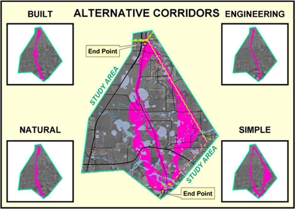
Figure
6.2.5-1. Alternate routes are generated
by evaluating the model using weights derived from different group
perspectives. (Courtesy of Photo Science and Georgia Transmission Corporation)
The
final route is developed by an experienced transmission line siting team who combine alternative route segments for a
preferred route. Engineers make slight
centerline realignments responding the detailed field surveys along the
preferred, and then design the final pole placements and construction estimates
for the final route.
The
ability to infuse different perspectives into the routing process is critical
in gaining stakeholder involvement and identifying siting
sensitivity. It acts at the front end of
the routing process to explicitly identify routing corridors that contain
constructible routes reflecting different perspectives that guide siting engineer deliberations. Also, the explicit nature of the methodology
tends to de-mystify the routing process by clearly identifying the criteria and
how it is evaluated.
In
addition, the participatory process 1) encourages interaction among various
perspectives, 2) provides a clear and structured procedure for comparing
decision elements, 3) involves quantitative summary of group interaction and
dialog, 4) identifies the degree of group consensus for each decision element,
5) documents the range of interpretations, values and considerations
surrounding decision criteria, and 6) generates consistent, objective and
defendable parameterization of
The
use of Delphi and
6.3 Statistical Modeling
Site-specific
management, often referred to as Precision Farming or Precision Agriculture, is
about doing the right thing, in the
right way, at the right place and time. It involves assessing and reacting to field
variability and tailoring management actions, such as fertilization levels,
seeding rates and variety selection, to match changing field conditions. It assumes that managing field variability
leads to cost savings, production increases and better stewardship of the
land. Site-specific management isn’t
just a bunch of pretty maps, but a set of new procedures that link mapped
variables to appropriate management actions.
Several
of the procedures, such as map similarity, level-slicing, clustering and
regression, used in precision agriculture are discussed thoroughly in section
4.0, Spatial Statistics Techniques. The
following discussion outlines how the analytical techniques can be used to
relate crop yield to driving variables like soil nutrient levels that support
management action.
6.3.1 Elements of Precision Agriculture
To
date, much of the analysis of yield maps have been visual interpretations. By viewing a map, all sorts of potential relationships
between yield variability and field conditions spring to mind. These ‘visceral visions’ and explanations
can be drawn through the farmer’s knowledge of the field— "…this area of
low yield seems to align with that slight depression," or "…maybe
that’s where all those weeds were," or "…wasn’t that where the seeder
broke down last spring?"
Data
visualization can be extended by
However,
map analysis greatly extends data visualization and can more precisely identify
areas of statistically high yield and correlate them to a complex array of
mapped field conditions. The synthesis
level of processing uses
The
precision agriculture process can be viewed as four steps: Data Logging, Point
Sampling, Data Analysis and Prescription Modeling as depicted in figure
6.3.1-1. Data logging continuously monitors measurements, such as crop
yield, as a tractor moves through a field. Point sampling, on the other
hand, uses a set of dispersed samples to characterize field conditions, such as
phosphorous, potassium, and nitrogen levels. The nature of the data derived by
the two approaches are radically different— a "direct census" of
yield consisting of thousands of on-the fly samples versus a "statistical
estimate" of the geographic distribution of soil nutrients based on a
handful of soil samples.
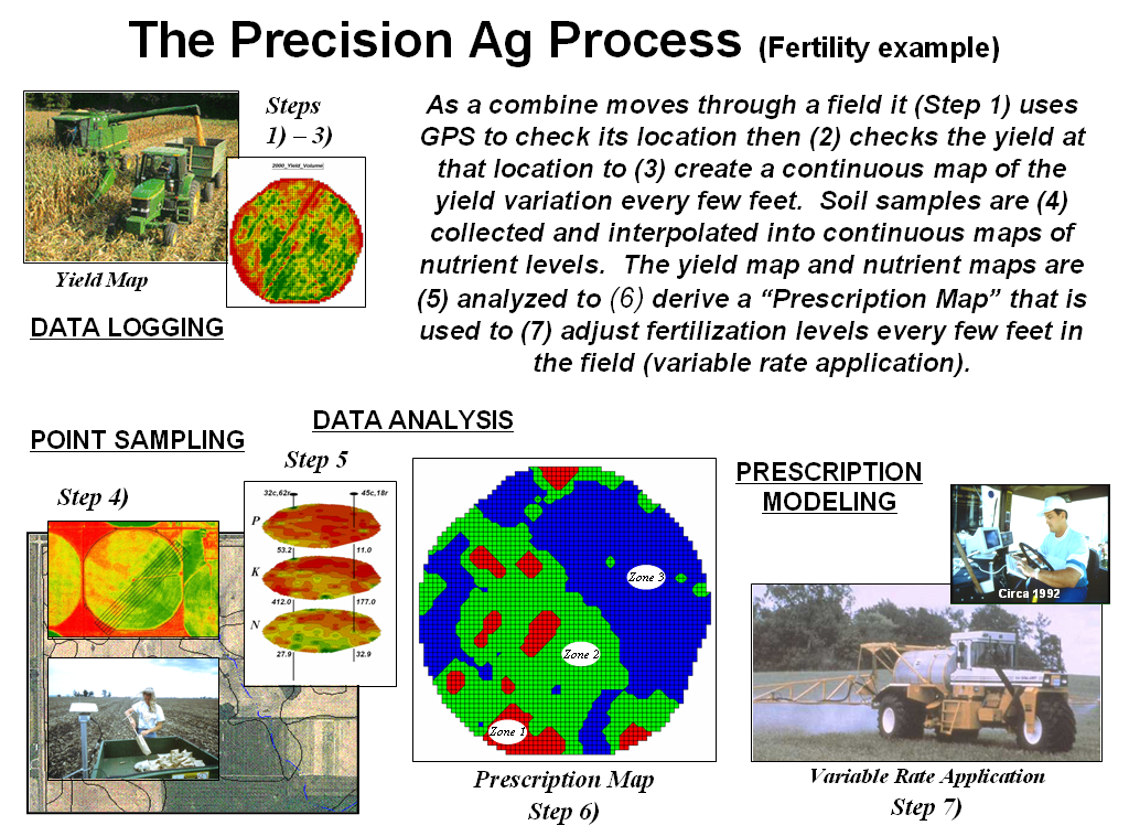
Figure
6.3.1-1. The Precision Agriculture process analysis involves Data Logging,
Point Sampling, Data Analysis and Prescription Mapping.
In
data logging, issues of accurate measurement, such as
In
point sampling, issues of surface modeling (estimating between sample points)
are of concern, such as sampling frequency/pattern and interpolation technique
to use. The cost of soil lab analysis
dictates "smart sampling" techniques based on terrain and previous
data be used to balance spatial variability with a farmer’s budget. In
addition, techniques for evaluating alternative interpolation techniques and
selecting the "best" map using residual analysis are available in
some of the soil mapping systems.
In
both data logging and point sampling, the resolution of the analysis grid used
to geographically summarize the data is a critical concern. Like a
stockbroker’s analysis of financial markets, the fluctuations of individual
trades must be "smoothed" to produce useful trends. If the analysis grid is too coarse,
information is lost in the aggregation over large grid spaces; if too small,
spurious measurement and positioning errors dominate the information.
The
technical issues surrounding mapped data
analysis involve the validity of applying traditional statistical
techniques to spatial data. For example, regression analysis of field plots has
been used for years to derive crop production functions, such as corn yield
(dependent variable) versus potassium levels (independent variable). In a
In
theory, prescription modeling moves the derived
relationships in space or time to determine the optimal actions, such as the
blend of phosphorous, potassium and nitrogen to be applied at each location in
the field. In current practice, these
translations are based on existing science and experience without a direct link
to data analysis of on-farm data. For example, a prescription map for
fertilization is constructed by noting the existing nutrient levels (condition)
then assigning a blend of additional nutrients (action) tailored to each
location forming an if-(condition)-then-(action) set of rules. The
issues surrounding spatial modeling are similar to data analysis and involve
the validity of using traditional "goal seeking" techniques, such as
linear programming or genetic modeling, to calculate maps of the optimal
actions.
6.3.2 The Big Picture
The
precision agriculture process is a special case of spatial data mining
described in section 2.1. It involves
deriving statistical models that spatially relate map variables to generate
predictions that guide management actions.
In the earlier case discussed the analysis involved a prediction model
relating product sales to demographic data.
In the precision agriculture example, corn yield is substituted for
sales and nutrient levels are substituted for demographics.
The
big picture however, is the same—relating a dependent map variable (sales or
yield) to independent map variables (demographics or nutrients) that easily
obtained and thought to drive relationship.
What separates the two applications is their practical implementation. Sales mapping utilizes existing databases to
derive the maps and
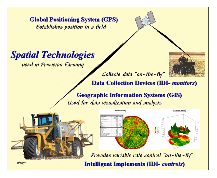
Figure
6.3.2-1. Precision Agriculture involves applying emerging spatial technologies
of
Precision
agriculture, on the other hand, is a much more comprehensive solution. It requires the seamless integration of three
technologies— global positioning system (
Modern
Once established these
relationships are used to derive a prescription map of management actions
required for each location in a field.
The final element, variable rate implements, notes a tractor’s
position through
Site-specific
management through statistical modeling extends our traditional understanding
of farm fields from "where is what" to analytical renderings of
"so what" by relating variations in crop yield to field conditions,
such as soil nutrient levels, available moisture and other driving variables.
Once these relationships are established, they can be used to insure the right
thing is done, in the right way, at the right place and time. Common sense
leads us to believe the efficiencies in managing field variability outweigh the
costs of the new technology. However, the enthusiasm for site-specific
management must be dampened by reality consisting of at least two parts:
empirical verification and personal comfort.
To
date, there have not been conclusive studies that economically justify site-specific
management in all cases. In addition,
the technological capabilities appear somewhat to be ahead of scientific
understanding and a great deal of spatial research lies ahead. In the information age, a farmer’s ability to
react to the inherent variability within a field might determine survival and
growth of tomorrow’s farms.
From
the big picture perspective however, precision agriculture is pushing the
envelope of
7.0 Conclusions
Research, decision-making
and policy development in the management of land have always required
information as their cornerstone. Early
information systems relied on physical storage of data and manual
processing. With the advent of the
computer, most of these data and procedures have been automated during the past
three decades. As a result, land-based
information processing has increasingly become more quantitative. Systems analysis techniques developed links
between descriptive data of the landscape to the mix of management actions that
maximizes a set of objectives. This
mathematical approach to land management has been both stimulated and
facilitated by modern information systems technology. The digital nature of mapped data in these
systems provides a wealth of new analysis operations and an unprecedented
ability to model complex spatial issues.
The full impact of the new data form and analytical capabilities is yet
to be determined.
Effective map analysis
applications have little to do with data and everything to do with
understanding, creativity and perspective.
It is a common observation of the Information Age that the amount of
knowledge doubles every fourteen months or so.
It is believed, with the advent of the information super highway, this
periodicity will likely accelerate. But
does more information directly translate into better decisions? Does the Internet enhance information
exchange or overwhelm it? Does the
quality of information correlate with the quantity of information? Does the rapid boil of information improve or
scorch the broth of decisions?
Geotechnology technology
is a major contributor to the tsunami of information, as terra bytes of mapped
data are feverishly released on an unsuspecting (and seemingly ungrateful)
public. From a
The first is data, the
"factoids" of our Information Age.
Data are bits of information, typically
but not exclusively, in a numeric form, such as cardinal numbers, percentages,
statistics, etc. It is exceedingly
obvious that data are increasing at an incredible rate. Coupled with the barrage of data, is a
requirement for the literate citizen of the future to have a firm understanding
of averages, percentages, and to a certain extent, statistics. More and more, these types of data dominate
the media and are the primary means used to characterize public opinion, report
trends and persuade specific actions.
The second term,
information, is closely related to data.
The difference is that we tend to view information as more word-based
and/or graphic than numeric. Information is data with
explanation. Most of what is taught in
school is information. Because it
includes all that is chronicled, the amount of information available to the
average citizen substantially increases each day. The power of technology to link us to
information is phenomenal. As proof,
simply "surf" the exploding number of "home pages" on the
Internet.
The philosophers' third
category is knowledge, which can be
viewed as information within a context.
Data and information that are used to explain a phenomenon become
knowledge. It probably does not double
at fast rates, but that really has more to do with the learner and processing
techniques than with what is available.
In other words, data and information become knowledge once they are
processed and applied.
The last category, wisdom, certainly does not double at a rapid
rate. It is the application of all three
previous categories, and some intangible additions. Wisdom is rare and timeless, and is important
because it is rare and timeless. We
seldom encounter new wisdom in the popular media, nor do we expect a deluge of
newly derived wisdom to spring forth from our computer monitors each time we
log on.
Knowledge and wisdom,
like gold, must be aggressively processed from tons of near worthless
overburden. Simply increasing data and
information does not assure the increasing amounts of the knowledge and wisdom
we need to solve pressing environmental and resource problems. Increasing the processing "thruput" by efficiency gains and new approaches might.
How does this
philosophical diatribe relate to geotechnology and map analysis? What is
Understanding sits at the
juncture between the data/information and knowledge/wisdom stages of
enlightenment. Understanding involves the honest dialog among various
interpretations of data and information in an attempt to reach common knowledge
and wisdom. Note that understanding is
not a "thing," but a process.
It is how concrete facts are translated into the slippery slope of
beliefs. It involves the clash of
values, tempered by judgment based on the exchange of experience. Technology, and in particular
Tomorrow's
This step needs to fully
engage the end-user in
See Map Analysis,
an online compilation of Joseph K. Berry's Beyond Mapping columns
published in GeoWorld
magazine from 1996 through 2007. It is intended to be used as a
self-instructional text or in support of formal academic courses for study of
grid-based map analysis and
http://innovativegis.com/basis/MapAnalysis/,
Map Analysis online
book
http://innovativegis.com/basis/, Papers,
presentations, instructional and other materials on map analysis and GIS
modeling
Hardcopy books and
companion CDs for hands-on exercises by the author on map analysis and GIS moeling include—
http://www.innovativegis.com/basis/Books/MapAnalysis/Default.htm,
Map Analysis by J. K. Berry (GeoTec Media 2007)
http://www.innovativegis.com/basis/Books/AnalyzingNRdata/Default.htm,
Analyzing Geospatial Resource Data by J. K. Berry (BASIS 2005)
http://www.innovativegis.com/basis/Books/AnalyzingGBdata/Default.htm,
Analyzing Geo-Business Data
by J. K. Berry (BASIS 2003)
http://www.innovativegis.com/basis/Books/AnalyzingPAdata/Default.htm,
Analyzing Precision Ag Data
by
J. K. Berry (BASIS 2002)
http://www.innovativegis.com/basis/Books/spatial.htm,
Spatial Reasoning for Effective GIS by J.
K. Berry (Wiley 1995)
http://www.innovativegis.com/basis/Books/bm_des.html,
Beyond Mapping: Concepts,
Algorithms and Issues in GIS by J. K. Berry (Wiley 1993)
1.0,
Introduction
- Figure
1.1-1. Spatial Analysis and Spatial Statistics are extensions of traditional
ways of analyzing mapped data.
2.0, Map
Analysis Approaches
-
Figure
2.1-1. Calculating the total number of
houses within a specified distance of each map location generates a housing
density surface.
- Figure
2.1-2. Spatial Data Mining techniques
can be used to derive predictive models of the relationships among mapped data.
- Figure
2.2-1. Map Analysis techniques can be
used to identify suitable places for a management activity.
3.0, Data
Structure Implications
- Figure
3.0-1. Grid-based data can be displayed
in 2D/3D lattice or grid forms.
- Figure
3.1-1. A map stack of individual grid
layers can be stored as separate files or in a multi-grid table.
- Figure
3.2-1. Map values are characterized from
two broad perspectives—numeric and geographic—then further refined by specific
data types.
- Figure
3.2-2. Discrete and Continuous map types
combine the numeric and geographic characteristics of mapped data.
- Figure
3.3-1. 3D display “pushes-up” the grid
or lattice reference frame to the relative height of the stored map values.
- Figure
3.4-1. Comparison of different 2D contour displays using Equal ranges, Equal
Count and +/-1 Standard deviation contouring techniques.
4.0, Spatial
Statistics Techniques
-
Figure
4.1.1-1. Spatial interpolation involves
fitting a continuous surface to sample points.
-
Figure
4.1.2-1. Variogram plot depicts the relationship between distance and
measurement similarity (spatial autocorrelation).
-
Figure
4.1.3-1. Spatial comparison of a
whole-field average and an IDW interpolated map.
-
Figure
4.1.3-2. Spatial comparison of IDW and Krig interpolated maps.
-
Figure
4.1.4-1. A residual analysis table
identifies the relative performance of average, IDW and Krig
estimates.
-
Figure 4.2.1-1.
Map surfaces identifying the spatial distribution of P,K
and N throughout a field.
-
Figure 4.2.1-2. Geographic space and data space can be
conceptually linked.
-
Figure 4.2.1-3.
A similarity map identifies how related the data patterns are for all
other locations to the pattern of a given comparison location.
-
Figure 4.2.2-1.
Level-slice classification can be used to map sub-groups of similar data
patterns.
-
Figure 4.2.3-1.
Map clustering identifies inherent groupings of data patterns in
geographic space.
-
Figure 4.2.3-2.
Data patterns for map locations are depicted as floating balls in data
space.
-
Figure 4.2.3-3.
Clustering results can be roughly evaluated using basic statistics.
-
Figure 4.2.4-1.
The corn yield map (top) identifies the pattern to predict; the red and
near-infrared maps (bottom) are used to build the spatial relationship.
-
Figure 4.2.4-2. The joint conditions for the spectral response
and corn yield maps are summarized in the scatter plots shown on the right.
-
Figure 4.2.4-3.
The red and NIR maps are combined for NDVI value that is a better
predictor of yield.
-
Figure 4.2.5-1.
A project area can be stratified based on prediction errors.
-
Figure 4.2.5-2.
After stratification, prediction equations can be derived for each
element.
- Figure
4.2.5-3. Stratified and whole-field
predictions can be compared using statistical techniques.
5.0, Spatial
Analysis Techniques
- Figure
5.0-1. An iterative processing
environment, analogous to basic math, is used to derive new map variables.
- Figure
5.2-1. Areas of meadow and forest on a
cover type map can be reclassified to isolate large areas of open water.
- Figure
5.2-2. A sequence of reclassification
operations (renumber, clump, size and renumber) can be used to isolate large
water bodies from a cover type map.
- Figure
5.3-1. Point-by point overlaying
operations summarize the coincidence of two or more maps, such as assigning a
unique value identifying the cover type and slope class conditions at each
location.
- Figure
5.3-2. Category-wide
overlay operations summarize the spatial coincidence of map categories, such as
generating the average slope for each cover type category.
- Figure
5.4-1. Proximity identifies the set of
shortest straight-lines among groups of points (distance zones).
- Figure
5.4-2. Proximity surfaces can be
generated for groups of points, lines or polygons identifying the shortest
distance from all location to the closest occurrence.
- Figure
5.4-3. Effective Proximity surfaces
consider the characteristics and conditions of movement throughout a project
area.
- Figure
5.4-4. Effective Distance waves are distorted as they encounter absolute and relative
barriers, advancing faster under easy conditions and slower in difficult areas.
- Figure
5.4-5. The basic set of distance
operations can be extended by considering the dynamic nature of the implied
movement.
- Figure
5.5-1. The two fundamental classes of
neighborhood analysis operations involve Characterizing Surface Configuration
and Summarizing Map Values.
-
Figure
5.5-2. At a location, the eight individual slopes can be calculated for a 3x3
window and then summarized for the maximum, minimum, median and average slope.
- Figure
5.5-3. Best-Fitted Plane and Vector Algebra can be used to calculate
overall slope.
- Figure
5.5-4 Approach
used in deriving a Customer Density surface from a map of customer locations.
- Figure
5.5-5. Calculations involved in deriving
customer density.
6.0,
- Figure
6.1-1. Binary maps representing Hugag habitat preferences are coded as 1= good and 0= bad.
- Figure
6.1.2-1. The binary habitat maps are
multiplied together to create a Binary Suitability map (good or bad) or added
together to create a Ranking Suitability map (bad, marginal, better or best).
- Figure
6.1.2-2. The sum of a binary progression
of values on individual map layers results in a unique value for each
combination.
- Figure
6.1.3-1. A Rating Suitability map is
derived by averaging a series of “graded” maps representing individual habitat
criteria.
- Figure
6.2.1-1.
- Figure
6.2.2-1. The sum of accumulated surfaces
is used to identify siting corridors as low points on
the total accumulated surface.
- Figure
6.2.3-1. The Delphi Process uses
structured group interaction to establish a consistent rating for each map
layer.
- Figure
6.2.4-1. The Analytical Hierarchy
Process uses direct comparison of map layers to derive their relative
importance.
- Figure
6.2.5-1. Alternate routes are generated
by evaluating the model using weights derived from different group
perspectives. (Courtesy of Photo Science and Georgia Transmission Corporation)
-
Figure 6.3.1-1. The Precision Agriculture process
analysis involves Data Logging, Point Sampling, Data Analysis and Prescription
Mapping.
-
Figure 6.3.2-1. Precision Agriculture involves
applying emerging spatial technologies of