|
Topic 4 –
Extending Spatial Statistics Procedures |
GIS
Modeling book |
What’s
Missing in Mapping? — discusses the need for identifying data
dispersion as well as average in Thematic Mapping
Throwing
the Baby Out with the Bath Water — discusses the information lost
in aggregating field data and assigning typical values to polygons (desktop
mapping)
Normally
Things Aren’t Normal — discusses the appropriateness of using
traditional “normal” and percentile statistics
Correlating
Maps and a Numerical Mindset — describes a Spatially Localized
Correlation procedure for mapping the mutual relationship between two map
variables
Spatially
Evaluating the T-test — illustrates the expansion of traditional
math/stat procedures to operate on map variables to spatially solve traditional
non-spatial equations
Further Reading
— three additional sections
<Click here>
for a printer-friendly version of this
topic (.pdf).
(Back to the Table of Contents)
______________________________
What’s Missing in Mapping?
(GeoWorld, April 2009)
We have
known the purpose of maps for thousands of years—precise placement of physical features for navigation. Without them historical heroes might have
sailed off the edge of the earth, lost their way along the Silk Route or missed
the turn to Waterloo. Or more recently,
you might have lost life and limb hiking the Devil’s Backbone or dug up the
telephone trunk line in your neighborhood.
Maps
have always told us where we are, and as best possible, what is there. For the most part, the historical focus of
mapping has been successfully automated.
It is the “What” component of mapping that has expanded exponentially
through derived and modeled maps that characterize geographic space in entirely
new ways. Digital maps form the building
blocks and map-ematical tools provide the cement in constructing more accurate
maps, as well as wholly new spatial expressions.
For
example, consider the left-side of figure 1 that shows both discrete (Contour)
and continuous (Surface) renderings of the Elevation gradient for a project
area. Not so long ago the only practical
way of mapping a continuous surface was to force the unremitting undulations
into a set of polygons defined by a progression of contour interval bands. The descriptor for each of the polygons is an
interval range, such as 500-700 feet for the lowest contour band in the
figure. If you had to assign a single
attribute value to the interval, it likely would be the middle of the range
(600).
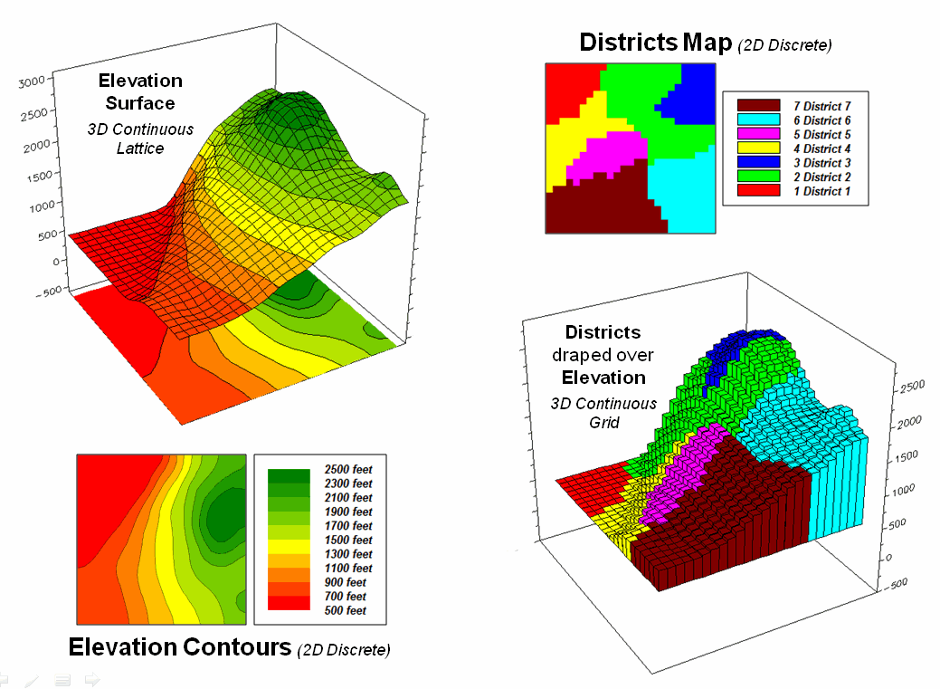
Figure 1. Visual assessment of the spatial coincidence
between a continuous Elevation surface and a discrete map of Districts.
But
does that really make sense? Wouldn’t
some sort of a statistical summary of the actual elevations occurring within a
contour polygon be a more appropriate representation? The average of all of the values within the
contour interval would seem to better characterize the “typical
elevation.” For the 500-700 foot
interval in the example, the average is only 531.4 feet which is considerably
less than the assumed 600 foot midpoint of the range.
Our paper map legacy has conditioned us to the
traditional contour map’s interpretation of fixed interval steps but that
really muddles the “What” information.
The right side of figure 1 tells a different story. In this case the polygons represent seven
Districts that are oriented every-which-way and have minimal to no relationship
to the elevation surface. It’s sort of
like a surrealist Salvador Dali painting with the Districts melted onto the
Elevation surface indentifying the coincident elevation values. Note that with the exception of District #1,
there are numerous different elevations occurring within each district’s
boundary.
One summary attribute would be simply noting the Minimum/Maximum values in a manner
analogous to contour intervals. Another
more appropriate metric would be to assign the Median of the values identifying the middle value for a metric that
divides the total
frequency into two halves. However the most commonly used statistic for
characterizing the “typical condition” is a simple Average of all the elevation numbers occurring within each
district. The “Thematic Mapping”
procedure of assigning a single value/color to characterize individual map
features (lower left-side of figure 2) is fundamental to many GIS applications,
letting decision-makers “see” the spatial pattern of the data.
The discrete pattern, however, is a generalization of the
actual data that reduces the continuous surface to a series of stepped mesas
(right-side of figure 2). In some
instances, such as District #1 where all of the values are 500, the summary to
a typical value is right on. On the
other hand, the summaries for other districts contain sets of radically
differing values suggesting that the “typical value” might not be very typical. For example, the data in District #2 ranges
from 500 to 2499 (valley floor to the top of the mountain) and the average of
1539 is hardly anywhere, and certainly not a value supporting good
decision-making.
So what’s the alternative? What’s better at depicting the “What
component” in thematic mapping? Simply
stated, an honest map is better. Basic
statistics uses the Standard Deviation
(StDev) to characterize the amount dispersion in a data set and the Coefficient of Variation (Coffvar=
[StDev/Average] *100) as a relative index.
Generally speaking, an increasing Coffvar index indicates increasing
data dispersion and a less “typical” Average— 0 to 10, not much data
dispersion; 10-20, a fair amount; 20-30, a whole lot; and >30, probably too
much dispersion to be useful (apologies to statisticians among us for the simplified
treatise and the generalized but practical rule of thumb). In the example, the thematic mapping results
are good for Districts #1, #3 and #6, but marginal for Districts #5, #7 and #4
and dysfunctional for District #2, as its average is hardly anywhere.
So what’s the bottom line? What’s missing in traditional thematic
mapping? I submit that a reasonable and
effective measure of a map’s accuracy has been missing (map “accuracy” is
different from “precision, ” see Authors Note).
In the paper map world one can simply include the Coffvar index within
the label as shown in left-side of figure 2.
In the digital map world a host of additional mechanisms can be used to
report the dispersion, such as mouse-over pop-ups of short summary tables like
the ones on the right-side of figure 2.
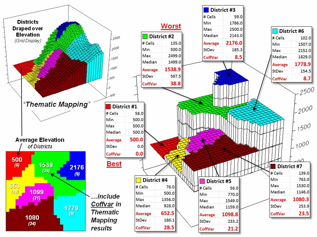
Figure 2. Characterizing the average Elevation for each
District and reporting how typical the typical Elevation value is.
Another possibility could be to use the brightness gun to
track the Coffvar—with the display color indicating the average value and the
relative brightness becoming more washed out toward white for higher Coffvar
indices. The effect could be toggled
on/off or animated to cycle so the user sees the assumed “typical” condition,
then the Coffvar rendering of how typical the typical really is. For areas with a Coffvar greater than 30, the
rendering would go to white. Now that’s
an honest map that shows the best guess of typical value then a visual
assessment of how typical the typical is—sort of a warning that use of shaky
information may be hazardous to you professional health.
As
Geotechnology moves beyond our historical focus on “precise placement of physical features for navigation” the ability
to discern the good portions of a map from less useful areas is critical. While few readers are interested in
characterizing average elevation for districts, the increasing wealth of mapped
data surfaces is apparent— from a realtor
wanting to view average home prices for communities, to a natural resource
manager wanting to see relative habitat suitability for various management
units, to a retailer wanting to determine the average probability of product
sales by zip codes, to policemen wanting to appraise typical levels of crime in
neighborhoods, or to public health officials wanting to assess air pollution
levels for jurisdictions within a county.
It is important that they all “see” the relative accuracy of the “What
component” of the results in addition to the assumed average condition.
_________________________
Author’s Note: see Beyond Mapping Compilation series book
IV, Topic 5, Section 5, “How to Determine Exactly ‘Where Is What’” for a discussion of the
difference between map accuracy and precision.
Throwing
the Baby Out with the Bath Water
(GeoWorld, November 2007)
The previous section first challenged the
appropriateness of the ubiquitous assumption that all spatial data is Normally Distributed. This section takes the discussion to new
heights (or is it lows?) by challenging the use of any scalar central
tendency statistic to represent mapped data.
Whether the average or the median is used, a robust
set of field data is reduced to a single value assumed to be same everywhere
throughout a parcel. This supposition is
the basis for most desktop mapping applications that takes a set of spatially
collected data (parts per million, number of purchases, disease occurrences,
crime incidence, etc.), reduces all of the data to a single value (total,
average, median, etc.) and then “paints” a fixed set of polygons with vibrant
colors reflecting the scalar statistic of the field data falling within each
polygon.
For example, the left side of figure 1 depicts the
position and relative values of some field collected data; the right side shows
the derived spatial distribution of the data for an individual reporting
parcel. The average of the mapped data
is shown as a superimposed plane “floating at average height of 22.0” and
assumed the same everywhere within the polygon.
But the data values themselves, as well as the derived spatial
distribution, suggest that higher values occur in the northeast and lower
values in the western portion.
The first thing to notice in figure 1 is that the
average is hardly anywhere, forming just a thin band cutting across the
parcel. Most of the mapped data is well
above or below the average. That’s what
the standard deviation attempts to tell you—just how typical the computed
typical value really is. If the
dispersion statistic is relatively large, then the computed typical isn’t
typical at all. However, most desktop
mapping applications ignore data dispersion and simply “paint” a color
corresponding to the average regardless of numerical or spatial data patterns
within a parcel.
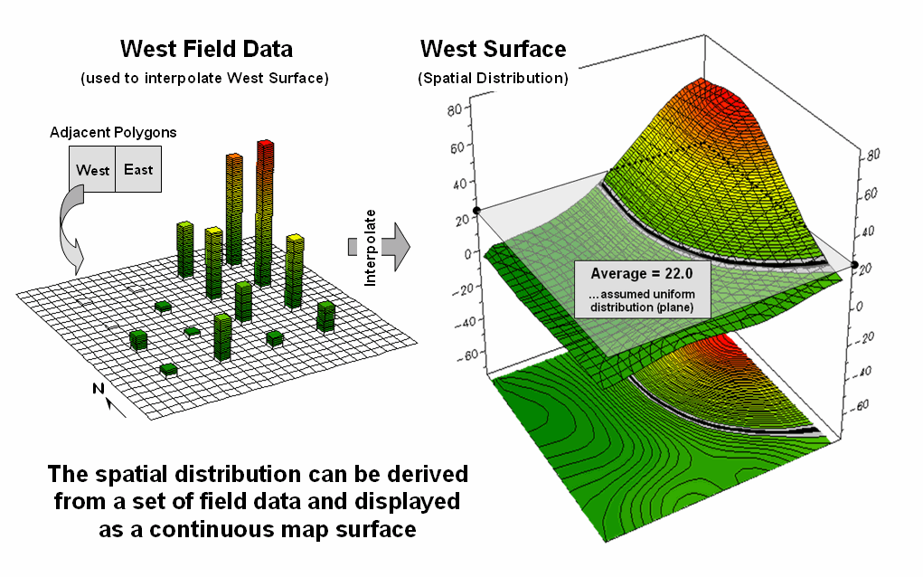
Figure
1. The average of a set of interpolated
mapped data forms a uniform spatial distribution (horizontal plane) in
continuous 3D geographic space.
______________________________
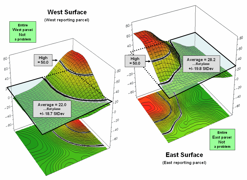
Figure
2. Spatial distributions and
superimposed average planes for two adjacent parcels.
Figure 2 shows how this can get you into a lot of
trouble. Assume the data is mapping an extremely
toxic chemical in the soil that, at high levels, poses a serious health risk
for children. The mean values for both
the West (22.0) and the East (28.2) reporting parcels are well under the
“critical limit” of 50.0. Desktop
mapping would paint both parcels a comfortable green tone, as their typical
values are well below concern. Even if
anyone checked, the upper-tails of the standard deviations don’t exceed the
limit (22.0 + 18.7= 40.7 and 28.2 + 19.8= 48.0). So from a non-spatial perspective, everything
seems just fine and the children aren’t in peril.
Figure 3, however, portrays a radically different
story. The West and East map surfaces
are sliced at the critical limit to identify areas that are above the critical
limit (red tones). The high regions,
when combined, represent nearly 15% of the project area and likely extend into
other adjacent parcels. The aggregated,
non-spatial treatment of the spatial data fails to uncover the pattern by
assuming the average value was the same everywhere within a parcel.
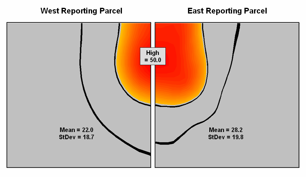
Figure
3. Mapping the spatial distribution of
field data enables discovery of important geographic patterns that are lost
when the average is assigned to entire spatial objects.
Our paper mapping legacy leads us to believe that
the world is composed of a finite set of discrete spatial objects—county
boundaries, administrative districts, sales territories, vegetation parcels,
ownership plots and the like. All we
have to do is color them with data summaries.
Yet in reality, few of these groupings provide parceling that reflects
inviolate spatial patterns that are consistent over space and time with every
map variable. In a sense, a large number
of GIS applications “throw the baby (spatial distribution) out with the bath
water (data)” by reducing detailed and expensive field data to a single, maybe
or maybe not, typical value.
Normally
Things Aren’t Normal
(GeoWorld, September 2007)
No matter how hard you have tried to avoid the
quantitative “dark” side of GIS, you likely have assigned the average (Mean)
to a set of data while merrily mapping it. It might have been the average account value
for a sales territory, or the average visitor days for a park area, or the
average parts per million of phosphorous in a farmer’s field. You might have even calculated the Standard Deviation to get an idea of how
typical the average truly was.
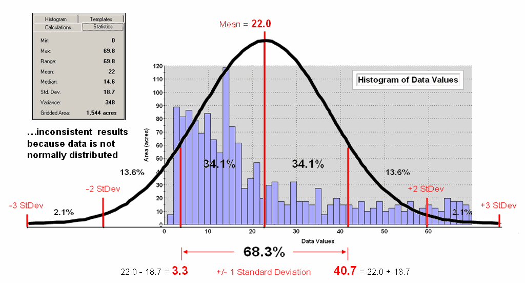
Figure 1. Characterizing data
distribution as +/- 1 Standard Deviation from the Mean.
But there is a major assumption every time you map
the average—that the data is Normally
Distributed. That means its
histogram approximates the bell curve shape you dreaded during grading of your
high school assignments. Figure 1
depicts a standard normal curve applied to a set of spatially interpolated
animal activity data. Notice that the
fit is not too good as the data distribution is asymmetrical—a skewed condition
typical of most data that I have encountered in over 30 years of playing with
maps as numbers. Rarely are mapped data
normally distributed, yet most map analysis simply sallies forth assuming that
it is.
A key
point is that the vertical axis of the histogram for spatial data indicates
geographic area covered by each increasing response step along the horizontal
axis. If you sum all of the piecemeal
slices of the data it will equal the total area contained in the geographic
extent of a project area. The assumption
that the areal extent is symmetrically distributed in a declining fashion around
the midpoint of the data range hardly ever occurs. The norm is ill-fitting curves with
infeasible “tails” hanging outside the data range like the baggy pants of the
teenagers at the mall.
As
“normal” statistical analysis is applied to multiple skewed data sets (the
spatial data norm) comparative consistency is lost. While the area under the standard normal
curve conforms to statistical theory, the corresponding geographic area varies
widely from one map to another.
Figure
2 depicts an alternative technique involving percentiles. The data is rank-ordered (either ascending or
descending) and then divided into Quartiles
with each step containing 25% of the data.
The Median identifies the
breakpoint with half of the data below and half above. Statistical theory suggests that the mean and
median align for the ideal normal distribution.
In this case, the large disparity (22.0 versus 14.6) confirms that the
data is far from normally distributed and skewed toward lower values since the
median is less than the mean. The bottom
line is that the mean is over-estimating the true typical value in the data
(central tendency).
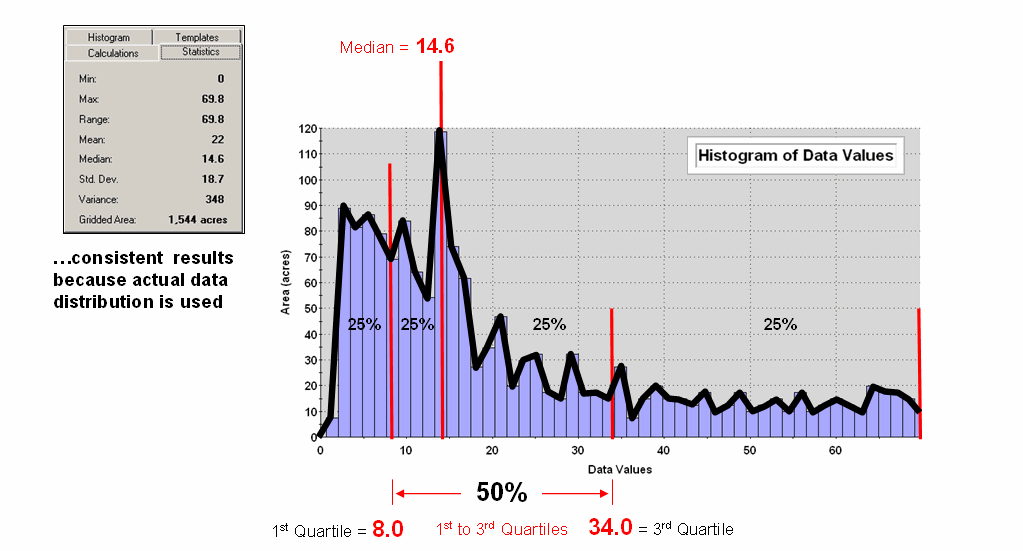
Figure 2. Characterizing data
distribution as +/- 1 Quartile from the Median.
Notice
that the quartile breakpoints vary in width responding to the actual
distribution of the data. The
interpretation of the median is similar to that of the mean in that it
represents the central tendency of the data.
In an analogous manner, the 1st to 3rd quartile
range is analogous to +/- 1 standard deviation in that it represents the
typical data dispersion about the typical value.
What is
different is that the actual data distribution is respected and the results
always fit the data like a glove. Figure
3 maps the unusually low (blue) and high (red) tails for both
approaches—traditional statistics (a) and percentile statistics (b). Notice in inset a) that the low tail is
truncated as the fitted normal curve assumes that the data can go negative,
which is an infeasible condition for most mapped data. In fact most of the low tail is lost to the
infeasible condition, effectively misrepresenting the spatial pattern of the
unusually low areas. The 2D discrete
maps show the large discrepancy in the geographic patterns.
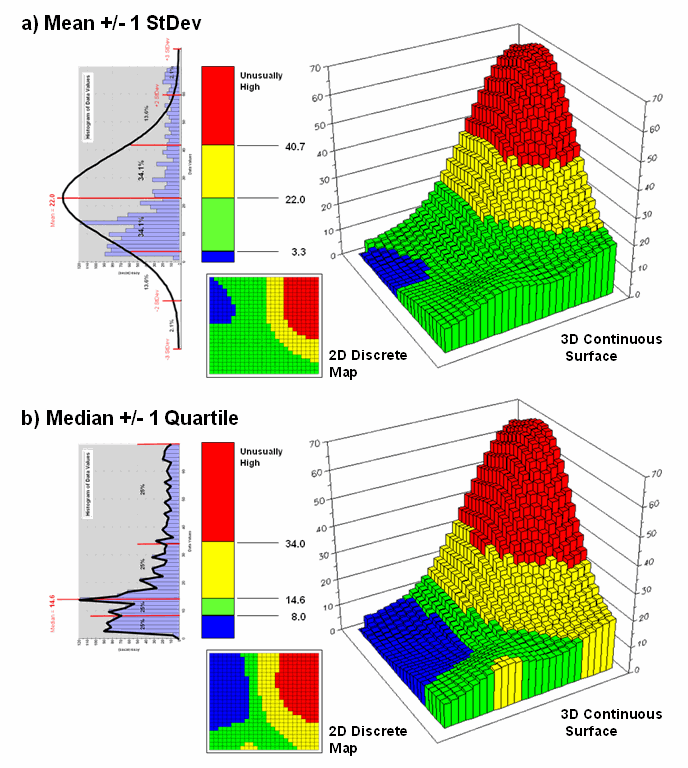
Figure 3. Geographic patterns
resulting from the two thematic mapping techniques.
The
astute reader will recognize that the percentile statistical approach is the
same as the “Equal Counts” display technique used in thematic mapping. The percentile steps could even be adjusted
to match the + /- 34.1, 13.6 and 2.1% groupings used in normal statistics. Discussion in the next section builds on this
idea to generate a standard variable map surface that identifies just how
typical each map location is—based on the actual data distribution, not an
ill-fitted standard normal curve …pure heresy.
Correlating
Maps and a Numerical Mindset
(GeoWorld, May 2011)
The previous section
discussed a technique for comparing maps, even if they were “apples and
oranges.” The approach normalized the
two sets of mapped data using the Standard Normal Variable equation to
translate the radically different maps into a common “mixed-fruit” scale for
comparison.
Continuing with this
statistical comparison theme (maps as numbers—bah, humbug), one can consider a
measure of linear correlation between two continuous quantitative map
surfaces. A general dictionary
definition of the term correlation is “mutual relation of two or more things”
that is expanded to its statistical meaning as “the extent of correspondence
between the ordering of two variables; the degree to which two or more
measurements on the same group of elements show a tendency to vary
together.”
So what does that have to
with mapping? …maps are just colorful
images that tell us what is where, right?
No, today’s maps actually are organized sets of number first, pictures
later. And numbers (lots of numbers) are
right down statistic’s alley. So while
we are severely challenged to “visually assess” the correlation among maps,
spatial statistics, like a tireless puppy, eagerly awaits the opportunity.
Recall from basic
statistics, that the Correlation Coefficient (r) assesses the linear
relationship between two variables, such that its value falls between -1<
r < +1. Its sign
indicates the direction of the relationship and its magnitude indicates the
strength. If two variables have a strong
positive correlation, r is close to +1 meaning that as values for x
increase, values for y increase proportionally.
If a strong negative correlation exits, r is close to -1 and as x
increases, the values for y decrease.
A perfect correlation of
+1 or -1 only occurs when all of the data points lie on a straight line. If there is no linear correlation or a weak
correlation, r is close to 0 meaning that there is a random or
non-linear relationship between the variables.
A correlation that is greater than 0.8 is generally described as strong,
whereas a correlation of less than 0.5 is described as weak.
The Coefficient
of Determination (r 2)
is
a related statistic that summarizes the ratio of the explained variation to the
total variation. It represents the
percent of the data that is the closest to the line of best fit and varies from
0 < r 2
< 1. It is most often used as a measure of how certain one can
be in making predictions from the linear relationship (regression equation)
between variables.
With that quickie stat
review, now consider the left side of figure 1 that calculates the correlation
between Elevation and Slope maps discussed in the last section. The gridded maps provide an ideal format for
identifying pairs of values for the analysis.
In this case, the 625 Xelev and Yslope values form
one large table that is evaluated using the correlation equation shown.
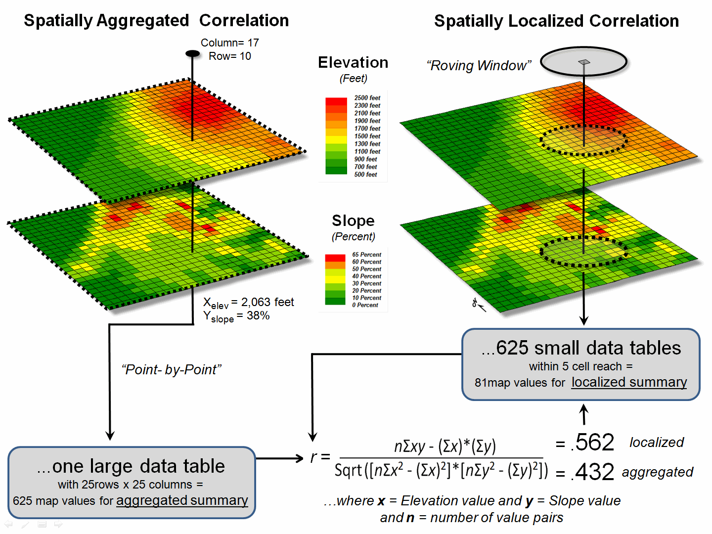
Figure 1. Correlation between two maps can be
evaluated for an overall metric (left side) or for a continuous set of
spatially localized metrics (right side).
The spatially aggregated
result is r = +0.432, suggesting a somewhat weak overall positive linear
correlation between the two map surfaces.
This translates to r 2 =
0.187, which means that only 19% of the total variation in y can be
explained by the linear relationship between Xelev and Yslope.
The other 81% of the total variation in y remains unexplained which
suggests that the overall linear relationship is poor and does not support
useful regression predictions.
The right side of figure
1 uses a spatially disaggregated approach that assesses spatially localized
correlation. The technique uses a roving
window that identifies the 81 value pairs of Xelev and Yslope
within a 5-cell reach, then evaluates the equation and assigns the computed r
value to the center position of the window.
The process is repeated for each of the 625 grid locations.
For example, the
spatially localized result at column 17, row 10 is r = +0.562 suggesting
a fairly strong positive linear correlation between the two maps in this
portion of the project area. This
translates to r 2 =
0.316, which means that nearly a third of the total variation in y can
be explained by the linear relationship between Xelev and Yslope.
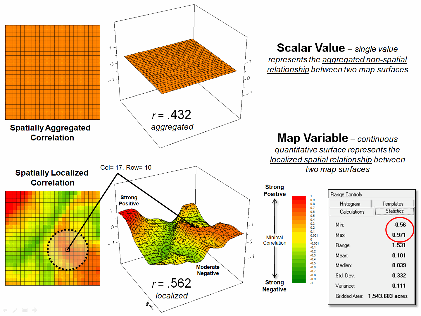
Figure 2. Spatially aggregated correlation provides
no spatial information (top), while spatially localized correlation “maps” the
direction and strength of the mutual relationship between two map variables
(bottom)
Figure
2 depicts the geographic distributions of the spatially aggregated correlation
(top) and the spatially localized correlation (bottom). The overall correlation statistic assumes
that the r = +0.432 is
uniformly distributed thereby forming a flat plane.
Spatially localized correlation, on the other
hand, forms a continuous quantitative map surface. The correlation surrounding column 17, row 10
is r = +0.562 but the northwest portion has significantly higher
positive correlations (red with a maximum of +0.971) and the central portion
has strong negative correlations (green with a minimum of -0.568). The overall correlation primarily occurs in
the southeastern portion (brown); not everywhere.
The bottom-line of
spatial statistics is that it provides spatial specificity for many traditional
statistics, as well as insight into spatial relationships and patterns that are
lost in spatially aggregated of non-spatial statistics. In this case, it suggests that the red and
green areas have strong footholds for regression analysis but the mapped data
needs to be segmented and separate regression equations developed. Ideally, the segmentation can be based on
existing geographic conditions identified through additional grid-based map
analysis.
It is this “numerical
mindset of maps” that is catapulting GIS beyond conventional mapping and
traditional statistics beyond long-established spatially aggregated metrics—the
joint analysis of the geographic and numeric distributions inherent in digital
maps provides the springboard.
Spatially
Evaluating the T-test
(GeoWorld, April 2013)
The historical roots of
map-ematics are in characterizing spatial patterns formed by the relative
positioning of discrete spatial objects—points, lines, and polygons. However, Spatial Data Mining has
expanded the focus to the direct application of advanced statistical techniques
in the quantitative analysis of spatial relationships that consider continuous
geographic space.
From this perspective,
grid-based data is viewed as characterizing the spatial distribution of map
variables, as well as the data’s numerical distribution. For example, in precision agriculture GPS and
yield monitors are used to record the position of a harvester and the current
yield volume every second as it moves through a field (figure 1). These data are mapped into the grid cells
comprising the analysis frame geo-registered to the field to generate the 1997
Yield and 1998 Yield maps shown in the figure (3,289 50-foot grid cells
covering a central-pivot field in Colorado).
The deeper green
appearance of the 1998 map indicates greater crop yield over the 1997
harvest—but how different is the yield between the two years? …where are there greatest differences? …are the differences statistically
significant?
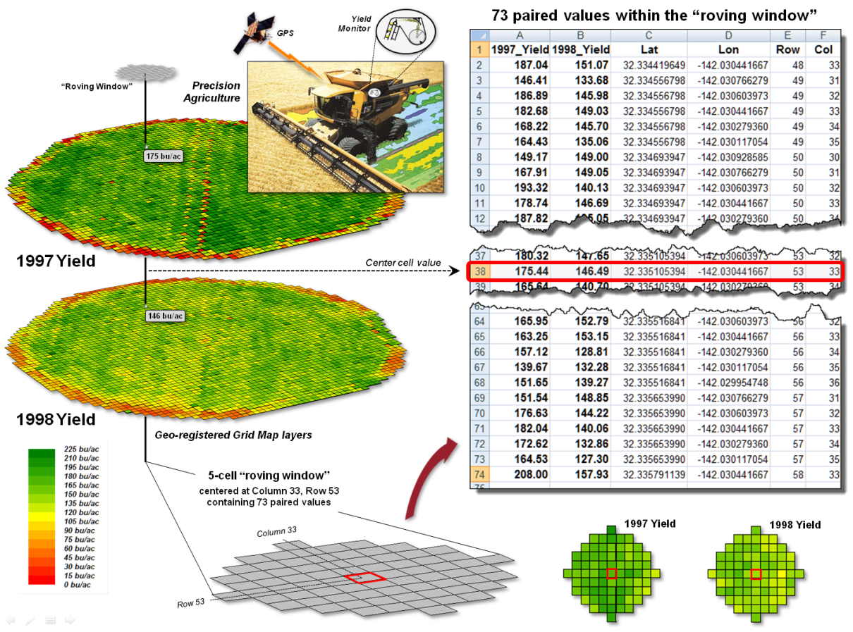
Figure 1. Precision Agriculture yield maps identify
the yield volume harvested from each grid location throughout a field. These data can be extracted using a “roving
window” to form a localized subset of paired values surrounding a focal
location.
Each grid cell location
identifies the paired yield volumes for the two years. The simplest comparison would be to generate
a Difference map by simply subtracting them.
The calculated difference at each location would tell you how different
the yield is between the two years and where the greatest differences
occur. But it doesn’t go far enough to
determine if the differences are “significantly different” within a statistical
context.
An often used procedure
for evaluating significant difference is the paired T-test that assesses
whether the means of two groups are statistically different. Traditionally, an agricultural scientist
would sample several locations in the field and apply the T-test to the sampled
data. But the yield maps in essence form
continuous set of geo-registered sample plots covering the entire field. A T-test could be evaluated for the entire
set of 3,289 paired yield values (or a sampled sub-set) for an overall
statistical assessment of the difference.
However, the following
discussion suggests a different strategy enabling the T-test concept to be
spatially evaluated to identify 1) a continuous map of localized T-statistic
metrics and 2) a binary map the T-test results.
Instead of a single scalar value determining whether to accept or reject
the null hypothesis for an entire field, the spatially extended statistical
procedure identifies where it can be accepted or rejected—valuable information
for directing attention to specific areas.
The key to spatially
evaluating the T-test involves an often used procedure involving the
statistical summary of values within a specified distance of a focal location,
termed a “roving window.” The lower
portion of figure 1 depicts a 5-cell roving window (73 total cells) centered on
column 33, row 53 in the analysis frame.
The pair of yield values within the window is shown in the Excel spread
sheet (columns A and B) on the right side of the figure 1.
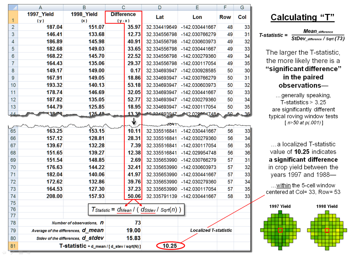
Figure 2. The T-statistic for the set of paired map
values within a roving window is calculated by dividing the Mean of the
Difference to the Standard Deviation of the Mean Differences divided by the
number of paired values.
Figure 2 shows these same
data and the procedures used to solve for the T-statistic within the localized
window. They involve the ratio of the
“Mean of the differences” to a normalized “Standard Deviation of the
differences.” The equation and solution
steps are—
TStatistic = dMean
/ ( dStdev / Sqrt(n) )
Step 1. Calculate the
difference (di = yi
− xi) between the two values for each pair.
Step 2. Calculate the mean
difference of the paired observations, dAvg.
Step 3. Calculate the
standard deviation of the differences, dStdev.
Step 4. Calculate the T-statistic
by dividing the mean difference between the paired observations by the standard
deviation of the difference divided by the square root of the number of paired
values— TStatistic
= dAvg / ( dStdev / Sqrt(n)
).
One way to conceptualize
the spatial T-statistic solution is to visualize the Excel spreadsheet moving
throughout the field (roving window), stopping for an instant at a location,
collecting the paired yield volume values within its vicinity (5-cell radius
reach), pasting these values into columns A and B, and automatically computing
the “differences” in column C and the other calculations. The computed T-statistic is then stored at
the focal location of the window and the procedure moves to the next cell
location, thereby calculating the “localized T-statistic” for every location in
the field.
However, what really
happens in the grid-based map analysis solution is shown in figure 3. Instead of a roving Excel solution, steps 1 -
3 are derived as a separate map layers using fundamental map analysis
operations. The two yield maps are
subtracted on a cell-by-cell basis and the result is stored as a new map of the
Difference (step 1). Then a neighborhood
analysis operation is used to calculate and store a map of the “average of the
differences” within a roving 5-cell window (step 2). The same operation is used to calculate and
store the map of localized “standard deviation of the differences” (step
3).
The bottom-left portion
of figure 3 puts it all together to derive the localized T-statistics (step
4). Map variables of the Mean and StDev
of the differences (both comprised of 3,289 geo-registered values) are
retrieved from storage and the map algebra equation in the lower-left is solved
3,289 times— once for each map location in the field. The resultant T-statistic map
displayed in the bottom-right portion shows the spatial distribution of the
T-statistic with darker tones indicating larger computed values (see author’s
note 1).
The T-test map is
derived by simply assigning the value 0 = no significant difference (yellow) to
locations having values less than the critical statistic from a T-table; and by
assigning 1= significant difference (black) to locations with larger computed
values.
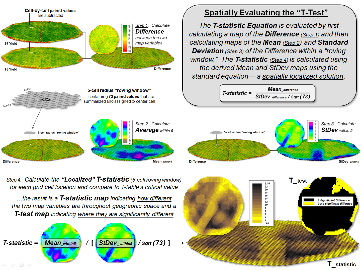
Figure 3. The grid-based map analysis solution for
T-statistic and T-test maps involves sequential processing of map analysis operations
on geo-registered map variables, analogous to traditional, non-spatial
algebraic solutions.
The
idea of a T-test map at first encounter might seem strange. It concurrently considers the spatial
distribution of data, as well as its numerical distribution in generating a new
perspective of quantitative data analysis (dare I say a paradigm shift?). While the procedure itself has significant
utility in its application, it serves to illustrate a much broader conceptual
point— the direct extension of the structure of traditional math/stat to map
analysis and modeling.
Flexibly
combining fundamental map analysis operations requires that the procedure
accepts input and generates output in the same gridded format. This is achieved by the geo-registered
grid-based data structure and requiring that each analytic step involve—
·
retrieval
of one or more map layers from the map stack,
·
manipulation
that applies a map-ematical operation to that mapped data,
·
creation
of a new map layer comprised of the newly derived map values, and
·
storage
of that new map layer back into the map stack for subsequent processing.
The
cyclical nature of the retrieval-manipulation-creation-storage processing
structure is analogous to the evaluation of “nested parentheticals” in
traditional algebra. The logical
sequencing of primitive map analysis operations on a set of map layers (a
geo-registered “map stack”) forms the map analysis and modeling required in
quantitative analysis of mapped data (see author’s note 2). As with traditional algebra, fundamental
techniques involving several basic operations can be identified, such as
T-statistic and T-test maps, which are applicable to numerous research and
applied endeavours.
The
use of fundamental map analysis operations in a generalized map-ematical
context accommodates a variety of analyses in a common, flexible and intuitive
manner. Also, it provides a familiar
mathematical context for conceptualizing, understanding and communicating the
principles of map analysis and modeling— the SpatialSTEM framework.
_____________________________
Author’s Notes: 1) an animated slide for communicating the spatial
T-test concept, see www.innovativegis.com/basis/MapAnalysis/Topic30/Spatial_Ttest.ppt. 2) See www.innovativegis.com/basis/Papers/Online_Papers.htm
for
a link to an early paper “A Mathematical Structure for Analyzing Maps.”
_____________________
Further Online Reading: (Chronological listing posted at www.innovativegis.com/basis/BeyondMappingSeries/)
Get a Consistent Statistical Picture
— describes creation of a Standardized Map Variable surface using Median
and Quartile Range (October 2007)
Comparing Apples and Oranges
— describes a Standard Normal Variable (SNV) procedure for normalizing
maps for comparison (April 2011)
Breaking Away from Breakpoints
— describes the use of curve-fitting to derive continuous equations for
suitability model ratings (June 2011)
(Back
to the Table of Contents)