|
Beyond
Mapping IV Topic 4
– Extending Spatial Statistics Procedures (Further Reading) |
GIS Modeling book |
Get a
Consistent Statistical Picture — describes creation of a Standardized
Map Variable surface using Median and Quartile Range (October 2007)
Comparing
Apples and Oranges — describes a Standard Normal Variable (SNV)
procedure for normalizing maps for comparison (April 2011)
Breaking Away from Breakpoints
— describes the use of curve-fitting to derive continuous equations for
suitability model ratings (June 2011)
<Click here> for a printer-friendly version of this topic (.pdf).
(Back
to the Table of Contents)
______________________________
Get a Consistent Statistical Picture
(GeoWorld, October
2007)
Previous spatial statistic discussion have investigated the wisdom of
using the arithmetic Average and Standard Deviation of a set of mapped data to
represent its “typical” value and presumed variation. The bottom line was that the assumptions
ingrained in the calculations of an Average are rarely met for most map
variables. Their distributions are often
skewed and seldom form an idealized bell-shaped curve. In addition force-fitting a standard normal
curve often extends the “tails” of the distribution into infeasible conditions,
such as negative values.
The discussion further suggested an alternative statistic, the Median,
as a much more stable central tendency measure.
It is identifies the break point where half of the data is below and half
is above ...analogous to the Average. A
measure of data variation is formed by identifying the Quartile Range
from the lowest 25% of the data (1st quartile) and the uppermost 25%
(4th quartile) …analogous to the Standard Deviation. The approach consistently recognizes the
actual balance point for mapped data and never force-fits a solution outside of
the actual data range.
This section takes the discussion a bit further by generating a Standardized
Map Variable surface that identifies just how typical each map location is
based on the actual data distribution, not an ill-fitted standard normal
curve. Figure 1 depicts the first step
of the process involving the conversion of the discrete point data into its implied
spatial distribution. Notice that the
relatively high sample values in the NE form a peak in the surface, while the
low values form a valley in the NW.
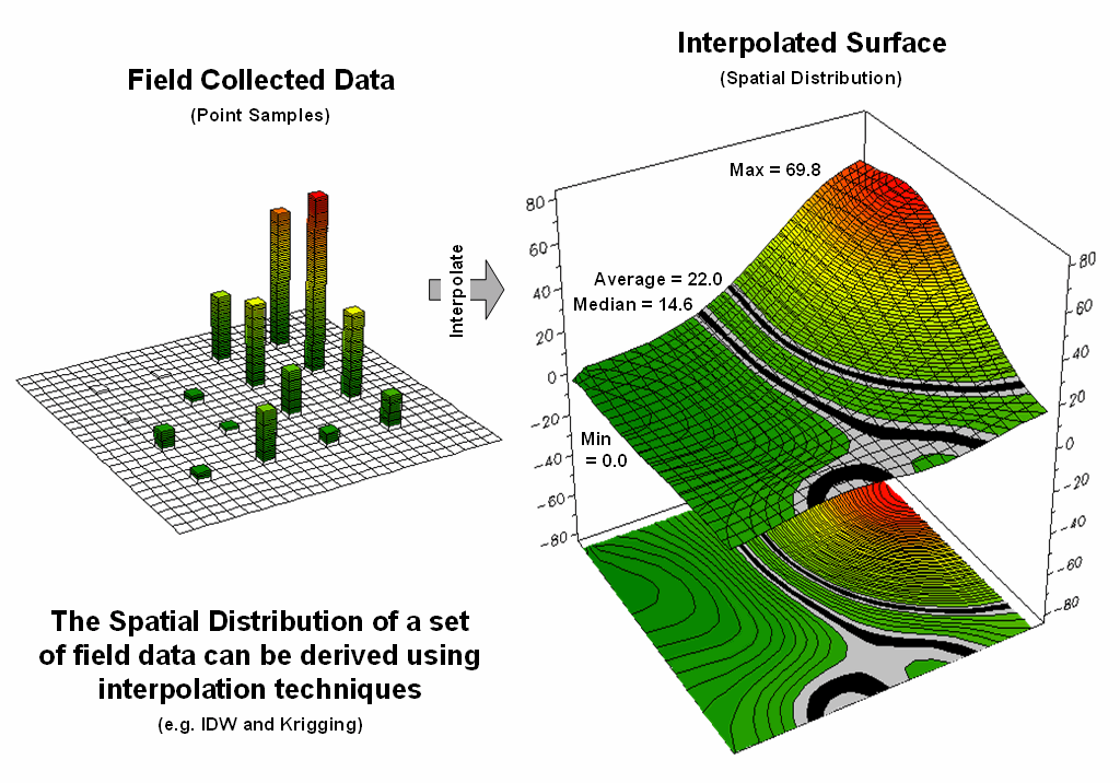
Figure 1. Spatial Interpolation is used to generate the
spatial distribution (continuous surface) inherent in a set of field data
(discrete points).
Both the Average and Median are shown in the surface plot on the right
side of the figure. As discussed in the
last section, the Average tends to over-estimate the typical value (central
tendency) because the symmetric assumption of the standard normal curve “slops”
over into infeasible negative values.
This condition is graphically reinforced in the figure by noting the
lack of spatial balance between the area above and below the Average. The Median, on the other hand, balances just
as much of the project area above the Median as below.
Figure 2 extends this relationship by generating a Standardized Map
Variable surface. The calculation
normalizes the difference between the interpolated value at each location and
the Median using the equation shown in the figure (where Q_Range is the
The result is that the Quartile Range captures the middle 50% of the
data and represents the typical dispersion in the data. The 1st and 4th
quartiles represent unusually low and high values in the “tails” of the numerical
distribution of the data. The
Standardized Map Variable plot shows you where these areas occur in the geographical
distribution of the data—blue tones increasing low and red tones
increasingly high.
Figure 2. A Standardized Map Variable (SMV) uses the
Median and
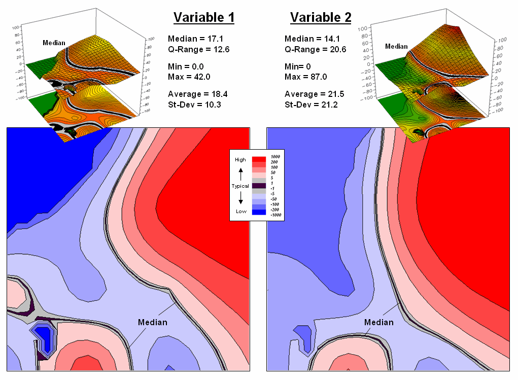
Figure 3. Mapping the spatial distribution of field
data enables discovery of important geographic patterns that are lost when the
average is assigned to entire spatial objects.
The real value of viewing your field collected data as a Standardized
Map Variable (SMV) is that is consistent for all data. You have probably heard that you can’t
compare “apples and oranges” but with a SMV surface you can. Figure 3 shows the results for two different
variables for the same project area.
SMV normalization enables direct comparison as percentages of the
typical data dispersion within data sets and without cartographic confusion and
inconsistency. A dark red area is just
as unusually high in variable 1 as it is in variable 2, regardless of their
respective measurement units, numerical distribution or spatial
distribution.
That means you can get a consistent “statistical picture” of the
relative spatial distributions (where the low, typical and high values
occur) among any mapped data sets you might want explore. How the blue and red color gradients align
(or don’t align) provides considerable insight into common spatial
relationships and patterns of mapped data.
Comparing Apples and Oranges
(GeoWorld, April
2011)
How many times have heard someone say “you can't compare apples and
oranges,” they are totally different things. But in GIS we see it all the time when a
presenter projects two maps on a screen and uses a laser pointer to circle the
“obvious” similarities and differences in the map displays. But what if there was a quantitative
technique that would objectively compare each map location and report metrics
describing the degree of similarity?
…for each map location? …for the
entire map area?
Since maps have been “numbers first, pictures later” for a couple of
decades, you would think “ocular subjectivity” would have been replaced by
“numerical objectivity” in map comparison a long time ago.
A few years back a couple of Beyond Mapping columns described
grid-based map analysis techniques for comparing discrete and continuous maps (Statistically
Compare Discrete Maps, GeoWorld, July 2006 and Statistically Compare
Continuous Map Surfaces, GeoWorld, September 2006). An even earlier column described procedures
for normalizing mapped data (Normalizing Maps for Data Analysis,
GeoWorld, September 2002). Given these
conceptual footholds I bet we can put the old “apples and oranges” quandary to
rest.
Consider the maps of Elevation and Slope shown in figure 1. I bet you eyes are quickly assessing the
color patterns and “seeing” what you believe are strong spatial
relationships—dark greens in the NW and warmer tones in the middle NE. But how “precise and consistent” can you be
in describing the similarity? …in delineating
the similar areas? …what would you do if
you needed to assess a thousand of these patches?
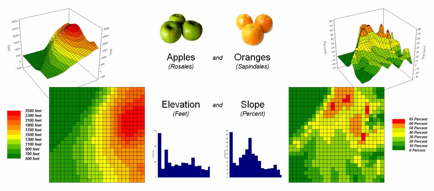
Figure 1. Elevation and Slope like
apples and oranges cannot be directly compared.
Obviously Elevation (measured in feet) and Slope (measured in percent)
are not the same thing but they are sort of related. It wouldn’t make sense to directly compare
the map values; they are apples and oranges after all, so you can’t compare
them …right?
That’s where a “mixed fruit” scale comes in. As depicted in the top portion of figure 2,
Elevation on the left and Slope on the right have unique raw data distributions
that cannot be directly compared.
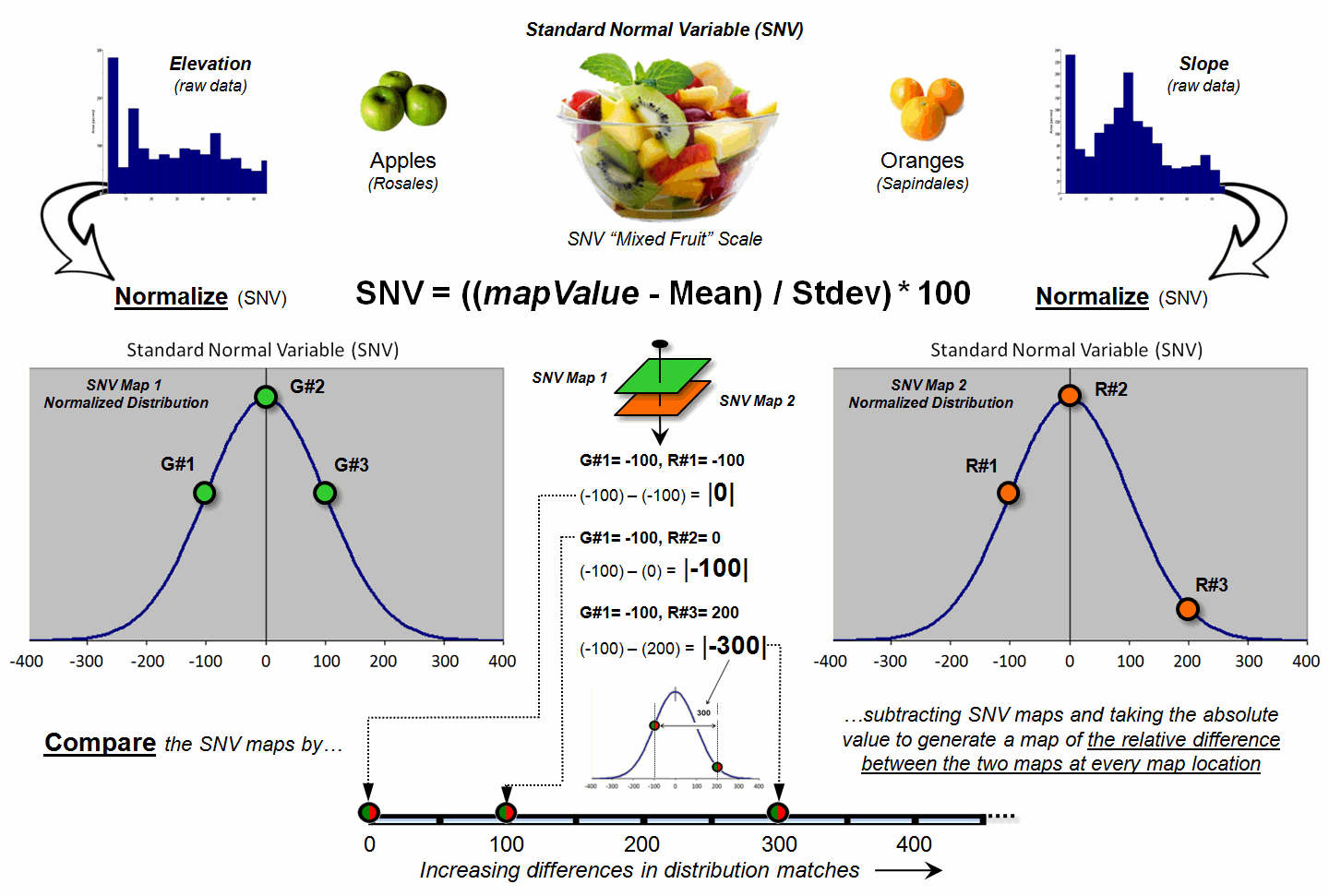
Figure 2. Normalizing maps by the
Standard Normal Variable (SNV) provides a foothold for comparing seemingly
incomparable things.
The middle portion of the figure illustrates using the Standard
Normal Variable (SNV) equation to “normalize” the two maps to a common
scale. This involves retrieving the map
value at a grid location subtracting the Mean from it, then dividing by the
Standard Deviation and multiplying by 100.
The result is a rescaling of the data to the percent variation from each
map’s average value.
The rescaled data are no longer apples and oranges but a mixed fruit salad that utilizes the standard normal curve as a common reference, where +100% locates areas that are one standard deviation above the typical value and -100% locates areas that are one standard deviation below. Because only scalar numbers are involved in the equation, neither the spatial nor the numeric relationships in the mapped data are altered—like simply converting temperature readings from degrees Fahrenheit to Celsius.
The middle/lower portion of figure 2 describes the comparison of the
two SNV normalized maps. The normalized
values at a grid location on the two maps are retrieved then subtracted and the
absolute value taken to “measure” how far apart the values are. For example, if Map1 had a value of -100 (one
Stdev below the mean) and Map 2 had a value of +200 (two Stdev above the mean)
for the same grid location, the absolute difference would be 300—indicating
very different information occurring at that location.
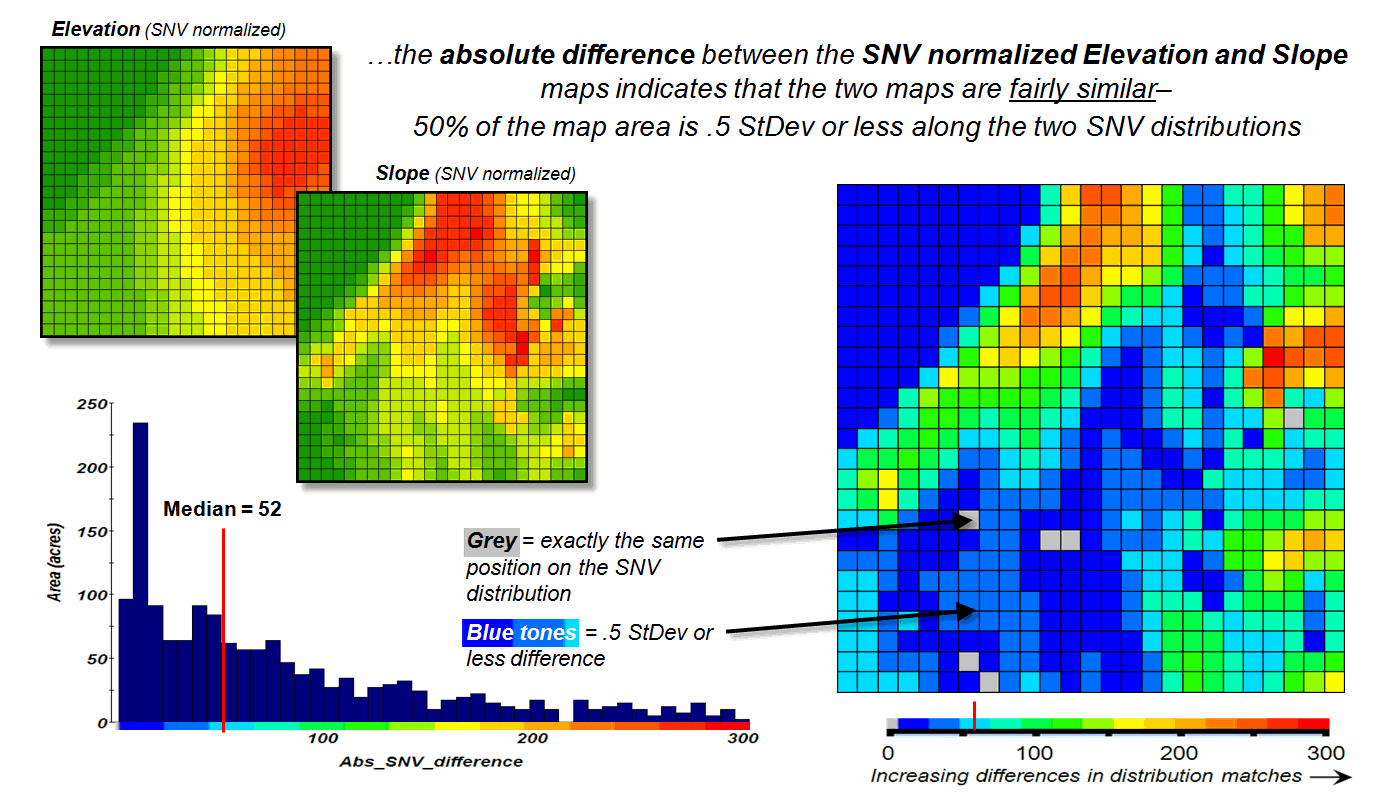
Figure 3. The absolute difference
between SNV normalized maps generates a consistent scale of similarity that can
be extended to different map variables and geographic locations.
Figure 3 shows the SNV comparison for the Elevation and Slope
maps. The red areas indicate locations
where the map values are at dramatically different positions on the standard
normal curve; blue tones indicate fairly similar positioning; and grey where
the points are at the same position. The
median of the absolute difference is 52 indicating that half of the map area
has differences of about half a standard deviation or less.
In practice, SNV Comparison maps can be generated for the same
variables at different locations or different variables at the same
location. Since the standard normal
curve is a “standard,” the color ramp can fixed and the spatial pattern and
overall similarities/differences among apples, oranges, peaches, pears and
pomegranates can be compared. All that
is required is grid-based quantitative mapped data (no qualitative vector maps
allowed).
_____________________________
Author’s
Note: For more information on map
Normalization and Comparison see the online book Beyond Mapping III, posted at www.innovativegis.com/basis/mapanalysis/,
Topic 18, Understanding Grid-based Data and Topic 16, Characterizing
Patterns and Relationships.
Breaking Away from Breakpoints
(GeoWorld, June
2011)
Another section in this online book (“Determining Exactly Where Is
What,” Topic 5, section 2) discusses the differences between precision and
accuracy. In short, Precision addresses
the exactness of the shape and positioning of spatial objects (the “Where”
component); whereas Accuracy addresses the correctness of the
characterization/classification of map locations (the “What” component).
Mapping tends to focus on precision, while map analysis and modeling
primarily are concerned with accuracy.
For example, thematic mapping often assigns the average from a wealth of
spatial samples although the standard deviation is high. The result is high precision in delineating a
spatial object (e.g., district boundary) but very low accuracy due to the over
generalization (e.g., average elevation) as discussed in an earlier section (“What’s
Missing in Mapping?” Topic 4, section1).
But let’s consider a less obvious source of inaccuracy— broad
categorization of suitability model inputs.
For example, the previous sections described a simple “rating” habitat
model with strong animal preferences for terrain configuration: prefers low
elevations (severe nose bleeds at higher altitudes), prefers gentle
slopes (fear of falling over and unable to get up) and prefers southerly
aspects (a place in the sun).
Figure 1 depicts the calibration of the Elevation and Slope maps into a
“graded goodness scale” from 1= worst to 9= best in terms of relative habitat
suitability. Note the discrete ranges of
map values equated to the suitability ratings—that’s the way humans think. For example, all locations between 900 and
1250 feet are assigned the same 7.0 suitability value. But it seems common sense that an elevation
of 900 isn’t that different from 899, while it is substantially different from
1249. The relative differences are more
an artifact of the discrete steps than real habitat variations.
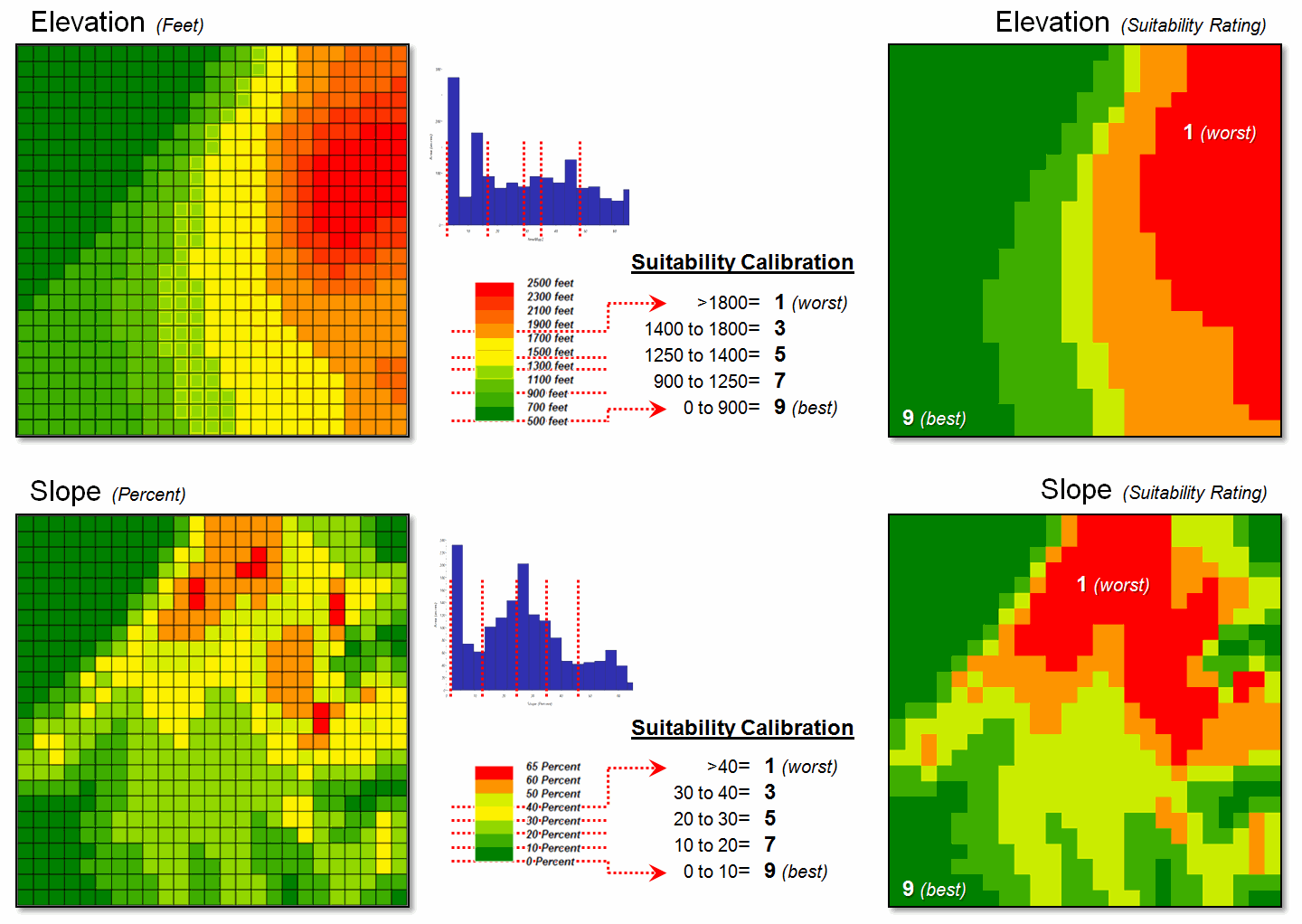
Figure 1. Abrupt breakpoints often
are used to calibrate suitability.
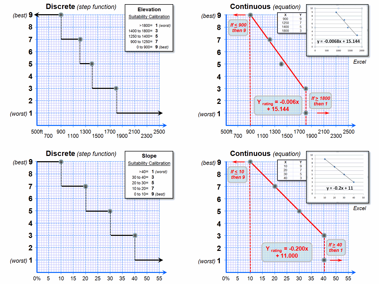
Figure 2. Curve-fitting can be
used to convert suitability step functions into continuous equations for
increased accuracy.
However, both the ratings and the map values define continuous numerical
scales that even allow for decimal-level differences. The left side of figure 2 shows the discrete
breaks in suitability ratings imposed by the step function approach.
A more robust approach develops a continuous relationship based on the
same calibration information. Excel can
be used to derive an equation (trend line) that calculates the suitability
rating associated with the full range of map values. For example, a 950 foot elevation calculates
to an 8.68 rating (Yrating= -.006Xelevation950 + 15.144=
8.68), whereas an elevation of 1200 calculates to 6.98.
Both conditions would be assigned a rating of 7 under the step function
approach—inaccuracy induced by a comfortable but overly generalized
categorization. The use of a continuous
equation instead of discrete reclassifying ranges has the effect of “smoothing”
the ratings from one point to the next for a gradient of suitability instead of
a set of abrupt breakpoints. The
curve-fitting does not have to be linear, with more accurate results (but
uglier equations) derived from exponential relationships.
Figure 3 compares the effects of discrete and continuous suitability
calibrations. Note the “pixilated
appearance” of the continuous suitability assignments (middle) over the sharp
rating transitions in the discrete assignments (left-side). This more exacting information carries over
to the suitability models themselves (right-side). A difference map between the model runs shows
some locations with as much as 1.5 rating difference—just by changing the
approach.
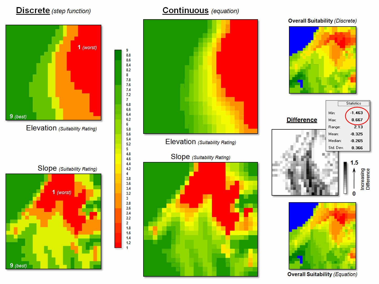
Figure 3. More accurate
suitability ratings from continuous equations can significantly affect modeling
results.
But the more exacting characterization only works for quantitative
mapped data like elevation and slope.
Qualitative maps (categorical data) are stuck with sharp boundaries in
both geographic and numeric space.
Aspect is even more interesting as it is continuous in geographic space
but discontinuous in numeric space as it wraps around on itself (1 and 359
degrees are more alike than 1 and 90 degrees).
The bottom line is that good GIS modelers view maps as “numbers first,
pictures later” with the both the spatial and numerical character of mapped
data determining appropriate procedures and the level of precision and accuracy
in model results.
_____________________________
Author’s
Note: While there are several curve-fitting programs on the Internet,
Excel is generally available and provides for both linear and exponential
equations. To identify the fitted
equation in Excel…
1) create
two data columns (X= map value and Y= rating),
2) highlight
the columns and click on the Insert tabà
Scatter Chart to create
a plot,
3) click
on the plot and select the Layout Tabà Trendline and specify Linear or
Exponential,
4)
right-click on the Trendline and select Format Trendline, and
5) click
the “Display Equation on chart” box.
(Back to the Table of Contents)