|
Topic 1 – Data
Structure Implications |
Map
Analysis book/CD |

Grids
and Lattices Build Visualizations — describes Lattice and Grid
forms of map surface display
Maps
Are Numbers First, Pictures Later — discusses the numeric and
geographic characteristics of map values
Normalizing
Maps for Data Analysis — describes map normalization and data
exchange with other software packages
Further Reading
— two additional sections
<Click here>
for a printer-friendly version of this
topic (.pdf).
(Back to the Table of Contents)
______________________________
Grids and Lattices Build Visualizations
(GeoWorld, July 2002)
For
thousands of years, points, lines and polygons have been used to depict map
features. With the stroke of a pen a cartographer
could outline a continent, delineate a highway or identify a specific
building’s location. With the advent of
the computer, manual drafting of these data has been replaced by the cold steel
of the plotter.
In
digital form these spatial data have been linked to attribute tables that
describe characteristics and conditions of the map features. Desktop mapping exploits this linkage to
provide tremendously useful database management procedures, such as address
matching, geo-query and routing. Vector-based data forms the foundation
of these techniques and directly builds on our historical perspective of maps
and map analysis.
Grid-based data,
on the other hand, is a relatively new way to describe geographic space and its
relationships. Weather maps, identifying
temperature and barometric pressure gradients, were an early application of
this new data form. In the 1950s
computers began analyzing weather station data to automatically draft maps of
areas of specific temperature and pressure conditions. At the heart of this procedure is a new map
feature that extends traditional points, lines and polygons (discrete objects)
to continuous surfaces.
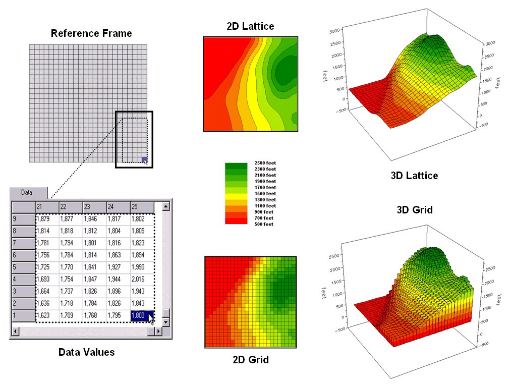
Figure
1. Grid-based data can be displayed in 2D/3D
lattice or grid forms.
The
rolling hills and valleys in our everyday world is a good example of a
geographic surface. The elevation values
constantly change as you move from one place to another forming a continuous
spatial gradient. The left-side of
figure 1 shows the grid data structure and a sub-set of values used to depict
the terrain surface shown on the right-side.
Grid
data are stored as an organized set of values in a matrix that is
geo-registered over the terrain. Each
grid cell identifies a specific location and contains a map value representing
its average elevation. For example, the
grid cell in the lower-right corner of the map is 1800 feet above sea
level. The relative heights of
surrounding elevation values characterize the undulating terrain of the area.
Two
basic approaches can be used to display this information—lattice and grid. The lattice display form uses lines to convey
surface configuration. The contour lines
in the 2D version identify the breakpoints for equal intervals of increasing
elevation. In the 3D version the
intersections of the lines are “pushed-up” to the relative height of the
elevation value stored for each location.
The grid display form uses cells to convey surface
configuration. The 2D version simply
fills each cell with the contour interval color, while the 3D version pushes up
each cell to its relative height.
The
right-side of figure 2 shows a close-up of the data matrix of the project
area. The elevation values are tied to
specific X,Y coordinates (shown as yellow dots). Grid display techniques assume the elevation
values are centered within each grid space defining the data matrix (solid back
lines). A 2D grid display checks the
elevation at each cell then assigns the color of the appropriate contour
interval.
Figure
2. Contour lines are delineated by connecting
interpolated points of constant elevation along the lattice frame.
Lattice
display techniques, on the other hand, assume the values are positioned at the
intersection of the lines defining the reference frame (dotted red lines). Note that the “extent” (outside edge of the
entire area) of the two reference frames is off by a half-cell*. Contour lines are delineated by calculating
where each line crosses the reference frame (red X’s) then these points are
connected by straight lines and smoothed.
In the left-inset of the figure note that the intersection for the 1900
contour line is about half-way between the 1843 and 1943 values and nearly on
top of the 1894 value.
Figure
3 shows how 3D plots are generated.
Placing the viewpoint at different look-angles and distances creates
different perspectives of the reference frame.
For a 3D grid display entire cells are pushed to the relative height of
their map values. The grid cells retain
their projected shape forming blocky extruded columns.
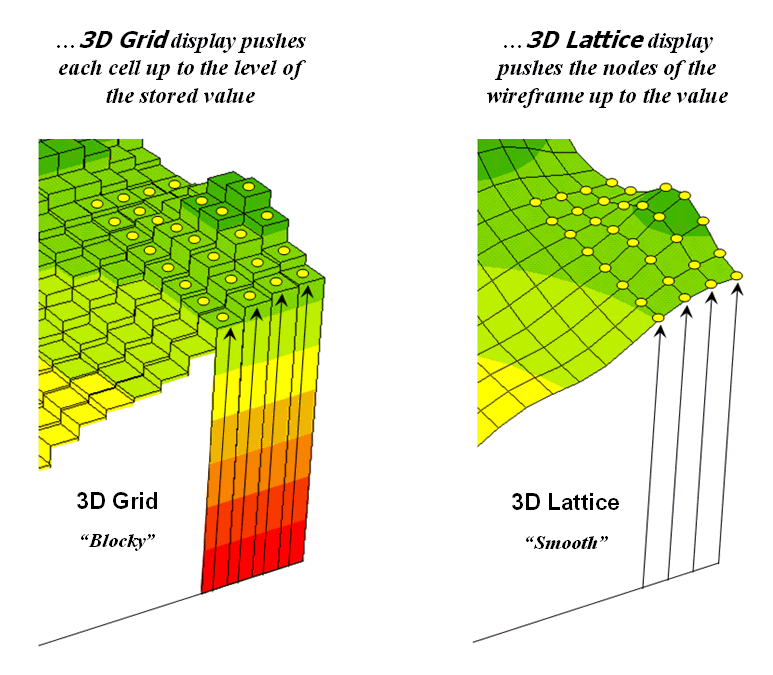
Figure
3. 3D display “pushes-up” the grid or lattice
reference frame to the relative height of the stored map values.
3D
lattice display pushes up each intersection node to its relative height. In doing so the four lines connected to it
are stretched proportionally. The result
is a smooth wireframe that expands and contracts with the rolling hills and
valleys. Generally speaking, lattice
displays create more pleasing maps and knock-your-socks-off graphics when you
spin and twist the plots. However, grid
displays provide a more honest picture of the underlying mapped data—a chunky
matrix of stored values.
____________________
Author's Note: Be
forewarned that the alignment difference between grid and lattice reference frames
is a frequent source of registration error when one “blindly” imports a set of
grid layers from a variety of sources.
Maps Are
Numbers First, Pictures Later
(GeoWorld, August 2002)
The
unconventional view that “maps are
numbers first, pictures later” forms the backbone for taking maps
beyond mapping. Historically maps
involved “precise placement of physical features for navigation.” More recently, however, map analysis has
become an important ingredient in how we perceive spatial relationships and
form decisions.
Understanding
that a digital map is first and foremost an organized set of numbers is
fundamental to analyzing mapped data.
But exactly what are the characteristics defining a digital map? What do the numbers mean? Are there different types of numbers? Does their organization affect what you can
do with them? If you have seen one
digital map have you seen them all?
In an
introductory
However
this geo-centric view rarely explains the full nature of digital maps. For example consider the numbers themselves
that comprise the X,Y coordinates—how does number type
and size effect precision? A general feel for the precision ingrained in a
“single precision floating point” representation of Latitude/Longitude in
decimal degrees is*…
1.31477E+08 ft = equatorial circumference of
the earth
1.31477E+08 ft / 360 degrees = 365214
ft/degree length of one degree Longitude
Single precision number carries six decimal
places, so—
365214 ft/degree * 0.000001= .365214 ft
*12 = 4.38257 inch precision
Think
if “double-precision” numbers (eleven decimal places) were used for storage—you
likely could distinguish a dust particle on the left from one on the right.
In
analyzing mapped data, however, the characteristics of the attribute values are
even more critical. While textual
descriptions can be stored with map features they can only be used in
geo-query. For example if you attempted
to add Longbrake Lane to Shortthrottle Way all you
would get is an error, as text-based descriptors preclude any of the
mathematical/statistical operations.
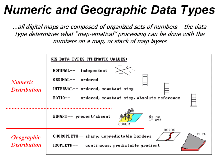
Figure
1. Map
values are characterized from two broad perspectives—numeric and
geographic—then further refined by specific data types.
So what
are the numerical characteristics of mapped data? Figure 1 lists the data types by two
important categories—numeric and geographic.
You should have encountered the basic numeric data types in several
classes since junior high school. Recall
that nominal
numbers do not imply ordering. A 3 isn’t
bigger, tastier or smellier than a 1, it’s just not a 1. In the figure these data are schematically
represented as scattered and independent pieces of wood.
Ordinal
numbers, on the other hand, do imply a definite ordering and can be
conceptualized as a ladder, however with varying spaces between rungs. The numbers form a progression, such as
smallest to largest, but there isn’t a consistent step. For example you might rank different five
different soil types by their relative crop productivity (1= worst to 5= best)
but it doesn’t mean that soil 5 is exactly five times more productive than soil
1.
When a
constant step is applied, interval numbers result. For example, a 60o Fahrenheit
spring day is consistently/incrementally warmer than a 30 oF winter
day. In this case one “degree” forms a
consistent reference step analogous to typical ladder with uniform spacing
between rungs.
A ratio
number introduces yet another condition—an absolute reference—that is analogous
to a consistent footing or starting point for the ladder, analogous to zero
degrees “Kelvin” defined as when all molecular movement ceases. A final type of numeric data is termed “binary.” In this instance the value range is
constrained to just two states, such as forested/non-forested or
suitable/not-suitable.
So what
does all of this have to do with analyzing digital maps? The type of number dictates the variety of
analytical procedures that can be applied.
Nominal data, for example, do not support direct mathematical or
statistical analysis. Ordinal data
support only a limited set of statistical procedures, such as maximum and
minimum. Interval and ratio data, on the
other hand, support a full set mathematics and statistics. Binary maps support special mathematical
operators, such as .
Even
more interesting (this interesting, right?) are the geographic characteristics
of the numbers. From this perspective
there are two types of numbers. “Choropleth”
numbers form sharp and unpredictable boundaries in space such as the values on
a road or cover type map. “Isopleth”
numbers, on the other hand, form continuous and often predictable gradients in
geographic space, such as the values on an elevation or temperature surface.
Figure
2 puts it all together. Discrete
maps identify mapped data with independent numbers (nominal) forming sharp
abrupt boundaries (choropleth), such as a covertype map. Continuous maps contain a range of
values (ratio) that form spatial gradients (isopleth), such as an elevation
surface. This clean dichotomy is muddled
by cross-over data such as speed limits (ratio) assigned to the features on a
road map (choropleth).
Discrete
maps are best handled in 2D form—the 3D plot in the top-right inset is
ridiculous and misleading because it implies numeric/geographic relationships
among the stored values. What isn’t as
obvious is that a 2D form of continuous data (lower-right inset) is equally as
absurd.
While a
contour map might be as familiar and comfortable as a pair of old blue jeans,
the generalized intervals treat the data as discrete (ordinal,
choropleth). The artificially imposed
sharp boundaries become the focus for visual analysis.
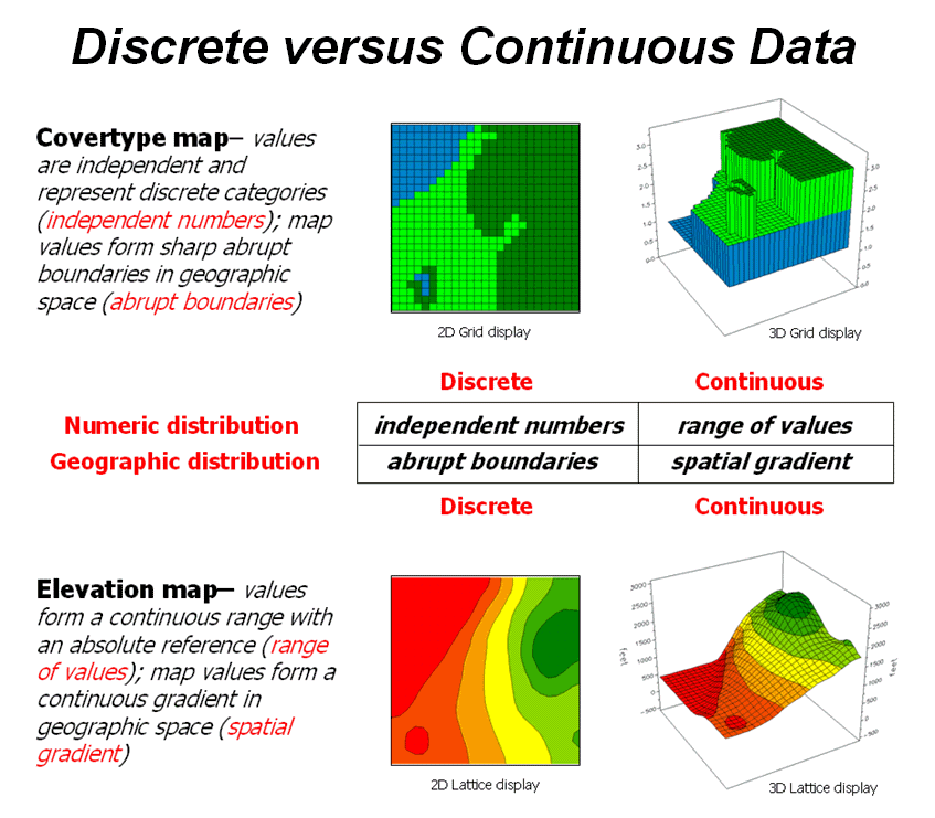
Figure
2. Discrete and Continuous map types combine the
numeric and geographic characteristics of mapped data.
Map-ematical analysis
of the actual data, on the other hand, incorporates all of the detail contained
in the numeric/geographic patterns of the numbers ...where the rubber meets the
spatial analysis road.
Normalizing Maps for Data Analysis
(GeoWorld, September 2002)
The
last couple of sections have dealt with the numerical nature of digital
maps. Two fundamental considerations
remain—data normalization and exchange. Normalization
involves standardizing a data set, usually for comparison among different types
of data. In a sense, normalization techniques
allow you to “compare apples and oranges” using a standard “mixed fruit scale
of numbers.”
The most basic normalization procedure uses a “goal” to adjust map values. For example, a farmer might set a goal of 250
bushels per acre to be used in normalizing a yield map for corn. The equation, Norm_GOAL =
(mapValue / 250) * 100, derives the percentage of the goal
achieved by each location in a field. In
evaluating the equation, the computer substitutes a map value for a field
location, completes the calculation, stores the result, and then repeats the
process for all of the other map locations.
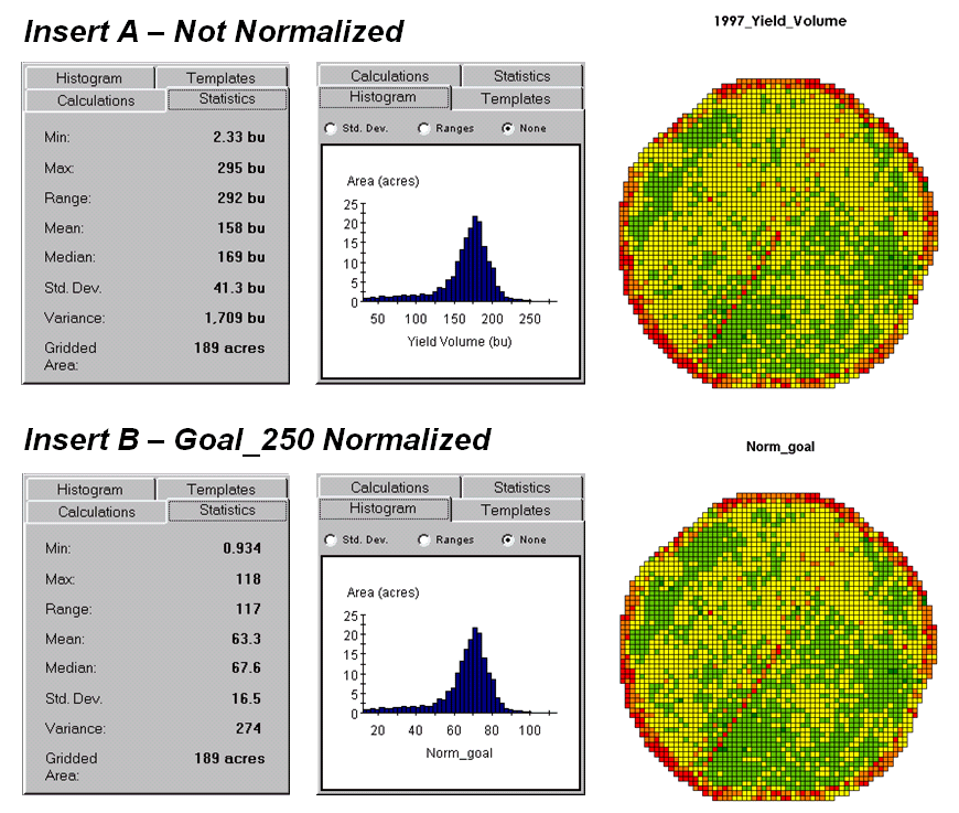
Figure 1. Comparison of original and goal normalized
data.
Figure
1 shows the results of goal normalization.
Note the differences in the descriptive statistics between the original
(top) and normalized data (bottom)—a data range of 2.33 to 295 with an average
of 158 bushels per acre for the original data versus .934 to 118 with an
average of 63.3 percent for the normalized data.
However,
the histogram and map patterns are identical (slight differences in the maps
are an artifact of rounding the discrete display intervals). While the descriptive statistics are
different, the relationships (patterns) in the normalized histogram and map are
the same as the original data.
That’s an important point— both the numeric and
spatial relationships in the data are preserved during normalization. In effect, normalization simply “rescales”
the values like changing from one set of units to another (e.g., switching from
feet to meters doesn’t change your height).
The significance of the goal normalization is that the new scale allows
comparison among different fields and even crop types based on their individual
goals— the “mixed fruit” expression of apples and oranges. Same holds for normalizing environmental,
business, health or any other kind of mapped data.
An
alternative “0-100”
normalization forces a consistent range of values by spatially evaluating the
equation Norm_0-100 = (((mapValue – min) * 100) / (max –
min)) + 0. The
result is a rescaling of the data to a range of 0 to 100 while retaining the
same relative numeric and spatial patterns of the original data. While goal normalization benchmarks a
standard value, the 0-100 procedure rescales the original data range to a
fixed, standard range (see Author’s note).
A third
normalization procedure termed Standard Normal Variable (
Map
normalization is often a forgotten step in the rush to make a map, but is
critical to a host of subsequent analyses from visual map comparison to
advanced data analysis. The ability to
easily export the data in a universal format is just as critical. Instead of a “do-it-all”
Figure
2 shows the process for grid-based data.
Recall that a consistent analysis frame is used to organize the data
into map layers. The map values at each
cell location for selected layers are reformatted into a single record and
stored in a standard export table that, in turn, can be imported into other
data analysis software.
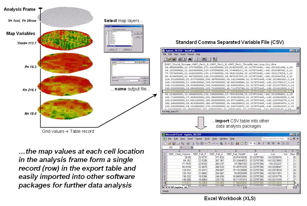
Figure
2. The
map values at each grid location form a single record in the exported table.
Figure
3 shows the agricultural data imported into the JMP statistical package (by
SAS). Area (1) shows the histograms and
descriptive statistics for the P, K and N map layers shown in figure 2. Area (2) is a “spinning 3D plot” of the data
that you can rotate to graphically visualize relationships among the data
patterns defining the three map layers.
Area
(3) shows the results of applying a multiple linear regression model to predict
crop yield from the soil nutrient maps.
These are but a few of the tools beyond mapping that are available
through data exchange between
Modern
statistical packages like JMP “aren’t your father’s” stat experience and are
fully interactive with point-n-click graphical interfaces and wizards to guide
appropriate analyses. The analytical
tools, tables and displays provide a whole new map-ematical
view of traditional mapped data.
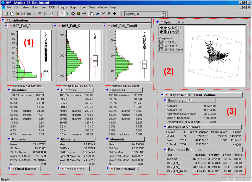
Figure
3. Mapped data can be imported into standard
statistical packages for further analysis.
While a
map picture might be worth a thousand words, a gigabyte or so of digital map data
is a whole revelation and foothold for site-specific decisions.
______________________
Author’s Note: the generalized rescaling equation to normalize
a data set to a fixed range of Rmin to Rmax is…
Normalize Rmin
to Rmax= (((X-Dmin)
* (Rmax – Rmin))
/ (Dmax – Dmin))
+ Rmin
…where Rmin and Rmax is the minimum and
maximum values for the rescaled range, Dmin and Dmax is the minimum and maximum values for the input data
and X is any value in the data set to be rescaled.
_____________________
Further Online
Reading: (Chronological
listing posted at www.innovativegis.com/basis/BeyondMappingSeries/)
Multiple Methods Help Organize Raster
Data — discusses different approaches to storing raster data (April
2003)
Use Mapping “Art” to Visualize Values
— describes procedures for generating contour maps (June 2003)
(Back
to the Table of Contents)