|
Beyond
Mapping III Topic 1
– Data Structure Implications (Further Reading) |
Map Analysis book |
Multiple Methods Help Organize Raster
Data — discusses different approaches to storing raster data (April 2003)
Use Mapping “Art” to Visualize Values
— describes procedures for generating contour maps (June 2003)
<Click here> for a printer-friendly version of this topic (.pdf).
(Back
to the Table of Contents)
______________________________
Multiple
Methods Help Organize Raster Data
(GeoWorld, April
2003)
Map features in a vector-based mapping system identify discrete,
irregular spatial objects with sharp abrupt boundaries. Other data types—raster images, pseudo grids
and raster grids—treat space in entirely different manner forming a spatially
continuous data structure.
For example, a raster image is composed of thousands of
“pixels” (picture elements) that are analogous to the dots on a computer
screen. In a geo-registered B&W aerial
photo, the dots are assigned a grayscale color from black (no reflected light)
to white (lots of reflected light). The
eye interprets the patterns of gray as forming the forests, fields, buildings
and roads of the actual landscape. While
raster maps contain tremendous amounts of information that are easily “seen,”
the data values simply reference color codes that afford some quantitative
analysis but are far too limited for the full suite of map analysis operations.
Pseudo grids and raster grids are similar to raster images as they
treat geographic space as a continuum.
However, the organization and nature of the data are radically
different. A pseudo grid
is formed by a series of uniform, square polygons covering an analysis area
(figure 1). In practice, each grid
element is treated as a separate polygon—it’s just that every polygon is the
same shape/size and they all adjoin each other—with spatial and attribute
tables defining the set of little polygons.
For example, in the upper-right portion of the figure a set of discrete
point measurements are stored as twelve individual “polygonal cells.” The interpolated surface from the point data
(lower-right) is stored as 625 contiguous cells.
While pseudo grids store full numeric data in their attribute tables
and are subject to the same vector analysis operations, the explicit
organization of the data is both inefficient and too limited for advanced
spatial analysis as each polygonal cell is treated as an independent spatial
object.
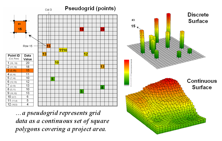
Figure 1. A vector-based system can store continuous
geographic space as a pseudo-grid.
A raster grid, on the other hand, organizes the data as a
listing of map values like you read a book—left to right (columns), top to
bottom (rows). This implicit
configuration identifies a grid cell’s location by simply referencing its
position in the list of all map values.
In practice, the list of map values is read into a matrix with the
appropriate number of columns and rows of an analysis frame superimposed over
an area of interest. Geo-registration of
the analysis frame requires an X,Y coordinate for one of the grid corners and
the length of a side of a cell. To
establish the geographic extent of the frame the computer simply starts at the
reference location and calculates the total X, Y length by multiplying the
number of columns/rows times the cell size.
Figure 2 shows a 100 column by 100 row analysis frame geo-registered
over a subdued vector backdrop. The list
of map values is read into the 100x100 matrix with their column/row positions
corresponding to their geographic locations.
For example, the maximum map value of 92 (customers within a quarter of
a mile) is positioned at column 67, row 71 in the matrix— the 7,167th
value in the list ((71 * 100) + 67 = 7167).
The 3D plot of the surface shows the spatial distribution of the stored
values by “pushing” up each of the 10,000 cells to its relative height.
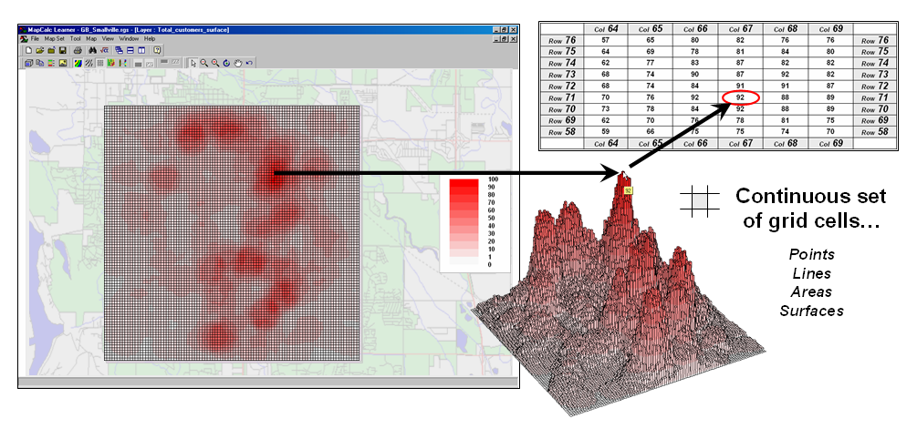
Figure 2. A grid-based system stores a long list of map
values that are implicitly linked to an analysis frame superimposed over an
area.
______________________
Figure 3. A map stack of individual grid layers can be
stored as separate files or in a multi-grid table.
In a grid-based dataset, the matrices containing the map values
automatically align as each value list corresponds to the same analysis frame
(#columns, # rows, cell size and geo-reference point). As depicted on the left side of figure 3,
this organization enables the computer to identify any or all of the data for a
particular location by simply accessing the values for a given column/row
position (spatial coincidence used in point-by-point overlay operations).
Similarly, the immediate or extended neighborhood around a point can be
readily accessed by selecting the values at neighboring column/row positions
(zonal groupings used in region-wide overlay operations). The relative proximity of one location to any
other location is calculated by considering the respective column/row positions
of two or more locations (proximal relationships used in distance and
connectivity operations).
There are two fundamental approaches in storing grid-based data—individual
“flat” files and “multiple-grid” tables (right side of figure 3). Flat files store map values as one long list,
most often starting with the upper-left cell, then sequenced left to right
along rows ordered from top to bottom.
Multi-grid tables have a similar ordering of values but contain the data
for many maps as separate field in a single table.
Generally speaking the flat file organization is best for applications
that create and delete a lot of maps during processing as table maintenance can
affect performance. However, a
multi-gird table structure has inherent efficiencies useful in relatively
non-dynamic applications. In either
case, the implicit ordering of the grid cells over continuous geographic space
provides the topological structure required for advanced map analysis.
_________________
Author's Note: Let me
apologize in advance to the “geode-ists” readership—yep it’s a lot more complex
than these simple equations but the order of magnitude ought to be about right
…thanks to Ken Burgess, VP R&D, Red Hen Systems for getting me this far.
Use Mapping “Art” to Visualize Values
(GeoWorld, June
2003)
The digital map has revolutionized how we collect, store and perceive
mapped data. Our paper map legacy has
well-established cartographic standards for viewing these data. However, in many respects the display of
mapped data is a very different beast.
In a
The display tools are both a boon and a bane as they require minimal
skills to use but considerable thought and experience to use correctly. The interplay among map projection, scale,
resolution, shading and symbols can dramatically change a map’s appearance and
thereby the information it graphically conveys to the viewer.
While this is true for the points, lines and areas comprising
traditional maps, the potential for cartographic effects are even more
pronounced for contour maps of surface data.
For example, consider the mapped data of phosphorous levels in a
farmer’s field shown in figure 1. The
inset on the left is a histogram of the 3288 grid values over the field ranging
from 4.2 to 53.2 parts per million (ppm).
The table describes the individual data ranges used to generalize the
data into seven contour intervals.
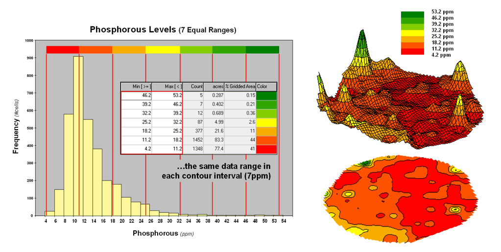
Figure 1. An Equal Ranges contour map of surface data.
In this case, the contour intervals were calculated by dividing the
data range into seven Equal Ranges. The procedure involves: 1] calculating the
interval step as (max – min) / #intervals= (53.2 – 4.2) / 7 = 7.0 step,
2] assigning the first contour interval’s breakpoint as min + step = 4.2 +
7.0 = 11.2, 3] assigning the second contour interval’s breakpoint as previous
breakpoint + step = 11.2 + 7.0 = 18.2, 4] repeating the breakpoint
calculations for the remaining contour intervals (25.2, 32.2, 39.2, 46.2,
53.2).
The equally spaced red bars in the plot show the contour interval
breakpoints superimposed on the histogram.
Since the data distribution is skewed toward lower values, significantly
more map locations are displayed in red tones— 41 + 44 = 85% of the map area
assigned to contour intervals one and two.
The 2D and 3D displays on the right side of figure 1 shows the results
of “equal ranges contouring” of the mapped data.
Figure 2 shows the results of applying other strategies for contouring
the same data. The top inset uses Equal
Count calculations to divide the data range into intervals that
represent equal amounts of the total map area.
This procedure first calculates the interval step as total #cells /
#intervals= 3288 / 7 = 470 cells then starts at the minimum map value and
assigns progressively larger map values until 470 cells have been
assigned. The calculations are repeated
to successively capture groups of approximately 470 cells of increasing values,
or about 14.3 percent of the total map area.
Figure 2. Equal Count and +/- 1 Standard Deviation
contour maps.
Notice the unequal spacing of the breakpoints (red bars) in the
histogram plot for the equal count contours.
Sometimes a contour interval only needs a small data step to capture
enough cells (e.g., peaks in the histogram); whereas others require
significantly larger steps (flatter portions of the histogram). The result is a more complex contour map with
fairly equal amounts of colored polygons.
The bottom inset in figure 2 depicts yet another procedure for
assigning contour breaks. This approach
divides the data into groups based on the calculated mean and Standard
Deviation. The standard
deviation is added to the mean to identify the breakpoint for the upper contour
interval (contour seven = 13.4 + 5.21= 18.61 to max) and subtracted to
set the lower interval (contour one = 13.4 - 5.21= 8.19 to min).
In statistical terms the low and high contours are termed the “tails”
of the distribution and locate data values that are outside the bulk of the
data— sort of unusually lower and higher values than you normally might
expect. In the 2D and 3D map displays on
the right side of the figure these locations are shown as blue and pink
areas.
The other five contour intervals are assigned by forming equal ranges
within the lower and upper contours (18.61 - 8.19 = 10.42 / 5 = 2.1 interval
step) and assigned colors red through green with a yellow inflection
point. The result is a map display that
highlights areas of unusually low and high values and shows the bulk of the
data as gradient of increasing values.
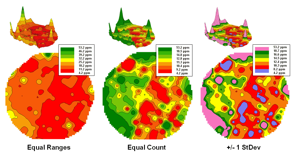
Figure 3. Comparison of different
2D contour displays.
The bottom line is that the same surface data generated dramatically
different 2D contour maps (figure 3).
All three displays contain seven intervals but the methods of assigning
the breakpoints to the contours employ radically different approaches. So which one is right? Actually all three are right, they just
reflect different perspectives of the same data distribution …a bit of the art
in the “art and science” of
__________________________
(Back to the Table of Contents)