…an introduction to
grid-based map analysis and modeling
GEOG 3110,
University of Denver, Geography, Winter Term 2011
Thursdays
6:00-8:50 pm,
…<click here> to review the Report Writing Tips
Keep in mind that for all the lab exercises
you have several “life lines”
if you need them—
1) send me an
email with a specific question,
2) arrange for a
phone call via email for tutorial walk-thru (you need to be at a computer with
MapCalc or Surfer),
3) an arranged
eyeball meeting in the GIS Lab on Thursdays between 10:00 am and 3:00 pm, or
4) open door
office hours 3:00 to 5:00 pm (or as specially
arranged for Friday mornings).
___________________________
Dear Dr. Berry, I have a question regarding Question
#9. Is there a way to look at the R square or Adjusted R square for the
multiple linear regression model to see statistically how it fits the data in
addition to look at the error surface? Best,
Qing
3/7 Qing— alas, the old stat tool we used for Regress doesn’t
provide for a traditional “R square or Adjusted R square” evaluation option
and we didn’t extend beyond the basic tool …possibly room for future
enhancement.
However, you can get the correlation matrix information using
the Correlate command. Another way is to Export the set of maps as a CSV
file and do the statistical analysis (regression and R-square) in a “grown-up”
stat package like JMP or SAS.
One interesting feature of Regress, however, is the…
For
<newMap>
The resulting map contains predicted values
for the dependent map using the regression equation.
…that evaluates the equation for the set of map data which you can
compare (subtract) to the actual dependent map for an error map that gives you
insight into both a spatial pattern and overall levels of error (Shading
Manager table summary). While it is not a “traditional non-spatial”
evaluation of regression fit, the “biased performance evaluation” with error
map/summary can be useful. Possibly it could be argued more useful
(except with traditional statisticians) as R-squared is an aggregate,
non-spatial evaluator and this is spatial statistics …making R-squared sort
of off-the mark as it ignores the spatial pattern of relationship. -Joe
Regress
Regress performs linear regression analysis
by using the "least squares" method to fit a line through a set of
data points in multiple maps. Each grid location identifies a series of values.
You can analyze how a single map (the dependent variable) is affected by the
values of one or more other maps (independent variables). For example, you can
determine how crop yield is affected by such factors as phosphorous, potassium
and pH levels.
Regression is used for developing a
prediction model based on a set of sampled data. The relationship between the
dependent and independent variables is determined by fitting a line to the data
that minimizes the deviations between the line and the data. The mathematical
equation for the line is used to estimate the dependent variable for any given
set of values contained in the independent variables.
Note: Regress does not work with maps
containing categorical information, such as a soil classification map.
Regress
<dependentMap>
With
<independentMap>
If using more than one independent map,
select as needed from the drop-down list. Click Add after each selection.
Add
Click to add
the independent map to the command line.
Del
Click to
delete a highlighted independent map from the command line.
To
<newTextFile>
For
<newMap>
The resulting map contains predicted values
for the dependent map using the regression equation.
___________________________
Joe, I am working on
number 3, and when i get the change in percetn yield map, the "percents" range from -80
to 4160. Is there really a 4000 percent change? …my faith in all things computer suggests
there really is a 4160% change—check it out …but be sure to
comment on whether you believe it is real or just something to do with a data
collection artifact involving small numbers I put
the formula in exactly as you had it in the homework. Thanks, Eric
Eric—yep, that’s the dilemma when working with small numbers
as percents. 4000 percent says there is a 40-fold increase in yield
which is likely from 1 to 40 bushels …which I suspect is occurring along the
edge of the field and is likely “data collection noise” as the harvester moves
in and out of the crop it is harvesting.
An interesting extended discussion (captures your interest,
right?) would be to use you pointer to find out where this unusually large
change occurred, note the two values and manually solve the
percent change equation to confirm the calculation. A follow-on
extended discussion could comment on why one might want to get rid of whacko areas
in a data (termed “eliminating outliers” in stat-speak) before developing any
statistical models. -Joe
___________________________
Dear Dr. Berry, I have a question about Exercise 9
Question #1. By saying "use the same legend"
for the two maps (1997_Fall_P & 1997_Fall K), do you mean use the same
intervals for the color ranges for the two maps? …Yes I noticed that the 1997_Fall_P
map has values ranging from 5-102, and 1997_Fall_K has values ranging from
88-310. The common value range (88-102) for the two maps is very small. …No—the combined range to
use is 5 to 310 but you might adjust to 0 to 320 and use 16 User Defined
intervals of 10 ppm In 1997_Fall_P only
17 out of 3288 cells is within 88-102 interval, and 1997_Fall_K has only 12
cells fall into the 88-102 range. So, I am not sure whether it would be helpful
to use the same ranges for the two maps to make a comparison.
If you're trying to get us to "use the same legend" for the two maps,
how do I define the range intervals? Thanks, Qing
3/6 Qing—when visually comparing tow maps the legends should
be the same. That means you need to determine the minimum and maximum
for both maps then set up a legend that covers the combined range—from the
“minimum” of the two minimums to the “maximum” of the two maximums –a data
range that encompasses the individual data ranges on both maps. In
practice it helps to make the range a bit bigger such that the ranges can be
set up in sensible steps. The result is a legend that has the same
“color-coding” for the same data steps enabling the viewer to easily “walk”
between both maps.
For example, if one map had values from 10 to 75 and the other
had values 45 to 90 the combined range would be 10 to 90 but it would make
sense to set up the legend from 0 to 100 with steps of 5 (into 20) or 10 (into
10) and set a color inflection at 50 for the color ramp..
Keep in mind that this technique only works for map surfaces
that have the same units. If the maps are of two different variables
(apples and oranges) you would need to normalize the mapped data to a common
scale and then set a common legend …reasonable “extended discussion” fodder. -Joe
___________________________
Joe, Sarah and I are having some difficulty converting
our point data (towns) into raster data. ArcMap
doesn't complete the operation, and spits out a generic error that effectively
says that something unknown is wrong. Do
you have any ideas as to why the "point to raster" tool is not
working for us? Can you potentially give us any other raster conversion tool to
use? Thanks. Hope all is well. Cheers
2/28 Mark and Sarah—yep, the “base map” data preparations is
always the difficult step. By copy of this email, I am asking any of you
“ArcGIS-sperts” with vectorßà skills
to contact Mark (Mark.Janko@du.edu) or
Sarah (smiller07@gmail.com) with your
advice.
It sounds simple …simply convert X,Y
point locations (in vector Lat/Lon WGS 84, I believe) into a raster map of
specified cell size, row/column configuration and geo-positioning. My
ancient experience used the PolyGrid command
in AML but I am not sure what the command and specifications are in the current
ArcGIS GUI tools.
Thanks, Joe
___________________________
Hi Joe, I am looking at question 2b that says: “Embed
a screen grab of your “color-filled” 5-foot contour map with data posting below”
…What does with "with data posting" mean? Thanks!
Eric
Eric—in Surfer you can “post” the original point data in a map
display. In Surfer select Help from the main menu items and
search on “Post” to get help on how to post the sample points’ data
values to a map surface display. -Joe
___________________________
2/23 Folks— on the possible Optional Paper front, a popular
topic in the past is to compare some of the commands in Grid/Spatial Analyst to
corresponding MapCalc commands, such as Costdistance
and Spread and Pathdistance and Stream. Folks
in the past were most interested in Spatial Analysis (vs. Spatial Statistics)
and had prior experience with ArcGIS. A
cross-reference of the commands is posted at http://www.innovativegis.com/basis/MapCalc/MCcross_ref.htm
(provided the class website is up and running). Joe
___________________________
2/23 Folks— last class I noted that several
of you were interested in the Standard Normal Variable (SNV) and other
normalization techniques that are useful in pre-processing mapped data before
Descriptive and Predictive statistics are employed. As warm-up for the
next two lectures/exercises you might want to add the following to your
“readings”…
Normalizing
Maps for Data Analysis — describes map
normalization and data exchange with other software packages
Comparing
Apples and Oranges
— describes a
Standard Normal Variable (SNV) procedure for normalizing maps for comparison
In addition, the “Compare” command
in MapCalc calculates a bunch of comparison statistics between two maps (need
to normalize if the data are not in the same units …apples and
oranges).
Compare
creates
a summary table of various comparison statistics between two maps. The
comparison table summarizes the percent difference between the two specified
maps on a cell-by-cell basis. The statistical indices test for significant
differences between the two sets of data.
Example:
COMPARE
Slope WITH Slope_max TO SSm_compare.txt
Compare
<existingMap>
With
<anotherMap>
To
<newTextFile>
Example
Output (Note:
SCAN is used first for this example)
SCAN
Elevation Average WITHIN 5 FOR Elevation_smoothed
COMPARE
Elevation WITH Elevation_smoothed TO
Compare_table.txt
…see page 76 of the MapCalc User’s Manual
for explanation/interpretation of the statistics generated. -Joe
___________________________
2/21 – Folks, I am cheerfully reading through the midterms
…mostly good so far. However, there were two of the first-part questions
that showed a bit of general confusion—
1) Question comparing Traditional GIS vs. Spatial Analysis and
Traditional Statistics vs. Spatial Statistics:
Traditional GIS: involves discrete spatial
objects (points, lines, polygons) primarily for geo-query and mapping
(inventory focus)
Spatial Analysis: involves continuous map
surfaces primarily for analysis of “contextual” spatial patterns and
relationships (analysis focus)
Traditional Statistics: involves characterizing
non-spatial data to determine the “typical” response (Mean and Stdev) considering the data’s numerical distribution
alone
Spatial Statistics: involves characterizing spatial
data to determine both the numeric and geographic distributions (maps
the Variance) to analyze “numerical” spatial patterns and relationships
2) Question to identify and briefly describe the differences in
information contained in the following types of visibility maps:
Net-Weighted Visual Exposure Density Surface—
…the viewer map values are assigned positive weights for “pretty”
things (beautiful Profile Rock) and negative weights for “ugly” things
(unsightly Joe’s Junkyard) such that the sum of the weights indicates the
net-weighted arithmetic total. A negative sign of the net-weighted
value identifies locations connected to mostly ugly things; positive, mostly
pretty things. The magnitude of the Net Weighted VEDS indicates how
pretty or ugly the overall visual connections are at every map location.
Joe
___________________________
Joe- in reference to Question #4
on Exercise 5, below: Are you suggesting one
selects the Square
option within SCAN when you talk about the 3x3 roving window?
Use Scan and the Covertype map to
identify the proportion of a roving window (3x3) that has the same cover type (Covertype_proportion map). Thanks, Pete
2/9 Pete— …yep,
3x3 square window. That results in 9 cells (center cell and eight
surrounding cells). The Proportion calculations will “note” the number of
similar cover type category (map value) cells in the roving window …expressed
as a proportion of the total # of cells. For extended discussion (A
stuff), what do you think is the minimum and maximum values that could result
within a 3x3 window? What about the min/max for a 4x4 window? -Joe
___________________________
Joe-- I am working on question 5 and am getting a little
confused with the first bit. I completed the first command:
Use Scan and the Covertype
map to create and display a Covertype_diversity map within 100 meter reach (one cell
radius).
Which resulted in the covertype
diversity map which has continuous data. However, when using the reassignment values
for the following command:
Use Renumber to isolate the areas of high
cover type diversity (Assigning 1 to 3 and 0 to 1 thru 2).
The
map looks really weird with multiple colors and I think 9 or 10 ranges. Using these assignments, it appears to me
that anything valued between two and three haven't been incorporated and
that is where all the weird colors are coming from. However, if I "Assign 1
to 2 thru 3, and Assign 0 to 0 to 2" I get a nice binary map that makes me
really happy. is Is it okay to adjust the assigment assignment
values or am I missing something important and embarrasingly embarrassingly
obvious? Thanks, Eric
2/9 Eric— I
think you are the victim of “default map” display. In coding Scan, we had to set a default map
display when the operation is completed.
Since there are lots of ‘quantitative” options for summarizing the data
in the window (e.g., average, StDev, etc.) we decided
to set the default display to “continuous.”
Since the diversity summary is simply a count of the number of different
types in the window, you have to press the display Data Type button to switch
to “discrete.”
Default display Correct display
___________________________
2/8 Pete-- you need to view
and reply to my emails in “HTML”, NOT “Plain Text,” because I
embed graphics and other stuff requiring the retention of formatting and special
fonts/characters/text/links. When you reply, however, the formatting is
automatically stripped and you send only “Plain text” in default Times
New Roman 10 font that isn’t very exciting (Aerial, Calibri or Verdana might be a good “new look” for you).
Also,
it is professional to set Spell Checking on. I am not sure how to set the default to HTML
and Spell Checking in other email readers (e.g., gmail,
DU direct access reader, etc.) but there ought to be a way. -Joe
From Outlook’s main menu bar,
select Toolsà Optionsà Mail Format tabà
and set the “Message format” to HTML…
___________________________
Hi Dr. Berry- We have a question about the 'Orient'
function and the map it displays. From our perspective, it looks like the
areas in pink should be relatively flat; however, as you can see from our
included image where azimuth degrees are draped over elevation, that's not the
case. Can you explain why that is?
Thanks! Kylee + friends
2/8 Kylee—I am not sure what went wrong
with your display. When I entered “ORIENT Elevation Precisely FOR Elev_azimuth” and then displayed the result using 9 User Defined Ranges as shown …
Joe
___________________________
Ok, Joe, then with reference to
question 23 on the midterm study guide.
My answer to the question describe how accumulation surface is used
to determine an optimal path between two locations is: accumulation surface
values increase continuously as they move from a given starting location out
and away toward a destination. This
pattern results in a bowl-like surface where each "steepest downhill line over the surface"
represents estimated travel time for every location from the given starting
point. Am I close to answering this
question, correctly? Thanks, Pete
2/7
Pete—you need to mention the three basic steps to Least Cost Path (LCP)
routing—1) create a Discrete Cost Map that contains absolute barriers
(avoidance) and relative barriers (preferences) to movement; 2) create an Accumulation
Cost Surface from a starting location(s) to everywhere; and, 3) identify
the steepest downhill path from a desired end point(s) over the
Accumulated Cost Surface to delineate the “best” (most preferred) route.
Mentioning
the three steps, plus the “continuously increasing” configuration of the
Accumulation Cost Surface (“bowl-like” with varying steepness as a function of
the intervening absolute/relative barriers) approaches a complete answer. You also should mention that the steepest
downhill path retraces the movements of the wave-front that got the end point
first. -Joe
___________________________
Joe- in reference to question 23
from the midterm study questions, is the term accumulation surface
synonymous with the term accumulation cost surface? Thanks, Pete
2/7
Pete—while the terms Accumulation Surface
and Accumulation Cost Surface are
often interchanged in practice, there is a big distinction …an Accumulation Cost Surface is
technically reserved for “Least Cost Path (LCP)” analysis for routing that uses
a Discrete Cost Surface to guide the
effective distance waves (absolute and relative barriers). The more general term is simply Accumulation Surface that
describes any effective distance map, regardless whether it us used for
routing.
For
example in Exercise #4, Question 1, the command “SPREAD Roads TO 20
Simply FOR Roads_simpleprox” just created an Accumulation
Surface (simple proximity) and didn’t take the analysis any further. On the other hand, the “Ranch_prox” map you created in Question 2 and coupled with “STREAM
Cabin OVER Ranch_prox Simply Steepest Downhill Only
FOR Cabin_route” used an Accumulation Cost Surface (Ranch_prox) to route the quickest path between the Ranch and the
Cabin. -Joe
___________________________
Hi Joe— for the Map Analysis "Mini
Exercises" are you looking for map output and descriptions of that output
or more of a narrative of the steps you have provided? Thanks! Eric
2/7
Eric—yep, sort of mini-exercises where you “solve” the problem to include your
commands and screen grabs of important maps.
For example, check out the A-
solution below …all of the solution’s elements are clearly identified and well
presented; however, there is ample room for extended discussion.
Joe
__________
Given the base
map of Total_customers
(smallville.rgs database) create a map that identifies “pockets of high
customer density” with over 35 customers
within a quarter of a mile (6 cell reach). Note: use MapCalc to implement and
SnagIt to capture your solution and embed below. Be sure to identify the input maps,
processing procedure, and output map with an interpretation of the map values.
|
|
|
|
|
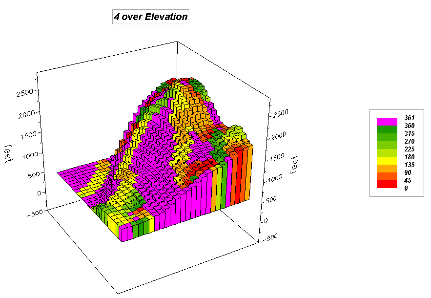
Figure 1a.
3D Grid Input map identifying the number of customers at each grid
location forming discrete quantitative data. |
Figure 1b.
Scan command that summarizes map values within a roving window |
Figure 1c.
2D Grid Output map determining the total number of customers within
.25 miles of each grid location forming continuous quantitative data. |
SCAN Total_customers Total IGNORE 0.0 WITHIN 6
CIRCLE FOR Total_customers_within6
The Scan
command is a Neighborhood class of
map analysis operators that summarizes map values within a “roving window” and
assigns the summary value to the center cell of the window. In this case, the total number of customers
within a .25 mile (6-cell) radius is calculated. The warmer tones in the Output map indicate
increasing number of customers within reach from 0 to 92.
|
|
|
|
|
Figure 2a.
3D Lattice Input map identifying the total number of customers within
.25 miles of each grid location forming continuous quantitative data (see
Figure 1c above). |
Figure 1b.
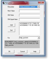
Renumber command that isolates areas of interest |
Figure 1c.
2D Grid Output map that locates areas with more than 35 customers
within .25 miles of each grid location forming discrete binary data. |
RENUMBER Total_customers_within6 ASSIGNING 0 TO 1 THRU 35 ASSIGNING 1 TO 35
THRU 92 FOR High_pockets
The Renumber
command is a Reclassify class of map
analysis operators that enables a user to specify new map values for old values
or range of values on an existing map.
In this case, a binary map is produced that identifies 0 with low
customer levels from 0 to 35, and 1 identifying “pockets of high customer
density “from 35 to 92 customers within a .25 mile reach.
___________________________
Joe - I don't get a slope_fitted option under MAP > OVERLAY after I have
performed the slope_fitted function.
2/7
Pete— slope isn’t an Overlay operator …the “Neighbors” drop-down contains all of the neighborhood
operations. Select the Slope command to pop-up its dialog box
and choose the “fitted” mode for
calculating slope. But I included a few more
“Helpful Hints” below that might be useful in preparing your report. -Joe
Use the Slope
command under the “Neighbors”
menu button, to create and capture 2D display maps you create of Slope_fitted, Slope_max, Slope_min and Slope_avg by
using the appropriate option button.
If you
intend to “visually compare” maps (as directed in this question) you must use a consistent legend.
Once you have calculated the four slope maps determine the maximum
range of values considering all four calculation techniques and then make
the best 2D display using User Defined for the display
calculation mode like above …map analysis “rule:” rarely can you use default
displays for report figures.
Be sure
your discussion explains the similarities/differences in the four maps of
slope and why it is necessary to use a common legend when visually comparing
map displays. -Joe
___________________________
Hi Joe— I have a question about
one of my assigned study-guide questions (#37).
What I think you're trying to get us to do is to explain how the spread
command calculates simple proximity for point, line, and polygon data. However, I can distinguish the difference
between the point and polygon data (ranches vs. housing). Where is the ranch data so that I can
actually do this command? -Nashwa
2/6
Nashwa-- the question under questions is...
37. Using the analogy to tossing an
object(s) into a pond, describe how a simple proximity map is created for the
following MapCalc commands…
SPREAD RanchMap
TO 100 for Ranch_Prox
SPREAD HousingMap
TO 100 for Housing_Prox
SPREAD RoadMap
TO 100 for Road_Prox
…the
ranch is on the Locations map (need
to Renumber to isolate it for the RanchMap). Note that the three different Starter(s) maps
contain different map features—a single Point, a set of Points and a set of
Lines.
I think
your proposed answer has most of the required elements. But keep in mind, the waves from a single
point simply propagates outward; waves from a set of points or lines propagate
outward but interact, such the distance to the closest Starter location is
retained. The discussions in…
Beyond
Mapping III, Topic 25: Calculating
Effective Distance and Connectivity
www.innovativegis.com/basis/MapAnalysis/Topic25/Topic25.htm
Measuring
Distance Is Neither Here nor There — discusses the basic
concepts of distance and proximity
Use
Cells and Rings to Calculate Simple Proximity — describes
how simple proximity is calculated
…ought
to help in formulating your answer. -Joe
___________________________
Hi Joe— I have a question about
exercise 4, question 4. When draping the
Elev_Smoothed_Difference Map over the 3D surface, I
used the Cover function to Cover Elev_Smoothed_Difference
over Elevation. My question is do I want
to ignore zero or not.
By ignoring zero the original
elevation values are visible depicting a 3D map that is not very
distinguishable from the elevation map.
However, maybe that is a good thing since this map is supposed to show areas
that have noticeable changes in elevation as determined by the difference
between actual values and the average value computed by neighboring cells. So overall, there aren't too many areas that
have major differences between actual and average.
On the other hand, if you want to
see where these changes actually occur, it's easier to see in a 3D map that
does not ignore zeros. Am I off base
here? Thanks, Nashwa
2/6
Nashwa-- Draping is a graphical overlay (just makes a cool map), whereas Cover
creates a new map (that one could use in further Map Analysis). In the exercise,
Question 4. Capture, embed, clearly
label the 2D and 3D (draped
over Elevation) displays of the maps you created then briefly discuss
the procedure you used to create the “Smoothed Difference” and “Coffvar” maps and interpret the meaning of the output map
values.
To drape
a map over display the 3D map you want to be the “drape” (e.g., Elevation), then select Map from the main menu, Overlay from the drop-down, and choose
the map you want to drape (e.g., Slope
in the example below; Elev_ElevSmoothed_difference in the Exercise Q4).
Once you
have created the enhanced displays, visually interpret what you see …does the
result make sense? -Joe
___________________________
Joe - re ex4: when entering the
spread operation in MapCalc from part 1, question 1, the null value is
PMAP_NULL. However, in the command line
from the exercise 4 document, PMAP_NULL is omitted. Will the map results be impacted due to this
discrepancy? Thanks, Pete
1/30
Pete-- PMAP_Null
is set to "infinity" in MapCalc and is used if the user wants to
exclude an area from processing. For
example, if one only wants to process an irregularly shaped town boundary you
could create a discrete binary Null_mask (assigning 1 to all town cells and PMAP_Null to the outside cells) that identifies all areas
outside of the boundary to the full extent of the rectangular analysis
frame. The PMAP_NULL cells will be
ignored during processing and displayed as a blank in the result…
In this
case we want to process everything within the rectangular project area so either
PMAP_NULL or no value in the ignoring phrase will cause the computer to
consider all locations in its processing—what we want. -Joe
___________________________
1/29
Folks— while grading Exercise # 3, I
see where I lead you astray about the differences in Display Type and Display Data Type…
|
-
2D/3D Toggle |
|
|
-
Use Cells |
|
|
-
Layer Mesh |
|
|
-
Data Type |
|
|
-
Shading Manager (you must set on your own) |
|
…hopefully the above revisions are
helpful. Keep in mind that mapped Data
Type always has two parts to its specification—the nature of both its Numeric
distribution and its
Geographic distribution. -Joe
___________________________
1/28 Folks—below is a simple flowchart
identifying the Hugag Habitat binary suitability
model that was created in PowerPoint
(for the cheap ones among us without Visio,
or who want flowcharts a bit more interesting).
The version on the right “soups” it up a bit with SnagIt screen grabs of the maps generated by in the map analysis
processing. For added effect, the map
graphics are grouped then assigned “animation” settings so they appear as you
press the down arrow to advance through the model logic steps. You can download and view the two-slide
animated PowerPoint from…
http://www.innovativegis.com/basis/Courses/GMcourse11/Email_dialog/HugagHabitat_Flowchart.ppt
If any of you are interested in a practicum
on creating “fancy” graphics like these using just SnagIt and PowerPoint, I
would be delighted to hold a short workshop on techniques I have learned before
class 5:00-6:00pm. Drop by class early
if you are interested …particularly useful for those who are getting ready for
thesis or dissertation defense as the procedures are generic to making
effective graphics, regardless of whether you use GIS modeling or not. -Joe
___________________________
1/27 Folks—Steven Yee and I meet this
morning and we are “confident” that MapCalc is fully functional on all of
the computers in the Large GIS Lab (BW room 126; our
class room). You are still required to use maps in your \MapCalc
Data folder that you copied to your student Z: drive.
However, when you copied the folder,
Windows was looking out to protect you from yourself, and by default the folder
is set to “Read Only.” You need to go to your Z:
drive and browse to your \MapCalc Data folder, right-click on the
folder, select Properties, then un-check the “Read Only” box
and choose to allow writing to all subfolders and files under the folder.
Don’t be concerned that it appears that
Windows doesn’t remember your request …the next time you check properties of
the folder it will look like it reverted back, but it didn’t—just a lingering
bug. The “Read Only” default setting might have been why some of you had
problems while others didn’t …they were aware of this “Nanny-feature” of
Windows of making every copied folder “Read Only” by default.
Another squirrelly thing on the lab
computers is that you have to copy any Adobe file (.pdf)
from your Z: drive to the desktop to be able to view it or print (e.g.,
MapCalc Manual.pdf). -Joe
___________________________
1/26 Folks—some of you have complained about MapCalc’s tacky
displays—“they’re not maps!!!” Alas,
traditional cartography is not MapCalc’s thing. The software has always
been the primary domain of instructors, researchers and other professionals as
a “toolbox” for understanding and utilizing grid-based map analysis and
modeling …not an operational stand-alone package. In fact, I find the
“stripped-down” nature of MapCalc helpful in keeping students focused on the
numbers (map analysis), not the colorful graphics (mapping). Below are a couple of “tricks” that might
keep your inner aesthetic child happy …have fun,
Joe
1) My “feeble attempts” at making “map display keepers” for
publications rely heavily on SnagIt’s cut and paste wizardry. For example, I build
a scale bar and north arrow by— 1)
screen-grabbing several (20 in this case) cells on the map, 2) paste it where I
want it alongside the map I want to “gussy-up” in PowerPoint, 3) label the
scale bar, 4) then insert a north arrow icon such that it points toward the
top, and 5) group the entire mess along with the map display being sure
that the Object’s Aspect Ratio (Scale) is locked (
Note: you can set the default
display modes in MapCalc by right-clicking on a map display, selecting “Properties”
and then “forcing” your desires through the Display, Title, Legend
and Plot Cube tabs. Your specifications will then be applied to
all current and/or future maps in the database. However, with the
exception of the mini-project, my hope was to keep the “cartographer in all of
you” at bay while we focus on the information content derived by applying map
analysis operations—the information is in the NUMBERS, not the graphic
portrayal. It is this sort of “backward thinking” that keeps us focused on
concepts and theory (educational enlightenment) instead of mechanics and
graphics (vocational training).
2) Another “graphics trick” I use a lot involves an indirect graphic overlay
technique. First, screen-grab a display
of a map, then assign “transparent” to one of the colors and paste on top of
another map. To set one of the colors on a screen grab-map (graphics file
needs to be .jpg, .gif or other format that allows
transparency), select the pasted picture in PowerPoint, then select Formatà Recolorà Set
transparent color and then click on the color in the picture and the color
will “disappear.” Click and drag the picture with the “transparent color”
onto the other map.
___________________________
Dr. Berry, greetings... it’s me,
Linda. Have a question— I know that I am
remedial, however, per Exercise #3 instructions, in attempting to locate the
precise map for Exercise #3, 1b, it specifically asks for "
z2000_Image_8_30_NIR " = NEAR INFRARED
map; however, only a
"z2000_Image_8_30_NDVI" map exists. What am I missing? I looked everywhere. Regards, Linda
1/23
Linda—you are correct …the map layer in the Agdata.rgs data set you should use is “z2000_Image_8_30_NDVI” not “z2000_Image_8_30_NIR” as
misrepresented in the exercise write-up.
For the
remote sensing nuts among us, you might extend your discussion a bit by
discussing what kind of information is contained in a Normalized Difference Vegetation Index (NDVI) map. For the want-a-be remote sensing nuts among
us, you might check out the Wikipedia’s thoughtful explanation of the derived
data layer. -Joe
___________________________
1/21 Folks— I suspect some of you will
encounter a problem with entering commands on your own for Question #6.
The native language interface requires you to press the Add button to
register assignment phrases one at a time as shown below. Not pressing Add
before pressing OK to execute a command leaves off the “hanging phrase”
and MapCalc is so dumb that it doesn’t warn you that you about to make a huge mistake.
___________________________
1/20 Folks—the contextual Help for MapCalc
was developed for Windows XP or older environments. For those of you who are running MapCalc
under Vista (sorry about that!!!) or
Windows 7 on your personal computers,
you have to install a patch for the Help button in the command GUI box to work—
”Microsoft stopped including the 32-bit Help file viewer in Windows
releases beginning with Windows Vista and Windows Server 2008. To support
customers who still rely on legacy .hlp files, the Microsoft Download Center provides WinHlp32.exe downloads for Windows
Vista, Windows 7, Windows Server 2008, and Windows Server 2008 R2.”
Download the appropriate
version of Windows Help program (WinHlp32.exe), depending on the operating
system that you are using:
You have to know whether your Windows
version is 32 or 64 bit, but there are step by step instructions on how to
determine your operating environment if you don’t know.
This worked fine for me on my machine …64
bit Windows 7. Hopefully you have the
same success. -Joe
___________________________
1/20 Folks—some of you seem a bit confused
about the +/- Standard Deviation display mode …a technique reserved for
grid-based data as it needs to be “continuous” in both data space (ratio)
and geographic space (isopleth), so you don’t see it used in
vector-based systems.
While use of the technique for displaying
elevation data isn’t very constructive, it is very useful in gaining insight
into other types of mapped variables, such as pollution, activity and cost
surfaces. Decision-makers often what to know “where” things are typical;
and where things are unusually high or low—not just a
aesthetically pleasing grouping of ranges of pastel colors. -Joe
___________________________
1/18 Folks—I have only heard of one
incidence, but beware of MapCalc misbehaving. Keep in mind that the
MapCalc Data Base has to be copied to a drive that you have “write
permission” …your Z: student drive in the lab, a pocket drive
you carry or your own computer. A pocket drive is the best
solution as you can “walk” it between lab and home computers. If you receive a “fatal error,” let me know
right away…
1) screen grab the
error message,
2) tell me what computer you were using,
3) what command
you were attempting,
4) which MapCalc
data set you were using (e.g., Tutor25.rgs) and
5) what drive it
was on.
Thanks, Joe
___________________________
1/12 Folks— in the Campground Suitability
model in Exercise #1 only six operations are
used. Hopefully you didn’t spend a lot
of time “wading in the swamp” of details about the various mechanical options
to the commands …that’s what we will be doing in an organized manner during the
rest of the course. The schematic and
summary table below ought to be sufficient in getting the conceptual drift
of what the campground Suitability model is doing …but postpone how it is doing
it for later in the course. -Joe
_______
The commands are classified as follows:
|
Command |
Analytical
Class |
Function (from Help/Manual) |
|
Slope |
Neighborhood Summary (Week 5) |
Slope creates a map indicating the slope (1st derivative) along
a continuous surface. Terrain
steepness (rise over run) expressed as a percent. Similar
to Esri Grid command “slope.” |
|
Spread |
Distance & Connectivity (Week 4) |
Spread creates a map indicating the shortest effective
distance from all cells with non-zero or non-null values to other cells
within the range specified in the “To” blank.
If no “friction” map is specified simple Euclidean distance is
measured. Similar to Esri Grid commands “EucDistance” and “CostDistance.” |
|
Radiate |
Distance & Connectivity (Week 4) |
Radiate creates a viewshed map
indicating areas that are visible from locations on the viewersMap. It can be used to identify all the cells that
can be seen from a single location, or groups of locations. Similar to Esri
Grid command “Visibility.” |
|
Orient |
Neighborhood Summary (Week 5) |
Orient produces a map of aspects or azimuths along a
surface map. It calculates azimuth degrees or aspect octants (eight compass
directions) of each cell on a map representing a continuous three-dimensional surface. Similar
to Esri Grid command “Aspect.” |
|
Renumber |
Reclassify (Week 3) |
Renumber assigns new values to the category values of an existing
map. It is one of the most frequently used operations in MapCalc as it prepares
maps for subsequent processing. Similar to Esri
Grid command “Reclassify.” |
|
Analyze |
Statistical (Week 7) |
Analyze creates a map of the simple or weighted average, standard
deviation, coefficient of variation and several other descriptive statistics
for two or more maps. Similar to Esri
Grid command “Average.” |
___________________________
1/11 Professor— we had a few
questions about the assignment. What is
the difference between verification and validation? From the derived maps what is the information
contained in the script? For example,
when it says spread roads nullvalue 0-100 uphill what
does that mean?
We are somewhat confused by this
assignment. -Jewell Wilson
Jewell—
the subtle difference between verification
and validation is usually discussed
in the first couple of weeks of any modeling course (spatial or non-spatial
mathematical modeling). Generally
speaking…
– Verification - does the model do
what we intended? (Internal workings of model/results;
often simply did it compile and generate reasonable “ballpark acceptable”
results)
– Validation - how does the model
compare to the real world? (External reality-check of the
model intermediate and final results; go to the field and evaluate by
measurement or experience)
…both concepts are getting at “accuracy” of
the information contained in a derived/interpreted/modeled map layer.
Your challenge is to discuss the concepts within the context of the Campground
Suitability models logic and results.
Your Funk & Wagnalls
dictionary might help with the differences in definition; or Google “verify
versus validate” …the Wikipedia has a particularly detailed discussion.
On the
broader front, you have every right to be confused as this is an unfair assignment. You were “simply” asked to complete a GIS
model in a software system you have never seen before (thrown in the deep end
of the pool). Whatever happened to that
comfortable old “didactic” approach to learning with instructor-guided baby
steps?
In this
exercise I was hoping to have you to “wrestle” with model and do your best at
interpreting what is happening as the base maps are “magically transformed”
into a solution map—a suitability ranking for locating a campground from 1=
worst places to 9= best places and 0= no way as the location is legally or
practically constrained. I suggest you
take a “100,000-foot” view of the model and not get hung-up with the command
details (options)—see if you can figure out what the command is doing, not how is it doing it.
As the
course progresses we will wallow in the details of the analytical processing,
but for this initial (beginners) assignment look at the forest (not the
trees). The experience should be
something like when you “break shrink-wrap” on any new software package—dive in
and start playing around. However, if
you want to stroll among the trees, and are executing the script in the GIS Lab
or own computer running under Windows XP, you can press the Help button in the GUI
pop-up to get an idea of what the processing entails. If running under Vista or Windows 7 you need
to consult the MapCalc Users manual posted on the class website. For example,
___________________________
1/10 Joe— our group has two questions so far about the
assignment; the first is about "empirical evaluation." We
weren't quite sure what you meant by this.
The second one relates to "levels of analysis." We found the
slide, but weren't sure if you were asking for the "algorithm,
calibration, weighting, modeled" list at the top or the "base,
derived, interpreted, modeled" words at the bottom. Regards, Eric
Eric— it is great to hear from you. By “empirical
evaluation” I mean what field measurement techniques might be
employed to determine the precision/accuracy (correctness) of a “derived map’s”
result. Derived maps represent “facts” on the landscape that could be
measured but with great difficulty or cost so “algorithms” are used to derive
them— “empirical evaluation” assesses how good the derived (versus measured)
results are.
“Levels of analysis” refers to the types of maps
created in a GIS model. The types are determined by the level of
abstraction from physical/measured maps (inventories) to theoretical/conceptual
map solution (cognitive). Don’t confuse “analysis levels” (map type) with
the “processing approaches” (techniques) used in the step-by-step processing.
Hopefully these somewhat “intentionally vague explanations” help
your team’s discussions, without explicitly giving you the answers
outright—knowledge flows from thoughtful pondering; trivia is assembled by rote
memory. Joe
___________________________
1/8 Folks— below are some
helpful hints on using Snagit to
screen capture “stuff” for your reports.
There are a lot of enhancements you can employ but for now just go with
the basic capture to your “clipboard” as described below. -Joe
_____________
Helpful Hints for
using Snagit – Basic Procedures
Once
you have downloaded, installed and launched SnagIt,
switch the program to “Compact” mode by selecting menu item Viewà Compact View.
|
|
The
“Mode” drop-down list is used to set the type of capture. The most common setting is “Image Capture” to generate a screen
grab that is sort of like taking a photo of the screen or portion of the
screen that you can paste into Word documents and PowerPoint slides. The “Video
Capture” mode can be used capture screen animations but the video file
generated has to be hyperlinked into documents and PowerPoint slides. |
|
|
The
“Input” drop-down list sets the type and properties of screen captures. The most commonly used type is “Region” that enables you to
click-and-drag a rectangular box around a portion of the screen. The “Window”
capture type is used to capture windows on the screen that are highlighted as
you move the cursor. The other capture
types are less frequently used. The “Include Cursor” option is used to capture the mouse pointer in an image capture. |
|
|
The
“Output” drop-down list sets the output type.
The most commonly used type is “Clipboard”
that first places the capture in the Snagit Editor then when you press finish
(press the “Green Checkmark”) the
image is copied to your clipboard. If
you want to save a screen capture as a graphic file while in Clipboard mode, you can simply choose
the Snagit button in the upper-left
corner of the Editor preview
window, then select Save As and
specify the file name, type and folder. Use the “Insert” tab to bring a sorted
graphic (picture) into PowerPoint or Word. |
|
|
Under
the “Tools” drop-down select “Program Preferences” and in the “Hotkeys” tab
you can select the key combination to activate SnagIt for capture. This
is normally just the Print Screen button but that can lead to problems. I suggest you use “Ctrl + Shift + P” but can be changed if it
conflicts with another programs hotkeys assignment. |
Now
you are ready to capture screen images.
Simultaneously press the “activate” keys (“Ctrl/Shift/P”) and the capture cursor will appear. Left Click-and-Drag a box around a portion of
the screen then release the mouse button and the SnagIt Editor with the captured portion will appear.
|
|
There
are numerous tools for adding text, drawing on the figure and special
effects. But
for your first capture, simply click on the “Green Checkmark” in the upper right corner to transfer the image
to your clipboard. |
For
a professional appearance in a report, Resize
and Center the image, and then add a Centered Caption in italics underneath
it to set the figure apart from the rest of the document. For example, screen captures of Lattice and
Grid displays of Tutor25.rgs Elevation data would appear as—
Figure 1-1. 3D Lattice Display.
Note the smooth appearance of the plot that “stretches” the grid pattern
by pushing up the intersections
of the grid lines.
Figure 1-2. 3D Grid Display. Note the chunky appearance of the plot pushes
up
the “pillars” representing each
grid cell border.
___________________________
1/8 Folks— anticipating
some of you might be encountering some initial “confusion” (sic) about running MapCalc,
I have prepared a couple of slides (below) that hopefully will get you started
with MapCalc and Exercise #1. -Joe
Helpful hints for
Running MapCalc
Note: the Contextual Help does not work in Windows
Vista or Windows 7 operating systems; the same information is available in the MapCalc
User’s Guide, Chapter 9 description of commands.
1/8 Folks— below is a
short excerpt from a book that might help with your write-up for this week’s
homework (Exercise #1 using the Exer1.doc template you download).
Also, there is a set of annotated screen captures describing the step-by-step
processing of the model at…
http://www.innovativegis.com/basis/Senarios/Campground.htm
Your “charge” is to distill your experience
running the script in MapCalc to a clear and professionally written report that
responds to the questions… the excerpt and annotated screen captures provide
additional context for the exercise.
-Joe
GIS
TECHNOLOGY IN ENVIRONMENTAL MANAGEMENT: Brief History, Trends and Probable
Future
By Joseph K. Berry
[excerpt from an invited
book chapter in the Handbook of Global Environmental Policy and
Administration, edited by Soden and Steel, Marcel
Dekker, 1999, ISBN:
0-8247-1989-1]
:
Excerpt…
:
GIS Modeling Approach
and Structure
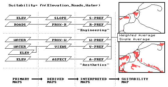
Consider the
simple model outlined in the accompanying figure (Figure 3). It identifies the suitable areas for a
residential development considering basic engineering and aesthetic
factors. Like any other model it is a
generalized statement, or abstraction, of the important considerations in a
real-world situation. It is
representative of one of the most common GIS modeling types— a suitability
model. First, note that the model is
depicted as a flowchart with boxes indicating maps, and lines indicating GIS
processing. It is read from left to
right. For example, the top line tells
us that a map of elevation (ELEV) is used to derive a map of relative steepness
(SLOPE), which in turn, is interpreted for slopes that are better for a
campground (S-PREF).
Figure
3. Development Suitability
Model. Flow chart of GIS
processing determining the best areas for a development as gently sloped, near
roads, near water, with good views of water and a westerly aspect.
Next,
note that the flowchart has been subdivided into compartments by dotted
horizontal and vertical lines. The
horizontal lines identify separate sub-models expressing suitability criteria—
the best locations for the campground are 1) on gently sloped terrain, 2) near
existing roads, 3) near flowing water, 4) with good views of water, and 5)
westerly oriented. The first two
criteria reflect engineering preferences, whereas the latter three identify
aesthetic considerations. The criteria
depicted in the flowchart are linked to a sequence of GIS commands (termed a
command macro) which are the domain
of the GIS specialist. The linkage
between the flowchart and the macro is discussed latter; for now concentrate on
the model’s overall structure. The vertical
lines indicate increasing levels of abstraction. The left-most primary maps section
identifies the base maps needed for the application. In most instances, this category defines maps
of physical features described through field surveys— elevation, roads and
water. They are inventories of the
landscape, and are accepted as fact.
The next
group is termed derived maps. Like
primary maps, they are facts, however these descriptors are difficult to
collect and encode, so the computer is used to derive them. For example, slope can be measured with an
Abney hand level, but it is impractical to collect this information for all of
the 2,500 quarter-hectare locations depicted in the project area. Similarly, the distance to roads can be
measured by a survey crew, but it is just too difficult. Note that these first two levels of model
abstraction are concrete descriptions of the landscape. The accuracy of both primary and derived maps
can be empirically verified simply by taking the maps to the field and measuring.
The next
two levels, however, are an entirely different matter. It is at this juncture that GIS modeling is
moved from fact to judgment—from the description of the landscape (fact) to the
prescription of a proposed land use (judgment).
The interpreted maps are the result of assessing landscape factors
in terms of an intended use. This
involves assigning a relative "goodness value" to each map
condition. For example, gentle slopes
are preferred locations for campgrounds.
However, if proposed ski trails were under consideration, steeper slopes
would be preferred. It is imperative
that a common goodness scale is used for all of the interpreted maps. Interpreting maps is like a professor's
grading of several exams during an academic term. Each test (vis. primary or derived map) is
graded. As you would expect, some
students (vis. map locations) score well on a particular exam, while others
receive low marks.
The final
suitability
map is a composite of the set of interpreted maps, similar to averaging
individual test scores to form an overall semester grade. In the figure, the lower map inset identifies
the best overall scores for locating a development, and is computed as the
simple average of the five individual preference maps. However, what if the concern for good views
(V-PREF map) was considered ten times more important in siting
the campground than the other preferences?
The upper map inset depicts the weighted average of the preference maps
showing that the good locations, under this scenario, are severely cut back to
just a few areas in the western portion of the study area. But what if gentle slopes (S-PREF map) were
considered more important? Or proximity to water (W-PREF map)? Where are best locations under these
scenarios? Are there any consistently
good locations?
The
ability to interact with the derivation of a prescriptive map is what
distinguishes GIS modeling from the computer mapping and spatial database
management activities of the earlier eras.
Actually, there are three types of model modifications that can be made—
weighting, calibration and structural. Weighting
modifications affect the combining of the interpreted maps into an overall
suitability map, as described above. Calibration modifications affect the assignment
of the individual "goodness ratings."
For example, a different set of ranges defining slope “goodness” might
be assigned, and its impact on the best locations noted.
Weighting
and calibration simulations are easy and straight forward— edit a model
parameter then resubmit the macro and note the changes in the suitability
map. Through repeated model simulation,
valuable insight is gained into the spatial sensitivity of a proposed plan to
the decision criteria. Structural modifications, on the other
hand, reflect changes in model logic by introducing new criteria. They involve modifications in the structure
of the flowchart and additional programming code to the command macro. For example, a group of decision-makers might
decide that forested areas are better for a development than open terrain. To introduce the new criterion, a new
sequence of primary, derived and interpreted maps must be added to the
"aesthetics" compartment of the model reflecting the group’s
preference. It is this dynamic
interaction with maps and the derivation of new perspectives on a plan that
characterize spatial reasoning and dialogue.
:
: …see http://www.innovativegis.com/basis/present/Global/global3.htm
for an online version of the complete Chapter containing a short case applying
the approach to the western tip of the Caribbean island of St. Thomas (
___________________________
1/7 Folks—it appears some
of you have your email setup so it can’t view embedded images in an email
(not-so-smart phone, maybe?). If you
can’t see the embedded image in the last email, check out the labeled class
photo on the class website.
You might consider setting your default
email environment from “Plain Text” to “HTML”
if possible …In Outlook select Toolsà Optionsà Mail Formatà HTML instead
of Plain Text like below—
________________________________________________________
…<click here> to review Student Statements and Instructor
Responses that
might give you some insight into the class makeup and explanations of
course approach, content and logistics
________________________________________________________
Pre-Class Questions, Winter Term 2011
I
recently looked at the finals schedule, and noticed our scheduled final exam
time is at 6 P.M. Sunday evening of March 13. However on our syllabus, it says
the final is online. I will be traveling for March break, and will need to book
a flight. I would like to know if we will need to physically be at DU for the
final, or if we can take it anywhere there is Internet. …the exams are
taken over the Internet with the final exam posted the last day of classes
and taken anytime/anywhere during finals week. The exams are essay questions and “closed
book/notes” so all you need is an Internet connection, a two hour block of time
and a good understanding of the material.
There is a fairly heavy workload in the course early in the term (some
say a bit “burdensome”) but is designed to “tail-off” toward the end of the
term when the rest of your courses and papers are peaking.
Will
I be able to handle this class without prior GIS experience? I would really
like to develop my GIS knowledge before I graduate but the intro course filled
up by the time my loan finally went through allowing me to register. …last year two undergrads were in the top five grade pool
…one did not have a prior GIS course.
Data nuances, structures, formats, and acquisition, as well as display
and geo-query/retrieval, are major elements of an introductory GIS course. These concepts and practices are the bedrock
of GIS, but in GIS Modeling we focus on “maps as numbers” and presume that are
data is “perfect” and cartographic procedures are reserved for final map display. The emphasis in the course is on “thinking
with mapped data” and ‘spatial reasoning” which do not require a deep keel of
understanding of traditional mapping techniques. The bottom line is that you don’t need a
prior GIS course but you do need to be 1) comfortable with basic math/stat principles
that we will apply to digital mapped data and 2) a bit of fortitude as the workload
of the course is at the upper division/grad level. I encourage you to checkout last year’s class
website at…
http://www.innovativegis.com/basis/Courses/GMcourse10/
…to get an idea of what we will cover and a
feel for the weekly team assignments completed outside class time. Also check the growing list of “Pre-class
Questions” on this year’s class website at…
http://www.innovativegis.com/basis/Courses/GMcourse11/Email_dialog/Email_dialog.htm
…Email jberry@innovativegis.com
or give me a call at 970-215-0825 and we can discuss further.
Extended Discussion. The main thing to
keep in mind is that while the material presented doesn’t require prior GIS
experience or advanced perquisites, the course is taught at the upper
division/graduate level making the demands fairly substantial (about 10-12
hours per week) with weekly team reports, readings, directed mini-project and a
couple of exams that keep students busy throughout the term …the pace makes
getting behind tough to catch up.
What
would you recommend brushing up on in statistics in order to be optimally
prepared for the class? …we will be using fairly
basic concepts in statistics—such as concepts/calculations for average/mean,
weighted average/mean, standard deviation, coefficient of variation ((StDev/Mean ) * 100), percent difference, standard normal
variable, correlation and linear regression. If you have had a statistics
course and “feel comfortable with numbers,” I don’t think you need to
“brush-up” …we will discuss in class when their use is part of an analysis
technique.
What is your preferred method of communication? (email, phone). …Email is the best way to contact me; however, sometimes a
follow-up phone call keeps us from writing long discourses. I post my
email responses to general interest questions to the “Email Dialog” item on the
class website.
If we prefer to purchase the book in class on the first day, do
you prefer a check or cash? …either is fine with a check
a “little finer” as we don’t have to worry about change.
I am not currently in the system to access computers in the lab. Do you
know when this will be available to me? …I don’t know when (or how) non-geography students get access to
the GIS lab computers. I’ll see if I can
find out the process. The textbook CD has most of the software you will
need (take a look at the “software” item on the class website) ...and most
students load it on their own PC to avoid long GIS lab stays. If you want
to “play around” with the software before you get the book/CD, there are links
for downloading it. UPDATE: UTS
(Steven Yee) will get a list of all students enrolled in GIS classes and create
domain accounts for GIS lab computer access. Will Kiniston will get same
list to add door access. Steve Hick
___________________________
Course
Content and
Who Wants to Be a GIS Modeler?
Joe-- Who do you feel is your ideal student? Someone
who is planning to continue using
Hilary-- students who are interested in
learning concepts/procedures/considerations in analyzing spatial
relationships are best served ...be they
The idea that
We will not be using ArcGIS
directly except for one exercise ...it is a fairly large and complex system
that has and a steep learning curve in mapping, database development
and spatial database management that must be negotiated to
use it in learning concepts, procedures and considerations underlying
grid-based map analysis …this would limit the class to
All of the MapCalc and Surfer operations we
will be using are cross-referenced to ArcGIS
operations and those with this background should be able to translate
the concepts, procedures and considerations they learn to the command syntax of
the ArcGIS environment (Grid/Spatial Analyst,
Geo-statistical Analyst, Image Analyst and 3D Analyst extensions).
Joe
___________________________
Folks—I am delighted that you have enrolled
in GIS Modeling for next term.
Please send an email (jberry@innovativegis.com) that briefly outlines your background, interests
and objectives in taking the course.
I encourage you to check out the class
syllabus posted at www.innovativegis.com/basis/Courses/GMcourse11/Syllabus/ for more information on the course
format and requirements. Note that homework exercises are completed in
3-person teams and are completed outside of class. Please send an
email to me with any questions or needed explanation of any aspect of the
course …I’ll share the Q/A with the overly shy in the course.
Since the class is fairly small and my
Blackboard skills limited, I prefer to run the course through my own
server. I will establish a limited BlackBoard
course outline setup but it will simply “bounce” to my server.
Some
logistical announcements…
-
The Class Website is posted at http://www.innovativegis.com/basis/Courses/GMcourse11/ and contains all materials
supporting the course including syllabus, schedule, reading assignments, and
exercises.
-
The Map Analysis textbook (www.innovativegis.com/basis/Books/MapAnalysis/) will be available at the 1st class meeting for the
author's discount price of $34.64, cash or check payable to Joseph K.
Berry. The companion CD contains the MapCalc, Surfer, and Snagit software
we will use in the course. If you want to get a copy of the book/CD
before the 1st class meeting, check with Will in the Geography
Department office.
-
The online links for the Readings for
the 1st Class are posted on the class website at http://www.innovativegis.com/basis/Courses/GMcourse11/. Be sure to read the http://www.innovativegis.com/basis/Papers/Other/GISmodelingFramework/ paper that presents a conceptual framework for map
analysis/modeling that will be used in the course. As the course kickoff
approaches I will post the PowerPoint on the class website.
-
The BASIS website at http://www.innovativegis.com/basis/ contains additional materials and papers
supporting the course. Of particular importance is the online book Beyond
Mapping III posted at http://www.innovativegis.com/basis/MapAnalysis/Default.htm containing extended discussion of material
presented in class and the textbook. The "Chronological Listing"
link identifies articles published since the Map Analysis textbook (2007).
Have a great set of holidays!!! See
you in January. -Joe