|
Topic 4: Toward
an Honest GIS |
Spatial Reasoning
book |
The
This, That, There Rule — describes
creating a “Shadow Map of Certainty” that characterizes the spatial
distribution of probable error
Spawning
Uncertainty — identifies a procedure for tracking
error propagation in map overlay
Avoid
Dis-Information — describes
the calculation of a localized Coefficient of Variance map
Empirical
Verification Assesses Mapping Performance — describes
procedures for assessing mapping performance through Error Matrix (discrete)
and Residual Analysis (continuous)
<Click here> for a printer-friendly version of this topic
(.pdf).
(Back to the Table of Contents)
______________________________
The This,
That, There Rule
(GIS World, July 1994)
You have heard it
before, “This map says we are on the
mountain over there.” Yep, maps are
not always perfect regarding precise placement of discernable features. Monmonier, in his
insightful book How to Lie with Maps
(1991), notes that it’s “not only easy to lie with maps, it’s essential …to
present a useful and truthful picture, an accurate map must tell white
lies.” So how can we sort the little
white lies from the more serious ones?
Where is a map most accurate; where is it least? If it is not correct, what is the next most
likely condition? In short, what does it
take to get an honest map?
First we need to
recognize that these white lies cause maps to 1) distort the 3-D world into a
2-D abstraction, 2) selectively characterize just a few elements from the
actual complexity of spatial reality, and 3) attempt to portray environmental
gradients and conceptual abstractions as distinct spatial objects.
The first two
concerns have challenged geographers and cartographers since the inception of
map-making and have resulted in at least de
facto standards for most of these issues.
The third concern, however, is more recent and involves fuzzy logic and
spatial statistics in its expression.
One approach
responding to the “fuzzy” nature of maps develops a shadow map of certainty assessing map accuracy throughout its
spatial extent. Figure 1 illustrates
such an approach using traditional soil and forest maps (left side) and their
corresponding maps of certainty (right side).
The shaded features on the base maps indicate soil type 2 and forest
type 5 (red and green respectively). Traditional
mapping assumes that soil type 2 occurs as one consistent glob in the right
portion of the study area and forest type 5 occurs as three little globs
precisely delineated as shown—a couple white lies.
Just ask the soil
scientist or forester who drew the maps.
The boundaries are likely somewhere near their delineations, but not
necessarily right on. It’s their best
guesses, not the latitudes and departures taken with a surveyor’s transit. The challenge for GIS is to differentiate
that type of map data (interpreted)
from precise map renderings (measured),
such as surveyed property boundaries.
Furthermore, a geographically distributed assessment of certainty should
accompany each map—sort of “glued” to the bottom of the interpreted map’s
features.
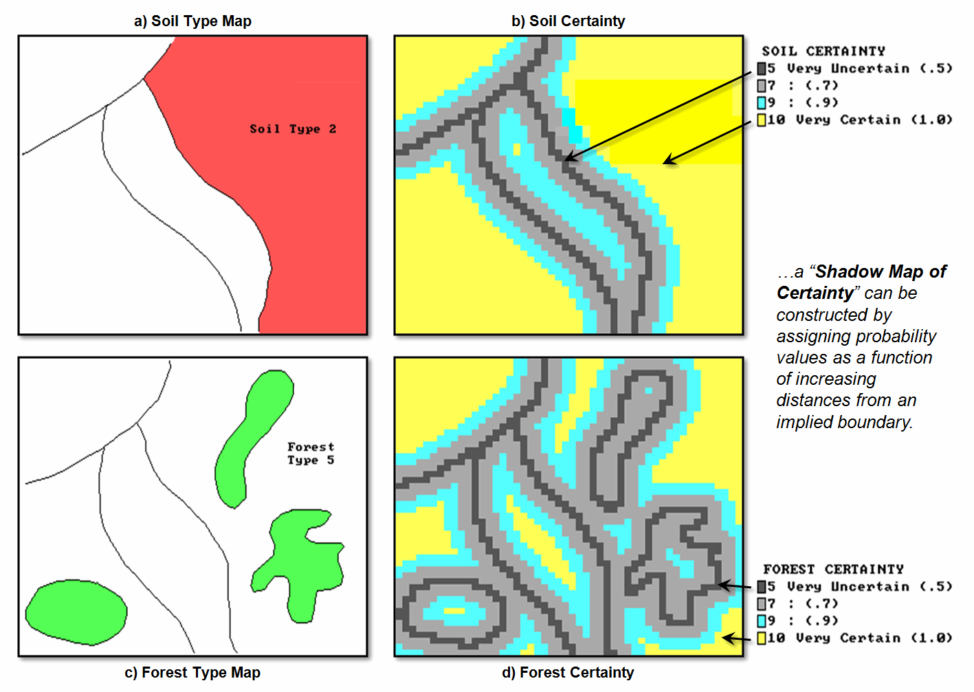
Figure 1. Maps of soil and forest cover (left) can be linked to their relative
certainty (right). Darker tones indicate
less certain areas around spatial transitions.
On the right side
of the figure, the lines indicate the implied feature boundaries, and the
shaded gradient depicts certainty as a function of proximity to an implied
boundary. The dark grey areas at the boundaries
are assigned a relatively low probability (.5) of correct classification,
whereas the interior yellow areas are assigned the highest value (1.0). The shades in between represent increasing
likelihood (light grey= .7 and bright blue= .9). This approach reflects a reasonable
“first-order” assumption that areas around soil and forest transitions are the
least certain, while feature interiors are the most certain.
In a raster
system, the shadow map is generated by “spreading” the boundary locations to a
specified distance. The resulting
proximity map is “renumbered” to indicate probability of correct
classification—from .5 for boundary locations to 1.0 for interior locations
relatively far away.
In this instance,
a linear function of increasing probability was used consistently throughout
both maps. However, if warranted, a
separate distance function could be developed for each type of boundary
transition (e.g., if soils 2 and 3 are easy to delineate, uncertainty might
extend only half as far from there implied boundary). Or a non-linear function, such as
inverse-distance-squared, could be used.
Also, if a feature is frequently “pocked” with other types, the interior
certainty value might not attain 1.0 probability.
Admittedly, all
this sounds a bit farfetched and a great deal of work for both man and machine,
but it does illustrate GIS’s capacity to map a continuum of certainty, as well
as simply feature location—an initial step toward an honest map. Subsequent sections will look at other means
for certainty mapping and its use in error propagation modeling.
_____________________
Reference: Monmonier, Mark. 1991.
How to Lie with Maps. University of Chicago Press,
Chicago, Illinois, USA.
Author's Note: For an overview of map certainty and error
propagation issues, see Topic 6, “Overlaying Maps and Characterizing Error
Propagation,” Beyond Mapping: Concepts, Algorithms and Issues in GIS (Berry,
1993; GIS World Books) or “Beyond Mapping” columns November-December, 1991, GIS
World. Those with tMAP
software should review TMAP6.CMD tutorial.
Spawning Uncertainty
(GIS World, August 1994)
The previous section developed the concept of
a shadow map of certainty to express the “fuzzy” nature of some map
boundaries. Now let’s extend that
concept to error propagation when combining maps. This strikes at the bread-and-butter of a
GIS—identifying areas of map coincidence.
The simple intersection of lines on two maps
isn’t sufficient, however, for overlaying uncertain maps. Keck, if you weren’t sure about either map’s
boundary placement, why would you be certain about their composite pile of
spaghetti? What is needed is a composite
shadow map of certainty that tells the user where it is likely less valid—an
honest assessment of error.
Figure 1 shows the joint coincidence (overlay)
of the soil and forest maps described in the previous section. The maps on the left identify the “son and
daughter polygons” spawned in the conventional overlay process. The process involves the mathematical
intersection of the locational tables associated with the two maps. The upper-left map graphically portrays the
results, but keep in mind that the GIS just “sees” a
massive table of X, Y coordinates. These
coordinates are grouped into the new polygons, and the attribute tables for the
soil and forest maps are merged. The
result is a link between each new polygon and its joint soil/forest attribute.
The bottom-left map shows the result (yellow
polygons) of a geographic search for all of the locations that are soil type 2
and forest type 5. To achieve this feat,
the computer merely searched the composite attribute table for the desired
joint condition, then plotted the coordinates of the S2F5 polygons to the screen
and filled them with a vibrant color.
There, that’s it—quick, clean and right-on. More importantly, it’s comfortable. It’s the same thing you would do if you were
armed with transparent sheets, pens, light table and vast amounts of patience.
Figure 1. The coincidence of the soil and forest maps can be linked to their joint
certainty (insets (c) and d)). Darker
tones (purple and dark blue) indicate less certain areas around the simple
coincidence of the polygon boundaries.
But how good is the result, considering that
uncertainty exists in both of the input maps?
Can the GIS account for the propagated error based on the certainty
maps?
A first-order approximation of the propagated
error involves computing the joint probability by simply multiplying the
soil-certainty map times the forest-certainty “shadow” map. The upper-right map in figure 1 shows the
resultant distribution of certainty. The
dark blue tone is the least certain (.5 x .5= .25) and represents areas of
boundary coincidence—really not-to-sure both conditions are there. The yellow tone identifies areas of relative
certainty (1.0 x 1.0= 1.0).
The bottom-right map (inset d) isolates the
certainty for the geographic search of soil 2 and forest 5. Note that most of the uncertainty is
concentrated in the left portion of both resultant polygons. Figure 2 contains a table summarizing these
data. About half of the map (50.95
percent) is fairly uncertain of the joint condition (S2F5 probability of <.7). But the results of the traditional overlay
procedure implied it’s 100 percent certain that S2F5 occurs throughout the
entire resultant polygons—a uniform spatial distribution of “no error
anywhere.” Honestly, can you believe
that?
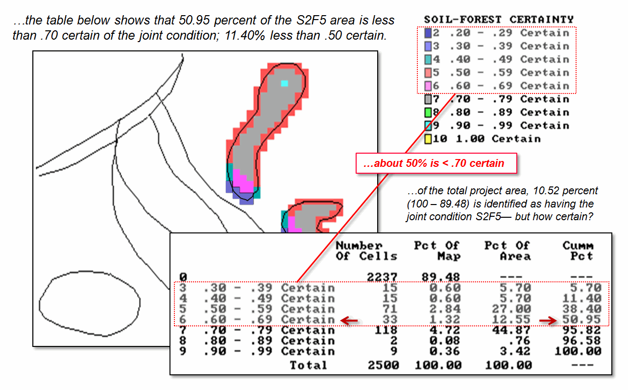
Figure 2. A table summarizes S2F5
coincidence certainty. Note that a
little over half of the coincidence map (50.95 percent) is fairly uncertain of
the joint condition (S2F5 probability <.7) and only nine cells (3.42%) are
identified as fairly certain of the joint condition (>.9).
_____________________
Author's Note: For
additional reading, see “Data Models and data Quality: problems and Prospects,”
M.F. Goodchild, chapter 8, Environmental Modeling
with GIS, 1993, Oxford press, oxford, England and “Uncertainty Issues in GIS,”
session theme (three papers), GIS ’94 Proceedings, Polaris Conferences,
Vancouver, Canada. For a PowerPoint slide
set describing error propagation modeling see http://www.innovativegis.com/basis/BeyondMapping_II/Topic4/Honest.ppt
Avoid Dis-Information
(GIS World, September 1994)
“Dis information ain’t right …blow ‘em away
Bugsy.” Sounds like a line from an old
gangster movie. But it is more
subversive than that. Dis-information is inaccurate data that
appear genuine and are used as if they are accurate. In some respects, that describes a large
portion of spatial data populating our GIS databases. The previous two sections developed the
concept of a shadow map of certainty and its use in error propagation
modeling. The discussion focused on
discrete map types (soil and forest) and the probability of correct boundary
line placement. Now let’s turn our
attention to continuous surface data and related techniques for assessing
error.
Continuous mapped data, such as elevation or
barometric pressure, are characterized best as surfaces (versus the traditional
mapping features of points, lines and polygons). These surfaces are often are derived through
spatial interpolation. If you are not
too “technologically-numbed,” review the January through March 1994 GeoWorld
columns (Beyond Mapping II, Topic 2)
discussing spatial interpolation. They
establish how the estimates of a mapped variable are derived from field
data. But what about the corresponding
shadow map of certainty? Where are
the estimates good predictors? Where are
they bad?
Figure 1 identifies the important considerations in developing a map of
certainty, based on the same field data used in the earlier interpolation
sections. First, note the circle
encompassing the 16 field samples of animal activity. All interpolation procedures establish some
sort of “roving window” to identify the measurements to be used in the
computations. The windows need not be
circular, but can take a variety of shapes and even change shape as they
move. In this example, the window is
large enough and positioned to capture all the field data when it is operating
in the center of the project area.
Locations toward the edges of the map must work with less data (only a
portion of the full circle).
That is the first order consideration in assessing certainty—the number
of sample values used. It is a bit more
complex, but it is common sense that if there is only one field measurement in
the window the estimate might be less reliable than if there are several. Another consideration is the positioning of
the measurements. If the values are at
the window extremities, the estimate might be less reliable than if they were close to the center
(location to be interpolated). The
“weighted nearest-neighbor” algorithm considers the relative distances o the
measurements, with the average their distances providing some insight into an
estimate’s certainty.
In addition to window shape and data positioning, the data values
themselves can contribute to certainty assessment. The left side of figure 1 depicts an implied
appraisal based on the data’s Coefficient of Variation (Coffvar),
a statistic that tracks the relative variation in the data used in the
interpolation. It computes both the
average (typical response) and the standard deviation (variability in
responses), then computes the percentage of the variability surrounding the
average. Interpolated locations based on
variable data within the window are assumed less reliable than locations with
values that are about the same unless there is a strong directional trend in
the data.
The figure identifies four equal steps in variability from 0 percent
though 200 percent. The highest Coffvar is 174 percent (viz., not too sure) at the top
left, while the lowest is 36 percent in the top right (viz., more sure). The map was “draped” on the interpolation surface
of animal activity so the viewer can see the estimated number of animals as the
height of the surface combined with color classes of map certainty. It is interesting that the greatest
variability (darker red tones) corresponds to the areas of lower animal
activity. Any ideas why?
True, the window in these areas captures the 0’s in the northwest
corner as well as some of the high values to the east. Foremost in your reasoning, however, should
be the simplicity of this technique. For
starters, a “weighted” Coffvar considering value
positioning might help, or composite statistic
considering the size of the window, number of values, their positioning and
their variation. How about the alignment with the trend in the data? How might sampling method affect
results? What about measurement error
versus procedural error? Whew!
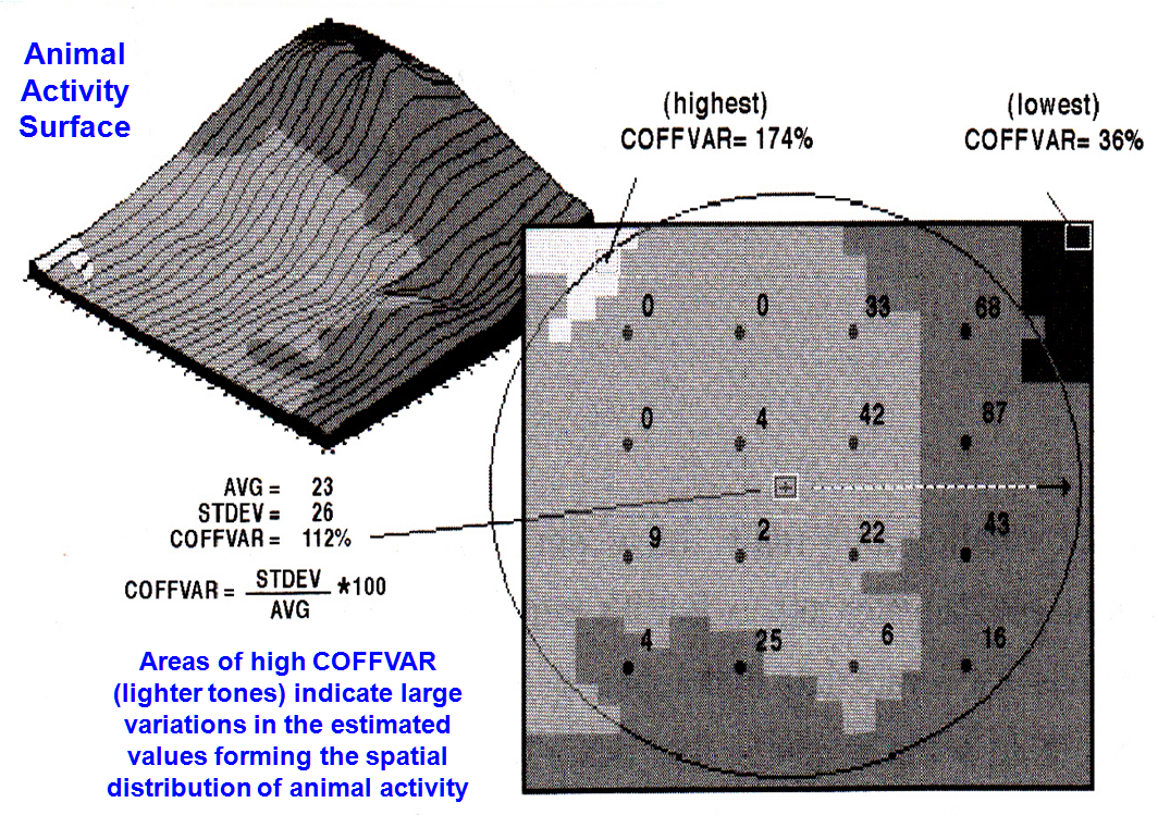
Figure 1. Statistics, such as Coefficient of Variation (COFFVAR), can be used to
assess spatial interpolation conditions and generate a map of certainty. The lighter tones indicate areas of less
certainty because the COFFVAR of the nearby samples is relatively large.
In reality, certainty assessment is a complex area in which spatial
statistics has only scrathed the surface. Procedures like Kriging generate a set of
shadowed errors each time a set of field measurements is interpolated. Most programs simply discard this valuable
information, as the focus is on the estimated surface itself. “Heck, what would users do with a map of
error anyway? Let’s give them another
256 colors instead.”
The important point for “mere-mapping-mortals” is not an in-depth
understanding of statistical theory, but the recognition that maps contain
uncertainty and that procedures are being developed to characterize error
distribution and propagation. Yep, GIS
has launched us beyond mapping as many of us remember it. Strap yourself in, because it is bound to be
an exciting, bumpy ride.
_____________________
Author's Note: As always,
allow me to apologize in advance for the “poetic license” invoked in this terse
treatment of a complex subject. Those
with access to MapCalc software, enter the command “Scan Data within 13 Coffvar for Coffvar13” to generate figure 1.
Empirical Verification Assesses Mapping Performance
(GIS World, October 1994)
If you want to turn a GIS specialist ashen, suggest
taking a map to the field for a little "empirical verification." You know, go to a location and look around to
see if the map is correct. If you do
that systematically at a lot of locations (keeping track of the number of
correct classifications and the nature of the incorrect classifications),
you'll learn a lot about the map's certainty.
The previous three sections discussed ways you could get the computer to
guess about certainty— but empirical verification uses "ground truth"
to directly assess mapping performance.
Consider a typical GIS map, such as soil or forest
type. What do you know about its
certainty? Usually nothing if you're a
typical user and you simply clicked on a map in a scroll list. It pops up with finely etched features filled
with vibrant colors. But try looking
beyond the image to its real-world accuracy.
Figure 1 identifies a couple of ways to do this based on a\error matrix
summarizing the correct and incorrect cells for a set of test plots.
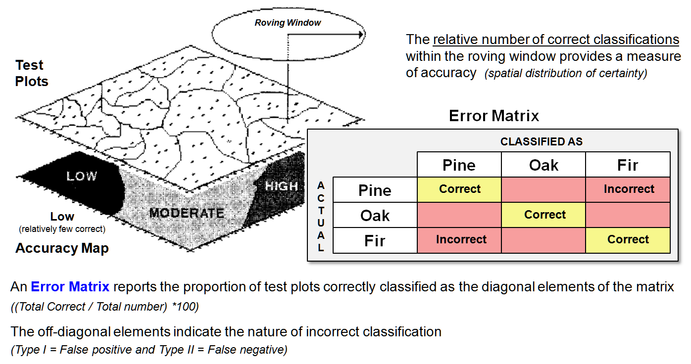
Figure 1. An Error Matrix reports the proportion of correct classifications along
the diagonal and the nature of the incorrect classifications in the
off-diagonal elements.
Suppose you had a forest map with discrete
classification categories Pine, Oak, and Fir.
After swatting mosquitoes and cursing the heat for a couple weeks, you
assemble the field verification data into the matrix shown. In the first cell of the table, record the
number of times it was mapped as pine when you actually stood in pines
(PINE-PINE, correct). Record the errors
for pines in the next two cells of the column— the number of times the map said
you were in pines, but actually you stood in oaks or firs (PINE-OAK and
PINE-FIR, incorrect). The correct and
incorrect results for the oak and Fir columns are recorded similarly. Now normalize all of the data in the matrix
to the total number of test plots for each category so it is expressed in
percent.
Note that the proportion of correct classifications
are along the diagonal, and the nature of the incorrect classifications are in
the off-diagonal elements— an effective summary of overall mapping
performance. The off-diagonal
information on errors is particularly useful in identifying overall
classification confusion.
But what about the distribution of the errors
throughout the project area? A first-order guess involves moving a summary
window around a map of the results of the test plots. If you find that the preponderance of the
mistakes was in the northwest, you might consider additional field checking in
that area. Or, possibly
that area was mapped by an individual needing a refresher course (or a pink
slip). A useful modification to
the procedure is to note just the errors in the roving window that involve the
category at the window's focus. That
gives you an idea of how well that classification is doing in its general
vicinity. It may be that pines
frequently are misclassified in the northeast, but exhibit good classification
in the southwest.
You also could have the window keep track of the
nature of misclassifications— the pines are confused with firs in the
northeast. Because there are so many fir
stands in that area it makes sense that there are a lot of errors. All that might sound a bit strange, but
remember. We’re after an honest map that
shows us more than just its best guesses without hinting to their
accuracy.
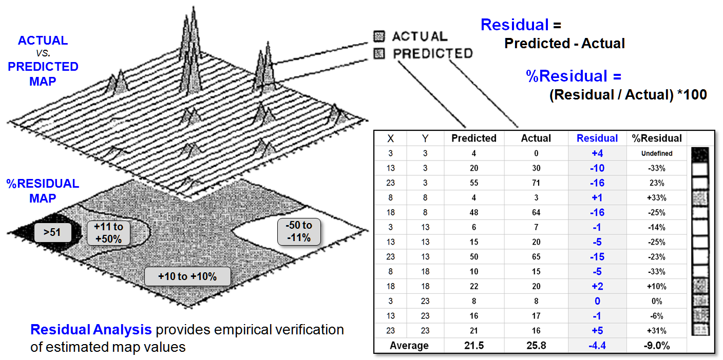
Figure 2. Residual Analysis investigates the difference between a predicted value
and the actual value for a set of test locations.
Figure 2 describes a related procedure for
verifying continuous data (map surfaces).
Residual analysis investigates the difference between a predicted value
and the actual value for a set of test locations. Recall the example of spatial interpolation
of animal activity nearly beaten to death in the previous discussions. Suppose we cheated the computer and held back
some of the field measurements from the interpolation. That would give us a good opportunity to
verify its performance against known levels of animal activity (ground
truth).
The figure identifies thirteen ground truth locations
of measured animal activity. The
difference between the predicted and actual values at a location identifies the
residual. In the figure, the middle
sample plot at X= 23 and Y= 13 is identified in the 3-D map. Its residual is computed as -15 (i.e., 50-65=
-15). The sign of a residual indicates
whether the estimate was too low (-) or too high (+). The magnitude of the residual indicates how
far off the guess was. The percent
residual merely normalizes the magnitude of error to the actual value; the
higher the percentage, the worse the performance.
To generate the %RESIDUAL (bottom left) the %RESID
values in the table were, in turn, interpolated for a map of the percent
residual. Note that the northeast and
southwest portion of the project area seemed to be on target (+10 percent
error), whereas the southeast and northwest portions appear less accurate. The extreme northwest portion is way off
(>51 percent error).
I wonder why?
Like the discussion in the previous section, the answer probably lies in
the assumptions and simplicity of the analysis procedure, as much as it lies in
the data themselves. Spatial statistics
is a developing field for which theory and practical foundation has yet to be
set in concrete. At the moment we may
have the cart (GIS) in front of the horse (science), but the idea of an honest
map boldly displaying its errors will become a reality in the not too distant
future...mark my words.
_____________________
(Back
to the Table of Contents)