|
Topic 2 – Extending
Effective Distance Procedures
|
GIS
Modeling book |
Advancing
the Concept of Effective Distance — describes the algorithms
used in implementing Starter value advanced techniques
A
Dynamic Tune-up for Distance Calculations — describes the
algorithms for dynamic effective distance procedures involving intervening
conditions
Contiguity
Ties Things Together — describes an analytical approach for
determining effective contiguity (clumped features)
A
Narrow-minded Approach — describes how Narrowness maps are derived
Narrowing-In
on Absurd Gerrymanders — discusses how a Narrowness Index (NI) can be
applied to assess redistricting configurations
Further Reading
— three additional sections
<Click here>
for a printer-friendly version of this
topic (.pdf).
(Back to the Table of Contents)
______________________________
Advancing the Concept of Effective Distance
(GeoWorld, February 2011)
The previous section described
several advanced distance procedures.
This and the next section expand on those discussions by describing the
algorithms used in implementing the advanced grid-based techniques.
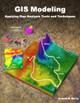
The top portion of figure
1 shows the base maps and procedure used in deriving Static Effective
Distance. The “Starter” map identifies
the locations from which distance will be measured, and their row, column
coordinates are entered into a data stack for processing. The “Friction,” or discrete cost map, notes
conditions that impede movement within a project area—“absolute” barriers
prohibit, while “relative” barriers restrict movement.
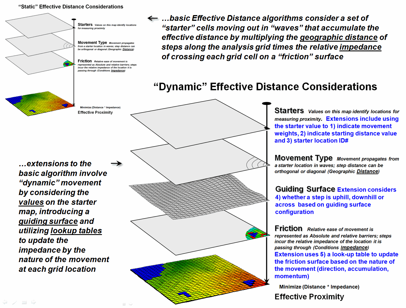
Figure 1. The five most common Dynamic Effective
Distance extensions to traditional “cost distance” calculations.
Briefly stated, the basic
algorithm pops a location off the Starter stack, then notes the nature of the
geographic movement to adjacent cells— orthogonal= 1.000 and diagonal=
1.414. It then checks the impedance/cost
for moving into each of the surrounding cells.
If an absolute barrier exists, the effective distance for that location
is set to infinity. Otherwise, the
geographic movement type is multiplied by the impedance/cost on the friction
map to calculate the accumulated cost.
The procedure is repeated as the movement “wave” continues to propagate
like tossing a rock into a still pond.
If a location can be accessed by a shorter wave-front path from the
Starter cell, or from a different Starter cell, the minimum effective distance
is retained.
The “minimize
(distance * impedance)” wave propagation repeats until the Starter stack is
exhausted. The result is a map surface
of the accumulated cost to access anywhere within a project area from its
closest Starter location. The solution
is expressed in friction/cost units (e.g., minutes are used to derive a
travel-time map).
The bottom portion of
figure 1 identifies the additional considerations involved in extending the
algorithm for Dynamic Effective Distance.
Three of the advanced techniques involve special handling of the values
associated with the Starter locations—1) weighted distance, 2) stepped
accumulation and 3) back-link to closest Starter location. Other extensions utilize 4) a guiding surface
to direct movement and 5) look-up tables to update relative impedance based on
the nature of the movement.
Figure 2. Weighted distance takes into account
differences in the relative movement (e.g., speeds) away from different Starter
locations.
Figure 2 shows the
results of “weighted distance” that considers differences in movement
characteristics. Most distance
algorithms assume that the character of movement is the same for all Starter
locations and that the solution space between two Starter locations will be a
true halfway point (perpendicular bisector).
For example, if there were two helicopters flying toward each other,
where one is twice as fast as the other, the “effective halfway” meeting is
shifted to an off-center, weighted bisector (upper left). Similarly, two emergency vehicles traveling
at different speeds will not meet at the geographic midpoint along a road
network (lower right).
Weighted distance is
fairly easy to implement. When a Starter
location is popped off the stack, its value is used to set an additional
weighting factor in the effective distance algorithm— minimize ((distance *
impedance) * Starter weight).
The weight stays in effect throughout a Starter location’s evaluation
and then updated for the next Starter location.
Figure 3 shows the
results of “stepped accumulation” distance that considers a series of sequenced
movement steps (see Author’s Note).
In the example, on-road travel-time is first calculated along the road
network from the headquarters Starter location with off-road travel treated as
an absolute barrier. The next step
assumes starting anywhere along the roads and proceeding off-road by ATV with
relative barriers determined by terrain steepness and absolute barriers set to
locations exceeding ATV operating limits (<40% slope). The final step propagates the distance wave
into the very steep areas assuming hiking travel.
Stepped distance is a bit
more complicated to implement. It
involves a series of calls to the effective distance algorithm with the
sequenced Starter maps values used to set the accumulation distance counter— minimize
[Starter value + (distance *
impedance)]. The Starter value for
the first call to calculate effective distance by truck from the headquarters
is set to one (or a slightly larger value to indicate “scramble time” to get to
the truck). As the wave front propagates
each road location is assigned a travel-time value.
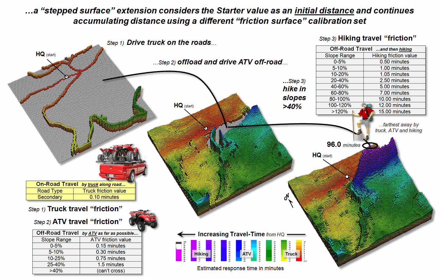
Figure 3. A stepped accumulation surface changes the
relative/absolute barriers calibrations for different modes of travel.
The second stage uses the
accumulated travel-time at each road location to begin off-road ATV
movement. In essence the algorithm picks
up the wave propagation where it left off and a different friction map is
utilized to reflect the relative and absolute barriers associated with ATV
travel. Similarly, the third step picks
up where ATV travel left off and distance wave continues into the very steep
slopes using the hiking friction map calibrations. The final result is a complete travel-time
surface identifying the minimum time to reach any grid location assuming the
best mix of truck, ATV and hiking movement.
A third way that Starter
value can be used is as an ID number to identify the Starter location with the
minimum travel-time. In this extension,
as the wave front propagates the unique Starter ID is assigned to the
corresponding grid cell for every location that “beats” (minimizes) all of the
preceding paths that have been evaluated.
The result is a new map that identifies the effectively closest Starter
location to any accessible grid location within a project area. This new map is commonly referred to a “back-link”
map.
In summary, the value on
the Starter map can be used to model weighted effective distance, stepped
movement and back-linked to the closest starting location. The next section considers the introduction
of a guiding surface to direct movement and use of look-up tables to
change the friction “on-the-fly” based on the nature of the movement
(direction, accumulation and momentum).
_____________________________
Author’s Note: For more
information on backcountry emergency response, see Topic 8, GIS Modeling in
Natural Resources.
A Dynamic
Tune-up for Distance Calculations
(GeoWorld, March 2011)
Last section described
three ways that a “Starter value” can be used to extend traditional effective
distance calculations—by indicating movement weights (gravity model),
indicating a starting/continuing distance value (stepped-accumulation)
and starter ID# for identifying which starter location is the closest (back-link). All three of these extensions dealt with differences
in the nature of the movement itself as it emanates from a location.
The other two extensions
for dynamic effective distance involve differences in the nature of the
intervening conditions—guiding surface redirection and dynamic
impedance based on accumulation, momentum and direction. Figure 1 identifies a “guiding surface”
responding to whether a movement step is uphill, downhill or across based on
the surface’s configuration.
Inset a) on the left-side
of the figure shows a constrained proximity surface that identifies locations
that are up to 200 meters “downhill” from roads. The result forms a “variable-width buffer”
around the roads that excludes uphill locations. The downhill locations within the buffer are
assigned proximity values indicating how close each location is to the nearest
road cell above it. Also note that the
buffer is “clipped” by the ocean so only on-island buffer distances are shown.
Inset b) uses a different
kind of guiding surface— a tilted plane characterizing current flow from the
southwest. In this case, downhill
movement corresponds to “down-current” flows from the two adjacent watersheds. While a simple tilted plane ignores the subtle
twists and turns caused by winds and bathometry differences, it serves as a
first order current movement characterization.
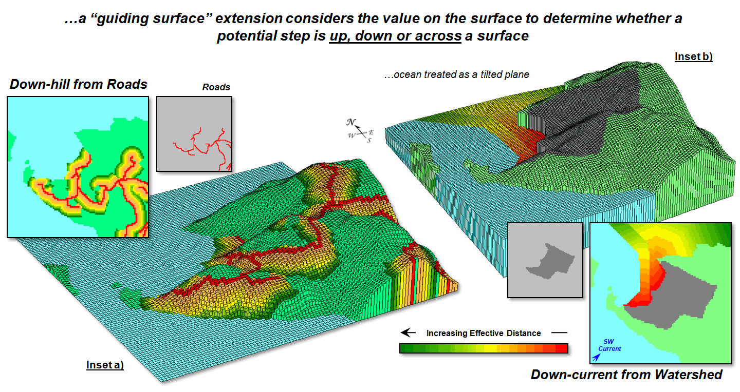
Figure 1. A Guiding Surface can be used to direct or
constrain movement within a project area.
A similar, yet more
detailed guiding surface, is a barometric map derived from weather station
data. A “down-wind” map tracks the down surface
(barometric gradient) movement from each project location to areas of lower
atmospheric pressure. Similarly,
“up-surface” movement from any location on a pollution concentration surface
can help identify the probable pathway flow from a pollution source (highest
concentration).
“Dynamic impedance”
involves changes with respect to increasing distance (accumulation), net
movement force (momentum) and interactions between a movement path and its
intervening conditions (direction). The
top portion of figure 2 outlines the use of an “additive factor equation” to
dynamically slow down movement in a manner analogous to compound interest of a
savings account. As a distance wave
propagates from a Starting location, the effective distance of each successive
step is slightly more impeded, like a tired hiker’s pace decreasing with
increasing distance—the last mile of a 20 mile trek seems a lot farther.
The example shows the
calculations for the 11th step of a SW moving wave front (orthogonal
step type= 1.414) with a constant impedance (friction= 1) and a 1% compounding
impedance (rate= .01). The result is an
accumulated hindrance effectively farther by about 25 meters (16.36 – 15.55=.81
* 30m cell size).
The bottom portion of
figure 2 shows the approach for assessing the net accumulation of movement
(momentum). This brings back a very old
repressed memory of a lab exercise in a math/programming course I attempted
over 30 years ago. We were given a
terrain-like surface and coefficients of movement (acceleration and
deceleration) of a ball under various uphill and downhill situations. Our challenge was to determine the location
to drop the ball so it would roll the farthest …the only thing I really got was
“dropping the ball.” In looking back, I
now realize that an “additive factor table” could have been a key to the
solution.
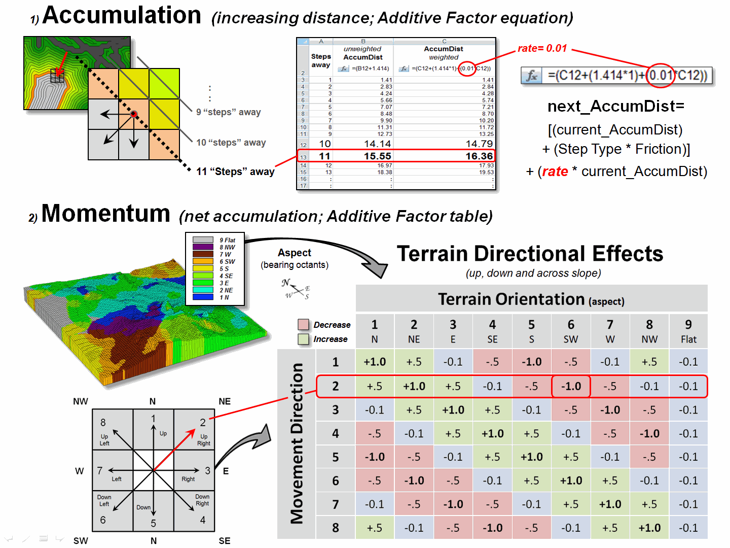
Figure 2. Accumulation and Momentum can be used to
account for dynamic changes in the nature of intervening conditions and
assumptions about movement in geographic space.
The table in the figure
shows the “costs/payments” of downhill, across and uphill movements. For this simplified example, imagine a money exchange
booth at each grid location—the toll or payout is dependent on the direction of
the wave front with respect to the orientation of the surface. If you started somewhere with a $10 bag of
money, depending on your movement path and surface configuration, you would
collect a dollar for going straight downhill (+1.0) but lose a dollar for going
straight uphill (-1.0).
The table summarizes the
cost/payout for all of the movement directions under various terrain
conditions. For example, a NE step is highlighted
(direction= 2) that corresponds to a SW terrain orientation (aspect= 6) so your
movement would be straight uphill and cost you a dollar. The effective net accumulation from a given
Starter cell to every other location is the arithmetic sum of costs/payments
encountered—the current amount in the bag at location is your net accumulation;
stop when your bag is empty ($0). In the
real-world, the costs/payments would be coefficients of exacting equations to
determine the depletions/additions at each step.
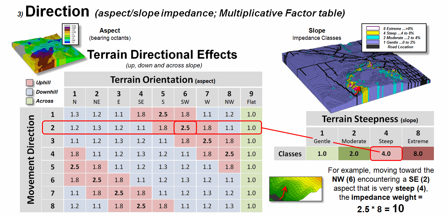
Figure 3. Directional effects of movement with
respect to slope/aspect variations can be accounted for “on-the-fly.”
Figure 3 extends the
consideration of dynamic movement through the use of a “multiplicative factor
table” based on two criteria—terrain aspect and steepness. All trekkers know that hiking up, down or
across slope are radically different endeavors, especially on steep
slopes. Most hiking time solutions,
however, simply assign a “typical cost” (friction) that assumes “the steeper
the terrain, the slower one goes” regardless of the direction of travel. But that is not always true, as it is about
as easy to negotiate across a steep slope as it is to traverse a gentle uphill
slope.
The table in figure 3
identifies the multiplicative weights for each uphill, downhill or across
movement based on terrain aspect. For
example, as a wave front considers stepping into a new location it checks its
movement direction (NE= 2) and the aspect of the cell (SW= 6), identifies the
appropriate multiplicative weight in the table (2,6 position= 2.5), then checks
the “typical” steepness impedance (steep= 4.0) and multiplies them together for
an overall friction value (2.5*4.0=
10.0); if movement was NE on a gentle slope the overall friction value
would be just 1.1.
In effect, moving uphill
on steep slopes is considered nearly 10 times more difficult than traversing
across a gentle slope …that makes a lot of sense. But very few map analysis packages handle any
of the “dynamic movement” considerations (gravity model, stepped-accumulation,
back-link, guiding surface and dynamic impedance) …that doesn’t make sense.
_____________________________
Author’s Note: For
more information on effective distance procedures, instructors see readings,
lecture and exercise for Week 4, “Calculating Effective Distance” online course
materials at www.innovativegis.com/basis/Courses/GMcourse10/.
Contiguity
Ties Things Together
(GeoWorld, March 2008)
One of the most interesting, yet often overlooked
operations involves “clumping” map features—more formally termed Contiguity, the
state of being in contact or close proximity. Our brain easily
assesses this condition when viewing a map but the process for a computer is a
bit more convoluted. For example,
consider the two spatial patterns in top portion of figure 1 (inset 1A). While both maps have the same number and size
of scattered forest parcels, the distribution pattern on the left appears more
dispersed than the relatively clumped pattern on the right.
Since vector-based systems store features as a loose set
of discrete entities in a spatial table, the computer is unable to “see” the entire
spatial pattern and intervening geographic space. Grid-based systems, on the other hand, store
an entire project area as an analysis frame including the spaces. Inset 1B represents the individual features
as a collection of grid cells. Adjacent
grid cells have the same stored value to uniquely identify each of the
individual features (1 through 9 in this case).
Note that both patterns in the figure have nine distinct grid
features—it’s the arrangement of the features in geographic space that establishes
the Dispersed and Clumped patterns.
Proximity establishes effective connections among
distinct features and translates these connections into patterns. For example, assume that a creature isn’t
constrained to the edges of a single feature, but can move away for a short
distance—say one grid space for a slithering salamander outside its confining
habitat. Trekking any farther would
result in an exhausted and dried-out salamander, akin to a raisin. Now further assume that the venturesome
salamander’s unit is either too small to support the current population or that
he yearns for foreign beauties. The
Dispersed pattern will leave him wanting, while the Clumped pattern triples the
possibilities.
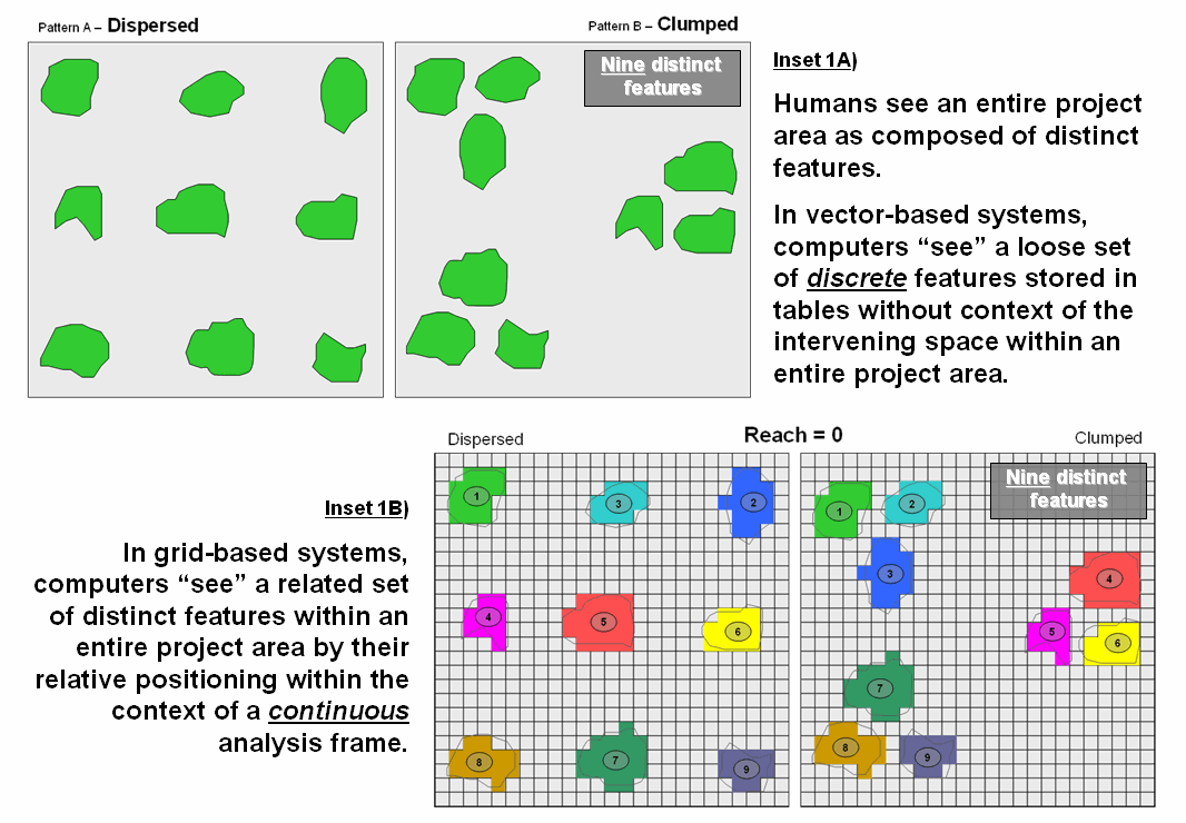
Figure 1. Humans see complete spatial patterns sets,
while computers “see” individual features that have to be related through data
storage and analysis approaches imposing topological structure.
The top portion of figure 2 (inset 2A) depicts how
reaching out one grid space from each of the distinct features can identify
effective groupings of individual habitat units. The result is that the nine defacto “islands”
are grouped into three effective habitat units in the Clumped pattern. In practice, contiguity can help wildlife
planners consider the pattern of habitat management units, as well as simply
their number, shape and size.
Arrangement can be as important (more?) as quantity and aerial
extent.
The
lower portion of figure 2 (inset 2b) illustrates a similar analysis assuming a
creature that can slither, crawl, scurry or fly up to three grid spaces. The result is three effective habitat
groupings—two on the left comprised of six individual units and one on the
right comprised of three individual units.
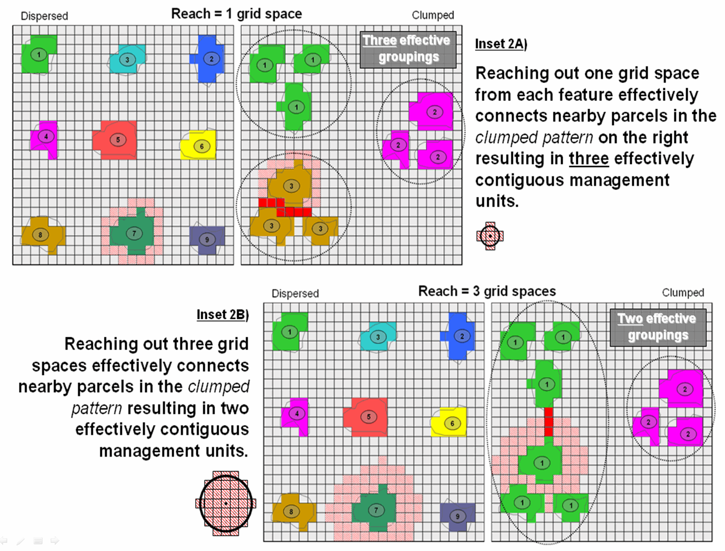
Figure 2. Contiguity uses relative proximity to
determine groups of nearby features that serve as extended management units.
Contiguity,
therefore, is in the mind of the practitioner—how far of a reach that connects
individual features is a user-defined parameter to the spatial analysis
operation. However, as is the rule in
most things analytical, how the tool works is rarely how we conceptualize the
process, or its mathematical expression.
Spatial algorithms often are radically different animals from manual
procedures or simply evaluating static equations.
The
“CLUMP” operation works by employing a moving filter like you read a book but
looking back and up at the grid cells previously considered. For the 1-grid space reach example, a 3x5
filter (figure 3) starts in the upper-left corner of the analysis frame and
moves across the row from left to right.
The first grid cell containing a forest parcel is assigned the value
1. If it encounters another forest cell
while an earlier clump is in the filter, the same clump number is
assigned—within the specified proximity that establishes effective
contiguity. If it encounters a forest
cell with no previous clump numbers in the filter, then a new sequential clump
number is assigned. Successive rows are
evaluated and if the filter contains two or more clump numbers, the lowest
clump number is assigned to the entire candidate grouping—merging the sides of
any U-shaped or other upward pointing shape.
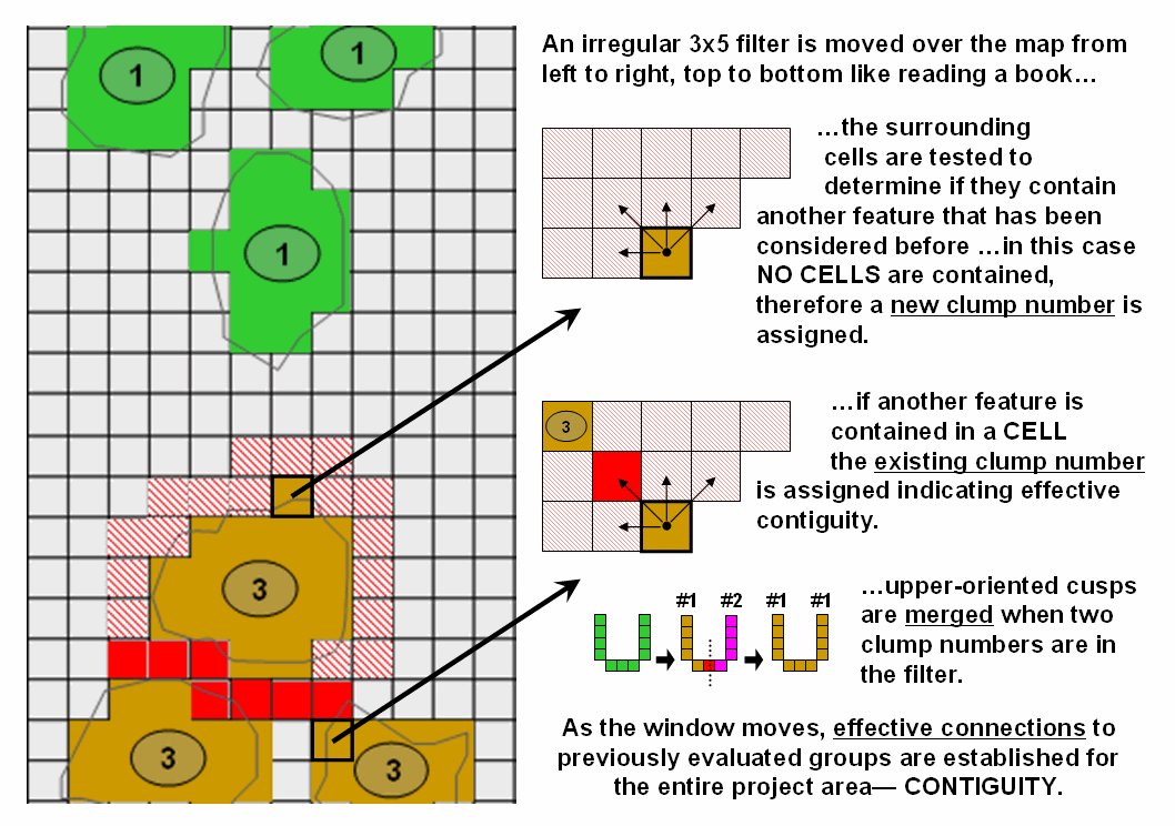
Figure 3. An irregular filter is used to establish
effective connections among neighboring features.
While
the clumping algorithm involves a “roving window” that that solves for the
“effective proximity” of nearby groupings of similar characteristics the
operation is usually classified as a Reclassifying operation because its result
simply assigns a clump number to neighboring clumps without altering their
shape or pattern.
The
bottom line isn’t that you fully understand contiguity and its
However,
it is the blinders of disciplinary stovepipes in companies and on campuses that
often hold us back. Hopefully a
A
Narrow-minded Approach
(GeoWorld, June 2009)
In the
previous sections, advanced and sometimes unfamiliar concepts of distance have
been discussed. The traditional
definition of “shortest straight line between two points” for Distance was extended to the concept of Proximity by relaxing the “two points”
requirement; and then to the concept of Movement
that respects absolute and relative barriers by relaxing the “straight line”
requirement.
The
concept of Connectivity is the final
step in this expansion referring to how locations are connected in geographic
space. In the case of effective
distance, it identifies the serpentine route around absolute and through
relative barriers moving from one location to another by the “shortest”
effective path—shortest, the only remaining requirement in the modern
definition of distance. A related
concept involves straight rays in 3-dimensional space (line-of-sight) to
determine visual connectivity among locations considering the intervening
terrain and vegetative cover.
However,
there is yet another concept of connectivity— Narrowness defined as the “shortest cord through a location
connecting opposing edges.” As with all
distance-related operations, the computer first generates a series of concentric
rings of increasing distance from an interior point (grid cell). This information is used to assign distance
to all edge locations. Then the computer
moves around the edge totaling the distances for opposing edges until it
determines the minimum—the shortest cord.
The process is repeated for all map locations to derive a continuous map
of narrowness.
For a
boxer, a map of the boxing ring would have values at every location indicating
how far it is to the ropes with the corners being the narrowest (minimum cord
distance). Small values indicate poor
boxing habitat where one might get trapped and ruthlessly bludgeoned without
escape. For a military strategist,
narrow locations like the Khyber Pass can
prove to be inhospitable habitat as well.
Bambi
and Mama Bam can have a similar dread of the narrow portions of an irregularly
shaped meadow (see figure 1, insets a
and b). Traditional analysis suggests that the
meadow's acreage times the biomass per acre determines the herd size that can
be supported. However, the spatial
arrangement of these acres might be just as important to survival as the
caloric loading calculations. The entire meadow could be sort of a Cordon Bleu
of deer fodder with preference for the more open portions, an ample distance
away from the narrow forest edge where danger may lurk. But much of the meadow has narrow places
where patient puma prowl and pounce, imperiling baby Bambi. How can new age wildlife managers explain
that to their kids— survival is just a simple calculation of acres times
biomass that is independent of spatial arrangement, right?
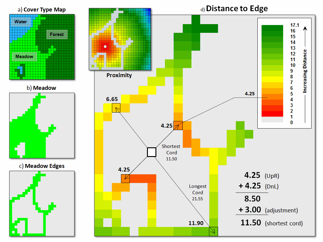
Figure 1. Narrowness determines constrictions within a
map feature as the shortest cord connecting opposing edges.
Many
GIS applications involve more than simple inventory mastication—extent (spatial
table) times characteristic/condition (attribute table). So what is involved in deriving a narrowness
map? …how can it be summarized? …how might one use a narrowness map and its
summary metrics?
The
first step is to establish a simple proximity map from a location and then
transfer this information to the edge cells of the parcel containing the
location (figure 1, insets c and d).
The algorithm then begins at an edge cell, determines its opposing edge
cell along a line passing through the location, sums the distances and applies
an adjustment factor to account for the center cell and edge cell lengths. In the example, the shortest cord is the sum
of the upper-right distance and its lower-left opposing distance plus the
adjustment factor (4.25 + 4.25 + 3.00= 8.50).
All other cords passing through the location are longer (e.g., 6.65 +
11.90 + 3.00= 21.55 for the longest cord).
Actually, the calculations are a bit dicier as they need to adjust for
off-orthogonal configurations …a nuance for the programmers among you to
consider.
Once
the minimum cord is determined the algorithm stores the value and moves to the
next location to evaluate; this is repeated until the narrowness of all of the
desired locations have been derived (figure 2 inset e for just the meadow and f
for the entire area). Notice that there
are two dominant kidney-shaped open areas (green tones)—one in the meadow and
one in the forest. Keep in mind that the
effect of the “artificial edges” of the map extent in this constrained example
would be minimal in a landscape level application.
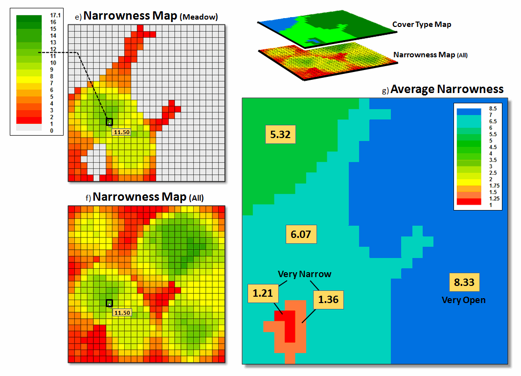
Figure 2. Summarizing average
narrowness for individual parcels.
The
right side of figure 2 (inset g)
illustrates the calculation of the average narrowness for each of the cover
type parcel Narrowness determines constrictions within a map feature (polygon)
as the shortest cord connecting opposing edges, such as a forest opening. It uses a region-wide overlay technique that
computes the average of the narrowness values coinciding with each parcel. A better metric of relative narrowness would
be the ratio of the number of narrow cells (red-tones) to the total number of
cells defining a parcel. For a large perfectly
circular parcel the ratio would be zero with increasing ratios to 1.0 for very
narrow shapes, such as very small or ameba-shaped polygons.
Narrowing-In
on Absurd Gerrymanders
(GeoWorld, July 2012)
In light of the current
political circus, I thought a bit of reflection is in order on how GIS has
impacted the geographic stage for the spectacle—literally drawing the lines in
the sand. Since the 1990 census, GIS has
been used extensively to “redistrict” electoral territories in light of
population changes, thereby fueling the decennary turf wars between the
Democrats and Republicans.
Redistricting involves redrawing
of U.S. congressional district boundaries every ten years in response to
population changes. In developing the
subdivisions, four major considerations come into play—
1)
equalizing the population of districts,
2) keeping existing
political units and communities within a single district,
3) creating geographically compact, contiguous districts, and
4)
avoiding the drafting of boundaries that create partisan
advantage or incumbent protection.
Gerrymandering, on the other hand, is the deliberate manipulation of
political boundaries for electoral advantage with minimal regard for the last
three guidelines. The goal of both sides
is to draw district boundaries that achieve the most political gain.
Three
strategies for gerrymandering are applied—
1) attempt to concentrate
the voting power of the opposition into just a few districts, to dilute the power
of the opposition party outside of those districts (termed “excess vote”),
2) diffuse the voting power
of the opposition across many districts, preventing it from having a majority
vote in as many districts as possible (“wasted vote”), and
3) link distant areas into
specific, party-in-power districts forming spindly tentacles and ameba-line
pseudopods (“stacked”).
For example, the 4th
Congressional District of Illinois is one of the most strangely drawn
and gerrymandered congressional districts in the country (figure 1). Its bent barbell shape is the poster-child of
“stacked” gerrymandering, but Georgia’s flying pig, Louisiana’s stacked
scorpions and North Carolina’s praying mantis districts have equally bizarre
boundaries.
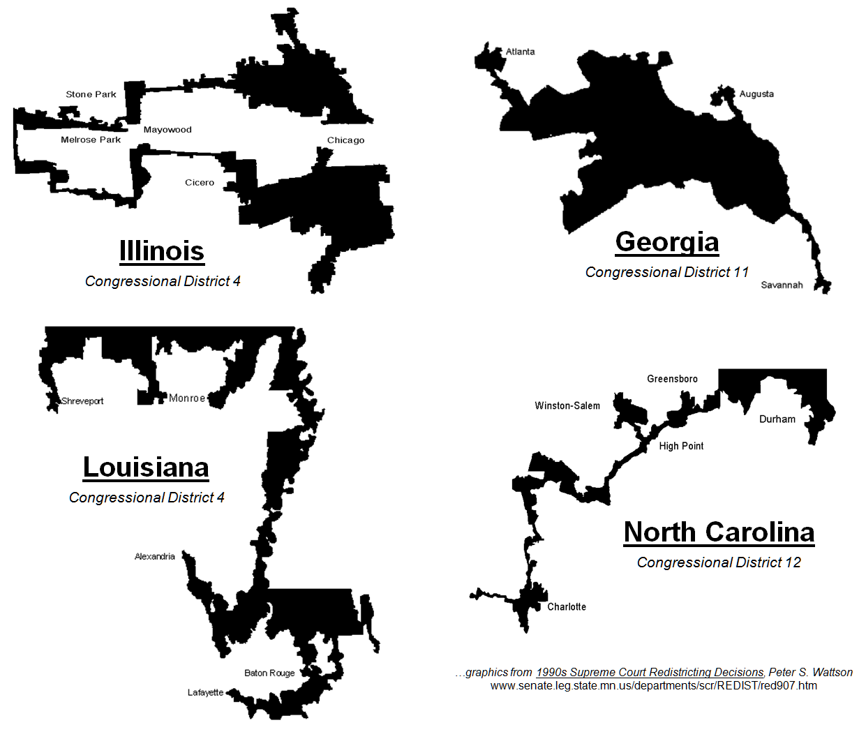
Figure 1. Examples of gerrymandered congressional
districts with minimal compactness.
Coupled
with census and party affiliation data, GIS is used routinely to gerrymander
congressional districts. But from
another perspective, it can be used to assess a district’s shape and through
legislative regulation could impose indices that encourage compactness. A “convexity index” (CI) and a “narrowness
index” (NI) are a couple of possibilities that could rein-in bazaar
gerrymanders.
The boundary configuration of any feature
can be identified as the ratio of its perimeter to its area (see author’s notes
1 and 2). In planimetric space, the
circle has the least amount of perimeter per unit area. Any other shape has more perimeter (see
figure 2), and as a result, a different Convexity Index.
In the
few GIS software packages having this capability, the index uses a "fudge
factor” (k) to account for mixed units (e.g., m for P and m2
for A) to produce a normalized range of values from 1 (very irregularly shaped)
to 100 (very regularly shaped). A
theoretical index of zero indicates an infinitely large perimeter around an
infinitesimally small area (e.g., a line without perimeter or area, just
length). At the other end, an index of
100 is interpreted as being 100 percent similar to a perfect circle. Values in between define a continuum of
boundary regularity that could be used to identify a cutoff of minimal
irregularity that would be allowed in redistricting.
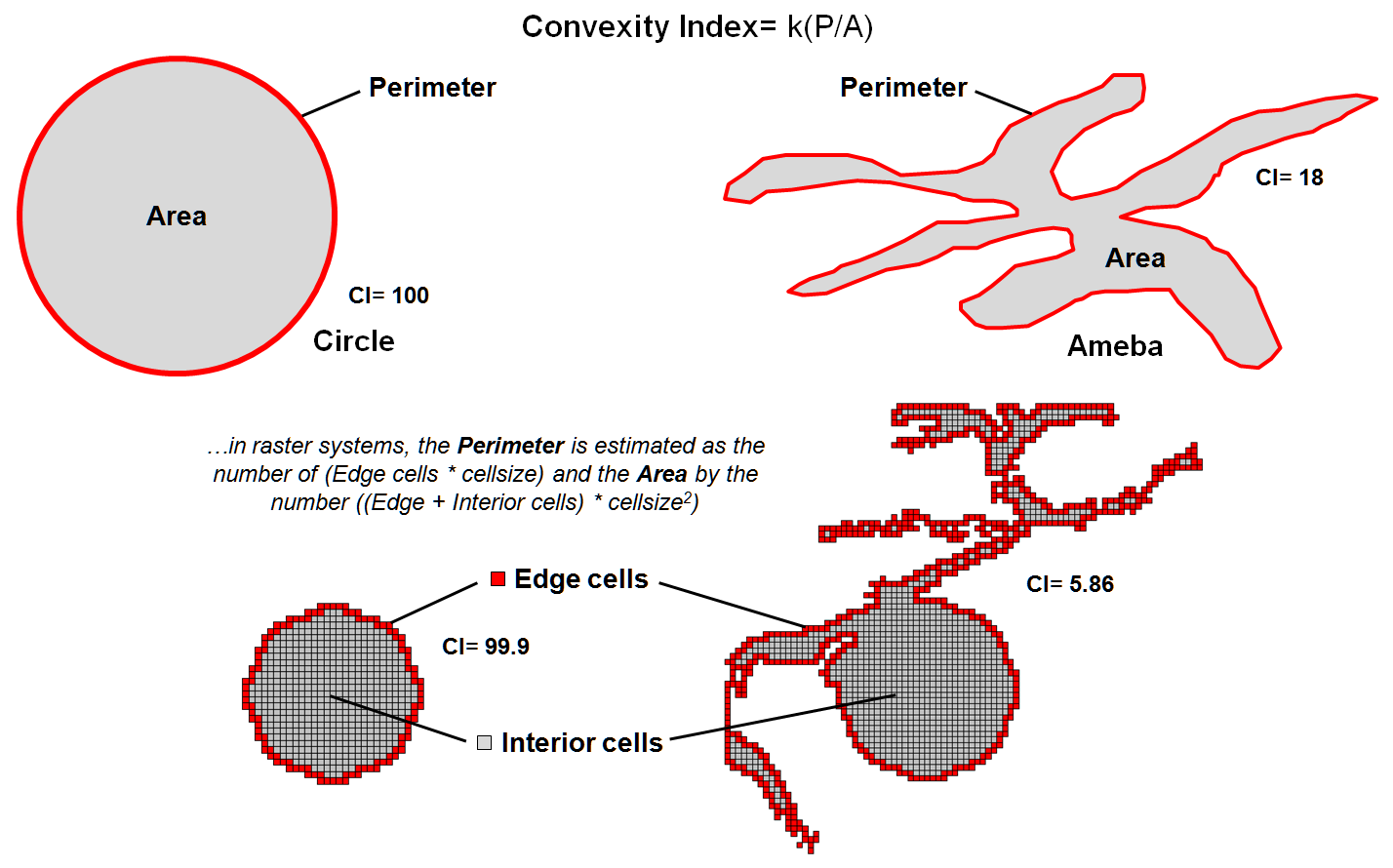
Figure 2. Convexity is characterized as the normalized
ratio of a feature’s perimeter to its area.
Another metric for assessing shape involves calculating “narrowness” within a
map feature. Narrowness can be defined
as the “shortest cord passing through a location that connects opposing edges”
(see author’s note 3). In practice,
narrowness is calculated to a specified maximum distance. Locations with cords exceeding this distance
are simply identified as “open areas.”
In
figure 3, the narrow locations are shown as a color gradient from the most narrow
locations (red=1 cell length= 30m) to minimally narrow (green= 9.9999 *30m=
299.9m) to open areas (grey= >300m).
Note the increasing number of narrow locations as the map features
become increasingly less compact.
A
Narrowness Index can be calculated as the ratio of the number of narrow cells
to the number of open cells. For the
circle in the figure, NI= 152/557= .273 with nearly four times as many open
cells than narrow cells. The bug shape
ratio is .848 and the spindly Medusa shape with a ratio of 2.232 has more than
twice as many narrow cells as open cells.
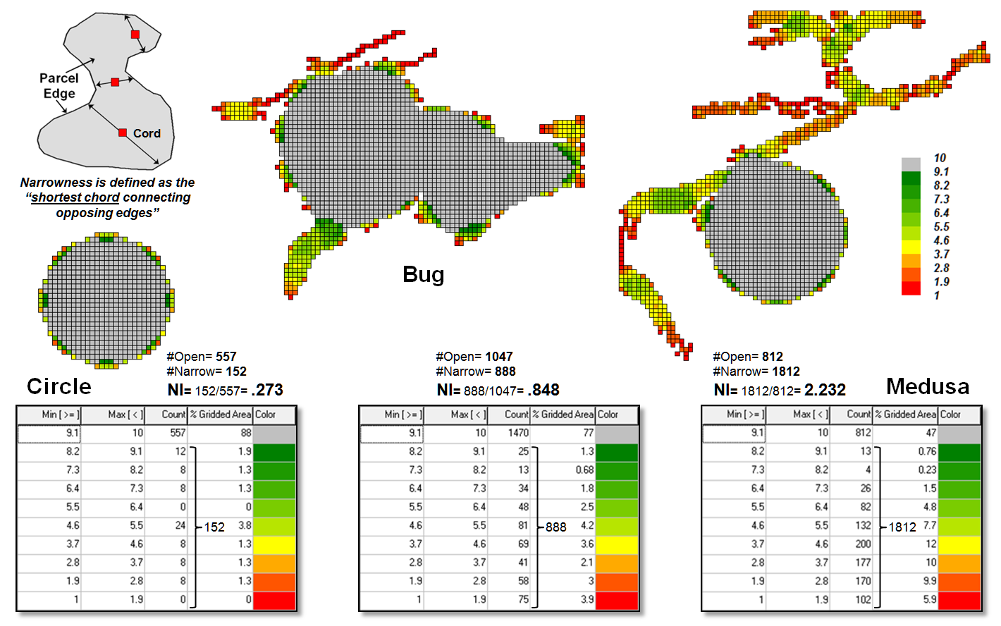
Figure 3. Narrowness is characterized as the
shortest cord connecting opposing edges.
Both
the convexity index and the narrowness index quantify the degree of
irregularity in the configuration of a map feature. However, they provide dramatically different
assessments. CI is a non-spatial index
as it summarizes the overall boundary configuration as an aggregate ratio
focusing on a feature’s edge and can be solved through either vector or raster
processing. NI on the other hand, is a
spatial index as it characterizes the degree and proportion of narrowness
throughout a feature’s interior and only can be solved through raster
processing. Also, the resulting
narrowness map indicates where narrow locations occur, that is useful in
refining alternative shapes.
To date,
the analytical power of GIS has been instrumental in gerrymandering
congressional districts that forge political advantage for whichever political
party is in control after a census. In
engineering an optimal partisan solution the compactness criterion often is
disregarded.
On the
other side of the coin, the convexity and narrowness indices provide a foothold
for objective, unbiased and quantitative measures that assess proposed district
compactness. Including acceptable CI and
NI measures into redistricting criteria would insure that compactness is
addressed— gentlemen (and ladies), start your GIS analytic engines.
_____________________________
Author’s Notes: 1)
See Beyond Mapping Compilation Series Book I, Topic 5, “You can’t See the Forest
for the Trees,” September 1991, for additional discussion on Feature Shape
Indices. 2) PowerPoint on Gerrymandering
and Legislative Efficiency by John Mackenzie, Director of Spatial Analysis Lab,
University of Delaware posted at www.udel.edu/johnmack/research/gerrymandering.ppt.
_____________________
Further Online Reading: (Chronological listing posted at www.innovativegis.com/basis/BeyondMappingSeries/)
Just How Crooked Are Things? —
discusses distance-related metrics for assessing crookedness (November 2012)
Extending Information into No-Data Areas
— describes a technique for “filling-in” information from
surrounding data into no-data locations (July 2011)
In Search of the Elusive Image
— describes extended geo-query techniques for accessing images containing
a location of interest (July 2013)
(Back
to the Table of Contents)