|
Topic 8 –
Spatial Modeling Example |
Map
Analysis book/CD |

A
Three-Step Process Identifies Preferred Routes — describes the
basic steps in Least Cost Path analysis
Consider
Multi-Criteria When Routing — discusses the
construction of a discrete “cost/avoidance” map and optimal path corridors
A
Recipe for Calibrating and Weighting GIS Model Criteria — identifies
procedures for calibrating and weighting map layers in GIS models
Think
with Maps to Evaluate Alternative Routes — describes procedures for
comparing routes
Further Reading
— seven additional sections
<Click here>
for a printer-friendly version of this
topic (.pdf).
(Back to the Table of Contents)
______________________________
A Three-Step Process Identifies Preferred Routes
(GeoWorld, July 2003)
Suppose
you needed to locate the best route for a proposed highway, or pipeline or
electric transmission line. What factors
ought to be considered? How would the
criteria be evaluated? Which factors
would be more important than others? How
would you be able to determine the most preferred route considering the myriad
of complex spatial interactions?
For
example, you might be interested identifying the most preferred route for a
power line that minimizes its visual exposure to houses. The first step, as shown in figure 1,
involves deriving an exposure map that indicates how many houses are visually
connected to each map location. From
previous discussion (see Author’s Note 1) you might recall that visual exposure
is calculated by evaluating a series of “tangent waves” that emanate from a
viewer location over an elevation surface.
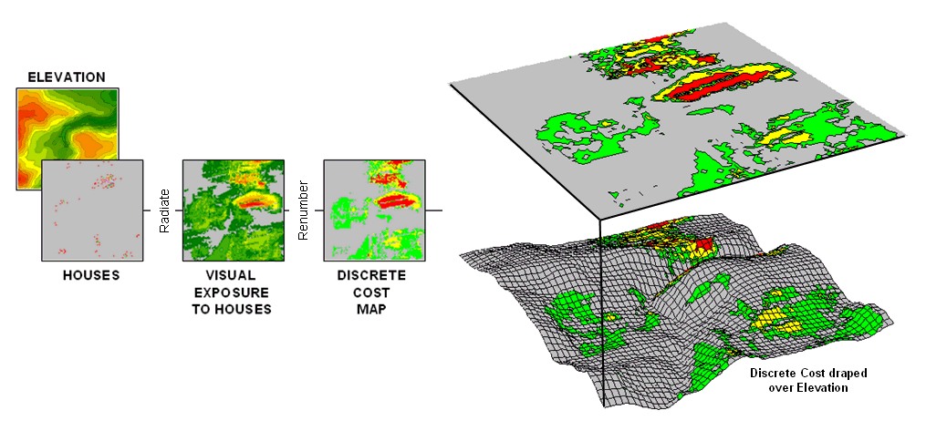
Figure 1. (Step 1) Visual Exposure levels (0-40 times seen) are translated into values
indicating relative cost (1=low as grey to 9=high as red) for siting a
transmission line at every location in the project area.
This
process is analogous to a searchlight rotating on top of a house and marking
the map locations that are illuminated.
When all of the viewer locations have been evaluated a map of Visual
Exposure to houses is generated like the one depicted in the left inset. The specific MapCalc command (see Author’s
Notes 2) for generating the exposure map is RADIATE
Houses over Elevation completely For VisualExposure.
In
turn, the exposure map is calibrated into relative preference for siting a
power line— from a cost of 1 = low exposure (0 -8 times seen) = most preferred
to a cost of 9 = high exposure (>20 times seen) = least preferred. The specific command to derive the Discrete
Cost map is RENUMBER VisualExposure
assigning1 to 0 through 8 assigning 3 to 8 through 12 assigning 6 to 12 through
20 assigning 9 to 20 through 1000 for DiscreteCost.
The
right-side of figure 1 shows the visual exposure cost map draped on the
elevation surface. The light grey areas
indicate minimal cost for locating a power line with green, yellow and red
identifying areas of increasing preference to avoid. Manual delineation of a preferred route might
simply stay within the light grey areas.
However a meandering grey route could result in a greater total visual
exposure than a more direct one that crosses higher exposure for a short
stretch.
The
Accumulative Cost procedure depicted in figure 2, on the other hand, uses
effective distance to quantitatively evaluate all possible paths from a
starting location (existing power line tap in this case) to all other locations
in a project area. Recall from previous
discussion that effective distance generates a series of increasing cost zones
that respond to the unique spatial pattern of preferences on the discrete cost
map (see Author’s Note 3).
Figure 2. (Step 2) Accumulated Cost from the
existing power line to all other locations is generated based on the Discrete
Cost map.
This
process is analogous to tossing a rock into a still pond—one away, two away, etc. With simple “as the crow flies” distance the
result is a series of equally spaced rings with constantly increasing
cost. However, in this instance, the
distance waves interact with the pattern of visual exposure costs to form an
Accumulation Cost surface indicating the total cost of routing a route from the
power line tap to all other locations—from green tones of relatively low total
cost through red tones of higher total cost.
The specific command to derive the accumulation cost surface is SPREAD Powerline through DiscreteCost for
AccumulatedCost.
Note
the shape of the zoomed 3D display of the accumulation surface in figure
3. The lowest area on the surface is the
existing power line—zero away from itself.
The “valleys” of minimally increasing cost correspond to the most
preferred corridors for sighting the new power line on the discrete cost
map. The “mountains” of accumulated cost
on the surface correspond to areas high discrete cost (definitely not preferred).
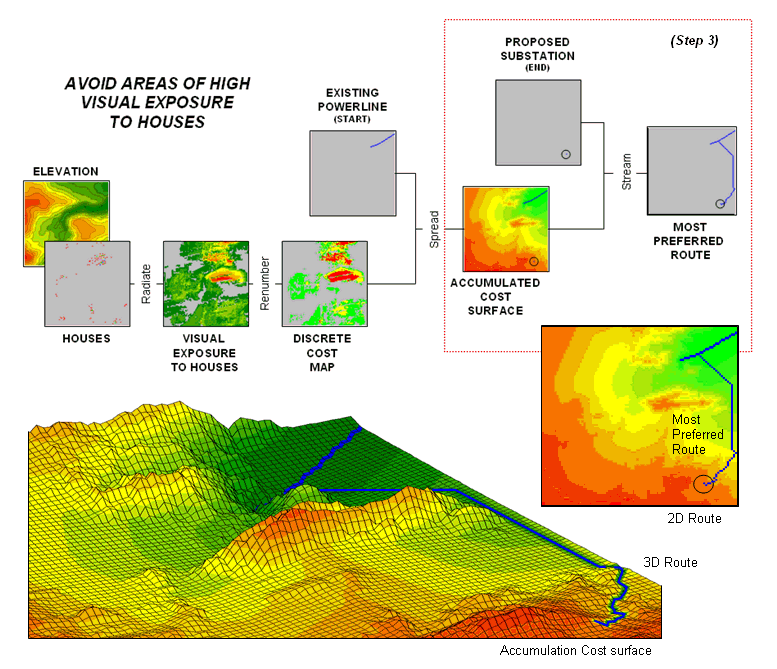
Figure 3. (Step 3) The steepest downhill path from the Substation over the Accumulated Cost
surface identifies the
The
path draped on the surface identifies the most preferred route. It is generated by choosing the steepest
downhill path from the substation over the accumulated cost surface using the
command STREAM Substation over
AccumulatedCost for MostPreferred_Route.
Any other route connecting the substation and the existing power
line would incur more visual exposure to houses.
The
three step process (step 1 Discrete
Costà step 2 Accumulated Costà step 3 Steepest Path) can be used to
help locate the best route in a variety of applications. The next section will expand the criteria
from just visual exposure to other factors such as housing density, proximity
to roads and sensitive areas. The
discussion focuses on considerations in combining and weighting multiple
criteria that is used to generate alternate routes.
_________________
Author's Notes: 1) See previous Topic 5, Calculating
Visual Exposure. 2) MapCalc
Learner (www.innovativegis.com) commands
are used to illustrate the processing.
The Least Cost Path procedure is available in most grid-based map
analysis systems, such as ESRI’s GRID, using RECLASS to calibrate the discrete
cost map, Costdistance to generate the accumulation cost surface and
PATHDISTANCE to identify the best path. 3)
See previous Topic 4, Calculating
Effective Distance).
Consider
Multi-Criteria When Routing
(GeoWorld, August 2003)
The
previous discussion described a procedure for identifying the most preferred
route for an electric transmission line that minimizes visual exposure to
houses. The process involves three
generalized steps—discrete costà
accumulated costà steepest path.
A map
of relative visual exposure is calibrated in terms preference for power line
siting (discrete cost) then used to
simulate siting a power line from an existing tap line to everywhere in the
project area (accumulated cost). The final step identifies the desired
terminus of the proposed power line then retraces its optimal route (steepest path) over the accumulated
surface.
While
the procedure might initially seem unfamiliar and conceptually difficult, the
mechanics of its solution is a piece of cake and has been successfully applied
for decades. The art of the science is
in the identification, calibration and weighting of appropriate routing
criteria. Rarely is one factor, such as
visual exposure alone, sufficient to identify an overall preferred route.
Figure
1 shows the extension of the discussion in the previous section to include
additional decision criteria. The bottom
row of maps characterizes the original objective of avoiding Visual Exposure. The three extra rows in the flowchart
identify additional decision criteria of avoiding locations in or near
Sensitive Areas, far from Roads or having high Housing Density.
Recall
that Base Maps are field collected
data such as elevation, sensitive areas, roads and houses. Derived
Maps use computer processing to calculate information that is too difficult
or even impossible to collect, such as visual exposure, proximity and
density. The Cost/Avoidance Maps translate this information into decision
criteria. The calibration forms maps
that are scaled from 1 (most preferred—favor siting, grey areas) to 9 (least
preferred—avoid siting, red areas) for each of the decision criteria.
The
individual cost maps are combined into a single map by averaging the individual
layers. For example, if a grid location
is rated 1 in each of the four cost maps, its average is 1 indicating an area
strongly preferred for siting. As the
average increases for other locations it increasingly encourages routing away
from them. If there are areas that are
impossible or illegal to cross these locations are identified with a “null
value” that instructs the computer to never traverse these locations under any
circumstances.
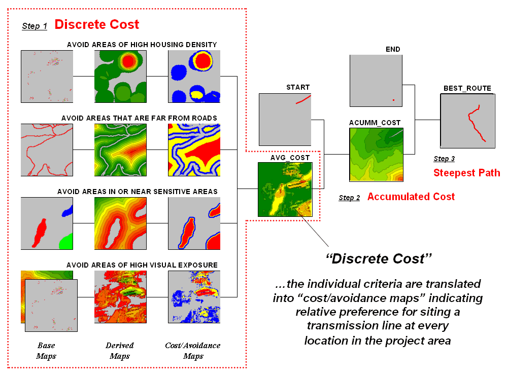
Figure 1. Discrete cost maps identify the relative
preference to avoid certain conditions within a project area.
The
calibration of the individual cost maps is an important and sensitive step in
the siting process. Since the computer
has no idea of the relative preferences this step requires human judgment. Some individuals might feel that visual
exposure to one house constitutes strong avoidance (9), particularly if it is
their house. Others, recognizing the
necessity of a new power line, might rate “0 houses seen” as 1 (most
preferred), 1 to 2 houses seen as 2 (less preferred), through more than 15
houses seen as 9 (least preferred).
In
practice, the calibration of the individual criteria is developed through group
discussion and consensus building. The
Delphi process (see author’s note) is a structured method for developing
consensus that helps eliminate bias. It
involves iterative use of anonymous questionnaires and controlled feedback with
statistical aggregation of group responses.
The result is an established and fairly objective approach for setting
preference ratings used in deriving the individual discrete cost maps.
Once an
overall Discrete Cost map (step 1) is
calculated, the Accumulated Cost
(step 2) and Steepest Path (step 3) processing
are performed to identify the most preferred route for the power line (see
figure 1). Figure 2 depicts a related
procedure that identifies a preferred route corridor.
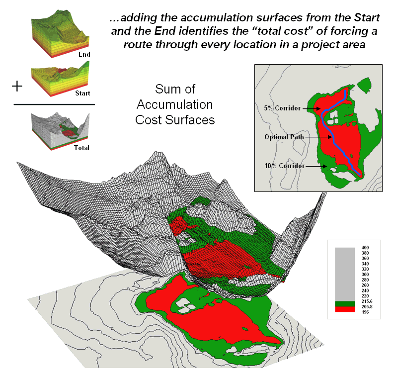
Figure 2. The sum of accumulated surfaces is used to
identify siting corridors as low points on the total accumulated surface.
The technique
generates accumulation surfaces from both the Start and End locations of the
proposed power line. For any given
location in the project area one surface identifies the best route to the start
and the other surface identifies the best route to the end. Adding the two surfaces together identifies
the total cost of forcing a route through every location in the project area.
The
series of lowest values on the total accumulation surface (valley bottom)
identifies the best route. The valley
walls depict increasingly less optimal routes.
The red areas in figure 2 identify all of locations that within five
percent of the optimal path. The green
areas indicate ten percent sub-optimality.
The
corridors are useful in delineating boundaries for detailed data collection,
such as high resolution aerial photography and ownership records. The detailed data within the macro-corridor
is helpful in making slight adjustments in centerline design, or as we will see
next month in generating and assessing alternative routes.
____________________________
Author’s Notes:
<click
here> to download a PowerPoint slide set
summarizing the Routing and Optimal Path process.
<click
here> to download a PowerPoint slide set describing calibration and
weighting.
< click
here> to download an animated PowerPoint slide set demonstrating
Accumulation Surface construction.
<click
here> to download an animated PowerPoint slide
set demonstrating Optimal Corridor analysis.
<click
here> to download a short video (.avi) describing Optimal Path analysis.
A Recipe for Calibrating and Weighting GIS Model Criteria
(GeoWorld, September 2003)
The
past two sections have described procedures for constructing a simple
As in
cooking, the implementation of a spatial recipe provides able room for
interpretation and varying tastes. For
example, one of the criteria in the routing model seeks to avoid locations
having high visual exposure to houses.
But what constitutes “high” …5 or 50 houses visually impacted? Are there various levels of increasing “high”
that correspond to decreasing preference?
Is “avoiding high visual exposure” more or less important than “avoiding
locations near sensitive areas.” How
much more (or less) important?
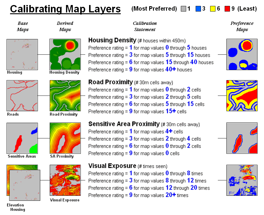
Figure 1. The Delphi Process uses structured group
interaction to establish a consistent rating for each map layer.
The
answers to these questions are what tailor a model to the specific
circumstances of its application and the understanding and values of the
decision participants. The tailoring involves
two related categories of parameterization—calibration and weighting. Calibration refers to establishing a
consistent scale from 1 (most preferred) to 9 (least preferred) for rating each
map layer used in the solution. Figure 1
shows the result for the four decision criteria used in the routing
example.
The Delphi Process, developed in the 1950s
by the Rand Corporation, is designed to achieve consensus among a group of
experts. It involves directed group
interaction consisting of at least three rounds. The first round is completely unstructured,
asking participants to express any opinions they have on calibrating the map
layers in question. In the next round
the participants complete a questionnaire designed to rank the criteria from 1
to 9. In the third round participants
re-rank the criteria based on a statistical summary of the questionnaires. “Outlier” opinions are discussed and
consensus sought.
The
development and summary of the questionnaire is critical to Delphi. In the case of continuous maps, participants
are asked to indicate cut-off values for the nine rating steps. For example, a cutoff of 4 (implying 0-4
houses) might be recorded by a respondent for Housing Density preference level
1 (most preferred); a cut-off of 12 (implying 4-12) for preference level 2; and
so forth. For discrete maps, responses
from 1 to 9 are assigned to each category value. The same preference value can be assigned to
more than one category, however there has to be at least one condition rated 1
and another rated 9. In both continuous
and discrete map calibration, the median, mean, standard deviation and
coefficient of variation for group responses are computed for each question and
used to assess group consensus and guide follow-up discussion.
Weighting of the
map layers is achieved using a portion of the Analytical Hierarchy Process developed in the early 1980s as a
systematic method for comparing decision criteria. The procedure involves mathematically
summarizing paired comparisons of the relative importance of the map
layers. The result is a set map layer
weights that serves as input to a
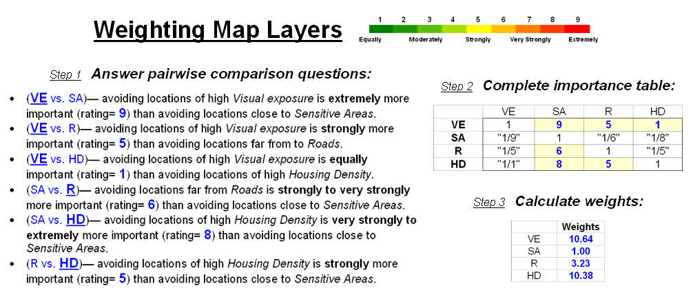
Figure 2. The Analytical Hierarchy Process uses
pairwise comparison of map layers to derive their relative importance.
In the
routing example, there are four map layers that define the six direct
comparison statements identified in figure 2 (#pairs= (N * (N – 1) / 2) = 4 * 3
/ 2 = 6 statements). The members of the
group independently order the statements so they are true, then record the
relative level of importance implied in each statement. The importance scale is from 1 (equally
important) to 9 (extremely more important).
This
information is entered into the importance table a row at a time. For example, the first statement views
avoiding locations of high Visual Exposure (VE) as extremely more important
(importance level= 9) than avoiding locations close to Sensitive Areas
(SA). The response is entered into
table position row 2, column 3 as shown.
The reciprocal of the statement is entered into its mirrored position at
row 3, column 2. Note that the last
weighting statement is reversed so its importance value is recorded at row 5,
column 4 and its reciprocal recorded at row 4, column 5.
Once
the importance table is completed, the map layer weights are calculated. The procedure first calculates the sum of the
columns in the matrix, and then divides each entry by its column sum to
normalize the responses. The row sum of
the normalized responses derives the relative weights that, in turn, are
divided by minimum weight to express them as a multiplicative scale (see
author’s note for an online example of the calculations). The relative weights for a group of
participants are translated to a common scale then averaged before expressing
them as a multiplicative scale.
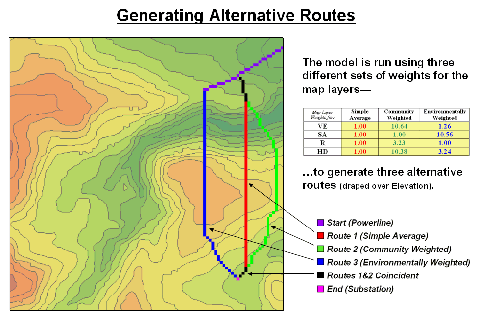
Figure 3. Alternate routes are generated by evaluating
the model using weights derived from different group perspectives.
Figure
3 identifies alternative routes generated by evaluating different sets of map
layer weights. The center route (red)
was derived by equally weighting all four criteria. The route on the right (green) was generated
using a weight set that is extremely sensitive to “Community” interests of
avoiding areas of high Visual Exposure (VE) and high Housing Density (HD). The route on the left (blue) reflects an
“Environmental” perspective to primarily avoid areas close to Sensitive Areas
(SA) yet having only minimal regard for VE and HD. Next month’s column will investigate
qualitative procedures for comparing alternative routes.
_________________
Author's Note: Supplemental
discussion and an Excel worksheet demonstrating the calculations are posted at www.innovativegis.com/basis/,
select “Column Supplements” for Beyond Mapping, September, 2003.
-
Delphi and AHP Worksheet an Excel worksheet templates for
applying the Delphi Process for calibrating and the Analytical Hierarchy
Process (AHP) for weighting as discussed in this sub-topic (GeoWorld, September
2003)
-
Delphi Supplemental Discussion
describing the application of the Delphi Process for calibrating map layers in
-
AHP Supplemental Discussion describing
the application of AHP for weighting map layers in GIS suitability modeling
Think with Maps to Evaluate Alternative Routes
(GeoWorld, October 2003)
The
past three sections have focused on the considerations involved in siting an
electric transmission line as representative of most routing models. The initial discussion described a basic
three step process (step 1 Discrete
Costà step 2 Accumulated Costà step 3 Steepest Path) used to delineate
the optimal path.
The
next sub-topic focused on using multiple criteria and the delineation of an
optimal path corridor. The most recent
discussion shifted to methodology for calibrating and weighting
The top
portion of Figure 1 identifies the calibration ratings assigned to the four
siting criteria that avoid locations of high housing density (HD), far from
roads (R), near sensitive areas (SA) and high visual exposure (VE).
The
bottom portion of the figure identifies weighted preference surfaces reflecting
Community and Environmental concerns for siting the power line. The community perspective strongly avoids
locations with high housing density (weight= 10.23) and high visual exposure to
houses (10.64). The environmental
perspective strongly avoids locations near sensitive areas (10.56) but has
minimal concern for high housing density and visual exposure (3.24 and 1.26,
respectively).
The
routing solution based on the different perspectives delineates two alternative
routes. Note that the routes bend around
areas that are less-preferred (higher map values; warmer tones) as identified
on their respective preference surfaces.
The optimal path considering one perspective, however, is likely far
from optimal considering the other.
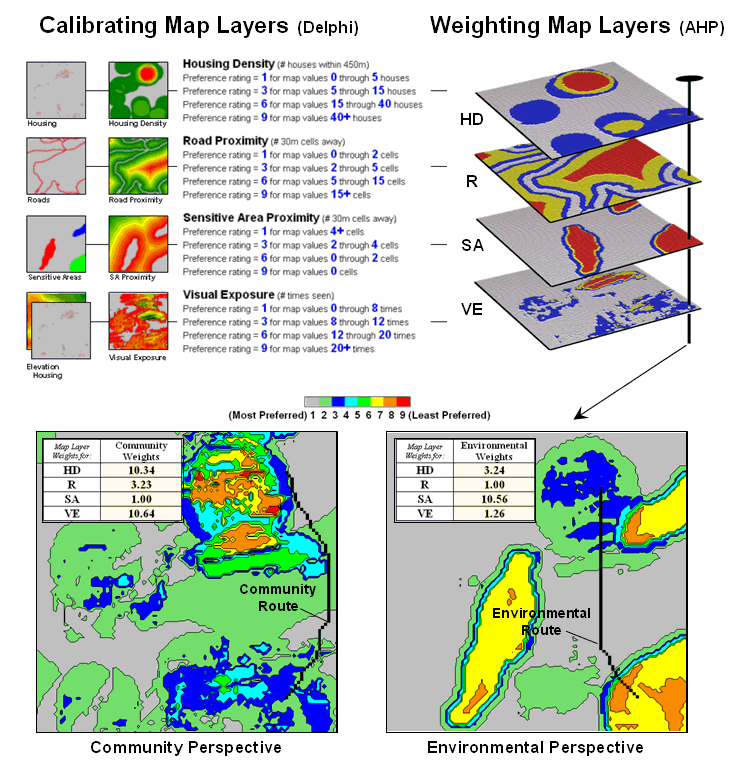
Figure 1. Incorporating different perspectives (model
weights) generate alternative preference surfaces for transmission line
routing.
One way
to compare the two routes is through differences in their preference
surfaces. Simple subtraction of the
Environmental perspective from the Community perspective results in a
difference map (figure 2). For example,
if a map location has a 3.50 on the community surface and a 5.17 rating on the
environmental surface, the difference is -1.67 indicating a location that is
less preferred from an environmental perspective.
Figure 2. Alternative routes can be compared by their
incremental and overall differences in routing preferences.
The
values on the difference map on the right side of the figure identify the
relative preference at each map location.
The sign of the value tells you which perspective dominates—negative
means less preferred by environmental (red tones); positive means less
preferred by community (green tones).
The magnitude of the value tells you the strength of the difference in
perspective—zero indicates no difference (grey); -1.67 indicates a fairly
strong difference in opinion.
Alignment
of the alternative routes on the difference map provides a visual
evaluation. Where a route traverses grey
or light tones there isn’t much difference in the siting preferences. However, where dark tones are crossed
significant differences exist. The two
small insets in the lower left portion mask the differences along the two
routes. Note the relative amounts of
dark red and green in the two graphics.
Nearly half of the Community route is red meaning there is considerable
conflict with the environmental perspective.
Similarly, the Environmental route contains a lot of green indicating
locations in conflict with the community perspective.
The
average difference is calculated by region-wide (zonal) summary of values along
the entire length of the routes. The
+1.22 average for the Environmental route says it is a fairly unfriendly
community alternative. Likewise, the
-1.59 average for the Community route means it is environmentally
unfriendly.
The
schematic in figure 3 depicts a “map stack” of the routing data. Mouse-clicking anywhere along a route pops-up
a listing of the values for all of map layers (drill-down). In the example, the difference at location
column 77, row 18 is -1.67 that means the location is environmentally
unfriendly although it is part of the Environmental route. This is caused by the 1.00 SA_proximity map value indicating that
the location is just 30 meters from a sensitive area.
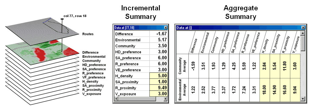
Figure 3. Tabular statistics are used to assess
differences in siting preferences along a route (incremental) or an overall
average for a route (aggregate).
In
addition to the direct query at a location (incremental summary), a table of
the average values for the map layers along the route can be generated
(aggregate summary). Note the large
difference in average housing density (only 2.84 houses within 450m for the
Community route but 18.0 for the Environmental route) and visual exposure (3.60
houses visually connected vs. 9.04).
In
practice, several alternative perspectives are modeled and their routes
compared. The evaluation phase isn’t so
much intended to choose one route over another, but to identify the best set of
common segments or slight adjustments in routing that delineate a
compromise. Rarely is
_____________________
Further Online
Reading: (Chronological
listing posted at www.innovativegis.com/basis/BeyondMappingSeries/)
’Straightening’ Conversions Improve
Optimal Paths — discusses a procedure for spatially responsive
straightening of optimal paths (November 2004)
Use LCP Procedures to Center Optimal
Paths — discusses a procedure for eliminating
“zig-zags” in areas of minimal siting preference (March 2006)
Connect All the Dots to Find Optimal
Paths — describes a procedure for determining
an optimal path network from a dispersed set of end points (September 2005)
Building
Accumulation Surfaces — reviews how proximity analysis and
effective distance is used to construct accumulation surfaces (October 1997)
Analyzing
Accumulation Surfaces — describes how two surfaces can be
analyzed to determine the relative travel-time advantages (November 1997)
Determining
Optimal Path Corridors — describes a technique for determining
the set of nth best paths between two points (December 1997)
Analyzing Stepped Accumulation Surfaces — describes
a technique for forcing an optimal path through a series of points (January 1998)
(Back
to the Table of Contents)