|
Topic 2 – From
Field Samples to Mapped Data |
Spatial Reasoning
book |

Averages
Are Mean
— compares
nonspatial and spatial distributions of field data
Surf’s
Up
— fitting
continuous map surfaces to geographic data distributions
Maneuvering
on GIS’s Sticky Floor — describes Inverse Distance, Kriging, and
Minimum Curvature techniques for surface modeling
<Click here> for a printer-friendly version of this topic
(.pdf).
(Back to the Table of Contents)
______________________________
Averages
Are Mean
(GeoWorld, January 1994)
Remember your
first brush with statistics? The thought
likely conjures up a prune-faced mathematics teacher who determined the average
weight of the students in your class.
You added the students' individual weights, then
divided by the number of students. T e average weight, or more formally stated
as the arithmetic mean (aptly named
for the mathematically impaired), was augmented by another measure termed the standard deviation. Simply stated, the mean tells you the typical
value in a set of data and the standard
deviation tells you how typical that typical is.
So what does that
have to do with GIS? It's just a bunch
of maps accurately locating physical features on handy, fold-up sheets of paper
or colorful wall-hangings. Right? Actually, GIS is
taking us beyond mapping— from images to
mapped data that are ripe for old pruneface's
techniques.
Imagine your old
classroom with the bulky football team in the back, the diminutive cheerleaders
in front and the rest caught in between.
Two things (at least, depending on your nostalgic memory) should come to
mind. First, all of the students didn't
have the same typical weight; some were heavier and some were lighter. Second, the differences from the typical
weight might have followed a geographic pattern; heavy in the back (football
players), light in the front (cheerleaders).
The second point is the focus of this topic— spatial statistics, which “map the variation in geographic data
sets.”
Figure 1 illustrates the
spatial and nonspatial character of a set of animal activity data. The right side of the figure lists the data
collected at sixteen locations (Samples #l-16) for two 24-hour periods (P1 in
June and P2 in August). Note the varying
levels of activity— 0 to 42 for period I and 0 to 87 for Period 2. Because humans can't handle more than a
couple of numbers at a time, we reduce the long data listings to their average
value— 19 for Period 1 and 23 for Period 2.
We quickly assimilate these findings, then determine whether the implied
activity change from Period I to Period 2 is too little, too much, or just
right (like Goldilocks' assessments of Mama, Papa, and Baby Bears'
things). Armed with that knowledge, we
make a management decision, such as "blow 'em
away," or, in politically correct wildlife-speak, "hold a special
hunt to 'cull' the herd for its own good."
It's obvious that animal activity is increasing at an alarming rate
throughout the project area.
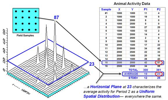
Figure 1. Spatial comparison of Field Samples and their
arithmetic mean.
Whoa! You can't say that, and the nonspatial
statistics tell you so. That's the role
of the standard deviation. A general
rule (termed the coefficient of variation
for the techy-types) tells us, "If the standard deviation is
relatively large compared to the arithmetic average, you can't use the average
to make decisions." Heck, it's
bigger for Period 2! These numbers are
screaming "warning, hazardous to your (professional) health" if you
use them in a management decision. There
is too much variation in the data; therefore, the computed typical isn't very
typical.
So what's a wildlife
manager to do? A simple solution is to
avoid pressing the calculator's standard deviation button, because all it seems
to do is trash your day. And we all know
that complicated statistics stuff is just smoke and mirrors, with weasel-words
like "likelihood" and "probability." Bah, humbug.
Go with your gut feeling (and hope you're not asked to explain it in
court).
Another approach is to take
things a step further. Maybe some of the
variation in animal activity forms a pattern in geographic space. What do you think? That's where the left side of figure 1 comes
into play. We use the X,Y coordinates of the Field Samples to locate them in
geographic space. The 3-D plot shows the
geographic positioning (X=East, Y=North) and the measured activity levels
(Z=Activity) for Period 2. I'll bet your
eye is "mapping the variation in the data"— high activity in the
Northeast, low in the Northwest, and moderate elsewhere. That's real information for an on-the-ground
manager.
The thick line in the plot
outlines the plane (at 23) that spatially characterizes the "typical"
animal activity for Period 2. The techy-types
might note that we often split hairs in characterizing this estimate (fitting
Gaussian, binomial or nonparametric density functions), but in the end, all
nonspatial techniques assume that the typical response is distributed uniformly
(or randomly) in geographic space. For
non-techy types, that means the different techniques might shift the average
more or less, but whatever it is, it's assumed to be the same throughout the
project area.
But your eye tells you that
guessing 23 around Sample #15, where you measured 87 and its neighbors are all
above 40, is likely an understatement.
Similarly, a guess of 23 around Sample #4, where both it and its
neighbors are 0, is likely an overstatement.
That's what the relatively large standard deviation was telling you:
Guess 23, but expect to be way off (+26) a lot of the time. However, it didn't give you any hints as to
where you might be guessing low and where you might be guessing high. It couldn't, because the analysis is
performed in numeric space, not in the geographic space of a GIS.
That's the main difference
between classical statistics and spatial statistics: classical statistics seeks
the central tendency (average) of data in numeric space; spatial statistics
seeks to map the variation (standard deviation) of data in geographic
space. That is an oversimplification,
but it sets the stage for further discussions of spatial interpolation
techniques, characterizing uncertainty and map-ematics. Yes, averages are mean, and it’s time for
kinder, gentler statistics for real-world applications.
Surf’s Up
(GeoWorld, February 1994)
The
previous section introduced the fundamental concepts behind the emerging field
of spatial statistics. It discussed how
a lot of information about the variability in field-collected data is lost
using conventional data analysis procedures.
Nonspatial statistics accurately reports the typical measurement
(arithmetic mean) in a data set and assesses how typical that typical is
(standard deviation). However, it fails
to provide guidance as to where the typical is likely too low and where
it's likely too high. That's the
jurisdiction of spatial statistics and its surface modeling capabilities.
The
discussion compared a map of data collected on animal activity to its
arithmetic mean, similar to inset (a) in figure 1. The sixteen measurements of animal activity
are depicted as floating balls, with their relative heights indicating the
number of animals encountered in a 24-hour period. Several sample locations in the northwest
recorded zero animals, while the highest readings of 87 and 68 are in the
northeast (see the previous section for the data set listing).
The
average of 23 animals is depicted as the floating plane, which balances the
balls above it (dark) and the balls below it (light). In techy-speak, and using much poetic
license, "It is the best-fitted horizontal surface that minimizes the
squared deviations (from the plane to each floating ball)." In conceptual terms, imagine sliding a window
pane between the balls so you split the group— half above and half below. OK, so much for the spatial characterization
of the arithmetic mean (that’s the easy stuff).
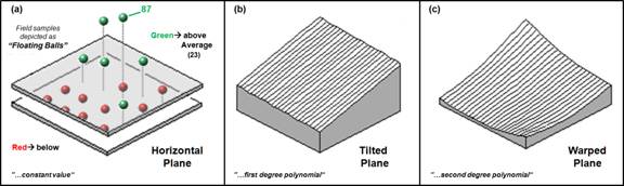
Figure 1. Surface-fitted approximations of the
geographic distribution of a mapped data set.
Now
relax the assumption that the plane has to remain horizontal (inset b). Tilt the plane every which way until you think
it fits the floating balls even better (the squared deviations should be the
smallest possible). Being a higher life
form, you might be able to conceptually fit a tilted plane to a bunch of
floating balls, but how does the computer mathematically fit a plane to the
pile of numbers it sees? In techy-speak,
"It fits a first degree polynomial to two independent
variables." To the rest of us, it
solves an ugly equation that doesn't have any exponents. How it actually performs that mathematical
feat is best left as one of life's great mysteries, such as how they get the
ships inside those tiny bottles (Google search “polynomial surface fitting” if
you really have to know).
Inset c
in figure l relaxes yet another assumption: The surface has to be a flat
plane. In that instance, in techy-speak,
"it fits a second degree polynomial to two independent variables" by
solving for another ugly equation with squared terms-definitely not for the
mathematically faint-of-heart. That
allows our plane to become pliable and pulled down in the center. If we allowed the equation to get really ugly
Nth degree equations), our pliable plane could get as warped as a
flag in the wind.
Figure
2 shows a different approach to fitting a surface to our data iteratively smoothed. Consider the top series of insets. Imagine
replacing the floating balls (insert a) with columns of modeler's clay rising
to the same height as each ball (insert b).
In effect you have made a first order guess of the animal activity throughout
the project area by assigning the map value of the closest field sample. In techy terms, you generated Thessian polygons, with sharp boundaries locating the
perpendicular bisectors among neighboring samples.
Now
for the fun stuff.
Imagine cutting away some of the clay at the top of the columns and
filling in at the bottom. However, your
computer can't get in there and whack-away like you, so it mimics your fun by
moving an averaging window around the matrix of numbers forming the nearest neighbor
map. When the window is centered over
one of the sharp boundaries, it has a mixture of big and small map values,
resulting in an average somewhere in between-a whack off the top and a fill in
at the bottom.
Inset
(c) in figure shows the results of one complete pass of the smoothing
window. The lower set of insets (d)
through (e) show repeated passes of the smoothing window. Like erosion, the mountains (high animal activity)
are pulled down and the valleys (low animal activity) are pulled up. If everything goes according to theory,
eventually the process approximates a horizontal plane floating at the
arithmetic mean. That brings you back to
where you started— 23 animals assumed everywhere.
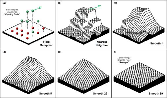
Figure 2. Iteratively smoothed
approximations of the spatial distribution of a mapped data set.
So what
did all that GIS gibberish accomplish?
For one thing, you now have a greater appreciation of the potential and
pitfalls in applying classical statistics to problems in geographic space. For another, you should have a better feel
for a couple of techniques used to characterize the geographic distribution of
a data set. (Topic 6 will take these
minutiae to even more lofty heights. ... I bet you can't wait.) More importantly, however, now you know
surf's up with your data sets.
Maneuvering
on GIS’s Sticky Floor
(GeoWorld, March 1994)
Have you
heard of the glass ceiling in organizational structure? In today's workplace there is an even more
insidious pitfall holding you back: the sticky floor of technology. You are assaulted by cyber-speak and new ways
of doing things. You might be good at
what you do, but "they" keep changing what it is you do.
For
example, GIS takes the comfortable world of mapping and data management into a
surrealistic world of map-ematics and spatial
statistics. The previous dicussions described how discrete field data can be used to generate a continuous map surface of the data.
These surfaces extend the familiar (albeit somewhat distasteful) concept
of central tendency to a map of the geographic distribution of the data.
Whereas classical statistics identifies the typical value in a data set,
spatial statistics identifies where you might expect to find unusual
responses.
The
previous section described polynomial
fitting and iterative smoothing
techniques for generating map surfaces.
Now let's tackle a few more of the surface modeling techniques. But first, let's look for similarities in
computational approaches among the various techniques. They all generate estimates of a mapped variable
based on the data values within the vicinity of each map location. In effect, that establishes a roving window
that moves about an area summarizing the field data it encounters. The summary estimate is assigned to the
center of the window, then the window moves on.
The extent of the window (both size and shape) sways the result,
regardless of the summary technique. In
general, a large window capturing a bunch of values tends to smooth the
data. A smaller window tends to result
in a rougher surface with abrupt transitions.
Three
factors affect the window's extent: its reach, number of samples, and
balancing. The reach, or search radius, sets a limit on how far the computer will
go in collecting data values. The number of samples establishes how many
data values should be used. If there are
more than enough values within a specified reach, the computer uses just the
closest ones. If there aren't enough
values, it uses all it can find within the reach. Balancing
consideration attempts to eliminate directional bias by ensuring that the
values are selected in all directions around the window's center.
Once a
window is established, the summary technique comes into play. Inverse
distance is easy to conceptualize.
It estimates a value for an unsampled location as an average of the data
values within its vicinity. The average
is weighted, so the influence of the surrounding values decreases with the
distance from the location being estimated.
Because that is a static averaging method, the estimated values never
exceed the range of values in the original field data. Also, it tends to pull down peaks and pull up
valleys in the data. Inverse distance is
best suited for data sets with random samples that are fairly independent of
their surrounding locations (i.e., no regional trend).
Inset
(a) of figure 1 contains contour and 3-D plots of the inverse distance
(squared) surface generated from the animal activity data described in the
previous sections (Period 2 with 16 evenly spaced sampled values from 0 to
87). Note that the inverse distance
technique is sensitive to sampled locations and tends to put bumps and
pock-marks around these areas.
Opaquely
speaking, kriging uses regional variable theory based on an underlying linear
variogram. That's techy-speak implying
that there is a lot of math behind this one.
In effect, the technique develops a custom window based on the trend in
the data. Within the window, data values
along the trend's direction have more influence than values opposing the trend. The moving average that defines the trend in
the data can result in estimated values that exceed the field data's range of
values. Also, there can be unexpected
results in large areas without data values.
The technique is most appropriate for systematically sampled data
exhibiting discernible trends.
The
center portion of figure 1 depicts the kriging surface of the animal activity
data. In general, it appears somewhat
smoother than the inverse distance method's plot. Note that the high points in the same region
of the map tend to be connected as ridges, and the low points are connected as
valleys.
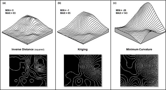
Figure 1. Comparison of Inverse
Distance, Kriging and Minimum Curvature interpolation results. (Interpolation
and 3D Surface and 2D Contour plots generated by SURFER, Golden Software)
Minimum curvature first
calculates a set of initial estimates for all map locations based on the
sampled data values. Similar to the
iterative smoothing technique discussed in the previous section, minimum curvature,
repeatedly applies a smoothing equation to the surface. The smoothing continues until successive
changes at each map location are less than a specified maximum absolute
deviation, or a maximum number of iterations has been
reached. In practice, the process is
done on a coarse map grid and repeated for finer and finer grid spacing steps
until the desired grid spacing and smoothness are reached. As with kriging, the estimated values often
exceed the range of the original data values and things can go berserk in areas
without sample values.
The
inset (c) of figure 1 contains the plots for the minimum curvature
technique. Note that it's the smoothest
of the three plots and displays a strong edge effect along the unsampled border
areas.
You
likely concede that GIS is sticky, but it also seems a bit fishy. The plots show radically different renderings
for the same data set. So, which
rendering is best? And how good is
it? That discussion is reserved for
later (see “Justifiable
Interpolation,” February 1997 describing
the "Residual Analysis" procedure for assessing interpolation
performance).
___________________________