|
Beyond
Mapping III Topic 4
– Calculating Effective Distance (Further Reading) |
Map Analysis book |
(Calculating Simple and
Effective Proximity)
Use Cells and Rings to Calculate
Simple Proximity — describes how simple proximity is calculated (May 2005)
Calculate and Compare to Find
Effective Proximity — describes how effective proximity is
calculated (July 2005)
Taking Distance to the Edge
— discusses advance distance operations (August 2005)
(Deriving and Analyzing
Travel-Time)
Use Travel-Time Buffers to Map
Effective Proximity — discusses procedures for
establishing travel-time buffers responding to street type (February 2001)
Integrate Travel-Time into Mapping
Packages — describes procedures for transferring travel-time data
to other maps (March 2001)
Derive and Use Hiking-Time Maps for
Off-Road Travel — discusses procedures for
establishing hiking-time buffers responding to off-road travel (April 2001)
Consider Slope and Scenic Beauty in
Deriving Hiking Maps — describes a general
procedure for weighting friction maps to reflect different objectives (May 2001)
Accumulation Surfaces Connect Bus
Riders and Stops — discusses an accumulation surface analysis
procedure for linking riders with bus stops (October 2002)
(Use of Travel-Time in
Geo-Business)
Use Travel Time to Identify
Competition Zones — discusses the procedure for deriving relative
travel-time advantage maps (March 2002)
Maps and Curves Can Spatially
Characterize Customer Loyalty — describes a
technique for characterizing customer sensitivity to travel-time (April 2002)
Use Travel Time to Connect with
Customers — describes techniques for optimal path and catchment
analysis (June
2002)
GIS Analyzes In-Store Movement and
Sales Patterns — describes a procedure using
accumulation surface analysis to infer shopper movement from cash register data (February 1998)
Further Analyzing In-Store Movement
and Sales Patterns — discusses how map analysis is
used to investigate the relationship between shopper movement and sales (March 1998)
Continued Analysis of In-Store
Movement and Sales Patterns — describes the use of
temporal analysis and coincidence mapping to enhance shopping patterns (April 1998)
(Micro-Terrain
Considerations and Techniques)
Confluence Maps Further Characterize
Micro-terrain Features — describes the use of optimal path
density analysis for mapping surface flows (April 2000)
Modeling Erosion and Sediment
Loading — illustrates a
Identify Valley Bottoms in
Mountainous Terrain — illustrates a technique for
identifying flat areas connected to streams (November 2002)
(Surface Flow
Considerations and Techniques)
Traditional Approaches Can’t
Characterize Overland Flow — describes the basic considerations in
overland flow (November 2003)
Constructing Realistic Downhill
Flows Proves Difficult — discusses procedures for characterizing
path, sheet, horizontal and fill flows (December 2003)
Use Available Tools to Calculate
Flow Time and Quantity — discusses procedures for tracking flow
time and quantity (January 2004)
Migration Modeling Determines Spill
Effect — describes procedures for assessing
overland and channel flow impacts (February 2004)
<Click here> for a printer-friendly version of this topic (.pdf).
(Back
to the Table of Contents)
______________________________
(Calculating Simple and Effective Proximity)
Use Cells and Rings to Calculate Simple Proximity
(GeoWorld, May
2005)
Earlier discussions in Topic 4 established that proximity is measured
by a series of propagating rings emanating from a starting location—splash
algorithm. Since the reference grid is a
set of square grid cells, the rings are formed by concentric sets of
cells. In figure 1, the first “ring” is
formed by the three cells adjoining the starting cell in the lower-right
corner. The top and side cells represent
orthogonal movement while upper-left one is diagonal. The assigned distance of the steps reflect
the type of movement—orthogonal equals 1.000 and diagonal equals 1.414.
As the rings progress, 1.000 and 1.414 are added to the previous
accumulated distances resulting in a matrix of proximity values. The value 7.01 in the extreme upper-left
corner is derived by adding 1.414 for five successive rings (all diagonal
steps). The other two corners are
derived by adding 1.000 five times (all orthogonal steps). In these cases, the effective proximity
procedure results in the same distance as calculated by the Pythagorean
Theorem.
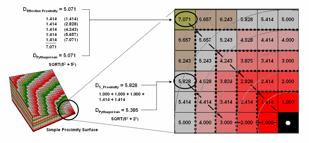
Figure 1.
Simple proximity is generated by summing a series of orthogonal and
diagonal steps emanating from a starting location.
Reaching other locations involve combinations of orthogonal and
diagonal steps. For example, the other
location in the figure uses three orthogonal and then two diagonal steps to
establish an accumulated distance value of 5.828. The Pythagorean calculation for same location
is 5.385. The difference (5.828 – 5.385=
.443/5.385= 8%) is due to the relatively chunky reference grid and the
restriction to grid cell movements.
Grid-based proximity measurements tend to overstate true distances for
off-orthogonal/diagonal locations.
However, the error becomes minimal with distance and use of smaller
grids. And the utility of the added
information in a proximity surface often outweighs the lack of absolute
precision of simple distance measurement.
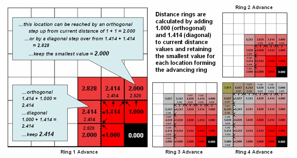
Figure 2.
Simple distance rings advance by summing 1.000 or 1.414 grid space
movements and retaining the minimal accumulated distance of the possible paths.
Figure 2 shows the calculation details for the remaining rings. For example, the larger inset on the left
side of the figure shows ring 1 advancing into the second ring. All forward movements from the cells forming
the ring into their adjacent cells are considered. Note the multiple paths that can reach
individual cells. For example, movement
into the top-right corner cell can be an orthogonal step from the 1.000 cell
for an accumulated distance of 2.000. Or
it can be reached by a diagonal step from the 1.414 cell for an accumulated
distance of 2.828. The smaller value is
stored in compliance with the idea that distance implies “shortest.”
If the spatial resolution of the analysis grid is 300m then the ground
distance is 2.000 * 300m/gridCell= 600m.In a similar
fashion, successive ring movements are calculated, added to the
previous ring’s stored values and the smallest of the potential distance values
being stored. The distance waves rapidly
propagate throughout the project area with the shortest distance to the
starting location being assigned at every location.
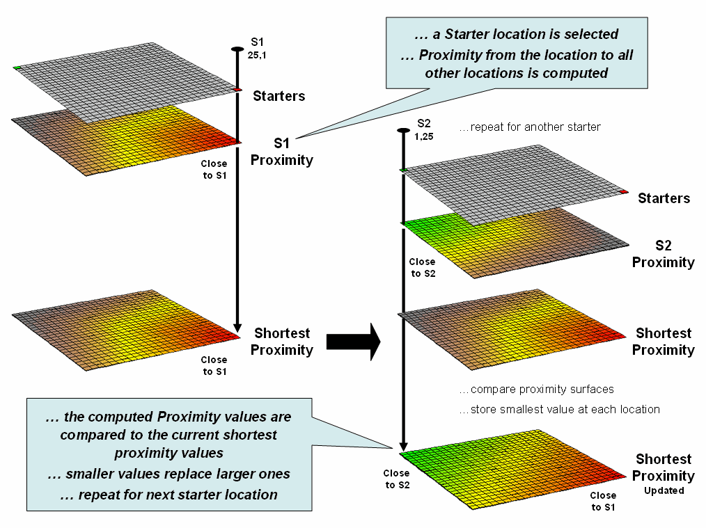
Figure 3.
Proximity surfaces are compared and the smallest value is retained to
identify the distance to the closest starter location.
If more than one starting location is identified, the proximity surface
for the next starter is calculated in a similar fashion. At this stage every location in the project
area has two proximity values—the current proximity value and the most recent
one (figure 3). The two surfaces are
compared and the smallest value is retained for each location—distance to
closest starter location. The process is
repeated until all of the starter locations representing sets of points, lines
or areas have been evaluated.
While the computation is overwhelming for humans, the repetitive nature
of adding constants and testing for smallest values is a piece of cake for
computers (millions of iterations in a few seconds). More importantly, the procedure enables a
whole new way of representing relationships in spatial context involving
“effective distance” that responds to realistic differences in the
characteristics and conditions of movement throughout geographic space.
Calculate and Compare to Find Effective Proximity
(GeoWorld, July
2005)
The last couple of sections have focused on how effective distance is
measured in a grid-based
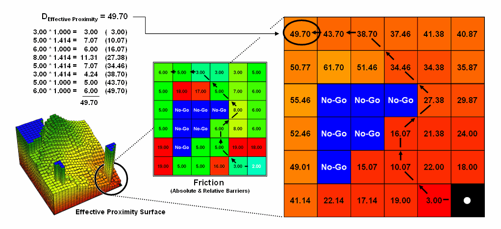
Figure 1.
Effective proximity is generated by summing a series of steps that
reflect the characteristics and conditions of moving through geographic space.
Figure 1 shows the effective proximity values for a small portion of
the results forming the proximity surface discussed previous section. Manual Measurement, Pythagorean Theorem and
Simple Proximity all report that the geographic distance to the location in the
upper-right corner is 5.071 * 300meters/gridCell=
1521 meters. But this simple geometric
measure assumes a straight-line connection that crosses extremely high
impedance values, as well as absolute barrier locations—an infeasible route
that results in exhaustion and possibly death for a walking crow.
The shortest path respecting absolute and relative barriers is shown as
first sweeping to the left and then passing around the absolute barrier on the
right side. This counter-intuitive route
is formed by summing the series of shortest steps at each juncture. The first step away from the starting
location is toward the lowest friction and is computed as the impedance value
times the type of step for 3.00 *1.000= 3.00.
The next step is considerably more difficult at 5.00 * 1.414= 7.07 and
when added to the previous step’s value yields a total effective distance of
10.07. The process of determining the
shortest step distance and adding it to the previous distance is repeated over
and over to generate the final accumulated distance of the route.
It is important to note that the resulting value of 49.70 can’t be
directly compared to the 507.1 meters geometric value. Effective proximity is like applying a rubber
ruler that expands and contracts as different movement conditions reflected in
the Friction Map are encountered.
However, the proximity values do establish a relative scale of distance
and it is valid to interpret that the 49.7 location is nearly five times farther
away than the location containing the 10.07 value.
If the Friction Map is calibrated in terms of a standard measure of
movement, such as time, the results reflect that measure. For example, if the base friction unit was
1-minute to cross a grid cell the location would be 49.71 minutes away from the
starting location. What has changed
isn’t the fundamental concept of distance but it has been extended to consider
real-world characteristics and conditions of movement that can be translated
directly into decision contexts, such as how long will it take to hike from “my
cabin to any location” in a project area.
In addition, the effective proximity surface contains the information
for delineating the shortest route to anywhere—simply retrace to wave front
movement that got there first by taking the steepest downhill path over the
accumulation surface.
The calculation of effective distance is similar to that of simple
proximity, just a whole lot more complicated.
Figure 2 shows the set of movement possibilities for advancing from the
first ring to the second ring. Simple
proximity only considers forward movement whereas effective proximity considers
all possible steps (both forward and backward) and the impedance associated
with each potential move.
For example, movement into the top-right corner cell can be an
orthogonal step times the friction value (1.000 * 6.00) from the 18.00 cell for
an accumulated distance of 24.00. Or it
can be reached by a diagonal step times the friction value (1.414 * 6.00) from
the 19.00 cell for an accumulated distance of 30.48. The smaller value is stored in compliance
with the idea that distance implies “shortest.”
The calculations in the blue panels show locations where a forward step
from ring 1 is the shortest, whereas the yellow panels show locations where
backward steps from ring 2 are shorter.
The explicit procedure for calculating effective distance in the
example involves:
Step 1) multiplying the friction
value for a step
Step 2) times the type of step
(1.000 or 1.414)
Step 3) plus the current
accumulated distance
Step 4) testing for the smallest
value, and
Step 5) storing the minimum
solution if less than any previously stored value.
Extending the procedure to consider movement characteristics merely
introduces an additional step at the beginning—multiplying the relative weight
of the starter.
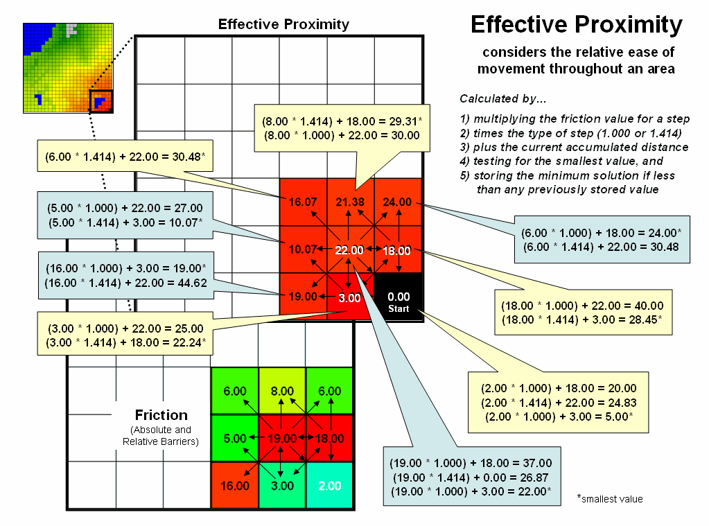
Figure 2.
Effective distance rings advance by summing the friction factors times
the type of grid space movements and retaining the minimal accumulated distance
of the possible paths.
The complete procedure for determining effective proximity from two or
more starting locations is graphically portrayed in figure 3. Proximity values are calculated from one
location then another and stored in two matrices. The values are compared on a cell-by-cell basis
and the shortest value is retained for each instance. The “calculate then compare” process is
repeated for other starting locations with the working matrix ultimately
containing the shortest distance values, regardless which starter location is
closest. Piece-of-cake
for a computer.
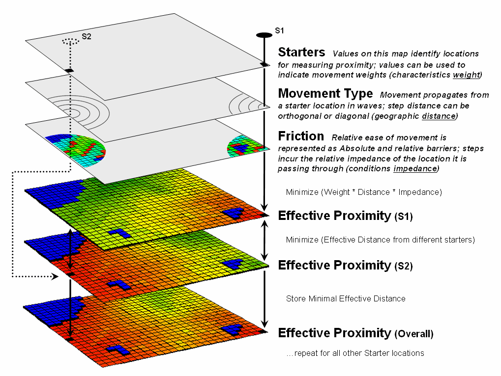
Figure 3. Effective proximity surfaces are
computed respecting movement weights and impedances then compared and the
smallest value is retained to identify the distance to the closest starter
location.
Taking Distance to the Edge
(GeoWorld, August
2005)
The past series of sections have focused on how simple distance is
extended to effective proximity and movement in a modern
While the computations of simple and effective proximity might be
unfamiliar and appear complex, once programmed they are easily and quickly
performed by modern computers. In
addition, there is a rapidly growing wealth of digital data describing
conditions that impact movement in the real world. It seems that all is in place for a radical
rethinking and expression of distance—computers, programs and data are poised.
However, what seems to be the major hurdle for adoption of this new way
of spatial thinking lies in the experience base of potential users. Our paper map legacy suggests that the
“shortest straight line between two points” is the only way to investigate
spatial context relationships and anything else is disgusting (or at least
uncomfortable).
This restricted perspective has lead most contemporary
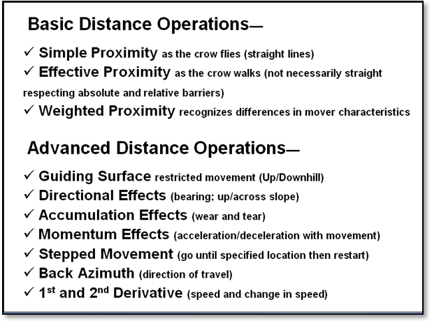
Figure 1.
Extended list of advance distance operations.
The first portion of figure 1 identifies the basic operations described
in the previous sections. Our
traditional thinking of distance as the “shortest, straight line between two
points” is extended to Simple Proximity by relaxing the
assumption that all movement is just between two points. Effective Proximity relaxes the
requirement that all movement occurs in straight lines. Weighted Proximity extends the
concept of static geographic distance by accounting for different movement
characteristics, such as speed.
The result is a new definition of distance as the “shortest, not
necessarily straight set of connections among all points.” While this new definition may seem awkward it
is more realistic as very few things move in a straight line. For example, it has paved the way for online
driving directions from your place to anywhere …an impossible task for a ruler
or Pythagoras.
In addition, the new procedures have set the stage for even more
advanced distance operations (lower portion of figure 1). A Guiding Surface can be used
to constrain movement up, down or across a surface. For example, the algorithm can check an
elevation surface and only proceed to downhill locations from a feature such as
roads to identify areas potentially affected by the wash of surface chemicals
applied.
The simplest Directional Effect involves compass
directions, such as only establishing proximity in the direction of a
prevailing wind. A more complex
directional effect is consideration of the movement with respect to an
elevation surface—a steep uphill movement might be considered a higher friction
value than movement across a slope or downhill.
This consideration involves a dynamic barrier that the algorithm must
evaluate for each point along the wave front as it propagates.
Accumulation Effects
account for wear and tear as movement continues. For example, a hiker might easily proceed
through a fairly steep uphill slope at the start of a hike but balk and pitch a
tent at the same slope encountered ten hours into a hike. In this case, the algorithm merely “carries”
an equation that increases the static/dynamic friction values as the movement
wave front progresses. A natural
application is to have a user enter their gas tank size and average mileage
into MapQuest so it would automatically suggest refilling stops along your vacation
route.
A related consideration, Momentum Effects, tracks the
total effective distance but in this instance it calculates the net effect of
up/downhill conditions that are encountered.
It is similar to a marble rolling over an undulating surface—it picks up
speed on the downhill stretches and slows down on the uphill ones. In fact, this was one of my first spatial
exercises in computer programming in the 1970s.
The class had to write a program that determined the final distance and
position of a marble given a starting location, momentum equation based on
slope and a relief matrix …all in unstructured FORTRAN.
The remaining three advanced operations interact with the accumulation
surface derived by the wave front’s movement.
Recall that this surface is analogous to football stadium with each tier
of seats being assigned a distance value indicating increasing distance from
the field. In practice, an accumulation
surface is a twisted bowl that is always increasing but at different rates that
reflect the differences in the spatial patterns of relative and absolute
barriers.
Stepped Movement allows
the proximity wave to grow until it reaches a specified location, and then
restart at that location until another specified location and so on. This generates a series of effective
proximity facets from the closest to the farthest location. The steepest downhill path over each facet,
as you might recall, identifies the optimal path for that segment. The set of segments for all of the facets
forms the optimal path network connecting the specified points.
The direction of optimal travel through any location in a project area
can be derived by calculating the Back Azimuth of the location on
the accumulation surface. Recall that
the wave front potentially can step to any of its eight neighboring cells and
keeps track of the one with the least “friction.” The aspect of the steepest downhill step (N,
NE, E, SE, S, SW, W or NW) at any location on the accumulation surface
therefore indicates the direction of the best path through that location. In practice there are two directions—one in
and one out for each location.
An even more bazaar extension is the interpretation of the 1st
and 2nd Derivative of an accumulation surface. The 1st derivative (rise over run)
identifies the change in accumulated value (friction value) per unit of
geographic change (cell size). On a
travel-time surface, the result is the speed of optimal travel across the cell. The second derivative generates values
whether the movement at each location is accelerating or decelerating.
Chances are these extensions to distance operations seem a bit
confusing, uncomfortable, esoteric and bordering on heresy. While the old “straight line” procedure from
our paper map legacy may be straight forward, it fails to recognize the reality
that most things rarely move in straight lines.
Effective distance recognizes the complexity of realistic movement by
utilizing a procedure of propagating proximity waves that interact with a map
indicating relative ease of movement.
Assigning values to relative and absolute barriers to travel enable the
algorithm to consider locations to favor or avoid as movement proceeds. The basic distance operations assume static
conditions, whereas the advanced ones account for dynamic conditions that vary
with the nature of the movement.
So what’s the take home from this series describing effective
distance? Two points seem to define the
bottom line. First, that the digital map
is revolutionizing how we perceive distance, as well as how calculate it. It is the first radical change since
Pythagoras came up with his theorem about 2,500 years ago. Secondly, the ability to quantify effective
distance isn’t limited by computational power or available data; rather our
difficulties in understanding accepting the concept. Hopefully the discussions have shed some
light on this rethinking of distance measurement.
(Deriving and Analyzing
Travel-Time)
Use Travel-Time Buffers to Map Effective Proximity
(GeoWorld, February
2001)
The ability to identify and summarize areas around a map feature
(a.k.a. buffering) is a fundamental analysis tool in most desktop
mapping systems. A user selects one or
more features then chooses the buffering tool and specifies a reach. Figure 1 shows a simple buffer
of 1-mile about a store that can be used to locate its “closest customers” from
a geo-registered table of street addresses.
This information, however, can be misleading as it treats all of the
customers within the buffer as the same.
Common sense tells us that some street locations are closer to the store
than others. A proximity buffer
provides a great deal more information by dividing the buffered area into zones
of increasing distance. But construction
of a proximity buffer in a traditional mapping system involves a tedious
cascade of commands creating buffers, geo-queries and table updates.
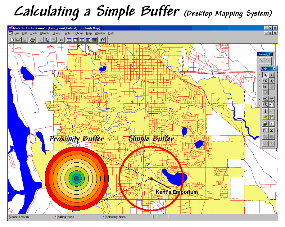
Figure 1.
A simple buffer identifies the area within a specified distance.
Yet even a proximity buffer lacks the spatial specificity to determine
effective distance considering that customers rarely travel in straight lines
from their homes to the store. Movement
in the real world is seldom straight but our traditional set of map analysis
tools assumes everything travels along a straightedge. As most customers travel by car we need a
procedure that generates a buffer based on street distances.
Figure 2 outlines a grid-based approach for calculating an effective
buffer based on travel-time along the street network. The first step is to export the store and street
locations from the desktop mapping system to a grid-based one. Inset (a) depicts the superimposition of a
100-column by 100-row analysis grid over an area of interest. In effect, the data exchange “burns” the
store location into its corresponding grid cell (inset b). Similarly, cells containing primary and
residential streets are identified (inset c) in a manner analogous to a
branding iron burning the street pattern into another grid layer.
Inset (d) shows a travel-time buffer derived from the two grid
layers. The Store map identifies the
starting location and the Streets map identifies the relative ease of
travel. Primary streets are the easiest
(.1 minute per cell), secondary streets are slower (.3 minute) and non-road
areas can’t be crossed at all (infinity).
The result is a buffer that looks like a spider’s web with color zones
assigned indicating travel-time from 0 to 9.5 minutes away (buffer reach).
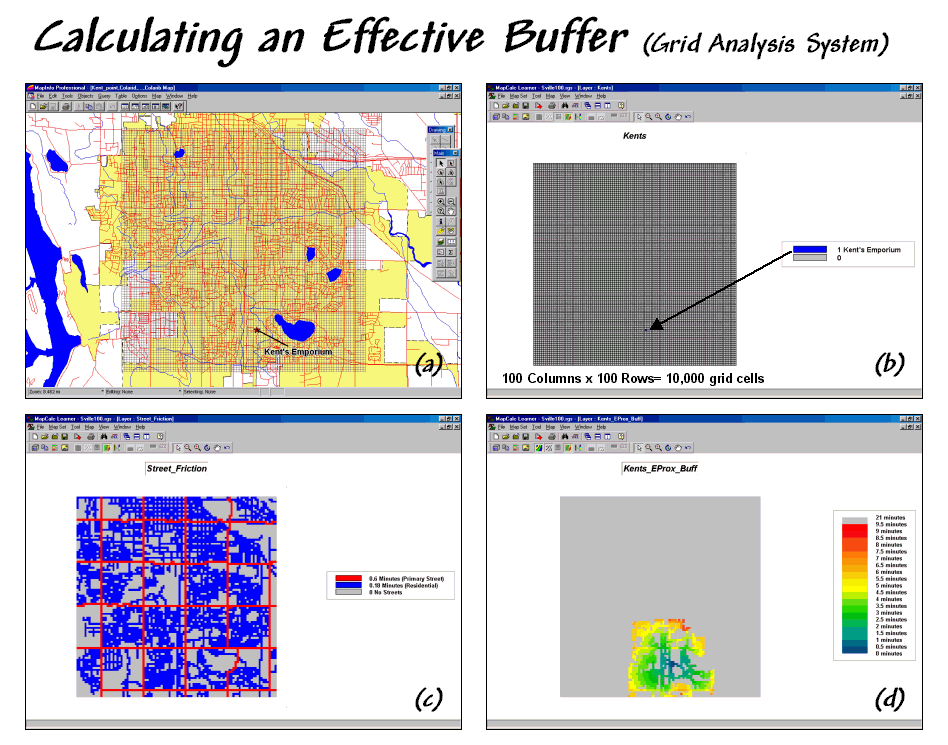
Figure 2.
An effective buffer characterizes travel-time about a map feature.
While the effective proximity buffer contains more realistic
information than the simple buffer, it isn’t perfect. The calibration for the friction surface
(inset c) assumed a generalized “average speed” for the street types without
consideration of one-way streets, left-turns, school zones and the like. Network analysis packages are designed for
such detailed routing. Grid analysis
packages, on the other hand, are not designed for navigation but for map
analysis. As in most strategic planning
it involves a statistical representation of geographic space.
Network and grid-based analysis both struggle with the effects of
artificial edges. Some of the streets
within the analysis window could be designated as infinitely far away because
their connectivity is broken by the window’s border. In addition if the grid cells are large,
false connections can be implied by closely aligned yet separate streets.
Generally speaking, the analysis window should extend a bit beyond the
specific area of interest and contain cells that are as small as possible. The rub is that large grid maps exponentially
affect performance. While the
10,000-cell grid in the example took less than a second to calculate, a
1,000,000-cell grid could take a couple of minutes. The larger maps also require more storage and
adversely affect the transfer of information between grid systems and desktop
mapping systems. A user must weigh the
errors and inaccuracies of a simple buffer against the added requirements of
grid processing. However as grid
software matures and computers become increasingly more powerful, the decision
tips toward the increased use of effective proximity.
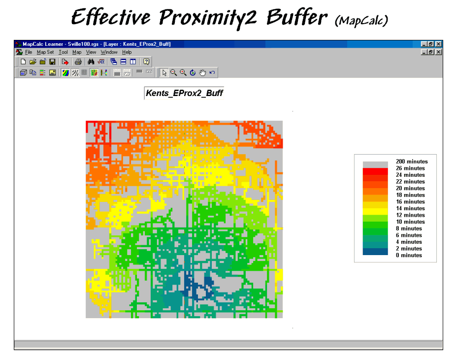
Figure 3.
The reach of the travel-time buffer can be extended to the entire
analysis grid.
Figure 3 extends the reach to encompass the entire analysis grid. Note that the farthest location from the
store appears to be 26 minutes and is located in the northwest corner. While the proximity pattern has the general
shape of concentric circles, the effects of different speeds tend to stretch
the results in the directions of the primary streets.
The information derived in the grid package is easily transferred to a
desktop mapping system as standard tables, such as ArcView’s
.SHP or MapInfo’s .TAB formats. In a sense, the process simply reverses the
“burning” of information used to establish the Store and Street layers (see
figure 4). A pseudo grid is generated
that represents each cell of the analysis grid as a polygon with the grid
information attached as its attributes.
The result is polygon map with an interesting spatial pattern—all of the
polygons are identical squares that abut one
another.
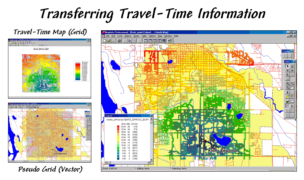
Figure 4.
The travel-time map can be imported into most generic desktop mapping
systems by establishing a pseudo grid.
Classifying the pseudo grid polygons into travel-time intervals
generated the large display in figure 4.
Each polygon is assigned the appropriate color-fill and displayed as a
backdrop to the line work of the streets.
More importantly, the travel-time values themselves can be merged with
any other map layer, such as “appending” the file of the store’s customers with
a new field identifying their effective proximity… but that discussion is
reserved for the next section.
Integrate Travel-Time into Mapping Packages
(GeoWorld, March
2001)
The previous section described a procedure for calculating travel-time
buffers and entire grid surfaces. It
involves establishing an appropriate analysis grid then transferring the point,
line or polygon features that will serve as the starting point (e.g., a store
location) and the relative/absolute barriers to travel (e.g., a street
map). The analytical operation simulates
movement from the starting location to all other map locations and assigns the
shortest distance respecting the relative/absolute barriers. If the relative barrier map is calibrated in
units of time, the result is a Travel-Time map that depicts the time it
takes to travel from the starting point to any map location.
This month’s discussion focuses on how travel-time information can be
integrated and utilized in a traditional desktop mapping system. In many applications, base maps are stored in
vector-based mapping system then transferred to a grid-based package for
analysis of spatial relationships, such as travel-time. The result is transferred back to the mapping
system for display and integration with other mapped data, such as customer
records.
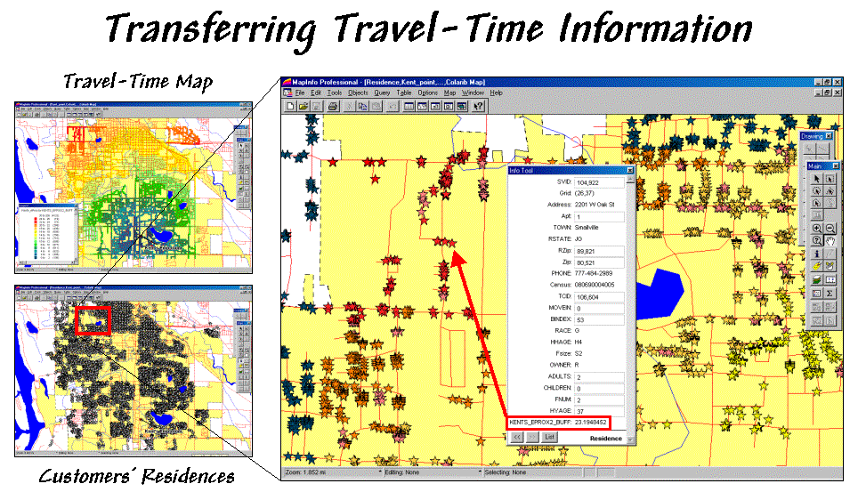
Figure 1.
Travel-time and customer information can be joined to append the
effective distance from a store for each customer.
The small map in the top-left of figure 1 is a display of the
travel-time map developed last month.
The discussion described a procedure for transferring grid-derived
information (raster) to desktop mapping systems (vector).
Recall that in a vector system this map is stored as a “pseudo grid”
with a separate polygon representing each grid cell—100 columns times 100 rows=
10,000 polygons in this example. While
that is a lot of polygons they are simply contiguous squares defined by four
lines and are easily stored. The cells
serve as a consistent parceling of the study area and any information derived
during grid processing is simply transferred and appended as another column to
the pseudo grid’s data table.
But how is this grid information integrated with the data tables
defining other maps? For example, one
might want to assign a computed travel-time value to each customer’s record
identifying residence (spatial location) and demographic (descriptive
attributes) information. The small map
in the bottom-left of figure 1 depicts the residences of the customers of
Most desktop mapping systems provide a feature for “spatially joining”
two tables. For example, MapInfo’s
“Update Column” tool can be used for the join as specified as “…where object
from table <Sville100> contains object from table< Residences>”— Sville100
is the pseudo grid and Residences is the point map (see figure 2). The procedure determines which grid cell
contains a customer point then appends the travel-time information for that
cell (K_TTime) to the customer record. The process is repeated for all of the
customer records and the transferred information becomes a permanent attribute
in the Residences table.
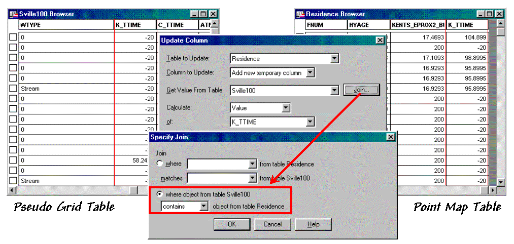
Figure 2.
A “spatial join” identifies points that are contained within each grid
cell then appends the information to point records.
The result is shown in the large map on the right side of figure
1. The stars that identify customers’
residences are assigned “colors” depicting their distance from the store. The “info tool” shows the specific distance
that was appended to a customer’s record.
At this point, the derived travel-time information is fully available in
the desktop mapping system for traditional thematic mapping and geo-query
processing.
For example, the updated residence table can be searched for customers
that are far from the store and have more than three children. The dialog box in the lower right corner of
figure 3 shows the specific query statement.
The result is a selection table that contains just the customers who
satisfy the query. The map display in
figure 3 plots these customers and shows a “hot link” between the selection
table and one of the customers with three children who live 10.6 minutes from
the store.
The ability to easily integrate travel-time information greatly
enhances traditional descriptive customer information. For example, large families might be a
central marketing focus and segmenting these customers by travel-time could
provide important insight for retaining customer loyalty. Special mailings and targeted advertising
could be made to these distant customers.
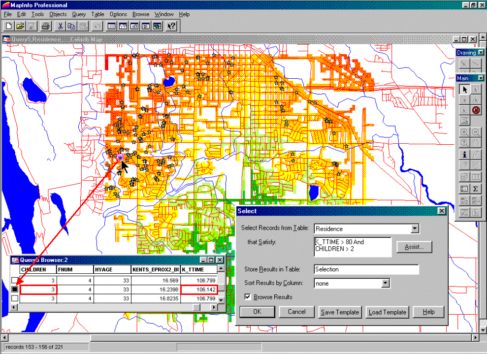
Figure 3.
The appended travel-time information can be utilized in traditional
geo-query and display.
Applications that benefit from integrating grid-analysis and geo-query
are numerous. However traditionally, the
processing capability was limited to large and complex
As awareness of grid-analysis capabilities increases and applications
crystallize, expect to see more map analysis capabilities and a tighter
integration between the raster and vector worlds. In the not so distant future all PC systems
will have a travel-time button and wizard that steps you through calculation
and integration of the derived mapped data.
Derive and Use Hiking-Time Maps for Off-Road
Travel
(GeoWorld, April
2001)
Travel-time maps are most often used within the context of a road
system connecting people with places via their cars. Network software is ideal for routing
vehicles by optimal paths that account for various types of roads, one-way
streets, intersection stoppages and left/right turn delays. The routing information is relatively precise
and users can specify preferences for their trip—shortest route, fastest route
and even the most scenic route.
In a way, network programs operate similar to the grid-based
travel-time procedure discussed in the last two columns. The cells are replaced by line segments, yet
the same basic concepts apply—absolute barriers (anywhere off roads) and
relative barriers (comparative impedance on roads).
However, there are significant differences in the information produced
and how it is used. Network analysis
produces exact results necessary for navigation between points. Grid-based travel-time analysis produces
statistical results characterizing regions of influence (i.e., effective
buffers). Both approaches generate valid
and useful information within the context of an application. One shouldn’t use a statistical travel-time
map for routing an emergency vehicle.
Nor should one use a point-to-point network solution for site location
or competition analysis within a decision-making context.
Neither does one apply on-road travel-time analysis when modeling
off-road movement. Let’s assume you are
a hiker and live at the ranch depicted in figure 1. The top two “floating” map layers on the left
identify Roads and Cover_type in the
area that affect off-road travel. The Locations
map positions the ranch and a nearby cabin.
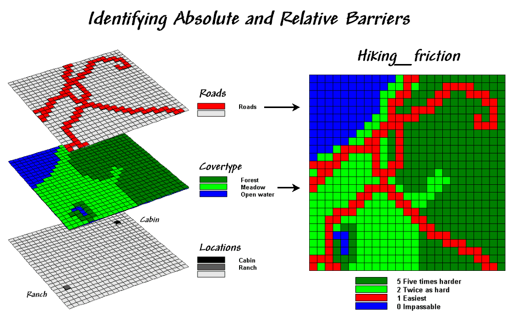
Figure 1.
Maps of Cover Type and Roads are combined and reclassified for relative
and absolute barriers to hiking.
In general, walking along the rural road is easiest and takes about a
minute to traverse one of the grid cells.
Hiking in the meadow takes twice as long (about two minutes). Hiking in the dense forest, however is much
more difficult, and takes about five minutes per cell. Walking on open water presents a real problem
for most mortals (absolute barrier) and is assigned zero in the Hiking_friction map on the right that combines the
information.
Now the stage is set for calculating foot-traffic throughout the entire
project area. Figure 2 shows the result
of simulating hiking from the Ranch to everywhere using the “splash”
procedure described in the previous two columns. The distance waves move out from the
ranch like a “rubber ruler” that bends, expands and contracts as influenced by
the barriers on the Hiking_friction map—fast
in the easy areas, slow in the harder areas and not at all where there is an
absolute barrier.
The result of the calculations identifies a travel-time surface where
the map values indicate the hiking time from the Ranch to all other map
locations. For example, the estimated
time to slog to the farthest point is about 62 minutes. However, the quickest hiking route is not
likely a straight line to the ranch, as such a route would require a lot of
trail-whacking through the dense forest.
Figure 2.
The hiking-time surface identifies the estimated time to hike from the
Ranch to any other location in the area.
The protruding plateaus identify inaccessible areas (absolute barriers)
and are considered infinitely far away.
The surface values identify the shortest hiking time to any
location. Similarly, the values around a
location identify the relative hiking times for adjacent locations. “Optimal” movement from a location toward the
ranch chooses the lowest value in the neighborhood—one step closer to the
ranch.
The “not-necessarily-straight” route that connects any location to the
ranch by the quickest pathway is determined by repeatedly moving to the lowest
value along the surface at each step—the steepest downhill path. Like rain running down a hillside, the unique
configuration of the surface guides the movement. In this case, however, the guiding surface is
a function of the relative ease of hiking under different Roads and Cover_type conditions.
Actually, the optimal path retraces the effective distance wave that
got to a location first—the quickest route in this case. The 3D display in figure 3 isolates the
optimal path from the ranch to the cabin.
The surface value (36.5) identifies that the cabin is about a 36-minute
hike from the ranch.
Figure 3.
The steepest downhill path from a location (Cabin) identifies the “best”
route between that location and the starter location (Ranch).
The 2D map in the center depicts the route and can be converted to X,Y coordinates that serve as waypoints for
________________________
Author’s Note: The following is a flowchart and command macro of
the processing steps described in above discussion. The commands can be entered into the MapCalc
Learner educational software for a hands-on experience in deriving
hiking-time maps.
Consider Slope and Scenic Beauty in Deriving
Hiking Maps
(GeoWorld, May
2001)
Keep in mind that “it’s the second mouse that gets the cheese.” While effective proximity and travel-time
procedures have been around for years, it is only recently that they are being
fully integrated into
Distance measurement
as the “shortest, straight line between two points” has been with us for
thousands of years. The application of
the Pythagorean Theorem for measuring distance is both conceptually and
mechanically simple. However in the real
world, things rarely conform to the simplifying assumptions that all movement
is between two points and in a straight line.
The discussion in the previous section described a procedure for
calculating a hiking-time map. The
approach eliminated the assumption that all measurement is between two points
and evolved the concept of distance to one of proximity. The introduction of absolute and relative
barriers addressed the other assumption that all movement is in a straight line
and extended the concept a bit further to that of effective proximity. The discussion ended with how the hiking-time
surface is used to identify an optimal path from any location to
the starting location—the shortest but not necessarily straight route.
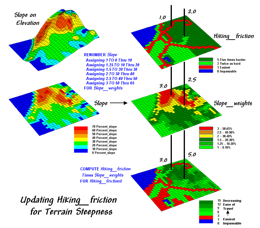
Figure 1.
Hiking friction based on Cover Type and Roads is updated by terrain
slope with steeper locations increasing hiking friction.
Now the stage is set to take the concept a few more steps. The top right map in figure 1 is the friction
map used last time in deriving the hiking-time surface. It assumes that it takes 1 minute to hike
across a road cell, 2 minutes for a meadow cell, and 3 minutes for a forested
one. Open water is assigned 0 as you
can’t walk on water and it takes zero minutes to be completely submerged. But what about slope? Isn’t it harder to hike on steep slopes
regardless of the land cover?
The slope map on the left side of the figure identifies areas of
increasing inclination. The “Renumber”
statement assigns a weight (figuratively and literally) to various steepness
classes— a factor of 1.0 for gently sloped areas through a factor 3.0 for very
steep areas. The “Compute” operation
multiplies the map of Hiking_friction times
the Slope_weights map. For example, a road location (1 minute) is
multiplied by the factor for a steep area (3.0 weight)
to increase that location’s friction to 3.0 minutes. Similarly, a meadow location (2 minutes) on a
moderately step slope (2.5 weight) results in 5.0
minutes to cross.
The effect of the updated friction map is shown in the top portion of
figure 2. Viewing left to right, the
first map shows simple friction based solely on land cover features. The second map shows the slope weights
calibrated from the slope map. The third
one identifies the updated friction map derived by combining the previous two
maps.
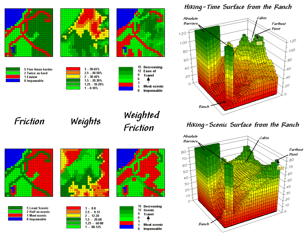
Figure 2.
Hiking movement can be based on the time it takes move throughout a
study area, or a less traditional consideration of the relative scenic beauty
encountered through movement.
The 3D surface shows the hiking-time from the ranch to all other
locations. The two tall pillars identify
areas of open water that are infinitely far away to a hiker. The relative heights along the surface show
hiking-time with larger values indicating locations that are farther away. The farthest location (highest hill top) is
estimated to be 112 minutes away. That’s
nearly twice as long as the estimate using the simple friction map presented
last month—those steep slopes really take it out of you.
The lower set of maps in figure 2 reflects an entirely different
perspective. In this case, the weights
map is based on aesthetics with good views of water enhancing a hiking
experience. While the specifics of
deriving a “good views of water” map are reserved for later discussion, it is
sufficient to think of it as analogous to a slope map. Areas that are visually connected to the
lakes are ideal for hiking, much like areas of gentle terrain. Conversely, areas without such views are less
desirable comparable to steep slopes.
The map processing steps for considering aesthetics are
identical—calibrate the visual exposure map for a Beauty_weights
map and multiply it times the basic Hiking_friction
map. The affect is that areas with good
views receive smaller friction values and the resulting map surface is biased
toward more beautiful hikes. Note the
dramatic differences in the two effective proximity surfaces. The top surface is calibrated in comfortable
units of minutes. But the bottom one is
a bit strange as it implies accumulated scenic beauty while respecting the relative
ease of movement in different land cover.
The pair of hiking paths depicted in figure 3 identify
significantly different hiking experiences.
Both represent an optimal path between the ranch and the cabin, however the red one is the quickest, while the green
one is the most beautiful. As discussed
last month, an optimal route is identified by the “steepest downhill path”
along a proximity surface. In this case
the surfaces are radically different (time vs. scenic factors) so the resulting
paths are fairly dissimilar.
The table in the figure provides a comparison of the two paths. The number of cells approximates the length
of the paths—a lot a longer for the “Time path” route (30 vs. 23 cells). The estimated time entries, however, show
that the “Time path” route is much quicker (73 vs. 192 minutes). The scenic entries in the table favor the
“Scenic path” (267 vs. 56). The values
in parentheses report the averages per cell.
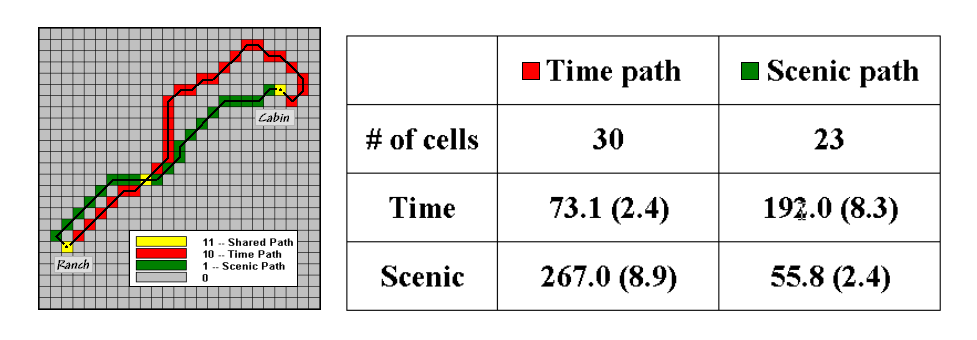
Figure 3.
The “best” routes between the Cabin and the Ranch can be compared by
hiking time and scenic beauty.
But what about a route that balances time and
scenic considerations? A
simple approach would average the two weighting maps, and then apply the result
to the basic friction map. That would
assume that time loss in very steep areas is compensated by gains in scenic
beauty. Ideally, one would want to bias
a hike toward gently sloping areas that have a good view of the lakes.
How about a weighted average where slope or beauty is treated as more
important? What about hiking
considerations other than slope and beauty?
What about hiking trail construction and maintenance concerns? What about seasonal effects? …that’s the beauty of
____________________________________
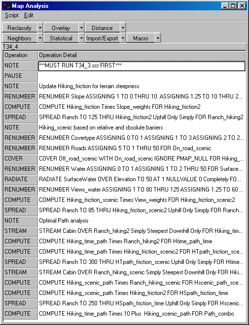
Command macro of the processing steps described in
above discussion. The commands can be
entered into the MapCalc
Learner educational software for a hands-on experience in deriving hiking-time
maps.
Accumulation Surfaces Connect Bus Riders and
Stops
(GeoWorld, October
2002)
Several online services and software packages offer optimal path
routing and point-to-point directions.
They use network analysis algorithms that connect one address to another
by the “best path” defined as shortest, fastest or most scenic. The 911 emergency response systems implemented
in even small communities illustrate how pervasive these routing applications
have become.
However, not all routing problems are between two known points. Nor are all questions simply
navigational. For example, consider the
dilemma of matching potential bus riders with their optimal stops. The rider’s address and destination are known
but which stops are best to start and end the trip must be determined. A brute-force approach would be to calculate
the routes for all possible stop combinations for home and destination
addresses, then choose the best pair.
The algorithm might be refined using simple proximity to eliminate
distant bus stops and then focus the network analysis on the subset of closest
ones.
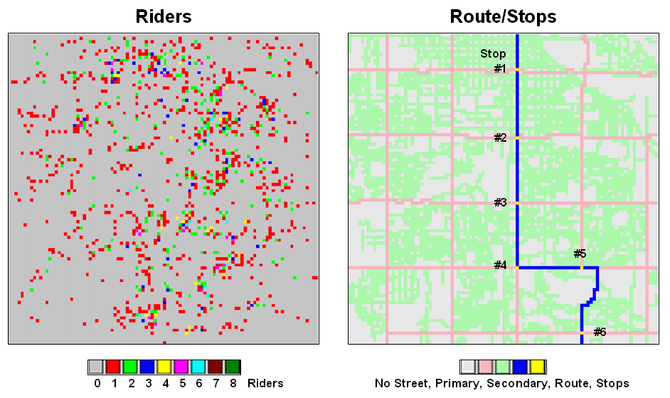
Figure 1.
Base maps identifying riders and stops.
An alternative approach uses accumulation surface analysis to identify
the connectivity. Figure 1 sets the
stage for an example analysis. The inset
on the left identifies the set of potential riders with a spatial pattern akin
to a shotgun blast with as many as eight riders residing in a 250-foot grid
cell (dot on the map). The inset on the
right shows a bus route with six stops. The
challenge is to connect any and all of the riders to their closest stop while
traveling only along roads (primary= red, secondary= green).
While the problem could keep a car load of kids with pencils occupied
for hours, a more expedient procedure is the focus. An accumulation “travel-time” surface is
generated by iteratively moving out from a stop along the roads while
considering the relative ease in traversing primary and secondary streets. The left inset in figure 2 is a 3D display of
the travel-time values derived—increasing height equates to locations that are
further away. The 2D map on the right
shows the same data with green tones close to a stop and red tones further
away.
The ridges radiating out from the stops identify locations that are
equidistant from two stops. Locations on
either side of a ridge fall into catchment areas that delineate
regions of influence for each bus stop.
In a manner analogous to a watershed, these “travel-sheds” collect all
of the flow within the area and funnel it toward the lowest point—which just
happens to be one of the bus stops (travel-time from a stop equals zero).
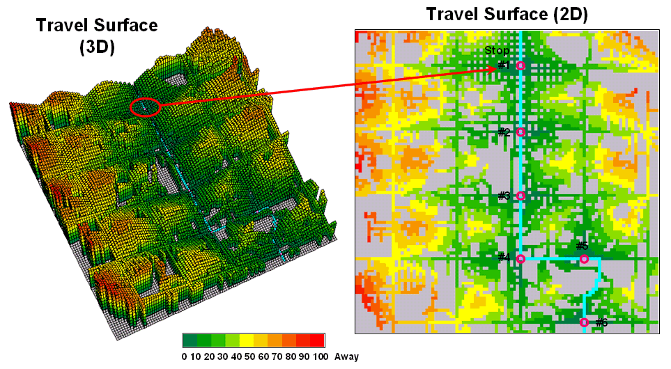
Figure 2.
Travel surface identifying relative distance from each of the bus stops
to the areas they serve.
Figure 3 puts this information into practice. The 3D travel surface on
the left is the same one shown in the previous figure. However, the draped colors report the flow of
optimal paths between a stop and its dispersed set of potential riders—greens
for light flow through reds for heavy flow.
The inset in the upper-left portion of the figure illustrates the
optimal path for one of the riders. It
is determined as the “steepest downhill path” from his or her residence to the
closest bus stop. Now imagine thousands
of these paths flowing from each of the rider locations (2D map in the
lower-left) to their closest stop. The
paths passing though each map location are summed to
indicate overall travel flow (2D map in the upper-right).
Like a rain storm in a watershed, the travel flow map tracks the
confluence of riders as they journey to the bus stop. The series of matrices on the right side of figure
3 identifies the influx of riders at each stop.
Note that 212 of the 399 riders approach stop #1 from the west—that’s
the side of the street for a hot dog stand.
Also note that each bus stop has an estimated number of riders that are
optimally served—total number of riders within the catchment area.
In a manner similar to point-to-point routing, directions for
individual riders are easily derived.
The appropriate stops for the beginning and ending addresses of a trip
are determined by the catchment areas they fall into. The routes to and from the stops are traced
by the steepest downhill paths from these addresses that can be highlighted on
a standard street map.
Figure 3.
Relative flows of riders from their homes to the nearest bus stop.
However, the real value in the approach is its ability to summarize
aggregate ridership. For example, how
would overall service change if a stop was eliminated or moved? Which part of the community would be
affected? Who should be notified? The navigational solution provided by
traditional network analysis fails to address these comprehensive
concerns. The region of influence
approach using accumulated surface analysis, on the other hand, moves the
analysis beyond simply mapping the route.
_________________
Author's Notes: All of the data in these examples are
hypothetical. See…www.innovativegis.com/basis,
select Map Analysis for the current online version and supplements. See www.redhensystems.com/mapcalc,
for information on MapCalc Learner software and “hands-on exercises” in
this and other
(Use of Travel-Time in
Geo-Business)
Use Travel Time to Identify Competition Zones
(GeoWorld, March
2002)
Does travel-time to a store influence your patronage? Will you drive by one store just to get to
its competition? What about an extra
fifteen minutes of driving? … Twenty
minutes? If your answer is “yes” you are
a very loyal customer or have a passion for the thrill of driving that rivals a
teenager’s.
If your answer is “no” or “it depends,” you show at least some
sensitivity to travel-time. Assuming
that the goods, prices and ambiance are comparable most of us will use
travel-time to help decide where to shop.
That means shopping patterns are partly a geographic problem and the old
real estate adage of “location, location, location” plays a roll
in store competition.
Targeted marketing divides potential customers into groups using
discriminators such as age, gender, education, and income then develops focused
marketing plans for the various groups.
Relative travel-time can be an additional criterion for grouping, but
how can one easily assess travel-time influences and incorporate the
information into business decisions?
Two map analysis procedures come into play—effective proximity and
accumulation surface analysis. Several
previous Beyond Mapping columns have focused on the basic concepts,
procedures and considerations in deriving effective proximity (February and
March, 2001) and analyzing accumulation surfaces (October and November, 1997).
The following discussion focuses on the application of these “tools” to
competition analysis. The
left side of figure 1 shows the travel-time surface from
The result is the estimated travel-time to every location in the
city. The surface starts at 0 and
extends to 24.4 minutes away. Note that
it is shaped like a bowl with the bottom at the store’s location. In the 2D display, travel-time appears as a
series of rings—increasing distance zones.
The critical points to conceptualize are 1) that the surface is analogous
to a football stadium (continually increasing) and 2) that every road location
is assigned a distance value (minutes away).
The right side of figure 1 shows the travel-time surface for Colossal
Mart with its origin in the northeast portion of the city. The perspective in both 3D displays is
constant and
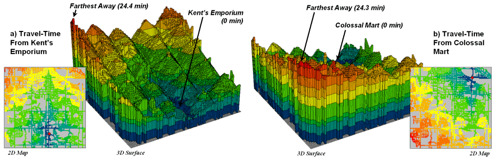
Figure 1.
Travel-time surfaces show increasing distance from a store considering
the relative speed along different road types.
Simply subtracting the two surfaces derives the relative travel-time
advantage for the stores (figure 2). Keep
in mind that the surfaces actually contain geo-registered values and a new
value (difference) is computed for each map location. The inset on the left side of the figure
shows a computed Colossal Mart advantage of 6.1 minutes (22.5 – 16.4= 6.1) for
the location in the extreme northeast corner of the city.
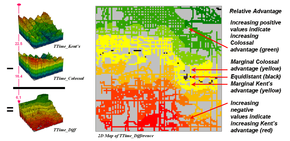
Figure 2.
Two travel-time surfaces can be combined to identify the relative
advantage of each store.
Locations that are the same travel distance from both stores result in
zero difference and are displayed as black.
The green tones on the difference map identify positive values where
Figure 3 displays the same information in a bit more intuitive
fashion. The combat zone is shown as a
yellow valley dividing the city into two marketing regions—peaks of strong
travel-time advantage. Targeted
marketing efforts, such as leaflets, advertising inserts and telemarketing
might best be focused on the combat zone.
Indifference towards travel-time means that the combat
zone residents might be more receptive to store incentives.
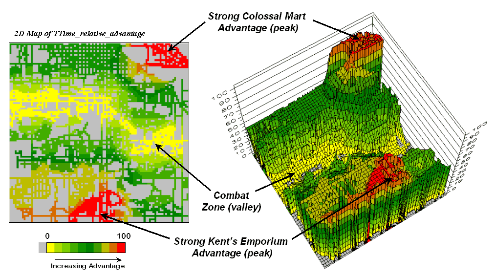
Figure 3.
A transformed display of the difference map shows travel-time advantage
as peaks (red) and locations with minimal advantage as an intervening valley
(yellow).
At a minimum the travel-time advantage map enables merchants to
visualize the lay of the competitive landscape.
However the information is in quantitative form and can be readily
integrated with other customer data.
Knowing the relative travel-time advantage (or disadvantage) of every
street address in a city can be a valuable piece of the marketing puzzle. Like age, gender, education, and income,
relative travel-time advantage is part of the soup that determines where we
shop… it’s just we never had a tool for measuring it.
Maps and Curves Can Spatially Characterize
Customer Loyalty
(GeoWorld, April
2002)
The previous discussion introduced a procedure for identifying
competition zones between two stores.
Travel-time from each store to all locations in a project area formed
the basis of the analysis. Common sense
suggests that if customers have to travel a good deal farther to get to your
store versus the competition it’ll be a lot harder to entice them through your
doors.
The competition analysis technique expands on the concept of
simple-distance buffers (i.e., quarter-mile, half-mile, etc.) by considering
the relative speeds of different streets.
The effect is a mapped data set that reaches farther along major streets
and highways than secondary streets. The
result is that every location is assigned an estimated time to travel from that
location to the store.
Comparing the travel-time maps of two stores determines relative access
advantage (or disadvantage) for each map location. Locations that have minimal travel-time
differences define a “combat zone” and focused marketing could tip the scales
of potential customers in this area.
The next logical step in the analysis links customers to the
travel-time information.
Figure 1 locates the addresses of nearly 1600 respondents to a
reader-survey of “What’s Best in Town” appearing in the local newspaper. Colossal Mart received 823 votes for the best
discount store while
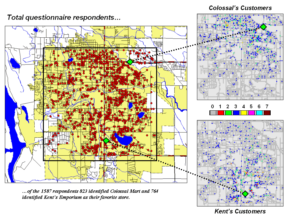
Figure 1.
Respondents indicating their preference for Kent’s Emporium or Colossal
Mart.
More important than who won the popularity contest is the information
encapsulated in spatial patterns of the respondents. The insets on the right of the figure split
the respondents into those favoring Colossal Mart and those favoring
The next step is to link the travel-time estimates to the
respondents. A few months ago (see
“Integrate Travel Time into Mapping Packages,” GEOWorld,
March, 2001, page 24) a procedure was discussed for transferring the
travel-time information to the attribute table of a desktop mapping
system. This time, however, we’ll
further investigate grid-based spatial analysis of the data.
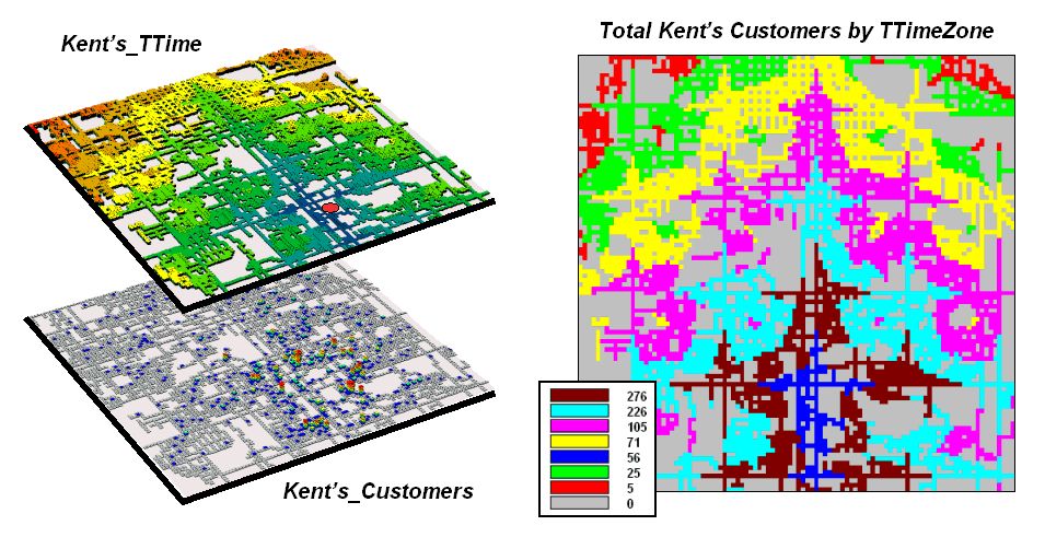
Figure 2.
Travel-time distances from a store can characterize customers.
The top map on the right of figure 2 (
The 2-D map on the right shows the results of
a region-wide summary where the total number of customers is computed
for each travel-time zone. The procedure is similar to taking a
cookie-cutter (Kent’s_ TTime zones) and
slamming it down onto dough (Kent’s Customers data) then working with
the material captured within the cookie cutter template– compute the total
number of customers within each zone.
The table in the center of figure 3 identifies various summaries of the
customer data falling within travel-time zones.
The shaded columns show the relationship between the two stores’
customers and distance—the area-adjusted average number of customers within
each travel-time zone.
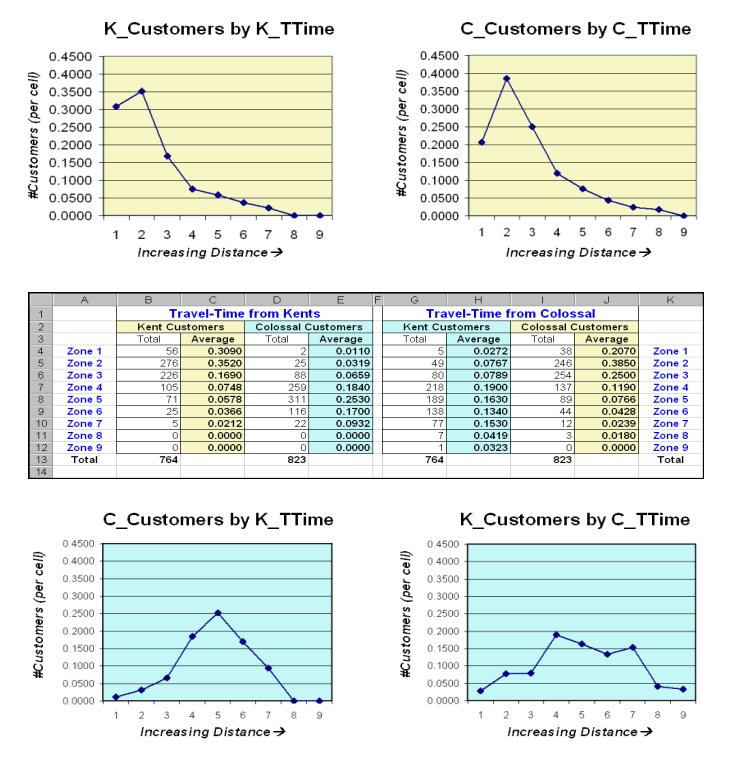
Figure 3.
Tabular summaries of customers within each travel-time zone can be
calculated.
The two curves on top depict the relationship for each store’s own
customers. Note the characteristic shape
of the curves—most of the customers are nearby with a rapid trailing off as
distance increases. Ideally you want the
area under the curve to be as much as possible (more customers) and the shape
to be fairly flat (loyal customers that are willing to travel great
distances). In this example, both stores
have similar patterns reflecting a good deal of sensitivity to travel-time.
The lower two graphs characterize the travel distances for the competitor’s
customers—objects for persuasion.
Ideally, one would want the curves to be skewed to the left (your lower
travel-time zones). In this example, it
looks like Colossal Mart has slightly better hunting conditions, as there is a
bit more area under the curve (total customers) for zones 1 through 4 (not too
far away). In both cases, however, there
looks like a fair number of competition customers in the combat zone (zones 4
through 6)—let the battle begin.
Use Travel Time to Connect with Customers
(GeoWorld, June
2002)
Several recent Beyond Mapping columns have dealt with travel-time and
its geo-business applications (see GeoWorld issues for February-March, 2001 and
March-April, 2002). This section extends
the discussion to “Optimal Path” and “Catchment” analysis.
As a review, recall that travel-time is calculated by respecting
absolute and relative barriers to movement throughout a project area. For most vehicles on a trip to the store, the
off-road locations represent absolute barriers—can’t go there. The road network is composed of different
types of streets represented as relative barriers—can go there but at
different speeds.
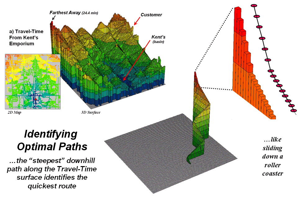
Figure 1.
The height on the travel-time surface identifies how far away each
location is and the steepest downhill path along the surface identifies the
quickest route.
In assessing travel-time, the computer starts somewhere then calculates
the time to travel from that location to all other locations by moving along
the road network like a series of waves propagating through a canal
system. As the wave front moves, it adds
the time to cross each successive road segment to the accumulated time up to
that point. The result is estimated
travel-time to every location in a city.
For example, the upper-left inset in figure 1 shows
a 2D travel-time map from
The lower-right inset in the figure depicts the quickest route that a
customer in the northeast edge of the city would take to get to the store. The algorithm starts at the customer’s
location on the travel-time surface, and then takes the “steepest downhill
path” to the basin (
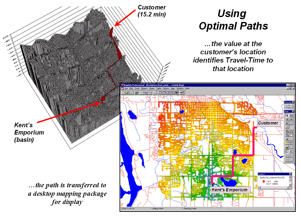
Figure 2.
The optimal path (quickest route) between the store and any customer
location can be calculated then transferred to a standard desktop mapping
system.
The upper-left inset of figure 2 shows the 3D depiction of the optimal
path in the grid-based analysis system used to derive the travel-time
information. The height of the
customer’s location on the surface (15.2 minutes) indicates the estimated
travel-time to
At each step along the optimal path the remaining time is equal to the
height on the surface. The inset in the
lower-right of the figure shows the same information transferred to a standard
desktop mapping system. If the car is
If fact, that is how many emergency response systems work. An accumulation surface is constructed from
the police/hospital/fire station to all locations. When an emergency call comes in, its location
is noted on the surface and the estimated time of arrival at the scene is
relayed to the caller. As the emergency
vehicle travels to the scene it appears as a moving dot on the console that
indicates the remaining time to get there.
Another use of travel-time and optimal path is to derive catchment
areas from a set of starting locations.
For example, the left-side of figure 3 shows the travel-time surface
from six ATM machines located throughout a city. Conceptually, it is like tossing six stones
into a canal system (road network) and the distance waves move out until they
crash into each other. The result is a
series of bowl-like pockmarks in the travel-time surface with increasing
travel-time until a ridge is reached (equidistant) then a downhill slide into
locations that are closer to the neighboring ATM machine.
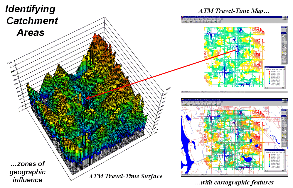
Figure 3.
The region of influence, or Catchment Areas, is identified as all
locations closest to one of a set of starting locations (basins).
The 2D display in the upper-right inset of figure 3 shows the
travel-time contours around each of the ATM locations—blue being closest through
red that is farthest away. The
lower-right inset shows the same information transferred to a desktop mapping
system. Similar to the earlier
discussion, any customer location in the city corresponds to a position on the
pock-marked travel-time surface—height identifies how far away to the nearest
ATM machine and the optimal path shows the quickest route.
This technique is the foundation for a happy marriage between
In the not too distance future you will be able to call your
“cell-phone agent” and leave a request to be notified when you are within a
five minute walk of a Starbucks coffee house.
As you wander around the city your phone calls you and politely says
“…there’s a Starbucks about five minutes away and, if you please, you can get
there by taking a right at the next corner then…” For a lot of spatially-challenged folks it
beats the heck out of unfolding a tourist map, trying to locate yourself and navigate to a point.
GIS Analyzes In-Store Movement and Sales Patterns
(GeoWorld,
February 1998)
There are two fundamental types of people in the world: shoppers and
non-shoppers. Of course, this
distinction is a relative one, as all of us are shoppers to at least some
degree. How we perceive stores and what
prompts us to frequent them form a large part of retail marketing’s
Movement within a store is conceptually similar, but the geographic factors and
basic approach are different. The
analysis scale collapses from miles along a road network, to feet through a
maze of aisles and fixtures. Since the
rules of the road and fixed widths of pavement don’t exist, shoppers can (and
do) move through capricious routes that are not amenable to traditional network
analysis. However, at least for me, the
objective is the same—get to the place(s) with the desired products, then get
out and back home as easily as possible.
What has changed in the process isn’t the concept of movement, but how
movement is characterized.
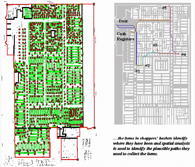
Figure 1.
Establishing Shopper Paths. Stepped accumulation surface analysis is used
to model shopper movement based on the items in a shopping cart.
The floor plan of a store is a continuous surface with a complex of
array of barriers strewn throughout. The
main aisles are analogous to mainline streets in a city, the congested areas
are like secondary streets, and the fixtures form absolute barriers (can’t
climb over or push aside while maintaining decorum). Added to this mix are the entry doors,
shelves containing the elusive items, cash registers, and finally the exit
doors. Like an obstacle race, your
challenge is to survive the course and get out without forgetting too
much. The challenge to the retailer is
to get as much information as possible about your visit.
For years, the product flow through the cash registers has been analyzed to
determine what sells and what doesn’t. Data analysis originally focused on
reordering schedules, then extended to descriptive statistics and insight into
which products tend to be purchased together (product affinities). However, mining the data for spatial
relationships, such as shopper movement and sales activity within a store, is
relatively new. The left portion of
figure 1 shows a map of a retail superstore with fixtures (green) and shelving
nodes (red). The floor plan was
digitized and the fixtures and shelving spaces were encoded to form map
features similar to buildings and addresses in a city. These data were gridded at a 1-foot
resolution to form a continuous analysis space.
The right portion of figure 1 shows the plausible path a shopper took to
collect the five items in a shopping cart.
It was derived through stepped accumulation surface analysis described
in last month’s column. Recall that this
technique constructs an effective proximity surface from a starting location
(entry door) by spreading out (increasing distance waves) until it encounters
the closest visitation point (one of the items in the shopping cart). The first leg of the shopper’s plausible path
is identified by streaming down the truncated proximity surface (steepest
downhill path). The process is repeated
to the establish the next tier of the surface by spreading from the current
item’s location until another item is encountered, then streaming over that
portion of the surface for the next leg of the path. The spread/stream procedure is continued
until all of the items in the cart have been evaluated. The final leg is delineated by moving to the
checkout and exit doors.
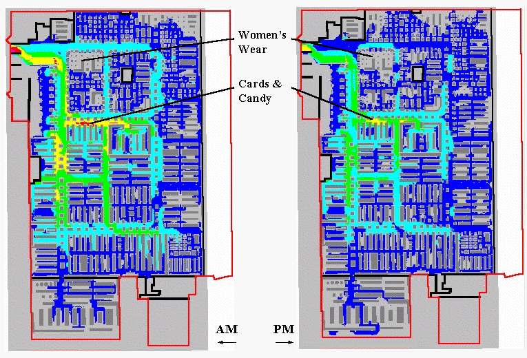
Figure 2.
Shopper Movement Patterns. The paths for a set of shoppers are
aggregated and smoothed to characterize levels of traffic throughout the store.
Similar paths are derived for additional shopping carts that pass
through the cash registers. The paths
for all of carts during a specified time period are aggregated and smoothed to
generate an accumulated shopper movement surface. Although it is difficult to argue that each
path faithfully tracks actual movement, the aggregate surface tends to identify
relative traffic patterns throughout the store.
Shoppers adhering to “random walk” or “methodical serpentine” modes of
movement confound the process, but their presence near their purchase points
are captured.
The left portion of figure 2 shows an aggregated movement surface for
163 shopping carts during a morning period; the right portion shows the surface
for 94 carts during an evening period of the same day. The cooler colors (blues) indicate lower
levels of traffic, while the warmer colors (yellow and red) indicate higher
levels. Note the similar patterns of
movement with the most traffic occurring in the left-center portion of the
store during both periods. Note the
dramatic falloff in traffic in the top portion.
The levels for two areas are particularly curious. Note the total lack of activity in the
Women’s Wear during both periods. As
suspected, this condition was the result of erroneous codes linking the
shelving nodes to the products.
Initially, the consistently high traffic in the Cards & Candy
department was thought to be a data error as well. But the data links held up. It wasn’t until the client explained that the
sample data was for a period just before Valentine’s Day that the results made
sense. Next month we will explore
extending the analysis to include sales activity surfaces and their link to
shopper movement.
__________________________
Author’s Note: the analysis reported is part of a pilot
project lead by HyperParallel, Inc., San Francisco,
California. A slide set describing the
approach in more detail is available on the Worldwide Web at
www.innovativegis.com
Further
Analyzing In-Store Movement and Sales Patterns
(GeoWorld, March
1998)
The previous section described a procedure for deriving maps of shopper
movement within a store by analyzing the items a shopper purchased. An analogy was drawn between the study of
in-store traffic patterns and those used to connect shoppers from their homes
to a store’s parking lot… aisles are like streets and shelving locations are
like street addresses. The objective of
a shopper is to get from the entry door to the items they want, then through
the cash registers and out the exit. The
objective of the retailer is to present the items shoppers want (and those they
didn’t even know they wanted) in a convenient and logical pattern that insures
sales.
Though conceptually similar, modeling traffic within a store versus
within a town has some substantial differences.
First the vertical component of the shelving addresses is important as
it affects product presentation. Also,
the movement options in and around store fixtures (verging on whimsy) is
extremely complex, as is the characterization of relative sales activity. These factors suggest that surface analysis
(raster) is more appropriate than the traditional network analysis (vector) for
modeling in-store movement and coincidence among maps.
Path density analysis develops a “stepped accumulation surface” from
the entry door to each of the items in a shopper’s cart and then establishes
the plausible route used to collect them by connecting the steepest downhill
paths along each of the “facets” of the proximity surface.
Figure 1 illustrates a single path superimposed on 2-D and 3-D plots of
the proximity surface for an item at the far end of the store. The surface acts like mini-staircase guiding
the movement from the door to the item.
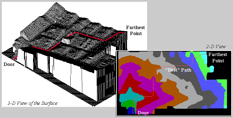
Figure 1.
A shopper’s route is the steepest downhill path over a proximity
surface.
The procedure continues from item to item, and finally to the checkout
and exit. Summing and smoothing the
plausible paths for a group of shoppers (e.g., morning period) generates a
continuous surface of shopper movement throughout the store— a space/time
glimpse of in-store traffic. The upper
left inset of figure 2 shows the path density for the morning period described
last time.
OK, so much for review. The lower left
inset identifies sales activity for the same period. It was generated by linking the items in all
of the shopping carts to their appropriate shelving addresses and keeping a
running count of the number of items sold at each location. This map summarizing sales points was
smoothed into a continuous surface by moving a “roving window” around the map
and averaging the number of sales within a ten-foot radius of each analysis grid
cell (1 square foot). The resulting
surface provides another view of the items passing through the checkouts— a
space/time glimpse of in-store sales action.
The maps in the center identify locations of high path density and high sales
activity by isolating areas exceeding the average for each mapped
variable. As you view the maps note
their similarities and differences. Both
seem to be concentrated along the left and center portions of the store,
however, some “outliers” are apparent, such as the pocket of high sales along
the right edge and the strip of high traffic along the top aisle. However, a detailed comparison is difficult
by simply glancing back and forth. The
human brain is good at a lot of things, but summarizing the coincidence of
spatially specific data isn’t one of them.
The enlarged inset on the right is an overlay of the two maps identifying all
combinations. The darker tones show
where the action isn’t (low traffic and low sales). The orange pattern identifies areas of high
path density and high sales activity— what you would expect (and retailer hopes
for). The green areas are a bit more
baffling. High sales, but low traffic
means only shoppers with a mission frequent these locations— a bit
inconvenient, but sales are still high.
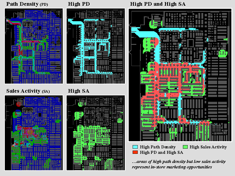
Figure 2.
Analyzing coincidence between shopper movement/sales
activity surfaces.
The real opportunity lies in the light blue areas indicating high
shopper traffic but low sales. The
high/low area in the upper left can be explained… entry doors and women’s
apparel with the data error discussed last time. But the strip in the lower center of the
store seems to be an “expressway” simply connecting the high/high areas above
and below it. The retailer might
consider placing some end-cap displays for impulse or sale items along the
route.
Or maybe not.
It would be silly to make a major decision from analyzing just a few
thousand shopping carts over a couple of days.
Daily, weekly and seasonal influences should be investigated. That’s the beauty of in-store analysis— its based on data that flows
through the checkouts every day. It
allows retailers to gain insight into the unique space/time patterns of their
shoppers without being obtrusive or incurring large data collection expenses.
The raster data structure of the approach facilitates investigation of the
relationships within and among mapped data.
For example, differences in shopper movement between two time periods
simply involve subtracting two maps. If
a percent change map is needed, the difference map is divided by the first map
and then multiplied by 100. If average
sales for areas exceeding 50% increase in activity are desired, the percent
change map is used to isolate these areas, then the
values for the corresponding grid cells on the sales activity map are
averaged. From this perspective, each
map is viewed as a spatially defined variable, each grid cell is analogous to a
sample plot, and each value at a cell is a measurement—all just waiting to
unlock their secrets. Next time we will
investigate more “map-ematical” analyses of these
data.
__________________________
Author’s Note: the
analysis reported is part of a pilot project lead by HyperParallel,
Inc., San Francisco, California. A slide
set describing the approach in more detail is available on the Worldwide Web at
www.innovativegis.com.
Continued Analysis of In-Store Movement and Sales
Patterns
(GeoWorld, April
1998)
The first part of this series described a procedure for estimating shopper
movement within a store, based on the items found in their shopping carts. The second part extended the discussion to
mapping sales activity from the same checkout data and introduced some analysis
procedures for investigating spatial relationships between sales and
movement. Recall that the raster data
structure (1-foot grids) facilitated the analysis as it forms a consistent
“parceling” of geographic space. Within
a “map-ematical” context, each value at a grid cell
is a measurement, each cell itself is analogous to a sample plot, and each
gridded map forms a spatially defined variable.
From this perspective, the vast majority of statistical and mathematical
techniques become part of the
The
The recognition that maps are data as well as pictures fuels this “data
mining” perspective. Cognitive
abstractions of data coupled with physical features for geographic reference
form new and useful views of the spatial relationships within a data set. For example, the insets in figure 1 show
three “snapshots” of an animated sequence of the surfaces depicting shopper
movement (left side) and sales activity (right side). The checkout data for a twenty-four hour
period was divided into hourly segments and the movement and sales surfaces
generated were normalized, and then assigned a consistent color ramp for
display.
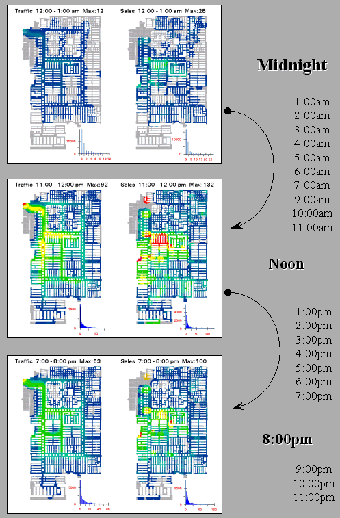 \
\
Figure 1.
Snapshots from a movie of hourly maps of shopper
movement and sales activity.
When viewed in motion, the warmer tones (reds) of higher activity
appear to roll in and out like wisps of fog under the Golden Gate Bridge. The similarities and miss-matches in the ebb
and flow provide a dramatic view (and new insights) of the spatial/temporal
relationships contained in the data.
Data visualization techniques, such as animation and 3-D datascapes, render complex and colorless tables of numbers
into pictures more appropriate for human consumption.
Although the human brain is good at many things, detailed analysis of mapped
data is not one of them. Visualizing the
hourly changes provides a general impression of the timing and patterns in
shopper movement and sales activity.
However, additional insight results from further map-ematics
identifying locations of “significant” difference at each time step. This is accomplished by subtracting two
surfaces (e.g., movement at
Segmentation of a data set forms the basis of many of the extended data mining
procedures. In addition to time (e.g.,
hourly time steps) the data can be grouped through spatial partitioning. For example, each department’s “footprint”
can be summarized into an index of shopper “yield” as a ratio of its average
sales to its average movement—calculated hourly shows which departments are
performing best at each time step.
A third way to segment a data set is by data characteristics. For example, traditional product “affinity”
analysis that notes which items tended to be purchased together can be extended
to its spatial implications. Common
sense suggests that items with a high product affinity, such as shampoo and
conditioner, should have a high spatial affinity (shelved close together). Proximity analysis is used to determine
effective distance between items, normalized to an affinity index, and then
compared to the pair’s product affinity index.
Miss-matches identify inconveniently shelved items—similar products
shelved far apart, or dissimilar products close
together. The affinity information also
assists in optimizing the shelving of impulse and sales items for frequently
changed action aisle and end-cap displays.
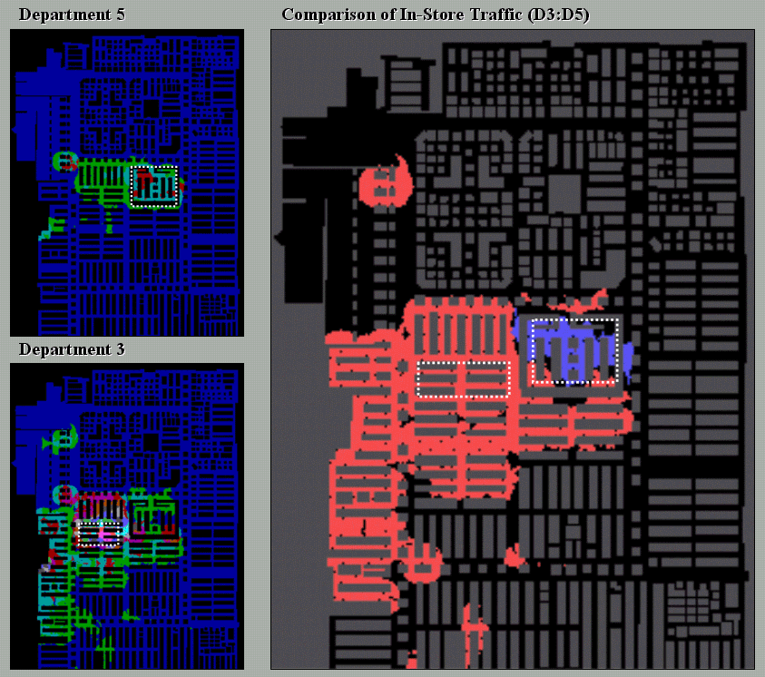
Figure 2.
Departmental comparison of shopper movement patterns.
Figure 2 shows another data characteristics segmentation analysis. The top left map summarizes all of the
shopper paths that contained items from Department 5 (Electronics delineated by
the dotted rectangle). Note the
concentration of paths within the vicinity of the Department indicating that
purchasers of these items tended not to venture into other departments. The bottom left inset is a similar map for
Department 3 (Card & Candy). Note
the larger number and greater dispersion of paths compared to Department
5.
The large map on the right shows areas of large differences in path
density between shopping carts containing items from Departments 3 (orange) and
5 (blue). It is expected that the areas
within the departments (dotted rectangles) show large differences. The blue areas at the top, however, show more
shoppers purchasing electronics traveled to men’s wear that those purchasing
cards & candy… a bit of common sense verified by empirical data. It leads one to wonder what insights might be
gained from analysis of the orange area (more cards & candy traffic) or
other departmental comparisons.
__________________________
Author’s Note:
the analysis reported is part of a pilot project lead by HyperParallel, Inc., San Francisco, California. A slide set describing the approach in more
detail is available on the Worldwide Web at www.innovativegis.com.
(Micro-Terrain Considerations and Techniques)
Confluence Maps Further Characterize
Micro-terrain Features
(GeoWorld, April
2000)
Earlier discussion focused on terrain steepness and roughness (March
2000 BM column). While the concepts are
simple and straightforward, the mechanics of computing them are a bit more
challenging. As you hike in the
mountains your legs sense the steepness and your mind is constantly assessing
terrain roughness. A smooth,
steeply-sloped area would have you clinging to things, while a rough
steeply-sloped area would look more like stair steps.
Water has a similar vantage point of the slopes it encounters, except
given its head, water will take the steepest downhill
path (sort of like an out-of-control skier).
Figure 1 shows a 3-D grid map of an elevation surface and the resulting
flow confluence. It is based on the
assumption that water will follow a path that chooses the steepest downhill
step at each point (grid cell "step") along the terrain surface.
In effect, a drop of water is placed at each location and allowed to
pick its path down the terrain surface.
Each grid cell that is traversed gets the value of one added to it. As the paths from other locations are
considered the areas sharing common paths get increasing larger values (one +
one + one, etc.).
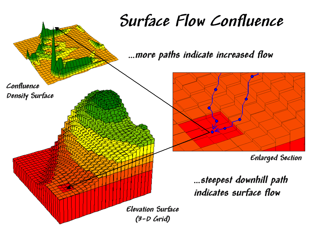
Figure 1.
Map of surface flow confluence.
The inset on the right shows the path taken by a couple of drops into a slight
depression. The inset on the left shows
the considerable inflow for the depression as a high peak in the 3-D display. The high value indicates that a lot of uphill
locations are connected to this feature.
However, note that the pathways to the depression are concentrated along
the southern edge of the area.
Now turn your attention to figure 2.
Ridges on the confluence density surface (lower left) identify areas of
high surface flow. Note how these areas
(darker) align with the creases in the terrain as shown on the draped elevation
surface on the right inset. The water
collection in the "saddle" between the two hills is obvious, as are
the two westerly facing confluences on the side of the hills. The 2-D map in the upper left provides a more
familiar view of where not to unroll your sleeping bag if flash floods are a
concern.
The various spatial analysis techniques for characterizing terrain
surfaces introduced in this series provide a wealth of different perspectives
on surface configuration. Deviation from
Trend, Difference Maps and Deviation Surfaces are used to identify areas that
"bump-up" (convex) or "dip-down" (concave). A Coefficient of Variation Surface looks at
the overall disparity in elevation values occurring within a small area. A Slope Map shares a similar algorithm
(roving window) but the summary of is different and reports the
"tilt" of the surface. An
Aspect Map extends the analysis to include the direction of the tilt as well as
the magnitude. The Slope of a Slope Map
(2nd derivative) summarizes the frequency of the changes along an
incline and reports the roughness throughout an elevation surface. Finally, a Confluence Map takes an extended
view and characterizes the number of uphill locations connected to each
location.
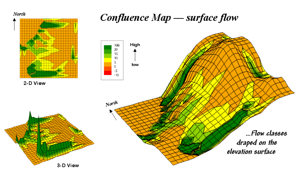
Figure 2.
2-D, 3-D and draped displays of surface flow confluence.
The coincidence of these varied perspectives can provide valuable input
to decision-making. Areas that are
smooth, steep and coincide with high confluence are strong candidates for
gully-washers that gouge the landscape.
On the other hand, areas that are rough,
gently-sloped and with minimal confluence are relatively stable. Concave features in these areas tend to trap
water and recharge soil moisture and the water table. Convex features under erosive conditions tend
to become more prominent as the confluence of water flows around it.
Similar interpretations can be made for hikers, who like raindrops react to
surface configuration in interesting ways.
While steep, smooth surfaces are avoided by all but the rock-climber,
too gentle surfaces tend to provide boring hikes. Prominent convex features can make
interesting areas for viewing—from the top for hearty and from the bottom for
the aesthetically bent. Areas of water
confluence don't mix with hiking trail unless a considerable number of
water-bars are placed in the trail.
These "rules-of-thumb" make sense in a lot of situations; however,
there are numerous exceptions that can undercut them. Two concerns in particular are important—
conditions and resolution. First,
conditions along the surface can alter the effect of terrain characteristics. For example, soil properties and the
vegetation at a location greatly effects surface runoff and sediment
transport. The nature of accumulated
distance along the surface is also a determinant. If the uphill slopes are long steep, the
water flow has accumulated force and considerable erosion potential. A hiker that has been hiking up a steep slope
for a long time might collapse before reaching the summit. If that steep slope is southerly oriented and
without shade trees, then exhaustion is reached even sooner.
In addition, the resolution of the elevation grid can effect
the calculations. In the case of water
drops the gridding resolution and accurate "Z" values must be high to
capture the subtle twists and bends that direct water flow. A hiker on the other hand, is less sensitive
to subtle changes in elevation. The rub
is that collection of the appropriate elevation is prohibitively expensive in
most practical applications. The result
is that existing elevation data, such as the USGS Digital Terrain Models (DTM),
are used in most cases by default. Since
the
The recognition of the importance of spatial analysis and surface modeling is
imperative, both for today and into the future.
Its effective use requires informed and wary users. However, as with all technological things,
what appears to be a data barrier today, becomes
routine in the future. For example,
The more important limitation is intellectual.
For decades, manual measurement, photo interpretation and process
modeling approaches have served as input for decision-making involving terrain
conditions. Instead of using
_______________________
Author's Note: The figures presented in this series on
"Characterizing Micro-Terrain Features" plus several other
illustrative ones are available online as a set of annotated PowerPoint slides
at the "Column Supplements" page at http://www.innovativegis.com/basis.
Modeling
Erosion and Sediment Loading
(GeoWorld, May
2000)
Previous discussions suggested that combining derived maps often is
necessary for a complete expression of an application. A simple erosion potential model, for
example, can be developed by characterizing the coincidence of a Slope Map and
a Flow Map (see the previous two columns in this series). The flowchart in the figure 1 identifies the
processing steps that form the model— generate slope and flow maps, establish
relative classes for both, then combine.
While a flowchart of the processing might appear unfamiliar, the
underlying assumptions are quite straightforward. The slope map characterizes the relative
"energy" of water flow at a location and the confluence map
identifies the "volume" of flow.
It's common sense that as energy and volume increases, so does erosion
potential.
The various combinations of slope and flow span from high erosion
potential to deposition conditions. On
the map in the lower right, the category "33 Heavy Flow; Steep" (dark
blue) identifies areas that are steep and have a lot of uphill locations
contributing water. Loosened dirtballs
under these circumstances are easily washed downhill. However, category "12 Light Flow;
Moderate" (light green) identifies locations with minimal erosion
potential. In fact, deposition (the
opposite of erosion) can occur in areas of gentle slope, such as category
"11 Light Flow; Gentle" (dark red).
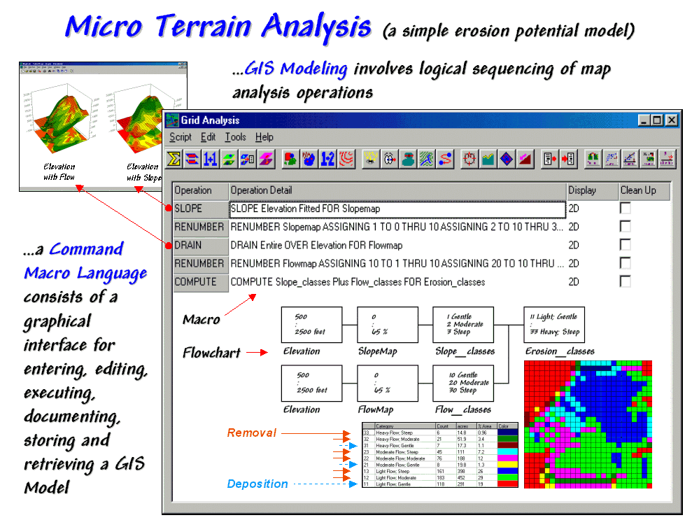
Figure 1.
A simple erosion potential model combines information on terrain
steepness and water flow confluence.
Before we challenge the scientific merit of the simplified model, note
the basic elements of the
The remaining sentences in the macro and the corresponding boxes/lines in the
flowchart complete the model. The macro
enables entering, editing, executing, storing and retrieving the individual
operations that form the application.
The flowchart provides an effective means for communicating the processing
steps. Most "
It provides a starting place for model refinement as well. Suppose the user wants to extend the simple
erosion model to address sediment loading potential to open water. The added logic is captured by the additional
boxes/lines shown in figure 2. Note that
the upper left box (Erosion_classes) picks up where
the flowchart in figure 1 left off.
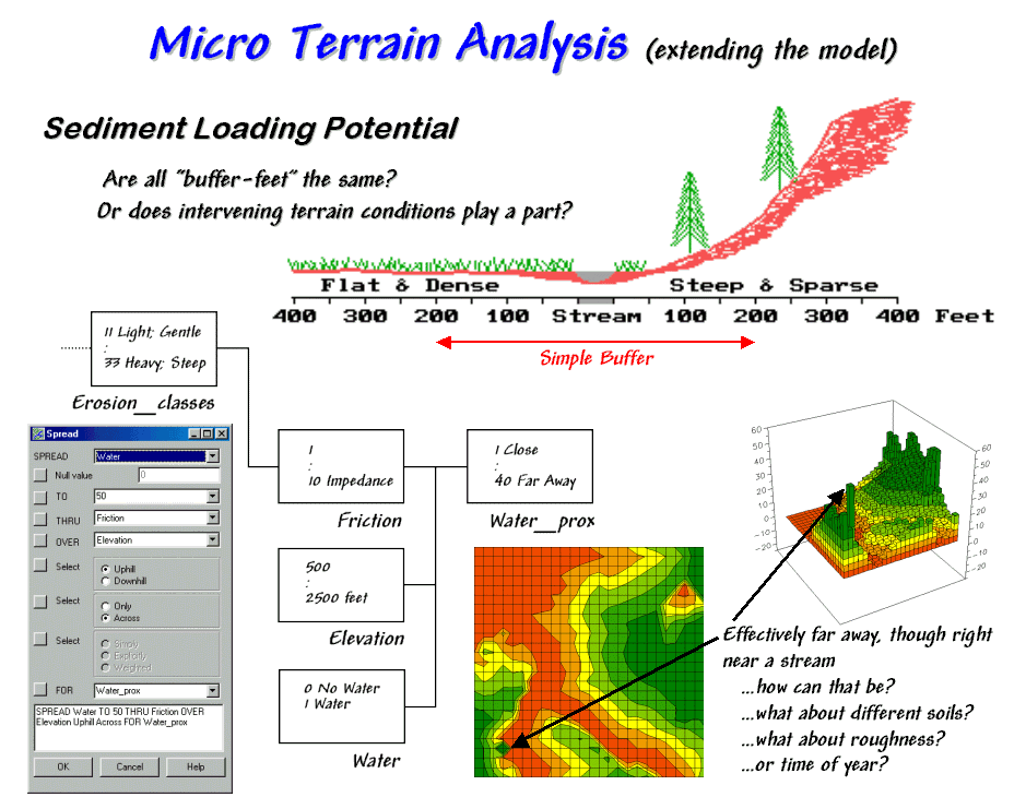
Figure 2.
Extended erosion model considering sediment loading
potential considering intervening terrain conditions.
A traditional approach would generate a simple buffer of a couple of hundred
feet around the stream and restrict all dirt disturbing actives to outside the
buffered area. But are all buffer-feet
the same? Is a simple geographic reach
on either side sufficient to hold back sediment? Do physical laws apply or merely civil ones
that placate planners?
Common sense suggests that the intervening conditions play a role. In areas that are steep and have high water
volume, the setback ought to be a lot as erosion potential is high. Areas with minimal erosion potential require
less of a setback. In the schematic in
figure 2, a dirt disturbing activity on the steep hillside, though 200 feet
away, would likely rain dirtballs into the stream. A similar activity on the other side of the
stream, however, could proceed almost adjacent to the stream.
The first step in extending the erosion potential model to sediment loading
involves "calibrating" the intervening conditions for dirtball
impedance. The friction map identified
in the flowchart ranges from 1 (very low friction for the 33 Heavy Flow: Steep
condition) to 10 (very high friction for 11 Light Flow; Gentle). A loose dirtball in an area with a high
friction factor isn't going anywhere, while one in an area of very low friction
almost has legs of its own.
The second processing step calculates the effective distance from open water
based on the relative friction. The
command, "SPREAD Water TO 50 THRU Friction OVER Elevation Uphill Across For Water_Prox," is
entered simply by completing a dialog box.
The result is a variable-width buffer that reaches farther in areas of
high erosion potential and less into areas of low potential. The lighter red tones identify locations that
are effectively close to water from the perspective of a dirtball on the
move. The darker green tones indicate
areas effectively far away.
But notice the small dark green area in the lower left corner of the map of
sediment loading potential. How can it
be effectively far away though right near a stream? Actually it is a small depression that traps
dirtballs and can't contribute sediment to the stream— effectively infinitely
far away.
Several other real-world extensions are candidates to improve model. Shouldn't one consider the type of
soils? The surface
roughness? Or
the time of year? The
possibilities are numerous. In part,
that's the trouble with
Much of our science was developed before we had these
spatially-explicit operations and is founded on simplifying assumptions of
spatial independence and averaging over micro conditions. But now the "chicken or egg"
parable is moot. Spatial analysis is
here and our science needs updating to reflect the new tools and purge simplifying
assumptions about geographic relationships.
Identify Valley Bottoms in Mountainous Terrain
(GeoWorld,
November 2002)
On occasion I am asked how I come up with ideas for the Beyond Mapping
column every month for over a dozen years.
It’s easy—just hang around bright folks with
interesting questions. It’s also the
same rationale I use for keeping academic ties in
For example, last section’s discussion on “Connecting Riders with Their Stops”
is an outgrowth of a grad student’s thesis tackling an automated procedure for
routing passengers through alternative public transportation (bike, bus and
light rail). This month’s topic picks up
on another grad student’s need to identify valley
bottoms in mountainous terrain.
The upper-left inset in figure 1 identifies a portion of a 30m digital
elevation model (DEM). The “floor” of
the composite plot is a 50-meter contour map of the terrain co-registered with
an exaggerated 3D lattice display of the elevation values. Note the steep gradients in the southwestern
portion of the area.
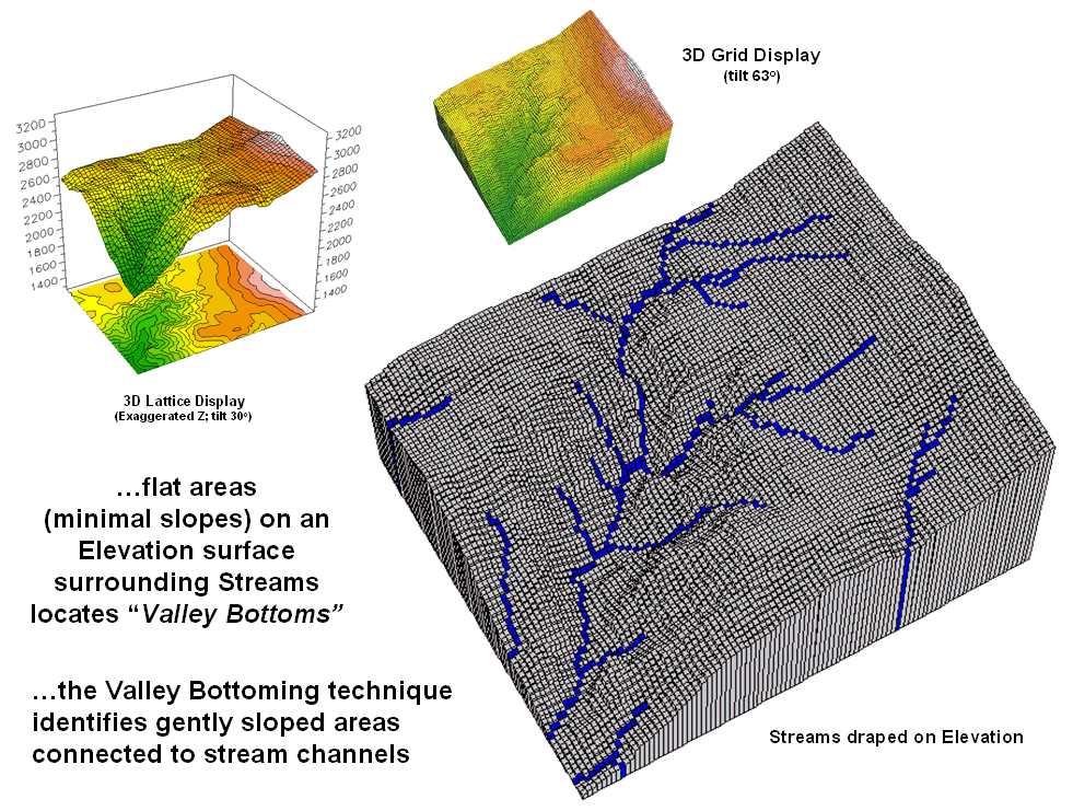
Figure 1.
Gentle slopes surrounding streams are visually apparent on a 3D plot of
elevation.
The enlarged 3D grid display on the right graphically overlays the
stream channels onto the terrain surface.
Note that the headwaters occur on fairly gentle slopes then flow into
the steep canyon. While your eye can
locate areas of gentle slope surrounding streams in the plot, an automated
technique is needed to delineate and characterize the valley bottoms for
millions of acres. In addition, a
precise rule set is needed to avoid inconsistencies among subjective visual
interpretations.
Like your eye, the computer needs to 1) locate areas with gentle slopes
that are 2) connected to the stream channels.
In evaluating the first step the computer doesn’t “see” a colorful 3D
plot like you do. It “sees” relative
elevation differences—rather precisely—that are stored in a matrix of elevation
values. The slope algorithm retrieves
the elevation value for a location and its eight surrounding values then
mathematically compares the subset of values.
If the nine elevation values were all the same, a slope of zero percent
(flat) would be computed. As the
elevation values in one portion of the 3x3 window get relatively large compared
to another portion, increasing slope values are calculated. You see a steep area on the 3D plot; the
computer sees a large computed slope value.
Figure 2 shows the slope calculation results for the project area. The small 3D grid plot at the top identifies
terrain steepness from 0 to 105% slope.
Gently sloped areas of 0-6% are shown in green tones with steeper slopes
shown in red tones. The gently sloped
areas are the ones of interest for deriving valley bottoms, and as your eye
detected, the computer locates them primarily along the rim of the canyon. But these areas only meet half of the valley
bottom definition—which of the flat areas are
connected to stream channels?
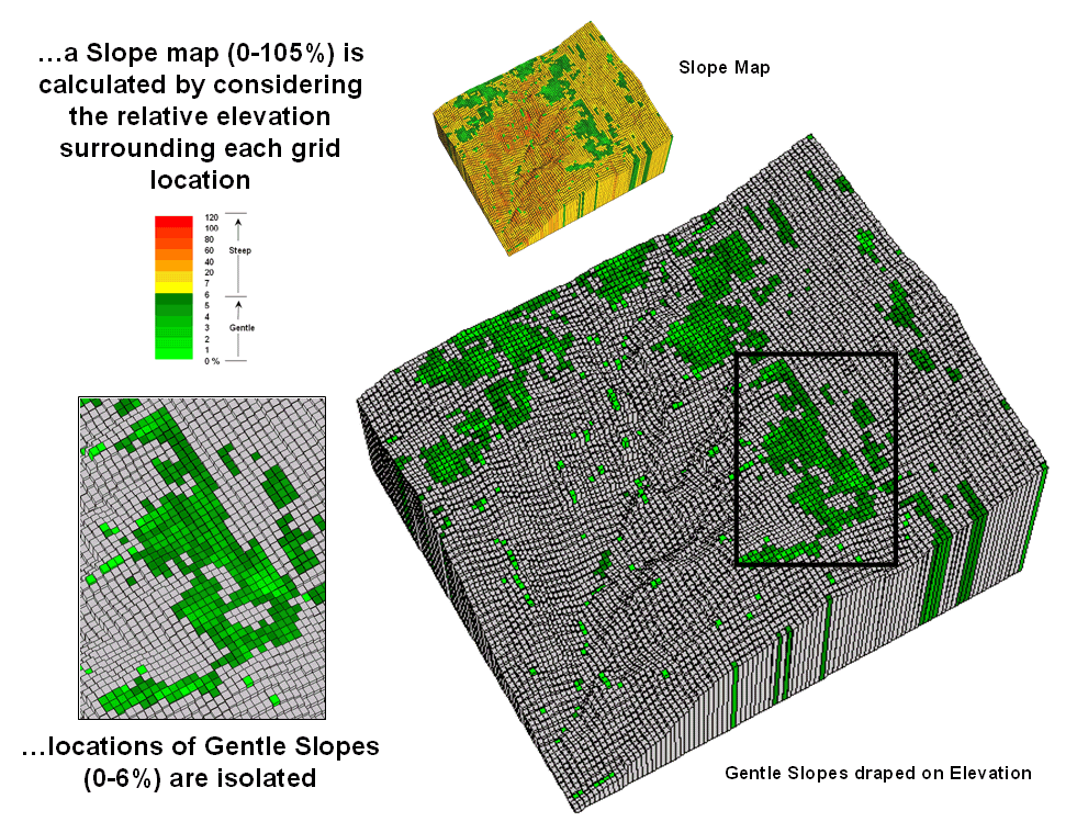
Figure 2.
Slope values for the terrain surface are calculated and gently sloped
areas identified.
Figure 3 identifies the procedure for linking the two criteria. First the flat areas are isolated for a
binary map of 0-6% slope=1 and greater slopes=0. Then an effective distance operation is used
to measure distance away from streams considering just the areas of gentle
slopes. The enlarged inset shows the
result with connected valley bottom as far away as 900 meters.
While the prototype bottoming technique appears to work, several
factors need to be considered before applying it to millions of areas. First is the question whether the 30 meter
DEM data supports the slope calculations.
In figure 2 the horizontal stripping in the slope values suggests that
the elevation data contains some inconsistencies. In addition what type of slope calculation
(average, fitted, maximum, etc) ought to be used? And is the assumption of 0-6% for defining
valley bottoms valid? Should it be more
or less? Does the definition change for
different regions?
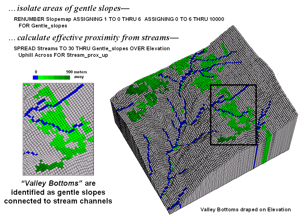
Figure 3.
Valley bottoms are identified as flat areas connected to streams.
Another concern involves the guiding surface used in determining
effective proximity—distance measurement uphill/downhill only or across
slopes? Do intervening soil and vegetation
conditions need to be considered in establishing connectivity? A final consideration is designing a field
methodology for empirically evaluating model results. Is there a strong correlation with riparian
vegetation and/or soil maps?
That’s the fun of scholarly pursuit.
Take a simple idea and grind it to dust in the research crucible—only
the best ideas and solutions survive.
But keep in mind that the major ingredient is a continuous flow of
bright and energetic minds.
_________________
Author's Note:
Sincerest thanks to grad students Jeff Gockley
and Dennis Staley with the University of Denver-Geography for inspiration…the
icing is easy but the pound cake of research awaits.
(Surface Flow
Considerations and Techniques)
Traditional Approaches Can’t Characterize
Overland Flow
(GeoWorld,
November 2003)
Common sense suggests that “water flows downhill” however the corollary
is “…but not always the same way.”
Similarly, overland flow modeling in a
The pipeline industry has been mandated to determine the flows that
would occur if a release were to happen at any location along a pipeline
route—that could be from
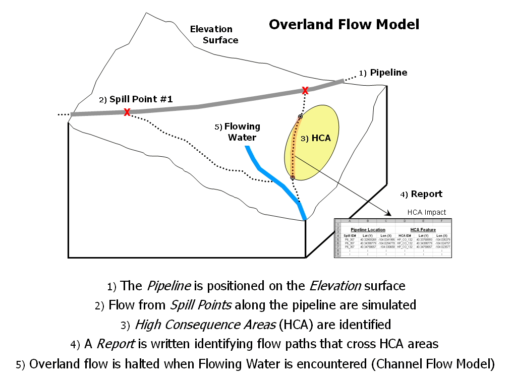
Figure 1.
Spill mitigation for pipelines identifies high consequence areas that
could be impacted if a spill occurs anywhere along a pipeline.
Figure 1 outlines the major steps of an Overland Flow model for
tracking potential spill migration. The
first step positions a pipeline on an elevation surface. Then a spill point along the pipeline is
identified and its overland flow path (downhill) identified. In an iterative fashion, successive spill
points and their paths are identified.
High Consequence Areas (HCAs) are delineated on maps prepared by the
Office of Pipeline Safety. These include
areas such as high population concentrations, drinking water supplies and
critical ecological zones. The HCAs
impacted by individual spills are identified and recorded in a database
table. The final step identifies where
paths enter streams or lakes and passes the information to a Channel Flow module
(subject for future discussion).
The centerline of the pipeline usually is stored as a series of vector
lines in an existing corporate database.
USGS’s National Elevation Data (NED) data set is available for the
entire
Developing a realistic model of overland flow is just as
challenging. Real world flows are
complex and need to consider differences in terrain slopes, product types and
intervening conditions. In addition,
information on the timing and quantity of flow as the path progresses is
invaluable in spill migration planning.
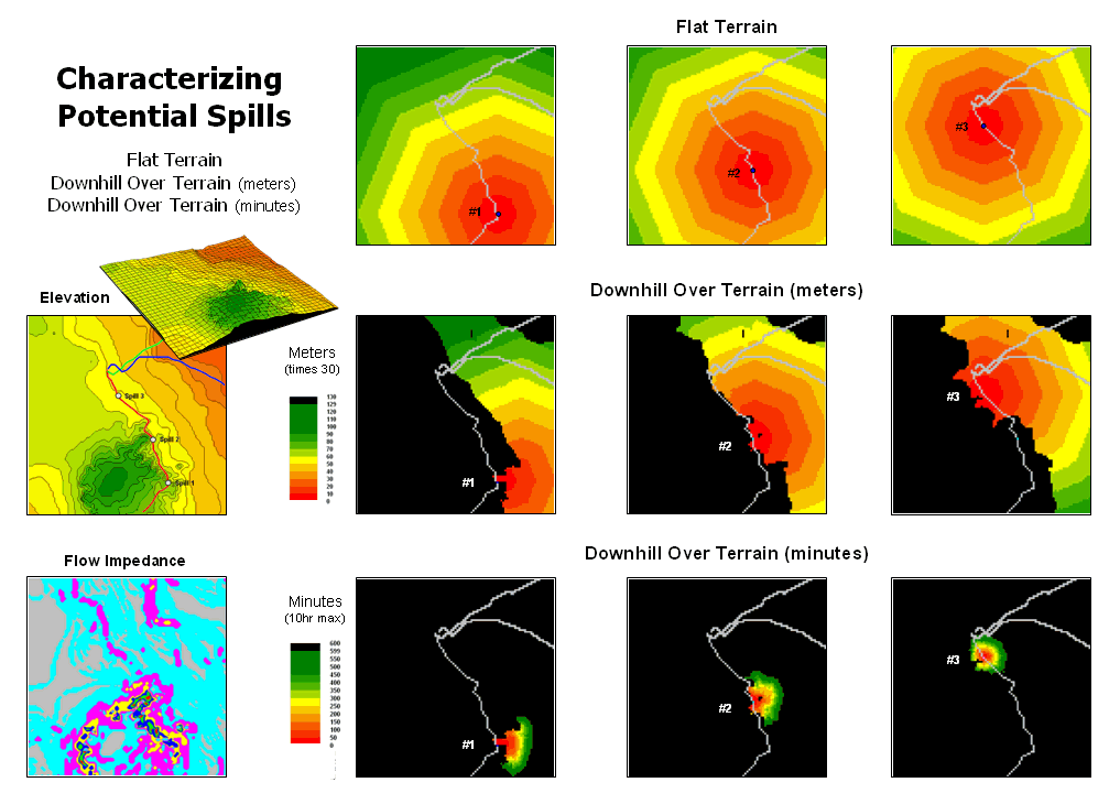
Figure 2.
Overland flow can be characterized as both distance traveled and elapsed
time.
The top portion of figure 2 shows the spill patterns for three
different locations along a pipeline assuming perfectly flat terrain. The jagged edges of the patterns result from
approximating circles through grid-based proximity analysis. The progressively larger rings are analogous
to slowly dripping coffee on your desk …first a small spill, then growing a
little larger and a little larger, etc.
Now let’s add a bit reality. The
middle series of maps identify the elevation surface for the area. The insets on the right show the downhill
locations from each of the three spill points.
The colored bands identify increasing distance with red tones
identifying locations close to a spill.
A final bit of reality recognizes that not all downhill locations
affect flow in the same manner. The Flow
Impedance map at the lower left incorporates the effects of terrain slope
on flow velocity. In flat or gently
sloped areas (<2% slope), flow is gradual and can take several minutes to
traverse a 30 meter cell. In steep
areas, on the other hand, the same distance can take far less than a minute.
This information is taken into account to generate maps at the
bottom-right of figure 2. The results
show a downhill flow “reach” of several hours for the three simulated spill
points. Note that most of the flow
occurs on very gentle slopes (cyan and light grey on the Flow Impedance map) so
progress isn’t very fast or far.
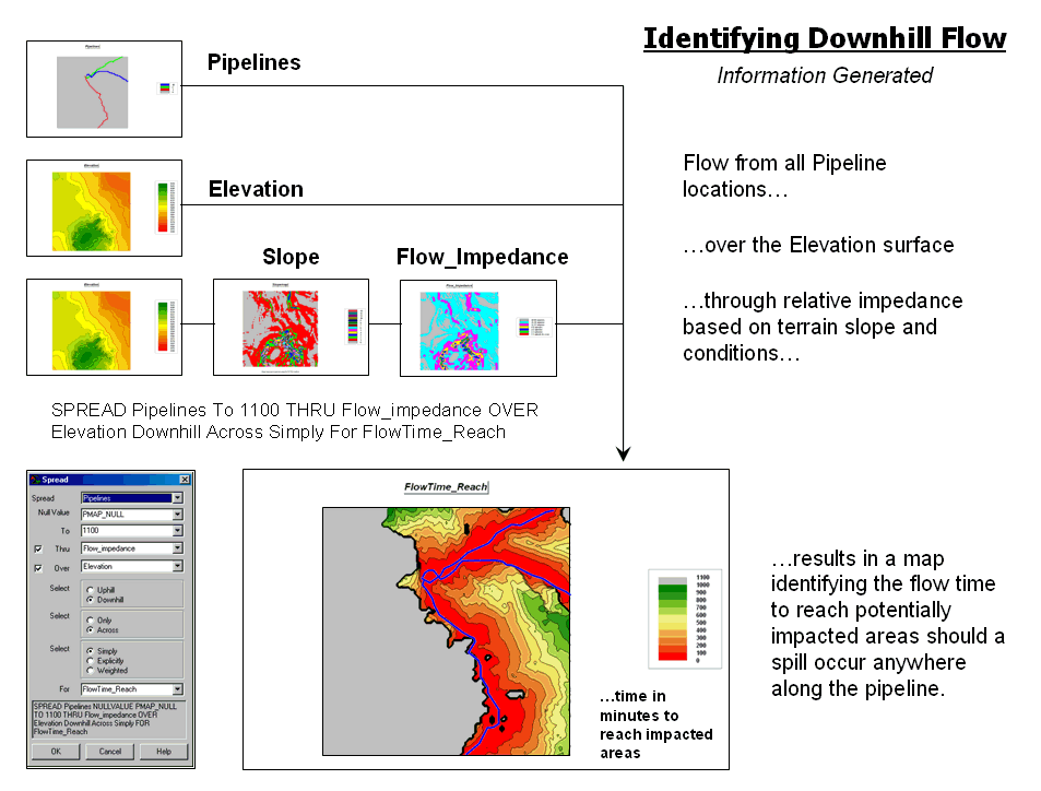
Figure 3. Effective downhill proximity from
a pipeline can be mapped as a variable-width buffer.
Figure 3 depicts the processing flowchart and results for simulating
overland flow from all locations defining the pipeline. The procedure is analogous to tossing a stick
shaped like the pipeline into a pond.
Ripples move outward indicating increasing distance. However in this instance, the waves can’t go
uphill and the shortest elapsed time to reach any location is calculated.
The grey areas on the resultant map identify uphill locations
(infinitely far away). The red tones
identify areas that are relatively close to the pipeline. They progress to green tones identifying
locations that are several hours away.
As we’ll see in the next section, things get even more complex as
various terrain conditions (path, sheet, flat flow and pooling) and product
properties (viscosity, release amount, etc.) come into play. The bottom line is that the traditional
approach of choosing just the steepest downhill path for characterizing
overland flow doesn’t hold water.
Constructing
Realistic Downhill Flows Proves Difficult
(GeoWorld,
December 2003)
The instinct of a herd of rain drops is unwavering. As soon as they hit the ground they start
running downhill as fast as they can.
But not all downhill options are the same. Some slopes are extremely steep and call the
raindrops like a siren. Other choices
are fairly flat and the herd tends to spread out. Depressions in the terrain cause them to
backup and pool until they can break over the lip and start running downhill
again.
In overland flow modeling these conditions are termed path, sheet, flat
and pooling flows. Figure 1 depicts two
downhill paths over a terrain surface that is displayed in its raw form as grid
cells raised to the relative height of their elevation values. A starting point on the surface is identified
and the computer simulates the downhill route.
As shown in the enlarged inset on the right, a location along the path
could potentially flow to any of its neighboring cells. Uphill possibilities with larger elevation
values are immediately eliminated (educated raindrops). The steepest downhill step is determined and
path flow moves to that location. The
process is repeated over and over to identify the steps along the steepest
downhill path.
This procedure works nicely until reality sets in. What happens when a flat
areas are encountered? No longer
is there a single steepest downhill step because all surrounding elevation
values are equal or larger. Obviously
the flow doesn’t stop; it simply spreads out into the flat area. In this instance the algorithm must follow
the raindrop’s lead and incorporate code that continues spreading as shown in
the figure. The “steepest downhill path,
then stop” approach isn’t sufficient.
Nor is a path that simply shoots a straight line across the flat area a
realistic solution.
Figure 1.
Surface flow takes the steepest downhill path whenever possible but
spreads out in flat areas and pools in depressions.
However, realistic flow modeling is even more subtle than that. Areas of very gentle slope but not perfectly
flat tend to exhibit sheet flow and spread out to all of the slight downhill
locations. Figure 2 depicts the different
conditions for path, sheet and flat flow.
Figure 2.
Surface inclination and liquid type determine the type of surface flow—path,
sheet or flat.
The upper-left inset (a) shows the steepest downhill path in areas of
steep terrain. Inset (b) shows the sheet
flow widening to all downhill locations when inclination is slight.
Inset (c) depicts the flow going in all directions on perfectly flat
terrain. As an empirical test, the next
time you are doing the dishes hold a cutting board under the faucet and watch
the water pattern change as you tilt the board from horizontal to steeper
inclinations—flat, sheet then increasingly narrow path flows.
Incorporating sheet flow into the algorithm inserts a test that
determines if the steepest downhill step is less than a specified angle—if so,
then steps to all of the downhill locations are taken. Another confounding condition occurs when
there are equally steep downhill possibilities.
In this instance both steps are taken and the flow path broadens or
splits.
That is the same procedure the computer algorithm uses. It searches the neighboring cells for the
smallest elevation, fills to that level, and then steps to that location. The procedure of filling and stepping is
repeated until the lip of the depression is breached and flow downhill can
resume.
Figure 3.
Pooling of surface flow occurs when depressions are encountered.
By far the trickiest flow for a computer to simulate is pooling. Figure 3 shows a path that seemingly stops
when it reaches a depression. In this
instance, all of the elevation values around it are larger and there are no
downhill or across steps to take. As
more and more raindrops backup in confusion they start filling the
depression. When they reach the height
of the smallest elevation surrounding them they flow into it.
Another possibility is that the quantity of flowing liquid is exhausted
and the path is terminated at a pooling depth that fails to completely fill the
depression. The idea of tracking flow
quantity, as well as elapsed time, along a flow path is an important one,
particularly when modeling pipeline spill migration. That discussion is reserved for the next section.
Use Available Tools to Calculate Flow Time and
Quantity
(GeoWorld, January
2004)
The past couple of sections have investigated overland flow modeling
with a
A fourth type of flow—pooling—occurs when a depression is
encountered. In this instance flow
continues rising until it fills the depression and can proceed further downhill
or the available quantity of liquid is trapped.
The introduction of flow quantity and timing are important concepts in
modeling pipeline spill events. It’s
common sense that a 100 barrel release won’t travel as far as a 1000 barrel
release from the same location.
Similarly, a “gooey” liquid takes longer to flow over a given distance
than a “watery” one.
So how does the computer track retained quantity and elapsed time along
a spill path? Several factors come into
play involving cell size, properties of the liquid, terrain configuration and
intervening conditions. Viscosity and
specific gravity determine the “gooeyness” of flowing liquid and the effective
depth of the flow.
This, plus the steepness of the terrain, determines the amount of
liquid that is retained on the surface at each location. Add an infiltration factor for seepage into
the soil and you have a fairly robust set of flow equations. In mathematical terms, this relationship can
be generalized as—
Quantity Retained = fn
[cellsize, flow depth, slope angle, soil
permeability]
Flow Velocity = fn
[gravitational constant, viscosity, specific gravity, flow depth, slope angle]
Implementing the cascading flow in a
In terms of pipeline spill mitigation, the quantities of jet fuel
(thin) or crude oil (thick) that are retained along a flow path can be
dramatically different. Equally striking
are the differences in quantities that seep into dissimilar soil types. Also, if the spill occurs when the soil is
saturated or frozen, infiltration will be minimal with nearly all of the
quantity continuing along the path.
Coding for all of these contingencies is what makes a spatially-specific
model particularly challenging.
Figure 1.
Overland flow is calculated as a series of time steps traveling downhill
over an elevation surface.
Figure 1 shows the overland flow from a simulated spill. It is a conservative estimate as the
simulation assumes sheet/flat flow at minimal inclinations, no soil
infiltration and an unlimited quantity of liquid. In addition, the flow is measured in units of
time by successively adding the time to cross each grid cell (time= cell length
/ flow velocity) as the flow proceeds.
The lower inset in the figure depicts an animation series of flow
progress in 20 minute time steps. Note
that the simulated release starts in relatively steep terrain of about 6
percent but quickly fans out as more gentle terrain is encountered. The maximum extent within the project area
occurs at the northern portion and is reached in a little over five hours.
Figure 2 compares the flow times for two different liquid types over
the same terrain.
In Mr. Wizard terms, it means if you pour a cup of water on a tilted
cutting board most of it runs off almost instantly. However, if you pour a cup of honey on the
same board it takes much longer to flow down and a relatively larger portion
sticks to the board.
The quantity and velocity equations quantitatively account for these
common sense characteristics of overland flow.
While neither the equations nor the data are perfect, the extension of
the cutting board example to the grid cell element provides a radically new
approach to modeling overland flow.
Figure 2.
Flow velocity is dependent on the type of liquid and the steepness of
the terrain.
Research into the equations has been ongoing for decades. However, in real-world applications the
effects of slope angle could not be adequately modeled until the advent of map
analysis tools and extensive data.
Today, we have seamless elevation data for the contiguous fifty states
(National Elevation Dataset) that can be purchased for about $1500. The pieces are in place—equations, technology
and data—for realistic modeling of overland flow. As we’ll see next in the next section the
same holds for modeling channel flows.
Migration Modeling Determines Spill Effect
(GeoWorld,
February 2004)
Overland flow careens downhill and across flat areas in a relentless
pursuit of beach front property.
Previous discussion has focused on the important factors in the flow
mechanics (path, sheet, flat and pooling) and
major considerations (quantity and velocity) behind the
calculations. The characteristics of the
liquid (viscosity and specific gravity) and the terrain (slope
angle and soil type) are the dominant influences on the velocity of
flow and the quantity retained at each location.
The ability to effectively model overland flow is critical to
understanding the impacts of potential pipeline spills. For example, an Impact Buffer can be
generated that identifies the minimum time for a spill to reach any impacted
location. The process involves
aggregating the results from repeated simulation of release points (left side
of figure 1).
Figure 1.
An Impact Buffer identifies the minimum flow time to reach any location
in the impacted area—areas that are effectively close to the pipeline.
Each spill point generates a path identifying the elapsed time to reach
locations within its impacted area. The
stack of simulated flow maps is searched for the minimum time at each grid
location. The result is an overall map
identifying the effected area (colors from red to
green) comprised of a series of contours estimating how close each location is
in terms of flow time. Such a map can be
invaluable in emergency response planning.
In a similar manner, the individual simulation maps can be summarized
to identify the estimated quantity retained or the portions of the impacted
area that are affected by specific sections of the pipeline. For example, the inset in the figure
identifies the spill numbers for each impacted location (blue for just spill 3;
yellow for spills 2 and 3; red for spills 1, 2, and 3). Such a map can be useful in characterizing
pipeline risk.
Another important component in risk assessment is the occurrence of
high consequence areas within the impacted area. It is like the age old question “If a tree
falls in the forest and no one is around to hear it, does it make a
sound?” If a spill occurs and doesn’t
impact high consequence areas then, while the spill hazard might be great, the risk
is relatively small.
The left side of figure 2 shows the spatial coincidence between the
impacted area and a map identifying the Other Populations
Figure 2.
Identification of High Consequence Areas (HCAs) impacted by a simulated
spill is automatically made when a flow path encounters an
However, overland flow is only part of the total solution. When the path encounters flowing water
entirely different processes take over and the
The first step involves structuring the stream network so each line
segment reflects the flow time it takes to traverse it. In most applications this is calculated as
the flow velocity based on the stream size multiplied times the segment
length. Stationing along the network is
established by beginning at a base point and accumulating flow times for each
vertex moving toward the head waters.
The second step links the overland flow time and remaining quantity to
the entry point in the stream network. In the example in the figure the entry
point time is proportioned between 12.10 and 12.82 hours and set as 12.46 hours
from the base point.
The next step determines the entry and exit times for impacted
The procedure is repeated for all of the impacted
Figure 3. Channel flow identifies the
elapsed time from the entry point of overland flow to high consequence areas
impacted by surface water.
The result of spill migration modeling identifies and characterizes all
of the potentially effected
_________________________