|
Topic 10 – A
Futuristic GIS |
Spatial Reasoning
book |
The Unique Character of Spatial
Analysis — discusses
spatial analysis as deriving new spatial information based on geographic
dependence within and among map variables
Analyzing
Spatial Dependency within a Map — investigates univariate analysis involving
spatial relationships within a single map layer
Analyzing
Spatial Dependency between Maps — Analyzing Spatial Dependency Between Maps — investigates
multivariate analysis involving the coincidence of two or more map layers
<Click
here>
for a printer-friendly version of this
topic (.pdf).
(Back to the Table of Contents)
______________________________
The Unique
Character of Spatial Analysis
(GeoWorld, April 1996)
GIS
mapping and management capabilities are becoming common in the workplace. The mapping revolution will be complete when
most office automation packages offer GIS at the touch of a button. So can the GIS technocrats declare a victory
and fade into a well-deserved (and well appointed) retirement? Is that all there is to GIS (as Peggy Lee
sings)? Or have we merely attained
another milestone along GIS's evolutionary path?
GIS is
often described as a "decision-support tool." Currently most of that support comes from its
data mapping and management (inventory) capabilities. The abilities to geo-query datasets and
generate tabular and graphical renderings of the results are already
recognized; they are invaluable tools but are still basically data handling
operations. It is the ability of GIS to
analyze the data that will eventually revolutionize the way we deal with
spatial information.
The
heart of GIS analysis is the spatial/relational model, which expresses complex
spatial relationships among map entities.
The relationships can be stored in the data structure (topology) or
derived through analysis. For example,
the cascading relationships among river tributaries can be encapsulated within
a dataset. The actual path a rain drop
takes to the sea and the time it takes to get there, however, must be derived
from the data by optimal path analysis.
Derivation techniques like these form the spatial analysis toolbox.
The
term "spatial analysis" has assumed various definitions over time and
discipline. To some, the geoquery for all locations of dense, old Douglas fir
stands from the set of all forest stands is spatial analysis. But to the GIS purist, the inquiry is a
nonspatial database management operation.
It involves manipulating the attribute database and producing a map as
its graphical expression, but it doesn't involve spatial analysis. Spatial analysis, strictly defined, involves
operations in which results depend on data locations-move the data, and the
results change. For example, if you move
a bunch of elk in a park their population center moves, but the average weight
for an elk doesn't. That distinction
identifies the two basic types of geo-referenced measures: spatially dependent
or independent. The population center
calculation is a spatially dependent measurement, and the average weight
considering the entire population is independent. Note that the term "measurement" is
a derived relationship, not a dataset characteristic. Spatial analysis involves deriving new
spatial information, not repackaging existing data.
With
that definition diatribe under your belt, you have one more distinction to
complete the conceptual framework for spatial analysis: derivation mechanics,
whether the data are spatially aggregated or disaggregated. In the elk example, the average weight for
the entire population in the park is spatially independent and aggregated. Spatial patterns can be inferred, however, if
disaggregated analysis is employed by partitioning space into subunits and
calculating independent measures. Such
analysis might reveal that the average weight for an elk is higher in one
portion of the park than it is in another.
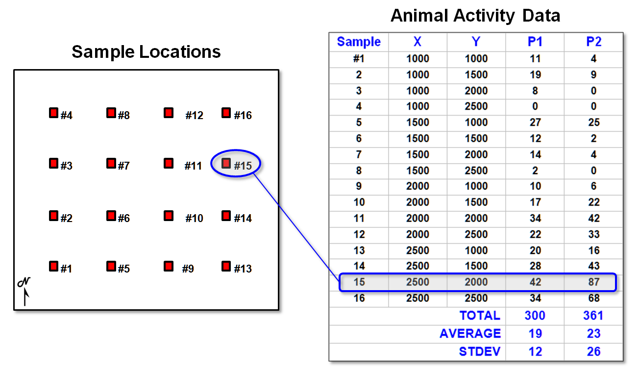
Figure
1. Field data of animal
activity.
These
concepts are illustrated in figure 1.
There are l6 field samples (samples #l-16), their coordinates (X,Y) and the animal activity values for two 24-hour periods
(P1 in June and P2 in August). Note the
varying levels of activity: 1 to 42 for Period I and 0 to 87 for Period 2—
sample location #15 has the highest activity in both periods. Also note that the average animal activity
increased (19 to 23), as well as its variability (12 to 26). These traditional statistics tell us things
have changed, but they fail to tie the changes to the ground.
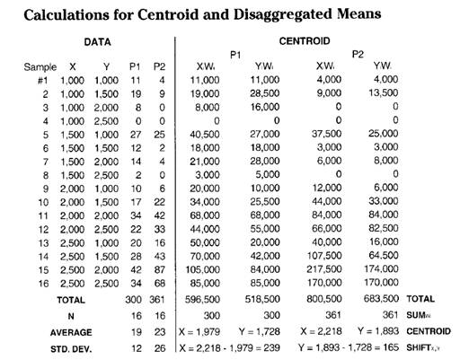
A
simple spatial summary of the data's geographic distribution is its centroid,
calculated as the weighted average of the X and Y coordinates. That's done by multiplying each of the sample
coordinates (Xi,Yi) by the number of animals for a
period at that location (Pi), then dividing the sum of the products by the
total animal activity (SUMXiPi / SUMPi and SUMYiPi
/ SUMPi where i
= 1 to 16). Whew!
The
calculations show the centroid for Period 1 as X = 1,979 and y = 1,728, and it
shifts to X = 2,218 and Y = 1,893 for Period 2.
Because the measure moved, the centroid must involve spatial
analysis. Both periods show a
"displaced centroid" from the geographic center of the project
area. If the data were uniformly or
randomly distributed, the centroid and the geographic center would align. The magnitude of the difference indicates the
degree of the displacement and its direction indicates the orientation of the
shift. Comparing the centroids for the
two periods shows a shift toward the northeast (X = 2,218 - 1,979 = 239 meters
to the east and Y = 1,893 - 728 = 165 meters to the north).
The
centroid identifies the data's "balance point," or centrality. Another technique to characterize the data's
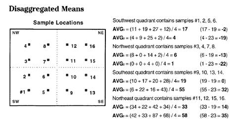
geographic distribution is a table of the spatially disaggregated means. First the study area is partitioned into
quarter-sections, or "quads."
The average for the data within each quad is computed, and then compared
to the average of the entire area. The
calculations show the following:
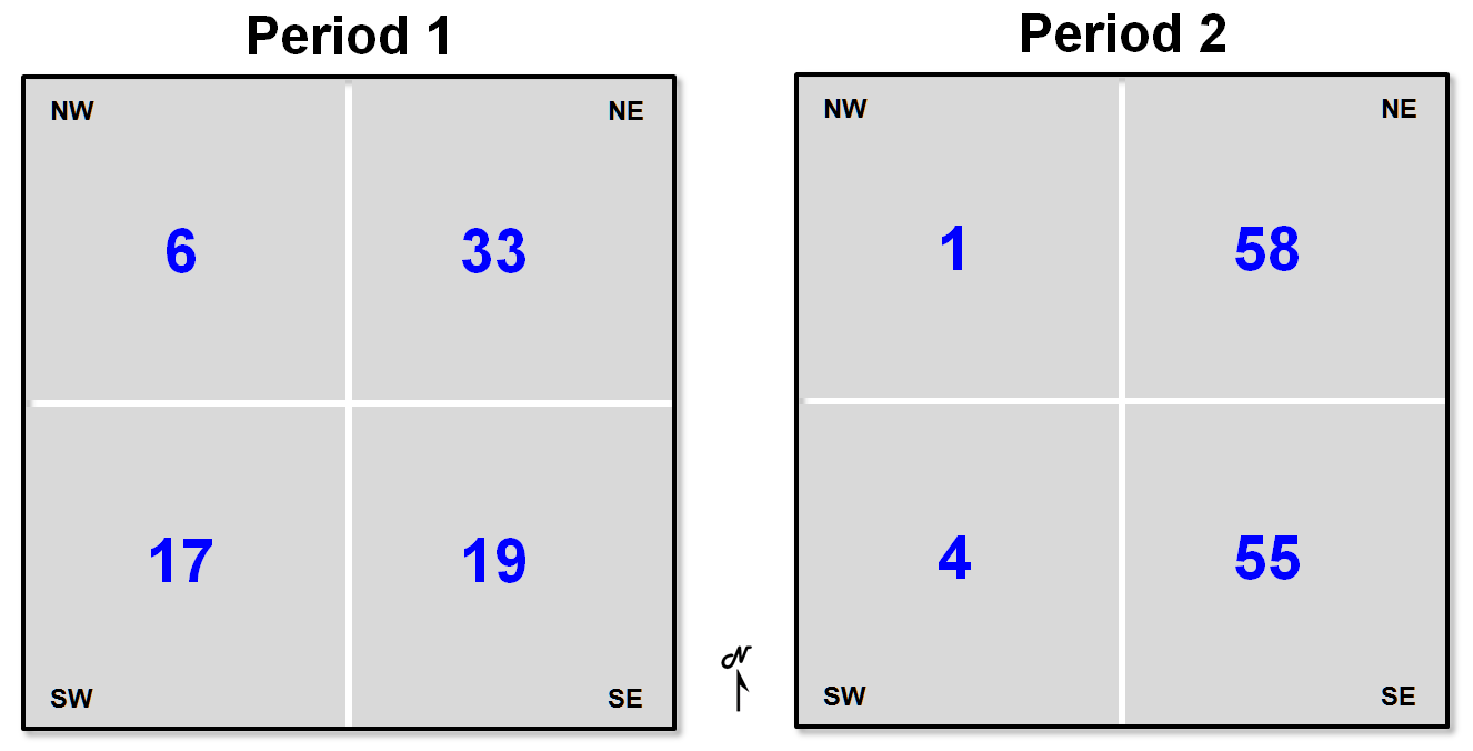
Whew! So what does that tell you (other than
"being digital" with maps is a pain)?
It appears the southeast and northeast quads have consistently high
populations (always above the period averages of 19 and 23), which squares with
the centroid's northeast displacement. Also, the northeast quad consistently has the
greatest overage (33 - 19 = 14 for Pl and 58 - 23 = 35 for P2), and the
southwest quad has the greatest percentage decrease ([(17 - 19) - (4 -23) / (17
- 19)] * 100 = -850%) from the averages for the two time periods.
The
analysis would be even more spatially disaggregated if you were to "quad
the quads," and compute their means.
With this example, however, there would be only one sample point in each
of the 16 subdivisions, and their mean would be meaningless. What if you "quaded
the quaded quads" (8 x 8 = 64 cells)? Most of the partitions wouldn't have a sample
value, so what would you do? That's
where the previous discussions of spatial interpolation (Topic 2) come in to fill the
holes.
The
next section will build on the spatial interpolation surface and fill in a few
of the conceptual holes as well, such as assumptions about spatial dependency,
autocorrelation, and cross-correlation.
Heck, by the time this topic is over, at least you'll have a useful
bunch of intimidating techno-science terms to throw around. If you're really into this stuff, consider
the following calculations for the centroid and disaggregated means.
Analyzing Spatial Dependency within a Map
(GeoWorld, May 1996)
The
previous section identified two measurements that characterize the geographic
distribution of field data: centroid and spatially disaggregated means. Both techniques reduce findings to discrete,
numeric summaries. The centroid's X,Y coordinates
identify the data's balance point, or centrality. The spatially disaggregated means are
expressed in a table of localized averages for an area's successive
quarter-sections. Both techniques reveal
the geographic bias in a dataset, but fail to map the data's continuous
distribution. That's where spatial
interpolation comes in to estimate the characteristics of unsampled locations
from nearby sampled ones.
Consider
the 3-D plot in the center of figure 1.
It identifies a weighted nearest-neighbors interpolated surface of the
geographic distribution for Period 2 animal activity data. Note that the peak in the northeast and the
dip in the northwest are consistent with the centroid and disaggregated means
characterizations discussed in the previous section. With the graphical rendering, however, you
can "see" the subtle fluctuations in animal activity within the
landscape. High activity appears as a
mountain in the northeast and a smaller hill to the south— sort of a two-bumper
distribution.
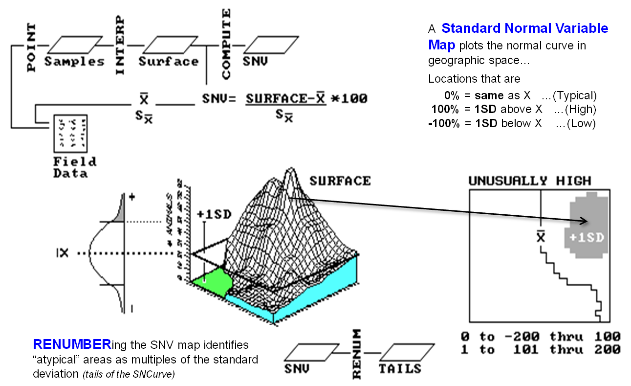
Figure
1. Calculation of Standard
Normal Variable (SNV) map (univariate spatial analysis).
The
surface looks cool and is generally consistent with the bias reported by the
centroid and aggregated means, but is it really a good picture of the
distribution? What are the assumptions
ingrained in spatial interpolation? How
well do they hold in this case? That
brings us to the concept of spatial dependence— what occurs at one location
depends on the characteristics of nearby locations, and near things tend to be
more related than distant things.
Spatial dependence can be negative (near things are less alike) or
positive (near things are more similar).
But common sense and most interpolation techniques are based on positive
spatial dependence.
That
implies a measure of spatial dependence within a dataset should provide insight
into how well spatial interpolation might perform. Such a measure is termed "spatial
autocorrelation." For the
techy-types, autocorrelation (in a nonspatial statistics context) means
residuals tend to occur as clumps of adjacent deviations on the same side of a
regression line— a bunch above, then a bunch below (high autocorrelation),
which is a radically different situation than every other residual alternating
above then below (low autocorrelation).
For the rest of us, it simply means how good one sample is at predicting
a similar sample (or a near sample in GIS's case).
It
shouldn't take a rocket scientist to figure out that high spatial autocorrelation
in a set of sample data should yield good interpolated results. Low autocorrelation should lower your faith
in the results. Two measures often are
used: the Geary index and the Moran index.
The Geary index compares the
squared differences in value between neighboring samples with the overall
variance in values among all samples.
The Moran index is calculated
similarly, except it's based on the product of values.
The
equations have lots of subscripts and summation signs and their mathematical
details are beyond the scope of this discussion, but both indices relate
neighboring responses to typical variations in the dataset. If neighbors tend to be similar, yet there's
a fairly high variability throughout the data, spatial dependency is rampant. If the neighbors tend to be just as
dissimilar as the rest of the data, there isn't much hope for spatial
interpolation.
Yep,
this is techy stuff, and I bet you're about to turn the page. But hold on!
This stuff is important if you intend to go beyond mapping or
data-painting by the numbers.
In a
modern GIS, you can click the spatial interpolation button and generate a map
from field data in a few milliseconds.
But you could be on thin ice if you simply assume it's correct— ask
Geary or Moran if it's worth generating a Standard Normal Variable (SNV) map
(the tremendously useful map shown on the right side of figure l) to identify
statistically unusual locations. The
procedure calculates a normalized difference from the average for each interpolated
location, effectively mapping the standard normal curve in geographic
space. The planimetric plot in the
figure identifies areas of unusually high animal activity (shaded blob in the
extreme northeast) as locations that are one or more standard deviations
greater than the average (depicted as the line balancing the surface's
volume).
So
what? Rather, so where! If your data show lead concentrations in the
soil instead of animal activity, you can identify areas of significantly high
lead levels. Or, if your data indicate
lead concentration in blood samples, you can identify pockets of potentially
sick people. If your data are monthly
purchases by customers, you can see where the big spenders live. The SNV map directs your attention to unusual
areas in space. The next step is to
relate such unusual areas to other mapped variables.
But
that step takes us into another arena-from univariate to multivariate spatial
analysis. Univariate analysis
characterizes the relationships within a single mapped variable, such as an SNV
that locates statistically unusual areas.
Multivariate analysis, however, uses the coincidence among maps to build
relationships among sets of mapped data.
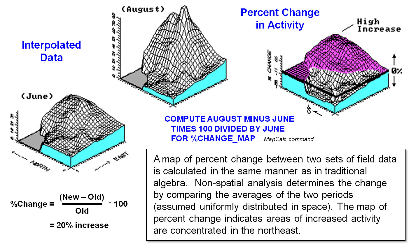
Figure
2. Calculation of percent change map
(multivariate spatial analysis).
For
example, figure 2 calculates a percent-change map between the two periods. The planimetric plot in the figure shows areas
of increased activity in l0 percent contour steps. The shaded area identifies locations that
increased more than 50 percent. Now if
these were sales data, wouldn't you like to know where the big increases
recently occurred? Even better,
statistically relate these areas to other factors, such as advertising coverages, demographics, or whatever else you might try as
a driving or correlated factor. But that
discussion is for the next section.
Analyzing Spatial Dependency between Maps
(GeoWorld, June 1996)
Most
traditional mathematical and statistical procedures extend directly into
spatial analysis. At one extreme, GIS is
simply a convenient organizational scheme for tracking important
variables. With geo-referenced data
hooked to a spreadsheet or database, drab tabular reports can be displayed as
colorful maps. At another level,
geo-referencing serves to guide the map-ematical
processing of delineated areas, such as total amount of pesticide applied in
each state's watersheds. Finally,
spatial relationships themselves can form the basis for extending traditional
math/stat concepts.
The top
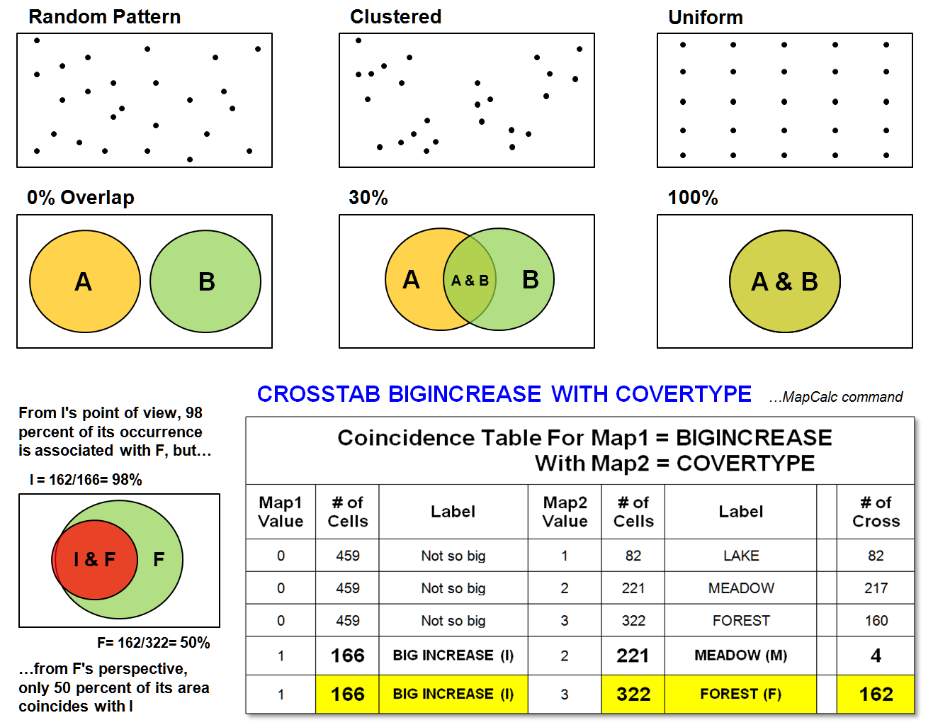
portion of figure 1 identifies a unique spatial operation: point pattern
analysis. The random pattern is used as
a standard that assumes all points are located independently and are equally
likely to occur anywhere. The average
distance between neighboring points under the random condition is based on the density of points per unit area: 1 / ((2
* density)**2), to be exact. Now suppose you record the locations for a
set of objects (e.g., trees), or events (e.g., robberies) to determine if they
form a random pattern. The GIS computes
the actual distance between each point and its nearest neighbor, then averages
the distances. If the computed average
is close to the random statistic, randomness is indicated. If the computed average is smaller, a clumped
pattern is evident. And if it approaches
the maximum average distance possible for a given density, the pattern occurs
uniformly.
An
alternate approach involves a roving window, or filter. It uses disaggregated spatial analysis as it
moves about the map calculating the number of points at each position. Because the window's size is constant, the
number of points about each location indicates the relative frequency of point
occurrence. A slight change in the
algorithm generates the average distance between neighboring points and
compares it to the expected distance for a random pattern of an equal number of
points within the window. Whew! The result is a surface with values
indicating the relative level of randomness throughout the mapped area.
Figure
1. Pattern and
cross-correlation analysis.
The
distinction between the randomness statistic for the entire area and the
randomness surface is important. It highlights
two dominant perspectives in statistical analysis of mapped data: spatial
statistics and geostatistics. Generally, spatial statistics involves
discrete space and a set of predefined objects, or entities. In contrast, geostatistics
involves continuous space and a gradient of relative responses, or fields. Although the distinction isn't sharp and the
terms are frequently interchanged, it generally reflects data structure
preferences-vector for entities and raster for fields.
The
center and lower portions of figure 1 demonstrate a different aspect of spatial
analysis: multivariate analysis. The
point pattern analysis is univariate, because it investigates spatial
relationships within a single variable (map).
Multivariate analysis, however, characterizes the relationships between
variables. For example, if you overlay a
couple of maps on a light-table, two features (A and B in the figure) might not
align (0 percent overlap). Or the two
features could be totally coincident (100 percent overlap). In either case, spatial dependency might be
at the root of the alignment. If two
conditions never occur jointly in space (e.g., open water and Douglas fir
trees), a strong negative spatial correlation is implied. If they always occur together (spruce budworm
infestation and spruce trees), a strong positive relationship is indicated.
What
commonly occurs is some intermediate coincidence, as there would be some
natural overlap even from random placement: if there are only two features and
they each occupy half of the mapped area, you would expect a 50 percent random
overlap. Deviation from the expected
overlap indicates spatial cross-correlation, or dependency between maps, but
two conditions keep the concept of spatial cross-correlation from being that
simple. First, instances of individual
map features are discrete and rarely occur often enough for smooth
distribution. Also, the multitude of
features on most maps results in an overwhelmingly complex table of
statistics.
Recall
the plot of "big increase" in animal activity (>50 percent change
between Period 1 and Period 2) previously discussed. It was a large shaded glob in the
northeastern corner of the study area. I
wonder if the occurrence of the big increase relates to another mapped
variable, such as cover type. The
crosstab table at the bottom of figure 1 summarizes the joint occurrences in
the area of Big Increase and cover type classes of Lake, Meadow, and
Forest. The last column in the table
reports the number of grid cells containing both conditions identified on the
table's rows. Note that Big Increase
jointly occurs with Meadows only four times, and it occurs 162 times with
Forests. It never occurs with Lakes.
(That's fortuitous, because the animal can't swim.) A gut interpretation is that they are
"dancing in the woods," as the Big Increase (I) is concentrated in
the Forest (F).
But can
you jump to that conclusion? The cell
count has to be adjusted for the overall frequency of occurrence. The diagram to the left of the table illustrates
this concept. From I's point of view, 98
percent of its occurrence is associated with F.
But from F's perspective, only 50 percent of its area coincides with I. Aaaaahhhh! All this statistical mumble jumble seems to cloud the
obvious.
That's
the trouble with being digital with maps.
The traditional mapping community tends to see maps as
sets of colorful objects, while the statistics community tends to ignore
(or assume away) spatial dependency. GIS
is posed to shatter that barrier. As a
catalyst for communication, consider figure 2.
It identifies several examples of statistical techniques grouped by the
Descriptive/Predictive and Univariate/Multivariate dimensions of the
statistician and the Discrete/continuous dimension of the GIS’er. At a minimum, the figure should generate
thought, discussion, and constructive dialogue about the spatial analysis
revolution.
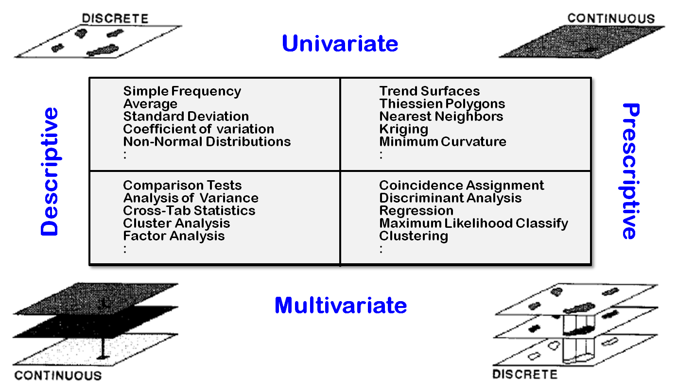
Figure
2. Dimensions of spatial statistics.
One
thing is certain: GIS is more different from than it is similar to traditional
mapping and data analysis. Many of the
map-ematical tools are direct conversions of existing
scalar procedures. Sure you can take the
second derivative of an elevation surface, but why would you want to? Who in their right mind would raise one map
to the power of another? Is map
regression valid? What about spatial
cluster analysis? How would you use such
techniques? What new insights do they
provide? What are the restrictive and
enabling conditions?
Another
thing is certain: GIS raises as many questions as it answers. As we move beyond mapping toward spatial
reasoning, the linkage between the spatial and quantitative communities will
strengthen. Both perspectives will
benefit from realistic physical and conceptual renderings of geographic
space. But the linkage must be extended
to include the user. The increasing
complexity of GIS results from its realistic depiction of spatial
relationships. Its descriptions of space
are vivid and intuitive. Its analyses,
however, can be confusing and foreign to new users. The outcome of the pending spatial analysis
revolution hinges as much on users' acceptance as on technological development.
_____________________
(Back
to the Table of Contents)