Beyond Mapping III
|
Map
Analysis book with companion CD-ROM
for hands-on exercises and further reading |
Grids and Lattices Build Visualizations — describes
Lattice and Grid forms of map surface display
Maps Are Numbers First, Pictures Later — discusses
the numeric and geographic characteristics of map values
Contour Lines versus Color Gradients for
Displaying Spatial Information
— discusses the
similarities and differences between discrete contour line and continuous
gradient procedures for visualizing map surfaces
Setting a Place at the Table for Grid-based
Data — describes the
differences between individual file and table storage approaches
VtoR and Back! — describes
various techniques for converting between vector and raster data types
Normalizing Maps for Data Analysis — describes
map normalization and data exchange with other software packages
Comparing Apples and Oranges — describes
a Standard Normal Variable (SNV) procedure for normalizing maps for comparison
Correlating Maps and a Numerical Mindset — describes
a Spatially Localized Correlation procedure for
mapping the mutual relationship between two map variables
Multiple Methods Help Organize Raster Data — discusses
different approaches to storing raster data
Use Mapping “Art” to Visualize Values — describes
procedures for generating contour maps
What’s Missing
in Mapping? — discusses the
need for identifying data dispersion as well as average in Thematic Mapping
Note: The processing and figures discussed in this topic were derived using MapCalcTM
software. See www.innovativegis.com to download a
free MapCalc Learner version with tutorial materials for classroom and
self-learning map analysis concepts and procedures.
<Click here>
right-click to download a printer-friendly version of this topic (.pdf).
(Back to the Table of Contents)
______________________________
Grids and
Lattices Build Visualizations
(GeoWorld, July 2002, pg. 26-27)
For thousands of years, points, lines and polygons have been used to depict map features. With the stroke of a pen a cartographer could outline a continent, delineate a highway or identify a specific building’s location. With the advent of the computer, manual drafting of these data has been replaced by the cold steel of the plotter.
In digital form these spatial data have been linked to attribute tables that describe characteristics and conditions of the map features. Desktop mapping exploits this linkage to provide tremendously useful database management procedures, such as address matching, geo-query and routing. Vector-based data forms the foundation of these techniques and directly builds on our historical perspective of maps and map analysis.
Grid-based data, on the other hand, is a relatively new way to describe geographic space and its relationships. Weather maps, identifying temperature and barometric pressure gradients, were an early application of this new data form. In the 1950s computers began analyzing weather station data to automatically draft maps of areas of specific temperature and pressure conditions. At the heart of this procedure is a new map feature that extends traditional points, lines and polygons (discrete objects) to continuous surfaces.
Figure 1. Grid-based data can be
displayed in 2D/3D lattice or grid forms.
The rolling hills and valleys in our everyday world is a good example of a geographic surface. The elevation values constantly change as you move from one place to another forming a continuous spatial gradient. The left-side of figure 1 shows the grid data structure and a sub-set of values used to depict the terrain surface shown on the right-side.
Grid data are stored as an organized set of values in a matrix that is geo-registered over the terrain. Each grid cell identifies a specific location and contains a map value representing its average elevation. For example, the grid cell in the lower-right corner of the map is 1800 feet above sea level. The relative heights of surrounding elevation values characterize the undulating terrain of the area.
Two basic approaches can be used to display this
information—lattice and grid. The lattice
display form uses lines to convey surface configuration. The contour lines in the 2D version identify
the breakpoints for equal intervals of increasing elevation. In the 3D version the intersections of the
lines are “pushed-up” to the relative height of the elevation value stored for
each location. The grid display form uses
cells to convey surface configuration.
The 2D version simply fills each cell with the contour interval color,
while the 3D version pushes up each cell to its relative height.
The right-side of figure 2 shows a close-up of the data matrix of the project area. The elevation values are tied to specific X,Y coordinates (shown as yellow dots). Grid display techniques assume the elevation values are centered within each grid space defining the data matrix (solid back lines). A 2D grid display checks the elevation at each cell then assigns the color of the appropriate contour interval.
Figure 2. Contour lines are delineated by
connecting interpolated points of constant elevation along the lattice frame.
Lattice display techniques, on the other hand, assume the values are positioned at the intersection of the lines defining the reference frame (dotted red lines). Note that the “extent” (outside edge of the entire area) of the two reference frames is off by a half-cell*. Contour lines are delineated by calculating where each line crosses the reference frame (red X’s) then these points are connected by straight lines and smoothed. In the left-inset of the figure note that the intersection for the 1900 contour line is about half-way between the 1843 and 1943 values and nearly on top of the 1894 value.
Figure 3 shows how 3D plots are generated. Placing the viewpoint at different look-angles and distances creates different perspectives of the reference frame. For a 3D grid display entire cells are pushed to the relative height of their map values. The grid cells retain their projected shape forming blocky extruded columns.
Figure 3. 3D display “pushes-up” the grid
or lattice reference frame to the relative height of the stored map values.
3D lattice display pushes up each intersection node to its relative height. In doing so the four lines connected to it are stretched proportionally. The result is a smooth wireframe that expands and contracts with the rolling hills and valleys. Generally speaking, lattice displays create more pleasing maps and knock-your-socks-off graphics when you spin and twist the plots. However, grid displays provide a more honest picture of the underlying mapped data—a chunky matrix of stored values.
____________________
Author's Note: Be forewarned that the alignment difference
between grid and lattice reference frames is a frequent source of registration
error when one “blindly” imports a set of grid layers from a variety of
sources.
Contour Lines versus Color Gradients for
Displaying Spatial Information
(GeoWorld, November 2012)
In mapping, there are historically three fundamental map features—points,
lines and areas (also referred to as polygons or regions)—that
partition space into discrete spatial objects (discontinuous).
When assembled into a composite visualization, the set of individual objects
are analogous to arranging the polygonal pieces in a jigsaw puzzle and then
overlaying the point and line features to form a traditional map display. In paper and electronic form, each separate
and distinct spatial object is stored, processed and displayed
individually.
By definition line features are constructed by connecting two or more
data points. Contour lines are a form of displaying information
that have been used for many years and are a particularly interesting case when
displaying information in the computer age.
They represent a special type of spatial object in that they connect
data points of equal value. A contour map is typically composed of a set
of contour lines with intervening spaces generally referred to as contour
intervals.
In general usage, the word “line” in the term “contour line” has been
occasionally dropped, resulting in the ill-defined terms of “contour” for an
individual contour line and “contours” for a set of contour lines or contour
intervals depending on whether your focus is on the lines or the intervening
areas.
The underlying concept is that contour lines are lines that are
separate and distinct spatial objects that connect data points of equal value
and are displayed as lines to convey this information to the viewer. Historically these values represented changes
in elevation to generate a contour map of a landscape’s undulating terrain,
formally termed topographical relief.
Today, contour lines showing equal data values at various data levels
are used to represent a broad array of spatial data from environmental factors
(e.g., climatic temperature/pressure, air pollution concentrations) to social
factors (e.g., population density, crime rates) to business intelligence (e.g.,
customer concentration, sales activity).
Within these contexts, the traditional mapping focus has been extended
into the more general field of data visualization.
With the advent of the computer age and the associated increased processing
power of the computer, a fourth type of fundamental map feature has emerged—surfaces—an
uninterrupted gradient (continuous). This perspective views space
as a continuously changing variable analogous to a magnetic field without
interruption of discrete spatial object boundaries. In electronic form, a
continuous surface is commonly stored as two-dimensional matrix (x,y) with a data value (z) at each
grid location. These data are often displayed as a 3-dimentional surface
with the x,y-coordinates orienting
the visualization plane in space and the z-value determining the relative
height above the plane.
In general, a 2-dimensional rendering of surface data can be
constructed two ways—using a continuous color gradient or by generating
a set of contour lines connecting points of equal data value (see figure
1).
As shown in the figure, the color gradient uses a continuum of colors
to display the varying data across the surface. The contour line display, on the other hand,
utilizes lines to approximate the surface information.
Contour intervals can be filled with a color or can be displayed as a solid background (left-side of figure 1). For displays of contour lines, the lines convey the information to the view as a set of lines of constant values. The contour intervals do not have constant values as they depict a range values.
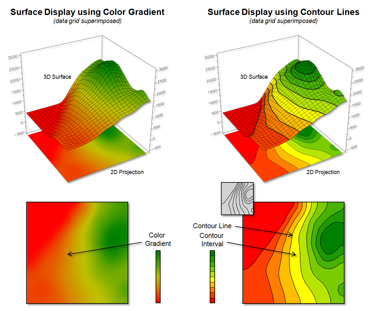
Figure 1. Surface displays using Contour Lines and
Color Gradient techniques.
Figure 2 shows some of the visual differences in the two types of display approaches. The top portion of the figure depicts the positioning (Data Points) and storage of the spatial information (Data Values) that characterize surface data. A reference grid is established and the data points are positioned at specific x,y-locations within the reference grid. This arrangement is stored as a matrix of data values in a computer with a single value corresponding to each grid cell. Both contour lines and continuous color gradient displays use this basic data structure to store surface data.
Differences between the two approaches arise, however, in how the data is processed to create a display and, ultimately, how the information is displayed and visualized. Typically, color gradient displays are generated by assigning a color from a continuous spectrum to each grid cell based on the magnitude of the data value (lower left side of figure 2). For example, the 1843 value is assigned light green along the continuous red to green color spectrum. The color-fill procedure is repeated for all of the other grid spaces resulting in a continuous color gradient over an entire mapped area thereby characterizing the relative magnitudes of the surface values.
Contour line displays, on the other hand,
require specialized software to calculate lines of equal data value and, thus,
a visualization of a surface (right side of figure 2). Since the stored
data values in the matrix do not form adjoining data that are of a constant
data value, they cannot be directly connected as contour lines.
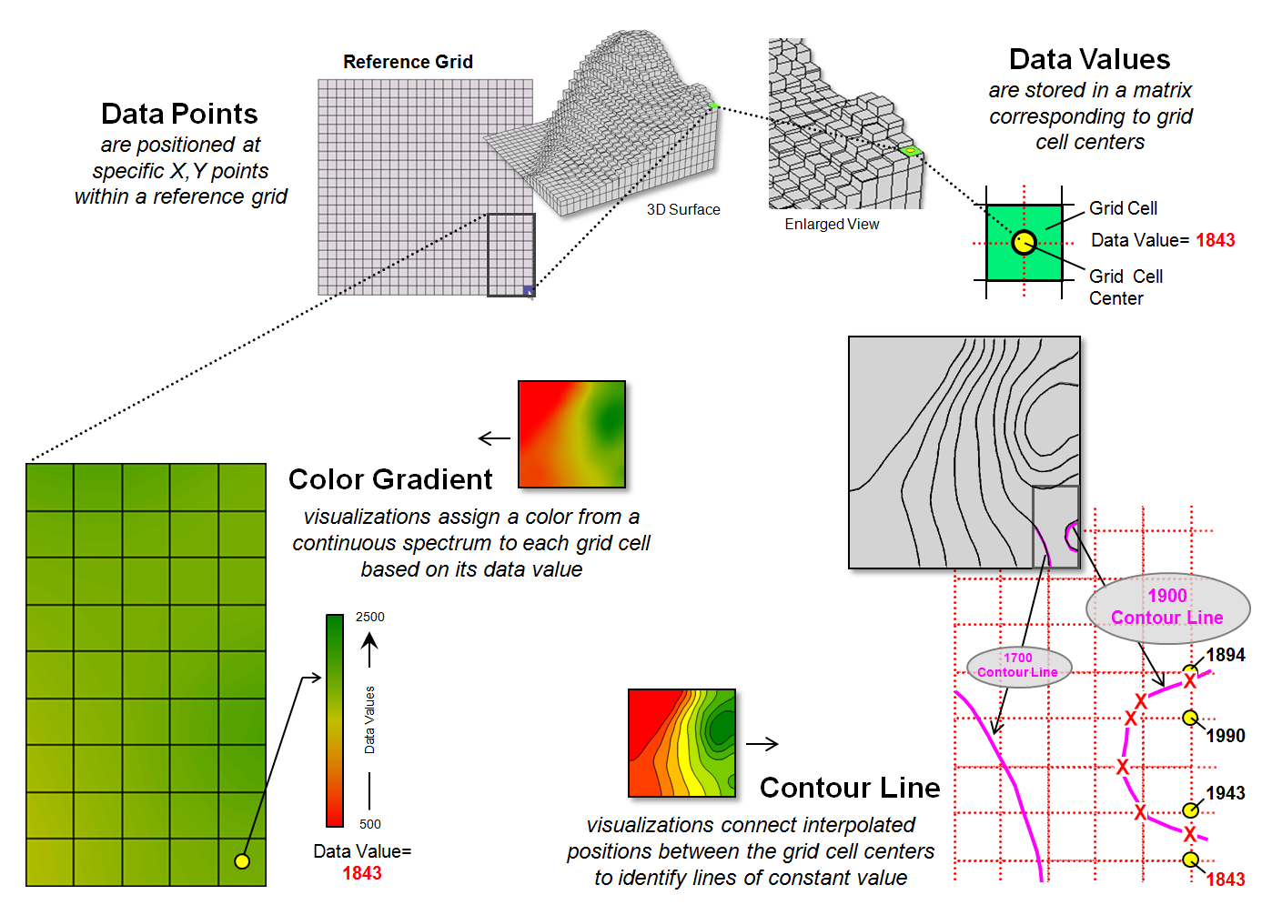
Figure 2. Procedures for creating surface displays
using Color Gradient and Contour Line techniques.
For example, the derivation of a “1900 value”
contour line involves interpolating the implied data point locations for the
line from the centers of the actual gridded data as shown in the figure. The two data values of 1843 to 1943 in the
extreme lower right portion of the reference grid bracket the 1900 value. Since the 1900 value is slightly closer to
1943, an x,y-point is
positioned slightly closer to the 1943 grid cell. Similarly, the data bracket for the 1990 and
1894 grid cells position a point very close to the 1894 cell. The procedure is repeated for all data values
that bracket the desired 1900 contour line value, resulting in a series of
derived x,y-points that are
then connected and displayed as a constant line that represents “1900”.
Figure 3 illustrates fundamental differences
between the color gradient and contour line data visualization techniques. The left side of the figure identifies the
data values defining the surface that contain the 1900 contour line discussed
above. Note that these values are not
constant and vary considerably from 1894 to 1994, so they cannot be directly
connected to form a contour line at constant value.
While the “lumpy bumpy” nature of a continuous
data surface accurately portrays subtle differences in a surface, it has to be
generalized to derive a contour line connecting points of constant data
value. The right side of the figure
portrays the contour line floating at a fixed height of 1900 (note: the pink
“1900 line” is somewhat enhanced to see it better).
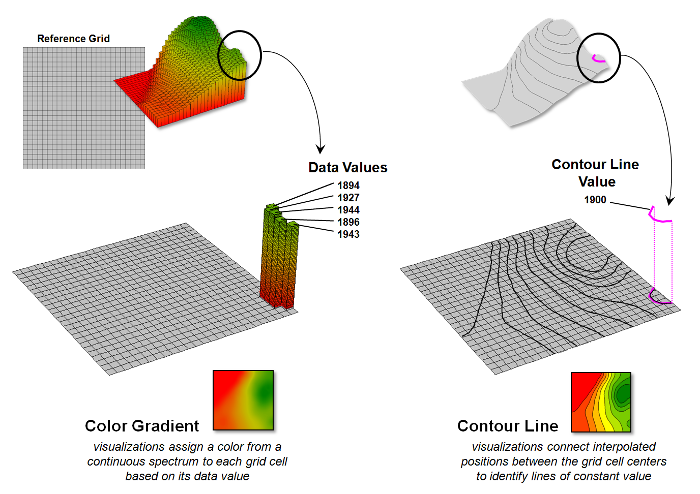
Figure 3. The x,y-coordinates
position surface information that can be displayed as continuously varying grid
cells of relative z-value heights (color gradient display) or as derived lines
of constant value (contour line display).
So what is the take-home from all this
discussion? First, surface data
(continuous) and contour lines (discontinuous) are not the same in either
theory or practice but are fundamentally different spatial expressions. A continuous color gradient is effective when
the underlying surface is a mathematical model or where the interval between
physical measurements is very small. In
these cases, the continuous color gradient is limited only by the resolution of
the display device.
Contour lines, on the other hand, are effective
to display coarse data. A contour line
display creates a series of lines at constant values that somewhat
“approximate” the gradient and provide the viewer with points of equal value
that serve as references for the changing surface.
For example, if a mountain region of Colorado
has elevation measurements taken every 100 feet, it would be impossible to
display the elevation of each individual square inch. In this scenario, a series of contour lines
describes the elevations in the region, with the understanding that the contour
lines are neither precise nor capture small bumps or depressions that occur
between the 100 foot measurements. If
more detailed measurements are taken, contour lines can be drawn closer
together, thus depicting greater detail of the underlying surface.
However, drawing contour lines close together
is ultimately limited both visually and computationally. When contour lines are too close together,
the lines themselves obscure the map, creating a useless blur. In addition, the processing time required to
compute and display a large number of contour lines renders the method
impractical.
This illustrates the beauty of the continuous
color gradient and contour line techniques—they are not same, hence they have
unique advantages and limitations that provide different data visualization
footholds for different spatial applications.
Setting a Place at the Table for
Grid-based Data
(GeoWorld, June 2013)
First the bad news—spatial data structure, formats and storage schemes
tend to be a deep dive into a quagmire of minutia from which few return. The good news is that is the realm of vector
data and this month’s journey is into the Land of Grids where things are quite
regular and straight forward (for the most part).
At its conceptual foundation, grid-based map data is simply a matrix of
values with a specified number of rows and columns (configuration) that
is referenced to a specific location on the earth’s surface (geo-registered). It’s as if you tore out a spreadsheet and
stretched and tugged until its rectangular boxes
formed squares (grid cell) to cover a portion of the landscape. The value assigned to each grid summarizes
the characteristic or condition of a spatial variable (map layer) at
that location. Additional aligned
worksheets piled on top (map stack) describe other important
geographically-based variables—just a stack of numbers towering over a continuous
set of regularly-spaced grid cells (analysis frame) depicting what
occurs at every location throughout an area (see author’s note 1).
There are no differing types of map features, irregular shapes, missing
puzzle pieces, complex topology about neighboring pieces, overlapping borders,
serially linked files or other confounding concepts to wade through. It is just a set of organized grid cells
containing information about every location.
The only major difference in storage approaches is whether the matrices
are stored as individual “files” or as a “table.”
Figure 1 depicts the data organization for Esri’s
Grid ASCII export format as a single independent “file.” The first six records in the file identify
the geo-registration and configuration information (bottom left-side of the
figure). Note that the geo-registration
is identified in decimal degrees of latitude and longitude for the lower-left
corner of the matrix. The configuration
is identified as the number of columns and rows with a specified cell size that
defines the matrix. In addition a “no
data” value is set to indicate locations that will be excluded from
processing.
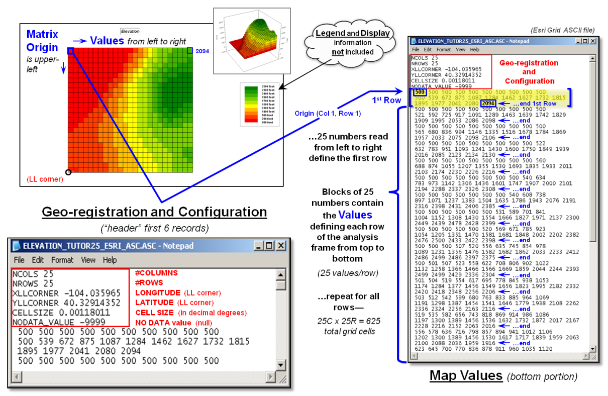
Figure 1. Storing grid maps as
independent files is a simple and flexible approach that has been used for
years.
The remainder of the grid map file contains blocks of values defining
individual rows of the analysis frame that are read left to right, top to the
bottom, as you would read a book. In the
example, each row is stored as a block of 25 values that extends for 25 blocks
for a total of 625 values. In a typical
computer, the values are stored as double-precision (64 bit) floating point
numbers which provides a range of approximately 10−308
to 10308 (really small to really big numbers) capable of handling just about
any map-ematical equation.
Each grid map is stored as a separate file and in the export format no
legend or display information is provided.
However in native ArcGIS grid format, this ancillary information is
carried and individual grid maps can be clipped, adjusted and resized to form a
consistent map stack for analysis stored as a group of individual flat files.
Figure 2 illustrates the alternative “table” format for
storing grid-based mapped data. In the
table, each grid layer is stored as a separate column (field) with their common
grid cell locations identified as an informational line (records). Each line in the table identifies all of the
spatial information for a given grid location in a project area. In the example, strings of 25 values in a
column define rows in the matrix read left to right. However in this example, the matrix origin
and the geo-registration origin align and the matrix rows are read from the
bottom row up to the top. The assignment
of the matrix origin is primarily a reflection of a software developer’s background—lower-left
for science types and upper-left for programmer types. Configuration information, such as 99.94 feet
for the cell size, is stored as header lines while the geo-registration of a
grid cell’s centroid can be explicitly stored as shown or implicitly inferred
by a map value’s position (line#) in the string of numbers. When map-ematical
analysis creates a new map its string of map values is added to the table as a
new column instead of being stored in an individual file.
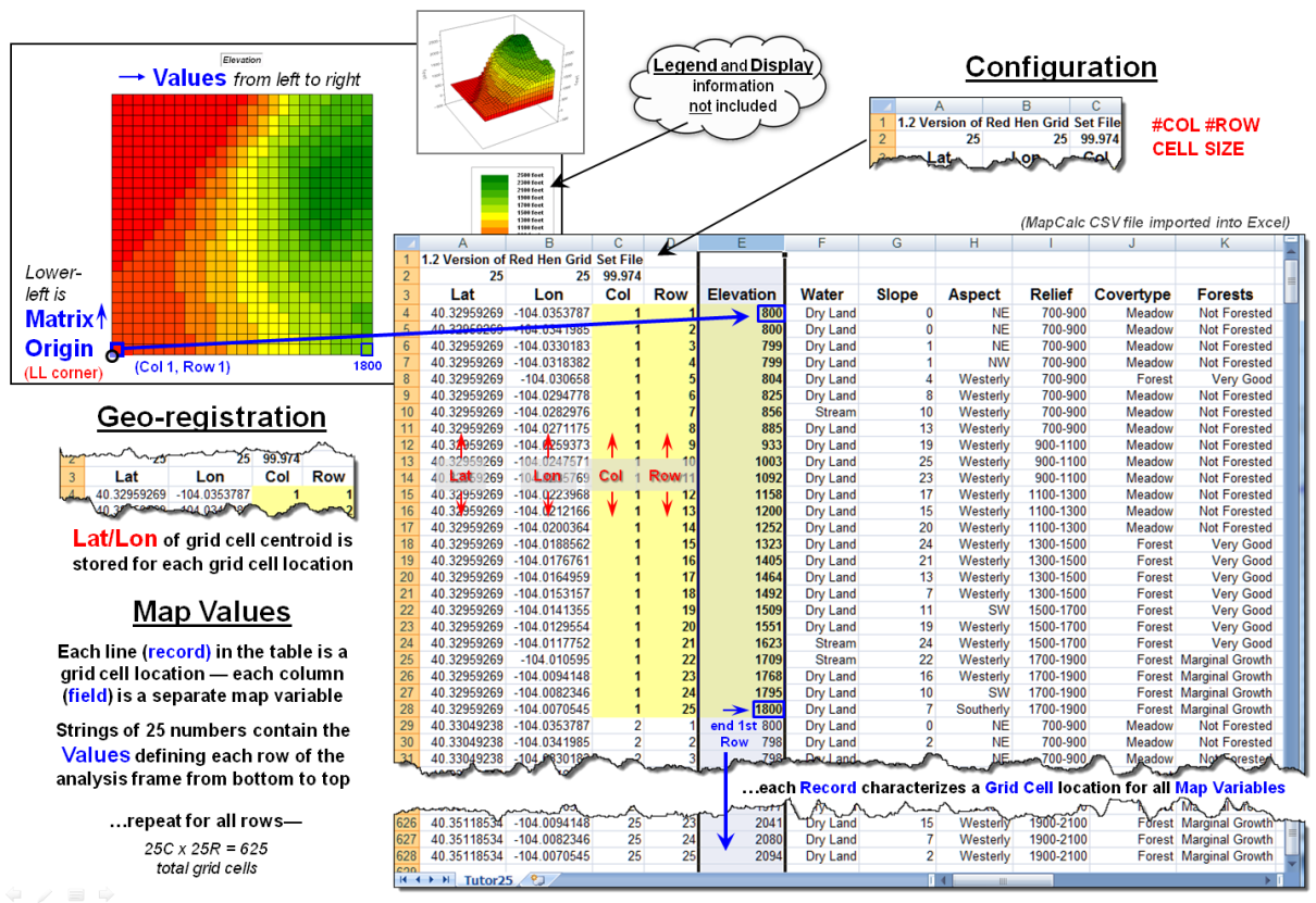
Figure 2. Storing groups of commonly geo-referenced and
configured grid maps in a table provides consistency and uniformity that
facilitates map analysis and modeling.
The relative advantages/disadvantages of the file versus table approach
to grid map storage have been part of the GIS community debate for years. Most GIS systems use independent files
because of their legacy, simplicity and flexibility. The geo-referencing and configuration of the
stored grid maps can take any form and “on-the-fly” processing can be applied
to account for the consistency needed in map analysis.
However, with the increased influence of remotely sensed data with
inter-laced spectral bands and television with interlaced signal processing,
interest in the table approach has been on the rise. In addition, relational database capabilities
have become much more powerful making “table maintenance” faster, less
problematic and more amenable to compression techniques.
Figure 3 shows the organizational structure for an early table-based
system (MapCalc). The top portion of the
table identifies the common geo-registration and configuration information
shared by all of the map layers contained in the map set. In the example, there are 19 map layers
listed whose values form an embedded table (bottom-left) as described in figure
2.
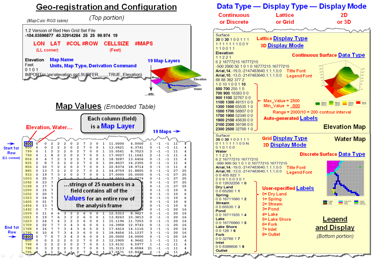
Figure 3. Combining all three basic
elements for storing grid maps (geo-registration/configuration, map values and
legend/display) sets the stage for fully optimized relation database tables for
the storage of grid-based data.
The right-side of the figure depicts the storage of additional legend
and display information for two of the map layers. The three display considerations of Data
Type (continuous or discrete), Display Type (lattice or grid) and Display
Mode (2D or 3D) are identified and specific graphics settings, such as
on/off grid mesh, plot cube appearance, viewing direction, etc., are contained
in the dense sets of parameter specifications.
Similarly, Legend Labeling and associated parameters are stored,
such as assigned color for each display category/interval. When a map layer is retrieved for viewing its
display and legend parameters are read and the appropriate graphical rendering
of the map values in the matrix is produced.
If a user changes a display, such as rotating and tilting a 3D plot, the
corresponding parameters are updated.
When a new map is created through map analysis its map name, map type
and derivation command is appended to the top portion of the table; its map
values are appended as a new field to the table in the middle portion; and a
temporary set of display and labeling parameters are generated depending on the
nature of the processing and the data type generated. While all this seems overwhelming to a human,
the “mechanical” reading and writing to a structured, self-documenting table is
a piece-of-cake for a computer.
The MapCalc table format for grid-based data was created in the early
1990s. While it still serves small
project areas very well (e.g., a few thousand acre farm or research site),
modern relational database techniques would greatly improve the approach.
For the technically astute, the full dB design would consist of three
related tables: Map Definition Table containing the MapID
(“primary key” for joining tables) and geo-registration/configuration
information, a Grid Layer Definitions Table containing the MapID, LayerID and legend/display
information about the data layer, and a third Cell Definition Table
containing MapID/LayerID
plus all of the map values in the matrix organized by the primary key of MapID à RowNumber à ColumnNumber (see author’s note 2).
Organizing the three basic elements for storing grid maps
(geo-registration/configuration, map values and legend/display) into a set of
linked tables and structuring the relationships between tables is a big part of
the probable future of grid-based map analysis and modeling. Also, it sets the stage for a follow-on
argument supporting the contention that latitude/longitude referencing of
grid-based data is the “universal spatial database key” (spatial stamp) that
promises to join disparate data sets in much the same way as the date/time
stamp—sort of the Rosetta Stone of geotechnology.
_____________________________
Author’s Notes:
1) For a discussion of basic grid-based data concepts and terms, see the online
book Beyond Mapping III, Topic 18, “Understanding Grid-based Data” posted at www.innovativegis.com/basis/MapAnalysis/. 2) A generalized schema for a full grid-based
database design is posted as an appended discussion.
VtoR and Back! (Pronounced
“V-tore”)
(GeoWorld, December 2012)
The previous section described considerations and procedures for
deriving contour lines from map surfaces.
The discussion emphasized the similarities and differences between
continuous/gradient map surfaces (raster) and discontinuous/discrete spatial
objects identifying points, lines and polygons (vector).
Keep in mind that while raster treats geographic space as a continuum,
it can store the three basic types of discrete map features—a point as a single
grid cell, a line as a series of connecting cells and a polygon as a set of
contiguous cells. Similarly, vector can
store generalizations of continuous map surfaces as a series of contour lines
or contour interval polygons.
Paramount in raster data storage is the concept of a data layer in
which all of the categories have to be mutually exclusive in space. That means that a given grid cell in a Water
map layer, for example, cannot be simultaneously classified as a “spring”
(e.g., category 1) and a “wetland” (e.g., category 2) at the same unless an additional
category is specified for the joint condition of “spring and wetland”
(e.g., category 12).
Another important consideration is that each grid cell is assumed to be
the same condition/characteristic throughout its entirety. For example, a 30m grid cell assigned as a
spring does not infer a huge bubbling body of water in the shape of a square—
rather it denotes a cell location that contains a spring somewhere within its
interior. Similarly, a series of stream
cells does not imply a 30m wide flow of water that moves in a saw-tooth fashion
over the landscape— rather it identifies grid cells that contain a stream
somewhere within their interiors.
While raster data tends to generalize/lower the spatial precision
of map object placement and boundary, vector data tends to generalize/lower the
thematic accuracy of classification.
For example, the subtle differences in a map surface continuum of
elevation have to be aggregated into broad contour interval ranges to store the
data as a discrete polygon. Or, as in
the case of contour lines, store a precise constant value but impart no
information for the space between the lines.
Hence the rallying cry of “VtoR and back!” by
grid-based GIS modelers echoes from the walls of cubicles everywhere for
converting between vector-based spatial objects and raster-based grids. This enables them to access the wealth of
vector-based data, then utilize the thematic accuracy and analytical power of
continuous grid-based data and upon completion, push the model results back to
vector.
Figure 1 depicts the processing steps for a frequently used method of
converting vector polygons to contiguous groupings of grid cells. It uses a point file of grid centers and
“point in polygon” processing to assign a value representing a polygon’s
characteristic/condition to every corresponding grid cell. In essence it is a statistical technique akin
to “dot grid” sampling that has been used in aerial photo interpretation and
manual map analysis for nearly 100 years.
While fast and straight forward for converting polygon data to cells, it
is unsuitable for point and line features.
In addition, if large cell-sizes are used, small polygons can be
missed.
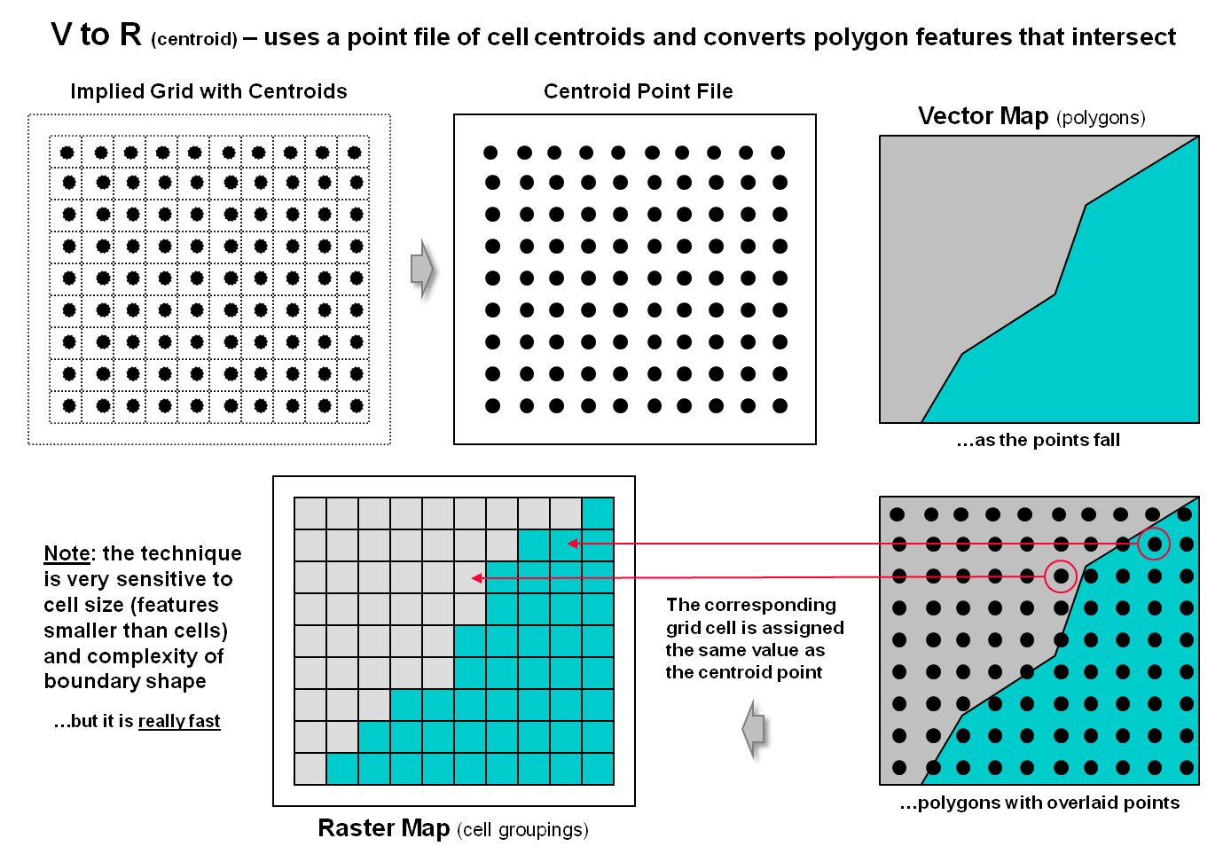
Figure 1. Basic procedure for
centroid-based vector to raster conversion (VtoR).
The top portion of figure 2 depicts an alternative approach that
directly “burns” the vector features into a grid analogous to a branding iron
or woodburning tool.
In the case of a point feature the cell containing its x,y coordinates is assigned a
value representing the feature. The
tricky part comes into play if there is more than one point feature falling
into a grid cell. Then the user must
specify whether to simply note “one or more” for a binary map or utilize a
statistical procedure to summarize the point values (e.g,
#count, sum, average, standard deviation, maximum, minimum, etc.).
For line features there are two primary strategies for VtoR conversion— fat and thin. Fat identifies every grid cell that is cut by
a line segment, even if it is just a nick at the corner. Thin, on the other hand, identifies the
smallest possible set of adjoining cells to characterize a line feature. While the “thin” option produces pleasing
visualization of a line, it discards valuable information. For example, if the line feature was of a stream,
then water law rights/responsibilities are applicable to all of the cells with
a “stream running through it” regardless of whether it is through the center or
just in a corner.
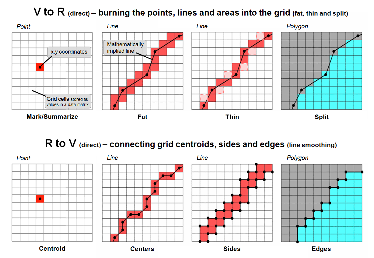
Figure 2. Basic procedures for direct
calculation-based vector to raster conversion (VtoR)
and the reverse (RtoV).
The upper-right inset in figure 2 illustrates
the conversion of adjacent polygons. The
“fat” edges containing the polygon boundary are identified and geometry is used
to determine which polygon is mostly contained within each edge cell. All of the interior cells of a polygon are
identified to finish the polygon conversion.
On rare occasions the mixed cells containing boundary line are given a
composite number identifying the two characteristics/conditions. For example, if a soil map had two soil types
of 1 and 2 occurring in the same cell, the value 12 might be stored for the
boundary condition with 1 and 2 assigned to the respective interior cells. If the polygons are not abutting but
scattered across the landscape, the boundary cells (either fat or thin) are
assigned the same value as the interior cells with the exterior cells assigned
a background value.
The lower portion of figure 2 depicts approaches for converting raster to vector. For single cell locations, the x,y coordinates of a cell’s centroid is used to position a point feature and the cell value is used to populate the attribute table. On rare occasion where the cell value indicates the number of points contained in a cell, a random number generator is used to derive coordinates within the cell’s geographic extent for the set of points.
For gridded line features, the x,y coordinates of the of the centroids (thin) are frequently used to define the line segments. Often the set of points are condensed as appropriate and a smoothing equation applied to eliminate the saw-tooth jaggies. A radically different approach converts the sides of the cells into a thin polygon capturing the area of possible inclusion of the grid-based line— sort of a narrow corridor for the line.
For gridded polygons, the sides at the edges of abutting cells are used to define the feature’s boundary line and its points are condensed and smoothed with topology of the adjoining polygons added. For isolated gridded polygons, the outside edges are commonly used for identifying the polygon’s boundary line.
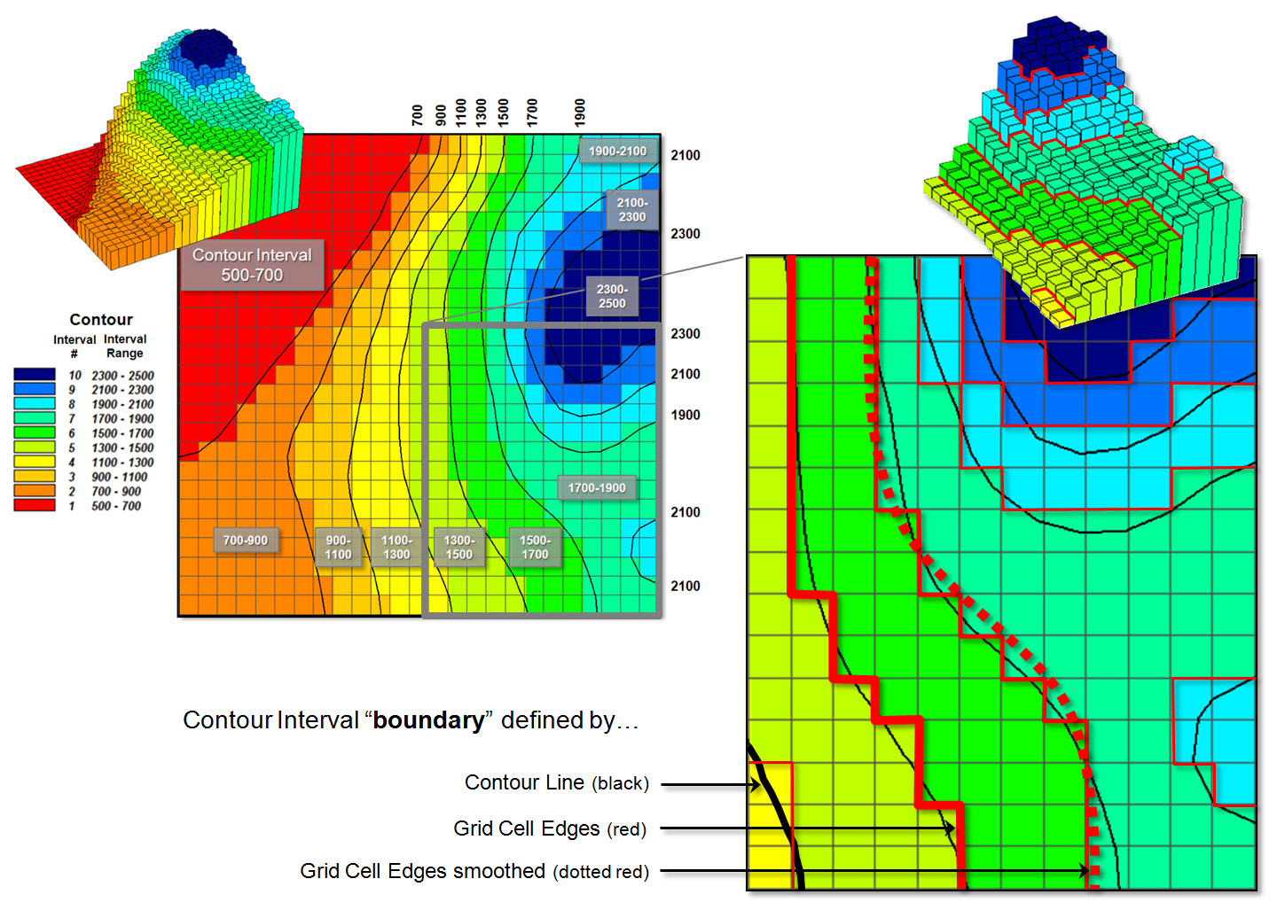
Figure 3. Comparison of the basic
approaches for identifying contour lines and contour interval boundaries.
Figure 3 deals with converting continuous map surfaces to discrete vector representations. A frequently used technique that generates true contour lines of constant value was described in detail in the previous section. The procedure involves identifying cell values that bracket a desired contour level, then interpolating the x,y coordinates for points between all of the cell value pairs and connecting the new points for a line of constant value. The black lines in figure 3 identify the set interpolated 200 foot contour lines for a data set with values from 500 to 2500.
Another commonly used technique involves
slicing the data range into a desired number of contour intervals. For example, 2500-500 / 10 = 200 identifies
the data step used in generating the data ranges of the contour intervals
(color bands) shown in the figure. The
first contour range from 500 to 700 “color-fills” with red all of the grid
cells having values that fall within this range; orange for values 700 to 900;
tan for values 900 to 1100; and so forth.
The 3D surface shows the contour interval classification draped over the
actual data values stored in the grid.
The added red lines in the enlarged inset
identify the edges of the grid cell contour interval groupings. As you can see in the enlarged 3D plot there
are numerous differing data values as the red border goes up and down with the
data values along the sawtooth edge. As previously noted this boundary can be
smoothed (dotted red) and used for the borders of the contour interval polygons
generated in the RtoV conversion.
The bottom line (pun intended) is that in many mapped data visualizations the boundary (border) outlining a contour interval is not the same as a contour line (line of constant value). That’s the beauty of grid vs. vector data structures— they are not the same, and therefore, provide for subtly and sometimes radically different perspectives of the patterns and relationships in spatial information—“V-tore and back!” is the rallying cry.
Maps Are Numbers First, Pictures
Later
(GeoWorld, August 2002, pg. 20-21)
The unconventional view that “maps are numbers first, pictures later” forms the backbone for taking maps beyond mapping. Historically maps involved “precise placement of physical features for navigation.” More recently, however, map analysis has become an important ingredient in how we perceive spatial relationships and form decisions.
Understanding that a digital map is first and foremost an organized set of numbers is fundamental to analyzing mapped data. But exactly what are the characteristics defining a digital map? What do the numbers mean? Are there different types of numbers? Does their organization affect what you can do with them? If you have seen one digital map have you seen them all?
In an introductory
However this geo-centric view rarely explains the full nature of digital maps. For example consider the numbers themselves that comprise the X,Y coordinates—how does number type and size effect precision? A general feel for the precision ingrained in a “single precision floating point” representation of Latitude/Longitude in decimal degrees is*…
1.31477E+08 ft = equatorial circumference of
the earth
1.31477E+08 ft / 360 degrees = 365214
ft/degree length of one degree Longitude
Single precision number carries six decimal
places, so—
365214 ft/degree * 0.000001= .365214 ft
*12 = 4.38257 inch precision
Think if “double-precision” numbers (eleven decimal places) were used for storage—you likely could distinguish a dust particle on the left from one on the right.
In analyzing mapped data, however, the characteristics of the attribute values are even more critical. While textual descriptions can be stored with map features they can only be used in geo-query. For example if you attempted to add Longbrake Lane to Shortthrottle Way all you would get is an error, as text-based descriptors preclude any of the mathematical/statistical operations.
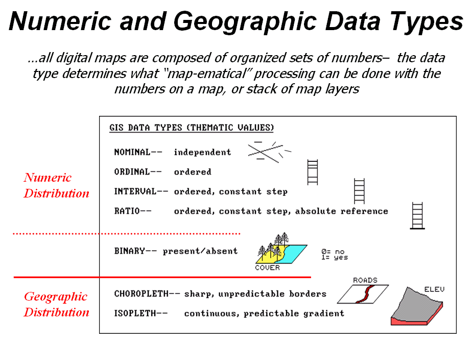
Figure 1. Map values are characterized from two broad perspectives—numeric and
geographic—then further refined by specific data types.
So what are the numerical characteristics of mapped data? Figure 1 lists the data types by two important categories—numeric and geographic. You should have encountered the basic numeric data types in several classes since junior high school. Recall that nominal numbers do not imply ordering. A 3 isn’t bigger, tastier or smellier than a 1, it’s just not a 1. In the figure these data are schematically represented as scattered and independent pieces of wood.
Ordinal numbers, on the other hand, do imply a definite ordering and can be conceptualized as a ladder, however with varying spaces between rungs. The numbers form a progression, such as smallest to largest, but there isn’t a consistent step. For example you might rank different five different soil types by their relative crop productivity (1= worst to 5= best) but it doesn’t mean that soil 5 is exactly five times more productive than soil 1.
When a constant step is applied, interval numbers result. For example, a 60o Fahrenheit spring day is consistently/incrementally warmer than a 30 oF winter day. In this case one “degree” forms a consistent reference step analogous to typical ladder with uniform spacing between rungs.
A ratio number introduces yet another condition—an absolute reference—that is analogous to a consistent footing or starting point for the ladder, analogous to zero degrees “Kelvin” defined as when all molecular movement ceases. A final type of numeric data is termed “binary.” In this instance the value range is constrained to just two states, such as forested/non-forested or suitable/not-suitable.
So what does all of this have to do with analyzing digital
maps? The type of number dictates the
variety of analytical procedures that can be applied. Nominal data, for example, do not support
direct mathematical or statistical analysis.
Ordinal data support only a limited set of statistical procedures, such
as maximum and minimum. Interval and
ratio data, on the other hand, support a full set mathematics and
statistics. Binary maps support special
mathematical operators, such as .
Even more interesting (this interesting, right?) are the geographic characteristics of the numbers. From this perspective there are two types of numbers. “Choropleth” numbers form sharp and unpredictable boundaries in space such as the values on a road or cover type map. “Isopleth” numbers, on the other hand, form continuous and often predictable gradients in geographic space, such as the values on an elevation or temperature surface.
Figure 2 puts it all together. Discrete maps identify mapped data with independent numbers (nominal) forming sharp abrupt boundaries (choropleth), such as a covertype map. Continuous maps contain a range of values (ratio) that form spatial gradients (isopleth), such as an elevation surface. This clean dichotomy is muddled by cross-over data such as speed limits (ratio) assigned to the features on a road map (choropleth).
Discrete maps are best handled in 2D form—the 3D plot in the top-right inset is ridiculous and misleading because it implies numeric/geographic relationships among the stored values. What isn’t as obvious is that a 2D form of continuous data (lower-right inset) is equally as absurd.
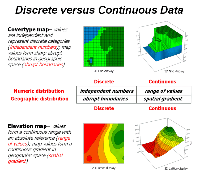
Figure 2. Discrete and Continuous map
types combine the numeric and geographic characteristics of mapped data.
While a contour map might be as familiar and comfortable as
a pair of old blue jeans, the generalized intervals treat the data as discrete
(ordinal, choropleth). The artificially
imposed sharp boundaries become the focus for visual analysis. Map-ematical analysis of the actual data, on the other hand,
incorporates all of the detail contained in the numeric/geographic patterns of
the numbers ...where the rubber meets the spatial analysis road.
Normalizing Maps for Data Analysis
(GeoWorld, September 2002, pg. 22-23)
The last couple of sections have dealt with the numerical
nature of digital maps. Two fundamental
considerations remain—data normalization and exchange. Normalization involves
standardizing a data set, usually for comparison among different types of
data. In a sense, normalization
techniques allow you to “compare apples and oranges” using a standard “mixed
fruit scale of numbers.”
The most basic normalization procedure uses a “goal” to adjust map values. For example, a farmer might set a goal of 250
bushels per acre to be used in normalizing a yield map for corn. The equation, Norm_GOAL = (mapValue
/ 250) * 100, derives
the percentage of the goal achieved by each location in a field. In evaluating the equation, the computer
substitutes a map value for a field location, completes the calculation, stores
the result, and then repeats the process for all of the other map locations.
Figure 1 shows the results of goal normalization. Note the differences in the descriptive statistics between the original (top) and normalized data (bottom)—a data range of 2.33 to 295 with an average of 158 bushels per acre for the original data versus .934 to 118 with an average of 63.3 percent for the normalized data.
However, the histogram and map patterns are identical (slight differences in the maps are an artifact of rounding the discrete display intervals). While the descriptive statistics are different, the relationships (patterns) in the normalized histogram and map are the same as the original data.
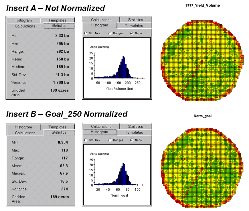
Figure
1. Comparison of original
and goal normalized data.
That’s an important point— both the numeric and
spatial relationships in the data are preserved during normalization. In effect, normalization simply “rescales”
the values like changing from one set of units to another (e.g., switching from
feet to meters doesn’t change your height).
The significance of the goal normalization is that the new scale allows
comparison among different fields and even crop types based on their individual
goals— the “mixed fruit” expression of apples and oranges. Same holds for normalizing environmental,
business, health or any other kind of mapped data.
An alternative “0-100” normalization forces a consistent range of values by spatially evaluating the equation Norm_0-100 = (((mapValue – min) * 100) / (max – min)) + 0. The result is a rescaling of the data to a range of 0 to 100 while retaining the same relative numeric and spatial patterns of the original data. While goal normalization benchmarks a standard value, the 0-100 procedure rescales the original data range to a fixed, standard range (see Author’s note).
A third normalization procedure, standard normal variable (
Map normalization is often a forgotten step in the rush to
make a map, but is critical to a host of subsequent analyses from visual map
comparison to advanced data analysis.
The ability to easily export the data in a universal format is just as
critical. Instead of a “do-it-all”
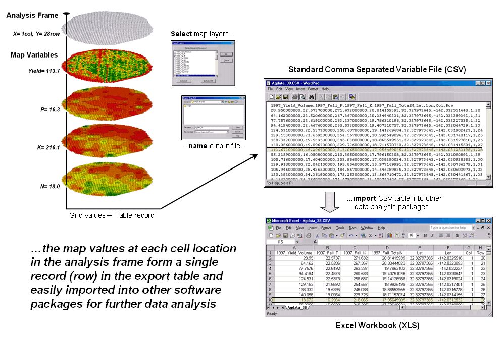
Figure 2. The map values at each grid location form a single record in the
exported table.
Figure 2 shows the process for grid-based data. Recall that a consistent analysis frame is used to organize the data into map layers. The map values at each cell location for selected layers are reformatted into a single record and stored in a standard export table that, in turn, can be imported into other data analysis software.
Figure 3 shows the agricultural data imported into the JMP
statistical package (by SAS). Area (1)
shows the histograms and descriptive statistics for the P, K and N map layers
shown in figure 2. Area (2) is a
“spinning 3D plot” of the data that you can rotate to graphically visualize
relationships among the map layers. Area
(3) shows the results of applying a multiple linear regression model to predict
crop yield from the soil nutrient maps.
These are but a few of the tools beyond mapping that are available
through data exchange between
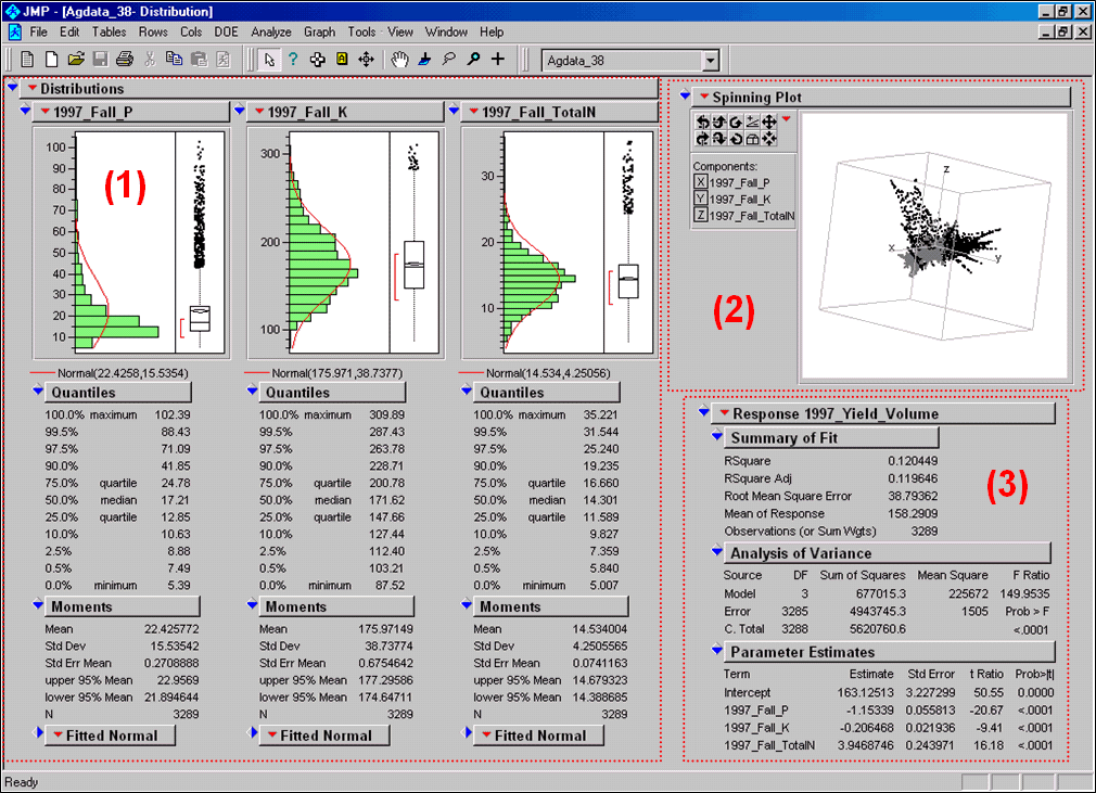
Figure 3. Mapped data can be imported
into standard statistical packages for further analysis.
Modern statistical packages like JMP “aren’t your father’s”
stat experience and are fully interactive with point-n-click graphical
interfaces and wizards to guide appropriate analyses. The analytical tools, tables and displays
provide a whole new view of traditional mapped data. While a map picture might be worth a thousand
words, a gigabyte or so of digital map data is a whole revelation and foothold
for site-specific decisions.
______________________
Author’s Note: the generalized rescaling
equation is…
Normalize a data set to a fixed range
of Rmin to Rmax=
(((X-Dmin) * (Rmax
– Rmin)) / (Dmax
– Dmin)) + Rmin
…where Rmin
and Rmax is the minimum and maximum values for the
rescaled range, Dmin and Dmax
is the minimum and maximum values for the input data and X is any value in the
data set to be rescaled.
(GeoWorld, April, 2011)
How many times have heard someone say “you can't compare apples and
oranges,” they are totally different things. But in GIS we see it all the time when a presenter
projects two maps on a screen and uses a laser pointer to circle the “obvious”
similarities and differences in the map displays. But what if there was a quantitative
technique that would objectively compare each map location and report metrics describing
the degree of similarity? …for each map location?
…for the entire map area?
Since maps have been “numbers first, pictures later” for a couple of
decades, you would think “ocular subjectivity” would have been replaced by
“numerical objectivity” in map comparison a long time ago.
A few years back a couple of Beyond Mapping columns described
grid-based map analysis techniques for comparing discrete and continuous maps (Statistically Compare Discrete Maps,
GeoWorld, July 2006 and Statistically Compare
Continuous Map Surfaces, GeoWorld, September 2006). An even earlier column described procedures
for normalizing mapped data (Normalizing Maps for Data Analysis,
GeoWorld, September 2002). Given these conceptual footholds I bet we can
put the old “apples and oranges” quandary to rest.
Consider the maps of Elevation and Slope shown in figure 1. I bet you eyes are quickly assessing the
color patterns and “seeing” what you believe are strong spatial
relationships—dark greens in the NW and warmer tones in the middle NE. But how “precise and consistent” can you be
in describing the similarity? …in delineating the similar areas? …what would you do if you needed to assess a
thousand of these patches?
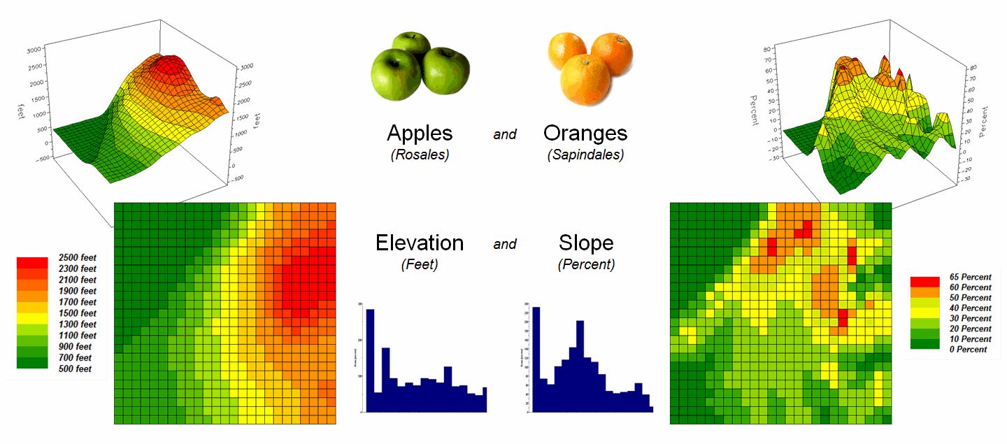
Figure 1. Elevation and Slope like apples and oranges
cannot be directly compared.
Obviously Elevation (measured in feet) and Slope (measured in percent) are not the same thing but they are sort of related. It wouldn’t make sense to directly compare
the map values; they are apples and oranges after all, so you can’t compare
them …right?
That’s where a “mixed fruit” scale comes in. As depicted in the top portion of figure 2,
Elevation on the left and Slope on the right have unique raw data distributions
that cannot be directly compared.
The middle portion of the figure illustrates using the Standard
Normal Variable (SNV) equation to “normalize” the two maps to a common
scale. This involves retrieving the map
value at a grid location subtracting the Mean from it, then dividing by the
Standard Deviation and multiplying by 100.
The result is a rescaling of the data to the percent variation from each
map’s average value.
Figure 2. Normalizing maps by the Standard Normal
Variable (SNV) provides a foothold for comparing seemingly incomparable
things.
The rescaled data are no longer apples and oranges but a mixed fruit salad that utilizes the standard normal curve as a common reference, where +100% locates areas that are one standard deviation above the typical value and -100% locates areas that are one standard deviation below. Because only scalar numbers are involved in the equation, neither the spatial nor the numeric relationships in the mapped data are altered—like simply converting temperature readings from degrees Fahrenheit to Celsius.
The middle/lower portion of figure 2 describes the comparison of the
two SNV normalized maps. The normalized
values at a grid location on the two maps are retrieved then subtracted and the
absolute value taken to “measure” how far apart the values are. For example, if Map1 had a value of -100 (one
Stdev below the mean) and Map 2 had a value of +200 (two Stdev above the mean)
for the same grid location, the absolute difference would be 300—indicating
very different information occurring at that location.
Figure 3 shows the SNV comparison for the Elevation and Slope
maps. The red areas indicate locations
where the map values are at dramatically different positions on the standard
normal curve; blue tones indicate fairly similar positioning; and grey where
the points are at the same position. The
median of the absolute difference is 52 indicating that half of the map area
has differences of about half a standard deviation or less.
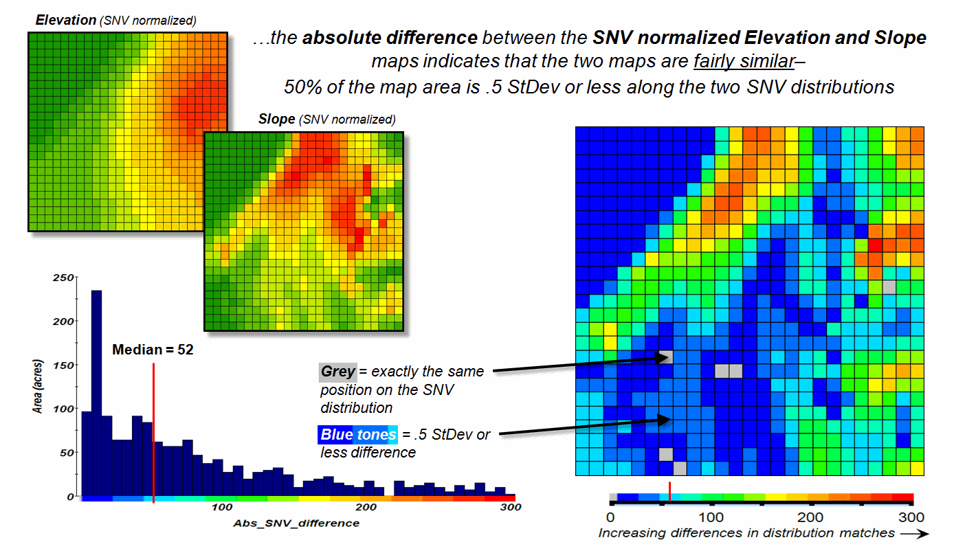
Figure 3. The absolute difference between SNV
normalized maps generates a consistent scale of similarity that can be extended
to different map variables and geographic locations.
In practice, SNV Comparison maps can be generated for the same
variables at different locations or different variables at the same
location. Since the standard normal
curve is a “standard,” the color ramp can fixed and the spatial pattern and
overall similarities/differences among apples, oranges, peaches, pears and
pomegranates can be compared. All that
is required is grid-based quantitative mapped data (no qualitative vector maps
allowed).
_____________________________
Author’s Note: For more information on map Normalization and Comparison see the online
book Beyond Mapping III, posted at www.innovativegis.com,
Topic 18, Understanding Grid-based Data and Topic 16, Characterizing
Patterns and Relationships.
Correlating Maps and a
Numerical Mindset
(GeoWorld, May 2011)
The previous section discussed a technique for comparing maps, even if
they were “apples and oranges.” The
approach normalized the two sets of mapped data using the Standard Normal
Variable equation to translate the radically different maps into a common
“mixed-fruit” scale for comparison.
Continuing with this statistical comparison theme (maps as numbers—bah,
humbug), one can consider a measure of linear correlation between two
continuous quantitative map surfaces. A
general dictionary definition of the term correlation is “mutual relation of
two or more things” that is expanded to its statistical meaning as “the extent
of correspondence between the ordering of two variables; the degree to which
two or more measurements on the same group of elements show a
tendency to vary together.”
So what does that have to with mapping?
…maps are just colorful images that tell us what is where, right? No, today’s maps actually are organized sets
of number first, pictures later. And
numbers (lots of numbers) are right down statistic’s alley. So while we are severely challenged to
“visually assess” the correlation among maps, spatial statistics, like a
tireless puppy, eagerly awaits the opportunity.
Recall from basic statistics, that the Correlation Coefficient (r) assesses the
linear relationship between two variables, such that its value falls between -1<
r < +1.
Its sign indicates the direction of the relationship and its magnitude
indicates the strength. If two variables
have a strong positive correlation, r is close to +1
meaning that as values for x increase, values for y increase
proportionally. If a strong negative
correlation exits, r is close to -1 and as x increases, the values for
y decrease.
A perfect correlation of +1 or -1 only occurs when all of the data
points lie on a straight line. If there
is no linear correlation or a weak correlation, r is close to 0 meaning that there is a random or non-linear
relationship between the variables. A
correlation that is greater than 0.8 is generally described as strong,
whereas a correlation of less than 0.5 is described as weak.
The Coefficient of Determination (r 2) is a related statistic that summarizes the ratio of the explained variation to the total variation. It represents the percent of the data that is the closest to the line of best fit and varies from 0 < r 2 < 1. It is most often used as a measure of how certain one can be in making predictions from the linear relationship (regression equation) between variables.
With that quickie stat review, now consider the left side of figure 1
that calculates the correlation between Elevation and Slope maps discussed in
the last section. The gridded maps
provide an ideal format for identifying pairs of values for the analysis. In this case, the 625 Xelev
and Yslope values form one large table
that is evaluated using the correlation equation shown.
The spatially aggregated result is r = +0.432,
suggesting a somewhat weak overall positive linear correlation between the two
map surfaces. This translates to r 2 =
0.187, which means that only 19% of the total variation in y can be
explained by the linear relationship between Xelev
and Yslope. The other 81% of the total
variation in y remains unexplained which suggests that the overall
linear relationship is poor and does not support useful regression
predictions.
The right side of figure 1 uses a spatially disaggregated approach that
assesses spatially localized correlation.
The technique uses a roving window that identifies the 81 value pairs of
Xelev and Yslope within a 5-cell
reach, then evaluates the equation and assigns the computed r value to the center position of the window. The process is repeated for each of the 625
grid locations.
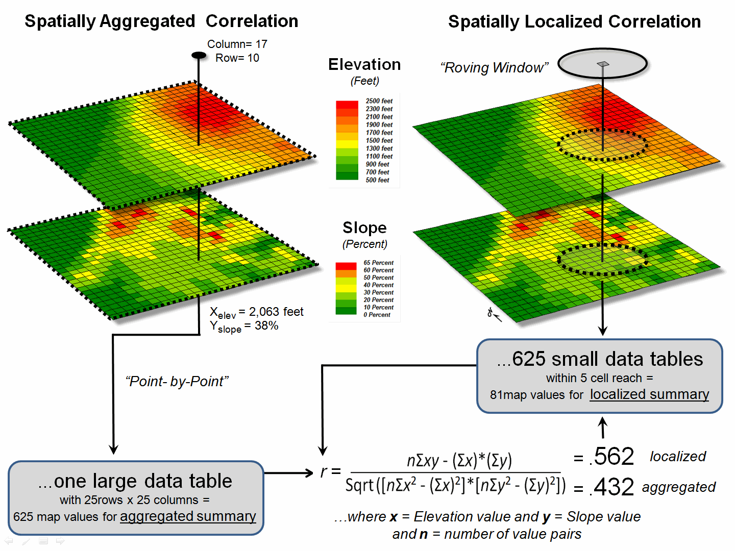
Figure 1. Correlation between two maps can be
evaluated for an overall metric (left side) or for a continuous set of
spatially localized metrics (right side).
For example, the spatially localized result at column 17, row 10 is r = +0.562 suggesting a fairly strong positive linear correlation between the two maps in this portion of the project area. This translates to r 2 = 0.316, which means that nearly a third of the total variation in y can be explained by the linear relationship between Xelev and Yslope.
Figure 2 depicts the geographic distributions of the
spatially aggregated correlation (top) and the spatially localized correlation
(bottom). The overall correlation
statistic assumes that the r = +0.432 is uniformly distributed thereby forming
a flat plane.
Spatially localized correlation,
on the other hand, forms a continuous quantitative map surface. The correlation surrounding column 17, row 10
is r = +0.562 but the northwest portion has
significantly higher positive correlations (red with a maximum of +0.971) and
the central portion has strong negative correlations (green with a minimum of
-0.568). The overall correlation
primarily occurs in the southeastern portion (brown); not everywhere.
The bottom-line of spatial statistics is that it provides spatial
specificity for many traditional statistics, as well as insight into spatial
relationships and patterns that are lost in spatially aggregated of non-spatial
statistics. In this case, it suggests
that the red and green areas have strong footholds for regression analysis but
the mapped data needs to be segmented and separate regression equations
developed. Ideally, the segmentation can
be based on existing geographic conditions identified through additional
grid-based map analysis.
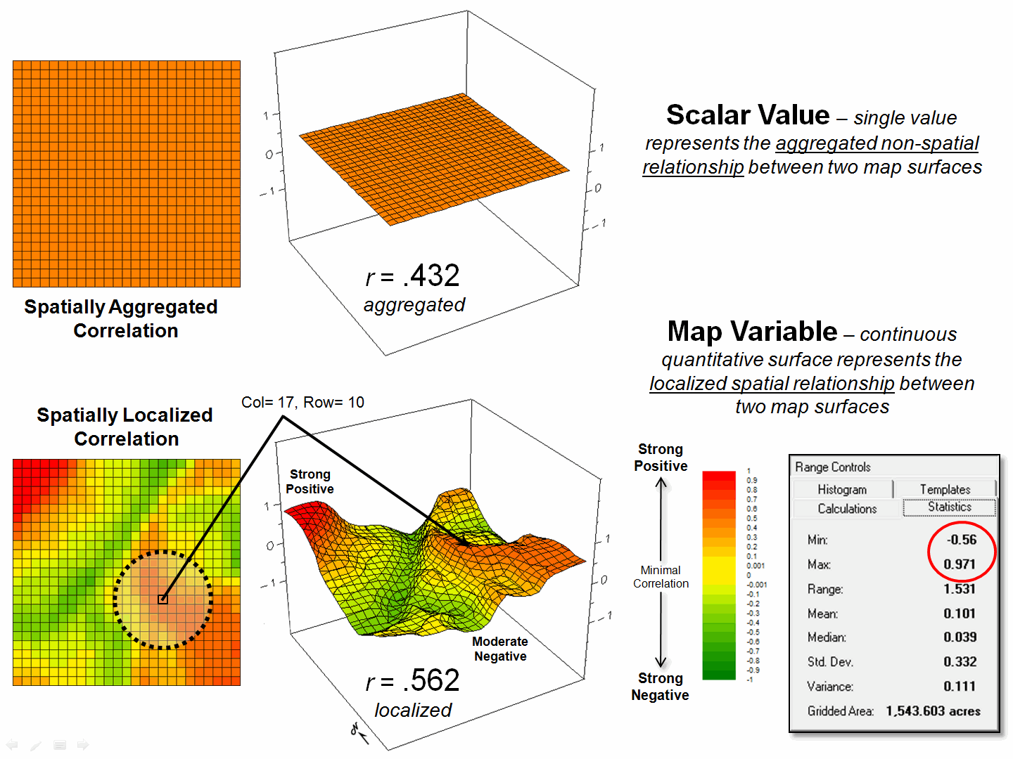
Figure 2. Spatially aggregated correlation provides no
spatial information (top), while spatially localized correlation “maps” the
direction and strength of the mutual relationship between two map variables
(bottom)
It is this “numerical mindset of maps” that is catapulting GIS beyond
conventional mapping and traditional statistics beyond long-established
spatially aggregated metrics—the joint analysis of geographic and numeric
distributions inherent in digital maps provide the springboard.
_____________________________
Author’s Note: For more information, see the online book Beyond Mapping III, posted at www.innovativegis.com, Topic 16, Characterizing
Patterns and Relationships and Topic 28, Spatial Data Mining in
Geo-Business.
Multiple Methods Help
Organize Raster Data
(GeoWorld, April 2003, pg. 22-23)
Map features in a vector-based mapping system identify discrete, irregular spatial objects with sharp abrupt boundaries. Other data types—raster images, pseudo grids and raster grids—treat space in entirely different manner forming a spatially continuous data structure.
For example, a raster image is composed of thousands of “pixels” (picture elements) that are analogous to the dots on a computer screen. In a geo-registered B&W aerial photo, the dots are assigned a grayscale color from black (no reflected light) to white (lots of reflected light). The eye interprets the patterns of gray as forming the forests, fields, buildings and roads of the actual landscape. While raster maps contain tremendous amounts of information that are easily “seen,” the data values simply reference color codes that afford some quantitative analysis but are far too limited for the full suite of map analysis operations.
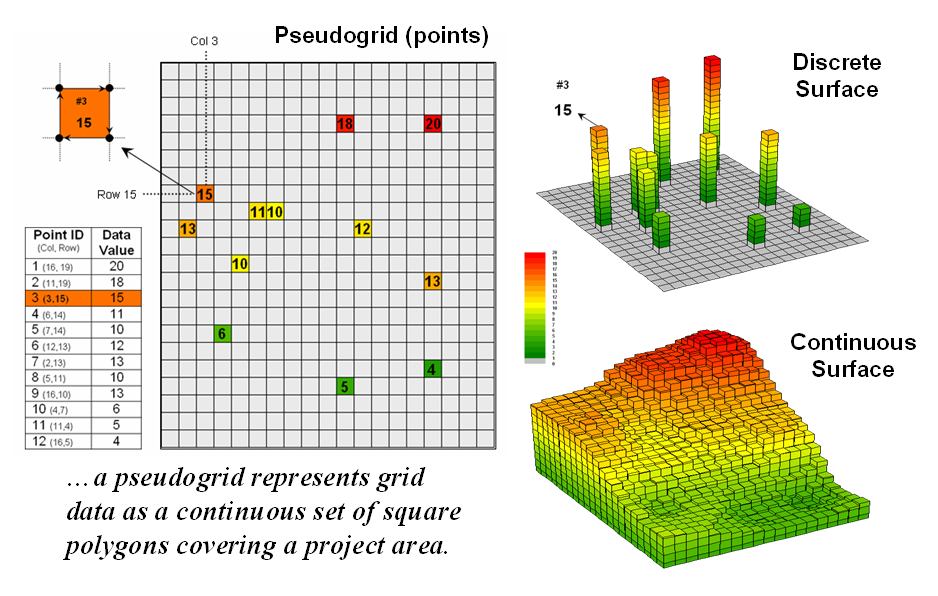
Figure 1. A vector-based system can store
continuous geographic space as a pseudo-grid.
Pseudo grids and raster grids are similar to raster images as they treat geographic space as a continuum. However, the organization and nature of the data are radically different.
A pseudo grid is formed by a series of uniform, square polygons covering an analysis area (figure 1). In practice, each grid element is treated as a separate polygon—it’s just that every polygon is the same shape/size and they all abut each other—with spatial and attribute tables defining the set of little polygons. For example, in the upper-right portion of the figure a set of discrete point measurements are stored as twelve individual “polygonal cells.” The interpolated surface from the point data (lower-right) is stored as 625 contiguous cells.
While pseudo grids store full numeric data in their attribute tables and are subject to the same vector analysis operations, the explicit organization of the data is both inefficient and too limited for advanced spatial analysis as each polygonal cell is treated as an independent spatial object. A raster grid, on the other hand, organizes the data as a listing of map values like you read a book—left to right (columns), top to bottom (rows). This implicit configuration identifies a grid cell’s location by simply referencing its position in the list of all map values.
In practice, the list of map values is read into a matrix with the appropriate number of columns and rows of an analysis frame superimposed over an area of interest. Geo-registration of the analysis frame requires an X,Y coordinate for one of the grid corners and the length of a side of a cell. To establish the geographic extent of the frame the computer simply starts at the reference location and calculates the total X, Y length by multiplying the number of columns/rows times the cell size.
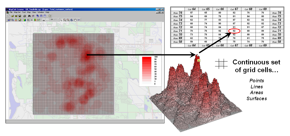
Figure 2. A grid-based system stores a long list of map values that are implicitly linked to an analysis frame superimposed over an area.
Figure 2 shows a 100 column by 100 row analysis frame geo-registered over a subdued vector backdrop. The list of map values is read into the 100x100 matrix with their column/row positions corresponding to their geographic locations. For example, the maximum map value of 92 (customers within a quarter of a mile) is positioned at column 67, row 71 in the matrix— the 7,167th value in the list ((71 * 100) + 67 = 7167). The 3D plot of the surface shows the spatial distribution of the stored values by “pushing” up each of the 10,000 cells to its relative height.
In a grid-based dataset, the matrices containing the map values automatically align as each value list corresponds to the same analysis frame (#columns, # rows, cell size and geo-reference point). As depicted on the left side of figure 3, this organization enables the computer to identify any or all of the data for a particular location by simply accessing the values for a given column/row position (spatial coincidence used in point-by-point overlay operations).
Similarly, the immediate or extended neighborhood around a point can be readily accessed by selecting the values at neighboring column/row positions (zonal groupings used in region-wide overlay operations). The relative proximity of one location to any other location is calculated by considering the respective column/row positions of two or more locations (proximal relationships used in distance and connectivity operations).
There are two fundamental approaches in storing grid-based data—individual “flat” files and “multiple-grid” tables (right side of figure 3). Flat files store map values as one long list, most often starting with the upper-left cell, then sequenced left to right along rows ordered from top to bottom. Multi-grid tables have a similar ordering of values but contain the data for many maps as separate field in a single table.
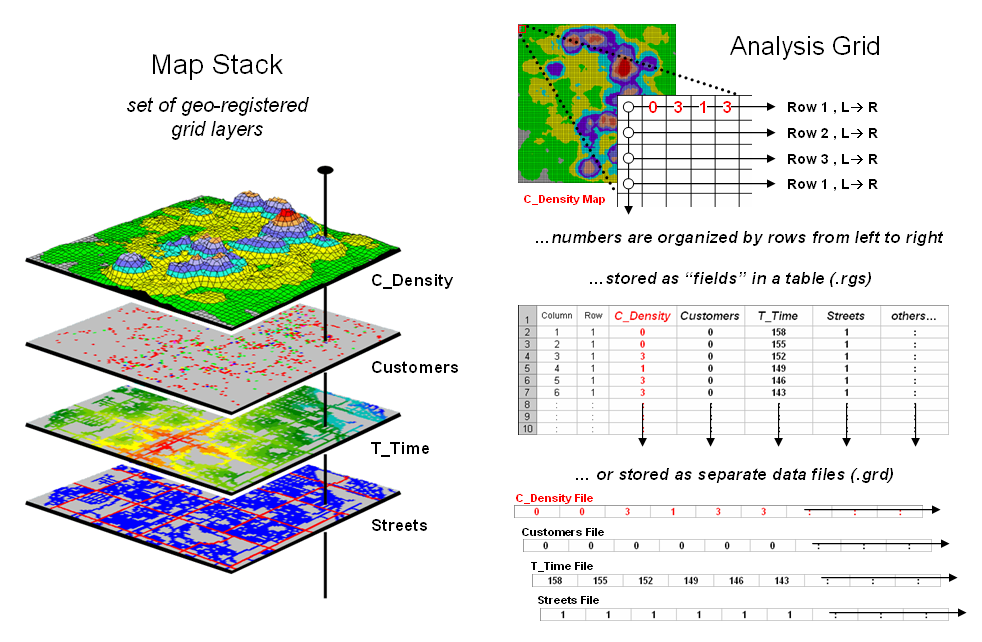
Figure 3. A map stack of individual grid
layers can be stored as separate files or in a multi-grid table.
Generally speaking the flat file organization is best for
applications that create and delete a lot of maps during processing as table
maintenance can affect performance.
However, a multi-gird table structure has inherent efficiencies useful
in relatively non-dynamic applications.
In either case, the implicit ordering of the grid cells over continuous
geographic space provides the topological structure required for advanced map
analysis.
_________________
Author's Note: Let me apologize in advance to the “geode-ists” readership—yep it’s a lot more complex than these
simple equations but the order of magnitude ought to be about right …thanks to
Ken Burgess, VP R&D, Red Hen Systems for getting me this far.
Use Mapping “Art” to Visualize Values
(GeoWorld, June 2003, pg. 20-21)
The digital map has revolutionized how we collect, store and perceive mapped data. Our paper map legacy has well-established cartographic standards for viewing these data. However, in many respects the display of mapped data is a very different beast.
In a
The display tools are both a boon and a bane as they require minimal skills to use but considerable thought and experience to use correctly. The interplay among map projection, scale, resolution, shading and symbols can dramatically change a map’s appearance and thereby the information it graphically conveys to the viewer.
While this is true for the points, lines and areas comprising traditional maps, the potential for cartographic effects are even more pronounced for contour maps of surface data. For example, consider the mapped data of phosphorous levels in a farmer’s field shown in figure 1. The inset on the left is a histogram of the 3288 grid values over the field ranging from 4.2 to 53.2 parts per million (ppm). The table describes the individual data ranges used to generalize the data into seven contour intervals.
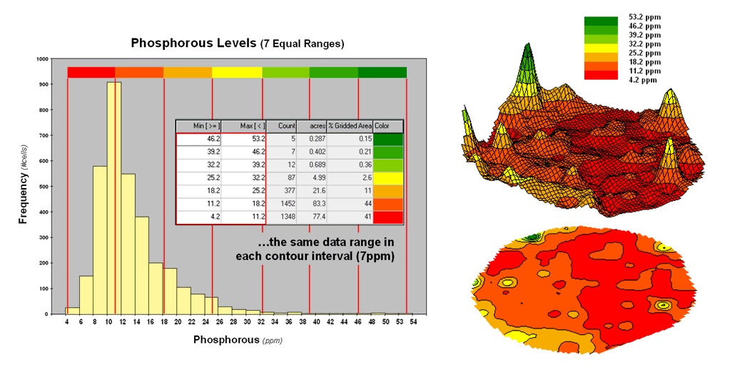
Figure
1. An Equal Ranges contour map
of surface data.
In this case, the contour intervals were calculated by dividing the data range into seven Equal Ranges. The procedure involves: 1] calculating the interval step as (max – min) / #intervals= (53.2 – 4.2) / 7 = 7.0 step, 2] assigning the first contour interval’s breakpoint as min + step = 4.2 + 7.0 = 11.2, 3] assigning the second contour interval’s breakpoint as previous breakpoint + step = 11.2 + 7.0 = 18.2, 4] repeating the breakpoint calculations for the remaining contour intervals (25.2, 32.2, 39.2, 46.2, 53.2).
The equally spaced red bars in the plot show the contour interval breakpoints superimposed on the histogram. Since the data distribution is skewed toward lower values, significantly more map locations are displayed in red tones— 41 + 44 = 85% of the map area assigned to contour intervals one and two. The 2D and 3D displays on the right side of figure 1 shows the results of “equal ranges contouring” of the mapped data.
 \
\
Figure
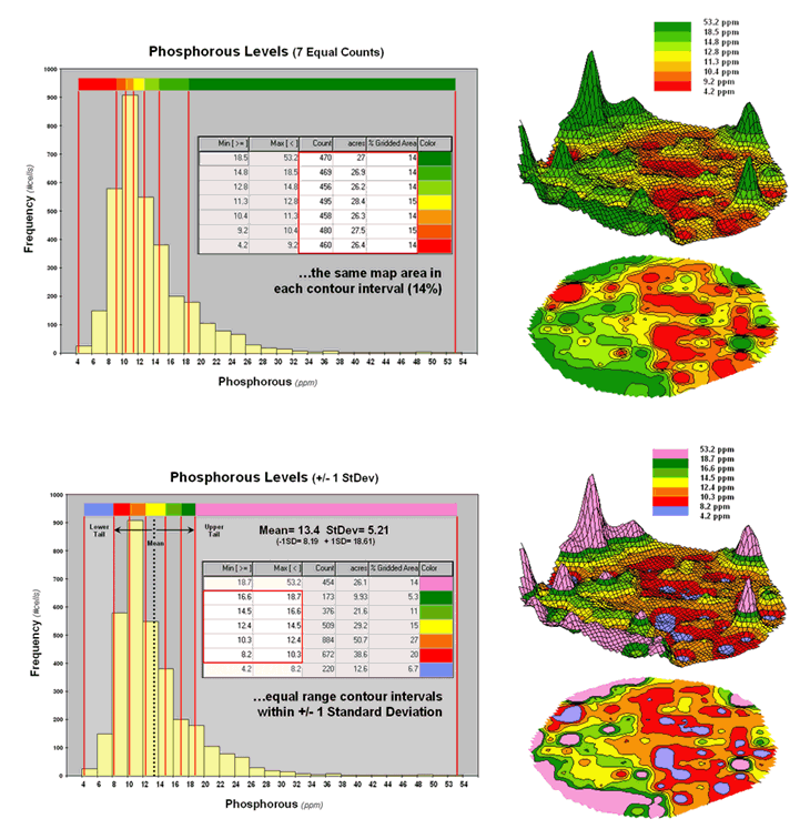
2. Equal Count and +/- 1 Standard Deviation
contour maps.
Figure 2 shows the results of applying other strategies for contouring the same data. The top inset uses Equal Count calculations to divide the data range into intervals that represent equal amounts of the total map area. This procedure first calculates the interval step as total #cells / #intervals= 3288 / 7 = 470 cells then starts at the minimum map value and assigns progressively larger map values until 470 cells have been assigned. The calculations are repeated to successively capture groups of approximately 470 cells of increasing values, or about 14.3 percent of the total map area.
Notice the unequal spacing of the breakpoints (red bars) in the histogram plot for the equal count contours. Sometimes a contour interval only needs a small data step to capture enough cells (e.g., peaks in the histogram); whereas others require significantly larger steps (flatter portions of the histogram). The result is a more complex contour map with fairly equal amounts of colored polygons.
The bottom inset in figure 2 depicts yet another procedure for assigning contour breaks. This approach divides the data into groups based on the calculated mean and Standard Deviation. The standard deviation is added to the mean to identify the breakpoint for the upper contour interval (contour seven = 13.4 + 5.21= 18.61 to max) and subtracted to set the lower interval (contour one = 13.4 - 5.21= 8.19 to min).
In statistical terms the low and high contours are termed the “tails” of the distribution and locate data values that are outside the bulk of the data— sort of unusually lower and higher values than you normally might expect. In the 2D and 3D map displays on the right side of the figure these locations are shown as blue and pink areas.
The other five contour intervals are assigned by forming equal ranges within the lower and upper contours (18.61 - 8.19 = 10.42 / 5 = 2.1 interval step) and assigned colors red through green with a yellow inflection point. The result is a map display that highlights areas of unusually low and high values and shows the bulk of the data as gradient of increasing values.
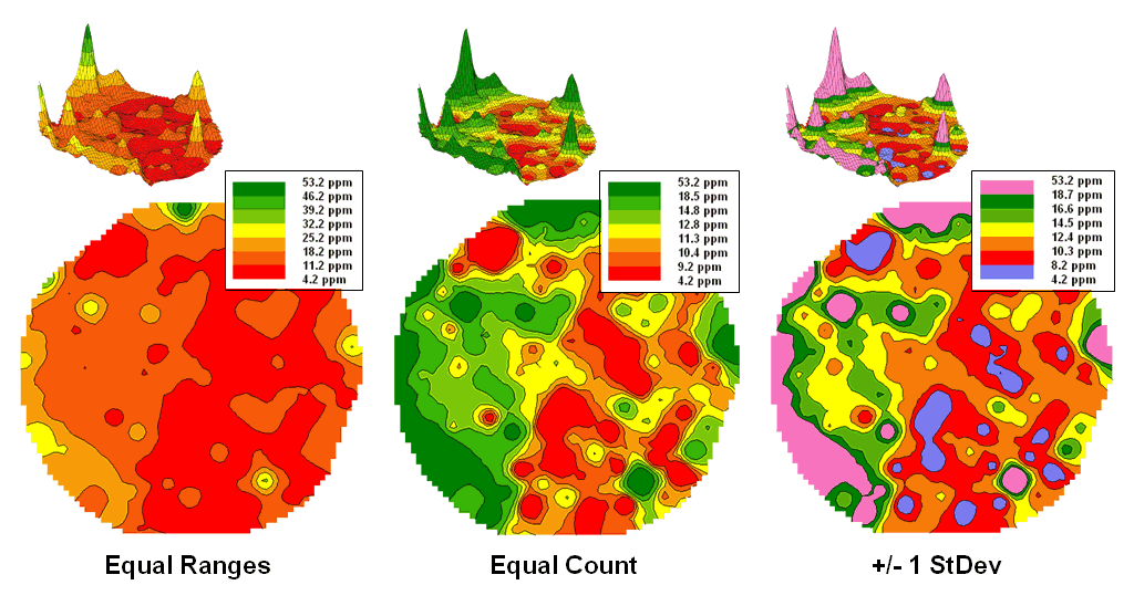
Figure
3. Comparison of different 2D
contour displays.
The
bottom line is that the same surface data generated dramatically different 2D
contour maps (figure 3). All three
displays contain seven intervals but the methods of assigning the breakpoints
to the contours employ radically different approaches. So which one is right? Actually all three are right, they just
reflect different perspectives of the same data distribution …a bit of the art
in the “art and science” of
What’s Missing in Mapping?
(GeoWorld, April 2009)
We have known the purpose of maps for thousands of years—precise placement of physical features for navigation. Without them historical heroes might have sailed off the edge of the earth, lost their way along the Silk Route or missed the turn to Waterloo. Or more recently, you might have lost life and limb hiking the Devil’s Backbone or dug up the telephone trunk line in your neighborhood.
Maps have always told us where we are, and as best possible, what is there. For the most part, the historical focus of mapping has been successfully automated. It is the “What” component of mapping that has expanded exponentially through derived and modeled maps that characterize geographic space in entirely new ways. Digital maps form the building blocks and map-ematical tools provide the cement in constructing more accurate maps, as well as wholly new spatial expressions.
For example, consider the left-side of figure 1 that shows both discrete (Contour) and continuous (Surface) renderings of the Elevation gradient for a project area. Not so long ago the only practical way of mapping a continuous surface was to force the unremitting undulations into a set of polygons defined by a progression of contour interval bands. The descriptor for each of the polygons is an interval range, such as 500-700 feet for the lowest contour band in the figure. If you had to assign a single attribute value to the interval, it likely would be the middle of the range (600).
But does that really make sense? Wouldn’t some sort of a statistical summary of the actual elevations occurring within a contour polygon be a more appropriate representation? The average of all of the values within the contour interval would seem to better characterize the “typical elevation.” For the 500-700 foot interval in the example, the average is only 531.4 feet which is considerably less than the assumed 600 foot midpoint of the range.
Our paper map legacy has conditioned us to
the traditional contour map’s interpretation of fixed interval steps but that
really muddles the “What” information.
The right side of figure 1 tells a different story. In this case the polygons represent seven
Districts that are oriented every-which-way and have minimal to no relationship
to the elevation surface. It’s sort of
like a surrealist Salvador Dali painting with the Districts melted
onto the Elevation surface indentifying the coincident elevation values. Note that with the exception of District #1,
there are numerous different elevations occurring within each district’s
boundary.
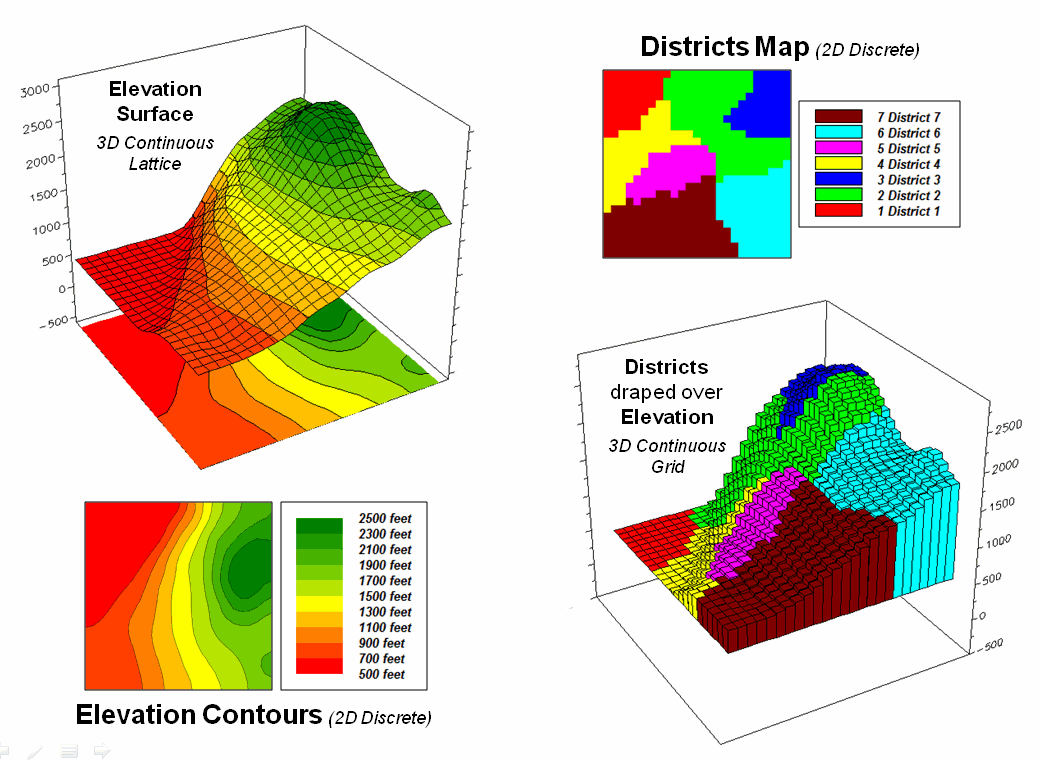
Figure 1. Visual assessment of the spatial coincidence between a continuous
Elevation surface and a discrete map of Districts.
One summary attribute would be simply
noting the Minimum/Maximum values in
a manner analogous to contour intervals.
Another more appropriate metric would be to assign the Median of the values identifying the
middle value for a metric that divides the total frequency into two
halves. However the most commonly used statistic for
characterizing the “typical condition” is a simple Average of all the elevation numbers occurring within each
district. The “Thematic Mapping”
procedure of assigning a single value/color to characterize individual map
features (lower left-side of figure 2) is fundamental to many GIS applications,
letting decision-makers “see” the spatial pattern of the data.
The discrete pattern, however, is a
generalization of the actual data that reduces the continuous surface to a
series of stepped mesas (right-side of figure 2). In some instances, such as District #1 where
all of the values are 500, the summary to a typical value is right on. On the other hand, the summaries for other
districts contain sets of radically differing values suggesting that the
“typical value” might not be very typical.
For example, the data in District #2 ranges from 500 to 2499 (valley
floor to the top of the mountain) and the average of 1539 is hardly anywhere,
and certainly not a value supporting good decision-making.
So what’s the alternative? What’s better at depicting the “What
component” in thematic mapping? Simply
stated, an honest map is better. Basic
statistics uses the Standard Deviation (StDev) to characterize the amount dispersion in a data
set and the Coefficient of Variation (Coffvar= [StDev/Average] *100)
as a relative index. Generally speaking,
an increasing Coffvar index indicates increasing data
dispersion and a less “typical” Average— 0 to 10, not much data dispersion;
10-20, a fair amount; 20-30, a whole lot; and >30, probably too much
dispersion to be useful (apologies to statisticians among us for the simplified
treatise and the generalized but practical rule of thumb). In the example, the thematic mapping results
are good for Districts #1, #3 and #6, but marginal for Districts #5, #7 and #4
and dysfunctional for District #2, as its average is hardly anywhere.
So what’s the bottom line? What’s missing in traditional thematic
mapping? I submit that a reasonable and
effective measure of a map’s accuracy has been missing (see Author’s Notes). In the paper map world one can simply include
the Coffvar index within the label as shown in
left-side of figure 2. In the digital
map world a host of additional mechanisms can be used to report the dispersion,
such as mouse-over pop-ups of short summary tables like the ones on the
right-side of figure 2.
Figure 2.
Characterizing the average Elevation for each District and reporting how
typical the typical Elevation value is.
Another possibility could be to use the
brightness gun to track the Coffvar—with the display
color indicating the average value and the relative brightness becoming more
washed out toward white for higher Coffvar
indices. The effect could be toggled
on/off or animated to cycle so the user sees the assumed “typical” condition,
then the Coffvar rendering of how typical the typical
really is. For areas with a Coffvar greater than 30, the rendering would go to
white. Now that’s an honest map that
shows the best guess of typical value then a visual assessment of how typical
the typical is—sort of a warning that use of shaky information may be hazardous
to you professional health.
As
Geotechnology moves beyond our historical focus on “precise placement of physical features for navigation” the ability
to discern the good portions of a map from less useful areas is critical. While few readers are interested in
characterizing average elevation for districts, the increasing wealth of mapped
data surfaces is apparent— from a
realtor wanting to view average home prices for communities, to a natural
resource manager wanting to see relative habitat suitability for various
management units, to a retailer wanting to determine the average probability of
product sales by zip codes, to policemen wanting to appraise typical levels of
crime in neighborhoods, or to public health officials wanting to assess air
pollution levels for jurisdictions within a county. It is important that they all “see” the
relative accuracy of the “What component” of the results in addition to the
assumed average condition.
_____________________________
Author’s
Notes: see http://www.innovativegis.com/basis/MapAnalysis/Topic18/Topic18.htm
for an online discussion of the related concepts, structures and considerations
of grid-based mapped data. Discussion of
the differences between map Precision and Accuracy is at http://www.innovativegis.com/basis/MapAnalysis/MA_Intro/MA_Intro.htm,
“Determining Exactly Where is What.”