Beyond Mapping III
|
Further |
Identify and Use Visual Exposure to Create Viewshed
Maps — discusses
basic considerations and procedures for establishing visual connectivity
Visual Exposure is in the Eye of the Beholder — describes
procedures for assessing visual impact and creating simple models
Use Exposure Maps and Fat Buttons to Assess Visual
Impact — investigates
procedures for assessing visual exposure
Use Maps to Assess Visual Vulnerability — discusses
a procedure for identifying visually vulnerable areas
Try Vulnerability Maps to Visualize Aesthetics — describes
a procedure for deriving an aesthetics map based on visual exposure to pretty
and ugly places
In Search of the Elusive Image — describes
extended geo-query techniques for accessing images containing a location of
interest
Note: The processing and figures discussed in this topic were derived using MapCalcTM
software. See www.innovativegis.com to download a
free MapCalc Learner version with tutorial materials for classroom and
self-learning map analysis concepts and procedures.
<Click here>
right-click to download a printer-friendly version of this topic (.pdf).
(Compilation Table of Contents)
______________________________
Identify and Use Visual
Exposure to Create Viewshed Maps
(GeoWorld, June 2001, pg. 24-25)
(top)
The past several columns have discussed the concept of effective
proximity in deriving variable width buffers and travel-time movement. The procedures relax the assumption that
distance is only measured as “the shortest straight line between two points.” Real world movement is rarely straight as it
responds to a complex set of absolute and relative barriers. While the concept of effective proximity
makes common sense, its practical expression had to wait for
Similarly, the measurement of visual connectivity is
relatively new to map analysis but has always been part of a holistic
perspective of a landscape. We might not
be able to manually draw visual exposure surfaces yet the idea of noting how
often locations are seen from other areas is an important ingredient in
realistic planning. Within a
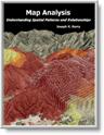
Figure
1. Viewshed
of all surface water locations.
For example, the viewshed map shown in top portion of figure 1 identifies all the map locations that are seen (tan) by at least one cell of surface water (dark blue). The light gray locations along the right side of the map locate areas that are not visually connected to water—bum places for hikers wanting a good view of surface water while enjoying the scenery.
The bottom portion of the figure takes visual connectivity a step further by calculating the number of times each map location is seen by the “viewer” cells. In the example there are 127 water cells and one location near the top of the mountain sees 121 of them… very high visual exposure to water. In effect, the exposure surface “paints” the viewshed by the relative amount of exposure—green not much and red a whole lot.
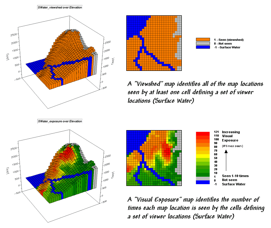
So how does the computer determine visual connectivity? The procedure actually is quite simple (for a tireless computer) and is similar to the calculation of effective proximity. A series of “distance waves” radiate out from a water cell like the ripples from a rock tossed into a pond (see figure 2). As the wave propagates, the distance from the viewer cell (termed the run) and the difference in elevation (termed the rise) are calculated for the cells forming the concentric ring of a wave. If the rise/run ratio is greater than any of the ratios for the previous rings along a line from the viewer cell, that location is marked as seen. If it is smaller, the location is marked as not seen.
Figure
2. Example
calculations for determining visual connectivity.
In the example shown in figure 2, the rise/run ratios to the south (arrow in the figure) are successively larger for rings 1 through 4 (marked as seen) but not for rings 5 through 9 (marked as not seen). The computer does calculations for all directions from the viewer cell and marks the seen locations with a value of one. The process is repeated for all of the viewer cells defining surface water locations—127 times, once for each water cell. Locations marked with a one at least once identifies the viewshed. Visual exposure, on the other hand, simply sums the markers for the number of times each location is seen.
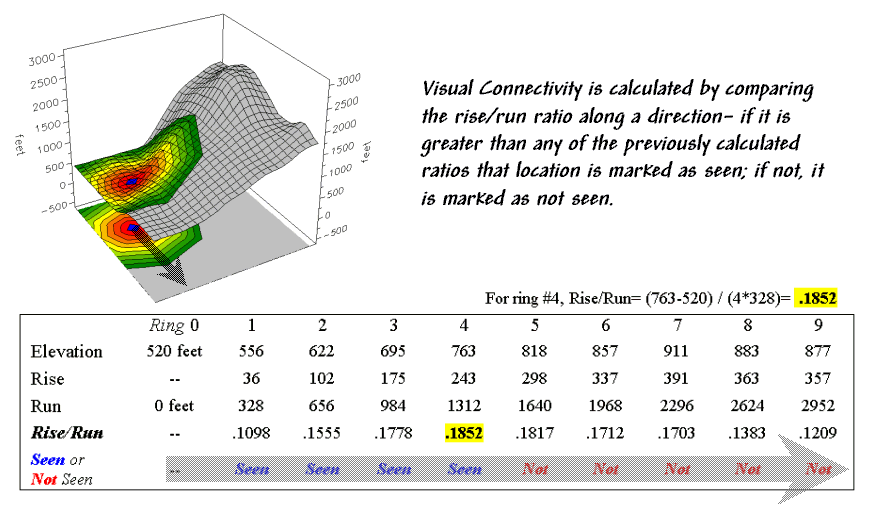
Now let’s complicate matters a bit. Suppose there is a dense forest with 75-foot trees that grow like “chia pet” hairs out of the elevation surface. The forest canopy height is analogous to raising the elevation surface an equal amount. But unless you’re a bird, your eyeball stays on the ground and the trees act like screens blocking your view.
The 3-D plot in figure 3 shows the effect of introducing a 75-foot forest canopy onto the elevation surface. Note the sharp walls around the water cells, particularly in the lower right corner. The view on the ground from these areas is effectively blocked. The computer “knows” this because the first ring’s rise/run ratio is very large (big rise for a small run) and is nearly impossible to beat in subsequent rings.
The consequence of the forest screens is shown in the maps on the right. The top one doesn’t consider trees, while the bottom one does. Note the big increase in the “not seen” area (gray) along the stream in the lower right where the trees serve as an effective visual barrier. If your motive is to hide something ugly in these areas from a hiking trail along the stream, the adjacent tree canopy is extremely important.
Figure
3. Introducing
visual screens that block line-of-sight connections.
The ability to calculate visual connectivity has many applications. Resource managers can determine the visual impact of a proposed activity on a scenic highway. County planners can assess what is seen, and who in turn can see, a potential development. Telecommunication engineers can try different tower locations to “see” which residences and roadways are within the different service areas.
Within a
Visual
Exposure Is in the Eye of the Beholder
(GeoWorld, July 2001, pg. 24-25)
(top)
The previous section introduced some basic calculations and considerations in deriving visual exposure. An important notion was that “viewer” locations can be a point, group of points, lines or areas—any set of grid cells. In the example described last month, all of the stream and lake cells were evaluated to identify locations seen by at least one water cell (termed a viewshed) or the number of water cells seeing each map location (termed visual exposure).
In effect, the water features are similar to the composite eye of a fly with each grid cell serving as an individual lens. The resulting map simply reports the line-of-sight connections from each lens (grid cell) to all of the other locations in a project area.
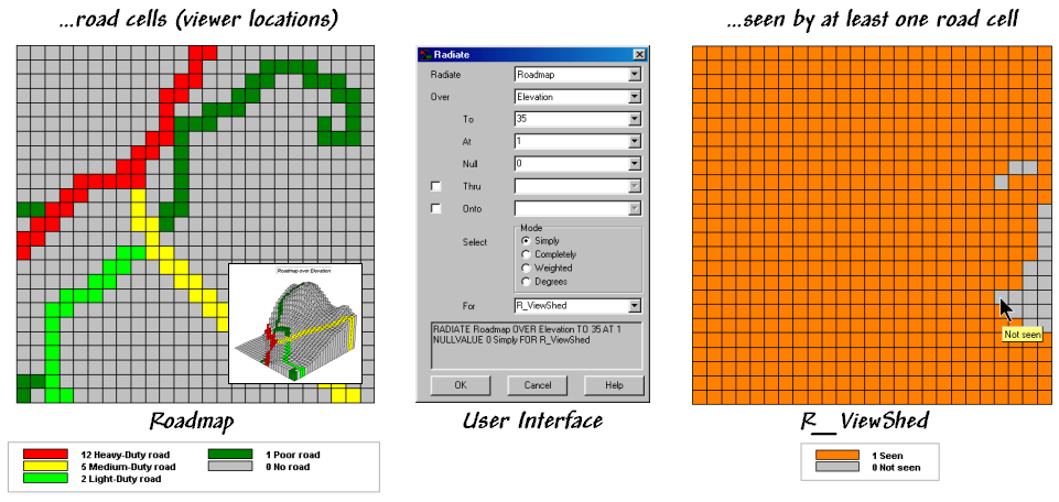
Figure 1. Identifying the “viewshed” of the road network.
Figure 1 shows a similar analysis for a road network. The cells defining the roads are shown in the map on the left with a draped display on the elevation surface as the inset. The computer “goes” to one of the road cells, “looks” everywhere over the terrain and “marks” each map location that can be seen with a value of one. The process is repeated for all of the other road cells resulting in the map on the right—a viewshed map with seen (tan), not seen (gray).
The interface in the middle of figure 1 shows how a user coerces the computer to generate a viewshed map. In the example, the command Radiate is specified and the Roadmap is selected to identify the viewer cells. The Elevation map is selected as the terrain surface whose ridges and valleys determine visual connectivity from each lens of the elongated eyeball. The To 35 parameter tells the computer to look upto 35 cells away in all directions—effectively everywhere on the 25x25 cell project area. The At 1 specification indicates that the eyeball is 1-foot over the elevation surface and the Null 0 sets zero as the background (not a viewer cell). The Thru and Onto specifications will be discussed a little later.
As the newer generations of
Locations on the R_ViewShed map that didn’t receive any connectivity marks (value 0) are not seen from any road cell. Figure 2 shows results using different calculation modes and the resulting maps.
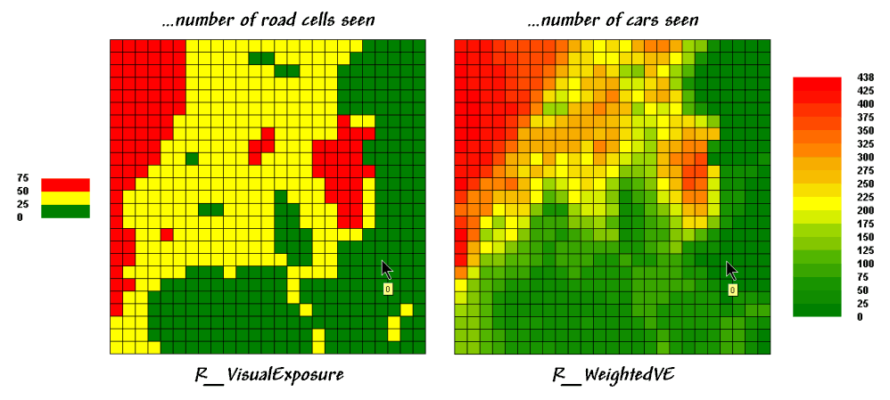
The values on the R_VisualExposure map were generated by clicking Completely to calculate the number of roads cells that “see” each location in the project area—from 0 (not seen) to 75 times seen. Generally speaking, you put ugly things where the numbers are low and pretty things where the numbers are high.
Figure
2. Calculating
simple and weighted visual exposure.
But just the sum of road cells that are visually connected doesn’t always tell the whole story. Note the values defining the different types of roads on the Roadmap in figure 1—1 Poor road, 2 Light-duty, 5 Medium-duty, and 12 Heavy-duty. The values were craftily assigned as “relative weights” indicating the average number of cars within a 15-minute time period. It’s common sense that a road with more cars should have more influence in determining visual exposure than one with just a few cars.
The calculation mode was switched to Weighted to generate the R_WeightedVE map displayed on the right side of figure 2. In this instance, the Roadmap values are summed for each map location instead of just counting how many road cells are visually connected. The resultant values indicate the relative visual exposure based on the traffic densities—viewer cells with a lot of cars having greater influence.
Now turn your attention to the Thru and Onto specifications in the example interface. The Thru hot-field allows the user to specify a map identifying the height of visual barriers within the area. In last month’s discussions it was used to place the 50-foot tree canopy for forested areas—the “chia pet” hairs on top of the elevation surface that blocks visual connections. The Thru map contains height values for all “screen” locations and effectively adds the blocking heights to the elevation values at each location—0 indicates no screen and 50 indicates a 50-foot visual barrier on top of the terrain.
The Onto hot-field is conceptually similar but has an important difference. It addresses tall objects, such as smoke-stacks or towers, that might be visible but not wide enough to block views. In this instance, the computer adds the “target” height when visual connectivity is being considered for a cell containing a structure but the added height isn’t considered for locations beyond. The effect is that the feature pops-up to see if it is seen but doesn’t hang around to block the view beyond it.
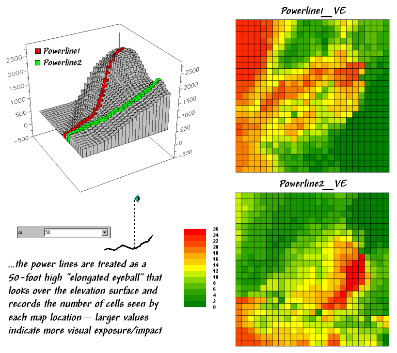
Figure 3 depicts yet another way of dealing with extended features. Assume you want to assess the difference in visual impact of two proposed power line routes shown in the 3-D inset in the figure. In this instance, Powerline1 is first selected as the viewer map (instead of Roadmap) and the At parameter is set to 50. The command is repeated for Powerline2.
Figure
3. Determining
the visual exposure/impact of alternative power line routes.
These entries identify the power line cells and their height above the ground. The Powerline1_VE map shows the number of times each map location is seen by the elongated Powerline1 eyeball. And by “line-of-sight,” if the power line can see you, you can see the power line. The differences in the patterns between Powerline1_Ve and Powerline2_VE maps characterize the disparity in visual impact for the two routes. What if your house was in a red area on one and a green area on another? Which route would you favor?… not in my visual backyard. Next month we’ll investigate a bit more into how models using visual exposure can be used in decision-making.
Use
Exposure Maps and Fat Buttons to Assess Visual Impact
(GeoWorld, August 2001, pg. 24-25)
(top)
The last section described several considerations in deriving visual exposure maps. Approaches ranged from a simple viewshed (locations seen) and visual exposure (number of times seen) to weighted visual exposure (relative importance of visual connections). Extended settings discussed included distance, viewer height, visual barrier height and special object height.
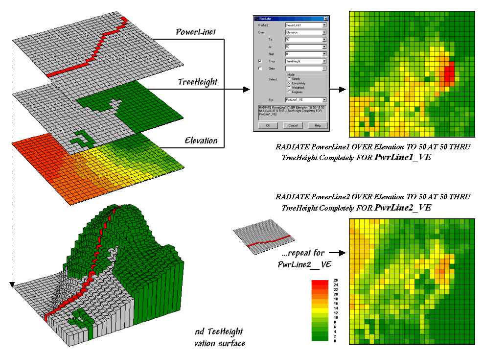
Figure 1. Calculating visual exposure
for two proposed power lines.
Figure 1 rekindles the important points before tackling visual impact modeling. The maps on the left identify input information for calculating visual exposure. The PowerLine1 map serves as an elongated eyeball, the TreeHeight map identifies areas with a 75-foot forest canopy that grows like “chia pet” hairs on the Elevation surface.
The 3-D inset is a composite display of all three input maps. The user interface shown in the middle is used to specify viewer height (At 50) that raises the power line 50-feet above the surface. A large distance value (To 50) is entered to force the calculations for all locations in the study area. Finally, the visual exposure mode is indicated (Completely) and a name assigned to the derived map (PwrLine1_VE).
The top-left map shows the result with red tones indicating higher visual exposure. The lower-left map shows visual exposure for a second proposed power line that runs a bit more to the south. It was calculated by simply changing the viewer map to PowerLine2 and the output map to PwrLine2_VE. Compare the patterns of visual exposure in the two resultant maps. Where do they have similar exposure levels? Where do they differ? Which one affects the local residents more?
This final question requires a bit more processing to nail down—locating the residential areas, “masking” their visual exposure and comparing the results. Figure 2 outlines a simple impact model for determining the exposure difference between the two proposed routes. The visual exposure maps on the left are the same as those in figure 1 and serve as the starting point for the impact model.
The Housing map identifies grid cells that contain at least one house. The values in the housing cells indicate how many residences occur in each cell—1 to 5 houses in this case; a 0 value indicates that no houses are present. This map is multiplied by the visual exposure maps to calculate the visual impact for both proposed routes (PwrLine1_VEimpact and PwrLine2_VEimpact). Note that exposure for areas without a house result in zero impact—0 times any exposure level is 0. Locations with one house report the calculated exposure level—1 times any exposure level is the same exposure level. Locations with more than one house serve as a multiplier of exposure impact—2 times any exposure level is twice the impact.
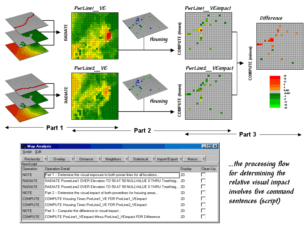
Figure
2. Determining
visual impact on local residents.
The final step involves comparing the two visual impact maps by simply subtracting them. The red tones on the Difference map identify residential locations that are impacted more by the PowerLine1 route—the higher the value, the greater the difference in impact.
The dark red locations identify residents that are significantly more affected by route 1—expect a lot of concern about the route. On the other hand, there are only three locations that are slightly more affected by route 2 (dark green; fairly low values).
The information in the lower portion of figure 2 is critical
in understanding
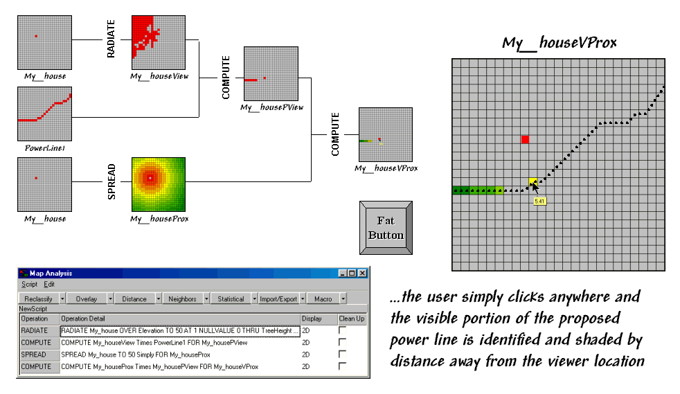
Figure
3. Determining
visible portions of a proposed power line.
The ability to save and re-run a map analysis sequence sets
the stage for the current revolution in
The flowchart shows the logical structure of the analysis and the intermediate maps generated—
ü Calculate the viewshed from the selected point
ü Mask the portion of the route within the viewshed
ü Calculate proximity from the selected point
ü Mask the proximity for just the proportion of the route
The script identifies the four sentences that solve the
spatial problem. The revolution is
represented by the “Fat Button” in the figure.
Within a
The ability to pop-up special input interfaces and launch command scripts moves
the paradigm of a “
Use Maps to Assess Visual Vulnerability
(GeoWorld,
February 2003, pg. 22-23)
(top)
The previous sections introduced fundamental concepts and procedures used in visual analysis. As a quick review, recall that the algorithm uses a series of expanding rings to determine relative elevation differences from the viewer position to all other map locations. Elevation differences that are less than those in previous rings are not seen.
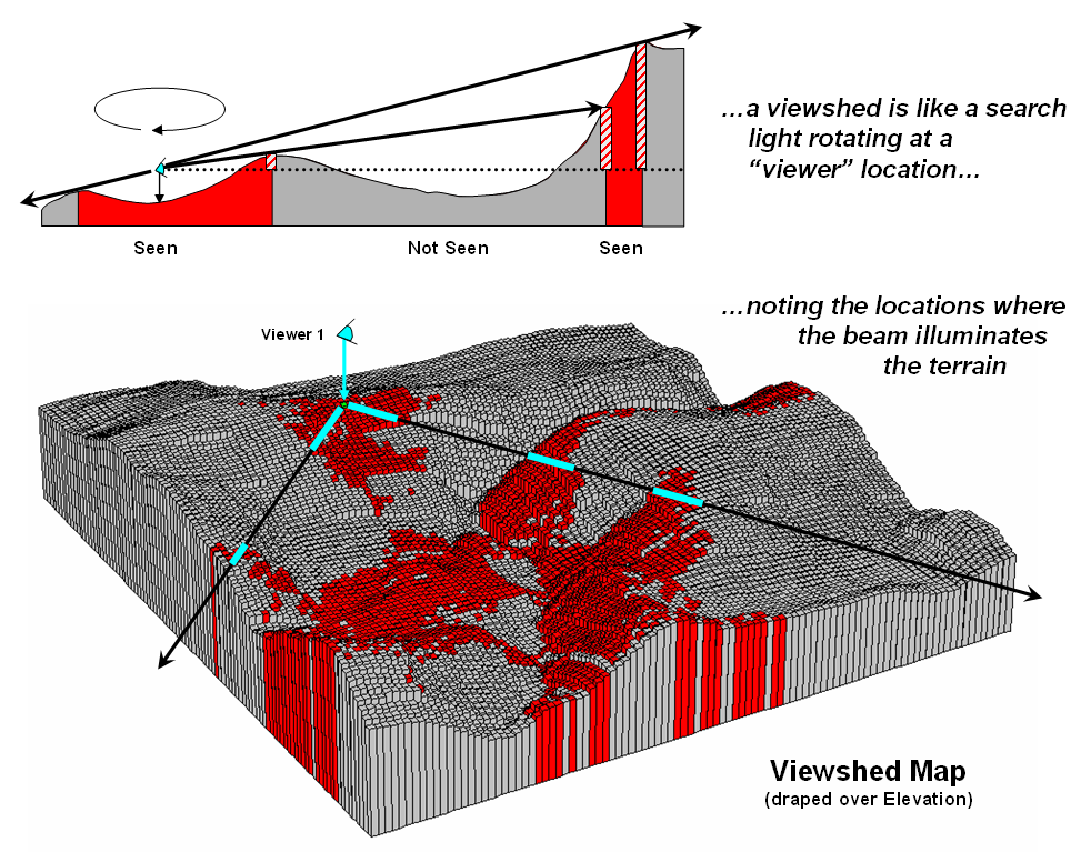
Figure 1. Calculating a
viewshed.
The top portion of figure 1 illustrates the
procedure. The ratio of the elevation
difference (rise indicated as striped
boxes) to the distance away (run
indicated as the dotted line) is used to determine visual connectivity. Whenever the ratio exceeds the previous
ratio, the location is marked as seen (red); when it fails it is marked as not
seen (grey).
To conceptualize the procedure, imagine a searchlight illuminating portions of
a landscape. As the searchlight revolves
about a viewer location the lit areas identify visually connected
locations. Shadowed areas identify
locations that cannot be seen from the viewer (nor can they see the
viewer). The result is a viewshed
map as shown draped over the elevation surface in figure 1. Additional considerations, such as tree
canopy, viewer height and view angle/distance, provide a more complete
rendering of visual connectivity.
The top portion of figure 2 shows the viewsheds from
three different viewer locations. Each
map identifies the locations within the project area that are visually
connected to the specified viewer location.
Note that there appears to be considerable overlap among the “seen”
(red) areas on the three maps. Also note
that most of the right side of the project area isn’t seen from any of the locations
(grey).
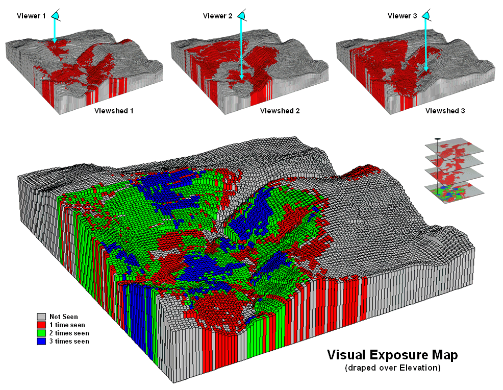
Figure 2. Calculating a
visual exposure map.
A visual exposure map is generated by
noting the number of times each location is seen from a set of viewer
locations. In figure 2 this process is
illustrated by adding the three viewshed maps together. The resulting visual exposure map in the
bottom of the figure contains four values—0= not seen, 1= one time seen, 2= two
times seen and 3= three times seen—forming a relative exposure scale.
The top portion of figure 3 shows the result considering the entire road
network as a set of viewer locations. In
addition, the different road types are weighted by the number of cars per hour. In this instance the total “number of cars”
replaces the “number of times seen” for each location in the project area.
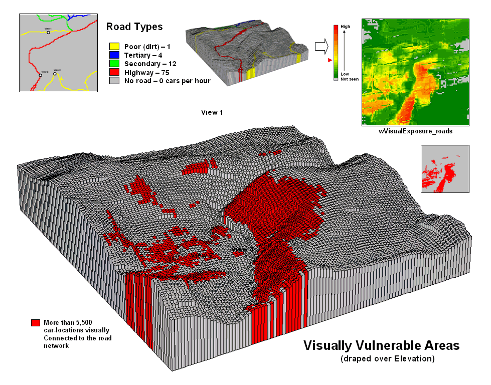
Figure 3. Calculating a
visual vulnerability map.
The effect is that extra importance is given to road types
having more cars yielding a weighted visual exposure map. The relative scale extends from 0 (not seen;
grey) to 1 (one car-location visually connected; dark green) through 12,614
(lots and lots of visual exposure to cars; dark red). In turn, this map was reclassified to
identify areas with high visual exposure—greater than 5,500 car-locations
(yellow through red)—for a map of visual vulnerability.
A visual vulnerability map can be useful in planning and decision-making. To a resource planner it identifies areas
that certain development alternative could be a big “eyesore.” To a backcountry developer it identifies
areas whose views are dominated by roads and likely a poor choice for “serenity
acres.” Before visual analysis
procedures were developed, visceral visions of visual connectivity were
conjured-up with knitted-brows focused on topographic maps tacked to a wall. Now detailed visual vulnerability assessments
are just a couple of clicks away.
Try Vulnerability Maps to Visualize Aesthetics
(GeoWorld, March 2003, pg. 22-23)
(top)
The previous section described procedures for characterizing visual vulnerability. The approach identified “sensitive viewer locations” then calculated the relative visual exposure to the feature for all other locations in a project area. In a sense, a feature such as a highway is treated as an elongated eyeball similar to a fly’s compound eye composed of a series of small lenses—each grid cell being analogous to a single lens.
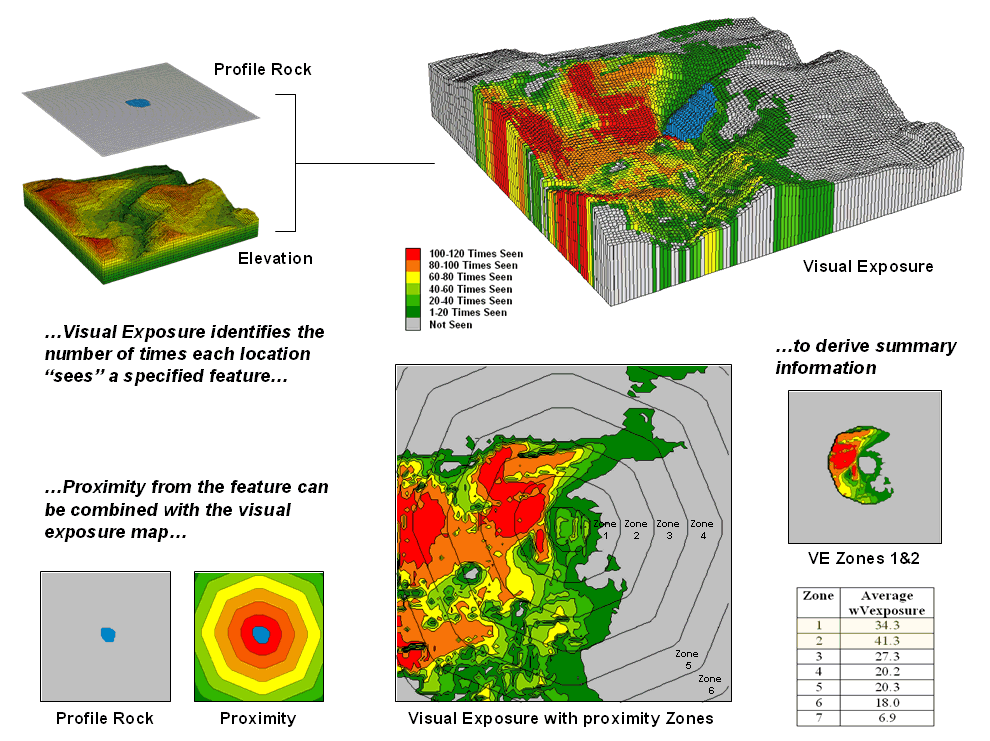
Figure 1. Visual connectivity to a map
feature (Profile Rock) identifies the number of times each location sees the
extended feature.
In figure 1, Profile Rock is composed of 120 grid cells
positioned in the center of the project area.
In determining visual exposure to Profile Rock, the computer calculates
straight line connectivity from one of its cells to all other locations based
on its relative position on the elevation surface. Depending on the unique configuration of the
terrain some areas are marked as seen and others are not.
The process is repeated for all of the cells defining Profile Rock and a
running count of the “number of times seen” is kept for each map location. The top right inset displays the resulting
visual exposure from not seen (VE= 0; grey) to the entire feature being visible
(VE= 120; red). As you might suspect, a
large amount of the opposing hillside has a great view of Profile Rock. The southeast plateau, on the other hand,
doesn’t even know it exists.
The lower portion of figure 1 extends on the concept of visual exposure by introducing distance. It is common sense that something near you (foreground) has more visual impact than something way off in the distance (background). A proximity map from the viewer feature is generated and distance zones can be intersected with the visual exposure map (lower-right inset in figure 3). The small map on the extreme right shows visual exposure for just distance Zones 1 and 2 (600m reach). The accompanying table summarizes the average visual exposure to Profile Rock within each distance zone—much higher for Zones 1 and 2 (34.3 and 41.3) than the more distant zones (27.3 or less).
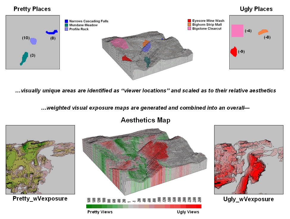
Figure 2. An aesthetic map determines the
relative attractiveness of views from a location by considering the weighted
visual exposure to pretty and ugly places.
The ability to establish weighted visual exposure for features is critical in deriving an aesthetic map. In this application various features are scaled in terms of their relative beauty— 0 to 10 for increasing pretty places and 0 to -10 for increasing ugly places. For example, Profile Rock represents a most strikingly beautiful natural scene and therefore is assigned a “10.” However, Eyesore Mine wash is one of the ugliest places to behold so it is assigned a “-9.” In calculating weighted visual exposure, the aesthetic value at a viewer location is added to each location within its viewshed. The result is high positive values for locations that are connected to a lot of very pretty places; high negative values for connections to a lot very ugly places; zero, or neutral, if not connected to any pretty or ugly places or they cancel out.
The top portion of figure 2 shows the aesthetics ratings for several “pretty and ugly” features in the area as 2D plots then as draped on the terrain surface. The 2D plots in the bottom portion of the figure identify the total weighted visual exposure for connections from each map location to pretty and ugly places.
The overall aesthetic map in the center is analogous to calculating net profit—revenue (think Pretty) minus expenses (think Ugly). It reports the net aesthetics of any location in the project area by simply adding the Pretty_wExposure and Ugly_wExposure maps. Areas with negative values (reds) have more ugly things within their view than pretty ones and are likely poor places for a scenic trail. Positive locations (greens), on the other hand, are locations where most folks would prefer to hike.
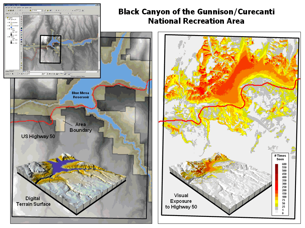
Figure 3. Weighted
visual exposure map for an ongoing visual assessment in a national recreation
area.
Real-world applications of visual assessment are taking
hold. For example, a senior honors
thesis project is underway at the
It seems to be a win-win situation with the student getting
practical
In Search of the Elusive Image
(GeoWorld, July
2013)
(top)
Last
year National Geographic reported that nearly a billion photos were taken in
the U.S. alone and that nearly half were captured using camera phones. Combine this with work-related imaging for
public and private organizations and the number becomes staggering. So how can you find the couple of photos that
image a specific location in the mountainous digital haystack?
For the highly organized folks, a cryptic description and file folder scheme
can be used to organize logical groupings of photos. However, the most frequently used automated search
technique uses the date/time stamp in the header of every digital photo. And if a GPS-enabled camera was used, the
location of an image can further refine the search. For most of us the basic techniques of Category,
Date/Time and Vicinity are sufficient for managing and accessing
a relatively small number of vacation and family photos (step 1, figure 1).
However if you are a large company or agency routinely capturing
terabytes of still photos and moving videos, searching by category, date/time
and earth position merely reduces the mountain of imagery to thousands
possibilities that require human interpretation to complete the search. Chances are most of the candidate image
locations are behind a hill or the camera was pointed in the wrong direction to
have captured the point of interest.
Simply knowing that the image is “near” a location doesn’t mean it
“sees” it.
Figure 2 outlines an approach that takes automated geo-searching a bit
farther (see author’s note 1). Step 2 in
the figure involves calculating the Viewshed from the query point
considering intervening terrain, cover type and the height of the camera. All of the potential images located outside
of the viewshed (grey areas) are not “visually connected” to the query point, so
the point of interest cannot appear in the image. These camera locations are eliminated.
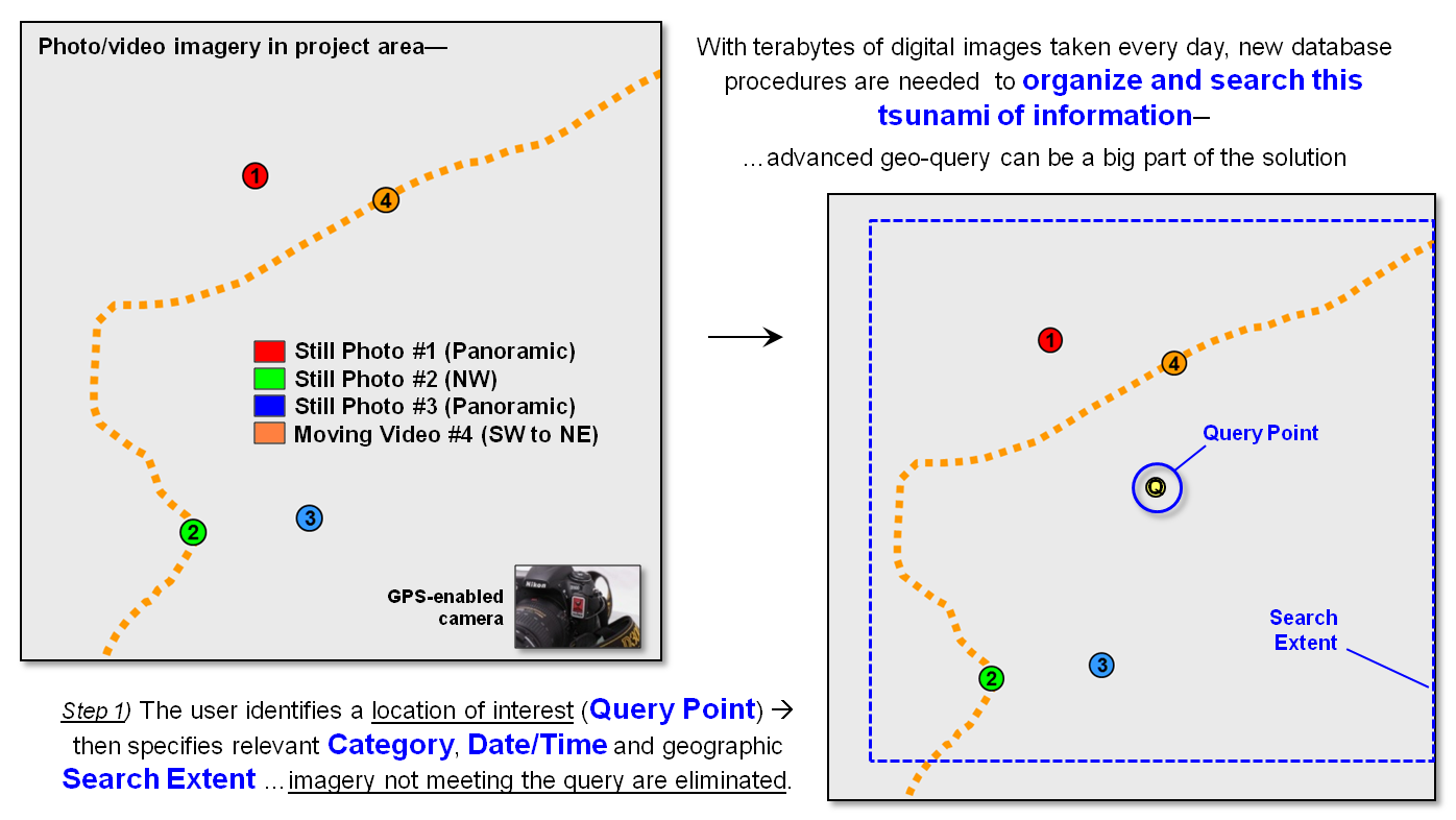
Figure 1. Geo-tagged photos and
streaming video extend traditional database category and date/time searches for
relevant imagery.
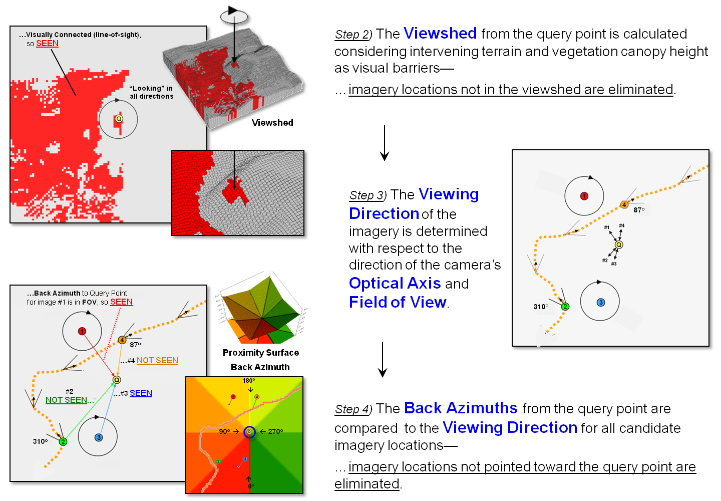
Figure 2. Viewshed Analysis
determines if a camera location can be seen from a location of interest and
Directional Alignment determines if the camera was pointed in the right
direction.
A third geo-query technique is a bit more involved and requires a
directionally-aware camera (step 3 in figure 2). While a lot of GPS-enabled cameras record the
position a photo was taken, few currently provide the direction/tilt/rotation
of the camera when an image is taken. Specialized
imaging devices, such as the three-axis gyrostabilizer mount
used in aerial photography, have been available for years to continuously monitor/adjust
a camera’s orientation. However, pulling
these bulky and expensive commercial instruments out of the sky is an
impractical solution for making general use cameras directionally aware.
On the other hand, the gyroscope/accelerometers in modern smartphones
primarily used in animated games routinely measure orientation, direction,
angular motion and rotation of the device that can be recorded with imagery as
the technology advances. All that is
needed is a couple of smart programmers to corral these data into an app that
will make tomorrow’s smartphones even smarter and more aware of their
environment to include where they are looking, as well as where they are
located. Add some wheels and a propeller
for motion and the smarty phone can jettison your pocket.
The final puzzle piece for fully aware imaging—lens geometry— has been
in place for years embedded in a digital photo’s header lines. The field of view (FOV) of a camera can be
thought of as a cone projected from the lens and centered on its optical axis. Zooming-in changes the effective focal length
of the lens that in turn changes the cone’s angle. This results in a smaller FOV that records a
smaller area of the scene in front of a camera.
Exposure settings (aperture and shutter speed) control the depth of
field that determines the distance range that is in focus.
The last step in advanced geo-query for imagery containing a specified
location mathematically compares the direction and FOV of the optical cone to
the desired location’s position. A
complete solution for testing the alignment involves fairly complex solid
geometry calculations. However, a first
order planimetric solution is well within current map analysis toolbox
capabilities.
A simple proximity surface from the specified location is derived and
then the azimuth for each grid location on the bowl-like surface is calculated
(step 4 in figure 2). This “back
azimuth” identifies the direction from each map location to the specified
location of interest. Camera locations
where the back azimuth is not within the FOV angle means the camera wasn’t
pointed in the right direction so they are eliminated.
In addition, the proximity value at a connected camera location
indicates how prominent the desired location is in the imaged scene. The different between the optical axis
direction and the back azimuth indicates the location’s centering in the image.
Figure 3 summarizes the advanced geo-query procedure. The user specifies the desired image category, date/time interval and geographic search extent, and then “clicks” on a location of interest. Steps 2, 3 and 4 are automatically performed to narrow down the terabytes of stored imagery to those that are within the category/date/time/vicinity specifications, within the viewshed of the location of interest and pointed toward the location of interest. A hyperlinked list of photos and streaming video segments is returned for further visual assessment and interpretation.
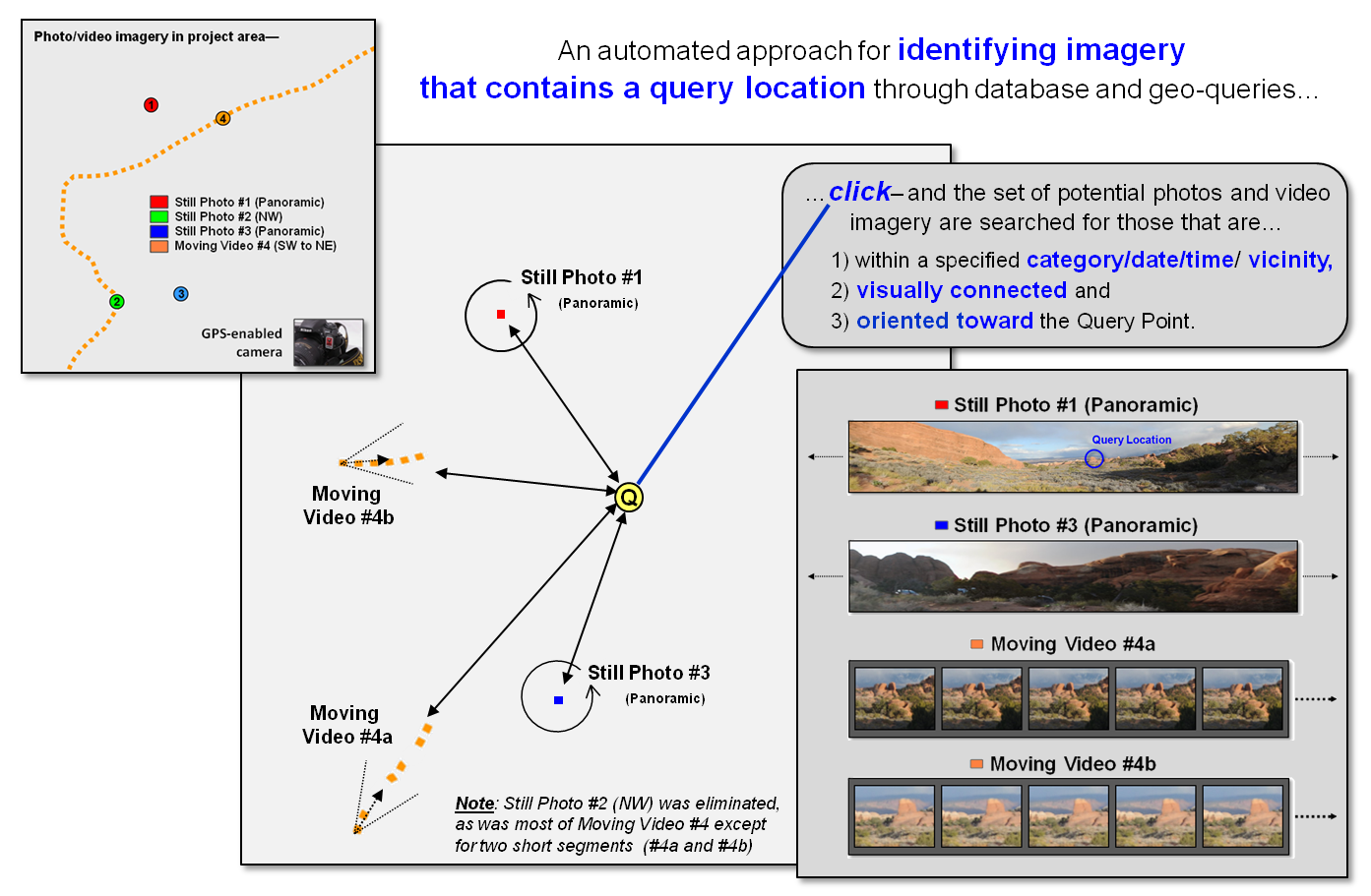
Figure 3. Advanced geo-query
automatically accesses relevant nearby imagery that is line-of-sight connected
and oriented toward a query point.
While full implementation of the automated processing approach awaits smarter phones/cameras (and a couple of smart programmers), portions of the approach (steps 1and 2) are in play today. Simply eliminating all of the GPS-tagged images within a specified distance of a desired location that are outside its viewshed will significantly shrink the mountain of possibilities—tired analyst’s eyes will be forever grateful.
_____________________________
Author’s Notes:
1) The advanced geo-query approach described
follows an early prototype technique developed for Red Hen Systems, Fort
Collins, Colorado.
(top)