Beyond Mapping III
|
Map
Analysis book with companion CD-ROM for hands-on exercises and further reading |
What's the Point? — discusses the
general considerations in point sampling design
Designer
Samples — describes
different sampling patterns and their relative advantages
Depending
on the Data — discusses
the fundamental concepts of spatial dependency
Uncovering
the Mysteries of Spatial Autocorrelation — describes approaches
used in assessing spatial autocorrelation
<Click here> right-click to download a
printer-friendly version of this topic (.pdf).
(Back to the Table of Contents)
______________________________
The reliability of an encoded map primarily depends on the accuracy of the
source document and the fidelity of the digitizer— which in turn is a function
of the caffeine level of the prefrontal-lobotomized hockey puck pusher
(sic). It’s at its highest when
Spatial dependency within a data set simply means that “what happens at one
location depends on what is happening around it” (formally termed positive
spatial autocorrelation). It’s this idea
that forms the basis of statistical tests for spatial dependency. The Geary Index calculates the squared difference
between neighboring sample values, then compares their summary to the overall
variance for the entire data set. If the
neighboring variance is a lot less than the overall, then considerable
dependency is indicated. The Moran Index
is similar, however it uses the products of
neighboring values instead of the differences.
A Variogram plots the similarity among locations as a function of
distance.
Although these calculations vary and arguments abound about
the best approach, all of them are reporting the degree of similarity among
point samples. If there is a lot, then
you can generate maps from the data; if there isn’t much, then you are more
than wasting your time. A pretty map can
be generated regardless of the degree of dependency, but if dependency is
minimal the map is just colorful gibberish… so don’t bet the farm on it.
OK, let’s say the data set you intend to map exhibits ample spatial
autocorrelation. Your next concern is
establishing a sampling frequency and pattern that will capture the variable’s
spatial distribution— sampling design issues.
There are four distinct considerations in sampling design: 1)
stratification, 2) sample size, 3) sampling grid, and 4) sampling pattern.
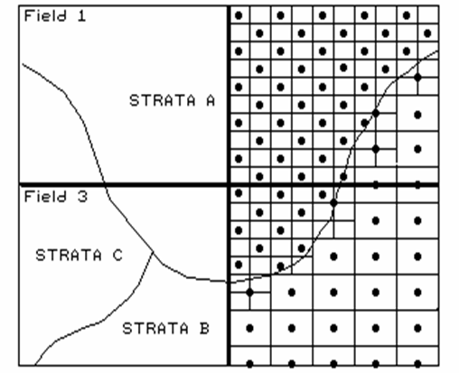
Figure 1. Variable sampling frequencies by soil strata for two fields.
The first three considerations determine the appropriate
groupings for sampling (stratification), the sampling intensity for each group
(sample size), and a suitable reference grid (sampling grid) for expressing the
sampling intensity for each group (see figure 1). All three are closely tied to the spatial
variation of the data to be mapped.
Let’s consider mapping phosphorous levels within a farmer’s field. If the field contains a couple of soil types,
you might divide it into two “strata.”
If previous sampling has shown one soil strata to be fairly consistent
(small variance), you might allocate fewer samples than another more variable
soil unit, as depicted in the accompanying figure.
Also, you might decide to generate a third stratum for even more intensive
sampling around the soil boundary itself.
Or, another approach might utilize mapped data on crop yield. If you believe the variation in yield is
primarily “driven” by soil nutrient levels, then the yield map would be a good surrogate for subdivision of the field into strata of high
and low yield variability. This
approach might respond to localized soil conditions that are not reflected in
the traditional (encoded) soil map.
Historically, a single soil sampling frequency has been used
throughout a region, without regard for varying local conditions. In part, the traditional single frequency was
chosen for ease and consistency of field implementation and simply reflects a
uniform spacing intensity based on how much farmers are willing to pay for soil
sampling.
Designer Samples
(GeoWorld, January 1997, pg. 30)
Last issue we briefly discussed spatial dependency and the
first three steps in point sampling design—stratification, sample size and
sampling grid. These considerations
determine the appropriate areas, or groupings, for sampling (stratification),
the sampling intensity for each group (sample size) and a suitable reference
grid (sampling grid) for locating the samples.
The fourth and final step “puts the sample points on the ground” by
choosing a sampling pattern to identify individual sample locations.
Traditional, non-spatial statistics tends to emphasize randomized patterns as
they insure maximum independence among samples… a critical element in calculating
the central tendency of a data set (average for an entire field). However, “the random thing” can actually
hinder spatial statistics’ ability to map field variability. Arguments supporting such statistical heresy
involve a detailed discussion of spatial dependency and autocorrelation, which
(mercifully) is postponed to another issue.
For current discussion, let’s assume sampling patterns other than random
are viable candidates.
Figure 1 identifies five systematic patterns, as well as a
completely random one. Note that the
regular pattern exhibits a uniform distribution in geographic space. The staggered start does so as well, except
the equally spaced Y-axis samples alternate the starting position at one half
the sampling grid spacing. The result is
a “diamond” pattern rather than a “rectangular” one. The diamond pattern is generally considered
better suited for generating maps as it provides more inter-sample distances
for spatial interpolation. The random
start pattern begins each column “transect” at a randomly chosen Y coordinate
within the first grid cell, thereby creating even more inter-sample
distances. The result is a fairly
regularly spaced pattern, with “just a tasteful hint of randomness.”
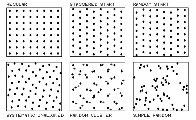
Figure 1. Basic spatial
sampling patterns.
Systematic unaligned also results in a somewhat regularly
spaced pattern, but exhibits even more randomness as it is not aligned in either
the X or Y direction. A study area
(i.e., farmer’s field) is divided into a sampling grid of cells equal to the
sample size. The pattern is formed by
first placing a random point in the cell in the lower-left corner of the grid
to establish a pair of X and Y offsets.
Random numbers are used to specify the distance separating the initial
point from the left border (termed the X-offset) and from the bottom border
(termed the Y-offset).
The “dots” in the random cluster pattern establish an underlying uniform
pattern (every other staggered start sample point in this example). The “crosses” locate a set of related samples
that are randomly chosen (both distance and direction) within the enlarged grid
space surrounding each regularly placed each dot. Note that the pattern is not as regularly
spaced as the previous techniques, as half of the points are randomly set,
however, it has other advantages. The
random subset of points provides a foothold for a degree of unbiased
statistical inference, such as a t-test of significance differences among
population means.
The simple random pattern uses random numbers to establish X and Y coordinates
within the entire study area. It allows
full use of statistical inference (whole field non-spatial statistics), but the
“clumping” of the samples results in large “gaps” thereby limiting its application
for mapping (site-specific spatial statistics).
So which pattern should be used?
Generally speaking, the Regular and Simple Random patterns are the worst
for spatial analysis. If you have
trouble locating yourself in space (haven’t bought into
Depending on the Data
Historically, maps have reported the precise position of
physical features for the purpose of navigation. Not long after emerging from the cave, early
man grabbed a stick and drew in the sand a route connecting the current
location to the best woolly mammoth hunting grounds, neighboring villages ripe
for pillaging, the silk route to the orient and the flight plan for the first
solo around the world. The basis for the
navigational foundation of mapping lies in referencing systems and the
expression of map features as organized sets of coordinates. The basis for modern
The technical focus has been enlarged to include a growing set of procedures
for discovering and expressing the dependencies within and among mapped
data. Spatial dependency identifies
relationships based on relative positioning.
Certain trees tend to occur on certain soil types, slopes and climatic
zones. Animals tend to prefer specific
biological and contextual conditions.
Particularly good sales prospects for luxury cars tend to cluster in a
few distinct parts of a city. In fact,
is anything randomly placed in geographic space? A rock, a bird, a person, a molecule?
There are two broad types of spatial dependency: 1) spatial variable dependence
and 2) spatial relations dependence.
Spatial variable dependency stipulates that what occurs at a map
location is related to:
·
the conditions of other variables at or around that location
(termed spatial correlation).
Contrast an elevation surface with a map of roads. If you're standing on a heavy duty, road-type
4 (watch out for buses) and note a light duty road-type 1 over there, it is
absurd to assume that there is a road-type 2.5 somewhere in between. Two spatial autocorrelation factors are at
play— formation of a spatial gradient and existence of partial states. Neither make sense for the occurrence of the
discrete map objects forming a road map (termed a choropleth map).
Both factors make sense for an elevation surface (termed an isopleth map). But spatial autocorrelation isn't black and
white, present or not present; it occurs in varying degrees for different map
types and spatial variables. The degree
to which a map exhibits intra-variable dependency determines the nature and
strength of the relationships one can derive about its geographic distribution.
In a similar manner, inter-variable dependency affects our ability to track
spatial relationships. Spatial correlation
forms the basis for mapping relationships among maps. For example, in the moisture limited
ecosystems of
Historically, scientists have used sets of discrete samples to investigate
relationships among field plots on the landscape, in a manner similar to Petri
dishes on a laboratory table— each sample is assumed to be spatially
independent.
Introduction of neighboring conditions, such as proximity to water and cover
type diversity, expands the simple alignment analysis to one of spatial
context. The derived relationship can be
empirically verified by generating a map predicting animal activity for another
area and comparing it to known animal activity within that area. Once established, the verified spatial
relationship can be used directly by managers in their operational
The other broad type of spatial dependency involves the nature of the
relationship itself. Spatial relations
dependency stipulates that relationships among mapped variables can be:
For example, a habitat unit across a river might be considered disjoint and
inaccessible to a non-swimming and flightless animal. However, if the river freezes in the winter,
then the spatial relationships defining habitat needs to change with the
seasons. Similarly, a forest growth
model developed for
The complexities of spatial dependence are not unique to resource models.
Uncovering the Mysteries of
Spatial Autocorrelation
This article violates all norms of journalism, as well as
common sense. It attempts to describe an
admittedly complex technical subject without the prerequisite discussion of the
theoretical linkages, provisional statements, and enigmatic equations. I apologize in advance to the statistical
community for the important points left out of the discussion… and to the rest
of you for not leaving out more. The
last article identified spatial autocorrelation as the backbone of all
interpolation techniques used to generate maps from point sampled data. The term refers to the degree of similarity
among neighboring points. If they
exhibit a lot similarity, or spatial dependence, then they ought to derive a
good map; if they are spatially independent, then expect pure, dense
gibberish. So how do we measure whether
“what happens at one location depends on what is happening around it?”
Previous discussion (GeoWorld, December 1996) introduced two simple measures to
determine whether a data set has what it takes to make a map— the Geary and
Moran indices. The Geary index looks at
the differences in the values between each sample point and its closest
neighbor. If the differences in neighboring
values tend to be less than the differences among all values in the data set,
then spatial autocorrelation exists. The
mathematical mechanics are easy (at least for a tireless computer)— 1) add up
all of the differences between each location’s value and the average for the
entire data set (overall variation), 2) add up all of the differences between
values for each location and its closest neighbor (neighbors variation), then
3) compare the two summaries using an appropriately ugly equation to account
for “degrees of freedom and normalization.”
If the neighbors differences are a
lot smaller than the overall variation, then a high degree of positive spatial
dependency is indicated. If they are
about the same, or if the neighbors variation is larger (a rare
“checkerboard-like” condition), then the assumption that “close things are more
similar” fails… and, if the dependency test fails, so will the interpolation of
the data. The Moran index simply uses
the products between the values, rather than the differences to test the
dependency within a data set. Both
approaches are limited, however, as they merely assess the closest neighbor,
regardless of its distance.
That’s where a variogram comes in. It is
a plot (neither devious nor spiteful) of the similarity among values based on
the distance between them. Instead of
simply testing whether close things are related, it shows how the degree of
dependency relates to varying distances between locations. Most data exhibits a lot of similarity when
distances are small, then progressively less similarity as the distances become
larger.
Figure 1. Plot of the similarity among sample points as a function of distance (shaded portion) shows whether interpolation of the data is warranted.
In Figure 1, you would expect more similarity among the
neighboring points (shown by the lines), than sample points farther away. Geary and Moran consider just the closest
neighbors (orthogonal distances of above, below, right and left for the regular
grid sampling design). A variogram shows
the dependencies for other distances, or spatial frequencies, contained in the
data set (such as the diagonal distances).
If you keep track of the multitude of distances connecting all locations
and their respective differences, you end up with a huge table of data relating
distance to similarity. In this case,
the overall variation in a data set (termed the variance) is compared to the
joint variation (termed the covariance) for each set of distances. For example, there is a lot of points that
are “one orthogonal step away” (four for the example point). If we compute the difference between the
values for all the “one-steppers,” we have a measure reminiscent of Moran’s “neighbors variation”— differences
among pairs of values.
A bit more “mathematical conditioning” translates this measure into the
covariance for that distance. If we
focus our attention on all of the points “a diagonal step away” (four around
the example point), we will compute a second similarity measure for points a
little farther away. Repeating the joint
variation calculations for all of the other spatial frequencies (two orthogonal
steps, two diagonal steps, etc.), results in enough information to plot the variogram
shown in the figure.
Note the extremes in the plot. The top
horizontal line indicates the total variation within the data set (overall
variation; variance). The origin (0,0)
is the unique case for distance=0 where the overall variation in the data set
is identical to the joint variation as both calculations use essentially the
same points. As the distance between
points is increased, subsets of the data are scrutinized for their dependency
(joint variation; covariance). The
shaded portion in the plot shows how quickly the spatial dependency among
points deteriorates with distance.
The maximum range position identifies the distance between points beyond which
the data values are considered to be independent of one another. This tells us that using data values beyond
this distance for interpolation is dysfunctional (actually messes-up the
interpolation). The minimum range
position identifies the smallest distance (one orthogonal step) contained in
the data set. If most of the shaded area
falls below this distance, it tells you there is insufficient spatial
dependency in the data set to warrant interpolation.
True, if you proceed with the interpolation a nifty colorful map will be
generated, but it’ll be less than worthless.
Also true, if we proceed with more technical detail (like determining
optimal sampling frequency and assessing directional bias in spatial
dependency), most this column’s readership will disappear (any of you still out
there?).
(Back to the Table of Contents)