Beyond Mapping III
|
Map
Analysis book with companion CD-ROM
for hands-on exercises and further reading |
Compare Maps by
the Numbers — describes
several techniques for comparing discrete maps
Use Statistics to Compare Map Surfaces
— describes
several techniques for comparing map surfaces
Use Scatterplots
to Understand Map Correlation
— discusses the
underlying concepts in assessing correlation among maps
Can Predictable Maps Work for You? — describes
a procedure for deriving a spatial prediction model
Note: The processing and figures discussed in this topic were derived using MapCalcTM
software. See www.innovativegis.com to download a
free MapCalc Learner version with tutorial materials for classroom and
self-learning map analysis concepts and procedures.
<Click here> right-click to download a
printer-friendly version of this topic (.pdf).
(Back to the Table of Contents)
______________________________
Compare Maps by the Numbers
(GeoWorld, September 1999, pg.
24-25)
I bet you've seen and heard it a
thousand times¾a
speaker waves a laser pointer at a couple of maps and says something like
"see how similar the patterns are."
But what determines similarity? A
few similarly shaped gobs appearing in the same general area? Do all of the globs have to kind of
align? Do display factors, such as color
selection, number of classes and thematic break-points, affect perceived
similarity? What about the areas that misalign?
Actually the three maps were derived from the same map surface. Map1 identifies low response (lightest tone)
as values below 65, medium as values in the range 65 through 70, and high as
values over 70 (darkest tone). Map2
extends the mid-range to 62.5 through 72.5, while Map3 increases it even
further to 60 through 75. In reality all
three maps are supposed to be tracking the same spatial variable. But the categorized renderings appear radically
different; or are they surprisingly similar?
What's your visceral vote?
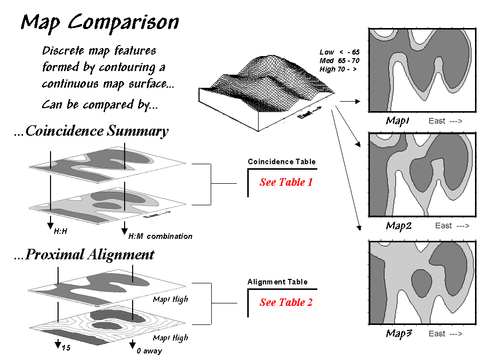
Figure 1.
Coincidence Summary and Proximal Alignment can be used to assess the
similarity between maps.
One way to find out for certain is to overlay the two maps and note
where the classifications are the same and where they are different. At one extreme, the maps could perfectly
coincide with the same conditions everywhere (identical). At the other extreme, the conditions might be
different everywhere. Somewhere in
between these extremes, the high and low areas could be swapped and the pattern
inverted¾similar but opposite.
Coincidence summary generates a cross-tabular listing of the intersection of
the two maps. In vector analysis the two
maps can be "topologically" overlaid and the areas of the resulting
son/daughter polygons aggregated by their joint condition. Another approach establishes a systematic or
random set of points that uses a "point in polygon" overlay to identify/summarize
the conditions on both maps.
Raster analysis uses a similar approach but simply counts the number of cells
within each category combination as depicted by the arrows in the figure. In the example, a 39 by 50 grid was used to
generate a comprehensive sample set of 1,950 locations (cells). Table 1 reports the coincidence summaries for
the top map with the middle and bottom maps.
The highlighted counts along the diagonals of the table report the
number of cells having the same classification on both maps. The off-diagonal counts indicate
disagreement. The percent values in
parentheses report relative coincidence.
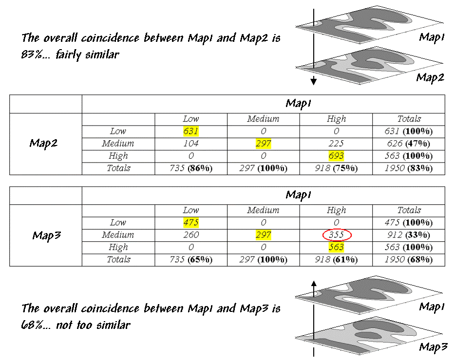
Table 1. Coincidence Summary.
For example, the 100% in the first row indicates that all of
"Low" areas on Map2 coincide with "Low" areas on Map1. The 86% in the first column, however, notes
that not all of the "Low" areas on Map1 are classified the same as
the same as those on Map2. The lower
portion of the table summarizes the coincidence between Map1 and Map2.
So what do all the numbers mean¾in user-speak? First, the "overall" coincidence percentage
in the lower right corner gives you a general idea of how well the maps match;
83% is fairly similar, while 68% is not too similar. Inspection of the individual percentages
gives you a handle on which categories are, or are not lining-up. A perfect match would have 100% for each
category; a complete mismatch would have 0%.
But simple coincidence summary just tells you whether things are the
same or different. One extension
considers the thematic difference. It
notes the disparity in mismatched categories with a "Low/High"
combination considered even less similar than a "Low/Medium" match.
Another procedure investigates the spatial difference, as shown in table 2. The technique, termed proximal alignment,
isolates one of the map categories (the dark-toned areas on Map3 in this case)
then generates its proximity map. The
proximity values are "masked" for the corresponding feature on the
other map (enlarged dark-toned area on Map1 High). The highlighted area on the Masked Proximity
Map identifies the locations of the greatest misalignment. Their relative occurrence is summarized in
the lower portion of the tabular listing.
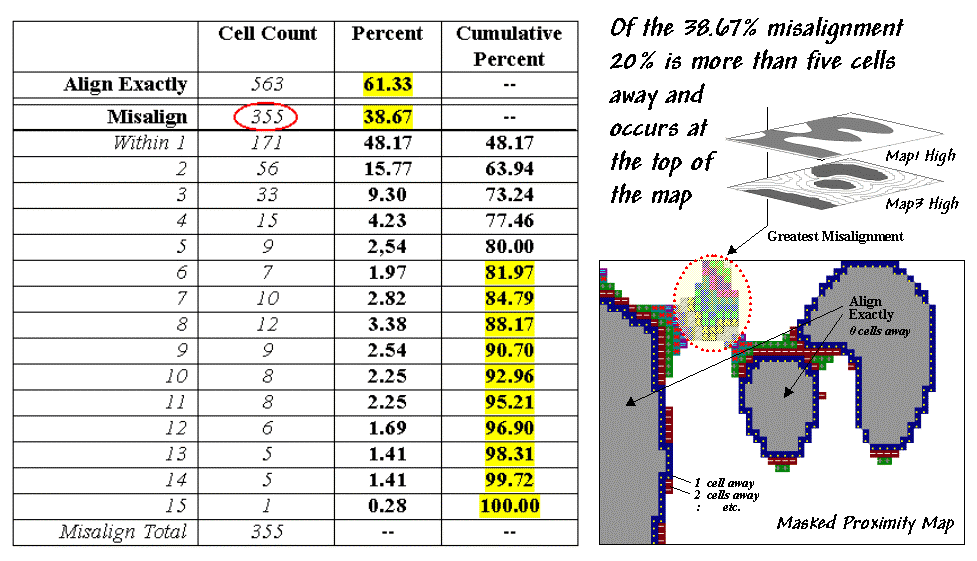
Table 2. Proximal Alignment.
So what does all this tell us¾in user-speak? First, note that twenty percent of the total
mismatches occurs more than five cells away from the nearest corresponding
feature, thereby indicating fairly poor overall alignment. A simple measure of misalignment can be
calculated by weight-averaging the proximity information¾1*171 + 2*56 + … / 15 = 3.28. Perfect alignment would result in 0, with
larger values indicating progressively more misalignment. Considering the dimensionality of the grid
(39 x 50), a generalized proximal alignment index can be calculated ¾3.28 / (39*50)**.5 =
.074.
So what's the bottom line? If you’re a
Use Statistics to Compare Map
Surfaces
(GeoWorld, October 1999, pg.
24-25)
While the human brain is good at lot of things, objective and
detailed comparison among maps isn't one of them. Quantitative techniques provide a foothold for
map comparison beyond waving a laser-pointer over a couple of maps and boldly
stating "see how similar (or dissimilar) the patterns are."
Last month's column identified a couple of techniques for comparing maps
composed of discrete map "objects"¾Coincidence Summary and Proximal
Alignment. Comparing map
"surfaces" involves similar approaches, but employs different
techniques taking advantage of the more robust nature of continuous data.
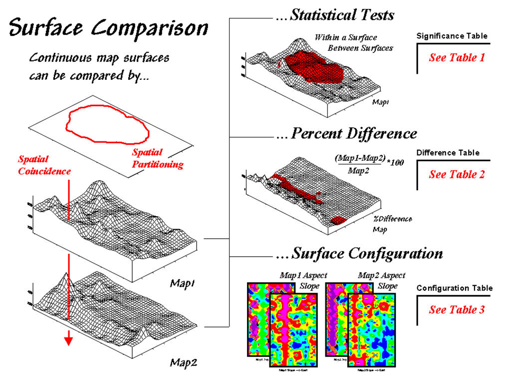
Figure 1. Map
surfaces can be compared by statistically testing for significant differences
in data sets, differences in spatial coincidence, or surface configuration
alignment.
Consider the two map surfaces shown on the left side of figure 1. Are they similar, or different? Where are they more similar or
different? Where's the greatest
difference? How would you know? In visual comparison, your eye looks
back-and-forth between the two surfaces attempting to compare the relative
"heights" at corresponding locations on the map. After about ten of these eye-flickers your
patience wears thin and you form a hedged opinion¾"not too similar."
In the computer, the relative "heights" are stored as individual map
values (in this case, 1380 numbers in an analysis grid of 46 rows by 30
columns). One thought might be to use
statistical tests to analyze whether the data sets are
"significantly different."
Since map surfaces are just a bunch of spatially registered numbers, the sets
of data can be compared by spatial coincidence (comparing corresponding values
on two maps) and spatial partitioning (dividing the mapped data into subsets,
then comparing the partitioned areas within one surface or between two
surfaces).
In this approach,
Or a farmer could test whether there is a significant difference in the topsoil
versus substrata potassium levels for a portion of a field. Actually, this is the case depicted in figure
1 (Map1 = topsoil; Map2 = substrata potassium) and summarized in table 1. The dark red area on the surface locates the
partitioned area in the field. The
"box-and-whisker" plots in the table identify the mean (dot), +/- standard deviation (shaded box) and min/max values (whiskers) for each of the four data sets
(Maps1&2 and in&out of the Partition).
Generally speaking, if the boxes tend to align there isn't much of a difference
between data groups (e.g., Map2_inP
and Map2_outP surfaces). If they don't align (e.g., Map1_inP and Map2_inP surfaces), there is a significant difference. The plots provide useful pictures of data
distributions and allow you to eyeball the overall differences among a set of
map surfaces.
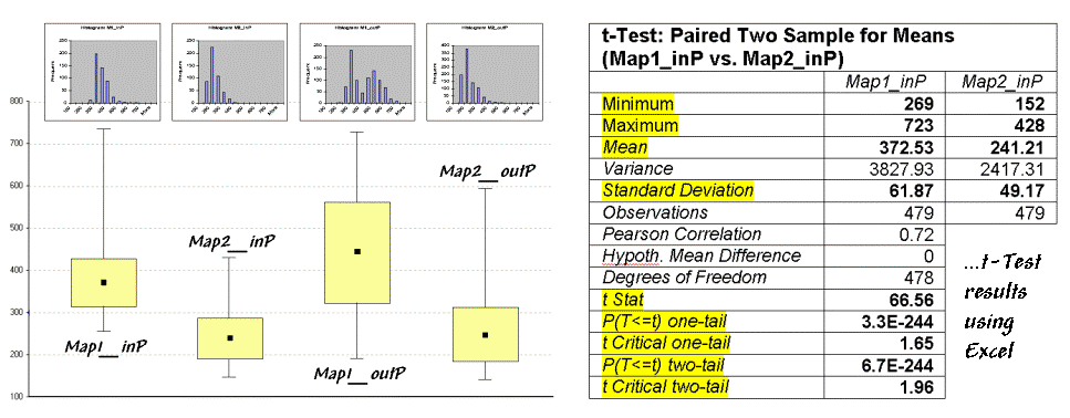
Table 1. Statistical Tests.
The most commonly used statistical method for evaluating the
differences in the means of two data groups is the t-test. The right side of
table 1 shows the results of a t-test
comparing the partitioned data between Map1_inP
and Map2_inP (the first and second
box-whisker plots).
While a full explanation of statistical tests is beyond the scope of this
discussion, it's relative safe to say the larger the
"t stat" value the greater
the difference between two data groups.
The values for the "one- and two-tail" tests at the bottom of
the table suggest that "the means of
the two groups appear distinct and there is little chance that there is no
difference between the groups."
As with all things statistical, there are a lot of preconditions that need to
be met before a t-test is appropriate¾the data must be independent and normally
distributed. The problem is that these
conditions rarely hold for mapped data.
While the t-test example might
serve as a reasonable instance of "blindly applying" non-spatial,
statistical tests to mapped data, it suggests this approach is a bit shaky as
it seldom provides a reliable test like it does in traditional, non-spatial
statistics (see author's notes).
In addition to data
condition problems, statistical tests ignore the explicit spatial context of
the data. Comparison using percent
difference, on the other hand, capitalizes on this additional
information in map surfaces. Table 2
shows a categorized rendering and tabular summary of the percent difference
between the Map1 and Map2 surfaces at each grid location. Note that the average difference is fairly
large (76% +/- 49%), while two identical surfaces would compute to 0% average
difference with +/- 0% standard deviation.
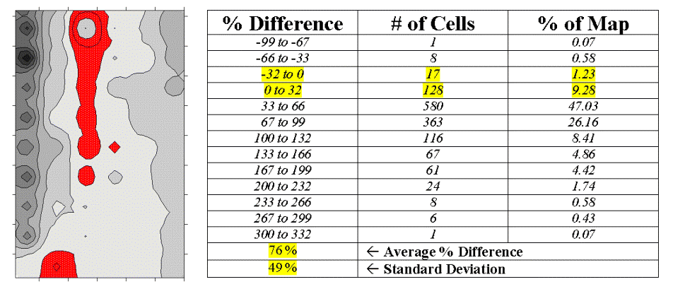
Table 2. Percent
Difference.
The dark red areas
along the center crease of the map correspond to the highlighted rows in the
table identifying areas within +/- 33 percent difference (moderate). That conjures up the "thirds rule of
thumb" for comparing map surfaces¾if
two-thirds of the map area is within one-third (33 percent) difference, the
surfaces are fairly similar; if less than one-third of the area is within
one-third difference, the surfaces are fairly different¾generally speaking that is. In this case only about 11% of the area meets
the criteria so the surfaces are "considerably" different.
Another approach termed surface configuration, focuses on
the differences in the localized trends between two map surfaces instead of the
individual values. Like you, the
computer can "see" the bumps in the surfaces, but it does it with a
couple of derived maps. A slope map indicates the relative
steepness while an aspect map denotes the orientation of locations along the
surface. You see a big bump; it sees an
area with large slope values at several aspects. You see a ridge; it sees an area with large
slope values at a single aspect.
So how does the computer see differences in the "lumpy-bumpy" configurations
of two map surfaces? Per usual, it
involves map-ematical analysis, but in this case some
fairly ugly trigonometry is employed (see equations at end of chapter). Conceptually speaking, the immediate
neighborhood around each grid location identifies a small plane with steepness
and orientation defined by the slope and aspect maps. The mathematician simply solves for the
normalized difference in slope and aspect angles between the two planes (see author's notes).
For the rest of us, it makes sense that locations with flat/vertical
differences in inclination (Slope_Diff = 90o)
and diametrically opposed orientations (Aspect_Diff =
180o) are as different as different can get. Zero differences for both, on the other hand,
are as similar as things can get (exactly the same slope and aspect). All other slope/aspect differences fall some where in between on a scale of 0-100.
The two superimposed
maps at the left side of table 3 show the normalized differences in the slope
and aspect angles (dark red being very different). The map of the overall differences in surface
configuration (Sur_Fig) is the average of the two
maps. Note that over half of the map
area is classified as low difference (0-20) suggesting that the
"lumpy-bumpy" areas align fairly well overall. The greatest differences in surface
configuration appear in the northwest portion.
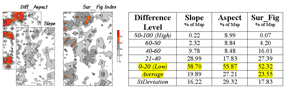
Table 3. Surface
Configuration.
Does all this
analysis square with your visual inspection of the Map1 and Map2 surfaces in
figure 1? Sort of big differences in the
relative values (surface height comparison summarized by percent difference analysis) with smaller differences in surface
shape (bumpiness comparison summarized by surface
configuration analysis). Or am I
leading the "visually malleable" with quantitative analysis that
lacks the comfort, artistry and subjective interpretation of laser-waving map
comparison?
_______________________
Author's Notes: An extended
discussion by William Huber of Quantitative Decisions on the validity of
statistical tests and an Excel workbook containing the equations and
computations leading to the t-test, percent difference and surface
configuration analyses are available online at the "Column
Supplements" page at http://www.innovativegis.com/basis.
Use Scatterplots to Understand Map Correlation
(GeoWorld, November 1999, pg. 26-27)
A continuing theme
of the Beyond Mapping columns has been that "
In traditional statistics there is a wealth of procedures for investigating
correlation, or "the relationship between variables." The most basic of these is the scatterplot
that provides a graphical peek at the joint responses of paired data. It can be thought of as an extension of the
histogram used to characterize the data distribution for a single variable.
For example, the x- and y-axes in figure 1 summarize the data
described last month. Recall that Map1
identifies the spatial distribution of potassium in the topsoil of a farmer's
field, while Map2 tracks the concentrations in the root zone. Admittedly, this example is “a bit
dirty" but keep in mind that a wide array of mapped data from resource
managers to market forecasters can be used.
The histograms and descriptive statistics along the axes show the individual
data distributions for the partitioned area (dark red "glob" draped
on the map surfaces). It appears the
topsoil concentrations in Map1 are generally higher (note the positioning of the histogram peaks; compare
the means) and a bit more variable (note the spread of the histograms; compare the standard deviations). But what about the
"joint response" considering both variables at the same time? Do higher concentrations in the root zone
tend to occur with higher concentrations in the topsoil? Or do they occur with lower
concentrations? Or is there no
discernable relationship at all?
These questions
involve the concept of correlation that tracks the extent that two variables are
proportional to each other. At one end of the scale, termed positive
correlation, the variables act in unison and as values of one variable increase,
the values for the other make similar increases. The other ends, termed negative correlation,
the variables are mirrored with increasing values for one matched by decreases
in the other. Both cases indicate a
strong relationship between the variables just one is harmonious (positive)
while the other is opposite (negative).
In between the two lies no
correlation without a discernable pattern between the changes in one
variable and the other.
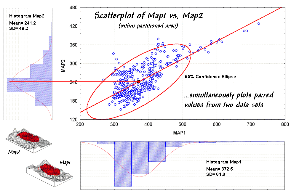
Figure 1. A scatterplot shows the
relation between two variables by plotting the paired responses.
Now turn your
attention to the scatterplot in figure 1.
Each of the data points (small blue circle) represents one of the 479
grid locations within the partitioned area.
The general pattern of the points provides insight into the joint
relationship. If there is an upward
linear trend in the data (like in the figure) positive correlation is
indicated. If the points spread out in a
downward fashion there's a negative correlation. If they seem to form a circular pattern or
align parallel to either of the axes, a lack of correlation is noted.
Now let's apply some common sense and observations about a scatterplot. First the "strength" of a
correlation can be interpreted by 1) the degree of alignment of the points with
an upward (or downward) line and 2) how dispersed the points are around the
line. In the example, there appears to
be fairly strong positive correlation (tightly clustered points along an upward
line), particularly if you include the scattering of points along the right side
of the diagonal.
But should you include them? Or are they
simply "outliers" (abnormal, infrequent observations) that bias your
view of the overall linear trend?
Accounting for outliers is more art than science, but most approaches
focus on the dispersion in the vicinity of the joint mean (i.e.,
statistical "balance point" of the data cloud). The joint mean in figure 30.3 is at the
intersection of the lines extended from the Map1 and Map2 averages. Now concentrate on the bulk of points in this
area and reassess the alignment and dispersion. Doesn't appear as strong, right?
A quantitative approach to identifying outliers involves a confidence ellipse. It is conceptually similar to standard
deviation as it identifies "typical" paired responses. In the figure, a 95% confidence ellipse is
drawn indicating the area in the plot that accounts for the vast majority of
the data. Points outside the ellipse are
candidates for exclusion (25 of 479 in this case) in hopes of concentrating on
the overall trend in the data. The
orientation of the ellipse helps you visualize the linear alignment and its thickness helps you visualize the dispersion (pretty good on both counts).
In addition to assessing alignment, dispersion and outliers you should look for a couple of other conditions in a
scatterplot¾distinct groups and nonlinear trends.
Distinct group bias can result in a high correlation that is
entirely due to the arrangement of separate data "clouds" and not the
true relationships between the variables within each data group. Nonlinear trends tend to show low
"linear" correlation but actually exhibit strong curvilinear
relationships (i.e., tightly clustered about a bending line). Neither of these biases is apparent in the
example data.
Now concentrate on the linkage between the scatterplot and the map
surfaces. The analysis grid structures
the linkage and enables you to "walk" between the maps and the
plot. If you click on a point in the
scatterplot its corresponding cell location on both surfaces are
highlighted. If you click on a location
on one of the maps its scatter plot point is highlighted.
That's set the stage for interactive data analysis. One might click on all of the outlier points
and see if they are scattered or grouped.
If they tend to form groups there is a good chance a geographic
explanation exists¾possibly explained by another data layer.
Another investigative procedure is to delineate sets of points on the
scatterplot that appear to form "fuzzy globs." The globs indicate similar characteristics
(data pattern) while the map plays out their spatial pattern. In a sense, manually delineating data globs
is analogous to the high-tech, quantitative procedure termed data clustering (see author's
notes). In fact quantitative expression
of the scatterplot's correlation information forms
the basis for predictive modeling…but that's next month's story.
_______________________
Author's Notes: An extended
discussion of data grouping and a online version of
"Identifying Data Patterns" (
Can Predictable Maps Work for You?
(GeoWorld, December 1999, pg. 24-25)
The last section
discussed map correlation as viewed through a scatterplot. Recall that the orientation of the "data cloud" indicated the nature of
the relationship between the values on two map surfaces, while its shape showed
the strength of the relationship.
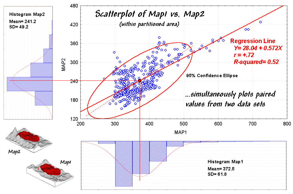
Figure 1. Scatterplot with correlation
and regression information identified.
Figure 1 should rekindle the concepts, but
note the addition of the information about the regression line. That brings us to the tough (more
interesting?) tuff¾quantitative measures of correlation and predictive modeling.
While a full treatise of the subject awaits your acceptance to graduate school,
discussion of some basic measures might be helpful. The correlation coefficient (denoted as
"r") represents the linear
relationship between two variables. It
can range from +1.00 (perfect positive correlation) to -1.00 (perfect negative
correlation), with a value of 0.00 representing no correlation. Calculating "r" involves finding the "best-fitting line" that
minimizes the sum of the squares of distances from each data point to the line,
then summarizing the deviations to a single value. When the correlation coefficient is squared
(referred to as the "R-squared" value), it
identifies the "proportion of common variation" and measures the
overall strength of the relationship.
The examples in
figure 2 match several scatterplots with their
R-squared values. The inset on the left shows four scatterplots
with increasing correlation (tighter linear alignment in the data clouds). The middle inset depicts data forming two
separate sub-groups (distinct group bias). In this instance the high R-squared of .81 is
misleading. When the data groups are
analyzed separately, the individual R-squared values are much weaker (.00 and
.04).
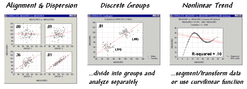
Figure 2. Example scatterplots depicting different data relationships.
The inset on the
right is an example of a data pattern that exhibits low linear correlation, but
has a strong curvilinear relationship (nonlinear trend). Unfortunately, dealing with nonlinear
patterns is difficult even for the statistically adept. If the curve is continuously increasing or
decreasing, you might try a logarithmic transform; if you can identify the
specific function, use it as the line to fit; or, if all else fails, break the
curve into segments that are better approximated by a series of straight lines.
Regression
analysis extends the concept of correlation by focusing on the best-fitted line
(solid red lines in the examples). The
equation of the line generalizes the linear trend in the data. Also, it serves as a predictive model, while
its correlation indicates how good the data fit the model. In the case of figure 1, the regression
equation is Map2(estimated) =
28.04 + 0.572 * Map1, with an
R-squared value of .52. That means if
you measure a potassium level of 500 in the topsoil expect to find about 314 in
the root zone (28.04 + 0.572 * 500 = 314.04).
But how good is that guess in the real world?
One way to evaluate
the model is to "play-it-back" using the original data. The left-side of figure 30-6 shows the
results for the partitioned area. As
hoped, the predicted surface is very similar to the actual data with an average
error of only 2% and over 98% of the area within 33% difference.
Model validation involves testing it on another set of
data. When applied outside the partition
the regression model didn't fair as well¾an average error of 19% and only 25% of the
area within 33% difference. The
difference surface shows you that the model is pretty good in most places but
really blows it along the western edge (big ridge of over estimation) and part
of the northern edge (big depression of under estimation). Maybe those areas should be partitioned and
separate prediction models developed for them?
Or, more likely your patience has ebbed.
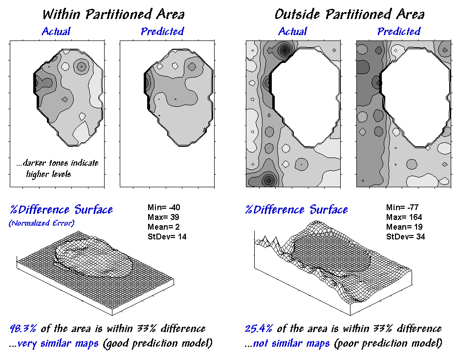
Figure 3. Results of
applying the predictive model.
A few final concepts
should wrap things up. First, data
analysis rarely uses raw data. As
discussed last month "outliers" are identified and eliminated. In figure 3, the dotted axis through the
confidence ellipse suggests a somewhat steeper regression line "better
fits" the bulk of the data.
Possibly this equation is a better predictor.
Some data analysts use a "roving window" (e.g., values in a 3x3
adjacent neighborhood) to derive a neighborhood-weighted average for each grid
location before deriving a prediction model.
This "smoothing" addresses slight misalignment in the data
layers and salt-and-pepper conditions in some data sets. Another school of thought suggests sampling
the data such that the distance between the samples is larger than the spatial
autocorrelation as determined by variogram analysis (see "Uncovering the
Mysteries of Spatial Autocorrelation,"
For most of us, however, the bottom-line lies not in debatable statistical
theory but in the results. Regardless of
technique, if model validation yields predictions are better than current
guesses, then "predictable maps" could work for you.
_______________________
Author's Notes: An Excel
workbook extending this discussion to segmented and localized regression is
available online at the "Column Supplements" page at http://www.innovativegis.com/basis.
Equations for "Comparing Map Surfaces" – Configuration
Using
trigonometric relationships to establish differences in surface configuration
Note:
Data preparation was completed in MapCalc using an analysis grid configured as
46 rows by 30 rows (1380 map values).
Slope
(rate of change) and Aspect (direction of change) maps were derived for both
the top and bottom soil potassium maps.
Calculate
the "normalized" difference in slope:
Most
grid-based
Percent
slope can be converted to
The
difference between the two slopes is obtained by
The
difference in slope angles can be
(((Diff_DegSlope
- min) * 100) / (max - min))
where min = 0 and max = 90
for degree_slope possible range.
Calculate
the "normalized" difference in azimuth:
Most
grid-based
Degrees
azimuth
The
difference between two azimuths can be calculated in degrees by
DEGREES( ACOS(
SIN(Map1_RadAzimuth) * SIN(Map2_RadAzimuth) +
COS(Map1_RadAzimuth)
* COS(Map2_RadAzimuth) ) )
Normalized
between 0 to 100 by (((Diff_DegAzimuth - min) *
100) / (max - min))
where min = 0 and max =
180 for degree_azimuth possible range.
(Back to the Table of Contents)