Beyond Mapping III
|
Map
Analysis book with companion CD-ROM
for hands-on exercises and further reading |

Twisting
the Perspective of Map Surfaces —
describes the character of spatial distributions through the generation of a
customer density surface
Linking
Numeric and Geographic Distributions — investigates
the link between numeric and geographic distributions of mapped data
Myriad
Techniques Help to Interpolate Spatial Distributions
— discusses the basic
concepts underlying spatial interpolation
Interpreting
Interpolation Results (and why it is important)
— describes the use
of “residual analysis” for evaluating spatial interpolation performance
Use
Map Analysis to Characterize Data Groups — discusses
the use of “data distance” to derive similarity among the data patterns in a
set of map layers
Get
“Map-ematical” to Identify Data Zones
— describes the use
of “level-slicing” for classifying locations with a specified data pattern
(data zones)
Discover
the “Miracle” in Mapping Data Clusters — describes
the use of “clustering” to identify inherent groupings of similar data
patterns
Can
We Really Map the Future? — describes
the use of “linear regression” to develop prediction equations relating
dependent and independent map variables
Follow
These Steps to Map Potential Sales — describes
an extensive geo-business application that combines retail competition analysis
and product sales prediction
The
Universal Key for Unlocking GIS’s Full Potential — outlines
a global referencing system approach compatible with standard DBMS systems
Note: The processing and figures
discussed in this topic were derived using MapCalcTM
software. See www.innovativegis.com to download a
free MapCalc Learner version with tutorial materials for classroom and
self-learning map analysis concepts and procedures.
<Click here>
right-click to download a printer-friendly version of this topic (.pdf).
(Back to the Table of Contents)
______________________________
Twisting the
Perspective of Map Surfaces
(GeoWorld, April 2008)
This section’s theme grabs some
earlier concepts, adds an eye of newt and then a twist of perspective to
concoct a slightly shaken (not stirred) new perception of map surfaces. Traditionally one thinks of a map surface in
terms of a postcard scene of the
However, a geomorphological point of view of a digital elevation model (DEM) isn’t the only type of map surface. For example, a Customer Density Surface can be derived from sales data that depicts the peaks and valleys of customer concentrations throughout a city as discussed in an earlier Beyond Mapping column (November 2005; see author’s note). Figure 1 summarizes the processing steps involved—1) a customer’s street address is geocoded to identify its Lat/Lon coordinates, 2) vector to raster conversion is used to place and aggregate the number of customers in each grid cell of an analysis frame (discrete mapped data), 3) a rowing window is used to count the total number of customers within a specified radius of each cell (continuous mapped data), and then 4) classified into logical ranges of customer density.
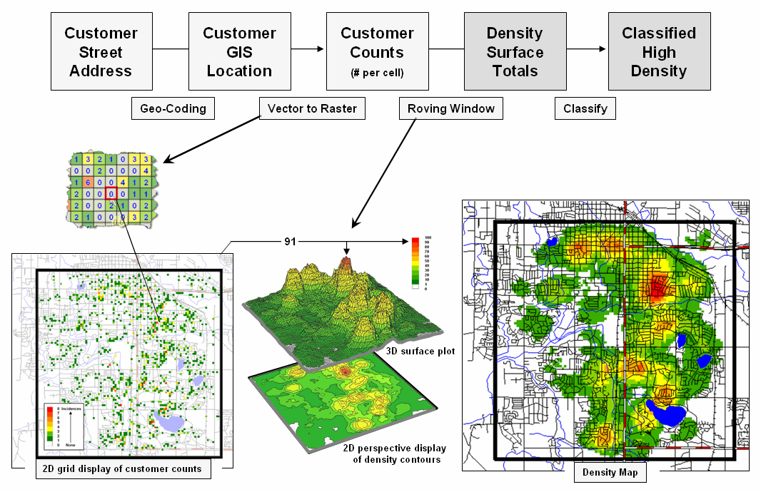
Figure 1. Geocoding can be used to connect customer addresses to
their geographic locations for subsequent map analysis, such as generating a map
surface of customer density.
The important thing to note is that the peaks and valleys characterize the Spatial Distribution of the customers, a concept closely akin to a Numerical Distribution that serves as the foundation for traditional statistics. However in this instance, three dimensions are needed to characterize the data’s dispersion—X and Y coordinates to position the data in geographic space and a Z coordinate to indicate the relative magnitude of the variable (# of customers). Traditional statistics needs only two dimensions—X to identify the magnitude and Y to identify the number of occurrences.
While both perspectives track the relative frequency of occurrence of the values within a data set, the spatial distribution extends the information to variations in geographic space, as well as in numerical variations in magnitude— from just “what” to “where is what.” In this case, it describes the geographic pattern of customer density as peaks (lots of customers nearby) and valleys (not many).
Within our historical perspective of mapping the ability to plot “where is what” is an end in itself. Like Inspector Columbo’s crime scene pins poked on a map, the mere visualization of the pattern is thought to be sufficient for solving crimes. However, the volume of sales transactions and their subtle relationships are far too complex for a visual (visceral?) solution using just a Google Earth mashed-up image.
The interaction of numerical and spatial distributions provides fertile turf for a better understanding of the mounds of data we inherently collect every day. Each credit card swipe identifies a basket of goods and services purchased by a customer that can place on a map for grid-based map analysis to make sense of it all—“why” and “so what.”
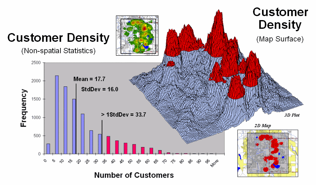
Figure 2.
Merging traditional statistics and map analysis techniques increases
understanding of spatial patterns and relationships (variance-focused;
continuous) beyond the usual central tendency (mean-focused; scalar)
characterization of geo-business data.
For example, consider the left side of figure 2 that relates the unusually high response range of customers of greater than 1 standard deviation above the mean (a numerical distribution perspective) to the right side that identifies the location of these pockets of high customer density (a spatial distribution perspective). As discussed in a previous Beyond Mapping column (May 2002; see author’s note), this simple analysis uses a typical transaction database to 1) map the customer locations, 2) derive a map surface of customer density, 3) identify a statistic for determining unusually high customer concentrations (> Mean + 1SD), and 4) apply the statistic to locate the areas with lots of customers. The result is a map view of a commonly used technique in traditional statistics—an outcome where the combined result of an integrated spatial and numerical analysis is far greater than their individual contributions.
However, another step is needed to complete the process and fully illustrate the geo-business framework. The left side of figure 3 depicts the translation of a non-spatial customer database into a mapped representation using vector-based processing that determines Lat/Lon coordinates for each record—the mapping component. Translation from vector to raster data structure establishes the analytic frame needed for map analysis, such as generating a customer density surface and classifying it into statistically defined pockets of high customer density—then map analysis component.
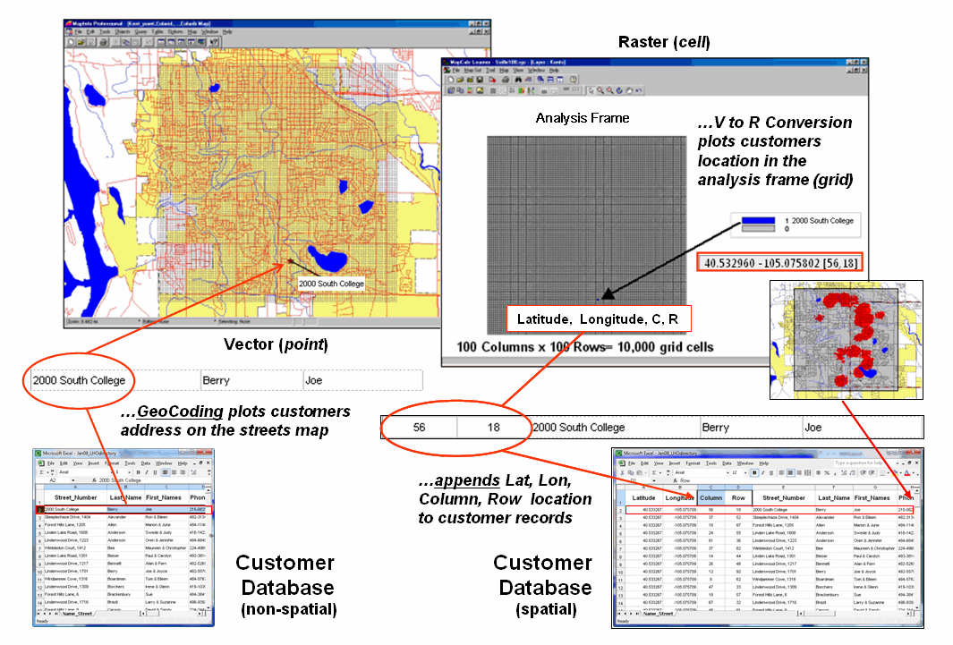
Figure 3. The
column, row index of the grid cells in the analytic frame serves as a primary
key for linking spatial analysis results with individual records in a database.
The importance of the analytic
frame is paramount in the process as it provides the link back to the original
customer database—the spatial data mining component. The column, row index of the matrix for each
customer record is appended to the database and serves as a primary key for
“walking” between the
Similarly, maps of demographics, sales by product, travel-time to our store, and the like can be used in customer segmentation and propensity modeling to identify maps of future sales probabilities. Areas of high probability can be cross-walked to an existing customer database (or zip +4 or other generic databases) to identify new sales leads, product mix, stocking levels, inventory management and competition analysis. At the core of this vast potential for geo-business applications is the analytic frame and its continuous map surfaces that underwrite a spatially aware database.
_____________________________
Author’s Note: Related
discussion on Density Surface Analysis is in Topic 6, Summarizing Neighbors in
the book Map Analysis (Berry, 2007; GeoTec
Media, www.geoplace.com/books/MapAnalysis)
and Topics 17 and 26 in the online Beyond Mapping
Linking Numeric
and Geographic Distributions
(GeoWorld, June 2008)
The previous section set the stage for discussion of the similarities and differences of geo-business applications to more conventional GIS solutions in municipalities, infrastructure, natural resources, and other areas with deep roots in the mapping sciences. Underlying the discussion was the concept of a Grid-based Analysis Frame that serves as a primary key for “walking” between a continuous geographic space representation and the individual records in a customer database.
It illustrated converting a point map of customer locations into a Customer Density Surface that depicts the “peaks and valleys” of customer concentrations throughout a city. While the process is analogous to Inspector Columbo’s crime scene pins poked on a map, the mere visualization of a point pattern is rarely sufficient for solving crimes. Nor is it adequate for a detailed understanding of customer distribution and spatial relationships, such as determining areas of statistically high concentrations—Customer Pockets—that can be used in targeted marketing, locating ATMs or sales force allocation.
Another grid-based technique for
investigating the customer pattern involves
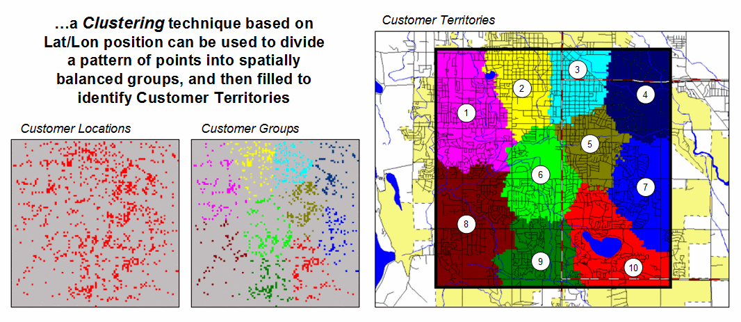
Figure 1.
Clustering on the latitude and longitude coordinates of point locations
can be used
to identify geographically balanced customer
territories.
The two small inserts on the left show the general pattern of customers, and then the partitioning of the pattern into spatially balanced groups. This initial step was achieved by applying a K-means clustering algorithm to the latitude and longitude coordinates of the customer locations. In effect this procedure maximizes the differences between the groups while minimizing the differences within each group. There are several alternative approaches that could be applied, but K-means is an often-used procedure that is available in all statistical packages and a growing number of GIS systems.
The final step to assign territories uses a nearest neighbor interpolation algorithm to assign all non-customer locations to the nearest customer group. The result is the customer territories map shown on the right. The partitioning based on customer locations is geographically balanced (approximately the same area in each cluster), however it doesn’t consider the number of customers within each group—that varies from 69 in the lower right (Territory #8) to 252 (Territory #5) near the upper right… that twist of map analysis will be tackled in a future beyond mapping column.
However it does bring up an
opportunity to discuss the close relationship between spatial and non-spatial
statistics. Most of us are familiar with
the old “bell-curve” for school grades.
You know, with lots of C’s, fewer B’s and D’s, and a truly select set of
A’s and F’s. Its shape is a perfect
bell, symmetrical about the center with the tails smoothly falling off toward
less frequent conditions.
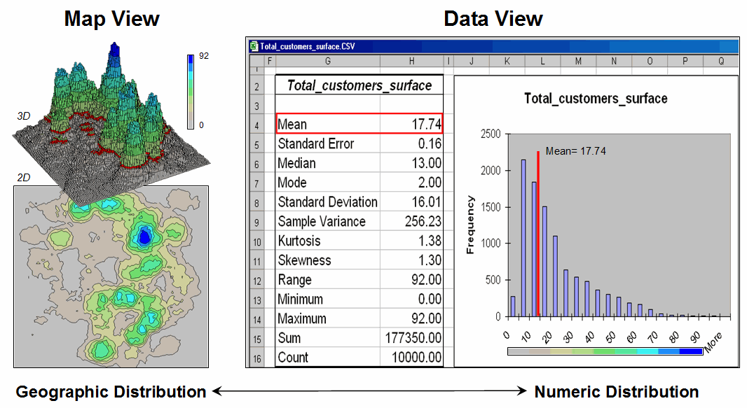
Figure 2. Mapped data are characterized by their
geographic distribution (maps on the left) and their numeric distribution
(descriptive statistics and histogram on the right).
However the normal distribution (bell-shaped) isn’t as normal (typical) as you might think. For example, Newsweek noted that the average grade at a major ivy-league university isn’t a solid C with a few A’s and F’s sprinkled about as you might imagine, but an A- with a lot of A’s trailing off to lesser amounts of B’s, C’s and (heaven forbid) the very rare D or F.
The frequency distributions of mapped data also tend toward the ab-normal (formally termed asymmetrical). For example, consider the customer density data shown in the figure 2 that was derived by counting the total number of customers within a specified radius of each cell (roving window). The geographic distribution of the data is characterized in the Map View by the 2D contour map and 3D surface on the left. Note the distinct pattern of the terrain with bigger bumps (higher customer density) in the central portion of the project area. As is normally the case with mapped data, the map values are neither uniformly nor randomly distributed in geographic space. The unique pattern is the result of complex spatial processes determining where people live that are driven by a host of factors—not spurious, arbitrary, constant or even “normal” events.
Now turn your attention to the numeric distribution of the data depicted in the right side of the figure. The Data View was generated by simply transferring the grid values in the analysis frame to Excel, then applying the Histogram and Descriptive Statistics options of the Data Analysis add-in tools. The map organizes the data as 100 rows by 100 columns (X,Y) while the non-spatial view simply summarizes the 10,000 values into a set of statistical indices characterizing the overall central tendency of the data. The mechanics used to plot the histogram and generate the statistics are a piece-of-cake, but the real challenge is to make some sense of it all.
Note that the data aren’t
distributed as a normal bell-curve, but appear shifted (termed skewed) to the
left. The tallest spike and the
intervals to its left, match the large expanse of grey values in the map
view—frequently occurring low customer density values. If the surface contained a disproportionably
set of high value locations, there would be a spike at the high end of the
histogram. The red line in the histogram
locates the mean (average) value for the numeric distribution. The red line in the 3D map surface shows the
same thing, except its located in the geographic distribution.
The mental exercise linking geographic space with data space is a good one, and
some general points ought to be noted.
First, there isn’t a fixed relationship between the two views of the
data’s distribution (geographic and numeric).
A myriad of geographic patterns can result in the same histogram. That’s because spatial data contains
additional information—where, as well
as what—and the same data summary of
the “what’s” can reflect a multitude of spatial arrangements (“where’s”).
But is the reverse true? Can a given
geographic arrangement result in different data views? Nope, and it’s this relationship that
catapults mapping and geo-query into the arena of mapped data analysis. Traditional analysis techniques assume a
functional form for the frequency distribution (histogram shape), with the
standard normal (bell-shaped) being the most prevalent.
Spatial statistics, the foundation of geo-business applications, doesn’t predispose any geographic or numeric functional forms—it simply responds to the inherent patterns and relationships in a data set. The next several columns will describe some of the surface modeling and spatial data mining techniques available to the venturesome few who are willing to work “outside the lines” of traditional mapping and statistics.
_____________________________
Author’s Note: Related
discussion is in Topic 6, Surface Modeling in the
workbook Analyzing Geo-Business Data (Berry, 2003; available from www.innovativegis.com/basis/Books/AnalyzingGBdata/).
Interpolating Spatial
Distributions
(GeoWorld, July 2008)
Statistical sampling has long been at the core of business research and practice. Traditionally data analysis used non-spatial statistics to identify the “typical” level of sales, housing prices, customer income, etc. throughout an entire neighborhood, city or region. Considerable effort was expended to determine the best single estimate and assess just how good the “average” estimate was in typifying the extended geographic area.
However non-spatial techniques fail to make use of the geographic patterns inherent in the data to refine the estimate—the typical level is assumed everywhere the same throughout a project area. The computed variance (or standard deviation) indicates just how good this assumption is—the larger the standard deviation, the less valid is the assumption “everywhere the same.” But no information is provided as to where values might be more or less than the computed typical value (average).
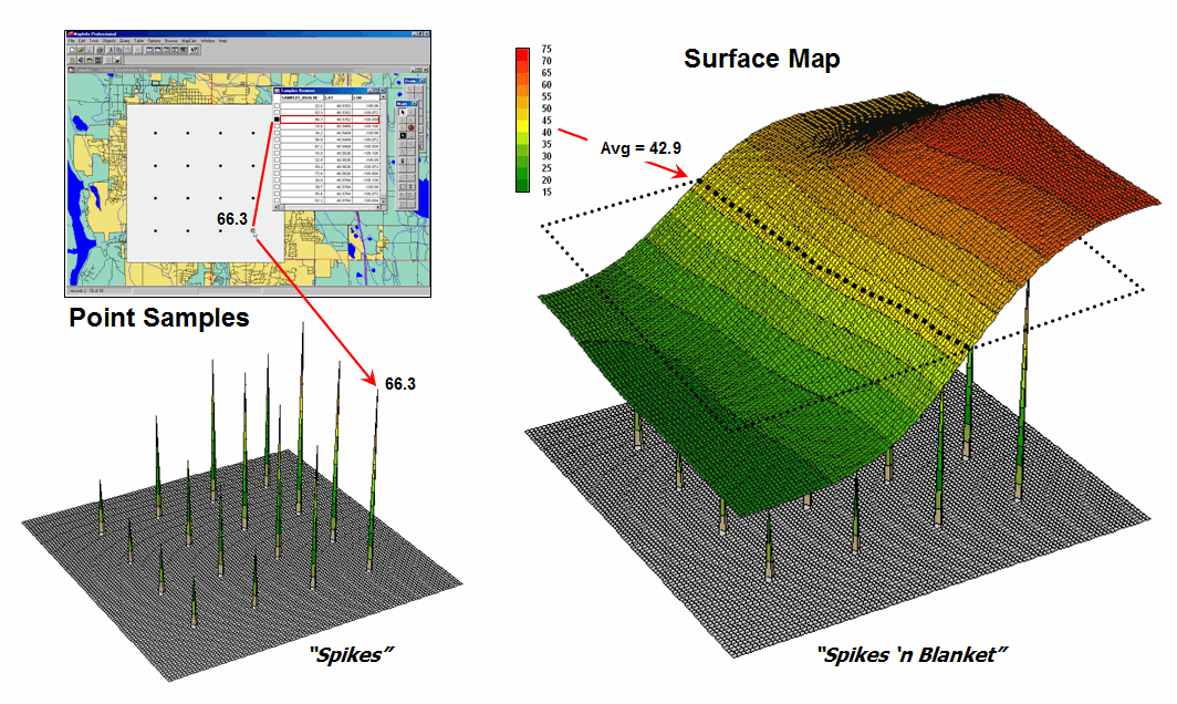
Figure 1. Spatial interpolation involves fitting a
continuous surface to sample points.
Spatial Interpolation, on the other hand, utilizes spatial patterns in a data set to generate localized estimates throughout the sampled area. Conceptually it “maps the variance” by using geographic position to help explain the differences in the sample values. In practice, it simply fits a continuous surface (kind of like a blanket) to the point data spikes (figure 1).
While the extension from non-spatial to spatial statistics is a theoretical leap, the practical steps are relatively easy. The left side of figure 1 shows 2D and 3D “point maps” of data samples depicting the percentage of home equity loan to market value. Note that the samples are geo-referenced and that the sampling pattern and intensity are different than those generally used in traditional non-spatial statistics and tend to be more regularly spaced and numerous.
The surface map on the right side of figure 1 translates pattern of the “spikes” into the peaks and valleys of the surface map representing the data’s spatial distribution. The traditional, non-spatial approach when mapped is a flat plane (average everywhere) aligned within the yellow zone. Its “everywhere the same” assumption fails to recognize the patterns of larger levels (reds) and smaller levels (greens). A decision based on the average level (42.88%) would be ideal for the yellow zone but would likely be inappropriate for most of the project area as the data vary from 16.8 to 72.4 percent.
The process of converting point-sampled data into continuous map surfaces representing a spatial distribution is termed Surface Modeling involving density analysis and map generalization (discussed last month), as well as spatial interpolation techniques. All spatial interpolation techniques establish a "roving window" that—
· moves to a grid location in a project area (analysis frame),
· calculates an estimate based on the point samples around it (roving window),
· assigns the estimate to the center cell of the window, and then
· moves to the next grid location.
The extent of the window (both size and shape) affects the result, regardless of the summary technique. In general, a large window capturing a larger number of values tends to "smooth" the data. A smaller window tends to result in a "rougher" surface with more abrupt transitions.
Three factors affect the window's extent: its reach, the number of samples, balancing. The reach, or search radius, sets a limit on how far the computer will go in collecting data values. The number of samples establishes how many data values should be used. If there is more than the specified number of values within a specified reach, the computer uses just the closest ones. If there are not enough values, it uses all that it can find within the reach. Balancing of the data attempts to eliminate directional bias by ensuring that the values are selected in all directions around window's center.
Once a window is established, one of several summary techniques comes into play. Inverse distance weighted (IDW) is an easy spatial interpolation technique to conceptualize (see figure 2). It estimates the value for a location as an average of the data values within its vicinity. The average is weighted in a manner that decreases the influence of the surrounding sample values as the distance increases. In the figure, the estimate of 53.35 is the "inverse distance-squared (1/D2) weighted average" of the four samples in the window. Sample #15 (the closest) influences the average a great deal more than sample #14 (farthest away).
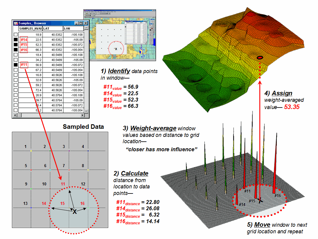
Figure 2.
Inverse distance weighted interpolation weight-averages sample values
within a roving window.
The right portion of figure 2 contains three-dimensional (3-D) plots of the point sample data and the inverse distance-squared surface generated. The estimated value in the example can be conceptualized as "sitting on the surface," 53.35 units above the base (zero).
Figure 3 shows the weighted average calculations for spatially interpolating the example location in figure 2. The Pythagorean Theorem is used to calculate the Distance from the Grid Location to each of the data Samples within the summary window. The distances are converted to Weights that are inversely proportional (1/D2; see example calculation in the figure). The sample Values are multiplied by their computed Weights and the “sum of the products” is divided by the “sum of the weights” to calculate the weighted average value (53.35) for the location on the interpolated surface.
Because the inverse distance procedure is a fixed, geometric-based method, the estimated values can never exceed the range of values in the original field data. Also, IDW tends to "pull-down peaks and pull-up valleys" in the data, as well as generate “bull’s-eyes” around sampled locations. The technique is best suited for data sets with samples that exhibit minimal regional trends.
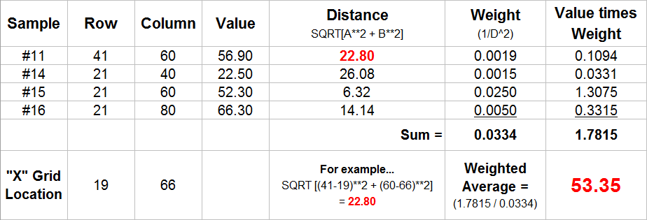
Figure 3.
Example Calculations for Inverse Distance Squared Interpolation.
However, there are numerous other spatial interpolation techniques that map the spatial distribution inherent in a data set. Next month’s column will focus on benchmarking interpolation results from different techniques and describe a procedure for assessing which is best.
_____________________________
Author’s Note: Related
discussion is in Topic 6, Surface Modeling in the
workbook Analyzing Geo-Business Data (Berry, 2003; available from www.innovativegis.com/basis/Books/AnalyzingGBdata/).
Interpreting
Interpolation Results (and why it is important)
GeoWorld, August, 2008)
For some, the previous column discussion on generating map surfaces from point data (GW July 2008) might have been too simplistic—enter a few things then click on a data file and, viola, you have a equity loan percentage surface artfully displayed in 3D with a bunch of cool colors.
Actually, it is that easy to create one. The harder part is figuring out if the map generated makes sense and whether it is something you ought to use in analysis and important business decisions. This month’s column discusses the relative amounts of information provided by the non-spatial arithmetic average versus site-specific maps by comparing the average and two different interpolated map surfaces. The discussion is further extended to describe a procedure for quantitatively assessing interpolation performance.
The top-left inset in figure 1 shows the map of the loan data’s average. It’s not very exciting and looks like a pancake but that’s because there isn’t any information about spatial variability in an average value—it assumes 42.88 percent is everywhere. The non-spatial estimate simply adds up all of the sample values and divides by the number of samples to get the average disregarding any geographic pattern.
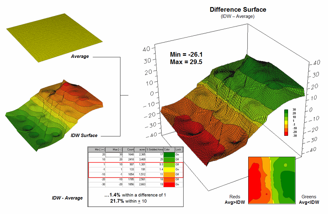
Figure 1. Spatial comparison of the project area
average and the IDW interpolated surface.
The spatially-based estimates comprise the map surface just below the pancake. As described last month, Spatial Interpolation looks at the relative positioning of the samples values as well as their measure of loan percentage. In this instance the big bumps were influenced by high measurements in that vicinity while the low areas responded to surrounding low values.
The map surface in the right portion of figure 1 compares the two maps by simply subtracting them. The colors were chosen to emphasize the differences between the whole-field average estimates and the interpolated ones. The thin yellow band indicates no difference while the progression of green tones locates areas where the interpolated map estimated higher values than the average. The progression of red tones identifies the opposite condition with the average estimate being larger than the interpolated ones.
The difference between the two maps ranges from –26.1 to +29.5. If one assumes that a difference of +/- 10 would not significantly alter a decision, then about one-quarter of the area (9.3+1.4+11= 21.7%) is adequately represented by the overall average of the sample data. But that leaves about three-fourths of the area that is either well-below the average (18 + 19 = 37%) or well-above (25+17 = 42%). The upshot is that using the average value in either of these areas could lead to poor decisions.
Now turn your attention to figure 2 that compares maps derived by two different interpolation techniques—IDW (inverse distance weighted) and Krigging (an advanced spatial statistics technique using data trends). Note the similarity in the two surfaces; while subtle differences are visible, the overall trend of the spatial distribution is similar.
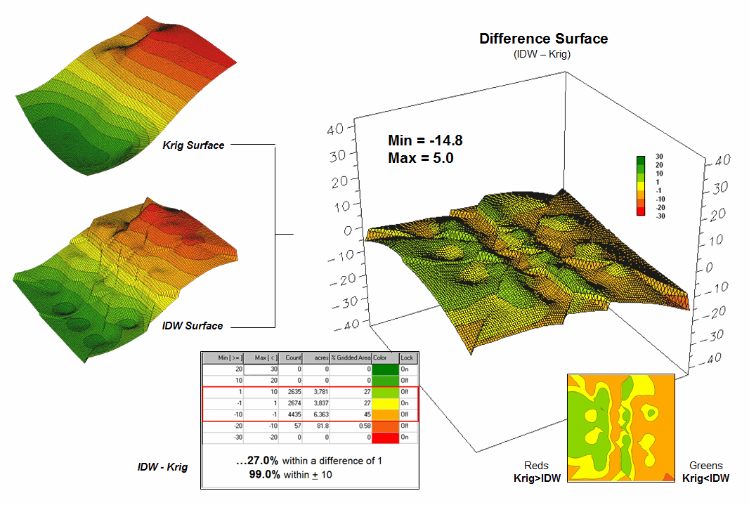
Figure 2. Spatial
comparison of IDW and Krig interpolated surfaces.
The difference map on the right confirms the similarity between the two map surfaces. The narrow band of yellow identifies areas that are nearly identical (within +/- 1.0). The light red locations identify areas where the IDW surface estimates a bit lower than the Krig ones (within -10); light green a bit higher (within +10). Applying the same assumption about plus/minus 10 difference being negligible for decision-making, the maps are effectively the same (99.0%).
So what’s the bottom line? First, that there are substantial differences between an arithmetic average and interpolated surfaces. Secondly, that quibbling about the best interpolation technique isn’t as important as using any interpolated surface for decision-making.
But which surface best characterizes the spatial distribution of the sampled data? The answer to this question lies in Residual Analysis—a technique that investigates the differences between estimated and measured values throughout an area.
The table in figure 3 reports the results for twelve randomly positioned test samples. The first column identifies the sample ID and the second column reports the actual measured value for that location. Column C simply depicts the assumption that the project area average (42.88) represents each of the test locations. Column D computes the difference of the “estimate minus actual”—formally termed the residual. For example, the first test point (ID#1) estimated the average of 42.88 but was actually measured as 55.2, so -12.32 is the residual (42.88 - 55.20= -12.32) …quite a bit off. However, point #6 is a lot better (42.88-49.40= -6.52).
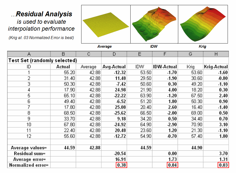
Figure 3. A residual analysis table identifies the relative performance of average, IDW and Krig estimates.
The residuals for the IDW and Krig maps are similarly calculated to form columns F and H, respectively. First note that the residuals for the project area average are considerably larger than either those for the IDW or Krig estimates. Next note that the residual patterns between the IDW and Krig are very similar—when one is off, so is the other and usually by about the same amount. A notable exception is for test point #4 where the IDW estimate is dramatically larger.
The rows at the bottom of the table summarize the residual analysis results. The Residual Sum characterizes any bias in the estimates—a negative value indicates a tendency to underestimate with the magnitude of the value indicating how much. The –20.54 value for the whole-field average indicates a relatively strong bias to underestimate.
The Average Error reports how typically far off the estimates were. The 16.91 figure for area average is about ten times worse than either IDW (1.73) or Krig (1.31). Comparing the figures to the assumption that a plus/minus10 difference is negligible in decision-making, it is apparent that 1) the project area average is inappropriate and that 2) the accuracy differences between IDW and Krig are very minor.
The Normalized Error simply calculates the average error as a proportion of the average value for the test set of samples (1.73/44.59= 0.04 for IDW). This index is the most useful as it allows you to compare the relative map accuracies between different maps. Generally speaking, maps with normalized errors of more than .30 are suspect and one might not want to use them for important decisions.
So what’s the bottom-bottom line? That Residual Analysis is an important component of geo-business data analysis. Without an understanding of the relative accuracy and interpolation error of the base maps, one cannot be sure of the recommendations and decisions derived from the interpolated data. The investment in a few extra sampling points for testing and residual analysis of these data provides a sound foundation for business decisions. Without it, the process becomes one of blind faith and wishful thinking with colorful maps.
_____________________________
Author’s Note: Related
discussion and hands-on exercises are in Topic 6, Surface Modeling
in the workbook Analyzing Geo-Business Data (Berry, 2003; available at www.innovativegis.com/basis/Books/AnalyzingGBdata/).
Use Map
Analysis to Characterize Data Groups
(GeoWorld, September 2008)
One of the most fundamental techniques in map analysis is the comparison of a set of maps. This usually involves staring at some side-by-side map displays and formulating an impression about how the colorful patterns do and don’t appear to align.
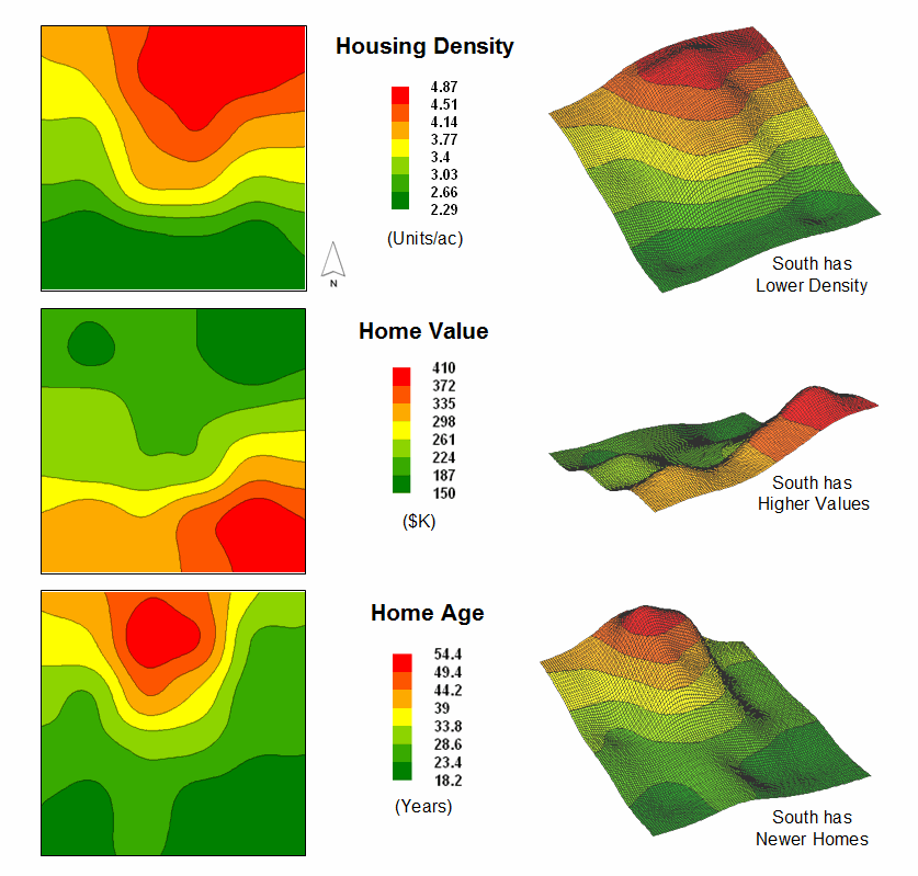
Figure 1.
Map surfaces identifying the spatial distribution of housing density,
value and age.
But just how similar is one location to another? Really similar, or just a little bit similar? And just how dissimilar are all of the other areas? While visual (visceral?) analysis can identify broad relationships, it takes quantitative map analysis to generate the detailed scrutiny demanded by most Geo-business applications.
Consider the three maps shown in figure 1— what areas identify similar data patterns? If you focus your attention on a location in the southeastern portion, how similar are all of the other locations? Or how about a northeastern section? The answers to these questions are far too complex for visual analysis and certainly beyond the geo-query and display procedures of standard desktop mapping packages.
The mapped data in the example show the geographic patterns of housing density, value and age for a project area. In visual analysis you move your focus among the maps to summarize the color assignments (2D) or relative surface height (3D) at different locations. In the southeastern portion the general pattern appears to be low Density, high Value and low Age— low, high, low. The northeastern portion appears just the opposite—high, low, high.
The difficulty in visual analysis is two-fold— remembering the color patterns and calculating the difference. Quantitative map analysis does the same thing except it uses the actual map values in place of discrete color bands. In addition, the computer doesn’t tire as easily as you and completes the comparison throughout an entire map window in a second or two (10,000 grid cells in this example).
The upper-left portion of figure 2 illustrates capturing the data patterns for comparing two map locations. The “data spear” at Point #1 identifies the housing Density as 2.4 units/ac, Value as $407,000 and Age as 18.3 years. This step is analogous to your eye noting a color pattern of green, red, and green. The other speared location at Point #2 locates the least similar data pattern with housing Density of 4.8 units/ac, Value of $190,000 and Age of 51.2 years— or as your eye sees it, a color pattern of red, green, red.
The right side of the figure schematically depicts how the computer determines similarity in the data patterns by analyzing them in three-dimensional “data space.” Similar data patterns plot close to one another with increasing distance indicating decreasing similarity. The realization that mapped data can be expressed in both geographic space and data space is paramount to understanding how a computer quantitatively analyses numerical relationships among mapped data.
Geographic space uses earth coordinates, such as latitude and longitude, to locate things in the real world. The geographic expression of the complete set of measurements depicts their spatial distribution in familiar map form. Data space, on the other hand, is a bit less familiar. While you can’t stroll through data space you can conceptualize it as a box with a bunch of balls floating within it.
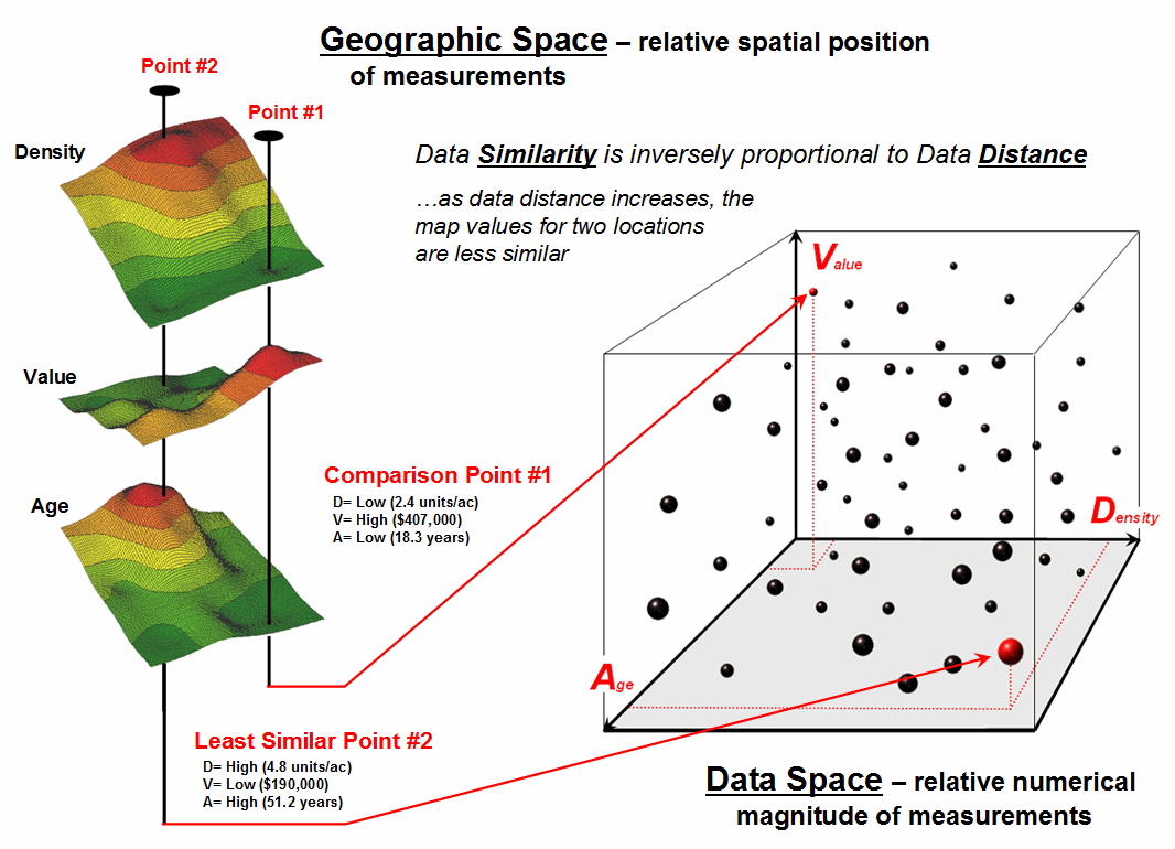
Figure 2. Conceptually linking geographic space and data space.
In the example, the three axes defining the extent of the box correspond to housing Density (D), Value (V) and Age (A). The floating balls represent data patterns of the grid cells defining the geographic space—one “floating ball” (data point) for each grid cell. The data values locating the balls extend from the data axes—2.4, 407.0 and 18.3 for the comparison point identified in figure 2. The other point has considerably higher values in D and A with a much lower V values so it plots at a different location in data space (4.8, 51.2 and 190.0 respectively).
The bottom line for data space analysis is that the position of a point in data space identifies its numerical pattern—low, low, low in the back-left corner, and high, high, high in the upper-right corner of the box. Points that plot in data space close to each other are similar; those that plot farther away are less similar. Data distance is the way computers “see” what you see in the map displays. The real difference in the graphical and quantitative approaches is in the details—the tireless computer “sees” extremely subtle differences between all of the data points and can generate a detailed map of similarity.
In the example in figure 2, the floating ball closest to you is least similar—greatest “data distance” from the comparison point. This distance becomes the reference for “most different” and sets the bottom value of the similarity scale (0% similar). A point with an identical data pattern plots at exactly the same position in data space resulting in a data distance of 0 equating to the highest similarity value (100% similar).
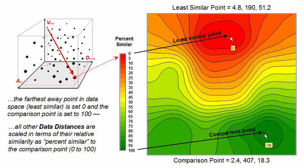
Figure 3. A
similarity map identifies how related locations are to a given point.
The similarity map shown in figure 3 applies a consistent scale to the data distances calculated between the comparison point and all of the other points. The green tones indicate locations having fairly similar D, V and A levels to the comparison location—with the darkest green identifying locations with an identical data pattern (100% similar). It is interesting to note that most of the very similar locations are in the southern portion of the project area. The light-green to red tones indicate increasingly dissimilar areas occurring in the northern portion of the project area.
A similarity map can be an extremely valuable tool for investigating spatial patterns in a complex set of mapped data. The similarity calculations can handle any number of input maps, yet humans are unable to even conceptualize more than three variables (data space box). Also, the different map layers can be weighted to reflect relative importance in determining overall similarity. For example, housing Value could be specified as ten times more important in assessing similarity. The result would be a different map than the one shown in figure 3— how different depends on the unique coincidence and weighting of the data patterns themselves.
In effect, a similarity map replaces a lot of general impressions and subjective suggestions for comparing maps with an objective similarity measure assigned to each map location. The technique moves map analysis well beyond traditional visual/visceral map interpretation by transforming digital map values into to a quantitative/consistent index of percent similarity. Just click on a location and up pops a map that shows how similar every other location is to the data pattern at the comparison point— an unbiased appraisal of similarity.
_____________________________
Author’s Note: Related
discussion and hands-on exercises are in Topic 7, Spatial Data Mining in the workbook Analyzing Geo-Business Data
(Berry, 2003; available at www.innovativegis.com/basis/Books/AnalyzingGBdata/).
Get “Map-ematical” to Identify Data
Zones
(GeoWorld, October 2008)
The last section introduced the concept of Data Distance as a means to measure data pattern similarity within a stack of map layers. One simply mouse-clicks on a location, and all of the other locations are assigned a similarity value from 0 (zero percent similar) to 100 (identical) based on a set of specified map layers. The statistic replaces difficult visual interpretation of a series of side-by-side map displays with an exact quantitative measure of similarity at each location.
An extension to the technique allows you to circle an area then compute similarity based on the typical data pattern within the delineated area. In this instance, the computer calculates the average value within the area for each map layer to establish the comparison data pattern, and then determines the normalized data distance for each map location. The result is a map showing how similar things are throughout a project area to the area of interest.
The link between Geographic Space and Data Space is the keystone concept. As shown in figure 1, spatial data can be viewed as either a map, or a histogram. While a map shows us “where is what,” a histogram summarizes “how often” data values occur (regardless where they occur). The top-left portion of the figure shows a 2D/3D map display of the relative housing density within a project area. Note that the areas of high housing Density along the northern edge generally coincide with low home Values.
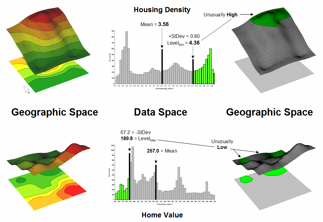
Figure 1. Identifying areas of unusually high measurements.
The histogram in the center of the figure depicts a different perspective of the data. Rather than positioning the measurements in geographic space it summarizes the relative frequency of their occurrence in data space. The X-axis of the graph corresponds to the Z-axis of the map—relative level of housing Density. In this case, the spikes in the graph indicate measurements that occur more frequently. Note the relatively high occurrence of density values around 2.6 and 4.7 units per acre. The left portion of the figure identifies the data range that is unusually high (more than one standard deviation above the mean; 3.56 + .80 = 4.36 or greater) and mapped onto the surface as the peak in the NE corner. The lower sequence of graphics in the figure depicts the histogram and map that identify and locate areas of unusually low home values.
Figure 2 illustrates combining the housing Density and Value data to locate areas that have high measurements in both. The graphic in the center is termed a Scatter Plot that depicts the joint occurrence of both sets of mapped data. Each ball in the scatter plot schematically represents a location in the field. Its position in the scatter plot identifies the housing Density and home Value measurements for one of the map locations—10,000 in all for the actual example data set. The balls shown in the light green shaded areas of the plot identify locations that have high Density or low Value; the bright green area in the upper right corner of the plot identifies locations that have high Density and low Value.
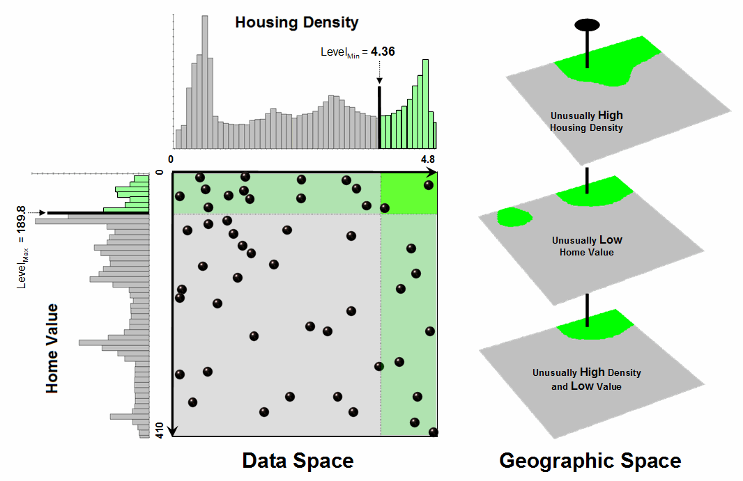
Figure 2. Identifying joint coincidence in both data and geographic space.
The aligned maps on the right side of figure 2 show the geographic solution for the high D and low V areas. A simple map-ematical way to generate the solution is to assign 1 to all locations of high Density and Value map layers (green). Zero (grey) is assigned to locations that fail to meet the conditions. When the two binary maps (0 and1) are multiplied, a zero on either map computes to zero. Locations that meet the conditions on both maps equate to one (1*1 = 1). In effect, this “level-slice” technique locates any data pattern you specify—just assign 1 to the data interval of interest for each map variable in the stack, and then multiply.
Figure 3 depicts level slicing for areas that are unusually low housing Density, high Value and low Age. In this instance the data pattern coincidence is a box in 3-dimensional scatter plot space (upper-right corner toward the back). However a slightly different map-ematical trick was employed to get the detailed map solution shown in the figure.
On the individual maps, areas of high Density were set to D= 1, low Value to V= 2 and high Age to A= 4, then the binary map layers were added together. The result is a range of coincidence values from zero (0+0+0= 0; gray= no coincidence) to seven (1+2+4= 7; dark red for location meeting all three criteria). The map values in between identify the areas meeting other combinations of the conditions. For example, the dark blue area contains the value 3 indicating high D and low V but not high A (1+2+0= 3) that represents about three percent of the project area (327/10000= 3.27%). If four or more map layers are combined, the areas of interest are assigned increasing binary progression values (…8, 16, 32, etc)—the sum will always uniquely identify all possible combinations of the conditions specified.
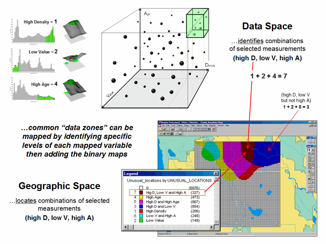
Figure 3. Level-slice classification using three map variables.
While level-slicing isn’t a very sophisticated classifier, it illustrates the usefulness of the link between Data Space and Geographic Space to identify and then map unique combinations of conditions in a set of mapped data. This fundamental concept forms the basis for more advanced geo-statistical analysis—including map clustering that will be the focus of next month’s column.
_____________________________
Author’s Note: Related
discussion and hands-on exercises are in Topic 7, Spatial Data Mining in the workbook Analyzing Geo-Business Data
(Berry, 2003; available at www.innovativegis.com/basis/Books/AnalyzingGBdata/).
Discover
the “Miracle” in Mapping Data Clusters
(GeoWorld, November 2008)
The last couple of sections have focused on analyzing data similarities within a stack of maps. The first technique, termed Map Similarity, generates a map showing how similar all other areas are to a selected location. A user simply clicks on an area and all of the other map locations are assigned a value from zero (0% similar—as different as you can get) to one hundred (100% similar—exactly the same data pattern).
The other technique, Level Slicing, enables a user to specify a data range of interest for each map layer in the stack then generate a map identifying the locations meeting the criteria. Level Slice output identifies combinations of the criteria met—from only one criterion (and which one it is), to those locations where all of the criteria are met.
While both of these techniques are useful in examining spatial relationships, they require the user to specify data analysis parameters. But what if you don’t know which locations in a project area warrant Map Similarity investigation or what Level Slice intervals to use? Can the computer on its own identify groups of similar data? How would such a classification work? How well would it work?
Figure 1 shows some example spatial patterns derived from Map Clustering. The “floating” map layers on the left show the input map stack used for the cluster analysis. The maps are the same ones used in previous examples and identify the geographic and numeric distributions of housing Density, home Value and home Age levels throughout the example project area.
The map in the center of the figure shows the results of classifying the D, V and A map stack into two clusters. The data pattern for each cell location is used to partition the field into two groups that are 1) as different as possible between groups and 2) as similar as possible within a group. If all went well, any other division of the mapped data into two groups would be worse at mathematically balancing the two criteria.
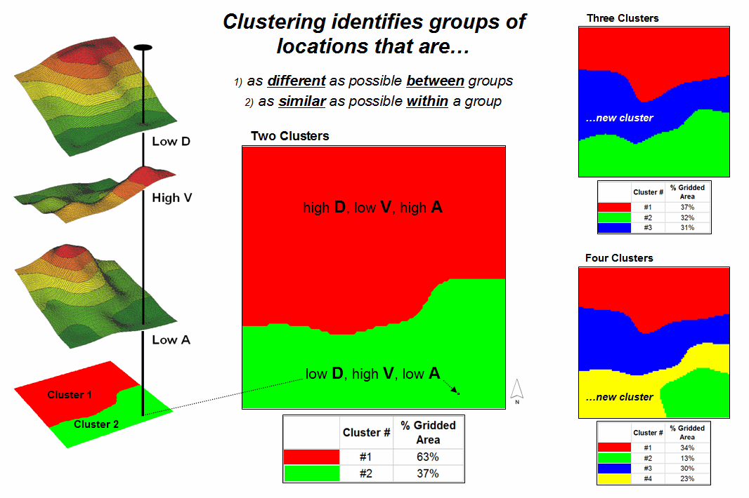
Figure 1.
Example output from map clustering.
The two smaller maps on the right show the division of the data set into three and four clusters. In all three of the cluster maps, red is assigned to the cluster with relatively high Density, low Value and high Age responses (less wealthy) and green to the one with the most opposite conditions (wealthy areas). Note the encroachment at the margin on these basic groups by the added clusters that are formed by reassigning data patterns at the classification boundaries. The procedure is effectively dividing the project area into “data neighborhoods” based on relative D, V and A values throughout the map area. Whereas traditional neighborhoods usually are established by historical legacy, cluster partitions respond to similarity of mapped data values and can be useful in establishing insurance zones, sales areas and marketing clusters.
The mechanics of generating cluster maps are quite simple. Just specify the input maps and the number of clusters you want then miraculously a map appears with discrete data groupings. So how is this miracle performed? What happens inside clustering’s black box?
The schematic in figure 2 depicts the process. The floating balls identify the data pattern for each map location (in Geographic Space) plotted against the P, K and N axes (in Data Space). For example, the tiny green ball in the upper-right corner corresponds to a map location in the wealthiest part of town (low D, high V and low A). The large red ball appearing closest depicts a location in a less wealthy part (high D, low V and high A). It seems sensible that these two extreme responses would belong to different data groupings (clusters 1 and 2, respectively).
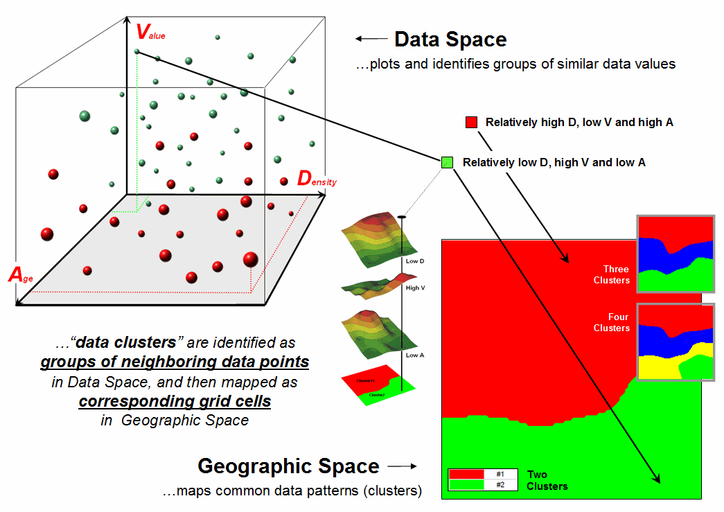
Figure 2.
Data patterns for map locations are depicted as floating balls in data
space with groups of nearby patterns identifying data clusters.
While the specific algorithm used in clustering is beyond the scope of this discussion (see author’s note), it suffices to recognize that data distances between the floating balls are used to identify cluster membership— groups of balls that are relatively far from other groups (different between groups) and relatively close to each other (similar within a group) form separate data clusters. In this example, the red balls identify relatively less wealthy locations while green ones identify wealthier locations. The geographic pattern of the classification (wealthier in the south) is shown in the 2D maps in the lower right portion of the figure.
Identifying groups of neighboring data points to form clusters can be tricky business. Ideally, the clusters will form distinct “clouds” in data space. But that rarely happens and the clustering technique has to enforce decision rules that slice a boundary between nearly identical responses. Also, extended techniques can be used to impose weighted boundaries based on data trends or expert knowledge. Treatment of categorical data and leveraging spatial autocorrelation are additional considerations.
So how do know if the clustering results are acceptable? Most statisticians would respond, “…you can’t tell for sure.” While there are some elaborate procedures focusing on the cluster assignments at the boundaries, the most frequently used benchmarks use standard statistical indices, such as T- and F-statistics used in comparing sample populations.
Figure 3 shows the performance table and box-and-whisker plots for the map containing two data clusters. The average, standard deviation, minimum and maximum values within each cluster are calculated. Ideally the averages between the two clusters would be radically different and the standard deviations small—large difference between groups and small differences within groups.
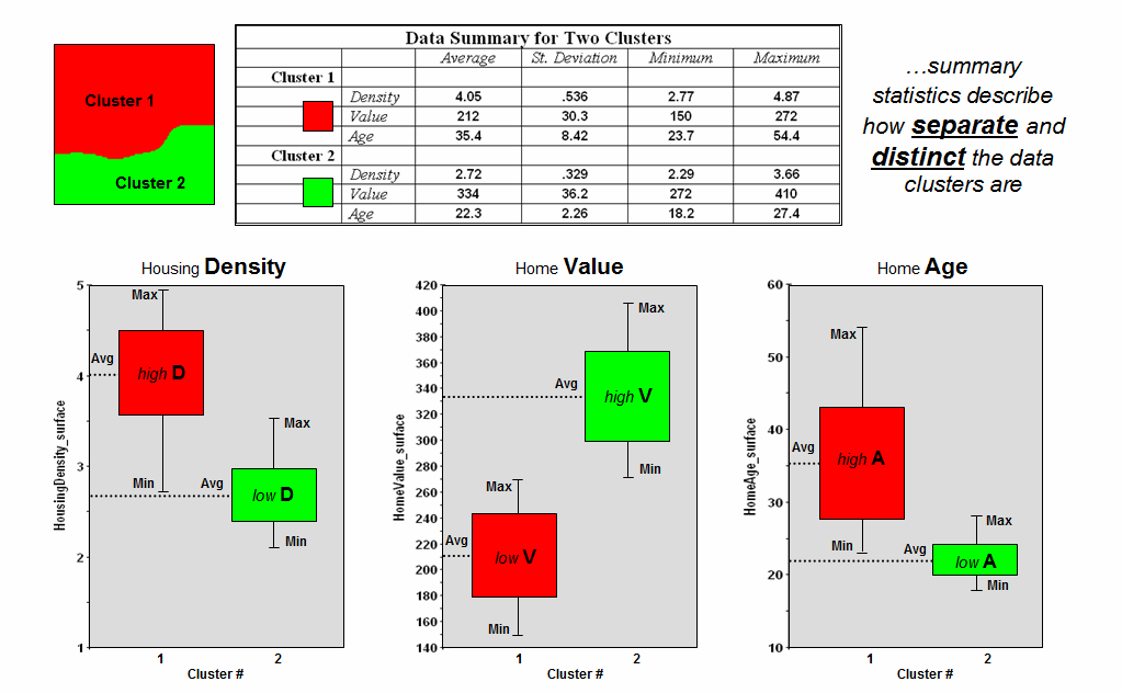
Figure 3.
Clustering results can be evaluated using “box and whisker” diagrams and
basic statistics.
Box-and-whisker plots enable us to visualize these differences. The box is aligned on the Average (center of the box) and extends above and below one Standard Deviation (height of the box) with the whiskers drawn to the minimum and maximum values to provide a visual sense of the data range. If the plots tend to overlap a great deal, it suggests that the clusters are not very distinct and indicates significant overlapping of data patterns between clusters.
The separation between the boxes in all three of the data layers of the example suggests good distinction between the two clusters with the Home Value grouping the best with even the Min/Max whiskers not overlapping. Given the results, it appears that the clustering classification in the example is acceptable… and hopefully the statisticians among us will accept in advance my apologies for such an introductory and visual treatment of a complex topic.
_____________________________
Author’s Note: The clustering
algorithm used in the examples was described in an earlier Beyond Mapping column (GeoWorld, August 1998) available online at www.innovativegis.com/basis/MapAnalysis/,
Topic 7, Identify Data Patterns. Related
discussion and hands-on exercises on Clustering are in Topic 7, Spatial Data Mining in the workbook Analyzing Geo-Business Data
(Berry, 2003; available at www.innovativegis.com/basis/Books/AnalyzingGBdata/).
Can We
Really Map the Future
(GeoWorld, December 2008)
Talk about the future of geo-business—how about mapping things yet to come? Sounds a bit farfetched but spatial data mining and predictive modeling is taking us in that direction. For years non-spatial statistics has been predicting things by analyzing a sample set of data for a numerical relationship (equation) then applying the relationship to another set of data. The drawbacks are that a non-spatial approach doesn’t account for geographic patterns and the result is just summary of the overall relationship for an entire project area.
Extending predictive analysis to mapped data seems logical as maps at their core are just organized sets of numbers and the GIS toolbox enables us to link the numerical and geographic distributions of the data. The past several columns have discussed how the computer can “see” spatial data relationships including “descriptive techniques” for assessing map similarity, data zones, and clusters. The next logical step is to apply “predictive techniques” that generates mapped forecasts of conditions for other areas or time periods.
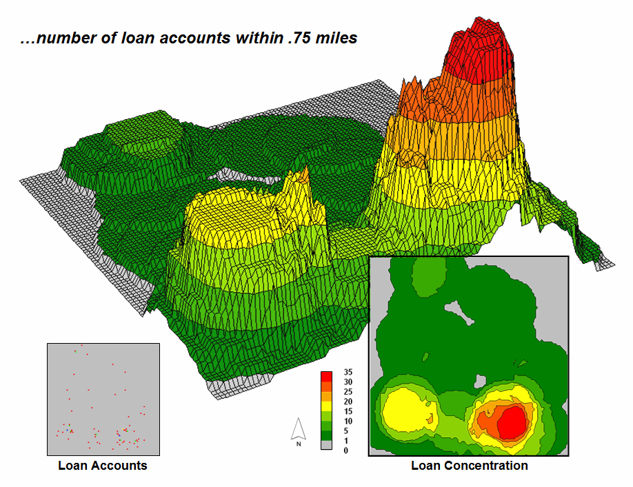
Figure 1. A
loan concentration surface is created by summing the number of accounts for
each map location within a specified distance.
To illustrate the process, suppose a bank has a database of home equity loan accounts they have issued over several months. Standard geo-coding techniques are applied to convert the street address of each sale to its geographic location (latitude, longitude). In turn, the geo-tagged data is used to “burn” the account locations into an analysis grid as shown in the lower left corner of figure 1. A roving window is used to derive a Loan Concentration surface by computing the number of accounts within a specified distance of each map location. Note the spatial distribution of the account density— a large pocket of accounts in the southeast and a smaller one in the southwest.
The most frequently used method for establishing a quantitative relationship among variables involves Regression. It is beyond the scope of this column to discuss the underlying theory of regression; however in a conceptual nutshell, a line is “fitted” in data space that balances the data so the differences from the points to the line (termed the residuals) are minimized and the sum of the differences is zero. The equation of the best-fitted line becomes a prediction equation reflecting the spatial relationships among the map layers.
To illustrate predictive modeling, consider the left side of figure 2 showing four maps involved in a regression analysis. The loan Concentration surface at top is serves as the Dependent Map Variable (to be predicted). The housing Density, Value, and Age surfaces serve as the Independent Map Variables (used to predict). Each grid cell contains the data values used to form the relationship. For example, the “pin” in the figure identifies a location where high loan Concentration coincides with a low housing Density, high Value and low Age response pattern.
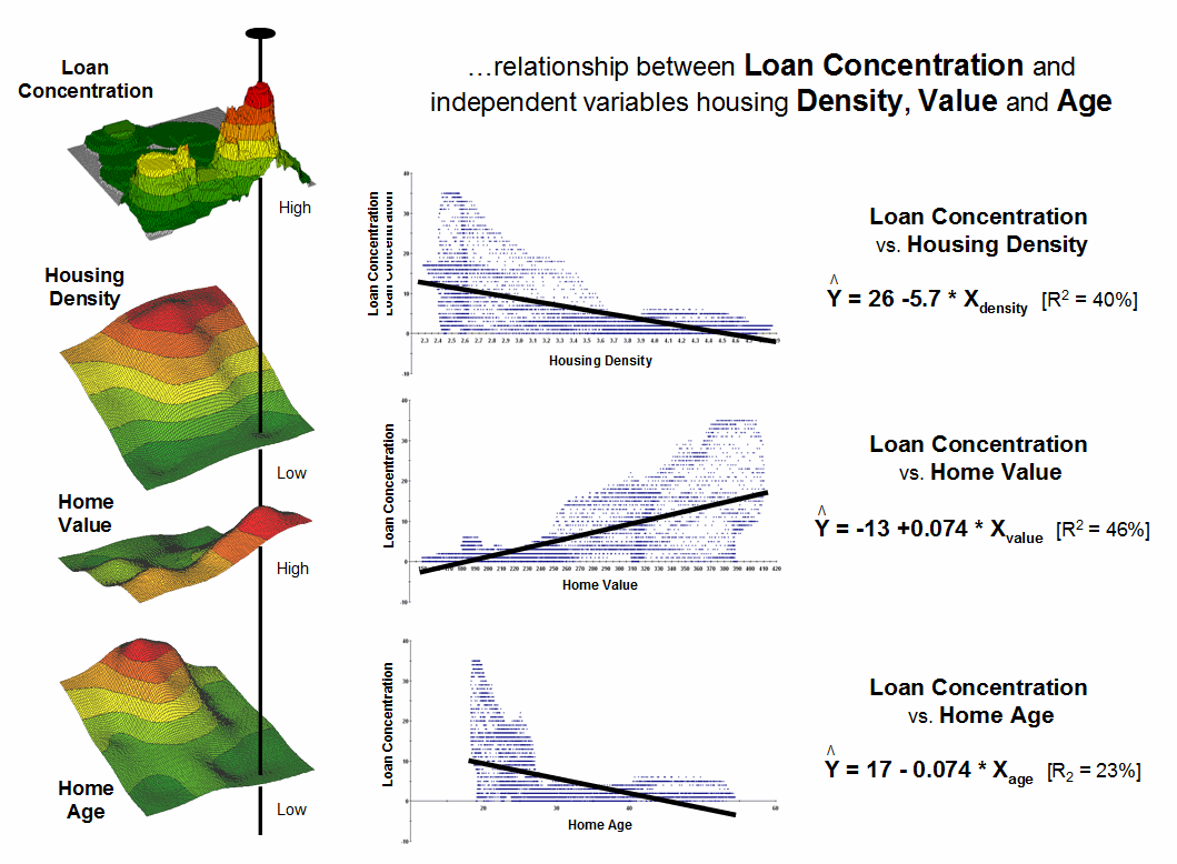
Figure 2. Scatter
plots and regression results relate Loan Density to three independent variables
(housing Density, Value and Age).
The scatter plots in the center of the figure graphically portray the consistency of the relationships. The Y axis tracks the dependent variable (loan Concentration) in all three plots while the X axis follows the independent variables (housing Density, Value, and Age). Each plotted point represents the joint condition at one of the grid locations in the project area—10,000 dots in each scatter plot. The shape and orientation of the cloud of points characterizes the nature and consistency of the relationship between the two map variables.
A plot of a perfect relationship would have all of the points forming a line. An upward directed line indicates a positive correlation where an increase in X always results in a corresponding increase in Y. A downward directed line indicates a negative correlation with an increase in X resulting in a corresponding decrease in Y. The slope of the line indicates the extent of the relationship with a 45-degree slope indicating a 1-to-1 unit change. A vertical or horizontal line indicates no correlation— a change in one variable doesn’t affect the other. Similarly, a circular cloud of points indicates there isn’t any consistency in the changes.
Rarely does the data plot into these ideal conditions. Most often they form dispersed clouds like the scatter plots in figure 2. The general trend in the data cloud indicates the amount and nature of correlation in the data set. For example, the loan Concentration vs. housing Density plot at the top shows a large dispersion at the lower housing Density ranges with a slight downward trend. The opposite occurs for the relationship with housing Value (middle plot). The housing Age relationship (bottom plot) is similar to that of housing Density but the shape is more compact.
Regression is used to quantify the trend in the data. The equations on the right side of figure 2 describe the “best-fitted” line through the data clouds. For example, the equation Y= 26.0 – 5.7X relates loan Concentration and housing Density. The loan Concentration can be predicted for a map location with a housing Density of 3.4 by evaluating Y= 26.0 – (5.7 * 3.4) = 6.62 accounts estimated within .75 miles. For locations where the prediction equation drops below 0 the prediction is set to 0 (infeasible negative accounts beyond housing densities of 4.5).
The “R-squared index” with the regression equation provides a general measure of how good the predictions ought to be— 40% indicates a moderately weak predictor. If the R-squared index was 100% the predicting equation would be perfect for the data set (all points directly falling on the regression line). An R-squared index of 0% indicates an equation with no predictive capabilities.
In a similar manner, the other independent variables (housing Value and Age) can be used to derive a map of expected loan Concentration. Generally speaking it appears that home Value exhibits the best relationship with loan Concentration having an R-squared index of 46%. The 23% index for housing Age suggests it is a poor predictor of loan Concentration.
Multiple regression can be used to simultaneously consider all three independent map variables as a means to derive a better prediction equation. Or more sophisticated modeling techniques, such as Non-linear Regression and Classification and Regression Tree (CART) methods, can be used that often results in an R-squared index exceeding 90% (nearly perfect).
The bottom line is that predictive modeling using mapped data is fueling a revolution in sales forecasting. Like parasailing on a beach, spatial data mining and predictive modeling are affording an entirely new perspective of geo-business data sets and applications by linking data space and geographic space through grid-based map analysis.
_____________________________
Author’s Note: Related
discussion and hands-on exercises on spatial regression are in Topic 8,
Predictive Modeling in the workbook Analyzing
Geo-Business Data (Berry, 2003; available at www.innovativegis.com/basis/Books/AnalyzingGBdata/).
Follow
These Steps to Map Potential Sales
(GeoWorld, January 2008)
My first sojourn into geo-business involved an application to extend a test marketing project for a new phone product (nick-named “teeny-ring-back”) that enabled two phone numbers with distinctly different rings to be assigned to a single home phone—one for the kids and one for the parents. This pre-Paleolithic project was debuted in 1991 when phones were connected to a wall by a pair of copper wires and street addresses for customers could be used to geo-code the actual point of sale/use. Like pushpins on a map, the pattern of sales throughout the city emerged with some areas doing very well (high sales areas), while in other areas sales were few and far between (low sales areas).
The assumption of the project was that a relationship existed between conditions throughout the city, such as income level, education, number in household, etc. could help explain sales pattern. The demographic data for the city was analyzed to calculate a prediction equation between product sales and census data.
The prediction equation derived
from test market sales in one city could be applied to another city by
evaluating exiting demographics to “solve the equation” for a predicted sales
map. In turn, the predicted sales map
was combined with a wire-exchange map to identify switching facilities that
required upgrading before release of the product in the
Now fast-forward to more contemporary times. A GeoWorld feature article described a similar, but much more thorough analysis of retail sales competition (Beyond Location, Location, Location: Retail Sales Competition Analysis, GeoWorld, March 2006; see Author’s Note). Figure 1 outlines the steps for determining competitive advantage for various store locations.
Most
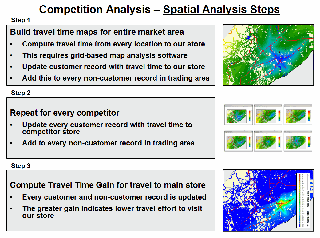
Figure 1. Spatial Modeling steps derive the relative travel
time relationships for our store and each of the competitor stores for every
location in the project area and links this information to customer records.
Step 1 map shows the grid-based solution for travel-time from “Our Store” to all other grid locations in the project area. The blue tones identify grid cells that are less than twelve minutes away assuming travel on the highways is four times faster than on city streets. Note the star-like pattern elongated around the highways and progressing to the farthest locations (warmer tones). In a similar manner, competitor stores are identified and the set of their travel time surfaces forms a series of geo-registered maps supporting further analysis (Step 2).
Step 3 combines this information for a series of maps that indicate the relative cost of visitation between our store and each of the competitor stores (pair-wise comparison as a normalized ratio). The derived “Gain” factor for each map location is a stable, continuous variable encapsulating travel-time differences that is suitable for mathematical modeling. A Gain of less than 1.0 indicates the competition has an advantage with larger values indicating increasing advantage for our store. For example, a value of 2.0 indicates that there is a 200% lower cost of visitation to our store over the competition.
Figure 2 summarizes the predictive modeling
steps involved in competition analysis of retail data. The geo-coding link between the analysis
frame and a traditional customer dataset containing sales history for more than
80,000 customers was used to append travel-times and Gain factors for all
stores in the region (Step 4).
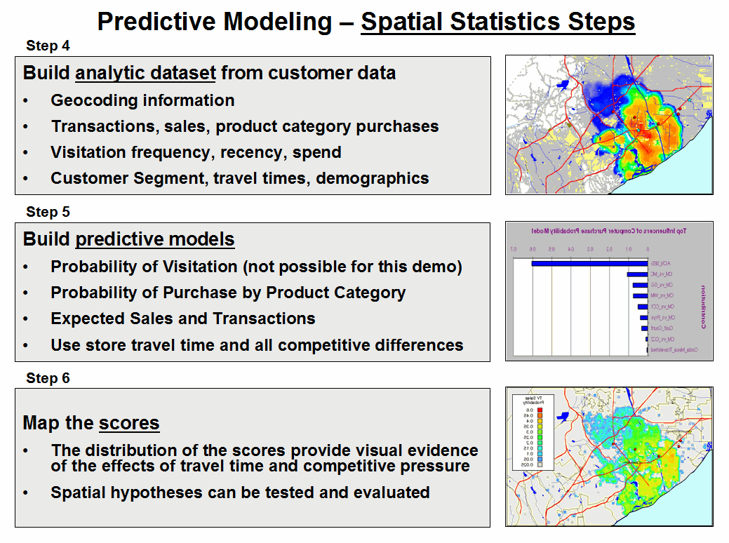
Figure 2.
Predictive Modeling steps use spatial data mining procedures for
relating spatial and non-spatial factors to sales data to derive maps of
expected sales for various products.
The regression hypothesis was that sales would
be predictable by characteristics of the customer in combination with the
travel-time variables (Step 5). A series
of mathematical models are built that predict the probability of purchase for
each product category under analysis (see Author’s Note). This provides a set of model scores for each
customer in the region. Since a number
of customers could be found in many grid cells, the scores were averaged to
provide an estimate of the likelihood that a person from each grid cell would
travel to our store to purchase one of the analyzed products. The scores for each product are mapped to
identify the spatial distribution of probable sales, which in turn can be
“mined” for pockets of high potential sales.
Targeted marketing, retail trade area
analysis, competition analysis and predictive modeling provide examples
applying sophisticated Spatial Analysis and Spatial Statistics to
improve decision making. The techniques
described in the past nine Beyond Mapping columns on Geo-business applications
have focused on Map Analysis— procedures that extend traditional mapping and
geo-query to map-ematically based analysis of mapped
data. Figure 3 outlines the classes of
operations described in the series (blue highlighted techniques were
specifically discussed).
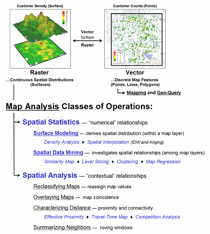
Figure 3. Map Analysis exploits the digital nature of
modern maps to examine spatial patterns and relationships within and among
mapped data.
Recall that the keystone concept is an Analysis
Frame of grid cells that provides for tracking the continuous spatial
distributions of mapped variables and serves as the primary key for linking
spatial and non-spatial data sets. While
discrete sets of points, lines and polygons have served our mapping demands for
over 8,000 years and keep us from getting lost, the expression of mapped data
as continuous spatial distributions (surfaces) provides a new foothold for the
contextual and numerical analysis of mapped data— in many ways, “thinking with
maps” is more different than it is similar to traditional mapping.
_____________________________
Author’s Note: a copy of the
article Beyond Location, Location, Location: Retail Sales Competition Analysis,
is posted online at www.innovativegis.com/basis/present/GW06_retail/GW06_Retail.htm. The predictive modeling used a specialized
data mining technology, KXEN K2R, based on Vapnik
Statistical Learning theory (www.kxen.com).
The
Universal Key for Unlocking GIS’s Full Potential
(GeoWorld, October 2011)
Geotechnology is rapidly changing how we
perceive, process and provide spatial information. It is generally expected that one can click
anywhere in the world and instantly access images and basic information about a
location. However, accessing your own specialized
and proprietary data is much more difficult—often requiring wholesale changes
to your corporate database and staffing.
The emergence of Geo-Web Applications
involving the integration/interaction of GIS, visualization and social media
has set the stage for entirely new perspectives on corporate DBMS. For example, one can upload sales figures for
individual customers into Google Earth and view as clusters of pins draped on
an aerial image of a city, or receive GPS-tagged photos of potholes on county
roads, or track shipments and field crews, or even locate vacant parking spaces
at the mall—all this and more from your somewhat overly-smart cell phone.
Generally speaking there are three information
processing modes…
-
Visualize— to recall or
form mental images or pictures involving map display (Charting capabilities),
-
Synthesize— to form a
material or abstract entity by combining parts or elements involving
the re-packaging of existing information (Geo-query capabilities),
and
-
Analyze— to separate a
material or abstract entity into constituent parts or elements to
determine their relationship involving deviation of new spatial
information identifying key factors, connections and
associations (Map Analysis capabilities).
Map Analysis is by far the least developed of
the three. Visualization and query of
mapped data are direct extensions of our paper map and filing systems
legacy. Analysis of mapped data, on the
other hand, involves somewhat unfamiliar territory for most organizations. Like “the chicken and the egg” quandary, the
demand for map analysis hasn’t been there because prior experience with map
analysis hasn’t been there. But even
more basic is the lack of mapped data in a form amenable for analysis.
Your grade school exposure to geography and
mapping can change all that. Recall that
Latitude (north/south) and Longitude (east/west) lines can be
drawn on the globe to identify a location anywhere in the world. Using typical single precision floating point
storage of Lat/Long coordinates in a standard database enables grid cell
referencing of about half a foot or less anywhere in the continental U.S. (365214
ft/degree * 0.000001= .365214 ft *12 = 4.38257 inch grid precision along the equator). That means appending Lat/Long fields to any
database record locates that record with more than enough precision for most
map analysis applications.
As review, recall that the Lat/Long coordinate
system uses solid angles measured from the center of the earth (figure 1). A line passing through the Royal Observatory
in Greenwich near London (termed the Prime Meridian) serves as the
international zero-longitude reference.
Locations to the east are in the eastern hemisphere, and places to the
west are in the western hemisphere with each half divided into 180
degrees.
Geographic latitude measures the angle from the equator to the poles that trace circles on the Earth’s surface called parallels, as they are parallel to the equator and to each other. The equator divides the globe into Northern and Southern Hemispheres— 0 to 90° North and 0 to 90° South. Figure 1 shows a ten degree Lat/Long gridding steps representing approximately 692 mile movements along the equator.
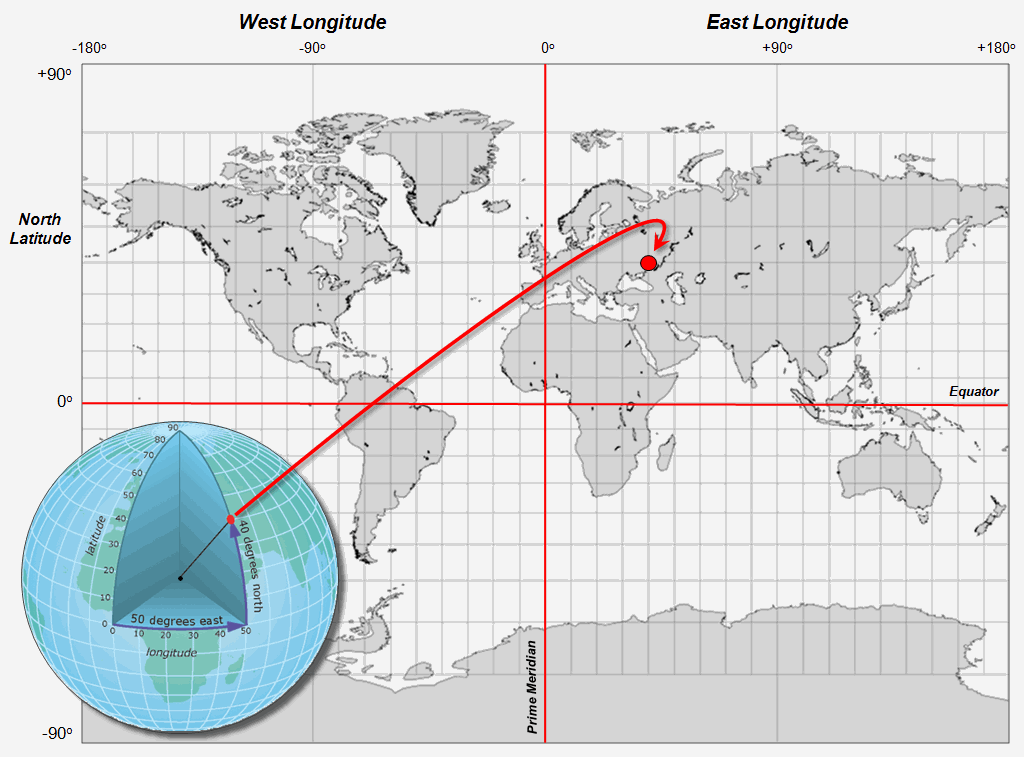
Figure 1. The Latitude/Longitude coordinate system
forms a comprehensive grid covering the entire world with cells of about half a
foot or less over the continental U.S.
So much for a conceptual review of Lat/Long, keeping in mind that there are lot of geographic and mathematical considerations in implementing the coordinate system. Thankfully they were hammered-out years ago resulting in a set universal standards that form the foundation for contemporary GPS use.
The next conceptual step involves extending
the paper map paradigm to grid-based data layers. Traditional mapping holds that there are
three fundamental map features— discrete points, lines and polygons. With the advent of the digital map, a fourth
feature type emerges—continuous surfaces. The Lat/Long grid forms a surface for
geographic referencing that is analogous to a digital image with a “dot”
(pixel) for every location in viewed area.
In the case of a grid map layer, a map value that identifies the
characteristic/condition at a location replaces the pixel value denoting color.
Like the image on a computer screen, a point
feature is represented by a single dot/cell containing that feature; a line feature
by a series of connected cells; and a polygon feature by all of the cells
defining it, both its interior and boundary.
A surface is represented by the entire gridded continuum and like an
elevation surface it depicts continuous changes in a map variable. Whereas points, lines and polygons have sharp
abrupt boundaries, surfaces form gradients of change.
The final conceptual leap is shown in figure 2. Like Google Earth’s registration of satellite images to Lat/Long referencing, mapped data of all types can be stored, retrieved and analyzed based on the stored coordinates for the records—thereby forming a “Universal DBMS Key” that can link seemingly disparate database files. The process is similar to a date/time stamp, except the “where information” provides a spatial context for joining data sets. Demographic records can be linked to resource records that in turn can be linked to business records, etc.
Figure 2. The Lat/Long grids are used to construct a
map stack of geo-registered map layers that are pre-conditioned for map
analysis and modeling.
In practice, extensive data is stored in “Virtual
Tiles” for efficient storage, access and processing. A user identifies a boundary extent, then an
“Analysis Frame” resolution (cell size) and pertinent data layers
that are automatically extracted into a “Map Stack” for grid-based map
analysis and modeling. Solution map(s)
resulting from analysis can be exported in either vector, raster or DBMS form
and the map stack retained for subsequent processing or deleted and
reconstructed as needed.
So what is holding back this seemingly utopian
mapping world? The short answer is “some
practical and legacy considerations.” On
the practical front, the geographic stretching and pinching of the grid cells
with increasing latitude confounds map analysis at global scales and lacks the
precision necessary for detailed cadastral/surveying applications. On the legacy front, the approach relies more
on DBMS and image processing mindsets than on traditional mapping paradigms and
geographic principles underlying most flagship GIS packages.
It is like a Rorschach inkblot. Since the middle ages we have thought of
Lat/Long as intersecting lines, whereas the new perspective is flipped
to a continuum of grid cells.
Current thinking is more like a worldwide egg crate with the grid spaces
as locations for placing map values that indicate the characteristics/conditions
of a multitude of map variables anywhere in the world.
As the Geo-Web mindset gains acceptance and
data storage becomes ubiquitous, more and more maps will take on image
characteristics—a raster map where Lat/Long grid cells replace pixels and map
values amenable to analysis replace color codes. While the vector map model will continue, it
is the raster model (Lat/Long grids in particular) that takes us well beyond
traditional mapping.
_____________________________
Author’s Notes: For more information on grid-based mapped
data considerations, see the online book Beyond Modeling III, Topic 18,
Understanding Grid-based Data posted at www.innovativegis.com/Basis/MapAnalysis/.