|
Topic 9 – Basic
Techniques in Spatial Statistics |
Map
Analysis book/CD |

GIS
Data Are Rarely Normal — describes the basic
non-spatial descriptive statistics
The Average
Is Hardly Anywhere — discusses the difference between
spatial and non-spatial data distributions
Under
the Hood of Spatial Interpolation — investigates the
basic concepts in IDW and Kriging interpolation procedures
Justifiable
Interpolation — describes the "Residual
Analysis" procedure for assessing interpolation performance
Further Reading
— ten additional sections organized into three parts
<Click here>
for a printer-friendly version of this
topic (.pdf).
(Back to the Table of Contents)
______________________________
GIS Data Are Rarely Normal
(GeoWorld, October 1998)
Most of
us are familiar with the old “bell-curve” for school grades. You know, with lots of C’s, fewer B’s and
D’s, and a truly select set of A’s and F’s.
Its shape is a perfect bell, symmetrical about the center with the tails
smoothly falling off toward less frequent conditions.
Although the distribution is familiar and easy to visualize, the normal
distribution (bell-shaped) isn’t as normal (typical) as you might
think. For example, Newsweek recently noted that the average grade at a major
ivy-league university isn’t a solid C with a few A’s and F’s sprinkled about as
you might imagine, but an A- with a lot of A’s trailing off to lesser amounts
of B’s, C’s and (heaven forbid) the rare D’s and F’s.
The frequency distributions of mapped data also tend toward the ab-normal (formally termed asymmetrical). For example, consider the elevation data
shown in figure 1. The contour map and
3-D surface on the left depicts the geographic distribution of the data. Note the distinct pattern of the terrain with
higher elevations in the northeast and lower ones along the western
portion. As is normally the case with
mapped data, the elevation values are neither uniformly nor randomly
distributed in geographic space. The
unique pattern is the result complex physical processes driven by a host of
factors—not spurious, arbitrary, constant or even “normal” events.
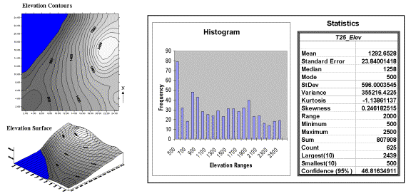
Figure
1. Mapped data are characterized by
their geographic distribution (maps on the left) and their numeric distribution
(histogram and statistics on the right).
Now
turn your attention to the numeric distribution of the data depicted in the
right side of the figure. The data
view was generated by simply transferring the gridded elevation values
to Excel, then applying the Histogram and
Descriptive Statistics options of the
Data Analysis add-in tools. The mechanics used to plot the histogram and
generate the statistics were a piece-of-cake, but the real challenge is to make
some sense of it all. Note that the data
aren’t distributed as a normal bell-curve, but appear flattened and slightly
shifted to the left. The tall spike at
the lowest elevation range (500-600 feet) is due to the lake in the northwest
corner. If the lake was drained (or its
bathometry considered) some of the spike’s values would be assigned smaller elevations
and the distribution would broaden and flatten even more.
If the terrain contained a plateau or mesa instead of the smooth hill in the
northeast, there would be a spike at the high end of the histogram. What do you think the histogram would look
like if the area contained several chimney-rocks or “whoodoos” scattered about
a flat plain? Or if the area were
centered on an escarpment?
The mental exercise linking geographic space with data space is a good one, and
some general points ought to be noted.
First, there isn’t a fixed relationship between the two views of the
data’s distribution (geographic and data).
A myriad of geographic patterns can result in the same histogram. That’s because spatial data contains
additional information—where, as well
as what—and the same data summary of
the “what’s” can reflect a multitude of spatial arrangements (“where’s).
But is the reverse true? Can a given
geographic arrangement result in different data views? Nope, and it’s this relationship that catapults
mapping and geo-query into the arena of mapped data analysis. Traditional analysis techniques assume a
functional form for the frequency distribution (histogram shape), with the
standard normal (bell-shaped) being the most prevalent. Last June’s column described the basic
descriptive statistics Excel’s summary table— maximum, minimum, range, mode, median, mean (average), variance,
standard deviation and an additional one termed coefficient of variation.
The discussion described how these statistics portray the central
tendency (typical condition) of a data set.
In effect, they reduce the complexity of a large number of measurements
to just a handful of numbers and provide a foothold for further analysis.
A brief discussion of the additional indices in Excel’s table is
warranted. The sum and the count
should be obvious—the total of all the measurements (sum= 807,908 “total” feet
above sea level doesn’t mean much in this context) and the number of
measurements (count= 625 data values indicates a fairly big data set as
traditional statistics go, but fairly small for spatial statistics). The largest/smallest statistic in the
table identifies the average of a user-specified number of values (10 in this
case) at the extreme ends of the data set.
It is interesting to note that the average of the 10 smallest elevation
values (500) is the same as the minimum value, while the average of the 10
largest values (2439) is well below the maximum value of 2500.
The standard
error calculates the average difference between the individual data
values and the mean (StdError= sum [[x-mean]**2] / [n*[n-1]]). If the average deviation is fairly small,
then the mean is fairly close to each of the sample measurements. The standard error for the elevation data is
23.84001418 (whoa Excel, way too many decimals— nothing in statistics is that
precise). The statistic means that the
mean is on the average (got that?) about 24 feet above or below the 625
individual elevation values comprising the map.
Useful information, but often the attention of most
The confidence
level is a range on either side of a sample mean that you are fairly
sure contains the population (true) average. For example, if you have some data
on mail order delivery times, you can determine, with a particular level of
confidence (usually 95%), the earliest and latest a product will likely arrive.
The elevation data’s confidence value of 46.81634911 suggests that we can be
fairly sure that the “true” average elevation is between 1245 and 1340. But this has a couple of important
assumptions—that the data represents a good sample and that the normal curve is
a good representation of the actual distribution.
But what if the distribution isn’t normal?
What if it is just a little ab-normal? What if it is a lot? That’s the stuff of doctoral theses, but
there are some general considerations that ought to be noted. First, there are some important statistics
that provide insight into how normal a data set is. Skewness tells us if the data is
lop-sided. Formally speaking, it
“characterizes the degree of asymmetry of a distribution around its mean.”
Positive skewness indicates a distribution shifted to left, while negative
skewness indicates a shift to the right and zero skewness is indicates
perfectly symmetrical data. The larger
the value, the more pronounced is the lop-sided shift. In the elevation data, a skewness value of
.246182515 indicates a slight shift to the right.
Another measure of ab-normality is
termed kurtosis. It
characterizes the relative “peakedness or flatness” of a distribution compared
with the “ideal” bell-shaped distribution. A positive kurtosis indicates a
relatively peaked distribution, while a negative kurtosis indicates a
relatively flat one and 0 is just the right amount (sounds like Goldilock’s
“papa, mamma and baby bear” sizing of distribution shape). Its magnitude reports the degree of
distortion from a perfect bell-shape.
The –1.13861137 kurtosis value for the elevation data denotes a
substantial flattening.
All in all, the skewness and kurtosis values don’t bode well for the elevation
data being normally distributed. In fact,
a lot of spatial data isn’t very normal…some might say most. So what do you do? Throw away the Excel-type descriptive
statistics? Punt on statistical analysis
and simply generate really cool graphics for visceral visions of the
relationships? Do you blindly go ahead
and impose assumptions of normalcy just to force-fit normal analysis
procedures? Good questions, but they
will have to wait for the next section’s discussions.
The
Average Is Hardly Anywhere
(GeoWorld, May 2006)
Remember
your first encounter with statistics? In
the days of old before politically correct examples, you might have calculated
the average weight of the students in the class by adding up all of the
students’ weights and then dividing by the number of students. The average
weight gives you an estimate of how heavy a “typical student” is and the standard deviation tells you how typical
that typical is.
Now
imagine your old classroom with the bulky jocks in the back, the diminutive
bookworms in front, and the rest caught in between. Two things should come to mind—1) not all of
the students had the same typical weight (some were heavier and some were
lighter) and 2) the differences from the typical weight might have followed a
geographic pattern (heavy in the back, light in the front). The second point forms the foundation of
surface modeling that “maps the variation in geographic data sets.”
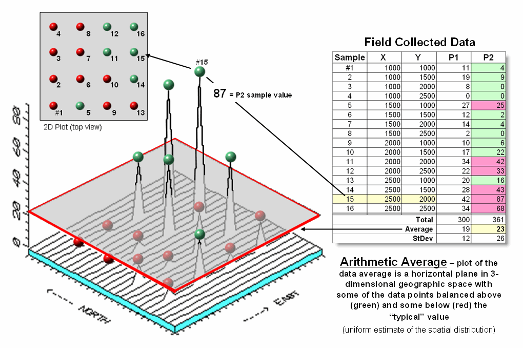
Figure
1. Comparison of the spatial
distributions of field samples (floating balls) and their arithmetic average
(horizontal plane).
Figure
1 illustrates the spatial and non-spatial character of a set of animal activity
data. The right side of the figure lists
the number of sightings at sixteen locations for two 24-hour periods (P1 in
June; P2 in August). Note the varying levels
of activity— 0 to 42 for P1 and 0 to 87 for P2 that can be reduced to their
average values of 19 and 23, respectively.
A wildlife manager might ponder these findings, and then determine
whether the implied typical activity is too little, too much or just right for
a particular management action.
But the
average does not address the variation in the data set— that's the role of the
standard deviation. As a general rule
(termed the Coefficient of Variation) “…if the standard deviation is relatively
large compared to the arithmetic average, the average cannot be used to
make decisions” as there is too much unexplained variation in the data (i.e.,
the computed average isn't very typical).
Possibly
some of the variation in animal activity forms a pattern in geographic space
that might help extend the explanation.
That is where the left side of figure 1 comes into play with a
three-dimensional plot used to show the geographic location (X, Y) and the
measured activity levels (Z). I'll bet
your eye is “mapping the variation in the data” as high activity in the
Northeast, low in the Northwest and moderate elsewhere.
The
thick line in the plot outlines a horizontal plane at 23 (arithmetic average)
that spatially characterizes the typical animal activity as uniformly
distributed in geographic space (horizontal plane). But your eye tells you that guessing 23
around Sample #15 with a measured value of 87, is likely an
understatement. Similarly, a guess of 23
around Sample #4 with a value of 0 is likely an overstatement. That is what the relatively large standard
deviation indicated— guess 23 but expect to be way off (+ 26) a lot of
the time.
The
non-spatial procedure, however, doesn’t provide a hint as to where the average
might be guessing too low and where it might be guessing high. That's the main difference between traditional
statistics and spatial statistics— traditional statistics characterizes the
central tendency (average) of data in numeric space; spatial statistics seeks
to map the variation (standard deviation) of data in geographic space.
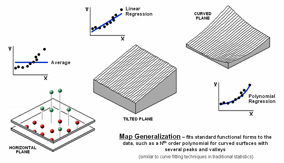
Figure 2. Map Generalization can be used to approximate
geographic trends.
Figure
2 illustrates Map Generalization as
an approach to mapping the spatial trend in the data using polynomial surface fitting. The average of 23 is depicted as a horizontal
plane that does its best to balance half of the balls above it and half below
it by minimizing the set of squared deviations from the plane to each floating
ball (similar to curve-fitting regression techniques in traditional
statistics).
Now
relax the assumption that the plane has to remain horizontal. Tilt it every-which-way until it better fits
the floating balls (Tilted Plane). Or
even better, the assumption of a flat plane can be relaxed and the surface can
curve to better fit the ups and downs of the data points. The right portion of the figure fits a 2nd
degree polynomial (Curved Plane).
Figure
3 shows an entirely different approach to fitting a surface to the data by
using the Spatial Interpolation
technique of iterative smoothing. Imagine replacing the floating balls with
columns of modeler's clay rising to the same height as each ball. In effect this is a blocky first-order
estimate of the animal activity throughout the project area derived by simply
assigning the closest field sample to each map location.
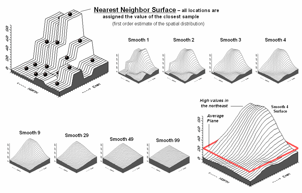
Figure 3. Iteratively Smoothed approximations of
localized geographic distribution.
<Click
here to download an animated slide set of Interactive Smoothing>
Now
imagine whacking away some of the clay at the top of the columns and filling-in
at the bottom. In the example, a 3x3
averaging window was moved around the matrix of values to systematically smooth
the blocky surface. When the window is
centered over one of the sharp boundaries, it has a mixture of small and larger
map values, resulting in an average somewhere in between... a localized whack
off the top and a fill-in at the bottom.
The series
of plots in the figure show repeated passes of the smoothing window from once
through ninety-nine times. Like erosion,
the mountains (high animal activity) are pulled down and the valleys (low
animal activity) are pulled up.
According to theory, the process eventually approximates a horizontal
plane floating at the arithmetic average.
The
bottom line is that field collected data with geographic coordinates holds a
lot more information than simply a reduction to a typical value. The nest section investigates other more
powerful methods for estimating the spatial, as well as numerical distribution
inherent in mapped data.
Under the Hood of Spatial Interpolation
(GeoWorld, June 2006)
The
previous section described how field
collected data (discrete points) can be used to generate a map (continuous surface) of the data’s
spatial patterns. The derived surface
extends the familiar concept of central tendency to a map of the geographic distribution
of the data. Whereas traditional
statistics identifies the typical value in a data set, surface modeling
identifies "where" you might expect to find the typical and
not so typical responses.
The Iterative Smoothing approach described
last time is a simple data-driven procedure.
However, all of the interpolation techniques share a similar approach
that generates estimates of a mapped variable based on the data values within
the vicinity of each map location. In
effect, this establishes a "roving window" that moves throughout an
area summarizing the field samples it encounters within its reach. The summary estimate is assigned to the
center of the window, and then it moves on.
The extents of the window (both size and shape) influence the result,
regardless of the summary technique. In
general, a large window capturing numerous values tends to smooth the
data. A smaller window tends to result
in a rougher surface.
Three
factors affect the window's configuration— its reach, number of samples, and
balancing. The reach, or search
radius, sets a limit on how far the computer will go in collecting data
values. The number of samples
establishes how many data values will be used.
The balancing of the data attempts to eliminate directional bias by
insuring that values are selected from all directions around the window's
center.
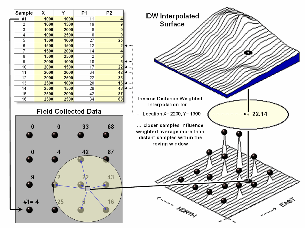
Figure 1. A roving window is used
to identify and summarize nearby sample values.
Once a
window is established, the summary technique comes into play. The Inverse Distance Weighted (IDW) technique is easy to
conceptualize (see figure 1). It
estimates a value for a location as the weighted-average of the nearby data
values within the roving window. The
average is weighted so the influence of the surrounding values decrease with
increasing distance from the location being estimated.
Figure
2 shows the IDW calculations for the location identified in figure 1. The Pythagorean Theorem is used to calculate
the geographic distance between the location and the six sample values in the window. A weight for each sample is determined as 1/D2,
then the weighted average of the samples is calculated and assigned to the
location. The process is repeated for
each location in the project area.
Because
IDW is a static averaging method, the estimated values can never exceed the
range of values in the original sample data.
Also, it tends to "pull-down peaks and pull-up valleys" in the
data. Inverse distance is best suited
for data sets where the samples are fairly independent of their surrounding
locations (i.e., no strong regional trend).
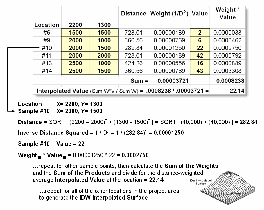
Figure 2. IDW calculations use
simple geographic distance to weight the average of samples within a roving
window.
Another
approach, Kriging (KRIG) uses regional variable theory based on an
underlying variogram. That's techy-speak
implying that there is a lot of math behind the approach. In effect, the technique develops custom
weights based on trends in the sample data.
The moving average weights that define the data trends can result in
estimated values that exceed the field data's range of values. Also, there can be unexpected results in
large areas without data values. The
technique is most appropriate for fairly dense, systematically sampled data
exhibiting discernable regional trends.
The
center portion figure 3 illustrates how the Krig weights are derived. The distances between each sample point and
all of the other sample points are calculated.
At the same time, the differences in the sample values are
recorded. Common sense suggests that
“nearby things are more alike than distant things” and a plot of Distance
versus Difference often looks something like the variogram in the center of the figure.
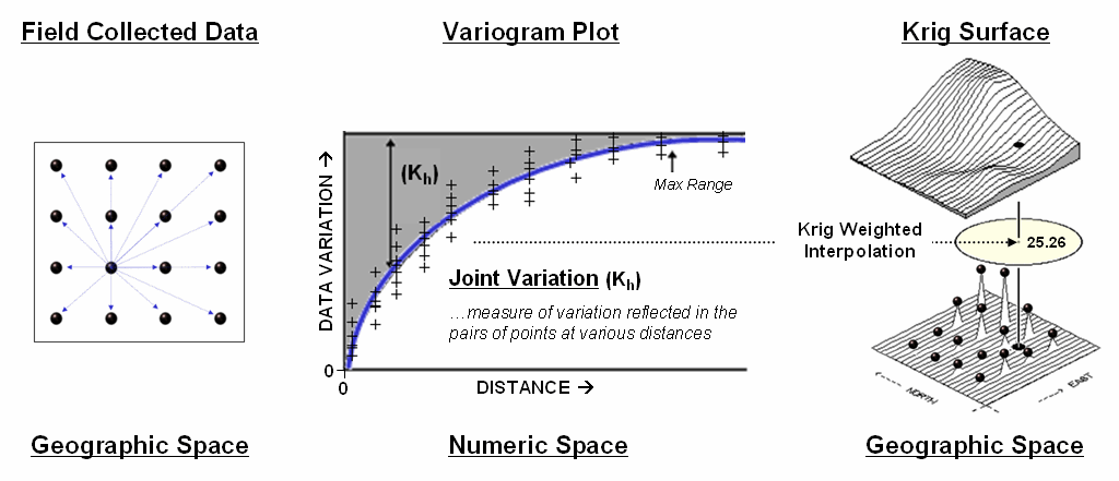
Figure
3. A variogram plot depicts the relationship between distance and similarity
between sample values.
The
origin of the plot at 0,0 is a unique case. The distance between
samples is zero; therefore, there shouldn’t be any dissimilarity (data
variation = zero) as the
location is exactly the same as itself.
As the distance between points increase, subsets of the data are
scrutinized for their dependency. The shaded portion in the idealized
plot shows a rapid deterioration of the spatial dependency among the sample
points. The maximum range (Max
Range) position identifies the distance between points beyond which the
data values are considered independent.
This suggests that using data values beyond this distance for
interpolation isn’t useful.
An
equation is fit to the Distance-Difference data and used to determine the
weights and reach used in averaging the sample values within the roving
window. Whereas IDW uses a fixed
geometric function, Krig derives the weights by investigating the spatial
dependency in the sample data (see Author’s Note). Keep in mind that most analytical
______________________________
Author’s Note: Let me
apologize in advance for such a terse treatment of a complex subject. See “Advanced Concepts in Spatial Dependency”
section of the Further Reading links for a more in depth discussion the various
measures of spatial autocorrelation, their interpretation and use in
interpolation.
Justifiable Interpolation
(GeoWorld, February 1997)
The
previous sections and references discuss the basic considerations in generating
maps from point data. Recall that both
sampling design and interpolation technique greatly affect the results when
converting discrete point samples (e.g., soil samples) to continuous map
surfaces (e.g., map of phosphorous levels throughout a field). The only thing for certain is that there
isn’t a single best procedure that covers all situations. Some rules of thumb and general
considerations have been discussed, but the only good way to determine the
“best” map is to empirically verify the results. This involves generating several maps under
different sampling/interpolation procedures, then testing the results against a
set of known measurements, aptly termed a “test set.” As in horseshoes and bocce ball, the closest
one wins.
The accompanying table show large differences among three interpolated surfaces
generated from the same set of point sampled data, termed the “interpolation
set.” The algorithmic nuances and
relative advantages and disadvantages of the Inverse Distance, Kriging and
Minimum Curvature techniques were discussed earlier. What should spring to mind at this point is
“OK, they’re different, so how can I tell which is best?” An empirical verification technique, termed
residual analysis, summarizes the differences between interpolation estimates
and actual measurements for each test location.
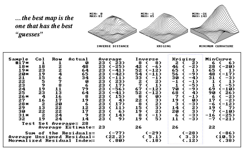
Figure 1. Residual table identifying actual and
estimated values.
The
table in figure 1 contains a test set of sixteen random samples (#17-32) used
to evaluate three maps. The “Actual”
column lists the measured values for the test locations identified by “Col,
Row” coordinates. The difference between
these values and those predicted by the three interpolation techniques form the
residuals shown in parentheses. The
“Average” column compares the whole field arithmetic mean of 23 (guess 23
everywhere) for each test location.
For
example, the first sample (#17) guessed 23 but was actually 0, therefore it’s
off by 23. Note the sign of the residual
indicates whether the guess was too high (positive) or too low (negative). If it was a perfect data world, you would
expect the Sum of the Residuals to be 0 (just as many high as low misses—
balanced boo-boo). However, in this case
there is a net residual of -77 indicating a strong bias to under estimate.
The
Average Unsigned Residual is simply the average magnitude of mistakes,
regardless whether they’re over or under.
For the “Average” estimate expect to be off by about 22.2 each time you
guess. The Normalized Residual Index is
simply the ratio of the Average Unsigned Residual to the Test Set Average. An index of .80 (22.2/28) indicates that the
“Average” technique isn’t very good at spatial estimates.
Now take a look at the residual analysis for the three interpolation
techniques. All three are considerably
better than the whole field average (Normalized Residual Indices of .18, .12
and .38, respectively, compared to the whopping .80 for the simple whole field
average). The “Kriging” technique is
best, having a 3.3 Average Unsigned Residual with a tendency to under estimate
(a Sum of the Residuals of -28). The
“Inverse” technique is a close second with an Average Unsigned Residual of 5.1
and a nearly identical under estimate bias of -29. The “MinCurve” technique indices indicate
that it is a distant third, but still much better than using the whole field
average for spatial estimates.
However, we haven’t considered other potential affects. The asterisks identify test measurements
outside the set of samples used for generating the map surfaces. Estimating these values is termed spatial
extrapolation and some techniques are better than others. I wonder if there are significant differences
among the three techniques in their spatial interpolation and extrapolation
estimates (get out your calculator).
Would you expect the conclusions to change if the “test” and
“interpolation” data samples were swapped and another residual analysis
performed? What if different sampling
designs were tried? What about different
interpolation parameters (window reach, number of samples and balancing)? At least residual analysis gives us a place
to start looking for answers.
_____________________
Further Online
Reading: (Chronological
listing posted at www.innovativegis.com/basis/BeyondMappingSeries/)
(Modeling Error Propagation)
Move
Beyond a Map Full of Errors — discusses a technique for generating a
"shadow map" of error (March
1997)
Comparing
Map Errors — describes how normalized maps of error
can be used to visualize the differences in error surfaces (April 1997)
(Point Sampling Considerations)
What's
the Point? — discusses the general considerations in
point sampling design (December 1996)
Designer
Samples — describes different sampling patterns
and their relative advantages (January 1997)
(Advanced Concepts in Spatial Dependency)
Depending
on the Data — discusses the fundamental concepts of
spatial dependency (May 1997)
Uncovering
the Mysteries of Spatial Autocorrelation — describes
approaches used in assessing spatial autocorrelation (July 1997)
Unlocking
the Keystone Concept of Spatial
Dependency — discusses spatial dependency and
illustrates the effects of different spatial arrangements of the same set of
data (November 1998)
Measuring
Spatial Dependency — describes the basic measures of
autocorrelation (December
1998)
Extending
Spatial Dependency to Maps — describes a technique for generating a
map of spatial autocorrelation (January
1999)
Use Polar Variograms to Assess
Distance and Direction Dependencies — discuses a
procedure to incorporate direction as well as distance for assessing spatial
dependency (September 2001)
(Back
to the Table of Contents)