|
Topic 6 –
Summarizing Neighbors |
Map
Analysis book/CD |


Computer
Processing Aids Spatial Neighborhood Analysis — discusses
approaches for calculating slope and profile
Milking
Spatial Context Information — describes a procedure for deriving a
customer density surface
Spatially
Aggregated Reporting: The Probability is Good
— discusses techniques for smoothing “salt and pepper” results and
deriving probability surfaces from aggregated incident records
Further Reading
— twelve additional sections organized into three parts
<Click here>
for a printer-friendly version of this
topic (.pdf).
(Back to the Table of Contents)
______________________________
Computer Processing Aids Spatial Neighborhood Analysis
(GeoWorld, October 2005)
This
and the following sections investigate a set of analytic tools concerned with
summarizing information surrounding a map location. Technically stated, the processing involves “analysis
of spatially defined neighborhoods for a map location within the context of its
neighboring locations.” Four steps are
involved in neighborhood analysis— 1) define the neighborhood, 2) identify map
values within the neighborhood, 3) summarize the values and 4) assign the
summary statistic to the focus location.
Then repeat the process for every location in a project area.
The
neighborhood values are obtained by a “roving window” moving about a map. To conceptualize the process, imagine a French
window with nine panes looking straight down onto a portion of the
landscape. If your objective was to
summarize terrain steepness from a map of digital elevation values, you would
note the nine elevation values within the window panes, and then summarize the
3-dimensional surface they form.
Now
imagine the nine values become balls floating at their respective
elevation. Drape a sheet over them like
the magician places a sheet over his suspended assistant (who says
Figure
1 shows a small portion of a typical elevation data set, with each cell
containing a value representing its overall elevation. In the highlighted 3x3 window there are eight
individual slopes, as shown in the calculations on the right side of the figure. The steepest slope in the window is 52%
formed by the center and the NW neighboring cell. The minimum slope is 11% in the NE
direction.
To get
an appreciation of this processing, shift the window one column to the right
and, on your own, run through the calculations using the focal elevation value
of 459. Now imagine doing that a million
times as the roving window moves an entire project area—whew!!!
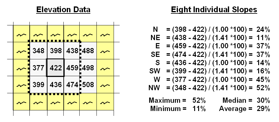
Figure 1. At a
location, the eight individual slopes can be calculated for a 3x3 window and
then summarized for the maximum, minimum, median and average slope.
But
what about the general slope throughout the entire 3x3 analysis window? One estimate is 29%, the arithmetic average
of the eight individual slopes. Another
general characterization could be 30%, the median of slope values. But let's stretch the thinking a bit more. Imagine that the nine elevation values become
balls floating above their respective locations, as shown in Figure 2. Mentally insert a plane and shift it about
until it is positioned to minimize the overall distances from the plane to the
balls. The result is a "best-fitted
plane" summarizing the overall slope in the 3x3 window.
Figure
2. Best-Fitted
Plane and Vector Algebra can be used to calculate overall slope.
Techy-types
will recognize this process as similar to fitting a regression line to a set of
data points in two-dimensional space. In
this case, it’s a plane in three-dimensional space. There is an intimidating set of equations
involved, with a lot of Greek letters and subscripts to "minimize the sum of
the squared deviations" from the plane to the points. Solid geometry calculations, based on the
plane's "direction cosines," are used to determine the slope (and
aspect) of the plane.
Another
procedure for fitting a plane to the elevation data uses vector algebra, as
illustrated in the right portion of Figure 2.
In concept, the mathematics draws each of the eight slopes as a line in
the proper direction and relative length of the slope value (individual vectors). Now comes the fun part. Starting with the NW line, successively
connect the lines as shown in the figure (cumulative vectors). The civil engineer will recognize this
procedure as similar to the latitude and departure sums in "closing a
survey transect." The length of the
“resultant vector” is the slope (and direction is the aspect).
In
addition to slope and aspect, a map of the surface profiles can be computed
(see figure 3). Imagine the terrain
surface as a loaf of bread, fresh from the oven. Now start slicing the loaf and pull away an
individual slice. Look at it in profile
concentrating on the line formed by the top crust. From left to right, the line goes up and down
in accordance with the valleys and ridges it sliced through.
Use
your arms to mimic the fundamental shapes along the line. A 'V' shape with both arms up for a
valley. An inverted 'V' shape with both
arms down for a ridge. Actually there
are only nine fundamental profile classes (distinct positions for your two
arms). Values one through nine will
serve as our numerical summary of profile.
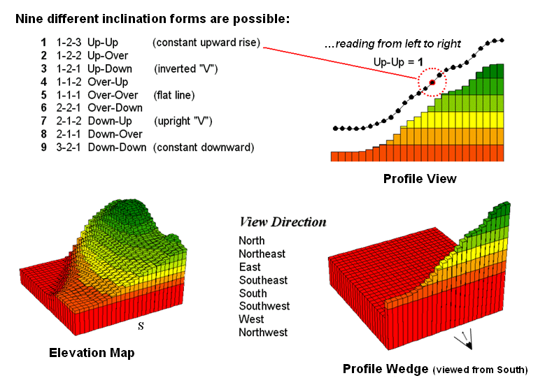
Figure
3. A 3x1 roving window is used to summarize
surface profile.
The
result of all this arm waving is a profile map— the continuous distribution
terrain profiles viewed from a specified direction. Provided your elevation data is at the proper
resolution, it's a big help in finding ridges and valleys running in a certain
direction. Or, if you look from two
opposing directions (orthogonal) and put the profile maps together, a location
with an inverted 'V' in both directions is likely a peak.
There
is a lot more to neighborhood analysis than just characterizing the lumps and
bumps of the terrain. What would happen
if you created a slope map of a slope map?
Or a slope map of a barometric pressure map? Or of a cost surface? What would happen if the window wasn't a
fixed geometric shape? Say a ten minute
drive window. I wonder what the average
age and income is for the population within such a bazaar window? Keep reading for more on neighborhood
analysis.
Milking
Spatial Context Information
(GeoWorld, November 2005)
The
previous discussion focused on procedures for analyzing spatially-defined neighborhoods
to derive maps of slope, aspect and profile. These techniques
fall into the first of two broad classes of neighborhood
analysis—Characterizing Surface Configuration and Summarizing map values (see
figure 1).
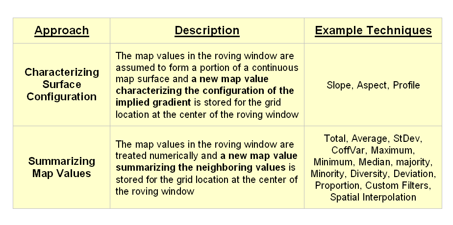
Figure
1. Fundamental classes of
neighborhood analysis operations.
It is
important to note that all neighborhood analyses involve mathematical or
statistical summary of values on an existing map that occur within a roving
window. As the window is moved
throughout a project area, the summary value is stored for the grid location at
the center of the window resulting in a new map layer reflecting neighboring
characteristics or conditions.
The
difference between the two classes of neighborhood analysis techniques is in
the treatment of the values—implied surface
configuration or direct numerical
summary. Figure 2 shows a direct
numerical summary identifying the number of customers within a quarter of a
mile of every location within a project area.
The
procedure uses a “roving window” to collect neighboring map values and compute
the total number of customers in the neighborhood. In this example, the window is positioned at
a location that computes a total of 91 customers within quarter-mile.
Note
that the input data is a discrete placement of customers while the output is a
continuous surface showing the gradient of customer density. While the example location does not even have
a single customer, it has an extremely high customer density because there are
a lot of customers surrounding it.
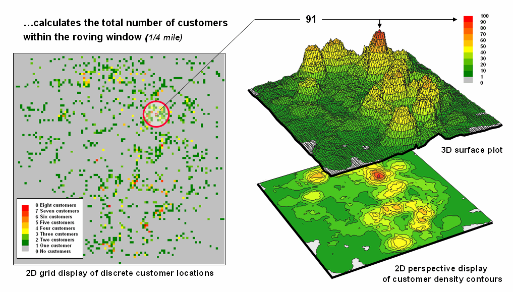
Figure
2. Approach used in deriving a Customer Density
surface from a map of customer locations.
The map
displays on the right show the results of the processing for the entire
area. A traditional vector
Figure
3 illustrates how the information was derived.
The upper-right map is a display of the discrete customer locations of
the neighborhood of values surrounding the “focal” cell. The large graphic on the right shows this
same information with the actual map values superimposed. Actually, the values are from an Excel
worksheet with the column and row totals indicated along the right and bottom
margins. The row (and column) sum
identifies the total number off customers within the
window—91 total customers within a quarter-mile radius.
This
value is assigned to the focal cell location as depicted in the lower-left
map. Now imagine moving the “Excel
window” to next cell on the right, determine the total number of customers and
assign the result—then on to the next location, and the next, and the next,
etc. The process is repeated for every
location in the project area to derive the customer density surface.
The
processing summarizes the map values occurring within a location’s neighborhood
(roving window). In this case the
resultant value was the sum of all the values.
But summaries other than Total
can be used—Average, StDev,
CoffVar, Maximum, Minimum, Median, Majority,
Minority, Diversity, Deviation, Proportion, Custom Filters, and Spatial
Interpolation.
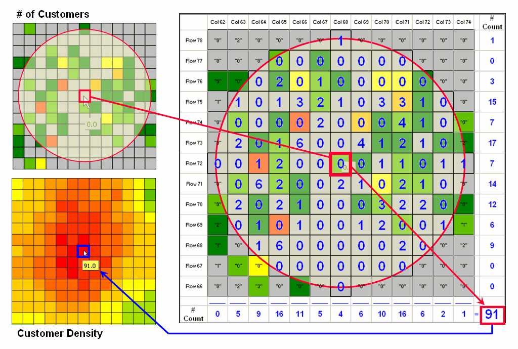
Figure
3. Calculations involved in deriving customer
density.
The
next section focuses on how these techniques can be used to derive valuable
insight into the conditions and characteristics surrounding locations—
analyzing their spatially-defined neighborhoods.
Spatially Aggregated Reporting: The Probability is Good
(GeoWorld, January 2006)
A
couple of the procedures used in the wildfire modeling warrant “under-the-hood”
discussion neighborhood operations—1) smoothing the results for dominant
patterns and 2) deriving wildfire ignition probability based on historical fire
records.
Figure
1 illustrates the effect smoothing raw calculations of wildfire risk. The map in the upper-left portion depicts the
fragmented nature of the results calculated for a set individual 30m grid
cells. While the results are exacting
for each location, the resulting “salt and pepper” condition is overly detailed
and impractical for decision-making. The
situation is akin to the old adage that “you can’t see the forest for the
trees.”
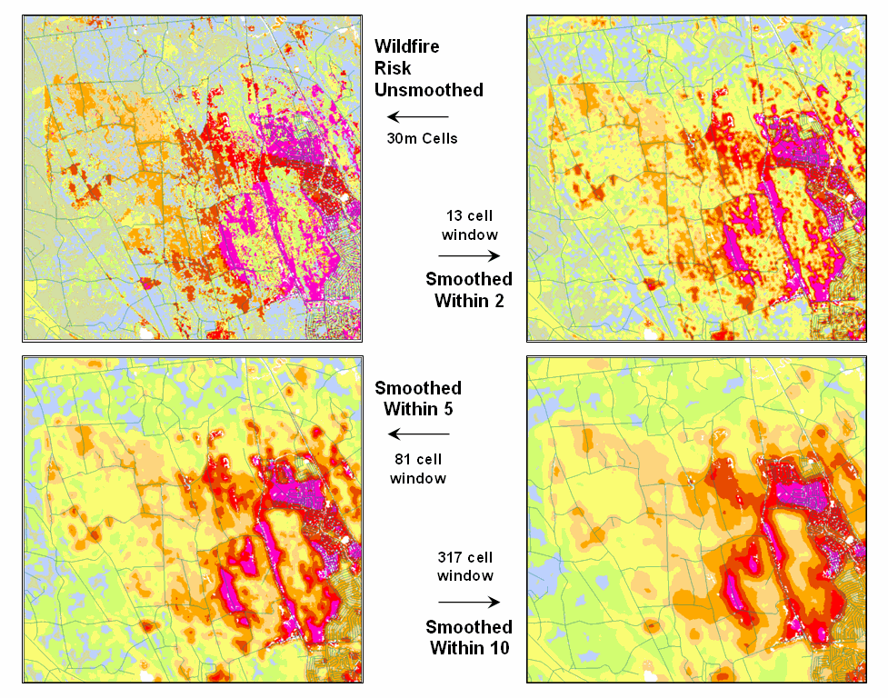
Figure
1. Smoothing eliminates the “salt and pepper”
effect of isolated calculations to uncover dominant patterns useful for
decision-making.
The
remaining three panels show the effect of using a smoothing window of increasing
radius to average the surrounding conditions.
The two-cell reach averages the wildfire risk within a 13-cell window of
slightly more than 2.5 acres. Five and
ten-cell reaches eliminate even more of the salt-and-pepper effect. An eight-cell reach (44 acre) appears best
for wildfire risk modeling as it represents an appropriate resolution for
management.
Another
use of a neighborhood operator is establishing fire occurrence probability
based on historical fire records. The
first step in solving this problem is to generate a continuous map surface
identifying the number of fires within a specified window reach from each map
location. If the ignition locations of
individual fires are recorded by geographic coordinates (e.g.,
latitude/longitude) over a sufficient time period (e.g., 10-20 years) the
solution is straightforward.
An
appropriate window (e.g., 1000 acres) is moved over the point data and the
total number of fires is determined for the area surrounding each grid
cell. The window is moved over the area
to allow for determination of the likelihood of fire ignition over an area
based on the historic ignition location data.
The derived fire density surface is divided by the number of cells in
window (fires per cell) and then divided by the number of years (fires per cell
per year). The result is a continuous
map indicating the likelihood (annualized frequency) that any location will
have a wildfire ignition.
The
reality of the solution, however, is much more complex. The relative precision of recording fires
differs for various reporting units from specific geographic coordinates, to
range/township sections, to zip codes, to entire counties or other
administrative groupings. The spatially
aggregated data is particularly aggravating as all fires within the reporting
polygon are represented as occurring at the centroid of a reporting unit. Since the actual ignition locations can be
hundreds of grid cells away from the centroid, a bit of statistical massaging
is needed.
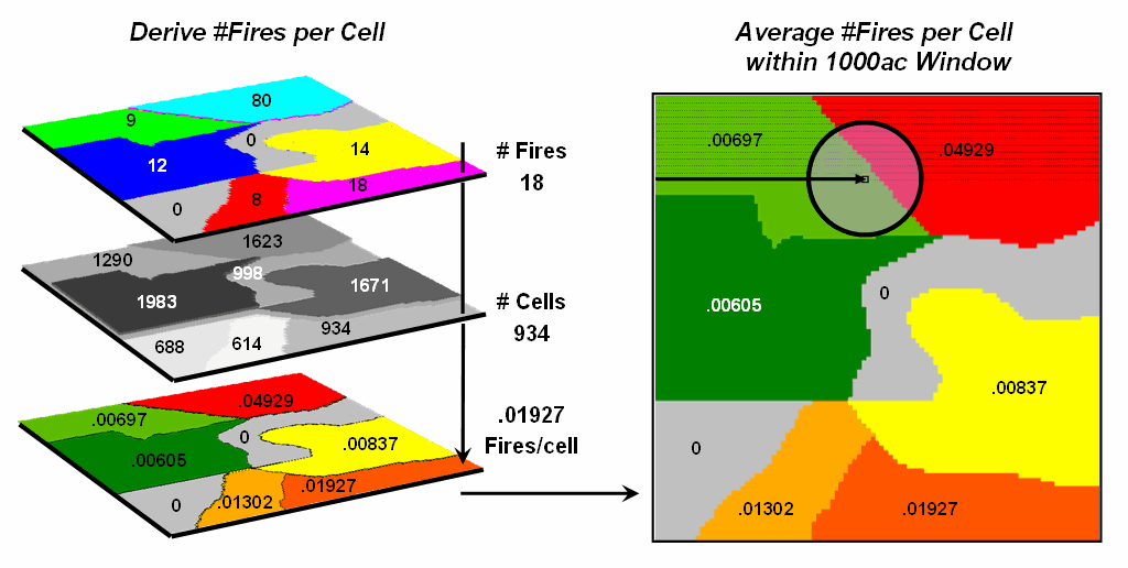
Figure
2. Fires per cell is calculated for each
location within a reporting unit then a roving window is used to calculate the
likelihood of ignition by averaging the neighboring probabilities.
Figure
2 summarizes the steps involved. The
reporting polygon is converted to match the resolution of the grid used by the
wildfire risk model and each location is assigned the total number of fires
occurring within its reporting polygon (#Fires). A second grid layer is established that
assigns the total number of grid cells within its reporting polygon
(#Cells). Dividing the two layers
uniformly distributes the number of fires within a reporting unit to the each
grid cell comprising the unit (Fires/Cell).
The
final step moves a roving window over the map to average the fires per cell as
depicted on the right side of the figure.
The result is a density surface of the average number of fires per cell
reflecting the relative size and pattern of the fire incident polygons falling
within the roving window. As the window
moves from a location surrounded by low probability values to one with higher
values the average probability increases as a gradient that tracks the effect
of the area-weighted average.
Figure
3 shows the operational results of stratifying the area into areas of uniform
likelihood of fire ignition. The
reference grid identifies PLSS sections used for fire reporting, with the dots
indicating total number of fires for each section. The dark grey locations identify non-burnable
areas, such as open water, agriculture lands, urbanization, etc. The tan locations identify burnable areas
with a calculated probability of zero.
Since zero probability is a result of the short time period of the
recorded data the zero probability is raised to a minimum value. The color ramp indicates increasing fire
ignition probability with red being locations having very high likelihood of
ignition.
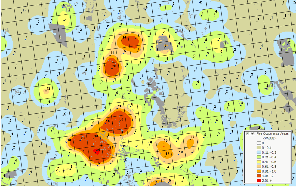
Figure
3. A map of Fire Occurrence frequency identifies
the relative likelihood that a location will ignite based on historical fire incidence
records.
It is
important to note that interpolation of incident data is inappropriate and
simple density function analysis only works for data that is reported with
specific geographic coordinates.
Spatially aggregated reporting requires the use of the area-weighted
frequency technique described above.
This applies to any discrete incident data reporting and analysis,
whether wildfire ignition points, crime incident reports, product sales. Simply assigning and mapping the average to
reporting polygons just won’t cut it as geotechnology moves beyond
mapping.
______________________________
Author’s Note: Based on
Sanborn wildfire risk modeling, www.sanborn.com/solutions/fire_management.htm. For more information on wildfire risk
modeling, see GeoWorld, December 2005, Vol.18, No. 12, 34-37, posted at http://www.geoplace.com/uploads/FeatureArticle/0512ds.asp
or click
here for article with enlarged figures and .pdf
hardcopy.
_____________________
Further Online
Reading: (Chronological listing posted at www.innovativegis.com/basis/BeyondMappingSeries/)
(Extended Neighborhood Techniques)
Grid-Based Mapping Identifies
Customer Pockets and Territories — identifies techniques for identifying unusually high
customer density and for delineating spatially balanced customer territories
(May 2002)
Nearby Things Are More Alike
— use of decay functions in weight-averaging surrounding conditions
(February)
Filtering for the Good Stuff
— investigates a couple of spatial filters for assessing neighborhood
connectivity and variability (December 2005)
(Micro-Terrain Analysis)
Use Data to Characterize
Micro-Terrain Features — describes techniques to
identify convex and concave features (January 200)
Characterizing Local Terrain
Conditions — discusses the use of "roving
windows" to distinguish localized variations (February 2000)
Characterizing Terrain Slope and
Roughness — discusses techniques for determining
terrain inclination and coarseness (March 2000)
Beware of Slope’s Slippery Slope
— describes various slope calculations and compares results
(January 2003)
Use Surface Area for Realistic
Calculations — describes a technique for adjusting
planimetric area to surface area considering terrain slope (December 2002)
(Landscape Analysis Techniques)
Use GIS to Calculate Nearby Neighbor Statistics — describes
a technique that calculates the proximity to all of the surrounding parcels of
a similar vegetation type (May 1999)
Use GIS to Analyze Landscape
Structure — discusses the underlying principles in landscape
analysis and introduces some example landscape indices (June 1999)
Get to the Core of Landscape
Analysis — describes techniques for assessing core area and edge
characterization (July 1999)
Use Metrics to Assess Forest
Fragmentation — describes some landscape indices for determining
richness and fragmentation (August 1999)