|
Beyond
Mapping IV Topic 7
– Spatial Data Mining in Geo-business (Further Reading) |
GIS Modeling book |
Interpreting
Interpolation Results (and why it is important) — describes the use
of “residual analysis” for evaluating spatial interpolation performance (August 2008)
Get
“Map-ematical” to Identify Data Zones — describes the use of
“level-slicing” for classifying locations with a specified data pattern (October 2008)
Can
We Really Map the Future? — describes the use of
“linear regression” to develop prediction equations relating dependent and
independent map variables (December 2008)
Follow
These Steps to Map Potential Sales — describes an
extensive geo-business application that combines retail competition analysis
and product sales prediction (January 2009)
<Click here> for a printer-friendly version of this topic (.pdf).
(Back
to the Table of Contents)
______________________________
Interpreting Interpolation Results (and why it is important)
(GeoWorld, August
2008)
For some, previous discussion on generating map surfaces from point
data (“Myriad Techniques Help to Interpolate Spatial Distributions,” GeoWorld,
July 2008) might have been too simplistic—enter a few things then click on a
data file and, viola, you have a equity loan percentage surface artfully
displayed in 3D with a bunch of cool colors.
Actually, it is that easy to create one. The harder part is figuring out if the map
generated makes sense and whether it is something you ought to use in analysis
and important business decisions. This
section discusses the relative amounts of information provided by the
non-spatial arithmetic average versus site-specific maps by comparing the
average and two different interpolated map surfaces. The discussion is further extended to
describe a procedure for quantitatively assessing interpolation performance.
The top-left inset in figure 1 shows the map of the loan data’s
average. It’s not very exciting and looks like a pancake but that’s because
there isn’t any information about spatial variability in an average value—it
assumes 42.88 percent is everywhere. The
non-spatial estimate simply adds up all of the sample values and divides by the
number of samples to get the average disregarding any geographic pattern.
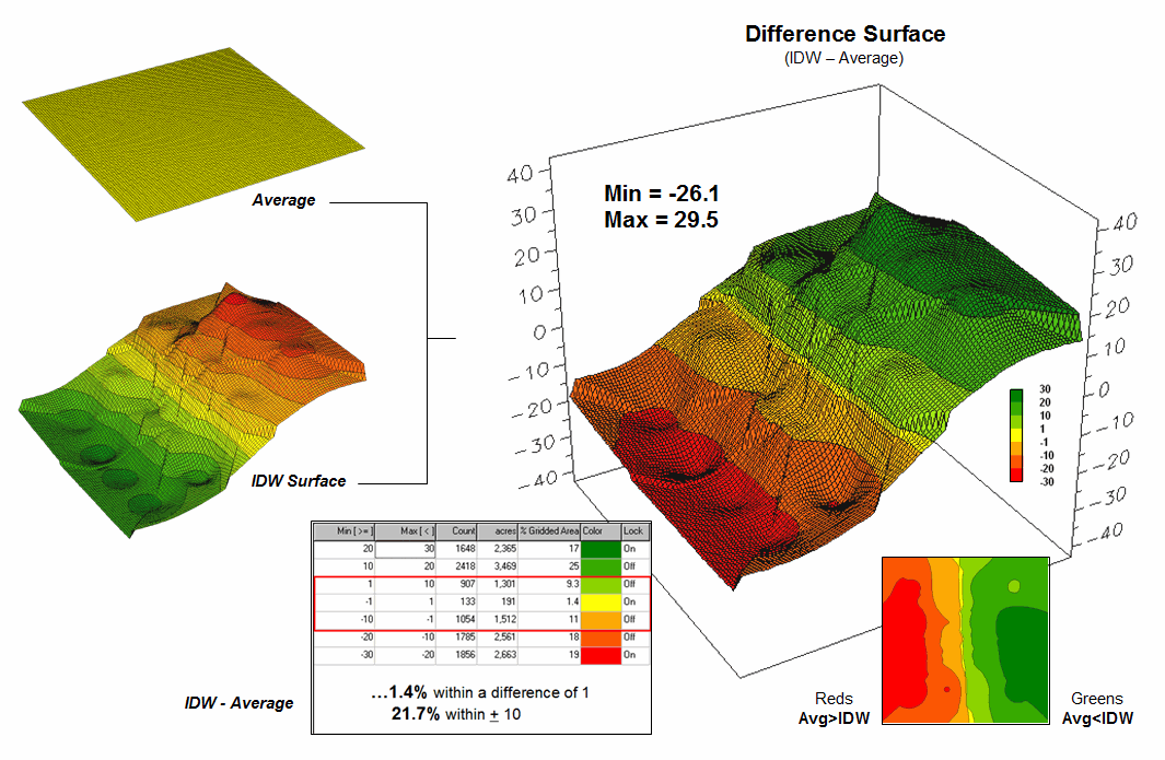
Figure 1. Spatial comparison of the project area
average and the IDW interpolated surface.
The spatially-based estimates comprise the map surface just below the
pancake. As described last month, Spatial
Interpolation looks at the relative positioning of the samples values as
well as their measure of loan percentage.
In this instance the big bumps were influenced by high measurements in
that vicinity while the low areas responded to surrounding low values.
The map surface in the right portion of figure 1 compares the two maps
by simply subtracting them. The colors
were chosen to emphasize the differences between the whole-field average
estimates and the interpolated ones. The
thin yellow band indicates no difference while the progression of green tones
locates areas where the interpolated map estimated higher values than the
average. The progression of red tones
identifies the opposite condition with the average estimate being larger than
the interpolated ones.
The difference between the two maps ranges from –26.1 to +29.5. If one assumes that a difference of +/- 10
would not significantly alter a decision, then about one-quarter of the area
(9.3+1.4+11= 21.7%) is adequately represented by the overall average of the
sample data. But that leaves about
three-fourths of the area that is either well-below the average (18 + 19 = 37%)
or well-above (25+17 = 42%). The upshot
is that using the average value in either of these areas could lead to poor
decisions.
Now turn your attention to figure 2 that compares maps derived by two
different interpolation techniques—IDW (inverse distance weighted) and Krigging
(an advanced spatial statistics technique using data trends). Note the similarity in the two surfaces;
while subtle differences are visible, the overall trend of the spatial
distribution is similar.
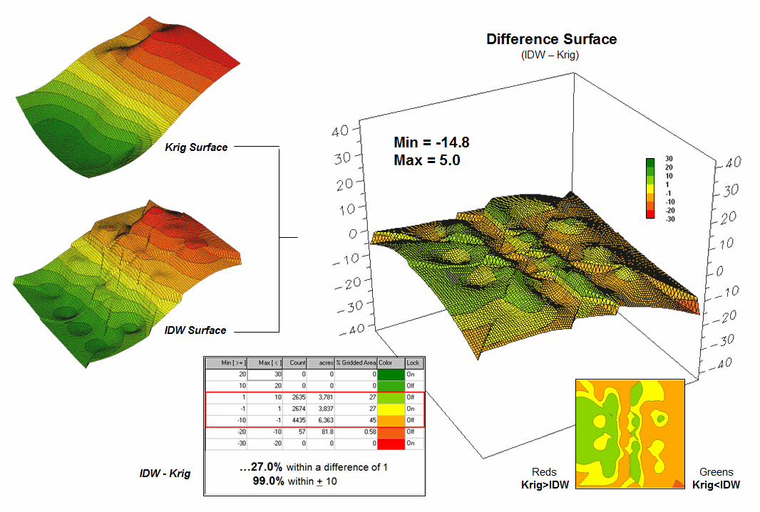
Figure 2. Spatial comparison of IDW and Krig
interpolated surfaces.
The difference map on the right confirms the similarity between the two
map surfaces. The narrow band of yellow
identifies areas that are nearly identical (within +/- 1.0). The light red locations identify areas where
the IDW surface estimates a bit lower than the Krig ones (within -10); light
green a bit higher (within +10).
Applying the same assumption about plus/minus 10 difference being
negligible for decision-making, the maps are effectively the same (99.0%).
So what’s the bottom line?
First, that there are substantial differences between an arithmetic
average and interpolated surfaces.
Secondly, that quibbling about the best interpolation technique isn’t as
important as using any interpolated surface for decision-making.
But which surface best characterizes the spatial distribution of the
sampled data? The answer to this
question lies in Residual Analysis—a technique that investigates
the differences between estimated and measured values throughout
an area.
The table in figure 3 reports the results for twelve randomly
positioned test samples. The first
column identifies the sample ID and the second column reports the actual
measured value for that location. Column
C simply depicts the assumption that the project area average (42.88)
represents each of the test locations.
Column D computes the difference of the “estimate minus actual”—formally
termed the residual. For example,
the first test point (ID#1) estimated the average of 42.88 but was actually
measured as 55.2, so -12.32 is the residual (42.88 - 55.20= -12.32) …quite a
bit off. However, point #6 is a lot
better (42.88-49.40= -6.52).
Figure 3. A residual analysis table identifies the
relative performance of average, IDW and Krig estimates.
The residuals for the IDW and Krig maps are similarly calculated to
form columns F and H, respectively.
First note that the residuals for the project area average are
considerably larger than either those for the IDW or Krig estimates. Next note that the residual patterns between
the IDW and Krig are very similar—when one is off, so is the other and usually
by about the same amount. A notable
exception is for test point #4 where the IDW estimate is dramatically larger.
The rows at the bottom of the table summarize the residual analysis
results. The Residual Sum
characterizes any bias in the estimates—a negative value indicates a tendency
to underestimate with the magnitude of the value indicating how much. The –20.54 value for the whole-field average
indicates a relatively strong bias to underestimate.
The Average Error reports how typically far off the estimates
were. The 16.91 figure for area average
is about ten times worse than either IDW (1.73) or Krig (1.31). Comparing the figures to the assumption that
a plus/minus10 difference is negligible in decision-making, it is apparent that
1) the project area average is inappropriate and that 2) the accuracy
differences between IDW and Krig are very minor.
The Normalized Error simply calculates the average error as a
proportion of the average value for the test set of samples (1.73/44.59= 0.04
for IDW). This index is the most useful
as it allows you to compare the relative map accuracies between different maps. Generally speaking, maps with normalized
errors of more than .30 are suspect and one might not want to use them for
important decisions.
So what’s the bottom-bottom line?
That Residual Analysis is an important component of geo-business data
analysis. Without an understanding of
the relative accuracy and interpolation error of the base maps, one cannot be
sure of the recommendations and decisions derived from the interpolated
data. The investment in a few extra
sampling points for testing and residual analysis of these data provides a sound
foundation for business decisions.
Without it, the process becomes one of blind faith and wishful thinking
with colorful maps.
_____________________________
Author’s
Note: Related discussion and hands-on exercises are in Topic 6, Surface
Modeling in the workbook Analyzing Geo-Business Data (Berry, 2003;
available at www.innovativegis.com/basis/Books/AnalyzingGBdata/).
Get “Map-ematical” to Identify Data Zones
(GeoWorld, October
2008)
Previous discussion introduced the concept of Data Distance as a
means to measure data pattern similarity within a stack of map layers (“Use
Map Analysis to Characterize Data Groups,” GeoWorld, September 2008). One simply mouse-clicks on a location, and all
of the other locations are assigned a similarity value from 0 (zero percent
similar) to 100 (identical) based on a set of specified map layers. The statistic replaces difficult visual
interpretation of a series of side-by-side map displays with an exact
quantitative measure of similarity at each location.
An extension to the technique allows you to circle an area then compute
similarity based on the typical data pattern within the delineated area. In this instance, the computer calculates the
average value within the area for each map layer to establish the comparison
data pattern, and then determines the normalized data distance for each map
location. The result is a map showing
how similar things are throughout a project area to the area of interest.
The link between Geographic Space and Data Space is the
keystone concept. As shown in figure 1,
spatial data can be viewed as either a map, or a histogram. While a map shows us “where is what,”
a histogram summarizes “how often” data values occur (regardless where
they occur). The top-left portion of the
figure shows a 2D/3D map display of the relative housing density within a
project area. Note that the areas of
high housing Density along the northern edge generally coincide with low home
Values.
The histogram in the center of the figure depicts a different
perspective of the data. Rather than
positioning the measurements in geographic space it summarizes the relative
frequency of their occurrence in data space.
The X-axis of the graph corresponds to the Z-axis of the map—relative
level of housing Density. In this case,
the spikes in the graph indicate measurements that occur more frequently. Note the relatively high occurrence of
density values around 2.6 and 4.7 units per acre. The left portion of the figure identifies the
data range that is unusually high (more than one standard deviation above the
mean; 3.56 + .80 = 4.36 or greater) and mapped onto the surface as the peak in
the NE corner. The lower sequence of
graphics in the figure depicts the histogram and map that identify and locate
areas of unusually low home values.

Figure 1. Identifying areas of unusually high
measurements.
Figure 2 illustrates combining the housing Density and Value data to
locate areas that have high measurements in both. The graphic in the center is termed a Scatter
Plot that depicts the joint occurrence of both sets of mapped data. Each ball in the scatter plot schematically
represents a location in the field. Its
position in the scatter plot identifies the housing Density and home Value
measurements for one of the map locations—10,000 in all for the actual example
data set. The balls shown in the light
green shaded areas of the plot identify locations that have high Density or
low Value; the bright green area in the upper right corner of the plot identifies
locations that have high Density and low Value.
The aligned maps on the right side of figure 2 show the geographic
solution for the high D and low V areas.
A simple map-ematical way to generate the solution is to assign 1
to all locations of high Density and Value map layers (green). Zero (grey) is assigned to locations that
fail to meet the conditions. When the
two binary maps (0 and1) are multiplied, a zero on either map computes to
zero. Locations that meet the conditions
on both maps equate to one (1*1 = 1). In
effect, this “level-slice” technique locates any data pattern you specify—just
assign 1 to the data interval of interest for each map variable in the stack,
and then multiply.
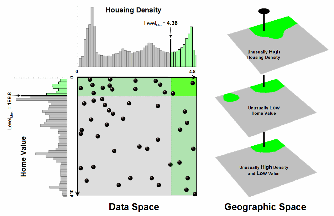
Figure 2. Identifying joint coincidence in both data
and geographic space.
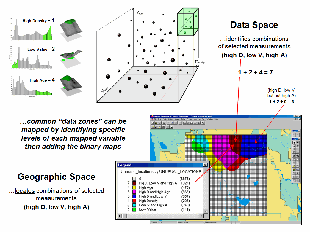
Figure 3. Level-slice classification using three map
variables.
Figure 3 depicts level slicing for areas that are unusually low housing
Density, high Value and low Age. In this
instance the data pattern coincidence is a box in 3-dimensional scatter plot
space (upper-right corner toward the back).
However a slightly different map-ematical trick was employed to
get the detailed map solution shown in the figure.
On the individual maps, areas of high Density were set to D= 1, low
Value to V= 2 and high Age to A= 4, then the binary map layers were added
together. The result is a range of
coincidence values from zero (0+0+0= 0; gray= no coincidence) to seven (1+2+4=
7; dark red for location meeting all three criteria). The map values in between identify the areas
meeting other combinations of the conditions.
For example, the dark blue area contains the value 3 indicating high D
and low V but not high A (1+2+0= 3) that represents about three percent of the
project area (327/10000= 3.27%). If four
or more map layers are combined, the areas of interest are assigned increasing
binary progression values (…8, 16, 32, etc)—the sum will always uniquely
identify all possible combinations of the conditions specified.
While level-slicing isn’t a very sophisticated classifier, it
illustrates the usefulness of the link between Data Space and Geographic Space
to identify and then map unique combinations of conditions in a set of mapped
data. This fundamental concept forms the
basis for more advanced geo-statistical analysis—including map clustering that
will be the focus of next month’s column.
_____________________________
Author’s
Note: Related discussion and hands-on exercises are in Topic 7, Spatial
Data Mining in the workbook Analyzing Geo-Business Data (Berry, 2003;
available at www.innovativegis.com/basis/Books/AnalyzingGBdata/).
Can We Really Map the Future?
(GeoWorld,
December 2008)
Talk about the future of geo-business—how about mapping things yet to
come? Sounds a bit farfetched but
spatial data mining and predictive modeling is taking us in that
direction. For years non-spatial
statistics has been predicting things by analyzing a sample set of data for a
numerical relationship (equation) then applying the relationship to another set
of data. The drawbacks are that a
non-spatial approach doesn’t account for geographic patterns and the result is
just summary of the overall relationship for an entire project area.
Extending predictive analysis to mapped data seems logical because maps
at their core are just organized sets of numbers and the GIS toolbox enables us
to link the numerical and geographic distributions of the data. The past several columns have discussed how
the computer can “see” spatial data relationships including “descriptive
techniques” for assessing map similarity, data zones, and clusters. The next logical step is to apply “predictive
techniques” that generates mapped forecasts of conditions for other areas or
time periods.
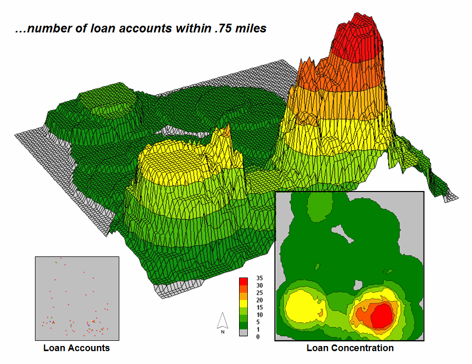
Figure 1. A loan concentration surface is created by
summing the number of accounts for each map location within a specified
distance.
To illustrate the process, suppose a bank has a database of home equity
loan accounts they have issued over several months. Standard geo-coding techniques are applied to
convert the street address of each sale to its geographic location (latitude,
longitude). In turn, the geo-tagged data
is used to “burn” the account locations into an analysis grid as shown in the
lower left corner of figure 1. A roving
window is used to derive a Loan Concentration surface by computing the number
of accounts within a specified distance of each map location. Note the spatial distribution of the account
density— a large pocket of accounts in the southeast and a smaller one in the
southwest.
The most frequently used method for establishing a quantitative
relationship among variables involves Regression. It is beyond the scope of this column to
discuss the underlying theory of regression; however in a conceptual nutshell,
a line is “fitted” in data space that balances the data so the differences from
the points to the line (termed the residuals) are minimized and the sum of the
differences is zero. The equation of the
best-fitted line becomes a prediction equation reflecting the spatial
relationships among the map layers.
To illustrate predictive modeling, consider the left side of figure 2
showing four maps involved in a regression analysis. The loan Concentration surface at top is
serves as the Dependent Map Variable (to be predicted). The housing Density, Value, and Age surfaces
serve as the Independent Map Variables (used to predict). Each grid cell contains the data values used
to form the relationship. For example,
the “pin” in the figure identifies a location where high loan Concentration
coincides with a low housing Density, high Value and low Age response
pattern.
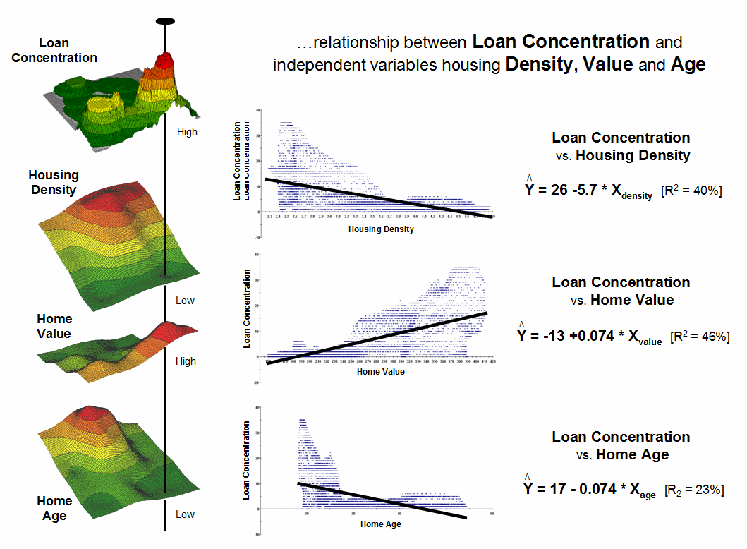
Figure 2. Scatter plots and regression results relate
Loan Density to three independent variables (housing Density, Value and Age).
The scatter plots in the center of the figure graphically portray the
consistency of the relationships. The Y
axis tracks the dependent variable (loan Concentration) in all three plots
while the X axis follows the independent variables (housing Density, Value, and
Age). Each plotted point represents the
joint condition at one of the grid locations in the project area—10,000 dots in
each scatter plot. The shape and
orientation of the cloud of points characterizes the nature and consistency of
the relationship between the two map variables.
A plot of a perfect relationship would have all of the points forming a
line. An upward directed line indicates
a positive correlation where an increase in X always results in a
corresponding increase in Y. A downward
directed line indicates a negative correlation with an increase
in X resulting in a corresponding decrease in Y. The slope of the line indicates the extent of
the relationship with a 45-degree slope indicating a 1-to-1 unit change. A vertical or horizontal line indicates no
correlation— a change in one variable doesn’t affect the other. Similarly, a circular cloud of points indicates
there isn’t any consistency in the changes.
Rarely does the data plot into these ideal conditions. Most often they form dispersed clouds like
the scatter plots in figure 2. The general
trend in the data cloud indicates the amount and nature of correlation in the
data set. For example, the loan
Concentration vs. housing Density plot at the top shows a large dispersion at
the lower housing Density ranges with a slight downward trend. The opposite occurs for the relationship with
housing Value (middle plot). The housing
Age relationship (bottom plot) is similar to that of housing Density but the
shape is more compact.
Regression is used to quantify the trend in the data. The equations on the right side of figure 2
describe the “best-fitted” line through the data clouds. For example, the equation Y= 26.0 – 5.7X
relates loan Concentration and housing Density.
The loan Concentration can be predicted for a map location with a housing
Density of 3.4 by evaluating Y= 26.0 – (5.7 * 3.4) = 6.62 accounts estimated
within .75 miles. For locations where
the prediction equation drops below 0 the prediction is set to 0 (infeasible
negative accounts beyond housing densities of 4.5).
The “R-squared index” with the regression equation provides a general
measure of how good the predictions ought to be— 40% indicates a moderately
weak predictor. If the R-squared index
was 100% the predicting equation would be perfect for the data set (all points
directly falling on the regression line).
An R-squared index of 0% indicates an equation with no predictive
capabilities.
In a similar manner, the other independent variables (housing Value and
Age) can be used to derive a map of expected loan Concentration. Generally speaking it appears that home Value
exhibits the best relationship with loan Concentration having an R-squared
index of 46%. The 23% index for housing
Age suggests it is a poor predictor of loan Concentration.
Multiple regression can be used to simultaneously consider all three
independent map variables as a means to derive a better prediction
equation. Or more sophisticated modeling
techniques, such as Non-linear Regression and Classification and Regression
Tree (CART) methods, can be used that often results in an R-squared index
exceeding 90% (nearly perfect).
The bottom line is that predictive modeling using mapped data is
fueling a revolution in sales forecasting.
Like parasailing on a beach, spatial data mining and predictive modeling
are affording an entirely new perspective of geo-business data sets and
applications by linking data space and geographic space through grid-based map
analysis.
_____________________________
Author’s
Note: Related discussion and hands-on exercises on spatial regression
are in Topic 8, Predictive Modeling in the workbook Analyzing Geo-Business
Data (Berry, 2003; available at www.innovativegis.com/basis/Books/AnalyzingGBdata/).
Follow These Steps to Map Potential Sales
(GeoWorld, January
2009)
My first sojourn into geo-business involved an application to extend a
test marketing project for a new phone product (nick-named “teeny-ring-back”)
that enabled two phone numbers with distinctly different rings to be assigned
to a single home phone—one for the kids and one for the parents. This pre-Paleolithic project was debuted in
1991 when phones were connected to a wall by a pair of copper wires and street addresses
for customers could be used to geo-code the actual point of sale/use. Like pushpins on a map, the pattern of sales
throughout the city emerged with some areas doing very well (high sales areas),
while in other areas sales were few and far between (low sales areas).
The assumption of the project was that a relationship existed between
conditions throughout the city, such as income level, education, number in
household, etc. could help explain sales pattern. The demographic data for the city was
analyzed to calculate a prediction equation between product sales and census
data.
The prediction equation derived from test market sales in one city
could be applied to another city by evaluating exiting demographics to “solve
the equation” for a predicted sales map.
In turn, the predicted sales map was combined with a wire-exchange map
to identify switching facilities that required upgrading before release of the
product in the
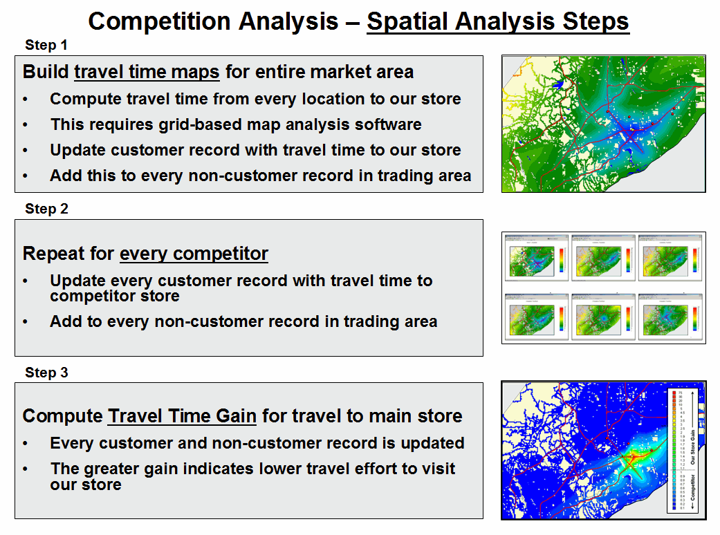
Figure 1. Spatial Modeling derives
the relative travel time relationships for a store and each competitor store
for all locations and then links this information to customer records.
Now fast-forward to more contemporary times. A GeoWorld feature article described a
similar, but much more thorough analysis of retail sales competition (Beyond
Location, Location, Location: Retail Sales Competition Analysis, GeoWorld,
March 2006; see Author’s Note). Figure 1
outlines the steps for determining competitive advantage for various store
locations.
Most
Step 1 map shows the grid-based solution for travel-time from “Our
Store” to all other grid locations in the project area. The blue tones identify grid cells that are
less than twelve minutes away assuming travel on the highways is four times
faster than on city streets. Note the star-like
pattern elongated around the highways and progressing to the farthest locations
(warmer tones). In a similar manner,
competitor stores are identified and the set of their travel time surfaces
forms a series of geo-registered maps supporting further analysis (Step 2).
Step 3 combines this information for a series of maps that indicate the
relative cost of visitation between our store and each of the competitor stores
(pair-wise comparison as a normalized ratio).
The derived “Gain” factor for each map location is a stable, continuous variable
encapsulating travel-time differences that is suitable for mathematical
modeling. A Gain of less than 1.0
indicates the competition has an advantage with larger values indicating
increasing advantage for our store. For
example, a value of 2.0 indicates that there is a 200% lower cost of visitation
to our store over the competition.
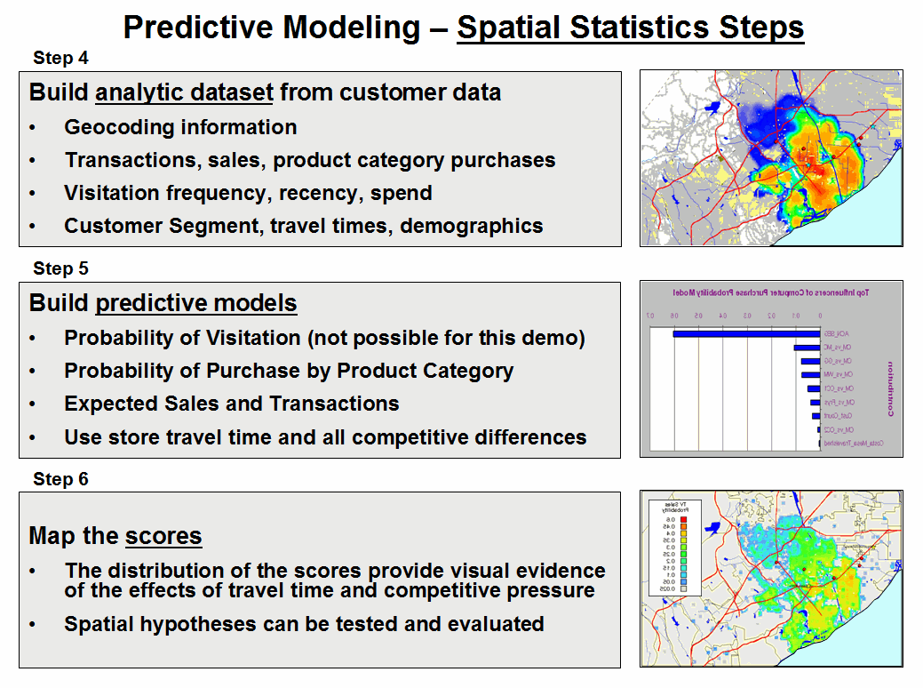
Figure 2. Predictive Modeling steps use spatial data
mining procedures for relating spatial and non-spatial factors to sales data to
derive maps of expected sales for various products.
Figure 2 summarizes the predictive modeling steps involved in
competition analysis of retail data. The
geo-coding link between the analysis frame and a traditional customer dataset
containing sales history for more than 80,000 customers was used to append
travel-times and Gain factors for all stores in the region (Step 4).
The regression hypothesis was that sales would be predictable by
characteristics of the customer in combination with the travel-time variables
(Step 5). A series of mathematical
models are built that predict the probability of purchase for each product
category under analysis (see Author’s Note).
This provides a set of model scores for each customer in the
region. Since a number of customers
could be found in many grid cells, the scores were averaged to provide an
estimate of the likelihood that a person from each grid cell would travel to
our store to purchase one of the analyzed products. The scores for each product are mapped to
identify the spatial distribution of probable sales, which in turn can be
“mined” for pockets of high potential sales.
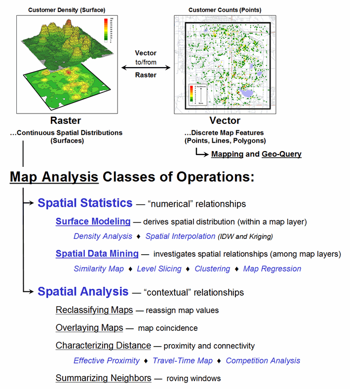
Figure 3. Map Analysis exploits
the digital nature of modern maps to examine spatial patterns and relationships
within and among mapped data.
Targeted marketing, retail trade area analysis, competition analysis
and predictive modeling provide examples applying sophisticated Spatial
Analysis and Spatial Statistics to improve decision making. The techniques described in the past nine
Beyond Mapping columns on Geo-business applications have focused on Map
Analysis— procedures that extend traditional mapping and geo-query to
map-ematically based analysis of mapped data.
Figure 3 outlines the classes of operations described in the series
(blue highlighted techniques were specifically discussed).
Recall that the keystone concept is an Analysis Frame of grid
cells that provides for tracking the continuous spatial distributions of mapped
variables and serves as the primary key for linking spatial and non-spatial
data sets. While discrete sets of
points, lines and polygons have served our mapping demands for over 8,000 years
and keep us from getting lost, the expression of mapped data as continuous
spatial distributions (surfaces) provides a new foothold for the contextual and
numerical analysis of mapped data— in many ways, “thinking with maps” is more
different than it is similar to traditional mapping.
_____________________________
Author’s
Note: a copy of the article Beyond Location, Location, Location: Retail Sales
Competition Analysis, is posted online at www.innovativegis.com/basis/present/GW06_retail/GW06_Retail.htm. The predictive modeling used a specialized data
mining technology, KXEN K2R, based on Vapnik Statistical Learning Theory (www.kxen.com).
(Back to the Table of Contents)