|
Beyond
Mapping III Topic 9
– Basic Techniques in Spatial Statistics (Further Reading) |
Map Analysis book |
(Modeling
Error Propagation)
Move
Beyond a Map Full of Errors — discusses a technique for
generating a "shadow map" of error (March 1997)
Comparing
Map Errors — describes how normalized maps of error can be
used to visualize the differences in error surfaces (April 1997)
(Point
Sampling Considerations)
What's
the Point? — discusses the general considerations in point
sampling design (December 1996)
Designer
Samples — describes different sampling patterns and their
relative advantages (January 1997)
(Advanced
Concepts in Spatial Dependency)
Depending
on the Data — discusses the fundamental concepts of
spatial dependency (May 1997)
Uncovering
the Mysteries of Spatial Autocorrelation — describes
approaches used in assessing spatial autocorrelation (July 1997)
Unlocking
the Keystone Concept of Spatial Dependency — discusses
spatial dependency and illustrates the effects of different spatial
arrangements of the same set of data (November 1998)
Measuring
Spatial Dependency — describes the basic measures of
autocorrelation (December 1998)
Extending
Spatial Dependency to Maps — describes a technique for
generating a map of spatial autocorrelation (January 1999)
Use
Polar Variograms to Assess Distance and Direction Dependencies —
discuses a procedure to incorporate direction as well as distance for assessing
spatial dependency (September 2001)
<Click here> for a printer-friendly version of this topic (.pdf).
(Back
to the Table of Contents)
______________________________
(Advanced
Concepts in Spatial Dependency)
Move Beyond a Map Full of Errors
(GeoWorld, March
1997)
Previous discussion (February 1997 BM column) described a procedure,
termed “Residual Analysis,” for checking the reliability of maps generated from
field samples, such as a map of phosphorous levels derived from a set of soil
samples. The data could have as easily
been lead concentrations in an aquifer from a set of sample wells, or any other
variable that forms a gradient in geographic space for that matter. The evaluation procedure suggested holding
back some of the samples as a test set to “empirically verify” the estimated
value at each location. Keep in mind, if
you don’t attempt to verify, then you are simply accepting the derived map as a
perfect rendering of reality (and blind faith isn’t a particularly a good basis
for visual analysis of mapped data). The
difference between a mapped “guess” (interpolated estimate) and “what is”
(actual measurement) is termed a residual.
A table of all the residuals for a test set is summarized to determine the
overall accuracy of an interpolated map.
The residual analysis described last time determined that the Kriging
interpolation procedure had the closest predictions to those of the example
test set. Its predictions, on average,
were only 3.3 units off, whereas the other techniques of Inverse Distance and Minimum
Curvature were considerably less accurate (5.1 and 10.5, respectively). The use of an arithmetic average for spatial
prediction was by far the worst with an average boo-boo of 22.2 for each guess. The residual table might have identified the
relative performance of the various techniques, but it failed to identify where
a map is likely predicting too high or too low— that’s the role of a residual
map.
The table in Figure 1 shows the actual and estimated values from Kriging for
each test location, with their residuals shown in parentheses. The posted values on the 3-D surface locate
the positioning of the residual values.
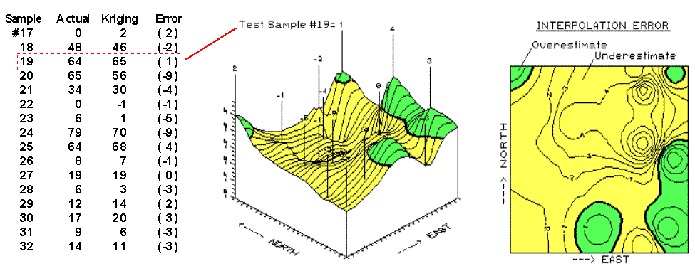
Figure 1. Map of errors from the
Kriging interpolation technique.
For example, the value 1 posted in the northeast corner identifies the
residual for test sample #19; the 4 to its right identifies the residual for
test sample #25 along the eastern edge of the field. The map of the residuals was derived by
spatially interpolating the set of residuals.
The three-dimensional rendering shows the residual surface, while the
2-D map shows 1-unit contours of error from -9 (under guessed by nine) to 4
(over guessed by four). The thick, dark
lines in both plots locates the zero residual contour— locations believed to be
right on target. The darker tones
identify areas of overestimates, while the lighter tones identify areas of underestimates.
As explained earlier, the sum of the residuals (-28) indicates a overall
tendency of the Kriging technique to underestimate the data used in this
example. The predominance of lighter
tones in the residual map spatially supports this overall conclusion. While the underestimated area occurs
throughout the center of the field, it appears that Kriging’s overestimates
occur along the right (east), bottom (south) and the extreme upper left
(northwest) and upper right (northeast) corners.
The upper right portion (northeast) of the error map is particularly
interesting. The two -9 “holes” for test
samples #20 and #24 quickly rise to the 1 and 4 “peaks” for samples #19 and
#25. Such wide disparities within close
proximity of each other (steep slopes in 3-D and tight contour lines in 2-D)
indicate areas of wildly differing interpolation performance. It’s possible that something interesting is
going on in the northeast and we ought to explore a bit further. Take a look at the data in the table. The four points represent areas with the
highest responses (65, 56, 70 and 78).
Come to think of it, a residual of 1 on an estimate of 64 for sample #19
really isn’t off by much (only 1.5%).
And its underestimated neighbor’s of 9 on 65 (sample #20) isn’t too bad
either (14%).
Maybe a map of “normalized” residuals might display the distribution of error
in a more useful form. What do you
think? Are you willing to “go the
distance” with the numbers? Or simply
willing to “click” on an icon in your
Comparing Map Errors
(GeoWorld, April
1997)
The previous section challenged you to consider what advantage a
normalized map of residuals might have.
Recall that an un-normalized map was generated from the boo-boos (more formally
termed “residuals”) uncovered by comparing interpolated estimates with a test
set of known measurements. Numerical
summaries of the residuals provided insight into the overall interpolation
performance, whereas the map of residuals showed where the guesses were likely
high and where they were likely low.
The map on the left side of figure 1 is the “plain vanilla” version of the
error map discussed in the previous section.
The one on the right is the normalized version. See any differences or similarities? At first glance, the sets of lines seem to
form radically different patterns. A
closer look reveals that the patterns of the darker tones are identical. So what gives?
First of all, let’s consider how the residuals were normalized. The arithmetic mean of the test set (28) was
used as the common reference. For
example, test location #17 estimated 2 while its actual value was 0, resulting
in an overestimate of 2 (2-0= 2). This
simple residual is translated into a normalized value of 7.1 by computing
(0-2)/28)*100= 7.1, a signed (+ or -) percentage of the “typical” test
value. Similar calculations for the
remaining residuals brings the entire test set in line with its typical, then a
residual map is generated.
Figure 1. Comparison of error maps
(2-D) using Absolute and Normalized Kriging residual values.
Now let’s turn our attention back to the maps. As the techy-types among you guessed, the
spatial pattern of interpolation error is not effected by normalization (nor is
its numerical distribution)— all normalizing did was re-scale the map surface. The differences you detect in the line
patterns are simply artifacts of different horizontal “slices” through the two
related map surfaces. Whereas a 5%
contour interval is used in the normalized version, a contour interval of 1 is
used in the absolute version. The common
“zero contour” (break between the two tones) in both maps have an identical
pattern, as would be the case for any common slice (relative contour step).
Ok… but if normalizing doesn’t change a map surface, why would anyone go to all
the extra effort? Because normalizing
provides the consistent referencing and scaling needed for comparison among
different data sets. You can’t just take
a couple of maps, plop them on a light table, and start making comparative
comments. Everyone knows you have to
adjust the map scales so they will precisely overlay (spatial
registration). In an analogous manner,
you have to adjust their “thematic” scales as well. That’s what normalization
does.
Now visually compare magnitude and pattern of error between the Kriging
and the Average surfaces in figure 2. A
horizontal plane aligning at zero on the Z-axis would indicate a “perfect”
residual surface (all estimates were exactly the same as their corresponding
test set measurements). The Kriging plot
on the left is relatively close to this ideal which confirms that the technique
is pretty good at spatially predicting the sampled variable. The surface on the right identifying the
“whole field” Average technique shows a much larger magnitude of error (surface
deflection from Z= 0). Now note the
patterns formed by the light and dark blobs on both map surfaces. The Kriging overestimates (dark areas) are
less pervasive and scattered along the edges of the field. The Average overestimates occur as a single
large blob in the southwestern half of the field.
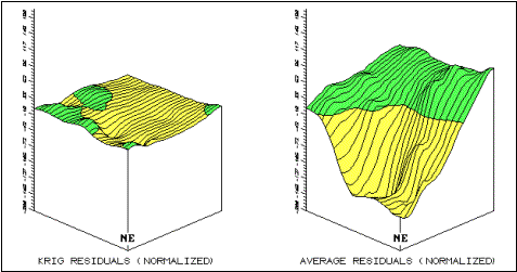
Figure 2. Comparison of Residual
Map Surfaces (3-D) Using Residual Values Derived by Kriging, and Average
Interpolation Techniques.
What do you think you would get if you were to calculate the volumes
contained within the light and dark regions?
Would their volumetric difference have anything to do with their Average
Unsigned Residual values in the residual table discussed a couple of articles
ago? What relationship does the
Normalized Residual Index have with the residual surfaces? …bah!
This map-ematical side of
(Point
Sampling Considerations)
What's the Point?
(GeoWorld,
December 1996)
The reliability of an encoded map primarily depends on the accuracy of the
source document and the fidelity of the digitizer— which in turn is a function
of the caffeine level of the prefrontal-lobotomized hockey puck pusher
(sic). It’s at its highest when
Spatial dependency within a data set simply means that “what happens at one
location depends on what is happening around it” (formally termed positive spatial
autocorrelation). It’s this idea
that forms the basis of statistical tests for spatial dependency. The Geary Index calculates the squared
difference between neighboring sample values, then compares their summary to
the overall variance for the entire data set.
If the neighboring variance is a lot less than the overall, then
considerable dependency is indicated.
The Moran Index is similar; however it uses the products of neighboring
values instead of the differences. A variogram
plots the similarity among locations as a function of distance.
Although these calculations vary and arguments abound about the best
approach, all of them are reporting the degree of similarity among point
samples. I f there is a lot, then you can generate maps from the data; if there
isn’t much, then you are more than wasting your time. A pretty map can be generated regardless of
the degree of dependency, but if dependency is minimal the map is just colorful
gibberish… so don’t bet the farm on it.
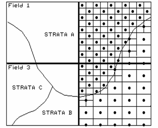
Figure 1. Variable sampling
frequencies by soil strata for two fields.
OK, let’s say the data set you intend to map exhibits ample spatial
autocorrelation. Your next concern is
establishing a sampling frequency and pattern that will capture the variable’s
spatial distribution— sampling design issues.
There are four distinct considerations in sampling design: 1) stratification,
2) sample size, 3) sampling grid, and 4) sampling pattern.
The first three considerations determine the appropriate groupings for
sampling (stratification), the sampling intensity for each group (sample size),
and a suitable reference grid (sampling grid) for expressing the sampling
intensity for each group (see figure 1).
All three are closely tied to the spatial variation of the data to be
mapped. Let’s consider mapping
phosphorous levels within a farmer’s field.
If the field contains a couple of soil types, you might divide it into
two “strata.” If previous sampling has
shown one soil strata to be fairly consistent (small variance), you might
allocate fewer samples than another more variable soil unit, as depicted in the
accompanying figure.
Also, you might decide to generate a third stratum for even more intensive
sampling around the soil boundary itself.
Or, another approach might utilize mapped data on crop yield. If you believe the variation in yield is
primarily “driven” by soil nutrient levels, then the yield map would be a good
surrogate for subdividing the field into strata of high and low yield
variability. This approach might respond
to localized soil conditions that are not reflected in the traditional
(encoded) soil map.
Historically, a single soil sampling frequency has been used throughout
a region, without regard for varying local conditions. In part, the traditional single frequency was
chosen for ease and consistency of field implementation and simply reflects a
uniform spacing intensity based on how much farmers are willing to pay for soil
sampling.
Within
Designer Samples
(GeoWorld, January
1997)
The previous section briefly discussed spatial dependency and the first
three steps in point sampling design— stratification, sample size and sampling
grid. These considerations determine the
appropriate areas, or groupings, for sampling (stratification), the sampling
intensity for each group (sample size) and a suitable reference grid (sampling
grid) for locating the samples. The
fourth and final step “puts the sample points on the ground” by choosing a sampling
pattern to identify individual sample locations.
Traditional, non-spatial statistics tends to emphasize randomized patterns as
they insure maximum independence among samples… a critical element in
calculating the central tendency of a data set (average for an entire
field). However, “the random thing” can
actually hinder spatial statistics’ ability to map field variability. Arguments supporting such statistical heresy
involve a detailed discussion of spatial dependency and autocorrelation, which
(mercifully) is postponed to another issue.
For current discussion, let’s assume sampling patterns other than random
are viable candidates.
Figure 1 identifies five systematic patterns, as well as a completely
random one. Note that the regular
pattern exhibits a uniform distribution in geographic space. The staggered start does so as well,
except the equally spaced Y-axis samples alternate the starting position at one
half the sampling grid spacing. The
result is a “diamond” pattern rather than a “rectangular” one. The diamond pattern is generally considered
better suited for generating maps as it provides more inter-sample distances
for spatial interpolation. The random
start pattern begins each column “transect” at a randomly chosen Y
coordinate within the first grid cell, thereby creating even more inter-sample
distances. The result is a fairly
regularly spaced pattern, with “just a tasteful hint of randomness.”
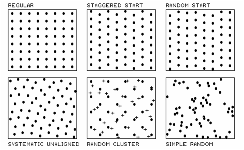
Figure 1. Basic spatial sampling
patterns.
The systematic unaligned pattern also results in a somewhat
regularly spaced pattern, but exhibits even more randomness as it is not
aligned in either the X or Y direction.
A study area (i.e., farmer’s field) is divided into a sampling grid of
cells equal to the sample size. The
pattern is formed by first placing a random point in the cell in the lower-left
corner of the grid to establish a pair of X and Y offsets. Random numbers are used to specify the
distance separating the initial point from the left border (termed the X-offset)
and from the bottom border (termed the Y-offset).
For the bottom row of the sampling grid, the X-offset is held constant while Y
is randomly varied. For the left-most
column, the Y-offset is held constant while X is varied. Sample points are then placed in the
remaining grid cells insuring that the X-offsets are the same along each row
and the Y-offsets are the same along each column. The result is a set of sample points that are
roughly equally spaced, but out of alignment.
The “dots” in the random cluster pattern establish an underlying uniform
pattern (every other staggered start sample point in this example). The “crosses” locate a set of related samples
that are randomly chosen (both distance and direction) within the enlarged grid
space surrounding each regularly placed each dot. Note that the pattern is not as regularly
spaced as the previous techniques, as half of the points are randomly set,
however, it has other advantages. The
random subset of points provides a foothold for a degree of unbiased
statistical inference, such as a t-test of significance differences among
population means.
The simple random pattern uses random numbers to establish X and Y
coordinates within the entire study area.
It allows full use of statistical inference (whole field non-spatial
statistics), but the “clumping” of the samples results in large “gaps” thereby
limiting its application for mapping (site-specific spatial statistics).
So which pattern should be used?
Generally speaking, the Regular and Simple Random patterns are the worst
for spatial analysis. If you have
trouble locating yourself in space (haven’t bought into
(Advanced
Concepts in Spatial Dependency)
Depending on the Data
(GeoWorld, May
1997)
Historically, maps have reported the precise position of physical
features for the purpose of navigation.
Not long after emerging from the cave, early man grabbed a stick and
drew in the sand a route connecting the current location to the best woolly
mammoth hunting grounds, neighboring villages ripe for pillaging, the silk
route to the orient and the flight plan for the first solo around the
world. The basis for the navigational
foundation of mapping lies in referencing systems and the expression of map features
as organized sets of coordinates. The
basis for modern
The technical focus has been enlarged to include a growing set of procedures
for discovering and expressing the dependencies within and among mapped
data. Spatial dependency identifies
relationships based on relative positioning.
Certain trees tend to occur on certain soil types, slopes and climatic
zones. Animals tend to prefer specific
biological and contextual conditions. Particularly good sales prospects for
luxury cars tend to cluster in a few distinct parts of a city. In fact, is anything randomly placed in
geographic space? A rock, a bird, a
person, a molecule?
There are two broad types of spatial dependency: 1) spatial variable dependence
and 2) spatial relations dependence. Spatial
variable dependency stipulates that what occurs at a map location is
related to:
1) the conditions of that
variable at nearby locations (termed spatial autocorrelation); and/or
2) the conditions of other variables
at or around that location (termed spatial correlation).
Spatial autocorrelation forms the backbone of all interpolation
techniques. They relate neighboring
sample points to predict a variable response at unmeasured locations. If the neighboring points are spatially
independent, there is little justification for generating a map surface. For example, if the elevation is 100 feet
here and you note that it is 50 over there, there has to be at least one location
of 75 feet in between. That's because
elevation forms a highly auto-correlated gradient in geographic space. True, it might be that the 75 foot location
is part way down the precipice a foot in front of you, but it has to
exist. The continuum is there, it's just
that the functional form isn't a simple linear transition between the points.
Contrast an elevation surface with a map of roads. If you're standing on a heavy duty, road-type
4 (watch out for buses) and note a light duty road-type 1 over there, it is
absurd to assume that there is a road-type 2.5 somewhere in between. Two basic spatial autocorrelation factors are
not at play— formation of a spatial gradient and existence of partial states. Neither of the assumptions makes sense for
the occurrence of the discrete map objects forming a road map (termed a choropleth
map).
However, both factors make sense for an elevation surface (termed an isopleth
map). But spatial autocorrelation
isn't black and white, present or not present; it occurs in varying degrees for
different map types and spatial variables.
The degree to which a map exhibits intra-variable dependency determines
the nature and strength of the relationships one can derive about its geographic
distribution.
In a similar manner, inter-variable dependency affects our ability to track
spatial relationships. Spatial correlation forms the basis for mapping
relationships among maps. For example,
in the moisture limited ecosystems of Colorado, spruce and fir forests most
often occur on northern slopes, while sparse pine forests tend to occur on the
dry southern exposures. Soil conditions
and depth play a big part in forest vitality, as well the frequency of
catastrophic events, such as fire.
Animal, bird, insect and micro-organism populations are strongly
dependent on terrain and forest conditions.
Boy and girl scouts as well as resource managers have known these
general "rules" of spatial coincidence for years. Scientists have written about them for
years. What has changed are the
"tools" for deriving, verifying and applying more detailed and
spatially explicit relationships.
Historically, scientists have used sets of discrete samples to investigate
relationships among field plots on the landscape, in a manner similar to Petri
dishes on a laboratory table— each sample is assumed to be spatially
independent.
Introduction of neighboring conditions, such as proximity to water and cover
type diversity, expands the simple alignment analysis to one of spatial
context. The derived relationship can be
empirically verified by generating a map predicting animal activity for another
area and comparing it to known animal activity within that area. Once established, the verified spatial
relationship can be used directly by managers in their operational
The other broad type of spatial dependency involves the nature of the
relationship itself. Spatial
relations dependency stipulates that relationships among mapped variables
can be:
1) constant throughout space and time
(termed spatial homogeneity); or
2) variable as a function of space
and/or time (termed spatial heterogeneity).
Very few relationships exhibit pure spatial homogeneity by remaining constant
over space and time. Even the
"laws" of thermal dynamics have conditional boundaries— water freezes
at zero degrees centigrade… as long as it is pure and at sea level. Pour in some salt and carry it to top of a
mountain and it will freeze at a different kinetic temperature. Similarly, most spatial relationships exhibit
spatial heterogeneity and vary to some degree with space and time.
For example, a habitat unit across a river might be considered disjoint and
inaccessible to a non-swimming and flightless animal. However, if the river freezes in the winter,
then the spatial relationships defining habitat needs to change with the
seasons. Similarly, a forest growth
model developed for Colorado might be inappropriate for application in
Oregon. It's likely the basic map layers
and logic structuring the model are identical, but the relative weights
assigned to the growth functions vary with geographic regions and the model
must be "tuned" for local variants.
The complexities of spatial dependence are not unique to resource models.
Uncovering the Mysteries of Spatial
Autocorrelation
(GeoWorld, July
1997)
The following discussion violates all norms of journalism, as well as
common sense. It attempts to describe an
admittedly complex technical subject without the prerequisite discussion of the
theoretical linkages, provisional statements, and enigmatic equations. I apologize in advance to the statistical
community for the important points left out of the discussion… and to the rest
of you for not leaving out more.
The last section identified spatial autocorrelation as the backbone of
all interpolation techniques used to generate maps from point sampled
data. The term refers to the degree of
similarity among neighboring points. If
they exhibit a lot similarity, or spatial dependence, then they ought to derive
a good map; if they are spatially independent, then expect pure, dense
gibberish. So how do we measure whether
“what happens at one location depends on what is happening around it?”
Previous discussion (December 1996 BM column) introduced two simple measures to
determine whether a data set has what it takes to make a map— the Geary and
Moran indices. The Geary Index
looks at the differences in the values between each sample point and its
closest neighbor. If the differences in
neighboring values tend to be less than the differences among all values in the
data set, then spatial autocorrelation exists.
The mathematical mechanics are easy (at least for a tireless computer)—
1) add up all of the differences between each location’s value and the average
for the entire data set (overall variation), 2) add up all of the differences
between values for each location and its closest neighbor (neighbors
variation), and then 3) compare the two summaries using an appropriately ugly
equation to account for “degrees of freedom and normalization.”
If the differences among the neighbors are a lot smaller than the
overall variation, then a high degree of positive spatial dependency is
indicated. If they are about the same,
or if the neighbors variation is larger (a rare “checkerboard-like” condition),
then the assumption that “close things are more similar” fails… and, if the
dependency test fails, so will the interpolation of the data. The Moran Index simply uses the
products between the values, rather than the differences to test the dependency
within a data set. Both approaches are
limited, however, as they merely assess the closest neighbor, regardless of its
distance.
That’s where a variogram comes in. I t is a plot (neither devious nor
spiteful) of the similarity among values based on the distance between
them. Instead of simply testing whether
close things are related, it shows how the degree of dependency relates to
varying distances between locations.
Most data exhibits a lot of similarity when distances are small, then
progressively less similarity as the distances become larger.
In figure 1, you would expect more similarity among the neighboring
points (shown by the lines), than sample points farther away. Geary and Moran consider just the closest
neighbors (orthogonal distances of above, below, right and left for the regular
grid sampling design). A variogram shows
the dependencies for other distances, or spatial frequencies, contained in the
data set (such as the diagonal distances).
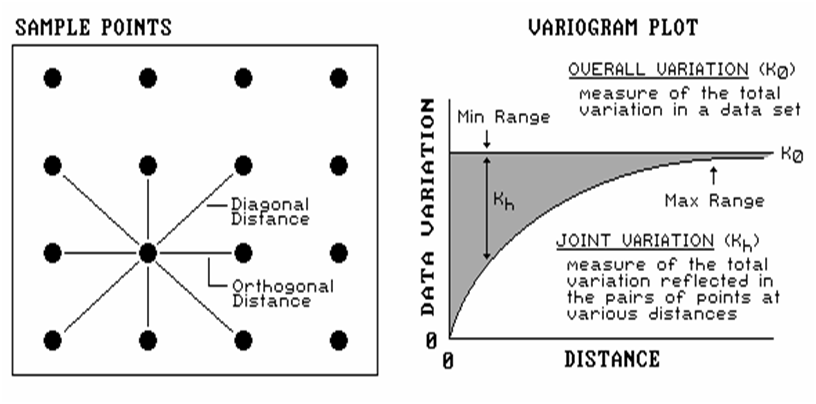
Figure 1. Plot of the similarity
among sample points as a function of distance (shaded portion) shows whether
interpolation of the data is warranted.
If you keep track of the multitude of distances connecting all
locations and their respective differences, you end up with a huge table of
data relating distance to similarity. In
this case, the overall variation in a data set (termed the variance) is
compared to the joint variation (termed the covariance) for each set of
distances. For example, there is a lot
of points that are “one orthogonal step away” (four for the example point). If we compute the difference between the
values for all the “one-steppers,” we have a measure reminiscent of Moran’s
“neighbors variation”— differences among pairs of values.
A bit more “mathematical conditioning” translates this measure into the
covariance for that distance. If we
focus our attention on all of the points “a diagonal step away” (four around
the example point), we will compute a second similarity measure for points a
little farther away. Repeating the joint
variation calculations for all of the other spatial frequencies (two orthogonal
steps, two diagonal steps, etc.), results in enough information to plot the
variogram shown in the figure.
Note the extremes in the plot. The top
horizontal line indicates the total variation within the data set (overall
variation; variance). The origin (0,0)
is the unique case for distance= 0 where the overall variation in the data set
is identical to the joint variation as both calculations use essentially the
same points. As the distance between
points is increased, subsets of the data are scrutinized for their dependency
(joint variation; covariance). The
shaded portion in the plot shows how quickly the spatial dependency among
points deteriorates with distance.
The maximum range position identifies the distance between points beyond which
the data values are considered to be independent of one another. This tells us that using data values beyond
this distance for interpolation is dysfunctional (actually messes-up the
interpolation). The minimum range
position identifies the smallest distance (one orthogonal step) contained in
the data set. If most of the shaded area
falls below this distance, it tells you there is insufficient spatial
dependency in the data set to warrant interpolation.
True, if you proceed with the interpolation a nifty colorful map will be
generated, but it’ll be less than worthless.
Also true, if we proceed with more technical detail (like determining
optimal sampling frequency and assessing directional bias in spatial
dependency), most this column’s readership will disappear (any of you still out
there?).
Unlocking the Keystone Concept of Spatial
Dependency
(GeoWorld,
November 1998)
Previous discussion (October 1998 BM column) investigated the numerical
character of a gridded elevation surface.
Keystone to the discussion was the degree of “normality” exhibited in
the data as measured by commonly used descriptive statistics— min,
max, range, median, mode, mean (or average), variance, standard deviation,
standard error, confidence level, skewness and kurtosis. All in all, it appeared that the elevation
data didn’t fit the old “bell-shaped” curve very well.
So, how useful is “normal” statistics in
At the risk of overstepping my bounds of expertise, let me suggest that using
the average to represent the central tendency of a data set is usually OK. However, when the data isn’t normally
distributed the average might not be a good estimator of the “typical”
condition. Similarly, the standard
deviation can be an ineffective measure of dispersion for ab-normally
distributed data… it all depends.
So, what’s a
Yet another response is to use the “poor man’s” answer to asymmetric
data— use the median to represent the “typical” condition and the quartile
range to estimate the data’s dispersion (the quartile range corresponds to the
middle 50% of the frequency distribution).
Suggesting such a “seat-of-the-pants” statistical procedure should
provide the last whack to my extended neck and set-off another round of
discussions in the Column Supplements.
Even more disturbing, however, is the realization that while descriptive
statistics might provide insight into the numerical distribution of the data,
they provide no information what-so-ever into the spatial distribution of the
data. As noted last month, all sorts of
terrain configurations can produce exactly the same set of descriptive
statistics. That’s because traditional
measures are breed to ignore geographic patterns— in fact spatial independence
is an underlying assumption.
So how can one tell if there is spatial dependency locked inside a data
set? You know, Tobler’s first law of
geography that “all things are related but nearby things are more related than
distant things.” Let’s use Excel and
some common sense to investigate this keystone concept and the approach used in
deriving a descriptive statistics that tracks spatial dependency (see Author’s
Note).
The left side of the figure 1 identifies sixteen sample points in a 25 column
by 25 row analysis grid (origin at 1, 1 in the upper left, northwest
corner). The positioning of the samples
are depicted in the two 3-D plots. Note
that the sample positions are the same (horizontal axes), only the measurements
at each location vary (vertical axis).
The plot on the left depicts sample values that form a plane constantly
increasing from the southwest to the northeast.
The plot on the right depicts a jumbled arrangement of the same
measurement values.
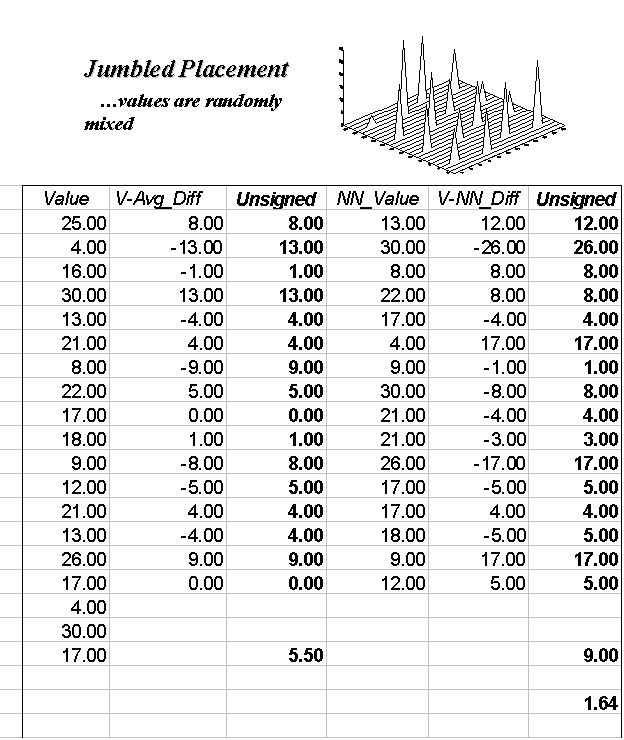
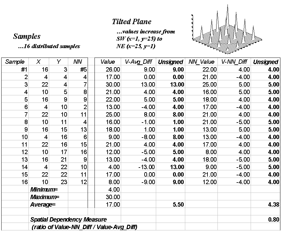
Figure 1. The spatial dependency
in a data set compares the “typical” and “nearest neighbor” differences— if the
nearest neighbor differences are less than the typical differences, then "nearby
things are more similar than distant things."
The first column (labeled Value) in the Tilted and Jumbled
worksheets confirm that the traditional descriptive statistics are identical—
derived from same values, just in different positions. The second column calculates the difference
between each value and the average of the entire set of samples. The sign of the difference indicates whether
the value is above or below the average, or typical value.
The third column (labeled Unsigned) identifies the magnitude of
the difference by taking its absolute value— |Value – Average|. The average of all the unsigned differences
summarizes the “typical” difference. The relatively large figure of 5.50 for
both the Tilted and Jumbled data sets establishes that the individual samples
aren’t very similar overall.
The next three columns in both worksheets provide insight into the spatial
dependency in the two data sets by evaluating Tobler’s first law. The NN_Value column identifies the
value for the nearest neighboring (closest) sample. It is determined by solving for the distance
from each sample location to all of the others using the Pythagorean theorem (c2=
a2 + b2), then assigning the measurement value of the
closest sample.
The final two columns calculate the unsigned difference between the
value at a location and its nearest neighboring value, then compute the
unsigned difference— |Value – NN_Value|. Note that the Tilted data’s nearest neighbor
difference (4.38) is considerably less than that for the Jumbled data (9.00).
Now the stage is set. If the nearest
neighbor differences are less than the typical differences, then “…nearby
things are more related than distant things.”
A simple Spatial Dependency Measure is calculated as the
ratio of the two differences. If the
measure is 1.0, then minimal spatial dependency exists. As the measure gets smaller, increased
positive spatial dependency is indicated; as it gets larger, increased negative
spatial dependency is indicated (nearby things are less similar than distant
things).
OK, so what if the basic set of descriptive statistics can be extended to
include a measure of spatial dependency?
What does it tell you? How can
you use it? Its basic interpretation is
to what degree the data forms a discernible spatial pattern. If spatial dependency is minimal or negative
there is little chance that geographic space can be used to explain the
variation in the data. In these conditions, assigning the average (or median)
to an entire polygon is warranted. On
the other hand, if strong positive spatial dependency is indicated, you might
consider subdividing the polygon into more homogenous parcels to better “map
the variation” locked in a data set. Or better yet, treat the area as a
continuous surface (gridded data). But
further discussion of refinements in calculating and interpreting spatial
dependency must be postponed until next time.
_____________________________
Author’s Note: the Excel worksheets supporting the discussions of
the Tilted and Jumbled data sets (as well as a Blocked and a Random pattern)
can be downloaded from the “Column Supplements” page at www.innovativegis.com/basis.
Measuring Spatial Dependency
(GeoWorld,
December 1998)
Recall the previous section’s discussion of "nearest
neighbor" spatial dependency to test the assertion that "nearby
things are more related than distant things." The procedure was simple— calculate the
difference between each sample value and its closest neighbor (|Value -
NN_Value|), and then compare them to the differences based on the typical
condition (|Value - Average|). I f the Nearest Neighbor and Average differences
are about the same, little spatial dependency exists. If the nearby differences are substantially
smaller than the typical differences, then strong positive spatial dependency
is indicated and it is safe to assume that nearby things are more related.
But just how are they related? And just
how far is "nearby?" To answer
these questions the procedure needs to be expanded to include the differences
at the various distances separating the samples. As with the previous discussions, Excel can
be used to investigate these relationships (see Author’s Note). The plot on the left side of figure 1
identifies the positioning and sample values for the Tilted Plane data set
described last month.
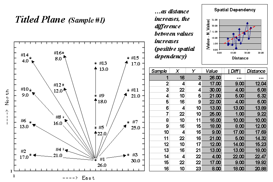
Figure 1. Spatial dependency as a
function of distance for sample point #1.
The arrows emanating from sample #1 shows its 15 paired values. The table on the right summarizes the
unsigned differences (|Diff |) and distances (Distance) for each
pair. Note that the "nearby"
differences (e.g., #3= 4.0, #4= 5.0 and #5= 4.0) tend to be much smaller than
the "distant" differences (e.g., #10= 17.0, #14= 22.0, and #16=
18.0). The graph in the upper right
portion of the figure plots the relationship of sample differences versus
increasing distances. The dotted line
shows a trend of increasing differences (a.k.a. dissimilarity) with increasing
distances.
Now imagine calculating the differences for all the sample pairs in the data
set—the 16 sample points combine for 120 sample pairs—(N*(N-1)/2)= (16*15)/2=
120). Admittedly, these calculations
bring humans to their knees, but it's just a microsecond or so for a
computer. The result is a table
containing the |Diff | and Distance values for all of the sample pairs.
The extended table embodies a lot of information for assessing spatial
dependency. The first step is to divide
the samples into two groups— close and distant pairs. For consistency across data sets, let's
define the "breakpoint" as a proportion of the maximum distance (Dmax)
between sample pairs. Figure 2 shows the
results of applying a dozen breakpoints to divide the data set into
"nearby" and "distant" sample sets. The first row in the table identifies very
close neighbors (.005Dmax= 6.10) and calculates the average nearby
differences (|Avg_Nearby|) as 4.00.
The remaining rows in the table track the differences for increasing
distances defining nearby samples. Note
that as neighborhood size increases, the average difference between sample values
increases. For this data set, the
greatest difference occurs for the neighborhood that captures all of the data
(1.00Dmax= 25.46 with an average difference of 8.19).
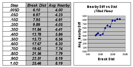
Figure 2. Average “nearby”
differences for increasing breakpoint distances used to define neighboring
samples.
The techy-types among us will note that the plot of “Nearby Diff versus
Dist” in figure 2 is similar to that of a variogram. Both assess the difference among sample
values as a function of distance.
However, the variogram tracks the difference at discrete distances,
while the “Nearby Diff versus Dist” plot considers all of the samples within
increasingly larger neighborhoods.
This difference in approach allows us to directly assess the essence of spatial
dependency—whether “nearby things are more related than distant things.” A “distance-based spatial dependency
measure (SD_D)” can be calculated as— SD_D = [|Avg_Distant| -
|Avg_Nearby|] / |Avg_Distant|.
The effect of this processing is like passing a donut over the
data. When centered on a sample
location, the “hole” identifies nearby samples, while the “dough” determines
distant ones. The “hole” gets progressively larger with increasing breakpoint
distances. If, at a particular step, the
nearby samples are more related (smaller |Avg_Nearby| differences) than the
distant set of samples (larger |Avg_Distant| differences), positive spatial
dependency is indicated.
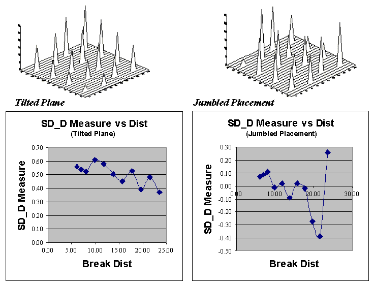
Figure 3. Comparing spatial
dependency by directly assessing differences of a sample’s value to those
within nearby and distant sets.
Now let’s put the SD_D measure to use.
Figure 3 plots the measure for the Tilted Plane (TP with constantly
increasing values) and Jumbled Placement (JP with a jumbled arrangement of the
same values) sample sets discussed the previous section. First notice that the measures for TP are
positive for all breakpoint distances (nearby things are always more related),
whereas they bounce around zero for the JP pattern. Next, notice the magnitudes of the measures—
fairly large for TP (big differences between nearby and distant similarities);
fairly small for JP. Finally, notice the
trend in the plots—downward for TP (declining advantage for nearby neighbors);
flat, or unpredictable for JP.
So what does all this tell us? If the
sign, magnitude and trend of the SD_D measures are like TP’s, then positive
spatial dependency is indicated and the data conforms to the underlying
assumption of most spatial interpolation techniques. If the data is more like JP, then “beware of
flakey interpolation.”
_____________________________
Author’s Note: the Excel worksheets supporting the discussion of
the Tilted and Jumbled data sets (as well as a Blocked and Random pattern) can
be downloaded from the “Column Supplements” page at www.innovativegis.com/basis.
Extending Spatial Dependency to Maps
(GeoWorld, January
1999)
The past four sections have focused on the important geographical
concept of spatial dependency— that nearby things are more related than distant
things. The discussion to date has
involved sets of discrete sample points taken from a variety of geographic
distributions. Several techniques were
described to generate indices tracking the degree of spatial dependency in
point sampled data.
Now let’s turn our attention to continuously mapped data, such as satellite
imagery, soil electric conductivity, crop yield or product sales surfaces. In these instances, a grid data structure is
used and a value is assigned to each cell based on the condition or character
at that location. The result is a set of
data that continuously describes a mapped variable. These data are radically different from point
sampled data as they fully capture the spatial relationships throughout an
entire area.
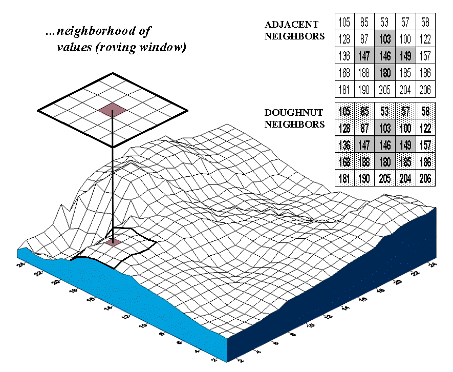
Figure 1. Spatial dependency in
continuously mapped data involves summarizing the data values within a “roving
window” that is moved throughout a map.
The analysis techniques for spatial dependency in these data involve
moving a “roving window” throughout the data grid. As depicted in figure 1, an instantaneous
moment in the processing establishes a set of neighboring cells about a map
location. The map values for the center
cell and its neighbors are retrieved from storage and depending on the
technique, the values are summarized.
The window is shifted so it centers over the next cell and the process
is repeated until all map locations have been evaluated. Various methods are used to deal with
incomplete windows occurring along map edges and areas of missing data.
The configuration of the window and the summary technique is what
differentiates the various spatial dependency measures. All of them, however, involve assessing differences
between map values and their relative geographic positions. In the context of the data grid, if two cells
are close together and have similar values they are considered spatially
related; if their values are different, they are considered unrelated, or even
negatively related.
Geary’s C and Moran’s I introduced in the 1950’s are the most
frequently used measures for determining spatial autocorrelation in mapped
data. Although the equations are a bit
intimidating—
Geary’s C = [(n –1) SUM wij
(xi – xj)2] / [(2 SUM wij) SUM (xi
– m)2]
Moran’s I = [n SUM wij (xi – m) (xj
– m)] / [(SUM wij) SUM (xi – m)2]
where, n = number of
cells in the grid
m = the mean of the values in
the grid
xi = value of cell
in group i and xj = value of cell in group j
wij = a switch set
to 1 if the cells are adjacent; 0 if not adjacent (diagonal)
—however, the underlying concept is fairly simple.
For example, Geary’s C simply compares the squared differences in values
between the center cell and its adjacent neighbors (numerator tracking “xi
– xj”) to the overall difference based on the mean of all the values
(denominator tracking “xi – m”).
If the adjacent differences are less, then things are positively related
(similar, clustered). If they are more,
then things are negatively related (dissimilar, checkerboard). And if the adjacent differences are about the
same, then things are unrelated (independent, random). Moran’s I is a similar measure, but relates
the product of the adjacent differences to the overall difference.
Now let’s do some numbers. An adjacent
neighborhood consists of the four contiguous cells about a center cell, as
highlighted in the upper right inset of figure 1. Given that the mean for all of the values
across the map is 170, the essence for this piece of Geary’s puzzle is
C = [(146-147)2 + (146-103) 2
+ (146-149) 2 + (146-180) 2] / [4 * (146-170) 2]
= [ 1 + 1849 + 9 + 1156 ] / [ 4 * 576
] = 3015 /2304 = 1.309
Since the Geary’s C ratio is just a bit more than 1.0, a slightly uncorrelated
spatial dependency is indicated for this location. As the window completes its pass over all of
the other cells, it keeps a running sum of the numerator and denominator terms
at each location. The final step applies
some aggregation adjustments (the “eye of newt” parts of the nasty equation) to
calculate a single measure encapsulating spatial autocorrelation over the whole
map— a Geary’s C of 0.060 and a Moran’s I of 0.943 for the map surface shown in
figure 1. Both measures report strong
positive autocorrelation for the mapped data.
The general interpretation of the C and I statistics can be summarized
as follows.
|
0 < C < 1 |
Strong positive
autocorrelation |
I > 0 |
|
C > 1 |
Strong Negative
autocorrelation |
I < 0 |
|
C = 1 |
Random distribution of
values |
I = 0 |
In the tradition of good science, let me suggest a new, related
measure—
Although this new measure might be intuitive—adjacent differences (nearby
things) versus overall difference (distant things)—it’s much too ugly for statistical
canonization. First, the values are too
volatile and aren’t constrained to an easily interpreted range. More importantly, the measure doesn’t
directly address “localized spatial autocorrelation” because the nearby
differences are compared to distant differences represented as the map mean.
That’s where the doughnut neighborhood comes in. The roving window is divided into two sets of
data—the adjacent values (inside ring of nearby things) and the doughnut values
(outside ring of distant things). One
could calculate the mean for the doughnut values and substitute it for Geary’s
C’s denominator. But since there’s just
a few numbers in the outer ring, why not use the actual variation between the
center and each doughnut value? That
directly assesses whether nearby things are more related than distant things
for each map neighborhood. A user can
redefine “distant things” simply by changing the size of the window. In fact, if you recall last month’s article,
a series of window sizes could be evaluated and differences between the maps at
various “doughnut radii” could provide information about the geographic
sensitivity of spatial dependency throughout the mapped area (sort of a mapped
variogram).
But let’s take the approach one step further for a new measure we might call Berry
IT (yep, you got it… "bury it" for tracking the Intimidating
Territorial autocorrelation). Such a
measure is reserved for the statistically adept as it performs an F-test for significant
difference between the adjacent and doughnut data groups for each neighborhood.
__________________
Author’s Note: check out this month’s Column Supplement at www.innovativegis.com for more info and
an Excel worksheet applying several concepts for mapping spatial dependency.
Use Polar Variograms to Assess Distance and
Direction Dependencies
(GeoWorld,
September 2001)
The previous sections have investigated spatial dependency—the
assumption that “nearby things are more related than distant things.” This autocorrelation forms the basic concept
behind spatial interpolation and the ability to generate maps from point
sampled data. If there is a lot of
spatial autocorrelation in a set of samples, expect a good map; if not, expect
a map of pure, dense gibberish.
An index of spatial autocorrelation compares the differences
between nearby sample pairs with those from the average of the entire data
set. One would expect a sample point to
be more like its neighbor than it is to the overall average. The larger the disparity between the nearby
and average figures the greater the spatial dependency and the likelihood of a
good interpolated map.
A variogram plot takes the investigation a bit farther by
relating the similarity among samples to the array of distances between
them. Figure 1 outlines the mechanics
and important aspects of the relationship.
The distance between a pair of points is calculated by the Pythagorean
Theorem and plotted along the X-axis. A
normalized difference between sample values (termed semi-variance) is
calculated and plotted along the Y-axis.
Each point-pair is plotted and the pattern of the points analyzed.
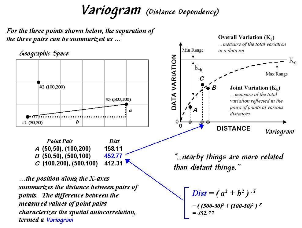
Figure 1. A variogram relates the
difference between sample values and their distance.
Spatial autocorrelation exists if the differences between sample values
systematically increase as the distances between sample points becomes
larger. The shape and consistency of the
pattern of points in the plot characterize the degree of similarity. In the figure, an idealized upward curve is
indicated. If the remaining point-pairs
continue to be tightly clustered about the curve considerable spatial
autocorrelation is indicated. If they
are scattered throughout the plot without forming a recognizable pattern,
minimal autocorrelation is present.
The “goodness of fit” of the points to the curve serves as an index of the
spatial dependency— a good fit indicates strong spatial autocorrelation. The curve itself provides relative weights
for the samples surrounding a location as it is interpolated— the weights are
calculated from the equation of the curve.
A polar variogram takes the concept a step further by considering
directional bias as well as distance. In
addition to calculating distance, the direction between point-pairs is
determined using the “opposite-over-adjacent (tangent)” geometry rule. A polar plot of the results is constructed
with rings of increasing distance divided into sectors of different angular
relationships (figure 2).
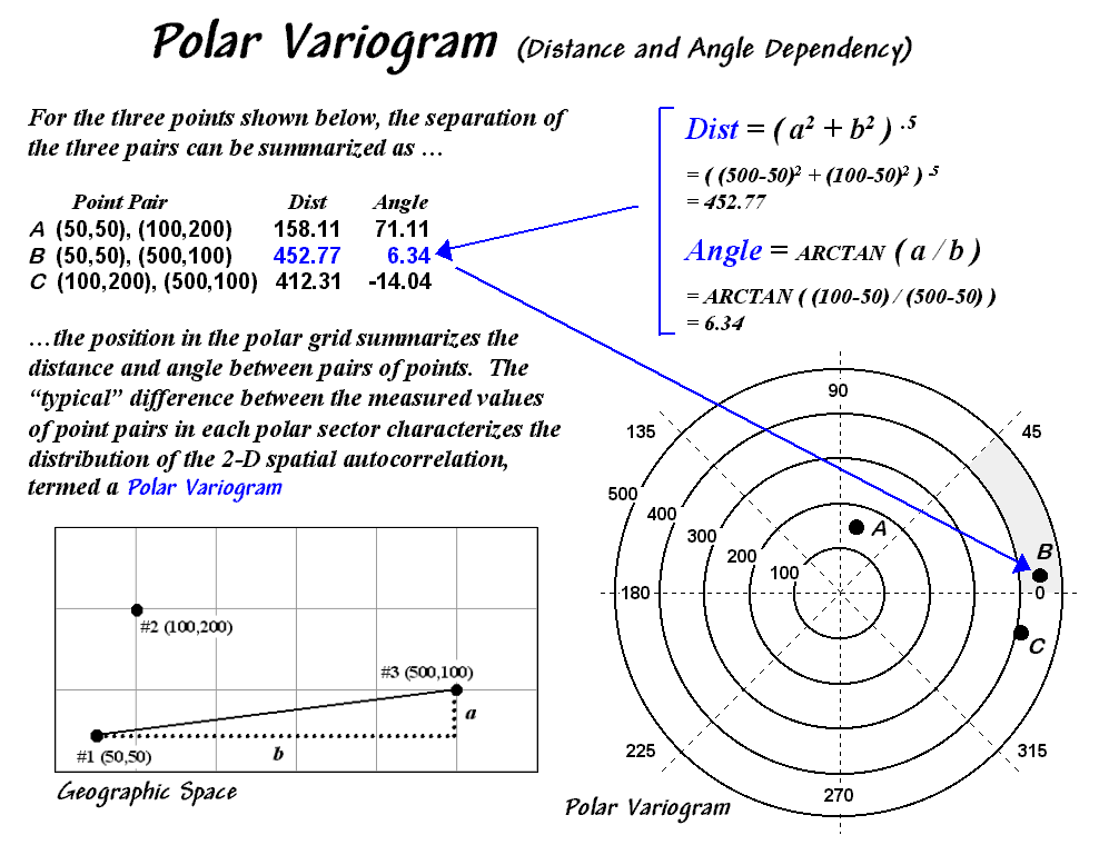
Figure 2. A polar variogram
relates the difference between sample values to both distance and direction.
Each point-pair plots within one of the sectors (shaded portion in
figure 2). The difference between the
sample values within each sector forms a third axis analogous to the “data
variation” (Y-axis) in a simple variogram.
The relative differences for the sectors serve as the weights for
interpolation. During interpolation, the
distance and angle for a location to its surrounding sample points are computed
and the weights for the corresponding sectors are used. If there is a directional bias in the data,
the weights along that axis will be larger and the matching sample points in
that direction will receive more importance.
The shape and pattern of the polar variogram surface characterizes the
distance and directional dependencies in a set of data— the X and Y axes depict
distance and direction between points while the Z-axis depicts the differences
between sample values.
An idealized surface is lowest at the center and progressively
increases. If the shape is a perfect
bowl, there is no directional bias.
However, as ridges and valleys are formed directional dependencies are
indicated. Like a simple variogram, a
polar variogram provides a graphical representation of spatial dependency in a
data set— it just adds direction to the mix of spatial dependency assessments.
(Back to the Table of Contents)