|
Topic 3 –
Assessing Neighborhood Characteristics using Roving Windows |
Beyond Mapping book |
Imagination is More Important than Information — describes
procedures for characterizing surface configuration (slope, aspect and profile)
It’s Like the New Math, I
am Just Too Old — discusses the
concept of calculating a “map derivative” and its use
Torture Numbers, They’ll Tell you Anything — discusses
the underlying theory and basic considerations of spatial interpolation
I Don’t Do Windows — describes
procedures for summarizing weighted roving windows
<Click here> for a printer-friendly version of this topic
(.pdf).
(Back to the Table of Contents)
______________________________
Imagination is more Important than
Information (Einstein)
(GIS World, June/July 1990)
...but
directed imagination needs the best information it can get.
When
viewing a map, the human mind nearly explodes with ideas about the
landscape. Although the ideas are
limitless, our ability to process the detailed spatial data is limited. When the computer 'views' a map, it sees an
organized set of spatial data ripe for processing, but has no idea of its
significance. Think about it, when was the last time you took your computer for
a walk in the woods?
That's
the beauty of the man/machine bonding in GIS.
The imagination of the user is magnified many-fold by the machine's
ability to assemble detail as directed.
Ian McHarg vividly makes this point in his
lectures on GIS-- 'it is a tool that extends the mind.' We easily conceptualize scenarios for a
landscape, but lack the facility to effectively evaluate their relative
merits. That's why we need our little
silicon subordinate... to take care of the details. From this perspective GIS is less computer
mapping and spatial data base management, than it is a Decision Support System
(DSS) for modeling and evaluating alternative land uses.
The
foundation of this 'thinking with maps' is rooted in the analytic capabilities
of GIS. The last series of articles
described how our simple concept of distance has been extended by the
computer's ability to calculate proximity, movement and connectivity. This is the first of a few articles
investigating a related set of analytic tools concerned with vicinity. Or, more technically stated, the analysis
of spatially defined neighborhoods by considering a map location within the
context of its neighboring locations. As
with all GIS processing, new values are computed as a function of the values on
another map. In neighborhood analysis
two steps are involved. First, establish
the neighborhood and its values, then summarize the
values.
Determination
of neighborhood membership is like a 'roving window' moving about a map. Picture a window with nine window panes
looking straight down onto a piece of the landscape (sort of makes you feel all
powerful, doesn't it). Now, like a nosey
neighbor, systematically move it around to check out the action. Suppose your concern was surface
configuration. You would note the nine
elevation values within the window, then summarize the
3-dimensional surface they form. If all
of the values were the same, say 100 feet elevation, you would say it was a
boring flat area and move your window slightly to one side. Some larger values appear on the side window
panes. Move it another couple of notches
and the window is full of different elevation values.
Imagine
the nine values become balls floating at their respective elevation. Drape a sheet over them like the magician
places a sheet over his suspended assistant (who says GIS isn't at least part
magic). There it is-- surface
configuration... now numerically summarize the lumps and bumps formed by the
ghostly sheet. That means reducing the
nine values to a single value characterizing the surface. How about its general steepness? You could compute the eight individual slopes
formed by the center value and its eight neighbors (change in elevation divided
by the change in horizontal distance expressed as a percent). Then average them for an average slope. You could, but how about choosing the maximum
slope? That's what water does. Or the minimum slope? That's what a weary hiker does. In special cases you would choose one of
these statistics.
Most
often you are interested in the best overall slope value. This is determined by the 'best fitted plane'
to the data. Replay your vision of the
nine floating balls. Now insert a glass
panel (plane) in such a way that the balls appear balanced about it (minimizing
the deviations from the plane to the balls).
If you're a 'techy', you will recognize this is simple 'linear
regression', except in 3-dimensional space.
But, if you value your computer's friendship, don't use a 'least-squares
fit' algorithm. Use vector algebra, its
much faster.
As
the window progresses about the map, slope values are assigned to the center
window pane (cell) until all locations have received a value... abra-ca-da-bra, a slope map. Locations with larger values indicate steep
terrain; smaller values for gently sloped terrain. But what is the terrain's orientation? That's an aspect map. Move the same window and best fitted plane
about the map, but this time use its 'direction cosines' to indicate the
orientation of the plane. Is it facing
south? Or north? Or 47 degrees azimuth? It could make a big difference. If you're trying to grow trees in a moisture
limited region those south facing slopes are only good for rattlesnakes. However, if there is ample water, they get
the most sunlight and tend to grow your best trees. If you're a land planner, the southern slopes
tend to grow the best houses, or at least lowest heating bills.
There
is one final surface configuration factor to consider-- profile. Imagine a loaf of bread, fresh from the
oven. It's sort of like an elevation
surface. At least mine has deep
depressions and high ridges. Now start
slicing the loaf and pull away an individual slice. Look at it in profile concentrating on the
line the top crust portion traces. From
left to right, the line goes up and down in accordance with the valleys and
ridges it sliced through. Use your arms
to mimic the shapes along the line. A 'V' with both arms up for a valley. An inverted 'V' with both
arms down for a ridge. Actually
there are only nine fundamental profile classes (distinct positions for your
two arms). Values one through nine will
serve as our numerical summary of profile.
However,
a new window is needed. This time as you
look down onto the landscape, move a window with just three panes along a
series of parallel lines. At an instant
in time, you have defined three elevation values. Compare the left side value to the
center. Is it higher or lower? Put your left arm in that position. Now do the same for the right side and center
values. Note the fundamental profile
shape you have formed and assign its value to the center location. Move the window over one pane and repeat
until you have assigned a profile value to every map location. The result of all this arm waving is a
profile map-- the continuous distribution profiles viewed from some direction. Provided your elevation data is at the proper
resolution, it's a big help in finding ridges and valleys running in a certain
direction. That's where the gold might
be. Or, if you look from two opposing
directions (orthogonal) and put the two profile maps together, a location with
an inverted 'V' in both directions is likely a peak.
There
is a lot more to neighborhood analysis than just characterizing the lumps and
bumps of the terrain. What would happen
if you created a slope map of a slope map?
Or a slope map of a barometric pressure map? Or of a cost surface? What would happen if the window wasn't a
fixed geometric shape? Say a ten minute
drive window. I wonder what the average
age and income is for the population within such a bazaar window?... See you next issue.
It’s Like the New Math… I am just too old
(GIS World, August/September 1990)
Earlier
discussions have established 'maps as data'.
The fact that maps are numbers in a GIS is what allows us to go beyond
mapping. It extends pens, symbols and
colors to spatial statistics, mathematics and modeling. But in doing so, does it leave the typical
user in the dust?
Your
initial response is likely, "You bet.
Its like new math, I'm just too
old." We have our established
procedures for dealing with maps and data, built up through years of study at
the School of Hardknocks. Maps are colorful graphics you hang on the
wall, and data are colorless numbers you align in a column. The thought that they are one of the same is
unsettling. Well, let's return to that
Land of Oz, featuring neighborhood characterization.
When
last we saw our hero, the 'roving window,' he was about to crash into a lumpy,
bumpy terrain surface. If that is all
that he is good for, he was going to end it all. Let's review the facts. The procedure for assessing surface
configuration was described as a window with nine panes moving about a map of
elevation values. At an instant in time,
the nine values in the window are summarized for the slope and aspect of the
three-dimensional surface they form (see last issue for algorithms). The results are assigned to the location at
the center of the window, then the window advances to the next position. This procedure is repeated until a slope or aspect
value is assigned to all locations in a project area. Useful information, but is that all there is?
Of
course not, this is the Land of Oz. A
slope map is actually the first derivative of the elevation surface. You remember the derivative; that blood-sucking
calculus teacher threatened you with it.
In simple terms, a derivative indicates the 'rate of change' in one
variable with respect to another. In the
terrain slope example, it is the rate of change in elevation per geographic
step-- "rise is to run." If
elevation doesn't change, the terrain is flat.
If it changes a lot over a short distance, it's steep. Slope (derivative) indicates how rapidly
things are changing throughout your map.
Aspect indicates the direction of this change. "I can handle that."
OK. Then what is the second derivative of an
elevation map? The
slope of a slope map? Let's see,
the first derivative is the rate of change in elevation per geographic
step. Then the second derivative must be
the rate of change in the rate of change in elevation per geographic step. What?
That doesn't make sense. Maps are
maps and math is math, and you shouldn't confuse them. No, the result is called a surface
'roughness' map. It shows you where
those little brown contour lines are close together, then far apart, then close
together again, then far apart-- heart break terrain for tired hikers. Close your eyes and envision a steep mountain
side you have to climb. It could be
worse.
Suppose
the slope isn't constant (a tilted, straight line in profile), but variable (a
tilted, wiggly line in profile). To get
to the same point, you would hike up, then down, then up, then down... at each
rise, your hopes (and elevation advantage earned) would be lost. Neither man nor machine likes to run around
in this sort of terrain. If you're a
forester, a roughness map could help you in harvest planning. If you're a regional planner, it could help
you assess likely corridors for a proposed highway. If you're a hydrologist, it could help in
modeling surface runoff.
Weatherpersons
have used map derivatives for years.
They collect barometric pressure readings at weather stations, then interpolate these data into pressure gradient
maps. To a casual observer, these maps
look just like a terrain surface... peaks, valleys and a host of varying slopes
connecting them. Winds blow from high to
low pressure; or stated another way, from the peaks to the valleys along the
pressure gradient. The steeper the slope
between peaks and valleys, the stronger the wind will be. Therefore, a 'slope' map of the pressure
gradient surface indicates wind speed at each location. The aspect of the same map indicates wind
direction at each location. So that's
how they get tomorrow's 'gusty' prediction.
Or how about a cooling pond's 'thermal gradient'? ...a mountain of high
temperature at the point of discharge that dissipates at different rates and
directions as a function of depth, bottom conditions, streams and springs. Slope and aspect of this thermal gradient
maps these complex interactions.
Let's
recapitulate before we go on. The
familiar concepts of terrain slope and aspect are down-to-earth examples of
that elusive mathematical concept of the derivative. It gives a firm footing in the real world to
one of the most powerful mathematical tools in numerical space. A slope map indicates the spatial
distribution of the rate of change in any map variable. An aspect map indicates the direction of that
change. Since slope and aspect have a
more general meaning than giving direction to raindrops, what else can they
do?
Consider
an accumulation surface. Remember that
bizarre map discussed a few issues ago in connection with weighted distance
measurement. An example is a
'travel-time' map indicating how long it would take to travel from one location
to all other locations in a project area.
If you move in straight lines in all directions, a perfect bowl of
constantly increasing distance is formed.
However, if you are a realistic hiker your movement throughout the area
will bend and twist around both absolute and relative barriers, as defined by
terrain and land cover features. The
result is a travel-time map that is bowl-like, but wrinkled with ridges and
valleys. That’s weird, but still a map
surface that is not unlike a terrain surface.
Its slope indicates the ease of optimal movement across any location in
the project area. Its aspect indicates
the direction of optimal movement. So
what?
Think
about it. This is a map of the pattern
of optimal movement throughout an area.
Such information is invaluable whether you are launching a crew of fire
fighters or a cruise missile. But why
stop at a travel-time map. Why not a
'cost surface,' in which its derivative produces a marginal cost map-- the cost
to go an additional step in space. Or a 'marginal revenue' map. Such is the decision fodder that fuels the
salaries of most MBA's-- except expressed as an entire map, instead of a single
number.
At
least two things should be apparent from the above discussion. First, that map analysis in a GIS is based on
mathematics. Maps are large groups of
numbers and most of the traditional analysis techniques are applicable. Certainly the derivative is a switch hitter
that propels GIS beyond mapping. How
about the integral? Sure, why not? Envision a single, huge window that covers
the entire map and sum all the values.
How about the mean? Just divide
the integrated sum by the number of locations.
How about the standard deviation?
And the coefficient of variation? Sure, but that's for the next issue. The other thing that should be apparent is
that you don't want to have a thing to do with this map-ematics
…maybe, maybe not. By reading this far,
a seed has been set. At minimum, the
thought of a map derivative will haunt you in your shower; like that innocent
bather who checked in at the Bates Motel.
Torture Numbers, They’ll Tell you Anything
(GIS World, October/November 1990)
The
last two sections introduced the idea of 'roving' a small window throughout a
map summarizing the surface configuration detected at each location. Slope, aspect and profile of an elevation
surface made sense. You have dug in your
fingernails on steep, southerly slopes and pitched your tent on flat ones. But the extension of the concept to abstract
maps, such as travel-time and cost surfaces, may have been a bit
uncomfortable. Relating
it to math's derivative made it down right inhospitable. Hopefully you saw through all that academic
hyperbole to visualize its application potential. Surface configuration tells you how and where
a 'mapped variable' is changing-- important information to tell you how and
where you should change your management action.
There
is another fundamental way to summarize a roving window-- statistically. For example, "How many houses are there
within a quarter mile radius?". Or, "What is the average lead
concentration in the soil within a hundred meters?" In these instances, the numbers defining a
map are 'windowed', then statistically summarized, with the summary value
assigned to the center location of the window.
The window repeats this process as it moves about the map. The list of data summary techniques is large
indeed-- total, average, standard deviation, coefficient of variation, maximum,
minimum, median, mode, diversity, deviation, and many others. In fact, any of the traditional mathematical
and statistical operations can be used to summarize the data in the window.
But
that's not all. Because of the spatial
nature of mapped data, new operations arise, such as Fourier two-dimensional
digital filtering-- a real trek on the quantitative side that is beyond the
scope of this article. Yet the basic
concept imbedded in these seemingly complex procedures actually is quite
simple. Consider the housing density map
noted above. The number of houses within
a quarter mile of any location is an indicator of human activity. More houses means
more activity. Yet suppose your concern
is a noisy neighborhood. It's not just
the total number of houses in the vicinity of a location, but their juxta-positioning.
If the woofers and tweeters are concentrated close to you, you'll be rock'n through the night.
If most are at the edge of your neighborhood 'window', no problem. Physics describes this condition as the
'dissipation of sound as a non-linear function of distance.' You probably describe it as relief. That means a house twice as far away sounds a
whole lot quieter than the one next door.
To
our GIS, that means a 'distance weighted' window capability. Weights are calculated as an inverse function
of the distance for each window position.
The result is a matrix of numbers analogous to writing a weighting
factor on each pane of glass forming the entire window. When you look though this window at the
landscape, multiply the data you see times its respective weight, then
statistically summarize these data and assign the summary value to the center
location of the window. In this
instance, the noise emanating from each house is adjusted for its positioning
in the window and the total noise computed by summing all of the adjusted
values.
The
concept of weighted windows is fairly easy to grasp. The procedure used to derive the weights is
what separates the manager from the mathematician. For now, let's stick to the easy stuff-- for
example, weighted nearest neighbor interpolation. It uses an 'inverse distance squared' window
similar to the one described above.
Instead of noisy data, field collected measurements of well pollution
levels, or barometric pressure, or animal activity can be used.
Consider
figure 1, but please excuse the PC EGA color graphics slide of the screen. It's not as pretty as a workstation rendering,
but I did it on my lap at 30,000 feet.
Inset (a) shows a geographic plot of animal activity recorded during a
twenty-four hour period at sixteen sample sites for a 625 hectare project area. Note the higher measurements are concentrated
in the northeast, while the lower measurements are in the northwest. The highest activity level is 87, while the
lowest is 0-- forming a rather large data range of 87. The computed average activity is 22.56, with
a standard deviation of + 26.2.
On the whole, the area is fairly active but not too bad.
Inset
(b) shows the result of moving the inverse distance squared window over the
data map. At each stop the activity data
is multiplied by its weighting factor, and the weighted average of all the
adjusted measurements is assigned to the center of the window. This provides an estimate (interpolated
value) of activity which is primarily influenced by those sampled points closer
to it. It's common sense... if there is
a lot of activity immediately around a location; chances are there is a lot of
activity at that location. This is often
the case, but not always (that's why we need the mathematician's complex
weighting schemes).
"Whoa! You mean tabular data can be translated into
maps?" In many instances, the answer
is yes. The 22.56 average animal activity actually implies a map. It's just that it is a perfectly flat surface
that estimates a 22.56 activity level is everywhere... plus or minus the
standard deviation of 26.2, of course.
But it doesn't indicate where you would expect more activity (plus), or
where to expect less (minus). That's
what the interpolated map does. If
higher activity is measured all around a location, such as in the northeastern
portion, then why not estimate more than the average? Not a bad assumption in this case, but 'it
depends on the data' is the correct answer.
As with all map analysis operations, you aren't just coloring maps,
you're processing numbers with all the rights, privileges and responsibilities
of math and stat. Be careful.
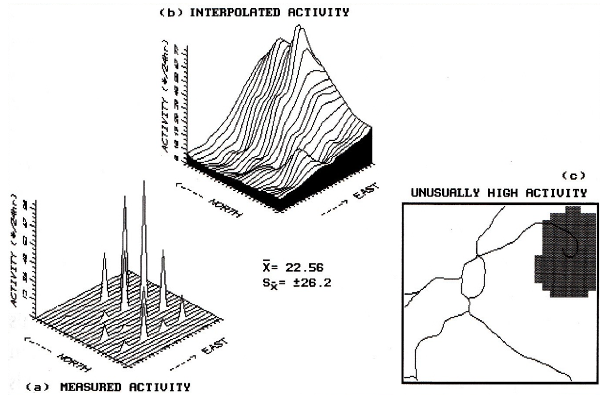
Figure
1. Spatial interpolation of discrete point
samples generates a continuous map surface that in turn, identifies areas of unusually
high activity.
You
might be asking yourself, "If the interpolated surface predicts a
different animal activity at each location, I wonder where there are areas of
unusual activity." That's a
'standard normal variable (SNV)' map.
It's this simple... SNV=((x-average)/standard
deviation)*100, where x is an interpolated value. It's not as bad as you might think. If the interpolated value (x) is exactly the
same as average, then it computes to 0... exactly what
you would expect. Positive SNV values
indicate areas above the average (more than you would expect); negative values
indicate areas below the average (less than you would expect). A +100 or larger value indicates areas that
are 100%, or more, of a standard deviation above the average... very unusually
high activity. Inset (c) of the
accompanying figure locates this area as easily accessible by the woods road in
the northeast. Now get in your pickup
truck and check it out. For the
techy-types, the SNV map is the geographic plot of the standard normal curve
and the map in inset (c) is the plot of the upper tail of the curve. For the rest of us, it's just a darn useful
technique that provides a new way of looking at our old data. It brings statistics down to earth.
So,
spatial interpolation is a neighborhood operation involving; at least
conceptually, a roving window; a weighted one at that. Actually, it's an operation fairly similar to
the familiar concepts of slope and aspect calculation. In the next issue, we will finish our brush with
neighbors by considering 'dynamic' windows.
Once you have tasted weighted windows, you will love dynamic ones. See you then.
I Don’t Do Windows
(GIS World, December 1990)
The
previous sections have discussed 'neighborhood' operations as moving a window
about map. We found that the data within
a window at an instant in time could be used to characterize the surface
configuration (e.g., slope or aspect) or generate a summary statistic (e.g.,
total or average). The value
representing the entire neighborhood is assigned to the focus of the window,
then the window shifts to the next location.
It
is a simple, straight forward process, except for two counts. One involves understanding the wealth of
mathematical and statistical processes involved. Most traditional math/stat operations are
possible (those termed 'commutative' operations for the techy types). That leads to the other complicating count--
why would I want to do these unnatural, numerical things to a map? And what would I do with the bazaar results,
such as a marginal cost map (slope of a cost surface)? Hopefully, the preceding articles provided
enough examples to stimulate your thinking beyond traditional mapping, to maps
as data, and finally to map analysis.
Intellectual
stimulation, however, can quickly turn to conceptual overload. Risking this, let's return to spatial
interpolation. Recall that interpolation
involves moving window about a map, identifying the sampled values within the
window, summarizing these samples and finally assigning the summary to the
focus of the window. The summary could
be a simple arithmetic average or a weighted average (most commonly 'the inverse
distance squared' weighted average).
How
about another conceptual step? Instead
of making the weights a simple function of distance, incorporate a 'bias' based
on the trend in the sampled data. This
is what that mysterious interpolator 'kriging' does. It's based on common sense-- the accuracy of
an estimated value is best at a sampled location and becomes less reliable as
interpolated points get further away. Simple and straight forward.
But the direction to a sampled value often makes a difference. For example, consider the change in
ecological conditions as you climb from Death Valley to the top of Mount
Whitney. As elevation rapidly increases
you quickly pass through several ecological communities. If you move along an elevation contour,
things don't change as quickly. For years,
ecologists have used elevation in their mapping.
Now
envision a map of this area (or refer to a map of southeastern
California). Major changes in elevation
primarily occur along the East/West axis.
Most of the contours (constant elevation) run along the North/South
axis. If our understanding of ecology
holds, an estimated location should be influenced more by samples in a
North/South direction from it. Samples
to the East/West should have less influence.
That's what kriging does. It
first analyzes the sample data set for directional bias, then
adjusts the weighting factors it uses in summarizing the samples in the
window. In this case, it would uncover
the directional bias in the sample data (induced by elevation gradient,
provided theory holds), then sets the window weighting factors.
Another
way to conceptualize the direction-biased window is as an ellipse instead of a
circle. Inverse distance squared
weighting forms concentric halos of equal weights-- a circular window. Kriging windows form football-shaped halos
reaching out the farthest in the direction of trend in the data-- an elliptical
window. For the techy few, this is
similar to the 'Mahalanobis' distance in multivariate analysis. For the rest of us, it demonstrates the first
consideration in roving window design-- direction. Why do widows have to form simple geometric
shapes, like circles and squares, in which all directions are symmetrically
considered? Well they don't.
For
example, consider secondary source air pollution and health risk mapping. If you have a map of the concentration of
lead in soils you might identify as 'risky' those areas with high
concentrations within five hundred meters.
To produce this map you could move a window with a radius of 500 meters
throughout the lead map, assigning the average concentration as you go. But this process ignores the prevailing
winds. An area might have a high
concentration to the north, with low concentrations elsewhere. Its average might be within the guidelines,
but as the wind blows from the north, the real effect would be disastrous for a
home built at this location. In this
case, a wedge-shaped window oriented to the north (up wind) would be more
appropriate.
Actually
there is more to windows than just direction.
There is distance. For example,
consider a big wind from the north.
Under these conditions relatively distant locations of high
concentrations could affect you. Under
light winds they wouldn't. Considering
both wind direction and strength, results in a dynamic window that adjusts
itself each time it defines a neighborhood.
To accomplish this, you need a wind map (often referred to as a 'wind
rose') as well as the lead concentration map.
The wind map develops the window configuration and the lead map provides
the data for summary. In reality,
'cumulative effects' and 'particulate mixing' should be considered, but that's
another story... even more complicated.
But in the end, it just results in better definition of window
weights.
Let's
try another dynamic window example.
Suppose you were looking for a good place for a fast food
restaurant. It should be on an existing
road (the automobile is king). It should
be close to those most prone to a 'Mac attack' (wealthy families with young
children). Armed with these criteria,
you begin your analysis. First you need
to build a data base containing information on roads and demographic
information. With any luck, the
necessary data are in the 'Tiger Files' available for your area (see the
several previous GIS World articles on this data source).
Now
all you need is a procedure that relates movement along roads from a location
to the people data-- a 'travel-time window'.
Based on the type of roads around a location, move the reach out ten
minutes in all directions. The result is
a spider-web-like window that reaches farther along fast roads than along slow
roads. A bit odd-shaped, but it's a
window no less. Now lay the window over
the demographic data to calculate the average income and number of children per
household. Assign your summary value
then move to the next location along the road.
When all locations have been considered, the ones with the highest
'yuppie indexes' are where candidate restaurant locations.
All
this may sound simple (ha!), but it's a different story when you attempt to
implement the theory. Several GIS
software packages will allow you to create 'dynamic weighted window 'maps. It's not a simple keystroke, but a complex
command 'macro.' Such concepts are
pushing at the frontier GIS. It's
currently the turf of the researcher.
Then again, GIS as you know it was just a glint in the researcher's eye
not so long ago. I bet you will 'do
windows' in your lifetime. It'll be fun.
_______________________________________