Quantitative Methods for Analyzing Map Similarity and Zoning
Joseph K. Berry1
President, Berry
& Associates // Spatial Information Systems
2000 South
College Avenue, Suite 300
Fort Collins,
Colorado, USA 80525
Phone:
970-215-0825
Email:
jberry@innovativegis.com
Abstract
In the past thirty years
GIS technology has progressed from computer mapping to spatial database
management, and more recently, to quantitative map analysis and modeling. However, most applications still rely on
visceral/visual analysis for determining similarity within and among maps. Various quantitative techniques for analysis
and comparison of mapped data are becoming available in inexpensive and
easy-to-use packages that seamlessly interface with existing desktop mapping
systems. This paper investigates the
conceptual basis and practical considerations in evaluating data patterns
within a single map and relationships among sets of map layers. Procedures discussed include comparison of
discrete/continuous maps, similarity index, and data zoning/clustering. Considerable attention is given to the
nature of mapped data, assumptions inherent in the techniques, and mechanisms
for evaluating results. Examples
emphasize environmental and natural resource applications yet apply to any
discipline seeking to quantify similarities within and among maps.
Introduction
I
bet you will see it over and over at this and other conferences¾a speaker waves a laser pointer at a couple
of maps and says something like "see
how similar the maps are." But
what determines similarity… a few similarly shaped gobs appearing in the same
general area? Or do all of the globs
have to kind of align? Do display
factors, such as color selection, number of classes and thematic break points,
affect perceived similarity? What about
the areas that misalign? How dissimilar
are they?
The
ability to objectively compare maps is fundamental to map analysis yet is often
neglected. Visual comparison is far too
limited and, in most cases, must generalize mapped data before human
consumption. The result is a subjective
analysis of generalized data with minimal spatial specificity. The problem is magnified for visual
assessment of spatial relationships among a set of maps. This paper presents several techniques for
comparing maps and quantifying spatial relationships implied in their
coincident data patterns.
Comparing Discrete Maps
Consider the three maps on the right side of
figure 1-1. The maps generalize the same map surface into discrete zones
(white= low, light gray= medium and dark gray= high). Are the maps similar? Is
the top map more similar to the middle one, than the map on the bottom? If so, how much more similar?
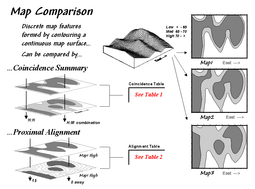 Figure
1-1. Coincidence Summary and Proximal
Alignment can be used to assess the similarity between maps. Note: the tables identified in the figure
are discussed in the referenced articles.
Figure
1-1. Coincidence Summary and Proximal
Alignment can be used to assess the similarity between maps. Note: the tables identified in the figure
are discussed in the referenced articles.
One
way to find out for certain is to overlay the two maps and note where the
classifications are the same and where they are different. At one extreme, the maps could perfectly
coincide with the same conditions everywhere (identical). At the other extreme, the conditions might
be different everywhere. Somewhere in
between these extremes, the high and low areas could be swapped and the pattern
inverted¾similar but opposite.
A “coincidence summary” generates
a cross-tabular listing of the intersection of two maps (Berry, 1999a). The percentage of the map area in agreement
indicates the overall similarity. Of
more interest, however, are the areas of disagreement. The summary table indicates for each
location the specific nature of the discrepancy. For example areas that are dark gray in the top map in the figure
that align with areas that are light gray in the bottom map are a different
type disagreement than a misalignment with white areas. Summary percentages for the different types
of misalignments provide insight into which classes are more often confused
than others.
In
vector analysis maps are intersected and aggregating the areas of the
son-and-daughter polygons that are derived summarizes the type of
disagreement. In grid-based analysis
the process simply involves noting the number of grid cells falling into each
category combination. All of the
remaining techniques for assessing similarity and data pattern relationships
require grid-based processing and are not available in vector systems.
A more powerful technique for comparing
discrete maps, termed “proximal alignment,” isolates one of
the map categories (e.g., the dark-toned areas on Map3 in the figure) then
generates its proximity map (Berry, 1999a).
The proximity values are "masked" for the corresponding
feature on the other map (e.g., enlarged dark-toned area on Map1). The result is proximity values appearing
within areas of misalignment between the two maps. These values provide further information about map disagreement as
larger values indicate locations where the two maps are drastically
misaligned. Small proximity values
indicate areas that are different but not too different. These proximity data on the geographic extent
of disagreement can be summarized for a statistic of “how far” off the two maps
are—not just “how often” (percentage of area) they are off.
Comparing
Continuous Map Surfaces
Comparing map surfaces involves similar
approaches, but employs different techniques taking advantage of the more
robust nature of continuous grid-based data.
Consider the two map surfaces shown on the left side of figure 1-2. Are they similar, or different? Where are they more similar or
different? Where's the greatest
difference? How would you know?
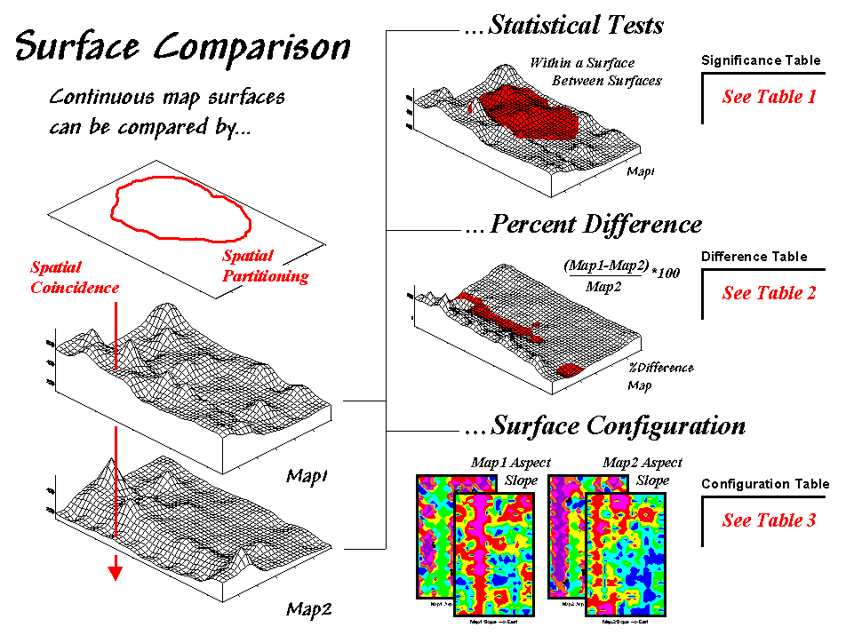 Figure
1-2. Map surfaces can be compared by
statistically testing for significant differences in data sets, differences in
spatial coincidence, or surface configuration alignment.
Figure
1-2. Map surfaces can be compared by
statistically testing for significant differences in data sets, differences in
spatial coincidence, or surface configuration alignment.
In visual comparison, your eye looks
back-and-forth between the two surfaces attempting to compare the relative
“heights" at corresponding locations on the surfaces. In the computer, the relative heights are
stored as individual map “values” (in this case, 1380 numbers in an analysis
grid of 46 rows by 30 columns).
One approach that quantitatively compares the
surfaces involves “statistical tests” whether the data sets are significantly
different (Berry, 1999b).
The
non-spatial statistical tests compare entire areas yet they fail to provide any
insight into the spatial distribution of the differences. Comparison
using “percent difference,” on the other hand, capitalizes on the
juxtaposition of the differences by simply evaluating the percent change
equation ([[map1_value – map2_value] / map1_value] *100) for each grid cell
(Berry, 1999b). This measure is the
most direct and easy to interpret comparison between two maps as it uses the
full data range and geographically depicts the differences—e.g., “…more
different over here than it is over there.”
The area statistics in the legend of a difference map can be summarized
to identify the "thirds rule of thumb" for comparison¾if
two-thirds of the map area is within one-third (33 percent) difference, the
surfaces are fairly similar; if less than one-third of the area is within
one-third difference, the surfaces are fairly different¾generally speaking that is.
Yet another approach to compare map surfaces,
termed surface configuration, focuses on the differences in the
localized trends between two map surfaces instead of the individual values
(Berry, 1999b). Like you, the computer
can "see" the bumps in the surfaces, but it does it with a couple of
derived maps. A “slope” map
indicates the relative steepness while an “aspect” map denotes the
orientation of locations along the surface.
The computer “sees” differences based on the
slope and aspect by evaluating some fairly complex trigonometry equations that
are beyond the scope of this paper (see the appended discussion at the end of
Topic 10 of the online Map Analysis book identified in the reference section
for detailed information). Conceptually
speaking, the immediate neighborhood around each grid location identifies a
small plane with steepness and orientation defined by the slope and aspect
maps. The equations simply solve for
the normalized difference in slope and aspect angles between the two planes. Locations with flat/vertical differences in
inclination (slope difference = 90o) and diametrically opposed
orientations (Aspect difference = 180o) are as different as
different can get. Zero differences for
both, on the other hand, are as similar as things can get (exactly the same
slope and aspect). All other
slope/aspect differences fall somewhere in between on a scale of 0-100.
Identifying Unusual Data Zones
In assessing similarity
among maps, the link between “Geographic Space” and “Data Space”
is key. As shown in figure 1-3, spatial
data can be viewed as a map or a histogram.
While a map shows us “where is what,” a histogram summarizes “how often”
measurements occur (regardless where they occur).
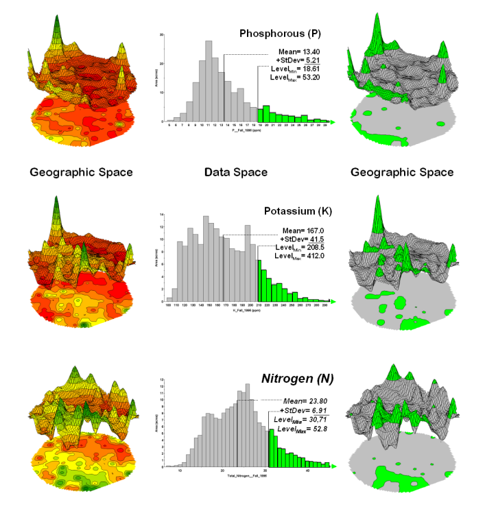 Figure 1-3.
Identifying areas of unusually high measurements based on the numerical
distribution of the data.
Figure 1-3.
Identifying areas of unusually high measurements based on the numerical
distribution of the data.
The top-left portion of the
figure shows a 2D/3D map display of the relative amount of phosphorous (P)
throughout a farmer’s field. Note the
spikes of high measurements along the edge of the field, with a particularly
big spike in the north portion.
The histogram to the right
of the map view forms a different perspective of the same data. Rather than positioning the measurements in
geographic space it summarizes their relative frequency of occurrence in data
space. The X-axis of the graph
corresponds to the Z-axis of the map—amount of phosphorous. In this case, the spikes in the graph
indicate measurements that occur more frequently. Note the high occurrence of phosphorous around 11ppm.
Now to put the
geographic-data space link to use. The
shaded area in the histogram view identifies measurements that are unusually
high—more than one standard deviation above the mean. This statistical cutoff is used to isolate locations of high
measurements as shown in the map on the right.
The level slicing procedure (Berry, 2001b) is repeated for
the potassium (K) and the nitrogen (N) surfaces to identify their locations of
unusually high concentrations.
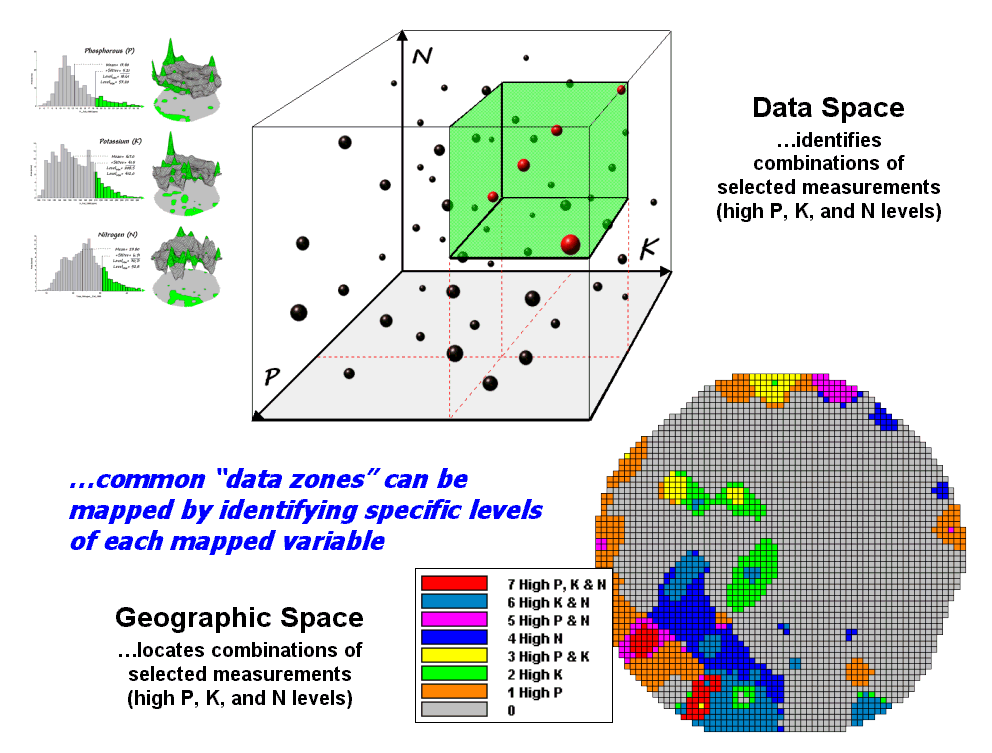 Figure 1-4.
Level-slice classification is used to identify data zones of specified
levels.
Figure 1-4.
Level-slice classification is used to identify data zones of specified
levels.
The box in figure 1-4 depicts
how the computer “sees” data patterns. In
this case “data space” is composed of three axes defining the extent of
the box that corresponds to the data ranges of P, K and N. The floating balls represent grid cells—one ball
for each grid cell in “geographic space”—and the position of the balls identify
their data pattern.
The balls plotting in the
shaded area of the diagram identify field locations that have unusually high P,
K and N concentrations. The non-shaded
portions of the box identify conditions in which at least on of the nutrient levels
is not unusually high. The map in the lower
right identifies the eight possible combinations from no unusually high concentrations
(near the origin of the scatter plot) to unusually high in all three nutrients
(shaded area of high, high, high response).
The level slicing in essence carved data space into eight boxes with the
map identifying the geographic distribution of the assignments—most of the
field does not have unusually high concentration of any of the nutrients (light
gray).
Calculating Map Similarity
Extending the geographic-data
space link using “data distance” measures develop a map similarity
index (Berry, 2001a). Consider the same
three maps shown in the upper-left portion of figure 1-5. If you focus your attention on the location
in the southeastern portion, how similar are all of the other locations in the
field? What about the location in the
extreme northern portion… how similar is its data pattern?
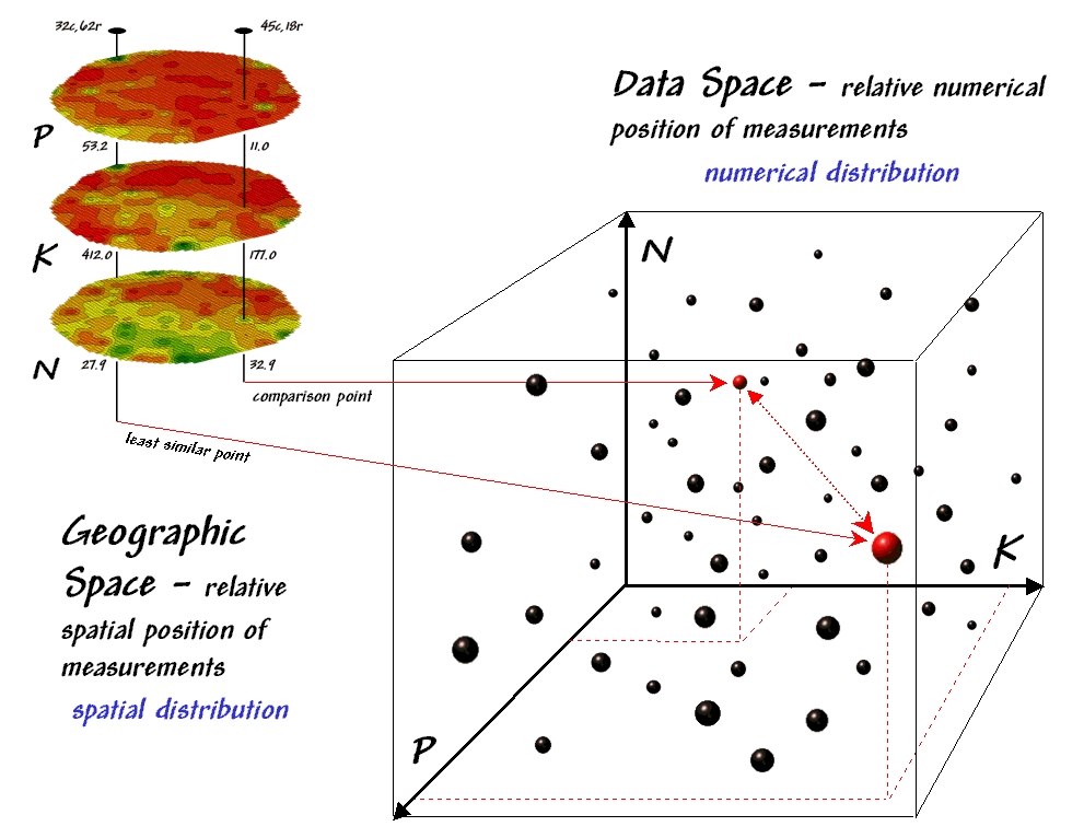 Figure 1-5.
Conceptually linking geographic space and data space for the spatial
distribution of P,K and N throughout an agricultural field.
Figure 1-5.
Conceptually linking geographic space and data space for the spatial
distribution of P,K and N throughout an agricultural field.
The “data spear” at map
location column 45, row 18 identifies that the P-level as 11.0ppm, the K-level
as 177.0 and N-level as 32.9. This step
is analogous to your eye noting a color pattern of burnt-red, dark-orange and light
green. The other location for
comparison (32c, 62r) has a data pattern of P= 53.2, K= 412.0 and N= 27.9—or as
your eye sees it, a color pattern of dark-green, dark-green and yellow.
As previously noted, the
position of any point in data space identifies its numerical pattern—low, low,
low is in the back-left corner, while high, high, high is in the upper-right
corner. Points that plot in data space
close to each other are similar and those that plot farther away are less
similar. In the example, the floating
ball closest to you is the farthest one from the comparison point in the
southeastern portion of the field. This
distance becomes the reference for “most different” data pattern and sets the
bottom value of the similarity scale (0%).
A point with an identical data pattern plots at exactly the same
position in data space resulting in a data distance of 0 that equates to the
highest similarity value (100%).
In practice, a user clicks
on a location and its data pattern for a selected set of maps becomes the “comparison
shishkebab” and the data distance for all other locations are calculated. An index is normalized to the most different
pattern and a similarity map is generated with from 0 (most different) to 100
(identical). The result is a map that
quantitatively shows how similar all of the other locations are to the selected
location.
Mapping Data Clusters
While level slicing and map
similarity are useful in examining spatial relationships and data patterns,
they require a user to specify data analysis parameters. But what if you don’t know what level slice
intervals to use or which locations in the field warrant map similarity
investigation? Can the computer on its
own identify groups of similar data?
How would such a classification work?
How well would it work?
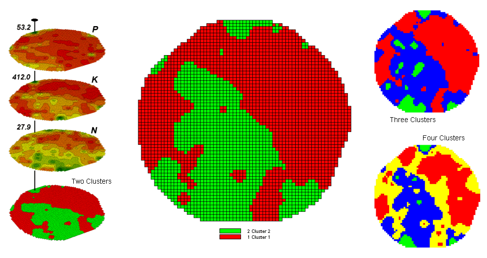 Figure
1-6. Relative data distance is used to divide
a map area into clusters of similar data patterns.
Figure
1-6. Relative data distance is used to divide
a map area into clusters of similar data patterns.
Figure 1 shows some
examples derived from map clustering (Berry, 2001c) the nutrient
data. The map in the center of the
figure shows the results of classifying the P, K and N map stack into two
clusters. The data pattern for each
cell location is used to partition the field into two groups that are 1) as
different as possible between groups and 2) as similar as possible
within a group. If all went well,
any other division of the field into two groups would be not as good at
balancing the two criteria.
The two smaller maps at the
right show the division of the data set into three and four clusters. In all three of the cluster maps red is
assigned to the data group with relatively low responses and green to the one
with relatively high responses. Note
the encroachment on these marginal groups by the added clusters that are formed
by data patterns at the boundaries.
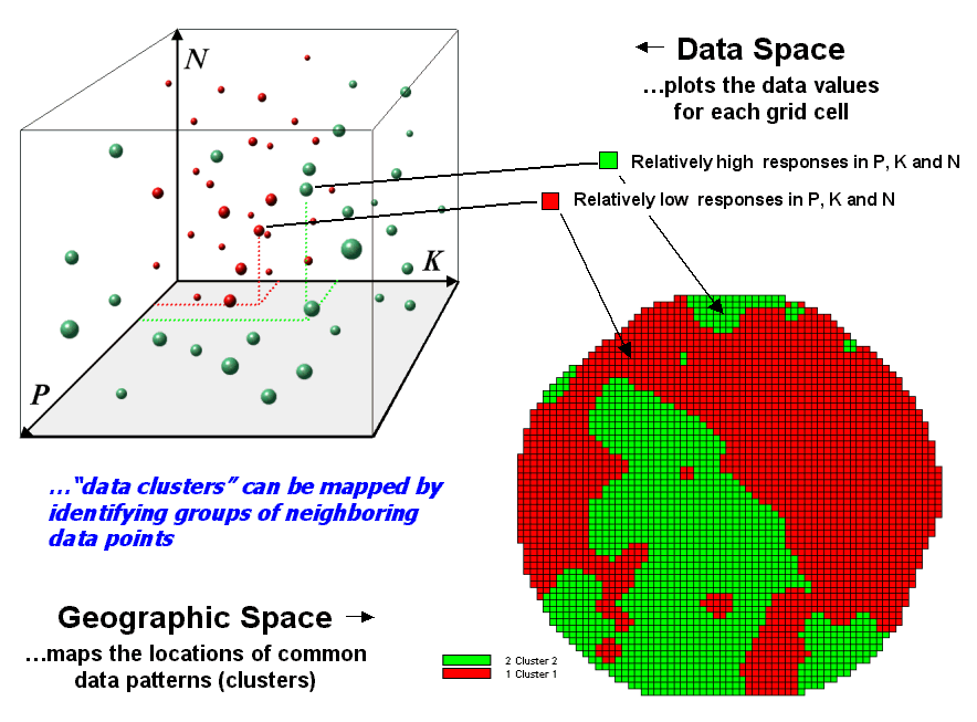 Figure
1-7. Data patterns for map locations
are depicted as floating balls in data space.
Figure
1-7. Data patterns for map locations
are depicted as floating balls in data space.
The schematic in figure 1-7
depicts the process. The floating balls
identify the data patterns for each map location (geographic space) plotted
against the P, K and N axes (data space).
For example, the large ball appearing closest to you depicts a location
with high values on all three input maps.
The tiny ball in the opposite corner (near the plot origin) depicts a
map location with small map values. It
seems sensible that these two extreme responses would belong to different data
groupings.
Discussion of the algorithm
used in clustering is beyond the scope of this paper but it suffices to note
that “data distances” between the floating balls are used to identify cluster
membership—groups of balls that are relatively far from other groups and
relatively close to each other form separate data clusters. In this example, the red balls identify
relatively low responses while green ones have relatively high responses. The geographic pattern of the classification
is shown in the map at the lower right of the figure.
Conclusion
While the discussion has
focused on agricultural data, keep in mind that the input maps could be crime,
pollution or sales data—most sets of application related data. The fundamental nature of map comparison,
data zoning, map similarity and clustering cuts across disciplines, data types
and applications. The techniques
address a basic need for evaluating spatial relationships and data patterns
beyond simply viewing a set of side-by-side maps. The capabilities discussed have been known for years and are part
of many GIS systems yet they are rarely employed. As spatial technology gains a larger foothold beyond mapping and
geo-query, the quantitative nature of digital mapped data will increasingly
become a focus. In the future, laser
pointer dancing about a set of map displays will be replaced by objective
measures that evaluate relationships within and among maps. Coincidence summary, proximal alignment, statistical
tests, percent difference, surface configuration, level-slicing, map similarity,
clustering and a host of other quantitative measures will replace subjective “visceral
visions” of relationships thought to exist when viewing graphic displays.
References
Note: The topics
discussed in this paper are treated in greater detail in the Beyond Mapping
columns appearing in GeoWorld cited below. These articles have been compiled into an online text at www.innovativegis.com/basis select the “Map Analysis” book and refer to
Topics 10 and 12.
Berry, 1999a. “Comparing Maps by the Numbers,” Beyond
Mapping column, GEOWorld, September issue, 1999, pages 23-24.
Berry, 1999b. “Use Statistics to Compare Map Surfaces,” Beyond
Mapping column, GEOWorld, October issue, 1999, pages 23-24.
Berry, 2001a. “Geographic Software Removes Guesswork from
Map Comparison,” Beyond Mapping column, GEOWorld, October, 2001, pages
23-24.
Berry, 2001b. “Use Similarity to Identify Data Zones,” Beyond
Mapping column, GEOWorld, November, 2001, pages 23-24.
Berry, 2001c. “Use Statistics to Map Data Clusters,” Beyond
Mapping column, GEOWorld, December issue, 2001, pages 23-24.
________________________
1Joseph K. Berry is a leading consultant and
educator in the application of Geographic Information Systems (GIS)
technology. He is the president of BASIS,
consultants and software developers in GIS and the author of the “Beyond
Mapping” column for GEOWorld magazine.
He has written over two hundred papers on the theory and application of
map analysis, and is the author of the popular books Beyond Mapping and Spatial
Reasoning. Since 1976, he has
presented workshops on GIS to thousands of individuals from a wide variety of
disciplines. Dr. Berry conducted basic
research and taught courses in GIS for twelve years at Yale University's
Graduate School of Forestry and Environmental Studies, and is currently a
Special Faculty member at Colorado State University and the W. M. Keck Visiting
Scholar in Geography at the University of Denver. He holds a B.S. degree in forestry, an M.B.A. in business
management and a Ph.D. emphasizing remote sensing and land use planning.