
June 4, 1998
GIS World
attn: Editor
re: "Link Data and Geographic Distributions," June 1988.
Letter to the editor…
Joseph Berry's "Beyond Mapping" columns have been a continuing asset to your
magazine for years. I recommend his two books-both compilations of past columns-to my GIS
students. Unfortunately, his most recent article clearly goes way beyond his area of
expertise. The resulting confusion and misinformation do a disservice to your readers.
Berry gets his definitions wrong, his theory wrong, and his advice wrong. As for the
definitions: the median is not the midrange, as he consistently defines it; and the mean
is not the median, as he implies in the column's last paragraph. As to the theory, the
phrase "Calculating the mean actually fits a 'standard normal curve' to the
histogram" is wrong on many levels: computing a mean is not a curve fitting
procedure; and the mean (viewed as a random variable) is not necessarily normally
distributed, either in theory or in practice. There are more instances of such abuse
sprinkled through the column, such as the nonsense about "mapping the standard normal
curve in geographic space." The only readers who think they understood that are
either already hopelessly confused or knew this stuff in the first place (or maybe both,
by now).
You might dismiss these objections as quibbles, though, but for the terrible advice. For
example, "if [the coefficient of variation] is large, then ? the mean is a poor
estimator of what's happening in a mapped area." As always, the correct advice is
"it depends," but this is a particularly poor rule of thumb. For example, a map
of temperature (degrees Centigrade) could average close to zero with very small standard
deviation but resulting huge CV. By contrast, the standard deviation of altitudes in the
Mt. Everest region is only about 20% of the mean: good enough for Mr. Berry to be
comfortable using the mean elevation to estimate "what's happening in [this] mapped
area." It would be far better to admonish readers to compute
standard deviations and compare them to the desired levels of precision. (Even that is not
clear or always correct, but it's much better-and simpler-than the CV rule of thumb.)
Worse, Berry's entire article implies that all variation in all data is correctly
described by a standard normal curve. Reality is just the opposite. This misconception is
at the heart of many statistical mistakes and overlooked opportunities. It is a shame to
see it propagated in such a reputable magazine by such a reputable columnist.
To continually come up with fresh and interesting things to write is a daunting challenge.
Sooner or later any persistent columnist will have to look beyond his core expertise for
more material. That's fine, since the columnist's gift is to simplify without
oversimplifying and to make material intelligible and appealing. (Writing these columns
takes special courage, which I greatly admire, because the writer always risks tirades
like this one!) Nevertheless, I recommend that you start to engage in some fact checking
and expert review lest you continue publishing nonsense.
William A. Huber, Ph.D.
Quantitative Decisions
539 Valley View Road
Merion, PA 19066
(610) 771-0606
William Huber
>>Reply...
Well hopefully the main point didn’t get scrambled—that mapped data has
strong conceptual links to traditional (non-spatial) statistical concepts and frequency
distributions. You’re right about the definition of the median. It’s halfway
between the minimum and the maximum only for the idealized standard normal distribution
(as depicted in the figure), but for more general cases (real world) involving
asymmetrical distributions, it is "the value midway in the frequency
distribution," with half of the distribution below it and half above it. Also, in
asymmetric frequency distributions the median lies between the mean and the mode, whereas
the three measures coincide in the idealized, symmetrical normal curve.
Also, I agree that characterizing a data distribution isn’t actually
"curve-fitting," but more like "curve imposing." When using the mean
and standard deviation to summarize a data set, the bell-shaped curve is
inferred—it’s height and breadth reflected in the two statistics (checkout the
column supplement at www.innovativegis.com/basis
for more on distribution shape).
Quibbles aside, I stand firm on a couple points. The mechanics and interpretations of
mapping the standard normal curve allow a GIS user to visualize the geographic
distribution of locations of data along the "inferred" normal
distribution—a laudable pursuit. Also, the coefficient of variation is a useful index
in communicating how well the mean characterizes a data set. Though unstable around 0,
it’s a lot better than considering the mean and standard deviation independently,
particularly when comparing two data distributions. And yes, Mt. Everest’s mean
sounds like it’s a pretty good estimator of the typical elevation in the area
(although its maximum value resonates with most folks). To be sure though, one should
calculate a few more statistics, like kurtosis and skewness, to test the assumption of
normalcy.
The unpleasant remark that I assume "all variation in all data is correctly described
by a standard normal curve" is unfounded. The column and column supplements have
repeatedly cautioned about simply "tagging polygons with the average value"
without regard of the data’s distribution. Your point that in reality most data is
not normal should strike fear in the hearts of all who develop and consume GIS data
describing the "average" tree in a forest stand, or #births per 1000 women in a
county, or ppm lead in an aquifer. It’s almost enough to scrape the whole concept of
GIS beyond its historical role of mapping physical features (categorical data).
The article centered on the normal curve not from the assumption that all data is so
distributed, but from a hope that discussing the characteristics of the simplest form (and
the one most likely retained from Stat 101) might help make the conceptual link between
spatial and non-spatial data representations. My reference to the "normal"
(without due recognition of asymmetric distributions) might be interpreted as a misguided
attempt to shed light on the link between "comfortable" concepts of basic
statistics and mapped data’s spatial distribution. But, as with all things
statistical… I guess it depends.
Joe Berry <joeb@cnr.colostate.edu>
>>>Reply to the reply…
Thank you for your response. Some of it is useful clarification and some of it I think
most professional statisticians would find at best eccentric. But you did a great job in
the subsequent article ("Explore Data Space," GIS World, July 1998), driving a
good balance between informality, being correct, and hinting at the qualifications and
subtleties, so I'm not going to beat a dead horse. I just want to make two recommendations
and you can decide whether they're worth taking.
1. Get your articles fact checked and peer reviewed, if only informally. You owe that to
yourself and to your readers. Making mistakes is a hazard of the profession and nobody is
error free.
2. If you're going to keep writing about statistics, learn it well before you turn around
and explain it. And then follow recommendation #1.
P.S. When you write "Your point that in reality most data is not normal should strike
fear in the hearts of all who develop and consume GIS data describing the
"average" tree in a forest stand, or #births per 1000 women in a county, or ppm
lead in an aquifer," I think you're getting the point. Have you carefully studied
Tukey's EDA (Addison-Wesley, 1977)? Does it not strike you that the seminal work in data
description and analysis never mentions the normal distribution? May I also suggest
Tufte's books ("The Visual Display of Quantitative Information," Graphics Press,
1984), if you're not already familiar with them, to get some idea of what GIS can do for
information communication when properly applied.
>>>Another comment…
Interesting discussion that I think raises several important issues, the key one being whether `normal’ is an appropriate distributional assumption for spatial data. The points I am about to make are of course from my perspective: any discussion of what is appropriate statistical practice must be premised on the context of the analysis. I find it safest to approach spatial data analysis on my knees; with humility and recognizing my profound ignorance regarding the space-time processes that gave rise to the data. This necessarily means the distribution from which the sample is drawn is unknown.
I must disagree regarding your [JKB] contention that the bell-shaped curve is inferred when one calculates the mean and standard deviation. In the first steps of ESDA one typically assumes the distribution from which the sample is drawn is unknown. One of the first steps is to calculate measures of central tendency (including the mean), dispersion (including the standard deviation and coefficient of variation), skewness and kurtosis. As such, mean and standard deviation are calculated before any distributional assumptions are made; there is no inference made regarding an underlying bell-shaped curve.
If one wishes to later apply techniques that require distributional assumptions (of which gaussian is only one possiblity, other common ones being exponential, logarithmic and etc.) one may use appropriate tests to determine whether the distribution of the sample is consistent with the assumed distribution. In my experience, spatial data are usually not normally distributed, especially when spatial dependencies exist that can reduce the variance and introduce multimodality. Indeed, if spatial structure doesn’t exist, why mess around with GIS and spatial analysis in the first place? The point being, that when spatial structure is present it usually violates many of the assumptions implicit in normal distribution theory (such as iid).
Given the power of today’s computers, it is often convenient to use empirical, rather than theoretical distributions. This is one of the rationales for using Monte Carlo techniques for resampling the data – the issue of determining the (unobservable) distribution from which the sample was drawn is rendered mute. This occurs at a substantial cost though, any statistical inferences then apply only to the sample, and not to the `universe’ or `population’ to which the theoretical distribution pertains.
All of which leaves me with a rather pragmatic perspective: I am not surprised when the data fail to meet distributional assumptions such as the normal curve, nor am I distressed, since I have little reason to expect the data to be normally distributed in the first place. Which leads to your [JKB] observation:
`Your point that in reality most data is not normal should strike fear in the hearts of all who develop and consume GIS data describing the `average’ tree in a forest stand, or #births per 100 women in a country, or ppm lead in an aquifer. It’s almost enough to scrap the whole concept of GIS beyond historical role of mapping physical features (categorical data).’
Measures of central tendency are still valid summary statistics when the underlying distribution isn’t normal, and (for those who take comfort in normal distribution theory) recall that the distribution of means tends to be normal, regardless of the distribution from which the data were sampled. More importantly, we’re doing GIS because we recognize that geographic space mediates almost all interactions in our physical world. As such, we should recognize there are many reasons why spatial data shouldn’t be normally distributed, because geography is irregular, anisotropy exists, discontinuities are common, etc. etc. So what is the lesson? Keep the GIS and scrap the distributional assumptions instead!
Keep up the great work,
Geoffrey M. Jacquez
BioMedware
516 North State Street
Ann Arbor, MI 48104-1236
(313) 913-1098
(313) 913-2201 fax
>>>>Reply…
The "mapping" of data as a histogram provides a glimpse at its numerical distribution. Most spatial data I have encountered is not normally distributed; in fact, just the opposite (checkout the column supplement at www.innovativegis.com/basis for a terse—I-bet-I-am-in-trouble-again—overview of asymmetrical data). However, I am continually amazed that the bulk of GIS processing assumes it is by "tagging" averages to polygonal entities, such as county-based demographic data. I raise your "scrap the distributional assumptions" to "scrap the artificial spatial units as well" (and utilize a grid-based schema whenever statistically analyzing data with spatial implications). My guess is that the "course carving" of geographic space into irregular globs contributes as much (if not more) to the inaccuracies of spatial data analysis as the distributional assumptions of central tendency defining the globs.
Having said that, I have to "fold" as the practical realities of getting the GIS user community to heed such advice and discard the "friendly, paper-map paradigm with chunky, artifical objects" is about nil… maybe in the next mapping millennium. Getting them to link data and geographic distributions through "normal" statistics may have technical shortcomings, but it just might be a useful conceptual exercise in getting the typical GIS user to realize that their maps are loaded with real data and they easily can shoot themselves in the foot.
Joe Berry <joeb@cnr.colostate.edu>
>>>>> Another comment…
I enjoyed your article in the recent issue of GIS World - my first reading of this
magazine. However, I did have a few (picky) comments:
You state that "Calculating the mean actually fits a 'standard normal curve' to the
histogram. Calculating the mean only provides a crude fit; calculating the mean and
standard deviation is a more appropriate fit.
The coefficient of variation is only useful for variables for which 0 is a
"natural" lower bound, and is related to the null-hypothesis "Is this
variable different from 0." Fortunately, this is true for most variables of interest
in the GIS community, though instances may exist where the "natural" lower bound
is greater than 0. (I warned you that I was picky.)
Another way to demonstrate the relationship shown in Figure 2 is to graph ((Surface -
<X>) / s)^2 and color regions with Surface - <X> << 0 blue and Surface -
<X> >> 0 red. This appeals to my natural instinct to think big is bad and
little is good when talking about deviations.
Don't you hate the ease with e-mail enables picky people to respond to articles?
Bobby Haas
Research Staff
Viggen Corporation
Knoxville, TN
(423) 691-8988
Bobby Haas <bhaas@usit.net>
>>>>>>>Reply...
On the contrary, thanks for the thoughts. Yours (and others;
see above) will help in the editing for the next compilation of columns. Your reworking of
the SNV "data viewing link" suggestion is right on target.
Joe Berry <joeb@cnr.colostate.edu>
>>>>> Another comment…
Greetings Mr. Berry: Although I did not read your "Link Data and Geographic Distributions" column, I did read Professor Huber’s letter and your response in the September issue of GIS World, and would like to respectively add a few comments regarding the application of statistical analyses mentioned therein. While it may be true that most data do not have an underlying Normal distribution, Professor Huber failed to mention that all distributions could be "assumed" to be Normal - if one decides to work with the mean distribution of the underlying distribution, not the underlying distribution itself. This is known as the Central Limit Theorem, one of the most important breakthroughs in all of statistics. In fact, the theorem is the basis for so many of the well known statistical tests, even for nonparametric distributions. It is also the Central Limit Theorem that proves the prudence of averaging, which reduces the standard deviation of a sample by a factor of [1/SQRT(n)], where n is the sample size. The theorem, moreover, is the basis from which you, in response to Prof. Huber, was correct, provided you were inferring about the mean distribution of the dataset’s underlying distribution, in saying, "When using the mean and standard deviation to summarize a dataset, the bell-shaped curve is inferred – its height and breadth reflected in the two statistics." The mean and standard deviation, otherwise, infers nothing about the dataset’s underlying distribution. Take an example of a fair six-sided die, whose mean is 3.5 and standard deviation is about 1.71. So a dataset randomly obtained should get similar results. Yet, the discrete probability distribution is not bell shaped, but a rectangle with an area of 1.
If indeed in nature most distributions are not Normal, this should not "strike fear in the hearts of all who develop and consume GIS data." Nor is it "almost enough to scrap the whole concept of GIS beyond historical mapping of categorical data." Scientists have always known and successfully dealt with the fact that many natural processes are not Normally distributed. The Chi-Square distribution, the basis of Chi-Square test and used by all Biologists, is not Normal. Neither is the Fermi-Dirac distribution function, nor the Einstein-Bose distribution function, nor the Exponential distribution, nor the probability distribution of the position of an electron in a sodium atom and nor the countless discrete distributions, just to name a few. In fact, physics is filled with them. There are even processes without any known distributions, leading statisticians to develop distribution free or nonparametric procedures to try to deal with them.
The fact that a dataset does not have an underlying Normal distribution also does not take away from the importance of calculating the mean and, if possible, the standard deviation. The standard deviation still tells us the spread, while the mean can be interpreted as the expected value. When applied to the aforementioned six-sided die, the expected value or mean tells us that if we re-calculate the average with each random toss of the die, the average will ever more closely approach 3.5 as the number of tosses increases. This is the Law of Averages. In biology, using the expected value and applying the Chi-Square test, one can assess the reasonableness of one’s data. Fisher used it to show that Mendel slightly fudged his experimental pea data. When applied to gambling games that depend purely on chance, one will find that no game offers a positive expected or mean dollar return to the gambler. That is why the house always makes money in the long run.
>>>>>>>Reply...
Thank you for the for your comments and insight. The main concern is the common practice of simply assigning the mean to a polygon (usually based on anthropogenic factors like political boundaries) of all the data samples that fall within it. Two problems often arise-- the data itself can be strongly skewed and/or its spatial pattern not uniform. It might be prudent to calculate some descriptive statistics (see Beyond Mapping column in the September 1998 issue) to see if the "typical value" is a good generalizer of the numeric and spatial character of the data.
Joe Berry <joeb@cnr.colostate.edu>
>>>Reply to the reply…
Greetings Mr. Berry: Thank you for your generous reply to my E-mail regarding your GIS World article, and please feel free to post it. If I may, I would like to add a few additional comments because the problem you pointed out is a very interesting one. I think one of the reasons it is inadequate and even misleading to simply assign a mean to a polygon is the likelihood of an inherent bias, which thereby excludes the possibility of Normality and many other well known probability distributions. Normality occurs through a random process, which political boundaries, block groups and the like, lack in significant ways. Consider census tract boundaries. Needless to say, people feel more comfortable congregating with other people like themselves, and so a census tract polygon, for example, will not contain people randomly distributed throughout. Instead, "clusters", representing the breakdown of people along some combination of racial, class and religious lines will be found. The problem is even more severe if one considers congressional districts, where gerrymandering is a guiding principle. Finding "clusters" can even occur in nature, without human interference. In upstate New York, a radioactive plume was mistakenly released by nuclear reprocessing plant and settled in a hilly, wooded area, near a residential neighborhood. With time, one would expect that the radioactive debris field would randomly scatter, allowing one to assign a known distribution. However, rainwater carried the radioactive particles into troughs and it settled there. So what one found were pockets of very high radioactive readings and minimal readings just a few feet away.
Nevertheless, since simple descriptive statistics are still very useful, there is a simple correction that can be made to the mean to minimize biases, when applicable: calculate the Trimmed mean instead. If there are extremes in either end of the dataset, discard the top and bottom 5 percent, and then calculate the mean from the remaining dataset.
Finally, I forgot to mention in my earlier E-mail that one should apply the very useful Normality Test, based on the Normal probability plot, along with kurtosis and skewness when determining how closely a dataset resembles a Normal distribution. The quantitative measure of Normality is the correlation coefficient of the aforementioned Normal probability plot, so that the closer the plot is to a straight line, the more it resembles a Normal distribution. The plot itself, furthermore, can even tell us whether the distribution is skewed or tailed. The only caveat is the sampling size; a sampling size greater than 30 is best.
_______________________________________________________________
Original article…
LINKING DATA AND GEOGRAPHIC DISTRIBUTIONS
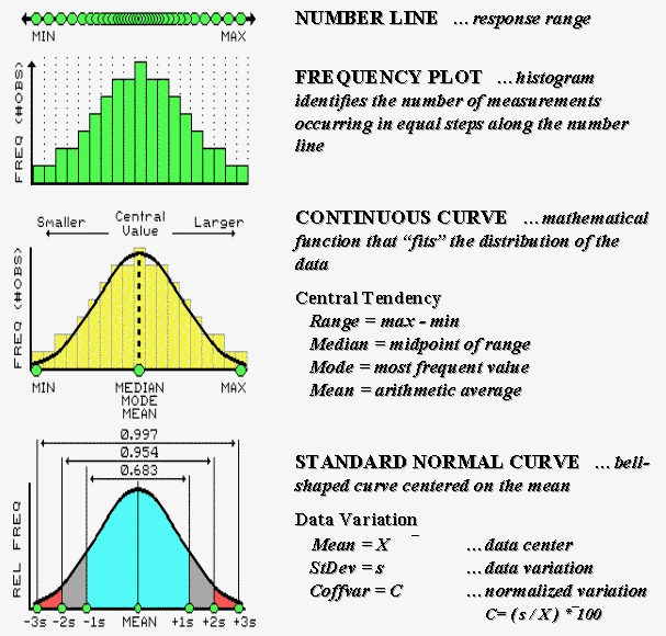
Some of the previous Beyond Mapping articles might have found you reaching for your old Stat 101 textbook. Actually, the concepts used in mapped data analysis are quite simple—it’s the intimidating terminology and "picky, picky" theory that are hard. The most basic concept involves a number line that is like a ruler with tic-marks for numbers from small to large. However, the units aren’t always inches, but data units like number of animals or dollars of sales. If you placed a dot for each data measurement (see top of Figure 27-2a), there would be a minimum value on the left (#animals = 0) extending to a maximum value on the right. The rest of the points would fall on top of each other throughout the data range.
Visualizing Data in Data Space
To visualize these data, we can look at the number line from the side and note where the measurements tend to pile up. If the number line is divided into equally spaced "shoots" (like in pinball machine) the measurements will pile up to form a histogram. Now you can easily see that most of the measurements fell about midrange.
In statistics, several terms are used to describe this plot and its "central tendency." The median identifies the value exactly halfway between the minimum and the maximum, while the mode identifies the most frequently occurring value in the data set. The mean, or average, is a bit trickier as it requires calculation. The total of all the measurements is calculated, then divided by the number of measurements in the data set.
Although the arithmetic is easy (for a tireless computer), its implications are theoretically deep. When you calculate the mean you’re actually fitting a "standard normal curve" to the histogram. The bell-shaped curve is symmetrical with the mean at its center. For the "normally distributed" data shown in the figure, the fit is perfect with exactly half of the data on either side. Also note that the mean, mode and median occur at the same value for this ideal distribution of data.
Now let’s turn our attention to the tough stuff—characterizing the data variation about the mean. When considering variation one must confront the concept of a standard deviation (StDev). The standard deviation describes the dispersion, or spread, of the data around the mean. It’s a consistent measure of the variation, as one standard deviation on either side of the mean "captures" slightly more than two-thirds of the data (.683 of the total area under the curve to be exact). Approximately 95% of all the measurements are included within two standard deviations, and more than 99% are covered by three.
The larger the standard deviation, the more variable is the data, indicating that the mean isn’t very typical. In GIS applications, a small standard deviation tells you there isn’t much variation in an area of interest. However, a large standard deviation indicates a lot of variability and using a simple average to characterize the area is likely misleading.
So what determines whether a standard deviation is large or small? That’s the role of the coefficient of variation (Coffvar). This semantically-challenging mouthful simply "normalizes" the variation in the data by expressing the standard deviation as a percent of the mean—if it’s large, say over 25%, then there is a lot of variation and the mean is a poor estimator of what’s happening in a mapped area. Keep this in mind the next time you assign an average value to map features, such as the average tree diameter for each forest parcel, or the average home value for each county.
Visualizing Data in Geographic Space
A large portion of the variation can be "explained" through its spatial distribution. Figure 27-2b shows a technique that brings statistics down to earth by mapping the standard normal curve in geographic space. The procedure first calculates the mean and standard deviation for the typical response in a data set. The data is then spatially interpolated into a continuous geographic distribution. A standard normal variable surface is derived by subtracting the mean from the map value at each location (deviation from the typical), then dividing by the standard deviation (normalizing to the typical variation) and multiplying by a hundred to form a percent. The result is that every map location gets a number indicating exactly how "typical" it is.
The contour lines draped on the SNV surface in the figure show half-StDev steps. Locations that are exactly the same as the mean equate to zero (typical areas). The high peak in the northeast portion locates an area of unusually high response (>200% of a standard deviation above the mean). The entire western portion of the map is characterized by responses below the typical, however there are no unusually low areas in this case. The geographic distribution balances at zero (just as many locations above the mean as below), but the data distribution is not balanced (no unusually low responses). This condition muddles the standard normal procedure, but that discussion is reserved for techy-types via www.innovativegis.com/basis (select Column Supplements).
|
|
| Figure 27-2a. The distribution of measurements in
"data space" is described by its histogram and summarized by descriptive
statistics. |
Figure 27-2b. A "standard normal
surface" identifies how typical every location is for an area of interest. |