 |
by Joseph K. Berry
Other topics in the Beyond Mapping series of articles include:
BM Intro - An Overview of Basic GIS Terminology and Organizational Structure
Topic #1 - Maps As Data and Data Structure Implications
Topic #2 - Measuring Effective Distance and Connectivity
Topic #3 - Roving Windows: Assessment of Neighborhood Characteristics
Topic #4 - What GIS Is (And Isn't): Spatial Data Mapping, Management, Modeling and More
Topic #5 - Assessing Variability, Shape and Pattern of Map Features
Topic #6 - Overlaying Maps and Characterizing Error Propagation
Topic #7 - Overlaying Maps and Summarizing the Results
Topic #8 - Scoping GIS: What to Consider
Topic #9 - Slope, Distance and Connectivity: Their Algorithms
Topic #10 - Cartographic and Spatial Modeling
BM Epilog - From Where is What, to So What: A Brief History and Probable Future of GIS TechnologySR Intro - Where Is GIS: Driving Forces, Trends and Forecasts
Topic #11 - Understanding GIS: High Technology for Mid-Level Management
Topic #12 - From Field Samples to Mapped Data: Assessing Geographic Distributions
Topic #13 - Implementing GIS: Considerations, Contingencies and Confusion
Topic #14 - Toward An Honest GIS: Practical Approaches to Mapping Uncertainty
Topic #15 - A Framework for Map Analysis: Essential Concepts and Practical Expressions
Topic #16 - Alternative Data Structures: Options Beyond Raster and Vector
Topic #17 - Organizing the Map Analysis Toolbox: Fundamental Components and Considerations
Topic #18 - The Anatomy of a GIS Model: Some Case Studies
Topic #19 - Putting GIS in the Hands of People: Considerations and Components of a Field Unit
Topic #20 - A Futuristic GIS: Some Examples of Advanced Analytical Procedures
SR Epilog - GIS's Wildcard: The Human Factor in GIS TechnologyMA Intro-- GIS Software’s Changing Roles
Topic #21 - Object-Oriented Technology and Its GIS Expressions
Topic #22 - Assessing Interpolation Results through Residual Analysis
Topic #23 - Considerations in Sampling Design
Topic #24 - Where Is GIS Education?
Topic #25 - Analyzing Accumulation Surfaces
Topic #26 - Analyzing In-Store Shopping Patterns
Topic #27 - Linking Data Space and Geographic Space
Topic #28 - Investigating Spatial Dependency
Topic #29 - Analyzing Landscape Patterns
Topic #30 - Applying Data Mining Techniques to Map Analysi
MA Epilog- Technical and Cultural Shifts in the GIS Paradigm
Topics #1 through #10, BM Intro and BM Epilog have been compiled into a book entitled Beyond Mapping: Concepts, Algorithms and Issues in GIS (Berry, 1993). Topics #11 through SR#20, SR Intro and SR Epilog have been compiled into a second book entitled Spatial Reasoning for Effective GIS (Berry, 1995). A third book is in preparation for release in late Fall '99. PC-based software tMAPTM provides hands-on exercises and gCONTM provides digital slide shows on GIS concepts corresponding to the material presented in the column and books. For information on these books and software, contact the publisher, GIS World Books, Adams Business Media, 2101 S. Arlington Heights Road, Suite 150, Arlington Heights, Illinois, USA 60005. Phone 1-800-396-3939, Fax 1-847-427-2037, Web www.GeoMarketPlace.com.
Joseph K. Berry is a leading consultant and educator in the application of GIS technology to resource and environmental management. He is the president of Berry & Associates // Spatial Information Systems, Inc., consultants and software developers in GIS technology, 2000 S. College Avenue, Suite 300, Fort Collins, Colorado, USA 80525. Phone (907) 490-2155, Fax –2300, Email joeb@cnr.colostate.edu.
Visit our Web Site at www.innovativegis.com/basis for more papers and presentations on GIS
_____________________________________________________________
(note: the following three articles by Joseph K. Berry appeared in the Beyond Mapping Column, GIS World Magazine, September through November, 1991)
NEED TO ASK THE RIGHT QUESTIONS..[W]here up so floating, many bells down...
(T.S. Eliot)Is some of this 'Beyond Mapping' discussion a bit dense? Like a T.S. Eliot poem-- full of significance (?) but somewhat confusing for the uninitiated. I am sure many of you have been left musing, "So what? This GIS processing just sound's like a bunch of gibberish to me." You're right. You are a decision-maker, not a technician. The specifics of processing are not beyond you and your familiar map, but such details are best left to the technologist. Or are they?
This concern is the focus of topic 4 where GIS is established as, above all else, a communication device facilitating the discussion and evaluation of different perspectives of actions on our landscape. The most difficult part of GIS is not digitizing, creating databases, or even communicating with the blasted system. Those are technical considerations with technical solutions outlined in the manual. The most difficult part of GIS is asking the right questions. Those questions involve conceptual considerations requiring you to think spatially. That's why you, the GIS user, need to go beyond mapping so you can formulate your complex questions about geographic space in a manner the technology can use. GIS can do a lot of things, but it doesn't know what to do without your help. A prerequisite to this partnership is your responsibility to develop an understanding of what GIS can, and can't do.
With this flourish in mind, let's complete our techy discussion of neighborhood operators (started in topic 3). Recall that these techniques involve summarizing the information found in the general vicinity of each map location. These summaries can characterize the surface configuration (e.g., slope and aspect) or generate a statistic (e.g., total and average values). The neighborhood definition, or roving window, can have a simple geometric shape (e.g, all locations within a quarter of a mile) or a complex shape (all locations within a ten minute drive). Window shape and summary technique define the wealth of neighborhood operators, from simple statistics to spatial derivative and interpolation. So much for review, on to new stuff.
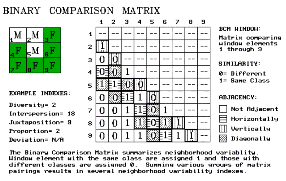
An interesting group of these operators are referred to as filters. Most are simple binary or weighted windows as discussed previously. But one has captivated my imagination since Dennis Murphy of the EROS Data Center introduced me to it late 1970s. He identified a technique for estimating neighborhood variability of nominal-scale data using a binary comparison matrix (BCM). That's mouthful of nomenclature, but it's a fairly simple and extremely useful concept. As we become more aware, variability within a landscape plays a significant role in how we (and our other biotic friends) perceive an area. But how can we assess such an illusive concept in decision terms?
Neighborhood Variability
Neighborhood variability can be described two ways, the complexity of an entire neighborhood and the comparison of conditions within the neighborhood. These concepts can be outlined as follows:
RICHNESS (Number of different classes)
EVENNESS (Frequency of class occurrence)
INTERSPERSION (Spatial arrangement of classes)
PROPORTION (Number of neighbors having the same class as the window center)
DEVIATION (Difference between the window center and the average of its neighbors)
|
Consider the 3x3 window in figure 16.1. Assume "M" is one class of vegetation (or soil or land use) and "F" is another. The simplest summary of neighborhood variability is to say there are two classes. If the window had only one class, you would say there is no variability. If it had nine classes, you would say there is a lot of variability. The number of different classes is called diversity, the broadest measure of neighborhood variability. If there were only one cell of "M" and eight of "F", you would probably say, "Sure the diversity is still two, but there is less variability than the three of "M" versus six of "F" condition. The measure of the frequency of occurrence of each class, termed evenness, is a refinement on the simple diversity count. But doesn't the positioning of the different classes contribute to window variability? It sure does. If the three "M's" were more spread out like a checkerboard, you would probably say there was more variability. The relative positioning of the classes is termed interspersion/juxtaposition.
We're not done yet. Neighborhood variability has another dimension. The measures of diversity, evenness and interspersion/juxtaposition summarize an entire neighborhood's complexity. Another way to view variability is to compare one neighborhood element to its surrounding elements. These measures focus on how different a specific cell is to its surroundings (often termed anomaly detection). For our example, we could calculate the number of neighbors with the same classification as the center element. This technique, termed proportion, is appropriate for nominal, discontinuous mapped data such as vegetation type maps. For gradient data, as with elevation, deviation can be computed by subtracting the average of the neighbors from the center element. The greater the difference, the more unusual the center. The sign of the difference tells you the nature of the anomaly-- unusually bigger (+) or smaller (-).
Quantifying Variability
Whew! That's a lot of detail. And, like T.S.'s poems, it may seem like a lot of gibberish. You just look at landscape and intuitively sense the degree of variability. Yep, you're smart, but the computer is dumb. It has to quantify the concept of variability. So how does it do it? The binary comparison matrix (BMC), of course. First, "binary" means we will only work with 0's and 1's. "Comparison" says we will compare each element in the window with every other element. If they are the same assign a 1. If different, assign a 0. "Matrix" tells us how the data will be organized.
Now let's put it all together. In figure 16.1, the window elements are numbered from one through nine. Is the class for element 1 the same as for element 2? Yes (both are "M"), so assign a 1 at the top of column one in the table. How about elements one and three? Nope, so assign a 0 in the second position of column one. How about one and four? Nope, then assign another 0 and so forth, until all of the columns in the matrix contain a 0 or a 1. But you are already bored. That's the beauty of the computer. It enjoys completing the table. And yet another table for next position as the window moves to the right, and the next, and the next, until it has done it thousands of times, roving the window throughout the map.
So why put your silicon subordinate through all this work? Surely its electrons get enough exercise just reading your e-mail. The work is worth it because the BCM contains the necessary data to quantify variability. It is how your computer sees landscape variability from its digital world. As the computer compares the window elements, it keeps track of the number of different classes it encounters-- diversity= 2. Within the table there are 36 possible comparisons. In our example, we find that 18 of these are similar by summing the entire matrix-- evenness= 18. The relative positioning of classes in the window can be summarized in several ways. Orthogonal adjacency (horizontal and vertical) frequently is used and is computed by summing the highlighted numbers in the table-- interspersion= 9. Diagonally adjacent and non-adjacent variability indexes sum different sets of window elements. Comparison of the center to its neighbors computes the sum for all pairs involving element five-- proportion= 2.
The techy reader is, by now, bursting with ideas of other ways to summarize the table. The rest of you are back to asking, "So what? Why should I care?" You can ignore the mechanics of the computation and still be a good decision maker. But can you ignore the indexes? Sure, if you are willing to visit every hectare of your management area or visually assess every square millimeter of your map. And convince me, your clients and the judge of your exceptional mental capacity for detail. Or you could learn, on your terms, to interpret the computer's packaging of variability. Does the spotted owl prefer higher or lower interspersion values? What about the pine martin? Or Dan Martin, my neighbor? Extracting meaning from T.S. Eliot is a lot work. The same goes for the unfamiliar analytical capabilities, such as the BCM. It's not beyond you. You just need a good reason to take the plunge.
__________________
I
n advance, I apologize to all quantitative geographers and pattern recognition professionals for the 'poetic license' I have invoked in this terse treatise of a technical subject. At the other extreme, those interested in going farther in "topological space" some classic texts are:YOU CAN'T SEE THE FOREST FOR THE TREES
...but on the other hand, you can't see the trees for the forest.
The previous article described how the computer sees landscape variability by computing indices of neighborhood "complexity and comparison." This might have incited your spirited reaction, "That's interesting. But, so what, I can see the variability of landscapes at a glance." That's the point. You see it as an image, the computer must calculate it from mapped data. You and your sickly, gray-toned companion live in different worlds-- inked lines, colors and planimeters for you; and numbers, algorithms and "map-ematics" for your computer. Can such a marriage last? It's like hippo and hummingbird romance-- bound to go flat.
In the image world of your map, your eye jumps around at what IBM futurist Walter Doherty calls "human viewing speed," or the very fast random access of information. The computer, however, is much more methodical. It plods through thousands of serial summaries developed by focusing on each piece of the landscape puzzle. In short, you see the forest; it sees the trees. You couldn't be further apart. Right?
No, it's just the opposite. The match couldn't be better. Both the strategic and the tactical perspectives are needed for complete understanding of maps. Our cognitive analyses have been fine-tuned through years of experience, but they are hard to summarize and fold into on-the-ground decisions. In the past, our numerical analyses have been overly simplifying and tedious. There is just too much information for human serial processing at the "tree" level of detail. That's where the computer's indices of spatial patterns come in. They provide an entirely new view of your landscape, one that requires understanding and interpretation before it can be used for decision-making.
In addition to landscape variability discussed in the previous artcle, the size and shape of individual features affect your impression of spatial patterns. For example, suppose you are a wildlife manager assessing ruffed grouse habitat and population dynamics. The total acreage of suitable habitat is the major determinant of population size. That's a task for the "electronic planimeter" of the GIS toolbox-- cell counts in raster systems and table summaries in most vector systems. But is that enough? Likely not, if you want fat and happy birds.
The shape of each habitat unit plays a part. Within a broad context, shape involves two characteristics, boundary configuration and spatial integrity. Consider the top portion of figure 17.1. Both habitat units are 30 acres. Therefore, they should support the same grouse grouping. Right? But research has shown that the bird prefers lots of forest/opening edges. That's the case on the right; it's boring and regular on the left. But what happens if your map has hundreds individual parcels. Your mind is quickly lost in the "tree" level detail of the "forest."
Boundary Configuration
That's where the computer comes in. The boundary configuration, or "outward contour," of each feature is calculated as a ratio of the perimeter to the area. In planimetric space, the circle has the least amount of perimeter per unit area. Any other shape has more perimeter and, as a result, a different "convexity index." In the few GIS's having this capability, the index uses a "fudge" factor (k) to produce a range of values from 1 to 99. A theoretical zero indicates an infinitely large perimeter around an infinitesimally small area. At the other end, an index of 100 is interpreted as being 100 percent similar to a perfect circle. Values in between define a continuum of boundary regularity. As a GIS user, your challenge is to translate this index into decision terms. "Oh, so the ruffed grouse likes it rough. Then the parcels with convexity indices less than 50 are particularly good, provided they are more than 10 acres, of course." Now you're beyond mapping and actually GISing.
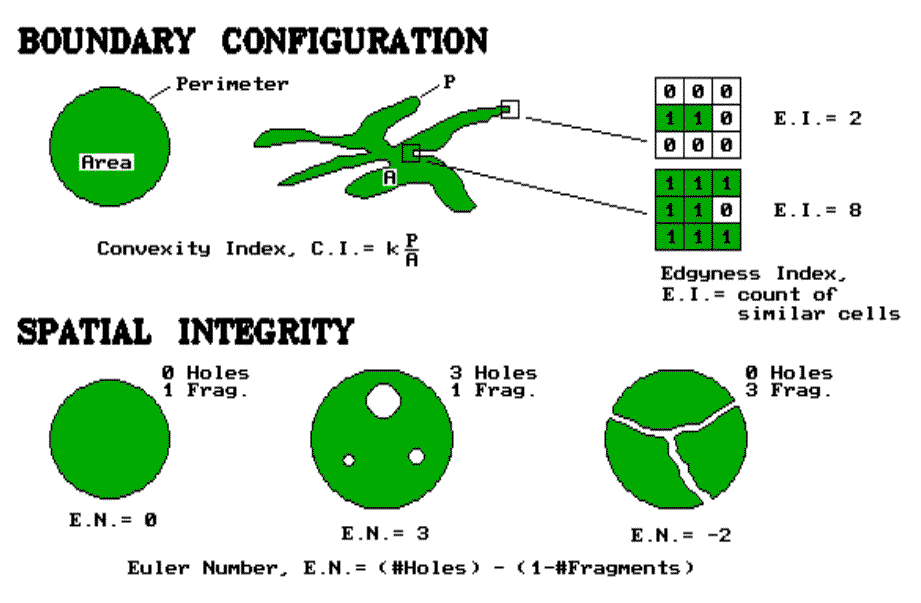 |
But what about the character of the edge as we move along the boundary of habitat parcels? Are some places better than others? Try an "Edgyness" count. It's similar to the Binary Comparison Matrix (BCM) discussed in the previous article. A 3-x-3 analysis window is moved about the edge of a map feature. A "1" is assigned to cells with the same classification as the edge cell; a "0" to those that are different. Two extreme results are shown in figure 17.1. A two count indicates an edge location that's really hanging out there. An eight count is an edge, but it is barely exposed to the outside. Which condition does the grouse prefer? Or an elk? Or the members of the Elks Lodge, for that matter? Maybe the factors of your decision-making don't care. At least it's comforting to know that such edginess can be quantified in a way the computer can "see" it and spatial modelers can use it.
Spatial Integrity
That brings us to our final consideration-- spatial integrity. It involves a count of "holes" and "fragments" associated with map features. If a parcel is just one glob, without holes poked in it, it is said to be intact, or spatially balanced. If holes begin to violate its interior, or it is broken into pieces, the parcel's character changes. Your eye easily assess that. It is said that the spotted owl's eye assesses that with the bird preferring large, uninterrupted old-growth forest canopies. But how about the computer's eye?
In its digital way, the computer counts the number of holes and fragments for the map features you specify. In a raster system, the algorithms performing the task are fairly involved. In a vector system, the topological structure of the data plays a big part in the processing. That's the programmer's concern. Our concern is understanding what it all means and how we might use it.
The simple counts of the number of holes and fragments are useful data. But these data taken alone can be as misleading as total acreage calculations. Their interplay provide additional information, summarized by the Euler number depicted in the figure. This index tracks the balance between the two elements of spatial integrity by computing their difference. If E.N.= 0, the feature is balanced. As you poke more holes in a feature, the index becomes positively unbalanced (large positive values). If you break it into a bunch of pieces, its index becomes negatively unbalanced (large negative values). If you poke it with the same number of holes as you break it into pieces, a feature becomes spatially balanced.
"What? That's gibberish." No, it's actually good information. It can tell you such enduring questions as "Does a Zebra have white stripes on a black background; or black stripes on a white background?" Or, "Is a region best characterized as urban pockets surrounded by a natural landscape, or as natural areas surrounded by urban sprawl?" Or, "As we continue clear-cutting the forest, when do we change the fabric of the landscape from a forest with clear-cut patches, to islands of trees within a clear-cut backdrop?" It's more than simple area calculations of the GIS.
Shape analysis is more than a simple impression you get as you look at a map. It's more than simple tabular descriptions in a map's legend. It's both the "forest" and the "trees," an informational interplay between your reasoning and the computer's calculations.
________________________
As with all Beyond Mapping articles, allow me to apologize in advance for the "poetic license" invoked in this terse treatment of a technical subject. Those interested in further readings having a resource application orientation should consult "Indices of landscape pattern," by O'Niell, et. al., in Landscape Ecology, 1(3):153-162, 1988, or any of the recent papers by Monica Turner, Environmental Sciences Division, Oak Ridge National Laboratory.
DISCOVERING FEATURE PATTERNS
Everything has its place; everything in its place (Granny)
Granny was as insightful as she was practical. Her prodding to get the socks picked up and in the drawer is actually a lesson in basic ecology. The results of dynamic interactions within a complex web of physical and biological factors puts "everything in its place." The obvious outcome of this process is the unique arrangement of land-cover features that seem to be tossed across a landscape. Such a seemingly disorganized arrangement is nurtured by Mother Nature. Its good she met Granny.
The last two articles deal with quantifying spatial arrangements into landscape variability and individual feature shape. Another characteristic your eye senses as you view a landscape is the pattern formed by the collection of individual features. People often use such terms as dispersed or diffused and bunched or clumped to describe the patterns formed on the landscape. However, these terms are useless to our "senseless" computer. It doesn't see the landscape as an image nor has it had the years of practical experience required for such judgement. Terms describing patterns are visceral. You just know these things. Stupid computer; it hasn't a clue. Or has it?
As previously established, the computer "sees" the landscape in an entirely different way-- digitally. Its view isn't a continuum of colors and shadings that form features but an overwhelming pile of numbers. The real difference is that you use "experience" and it uses "computation" to sort through the spatial information.
So how does it analyze a pattern formed by the collection of map features? The computer's view of landscape patterns must be some sort of a mathematical summary of numbers. Over the years, a wealth of indices have been suggested. Most of the measures can be divided into two broad approaches: those summarizing individual feature characteristics and those summarizing spacing among features.
Feature Characteristics
Feature characteristics, such as abundance, size and shape can be summarized for an entire landscape. These landscape statistics provide a glimpse of the overall pattern. Imagine a large, forested area pocketed with clear-cut patches. A simple count of the number of clear-cuts gives you a "first cut" measure of forest fragmentation. An area with hundreds of cuts is likely more fragmented than an equal-sized area with only a few. But it also depends on the size of each cut and, as discussed in in the previous article, the shape of each cut.
Putting size and shape together over an entire area is the basis of fractal geometry. In mathematical terms, the fractal dimension, D, is used to quantify the complexity of the shape of features using a perimeter-area relation, specifically, P ~ A **(D/2), where P is the patch perimeter and A is the patch area. The fractal dimension for an entire area is estimated by regressing the logarithm of patch area on its corresponding log-transformed perimeter. Whew! Imposing mathematical mechanics, but a fairly simple concept; more edge for a given area of patches means things are more complex. To the user, it is sufficient to know that the fractal dimension is simply a useful index. As it gets larger, it indicates an increasing departure from Euclidean geometry. Or, in more humane terms, a large index indicates a more fragmented forest and, quite possibly, more irritable beasts and birds.
Feature Spacing
Feature spacing addresses another aspect of landscape pattern aspect. With a ruler, you can measure the distances from the center of each clear-cut patch to the center of its nearest neighboring patch. The average of all the nearest-neighbor distances characterizes feature spacing for an entire landscape. This is theoretically simple, but both too tedious to implement and too generalized to be useful. It works great on scattering of marbles. But, as patch size and density increase and shapes become more irregular, this measure of feature spacing becomes ineffective. The merging of both area-perimeter characterization and nearest-neighbor spacing into an index provides much better estimates.
For example, a frequently used measure developed in 1950s, uses the following equation: R = 2((p **1/2) * r), where R is dispersion, r is the average nearest-neighbor distance and p is the average patch density (computed as the number of patches per unit area. When R equals 1, a completely random patch arrangement is indicated. A dispersion value less than 1 indicates increasing aggregation; a value of more than 1 indicates a more regular dispersed pattern.
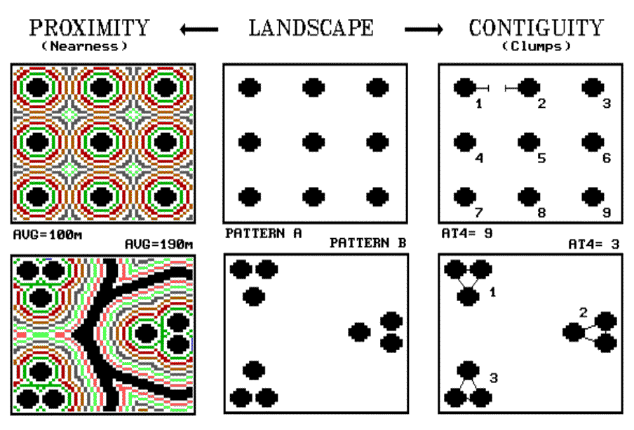 |
All of the equations, however, are based in scaler mathematics and simply use GIS to calculate equation parameters. This is not a step beyond mapping but an automation of current practice. Consider the rigt-hand side of figure 18.1 for a couple of new approaches. The center two plots depict two radically different patterns of "globs," a systematic arrangement (pattern A) on the top and a aggregated one on the bottom (pattern B).
The proximity measure on the left side forms a continuous surface of buffers around each glob. The result is a proximity surface indicating the distance from each map location to its nearest glob. For the systematic pattern A, the average proximity is only 100 meters (five "steps" of 20 meters each), with a maximum distance of 220 meters and a standard deviation of +40 meters. The aggregated pattern B, has a much larger average of 190 meters, with a maximum distance of 500 meters and a much larger standard deviation of +120 meters. Where the broad starts, it is more than 300 meters to the nearest glob, much more than the farthest distance in the systematic pattern. Your eye senses this void; the computer recognizes it as having large proximity values.
The contiguity measure on the right side of the figure takes a different perspective. It looks at how the globs are grouped. It asks the question, "If each glob is allowed to reach out a bit, which ones are so close that they will effectively touch?" If the "reach at" factor is only one "step" of 20 meters, none of the nine individual clumps will be grouped in either pattern A or B. However, if the factor is two, some grouping occurs in pattern B, and the total number of extended clumps are reduced to six. As shown in figure 18.1, an "at" factor of 4 results in just three extended clumps for the aggregated pattern. The systematic pattern is still left with the original nine. Your eye senses the nearness of globs; the computer recognizes this same thing as effective clump numbers.
See? Both you and your computer can see the differences in the patterns. But, the computer sees it in a quantitative fashion with a lot more detail in its summaries. Instead of just a simple average proximity between globs, it can generate a distribution of feature spacing-- 100 percent of pattern A is 11 steps or less away; only 67 percent of pattern B is 11 steps or less away. The computer can describe the distribution of feature spacing as either a cumulative frequency table or a map image-- either quantitatively or geographically.
But there is more. Remember articles in topic 5 that describe effective distance? Not all things align themselves in straight lines 'as-the-crow-flies." Suppose some patches are separated by streams your beast of interest can't cross, or areas with high human activity that they could cross, but prefer not to cross unless they have to. Now, what is the real feature spacing? You don't have a clue. But the proximity and contiguity distributions based on effective distance will tell you what it is really like to move among the features. Without the computer, you must assume your animal moves in the straight line of a ruler and the real-world complexity of landscape patterns can be reduced to a single value. These are bold assumptions that ask little of GIS. To go beyond mapping, GIS asks a great deal of you-- to rethink your assumptions and methodology in light of its new tools.
_____________________
As with all Beyond Mapping articles, allow me to apologize in advance for the "poetic license" invoked in this terse treatment of a technical subject. A good reference on fractal geometry is "Measuring the Fractal Geometry of Landscapes," by Bruce T. Milne, in Applied Mathematics and Computation, 27:67-79 (1988). An excellent practical application of forest fragmentation analysis is "Measuring Forest Landscape Patterns in the Cascade Range of Oregon," by William J. Ripple, et. al., in Biological Conservation, 57:73-88 (1991).