Supplement for Beyond Mapping column, Joseph K. Berry,
April, 1999
Representing Spatial Patterns and
Relationships
In Peter Burrough's book (Principles of Geographical Information
Systems for Land Resource Assessment, 1986; an old standby for GIS'ers) there is particularly appropriate passage on page
139. It points out the Zones/Surfaces
considerations have been with us for decades and GIS'ers
have long used data-based procedures to "test" the validity of
choropleth maps for representing diffuse phenomena...
"The choropleth map (read Zones;
discretely partitioned objects) is the visible result of cutting the data set
(read Surface; continuously mapped data) by a number of horizontal planes, the
positions of which are set by the class boundaries. As Evans (1977) and Jenks
and Caspall (1971) have rightly pointed out, the map
maker has an enormous range of possibilities to choose from in order to produce
the map he thinks is required. Jenks and Caspall
calculated that for a data set of 102 values of gross farm products for the
state of Ohio, 101 different two-class choropleth maps could be
made, 5050 three-class maps, 166,650 four-class, 4,082,925 five-class,
79,208,745 six-class and 12,677,339,920 seven-class maps! These numbers do not
include maps based on the properties of the frequency distribution, such as
means and standard deviations. There is clearly 'an opportunity for the
map-author to select a map which suits a known or unknown bias' (Jenks and Caspall 1971, p. 222); 'a skilled cartographer can
manipulate his map like a musician does his instrument, bringing out the
quality he wants' (Schultz 1961).
"Many thematic maps are used as data sources for geographical information
systems; they are not just the products of data analysis and classification.
The knowledge that these maps can be so easily manipulated must warn us about
the dangers of attempting to do cleaver manipulations with pre-digested data. It is always best where possible
to enter the original data into a GIS, or at least to reject all sources of
classified data that are not supported by reliable information about
within-class means and deviations."
In fact, this issue is a dominant
theme in "How to Lie with Maps," by Mark Monmonier,
________________________________
ZONES AND SURFACES (Part 1)
Site-specific farming involves “carving” a field into
smaller pieces that better represent the unique conditions and patterns
occurring in the field. Two fundamental
approaches are used: management zones and map surfaces (see figure 1). Management zones use a
farmer’s knowledge, air photos, terrain features, yield maps or other factors
to identify discrete areas
that
are
considered homogeneous. Sampling, analysis and management decisions are
undertaken for each distinct zone—as if they were separate, mini-fields.
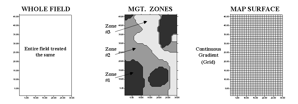
Figure
1. Comparison
of approaches to subdivide the field.
Map surfaces, on the
other hand, treat a field as a continuous surface by partitioning it into thousands of grid cells
that track gradual transitions throughout the field. The resulting grid spaces represent tiny
snippets of the field and information is assigned to each, thereby tracking the
pattern of variation.
Both approaches have their advantages, and
disadvantages—management zones are intuitive, require minimal data collection and
are less expensive to implement. Map
surfaces, on the other hand, are not constrained to artificially abrupt
boundaries, better describe field variability and have greater analysis
capabilities. “Like all things GIS,” an
understanding of the nature of the data and the assumptions underlying the
approaches provide insight into their differences.
Figure 2. Comparison of soil data maps generated by the different approaches.
Consider the maps of P, K and pH shown in figure 2.*The Whole Field representations
are characterized as three horizontal planes “floating” at their average
values—the same throughout the entire field.
The Management
Zones approach depicts a “plateau” for each of the three zones determined by
their averages—the same throughout each zone.
Note that Zone 3 shows lower P and K (42 and 384), but higher pH (6.8)
than the whole field averages (48, 419 and 6.5, respectively).
Now consider the Map Surfaces that were interpolated from the
same soil samples used by the other two approaches. In a sense, the approach “maps the variance”
in the data instead of assigning its average is everywhere. The maps characterize the field as a
gradient—constantly varying. Note the
large phosphorous peak in the NE portion of the field (maximum = 140) and the
low values in the SE (minimum = 22). The
other surfaces also locate areas that are well above and below the Whole Field and Management Zones averages.
Table 1. Statistical Summary of
Approaches to Subdivide the Field.
|
|
WHOLE
FIELD |
MGT.
ZONES |
MAP
SURFACE |
|
Phosphorous (P) |
Avg.= 48 Coffvar= 39% |
Z1 Avg.= 55 Coffvar=
47% ß Z2 Avg.= 46 Coffvar= 24% Z3 Avg.= 42 Coffvar= 31% |
Z1 Min.= 29 Max.= 150 Z2 Min.= 27 Max = 80 Z3 Min.= 22 Max= 74 |
|
Potassium
(K) |
Avg.= 419 Coffvar= 33% |
Z1 Avg.= 457
Coffvar= 23% Z2 Avg.= 419
Coffvar= 35%
ß Z3 Avg.= 384
Coffvar= 39%
ß |
Z1 Min.= 295
Max = 625 Z2 Min.= 261
Max = 727 Z3 Min.= 194
Max = 785 |
|
Acidity (Ph) |
Avg.= 6.5 Coffvar= 9% |
Z1 Avg.= 6.4 Coffvar=
11% ß Z2 Avg.= 6.5 Coffvar= 8% Z3 Avg.= 6.8 Coffvar= 8% |
Z1 Min.= 5.5 Max = 7.7 Z2 Min.= 5.7 Max = 7.2 Z3 Min.= 6.0 Max = 7.7 |
The differences among the approaches also show up in statistical
summaries (see Table 1). Recall that the
coefficient of variation (Coffvar) is a frequently used measure that indicates the
amount of variation in a set of data—with greater numbers indicating more
variation. The Whole Field Coffvar’s tell us that, throughout the field, there is a
fair amount of variation in the P and K values (39% and 33%), but not much for
pH (9%). Since the Management Zones approach
breaks the field into smaller units that are assumed to be more homogenous, it
is expected that the Coffvar’s for the zones would be
less than those of the Whole Field.
In most cases they are, but the exceptions (identified by
arrows in the table) are interesting.
They identify zones where the subdividing isn’t very good and the averages
of the zones are misleading. Note that
the data ranges (minimum to maximum value as depicted by the Map Surfaces) are very
large for these zones. For example, zone
1 with a coffvar of 47% has phosphorous values
ranging from 29 to 150 (a five-fold difference). Similarly, the pH range (5.5 to 7.7) for the
zone is fairly large. The real problem
arises when non-typical conditions align in space, such as the NE corner in
zone 1. As both the Whole Field and Management Zones
approaches assume the “typical” (average) is everywhere, they miss the combined
effects of subtle (and not so subtle) differences from the averages contained
in the Map
Surfaces. The result could be
significant differences in a prescription for variable rate application of
fertilizer. While Management Zones is a
start toward precision farming and site-specific management, it can fall a fair
distance short—it’s all in the data and its spatial coincidence.
__________________
*This data is described in Inside the GIS Toolbox columns for September and October, 1997. Excel worksheets supporting this column can be downloaded for the “Column Supplements” page at www.innovativegis.com /basis.
ZONES AND SURFACES (Part 2)
Last month discussed the similarities and differences in the
characterization of field data by Management Zones and Map Surfaces. Recall that both approaches “carve” a field
into smaller pieces to better represent the unique conditions and patterns
occurring in the field. Zones partition
it into relatively large, irregular areas that are assumed to be
homogenous. Field samples (e.g., soil
samples) are extracted and the average for each factor is assigned to the
entire zone—discrete polygons. Surfaces,
on the other hand, interpolate field samples for an estimate of each factor at
each grid cell in a uniform analysis grid—continuous gradient.
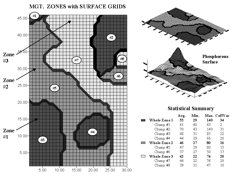
Figure 1. Comparison of Management Zones and Map Surface representations of phosphorous levels in a field.
The
left side of the accompanying figure shows an overlay of surface grids and
management zones for the field discussed last month. Note that the three management zones are
divided into eight individual clumps—four for zone 1 and two for zones 2 and
3.
The map surface for the same area is composed of 1,380 grid cells configured as an analysis grid of 46 rows by 30 columns. Each zone contains numerous grid cells—from Clump #1 with only 11 cells to Clump #5 with nearly 800. While a single value is assigned to all of the clumps comprising a zone, each grid cell is assigned a value that best represents the field data collected in its vicinity. The subtle (and not so subtle) differences within zones and their individual clumps are contained within the grid values defining the continuous map surface.
The right side of the figure summarizes these differences. The maps at the top show the alignment of the Management Zones with the Map Surface. Note the big “bump” on the surface occurring in Clump #2 (northeast corner) of Zone 1 (darkest tone). Note the big “hole” next to it at the top of Clump #7 of Zone 3 and the “wavy” pattern throughout the rest of the clump. Although these and less obvious surface variations are lost in the zone averages, the zones and surface patterns have some things in common—Zone 1 tends to coincide with the higher portions of the surface, Zone 2 a bit lower and Zone 3 the lowest.
Now consider the summary table. The average for Zone 1 (all four clumps) is 55, but there’s a fair amount of variation in the grid values defining the same area—ranging from 29 to 140. Its coefficient of variation (Coffvar) of 34% warns us that the zone average isn’t very typical. The bumpiness of the dark toned areas on the surface visually confirms the same thing. Note that of all the clumps, Clump #2 has the largest internal variation (values from 43 to 140, Coffvar of 31% and the largest bump). Clump #1 has the least internal variation (values from 40 to 43, Coffvar of only 2% and nearly flat). A similar review of the tabular statistics and surface plot for the other whole zones and individual clumps highlight the differences between the two approaches.
Site-specific management assumes reliable characterization of the spatial variation in a field. Whereas Management Zones may account for more variation than Whole Field averages, the approach fails to map the variation within the zones. Next time we will investigate the significance of this limitation.
__________________
Note: similar analyses for the potassium (K) and acidity (pH) data discussed in last month’s column is available for downloading as a Word97 file from the “Column Supplements” page at www.innovativegis.com /basis.
ZONES AND SURFACES (Part 3)
While
much of the information in a GIS is discrete, such as the infrastructure of
roads, buildings, and power lines, the focus of many applications, including
precision farming, extend to decision factors that widely vary throughout
geographic space. As a result, surface
modeling plays a dominant role in site-specific management of such
geographically diffuse conditions.
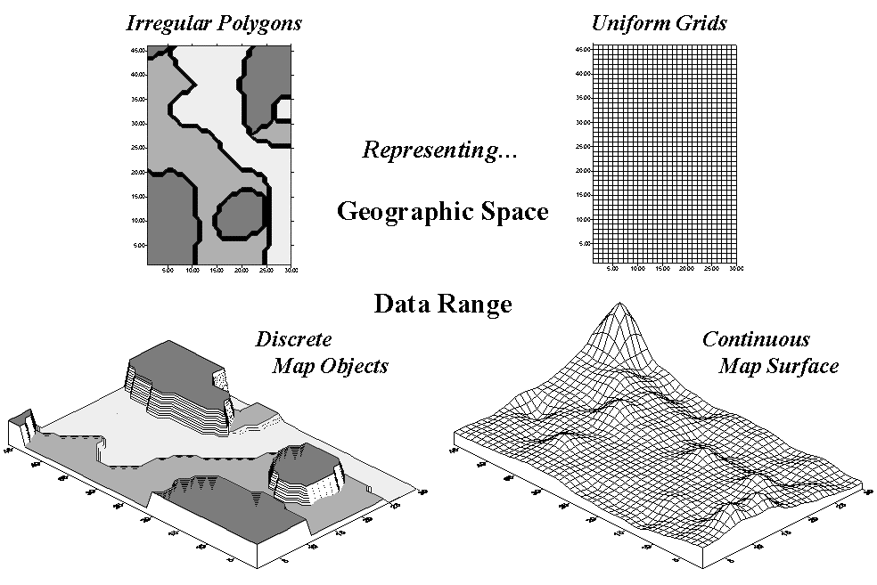
Figure 1. Comparison of zone
(polygon) and surface (grid) representations for a continuous variable.
Map surfaces, also termed spatial gradients, are characterized by grid-based data structures. In forming a surface, the traditional geographic representation based on irregular polygons is replaced by a highly resolved matrix of grid cells superimposed over an area (top portion of Figure 1).
The data range representation for the two approaches are radically different. Consider the alternatives for characterizing phosphorous levels throughout a field. Zone management, uses air photos and a farmer’s knowledge to subdivide the field into similar areas (gray levels depicted on the left side of Figure 1). Soil samples are randomly collected in the areas and the average phosphorous level is assigned to each zone. A complete set of soil averages is used to develop a fertilization program for each zone in the field.
Site-specific management, on the other hand, systematically samples the field and interpolates these data for a continuous map surface (right side of Figure 1). First, note the similarities between the two representations— the generalized levels (data range) for the zones correspond fairly well with the map surface levels with the darkest zone generally aligning with higher surface values, while the lightest zone generally corresponds to lower levels.
Now consider the differences between the two representations. Note that the zone approach assumes a constant level (horizontal plane) of phosphorous throughout each zone—Zone#1 (darkgray)= 55, Zone#2= 46 and Zone#3 (lightgray)= 42— while the map surface shows a gradient of change across the entire field that varies from 22 to 140. Two important pieces of information are lost in the zone approach— the extreme high/low values and the geographic distribution of the variation. This “missing” information severely limits the potential for further analysis of the zone data.
The
loss in spatial specificity for a map variable by generalizing it into zones
can be significant. However, the real
kicker comes when you attempt to analyze the coincidence among maps. Figure 2 shows three geo-referenced surfaces
for the field— phosphorous, potassium and acidity (PH). The pins depict four of the 1380 possible
combinations of data for the field. By
contrast, the zonal representation has only three possible combinations, since
it has just three distinct zones with averages attached.
The
assumption of the zone approach is that the coincidence of the averages
is consistent throughout the field. If there
is a lot of spatial dependency among the variables and the zones happen to
align with actual patterns in the data, this assumption holds. However in reality, good alignment for all of
the variables is not always the case.
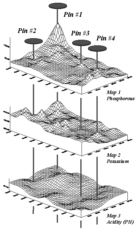
Figure 2. Geo-referenced map
surfaces provide information about the unique combinations of data values
occurring throughout an area.
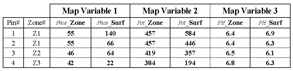
Table 1. Comparison
of zone and surface data for selected locations.
Consider
the “shishkebab” of data values for the four pins shown in Table 1. The first two pins are in Zone #1 so the
assumption is that the levels of phosphorous= 55, potassium= 457 and PH= 6.4
are the same for both pin locations (as they are for all locations within Zone
#1). But the surface data for Pin #1
indicates a sizable difference from the averages—150% ([[140-55]/55]*100) for
phosphorous, 28% for potassium and 8% for PH.
The differences are less for Pin #2 with 20%, 2% and –2%,
respectively. Pins #3 and #4 are in
different zones, but similar deviations from the averages are noted, with the
greatest differences in phosphorous levels and the least in PH levels. It follows that different fields likely have
different “alignments” between the zones and surfaces—some good and some bad.
The pragmatic arguments of minimal sampling costs and conceptual
simplicity, however, favor zone management, provided the objective is to forego
site-specific management and "carve" a field into presumed
homogenous, bite-sized pieces. One can
argue that even an arbitrary sub-division of a field often can lower the
variance in each section— at least if the driving variables aren't uniformly or
randomly distributed across the field (i.e., no spatial autocorrelation).
Most field boundaries are expressions of ownership and historical
farm practices. The appeal of
sub-dividing these arguably arbitrary parcels into more management-based units
is compelling, particularly if the
parsing results in significantly lower sampling costs.
However, site-specific management is more than simply breaking a
field into smaller, more intuitive zones.
It is deriving relationships among agronomic variables and farm
inputs/actions that are unique to a field.
An important limitation of zone management is that it assumes ideal
stratification of a field at the onset of data collection, analysis and
determining appropriate action— in scientific-speak, "spatially
biasing" the process.
Since the discrete zones are assumed homogenous at the onset,
tests of that assumption and any further spatial analysis is usurped. What if the intuitive zones don't align with
the actual soil fertility levels currently in the soil? Does it make sense to manage fertility levels
within intuitive zones that are primarily determined by water management,
variety response, localized disease/insect pockets or other processes? Would two different consultant/farmer teams
draw the same lines for a given field?
Or for that matter, would an aerial photo taken a couple of days after a
storm show the same bare-soil patterns as one taken several weeks after the
last rainfall? Do zones derived by
electrical conductivity mapping align with aerial photo based ones? What might cause the differences in zone maps
generated by the two approaches and which one more closely aligns with the
actual variation in soil nutrient levels?
What is the appropriate minimum mapping unit (smallest
"circled" area) for a zone?
What is the appropriate number of zones (low... medium... high)? Is the low productivity in a slight
depression due to variety intolerance, disease susceptibility, or
fertility? What about the yield
inconsistencies on the hummocks?
Zone management is unable to address any of these questions as it
fails to collect the necessary spatial data— although zone sampling is
inexpensive, a simple average assigned to each zone fails to leave a foothold
for assessing how well the technique is tracking the actual patterns in a
field. Nor does it provide any insights
into the unique and spatially complex character of most fields.
In addition, management actions (e.g., fertilization program) are
developed using generalized relationships (largely based on research developed
years ago at an experiment station miles away) and applied uniformly over each
zone regardless of the amount or pattern of its variance in soil samples. What if crop variety responds differently on
the subtly (and not so subtle) differences between the research field and the
actual field? What if there are fairly
significant differences in micro topography between the fields? What about the pattern and extent of soil
texture differences? Are seeding rates
and cultivation practices the same?
Zone management follows in the tradition of the whole-field
approach— sort of a “whole-zone” approach.
It’s likely a step in the right direction, but how far? And do the assumptions apply in all
cases? How much of a field’s reality
(spatial variability) is lost in averaging?
There is likely a myriad of interrelated "zones" within a
field (water, microclimate, terrain, subsurface flows, soil texture,
microorganisms, fertility, etc.) depending on what variable is under
consideration. The assumption that there
is a single distinct and easily drawn set of polygons that explain crop
response doesn't always square with GIS or agronomic logic.
Current zoning practices contain both art and science. Like herbal cures, zone management holds
significant promise, but needs to be validated and perfected. Simply justifying the approach as a remedy to
the "high cost of entry" to precision farming without establishing
its scientific underpinnings could make it a low-cost snake-oil elixir in
high-tech trappings. The advice of the Great and
All-powerful Oz might hold— “Pay no attention to the man behind the curtain”
…at least until minimal data analysis proves the assumptions hold on your
farm.
________________
Note: got any thoughts on the merits and demerits of the zone and site-specific approaches to precision farming? If they are “fit to print,” join the Precision @griculture discussion group at www.agriculture.com/technology.