Applying MapCalc Map Analysis Software
Visualizing Yield Data: A crop consultant needs to generate maps
of crop yield that are more effective in conveying yield patterns throughout a
field. Most mapping programs simply display
2-D contour maps that are automatically themed into a few discrete color
zones. The method used in contouring the
continuous yield data collected in the field greatly biases the perceived
patterns.
<click here> for a
printer friendly version (.pdf)
Base Maps. The Base Maps needed include:
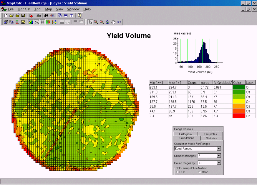
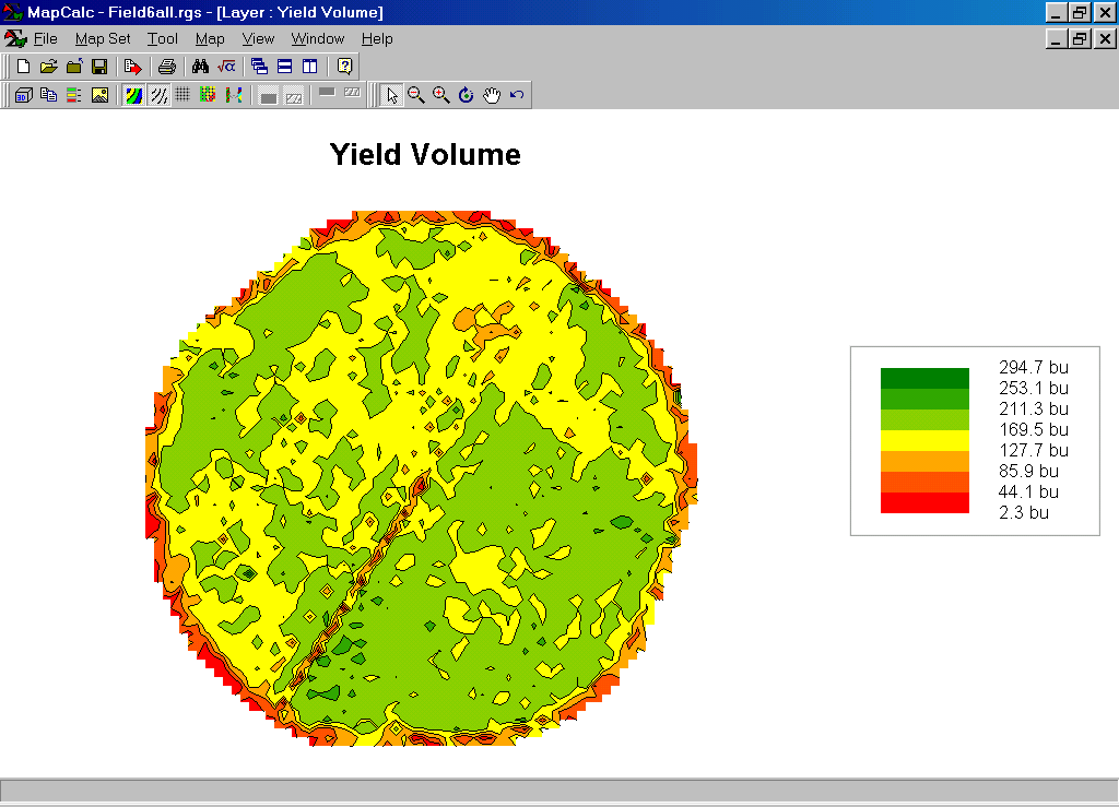 Yield Map (2D Contour Display). The contour map shows seven levels (color
zones) of yield. In constructing the
map, a yield surface was generated using a grid with 66 rows by 64 columns
(cells 50 feet on a side). Yield data
was collected about every six-feet, therefore each
grid space has nearly ten sample points.
Yield Map (2D Contour Display). The contour map shows seven levels (color
zones) of yield. In constructing the
map, a yield surface was generated using a grid with 66 rows by 64 columns
(cells 50 feet on a side). Yield data
was collected about every six-feet, therefore each
grid space has nearly ten sample points.
Step 1. Traditional, non-spatial statistics and plots summarize a yield map…
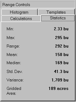 A statistical summary shows that yield varies
from 2.33bu to 295bu per acre. The
average yield was 158bu with a fairly large variation (standard deviation=
41.3bu).
A statistical summary shows that yield varies
from 2.33bu to 295bu per acre. The
average yield was 158bu with a fairly large variation (standard deviation=
41.3bu).
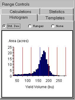 A histogram of the data shows that it is
skewed. The mean (or average; blue line)
would be in the middle of the curve with both sides equally balanced if the
data were “normally distributed.” While
most of the field produced above 155 bushels, a large portion produced well
below this level.
A histogram of the data shows that it is
skewed. The mean (or average; blue line)
would be in the middle of the curve with both sides equally balanced if the
data were “normally distributed.” While
most of the field produced above 155 bushels, a large portion produced well
below this level.
Step 2. General statistics and a histogram (numeric distribution) summarize the data without any regard to its geographic patterns (spatial distribution). The objective of yield mapping, on the other hand, is to effectively convey the spatial patterns contained in the data. Using MapCalc’s “Shading Manager” tool…
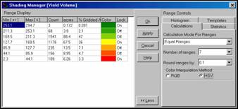 Shading Manager Dialog Box.
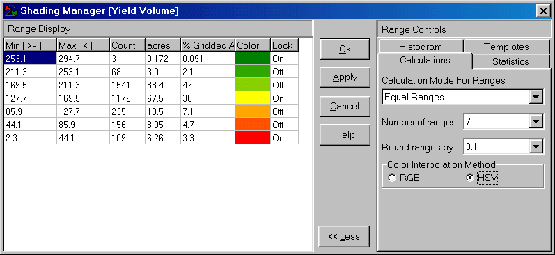
…enables users to display a variety of contour maps.
Changing the method used to calculate the intervals radically changes the appearance of the map…
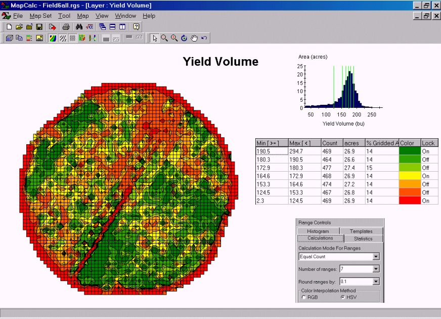 Equal Count of 7
intervals. This display
uses the “equal count” method for defining the intervals. Each interval contains approximately the same
number of cells (about 470 of the 3,288 cells with yield values). Note the positioning of the seven intervals
in the histogram— large interval spread over data ranges with few map
occurrences; small interval steps for data ranges with many occurrences (around
histogram peak).
Equal Count of 7
intervals. This display
uses the “equal count” method for defining the intervals. Each interval contains approximately the same
number of cells (about 470 of the 3,288 cells with yield values). Note the positioning of the seven intervals
in the histogram— large interval spread over data ranges with few map
occurrences; small interval steps for data ranges with many occurrences (around
histogram peak).
Step 3. An alternative way to view the yield data is as a 3-D surface with color zones draped over it…
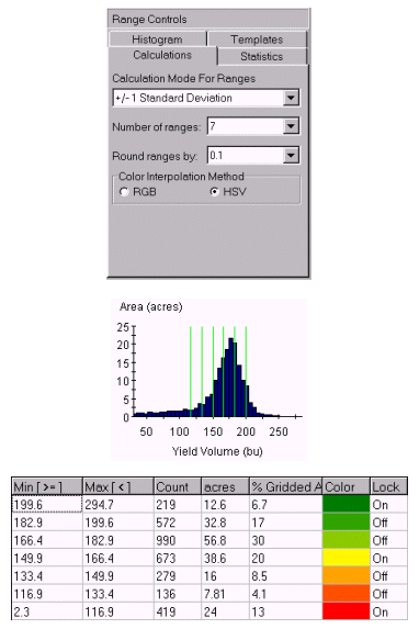
Wireframe Display of Yield Surface with Standard Deviation Intervals. The accompanying display was generated by pressing the “Toggle 3-D View” button on the main tool bar. It shows the color zones superimposed on a 3-D surface map of the yield data. The plot can be easily sized and rotated using a mouse. Note the positioning of the seven intervals in the histogram— this time each interval is based on the standard deviation of the data and centered on the average value.
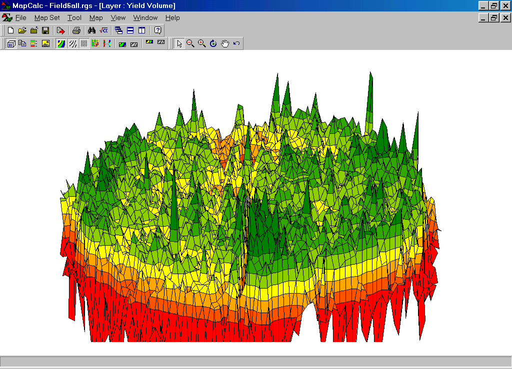
The “Use Cells” button on the main tool bar renders a different 3-D view…
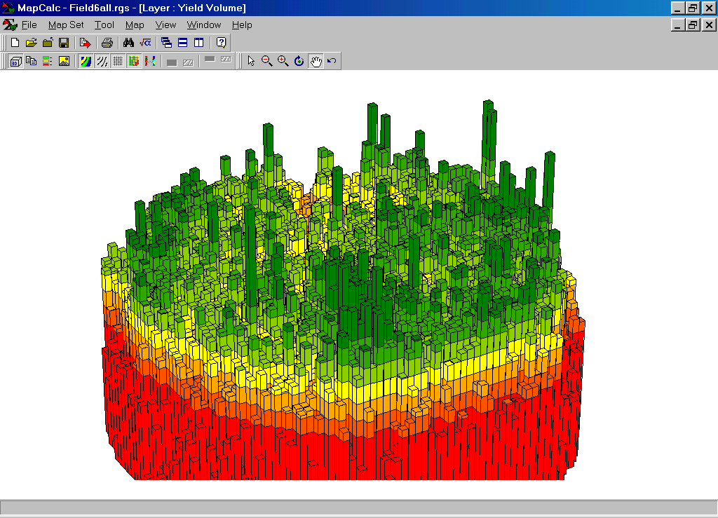
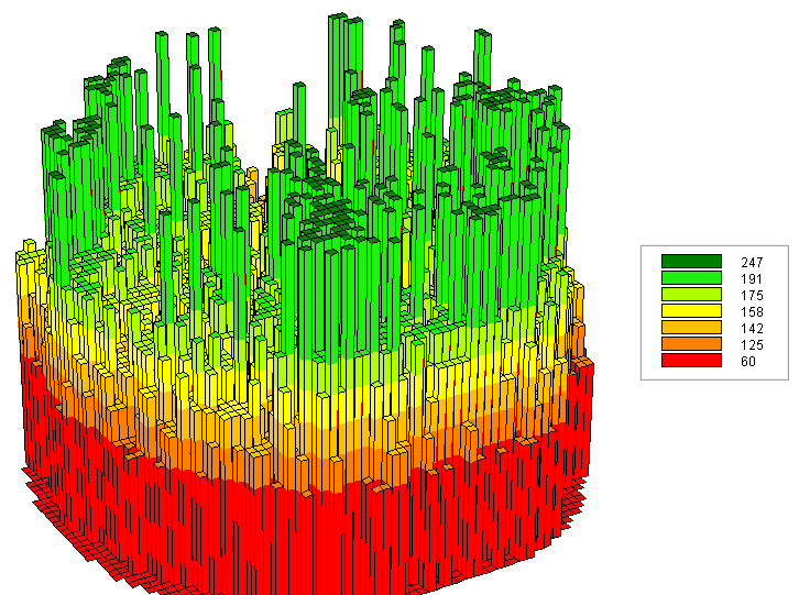
Extruded Grid of Yield Surface with Standard Deviation Intervals. This view “pushes” each grid cell to a level equaling its yield value. The color indicates its contour interval. Its height visually portrays its precise yield. Note that there is a lot of variation within each of the intervals that cannot be shown in a contour map. The accompanying map shows the contour map in 3-D. Note that the actual variation within each contour interval is lost—each interval is assumed to have the average value (one color “plateau” for each). For example, contour interval #1 ranges from 2.3 to 116.9bu, but is “painted” one color implying that 59.6bu is everywhere within the contour feature. In effect, the assumption pulls up many grid cells within an interval from their field-measured values, but pulls down others.
Step 4. While the underlying yield data does not change, a wide variety of map displays can be generated. A MapCalc user can make several alternative displays then chose the one they feel best shows the spatial patterns in the data…
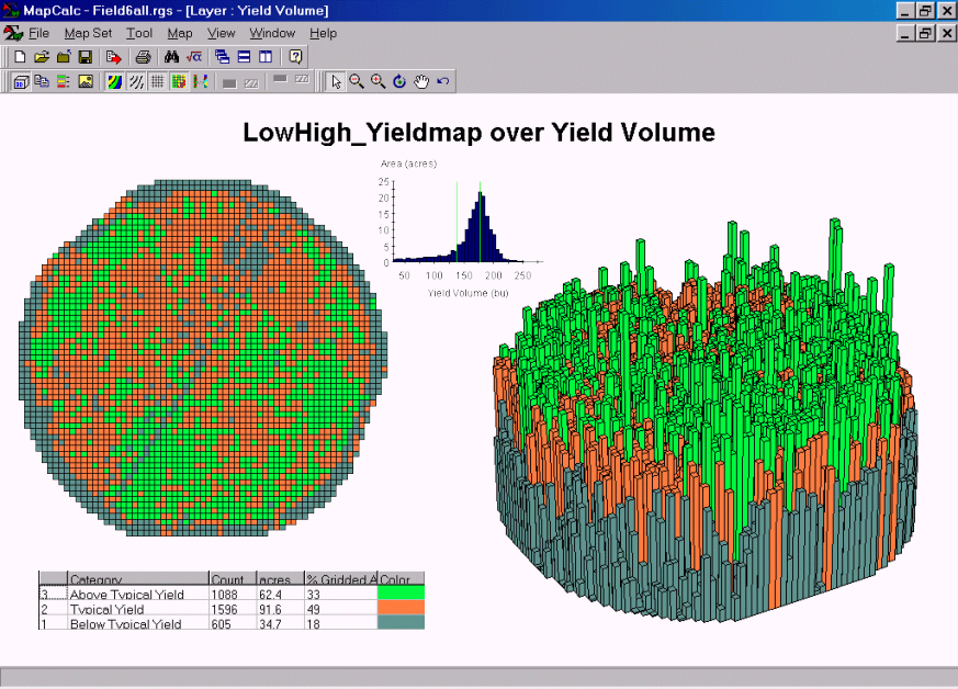
Composite Display of Yield Variability. This plot shows the histogram of the data, 2-D Grid display, 3-D Extruded grid display and the assignment colors and statistics for a 3 interval classification.
Summary. Visualizing yield data requires flexible and comprehensive display tools. Simple 2-D contour maps generalize the detailed data from in yield monitors. Within a contour interval, all of the information on the spatial variation is lost. The choice of breakpoints for the intervals can draw radically different maps. Surface maps (Wireframe and Extruded Grid) show all of the information and accurately portray spatial patterns, but are unfamiliar and appear overly complex. By combining both 2-D and 3-D displays with statistical tables and charts, the “best” presentation can be achieved.