Applying MapCalc Map Analysis Software
Comparing Map Surfaces: A farmer wants to compare this year’s corn
yield with last year’s and identify areas in the field with large
differences. Information on areas of large
differences will help in planning next year’s planting and fertilization
programs.
<click
here> for a printer friendly
version (.pdf)
Processing Flow.
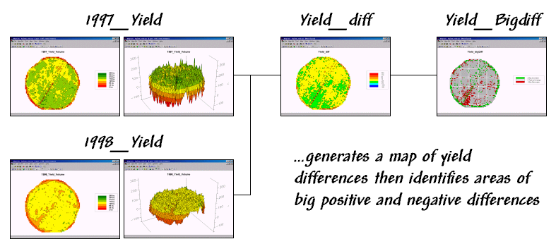
Base Maps. The Base Maps needed include:
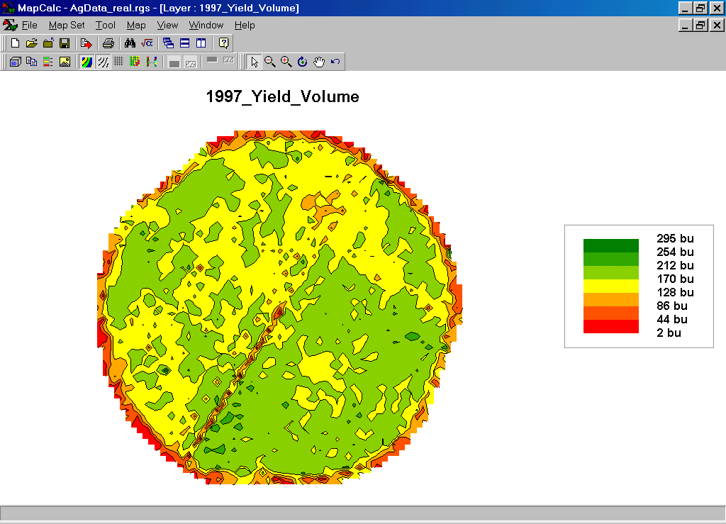
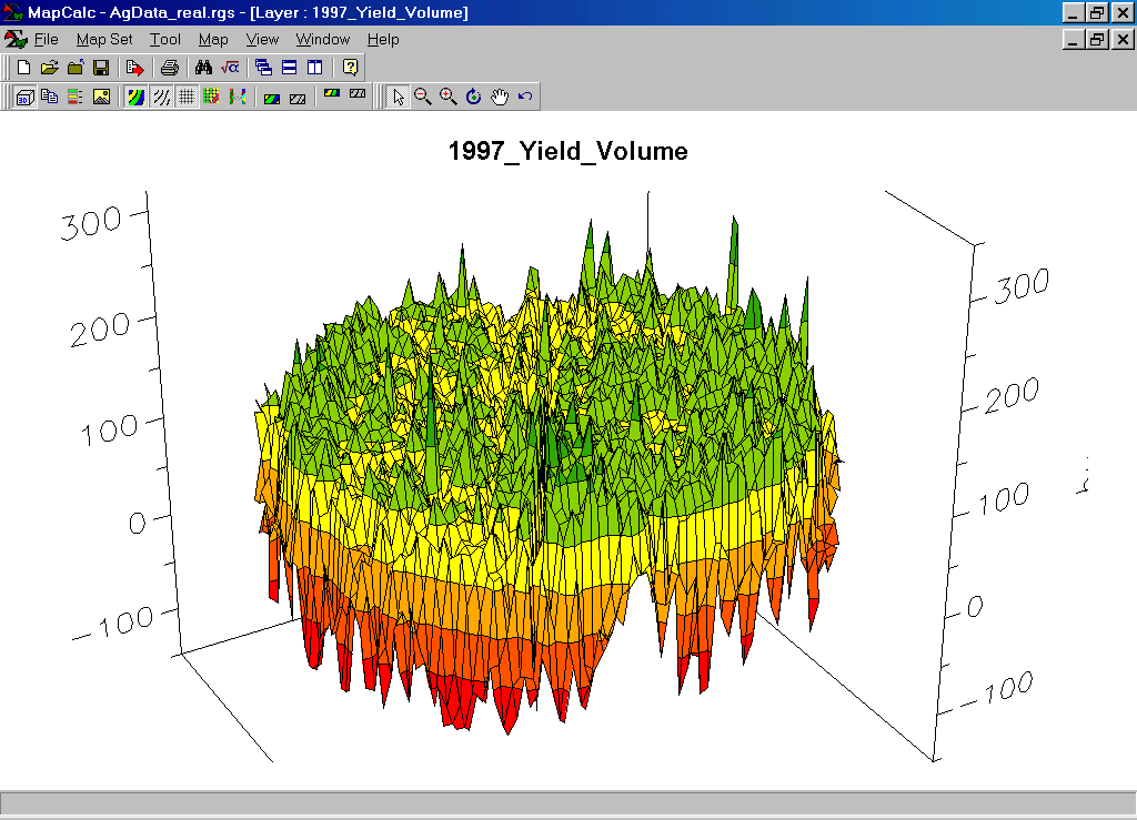
1997_Yield Map.
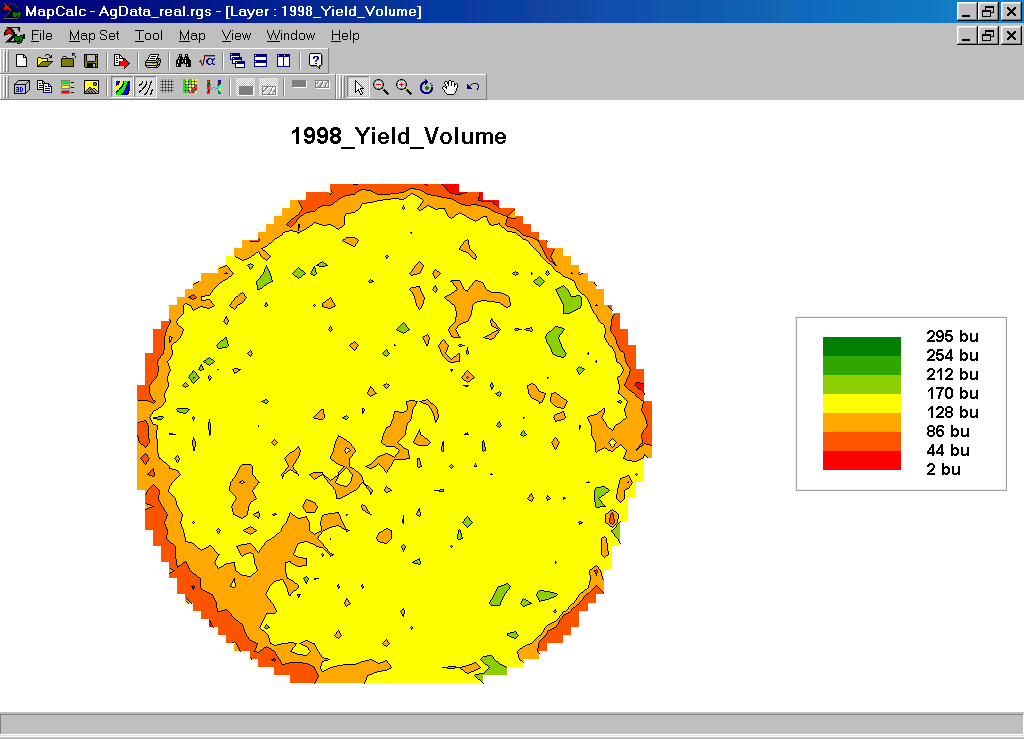
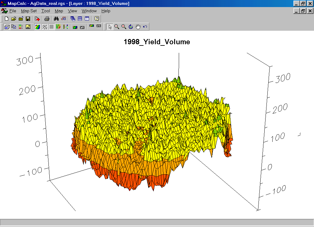
1998_Yield Map. The 2D and 3D map displays use common theme classification (color pallet) and vertical scaling. Note the dramatic smaller yields in 1998.
Step 1. The MapCalc operation…
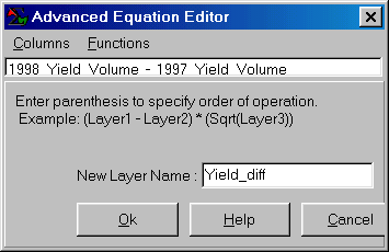 1998_Yield_Volume – 1997_Yield_Volume.
…generates a map of the difference between the 1998 and 1997 corn yields.
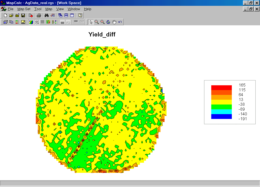
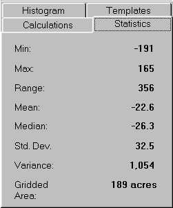
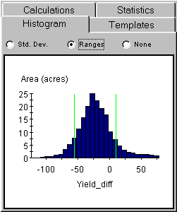
Yield_diff Map. The map and statistics show that the 1998 yield was much smaller than the 1997 yield. On the average, there was a –22.6 bu/ac decrease with the larger decreases concentrated in the southwest portion of the field (green and blue). The large increases (red) scattered along the edge of the field and along the access road in the southwest likely are an artifact of inconsistent yield measurement.
Step 1. The MapCalc operation…
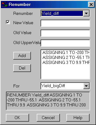 RENUMBER Yield_diff ASSIGNING 1 TO -200
THRU -55.1 ASSIGNING 2 TO -55.1 THRU
9.9 ASSIGNING 3 TO 9.9 THRU 200 FOR Yield_bigDiff.
RENUMBER Yield_diff ASSIGNING 1 TO -200
THRU -55.1 ASSIGNING 2 TO -55.1 THRU
9.9 ASSIGNING 3 TO 9.9 THRU 200 FOR Yield_bigDiff.
…creates a map that isolates the areas of big differences in yield between the two years. The “cutoff values” were derived by subtracting the standard deviation from the mean (-22.6 – 32.5 = -55.1) to identify areas of unusually large decreases and adding the standard deviation to the mean (-22.6 + 32.5= 9.9) to identify areas of unusually large increases. The cutoff values are plotted as the green lines in the histogram (see previous section).
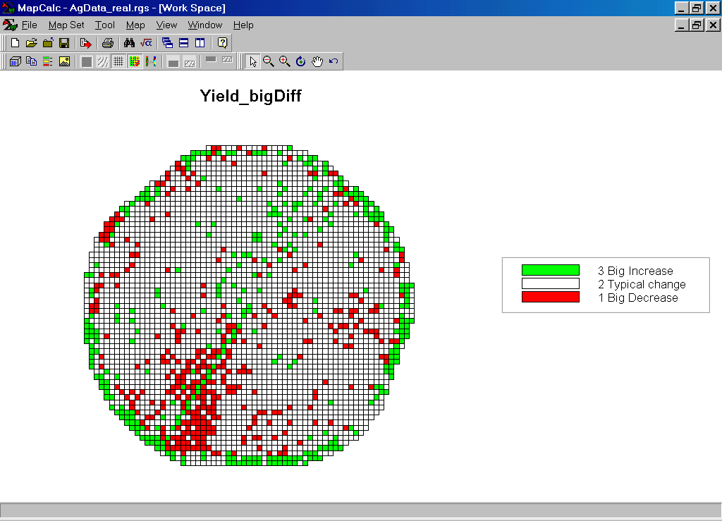 Yield_bigDiff Map. The scattered spatial pattern of the
relatively big changes suggests that there isn’t a geographic explanation for the
differences in yield between the two years.
Actually, the dramatic drop in yield was due to a hailstorm that passed
over the entire field.
Yield_bigDiff Map. The scattered spatial pattern of the
relatively big changes suggests that there isn’t a geographic explanation for the
differences in yield between the two years.
Actually, the dramatic drop in yield was due to a hailstorm that passed
over the entire field.
Summary. Simple “grid math” was used to map the difference in yield for a field between two years. Areas of “statistically large differences” are easily isolated on the difference map. The map of yield differences and the identification of areas with relatively large change provides a farmer with an important perspective of crop dynamics. The procedure is not application-specific (just for farmers) but can be useful for a variety of users— e.g., an environmental manager who wants to compare this month’s air pollution surface with last month’s and identify areas with large differences.