Applying MapCalc Map Analysis Software
Using MapCalc’s Shading
Manager for Displaying Continuous Maps:
The display of continuous data, such as elevation, is fundamental to
a grid-based map analysis package. Understanding
the interaction between the data distribution and different display options is
critical to generating effective map presentation.
<click here> for a
printer friendly version (.pdf)
Summary of MapCalc Shading Results.
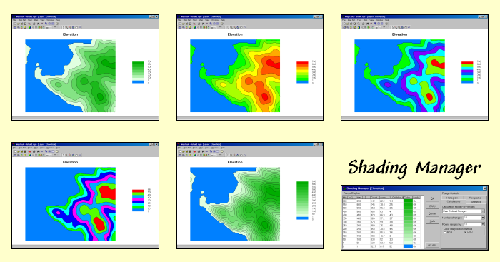
Assigning Colors and Contour Intervals. All grid-based data (also referred to as “raster” data) is represented as a matrix of numbers. Continuous maps contain values that form a continuum in both numeric and geographical space, such as an elevation map, temperature gradient or sales density surface. The range of values on the map is divided into contour intervals and colors are assigned to each interval. MapCalc’s Shading Manager is used for making these assignments.
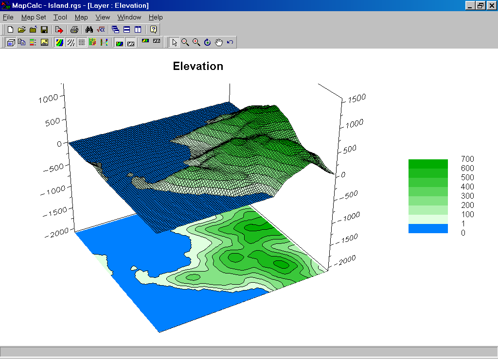
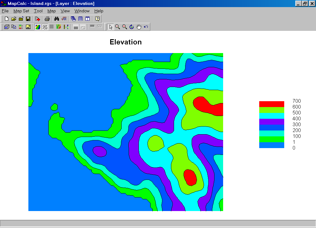
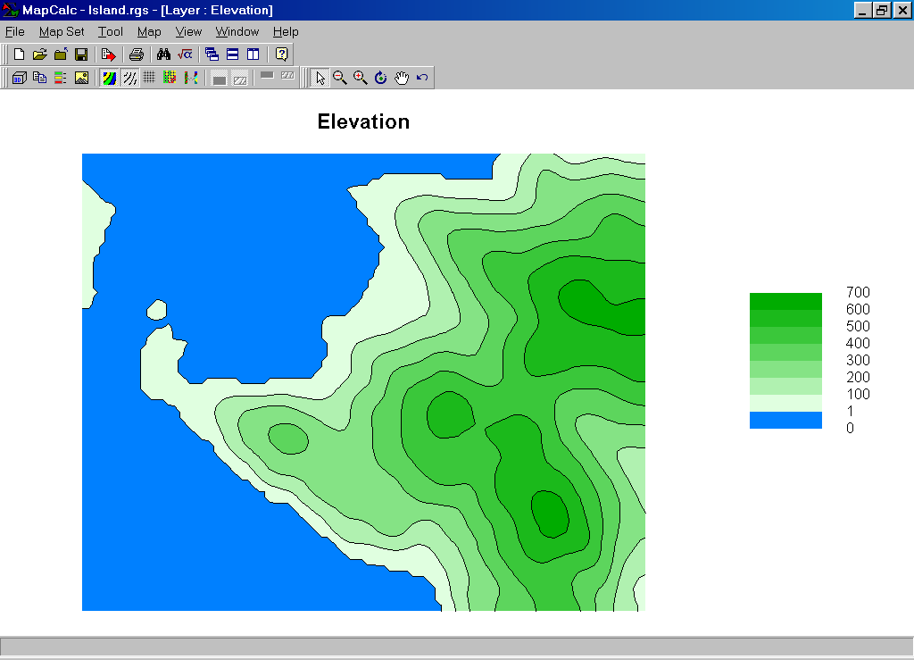 Contour Map
(elevation surface). The
elevation values on this map range from 0 (sea level) to 635 feet. If a separate color was assigned to each data
“step” there could be as many as 636 different colors and the display would
look like confetti. For this display
the map values were grouped into seven 100-foot contour intervals from pale to
dark green, plus an additional interval representing the ocean (0-foot) as
light blue.
Contour Map
(elevation surface). The
elevation values on this map range from 0 (sea level) to 635 feet. If a separate color was assigned to each data
“step” there could be as many as 636 different colors and the display would
look like confetti. For this display
the map values were grouped into seven 100-foot contour intervals from pale to
dark green, plus an additional interval representing the ocean (0-foot) as
light blue.
Step 1. A different color scheme can be applied by right-clicking on the map then selecting the “Shading Manager” (or clicking on the “Shading Manager” button on the tool bar; or from the Main Menu, select Mapà Shading Manager)…

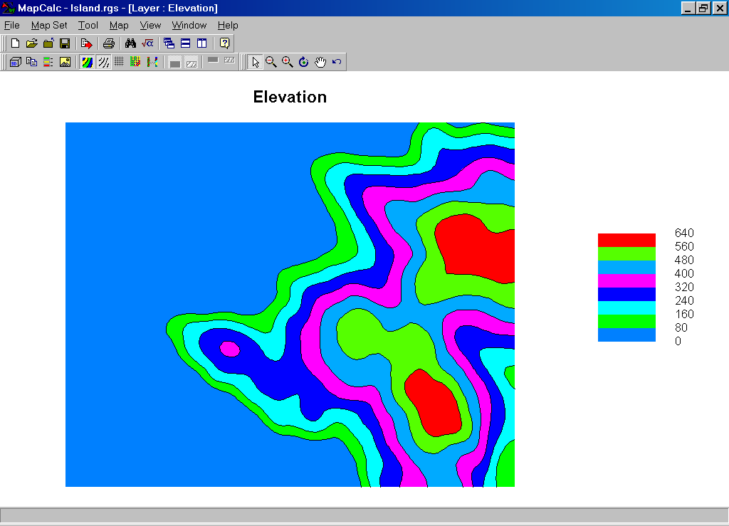
 The color for an interval can be changed by
selecting it, then choosing a new color from a pop-up pallet. In this example a light green was assigned
to the 1-100 foot contour and bright red was assigned to the 600-700 foot
contour. The intervening colors were
automatically assigned as a continuous color gradient from green to red.
The color for an interval can be changed by
selecting it, then choosing a new color from a pop-up pallet. In this example a light green was assigned
to the 1-100 foot contour and bright red was assigned to the 600-700 foot
contour. The intervening colors were
automatically assigned as a continuous color gradient from green to red.
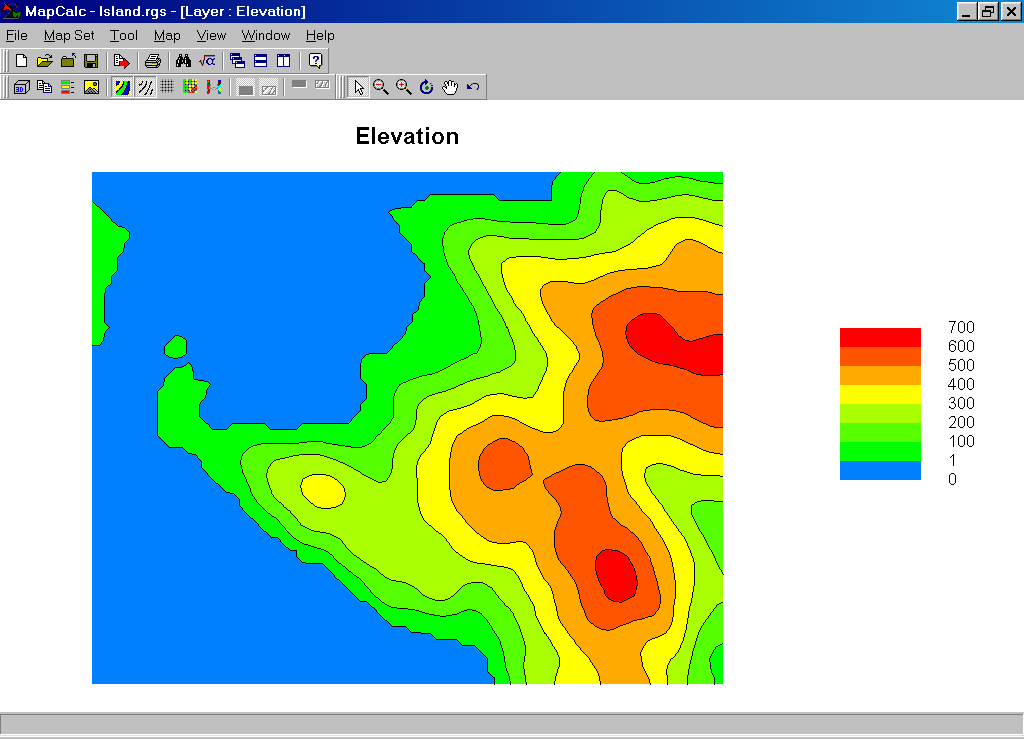 Color gradient (green
to red). Note that the
spatial patterns are unchanged and that just the color assignments were
modified.
Color gradient (green
to red). Note that the
spatial patterns are unchanged and that just the color assignments were
modified.
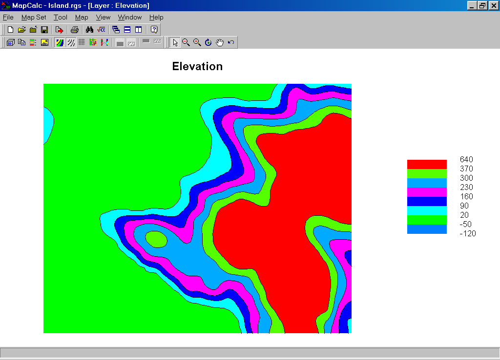
The “On/Off Lock” sets in the color table can be used to establish inflection points in the color gradients. For example, if the yellow selection is reassigned to a bright purple, the color gradient progresses from green to purple to red…
 Color gradient (green
to purple to red). The
purple interval is set and the color gradients on either side are automatically
assigned. To “force” color assignments
you would simply set the color locks on.
Color gradient (green
to purple to red). The
purple interval is set and the color gradients on either side are automatically
assigned. To “force” color assignments
you would simply set the color locks on.
Step 2. The right side of the shading manager provides several options for viewing a map (the Less/More button toggles off and on the extended option window).


The Templates tab allows you to store and recall color pallets for applying them to other maps. This feature is critical for consistent viewing of related maps, such as applying the “CornYield” template to several different cornfields. The Statistics tab provides basic statistics summarizing the values on a map. The Histogram tab plots a frequency distribution of the data (not very informative in this case as most of the map area is classified as ocean— 0 foot, hence the big spike).
Step 3. The Calculations tab allows you to specify different methods for determining data intervals used in a display…
 For
example, if the User Defined Ranges method is changed to
For
example, if the User Defined Ranges method is changed to
 +/- 1 Standard
Deviation Classification.
This method uses the mean and standard deviation to calculate the
interval assignments— bounds assigns equal range intervals to the middle range
of values (+/- 1 standard deviation) and leaves the “tails” for the upper and
lower intervals. Note the assignment of
“irrational” negative intervals results if the data isn’t normally distributed.
+/- 1 Standard
Deviation Classification.
This method uses the mean and standard deviation to calculate the
interval assignments— bounds assigns equal range intervals to the middle range
of values (+/- 1 standard deviation) and leaves the “tails” for the upper and
lower intervals. Note the assignment of
“irrational” negative intervals results if the data isn’t normally distributed.
Step 4. The number of intervals used can dramatically affect the display of a map.
 In this example, the original User Defined
Ranges of eight intervals was increased to fourteen, retaining the same
color gradient from light green to dark green with the ocean area assigned
light blue.
In this example, the original User Defined
Ranges of eight intervals was increased to fourteen, retaining the same
color gradient from light green to dark green with the ocean area assigned
light blue.
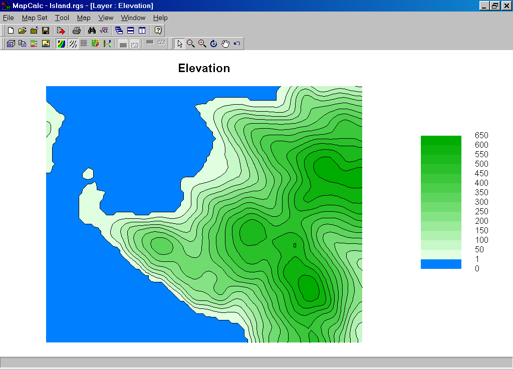 2D Contour Map
(50-foot interval). The
result is a 50-foot contour map that implies more information. Generally speaking, more than 20 intervals
tends to make maps “overly busy” and is not encouraged.
2D Contour Map
(50-foot interval). The
result is a 50-foot contour map that implies more information. Generally speaking, more than 20 intervals
tends to make maps “overly busy” and is not encouraged.
Summary. Color, interval calculation method and number of intervals can dramatically change map displays. It is important to use the most appropriate specifications for each of these considerations when generating displays of continuous data. The ability to easily construct and recall customized display templates is an key feature of any mapping software package.
When attempting to view a map, you should first consider its Data Type (Discrete or Continuous) then decide on the Display Type (Lattice or Grid and 2D or 3D) and finally the Color Intervals/Pallet (Shading Manager) to use.