GIS Out of the Box
Current and Future Directions in Geographic Information Systems
by Joseph K.
Berry, W.M. Keck Visiting Scholar
based on the
presentation "GeoBusiness Out of the Box, Business Geographics Conference
'99, Chicago, Illinois, October 5, 1999
Fall
Colloquium Series, Department of Geography
University of Denver — Denver, Colorado —
October 14, 1999
 [#1 …Title] Traditionally, talks on GIS technology
began with a definition of the acronym… "Guessing Is Simpler,"
"Gee It's Stupid," and "Guaranteed Income Stream" made
sense to most early users and software developers, while the formal definition
of "Geographic Information Systems" seemed somewhat diffuse.
[#1 …Title] Traditionally, talks on GIS technology
began with a definition of the acronym… "Guessing Is Simpler,"
"Gee It's Stupid," and "Guaranteed Income Stream" made
sense to most early users and software developers, while the formal definition
of "Geographic Information Systems" seemed somewhat diffuse.
However,
in contemplating what to include in this address, the idea of “where is GIS?” kept cropping up. Not so many years ago the answer to that
question was simply, “down the hall and
to the right, …I think?” In three
short decades, GIS has evolved from a mapping system to a spatial database
technology, and more recently, to modeling complex spatial relationships. However, with the popularity of GIS, the
readings of its current trends and probable futures are as diverse as its
growing community of users.
 [#2 …Outline of Topics]
In an attempt to avoid a “laundry list” of challenges facing our
maturing technology, I have narrowed the list to just three topics we ought to
discuss…
[#2 …Outline of Topics]
In an attempt to avoid a “laundry list” of challenges facing our
maturing technology, I have narrowed the list to just three topics we ought to
discuss…
·
first, a
brief reflection on the historical setting over three decades and the legacy
left by the pioneers;
·
secondly, a
series of contemporary applications that demonstrate the common threads among
GIS procedures and applications,
·
and
finally, some thoughts on trends that provide new ways of linking mapped data,
processing and spatial reasoning.
 [#3 …Setting and Evolution Highlighted]
THE
HISTORICAL SETTING
Information has always been the cornerstone
of effective decisions. Spatial
information is particularly complex as it requires two descriptors— where
is what. For hundreds of years the link between the
two descriptors has been the traditional, manually drafted map. Its historical use was for navigation
through unfamiliar terrain and seas, with emphasis on accurate location of
physical features.
More
recently, analysis of mapped data has become an important part of
decision-making. This new perspective
marks a turning point in the use of maps—from one emphasizing physical
description of geographic space …to one of interpreting mapped data …and
finally, to spatially characterizing and communicating management actions. The movement from "where is what" to
"so what and why" has set the stage for entirely new
concepts in planning and management of geographic space.
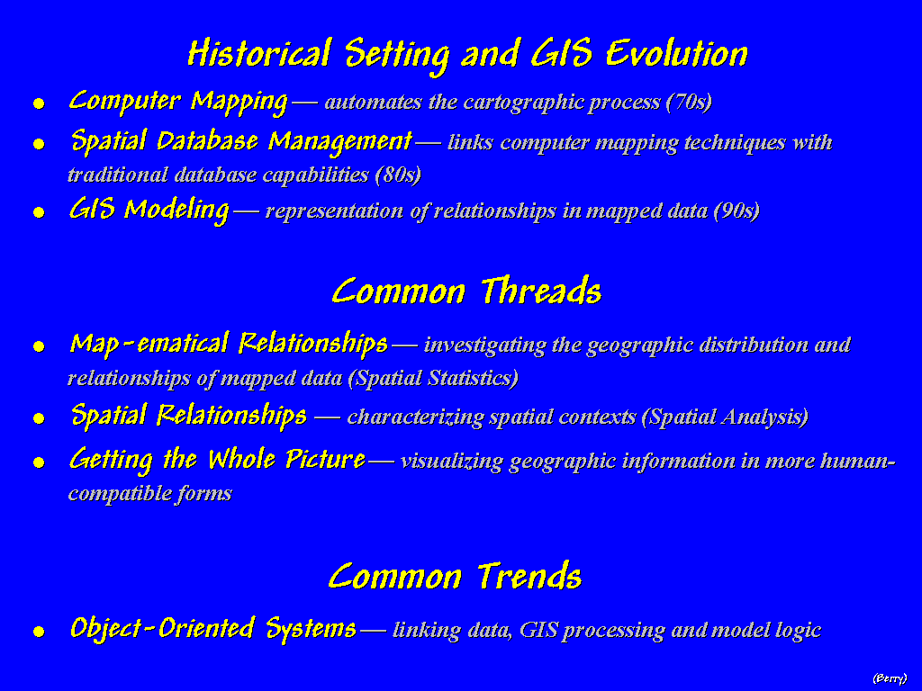
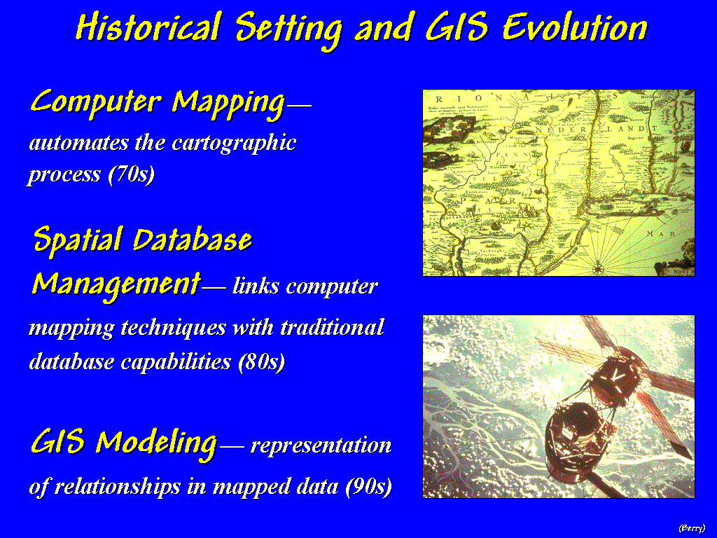
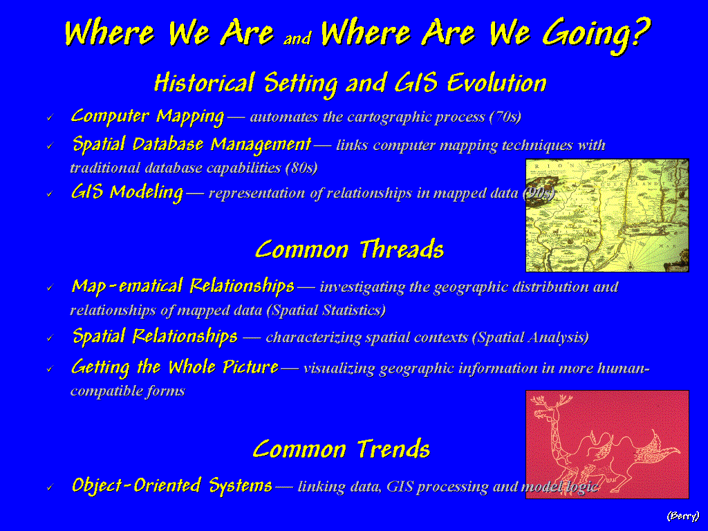
The First Decade…
COMPUTER MAPPING.
The early 1970's saw computer mapping automate
the cartographic process. The
pioneering work during this period established many of the underlying concepts
and procedures of modern GIS technology.
An obvious advantage of computer mapping is the ability to change a
portion of a map and quickly redraft the entire area. A less obvious advantage is the radical change in the format of
mapped data—from an analog image of inked lines on paper, to thousands of
numbers stored on a disk. However, the
most lasting implication of computer mapping is the realization "that it comes …with some assembly required."
The
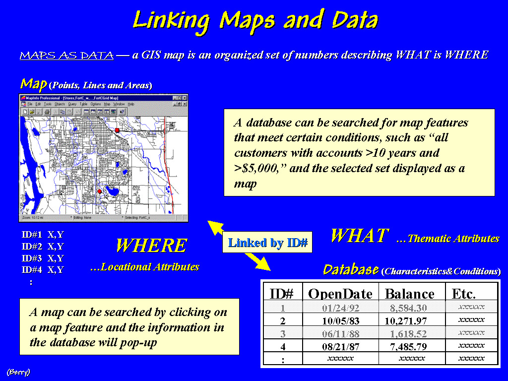
Second Decade… SPATIAL DATABASE MANAGEMENT
The early 1980's exploited the change in
the format of mapped data. Spatial
database management systems were developed that linked computer mapping
techniques with traditional database capabilities. Thematic mapping and geo-query capabilities enabled users to
quickly retrieve information and generate map products— "…sort of a database, with a picture waiting to happen."
Prior
to spatial database management, procedures involved file cabinets of
information that were linked to maps on the wall through "shoe
leather." One would simply wear a
path between the map and files whenever spatial and descriptive data were
needed. With today's technology the
link is a lot easier.
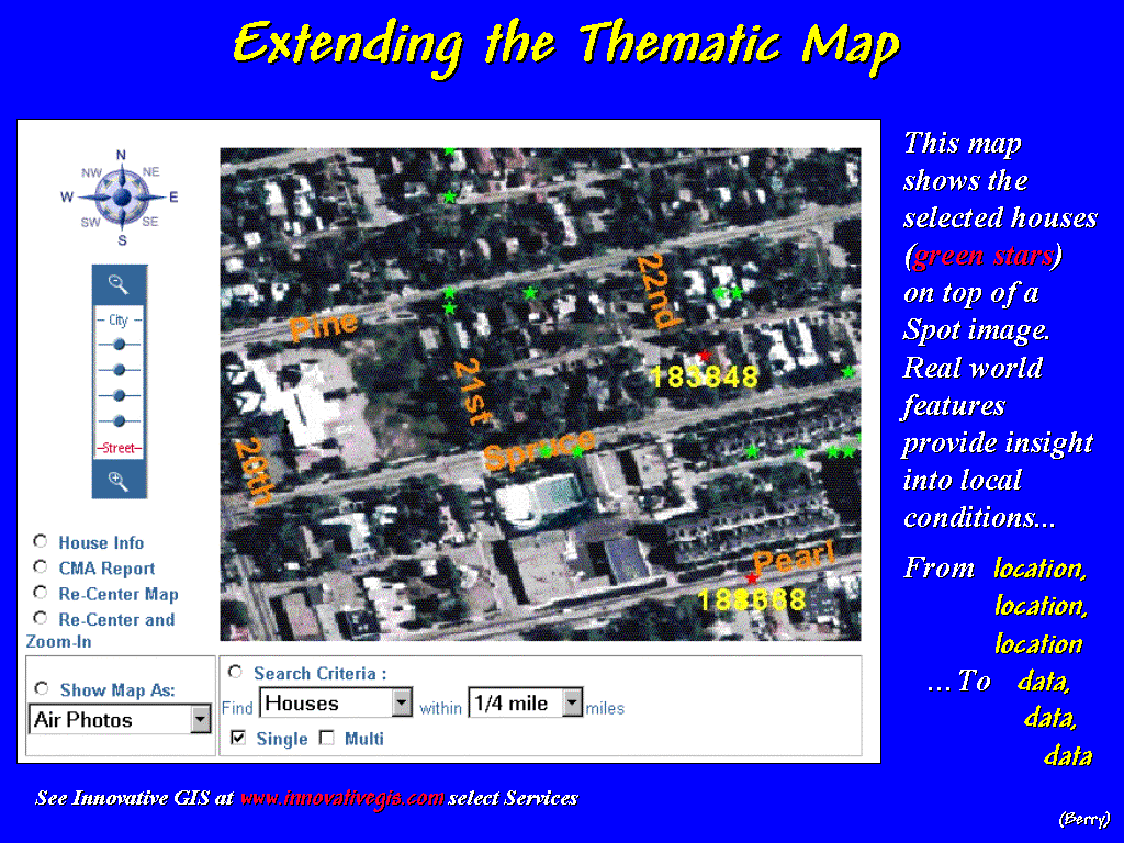
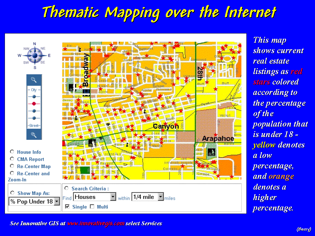 [#4
…RealEstate1] For example, a new-age real estate agent can
search the local multiple listing for suitable houses, then electronically
“post” them to a map of the city.
[#4
…RealEstate1] For example, a new-age real estate agent can
search the local multiple listing for suitable houses, then electronically
“post” them to a map of the city.
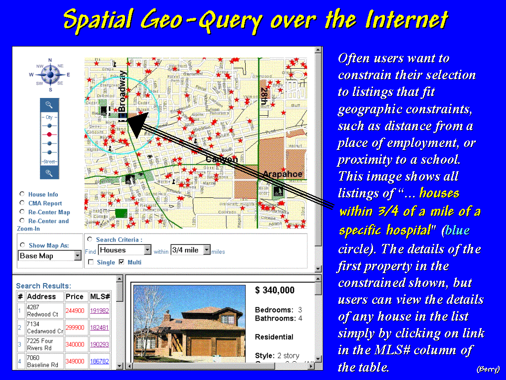 [#5 …RealEstate2] A
few more mouse-clicks and a prospective buyer a thousand miles away can take a
video tour of the homes "within three-quarters of a mile from the
hospital where he will work."
And by viewing a GPS-linked video, take a drive around the neighborhood.
[#5 …RealEstate2] A
few more mouse-clicks and a prospective buyer a thousand miles away can take a
video tour of the homes "within three-quarters of a mile from the
hospital where he will work."
And by viewing a GPS-linked video, take a drive around the neighborhood.
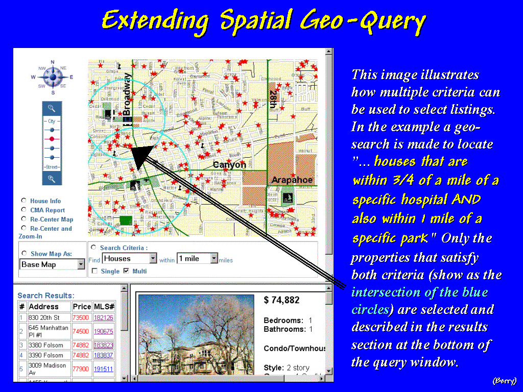 [#6 …RealEstate3]
A quick geo-query of the spatially-linked database, locates neighboring
shopping centers, churches, schools and parks.
[#6 …RealEstate3]
A quick geo-query of the spatially-linked database, locates neighboring
shopping centers, churches, schools and parks.
 [#7 …RealEstate4]
The city’s zoning map, land use plan, proposed developments and aerial
imagery can be superimposed for a glimpse of future impacts. Demographic summaries by census tracts can
be generated and financial information for “comparables” can be plotted and
cross-linked for a better understanding of market dynamics. Armed with this information narrowing the
housing choices, a prospective buyer can “hit the ground running” right off the
plane—the revolution of the digital map
and spatial database management is here, and increasingly, everywhere.
[#7 …RealEstate4]
The city’s zoning map, land use plan, proposed developments and aerial
imagery can be superimposed for a glimpse of future impacts. Demographic summaries by census tracts can
be generated and financial information for “comparables” can be plotted and
cross-linked for a better understanding of market dynamics. Armed with this information narrowing the
housing choices, a prospective buyer can “hit the ground running” right off the
plane—the revolution of the digital map
and spatial database management is here, and increasingly, everywhere.
 [#8 …Linking Maps and Data] The electronic link between mapping and data management certainly has
expedited this process and saved considerable shoe leather… but come to think
of it, it hasn’t fundamentally changed the process. GIS software’s mapping and data management components are a
result of a technological evolution, whereas its modeling component is a
revolution in our perception of geographic space, spatial relationships
and users of maps.
[#8 …Linking Maps and Data] The electronic link between mapping and data management certainly has
expedited this process and saved considerable shoe leather… but come to think
of it, it hasn’t fundamentally changed the process. GIS software’s mapping and data management components are a
result of a technological evolution, whereas its modeling component is a
revolution in our perception of geographic space, spatial relationships
and users of maps.
The
Third Decade… GIS MODELING
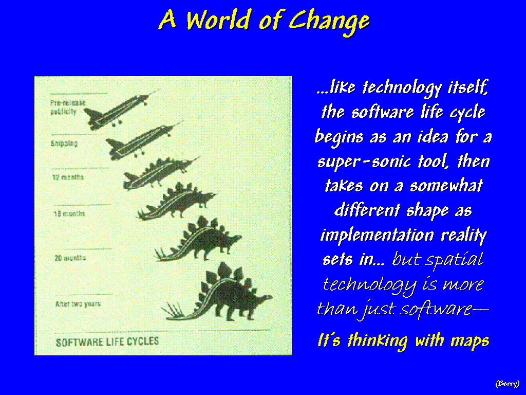 [#9 …Software Life Cycles] Like technology itself, the software life cycle
begins as an idea for a super-sonic tool, then takes on a somewhat different
shape as implementation reality sets in…but keep in mind, spatial technology is
more than just software—it's thinking with maps. In our search to automate mapping, we stumbled onto an entirely
new way of doings, and things to do.
[#9 …Software Life Cycles] Like technology itself, the software life cycle
begins as an idea for a super-sonic tool, then takes on a somewhat different
shape as implementation reality sets in…but keep in mind, spatial technology is
more than just software—it's thinking with maps. In our search to automate mapping, we stumbled onto an entirely
new way of doings, and things to do.
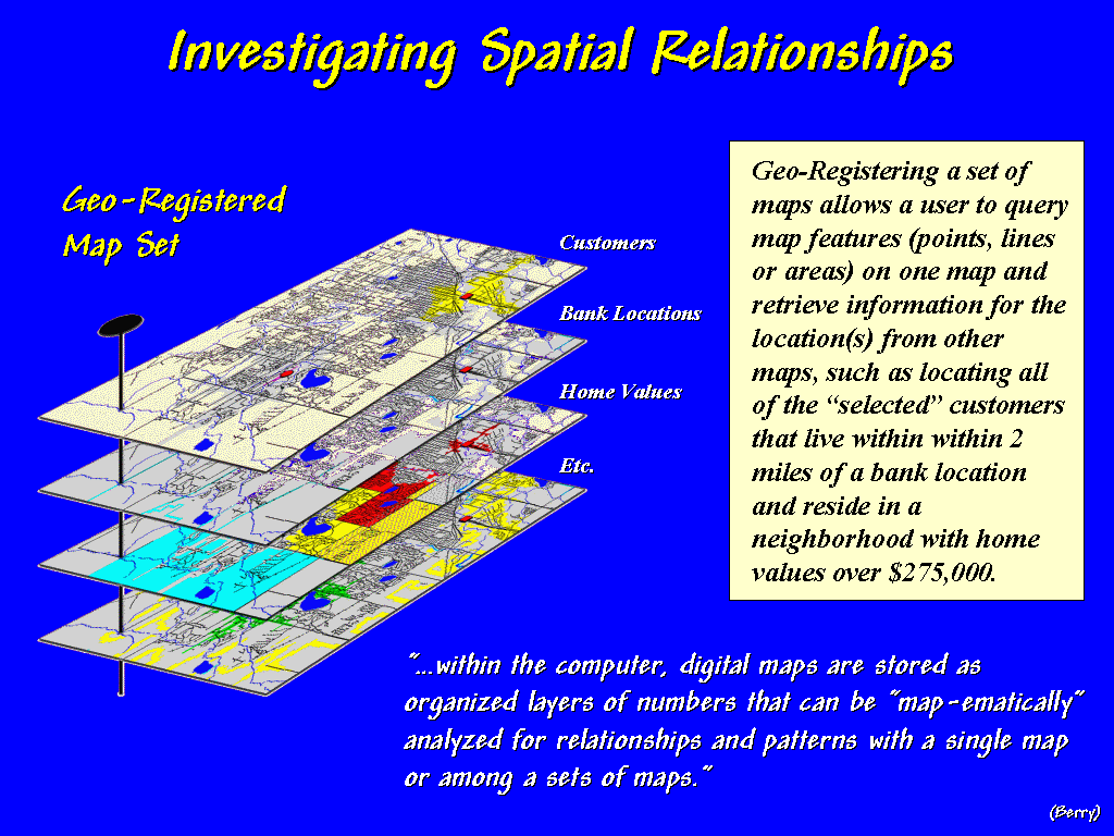 [#10 …Investigating Spatial Relationships] In
today's world, maps are numbers first, pictures later and this new perspective
of spatial data is destined to change our paradigm of map analysis, as much as
it changes our procedures. While the
early systems concentrated on automating traditional mapping and data
management practices, more recent applications focus on understanding complex
map relationships within a decision-context.
These “map-ematical” extensions involve a comprehensive modeling
theory that is rooted in the digital nature of GIS maps and has all of the
rights, privileges and responsibilities of traditional mathematics.
[#10 …Investigating Spatial Relationships] In
today's world, maps are numbers first, pictures later and this new perspective
of spatial data is destined to change our paradigm of map analysis, as much as
it changes our procedures. While the
early systems concentrated on automating traditional mapping and data
management practices, more recent applications focus on understanding complex
map relationships within a decision-context.
These “map-ematical” extensions involve a comprehensive modeling
theory that is rooted in the digital nature of GIS maps and has all of the
rights, privileges and responsibilities of traditional mathematics.
For
example, consider the emerging field of Precision Farming. With mud up to axles and 400 acres left to plow,
precision in farming can seem worlds away. Yet site-specific management
makes sense to a rapidly growing number of farmers. Mapping and analyzing field variability for better economic and
ecological decisions puts production agriculture at the cutting edge of GIS
applications—both down to earth and downright ambitious.
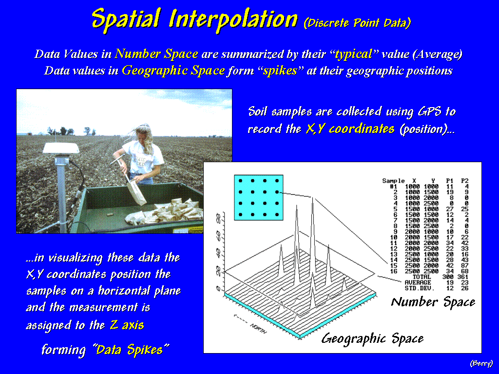 [#11 …SStat1_Descrete] Traditionally,
fertilization programs were determined by averaging soil samples taken
throughout a field. Today, soil samples
are collected with GPS coordinates then spatially interpolated for maps of
nutrient variations. This process can
be conceptualized…
[#11 …SStat1_Descrete] Traditionally,
fertilization programs were determined by averaging soil samples taken
throughout a field. Today, soil samples
are collected with GPS coordinates then spatially interpolated for maps of
nutrient variations. This process can
be conceptualized…
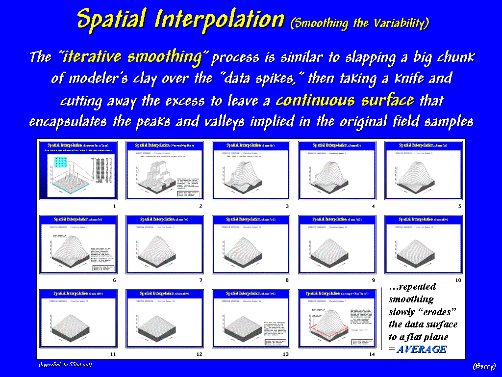 [#12 …SStat2_Animation] …as first
"guessing" that all of the non-sampled locations are identical to the
closest sample point (click on the hyperlink to the SStat slide set). The next series of steps involves passing a
"smoothing filter" over the data… once, twice, three, four
times. Now that looks like what the
point data was trying to tell us—more phosphorous in the NE portion of the
field, not much in the NW.
[#12 …SStat2_Animation] …as first
"guessing" that all of the non-sampled locations are identical to the
closest sample point (click on the hyperlink to the SStat slide set). The next series of steps involves passing a
"smoothing filter" over the data… once, twice, three, four
times. Now that looks like what the
point data was trying to tell us—more phosphorous in the NE portion of the
field, not much in the NW.
The
“smoothing” process is similar to slapping a big chunk of modeler’s clay over
the data spikes, then taking a knife and cutting away the excess to leave a
continuous surface that encapsulates the peaks and valleys implied in the
original field samples—a map of the variation in phosphorous throughout the
field.
But
what if we keep smoothing the data? … 9
times, 19, 29, 39, 49, 69, 99 times!
What do you think would happen if you smoothed it 9,999 times? (…last slide in the animated series)
Yep, it would be a horizontal plane aligning with the arithmetic average (…press
Esc to return, then advance to slide #16).
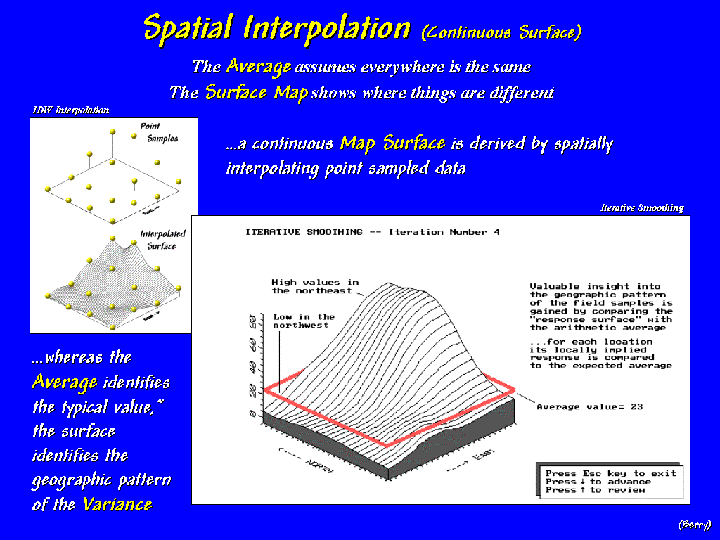 [#13 …SStat3_Continuous] Note
that the whole-field average (identified as the red band) is hardly
anywhere. Most of the field is either
well-above or well-below the average. A
fertilization application based on the assumption that the "average"
amount of phosphorous is everywhere, would be adding even more in the NE where
it's not needed and probably not enough in the NW where it' deficient—bad for
the environment and bad the pocketbook.
[#13 …SStat3_Continuous] Note
that the whole-field average (identified as the red band) is hardly
anywhere. Most of the field is either
well-above or well-below the average. A
fertilization application based on the assumption that the "average"
amount of phosphorous is everywhere, would be adding even more in the NE where
it's not needed and probably not enough in the NW where it' deficient—bad for
the environment and bad the pocketbook.
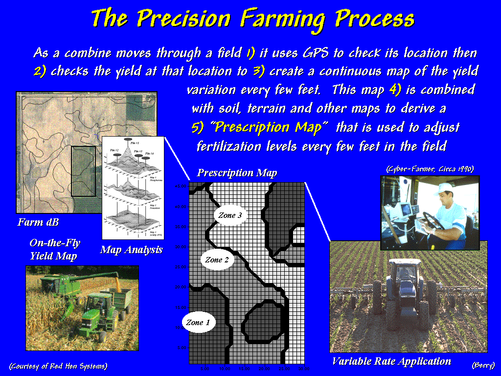 [#14 …PF Process]
As a combine moves through a field it checks the GPS location and yield
flow every second and writes this information to a data file that is used to
generate a map of yield variation every few feet throughout a field. This map is combined with soil, terrain and
other mapped data to derive a “Prescription Map” that is used to
automatically adjust fertilization levels every few feet as a spray rig moves
in the field. The result is to
constantly adjust the fertilization prescription to the unique combination of
conditions occurring in the field.
[#14 …PF Process]
As a combine moves through a field it checks the GPS location and yield
flow every second and writes this information to a data file that is used to
generate a map of yield variation every few feet throughout a field. This map is combined with soil, terrain and
other mapped data to derive a “Prescription Map” that is used to
automatically adjust fertilization levels every few feet as a spray rig moves
in the field. The result is to
constantly adjust the fertilization prescription to the unique combination of
conditions occurring in the field.
Site-specific
management recognizes the variability within a field and is about doing the right thing, in the right way, at
the right place and time. Its
environmental and economic benefits are radically changing mankind’s oldest
profession. Farmers at the cutting edge
of GIS …what'll they think of next? How about the unlikely processing partner of
a market forecaster?
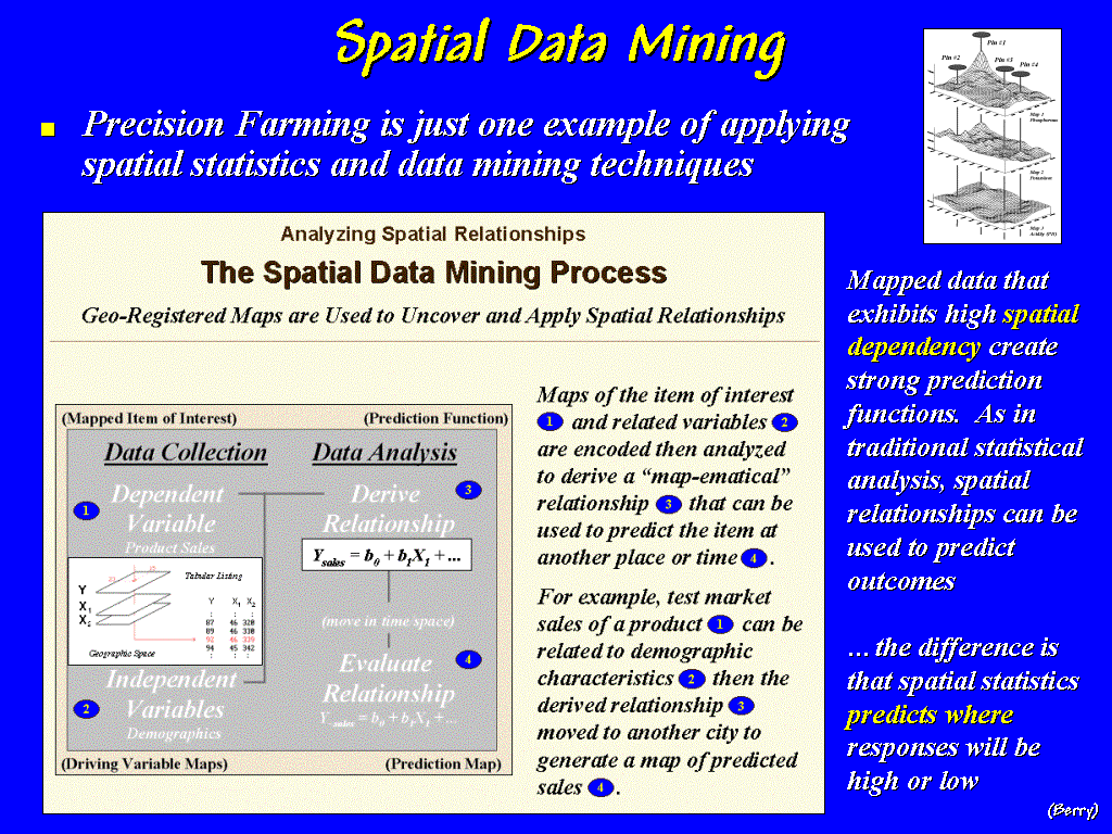 [#15 …Spatial Data Mining]
The precision
farming approach is not restricted to the back roads, it promises revolutionary
changes in most geographical-based analysis.
Maps of an item of interest, be it corn yield, animal activity, or
product sales, are encoded along with related “driving” variables, then
analyzed to derive a “map-ematical” relationship that is used to predict the
item at another place or time. Like
traditional statistics, the approach is independent of the application and
exploits the dependency among variables— in spatial data mining, the geographic
dependency is the focus and the results predict where responses will be
high or low.
[#15 …Spatial Data Mining]
The precision
farming approach is not restricted to the back roads, it promises revolutionary
changes in most geographical-based analysis.
Maps of an item of interest, be it corn yield, animal activity, or
product sales, are encoded along with related “driving” variables, then
analyzed to derive a “map-ematical” relationship that is used to predict the
item at another place or time. Like
traditional statistics, the approach is independent of the application and
exploits the dependency among variables— in spatial data mining, the geographic
dependency is the focus and the results predict where responses will be
high or low.
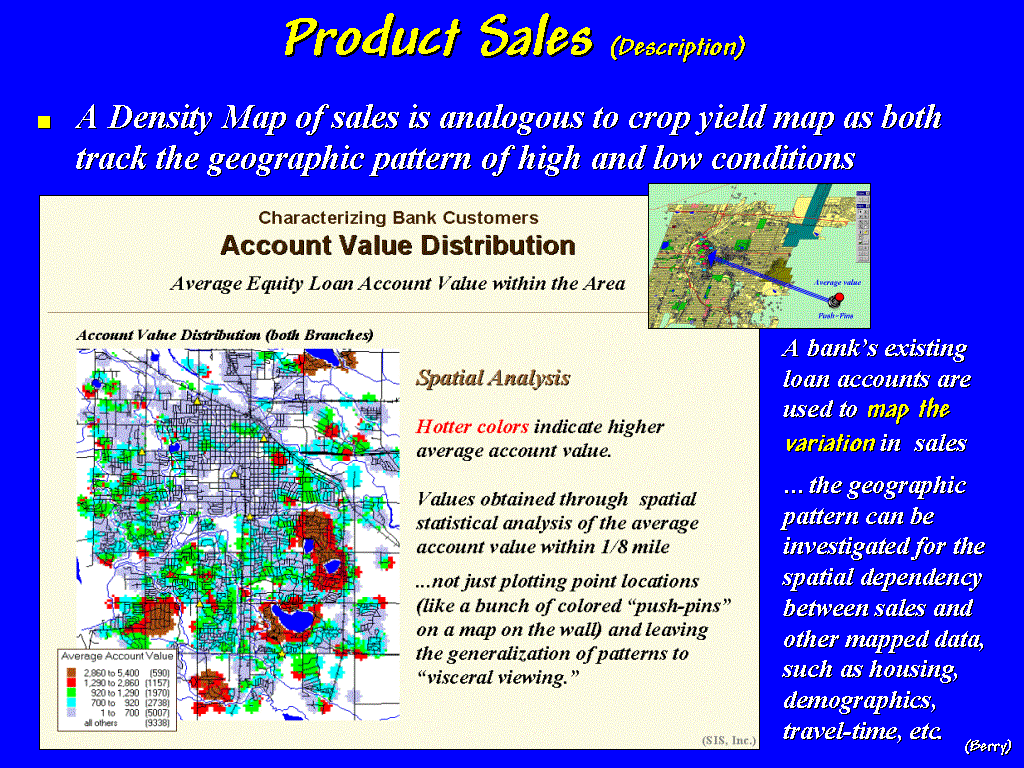 [#16 …Account Value Distribution] For example, consider a spatial data
mining application investigating a bank’s home equity loan accounts. Normally, this analysis would be based on
descriptive information about each customer with minimal direct consideration
of where they lived. The map in this
slide is a plot of a density surface identifying the geographic distribution of
account values. It is analogous to a
map on the wall with a bunch of push-pins colored by the amount of the
loan. The warmer tones indicate areas
of higher average values that translate into fertile locations for home equity
loans. Like the corn yield map, this
map layer establishes the spatial patterns of interest.
[#16 …Account Value Distribution] For example, consider a spatial data
mining application investigating a bank’s home equity loan accounts. Normally, this analysis would be based on
descriptive information about each customer with minimal direct consideration
of where they lived. The map in this
slide is a plot of a density surface identifying the geographic distribution of
account values. It is analogous to a
map on the wall with a bunch of push-pins colored by the amount of the
loan. The warmer tones indicate areas
of higher average values that translate into fertile locations for home equity
loans. Like the corn yield map, this
map layer establishes the spatial patterns of interest.
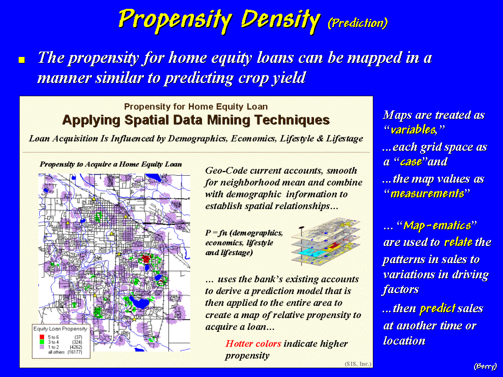 [#17 …Propensity Density] The patterns on the loan activity map are
related to other mapped data, such as demographics, economics, housing, and
lifestyle. The applications might be
different, sales and social data being related instead of crop yield and dirt,
but the data mining process is basically the same. Applying the relationships, in this case, generates a “propensity density surface” that
identifies pockets of potential equity loan customers throughout a city as
shown in this slide.
[#17 …Propensity Density] The patterns on the loan activity map are
related to other mapped data, such as demographics, economics, housing, and
lifestyle. The applications might be
different, sales and social data being related instead of crop yield and dirt,
but the data mining process is basically the same. Applying the relationships, in this case, generates a “propensity density surface” that
identifies pockets of potential equity loan customers throughout a city as
shown in this slide.
The
information can be critical in market forecasting and in locating areas where
you should be doing well, but aren’t.
Targeted marketing and competition analysis are obvious offshoots of
this type of GIS modeling.
[#18
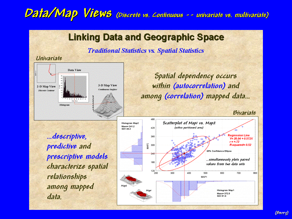
…Data/Map Views] The link
between "maps as data" and "maps as images"
provides an entirely new view of spatial relationships. Once again, consider the farmer's
phosphorous map as depicted in the upper inset of this slide. The histogram of the data in the center
forms a statistician's traditional view.
When linked in a GIS, one can "click" on an interval in the
histogram and the locations with those data values will be highlighted in the
2-D and 3-D maps.
The lower inset takes this
capability a bit further by linking a "scatterplot" to a couple of
views of another farmer's field. The
Y-axis depicts the distribution of phosphorous in the topsoil while the X-axis
shows the distribution in the subsoil.
Each dot in the scatterplot identifies the "joint condition"
for the locations outlined in red on the map surfaces in the lower-left
corner. If you lasso a group of dots in
the scatterplot, their geographic locations are identified. Similarly, lassoing an area on the map
causes the corresponding dots in the scatterplot to be highlighted. The linkage allows us to simultaneously
visualize the relationships between the geographic and data distributions.
This graphical link can be extended
to spatial statistics. For example,
traditional statistics can be used to derive a regression equation for
predicting subsoil levels of phosphorous based on the topsoil levels (as
reported in the red annotations).
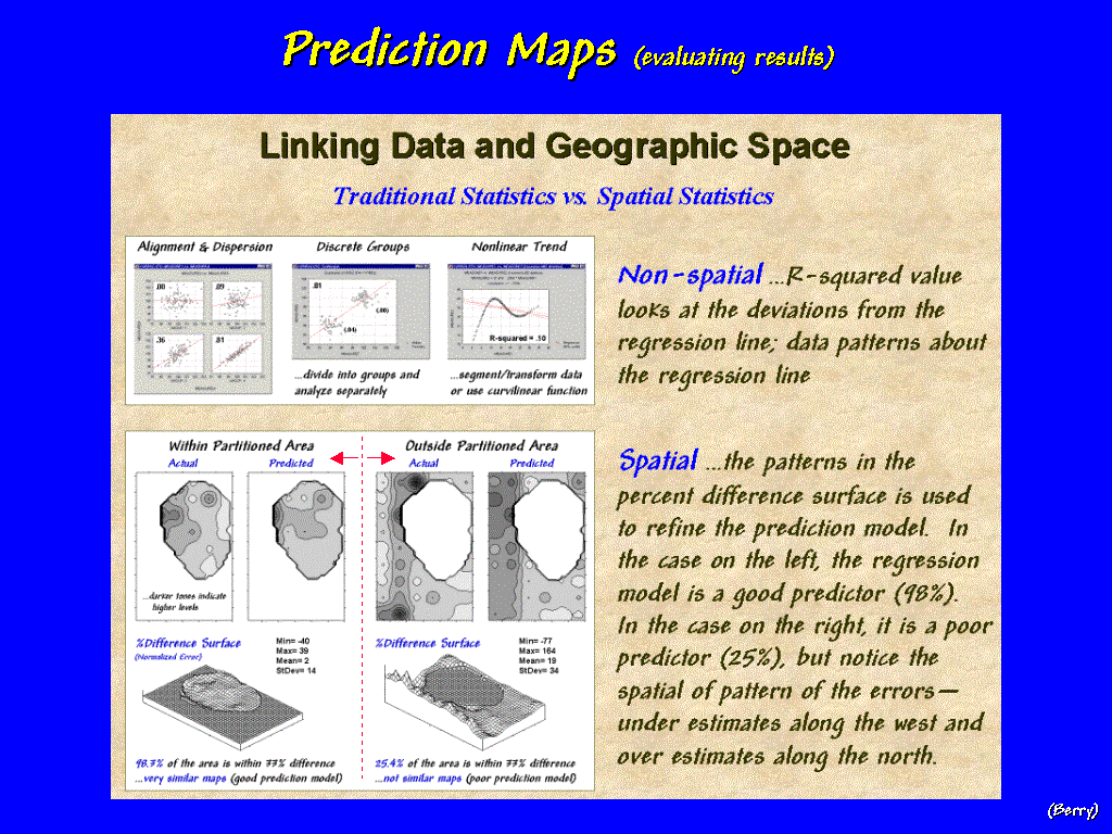 [#19 …Prediction Maps] Non-spatial
statistics evaluates the predictions without consideration of geographic
patterns and reports R-squared values as overall assessment of how well a
prediction model is performing. The
lower inset in the slide shows the results of using the prediction model in
different parts of the farmer's field.
The paired maps on the left depict the actual and predicted phosphorous
levels for an interior portion of the field.
The relatively flat "difference surface" on the bottom
indicates that the predictions are fairly good.
[#19 …Prediction Maps] Non-spatial
statistics evaluates the predictions without consideration of geographic
patterns and reports R-squared values as overall assessment of how well a
prediction model is performing. The
lower inset in the slide shows the results of using the prediction model in
different parts of the farmer's field.
The paired maps on the left depict the actual and predicted phosphorous
levels for an interior portion of the field.
The relatively flat "difference surface" on the bottom
indicates that the predictions are fairly good.
However, the lumpy-bumpy difference
surface for the paired maps on the right show that the model isn't anywhere
near as good a predictor outside the partitioned area. In fact, it suggests that the big ridge of
over estimation along the western portion should be analyzed separately—some
spatial guidance that isn't possible without GIS's link between the geographic
and data distributions.
The
recognition that GIS maps are numbers first and pictures later, extends our
perspective from qualitative to quantitative map analysis and should
titillate the researchers among us. Now
let’s turn our attention to the flip-side of spatial statistics
that focuses on numerical relationships of mapped data … to that of spatial
analysis that characterizes the spatial context and arrangement
of map features. A good example of this
type of GIS processing is landscape structure analysis.
 [#20
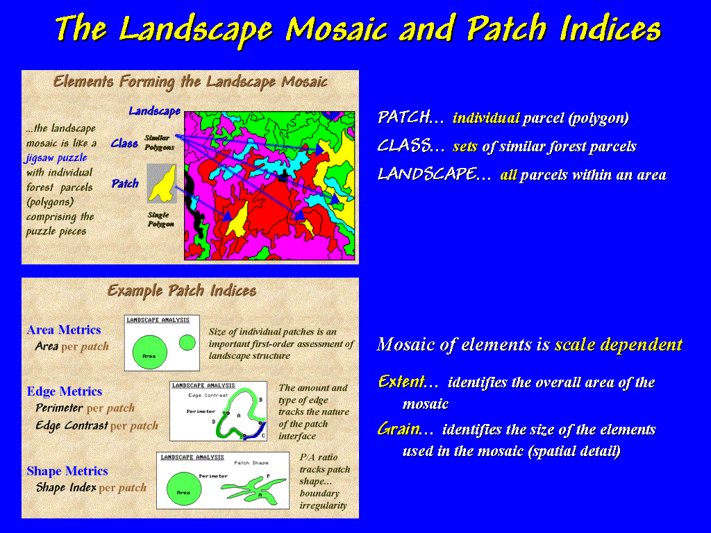
…Mosaic and Patch Indices] Recall
from Forestry 101 that the basic unit in landscape analysis is the forest
parcel—sort of like the individual pieces of the jigsaw puzzle comprising the
vegetation mosaic we see when gazing from a ridge top.
[#20
…Mosaic and Patch Indices] Recall
from Forestry 101 that the basic unit in landscape analysis is the forest
parcel—sort of like the individual pieces of the jigsaw puzzle comprising the
vegetation mosaic we see when gazing from a ridge top.
A
wide variety of structural metrics tracking the shape, pattern and arrangement
of the puzzle pieces are becoming available through GIS. The most basic metrics are the area and
perimeter of each forest polygon. Edge
contrast extends the description of the perimeter by weighting the boundary
segments by the nature of the abutting patches. For example, a portion an aspen stand’s boundary adjoining mixed
hardwoods has less contrast than a portion adjoining conifers or open
water. In a sense, edge contrast
describes the “ecological porosity”
of the individual landscape units.
Another
extended metric is the shape index that is a normalized ratio of the perimeter
to the area. As the perimeter increases
for a given area, an increasingly irregular boundary is indicated. These and numerous other metrics are used to
characterize the shape, pattern and arrangement "puzzle-pieces"
comprising our forests.
 [#21
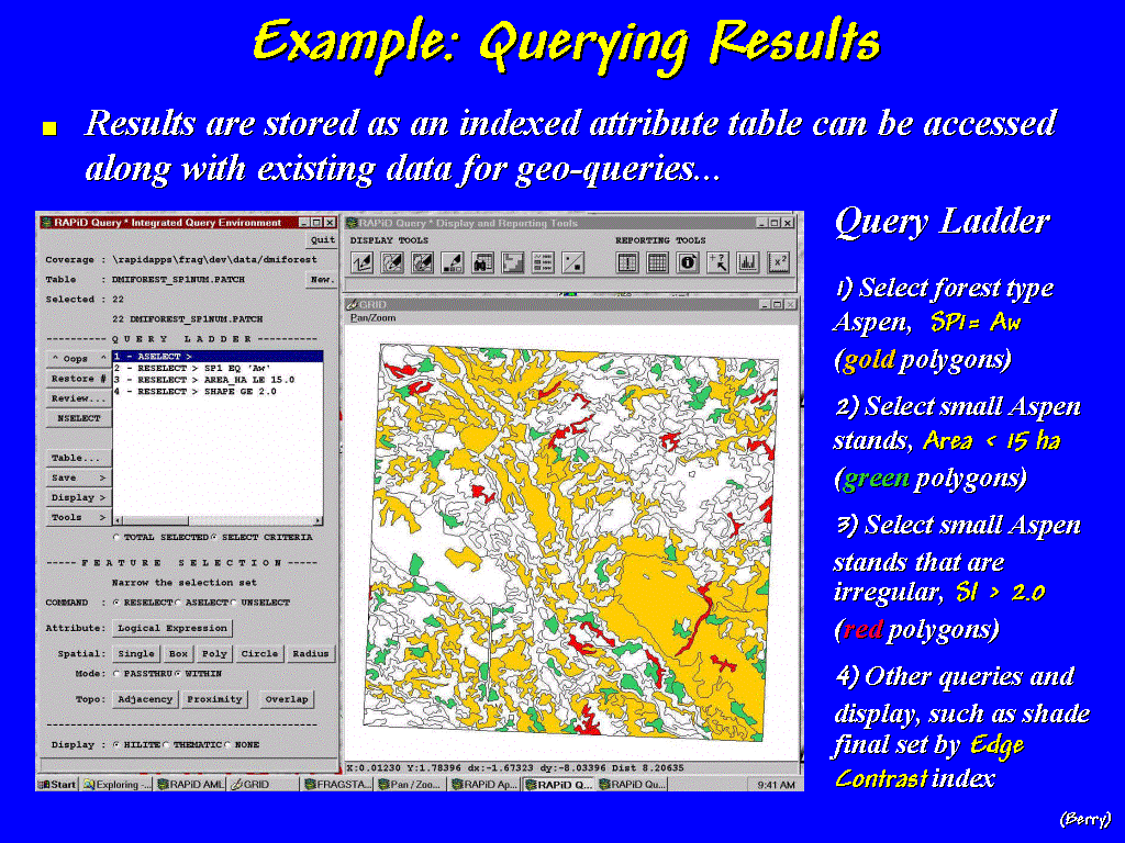
…Querying Results] Procedures for
calculating landscape metrics have been available for years. What has been
lacking is its operational GIS expression.
Now that extensive databases have been compiled, the direct link to
landscape analysis capabilities is coming online. For example, this slide shows a simple spatial model that first
selects all of the aspen stands (shown in gold), then identifies those that are
small (shown in green with areas less than 15 hectares) and finally those that
are “irregular” (shown in red where the shape index is > 2.0). Subsequent steps might be a thematic map,
tabular listing, and graph summarizing the edge contrast of the small,
irregular aspen stands.
[#21
…Querying Results] Procedures for
calculating landscape metrics have been available for years. What has been
lacking is its operational GIS expression.
Now that extensive databases have been compiled, the direct link to
landscape analysis capabilities is coming online. For example, this slide shows a simple spatial model that first
selects all of the aspen stands (shown in gold), then identifies those that are
small (shown in green with areas less than 15 hectares) and finally those that
are “irregular” (shown in red where the shape index is > 2.0). Subsequent steps might be a thematic map,
tabular listing, and graph summarizing the edge contrast of the small,
irregular aspen stands.
 [#22
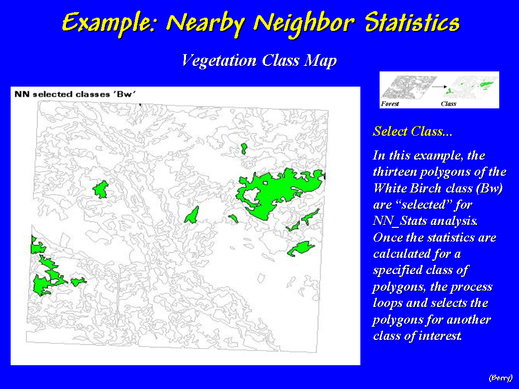
…Nearby Neighbor Statistics] A
further analysis might focus on the fragmentation of these threatened stands by
calculating the nearest neighbor distances for each patch and summarizing the
results for the entire vegetation class.
For example, the relative isolation of white birch stands in this area
could be determined. The process begins
by identifying the polygons of interest…
[#22
…Nearby Neighbor Statistics] A
further analysis might focus on the fragmentation of these threatened stands by
calculating the nearest neighbor distances for each patch and summarizing the
results for the entire vegetation class.
For example, the relative isolation of white birch stands in this area
could be determined. The process begins
by identifying the polygons of interest…
 [#23
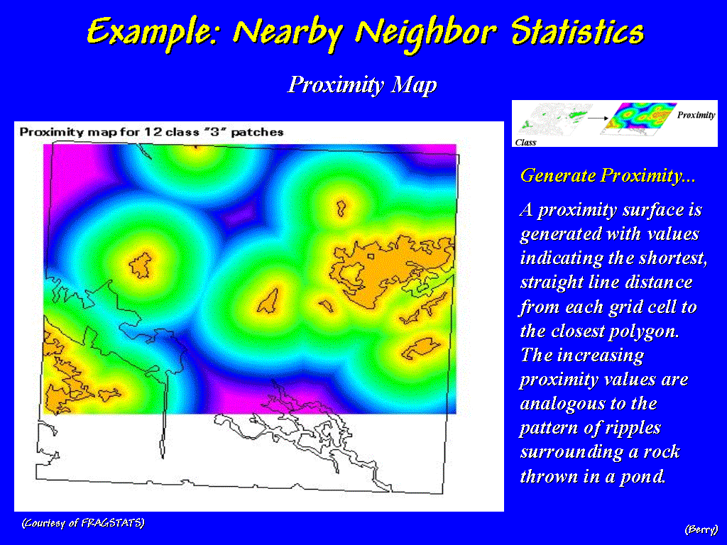
…NN Proximity Map] …then calculating the proximity from every location in
the study area to the nearest white birch polygon. The increasing proximity values emanating from each parcel are
analogous to the ripples surrounding a rock thrown into a pond— splash,
one-away, two-away and so on. The pinks
and purples in this slide identify locations that are far from the nearest
birch polygon.
[#23
…NN Proximity Map] …then calculating the proximity from every location in
the study area to the nearest white birch polygon. The increasing proximity values emanating from each parcel are
analogous to the ripples surrounding a rock thrown into a pond— splash,
one-away, two-away and so on. The pinks
and purples in this slide identify locations that are far from the nearest
birch polygon.
 [#24
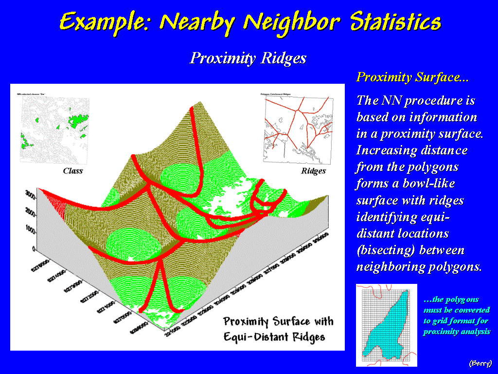
…NN Proximity Ridges] This slide
shows the same information but is represented as a 3-D surface with increasing
distance rising from the birch polygons like a series of abutting football
stadiums. The ridges shown in red
identify interesting locations that are equidistant between two birch
stands.
[#24
…NN Proximity Ridges] This slide
shows the same information but is represented as a 3-D surface with increasing
distance rising from the birch polygons like a series of abutting football
stadiums. The ridges shown in red
identify interesting locations that are equidistant between two birch
stands.
All
locations within the ridge-lines are closer to one of the stands and form its “area of influence.” A wealth of information about the relative
isolation of each polygon is contained in the proximity map and its
ridges. For example, the lowest point along
the ridge surrounding a polygon determines the distance to its nearest
neighbor… sort of an ecological expression of "competition analysis"
routinely used in retail siting models—just a shift in application perspective.
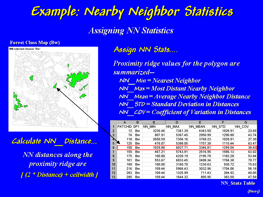 [#25
…Assigning NN Statistics] The table
in this slide identifies several additional indices that summarize a polygon’s
surrounding neighbors. The nearest
neighbor to one in the center is just over a thousand meters away while the
farthest is over six thousand. These
extremes identify the best and worst case scenarios for a venturesome creature
striking out to another habitat-island, while the average distance of a little
over three thousand three meters away represents the typical wandering
required.
[#25
…Assigning NN Statistics] The table
in this slide identifies several additional indices that summarize a polygon’s
surrounding neighbors. The nearest
neighbor to one in the center is just over a thousand meters away while the
farthest is over six thousand. These
extremes identify the best and worst case scenarios for a venturesome creature
striking out to another habitat-island, while the average distance of a little
over three thousand three meters away represents the typical wandering
required.
While
the forester's landscape view is comprised of vegetation polygons, keep in mind
that an urban planner's view of a cityscape or a chemist's view of an electron
microscope slide—a micro-scape? —has a similar set of "puzzle-pieces"
forming important patterns and arrangements that determine the connectivity of
the system.
Spatial analysis of landscape elements
provides useful information about animal habitat. It can also provide information about shopper habitat, such as a
superstore. Consider another
"non-traditional" perspective of geographic space—a floor plan of a
superstore—and another off-the-wall new user of spatial technology—a retail
store manager.
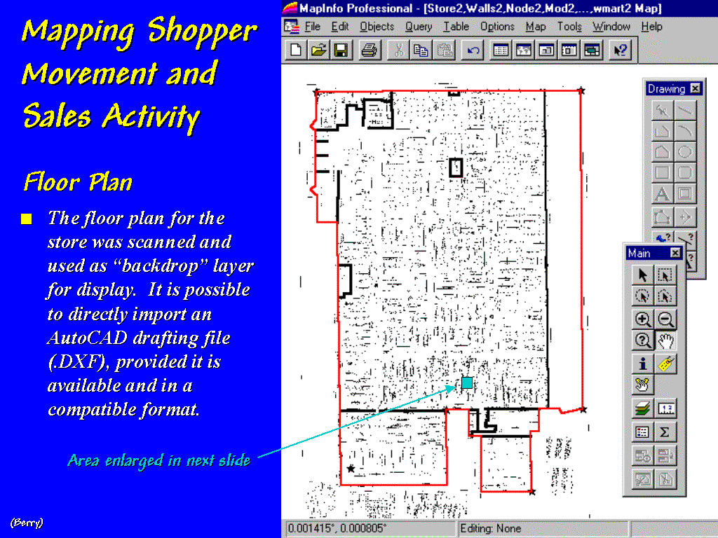 [#26
…Floor Plan] This is an interesting
geographic space… the floor plan of a retail super store.
[#26
…Floor Plan] This is an interesting
geographic space… the floor plan of a retail super store.
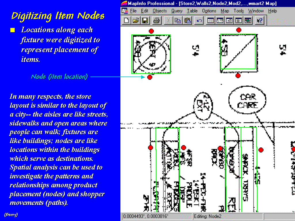 [#27
…Item Nodes] The fixtures and
shelving spaces are encoded to form map features similar to the buildings and
addresses in a city.
[#27
…Item Nodes] The fixtures and
shelving spaces are encoded to form map features similar to the buildings and
addresses in a city.
 [#28
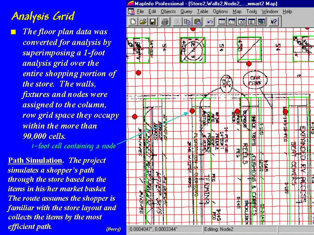
…Analysis Grid] These data are
gridded at a 1-foot resolution to form a continuous analysis space.
[#28
…Analysis Grid] These data are
gridded at a 1-foot resolution to form a continuous analysis space.
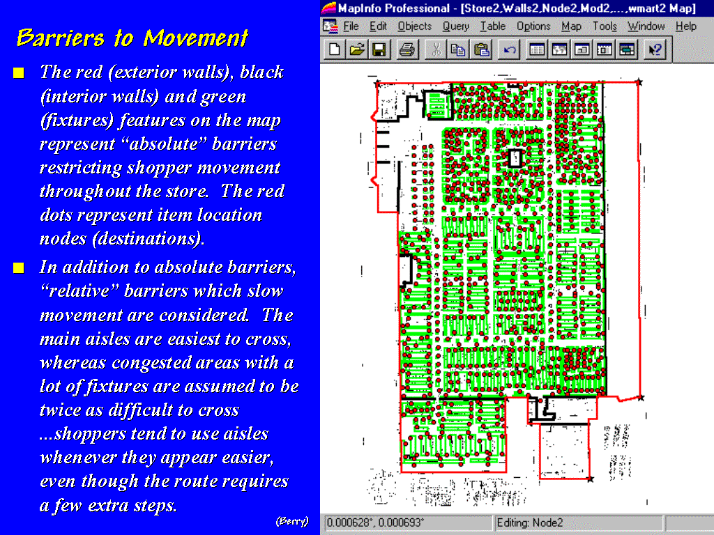 [#29
…Barriers to Movement] The result
is a map of barriers to shopper movement and the locations the shoppers want to
visit.
[#29
…Barriers to Movement] The result
is a map of barriers to shopper movement and the locations the shoppers want to
visit.
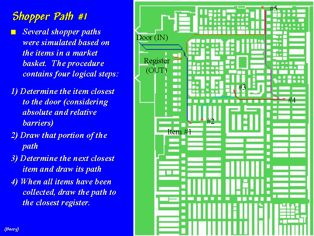 [#30
…Shopper Path 1] The items in a
shopper’s basket identify where he or she has been and spatial analysis is used
to identify the plausible path used to collect the items.
[#30
…Shopper Path 1] The items in a
shopper’s basket identify where he or she has been and spatial analysis is used
to identify the plausible path used to collect the items.
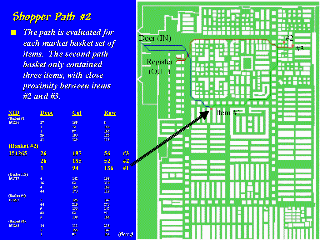 [#31
…Shopper Path #2] Additional paths
are derived for other shopping carts that pass through the checkout.
[#31
…Shopper Path #2] Additional paths
are derived for other shopping carts that pass through the checkout.
 [#32
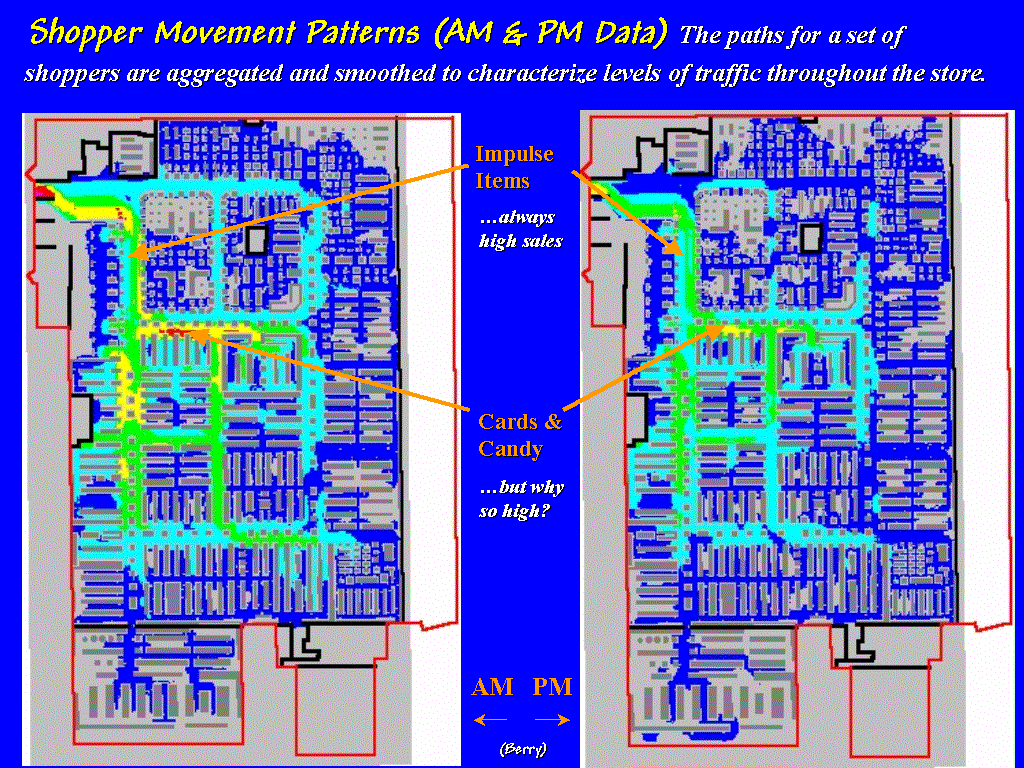
…Analyzing Shopper Movement Patterns] The paths for shopper movement
surfaces for user-specified time steps hundreds of carts throughout a day are
aggregated into accumulated. The
brighter tones in these maps show higher shopper movement.
[#32
…Analyzing Shopper Movement Patterns] The paths for shopper movement
surfaces for user-specified time steps hundreds of carts throughout a day are
aggregated into accumulated. The
brighter tones in these maps show higher shopper movement.
Note
the high levels of sales for impulse items in both the AM and PM periods which
is understandable… but the consistently high level for items in the Card and
Candy section is not. At first we
thought there must be a problem with analysis procedure; then we suspected the
data. Actually, it all made sense when
the client revealed that the data for the pilot project was for a 24-hour
period before Valentine’s Day.
 [#33
…Analyzing Coincidence] Coincidence
analysis between shopper movement and sales activity can be investigated as
well. The orange locations on this map
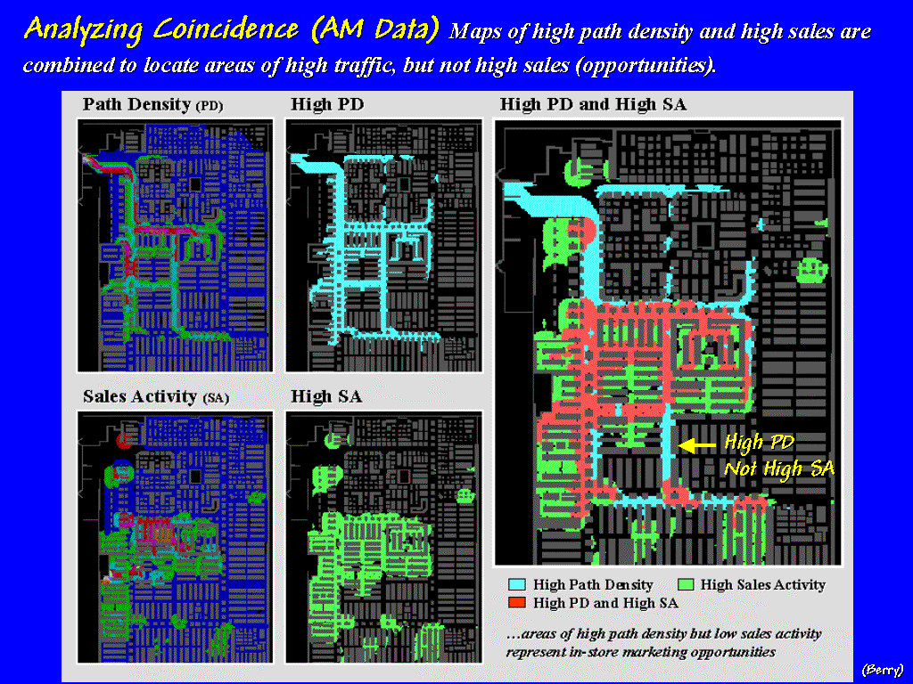
identify the counter-intuitive condition where sales are high, but shopper traffic is low…
a retailer’s dream. The opposite
condition of areas with high traffic,
but low sales, on the other hand,
provides the retailer with a map of in-store marketing problems such as shown
in bright blue on the large map on the right—these are candidate areas for
changing the product mix on the end-cap shelves.
[#33
…Analyzing Coincidence] Coincidence
analysis between shopper movement and sales activity can be investigated as
well. The orange locations on this map
identify the counter-intuitive condition where sales are high, but shopper traffic is low…
a retailer’s dream. The opposite
condition of areas with high traffic,
but low sales, on the other hand,
provides the retailer with a map of in-store marketing problems such as shown
in bright blue on the large map on the right—these are candidate areas for
changing the product mix on the end-cap shelves.
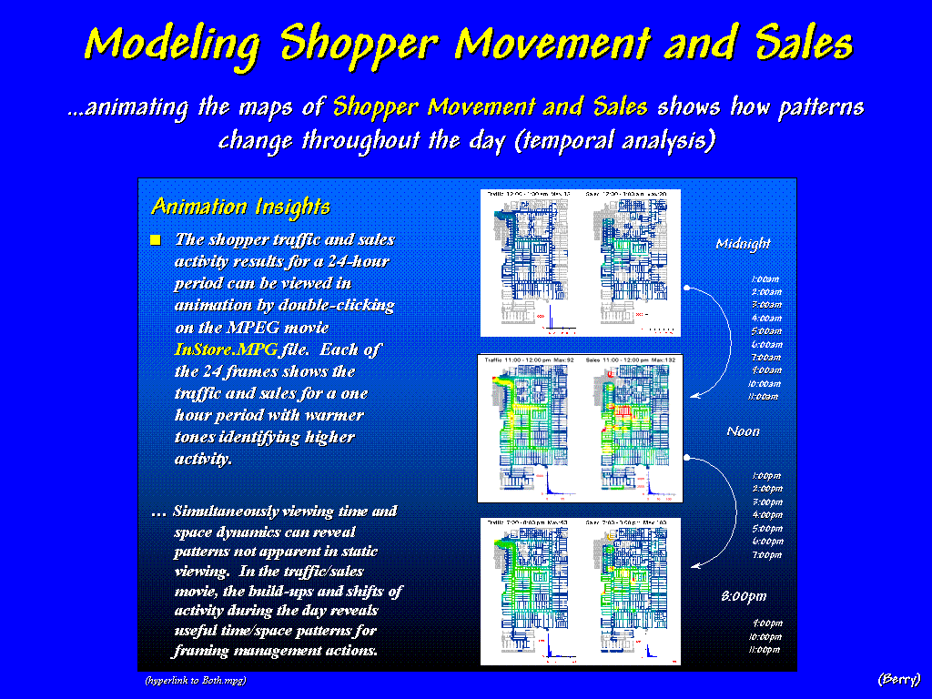 [#34 …Shopper Movement--Animation]
The GIS model can be extended by "animation" of the maps of
Shopper Movement and Sales to show how patterns change throughout the day (…click
on the hyperlink to activate).
When the side-by-side displays are animated, the warmer colors of higher
activity appear to roll in and out like wisps of fog under the Golden Gate
Bridge. The similarities and
miss-matches in the ebb and flow of movement and sales provide a dramatic view
of the spatial/temporal relationships contained in the traditionally
non-spatial records of cash registers receipts. (…stop the mpeg movie,
then advance to slide #20).
[#34 …Shopper Movement--Animation]
The GIS model can be extended by "animation" of the maps of
Shopper Movement and Sales to show how patterns change throughout the day (…click
on the hyperlink to activate).
When the side-by-side displays are animated, the warmer colors of higher
activity appear to roll in and out like wisps of fog under the Golden Gate
Bridge. The similarities and
miss-matches in the ebb and flow of movement and sales provide a dramatic view
of the spatial/temporal relationships contained in the traditionally
non-spatial records of cash registers receipts. (…stop the mpeg movie,
then advance to slide #20).
[#35 …Video
Mapping System]
That brings us to another "beyond
mapping" application—the linking of multimedia and GIS. GPS signals can be "stamped" to
one of the audio channels whenever a handy-cam is used. When the tape is played back to the
computer, it's automatically geo-referenced to a base map. This allows users to click on a map and
retrieve the streaming footage or a captured still image for any location. (…hyperlink to HTMLs)
[#]
For example, an ultralite—you know a hang glider with an engine—was used for a
“bumblebee” flight over Lorry State Park near Fort Collins, Colorado. Clicking anywhere along the flight path (shown
as the blue line) brings up the aerial footage beginning at that location. Users can “drop a pin” at any point and
capture a still image for that location (…click on a couple of blue dots).
[#]
Field plots can be augmented with images, as well as traditional inventory data
and summary statistics (…click on a couple of red dots). In this vein, field data collection is
extended to field experience collection that tempers abstract maps
and dense tables with glimpses of reality (…return from hyperlink).
 [#36 …VF General Scene] GIS's
"paper map" legacy is extended through a rich set of geo-query and
display tools that facilitate data handling.
Video multimedia links the GIS to reality. However, effective decision-making requires more than just data
access and graphical presentation of current conditions.
[#36 …VF General Scene] GIS's
"paper map" legacy is extended through a rich set of geo-query and
display tools that facilitate data handling.
Video multimedia links the GIS to reality. However, effective decision-making requires more than just data
access and graphical presentation of current conditions.
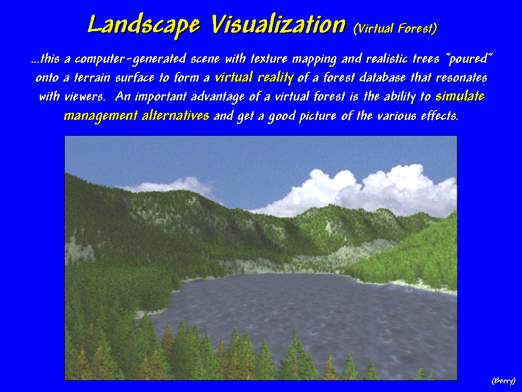
GIS
not only describes “what is,” but can
help us visualize and communicate “what
could be.” This slide is a computer-generated
scene with texture mapping and rendering replacing familiar map colors and
symbols with realistic tree-objects that are “poured” onto a terrain
surface. The result is a virtual
reality of a forest database that resonates with viewers.
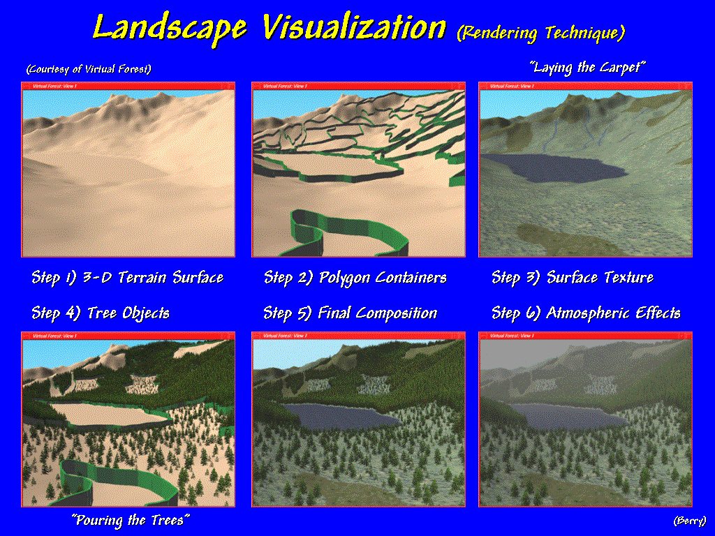 [#37 …Steps in 3D Rendering] There are several
basic steps in generating a rendered scene.
A light-shaded terrain surface is generated and the polygon containers
linked to the forest inventory are identified.
Based on the vegetation data, appropriate textures are chosen for the
forest floor, open spaces and landscape features. This step is like laying a carpet within each polygon container.
[#37 …Steps in 3D Rendering] There are several
basic steps in generating a rendered scene.
A light-shaded terrain surface is generated and the polygon containers
linked to the forest inventory are identified.
Based on the vegetation data, appropriate textures are chosen for the
forest floor, open spaces and landscape features. This step is like laying a carpet within each polygon container.
Next
the tree objects are added. The vegetation factors of tree-type, age and
density are combined with the viewing factors to determine how the bit maps of
the tree-objects are resized and positioned.
The final map combines the surface texturing with the tree objects. Atmospheric conditions, such as haze, add a
final touch. Seasonal effects, such as
a winter-scene or fall coloration, simply assign a new set of texture maps and
tree objects.
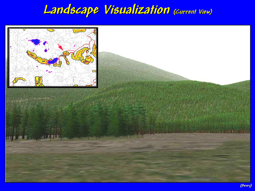 [#38 …Forested Scene]
An important advantage of a virtual forest is the ability to simulate
management alternatives and get a good picture of various effects. For example, consider this computerized
landscape derived from an ArcInfo vegetation map. Inventory data of tree type, age, composition and stocking for
each forest parcel is used to place the trees, grass, and other features in the
scene. But what would the scene look
like if a clear-cut were introduced?
[#38 …Forested Scene]
An important advantage of a virtual forest is the ability to simulate
management alternatives and get a good picture of various effects. For example, consider this computerized
landscape derived from an ArcInfo vegetation map. Inventory data of tree type, age, composition and stocking for
each forest parcel is used to place the trees, grass, and other features in the
scene. But what would the scene look
like if a clear-cut were introduced?
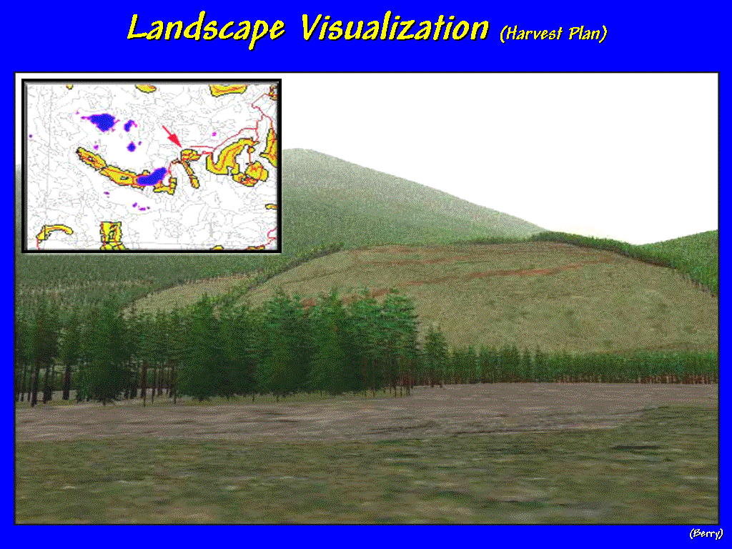 [#39 …Clear-cut Scenario A] The
user should be able to query a simulation as easily as they geo-query a static
database. In this example, the user
simply identified the type of harvest and the forest parcels involved to
generate the simulated rendering. Or
different harvest boundaries can be simulated…
[#39 …Clear-cut Scenario A] The
user should be able to query a simulation as easily as they geo-query a static
database. In this example, the user
simply identified the type of harvest and the forest parcels involved to
generate the simulated rendering. Or
different harvest boundaries can be simulated…
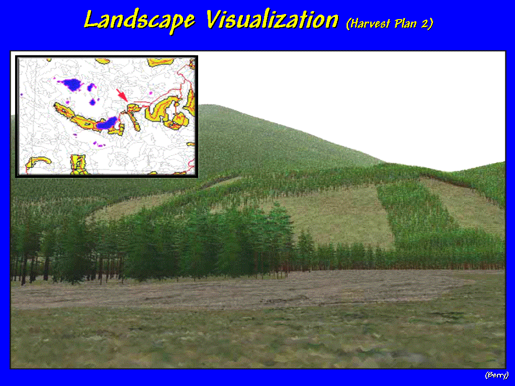 [#40 …Clear-cut Scenario B] …to investigate the visual impacts of other
possible bad haircuts. To be effective
in decision-making, the interaction with a GIS must be immediate and comfortable
for the decision-makers. If there is a
time-lag for GIS wizards to concoct their magic, the interactive dialog with
mapped data is lost.
[#40 …Clear-cut Scenario B] …to investigate the visual impacts of other
possible bad haircuts. To be effective
in decision-making, the interaction with a GIS must be immediate and comfortable
for the decision-makers. If there is a
time-lag for GIS wizards to concoct their magic, the interactive dialog with
mapped data is lost.
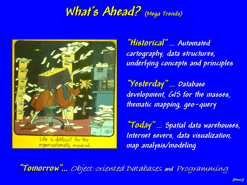
[#41
…What's
Ahead] Our historical roots
focused on automating the cartographic process and refining the digital
map. These efforts evolved into spatial
database management systems providing a host of useful thematic mapping and
geo-query tools. Our current focus is
on extending these capabilities to larger databases accessed over the Internet
and broadening applications in both their general use and ability to model
complex spatial relationships. So
what's ahead? On the technical front,
without question, it's object-oriented databases and programming.
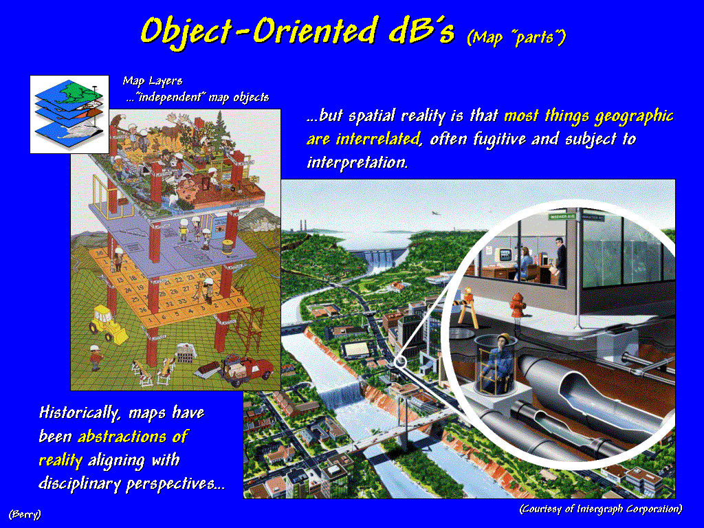 [#42 …Object-Oriented
dB1] Historically, maps have been abstractions of
reality aligning with disciplinary perspectives. They often are described as separate map layers conjuring up thoughts
of laying transparent sheets on a light-table and viewing the coincidence
within a stack of maps. But spatial
reality is that most things geographical are interrelated, often fugitive and
subject to interpretation—rarely independent perspectives complied into
disjoint renderings by varied disciplines.
The figure on the right suggests a complex spatial reality of spatially
linked occurrences.
[#42 …Object-Oriented
dB1] Historically, maps have been abstractions of
reality aligning with disciplinary perspectives. They often are described as separate map layers conjuring up thoughts
of laying transparent sheets on a light-table and viewing the coincidence
within a stack of maps. But spatial
reality is that most things geographical are interrelated, often fugitive and
subject to interpretation—rarely independent perspectives complied into
disjoint renderings by varied disciplines.
The figure on the right suggests a complex spatial reality of spatially
linked occurrences.
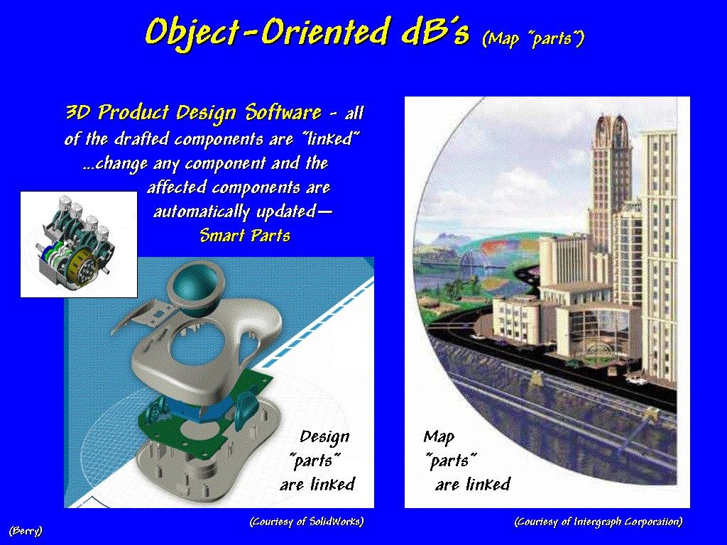 [#43 …Object-Oriented
dB2] That's the underlying assumption of object-oriented databases. 3-D product design software pioneered this
perspective. You have probably seen an
engineering equivalent in a host of TV commercials, such as the Chrysler one
that "peels-away" the body and interior components to just the car's
drive train, then reconstructs it. This
is accomplished by a database with all of the components inter-linked and the
rigidly enforced associations can be traversed and displayed by simple queries.
The linking of the "design" parts are analogous to the linking of
"map parts" in an object-oriented GIS database that tracks all common
features, coincident lines and spatial dependencies.
[#43 …Object-Oriented
dB2] That's the underlying assumption of object-oriented databases. 3-D product design software pioneered this
perspective. You have probably seen an
engineering equivalent in a host of TV commercials, such as the Chrysler one
that "peels-away" the body and interior components to just the car's
drive train, then reconstructs it. This
is accomplished by a database with all of the components inter-linked and the
rigidly enforced associations can be traversed and displayed by simple queries.
The linking of the "design" parts are analogous to the linking of
"map parts" in an object-oriented GIS database that tracks all common
features, coincident lines and spatial dependencies.
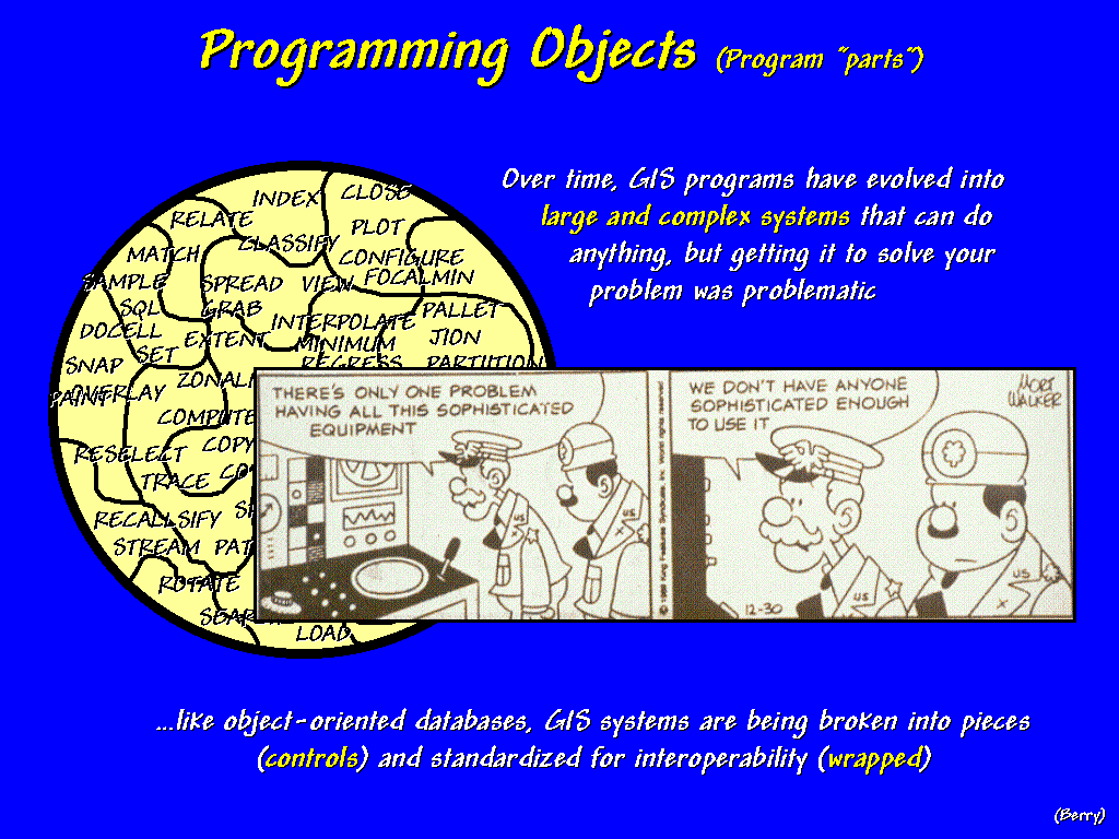 [#44 …Programming Objects1] Programming objects promise a
similar revolution in software design and use.
Most current GIS programs have evolved into large and complex systems
that can do just about anything, but getting them to solve your problem was
often problematic. As general Halftrack
notes "…there’s only one problem having all this sophisticated
equipment; we don’t have anyone sophisticated enough to use it.” Like object-oriented databases, GIS systems
are being broken into pieces (termed controls) and standardized for
interoperability (termed wrapping).
[#44 …Programming Objects1] Programming objects promise a
similar revolution in software design and use.
Most current GIS programs have evolved into large and complex systems
that can do just about anything, but getting them to solve your problem was
often problematic. As general Halftrack
notes "…there’s only one problem having all this sophisticated
equipment; we don’t have anyone sophisticated enough to use it.” Like object-oriented databases, GIS systems
are being broken into pieces (termed controls) and standardized for
interoperability (termed wrapping).
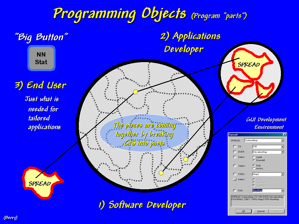 [#45 …Programming
Objects2] What this means is that
software developers are "exposing" the individual operations within a
GIS to application developers. The
result is tailored software that strips away all of the unnecessary routines
and picks-and-chooses the ones from a host of GIS packages and other systems
that best fits the problem—sort of like choosing off the al cart menu for just
want you want. Also, the approach makes
the assembly of these "boutique packages" much easier by adhering to
common computer programming standards rather than developing proprietary
scripting environments. At the bottom-line
are packages that are laser-focused on the applications of specific groups of
users, not cumbersome, all-purpose toolboxes with hundreds of commands and a
shelf full of manuals. As you stroll
the vender area, ask about their objectives in "object-oriented"
databases and programming.
[#45 …Programming
Objects2] What this means is that
software developers are "exposing" the individual operations within a
GIS to application developers. The
result is tailored software that strips away all of the unnecessary routines
and picks-and-chooses the ones from a host of GIS packages and other systems
that best fits the problem—sort of like choosing off the al cart menu for just
want you want. Also, the approach makes
the assembly of these "boutique packages" much easier by adhering to
common computer programming standards rather than developing proprietary
scripting environments. At the bottom-line
are packages that are laser-focused on the applications of specific groups of
users, not cumbersome, all-purpose toolboxes with hundreds of commands and a
shelf full of manuals. As you stroll
the vender area, ask about their objectives in "object-oriented"
databases and programming.
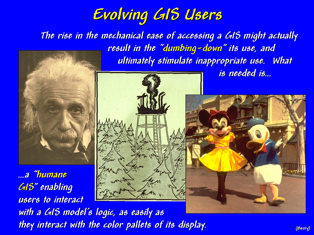 [#46 …Mickey & Minney] But
the future of GIS lies in its acceptance and creative use as much as it lies in
its technological advancements.
Indisputably, GIS technology has grown up and moved from the laboratories
of the pioneers to large software houses and applications in almost every
business activity. As a result, it is
facing a utilitarian user who lacks the sentimental attachment and patience of
earlier GIS zealots. The excitement of
“developing technology for technology's self” has given way to its practical
use. It has been sold as a toolbox, and
users are clambering for it to be as easy to use as a hammer. A friendly, graphical user interface
composed of icons, scroll lists, buttons, and bows makes interacting with a GIS
much easier.
[#46 …Mickey & Minney] But
the future of GIS lies in its acceptance and creative use as much as it lies in
its technological advancements.
Indisputably, GIS technology has grown up and moved from the laboratories
of the pioneers to large software houses and applications in almost every
business activity. As a result, it is
facing a utilitarian user who lacks the sentimental attachment and patience of
earlier GIS zealots. The excitement of
“developing technology for technology's self” has given way to its practical
use. It has been sold as a toolbox, and
users are clambering for it to be as easy to use as a hammer. A friendly, graphical user interface
composed of icons, scroll lists, buttons, and bows makes interacting with a GIS
much easier.
But
has it enhanced the understanding of complex applications? The rise in the mechanical ease of accessing
a GIS might actually result in the “dumbing-down” its use, and ultimately
stimulate inappropriate use of "big button" solutions.
Remember,
GIS used to be “down the hall and to the right” in a room populated with
technical specialists. Now that it’s on
everyone’s desk, we need a mechanism that helps users understand a GIS
application, as well as its operational expedients. What is needed is… a
“humane” GIS enabling users to interact with a GIS application, as easily
as they interact with the color pallets of its display. Key to this cognitive view is the emerging
concept of a “dynamic map pedigree” linking GIS code to a flowchart of the
processing.
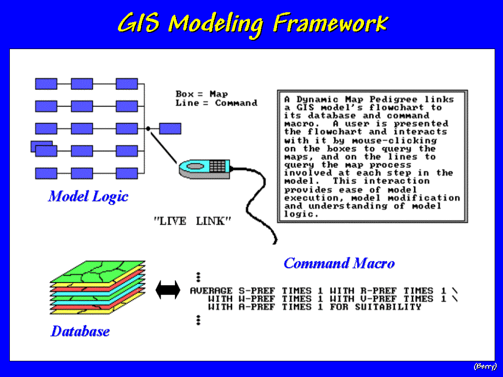 [#47
…GIS Modeling Framework] A GIS
model involves a series of processing steps that converts mapped data into
information, and in some cases into actual decision alternatives. Throughout the processing, assumptions are
made and interpretations of the conditions are implemented. The link between a model’s logic and its
specific expression as a command macro forms a chasm between users and GIS
specialists. A dynamic flowchart of the
processing might help bridge this gap.
[#47
…GIS Modeling Framework] A GIS
model involves a series of processing steps that converts mapped data into
information, and in some cases into actual decision alternatives. Throughout the processing, assumptions are
made and interpretations of the conditions are implemented. The link between a model’s logic and its
specific expression as a command macro forms a chasm between users and GIS
specialists. A dynamic flowchart of the
processing might help bridge this gap.
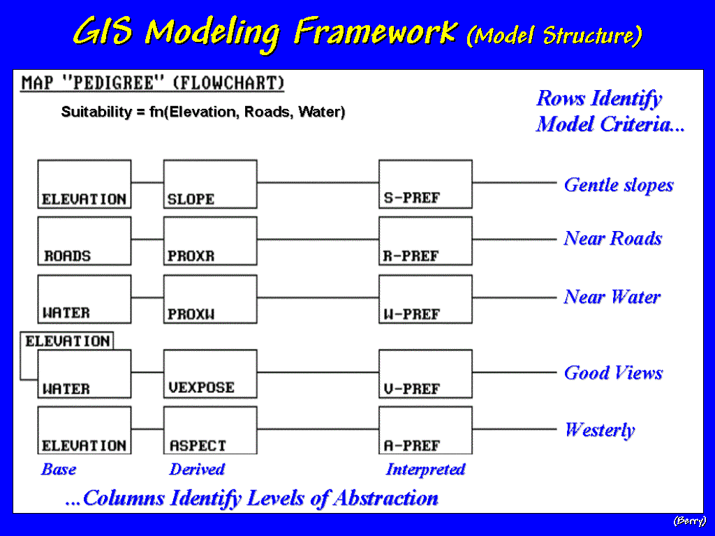 [#48 …Model Structure] For example, a Campground Suitability
Model can be flowcharted as shown in this slide. Its criteria are identified as rows, while the level of
abstraction from base maps, to derived maps, to interpreted maps are
represented as columns.
[#48 …Model Structure] For example, a Campground Suitability
Model can be flowcharted as shown in this slide. Its criteria are identified as rows, while the level of
abstraction from base maps, to derived maps, to interpreted maps are
represented as columns.
The
top row expresses a concern for siting the campground on gentle slopes. It begins with an Elevation map and uses the
slope command to derive a map of
relative steepness. In turn, this map
is interpreted to identify the good
slopes that are gentle.
In
a similar manner, concerns to be near roads, near water, have good views of
water and westerly oriented are evaluated.
Note that the model criteria form submodels that have a common logical
flow— base, derived, then interpreted data.
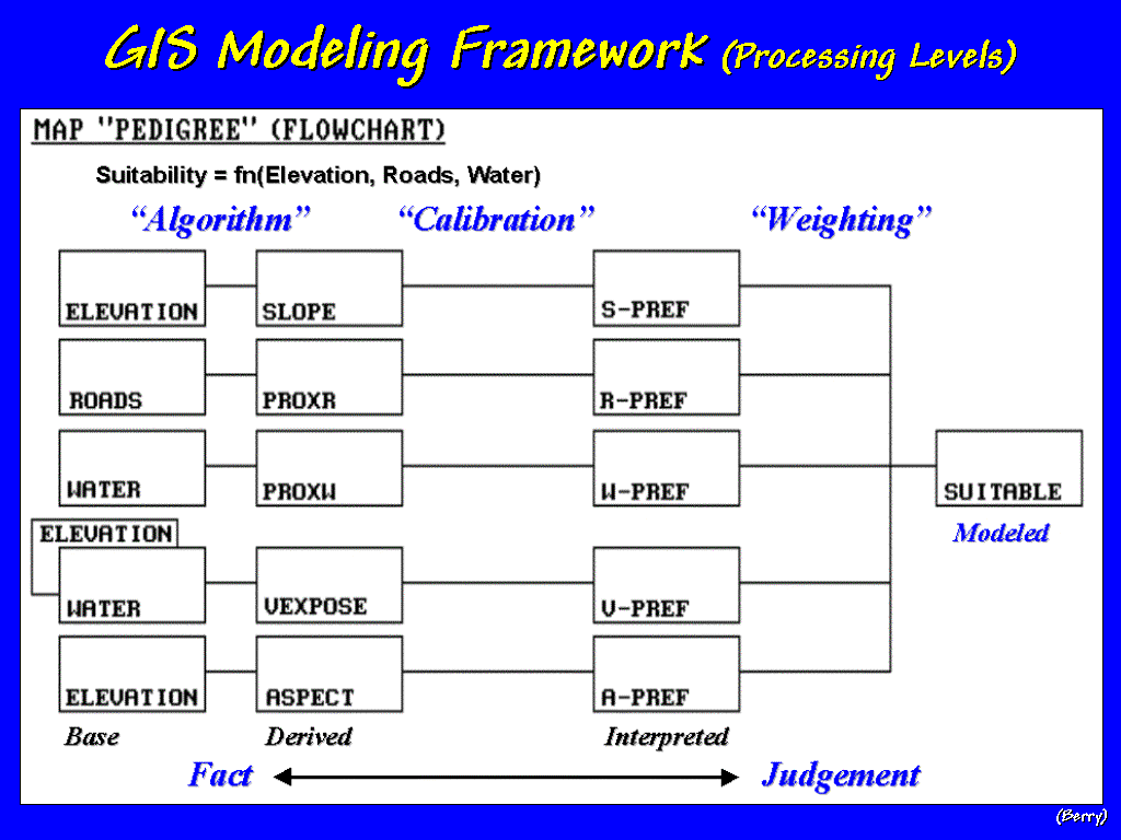
[#49 …Processing Levels] In
this example, weighted-averaging of the criteria is used to combine the five
factors. This is something akin to a
professor using different weights for five exams when assigning a grade for the
semester. Locations on each of the
criteria maps are first graded, then combined for an overall campground
suitability map.
The
important point is that while the left side of the flowchart primarily involves
the GIS specialist, the right side involves end-user knowledge and
sensitivities. As processing moves from
left to right, the physical characteristics and conditions (Data) are translated by assumptions and
values (Judgement). Within a decision context, a variety of
assumptions and values are simulated so the decision-makers can visualize the
sensitivity and relative merits of a series of possible perspectives.
In
most applications, this interactive dialog with the logic of a model is
extremely limited. To the users, it
requires a pilgrimage “down the hall and
to the right” to the GIS alter for each iteration of possible
alternatives. To the specialists it
perpetrates frustration with the “endless
waffling of the policy-wonks” who never seem to make up their minds. In many organizations, the cultural clash
has lead to simply wallpapering the conference room with a bunch of colorful
base maps, and very little GISing.
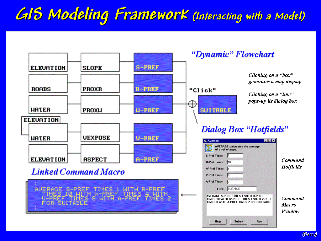 [#50 …Linking Logic] An alternative is to interactively link
the flowchart of a model’s logic to its processing code. In this environment the specialist and
end-user collaborate on building the structure of the model, then the
specialist implements it. In doing so,
global variables are used at decision points and linked to the flowchart’s
boxes (representing maps) and lines (representing processing steps). Once assembled, users can click on any part
of the model’s logic and assess the assumptions at that step. On their own, they can modify the
“calibration and weighting factors” to run different scenarios.
[#50 …Linking Logic] An alternative is to interactively link
the flowchart of a model’s logic to its processing code. In this environment the specialist and
end-user collaborate on building the structure of the model, then the
specialist implements it. In doing so,
global variables are used at decision points and linked to the flowchart’s
boxes (representing maps) and lines (representing processing steps). Once assembled, users can click on any part
of the model’s logic and assess the assumptions at that step. On their own, they can modify the
“calibration and weighting factors” to run different scenarios.
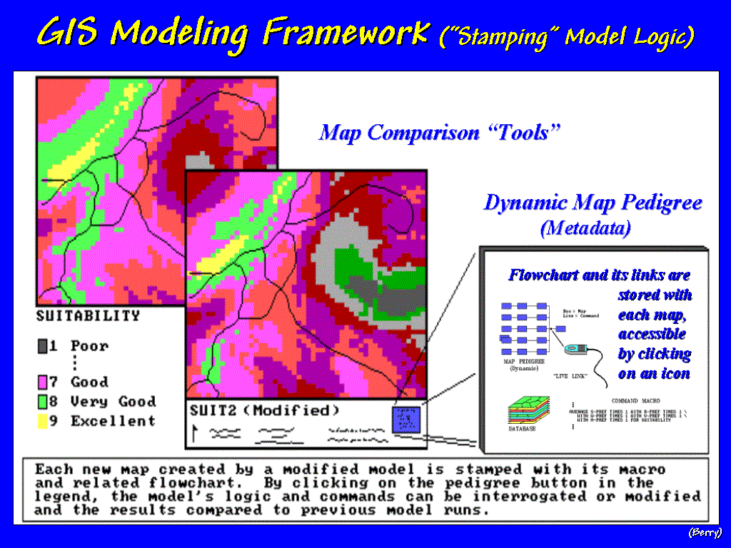 [#51 …Stamping Logic] The different scenarios can be compared
to visualize the effects of various alternatives. The change in model results as different assumptions are
investigated provides an entirely new perspective on the sensitivities of
potential decisions.
[#51 …Stamping Logic] The different scenarios can be compared
to visualize the effects of various alternatives. The change in model results as different assumptions are
investigated provides an entirely new perspective on the sensitivities of
potential decisions.
The
“pedigree” of each modeled map is contained in its flowchart and
parameterization. These files are
stored with the metadata for each map and can be accessed through a button in
the map’s legend. In a sense, a dynamic
flowchart is like a geo-query, except the logic of a spatial model is
queried. A better analogy might be a
“spatial spreadsheet” where users can induce and visualize the effects of
management alternatives— it’s main difference is that the “bottom line” is a
map. In this example, candidate
locations for a campground, but with minimal modifications the model could help
identify locations for "mega-buck estates" or "fractious factory
outlet mall."
Concluding
Thoughts… A PARADIGM SHIFT FROM MAPS TO SPATIAL REASONING
In just three decades GIS has evolved
from its historical roles of computer mapping and spatial database management
to GIS modeling and new forms of interacting with mapped data. The next decade of GIS will take us from the
map room to the boardroom, and even to the public hearing, where it is used as
an active ingredient in conceptualizing alternatives. Within this context GIS isn't used to provide colorful map
answers and conference room wallpaper, but is used in participatory
decision-making. Within this context,
GIS is used as a means to respond to a series of "what if" scenarios in which any single map isn't
important. It is how maps change as
different perspectives are tried that becomes the information for a
decision.
The
new paradigm actively involves decision-makers in the analysis process instead
of just choosing from a set of alternatives, or tacit decisions, produced by
detached analysis in the GIS shop down
the hall and to the right.
The
trek from the map room to the boardroom and the kitchen table isn’t so much
increased number crunching and friendly user interfaces for geo-query, as it is
communication of ideas and possibilities.
It isn’t just archiving more data and developing faster mappers simply
to increase the deluge of colorful map products. It isn’t just sharing data, but expanding on how that data is
assimilated and transformed into useful information, and ultimately viable
management alternatives. As exciting as
the past three decades in GIS has been, our future will be even more
exhilarating as we move beyond mapping to spatial reasoning—the common thread
in GIS.
 [#53 …Last Slide] Thank you for the opportunity to speak this afternoon
and the opportunity to work with you throughout the academic year.
[#53 …Last Slide] Thank you for the opportunity to speak this afternoon
and the opportunity to work with you throughout the academic year.