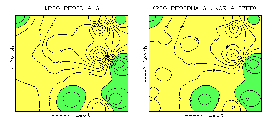
Figure 1. Comparison of Residual Maps (2-D) Using Absolute and Normalized Kriging Residual Values.
From recent GIS Toolbox articles (How Good Is My Map, September, 1996; A Map of Error, October 1996), recall that a map was generated from the boo-boos (more formally termed residuals) uncovered by comparing interpolated estimates with a test set of known measurements. Numerical summaries of the residuals provided insight into the overall interpolation performance, whereas the map of residuals showed where the guesses were likely high and where they were likely low. The map on the left side of figure 1 is the "plain vanilla" version discussed in the October article. The one on the right is the normalized version. See any differences or similarities? At first glance, the sets of lines seem to form radically different patterns. A closer look reveals that the patterns of the darker tones are identical. So what gives?
Defining the Norm
First of all, let’s consider how the residuals were normalized. The arithmetic mean of the test set (28) was used as the common reference. For example, test location #17 estimated 2 while its actual value was 0, resulting in an overestimate of 2 (2-0= 2). This simple residual is translated into a normalized value of 7.1 by computing (0-2)/28)*100= 7.1, a signed (+ or -) percentage of the "typical" test value. Similar calculations for the remaining residuals brings the entire test set in line with its typical, then a residual map is generated. Now let’s turn our attention back to the maps. As the techy-types among you guessed, the spatial pattern of interpolation error is not effected by normalization (nor is its numerical distribution)— all normalizing did was "linearly" re-scale the map surface. The differences you detect in the line patterns are simply artifacts of different horizontal "slices" through the two related map surfaces. Whereas a 5% contour interval is used in the normalized version, a contour interval of 1 is used in the absolute version. The common "zero contour" (break between the two tones) in both maps have an identical pattern, as would be the case for any common slice (relative contour step).
Comparing the Comparable
Ok… but if normalizing doesn’t change a map surface, why would anyone go to all the extra effort? Because normalizing provides the consistent referencing and scaling needed for comparison among different data sets. You can’t just take a couple of maps, plop them on a light table, and start making comparative comments. Everyone knows you have to adjust the map scales so they will precisely overlay (spatial registration). In an analogous manner, you have to adjust their "thematic" scales as well. That’s what normalization does. Now visually compare magnitude and pattern of error between the Kriging and the Average surfaces in figure 2. A horizontal plane aligning at zero on the Z-axis would indicate a "perfect" residual surface (all estimates were exactly the same as their corresponding test set measurements). The Kriging plot on the left is relatively close to this ideal which confirms that the technique is pretty good at spatially predicting the sampled variable. The surface on the right identifying the "whole field" Average technique shows a much larger magnitude of error (surface deflection from Z= 0). Now note the patterns formed by the light and dark blobs on both map surfaces. The Kriging overestimates (dark areas) are less pervasive and scattered along the edges of the field. The Average overestimates occur as a single large blob in the southwestern half of the field. What do you think you would get if you were to calculate the volumes contained within the light and dark regions? Would their volumetric difference have anything to do with their Average Unsigned Residual values in the residual table discussed a couple of articles ago? What relationship does the Normalized Residual Index have with the residual surfaces? …Bah! This map-ematical side of GIS really muddles its comfortable cartographic side— bring on the colorful maps at megahertz speed and damn the details.
Note: Contact the author for "…the rest of the story (Part 2)" comparing the normalized residual maps of the Averaging, Inverse, Kriging and Minimum Curvature interpolation techniques.
|
Figure 1. Comparison of Residual Maps (2-D) Using Absolute and Normalized Kriging Residual Values. |
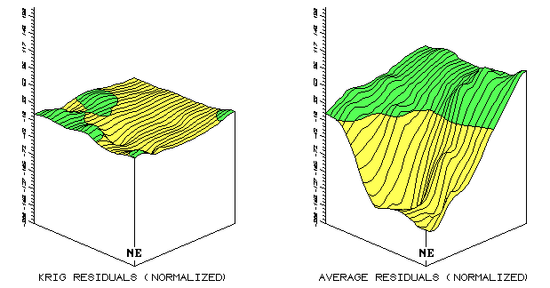 |
Figure 2. Comparison of Residual Map Surfaces (3-D) Using Residual Values Derived by Kriging, and Average Interpolation Techniques. |