 |
(Draft not for general distribution)
THE PRECISION FARMING PRIMER
GIS Technology and Site Specific Management in Production Agriculture
by Joseph K. Berry
Understanding GIS (Part 5)
Geographic Information Systems (GIS) provides the technological "glue" of the Precision Farming process— organizing mapped data
What is GIS? (1/94-- Ag/INNOVATOR)
What is GIS? Sure it’s an acronym for Geographic Information Systems, but it means different things to different people. To some, it’s a tool to create and update maps. To others, it’s a technology for combining and interpreting mapped data. However, all agree that in the broadest sense, it’s a revolution in map structure, content and use.
In the real world, the landscape is composed of soil (never enough), rocks (too many), water (often too little), plants (more often weeds) and a vicissitude of biological life. In the paper world, words, numbers and graphics are used to represent these things. A traditional map is a graphical representation that accounts for geographic space (where), as well as the characteristic and condition (what).
GIS takes the traditional map to new heights and may be described by its process, data, and analytical capabilities. The GIS process involves encoding, storage, processing and display of computerized (digital) maps.
Processing functions include 1) computer mapping, 2) spatial database management, and 3) spatial statistics, analysis and modeling. These functions are descriptive and interpretive, as well as prescriptive in nature. Computer mapping is a descriptive process that rapidly creates and updates map products. It provides tools for automating the cartographic process, but does not alter the inherent nature of a traditional map.
Spatial database management is used to combine and interpret sets of mapped data. It provides new procedures for "geo-query" of the data. For example, a database map can be searched for map compartments with certain requirements (such as low pH values in a certain soil type), then produce a map locating these areas. The spatial modeling capabilities extend the descriptive and interpretive uses of maps by deriving new information through the relationships among existing maps. For example, template maps can be "summarized" for typical characteristics (such as average slope for each mapping compartment), and the result can be added as a new column to the database.
Part of the revolution in GIS simply involves "digitizing" familiar maps (converting ink to numbers). However, GIS goes beyond just a new form of maps. It is a powerful set of new tools for "map-matical" processing of these data and modeling complex systems, such as crop production—describing, interpreting, predicting and prescribing the potential.
Data Formats (2/94-- Ag/INNOVATOR)
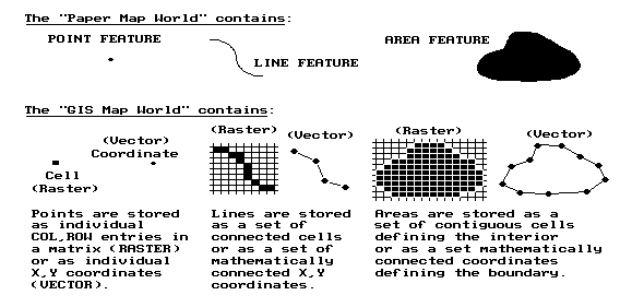
Traditional maps are graphical abstractions containing inked lines, shadings and symbols to locate landscape features. Points represent dimensionless features, such as wells. Lines depict features with length, such as streams or waterways. Areas (or polygons) have length and width, such as agricultural fields. Add depth, and areas are extended to volumes, such as the entire body of water in a pond. Hyper-volumes continue to extend the dimensions beyond simple geometry, such as considering time (mapping the rising and falling levels in a body of water throughout a year).
Most maps are composed of points, lines and areas. For example, a typical field map may identify an irrigation gate as a dot, an irrigation ditch as a squiggle, and a ponding area as a blob. A GIS can produce a similar graphic representation, but it doesn’t store the data that way.
|
In a vector-based GIS world, map features are represented by X, Y coordinates. Points are identified as a single coordinate pair. Lines are a connected set of points (like a connect-the-dot picture). Areas, such as soil type units, are identified by a list of coordinates defining the line segments forming their borders. The fundamental unit of a vector system is the point. A line is constructed by connecting individual points. An area is constructed by a line that connects to itself forming a border around the area of interest. The data structure and mathematics defining the implied line segments is extremely complex. The basic structure of points, lines and areas, however, is very familiar as it mimics the inked markings on traditional maps.
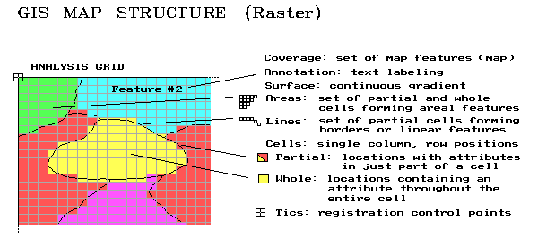
A less familiar format, termed raster, uses an imaginary grid of cells (similar to a spreadsheet layout) to represent the landscape. Points are individual Column, Row entities (grid cells), lines are a set of connected cells, and areas are stored as all the cells within the interior of each map feature. Although this data structure has several advantages, it has a major disadvantage—lack of spatial precision. If a stream passes through an acre grid cell, the whole cell is identified as containing the stream. You don’t know if it’s at the top, bottom, or wiggles several times through the center of the cell.
At this juncture, it is important to note that vector systems "precisely locate" map features, whereas raster systems "statistically express the occurrence" of features. Generally speaking, vector is better for computer mapping and spatial database management processing functions, while raster is better for spatial modeling of the relationships within and among mapped data.
In part, this distinction arises from the recognition of a fourth basic map feature—surfaces. Whereas points, lines and areas form discrete spatial entities, a map surface depicts a continuously changing gradient. Elevation, for example, is constantly changing throughout geographic space. While representing elevation as a series of discrete contour lines may be familiar, it is an inaccurate representation (hold-over from manual drafting). Similar arguments hold for the complex spatial distributions of crop yield and soil nutrient levels, as well as a multitude of other farm conditions affecting crop production.
Though less precise at depicting discrete features, raster systems are ideal for representing map surfaces. They partition geographic space into consistent spatial units (grid cells) that are analogous to sample plots—it’s just that there is a sample plot everywhere. In techy-speak, raster’s contiguous set of grid cells "sample" the continuous spatial distribution of each variable and maps its spatial autocorrelation.
Also, analysis of the spatial dependency among maps is simplified by using a consistent "sampling" grid. Since the grid cells align in each map, the computer simply retrieves the necessary data stored for each cell location. A vector-based system, on the other hand, must calculate the coincidence for each irregularly bounded feature with every other feature on every map—a considerable task as most map’s contain hundreds of irregular features defined by a multitude of mathematically implied line segments.
Data Links (2/94-- Ag/INNOVATOR)
How are maps linked to descriptive data? In the paper world, the human is the link, running back and forth between a map on a wall and data about map features stored in file cabinets. If a farm cooperative needs to know which fields have certain corn varieties growing on Cohasset soil, they flip through their files and note the field numbers of the ones they’re after. Then they go to the map to locate them. If they wonder what the variety and soil type is for a neighboring field or forest stand, they run back to the files.
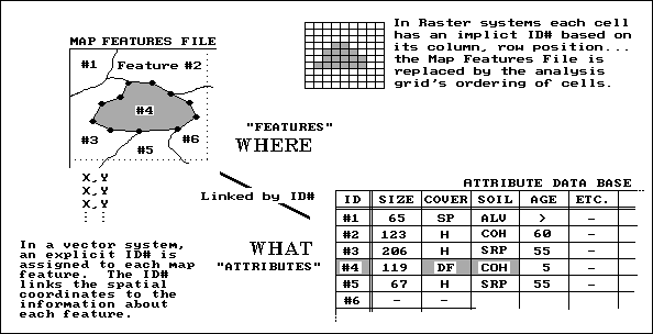 |
That’s a lot of work for humans, but a snap for a GIS system. In effect, the map and file cabinets are electronically linked as shown in the accompanying figure. A common identification number (ID#) is part of the map features (where) and the thematic attribute (what) tables. Actually, these tables are just plain old databases—one stores the X, Y coordinates, while the other stores the information about each feature. Each row of the attribute table (termed records) is divided into several columns (termed items). This is similar to the old days when data (items) was kept on a 4x5 card (record) for each field.
In techy-speak, a "database entry, geo-query" searches the attribute table for the items COVER = DF (for Darn Fine corn) AND SOIL = COH (for Cohasset). As shown in the figure, map feature #4 is the only one that meets the joint condition. Its coordinates are plotted to the screen and filled with a vibrant color of your choice. The GIS searches the remaining 10,000 features (individual fields) within the county, and all of the "hits" are plotted in matter of seconds.
Conversely, a "map entry, geo-query" involves "mouse-clicking" anywhere on the map and all of the data for that field instantly pops-up. Think of the shoe leather you could save!
The raster world has an analogous link. Each cell has an implicit ID# based on its column, row position. By convention, the analysis grid is ordered as you read a book, from left to right, top to bottom. By implication, the first cell (ID# 1) is in the upper-left corner. The next cell (ID# 2) is the adjacent cell to the right. The sequential numbering continues through the last column of the first row. It then picks up the sequence for each successive row. It finally finishes with the lower-right cell. Most raster systems store their "what" information in a separate attribute table for each map.
A few raster systems, however, store the information as one large table with each record (row) indicating a grid cell and each item (column) describing a separate thematic attribute, such as variety, soil type, and elevation. If you think about it, the similarities between vector and raster formats should be apparent. The attribute databases, containing the "what" information, are nearly identical with the exception of the ID#’s—explicit for vector, implicit for raster. The map features file, containing the "where" information, for vector stores irregular features, whereas for raster it is an implied analysis grid of regular cells.
Dumb Maps (5/94-- Ag/INNOVATOR)
When you view a map, all sorts of things are apparent. If two blue lines come together you instantly recognize it as a fork in a stream. You easily comprehend which stream networks are connected, and which are not. Your interpretation of contour lines even tells you which way water flows.
A geographic information system isn’t as lucky. The relationships among the features forming a map (termed map topology) has to be contained in the data’s organization. The GIS may know that a coordinate pair (X, Y location) is identified with a stream. But without topology it has no idea how that location relates to all of the other map locations.
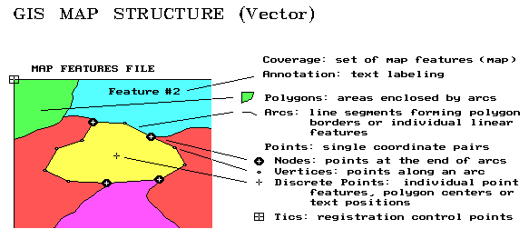 |
Recall that the fundamental element of map structure in a vector system is the point, represented by an X, Y pair of values. These coordinates usually relate to a standard earth coordinate system such as latitude and longitude. Although the geo-referencing is the same, there are several types of points. Tics are geographic control points used in registering a map. Discrete points are used to represent information such as wells. These independent points also are used to associate data with areas and to position map labels. Vertices and nodes are points used to construct lines and polygons. This process is similar to "connect-the-dots" drawings. Vertices are merely are merely passed through, whereas nodes identify the special points where more than two lines meet.
The set of all line segments (connected vertices) between two nodes forms an arc. For linear features, such as a stream network, the GIS data structure keeps track of the connected arcs. When a stream flows into a lake, the node tagged as an inlet. The stream node at the other end of the lake is identified as an outlet. You "see" this stuff; the computer has to be told.
Polygons are areas enclosed by arcs. Just as several points form an arc, a closed series of arcs form polygons. A discrete point inside each polygon (usually the centroid) serves as a quick link to information about it such as soil, size, and crop. When polygons are adjoining, such as soil types within a field, their shared arcs are tagged with a special code. In this manner, the GIS knows the adjoining polygons, and their adjoining polygons, and so on.
With minimal guidance from map annotations and labels, you see all these relationships in a paper map. But the GIS just "see" a huge pile of numbers. It must incorporate all of the relationships you see into its data structure. When it jumps into the middle of a map (technically termed a coverage), it has to be able to sequentially construct all of the relationships among map features. Yep, digital maps are dumb without a data structure that keeps track of all the details.
Raster Features (6/94-- Ag/INNOVATOR)
The vector data structure is constructed by connecting points, lines, and arcs, then explicitly storing their relationships such as which polygons are touching. Recall that raster systems store the "what" information with an implicit (rather than explicit) ID# that’s based on the position of the information in a data file. The entire landscape is covered by an imaginary grid of cells, the basic unit of this data structure. Like vector’s point, there are different types of cells. A whole cell contains a single map characteristic throughout its interior such as a particular soil type. A partial cell contains a mixture of characteristics such as portions of two soil types, or an individual characteristic, such as a road or spring, that is too small to cover the entire cell.
 |
It’s the partial cells that account for the lack of precision in raster data. In this data structure, all of the spatial detail smaller than a cell gets lost. If a finer analysis grid is used, precision increases. In theory, the grid could be as fine as the X, Y coordinates in a vector system, yielding identical spatial precision. However, the storage and processing demands at such a high resolution exceed the capacity of most modern computers.
Until a super computer sits on every desk, an oversized partial cell must be used to identify a single point in geographic space. Connected series of partial cells identify rasterized line features. A set of whole (interior) and partial (border) cells identify rasterized areas. To simplify things, the characteristic dominating a border cell can be can be assigned, thus making it a whole cell (and a whole lot easier to conceptualize and store).
Also recall that raster structure allows us to extend the basic map features from just discrete points, lines and areas to map surfaces. A surface describes the continuous distribution of gradient data. Elevation is a classic example, at least in hilly terrain. Each grid cell is assigned an elevation value that typifies the elevation within its boundary. The raster format of elevation data is termed a "digital elevation model (DEM)" and contains radically different information than the traditional contour lines on a topographic map.
Atmospheric pressure, temperature and cost surfaces are other examples of this new type of map feature. In fact, site-specific management implies a continuous treatment of geographic space. Whereas the infrastructure of a farm (buildings, roads fences, ditches) are best represented as vector data forming traditional maps, most agronomic data (crop yield, soil nutrients, soil moisture, nematode concentration) are inherently continuous spatial gradients best represented as raster data forming map surfaces.
Converting Between Lines and Squares (8/98—ag/INNOVATOR)
A common thread in discussions on concepts and procedures in analyzing mapped data is the data structure employed—an imaginary grid of cells superimposed over an area of interest. The distinction between this gridded structure (termed raster), and the more familiar map form composed of points, lines and polygons (termed vector) was discussed in earlier articles (February 1994 through June 1994*).
The most important distinction affecting data analysis is that raster data characterizes a consistent "parceling" of geographic space, whereas vector structure contains sets of irregular parcels. The imaginary grid of uniform cells represents an area as a continuous surface that is identical throughout a single map and between map layers. The vector structure, on the other hand, represents discrete objects that provide little information about their spatial context and none of the consistency needed for efficient spatial analysis within or among maps.
Conversion between the two data structures is easily done, but at a cost in spatial precision and informational accuracy. Transforming a vector point simply identifies the raster grid cell containing the point. Reversing the process simply uses the centroid of a cell to represent a point feature. If the cells used the translation are small the imprecision introduced isn’t much. The positioning error is a function of cell size (worst case is one-half the diagonal distance of the cell) and dramatically increases with larger cells.
Conversion of line features is a bit more complex. As shown in the accompanying figure, two basic options hold—fat and thin. Fat raster representation uses simple geometry to identify every cell that contains a line, even if it just touches a corner. Thin raster uses a "spatial filter" to reduce the set of "fat" cells to those that best represent a linear feature.
In practice, fat cells are used for blurry features with uncertain positioning, whereas thin cells are used for well-defined features. Some linear features, such as an irrigation canal, can go either way—thin to best represent the canal’s positioning, or fat to statistically identify all cells that have direct access to water.
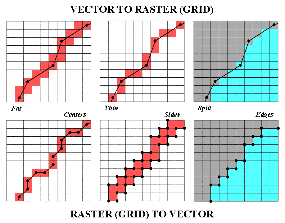 |
Polygonal features divide continuous space into cells best representing the condition within each cell. An interior cell is easily assigned as the same condition covers the entire cell… it’s the edge cells that present the problems. Most procedures split the set of edge cells based on their dominant condition. Geometry is used to determine which side of a line contains the most area of a cell. Another approach uses fat cells to identify a separate "transition" category and identifies the mixed conditions within each edge cell (e.g., some soil A and some soil B).
Conversion from raster to vector is just as inexact and plagued with simplifying assumptions. With V-to-R, precise locations are "blurred" and represented as occurring somewhere within a cell. R-to-V transformation, on the other hand, takes a generalized location (somewhere within a cell) and infers precise positioning—an art form at best. The simplest approach uses the centers of the cells to extract a list of X,Y coordinates that are used position point features, or a string of connected centroids to locate a line. Many systems use "spline functions" to mathematically smooth a line like a draftsman’s French curve template.
An alternative for representing linear features "outlines" the sides of cells (usually fat cells) for a vector representation of "corridor" containing the line—in one sense, a more honest reporting than inferring precise placement from a smoothed set of connected centroids. In a similar vein, the edges of the border cells of a polygon can be outlined (and smoothed) to form a precise rendering of the implied boundary, or the sides of border cells can be identified to represent a transitional zone.
In precision farming, V-to/from-R conversion plays an important role. Many of the input maps and popular map display systems (e.g., ArcView and MapInfo) utilize traditional vector data structure. However most data analysis utilizes raster data. Conversion between the two is not an exact science and users should be aware of transformation approaches and sensitive to the interpretation of their results.
Workspaces (7/94-- Ag/INNOVATOR)
So far, the basic concepts and terminology in GIS data structure have been identified. However, there is a bigger picture that needs to be covered—workspace organization. A GIS workspace is like your desktop when you are working on a project. It has all of the information (books, maps, papers, calculator, etc.) you need to tackle a problem. Within a computer, the data and programs you need are assembled into a workspace.
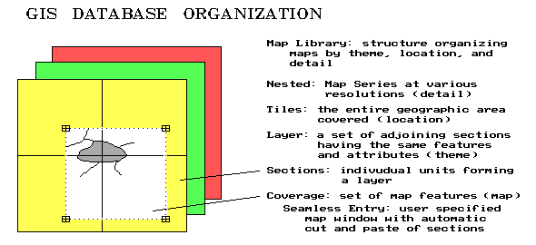 |
Recall that a coverage is the proper term for a GIS map (vector or raster format alike). Three things make a GIS coverage different from a traditional paper map—1) it’s digital (numbers instead of ink), 2) it represents only one theme (the "what" of a map), and 3) it’s seamless. Whereas a paper map composites several themes, such as political boundaries, roads, water and soils, a GIS stores each theme as a separate coverage. In addition, each of the categories defining a coverage must be mutually exclusive in geographic space—can’t have two soil types assigned to the same location. Seamless means a user can specify a set of corner coordinates and the GIS will automatically "cut and paste" data from the appropriate storage locations. This process is similar to your locating four adjoining topographic maps, identifying your project boundary on each, whacking away with your scissors, then taping the pieces together. A section, in GIS-speak, is simply the computer’s means of dividing a large area into regular blocks for efficient referencing and disk storage.
A layer is a set of adjoining sections having the same features and attributes. For example, a GIS database might contain separate layers for field boundaries, drainage tiles, soil type, nutrient levels, crop yield and terrain slope. Each layer is stored separately, but can be printed as a "sandwich" of inked layers.
You must take great care in encoding each section to make sure they edge match. The boundaries of features must continue from section to section. This requires precise digitizing (tracing map features into the computer) and consistent classification schemes for the mapped data.
Whereas a layer describes the informational content of each GIS map, a tile describes the geographic area represented in each of the layers. It identifies the geographic extent covered in by the workspace. A extension agent’s "tile" is likely an entire county or two, while a farmer’s "tile" might cover just a few fields. The size of the tile, in large part, determines the size of the database, and ultimately the size of the computer system and complexity of the software needed to handle the data. Most farm-level workspaces easily fit in a standard personal computer environment. Larger "chunks" of land for coop or government-level perspectives require larger computers and extensive data networks—like shoes, a "one size system" does not fit all.
A nested map series contains maps at various resolutions (levels of detail) over the same geographic area (tile). This concept is particularly applicable to raster databases containing different remote sensing data. Frequently, a user will store two or more analysis grid resolutions of the same area—a course one for strategic planing and a fine one for tactical studies.
The final workspace concept ties it all together—the map library. A map library refers to a listing of all GIS maps in a system. The listing is simultaneously organized by location, theme and detail. In a full-features GIS, you can specify a project area, select the maps you need, then store them in your own workspace. With a healthy understanding of the errors involved, you can transform maps at various geographic scales and projections, resample map of various levels of detail, as well as exchange vector and raster maps.
Whew! All this has been an overload of important, but mundane and arcane terminology. Some of it makes common sense; some of it may make no sense at all. In many ways a digital map is as different as it is similar to traditional paper maps. Keep in mind that you’re the intellectual superior of the GIS. You simply "see" things on paper, while the computer has to organize everything in excruciating detail on disk. Although fundamentally different, you and your GIS need to be agreeable partners—the following list summarizes the "terms" of this partnership…
| Spatial Data Characterization
Points, lines, areas Volumes Map surfaces Hyper-space (time) Vector data X,Y coordinates Map features Thematic attribute Identification # Table records Table items Raster data Col, row entries |
Vector
Data ModelMap topology
Points (x,y) Control tics Discrete points Vertices Nodes Line segments Arcs Polygons Map annotation Explicit topology |
Raster
Data ModelCells (col,row)
Whole cells Partial cells Rasterized lines Rasterized areas Map surfaces Implicit topology |
Spatial
Data OrganizationWorkspace
Coverages Seamless entry Sections Layers Edge-match Tiles Nested maps Map library |
More on Spatial Topology (11/94-- Ag/INNOVATOR)
Your computer thinks of a map as simply an organized set of numbers. Spatial topology is the term used to describe the linkage of numbers and map features. Think of it as the information that gets added to map coordinates so the computer can "see" their relative positioning.
Different software allows the computer to see maps differently. A graphics package, or paint-brush type system does a great job of coloring maps, since the computer sees the map as "on-and-off dots," all assigned an appropriate color. Your eye assembles the dots into patterns, but the computer only sees a pile of independent dots. A graphics package can draw maps, but doesn’t supply the spatial topology needed for analysis.
A mapping package offers more, as "connect-the-dots" topology. It divides up the set of coordinates into separate groups of map features. It uses the same approach as computer-aided design (similar to CAD .DXF files), with points (a pair of coordinates), lines (a string of connected coordinates), and polygons (a line that closes on itself). A mapping package can draw maps, and keep track of separate map features.
A spatial database management system (SDBMS) adds another ability, using a "connect-the-dots to records" structure for thematic mapping and geo-query. With this approach, a CAD-type structure of map features (spatial table) is linked to a database containing information about each feature (thematic table). It uses a common ID number for each feature, which is found in both the spatial and the thematic tables.
A thematic map is generated by assigning colors to a range of conditions identified with one of the map themes. For example, a farm coop can generate a corn yield map for a county by assigning colors to low, medium and high yields for each field’s aggregate yield. A farmer can generate a yield map of each field by assigning colors for low, medium and high yield measurements recorded by a yield monitor with GPS positioning.
A geo-query selects sub-sets of the data. The simplest geo-query involves mouse-clicking on any map feature and the thematic data linked to it pops-up. Conversely, the thematic table can be queried, resulting in a map. For example, a farm coop can select certain farmers’ fields for thematic mapping of yield. Or a farmer might ask for a map of field locations that have both high yields and high moisture content. The power of an SDBMS is in the ability to visualize existing data.
A geographic information system (GIS) fills in several gaps in the computer’s understanding of the relationships in mapped data. A GIS provides "connect-the-dots to records and to spatial relationships" topology. This relational capability separates pretty maps from GIS maps—and provides software with the ability to perform map analysis. For a computer to find its way around a map, the connections you see must be stored in the spatial table, as well as the list of coordinates (vector x,y or raster col,row) positioning each feature.
For example, a farm coop might be interested in deriving a map of all high yielding fields within twenty miles of a grain elevator. Or a farmer might calculate a "percent change" map for a field’s yield between two years, then generate a map of locations that increased (or decreased) by a certain percentage.
Generally speaking, a "topologically structured" GIS allows the derivation of new spatial information based on existing data, as well as query and display. A SDBMS provides geo-query and thematic mapping of existing data, but no spatial analysis. Mapping and graphics packages provide colorful map products, but no query or analysis capabilities. The differences in the capabilities among these packages arise from their differences in topological structures. Topology differences also account for important differences in cost and complexity of precision farming software.
Data Pedigree (6/95-- Ag/INNOVATOR)
Metadata refers to "data about data," including specification of the spatial and thematic characteristics of mapped data. Five elements make up the metadata used in precision farming: 1) data dictionary (measurement units; relationships), 2) thematic data attributes (integer; floating-point), 3) spatial data structure (vector; raster), 4) geo-referencing (coordinate system; projection), and 5) data quality (derivation procedures; level of detail).
For example, the data dictionary might define "bushels per acre" as the common unit of measurement for wheat and "pounds per acre" or "kilograms per hectare" as interchangeable definitions for nitrogen application. Once the units are identified, the thematic data attributes, for each data element are defined and the structure of the thematic table is specified. For example, yield might be characterized as a positive, floating-point value, whereas crop type might be set to a positive integer code and a large alphanumeric text string.
At this point the computer knows about the "what" information for each map variable. The spatial data structure identifies the composition and organization of the spatial table. Geo-referencing details the procedures used in registering the map. At this point the computer knows "where" the data is on the face of the earth. Finally, data quality specifications complete the description of the data by noting "how good it is."
A benefit of adhering to common metadata definitions, is the interchange of data among different software. Early systems were self-contained and relied on non-standard (and often proprietary) data formats. It was like the old days when a red hitch wouldn’t accept a green implement. The details encapsulated in the metadata describe a data set in terms of its format and structure, that is particularly useful for software developers. But it also deals with interrelationships and common descriptions. It organizes data in meaningful terms for intended users, who want to "surf" the conceptual framework of related data.
The details of metadata best are left to programmers, but the agriculture community needs to understand the importance of standards in the products they buy. The first four elements of metadata facilitate data exchange by detailing the "what" and "where" information, whereas the data quality element describes its accuracy. Statistics on the level of detail and data confidence should be the focal point of end users (farmers)—"garbage in is garbage out," no matter how efficiently it is transferred.
Previous discussions have identified the distinction between precision and accuracy, and even suggested techniques for assessing and mapping uncertainty. A couple of developing areas in GIS technology extend these measures, and thereby the data quality component of metadata. A map pedigree follows the lineage of a map like a hog’s pedigree follows its genealogy. It is similar to the textual descriptions accompanying soil maps, with some significant enhancements.
A map pedigree logs such information as who is "responsible" for the data, how base data was collected, and how derived data was processed, as well as statistics on map precision and accuracy. For example, a GIS model of soil loss might use a base map of field elevation to calculate a derived layer of terrain slope. In turn, the slope map is interpreted for its effect on soil loss (increasing slope increases soil loss). The interpreted slope map is combined with base, derived and interpreted maps of other factors (e.g., soil type, crop cover, tillage) to generate a modeled map of soil loss for a series of storm events. Or, a map of crop production potential might be generated from similar set of mapped data. Or, in a similar fashion, a prescription map for site-specific nutrient application might be modeled from a set of maps depicting the current levels of soil nutrients throughout a field.
What is common among these examples is that the modeled map is dependent upon logic and processing flow—not "the precise placement of physical features for navigation" heritage of the traditional map. GIS technology has extended the descriptive role of mapping to interpretation, prediction and prescription. As such, the concepts of map precision and accuracy must be extended to model logic and interactions among mapped data.
A logic flowchart is a diagram illustrating the interrelationships among maps leading to a modeled map. It is a graphical summary of the map pedigree for maps that interpret, predict or prescribe spatial conditions. It shows you each "thoughtful" step in the process with boxes representing maps and arrows connecting the boxes representing processing. It extends traditional data quality measures to the quality of the "conceptual" maps used in decision-making.
Also, it extends the interaction with a GIS to the level of a "spatial spreadsheet." Users can ask "what if" questions by changing portions of the flowchart and rerunning the model. In the future, the logic flowchart will be the focus of discussions between a farmer and an agronomist when viewing a prescription map of management options, such site-specific fertilizer application rates. "What would happen if phosphorous is increased over here, but reduced over there?" Or, "if nitrogen levels were cut by 10% everywhere, would productivity plummet?" "If so, where would it plummet?" "Where wouldn’t it matter much?"
It is fundamental to recognize that maps used in decision-making are fundamentally different from maps used for navigation. Do you understand the sensitivity of the modeled map you’re about to bet the farm on? Do you agree with the its assumptions and logic? After all, you’ll be paying for them.
________________________________________________
Note: the material presented in this paper is from...
THE PRECISION FARMING PRIMER
GIS Technology and Site Specific Management in Production Agriculture
|
by Joseph K. Berry
Forward by Grant Mangold
Overview of Precision Farming (Introduction)
Continuous Data Logging (Part 1)
This step uses GPS positioning and data collection devices to "census" crop yield and other factors every few meters throughout a field— deriving yield maps
Point Sampling (Part 2)
This step involves sampling a variable and spatially interpolating it into a continuous surface to match the data derived in step 1— deriving soil nutrient maps
Mapped Data Analysis—Within a Single Map (Part 3a)
This step uses "map-ematical" techniques to derive spatial relationships within a map generated in steps 1 and 2— deriving farm input/out connections using "univariate" data
Mapped Data Analysis—Among Several Maps (Part 3b)
This step uses "map-ematical" techniques to derive spatial relationships among several maps generated in steps 1 and 2— deriving farm input/out connections using "multivariate" data
Modeling Management Actions (Part 4)
This step uses the relationship(s) derived in step 3 to determine the appropriate, site-specific management actions— deriving prescription maps
Understanding GIS (Part 5)Geographic Information Systems (GIS) provides the technological "glue" of the PF process— organizing mapped data
Understanding GPS/IDI/RS (Part 6)
The technologies of the Global Positioning System (GPS), intelligent devices and implements (IDI), and remote sensing (RS) provide essential base data— collecting and handling mapped data
Putting it all together… (Conclusion)
"…the rest of the story" (Appendix A)
Many of the concepts and procedures forming Precision Farming require further explanation for the techy-types— getting into the details
Precision Farming Resources compiled by G. Mangold (Appendix B)
There is a growing body of knowledge out there— organizations and publications involved with PF
Checklist for Yield Mapping Software (Appendix C)
Yield mapping software is at the heart of precision farming— assessing yield mapping software
This manuscript is a compilation of the articles written by Joseph K. Berry for the "Inside the GIS Toolbox" column in the @g/INNOVATOR newsletter and @gOnline electronic forum. The text and figures in this document are copyrighted (© 1993-1998) and are for the sole personal use of participants at workshops presented by the author. Further distribution of this draft manuscript is prohibited without prior written permission of the author.
________________________________________________