Beyond Mapping III
|
Map
Analysis book with companion CD-ROM for hands-on exercises and further reading |
Use GIS
to Calculate Nearby Neighbor Statistics — describes a technique that calculates
the proximity to all of the surrounding parcels of a similar vegetation type
Use GIS to Analyze Landscape Structure — discusses the
underlying principles in landscape analysis and introduces some example
landscape indices
Get to the
Core of Landscape Analysis — describes techniques for assessing core
area and edge characterization
Use Metrics to Assess Forest Fragmentation — describes
some landscape indices for determining richness and fragmentation
Note: Most of the processing and figures discussed in this topic were derived
using ESRI ArcInfo
software. Some of the processing and
figures were derived using MapCalcTM software. See www.innovativegis.com
to download a free MapCalc Learner version with tutorial materials for
classroom and self-learning map analysis concepts and procedures.
<Click here> right-click to download a printer-friendly
version of this topic (.pdf).
(Back to the Table of Contents)
______________________________
Use
(GeoWorld, May 1999, pg. 26-27)
As
It’s windshield common sense that natural and
human induced events are continuously altering the makeup of our
landscapes. Most natural resource
applications of
Landscape structure analysis provides insight
into the spatial context of parcels—the “pieces” to the landscape “jig-saw
puzzle.” Most
The spacing between neighboring parcels of
the same type is an important thread in landscape analysis. Early vector-based solutions for determining
the “nearest neighbor” of a parcel used the Pythagorean theorem
to calculate centroid-to-centroid distances to all of its neighbors, then
selected the smallest distance. More
realistic approaches use a raster-based “proximity” algorithm for considering
edge-to-edge distances.
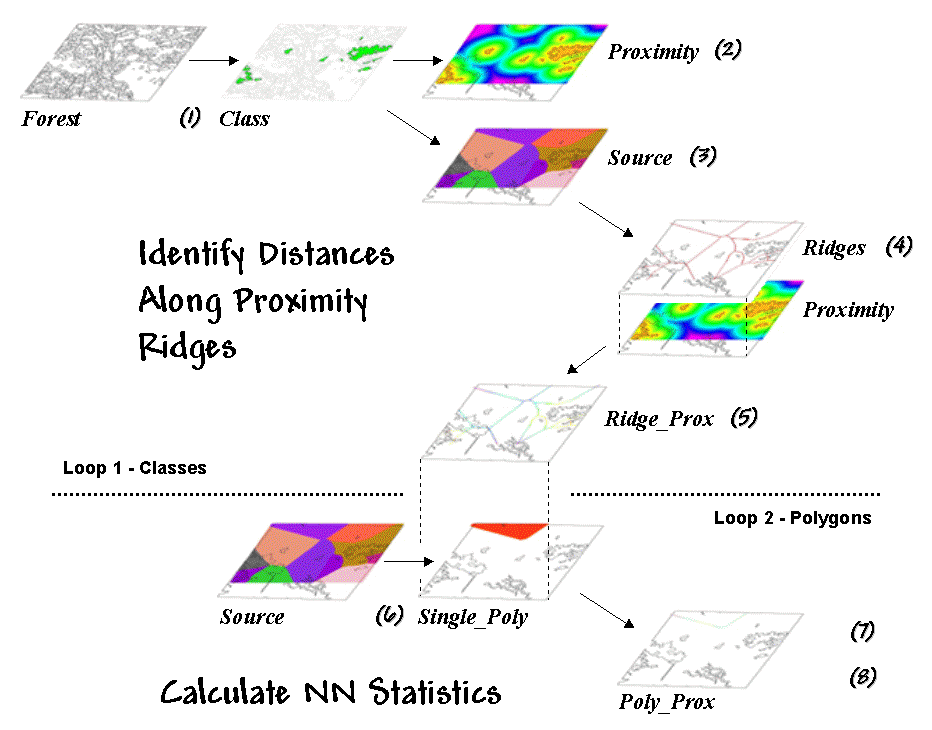
Figure 1. Processing steps for calculating Nearby Neighbor metrics.
Both approaches
reflect traditional map processing and can be manually implemented with a
ruler. Figure 1, on the other hand,
depicts an eight-step spatial analysis procedure without a paper map
legacy. The approach uses proximity
surface analysis to identify equidistant “ridges” bisecting a set of
forest parcels (steps 1-5), then evaluates the inter-parcel distances along the
ridges to determine its nearest neighbor and a host of other “nearby neighbor”
statistics (steps 6-8).
The process begins
by identifying the set of polygons defining a class of interest, such as all
the white birch stands in this example (Step
1). A proximity map (Step 2) is generated that identifies the
distances from all locations in the study area to the nearest polygon. This raster-based operation is analogous to
tossing a handful of rocks into a pond—splash, splash, splash …followed by
series of emanating ripples that continue to expand until they collide with
each other.
The area surrounding
each polygon before the “distance-waves” collide identifies a catchment
area that is analogous to a watershed’s region of influence. All map locations within a catchment area are
closer to its source polygon than any of the others (Step 3).
At this point, we
know how far away every location is to its nearest polygon and which polygon
that is. Step 4 isolates the ridges that bisect each of the
neighboring polygons. It is determined
by passing a spatial filter over the source map and noting the number of
different catchments within a 3x3 window—one
identifies interior locations, two
identifies locations along the bordering ridge, and three identifies ridge intersections. Once the bisecting ridges have been
identified the proximity values for the grid cells comprising the borders are
“masked” (Step 5).
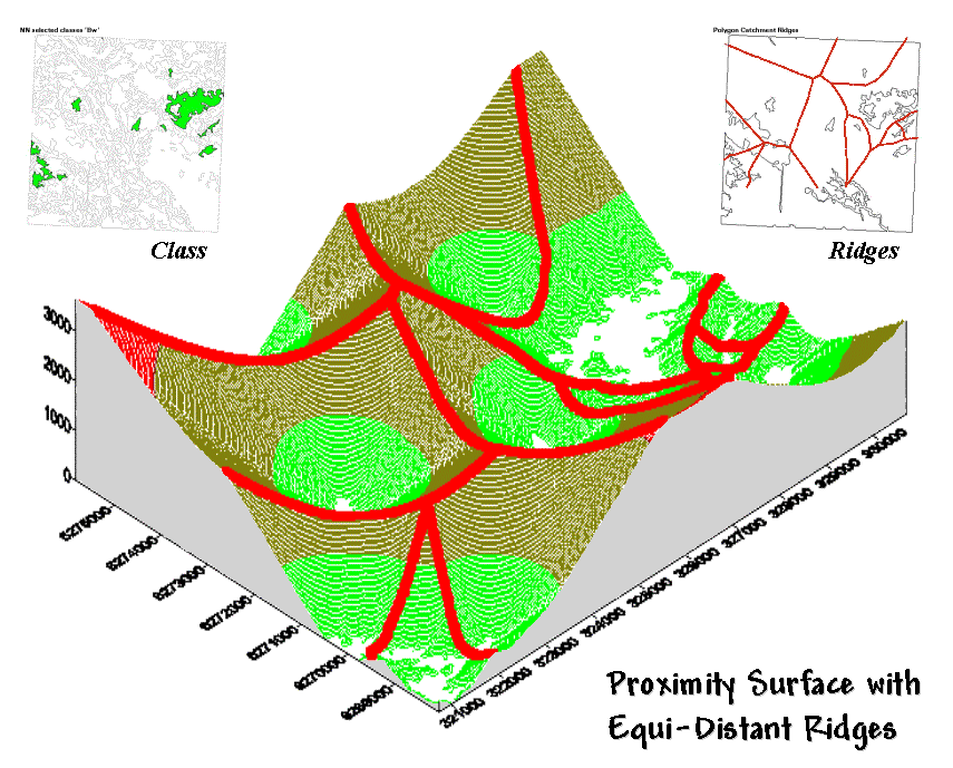
Figure 2. Proximity Surface with draped bisecting ridges.
The 3-D plot of
the proximity surface for white birch in figure 2 might help to conceptualize
the process. Note that the polygons in
the Class inset align with the lowest
points (basins) on the surface—zero away from the nearest polygon. As distance
increases the surface rises like the seats in a football stadium.
The Ridges inset aligns with the inflection
points where increasing distance values from one polygon
start a downhill slide into another. A
pair of distance values anywhere along a ridge identifies how far it is to both
of the neighboring polygons. The
smallest pair (deepest dip in a ridge) identifies the closest point between two
neighboring polygons; the largest pair (highest sweep along a ridge) identifies
the most distant point.
Step 6 in the process identifies an
individual polygon, then “masks” the set of ridge proximity values surrounding
that polygon (Step 7). The smallest value along the ridge represents
the polygon’s traditional Nearest Neighbor Distance— [[2 * Min_Value] + .5 * CellWidth]. Step 8
finalizes the process by summarizing the values along the proximity ridge and
stores the resulting indices in a database table that is inherently in the
There are a
couple of things to note about this somewhat unfamiliar approach to deriving
the very familiar metric of NN distance.
First, it’s a whole lot faster (not to mention more “elegant”) than the
common brute force technique of calculating distances from each polygon and
checking who’s closest—bunches of separate polygon distance calculations versus
just one per class.
More importantly,
NN distance is only a small part of the information contained in the proximity
ridges. The proximity values along the
ridges characterize all of the distances to the surrounding polygons—Nearby
Neighbors instead of just the nearest neighbor. The largest value identifies how far it is to
the most distant surrounding neighbor.
The average indicates the typical distance to a neighbor. The standard deviation and coefficient of
variation provide information on how variable the connectivity is.
If animals want
to “jump ship” and move from one polygon to another, they rarely know at the
onset the closest edge cell for departure and the distance/bearing to the
nearest neighbor. Characterization of
the set of linkages to all surrounding neighbors provides a more realistic
glimpse of the relative isolation of individual polygons.
It also provides
a better handle for assessing changes in landscape structure. If one of the polygons is removed (e.g., by
timber harvesting or wild fire), the nearest neighbor approach only tracks one
of the myriad effects induced on the matrix of interconnected neighbors. The nearby neighbors approach not only
contains information on traditional NN_distance but a
wealth of extended metrics summarizing the connectivity among sets of
interacting polygons.
By thinking
spatially, instead of simply automating an existing paper-map paradigm, an
approach that is both efficient (much faster) and effective (more comprehensive
information) is “rediscovered” by implementing general
_____________________________
Author’s Note: A PowerPoint presentation describing
this approach in more detail is available.
Nearby Neighbor metrics plus numerous other indices of landscape
structure are contained in FRAGSTATS*ARC software used in preparing this
column. Both the presentation and a description of the software can be reached
via links posted at www.innovativegis.com/basis, select “Column Supplements.”
Use
(GeoWorld,
June 1999, pg. 26-27)
Last month’s
column described an interesting processing approach for calculating statistics
about neighboring polygons. The
technique used proximity ridges to
identify all of the surrounding polygons of the same type as a given polygon, then summarize the minimum, maximum, average and variation
of the distances. The result was a set
of metrics that described the “isolation” of every polygon to its nearby neighbors. Further summary provides insight into the
relative isolation of each polygon to others in its class and, at another
level, the isolation occurring within one vegetation type compared to that of
other types.
In practice, this
information can help resource professionals better understand the complex
ecological interactions among the puzzle pieces (forest polygons) comprising a
forested landscape. There is growing
evidence that habitat fragmentation is detrimental to many species and may
contribute substantially to the loss of regional and global biodiversity. How to track and analyze landscape patterns,
however, has been an ecological problem—but an ideal opportunity for
Although the “nearby
neighbors” technique is interesting in its own right (techy-types
revel in the elegance of the bazaar logic), it serves as a good introduction to
an entire class of map analysis operations—landscape structure metrics. Many of the structural relationships can be
expressed by indices characterizing the shape, pattern and arrangement of
landscape elements, spatially depicted as individual patches (e.g., individual
vegetation polygon), classes of related patches (e.g.,
polygons of the same type/condition), and entire landscape sets (e.g., all
polygons within an area).
Two additional
concepts relating to map scale complete the systematic view of landscape
elements—extent and grain (see figure 1). Extent refers to the overall area
used in an analysis. Grain
refers to the size of the individual patches.
It is important to note that these criteria define the resolution and
scale-dependency of a study.
For example, both
the grain would be coarser and the extent larger for studying a hawk’s
territory than that for a finch. A
single mixed-woods patch of 25 hectares as viewed by the hawk might comprise
the entire extent for the finch with smaller parcels of wetland, birch and spruce
forming its perceived patches. In turn,
the extent for a butterfly might be defined by the wetland alone with its grain
identified by patches of open water, reeds and grasses of a fraction of a
hectare each. The “parceling of an area”
for a ladybug, ant and aphid would result in even finer-grained maps.
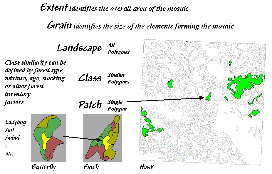
Figure 1. Elements and concepts in landscape structure analysis.
Well so much for
the underlying theory; now for the practical considerations. While the procedures for calculating
landscape metrics have been around for years, direct integration with
Eight fundamental
classes of landscape metrics are generally recognized— Area, Density, Edge, Shape, Core-Area, Neighbors, Diversity and Arrangement. At the heart of many of the metrics is the
characterization of the interior and edge of a patch. For example, Area metrics simply
calculate the area of each patch, the area for each class and the total area of
the entire landscape. These measures can
be normalized to identify the percent of the landscape occupied by each class and
a similarity measure that indicates for each patch how much of the landscape is
similarly classified.
While area
metrics indicate overall dominance, Density measures consider the
frequency of occurrence. For example, patch density is computed by dividing
the number of patches in a class by the total area of the class (#patches per
square kilometer or mile). Similarly,
the average patch size can be calculated for a class, as well as the variation
in patch size (standard deviation).
Density metrics serve as first-order indicators of the overall spatial
heterogeneity in a landscape—greater patch density and smaller average patch
size indicate greater heterogeneity.
Edge
metrics, on the other hand, quantify patch boundaries by calculating the
perimeter of each patch, then summing for the total edge in each class and for
the entire landscape. As with the
previous metrics, the relative amount of edge per class and edge density can be
computed. This information can be
critical to “edge-loving” species such as elk and grouse.
However the
nature of the edge might be important.
An edge contrast index
considers the degree of contrast for each segment of the perimeter defining a
patch. For example, an aspen patch that
is surrounded by other hardwood species has a much lower contrast to its
adjacent polygons than a similar aspen patch surrounded by conifer polygons or
bordering on a lake. In a sense, edge
contrast tracks “patch permeability” by indicating how different a patch is from
its immediate surroundings—higher index values approaching 100 indicate more
anomalous patches.
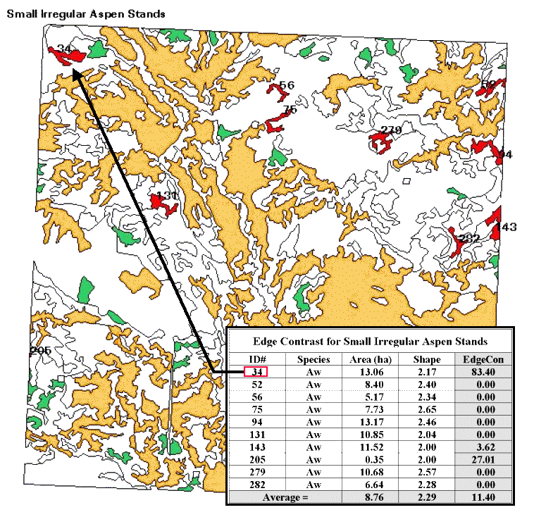
Figure 2. Results of a geo-query to identify the edge contrast of the small,
irregular aspen stands within a landscape.
Shape
metrics summarize boundary configuration.
A simple shape index measures
the complexity of a patch’s boundary by calculating a normalized ratio of its
perimeter to its area— [P / (2 * (pi
* A).5)]. As the shape index
gets bigger it indicates increasingly irregular patches that look less like a
circle and more like an ameba. More
complicated shape measures calculate the fractal
dimension for an entire landscape or the mean fractal dimension of
individual vegetation classes. These
indices range from 1 (indicating very simple shapes such as a circle or
rectangle) to 2 (indicating highly irregular, convoluted shapes).
Now let’s put some of the landscape metrics to use. Figure 2 shows a predominately hardwood landscape comprising nearly a township in northern Alberta, Canada. The map was created by the query 1) select forest type aspen (gold), SP1=Aw, 2) reselect small aspen stands (green), Area<15ha, and 3) reselect small aspen stands that are irregular (red), Shape>2.0. The table identifies the selection criteria for each of the patches, as well as their edge contrast indices.
Several things
can be noted. First, most of the small,
irregular forest parcels are in the northern portion of the landscape (9 out of
10). Most of the patches exhibit minimal
contrast with their immediate surroundings (7 out of 10). Patch #34, however, is very unusual as its
high edge contrast index (83 out of 100) indicates that it is very different
from its surroundings. While all of the
patches are irregular (shape>2.0), patches #75 and #279 have the most
complex boundary configurations (2.65 and 2.57, respectively).
Also, note that several
of the patches aren’t “wholly contained” within the landscape (4 out of
10). The introduction of the map border
spawns artificial edges that can bias the statistics. For example, Patch #205 with an area of .35
hectare is likely just a tip of a much larger aspen stand and shouldn’t be used
in the analysis.
Although
landscape metrics might be interesting, the real issue is “so what.” Do we want more or
less small irregular aspen stands? Do we
like them “contrasty?” What about the large aspen stands? What about the other vegetation types? In the case of landscape structure analysis
we have the technological cart ahead of the scientific horse—we can calculate
the metrics, but haven’t completed the research to translate them into
management action. At a minimum, we have
a new tool that can assess the changes in landscape diversity and fragmentation
for alternative scenarios… we “simply” need to understand their impacts on
ecosystem function. Next month we will
tackle the other metric classes. In the
interim, see if you can think up some applications for structural analysis in
what you do.
______________________________
Author’s Note: A good reference on landscape analysis
is USDA-Forest Service Technical report
Get to the Core of Landscape
Analysis
(GeoWorld,
July 1999, pg. 26-27)
The past couple
of columns identified the fundamental classes of landscape structure metrics— Area, Density, Edge, Shape, Core-Area, Neighbors, Diversity and Arrangement. As noted, the
first couple of classes (Area and Density) contain several indices that
characterize the relative dominance and frequency of occurrence of the puzzle
pieces (forest polygons) comprising a landscape mosaic. Changes in these indices indicate broad
modifications in the overall balance of landscape elements. The next couple classes (Edge and Shape) focused
on the boundary configuration and adjacency of the polygons. Changes in these metrics indicate alterations
in a polygon’s complexity and its contrast to its surroundings.
Also recall that
the metrics can be summarized for three perspectives of landscape elements—patches (individual polygons), classes (sets of similar polygons) and landscape (all polygons within an
area). At the class level, individual
patch indices are aggregated to identify differences and similarities among the
various vegetation types. Landscape
indices further summarize structural characteristics for an entire project
area, such as a watershed or eco-region.
Now the stage is
set to discuss some of the advanced stuff—assessing landscape edge characteristics. Core-Area metrics begin to blur the
sharp edge of the puzzle-pieces by making a distinction between the
edge-influenced area and the interior of a polygon. In figure 1 the dark green lines identify a
buffer of 20 meters around the forest patches.
The light red portions identify the core areas of each patch.
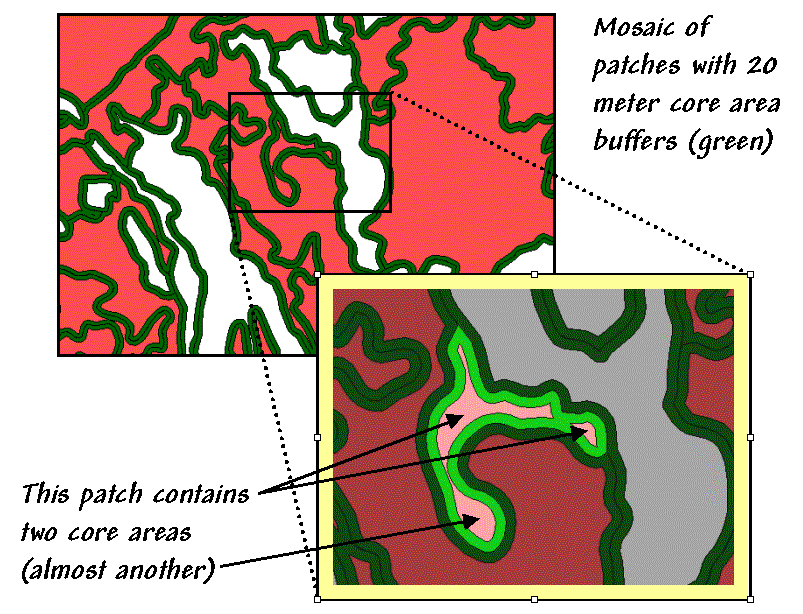
Figure 1.
Core-Area metrics summarize the interior portions of landscape patches.
Many ecosystem
processes respond differently to exterior and interior locations. In fact with the advent of modern
Information about
core areas provides a new perspective of a landscape mosaic. Many species of flora and fauna (humans
included) react differently to the interior and exterior of a forest
parcel. Simple statistics about core
area can adjust for effective habitat area.
The inset in figure 1 focuses on a single parcel of 4.5 hectares of excellent
habitat type. But for an interior-loving
animal the total geometric area is reduced dramatically to just 1.6 hectares
(light red), barely a third of the original polygon’s area.
That’s important information
if you’re a wildlife biologist trying to set aside sufficient habitat to
sustain a population of interior-loving things.
Just as important is the knowledge that the interior area is divided
into two distinct cores (and almost three).
If individual core areas are so small that no self-respecting organism
would occupy such small islands, then the polygon actually contributes nothing
to the habitat pool (from 4.5 to 0 hectares).
A simple
The character of the edge can make a difference as well. Similar to the edge contrast metrics discussed last time, the nature of the edge changes as you move along it. If an edge location is mostly surrounded by another type, it is more “edgy” than one that is sounded by similar edge type, or even better, interior locations.
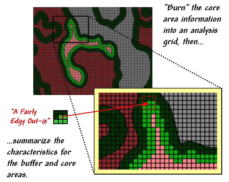
Figure 2. Analyzing polygon edge characteristics.
Like
belly-buttons, the curves along an edge can be categorized as “in-ies” (concave indentation) or “out-ies”
(convex protrusion). The nature of the
edge transition is best analyzed in an analysis grid. As depicted in figure 2, the first step is to
“burn” the boundary lines into the grid and assign each cell the condition that
dominates it—interior core (light red) or boundary edge (dark green).
Depending on
cell-size, the edge locations have three possible conditions in terms of the
surrounding cells—some interior, some edge and some other type. One summary procedure moves a 3x3 window
around the edge cells and counts the number of “other cells.” A large edgy index means things around it
are fairly different; a small one means it has a bunch of very similar things.
The inset in figure 2 shows “a fairly edgy out-ie”
as half of its surroundings are something else. However, the edge cell directly below it
isn’t very edgy as just 1 of its 8 neighbors is something else. The edge cell below that is even less edgy as
its neighborhood doesn’t have any “something else” and even has 1 interior
cell.
Now imagine
moving the 3x3 window around all of the light green cells. Combinations range from nearly all interior
cells (very amiable in-ies) to nearly all something
else (very edgy out-ies)—that’s the stuff indices are
made of. At this point the spatial
distribution of edgyness is mapped and areas of high
or low transition can be identified.
This information
can be summarized by edge-type, individual patches, and at the class and
landscape levels. An extension takes a
cue from edge contrast and extends the edgy
index to a weighted edgy index by applying weighting factors to each of
the vegetation type combinations—“…a little edgy around that type, but really
edgy around that other type.”
All this might
run contrary to conventional cartography and ecological precedent, but heck,
that’s the way it is in the reality of the wilderness far from human
engineering and surveying. The discrete
lines just aren’t there (reports of foresters tripping over them have been
greatly exaggerated). Transitional
gradients (patch edge) with
undulating shapes that continuously change relationships are the norm. Instead of “force-fitting” metrics to past
simplifying theories we need to use spatial reasoning and
______________________________
Author’s Note: see A good
reference on landscape analysis is USDA-Forest Service Technical report
Use Metrics to Assess
(GeoWorld,
August 1999, pg. 20-21)
The past few
columns have investigated several metrics used to characterize landscape
structure. The first column in the
series looked at Nearby Neighbor
indices that describe the relative isolation of vegetation parcels. The next investigated the basic metrics of Area, Density, Edge and Shape that are conceptually simple, but a
bit of a struggle as a bunch of equations. Last month's column focused on Core-area measures that introduced
"buffered edges" around each polygon as a new map feature. This time we'll flounder in more advanced
stuff-- metrics assessing Diversity
and Arrangement.
Recall that there
are three levels of landscape metrics (patch,
class and landscape) depending on whether the focus is on a single vegetation
parcel, a set of similar parcels or all of the parcels within an area. Traditionally, diversity metrics are
only calculated at the landscape level, since by definition more than one class
is needed.
The indices are
influenced by two components-- evenness and richness. Richness identifies the number of
classes or patch types. A landscape
composed of twelve cover types is considered much "richer" than one
containing only three. Evenness,
on the other hand, refers to the distribution of the area among the different
vegetation types. A landscape where the
classes are fairly equally distributed is considered much more "even"
than another that has just a couple of types dominating the area. Note that richness and evenness are not
directly related. Landscapes that are
"rich" but "uneven" often contain rare types (infrequently
occurring) that are ecologically important.
So how does the
computer reduce diversity to a bunch of numbers? The simplest is a direct measure of richness
that just counts the number of patch types in a landscape. Relative
patch richness translates the count to a percent by considering the maximum
number of classes as specified by the user-- [((#Patch Types / Max #Patch
Types) * 100)]. This enables users to
easily compare the richness among different landscapes in a region. Patch
richness density standardizes the count to an intuitive per area basis--
[(#Patch Types / Area)]. An area with
4.25 types per square mile is considered richer than one with only 1.73 types.
A somewhat more
sophisticated and frequently used measure is
Simpson's diversity index is another
popular measure based on proportional abundance-- [1 - (SUM(
(Pi)2 )].
Simpson's index is less sensitive to the presence of rare types and
represents the probability that any two patches selected at random will be
different types. The index ranges from 0
to 1 with higher values indicating greater diversity.
Another class of metrics focuses on the "evenness" aspect of diversity. Both Shannon's evenness index—
[( (-SUM((Pi) * ln(Pi)) ) / (ln(Max #Patch Types)) )]
and Simpson's evenness index—
[( (1 - (SUM( (Pi)2 ) ) / ( 1- ( 1 / ln(Max #Patch Types)) )]
…isolate the
effect of the distribution of the total area among vegetation types. Both measures range from 0 (very uneven
distribution) to 1 (perfectly even distribution).
In addition to
the diversity measures, arrangement metrics provide insight
into landscape configuration and fragmentation.
While the measures are far too complex for detailed discussion in this
column (see author's note), they are fairly easy to conceptualize. They involve some fairly unfamiliar terms--
contagion, interspersion and juxtaposition-- that might need explanation. "Contagion," like its more familiar
usage as contagious, implies contact.
The contagion index is based
on raster cell adjacencies and reports the probability that two randomly chosen
adjacent cells belong to a particular pair of vegetation types. The index ranges from 0 to 100, where 100 indicates that all vegetation types are equally adjacent to
all other types (even distribution of adjacencies). Lower values indicate landscapes with uneven
adjacencies indicating a clumping bias in the distribution of vegetation types.
"Interspersion" means scattering and
"juxtaposition" means side-by-side positioning. The interspersion
and juxtaposition index is similar to the contagion index except it measures
entire "patch" adjacency (vector) and not individual "cell"
adjacency (raster). It evaluates each
patch for the vegetation types surrounding it then summarizes the data at the
class and landscape levels. Higher
values indicate well-interspersed landscapes (types are equally adjacent to
each other), whereas lower values characterize landscapes clumping
(disproportionate patch type adjacencies).
Whew!!! That's a lot of theory and a wrath of intimidating
equations presented in this and the past few columns. The bottom line is that linking
However, the
contribution of
For example,
consider figure 1. The bottom layer is a
typical forest map locating the various vegetation types in the area. The richness surface is derived by first
rasterizing the type map, then moving a window over the grid that counts the
number of different vegetation types.
The red clumps on the richness surface locate highly diverse areas with
seven vegetation types within the half-kilometer radius of the window.
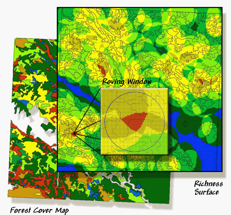
Figure 1.
A "richness" surface identifies the number of different
vegetation types within the vicinity of each grid cell (brighter tones indicate
more diverse areas).
In effect, the roving window serves as a temporary "mini-landscape" definition and can be summarized for most of the existing landscape metrics-- the concept of the grid "cell" being substituted for the polygonal "patch." As with traditional measures, the "extent" (window size) and "grain" (cell size) are important considerations in mapping the indices as surfaces.
The top pair of
circles in Figure 2 shows local conditions for a "richness" index of
1 on the left and 3 on the right. The
next pair of windows has the same richness value of 3, but show alignments with
different "evenness" measures.
The bottom pair has the same richness (number of different types) and
evenness (same proportional areas), but the one on the right is more
"interspersed."
The surface maps
of the indices show the actual spatial distribution of landscape structure
concepts— e.g., "more diverse over here, but a real mono-culture over
there, though it's just moderately diverse overall." The cell values occurring within each patch
can be summarized then aggregated at the class and landscape levels. The extended procedures provide new insight
into the localized effect of management alternatives.
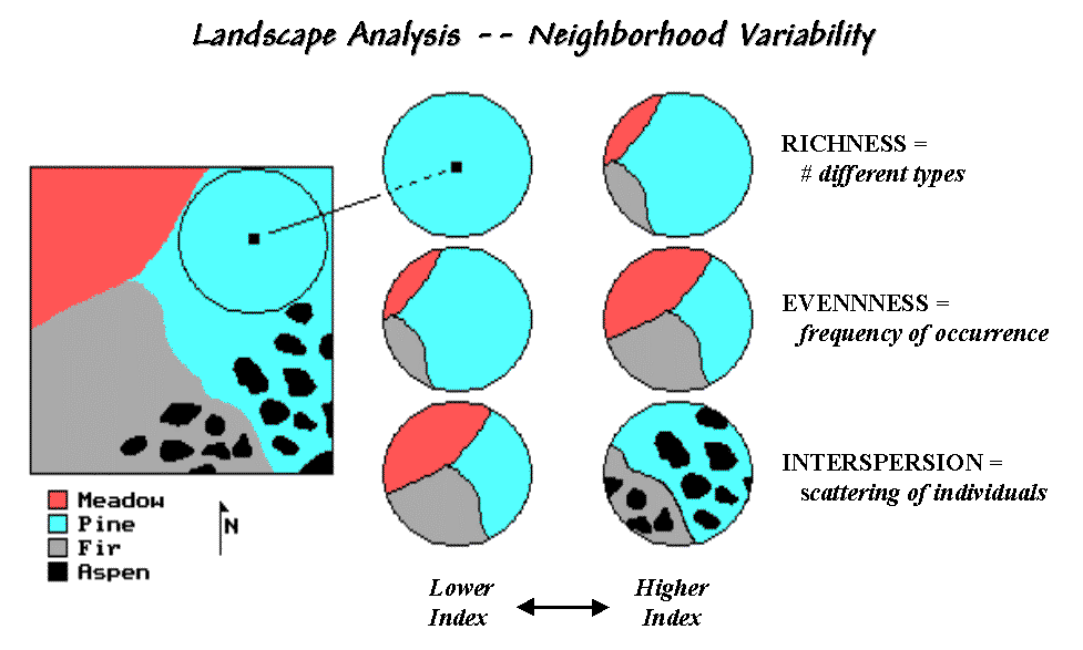
Figure 2. Roving window configurations for various landscape richness, evenness and interspersion conditions.
Also they
demonstrate the potential for applying
______________________________
Author’s Note: An extended discussion of Diversity
and Interspersion/Juxtaposition metrics and an online copy of Topic 5,
"Assessing Variability, Shape and Pattern of Map Features," from Beyond
Mapping by Joseph K. Berry are available via the Internet at
www.innovativegis.com/basis, select “Column Supplements.”
(Back to the Table of Contents)