Beyond Mapping III
|
Map
Analysis book with companion CD-ROM
for hands-on exercises and further reading |
Moving Mapping to Analysis of Mapped Data — describes
Spatial Analysis and Spatial Statistics as extensions to traditional mapping
and statistics
Bending Our Understanding of Distance — uses
effective distance in establishing erosion setback to demonstrate spatial
analysis
Use Spatial Statistics to Map Abnormal
Averages — discusses
surface modeling to characterize the spatial distribution inherent in a data
set
Making Space for Mapped Data — investigates
the link between geographic space and data space for mapping data patterns
Note: The processing and figures discussed in this topic were derived using MapCalcTM software. See www.innovativegis.com
to download a free MapCalc Learner version with tutorial materials for
classroom and self-learning map analysis concepts and procedures.
<Click here>
right-click to download a printer-friendly version of this topic (.pdf).
(Back to the Table of Contents)
______________________________
Moving Mapping to Analysis
of Mapped Data
(GeoWorld, December 2004, pg. 18-19)
The evolution (or is it revolution?) of
Figure 1 identifies two key trends in the movement from
mapping to map analysis. Traditional
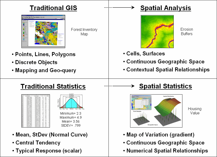
Figure 1. Spatial Analysis and Spatial Statistics are extensions of
traditional ways of analyzing mapped data.
Spatial Analysis extends the basic set of discrete map features of points, lines and polygons to surfaces that represent continuous geographic space as a set of contiguous grid cells. The consistency of this grid-based structuring provides a wealth of new analytical tools for characterizing “contextual spatial relationships”, such as effective distance, optimal paths, visual connectivity and micro-terrain analysis.
In addition, it provides a mathematical/statistical framework by numerically representing geographic space. Traditional Statistics is inherently non-spatial as it seeks to represent a data set by its typical response regardless of spatial patterns. The mean, standard deviation and other statistics are computed to describe the central tendency of the data in abstract numerical space without regard to the relative positioning of the data in real-world geographic space.
Spatial Statistics, on the other hand, extends traditional statistics on two fronts. First, it seeks to map the variation in a data set to show where unusual responses occur, instead of focusing on a single typical response. Secondly, it can uncover “numerical spatial relationships” within and among mapped data layers, such as generating a prediction map identifying where likely customers are within a city based on existing sales and demographic information.
The next few columns will investigate important aspects and procedures in Spatial Analysis and Spatial Statistics through a couple of example applications in natural resources and geo-business. Figure 2 shows the processing logic for generating a map of potential erosion for part of a large watershed. The model assumes that erosion potential is primarily a function of terrain steepness and water flow. Admittedly the model is simplistic but serves as a good starting point for a spatial analysis example in natural resources.
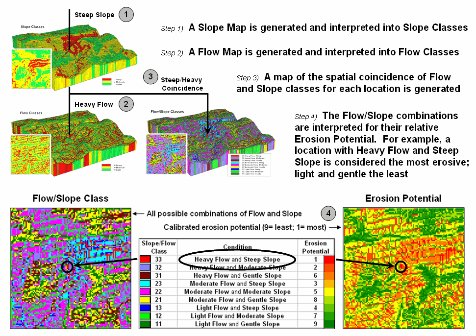
Figure 2. Erosion potential is in large part dependent on the spatial
combination of slope and flow.
The first step calculates a slope map that is interpreted into three classes of relative steepness—gentle (green), moderate (yellow) and steep (red) terrain. Similarly, an accumulation flow map is generated and then interpreted into three classes of surface confluence—light (green), moderate (yellow) and heavy (red) overland flows. The slope and flow maps are shown draped over the terrain surface to help visually verify the results. How the slope and flow maps were derived has been discussed in previous columns focusing on procedures and algorithms involved (see Author’s Notes). What is important for this discussion is the realization that realistic spatial considerations beyond our paper-map legacy can be derived and incorporated into map processing logic.
The third step combines the two maps into nine possible coincidence combinations and then interprets the combinations into relative erosion potential. For example, areas with heavy flows and steep slopes have the greatest potential for erosion while areas that have light flows and gentle slopes have the least. At this point, the calibration identifying relative erosion potential should raise some concern, but discussion of this critical step is reserved for later. What is important at this point is a basic understanding of the spatial reasoning supporting the model’s logic.
The Erosion Potential map in figure 2 clearly shows that not all locations have the same potential to get dirt balls rolling downhill. Given this information, a series of simple buffers based on planimetric distance would be ludicrous for protecting against sediment loading to streams. It is common sense that a fixed distance likely would be an insufficient setback in areas of high erosion potential with heavy flows and steep intervening conditions. Similarly the buffer would reach too far in conditions of light flow and gentle slopes.
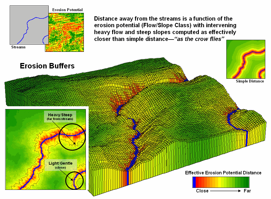
Figure 3. Effective distance from streams considering erosion
potential generate realistic protective buffers.
Figure 3 shows an extension of the model that reaches farther from streams under adverse erosion conditions and not as far in favorable conditions. The result is a buffer that constricts and expands with erosion potential around the streams (see Author’s Notes). While this “rubber-ruler” approach to establishing protective buffers isn’t part of our traditional map paradigm, it is part of real-world experience that recognizes “all buffer-feet are not the same.”
This simple example of a Spatial Analysis application
illustrates how the evolution of
___________________________
Author’s Note: See www.innovativegis.com/basis,
select the online book Map Analysis and Topic 11, Characterizing Micro-Terrain
Features for discussion of slope and flow calculation; select Topic 13,
Creating Variable-Width Buffers for discussion on calculating effective
distance.
Bending
Our Understanding of Distance
(GeoWorld, January 2005, pg. 18-19)
The last section introduced two dominant forces that are moving mapping toward map analysis. Spatial Statistics is used to characterize the geographic distribution in a set of data and uncover the “numerical spatial relationships” among data layers. Spatial Analysis extends traditional discrete map objects of point, lines and polygons to continuous surfaces that support a wealth of new analytical operations for characterizing “contextual spatial relationships.”
In describing spatial analysis, an example of generating an effective erosion buffer was used. A comparison of simple distance (as the crow flies) and effective distance (as the crow walks) showed how a more realistic protective buffer around a stream expands and contracts depending on the erosion potential conditions surrounding the stream. What was left unexplained was how the computer calculates the effective distance short of using a rubber ruler.
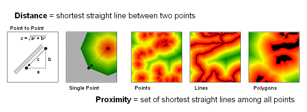
Figure 1. Distance measures the space between two points while proximity
identifies the spacing throughout a continuous geographic area.
The left side of figure 1 diagrams how we traditionally measure distance between two points—manually and mathematically. We can place a ruler alongside the points and note the number of tic-marks separating them, and then multiply the map distance times the scale factor to determine the geographic distance. Or we can calculate the X and Y differences between the points’ coordinates and use the Pythagorean Theorem to solve for the shortest straight line distance between two points (hypotenuse of a right triangle).
Spatial analysis takes the concept of distance a bit farther to that of proximity—the set of shortest straight lines among all points within a geographic area. It is calculated as a series of distance waves that move out from one of the points. In effect this process is analogous to nailing a ruler at the point and spinning it with the tic-marks scribing concentric circles of distance. The distance to any point within a project area is simply its stored value indicating the number of rings away from the starting location.
If more than one feature is considered (sets of starting points, lines or polygons) the computer successively calculates proximity a starting location at a time, and keeps track of the shortest distance that is calculated for each map location. The result is a proximity surface that identifies the distance to the closest starting point. In figure 1 the three maps on the right identify proximity surfaces for a set of housing locations (points), the entire road network (lines) and critical habitat areas (polygons).
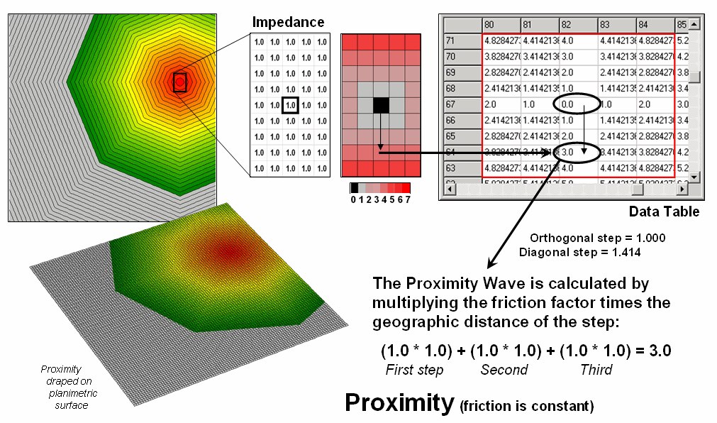
Figure 2. Simple proximity considers uniform impedance as a Proximity Wave front propagates away from a starting location—“as the crow flies.”
Figure 2 illustrates the calculations for a portion of the proximity surface shown in figure 1. The algorithm first identifies the adjoining grid cell locations that a starting location could move into (eight adjacent light grey cells). Then it determines the geographic distance of the step as orthogonal (up/down or across = 1.000 grid space) or diagonal (slanting = 1.414) and multiples this distance times its relative impedance factor. In the case of simple proximity the factor is constant (1.0) throughout the project area and the result is reduced to simply the geographic distance of the step.
The process is repeated for all cells within successive distance rings with the computer keeping track of the smallest distance value for each location as the waves advance (like tossing a rock into a pond). Note that the values stored in the table increment by one in the orthogonal directions (1.0, 2.0, etc) and are adjusted for longer steps in the diagonal directions (1.414, 2.828, etc.) and off-diagonal directions (2.414, etc.) as combinations of orthogonal and diagonal steps.
Effective proximity relaxes the assumption that the relative ease of movement (impedance) is the same throughout a project area. In the example shown in figure 3, the Proximity Wave for the first step is 1.0 (orthogonal step) times its difficulty of 8.0 (impedance factor) results in an effective distance of 8.0. The second step has an effective distance of 3.0 (1.0 * 3.0) and combines for a total movement of 11.0 (8.0 + 3.0) from the starting location. Note that the movement in the opposite direction is effectively a little further away ((1.0 * 7.0) + (1.0 * 5.0) = 12.0)). In practice, half steps are used for more precise calculations (see author’s notes).
In the practical example discussed last month, a map of erosion potential was used to identify variable impedance based on slope and flow characteristics of the surrounding terrain. Areas with high erosion potential were assigned low friction values and therefore the effective buffers reached farther than in areas of minimal erosion potential having higher friction values. The result was a map of effective protection buffers around streams that expanded and contracted in response to localized conditions.
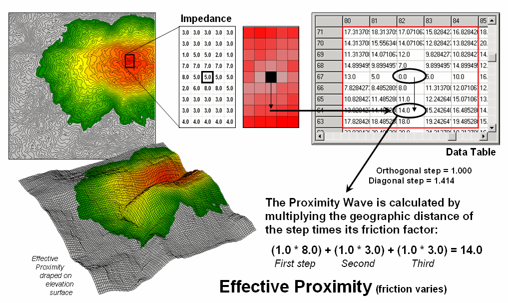
Figure 3. Effective proximity considers varying impedance that changes with intervening conditions—“as the crow walks.”
Effective buffers are but one example of a multitude of new spatial analysis procedures that are altering our traditional view mapped data analysis. Next month’s column will investigate some of the new procedures in spatial statistics that uncover numerical relationships within and among map layers.
________________________
Author’s Note: The more exacting half-step calculation for
the example is (0.5 * 5.0) + (0.5 * 8.0) + (0.5 * 8.0) + (0.5 * 3.0) + (.5 *
3.0) + (.5 * 3.0) = 15.0. See www.innovativegis.com/basis, and
select the online book Map Analysis, Topic 25, Understanding Effective
Distance and Connectivity, for an in-depth discussion of how effective
proximity is calculated.
Use
Spatial Statistics to Map Abnormal Averages
(GeoWorld, February, 2005, pg. 18-19)
The previous couple of sections identified two dominant forces that are moving mapping toward map analysis—Spatial Analysis and Spatial Statistics. The discussion focused on Spatial Analysis that supports a wealth of new analytical operations for characterizing “contextual spatial relationships.” Now we can turn our attention to Spatial Statistics and how it characterizes the geographic distribution of mapped data to uncover the “numerical spatial relationships.”
Most of us are familiar with the old “bell-curve” for school grades. You know, with lots of C’s, fewer B’s and D’s, and a truly select set of A’s and F’s. Its shape is a perfect bell, symmetrical about the center with the tails smoothly falling off toward less frequent conditions.
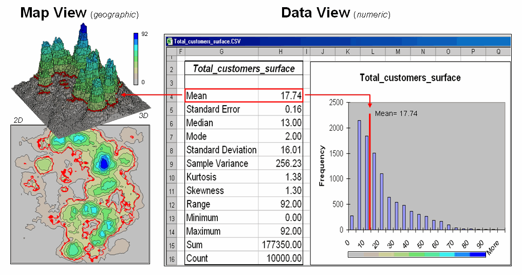
Figure 1. Mapped data are characterized by their geographic
distribution (maps on the left) and their numeric distribution (descriptive
statistics and histogram on the right).
However the normal distribution (bell-shaped)
isn’t as normal (typical) as you might think ...in the classroom or in
The geographic distribution of the data is characterized in the map view by the 2D contour map and 3D surface on the left. Note the distinct geographic pattern of the surface with bigger bumps (higher customer density) in the central portion of the project area. As is normally the case with mapped data, the map values are neither uniformly nor randomly distributed in geographic space. The unique pattern is the result of complex spatial processes determining where people live that are driven by a host of factors—not spurious, arbitrary, constant or even “normal” events.
Now turn your attention to the numeric distribution of the data depicted in the right side of the figure. The data view was generated by simply transferring the grid values defining the map surface to Excel, and then applying the Histogram and Descriptive Statistics options of the Data Analysis add-in tools. The mechanics used to plot the histogram and generate the statistics were a piece-of-cake, but the intellectual challenge is to make some sense of it all.
Note that the data aren’t distributed as a normal
bell-curve, but appear shifted to the left.
The tallest spike and the intervals to its left, match the large expanse
of grey values in the map view—frequently occurring values. If the surface contained disproportionably
higher value locations, there would be a spike at the high end of the
histogram. The red line in the histogram
locates the mean (average) value for the numeric distribution. The red line in the 2D and 3D maps shows the
same thing, except it’s identified in the geographic distribution.
The mental exercise linking geographic space with data space is fundamental to
spatial statistics and leads to important points about the nature of mapped
data. First, there isn’t a fixed
relationship between the two views of the data’s distributions (geographic and
data). For example, a myriad of
geographic patterns can result in the same histogram. That’s because spatial data contains
additional information—where, as well
as what—and the same data summary of
the “what’s” can be reflected in a multitude of spatial arrangements
(“where’s).
But is the reverse true? Can a given
geographic arrangement result in different data views? Nope, and it’s this relationship that
catapults mapping and geo-query into the arena of mapped data analysis. Traditional analysis techniques assume a
functional form for the frequency distribution (histogram shape), with the
standard normal (bell-shaped) being the most prevalent.
Figure 2 offers yet another perspective of the link between
numeric and geographic distributions.
The upper-left inset identifies the spatial pattern formed by 16 samples
of the “percent of home equity loan limit” for a small project area— ranging
from 16.8 to 72.4. The table reports the
numerical pattern of the data— mean= 42.88 and standard deviation= 19.57. The coefficient of variation is 45.6%
((19.57/42.88) * 100= 45.6%) suggesting a fairly large unexplained variation
among the data values.
In a geographic context, the mean represents a horizontal plane hovering over the project area. However, the point map suggests a geographic trend in the data from values lower than the mean in the west toward higher values in the east. The inset in the upper-right portion of figure 2 shows a “nearest neighbor” surface generated by assigning the closest sample value to all of the other non-sampled grid locations in the project area. While the distribution is blocky it serves as a first-order estimate of the geographic distribution you see in the point map—lower in the east and higher in the west.
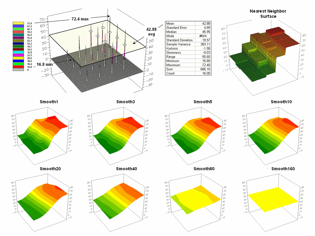
Figure 2. The spatial distribution implied by a set of
discrete sample points can be estimated by iterative smoothing of the point
values.
The series of plots in the lower portion of figure 2 shows the results of iteratively smoothing the blocky data. This process repeatedly passes a “roving window” over the area that calculates the average value within quarter-mile. The process is analogous to chipping away at the stair steps with the rubble filling in the bottom. The first smoothing still retains most of the sharp peak and much of the angular pattern in the blocky surface. As the smoothing progresses the surface takes on the general geographic trend of the data (Smooth10).
Eventually the surface is eroded to a flat plane— the arithmetic mean of the data. The progressive series of plots illustrate a very important concept in surface modeling— the geographic distribution maps the variance. Or, in other words, a map surface uses the geographic pattern in a data set to help explain the variation among the sample points.
Keep this in mind the next time you reduce a bunch of sample data to their arithmetic average and then assign that value to an entire polygon, such as a sales district, county or other administrative boundary. In essence, this simple mapping procedure often strips out the inherent spatial information in a set of data—sort of like throwing the baby out with the bath water.
_________________________
Author’s Note: See www.innovativegis.com/basis, and
select the online book Map Analysis, Topic 2, Assessing Interpolation
Results and Topic 8, Investigating Spatial Dependency.
(GeoWorld, March 2005, pg. 20-21)
The past three sections have investigated two dominant forces
that are driving traditional
The other force, Spatial
Statistics, is used to derive “numerical spatial relationships” that map
the variation in a set of data (surface modeling) and investigate the
similarity among map layers to classify data patterns and develop predictive
models (spatial data mining). This final
installment in the series focuses on the underlying concepts supporting data
mining capabilities of analytical
The most fundamental notion is that geographic space and data space are interconnected. The three maps on the left side of figure 1 depict surfaces of housing Density, Value and Age for a portion of a city. It is important that “maps are numbers first, pictures later” and that the peaks and valleys on the surfaces are simply the graphic portrayal of actual differences in the values stored at each map location (grid cell).
The “data spear” at Point
#1 identifies the housing Density as 2.1 units/ac, Value as $407,000 and Age as
18.3 years and is analogous to your eye noting a color pattern of green, red,
and green. The other speared location
locates a very dissimilar data pattern with Density= 4.8 units/ac, Value= $190,000 and Age=
51.2 years—or as your eye sees it, a color pattern of red, green and red.
The right side of figure 1
depicts how the computer “sees” the data patterns for the two locations in
three-dimensional data space. The three
axes defining the extent of the box correspond to housing Density (D), Value
(V) and Age (A). The floating balls
represent data patterns of the grid cells defining the geographic space—one
“floating ball” (data point) for each grid cell. The data values locating the balls extend
from the data axes—2.41, 407.0 and 18.3 for Point #1. The other point has considerably higher
values in D and A with a much lower V values (4.83, 51.2 and 190.0
respectively) so it plots at a very different location in data space.
Figure 1. Conceptually linking geographic
space and data space.
The fact that similar data
patterns plot close to one another in data space with increasing distance
indicating less similarity provides a foothold for mapping numerical
relationships. For example, a cluster
map divides the data into groups of similar data patterns as schematically
depicted in figure 2.
As noted before the
floating balls identify the data patterns for each map location (geographic
space) plotted against the P, K and N axes (data space). For example, the tiny green ball in the
upper-left corner depicts a map location in the fairly wealthy part of town
(low D, high V and low A). The large red
ball appearing closest to you depicts a location in the less affluent part
(high D, low V and high A).
It seems sensible that
these two extreme responses would belong to different data groupings (clusters
1 and 2) with the red area locating less wealthy locations while the green area
identifies generally wealthier sections.
In a similar fashion, the project area can be sub-divided into three and
four clusters identifying more detailed data pattern groupings.
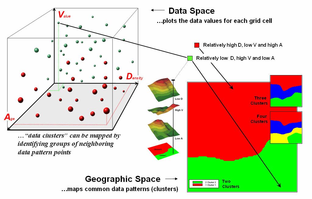
Figure 2. Data patterns for map locations
are depicted as floating balls in data space that can be grouped into clusters
of similar patterns based on their data distances.
While the specific
algorithm used in clustering is beyond the scope of this discussion, it suffices
to note that data distances between the floating balls are used to identify
cluster membership—groups of balls that are relatively far from other groups
and relatively close to each other form separate data clusters. Other techniques, such as map similarity and
regression, use the link between geographic and data space to characterize
spatial relationships and develop prediction maps.
The realization that mapped
data can be expressed in both geographic space and data space is paramount to a
basic understanding of how a computer analyses numerical interrelationships
among mapped data. Geographic space
uses coordinates, such as latitude and longitude, to locate things in the real
world. The geographic expression of the
complete set of measurements depicts their spatial distribution in familiar map
form.
Data space, on the other hand, is a bit less familiar. While you can’t stroll through data space you
can conceptualize it and write algorithms that analyze it … as well as imagine
plenty of potential of applications from geo-business to natural
resources. Coupling the power of Spatial
Statistics with that of Spatial Analysis takes traditional statistics and
____________________________
Author’s Note: See www.innovativegis.com/basis, and
select the online book Map Analysis, Topic 10, Analyzing Map Similarity
and Zoning and Topic 16, Characterizing Patterns and Relationships.
(Back to the Table of Contents)