Beyond Mapping III
|
Map
Analysis book with companion CD-ROM for hands-on exercises and further reading |

Use
Travel Time to Identify Competition Zones — discusses the procedure for deriving relative
travel-time advantage maps
Maps and Curves Can Spatially Characterize Customer
Loyalty — describes a technique for characterizing
customer sensitivity to travel-time
Grid-Based Mapping Identifies Customer
Pockets and Territories — identifies
techniques for identifying unusually high customer density and for delineating
spatially balanced customer territories
Use Travel Time to Connect with Customers — describes techniques for optimal path and
catchment analysis
Accumulation Surfaces Connect Bus Riders and
Stops — discusses
an accumulation surface analysis procedure for linking riders with bus stops
Author’s
Notes: The figures in this topic use MapCalcTM
software. An educational CD with online
text, exercises and databases for “hands-on” experience in these and other
grid-based analysis procedures is available for US$21.95 plus shipping and
handling (www.farmgis.com/products/software/mapcalc/
).
<Click
here> right-click to download a printer-friendly version of this topic
(.pdf).
(Back to the Table of Contents)
______________________________
Use Travel Time to
Identify Competition Zones
(GeoWorld, March 2002, pg. 20-21)
Does travel-time to a store influence your patronage? Will you drive by one store just to get to its competition? What about an extra fifteen minutes of driving? … Twenty minutes? If your answer is “yes” you are a very loyal customer or have a passion for the thrill of driving that rivals a teenager’s.
If you answer is “no” or “it depends” you show at least some sensitivity to travel-time. Assuming that the goods, prices and ambiance are comparable most of us will use travel-time to help decide where to shop. That means shopping patterns are partly a geographic problem and the old real estate adage of “location, location, location” plays a roll in store competition.
Targeted marketing divides potential customers into groups using discriminators such as age, gender, education, and income then develops focused marketing plans for the various groups. Relative travel-time can be an additional criterion for grouping, but how can one easily assess travel-time influences and incorporate the information into business decisions?
Two map analysis procedures come into play—effective proximity and accumulation surface analysis. Several previous Beyond Mapping columns have focused on the basic concepts, procedures and considerations in deriving effective proximity (February and March, 2001) and analyzing accumulation surfaces (October and November, 1997).
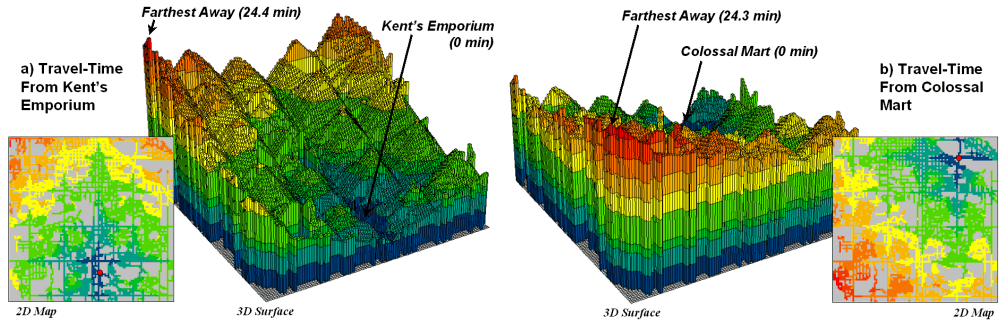
Figure 1. Travel-time surfaces show increasing distance from a store considering the relative speed along different road types.
The following discussion focuses on the application of these
“tools” to competition analysis.
The left side of figure 1 shows the travel-time surface from
The result is the estimated travel-time to every location in the city. The surface starts at 0 and extends to 24.4 minutes away. Note that it is shaped like a bowl with the bottom at the store’s location. In the 2D display, travel-time appears as a series of rings—increasing distance zones. The critical points to conceptualize are 1) that the surface is analogous to a football stadium (continually increasing) and 2) that every road location is assigned a distance value (minutes away).
The right side of figure 1 shows the travel-time surface for
Colossal Mart with its origin in the northeast portion of the city. The perspective in both 3D displays is
constant and
Simply subtracting the two surfaces derives the relative travel-time advantage for the stores (figure 2). Keep in mind that the surfaces actually contain geo-registered values and a new value (difference) is computed for each map location. The inset on the left side of the figure shows a computed Colossal Mart advantage of 6.1 minutes (22.5 – 16.4= 6.1) for the location in the extreme northeast corner of the city.
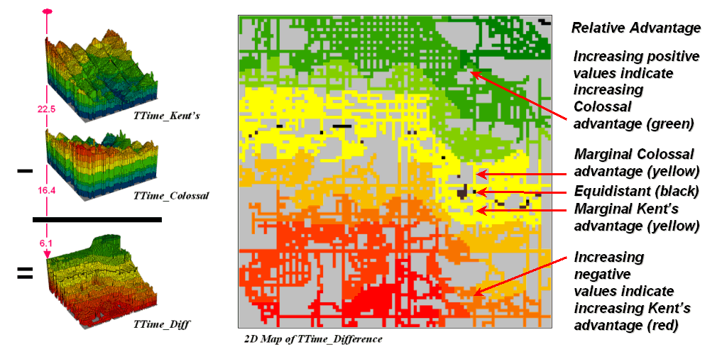
Figure 2. Two travel-time surfaces can be combined to identify the relative advantage of each store.
Locations that are the same travel distance from both stores
result in zero difference and are displayed as black. The green tones on the difference map
identify positive values where
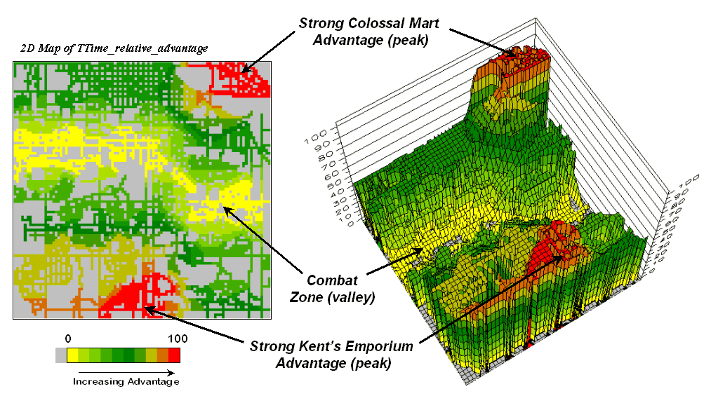
Figure 3. A transformed display of the difference map shows travel-time advantage as peaks (red) and locations with minimal advantage as an intervening valley (yellow).
Figure 3 displays the same information in a bit more intuitive fashion. The combat zone is shown as a yellow valley dividing the city into two marketing regions—peaks of strong travel-time advantage. Targeted marketing efforts, such as leaflets, advertising inserts and telemarketing might best be focused on the combat zone. Indifference towards travel-time means that the combat zone residents might be more receptive to store incentives.
At a minimum the travel-time advantage map enables merchants
to visualize the lay of the competitive landscape. However the information is in quantitative
form and can be readily integrated with other customer data. Knowing the relative travel-time advantage
(or disadvantage) of every street address in a city can be a valuable piece of
the marketing puzzle. Like age, gender,
education, and income, relative travel-time advantage is part of the soup that
determines where we shop… it’s just we never had a tool for measuring it.
Maps and Curves Can Spatially Characterize Customer Loyalty
(GeoWorld, April 2002, pg. 20-21)
The previous discussion introduced a procedure for identifying competition zones between two stores. Travel-time from each store to all locations in a project area formed the basis of the analysis. Common sense suggests that if customers have to travel a good deal farther to get to your store versus the competition it’ll be a lot harder to entice them through your doors.
The competition analysis technique expands on the concept of simple-distance buffers (i.e., quarter-mile, half-mile, etc.) by considering the relative speeds of different streets. The effect is a mapped data set that reaches farther along major streets and highways than secondary streets. The result is that every location is assigned an estimated time to travel from that location to the store.
Comparing the travel-time maps of two stores determines relative access advantage (or disadvantage) for each map location. Locations that have minimal travel-time differences define a “combat zone” and focused marketing could tip the scales of potential customers in this area.
The next logical step in the analysis links customers to the travel-time information.
Figure 1 locates the addresses of nearly 1600 respondents to
a reader-survey of “What’s Best in Town” appearing in the local newspaper. Colossal Mart received 823 votes for the best
discount store while
More important than who won the popularity contest is the
information encapsulated in spatial patterns of the respondents. The insets on the right of the figure split
the respondents into those favoring Colossal Mart and those favoring
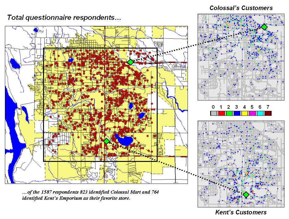
Figure 1. Respondents indicating their preference for Kent’s Emporium or Colossal Mart.
The next step is to link the travel-time estimates to the respondents. A few months ago (see “Integrate Travel Time into Mapping Packages,” GEOWorld, March, 2001, page 24) a procedure was discussed for transferring the travel-time information to the attribute table of a desktop mapping system. This time, however, we’ll further investigate grid-based spatial analysis of the data.
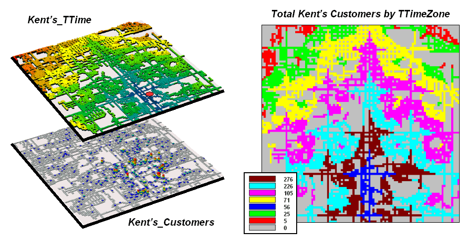
Figure 2. Travel-time distances from a store can characterize customers.
The top map on the right of figure 2 (
The 2-D map on the right shows the results of a region-wide summary where the total number of customers is computed for each travel-time zone. The procedure is similar to taking a cookie-cutter (Kent’s_ TTime zones) and slamming it down onto dough (Kent’s Customers data) then working with the material captured within the cookie cutter template– compute the total number of customers within each zone.
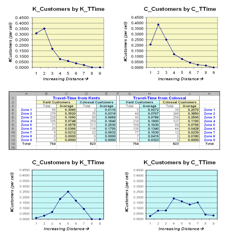
Figure 3. Tabular summaries of customers within each travel-time zone can be calculated.
The table in the center of figure 3 identifies various summaries of the customer data falling within travel-time zones. The shaded columns show the relationship between the two stores’ customers and distance—the area-adjusted average number of customers within each travel-time zone.
The two curves on top depict the relationship for each store’s own customers. Note the characteristic shape of the curves—most of the customers are nearby with a rapid trailing off as distance increases. Ideally you want the area under the curve to be as much as possible (more customers) and the shape to be fairly flat (loyal customers that are willing to travel great distances). In this example, both stores have similar patterns reflecting a good deal of sensitivity to travel-time.
The lower two graphs characterize the travel distances for
the competitor’s customers—objects for persuasion. Ideally, one would want the curves to be
skewed to the left (your lower travel-time zones). In this example, it looks like Colossal Mart
has slightly better hunting conditions, as there is a bit more area under the
curve (total customers) for zones 1 through 4 (not too far away). In both cases, however, there looks like a
fair number of competition customers in the combat zone (zones 4 through 6)—let
the battle begin.
Grid-Based Mapping Identifies Customer Pockets
and Territories
(GeoWorld, May 2002, pg. 22-23)
Geo-coding based on customer address is a powerful capability in most desktop mapping systems. It automatically links customers to digital maps like old pushpins on a map on the wall. Viewing the map provides insight into spatial patterns of customers. Where are the concentrations? Where are customers sparse? See any obvious associations with other map features, such as highways or city neighborhoods?
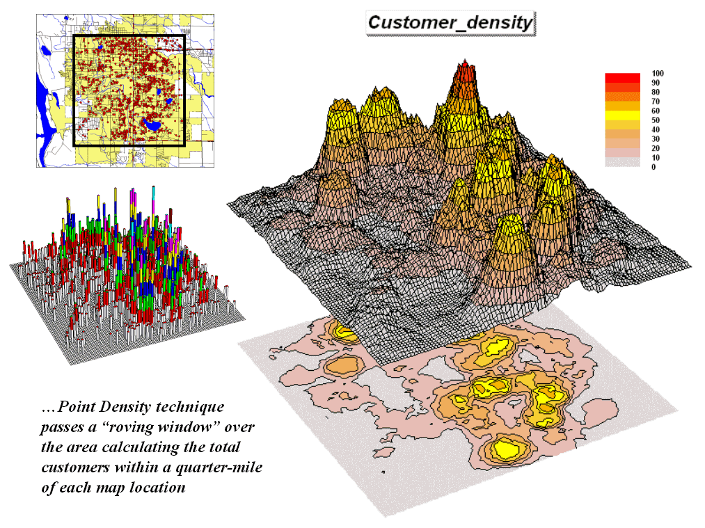
Figure 1. Point Density analysis identifies the number of customers with a specified distance of each grid location.
The spatial relationships encapsulated in the patterns can be a valuable component to good business decisions. However, the “visceral viewing” approach is more art than science and is very subjective. Grid-based map analysis, on the other hand, provides tools for objectively evaluating spatial patterns. Last section discussed a Competition Analysis procedure that linked travel-time of customers to a retail store. This discussion will focus on characterizing the spatial pattern of customers.
The upper left inset in figure 1 identifies the location of customers as red dots. Note that the dots are concentrated in some areas (actually falling on top of each) while in other areas there are very few dots. Can you locate areas with unusually high concentrations of customers? Could you delineate these important areas with a felt-tip marker? How confident would you be in incorporating your sketch map into critical marketing decisions?
The lower left inset identifies the first step in a quantitative investigation of the customer pattern—Point Density analysis. An analysis grid of 100 columns by 100 rows (10,000 cells) is superimposed over the project area and the number of customers falling into each cell is aggregated. The higher “spikes” on the map identify greater customer tallies. From this perspective your eyes associate big bumps with greater customer concentrations.
The map surface on the right does what your eyes were attempting to do. It summarizes the number of customers within the vicinity of each map location. This is accomplished by moving a “roving window” over the map that calculates the total number of customers within a six-cell reach (about a quarter of a mile). The result is obvious peaks and valleys in the surface that tracks customer density.
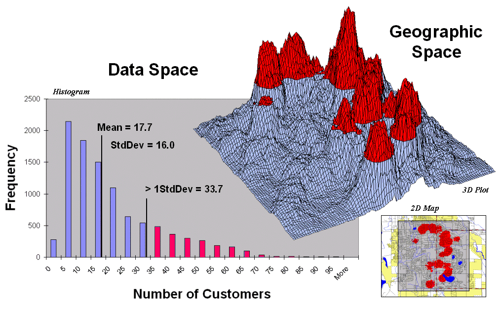
Figure 2. Pockets of unusually high customer density are identified as more than one standard deviation above the mean.
Figure 2 shows a process to identify pockets of unusually
high customer density. The mean and
standard deviation of the customer density surface are calculated. The histogram plot on the left graphically
shows the cut-off used—more than one standard deviation above the mean (17.7 +
16 = 33.7). Aside—since the customer data isn’t
normally distributed it might be better to use Median plus
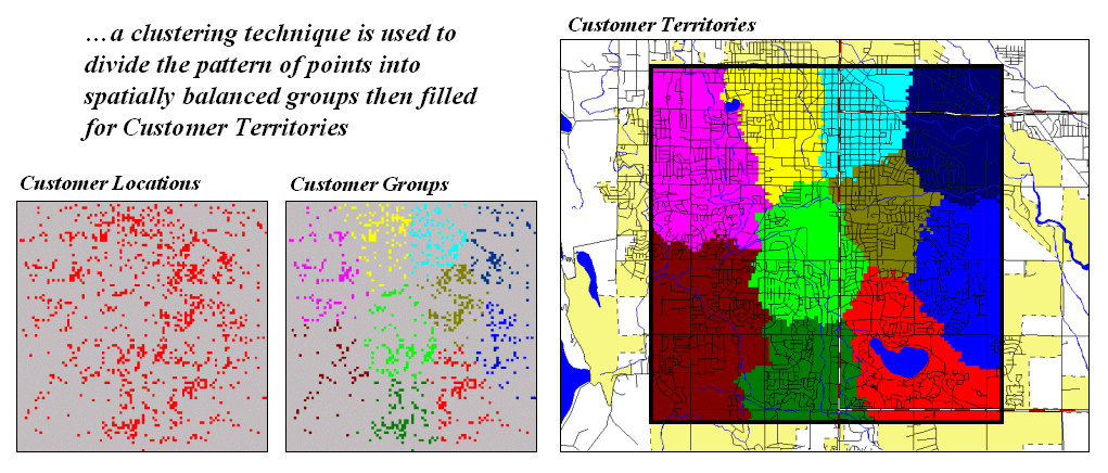
Figure 3. Clustering on the latitude and longitude coordinates of point locations identify customer territories.
Another grid-based technique for investigating the customer
pattern involves
The two small inserts on the left of figure 3 show the
general pattern of customers then the partitioning of the pattern into
spatially balanced groups. This initial
step was achieved by applying a K-means clustering algorithm to the
latitude and longitude coordinates of the customer locations. In effect this procedure maximizes the
differences between the groups while minimizing the differences within each
group. There are several alternative
approaches that could be applied, but K-means is an often-used procedure that
is available in all statistical packages and a growing number of
The final step to assign territories uses a nearest
neighbor interpolation algorithm to assign all non-customer locations to
the nearest customer group. The result
is the customer territories map shown on the right. The partitioning based on customer locations
is geographically balanced, however it doesn’t consider the number of customers
within each group—that varies from 69 in the lower right (maroon) to 252 (awful
green) near the upper right. We’ll have
to tackle that twist in a future beyond mapping column.
Use Travel Time to Connect with Customers
(GeoWorld, June 2002, pg. 24-25)
Several recent Beyond Mapping columns have dealt with travel-time and its geo-business applications (see GeoWorld issues for February-March, 2001 and March-April, 2002). This section extends the discussion to “Optimal Path” and “Catchment” analysis.
As a review, recall that travel-time is calculated by respecting absolute and relative barriers to movement throughout a project area. For most vehicles on a trip to the store, the off-road locations represent absolute barriers—can’t go there. The road network is composed of different types of streets represented as relative barriers—can go there but at different speeds.
Figure
1. The height on the travel-time surface
identifies how far away each location is and the steepest downhill path along
the surface identifies the quickest route.
In assessing travel-time, the computer starts somewhere then calculates the time to travel from that location to all other locations by moving along the road network like a series of waves propagating through a canal system. As the wave front moves, it adds the time to cross each successive road segment to the accumulated time up to that point. The result is estimated travel-time to every location in a city.
For example, the upper-left inset in figure 1 shows a 2D
travel-time map from
The lower-right inset in the figure depicts the quickest
route that a customer in the northeast edge of the city would take to get to
the store. The algorithm starts at the
customer’s location on the travel-time surface, and then takes the “steepest
downhill path” to the basin (
Figure
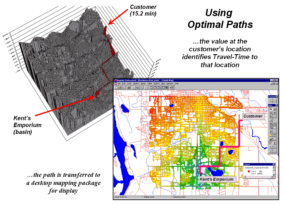
2. The optimal path (quickest route)
between the store and any customer location can be calculated then transferred
to a standard desktop mapping system.
The upper-left inset of figure 2 shows the 3D depiction of
the optimal path in the grid-based analysis system used to derive the travel-time
information. The height of the
customer’s location on the surface (15.2 minutes) indicates the estimated
travel-time to
At each step along the optimal path the remaining time is
equal to the height on the surface. The
inset in the lower-right of the figure shows the same information transferred
to a standard desktop mapping system. If
the car is
If fact, that is how many emergency response systems work. An accumulation surface is constructed from the police/hospital/fire station to all locations. When an emergency call comes in, its location is noted on the surface and the estimated time of arrival at the scene is relayed to the caller. As the emergency vehicle travels to the scene it appears as a moving dot on the console that indicates the remaining time to get there.
Another use of travel-time and optimal path is to derive catchment areas from a set of starting locations. For example, the left-side of figure 3 shows the travel-time surface from six ATM machines located throughout a city. Conceptually, it is like tossing six stones into a canal system (road network) and the distance waves move out until they crash into each other. The result is a series of bowl-like pockmarks in the travel-time surface with increasing travel-time until a ridge is reached (equidistant) then a downhill slide into locations that are closer to the neighboring ATM machine.
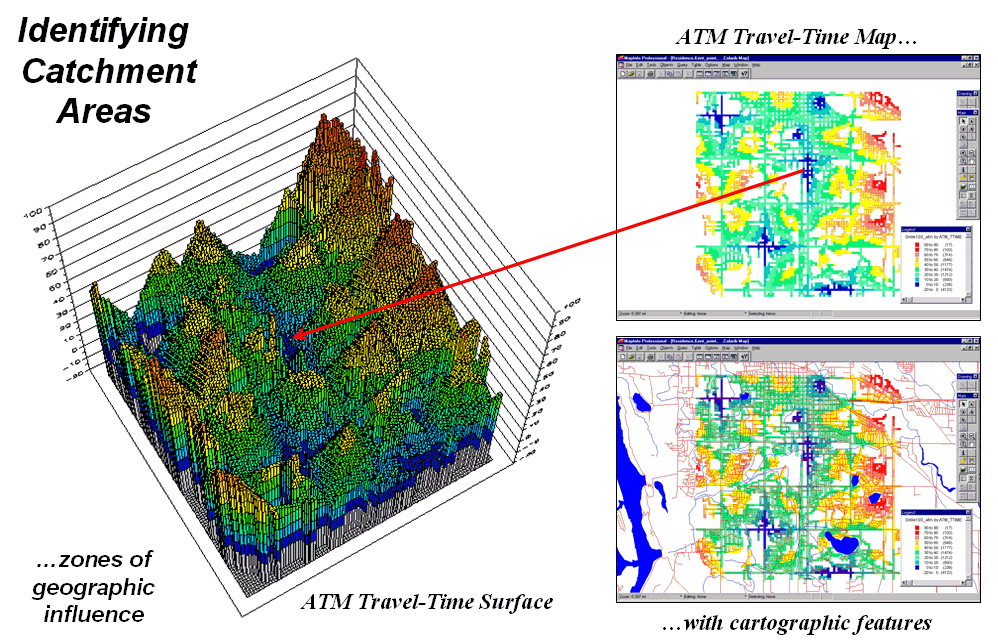
Figure 3. The region of
influence, or Catchment Areas, is identified as all locations closest to one of
a set of starting locations (basins).
The 2D display in the upper-right inset of figure 3 shows the travel-time contours around each of the ATM locations—blue being closest through red that is farthest away. The lower-right inset shows the same information transferred to a desktop mapping system. Similar to the earlier discussion, any customer location in the city corresponds to a position on the pock-marked travel-time surface—height identifies how far away to the nearest ATM machine and the optimal path shows the quickest route.
This technique is the foundation for a happy marriage
between
In the not too distance future you will be able to call your
“cell-phone agent” and leave a request to be notified when you are within a
five minute walk of a Starbucks coffee house.
As you wander around the city your phone calls you and politely says
“…there’s a Starbucks about five minutes away and, if you please, you can get
there by taking a right at the next corner then…” For a lot of spatially-challenged folks it
beats the heck out of unfolding a tourist map, trying to locate yourself and
navigate to a point.
Accumulation Surfaces Connect Bus Riders and
Stops
(GeoWorld, October 2002, pg. 24-25)
Several online services and software packages offer optimal path routing and point-to-point directions. They use network analysis algorithms that connect one address to another by the “best path” defined as shortest, fastest or most scenic. The 911 emergency response systems implemented in even small communities illustrate how pervasive these routing applications have become.
However, not all routing problems are between two known points. Nor are all questions simply navigational. For example, consider the dilemma of matching potential bus riders with their optimal stops. The rider’s address and destination are known but which stops are best to start and end the trip must be determined. A brute-force approach would be to calculate the routes for all possible stop combinations for home and destination addresses, then choose the best pair. The algorithm might be refined using simple proximity to eliminate distant bus stops and then focus the network analysis on the subset of closest ones.
An alternative approach uses accumulation surface analysis to identify the connectivity. Figure 1 sets the stage for an example analysis. The inset on the left identifies the set of potential riders with a spatial pattern akin to a shotgun blast with as many as eight riders residing in a 250-foot grid cell (dot on the map). The inset on the right shows a bus route with six stops. The challenge is to connect any and all of the riders to their closest stop while traveling only along roads (primary= red, secondary= green).
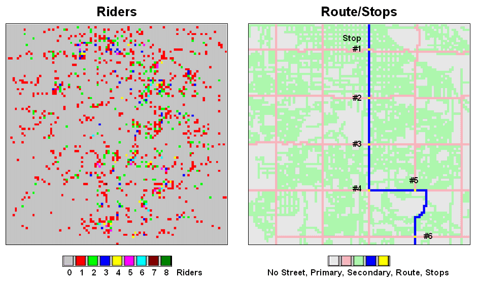
Figure
1. Base maps identifying riders and
stops.
While the problem could keep a car load of kids with pencils occupied for hours, a more expedient procedure is the focus. An accumulation “travel-time” surface is generated by iteratively moving out from a stop along the roads while considering the relative ease in traversing primary and secondary streets. The left inset in figure 2 is a 3D display of the travel-time values derived—increasing height equates to locations that are further away. The 2D map on the right shows the same data with green tones close to a stop and red tones further away.
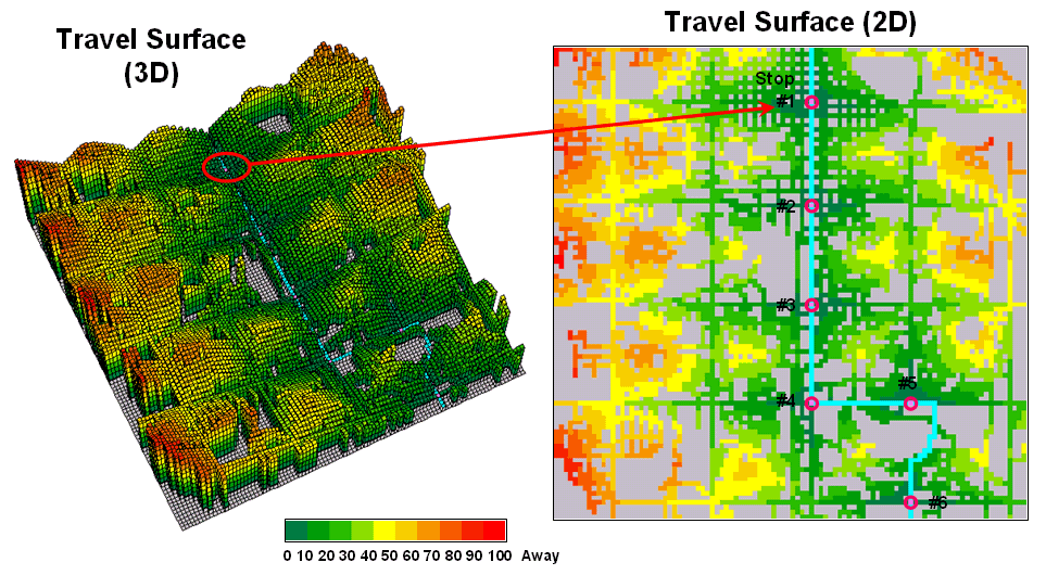
Figure 2.
Travel surface identifying relative distance from each of the bus stops
to the areas they serve.
The ridges radiating out from the stops identify locations that are equidistant from two stops. Locations on either side of a ridge fall into catchment areas that delineate regions of influence for each bus stop. In a manner analogous to a watershed, these “travel-sheds” collect all of the flow within the area and funnel it toward the lowest point—which just happens to be one of the bus stops (travel-time from a stop equals zero).
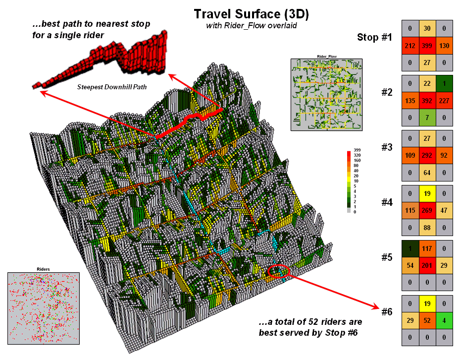
Figure 3.
Relative flows of riders from their homes to the nearest bus stop.
Figure 3 puts this information into practice. The 3D travel surface on the left is the same one shown in the previous figure. However, the draped colors report the flow of optimal paths between a stop and its dispersed set of potential riders—greens for light flow through reds for heavy flow.
The inset in the upper-left portion of the figure illustrates the optimal path for one of the riders. It is determined as the “steepest downhill path” from his or her residence to the closest bus stop. Now imagine thousands of these paths flowing from each of the rider locations (2D map in the lower-left) to their closest stop. The paths passing though each map location are summed to indicate overall travel flow (2D map in the upper-right).
Like a rain storm in a watershed, the travel flow map tracks the confluence of riders as they journey to the bus stop. The series of matrices on the right side of figure 3 identifies the influx of riders at each stop. Note that 212 of the 399 riders approach stop #1 from the west—that’s the side of the street for a hot dog stand. Also note that each bus stop has an estimated number of riders that are optimally served—total number of riders within the catchment area.
In a manner similar to point-to-point routing, directions for individual riders are easily derived. The appropriate stops for the beginning and ending addresses of a trip are determined by the catchment areas they fall into. The routes to and from the stops are traced by the steepest downhill paths from these addresses that can be highlighted on a standard street map.
However, the real value in the approach is its ability to summarize aggregate ridership. For example, how would overall service change if a stop was eliminated or moved? Which part of the community would be affected? Who should be notified? The navigational solution provided by traditional network analysis fails to address these comprehensive concerns. The region of influence approach using accumulated surface analysis, on the other hand, moves the analysis beyond simply mapping the route.
_________________
Author's Notes: All of the data in these examples are hypothetical. See…www.innovativegis.com/basis,
select Map Analysis for the current online version and supplements. See
www.redhensystems.com/mapcalc,
for information on MapCalc Learner software and “hands-on exercises” in
this and other