|
Topic 9 – Slope, Distance and
Connectivity Algorithms |
Beyond Mapping book |
There’s More Than One Way to Figure Slope — describes procedures for calculating
surface slope and its varied applications
Distance Is Simple and Straight Forward — describes
simple distance calculation as a propagating wavefront
Rubber
Rulers Fit Reality Better — describes
procedures for calculating effective distance that considers intervening
absolute and relative barriers
Twists and Contortions Lead to Connectivity — describes
procedures for calculating optimal paths and routing corridors
Take a New Look at Visual Connectivity — describes
viewshed and visual exposure procedures
Note: The processing
and figures discussed in this topic were derived using MapCalcTM software. See www.innovativegis.com to
download a free MapCalc Learner version with tutorial materials for classroom
and self-learning map analysis concepts and procedures.
<Click here>
right-click to download a printer-friendly version of this topic (.pdf).
(Back to the Table of Contents)
______________________________
There’s More Than One Way to
Figure Slope
(GIS
World, September 1992)
…“you knowest me not” (Shakespeare’s Romeo and Juliet)
Romeo speaks these famous lines as he attempts to befriend his family's enemy, Tybalt. However, as the scene unfolds, Romeo wields his sword and runs him through-- maybe Tybalt knowest him too well? No, it's just plain old ignorance. Romeo knowest his secret marriage to Juliet maketh him Tybalt's brother, but Tybalt knowest not such portentous information.
What's
all this got to do with GIS? A simple
lesson-- knowest thy GIS operations, or
thee shalt be gored. Take the simple concept of slope. We all remember Ms. Deal's explanation (the
generic geometry persona) of "rise over run." If the rise is 10 feet when you walk (or run)
100 feet, then the slope is 10/100 * 100%= 10 percent slope. There, the concept is easy. So is the practice. Boy Scouts and civil engineers should recall
sighting through their clinometers and dumpy levels to measure slope.
But
what's a slope map? Isn't it just
the same concept and practice jammed into a GIS? Or is it something else, you may knowest not? In a
nutshell, it is a continuous distribution of slope (rise over run) throughout
an area. Or stated another way, it is
the trigonometric tangent taken in all directions. Or, the three-dimensional
derivative of a digital terrain model.
Bah! You might be thinking,
"this stuff is too techy, I'll just ignore it and
stick with Ms. Deal's comfortable concept."
No,
try sticking it out. For those with GW
issues going way back, an overview of this subject was made in the June '90
issue (GIS World, Vol. 3 No. 3). But for
now let's get down to the nitty-gritty-- how you derive a slope map. In most offices it is an ocular/manual
process. You look at a map and if the
contour lines are close together, you mark the area as "steep." If they are far apart, you circle it as
"gentle." Anything you didn't
mark must be "moderate." As a
more exacting alternative, you could count the number of contour lines per unit
of distance and calculate the percent slope, but that's a lot of work. You might construct a ruler-like guide, but
using it is still inhumane.
More
importantly, the procedure is assessing slope along a single transect. As you stand on the side of a hill, isn't
there a bunch of different slope transects-- down, up, and across from
you? A water drop recognizes the
steepest. A weary
hiker responses to the minimum slope.
A developer usually assesses the overall slope. In the real world, we need several different
slope algorithms for different application requirements.
An
interesting physical slope procedure involves creating a black and white
negative of a map's contour lines. In
printing the negative, the paper is rapidly "wiggled" about a pivot
at its center. Those areas with closely
spaced contours (steep) do not expose the paper to as much light as those areas
where the contours are far apart (gentle).
The result is a grey-scale map progressing from dark areas having gentle
slopes to light areas having steep slopes.
Now we have a real slope map-- a robust range of slope conditions and a
procedure considering all of the slopes about each location throughout an
area.
In
a somewhat analogous fashion, a series of grid cells can be overlaid on a map of
contour lines. The number of lines
within each cell is counted-- the more lines the steeper the slope. This approach was used in early vector
systems, but requires considerable computation and is sensitive to the spacing
and positioning of the analysis grid.
Most
slope processing is done with data formatted as a Digital Elevation Model
(DEM). The DEM uses a raster format of
regularly spaced elevation data. Figure
1 shows a small portion of a typical data set, with each cell containing a
value approximating its overall elevation.
As there is only one value in each cell we can't compute a slope for an
individual cell without considering the values surrounding it. In the highlighted 3x3 window there are eight
individual slopes, as shown in the calculations accompanying the figure. The steepest slope of 52% is formed with the
center and the cells to its NW and W.
The minimum slope is 10% in the SW direction.
But
what about the general slope throughout the entire 3x3 analysis window? One estimate is 30%, the average of the eight
individual slopes. Another general
characterization could be 31%, the median of slopes. To get an appreciation of this processing,
shift the window one column to the right and run through the calculations using
the value 459 as the center. Now imagine
doing that a million times with an impatient and irate human pounding at your
peripherals. Show some compassion for
your computer-- the basis of a meaningful GIS relationship.
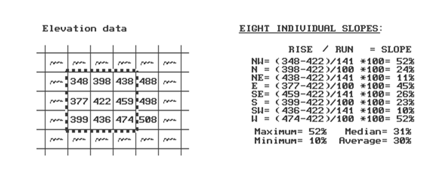
Figure 1. Example Elevation Data.
An
alternative format to DEM is Triangulated Irregular Network (TIN) using
irregularly spaced elevation points to form a network of "triangular facets." Instead of a regular DEM spacing, areas of
rapidly changing terrain receive more points than relatively flat areas. Any three elevation points, when connected,
form a triangle floating in three-dimensional space. Simple (ha!) trigonometry is used to compute
the slope of the tilted triangular facets, which are stored as a set of
adjoining polygons in conventional vector format. TIN algorithms vary widely in how they
develop the irregular network of points, so their slope maps often are
considerably different.
A
related raster-approach treats the octants about the center position in the 3x3
window as eight triangular facets. The
slopes of the individual facets are computed and generalized for an overall
slope value. To bring things closer to
home, the elevations for the cardinal points along the center cell's sides can
be interpolated from the surrounding DEM values. This refinement incorporates the lateral
interactions among the elevation points and often produces different results
than those directly using the DEM values.
Now
let's stretch our thinking a bit more.
Imagine that the nine elevation values become balls floating above their
respective locations, as shown in Figure 2.
Mentally insert a plane and shift it about until it is positioned to
minimize the overall distances to the balls.
The result is a "best-fitted plane" summarizing the overall
slope in the 3x3 window.
The
techy-types will recognize this process as similar to fitting a regression line
to a set of data points in two-dimensional space. In this case, it is a plane in
three-dimensional space. It is an
intimidating set of equations, with a lot of Greek letters and subscripts to
"minimize the sum of the squared deviations" from the plane to the
points. Solid geometry calculations,
based on the plane's "direction cosines," determine the slope (and
aspect) of the plane.
This
approach can yield radically different slope estimates to the others
discussed. Often the results are closer
to your visceral feeling of slope as stand on the side of a hill... often they
are not. Consider a mountain peak, or a
terrain depression. Geometry
characterizes these features as a cone, with eight steeply sloped sides--
result is very steep. The fitted-plane
approach considers these features as a balanced transition in slopes-- result
is perfectly flat. Which way do you view
it?
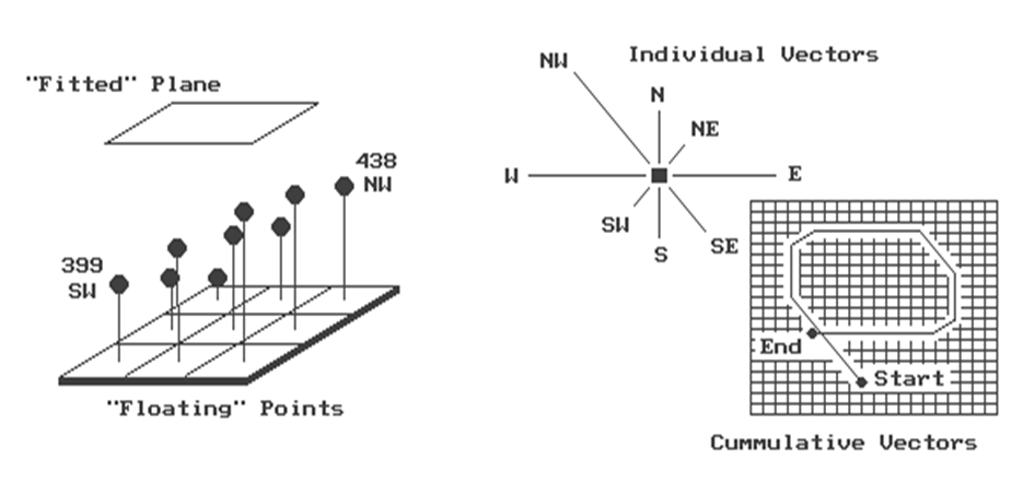
Figure 2. "Best-Fitted"
Plane Using Vector Algebra.
Another
procedure for fitting a plane to the elevation data uses vector algebra, as
illustrated in the right portion of figure 2. In concept, the mathematics draws each of the
eight slopes as a line in the proper direction and relative length of the slope
value (individual vectors). Now comes
the fun part. Starting with the NW line,
successively connect the lines as shown in the figure (cumulative
vectors). The civil engineer will
recognize this procedure as similar to the latitude and departure sums in
"closing a survey transect."
The physicist sees it as the vector sums of atomic movements in a cloud
chamber. We think of it as the
serpentine path we walked in downtown Manhattan.
If
the vector sum happens to close on the starting point, the slope is 0%. A gap between the starting and end points is
called the "resultant vector."
The length of the resultant vector is the slope of a plane fitting the
floating data points, which in turn, is interpreted as the general slope of the
terrain. In the example, the resultant
slope is 36%, oriented toward the NW.
Considering
our calculations, what's the slope-- 52, 10, 30, 31, or 36? They're all correct. The point is, it depends... it depends on
your understanding of the application's requirement and the algorithm's
sensitivity. A compatible marriage
between application and algorithm must be struck. "With this kiss, I die" might be
your last words if you "knowest not" your GIS operations and blindly
apply any old GIS result from clicking your mouse on the slope icon.
Distance Is Simple and Straight
Forward
(GIS
World, October 1992)
For
those with a GIS World archive, an overview of the evolving concept of distance
was made in the September 1989 issue (GIS World, Vol. 2, No. 5). The objective of this revisiting of the
subject focuses on the real stuff-- how a GIS derives a distance map. The basic concept of distance measurement
involves two things-- a unit and a procedure. The tic-marks on your ruler establishes the
unit. If you are an old wood-cutter like
me, a quarter of an inch is good enough.
If more accuracy is required, you choose a ruler with finer
spacing. The fact that these units are
etched on side of a straight-edge implies that the procedure of measurement is
"shortest, straight line between two points." You align the ruler between two points and
count the tic-marks. There, that's it--
simple, satisfying and comfortable.
But
what is a ruler? Actually, it is just
one row of an implied grid you have placed over the map. In essence, the ruler forms a reference grid,
with the distance between each tic-mark forming one side of a grid cell. You simply align the imaginary grid and count
the cells along the row. That's easy for
you, but tough for a computer. To
measure distance like this, the computer would have to recalculate a
transformed reference grid for each measurement. Pythagoras anticipated this potential for
computer-abuse several years ago and developed the Pythagorean Theorem. The procedure keeps the reference grid
constant and relates the distance between two points as the hypotenuse of a right
triangle formed by the grid's rows and columns.
There that's it-- simple, satisfying and comfortable for the high school
mathematician lurking in all of us.
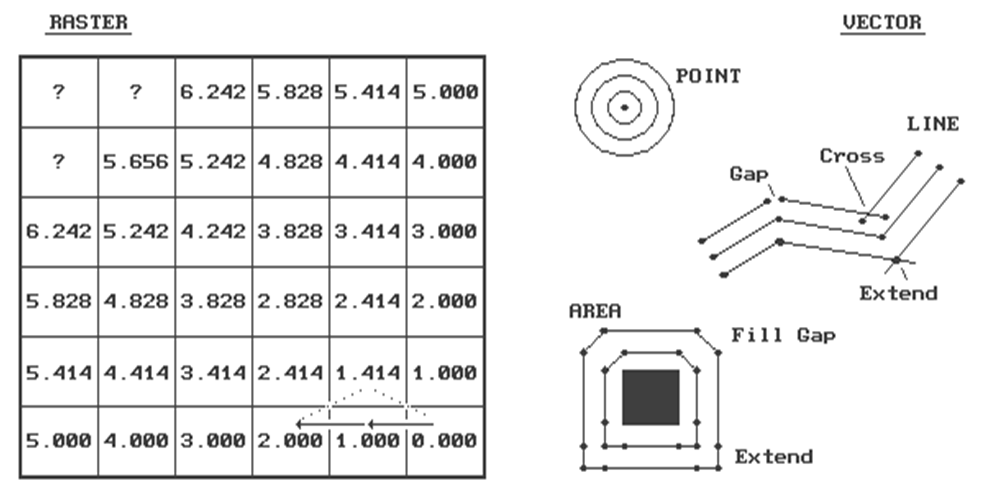
Figure 3. Characterizing Simple
Proximity.
A
GIS that's beyond mapping, however, "asks not what math can do for it, but
what it can do for math." How about
a different way of measuring distance? Instead
of measuring between just two points, let's expand the concept of distance to
that of proximity-- distance among sets of points. For a raster procedure, consider the analysis
grid on the left side of figure 3. The
distance from the cell in the lower-right corner (Col 6, Row 6) to each of its
three neighbors is either 1.000 grid space (orthogonal), or 1.414
(diagonal). Similar to the tic-marks on
your ruler, the analysis grid spacing can be very small for the exacting types,
or fairly course for the rest of us.
The
distance to a cell in the next "ring" is a combination of the
information in the previous ring and the type of movement to the cell. For example, position Col 4, Row 6 is 1.000 +
1.000= 2.000 grid spaces as the shortest path is orthogonal-orthogonal. You could move diagonal-diagonal passing
through position Col 5, Row 5, as shown with the dotted line. But that route wouldn't be
"shortest" as it results in a total distance of 1.414 + 1.414= 2.828
grid spaces. The rest of the ring assignments
involves a similar test of all possible movements to each cell, retaining the
smallest total distance. With tireless
devotion, your computer repeats this process for each successive ring. The missing information in the figure allows
you to be the hero and complete the simple proximity map. Keep in mind that there are three possible
movements from ring cells into each of the adjacent cells. (Hint-- one of the answers is 7.070).
This
procedure is radically different from either your ruler or Pythagoras's
theorem. It is more like nailing your
ruler and spinning it while the tic-marks trace concentric circles-- one unit
away, two units away, etc. Another
analogy is tossing a rock into a still pond with the ripples indicating
increasing distance. One of the major
advantages of this procedure is that entire sets of "starting
locations" can be considered at the same time. It's like tossing a handful of rocks into the
pond. Each rock begins a series of
ripples. When the ripples from two rocks
meet, they dissipate and indicate the halfway point. The repeated test for the smallest
accumulated distance insures that the halfway "bump" is
identified. The result is a distance
assignment (rippling ring value) from every location to its nearest starting location.
If
your conceptual rocks represented the locations of houses, the result would be
a map of the distance to the nearest house for an entire study area. Now imagine tossing an old twisted branch
into the water. The ripples will form
concentric rings in the shape of the branch.
If your branch's shape represented a road network, the result would be a
map of the distance to the nearest road.
By changing your concept of distance and measurement procedure,
proximity maps can be generated in an instant compared to the time you or
Pythagoras would take.
However,
the rippling results are not as accurate for a given unit spacing. The orthogonal and diagonal distances are
right on, but the other measurements tend to overstate the true distance. For example, the rippling distance estimate
for position 3,1 is 6.242 grid spaces.
Pythagoras would calculate the distance as C= ((3**2 + 5**2)) **1/2)=
5.831. That's a difference of .411 grid
spaces, or 7% error. As most raster
systems store integer values, the rounding usually absorbs the error. But if accuracy between two points is a must,
you had better forego the advantages of proximity measurement.
A
vector system, with its extremely fine reference grid, generates exact
Pythagorean distances. However,
proximity calculations are not its forte.
The right side of the accompanying figure shows the basic considerations
in generating proximity "buffers" in a vector system. First, the "reach" of the buffer is
established by the user-- as before, it can be very small for the exacting
types, or fairly course for the rest of us.
For point features, this distance serves as the increment for increasing
radii of a series of concentric circles.
Your high school geometry experience with a compass should provide a
good conceptualization of this process.
The GIS, however, evaluates the equation for a circle given the center
and radius to solve for the end points of the series of line segments forming
the boundary.
For
line and area features, the reach is used to increment a series of parallel
lines about the feature. Again, your
compass work in geometry should rekindle the draftsman's approach. The GIS, on the other hand, uses the slope of
each line segment and the equation for a straight line to calculate the end
points of the parallel lines.
"Crosses" and "gaps" occur wherever there is a
bend. The intersection of the parallel
lines on inside bends are clipped and the intersection is used as the common
end point. Gaps on outside bends present
a different problem. Some systems simply
fill the gaps with a new line segment.
Others extend the parallel lines until they intersect. The buffers around the square feature shows
that these two approaches can have radically different results. You can even take an additional step and fit
a spline-fitting algorithm to smooth the lines.
A
more important concern is how to account for "buffer bumping." It's only moderately taxing to calculate the
series buffers around individual features, but it's a monumental task to
identify and eliminate any buffer overlap.
Even the most elegant procedure requires a ponderous pile of computer
code and prodigious patience by the user.
Also, the different approaches produce different results, affecting data
exchange and integration among various systems.
The only guarantee is that a stream proximity map on system A will be
different than a stream proximity map on system B.
Another
guarantee is that new concepts of distance are emerging as GIS goes beyond
mapping. The next section will focus on
the twisted concept of "effective" proximity which is anything but
simple and straight forward.
_____________________
As
with all Beyond Mapping articles, allow me to apologize in advance for the
"poetic license" invoked in this terse treatment of a complex
subject. Readers interested in more
information on distance algorithms should consult the classic text, The
Geography of Movement, by Lowe and Moryadas, 1975, Houghton Miffen
publishers.
Rubber Rulers Fit Reality Better
(GIS
World, November 1992)
It
must be a joke, like a left-handed wrench, a bucket of steam or a snipe
hunt. Or it could be the softening of
blows in the classroom through enlightened child-abuse laws. Actually, a rubber ruler often is more useful
and accurate than the old straight-edge version. It can bend, compress and stretch throughout
a mapped area as different features are encountered. After all it's more realistic, as the
straight path is rarely what most of us follow.
The
last section established the procedure for computing simple proximity
maps as forming a series of concentric rings.
The ability to characterize the continuous distribution of simple,
straight-line distances to sets of features like houses and roads is useful in
a multitude of applications. More
importantly, the GIS procedure allows measurement of effective proximity
recognizing absolute and relative barriers to movement, as shown in figure 1.
As
discussed in the last issue, the proximity to the starting location at Col 6,
Row 6 is calculated as a series of rings.
However, this time we'll use the map on the left containing
"friction" values to incorporate the relative ease of movement
through each grid cell. A friction value
of 2.00 is twice as difficult to cross as one with 1.00. Absolute barriers, such as
a lake to a non-swimming hiker, are identified as infinitely far away and
forces all movement around these areas.
Step Distance= .5 * (GSdistance * FfactorN)
Accumulated Distance= Previous +
Sdistance1 + Sdistance2
Minimum Distance is Shortest,
Non-Straight Distance
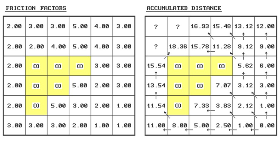
Figure 1. Characterizing Effective Proximity.
A
generalized procedure for calculating effective distance using the friction
values is as follows (refer to the figure).
Step 1 - identify the ring
cells ("starting cell" 6,6 for first
iteration).
Step 2 - identify the set of
immediate adjacent cells (positions 5,5; 5,6; and 6,5
for first iteration).
Step 3 - note the friction
factors for the ring cell and the set of adjacent cells (6,6=1.00;
5,5=2.00; 5,6=1.00; 6,5=1.00).
Step 4 - calculate the
distance, in half-steps, to each of the adjacent cells from each ring cell by
multiplying 1.000 for orthogonal or 1.414 for diagonal movement by the
corresponding friction factor...
.5
* (GSdirection * Friction Factor)
For
example, the first iteration ring from the center of 6,6
to the center of position
5,5 is .5 * (1.414 *
1.00)= .707
.5
* (1.414 * 2.00)= 1.414
2.121
5,6 is .5 * (1.000 *
1.00)= .500
.5
* (1.000 * 1.00)=
.500
1.000
6,5 is .5 * (1.000 *
1.00)= .500
.5
* (1.000 * 1.00)=
.500
1.000
Step 5 - choose the smallest
accumulated distance value for each of the adjacent cells.
Repeat - for successive
rings, the old adjacent cells become the new ring cells (the next iteration
uses 5,5; 5,6 and 6,5 as the new ring cells).
Whew! That's a lot of work. Good thing you have a silicon slave to do the
dirty work. Just for fun (ha!) let's try
evaluating the effective distance for position 2,1...
If you move from position 3,1
its—
.5 * (1.000
* 3.00)=
1.50
.5 * (1.000
* 3.00)=
1.50
3.00
plus previous
distance= 16.93
equals accumulated distance= 19.93
…If you move from position 3,2
its—
.5 * (1.414
* 4.00)=
2.83
.5 * (1.414
* 3.00)=
2.12
4.95
plus previous
distance= 15.78
equals accumulated distance= 20.73
…If you move from position 2,2
its—
.5 * (1.000
* 2.00)=
1.00
.5 * (1.000
* 3.00)=
1.50
2.50
plus previous
distance= 18.36
equals
accumulated distance= 20.86
Finally, choose the smallest accumulated distance value of 19.93, assign it to position 2,1 and draw a horizontal arrow from position 3,1. Provided your patience holds, repeat the process for the last two positions on your own.
The
result is a map indicating the effective distance from the starting location(s)
to everywhere in the study area. If the
"friction factors" indicate time in minutes to cross each cell, then
the accumulated time to move to position 2,1 by the shortest route is 19.93
minutes. If the friction factors indicate
cost of haul road construction in thousands of dollars, then the total cost to
construct a road to position 2,1 by the least cost route is $19,930. A similar interpretation holds for the
proximity values in every other cell.
To
make the distance measurement procedure even more realistic, the nature of the
"mover" must be considered.
The classic example is when two cars start moving toward each other. If they travel at different speeds, the
geographic midpoint along the route will not be the location the cars actually
meet. This disparity can be accommodated
by assigning a "weighting factor" to each starter cell indicating its
relative movement nature-- a value of 2.00 indicates a mover that is twice as
"slow" as a 1.00 value. To
account for this additional information, the basic calculation in Step 4 is
expanded to become
. 5 * (GSdirection
* Friction Factor * Weighting Factor)
Under
the same movement direction and friction conditions, a "slow" mover
will take longer to traverse a given cell.
Or, if the friction is in dollars, an "expensive" mover will
cost more to traverse a given cell (e.g., paved versus gravel road
construction).
I
bet your probing intellect has already taken the next step-- dynamic effective
distance. We all know that real movement
involves a complex interaction of direction, accumulation and momentum. For example, a hiker walks slower up a steep
slope than down it. And, as the hike
gets longer and longer, all but the toughest slow down. If a long, steep slope is encountered after
hiking several hours, most of us interpret it as an omen to stop for quiet
contemplation.
The
extension of the basic procedure to dynamic effective distance is still in the
hands of GIS researchers. Most of the
approaches use a "look-up table" to update the "friction
factor" in Step 4. For example,
under ideal circumstances you might hike three miles an hour in gentle
terrain. When a "ring"
encounters an adjacent cell which is steep (indicated on the slope map) and the
movement is uphill (indicated on the aspect map), the normal friction is
multiplied by the "friction multiplier" in the look-up table for the
"steep-up" condition. This
might reduce your pace to one mile per hour.
A three-dimensional table can be used to simultaneously introduce
fatigue-- the "steep-up-long" condition might equate to zero miles
per hour.
See
how far you have come? From the straight
forward interpretation of distance ingrained in your ruler and Pythagoras's
theorem, to the twisted movement around and through intervening barriers. This bazaar discussion should confirm that
GIS is more different than it is the same as traditional mapping. The next issue will discuss how the shortest,
but "not necessarily straight path," is identified.
_____________________
As
with all Beyond Mapping articles, allow me to apologize in advance for the
"poetic license" invoked in this terse treatment of a complex
subject. Readers with the pMAP Tutorial
disk should review the slide show and tutorial on "Effective Sediment
Loading." An excellent discussion
of effective proximity is in C. Dana Tomlin's text, Geographical Information
Systems and Cartographic Modeling, available through the GIS World
Bookshelf.
Twists and Contortions Lead to
Connectivity
(GIS
World, December 1992)
…identifying
optimal paths and routing corridors.
The
last couple of sections challenged the assumption that all distance measurement
is the "shortest, straight line between two points." The concept of proximity relaxed the
"between two points" requirement.
The concept of movement, through absolute and relative barriers,
relaxed the "straight line" requirement. What's left? --"shortest," but not
necessarily straight and often among sets points.
Where
does all this twisted and contorted logic lead?
That's the point-- connectivity.
You know, "the state of being connected," as Webster would
say. Since the rubber ruler algorithm
relaxed the simplifying assumption that all connections are straight, it seems
fair to ask, "then what is the shortest route, if it isn't
straight." In terms of movement,
connectivity among features involves the computation of optimal paths. It all starts with the calculation of an
"accumulation surface," like the one shown on the left side of the
accompanying figure. This is a
three-dimensional plot of the accumulated distance table you completed last
month. Remember? Your homework involved that nasty, iterative,
five-step algorithm for determining the friction factor weighted distances of
successive rings about a starting location.
Whew! The values floating above
the surface are the answers to the missing table elements-- 17.54, 19.54 and
19.94. How did you do?
But
that's all behind us. By comparison, the
optimal path algorithm is a piece of cake-- just choose the steepest downhill
path over the accumulated surface. All
of the information about optimal routes is incorporated in the surface. Recall, that as the successive rings emanate
from a starting location, they move like waves bending around absolute barriers
and shortening in areas of higher friction.
The result is a "continuously increasing" surface that
captures the shortest distance as values assigned to each cell.
In
the "raster" example shown in the figure, the steepest downhill path
from the upper left corner (position 1,1) moves along the left side of the
"mountain" of friction in the center.
The path is determined by successively evaluating the accumulated
distance of adjoining cells and choosing the smallest value. For example, the first step could move to the
right (to position 2,1) from 19.54 to 19.94 units away. But that would be stupid, as it is farther
away than the starting position itself.
The other two potential steps, to 18.36 or 17.54, make sense, but 17.54
makes the most sense as it gets you a lot closer. So you jump to the lowest value at position
1,2. The process is repeated until you
reach the lowest value of 0.0 at position 6,6.
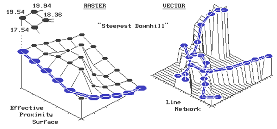
Figure 1. Establishing Shortest, Non-Straight Routes.
Say,
that's where we started measuring distance.
Let's get this right-- first you measure distance from a location
(effective distance map), then you identify another location and move downhill
like a rain drop on a roof. Yep, that's
it. The path you trace identifies the
route of the distance wavefront (successive rings) that got there first--
shortest. But why stop there, when you
could calculate optimal path density?
Imagine commanding your silicon slave to compute the optimal paths from
all locations down the surface, while keeping track of the number of paths
passing through each location. Like
gullies on a terrain surface, areas of minimal impedance collect a lot of
paths. Ready for another step?--
weighted optimal path density. In this
instance, you assign an importance value (weight) to each starting location,
and, instead of merely counting the number of paths through each location, you
sum the weights.
For
the techy types, the optimal path algorithm for raster systems should be
apparent. It's just a couple of nested
loops that allow you to test for the biggest downward step of "accumulated
distance" among the eight neighboring cells. You move to that position and repeat. If two or more equally optimal steps should
occur, simply move to them. The
algorithm stops when there aren't any more downhill steps. The result is a series of cells which form
the optimal path from the specified "starter" location to the bottom
of the accumulation surface. Optimal
path density requires you to build another map that counts the number paths
passing through each cell. Weighted
optimal path density sums the weights of the starter locations, rather than
simply counting them.
The
vector solution is similar in concept, but its algorithm is a bit more tricky
to implement. In the above discussion,
you could substitute the words "line segment" for "cell"
and not be too far off. First, you
locate a starting location on a network of lines. The location might be a fire station on a
particular street in your town. Then you
calculate an "accumulation network" in which each line segment end
point receives a value indicating shortest distance to the fire station along
the street network. To conceptualize
this process, the raster explanation used rippling waves from a tossed rock in
a pond. This time, imagine waves
rippling along a canal system. They are
constrained to the linear network, with each point being farther away than the
one preceding it. The right side of the
accompanying figure shows a three-dimensional plot of this effect. It looks a lot like a roll-a-coaster track
with the bottom at the fire station (the point closest to you). Now locate a line segment with a
"house-on-fire." The algorithm
hops from the house to "lily pad to lily pad" (line segment end
points), always choosing the smallest value.
As before, this "steepest downhill" path traces the wavefront
that got there first-- shortest route to the fire. In a similar fashion, the concepts of optimal
path density and weighted optimal path density from multiple starting locations
remain intact.
What
makes the vector solution testier is that the adjacency relationship among the
lines is not as neatly organized as in the raster solution. This relationship, or "topology,"
describing which cell abuts which cell is implicit in the matrix of numbers. On the other hand, the topology in a vector
system must be stored in a database. A
distinction between a vertex (point along a line) and a node (point of
intersecting lines) must be maintained.
These points combine to form chains which, in a cascading fashion,
relate to one another. Ingenuity in
database design and creative use of indices and pointers for quick access to
the topology are what separates one system from another. Unfettered respect should be heaped upon the
programming wizards that make all this happen.
However,
regardless of the programming complexity, the essence of the optimal path
algorithm remains the same-- measure distance from a location (effective
distance map), then locate another location and move downhill. Impedance to movement can be absolute and
relative barriers such as one-way streets, no left turn and speed limits. These "friction factors" are
assigned to the individual line segments, and used to construct an accumulation
distance network in a manner similar to that discussed last month. It is just that in a vector system, movement
is constrained to an organized set of lines, instead of an organized set of
cells.
Optimal
path connectivity isn't the only type of connection between map locations. Consider narrowness-- the shortest cord
connecting opposing edges. Like optimal
paths, narrowness is a two part algorithm based on accumulated distance. For example, to compute a narrowness map of a
meadow your algorithm first selects a "starter" location within the
meadow. It then calculates the
accumulated distance from the starter until the successive rings have assigned
a value to each of the meadow edge cells.
Now choose one of the edge cells and determine the "opposing"
edge cell which lies on a straight line through the starter cell. Sum the two edge cell distance values to
compute the length of the cord.
Iteratively evaluate all of the cords passing through the starter cell,
keeping track of the smallest length.
Finally, assign the minimum length to the starter cell as its narrowness
value. Move to another meadow cell and
repeat the process until all meadow locations have narrowness values assigned.
As
you can well imagine, this is a computer-abusive operation. Even with algorithm trickery and user limits,
it will send the best of workstations to "deep space" for quite
awhile. Particularly when the user wants
to compute the "effective narrowness" (non-straight cords respecting
absolute and relative barriers) of all the timber stands within a 1000x1000 map
matrix. But GIS isn't just concerned
with making things easy; be it for man or machine. It is for making things more realistic which,
hopefully, leads to better decisions.
Optimal path and narrowness connectivity are uneasy concepts leading in
that direction.
Take a New Look at Visual
Connectivity (GIS World, January 1993)
Remember
the warning the Beast gave Belle, "Don't go into the west wing." Such is the Byzantine world of GIS-- full of unfamiliar
bells and whistles which tempt our curiosity.
Spatial derivative, effective distance, optimal paths and narrowness are
a few of these discussed in recent issues.
Let's continue our groping in the realm of the unfamiliar with visual
connectivity. As before, the focus will
be on the computational approach.
As
an old Signal Corps officer, I am very familiar with the manual procedure for
determining FM radio's line-of-sight connectivity. You plot the position of the General's tent
(down in the valley near the good fishing hole) and spend the rest of the day
drawing potential lines to the field encampments. You note when your drafted lines "dig
into the dirt" as indicated by the higher contour values of ridges. In an iterative fashion, you narrow down the
placement of transmitters and repeaters until there is line-of-sight
connectivity among all the troops. About
then you are advised that the fishing has played out and the General's tent is
being moved to the next valley.
In
a mathematical context, the drafted lines are evaluating the relationship of
the change in elevation (rise) per unit of horizontal distance (run). The "rise to run" ratio, or
tangent, determines whether one location can be seen from another. Consider the line-of-sight plot shown in left
portion of Figure 1. Points along a line
are visible as long as their tangents exceed those of all intervening points
(i.e., rise above). The seen locations
are depicted by the shaded area. The
tangent values at the last two points are smaller than that of the fourth
point, therefore, they are marked as not seen (unshaded). Now identify another "ray in space"
and calculate where it digs into the dirt.
That's it-- a simple, straight forward adaptation of high school
geometry's characterization of a familiar drafting technique.
But,
as we have seen before, a mathematical solution can be different from a machine
solution, or algorithm. Just for fun,
let's invoke the "rippling" wave concept used in measuring distance. "Splash," the rock falls in the
lower-left corner of the map (see Figure 1).
The elevation of the "viewer cell" is noted, along with the
elevations of it's eight neighboring cells.
The neighboring cells are marked as seen and eight "tangents to be
beat" are calculated and stored.
Attention is moved to the next ripple where the tangents are calculated
and tested to determine if they exceed those on the inside ring. Locations with smaller tangents are marked as
not seen. Those with larger tangents are
marked as seen and the respective tangents to be beat are updated.
It
is just what your machine likes-- neat organization. The ripple number implicitly tracks of the
horizontal distance. The elevations are
identified by the column and row designation of current ripple's set of
cells. The tangents to be beat are
identified by cell positions of the previous ripple. "Splash," followed by a series of
rippling waves carry the tangents to be beat, while the visible locations are
marked in their wake. The effects of
haze can be introduced by only rippling so far, or adding a visual fall-off
weight, such as "inverse distance squared." The lower map in the right portion of Figure
1 is a planimetric plot of the viewshed of the same point described
above. For reference, the line-of-sight
is traced on the planimetric map. The
map on top, drapes the viewshed on the elevation surface. Note that the line-of-sight shading of
visible locations continues up the side of the mountain until the inflection
point (ridge top) at the reference ring.
In
general, the machine solution is not as exacting as a strict mathematical
implementation. But what it lacks in
exactness often is made up in computational speed and additional capabilities. Consider tossing a handful of rocks (viewer
locations) into the pond. "Splash,
splash, ...." As each ripple
pattern is successively evaluated, the resultant map keeps track of the number
of viewer locations connected to each map location. If thirty splashes (viz. houses) see a
location, that location is more "visually exposed" than another which
has none or just a few. Instead of a
viewshed map, a visual exposure density surface is created. It is like viewing through a fly's compound
eyeball-- a set of lenses (viewer cells) considered as a single viewing
entity. But why stop here? Imagine the visual exposure density surface
of an entire road system. High values
indicate locations with a lot of windshields connected. You might term these areas "visually
vulnerable" to roads. A sensitive
logger might term these areas "trouble" and move the clearcut just
over the ridge.
To
make the algorithm a bit more realistic, we need to add some additional
features. First, let's add the
capability to discriminate among different types of viewers. For example, we all know a highway has more
traffic than a back road. On the viewers
map, assign the value 10 to the highway and 1 to the back road as
"weighting factors." When your
rippling wave identifies seen locations, it will add the weight of the viewer
cell. The result is a weighted visual
exposure density surface, with areas connected to the highway receiving
higher exposure values. Isn't that more
realistic? You can even simulate an
aesthetics rating by assigning positive weights to beautiful things and negative
weights to ugly things. A net weighted
visual exposure value of 0 indicates a location that isn't connected to any
important feature, or has counter-balancing beauties and uglies in its visual
space... far out, man!
Another
enhancement is the generation of a prominence map. As the ripples advance, the difference
between the current and the previous tangent identifies the "degree"
of visual exposure. If the difference is
0 or negative, the location is not seen.
As the positive values increase, increasing visual prominence is
indicated. A very large positive
difference identifies a location that is "sticking out there like a sore
thumb-- you can't miss it." Couple
this concept with the previous one and you have a weighted prominence map. The algorithm simply multiplies the tangent
difference (prominence) times the viewer weight (importance) and keeps a
running sum of all positive values for each map location. The result is a map that summarizes the
effective visual exposure throughout a project area to a set of map
features. This is real information for
decision-making.
But
we aren't there yet. The final group of
enhancements include conditions affecting the line-of-sight. Suppose your viewing position is atop a
90-foot fire tower. You had better let
the computer know so it can add 90 to the elevation value for your actual
viewer height. You will see at lot
more. What about the dense forest stands
scattered throughout the area? Better
let the computer know the visual screening height of each stand so it can add
them to the elevation surface. You will
see a lot less. Finally, suppose there
is a set of features that rise above the terrain, but are so thin they really
don't block your vision. These might be
a chimney, an antenna and a powerline.
At the instance the algorithm is testing if such a location is seen, its
elevation is raised by the feature height to test if it is seen. However, the surface elevation is used in
testing for tangent update to determine if any cells in the next ring are
blocked. Picky, picky, picky. Sure, but while we are at it, we might as
well get things right.
Figure 1. Establishing Visual Connectivity.
Figure
2 puts this visual analysis thing in perspective. It is a simple model determining the average
visual exposure to both houses and roads for each district in a project
area. The "box and line"
flowchart to the right summarizes the model's logic. The sentences at the bottom list the command
lines implementing the processing. The
visual exposure to roads and houses is determined (RADIATE), then calibrated to
a common index of relative exposure (RENUMBER).
An overall index is computed (AVERAGE), then summarized for each
district (COMPOSITE). The resultant map
shows the district in the upper-left has a very high visual exposure-- not a
good place for an eyesore development.
But what have you learned? How
would you change the model to make it more realistic? Would weighted prominence be a better
measure? What about screening effect of
trees? Or the proximity to roads? Which houses are most affected? ...that
leaves some discussion for next issue-- concepts and procedures in spatial
modeling.
_______________________________________

(Back to the Table of Contents)