|
Topic 6 – Overlaying Maps and Characterizing Error Propagation |
Beyond
Mapping book |
GIS Facilitates Error Assessment — discusses potential sources of error when
overlaying maps and how “shadow maps” of error and
“fuzzy theory” can shed light on the problem
Analyzing the Non-Analytical — describes how “joint probability of
coincidence” and “minimum mapping resolution” can be used to assess results of
overlaying maps
Note: The processing
and figures discussed in this topic were derived using MapCalcTM
software. See www.innovativegis.com
to download a free MapCalc Learner version with tutorial materials for
classroom and self-learning map analysis concepts and procedures.
<Click here> right-click to
download a printer-friendly version of this topic (.pdf).
(Back to the Table of Contents)
______________________________
GIS Facilitates Error Assessment
(GIS
World, November 1991)
…cross an
Elephant with a Rhino and what do you get? …El-if-I-Know
Overlay
a soils map with a forest cover map, and what do you get?—
El-if-I-Know. It is supposed to be a map
that indicates the soil/forest conditions throughout a project area. But are you sure that's what it is? Where are you sure the reported coincidence
is right-on? Where are you less sure
about the results? Stated in the
traditional opaque academic way... "what is the
spatial distribution of probable error associated with your GIS modeling
product?"
It's
not enough to simply jam a few maps together and presume the results are
inviolately accurate. You have surely
heard of the old adage, "garbage in, garbage out." But even if you have good data as input, the
'thruput' can garble your output. Whoa!
That's nonsense. As long as one
purchases a state-of-the-art system and is careful in constructing the database,
everything will be OK. Right? Well, maybe
there is just couple of other things to consider, like map uncertainty and
error assessment.
There
are two broad types of error in GIS-- those that are present in the encoded
base maps, and those that arise during analysis. The source documents you encode may be
inherently wrong. Or your encoding
process may introduce error. The result
in either case, is garbage poised to be converted into
more garbage... at megahertz speed and in vibrant colors. But things aren't that simple, just good or
bad data, right or wrong. The ability of
the interpretation process to characterize a map feature comes into play.
Things
always seem a bit more complicated in a GIS.
Traditional 'scaler' mathematical models
reside in numeric space, not the seemingly chaotic reality of geographic
space. Spatial data has both a 'what'
(thematic attribute) and a 'where' (locational attribute). That's two avenues to error. Consider a class of aspiring photo
interpretation students. Some of the
students will outline a tightly clustered stand of trees and mark it as
ponderosa pine. Others will extend their
boundaries out to encompass a few nearby trees scattered in the adjoining
meadow, and similarly mark it as ponderosa pine. The remainder of the class will trace a
different set of boundaries, and mark their renderings as lodgepole
pine. Who's
feature definition are you going to treat as gospel in your GIS?
Unless
a feature exhibits a sharp edge and is properly surveyed, there is a strong
chance that the boundary line is misplaced in at least a few locations. Even exhibiting a sharp edge may not be
enough. Consider a lake on an aerial
photo. Using your finest tipped pen and
drafting skills, your line is bound to be wrong. A month later the shoreline might recede a
hundred yards. Next spring it could be a
hundred yards in the other direction. So
where is the lake?-- El-if-I-Know. But I do know it is somewhere between here
(high water mark) and there (low water mark).
If it's late spring, its most likely near here.
This
puts map error in a new light. Instead
of a sharp boundary implying absolute truth, a probability surface can be
used. Consider a typical soil map. The polygonal edge implies that soil A stops right here, and soil B begins immediately. Like the boundary between you and your
neighbor, the transition space is zero and the characteristics of the adjoining
features are absolutely known. That's
not likely the case for soils. It's more
like a probability distribution, but expressed in map space.
Imagine
a typical soil map with a probability 'shadow' map clinging to it-- sort of
glued to the bottom. Your eye goes to a
location on the map and notes the most likely soil from the top map, then peers
through to the bottom to see how likely it actually is. For human viewing you could assign a color to
each soil type, just like we do now.
Then you could control the 'brightness' of the color based on the soils
likelihood-- a washed-out pink if you're not too sure it's soil A; a deep red
if you're certain. That's an interesting
map with colors telling you the type of soil (just like before), yet the
brightness adds information about map uncertainty.
The
computer treats map uncertainty in a similar fashion. It can store two separate maps (or fields in
the attribute table). One
for classification type and another for uncertainty. Or for efficiency sake, it can use a
'compound' number with the first two digits containing the classification type
and the second two digits its likelihood.
Sort of a number sandwich, that can be peeled apart into the two
components identifying the 'what' characteristic of maps-- what do you think is
there, and how sure are you.
An
intriguing concept, but is it practical?
We have enough trouble just preparing traditional maps, little lone a
shadow map of probable error. For
starters, how do we currently report map error?
If it is reported at all, it is broadly discussed in the map's legend or
appended notes. For some maps, they are
field evaluated and an error matrix is reported. This involves locating yourself in a project
area, noting what is around you, and comparing this with what the map
predicts. Do this a few hundred times
and you get a good idea of how well the map is performing-- e.g., ponderosa
pine was correctly classified 80% of the time.
If you keep track of the errors that occurred, you also know something
about which map features are being confused with others-- e.g., 10% of the time
Lodgepole pine was incorrectly identified as ponderosa pine.
Good
information. It alerts us to the reality
of map errors and even describes the confusion among map features. But still, it's a spatially aggregated
assessment of error, not a continuous shadow map of error. However, it does provide insight into one of
the elements necessary to the development of the shadow map. Recall the example of the photo
interpretation students. There are two
ways they can go wrong. They can
imprecisely outline the boundary and/or they can inaccurately classify the
feature. The error matrix summarizes
classification accuracy.
But what about the precision of a boundary's
placement?
That's the realm of fuzzy theory, a new field in
mathematics. You might be sure the
boundary is around here somewhere, but not sure of it's
exact placement. If this is the case,
you have a transition gradient, not a sharp line. Imagine a digitized line, separating soil A
from soil B. Now imagine a series of
distance zones about the line. Right at
the boundary line, things are pretty unsure, say 50/50 as to whether it is soil
A or B. But as you move away from the
implied boundary line, and into the area of soil A, you become more certain
it's A. Each of the distance zones can
be assigned a slightly higher confidence, say 60% for the first zone, 70% for
the second and so on.
Keep
in mind that the transition may not be a simple linear one, nor
the same for all soils. And recall, the
information in the error matrix likely indicates that we never reach 100%
certainty. These factors form the
ingredients of the shadow map of error.
Also, they form a challenge to GIS'ers... to conceptualize many map
themes in a new, and potentially more realistic
way. GIS is not just the cartographic
translation of existing maps into the computer.
The digital map is inherently different from a paper map. The ability to map uncertainty is a big part
of this difference. The ability to
assess error propagation as we analyze these data is another part... reserved
for next issue.
_____________________
As with all Beyond Mapping articles, allow me to apologize in advance for the "poetic license" invoked in this terse treatment of a technical subject. Two references on GIS error assessment are "Recognition and Assessment of Error in Geographic Information Systems," by S.J. Walsh, et. al., Photogrammetric Engineering and Remote Sensing, October, 1987, Vol. 53(10):1423-1430 and "Accumulation of Thematic Map Error in Digital Overlay Analysis," by J.A. Szajgrin, The American Cartographer, 1984, Vol. 11(1):58-62.
Analyzing the Non-Analytical
(GIS
World, December 1991)
The
previous section took the position that most maps contain error, and some maps
actually are riddled with it. For most
readers, this wasn't so much a revelation, as recognition of reality. Be realistic... a soil or vegetation map is
just an estimate of the actual landscape pattern of these features. No one used a transit to survey the
boundaries. Heck, we're not even
positive the classification is right.
Field checking every square inch is out of the question.
Under
some conditions our locational and thematic guesses are pretty good; under
other conditions, they're pretty bad. In
light of this, last issue suggested that all maps should contain 'truth in
labeling' and direct the user's attention to both the nature and extent of map
uncertainty. You were asked to imagine a
typical soil map with a 'shadow' map of probable error glued to its
bottom. That way you could look at the
top to see the soil classification, then peer through to the bottom to see how
likely that classification is at that location. Use of an 'error matrix'
and 'fuzzy theory' were discussed as procedures for getting a handle on
this added information. More advanced
approaches, such as Bayesian, Kriging and other statistical techniques will be
discussed in a latter issue.
But,
regardless how we derive the 'shadow' map of error, how would we use such
information? Is it worth all the
confusion and effort? In manual map
analysis, the interaction of map error is difficult to track and most often
deemed not worth the hassle. However,
digital map analysis is an entirely new ball game. When error propagation comes to play, it
takes us beyond mapping and even beyond contemporary GISing. It extends the concept of Cartographic
Modeling to one of Spatial Modeling.
Applications can move from planning models to process models. Whoa!
This is beginning to sound like an academic beating-- a hundred lashes
with arcane terminology longer than a bull whip.
Actually,
it identifies a new frontier for GIS technology-- error propagation modeling. Assume you want to overlay vegetation and
soil maps to identify areas of Douglas fir and Cohasset soil. But be realistic, you're not completely
comfortable with either map's accuracy.
Even if the classifications are correct, the boundaries may not be
exactly in the right place. The simplest
error propagation model is the joint probability. Say two features are barely overlapping as
depicted in the left portion of figure 1.
That says, if it's only a coin-flip that it's
Douglas fir (0.5), and it's only a coin-flip that it's Cohasset soil (0.5),
then it's quite a long shot (0.5 * 0.5= 0.25) that both are present at that
location. The Douglas fir and Cohasset
combination is our best estimate, but don't put too much stock in it. Another map location that is well within the
bounds of both features is a lot more certain of the coincidence. Common sense (and the joint probability of
1.0 * 1.0= 1.0), tells us that.
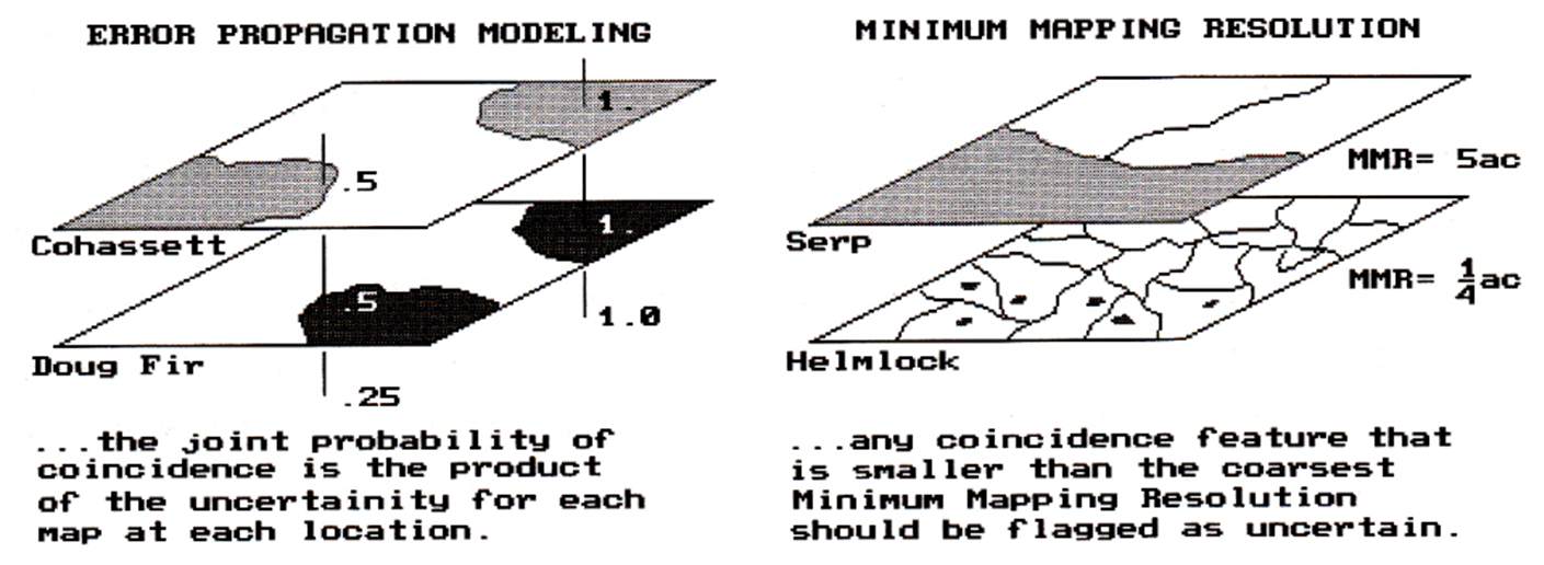
Figure
1. Characterizing map certainty involves 1) error propagation modeling and 2) mixing
informational scales (minimum mapping resolution).
An
even better estimate of propagated error is a weighted joint
probability. It's a nomenclature
mouthful, but an easy concept. If you
are not too sure about a location's classification, but it doesn't have much
impact on your model, then don't sweat it.
However, if your model is very sensitive to a map variable, and you're
not too sure of its classification, then don't put much stock in the
prediction.
The
techy types should immediately recognize that the error propagation weights are
the same as the model weights-- e.g., the X coefficients in a regression
equation. In implementation, you
spatially evaluate your equation using the maps as variables. At each map location a set of values are
'pulled' from the stack of maps, the equation solved, and the result assigned
to that location on the solution map.
However, you are not done until you 'pull' error estimates from the set
'shadow' maps, compute a weighted joint probability and glue it to the bottom
of the solution map. Vendors and users
willing, this capacity will be part of the next generation of GIS packages.
So
where does this leave us? We have, for
the most part, translated the basic concepts and procedures of manual map
analysis into our GIS packages. Such
concepts as map scale and projection are efficiently accounted for and recorded. Some packages even pop-up a warning if you
try to overlay two maps having different scales. You can opt to rescale to a common base
before proceeding. But should you? Is a simple geographic scale adjustment
sufficient? Is there more to this than
meets the eye? The procedure of
rescaling is mathematically exacting-- simply multiply the X,Y
coordinates by conversion factor. But
the procedure ignores the informational scale implications (viz.
thematic error assessment).
A
simple classroom exercise illustrates this concern. Students use a jeweler's loupe to measure the
thickness of a stream depicted on both 1:24,000 and 1:100,000 map sheets. They are about the same thickness which
implies a stream several feet wide at the larger scale, and one tens of feet
wide at the smaller scale. Which measure
is correct? Or is flooding implied? Using a photo copier they enlarge the 1:100,000
map to match the other one. The two maps
are woefully dissimilar. The jigs and
jags in one is depicted as a fat smooth line in the
other. Which is correct? Or is stream rechanneling implied?
The
discrepancy is the result of mixing scales.
The copier adjusted the geographic scale, but ignored the informational
scale differences. In a GIS, rescaling
is done in a blink of the eye, but it should be done with proper
reverence. Estimation of the error
induced should be incorporated in the rescaled product.
Minimum
mapping resolution (MMR) is another aspect of
informational scale. It reports the
level of spatial aggregation. All maps
have some level of spatial aggregation.
And with spatial aggregation, comes variation-- a real slap in the face
to map accuracy. A soil map, for
example, is only a true representation at the molecular level. If you aggregate to dust particles, I bet
there are a few stray molecules tossed in.
Even a dirt clod map will likely have a few foreign particles tossed
in. In a similar light, does one tree
constitute a timber stand on a vegetation map?
Or does it take two? What about a
clump of twenty pines with one hemlock in the center? The minimum mapping resolution reports the
smallest area that will be circled and called one thing.
So
what? Who cares? Consider the right side of the accompanying
figure. If we overlay the soil and
vegetation maps again, and this time identify locations of Serpentine soil and
Hemlocks, an interesting conclusion can be drawn-- there is a lot Hemlocks
growing in of Serpentine soils. That's
interesting, because foresters tell us that never happens. But there it is, bright green globs growing
in bright orange blobs.
What
is going on here? Mixing scales again,
that's what. Any photo interpreter can
see individual hemlocks in a sea of deciduous trees in winter imagery. But you don't circle just one, as you're left
with just an ink dot. So you circle
stands of about a quarter acre forming small polygons. Soil mapping is often a tougher task. You have to look through the vegetation mask,
note subtle changes in topography and mix well with a lot of intuition before
circling a soil feature. As of
Serpentine soil features are particularly difficult to detect, a five acre
polygon is about as small as you go.
However, you are careful to place a marginal note in the legend of the
soil map about frequent alluvial pockets of about a quarter acre in the
area.
That's
the reality of the of Serpentine and Hemlock coincidence-- the trees are
growing on alluvial pockets smaller than the MMR of the soil map. But the GIS said it was growing in of
Serpentine soil. That's induced error by
mixing informational scales. So what can
we do? The simplest approach is to
'dissolve' any polygonal prodigy that are ridiculously
small into their surroundings. Another
approach 'tags' each coincidence feature that is smaller
than the coarsest MMR with an error estimate.
Sort of a warning that you may be wrong.
Whew! Many GIS'ers are content with just going with
the best guess of map coincidence and have no use for mapping error. A cartographic model that automates
manual map analysis procedures is often more than sufficient and worth its
weight in gold. Yet there is a growing
interest in spatial models with all the rights, privileges and
responsibilities of a true map-ematics. A large part of this rigor is the extension
of mathematical procedures, such as error assessment, to GIS technology. We are just scratching at the surface of this
extension. In doing so, we have uncovered
a closet of old skeletons defining map content, structure and use. The digital map and new analytic capabilities
are challenging these historical concepts and rapidly redefining the
cartographic playing field.
_____________________
As
with all Beyond Mapping articles, allow me to
apologize in advance for the "poetic license" invoked in this terse
treatment of a technical subject.
Readers interested in further references should contact NCGIA about
their forthcoming Proceedings of the First International Conference on
Integrating Geographic Information Systems and Environmental Modeling, held in
Boulder, Colorado, September 15-19, 1991 (phone, 805-893-8224).
_______________________________________

(Back to the Table of Contents)