|
Topic 5 – Assessing Variability,
Shape, and Pattern of Map Features |
Beyond Mapping book |
Need to Ask the Right Questions Takes You Beyond Mapping — describes indices of map variability
(Neighborhood Complexity and Comparison)
You Can’t See the Forest for the Trees — discusses
indices of feature shape (Boundary Configuration and Spatial Integrity)
Discovering Feature Patterns — describes
procedures for assessing landscape pattern (Spacing and Contiguity)
Note: The processing
and figures discussed in this topic were derived using MapCalcTM
software. See www.innovativegis.com
to download a free MapCalc Learner version with tutorial materials for classroom
and self-learning map analysis concepts and procedures.
<Click here>
right-click to download a printer-friendly version of this topic (.pdf).
(Back to the Table of Contents)
______________________________
Need to
Ask the Right Questions Takes You Beyond Mapping
(GIS
World, August 1991)
...where up so floating, many bells down... (T.S.
Eliot)
Is some of this “Beyond Mapping”
discussion a bit dense? Like a T.S.
Eliot poem— full of significance (?), but somewhat confusing for the
uninitiated. I am sure many of you have
been left musing, "So what... this GIS processing just sounds like a bunch
of gibberish to me." You're
right. You are a decision-maker, not a
technician. The specifics of processing
are not beyond you and your familiar map; it's just that such details
are best left to the technologist... or are they?
The earlier topics addressed this
concern. They established GIS as, above
all else, a communication device facilitating the discussion and evaluation of
different perspectives of our actions on the landscape. The hardest part of GIS is not digitizing,
database creation, or even communicating with the 'blasted' system. Those are technical considerations which have
technical solutions outlined in the manual.
The hardest part of GIS is asking the right questions. Those involve conceptual considerations
requiring you to think spatially. That's
why you, the GIS user, need to go beyond mapping. So you can formulate your complex questions
about geographic space in a manner that the technology can use. GIS can do a lot of things— but it doesn't
know what to do without your help. A prerequisite
to this partnership is your responsibility to develop an understanding of what
GIS can, and can't do.
With this flourish in mind, let's
complete our techy discussion of neighborhood operators (GIS World issues
June-December, 1990). Recall that these
techniques involve summarizing the information found in the general vicinity of
each map location. These summaries can
characterize the surface configuration (e.g., slope and aspect) or generate a
statistic (e.g., total and average values).
The neighborhood definition, or 'roving window,' can have a simple
geometric shape (e.g., all locations within a quarter of a mile) or a complex
shape (all locations within a ten minute drive). Window shape and summary technique are what
define the wealth of neighborhood operators, from simple statistics to spatial
derivative and interpolation. OK, so
much for review; now onto the new stuff.
An interesting group of these
operators are referred to as 'filters'.
Most are simple binary or weighted windows as discussed in previous
issues. But one has captivated my
imagination since Dennis Murphy of the EROS Data Center introduced me to it
late 1970's. He identified a technique
for estimating neighborhood variability of nominal scale data using a Binary
Comparison Matrix (BCM). That's mouthful
of nomenclature, but it's fairly simple, and extremely
useful concept. As we are becoming more
aware, variability within a landscape plays a significant role in how we (and
our other biotic friends) perceive an area.
But, how can we assess such an elusive concept in decision terms?
Neighborhood variability can be
described two ways— the complexity of an entire neighborhood and the comparison
of conditions within the neighborhood.
These concepts can be outlined as follows.
NEIGHBORHOOD VARIABILITY
ü COMPLEXITY (Entire Neighborhood)
o
DIVERSITY— number of different
classes
o
INTERSPERSION— frequency of class
occurrence
o
JUXTAPOSION— spatial arrangement
of classes
ü COMPARISON (Individual Versus Neighbors)
o
PROPORTION— number of neighbors
having the same class as the window center
o
DEVIATION— difference between
the window center and the average of its neighbors
Consider the 3x3 window in figure
1. Assume "M" is one class of
vegetation (or soil, or land use) and "F" is another. The simplest summary of neighborhood
variability is to say there are two classes.
If there was only one class in the window, you would say there is no
variability. If there were nine classes,
you would say there is a lot more variability.
The count of the number of different classes is called diversity,
the broadest measure of neighborhood variability. If there were only one cell of "M"
and eight of "F", you would probably say, "sure the diversity is
still two, but there is less variability than the three of "M" versus
six of "F" condition in our example.
The measure of the frequency of
occurrence of each class, termed interspersion, is a refinement on the
simple diversity count. But doesn't the
positioning of the different classes contribute to window variability? It sure does.
If our example's three "M's" were more spread out like a
checkerboard, you would probably say there was more variability. The relative positioning of the classes is
termed juxtapositioning.
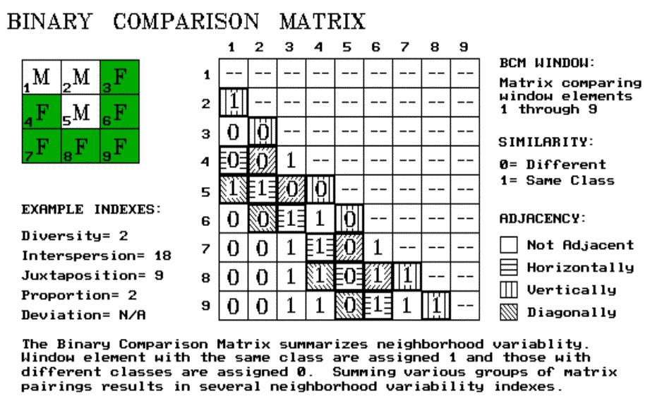
Figure 1. Binary Comparison Matrix summarizes
neighborhood variability.
We're not done yet. There is another whole dimension to
neighborhood variability. The measures
of diversity, interspersion and juxtapositioning summarize an entire
neighborhood's complexity. Another way
to view variability is to compare one neighborhood element to its surrounding
elements. These measures focus on how
different (often termed anomaly detection) a specific cell is to its
surroundings. For our example, we could
calculate the number of neighbors having the same classification as the center
element. This technique, termed proportion,
is appropriate for nominal, discontinuous mapped data like a vegetation
map. For gradient data, like elevation, deviation
can be computed by subtracting the average of the neighbors from the center
element. The greater the difference, the
more unusual the center is. The sign of
the difference tells you the nature of the anomaly— unusually bigger (+) or
smaller (-).
Whew! That's a lot of detail. And, like TS's poems, it may seem like a lot
of gibberish. You just look at landscape
and intuitively sense the degree of variability. Yep, you're smart— but the computer is
dumb. It has to quantify the concept of
variability. So how does it do it? …using a Binary Comparison Matrix of course. First, "Binary" means we will only
work with 0's and 1's.
"Comparison" says we will compare each element in the window
with every other element. If they are
the same assign a 1. If different,
assign a 0. The term "Matrix"
tells us how the data will be organized.
Now let's put it all
together. In the figure, the window
elements are numbered from one through nine.
Is the class for element 1 the same as for element 2? Yes (both are "M"), so assign a 1
at the top of column one in the table.
How about elements 1 and 3? Nope,
so assign a 0 in the second position of column one. How about 1 and 4? Nope, then assign another 0. Etc., etc., etc, until all of the columns in
the matrix contain a "0" or a "1". But you are bored already. That's the beauty of the computer. It enjoys completing the table. And yet another table for next position as the
window moves to the right. And the next
...and the next ...for thousands of times, as the roving the window moves
throughout a map.
So why put your silicon
subordinate through all this work.
Surely its electrons get enough exercise just reading your electronic
mail. The work is worth it because the
BCM contains the necessary data to quantify variability. It is how your computer 'sees' landscape
variability from its digital world. As
the computer compares the window elements it keeps track of the number of
different classes it encounters— diversity= 2.
Within the table there are 36 possible comparisons. In our example, we find that eighteen of
these are similar by summing the entire matrix— interspersion= 18. The relative positioning of classes in the
window can be summarized in several ways.
Orthogonal adjacency (side-by-side and top-bottom) is frequently used
and is computed by summing the vertical/horizontal cross-hatched elements in
the table— juxtaposition= 9. Diagonally
adjacent and non-adjacent variability indexes sum different sets of window
elements. Comparison of the center to
its neighbors computes the sum for all pairs involving element 5— proportion=
2.
The techy reader is, by now,
bursting with ideas of other ways to summarize the table. The rest of you are back to asking, "So
what. Why should I care?" You can easily ignore the mechanics of the
computations and still be a good decision-maker. But can you ignore the indexes? Sure, if you are willing to visit every
hectare of your management area. Or
visually assess every square millimeter of your map. And convince me, your clients and the judge
of your exceptional mental capacity for detail.
Or you could learn, on your terms, to interpret the computer's packaging
of variability.
Does the spotted owl prefer
higher or lower juxtapositioning values?
What about the pine martin? Or Dan Martin, my neighbor?
Extracting meaning from T.S. Eliot is a lot work. Same goes for the unfamiliar analytical
capabilities, such as the BCM. It's not
beyond you. You just need a good reason
to take the plunge.
__________________
In
advance, I apologize to all quantitative geographers and pattern recognition
professionals for the 'poetic license' I have invoked in this terse treatise of
a technical subject. At the other
extreme, those interested in going farther in "topological space"
some classic texts are: Abler,
R.J., J.S. Adams and P. Gould.
1971. Spatial Organization- The
Geographer's View of the World, Prentice-Hall; and Munkres,
J.R. 1975. Topology: A First Course, Prentice-Hall.
You Can’t See the Forest for the
Trees ...but on the other hand,
you can’t see the trees for the forest
(GIS
World, September 1991)
The previous section described
how the computer sees landscape variability by computing indices of
neighborhood "Complexity and Comparison." This may have incited your spirited reaction,
"That's interesting. But, so what,
I can see the variability of landscapes at a glance." That's the point. You see it as an image; the computer
must calculate it from mapped data.
You and your sickly, gray-toned companion live in different worlds—
inked lines, colors and planimeters for you and numbers, algorithms and map-ematics for your computer.
Can such a marriage last? It's
like hippo and hummingbird romance— bound to go flat.
In the image world of your map,
your eye jumps around at what futurist Walter Doherty calls "human viewing
speed" …very fast random access of information (holistic). The computer, on the other hand, is much more
methodical. It plods through thousands
of serial summaries developed by focusing on each piece of the landscape puzzle
(atomistic). In short, you see the
forest; it sees the trees. You couldn't
be further apart. Right?
No, it's just the opposite. The match couldn't be better. Both the strategic and the tactical
perspectives are needed for a complete understanding of maps. Our cognitive analyses have been fine tuned
through years of experience. It's just
that they are hard to summarize and fold into on-the-ground decisions. In the past, our numerical analyses have been
as overly simplifying, as they have been tedious. There is just too much information for human
serial processing at the "tree" level of detail. That's where the computer's indices of
spatial patterns come in. They provide
an entirely new view of your landscape.
One that requires a planner's and manager's
understanding and interpretation before it can be effectively used in
decision-making.
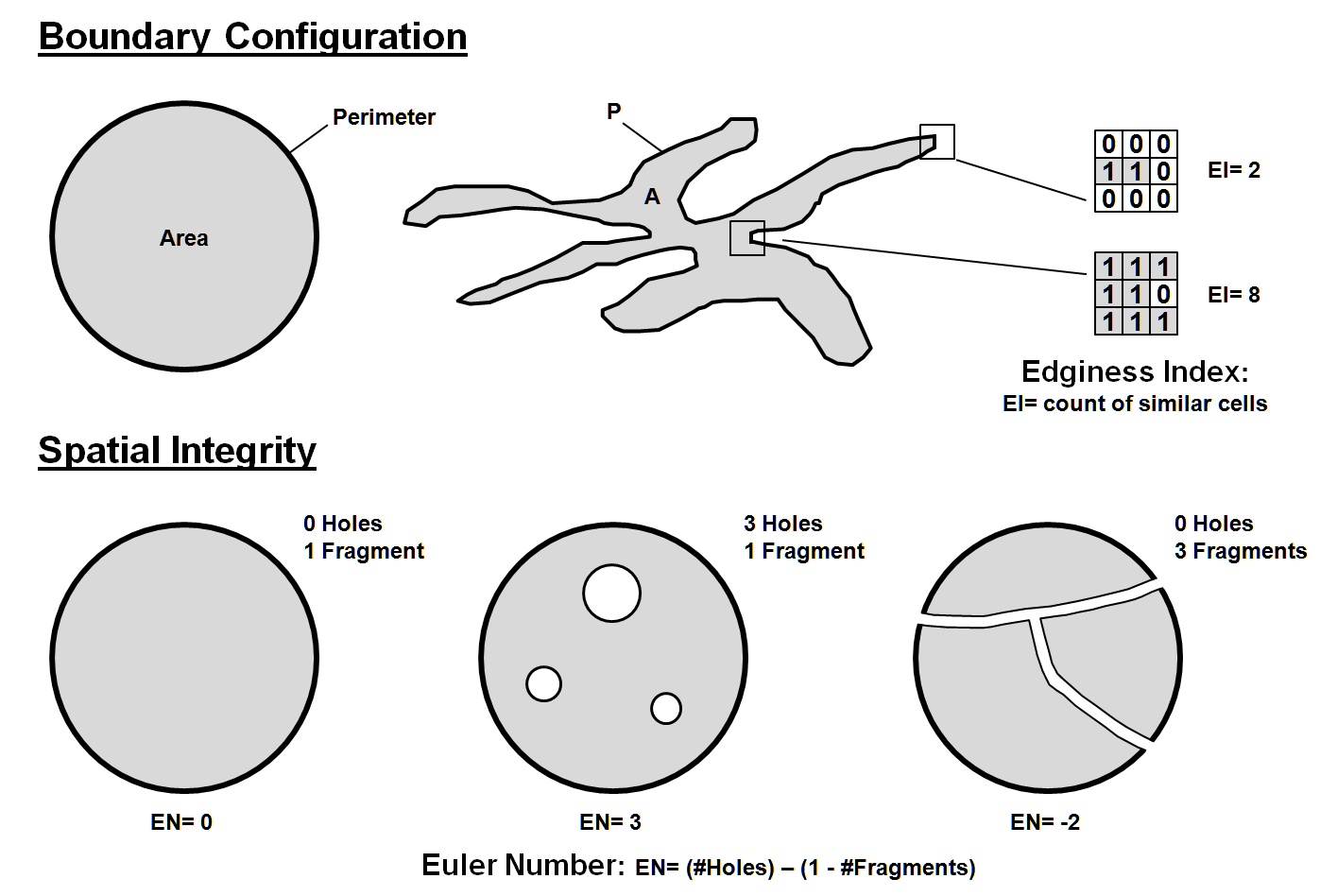
Figure 1.
Characterizing boundary configuration and spatial integrity.
In addition to landscape variability
discussed in the previous section, the size and shape of individual features
affects your impression of spatial patterns.
For example, suppose you are a wildlife manager assessing ruffed grouse
habitat and population dynamics.
Obviously the total acreage of suitable habitat is the major determinant
of population size. That's a task for
the "electronic planimeter" of the GIS toolbox— cell counts in raster
systems, and table summaries in most vector
systems. But is that enough? Likely not, if you want fat and happy
birds.
The shape of each habitat unit
plays a part. Within a broad context,
shape involves two characteristics— Boundary Configuration and Spatial
Integrity. Consider the top portion of
the figure 1. Both habitat units are thirty
acres in size. Therefore, they should
support the same grouse grouping. Right? But research
has shown that the bird prefers lots of forest/opening edge. That's the case on the right; it's boring and
regular on the left. You can easily see
it in the example. But what happens if
your map has hundreds, or even thousands individual parcels. Your mind is quickly lost in the
"tree" level detail of the "forest."
That's where the computer comes
in. The boundary configuration, or
"outward contour," of each feature is easily calculated as a ratio of
the perimeter to the area. In
planimetric space, the circle has the least amount of perimeter per unit
area. Any other shape has more
perimeter, and, as a result, a different "convexity index." In the few GIS's having this capability, the
index uses a 'fudge factor (k)' to produce a range of values from 1 to
100. A theoretical zero indicates an
infinitely large perimeter around an infinitesimally small area. At the other end, an index of a hundred is
interpreted as being 100% similar to a perfect circle. Values in between define a continuum of
boundary regularity. As a GIS user, your
challenge is to translate this index into decision terms... "Oh, so the
ruffed grouse likes it rough. Then the
parcels with convexity indices less than fifty are particularly good, provided
they are more than ten acres, of course."
Now you’re beyond mapping and actually GIS’ing.
But what about the character of
the edge as we move along the boundary of habitat parcels? Are some places better than others? Try an "Edginess Index." It's similar to the Binary Comparison Matrix
(BCM) discussed in the previous section.
A 3x3 analysis window is moved about the edge of a map feature. A "1" is assigned to cells with the
same classification as the edge cell; a "0" to those that are
different. Two extreme results are shown
in the figure. A count of
"two" indicates an edge location that's really hanging out
there. An "eight count" is an
edge, but it is barely exposed to the outside.
Which condition does the grouse prefer?
Or an elk?
Or the members of the Elks Lodge, for that matter? Maybe the factors of your decision-making
don't care. At least it's comforting to
know that such spatial variability can be quantified in a way the computer can
'see' it, and spatial modelers can use it.
That brings us to our final
consideration— spatial integrity. It
involves a count of "holes" and "fragments" associated with
map features. If a parcel is just one
glob, without holes poked in it, it is said to be intact, or "spatially
balanced." If holes begin to
violate its interior, or it is broken into pieces, the parcel's character
obviously changes. Your eye easily
assesses that. It is said that the
spotted owl's eyes easily assess that, with the bird preferring large
uninterrupted old growth forest canopies.
But how about a computer's eye?
In its digital way, the computer
counts the number of holes and fragments for the map features you specify. In a raster system, the algorithms performing
the task are fairly involved. In a
vector system, the topological structure of the data plays a big part in the
processing. That's the concern of the
programmer. For the rest of us, our
concern is in understanding what it all means and how we might use it.
The simple counts of the number
of holes and fragments are useful data.
But these data taken alone can be as misleading as total acreage
calculations. The interplay provides additional
information, summarized by the "Euler Number" depicted in the
figure. This index tracks the balance
between the two elements of spatial integrity by computing their
difference. If EN= 0, the feature is
balanced. As you poke more holes in a
feature, the index becomes positively unbalanced (large positive values). If you break it into a bunch of pieces, its
index becomes negatively unbalanced (large negative values). If you poke it with the same number of holes
as you break it into pieces, a feature becomes spatially balanced.
"What? That's gibberish." No, it's actually good information. It can tell you such enduring questions as
"Does a Zebra have white strips on a black background; or black strips on
a white background?" Or, "Is a
region best characterized as containing urban pockets surrounded by a natural
landscape; or natural areas surrounded by urban sprawl?" Or, "As we continue clear-cutting the
forest, when do we change the fabric of the landscape from a forest with cut
patches, to islands of trees within a clear-cut backdrop?" It's more than simple area calculations of
the GIS.
Shape analysis is more than a
simple impression you get as you look at a map.
It's more than simple tabular descriptions in a map's legend. It's both the "forest" and the
"trees"— an informational interplay between your reasoning and the
computer's calculations.
________________________
As
with all Beyond Mapping articles, allow me to
apologize in advance for the "poetic license" invoked in this terse
treatment of a technical subject. Those
interested in further readings having a resource application orientation should
consult "Indices of landscape pattern," by O'Niell,
et. al., in Landscape Ecology, 1(3):153-162, 1988, or
any of the recent papers by Monica Turner, Environmental Sciences Division, Oak
Ridge National Laboratory.
Discovering Feature Patterns ...everything has its place; everything in its
place (Granny)
(GIS
World, October 1991)
Granny was as insightful as she
was practical. Her prodding to get the
socks picked up and placed in the drawer is actually a lesson in the basic
elements of ecology. The results of the
dynamic interactions within a complex web of physical and biological factors
put "everything in its place."
The obvious outcome of this process is the unique arrangement of land
cover features that seem to be tossed across a landscape. Mother Nature nurtures such a seemingly
disorganized arrangement. Good thing her
housekeeping never met up with Granny.
The last two sections have dealt
with quantifying spatial arrangements into landscape variability and
individual feature shape. This
article is concerned with another characteristic your eye senses as you view a
landscape— the pattern formed by the collection of individual
features. We use such terms as
'dispersed' or 'diffused' and 'bunched' or 'clumped' to describe the patterns
formed on the landscape. However, these
terms are useless to our 'senseless' computer.
It doesn't see the landscape as an image, nor has it had the years of
practical experience required for such judgment. Terms describing patterns reside in your
visceral. You just know these things. Stupid computer, it hasn't a clue. Or does it?
As previously established, the
computer 'sees' the landscape in an entirely different way— digitally. Its view isn't a continuum of colors and
shadings that form features, but an overwhelming pile of numbers. The real difference is that you use 'grey
matter' and it uses 'computation' to sort through the spatial information.
So how does it analyze a pattern
formed by the collection of map features?
It follows, that the computer's view of landscape patterns must be some
sort of a mathematical summary of numbers.
Over the years, a wealth of indices has been suggested. Most of the measures can be divided into two
broad approaches— those summarizing individual feature characteristics and
those summarizing spacing among features.
Feature characteristics, such as abundance, size and
shape can be summarized for an entire landscape. These landscape statistics provide a glimpse
of the overall pattern of features.
Imagine a large, forested area pocketed with clear-cut patches. A simple count of the number of clear-cuts
gives you a 'first cut' measure of forest fragmentation. An area with hundreds of cuts is likely more
fragmented than an equal-sized area with only a few. But it also depends on the size of each cut. And, as discussed in last section, the shape
of each cut.
Putting size and shape together
over an entire area is the basis of fractal geometry. In mathematical terms, the fractal dimension,
D, is used to quantify the complexity of the shape of features using a
perimeter-area relation. Specifically,
P
~ A **(D/2)
where P is the patch perimeter and A
is the patch area. The fractal dimension
for an entire area is estimated by regressing the
logarithm of patch area on its corresponding log-transformed perimeter. Whew!
Imposing mathematical mechanics, but a fairly simple concept— more edge
for a given area of patches means things are more complex. To the user, it is sufficient to know that
the fractal dimension is simply a useful index.
As it gets larger, it indicates an increasing 'departure from Euclidean
geometry.' Or, in more humane terms, a
large index indicates a more fragmented forest, and, quite possibly, more
irritable beasts and birds.
Feature spacing addresses another aspect of
landscape pattern. With a ruler, you can
measure the distances from the center of each clear-cut patch to the center of
its nearest neighboring patch. The
average of all the nearest-neighbor distances characterizes feature spacing for
an entire landscape. This is
theoretically simple, but both too tedious to implement and too generalized to
be very useful. It works great on
scattering of marbles. But, as patch
size and density increase and shapes become more irregular, this measure of
feature spacing becomes ineffective. The
merging of both area-perimeter characterization and nearest-neighbor spacing into
an index provides much better estimates.
For example, a frequently used
measure, termed 'dispersion,' developed in 1950's uses the equation
R
= 2((p **1/2) * r)
where R is dispersion, r is the
average nearest-neighbor distance and p is the average patch density (computed
as the number of patches per unit area).
When R equals 1, a completely random patch arrangement is
indicated. A dispersion value less than
1 indicates increasing aggregation; a value more than 1 indicates a more
regular dispersed pattern.
All of the equations, however,
are based in scalar mathematics and simply use GIS to calculate equation
parameters. This isn't a step beyond
mapping, but an automation of current practice.
Consider figure 1 for a couple of new approaches. The center two plots depict two radically
different patterns of 'globs'— a systematic arrangement (Pattern A) on the top
and an aggregated one on the bottom (Pattern B).
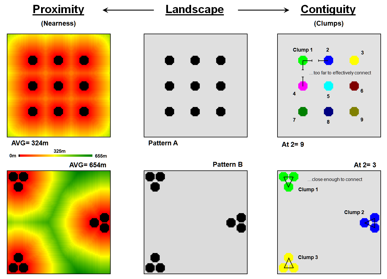
Figure 1. Characterizing map feature
spacing and pattern.
The Proximity measure on
the left side forms a continuous surface of 'buffers' around each glob. The result is a proximity surface indicating
the distance from each map location to its nearest glob. For the systematic pattern, A, the average
proximity is only 324 meters with a maximum distance of 933m and a standard
deviation of +213m. The
aggregated pattern, B, has a much larger average of 654m, with a maximum
distance of 1515m and a much larger standard deviation of +387m. Heck, where the green-tones start it is more
than 3250m to the nearest glob— more than the farthest distance in the
systematic pattern. Your eye senses this
'void'; the computer recognizes it as having large proximity values.
The Contiguity measure on
the right side of the figure takes a different perspective. It looks at how the globs are grouped. It asks the question, "If each glob is
allowed to reach out a bit, which ones are so close that they will effectively
touch? If the 'reach at' factor is only
one (1 'step' of 30m), none of the nine individual clumps will be grouped in
either pattern A or B. However, if the
factor is two, grouping occurs in Pattern B and the total number of ‘extended’
clumps is reduced to three. As shown in
the figure, an 'at' factor of two results in just three extended clumps for the
clumped pattern. The systematic pattern
is still left with the original nine.
Your eye senses the 'nearness' of globs; the computer recognizes this
same thing as the number of effective clumps.
See, both you and your computer
can 'see' the differences in the patterns.
But, the computer sees it in a quantitative fashion, with a lot more
detail in its summaries. But there is
more. Remember those articles describing
'effective distance' (GIS WORLD September, 1989 through February, 1990)? Not all things align themselves in straight
lines 'as-the-crow-flies." Suppose
some patches are separated by streams your beast of interest can't cross. Or areas, such as high human activity, which
they could cross, but prefer not to cross unless they have to. Now, what is the real feature spacing? You don't have a clue. But the proximity and contiguity
distributions will tell you what it is really like to move among the
features.
Without the computer, you must
assume your animal moves in the straight line of a ruler and the real-world
complexity of landscape patterns can be reduced to a single value. Bold assumptions, that asks little of
GIS. To go beyond mapping, GIS asks a
great deal of you— to rethink your assumptions and methodology in light of its
new tools.
_____________________
As
with all Beyond Mapping articles, allow me to
apologize in advance for the "poetic license" invoked in this terse
treatment of a technical subject. A good
reference on fractal geometry is "Measuring the Fractal Geometry of
Landscapes," by Bruce T. Milne, in Applied Mathematics and Computation,
27:67-79 (1988). An excellent practical
application of forest fragmentation analysis is "Measuring Forest
Landscape Patterns in the Cascade Range of Oregon," by William J. Ripple, et. al., in Biological Conservation, 57:73-88 (1991).
_______________________________________

(Back to the Table of Contents)