|
Topic 2 –
Measuring Effective Distance and Connectivity |
Beyond Mapping book |
You Can’t Get There from Here — introduces
the similarities and differences between “simple” and “effective distance
measurement approaches
As the Crow Walks — describes
the use of “propagating waves” for calculating effective distance and optimal
paths
Keep It Simple Stupid (KISS) — describes
the use of “accumulation surfaces” for deriving optimal path density and Nth best paths
There’s Only One Problem Having All this
Sophisticated Equipment — discusses
the basic approaches used for calculating narrowness and visual
connectivity
<Click here> for a printer-friendly version of this topic
(.pdf).
(Back to the Table of Contents)
______________________________
You Can’t Get There from Here
(GIS World, September/October
1990)
Measuring
distance is one of the most basic map analysis techniques. However, the effective integration of
distance considerations in spatial decisions has been limited. Historically, distance is defined as “the
shortest straight-line distance between two points.” While this measure is both easily
conceptualized and implemented with a ruler, it is frequently insufficient for
decision-making. A straight line route
may indicate the distance 'as the crow flies', but offer little information for
the walking crow or other flightless creature.
It is equally important to most travelers to have the measurement of
distance expressed in more relevant terms, such as time or cost.
Consider
the trip to the airport from your hotel.
You could take a ruler and measure the map distance, then
use the map scale to compute the length of a straight-line route— say twelve
miles. But you if intend to travel by
car it is likely longer. So you use a
sheet of paper to form a series of 'tick marks' along its edge following the zigs and zags of a prominent road
route. The total length of the marks
multiplied times the map scale is the non-straight distance-- say eighteen
miles. But your real concern is when
shall I leave to catch the nine o'clock plane, and what route is the best? Chances are you will disregard both distance
measurements and phone the bellhop for advice-- twenty four miles by his
back-road route, but you will save ten minutes. Most decision-making involving
distance follows this scenario of casting aside the map analysis tool and
relying on experience. This procedure is
effective as long as your experience set is robust and the question is not too
complex.
The
limitation of a map analysis approach is not so much in the concept of distance
measurement, but in its implementation.
Any measurement system requires two components— a standard unit
and a procedure for measurement.
Using a ruler, the 'unit' is the smallest hatching along its edge and
the 'procedure' is shortest line along the straight-edge. In effect, the ruler represents just one row
of a grid implied to cover the entire map.
You just position the grid such that it aligns with the two points you
want measured and count the squares. To
measure another distance you merely realign the grid and count again.
The
approach used by most GIS's has a similar foundation. The unit is termed a grid space
implied by superimposing an imaginary grid over an area, just as the ruler
implied such a grid. The procedure for
measuring distance from any location to another involves counting the number of
intervening grid spaces and multiplying by the map scale-- termed shortest
straight-line. However, the
procedure is different as the grid is fixed so it is not always as easy as
counting spaces along a row. Any
point-to-point distance in the grid can be calculated as the hypotenuse of a
right triangle formed by the grid's rows and columns. Yet, this even procedure is often too limited
in both its computer implementation and information content.
Computers
detest computing squares and square roots.
As the Pythagorean Theorem, just noted, is full of them most GIS use a
different procedure— proximity. Rather than sequentially computing the
distance between pairs of locations, concentric equidistance zones are
established around a location or set of locations. This procedure is analogous to nailing one
end of a ruler at one point and spinning it around. The result is similar to the wave pattern
generated when a rock is thrown into a still pond. Each ring indicates one 'unit farther away'—
increasing distance as the wave moves away.
A more complex proximity map would be generated if, for example, all
locations with houses are simultaneously considered target locations; in
effect, throwing a handful of rocks into the pond. Each ring grows until wave fronts meet, then they stop. The
result is a map indicating the shortest straight-line distance to the nearest
target area (house) for each non-target area.
In
many applications, however, the shortest route between two locations may not
always be a straight-line. And even if it is straight, its geographic length
may not always reflect a meaningful measure of distance. Rather, distance in these applications is
best defined in terms of 'movement' expressed as travel-time, cost or energy
that may be consumed at rates which varies over time and space. Distance modifying effects are termed barriers,
a concept implying the ease of movement in space is not always constant. A shortest route respecting these barriers
may be a twisted path around and through the barriers. The GIS data base allows the user to locate
and calibrate the barriers. The GIS
wave-like analytic procedure allows the computer to keep track of the complex
interactions of the waves and the barriers.
Two
types of barriers are identified by their effects— absolute and relative. Absolute
barriers are those completely restricting movement and therefore imply an
infinite distance between the points they separate. A river might be regarded as an absolute
barrier to a non-swimmer. To a swimmer
or a boater, however, the same river might be regarded as a relative
barrier. Relative barriers are those that are passable, but only at a cost
which may be equated with an increase in geographical distance-- it takes five
times longer to row a hundred meters than to walk that same distance. In the conceptual framework of tossing a rock
into a pond, the waves crash and dissipate against a jetty extending into the
pond-- an absolute barrier the waves must circumvent to get to the other side
of the jetty. An oil slick characterizes
a relative barrier-- waves may move through, but at a reduced wavelength
(higher cost of movement over the same grid space). The waves will move both around and through
the oil slick; the one reaching the other side identifies the 'shortest, not
necessarily straight line'. In effect,
this is what leads to the bellhop’s wisdom— he has tried many routes under
various conditions to construct his experience base. In GIS, this same approach is used, yet the
computer is used to simulate these varied paths.
In
using a GIS to measure distance, our limited concept of 'shortest straight-line
between two points' is first expanded to one of proximity, then to a more
effective one of movement through a realistic space containing various
barriers. In the past our only recourse
for effective distance measurement in 'real' space was experience— “you can't
get there from here, unless you go straight through them there mountains.” But deep in your visceral you know there has
to be a better way.
As the Crow Walks
(GIS World, November/December
1990)
…traditional mapping is in triage. We need to discard some of the old
ineffective procedures and apply new life-giving technology to others.
Last
section's discussion of distance measurement with a GIS challenged our
fundamental definition of distance as 'the shortest straight line between two
points.' It left intact the concept of
'shortest', but relaxed the assumptions that it involves only 'two points' and
has be 'straight'.
In so doing, it first expanded the concept of distance to one of
proximity— shortest, straight line from a location, or set of locations, to all
other locations—such as a 'proximity to housing' map indicating the distance to
the nearest house for every location in a project area. Proximity was then expanded to the concept of
movement by introducing barriers— shortest, but necessarily a straight. Such as a 'weighted proximity to housing' map
recognizing various road and water conditions effect on the movement of some
creatures (flightless, non-swimming crawlers— like us when the car is in the
shop).
Basic
to this expanded view of distance is conceptualizing the measurement process as
waves radiating from a location(s)— analogous to the ripples
caused by tossing a rock in a pond. As
the wavefront moves through space, it first checks to see if a potential 'step'
is passable (absolute barrier locations are not). If so, it moves there and
incurs the 'cost' of such a movement (relative barrier weights of
impedance). As the wavefront proceeds,
all possible paths are considered and the shortest distance assigned (least
total impedance from the starting point).
It's similar to a macho guy swaggering across a rain-soaked parking lot
as fast as possible. Each time a puddle
is encountered a decision must be reached-- slowly go through so as not to
slip, or continue a swift, macho pace around.
This distance-related question is answered by experience, not detailed
analysis. "Of all the puddles I have
encountered in my life", he muddles, "this looks like one I can
handle." A GIS will approach the
question in a much more methodical manner.
As the distance wavefront confronts the puddle, it effectively splits
with one wave proceeding through at a slower rate and one going around at a
faster rate. Whichever wave gets to the
other side first determines the 'shortest distance'; whether straight or
not. The losing wavefront is then
totally forgotten and no longer considered in subsequent distance measurements.
As
the wavefront moves through space it is effectively evaluating all possible
paths, retaining only the shortest. You
can calibrate a road map such that off-road areas reflect absolute barriers and
different types of roads identify relative ease of movement. Then start the computer at a location asking
it move outward with respect to this complex friction map. The result is a map indicating the
travel-time from the start to everywhere along the road network— shortest
time. Or, identify a set of starting
points, say a town's four fire houses, and have them simultaneously move
outward until their wave fronts meet.
The result is a map of travel-time to the nearest fire house for every
location along the road network. But
such effective distance measurement is not restricted to line networks. Take it a step further by calibrating
off-road travel in terms of four-wheel 'pumper truck' capabilities based on
land cover and terrain conditions— gently sloping meadows are fastest; steep
forests much slower; and large streams and cliffs, prohibitive (infinitely long
time). Identify a forest district's fire
headquarters, then move outward respecting both on- and off-road movement for a
fire response surface. The resulting
surface indicates the expected time of arrival to a fire anywhere in the
district.
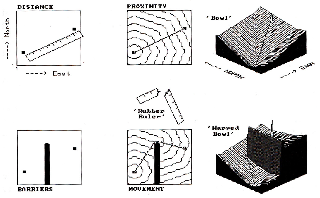
Figure
1. Effective distance is measured as a series of
propagating waves.
The
idea of a map surface is basic in
understanding both weighted distance computation and application. The top portion of figure 1 develops this
concept for a simple proximity surface.
The 'tic marks' along the ruler identify equal geographic steps from one
point to another. If it were replaced
with a drafting compass with its point stuck at the lower left, a series of
concentric rings could be drawn at each ruler tic mark. This is effectively what the computer
generates by sending out a wavefront through unimpeded space. The less than perfect circles in the middle
inset of the figure are the result of the relatively coarse analysis grid used
and approximating errors of the algorithm-- good estimates of distance, but not
perfect. The real difference is in the
information content— less spatial precision, but more utility for most
applications.
A
three-dimensional plot of simple distance forms the 'bowl-like' surface on the
left side of the figure. It is sort of
like a football stadium with the tiers of seats indicating distance to the
field. It doesn't matter which section
you are in, if you are in row 100 you had better bring the binoculars. The X and Y axes determine location while the
constantly increasing Z axis (stadium row number) indicates distance from the
starting point. If there were several
starting points the surface would be pock-marked with craters, with the ridges
between craters indicating the locations equidistant between starters.
The
lower portion of the figure shows the effect of introducing an absolute barrier
to movement. The wavefront moves outward
until it encounters the barrier, then stops.
Only those wave fronts that circumvent the barrier are allowed to
proceed to the other side, forming a sort of spiral staircase (lower middle
inset in the figure). In effect,
distance is being measured by a by a 'rubber ruler' that has to bend around the
barrier. If relative barriers are
present, an even more unusual effect is noted-- stretching and compressing the
'rubber ruler'. As the wavefront
encounters areas of increased impedance, say a steep forested area in the fire
response example above, it is allowed to proceed, but at increased time to
cross a given unit of space. This has
the effect of compressing the ruler's tic marks-- not geographic scale in units
of feet, but effect on pumper-truck movement measured in units of time.
Regardless
of nature of barriers present, the result is always a bowl-like surface of
distance, termed an 'accumulation' surface.
Distance is always increasing as you move away from a starter location,
forming a perfect bowl if no barriers are present. If barriers are present, the rate of
accumulation varies with location, and a complex, warped bowl is formed. But a bowl none the less,
with its sides always increasing, just at different rates. This characteristic shape is the basis of
'optimal path' analysis. Note that the
straight line between the two points in the simple proximity 'bowl' in the
figure is the steepest downhill path along the surface-- much like water
running down the surface. This 'steepest
downhill path' retraces the route of the wavefront that got to the location
first. In this case,
the shortest straight line. Note
the similar path indicated on the 'warped bowl' (bottom right inset in the
figure). It goes straight to the
barrier's corner, then straight to the starting point-- just as you would bend
the ruler (if you could). If relative
barriers were considered, the path would bend and wiggle in seemingly bazaar
ways as it retraced the wavefront (optimal path). Such routing characterizes the final
expansion of the concept of distance-- from distance to proximity to movement
and finally to 'connectivity', the characterization of how locations are
connected in space. Optimal paths are
just one way to characterize these connections.
No,
business is not as usual with GIS. Our
traditional concepts of map analysis are based on manual procedures, or their
direct reflection in traditional mathematics.
Whole procedures and even concepts, such as distance always being 'the
shortest straight line between two points', are coming under scrutiny.
Distance Measurement: Keep It Simple Stupid (KISS)
(GIS World, February/March 1990)
…but,
it's stupid to keep it simple as simplifying leads to absurd proposals (SLAP)
The
last two sections described distance measurement in new and potentially
unsettling ways. Simple distance, as
implied by a ruler's straight line, was expanded to weighted proximity which
responds to a landscape's pattern of absolute and relative barriers to
movement. Under these conditions the
shortest line between two points is rarely straight. And even if it is straight, the geographic
length of that line may not reflect a meaningful measure— how far it is to the
airport in terms of time is often more useful in decision-making than just
mileage. Non-simple, weighted distance
is like using a 'rubber ruler' you can bend, squish and stretch through
effective barriers, like the various types of roads you might use to get to the
airport.
The
concept of delineating a line between map locations, whether straight or
twisted, is termed 'connectivity.' In
the case of weighted distance, it identifies the optimal path for moving from
one location to another. To understand
how this works, you need to visualize an accumulation
surface— described in excruciating detail in the last article as a
bowl-like surface with one of the locations at the bottom and all other
locations along rings of successively greater distances. It's like the tiers of seats in a football
stadium, but warped and contorted due to the influence of the barriers.
Also
recall that the 'steepest downhill path' along a surface traces the shortest
(i.e., optimal) line to the bottom. It's
like a rain drop running down a roof— the shape of the roof dictates the
optimal path. Instead of a roof,
visualize a lumpy, bumpy terrain surface.
A single rain drop bends and twists as it flows down the complex
surface. At each location along its
cascading route, the neighboring elevation values are tested for the smallest
value and the drop moves to that location; then the next, and the next,
etc. The result is a map of the rain
drop's route.
Now,
conceptually replace the terrain surface with an accumulation surface
indicating weighted distance to everywhere from a starting location. Place your rain drop somewhere on that
surface and have it flow downhill as fast as possible to the bottom. The result is the shortest, but not
necessarily straight, line between the two starting points. It retraces the path of the 'distance wave'
that got there first— the shortest route whether measured in feet, minutes, or
dollars depending on the relative barrier's calibration.
So
much for review, let's expand on the concept of connectivity. Suppose, instead of a single rain drop, there
was a down pour. Drops are landing
everywhere, each selecting their optimal path down the surface. If you keep track of the number of drops
passing through each location, you have an optimal
path density surface. For water
along a terrain surface, it identifies the number of uphill contributors,
termed channeling. You shouldn't unroll
your sleeping bag where there is a lot of water channeling, or you might be
washed to sea by morning.
Another
interpretation is that the soil erosion potential is highest at these
locations, particularly if a highly erodible soil is present. Similarly, channeling on an accumulation
surface identifies locations of common best paths-- for example, trunk lines in
haul road design or landings in timber harvesting. Wouldn't you want to site your activity where
it is optimally connected to the most places you want to go?
Maybe …maybe not. How about a weighted optimal path density surface... you're kidding, aren't
you? Suppose not all of the places you
want to go are equally attractive. Some
forest parcels are worth a lot more money than others (if you have seen one tree,
you haven't necessarily seen them all).
If this is the case, have the computer sum the relative weights of the
optimal paths through each location; instead of just counting them. The result will bias siting your activity
toward those parcels you define as more attractive.
One
further expansion, keeping in mind that GIS is “beyond mapping” as usual (it's
spatial data analysis). As previously
noted, the optimal path is computed by developing an accumulation surface, then
tracing the steepest downhill route. …but what about the next best path? …and the next? …or the nth best
path? This requires us to
conceptualize two accumulation surfaces— each emanating from one of the end
points of a proposed path. If there are
no barriers to movement, the surfaces form two perfect bowls of constantly
increasing distance.
Interesting
results occur if we subtract these surfaces.
Locations that are equidistant from both (i.e., perpendicular bisector)
are identified as 0. The sign of
non-zero values on the differential accumulation surface indicates which
point is closest; the magnitude of the difference indicates how much closer—
relative advantage. If our surfaces were
more interesting, say travel time from two saw mills or shopping malls, the
difference map shows which mill or mall has a travel advantage, and how much of
an advantage, for every location in the study area. This technique is often referred to as
'catchment area analysis' and is useful in planning under competitive
situations, whether timber bidding or retail advertizing.
But
what would happen if we added the two accumulation surfaces? The sum identifies the total length of the
best path passing through each location.
'The optimal path' is identified as the series of locations assigned the
same smallest value— the line of shortest length. Locations with the next larger value belong
to the path that is slightly less optimal.
The largest value indicates locations along the worst path. If you want to identify the best path through
any location, ask the computer to move downhill from that point, first over one
surface, then the other.
Thus,
the total accumulation surface allows
you to calculate the 'opportunity cost' of forcing the route through any
location by subtracting the length of the optimal path from the length of path
through that location. "If we force
the new highway through my property it will cost a lot more, but what the heck,
I'll be rich." If you subtract the
optimal path value (a constant) from the total accumulation surface you will
create a map of opportunity cost— the nth best path map...whew! Maybe we should stop this assault on
traditional maps and map analysis and keep things simple. But that would be stupid, unless you are a
straight-flying crow.
There’s Only One Problem Having All this Sophisticated Equipment
(GIS World, April/May 1990)
…we
don't have anyone sophisticated enough to use it (General Halftrack in
the Beetle Bailey comic strip)
As
the previous sections have established, distance is simple when we think of it
solely in the context of a ruler and “shortest straight line between two
points.” The realistic expansion of
distance to consider barriers of movement brought on a barrage of new concepts—
accumulation surface, optimal path, optimal path density, weighted optimal path
density, nth best path... whew!
Let's get back to some simple and familiar concepts of
connectivity.
Take
a narrowness surface for example—
identifying the shortest cord through a location, connecting opposing
edges. As with all distance-related
operations, the computer first generates a series of concentric rings of
increasing distance about a point. This
information is used to assign distance to all of the edge locations. Then the computer moves around the edge
totaling the distances for opposing edges until it determines the minimum— the
shortest cord. For a boxer, the corners
of the boxing ring are the narrowest. A
map of the boxing ring's narrowness would have values at every location
indicating how far it is to the ropes.
Small values identify areas you might get trapped and ruthlessly
bludgeoned.
But
consider Bambi and Momma Bam's perception of the
narrowness of an irregularly-shaped meadow.
The forage is exceptional, sort of the 'Cordon Bleu' of deer
fodder. Its acreage times the biomass
per acre suggests that a herd of fifty can be supported. However, the spatial arrangement of these
acres may be important. Most of the
meadow has large narrowness values— a long way to the protection of the
surrounding forest cover. The timid herd
will forage along the edges, so at the first sign of danger they can quickly
hide in the woods. Only pangs of hunger
drive them to the wide-open spaces where Bambi may be lost to wolves; not what
you had in mind.
Now
raise your sights from cords to rays in three-dimensional space— line-of-sight
connectivity, or viewshed analysis. Again, concentric rings form the basis of the
distance-related algorithm. In this case,
as the rings radiate from a starting point (viewer location) they carry the
tangent (angle of line between the viewer and a location) that must be beat to
mark a location as seen. Several terrain
and viewer factors affect these calculations.
Foremost is a surface map of elevation.
The starting point and its eight surrounding neighbors' elevations
establish the initial ring's tangents ('rise to run' ratio, computed as the
difference in elevation divided by the horizontal distance). The next ring's elevations and distance to
viewer are used to calculate their tangents.
The computer then tests if a location's computed tangent is greater than
the previous tangent between it and the viewer.
If it is, it's marked as seen and the new tangent becomes the one to
beat. If not, it's marked as not seen
and the previous tangent is still the one to beat.
However,
elevation alone is rarely a good estimate of actual visual barriers. 'Screens', such as a dense forest canopy,
should be added to the elevation surface.
Viewer height, such as a ninety-foot fire tower, also should adjust the
elevation surface. Similarly, there may
be features, such as a smoke stack and plume that rises above the surface, but
doesn't block visual connectivity behind it.
At the time of testing whether seen, this added height is considered,
but the enlarged tangent is not used to effectively block locations beyond
it. Picky, picky, picky... yet to not
address the real complexity is unacceptably simplistic. Even more important, is to expand the concept
of visual connectivity from 'a point' to 'a set of points' forming extended
viewers. What is the 'viewshed' of a
road, or a set of houses, or power line or clear cut? In this case, the extended feature is
composed of numerous viewing elements (like the multiple lens of a fly's eye),
each marking what it can see; the total area seen is the collective viewshed.
Are
you ready for another conceptual jump? ...a visual exposure density surface. In this instance, don't just mark locations as
seen or not seen, but count the number of times each location is seen. "Boy, it would be political suicide to
clear cut this area, it's seen by over a hundred
houses. Let's cut over here, the views
of only a couple of houses will be affected." Or, consider a 'weighted visual exposure
surface'. This involves marking each
location seen with the relative importance weight of the viewer. "Of this area's major scenic features,
Pristine Lake is the most beautiful (say 10), Eagle Rock is next (say 6), Deer Meadow
is next (say 3) and the others are typical (say 1)." In this case 10, 6, 3 and 1 is added to every
location that is visually connected to the respective features.
Now
consider a net-weighted visual exposure
density surface. "Joe's
Junkyard is about the ugliest view in the area (say -10)." If a location is connected to Pristine Point
(say +10; Ah!), but also connected to Joe's (Ugh!), its net importance is 0—
not as good a place for hiking trail as just over the ridge that blocks Joe's,
but still sees Pristine Point.
The previous sections have addressed distance and connectivity capabilities of GIS technology. Be honest, some of the discussion was a bit unfamiliar in context of your current map processing procedures. Yet I suspect this uncomfortable feeling is more from "I have never done that with maps," than "You can't or shouldn't do that with maps." We have developed and ingrained a map analysis methodology that reflects the analog map (an image). In doing so, we had to make numerous simplifying assumptions-- like all movement is as straight as a ruler. But GIS maps are digital (spatial data), and we need to reassess what we can do with maps. GIS is more different, than it is similar to traditional mapping.
_______________________________________

(Back to the Table of Contents)