|
Topic 10 –
Cartographic and Spatial Modeling |
Beyond Mapping
book |
GIS Mirrors Perceptions of Decision Criteria — describes
a flowcharting procedure that expresses GIS model logic in a clear and concise
form
Effective Standards Required to Go Beyond Mapping
— identifies
and describes four levels of GIS standards (data Exchange, Geographic,
Algorithmic and Interpretational)
Maps Speak Louder than Words
— describes analysis procedures that translate
decision-maker concerns into maps
Is Conflict Resolution an Oxymoron?
— discusses how
weights are used combining individual map layers of concern to derive an
overall map of suitability that reflects group consensus
<Click here> for a printer-friendly version of this topic
(.pdf).
(Back to the Table of Contents)
______________________________
GIS Mirrors Perceptions of Decision Criteria
(GIS World, February 1993)
…whether you
like it or not
As GIS takes us beyond mapping to application modeling, our attention is increasingly focused on the considerations embedded in the derivation of the "final" map. The map itself is valuable, but the thinking behind its creation provides the real insights for decision-making. From this perspective, the model becomes even more useful than the graphic output. Yeah, sure.
No,
it's true. Consider the simple model
outlined in Figure 1. It identifies the
suitable areas for a campground considering basic engineering and aesthetic
factors. Like any other model it is a generalized statement, or abstraction, of
the important considerations in a real-world situation. It is representative of one of the most
common GIS applications— a suitability model.
There are other types, but for now, let's take a closer look at this
one.
First,
note that the model is depicted as a flowchart with boxes indicating maps, and
lines indicating GIS processing. It is
read from left to right. For example,
the top line tells us that a map of elevation (ELEV) is used to derive a map of
relative steepness (SLOPE), which in turn, is interpreted for slopes that are
better for a campground (S-PREF).
Next,
note that the flowchart has been subdivided into compartments by dotted
horizontal and vertical lines. The
horizontal lines identify separate sub-models expressing suitability criteria—
gently sloped, near roads, near water, with good views of water and a westerly
aspect. But more on these details
latter. For now concentrate on the
overall structure of the model. The
vertical lines indicate increasing levels of abstraction. The left-most PRIMARY MAPS section identifies
the base maps needed for this application.
In most instances, they are physical features described through field
surveys— elevation, roads and water.
They are our inventory of the landscape that we accept as
"fact."
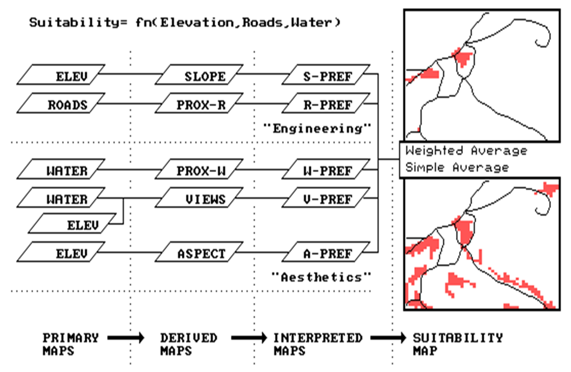
Figure
1. Campground Suitability
Model. The "best" areas
are gently sloped, near roads, near water, with good views of water and a
westerly aspect.
The
next group is termed DERIVED MAPS. Like
primary maps, they are "facts."
It is just that they are difficult to collect and encode, so we use the
computer to derive them. For example,
slope can be measured with a clinometer, but it is
impractical to collect this information for the 2,500 quarter-hectare locations
(grid cells) in the project area.
Similarly, the distance to roads can be measured by a survey crew
"pulling tape." But it is just
too difficult. Note that these first two
levels of model abstraction are concrete descriptions of the landscape. We could check the accuracy of our primary
and derived maps simply by taking them into the field and measuring. They exist.
They're tangible. We're
comfortable.
The
next two levels, however, are an entirely different matter. It is at this juncture that we move from
"fact" to "judgment" …from the description of the landscape to the prescription of a proposed land use. The INTERPRETED MAPS are the result of
grading landscape factors in terms of an intended use. This involves assigning a relative
"goodness value" to each map condition. For example, gentle slopes are preferred
locations for campgrounds. However, if
you were assessing suitability for a ski area, the steeper slopes might be
better. It is imperative that a common
goodness scale is used for all of the interpreted maps. It's like a professor's grading of several
exams throughout the term. Each test
(analogous to a primary or derived map) is graded. As you would expect, some students (analogous
to map locations) score well on an exam, while others flunk.
The
final SUITABILITY MAP is a composite of the set of interpreted maps. Like the professor at the end of the term,
you simply average the test scores for each student's semester grade. There, that's it. Everyone (analogous to each map location) is
given an overall ranking. In the figure,
the lower map inset identifies the best overall scores. However, you might want to do some spatial
spreadsheet "what-if-ing." What if
views (V-PREF map) are ten times more important than the other
preferences? The upper map inset shows
that the good locations, in this scenario, are severely cut back to just a few
areas. But what if steepness was more
important? Or
proximity to water? Where are
best locations now? Are there any
consistently good locations?
Whoa! Too abstract. It's time to look at the specifics of the
model. The horizontal compartments chart
the processing of the individual criteria.
The "engineering" concerns for avoiding
steep slopes and large distances from existing roads is common
sense. It costs a lot more to construct
a campground under these conditions.
Hidden behind the flowchart is the actual code (termed a
"macro") which achieves the objectives. Expressed in MapCalc command sentences, they
are:
SLOPE ELEVATION FOR SLOPEMAP
RENUMBER
SLOPEMAP FOR S‑PREF ASSIGN 9 TO 0 THRU 5 ASSIGN 8
TO 6 THRU 15 ASSIGN 5 TO 16 THRU 25 ASSIGN 3 TO 26 THRU 40
ASSIGN 1 TO 41 THRU 100
SPREAD
ROADS TO 100 FOR PROX‑R
RENUMBER
PROX‑R FOR R‑PREF ASSIGN 9 TO 0 ASSIGN 8
TO
1 ASSIGN 7 TO 2 THRU 3 ASSIGN
4 TO 4 THRU 6 ASSIGN
1 TO 7 THRU 100
The
"slope" and "spread" commands create the derived maps
indicating steepness and proximity to roads.
These in turn are "renumbered" (i.e., calibrated) with 9 being
the best through 1 being the worst. For
example, the value 9 is assigned to the gentlest slopes of 0-5% and the closest
distances of 0 cells away (100m grid spacing).
The
"aesthetics" considerations of being near water, having good views of
water and oriented toward the west are expressed in the following sentences.
SPREAD WATER TO 100 FOR PROX‑W
RENUMBER
PROX‑W FOR W‑PREF ASSIGN 9 TO 0 THRU 2 ASSIGN 7 TO
3 THRU 4 ASSIGN 4 TO 5 THRU 6 ASSIGN 1 TO 7
THRU 100
RADIATE
WATER OVER ELEVATION COMPLETELY TO 10 FOR VIEWS
RENUMBER
VIEWS FOR V‑PREF ASSIGN 9 TO 30 THRU 100 ASSIGN 8
TO 20 THRU 29 ASSIGN 6 TO 15 THRU 19 ASSIGN
14 ASSIGN 1 TO 0 THRU 4
ORIENT
ELEVATION FOR ASPECTMAP
RENUMBER
ASPECTMAP FOR A‑PREF ASSIGN 9 TO 6 THRU 8
ASSIGN 7 TO 1 THRU 2 ASSIGN
The
"spread," "radiate" and "orient" commands
generate the derived maps.
"Renumber" calibrates each map using the same grading
scheme. For example, 9 is assigned to the
closest distances to water of 0-2 cells away, the most visually exposed to
water of 30-100 connections and the westerly octants of 6-8. Such power, you're in command. Like the professor, your interpretations
control the fate of thousands of entities (analogous to map locations).
The
easy part is the next step. Just enter:
AVERAGE S‑PREF TIMES 1 WITH R‑PREF TIMES 1
WITH W‑PREF TIMES
1 WITH V‑PREF TIMES 1 WITH A‑PREF
TIMES 1 FOR RANKING
for an overall
ranking. Locations with an average of 7
or better are displayed with the road network for reference in the lower
inset. These locations are the
contenders for the campground.
But
we might want to do some additional thinking.
You know, try a few things. Note
that the "times 1" in the averaging command indicates the weighting
factor for each map. Edit the sentence
to "V-PREF TIMES 10" and resubmit to make good views more
important. The result is the map on top,
with a much narrower set of choices.
Actually,
there are three types of modifications you can make— weighting, calibration and
structural. Each involves editing the
"macro," then resubmitting.
Weighting modifications affect the compositing of interpreted maps into
the overall suitability map, as described above. Calibration modifications affect the
assignment of the individual "goodness ratings." For example, you might assign 9 (best) to a
broader range of slopes, say 0-10%. I
wonder if that changes things much.
Weighting and calibration modifications are easy and straight forward—edit a parameter, then resubmit and see the effect. Structural changes are something else. They involve changing the logical structuring of the flowchart. For example, it might occur to you that forested areas are better than open terrain. To handle this, you need to add a new sequence of maps to the "aesthetics" compartment beginning with a cover type map. Now you are GISing— conceptualizing the important considerations as maps, and expressing their relationships as GIS commands. Actually that's map-ematical modeling— a piece of cake.
_____________________
Author's Note: As with all Beyond Mapping
columns, allow me to apologize in advance for the "poetic license"
invoked in this terse treatment of a complex subject. Readers with the MapCalc Tutorial disk should
review TU-DEVEL.CMD which executes a similar suitability model. A related discussion on modeling appears in a
paper by
Effective Standards Required to Go Beyond Mapping
(GIS World, March 1993)
…the problem
is that there are so many different ones
The
previous section outlined the basic concepts in GIS modeling. Behind each complex map there is a sequence
of commands (termed a macro) which reflects the "rational thinking"
of the application model. The processing
often is summarized into a flowchart for easier communication. Once structured, the model can be repeatedly
executed in a manner similar to running "what if" scenarios in
spreadsheet analysis. That must be it—
GIS is merely a spatial spreadsheet.
Yep,
you're right... in part. Actually,
spreadsheet analysis is just one piece of a larger field called mathematical
modeling. Now that maps are numbers
(which we process with map-ematics) it becomes
apparent that GIS comes with all the rights, privileges and responsibilities of
other mathematics. First and foremost,
is a requirement to cloud common sense with litany of terminology. At the risk of heated debate, let me suggest
that are three broad types of models in GIS— the data model, the relational
model, and the application model. Data
and relational models describe how spatial information is developed and stored
within the GIS. An example of a data
model is the use of Kriging to spatially interpolate a set of point
measurements into a continuous surface, or mapped variable. With remotely sensed data, it is the
classification procedure and the spectral signatures. Once a "map variable" is defined,
the relational model assigns "spatial topology" and "attribute
characteristics" within the context of the GIS system.
Whew,
did you survive that opaque statement?
Do you know what it means?
Several of the earlier Beyond Mapping articles discussed some the
important considerations in these models (GW September, 1989 through April,
1990). In short, the data and relational
models describe the "what and where" of spatial information. An application model, on the other hand,
addresses the "so what" aspects of mapped data. It investigates the intra- and
inter-relationships of maps. The
application model is used to gain conceptual clarity and better understanding
of a system or issue.
In
the broadest of definitions, there are two types of application models—
cartographic and spatial. The
distinction between the two lies along a continuum extending from conceptual to
system modeling. The degree of
mathematical rigor is a good litmus test of the two types. For example, I recently had a graduate GIS
class nearly split between civil engineers and natural resource managers. The term projects of the resource managers
tended toward cartographic models expressing their understanding of a issue, such as spotted owl habitat. These conceptual models were heavy on
insight, but relatively light on mathematics and empirical study. The engineers' models, on the other hand,
generally involved the spatial evaluation of existing equations, such as Horton
overland flow of surface water. One
student even had a model with a single equation that exceeded four lines of
code (e.g., (ln(map1 ** map2)...).
The differences in approach and GIS requirements between the
cartographic and spatial modelers were readily apparent.
These
differences, along with those raised in data and
relational models, places new demands on map standards. Like the fabled Kracken,
in Greek mythology, standards will rise from a sea of confusion and inundate
our feeble structures of paper map standards.
The assault is on four fronts— exchange, geographic, algorithm and
modeling. Data Exchange standards, the easiest to address, merely involve
establishing data formats for the importing and exporting of maps among
different GIS systems. In the
Geographic standards
for manually prepared maps have been evolving for hundreds of years. Historically, they have been concerned with
the spatial precision used in locating the boundaries of map features. Concepts, such as map scale and projection,
are well-developed and standardized. For
the most part, these standards are easily translated into the digital world of
GIS. But there are
some hidden pitfalls GIS's characterization of mapped data.
A
major problem lies in the assignment of numbers (thematic values) to represent
the various characteristics and conditions of a map variable. For example, a map of soils might contain
numbers which merely reflect the color pallet used to plot the standard colors
associated with each soil class. These
numbers are likely sufficient for most mapping and data base management
applications, but modeling is more demanding.
Numbers from 0 to 100 might be used to identify the clay content of each
soil class. For runoff modeling, a
saturation index might be a more useful expression of soil distribution than
simply soil class number. On a
vegetation map, numbers incorporating the range of age and stocking, as well as
species, might be required. A
sophisticated spatial timber supply model will require a statistical
description of the variance in all of these data.
That's
the problem— the simple translation of map symbols and colors into numbers may
not be sufficient for many of the application models. Review of geographic standards for the
"corporate data base" needs to be extended to include the
informational content, as well as locational precision. In the
Algorithmic standards,
involving the processing capabilities within a GIS, must also be
addressed. At the computational level
various algorithms need to be benchmarked, and users given guidelines for their
appropriate use. For example, the
differences among maximum, average and fitted slope algorithms should be
established and users advised which is most appropriate for particular
applications. Spatial interpolation,
distance measurement, visual analysis and fragmentation indices are other
examples of algorithms awaiting review.
At
another level, the processing structure of GIS can be made more standard. In the early years of data base management,
the various products had little to do with one another. The advent of the Standard Query Language
(SQL) greatly added to the utility of these systems. In a similar vein, a "GSL" (GIS
Standard Language) would stimulate the development and exchange of application
models. Without it (or at least a basic
set of functionality) our modeling efforts are atomized. It's like each car company deciding where to
put the clutch, brake and gas pedals— both dumb and dangerous.
A
coordinated assault on algorithm standards is not, as of yet, in place. However, several factors in the natural
maturation of GIS are contributing its refinement. Within academia, the growing number of
courses and texts in GIS are contributing to definition of a common and
comprehensive processing structure. As
GIS vendors look over their shoulders at the competition, they tend to
incorporate the "good ideas" of others. Finally, as an increasing number of large
procurements hit the street, their specifications provide a defacto
definition of processing capabilities.
This same maturation progression was evident in data base management—
GIS is just its younger sibling.
Let's
see, exchange standards have been addressed, geographic standards are being
addressed, and algorithm standards are gleam in the eyes of a venturesome
few. But what about
standards in the models themselves?
Such concerns, referred to as Interpretational
standards, have received minimal attention.
To date, emphasis has been on producing products, not the verification
of the results or logic behind a final map.
As more and more "modeled" maps surface, there is an
increasing opportunity to scrutinize modeling results. If an area is classified as excellent elk
habitat, or ancient forest, but those on the ground know different, the product
will eventually be deemed sub-standard.
Two
procedures might accelerate this process.
First, empirical verification results could be included with a final
map, like the geographic descriptors of scale and projection. If "ground truth" shows that
ancient forest was incorrectly identified a third of the time, the user of the
product should be so advised. If
empirical verification isn't possible, error propagation modeling can be used
to estimate the reliability of the final map (see Beyond Mapping, November,
1991 through February, 1992). Keep in
mind that, by definition, modeling is an abstraction of reality (an
"educated" guess).
Another
useful tool in establishing interpretation standards is the map
"pedigree." This is a new
addition to a map's legend brought on by GIS modeling. In its simplest form, the pedigree is merely
a listing of the macro (commands) used to create the final map. More elegant renderings contain a flowchart
of processing as well. These succinct descriptions of model logic provides and
entry point for evaluating the model and suggesting changes. As GIS modeling matures, a map without its
pedigree will be as unacceptable as dog show contestant without its AKC papers.
In
the past, maps were principally accepted on face-value. A neatly drafted map indicated the
cartographer's concern for accuracy. If
it looked good, it was probably good.
But GIS modeling has changed the playing field, as well as the
rules. Without effective standards that
address this new environment, GIS will have difficulty going beyond mapping.
Maps Speak Louder than Words
(GIS World, April 1993)
By
their nature, all land use plans contain (or imply) a map. The issue is just that— "what should go
where." As noted in the last couple
of articles, there is a lot of thinking that goes into a final map
recommendation. One can't simply arm a
survey crew with a "land use-ometer" to
measure the potential throughout a project area. The logic behind the land use model and its
interpretation by different groups are the basic elements leading to an
effective land use map "solution."
The map itself is merely one rendering of the thought process.
The
potential of "interactive" GIS modeling extends far beyond its
technical implementation. It promises to
radically alter the decision-making environment itself. A "case study" might help in making
this claim. The study uses three
separate spatial models for allocating alternative land uses of conservation,
research and residential development. In
the study, GIS modeling is used in consensus building and conflict resolution
to derive the "best" combination of competing uses of the landscape.
The
study takes place in consulting heaven— the western tip of
A
map of accessibility to existing roads and the coastline formed the basis of
the Conservation Areas Model. In
determining access, the slope of the intervening terrain is considered. The 'slope-weighted' proximity from the roads
and from the coastline was calculated.
In these calculations, areas that appear geographically near a road may
actually be much less accessible. For
example, the coastline may be a 'stone's throw away' from the road, but if it's
at the foot of a cliff it may be effectively inaccessible for recreation.
The
two maps of weighted proximity from both the roads and the coast were combined
into an overall map of accessibility.
The final step of the analysis involved interpreting relative access
into conservation uses (see figure 1).
Recreation was identified for those areas near both roads and the
coast. Intermediate access areas were
designated for limited use. Areas
effectively far from roads were designated as preservation areas.
The
characterization of the Research Areas Model first used the elevation map to
identify individual watersheds. The set
of all watersheds was narrowed to just three based on scientists' requirements
that they be relatively large and wholly contained areas (Figure 2). A sub-model used the prevailing current to
identify coastal areas influenced by each of the three terrestrial research
areas.
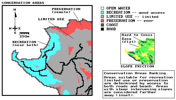
Figure
1. Conservation Areas Map.
The
Development Areas Model determined the 'best' locations for residential
development. The model structure used is
nearly identical to that of "campground" suitability model described
two issues ago— mega-bucks estates simply replaces tent city. Engineering, aesthetic, and legal factors
were considered. As before, the
engineering and aesthetic considerations were treated independently, as
relative rankings (analogous to, midterm test scores). An overall ranking (analogous to, term grade)
was assigned as the weighted average of the five "preference"
factors. The legal constraints, on the
other hand, were treated as "critical" factors. For example, an area within the 100 meter
set-back was considered unacceptable, regardless of its aesthetic or
engineering rankings.
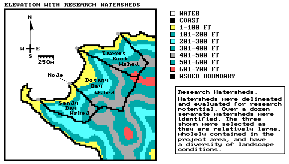
Figure 2. Research Areas Map.
Figure
3 shows a composite map containing the simple arithmetic average of the five
separate preference maps used to determine development suitability. The constrained locations mask these results
and are shown as light grey (values within constrained areas are assigned the
preference value of 0). Note that
approximately half of the land area is ranked as 'Acceptable' or better (darker
tones). In averaging the five preference
maps, all criteria were considered equally important at this step.
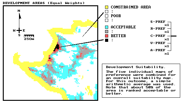
Figure 3. Development Areas Map (Unweighted).
The
analysis was extended to generate a series of weighted suitability maps. Several sets of weights were tried. The group finally decided on:
ü view preference times 10 (Most Important)
ü coast proximity times 8
ü road proximity times 3
ü aspect preference times 2
ü slope preference times 1 (Least Important)
The
resulting map of the weighted averaging is presented in Figure 4. Note that a smaller portion of the land is
ranked as 'Acceptable' or better. Also
note the spatial distribution of these prime areas are localized to three
distinct clusters.
The
group of decision-makers was involved in construction of all three of the
individual models— conservation, research and development. While looking over the shoulder of the GIS
specialist, they saw their concerns translated into map images. They discussed whether their assumptions made
sense. Debate surrounded the
"weights and calibrations" of the models. They saw the sensitivity of each model to
changes in its parameters. In short,
they became involved and understood the map analysis taking place. That's a far cry from viewing a
"solution" map for the first time at a public hearing. Or, hearing the continued reference by the
experts to the three volume report each time there is a question. Heck, you didn't have the time (nor expertise) to read the report in the first place. Damned if you will read it after tonight's
vote.
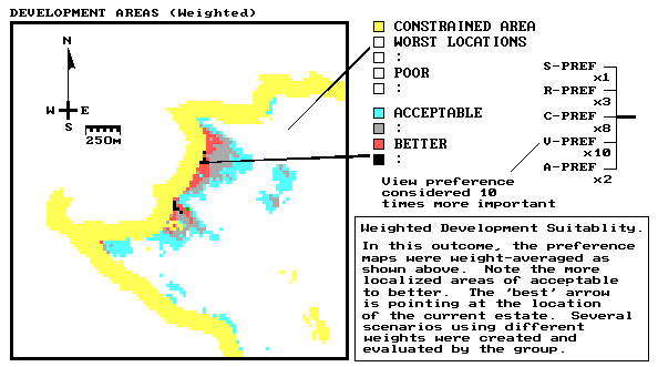
Figure 4. Development Areas Map (Weighted).
That's
the new twist GIS modeling brings. It
enables decision-makers to be just that— decision-makers. Not choice-choosers constrained to a few
pre-defined alternatives. The
involvement of decision-makers in the analysis process contributes to consensus building. As you see your concerns, and those of
others, incorporated into the analysis, you get a better feeling about the
issue. In this case, the group reached
consensus on the three independent land use renderings. That sets the stage for the final show-down— conflict resolution. See you next issue.
_____________________
Author's Note: As with all Beyond Mapping
articles, allow me to apologize in advance for the "poetic license"
invoked in this terse treatment of a complex subject. Readers with the MapCalc Tutorial disk should
review the "digital" slide show BB-BK.BAT which contains a slide set
of the application described. A more
detailed discussion on the application is in "
Is Conflict Resolution an Oxymoron?
(GIS World,
May 1993)
The
previous section might have left you hanging.
The three analyses determined the best use of the project area
considering conservation, research and development criteria in a unilateral
manner. However, what about areas common
to two or more of the maps? These are
the areas of conflict are where the decision-makers must "either fish or
cut bait." Three basic approaches
in resolving conflicts are at your disposal— hierarchical dominance, compatible
use and tradeoff. Hierarchical dominance assumes certain land uses are more important
and, therefore, supersede all other potential uses. Compatible
use, on the other hand, identifies harmonious uses and assigns several uses
to a single location. Tradeoff recognizes the hardcore
conflicting uses on a parcel-by-parcel basis and attempts resolve that land use
takes precedence. Effective land use
decisions involve elements of all three of these approaches.
From
a map processing perspective, the hierarchical approach is easily expressed in
a quantitative manner and results in a deterministic solution. Once the political system has identified a
superseding use it is relatively easy to map these areas and assign a value
indicating the desire to protect them from other uses. Multiple use also is
technically simple from a map analysis context, though often difficult from a
policy context. When compatible uses are
identified, a unique value identifying both uses is simply assigned to all
areas with the joint condition.
Conflict
arises when the uses are incompatible.
In these instances, quantitative solutions to the allocation of land use
are difficult, if not impossible, to implement.
The complex interaction of the frequency and juxta-positioning
of several competing uses is still most effectively dealt with by human
intervention. GIS technology assists
decision-making by deriving a map which indicates the set of alternative uses
vying for each location. Once in this
graphic form, decision-makers can assess the patterns of conflicting uses and
determine land use allocations. GIS can
also assist by comparing different allocation scenarios and identifying areas
of difference.
In
the "consulting heaven" study, the Hierarchical Dominance approach
was tried, but it was a total failure.
At the onset, the group was uncomfortable with identifying one land use
as always better than another. However,
just for fun, identifying development as least favored, recreation next, and
the researchers’ favorite watershed taking final precedence demonstrated the
approach. The resulting map was rejected
as it contained very little area for development, and what areas were
available, were scattered into disjointed parcels— infeasible conditions. Even if you could clarify conflict in 'policy
space,' it is frequently muddled in the complex reality of geographic
space.
The
alternative approaches of compatible use and tradeoff both depend on generating
a map indicating all of the competing land uses for each location in a project
area— a comprehensive conflicts map. Figure 1 is such a map considering the
Conservation Areas, Research Areas and Development Areas maps. Note that most of the area is without
conflict (lightest tone). In the absence
of the spatial guidance in a conflicts map, there is a tendency to assume every
square inch is in conflict. In the
presence of a conflicts map, however, attention is quickly focused on the
unique patterns of actual conflict.
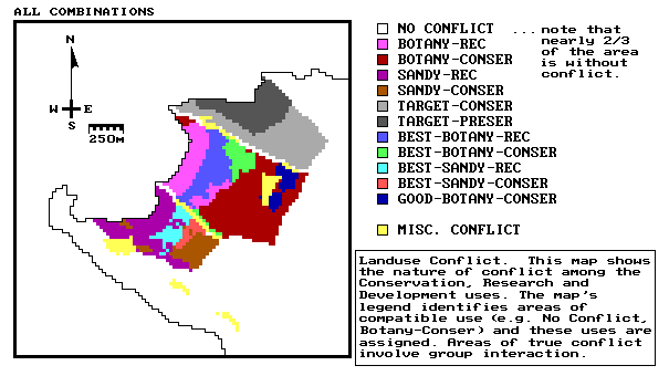
Figure 1. Conflicts Map.
First,
the areas of actual conflict were reviewed for compatibility. For example, it was suggested that research
areas could support limited use hiking trails, and both activities were
assigned to those locations. However,
most of the conflicts were real and had to be resolved "the hard
way." Figure 2 presents the group's
'best' allocation of land use. Dialogue
and group dynamics dominated the tradeoff process. As in all discussions, individual
personalities, persuasiveness, rational arguments and facts affected the
collective opinion. The initial
break-through was the agreement that the top and bottom research areas should
remain intact. In part, this made sense
as these areas had significantly less conflict than the central watershed.
It
was decided that all development should be contained within the central
watershed. Structures would be
constrained to the approximately twenty contiguous hectares identified as best
for development, which was consistent with the island's policy to encourage
'cluster' development. The legally
'constrained' area between the development cluster and the coast would be for
the exclusive use of the residents. The
adjoining research areas would provide additional buffering and open space,
thereby enhancing the value of the development.
In fact, it was pointed out that this arrangement provided a third
research setting to investigate development, with the two research watersheds
serving as control.
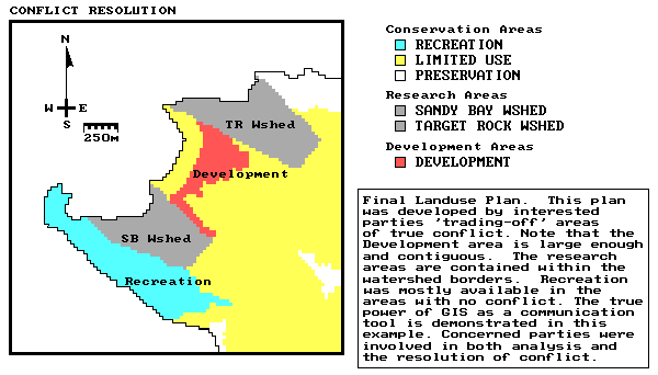
Figure 2. Final Map of Land Use Recommendations.
Recreation
use then received the group's attention.
This step was easy as a large part of the best recreation area was in
the southern portion with minimal conflict with the other uses. Finally, the remaining small 'salt and
pepper' parcels were absorbed by their surrounding 'limited or preservation
use' areas. In all, the group's final
map is a fairly rational land use allocation result and one that is readily
explained and justified. Although the
decision group represented several diverse opinions, this final map achieved consensus. In addition, each person felt as though they
actively participated and, by using the interactive process, better understood
both the area's spatial complexity and the perspectives of others.
This
last step of tradeoffs in the analysis may seem anticlimactic. After a great deal of 'smoke and dust
raising' about computer processing, the final assignment of land uses involved
a large amount of subjective judgment.
This point, however, highlights the capabilities and limitations of GIS
technology. Geographic Information
Systems provide significant advances in how we manage and analyze mapped
data. It rapidly and tirelessly allows
us to assemble detailed spatial information.
It also allows us to incorporate much more sophisticated and realistic
interpretations of the landscape. It
doesn't, however, provide an artificial intelligence for land use
decision-making. GIS technology greatly
enhances our decision-making capabilities, but does not replace them. It is both a toolbox of advanced analysis
capabilities and a sandbox to express our creativity and concerns.
_____________________
Author's Note: The
application reported demonstrates the important concepts GIS modeling— the material
is presented for demonstration purposes only.
Readers with the MapCalc Tutorial disk should review the
"digital" slide show BB-BK.BAT which contains a slide set of the
application described. A more detailed
discussion on the application is in "GIS Resolves Land Use Conflicts: A
Case Study," 1993 GIS International Source Book, available from the GIS
World Bookshelf.
_______________________________________