|
Topic 1 – Maps
as Data and Data Structure Implications |
Beyond Mapping book |
Maps
as Data: a 'Map-ematics' is emerging
— describes the differences
between Discrete and Continuous mapped data
It
Depends: Implications of data structure — discusses
and compares the similarities and differences between Vector and Raster data
structure applications
GIS
Technology Is Technical Oz — discusses
and compares the relative advantages/disadvantages between Vector and Raster
processing
<Click here> for a printer-friendly version of this topic
(.pdf).
(Back to the Table of Contents)
______________________________
Maps as Data: a 'Map-ematics'
is emerging
(GIS World, March 1989)
Old Proverb: A picture is worth a thousand
words...
New Proverb: A map is worth (and most often
exceeds) a thousand numbers.
Our
historical perspective of maps is one of accurate location of physical features
primarily for travel through unfamiliar areas.
Early explorers used them to avoid angry serpents, alluring sirens and
even the edge of the earth. The mapping
process evokes images of map sheets, and drafting aids such as pens, rub-on
shading, rulers, planimeters, dot grids, and acetate transparencies for
light-table overlays. This perspective
views maps as analog mediums composed of lines, colors and cryptic symbols that
are manually created and analyzed. As
manual analysis is difficult and often limited, the focus of the analog map and
manual processing is descriptive— recording the occurrence and distribution of
features.
More
recently, the analysis of mapped data has become an integral part of resource
and land planning. By the 1960's, manual
procedures for overlaying maps were popularized. These techniques marked a turning point in the
use of maps— from one emphasizing the physical descriptors of geographic space,
to one spatially characterizing appropriate management actions. The movement from 'descriptive' to
'prescriptive' mapping has set the stage for modern computer-assisted map
analysis.
Since
the 1960's, decision-making has become much more quantitative. Mathematical models for non-spatial analyses
are becoming commonplace. However, the
tremendous volumes of data used in spatial analysis limits the application of
traditional statistics and mathematics to spatial models. Non-spatial procedures require maps be
generalized to typical values before they can be used. The spatial detail for large areas are
reduced to a single value expressing the 'central tendency' of a variable at
that location— a tremendous reduction from the spatial specificity in the
original map.
Recognition
of this problem led to the 'stratification' of maps at the onset of analysis by
dividing geographic space into assumed homogenous response parcels. Heated arguments often arise as to whether a
standard normal, binomial or Poisson distribution best characterizes the
typical value in numeric space. However,
relatively little attention is given to the broad assumption that this value
must be presumed to be uniformly distributed in geographic space. The area-weighted average of several parcels'
typical values is used to statistically characterize an entire study area. Mathematical modeling of spatial systems has
followed a similar approach as that of spatial statistics— aggregating spatial
variation in model variables. Most
ecosystem models, for example, identify 'level' and 'flow' variables presumed
to be typical for vast geographic expanses.
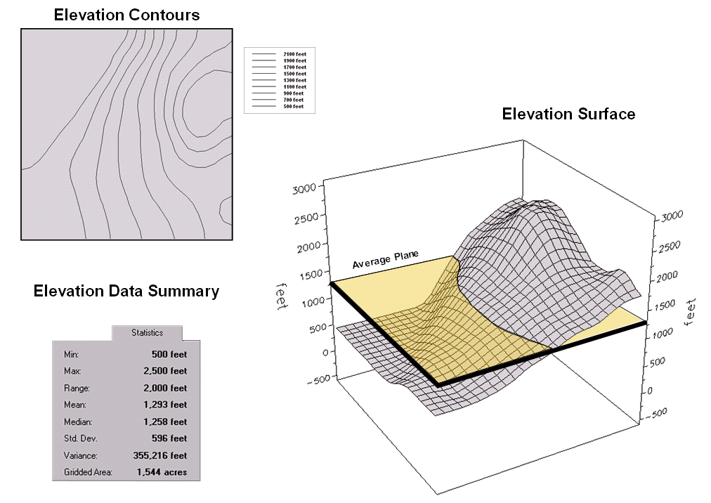
Figure
1. Conventional elevation
(topographic) contour map versus three-dimensional terrain representation.
However,
maps actually map the details of spatial variation. Manual cartographic techniques allow
manipulation of these detailed data; yet they are fundamentally limited by
their non-digital nature. Traditional
statistics and mathematics are digital; yet they are fundamentally limited by
their generalizing of the data. This dichotomy
has led to the revolutionary concepts of map structure, content and use forming
the foundation of GIS technology. It
radically changes our perspective. Maps
move from analog images describing the location of features to digital mapped
data quantifying a physical, social or economic system in prescriptive
terms.
This
revolution is founded in the recognition of the digital nature of computerized
maps— maps as data, maps as numbers. To
illustrate, consider the tabular and graphic information in Figure 1. The upper left inset is a typical topographic
map. One hundred foot contour lines show
the pattern of the elevation gradient over the area. The human eye quickly assesses the flat
areas, the steep areas, the peaks and the depressions. However in this form, the elevation
information is incompatible with any quantitative model requiring input of this
variable.
Traditional
statistics can be used to generalize the elevation gradient as shown in the
table in the upper right. We note that
the elevation ranges from 500 to 2500 feet with an average of 1293 feet. The standard deviation of +- 595 feet tells
us how typical this average is— most often (about two-thirds of the time)
expect to encounter elevations from 698 to 1888 feet. But where would I expect higher elevations;
where would I expect lower? The
statistic offers no insight other than that the larger the variation, the less
'typical' is the average; the smaller the better. In this instance, it's not very good as the
standard deviation is nearly half the mean (coefficient of variation= .46).
The
larger centered inset is a 3-dimentional plot of the elevation data. The gridded data contains an estimate of the
elevation at each hectare throughout the area.
In this form, your eye sees the variability in the terrain— the flat
area in the NW, the highlands in the NE.
For contrast, the average elevation is represented as the horizontal
plane intersecting the surface at 1293 feet.
Its standard deviation can be conceptualized as two additional planes
'floating' +- 595 feet above and below the average plane (arrows along the 'Z'
axis).
A
non-spatial model must assume the actual elevation for any parcel is somewhere
between these variation planes, most likely about 1293 feet. But your eye notes the eastern portion is
above the mean, while the western portion is below. The digital representation stored in a GIS
maps this variation in quantitative terms.
Thus the average and variance is the conceptual link between spatial and
non-spatial data. The average of
traditional statistics reduces the complexity of geographic space to a single
value. Spatial statistics retains this
complexity as a map of the variation in the data.
In
computer-assisted map analysis all maps are viewed as an organized set of
numbers. These numbers have numerical
significance, as well as conventional spatial positioning concerns, such as
scale or projection. It is the numerical
attribute of GIS maps that fuels the concepts of 'map-ematics'. For example, the first derivative of the
elevation surface in the figure creates a slope map. The second derivative creates a terrain
roughness map (where slope is changing).
An aspect map (azimuthal orientation) indicates
the direction of terrain slope at each hectare parcel.
But
what if the figure wasn't mapping elevation— rather the concentration of an
environmental variable, such as lake temperatures or soil concentrations of
lead? For lake temperatures, the first
derivative would map the rate of cooling.
The aspect map would indicate the direction of cooling throughout the
lake. For lead concentrations, the first
derivative would map the rate of lead accumulation throughout the study
area. The second derivative (change in
the rate of accumulation) would provide information about multiple sources of
lead pollution or abrupt changes in seasonal wind patterns. The aspect map of lead concentrations would
indicate the direction of accumulation.
If the figure were a cost surface, the first derivative maps marginal
cost; the aspect map indicates direction of minimal cost movement throughout
the area. If it were a travel-time
surface, the first derivative maps speed, the second, acceleration, and the
aspect map indicates the optimal movement through each parcel.
This
quantitative treatment of maps will be the subject of a series of articles in
GIS World. We will investigate such
topics as data structure implications, error assessment, measuring effective
distance, establishing optimal paths and visual connectivity, spatial
interpolation, and linking spatial and non-spatial data. The foundation for these new analytic
capabilities is the digital nature of GIS maps— a map is worth (and sometimes
exceeds) a thousand numbers.
It Depends: implications
of data structure
(GIS World,
May 1989)
The
main purpose of a geographic information system is to process spatial
information. In doing so it must be
capable of four things:
-
create
digital abstractions of the landscape (encode),
-
efficiently
handle these data (store),
-
develop
new insights into the relationships of spatial variables (analyze),
-
and ultimately create
'human-compatible' summaries these relationships (display).
The
data structure used for storage has far reaching implications in how we encode,
analyze and display digital maps. It has
also has fueled heated debate as to the 'universal truth' in data structure
since the inception of GIS. In truth,
there are more similarities than differences in the various approaches.
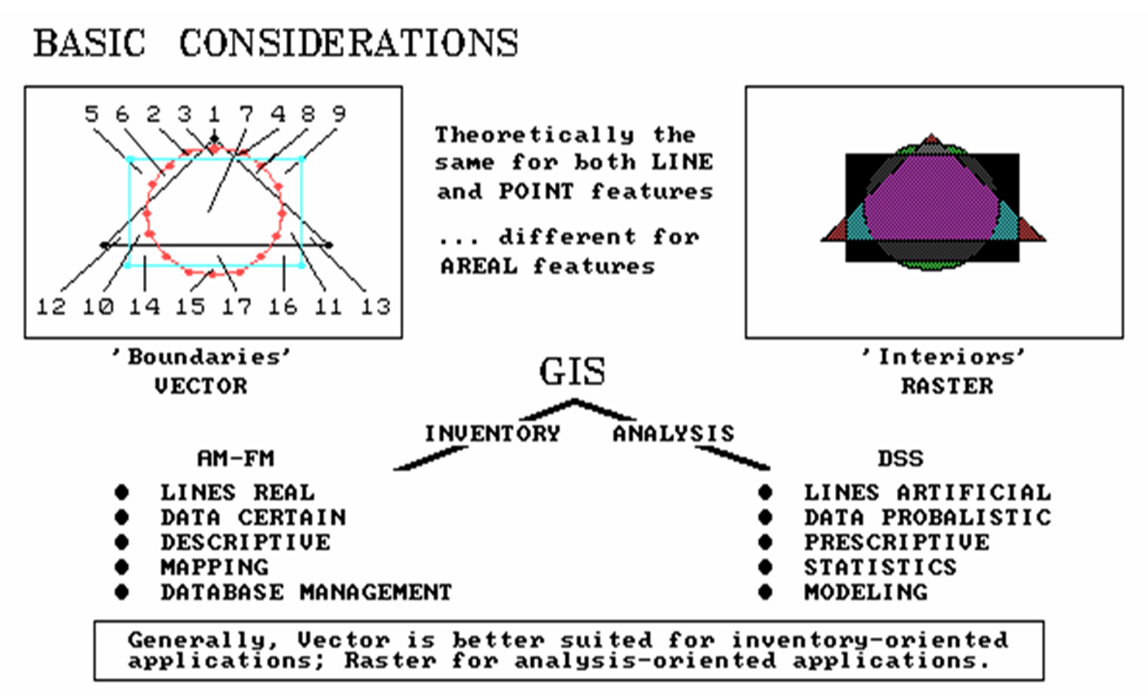
All
GIS are 'internally referenced' which means they have an automated linkage
between the data (or thematic attribute) and the where‑abouts (or positional attribute) of that data. There are two basic approaches used in
describing positional attributes. One
approach (vector) uses a collection of line segments to identify the boundaries
of point, linear and areal features. The
alternative approach (raster) establishes an imaginary grid pattern over a
study area, then stores values identifying the
thematic attribute occurring within each grid space.
Although
there are significant practical differences in these data structures, the
primary theoretical difference is that the grid structure stores information on the
interior of areal features, and implies boundaries; whereas, the line
structure stores information about boundaries, and implies
interiors. This fundamental difference
determines, for the most part, the types of applications that may be addressed
by a particular GIS.
It
is important to note that both systems are actually grid-based, it's just in
practice that line-oriented systems use a very fine grid of 'digitizer'
coordinates. Point features, such as
springs or wells on a water map, are stored the same for both systems— a single
digitizer 'x,y' coordinate pair or a single 'column,row'
cell identifier. Similarly, line
features, such as streams on a water map, are stored the same— a series of 'x,y' or 'column,row' identifiers.
If the same gridding resolution is used, there is no theoretical
difference between the two data structures, and considering modern storage
devices, only minimal practical differences in storage requirements.
Yet,
it was storage considerations that fueled most of the early debate about the
relative merits of the two data structures.
Demands of a few, or even one, megabyte of storage were considered a lot
in the early 1970's. To reduce storage,
very coarse grids were used in early grid systems. Under this practice, streams were no longer
the familiar thin lines assumed a few feet in width, but represented as a
string of cells of several acres each.
This, coupled with the heavy reliance on pen-plotter output, resulted in
'ugly, saw-toothed' map products when using grid systems. Recognition of any redeeming qualities of
this data form was lost to the unfamiliar character of the map product.
Consideration
of areal features present significant theoretical differences between the two
data structures. Its border defined as a
series of line segments, or its interior defined by a set of cells identifying
open water might describe a lake on a water map. This difference has important implications in
the assumptions about mapped data. In a
line-based system, the lines are assumed to be 'real' divisions of geographic
space into homogenous units. This
assumption is reasonable for most lakes if you accept the premise that the
shoreline remains constant.
However,
if the body of water is a flood-control reservoir the shoreline could shift
several hundred meters during a single year.
A better example of an ideal line feature is a property boundary. Although these divisions are not physical,
they are real and represent indisputable boundaries that, if you step one foot
over the line, often jeopardize friendships and international treaties
alike.
However,
consider the familiar contour map of elevation.
The successive contour lines form a series of long skinny polygons. Within each of these polygons the elevation
is assumed to be constant— forming a 'layer-cake' of flat terraces in
3-dimensional data space. For a few
places in the world, such as rice patties in mountainous portions of
An
even less clear example of a traditional line-based image is the familiar soil
type map. The careful use of a fine-tipped
pen in characterizing the distribution of soils imparts artificial accuracy at
best. At worst, it severely limits the
potential uses of soil information in a geographic information system.
As
with most resource and environmental data, a soil map is not 'certain'; as
contrasted with the surveyed and legally filed property map. Rather the distribution of soils is
probabilistic— the lines form artificial boundaries presumed to be the abrupt
transition from one soil type to another.
Throughout each of the soil polygons, the occurrence of the designated
soil type is treated as equally likely.
Most soil map users reluctantly accept the 'inviolately accurate'
assumption of this data structure, as the recourse is to dig soil pits
everywhere within a study area. It’s a
lot easier to just go with the flow.
A
more useful data structure for representing soils is gridded, with each grid
location identified by its most probable soil, a statistic indicating how
probable, the next most probable soil, its likelihood, and so on. In this context, soils are characterized as a
continuous statistical gradient— detailed data, rather than an aggregated,
human-compatible image. Such treatment
of map information is a radical departure from the traditional cartographic
image. Such treatment highlights the
revolution in spatial information handling brought about by the digital
map. From this new perspective, maps
move from images 'describing' the location of features to mapped information
quantifying a physical or abstract system in 'prescriptive' terms— from inked
lines and colorful patterns to mapped variables affording numerical analysis of
complex spatial interrelationships.
The
data structure (lines or grids) plays an important part in map analysis. Storage requirements of GIS's are
massive. A typical U.S Soil Conservation
Service map based on the US Geological 7.5 minute quadrangle contains about
1,200 soil polygons. A complete digital
data base containing all 54,000 quadrangle maps covering the lower 49 U.S.
states would involve keeping track of nearly 65,000,000 polygons each defined
by numerous coordinates. A similar grid
system would require 1,000,000,000,000,000 bits of data for a detailed gridding
resolution of 1.7 meters (Light, 1986).
With
current technology, all those data could be stored on 4000 optical disks—
smaller than a phonograph record library at a typical radio station. The storage requirements for a hectare
gridding resolution (a reasonable land planning cell size) for a similar data base
for the entire continent of
Figure
1. Comparison of two data
structures and their applications.
The
theoretical differences between the two data structures—'line' and 'grid'—are
significant in considering the future of GIS technology. The insets in Figure 1
overlaid results of three simple geometric shapes— lines on the left; grids on
the right. As noted previously, the
lines describe boundaries around areas assumed to be the same throughout their
interior. Grid structure, on the other
hand, defines the interior of features as groupings of contiguous cells. For lines, this consists of a few coordinate
pairs stored for each shape, with the curved line of the circle having the most
line segments at fourteen.
The
grid structure uses a 25 by 25 matrix of numbers (625 total cells) to represent
each of the three geometric shapes. Even
though a data compression technique was used for the gridded maps, the storage
requirement for these simple shapes is significantly less for the line
structure— 21 coordinate pairs versus nearly five hundred numbers for the three
gridded maps. In addition, the
boundaries of the features are more accurately plotted. Why would anyone ever use grids? Well it depends.
Significant
differences are apparent during analysis of these data. In the line structure, seventeen new polygons
were derived, comprised of 39 individual line segments. A significant increase is noted in the
storage requirement for the composite map over any of the original maps. Consider the complexity of overlaying a
typical land use map of several hundred polygons with a soil map of over a
thousand— the result is more 'son and daughter' polygonal offspring than you
would care to count (or most small computers would care to store).
Even
more significant, are the computational demands involved in splitting and
fusing the thousands of line segments forming the new boundaries of the
composite map. By contrast, a composite
of the maps stored in grid structure simply involves matrix addition. The storage requirement for the result is
slightly more than that of any of the original maps, but can never exceed the
maximum dimensionality of the grid. In
most advanced map analyses, the line structure is significantly less efficient
in both computation and storage of derived data. In addition, recent advances in computer
hardware, such as array processors and fast access, high-resolution raster
displays, utilize a grid structure. To
take advantage of this new technology, line systems must be converted to grids,
adding an additional processing step.
GIS Technology Is Technical Oz
(GIS World, July/August 1989)
...you're
hit with a tornado of new concepts, temporarily hallucinate and come back to
yourself a short time later wondering what on earth all those crazy things
meant (JKB)
As
promised (or threatened) in the last issue of GIS World, this article continues
to investigate the implications of data structure on map analysis. Recall that first and foremost, maps in a GIS
are digital data organized as large sets of numbers; not analog images
comprised of inked lines, colors and shadings.
Data structure refers to how we organize these numbers— basically as a
collection of line segments or as a set of grid cells. Theoretical differences between these two
structures arise for storage of polygonal features. Line-based structures store information about
polygon boundaries, and imply interiors.
Cell-based structures do just the opposite; implying boundaries while
storing information on interiors. So much for review.
What does this imply for map analysis?
In
short, which of the two basic approaches is used significantly affects map
analysis speed, accuracy and storage requirements. It also defines the set of potential analytic
'tools' and their algorithms. For
example, consider the accompanying figure depicting three simple geometric
shapes stored in typical formats of both structures. As noted previously, the lines describe
boundaries around areas assumed to be the same throughout their interior (right
side of figure 1).
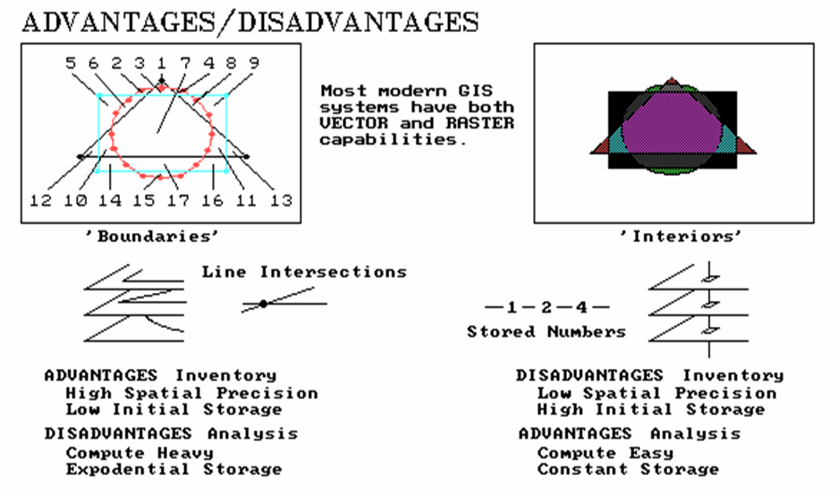
Figure
1. Comparison of overlay
results using vector (left side) and raster (right side).
Cells,
on the other hand, define the interior of features as groupings of contiguous
cells (left side). The series of numbers
with both insets in the figure show example storage structures (stylized). For lines, this consists of a few coordinate
pairs stored for each shape, with the curved line of the circle having the most
line segments at fourteen. The grid
structure uses a 25 by 25 matrix of numbers (625 numbers per map), shown as the
storage arrays to the immediate right of each geometric shape. The storage requirement of these features is
obviously less for the line structure (tens of numbers versus hundreds). The spatial precision of the boundaries is
also obviously better for
the line structure— the saw tooth effect in the grid structure is
an unreal and undesirable artifact.
It's fair to say that the line structure frequently has an advantage in
spatial precession and storage efficiency of base maps— inventory.
However,
other differences are apparent during analysis of these data. For example, the composite maps at the bottom
of the figure are the results of simply overlaying the three features; one of
the basic analytic functions. In the
line structure, seventeen new polygons are derived, composed of 39 individual
line segments. This is a significant
increase in the storage requirement for the composite map as compared to any of
the simple original maps. But consider
the realistic complexity of overlaying a land use map of several hundred
polygons with a soil map of over a thousand— the result is more 'son and
daughter' polygonal prodigy than you would care to count (or most small
computers would care to store).
On
the other hand, the storage requirement for the grid structure can never exceed
the maximum dimensionality of the grid— no matter how many input maps or their
complexity. Even more significant, is
the computational demands involved in splitting and fusing the potentially
thousands of line segments forming the new boundaries of the derived map. By contrast, the overlaying of the maps
stored in grid structure simply involves direct storage access and matrix
addition. It's fair to say that the grid
structure frequently has an advantage in computation and storage efficiency of
derived maps— analysis.
It
is also fair to say that the relative advantages and disadvantages of the two
data structures have not escaped GIS technologists. Database suppliers determine the best format
for each variable (USGS uses vector DLG format for all 7.5 minute quadrangle
information but elevation, which is in raster DEM format). Most vendors provide conversion routines for
transferring data between vector and raster.
Many provide 'schizophrenic' systems with both a vector and a raster
processing side. Some have developed
specialized data structure offshoots, such as 'Rasterized lines, Quadtrees and TIN.'
In each instance careful consideration is made to nature of the data,
processing considerations and the intended use— it depends.
Another
concern is the characteristics of the data derived in map analysis. In the case of line structure, each derived
polygon is assumed to be accurately defined— precise intersection of real boundaries
surrounding a uniform geographic distribution of data. True for overlaying a property map with a zip
code map, but a limiting assumption for probabilistic resource data, such as
soils and land cover, as well as gradient data, such as topographic relief and
weather maps. For example, recall the
geographic search (overlay) for areas of Cohassett
soil, moderate slope, and ponderosa pine forest cover described in the first
article of this series. A line-based
system generates an 'image' of the intersections of the specified
polygons. Each derived polygon is
assumed to locate the precisely defined combinations of the variables. In addition, the likelihood of actual
occurrence is assumed the same for all of the
polygonal prodigy— even small slivers formed by intersecting edges of the input
polygons.
A
grid-oriented system calculates the coincidence of variables at each cell
location as if each were an individual 'polygon'. Since these 'polygons' are organized as a consistent,
uniform grid, the calculations simply involve storage retrieval and numeric
evaluation— not geometric calculations for intersecting lines. In addition, if an estimate of error is
available for each variable at each cell, the value assigned as a function of
these data can also indicate the most likely composition (coincidence) of the
variables— 'there is an 80% chance that this hectare is Cohassett
soil, moderately sloped and ponderosa pine covered.' The result is a digital map of the derived variable,
expressed as a geographic distribution, plus its likelihood of error (a sort of
'shadow' map of certainty of result).
This concept, termed 'error propagation' modeling, is admittedly an
unfamiliar, and likely an uncomfortable one.
It
is but one of the gusts in the GIS whirlwind that is taking us beyond
mapping. Others include drastically
modified techniques, such as weighted distance measurement (a sort of rubber
ruler), and entirely new procedures, such as optimal path density analysis
(identifying the Nth best route).
These new analytic concepts and constructs will be the focus of future
articles.
_______________________________________

(Back to the Table of Contents)