|
Beyond
Mapping IV Topic 5
– Structuring GIS Modeling Approaches (Further
Reading) |
GIS Modeling book |
Explore
the Softer Side of GIS — describes a Manual GIS (circa
1950) and the relationship between social science conceptual (January 2008)
Use Spatial Sensitivity
Analysis to Assess Model Response — develops an approach for
assessing the sensitivity of GIS models (August 2009)
<Click here> for a printer-friendly version of this topic (.pdf).
(Back
to the Table of Contents)
______________________________
Explore the Softer Side of GIS
(GeoWorld, January
2008)
While computer-based procedures supporting Desktop Mapping seem
revolutionary, the idea of linking descriptive information (What) with maps
(Where) has been around for quite awhile.
For example, consider the manual GIS that my father used in the 1950s
outlined in figure 1.
The heart of the system was a specially designed index card that had a
series of numbered holes around its edge with a comment area in the
middle. In a way it was like a 3x5 inch
recipe card, just a little larger and more room for entering information. For my father, a consulting forester, that
meant recording timber stand information, such as area, dominant tree type,
height, density, soil type and the like, for the forest parcels he examined in
the field (What). Aerial photos were
used to delineate the forest parcels on a corresponding map tacked to a nearby
wall (Where).
What went on between the index card and the map was revolutionary for
the time. The information in the center
was coded and transferred to the edge by punching out (notching) the
appropriate numbered holes. For example,
hole #11 would be notched to identify a Douglas fir timber stand. Another card would be notched at hole #12 to
indicate a different parcel containing ponderosa pine. The trick was to establish a mutually
exclusive classification scheme that corresponded to the numbered holes for all
of the possible inventory descriptors and then notch each card to reflect the
information for a particular parcel.
Cards for hundreds of timber stands were indiscriminately placed in a
tray. Passing a long needle through an
appropriate hole and then lifting and shaking the stack caused all of the
parcels with a particular characteristic to fallout— an analogous result to a
simple SQL query to a digital database.
Realigning the subset of cards and passing the needle through another
hole then shaking would execute a sequenced query—such as Douglas fir (#11) AND
Cohasset soil (#28).
The resultant card set identified the parcels satisfying a specific
query (What). The parcel ID# on each
card corresponded to a map parcel on the wall.
A thin paper sheet was placed over the base map and the boundaries for
the parcels traced and color-filled (Where)—a “database-entry geo-query.” A “map-entry geo-query,” such as identifying
all parcels abutting a stream was achieved by viewing the map, is achieved by
noting the parcel ID#’s on the map and searching with the needle to subset the
abutting parcels to get their characteristics.
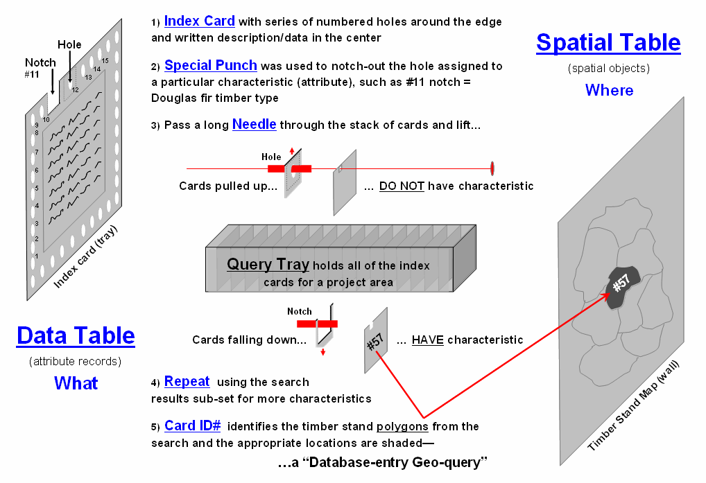
Figure 1. Outline of the processing flow of a manual
GIS, circa 1950.
The old days wore out a lot of shoe leather running between the index
card tray and the map tacked to the wall. Today, it’s just electrons scurrying
about in a computer at gigahertz speed.
However, the bottom line is that the geo-query/mapping approach hasn’t
changed substantially—linking “What is Where” for a set of pre-defined parcels
and their stored descriptors. But the
future of GIS holds entirely new spatial analysis capabilities way outside our
paper map legacy.
Figure 2 graphically relates the softer (human dimensions) and harder
(technology) sides of GIS. The matrix
is the result of musing over some things lodged in my psyche years ago when I
was a grad student (see Author’s Note 1).
Last month’s column (December 2007) described the Philosopher’s Levels
of Understanding (first column) that moves thinking from descriptive Data,
to relevant Information, to Knowledge of interrelationships and
finally to prescriptive Wisdom that forms the basis for effective
decision-making. The dotted horizontal
line in the progression identifies the leap from visualization and visceral
interpretation in GeoExploration of Data and Information to the map analysis
ingrained in GeoScience for gaining Knowledge and Wisdom for problem solving.
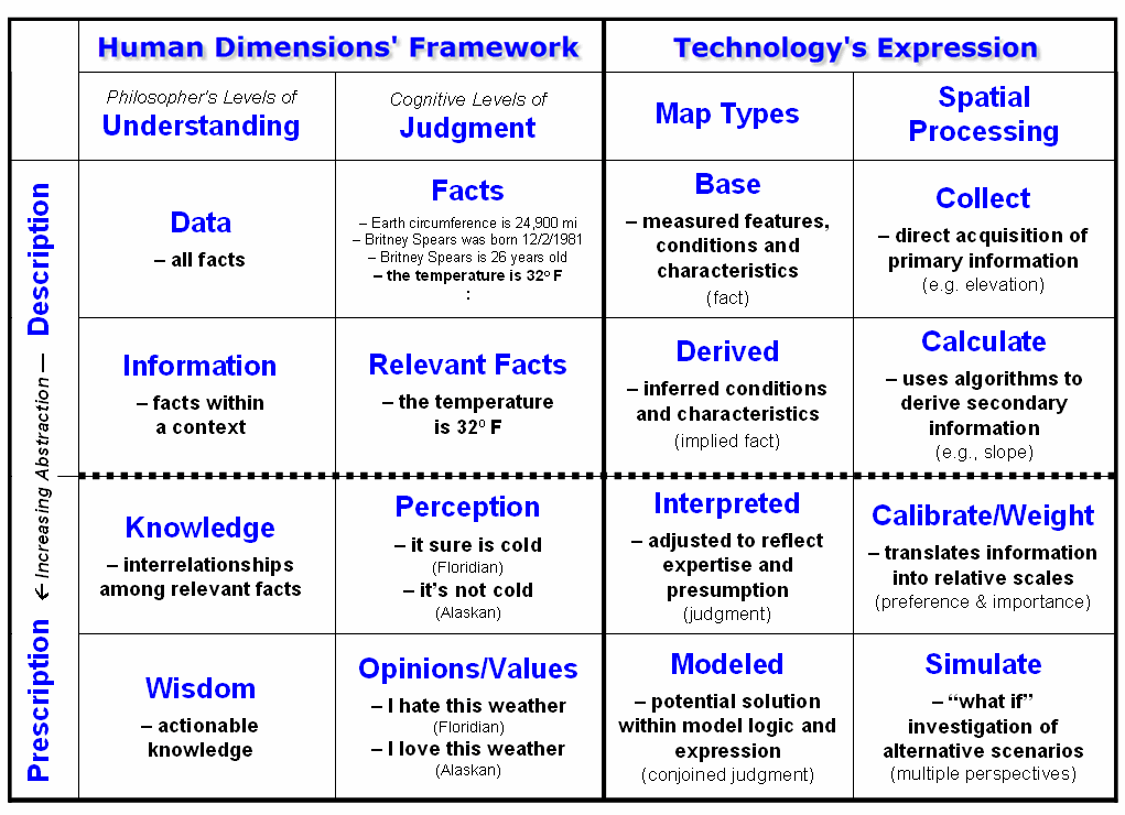
Figure 2. Conceptual framework for moving maps from
Description to Prescription application.
The second column extends the gradient of Understanding to the stark
reality of Judgment that complicates most decision-making applications
of GIS. The basic descriptive level for Facts
is analogous to that of Data and includes things that we know, such as the
circumference of the earth, Brittney Spears’ birth date, her age and today’s
temperature. Relevant Facts
correspond to Information encompassing only those facts that pertain to a particular
concern, such as today’s temperature of 32oF.
It is at the next two levels that the Understanding and Judgment
frameworks diverge and translate into radically different GIS modeling
environments. Knowledge implies
certainty of relationships and forms the basis of science—discovery of
scientific truths. The concept of Perception,
however, is a bit mushier as it involves beliefs and preferences based on
experience, socialization and culture—development of perspective. For example, a Floridian might feel that 32o
is really cold, while an Alaskan feels it certainly is not cold, in fact rather
mild. Neither of the interpretations is
wrong and both diametrically opposing perceptions are valid.
The highest level of Opinion/Values implies actionable beliefs
that reflect preferences, not universal truths.
For example, the Floridian might hate the 32o weather,
whereas the Alaskan loves it. This stark
dichotomy of beliefs presents a real problem for many GIS technologists as the
bulk of their education and experience was on the techy side of campus, where
mapping is defined as precise placement of physical features (description of
facts). But the other side of campus is
used to dealing with opposing “truths” in judgment and sees maps as more fluid,
cognitive drawings (prescription of relationships).
The columns on the right attempt to relate the dimensions of
Understanding and Judgment to Map Types and Spatial Processing
used in prescriptive mapping. The
descriptive levels are well known to GIS’ers—Base maps from field collected
data (e.g., elevation) and Derived maps calculated by analytical
tools (e.g., slope from elevation).
Interpreted maps,
on the other hand, calibrate Base/Derived map layers in terms of their
perceived impact on a spatial solution.
For example, gentle slopes might be preferred for powerline routing
(assigned a value of 1) with increasing steepness less preferred (assign values
2 through 9) and very steep slopes prohibitive (assign 0). A similar preference scale might be calibrated
for a preference to avoid locations of high Visual Exposure, in or near
Sensitive Areas, far from Roads or having high Housing Density. In turn, the model criteria are weighted
in terms of their relative importance to the overall solution, such as a homeowner’s
perception that Housing Density and Visual Exposure preference ratings are ten
times more important than Sensitive Areas and Road Proximity ratings (see
Author’s Note 2).
Interpreted maps provide a foothold for tracking divergent assumptions
and interpretations surrounding a spatially dependent decision. Modeled maps put it all together by simulating
an array of opinions and values held by different stakeholder groups involved
with a particular issue, such as homeowners, power companies and environmentalists
concerns about routing a new powerline.
The Understanding progression assumes common
truths/agreement at each step (more a natural science paradigm), whereas
the Judgment progression allows differences in opinion/beliefs (more a
social science paradigm). GIS modeling
needs to recognize and embrace both perspectives for effective
spatial solutions tuned to different applications. From the softer
side perspective, GIS isn’t so much a map, as it is the change in a series of
maps reflecting valid but differing sets of perceptions, opinions and
values. Where these maps agree and
disagree becomes the fodder for enlightened discussion, and eventually an
effective decision. Judgment-based GIS
modeling tends to fly in the face of traditional mapping— maps that
change with opinion sound outrageous and are radically different from our paper
map legacy and the manual GIS of old. It
suggests a fundamental change in our paradigm of maps, their use and conjoined impact—
are you ready?
_____________________________
Author’s Notes: 1) Ross
Whaley, Professor Emeritus at SUNY-Syracuse (and member of my doctoral
committee) in a plenary presentation at the New York State
Use Spatial Sensitivity Analysis to Assess Model
Response
(GeoWorld, August
2009)
Sensitivity analysis …sounds like 60’s thing involving a lava lamp and
a group séance shrouded in a semi-conscious fog attempting to make one more sensitive to others. Spatial sensitivity analysis is kind of like
that, but less Kumbaya and more quantitative
investigation into the sensitivity of a model to changes in map variable
inputs.
The Wikipedia defines Sensitivity Analysis
as “the study of how the variation (uncertainty) in the output of a
mathematical model can be apportioned to different sources of variation in the
input of a model.” In more general
terms, it investigates the effect of changes in the inputs of a model to the
induced changes in the results.
In its simplest form, sensitivity analysis is
applied to a static equation to determine the effect of input factors, termed
scalar parameters, by executing the equation repeatedly for different parameter
combinations that are randomly sampled from the range of possible
values. The result is a series of model
outputs that can be summarized to 1) identify factors that most strongly
contribute to output variability and 2) identify minimally contributing
factors.
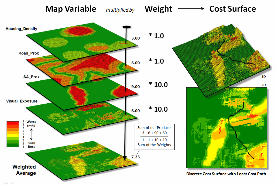
Figure 1. Derivation of a cost
surface for routing involves a weighted average of a set of spatial
considerations (map variables).
As one might suspect, spatial sensitivity
analysis is a lot more complicated as the geographic arrangement of values
within and among the set of map variables comes into play. The unique spatial patterns and resulting
coincidence of map layers can dramatically influence their relative importance—
a spatially dynamic situation that is radically different from a static
equation. Hence a less robust but
commonly used approach systematically changes each factor one-at-a-time
to see what effect this has on the output.
While this approach fails to fully investigate the interaction among the
driving variables it provides a practical assessment of the relative influence
of each of the map layers comprising a spatial model.
The left side of figure 1 depicts a stack of input layers (map
variables) that was discussed in the previous discussions on routing and
optimal paths. The routing model seeks
to avoid areas of 1) high housing density, 2) far from roads, 3) within/near
sensitive environmental areas and 4) high visual exposure to houses. The stack of grid-based maps are calibrated
to a common “suitability scale” of 1= best through 9= worst situation for
routing an electric transmission line.
In turn, a “weighted average” of the calibrated map layers is used to
derive a Discrete Cost Surface containing an overall relative
suitability value at each grid location (right side of figure 1). Note that the weighting in the example
strongly favors avoiding locations within/near sensitive environmental areas
and/or high visual exposure to houses (times 10) with much less concern for
locations of high housing density and/or far from roads (times 1).
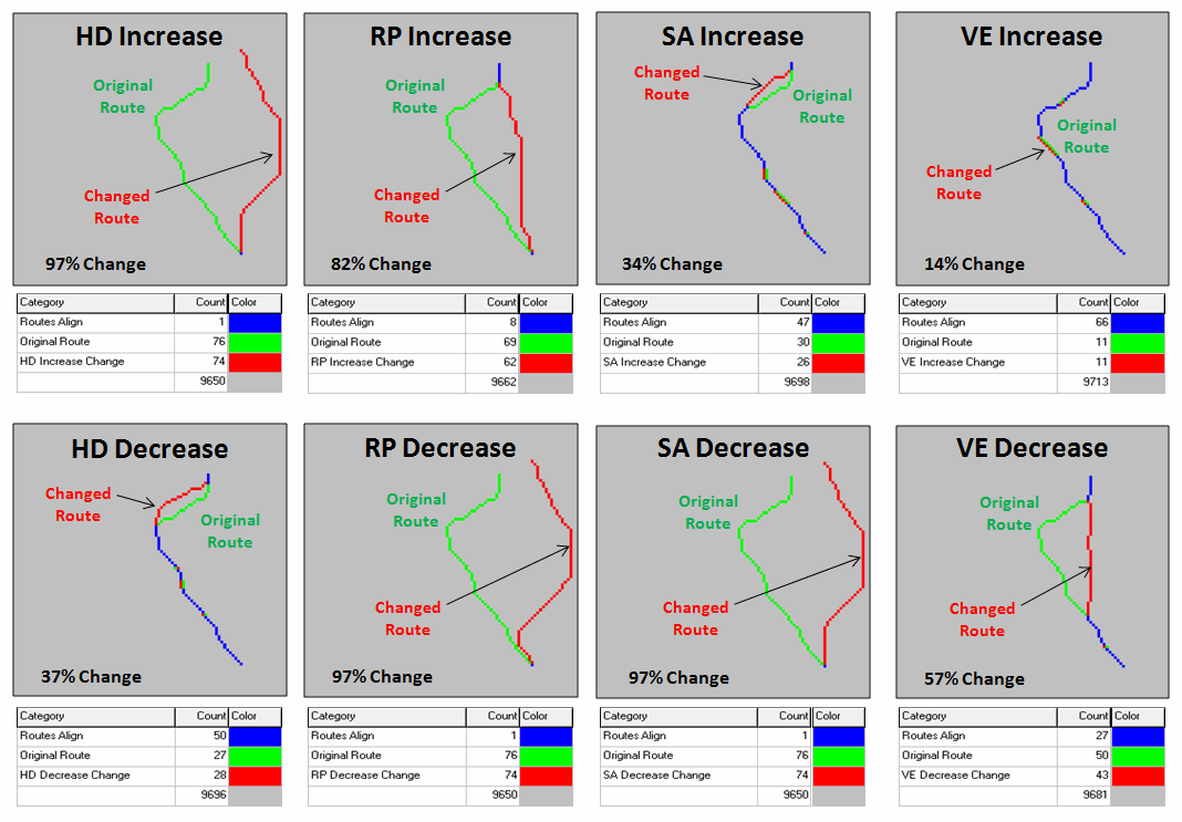
Figure 2. Graphical comparison of
induced changes in route alignment (sensitivity analysis).
The routing algorithm then determines the path that minimizes the total
discrete cost connecting a starting and end location. But how would the optimal path change if the
relative importance weights were changed?
Would the route realign dramatically?
Would the total costs significantly increase or decrease? That’s where spatial sensitivity analysis
comes in.
The first step is to determine a standard unit to use in inducing
change into the model. In the example,
the average of the weights of the base model was used—1+1+10+10= 22/4=
5.5. This change value is added to one
of the weights while holding the other weights constant to generate a model
simulation of increased importance of that map variable.
For example, in deriving the sensitivity for an increase in concern for
avoiding high housing density, the new weight set becomes HD= 1.0 + 5.5= 6.5,
RP= 1.0, SA= 10.0 and VE= 10.0. The
top-left inset in figure 2 shows a radical change in route alignment (97% of
the route changed) by the increased importance of avoiding areas of high
housing density. A similar dramatic
change in routing occurred when the concern for avoiding locations far from
roads was systematically increased (RPincrease= 82% change). However, similar increases in importance for
avoiding sensitive areas and visual exposure resulted in only slight routing
changes from the original alignment (SAincrease= 34% and VEincrease=14%).
The lower set of graphics in figure 2 show the induced changes in
routing when the relative importance of each map variable is decreased. Note the significant realignment from the
base route for the road proximity and sensitive area considerations (RPdecrease=
97% and SAdecrease=97%); less dramatic for the visual exposure
consideration (VEdecrease= 57%); and marginal impact for the housing
density consideration (HDdecrease= 37%). An important enhancement to this summary
technique beyond the scope of this discussion calculates the average distance
between the original and realigned routes (see author’s note) and combines this
statistic with the percent deflection for a standardized index of spatial
sensitivity.

Figure 3. Tabular Summary of
Sensitivity Analysis Calculations.
Figure 3 is a tabular summary of the sensitivity analysis calculations
for the techy-types among us. For the
rest of us after the “so what” big picture, it is important to understand the
sensitivity of any spatial model used for decision-making—to do otherwise is to
simply accept a mapped result as a “pig-in-a-poke” without insight into its
validity nor an awareness of how changes in assumptions and conditions might
affect the result.
_____________________________
Author’s
Note: For a discussion of “proximal alignment” analysis used in the
enhanced spatial sensitivity index, see the online book Map Analysis, Topic 10,
Analyzing Map Similarity and Zoning (www.innovativegis.com/basis/MapAnalysis/).
(Back to the Table of Contents)