|
Beyond
Mapping III Topic 6
– Summarizing Neighbors (Further Reading) |
Map Analysis book |
(Extended Neighborhood Techniques)
Grid-Based
Mapping Identifies Customer Pockets and Territories — identifies techniques for identifying unusually high
customer density and for delineating spatially balanced customer territories (May 2002)
Nearby
Things Are More Alike — use of decay functions
in weight-averaging surrounding conditions (February 2006)
Filtering
for the Good Stuff — investigates a couple of spatial filters for
assessing neighborhood connectivity and variability (December 2005)
(Micro-Terrain Analysis)
Use
Data to Characterize Micro-Terrain Features — describes
techniques to identify convex and concave features (January 2000)
Characterizing
Local Terrain Conditions — discusses the use of
"roving windows" to distinguish localized variations (February 2000)
Characterizing
Terrain Slope and Roughness — discusses techniques for
determining terrain inclination and coarseness (March 2000)
Beware
of Slope’s Slippery Slope — describes various slope
calculations and compares results (January 2003)
Use
Surface Area for Realistic Calculations — describes a
technique for adjusting planimetric area to surface area considering terrain
slope (December
2002)
(Landscape Analysis Techniques)
Use
GIS to Calculate Nearby Neighbor Statistics —
describes a technique that calculates the proximity to all of the surrounding
parcels of a similar vegetation type (May 1999)
Use
GIS to Analyze Landscape Structure — discusses the underlying principles
in landscape analysis and introduces some example landscape indices (June 1999)
Get
to the Core of Landscape Analysis — describes techniques for assessing
core area and edge characterization (July 1999)
Use
Metrics to Assess Forest Fragmentation — describes some landscape
indices for determining richness and fragmentation (August 1999)
<Click here> for a printer-friendly version of this topic (.pdf).
(Back
to the Table of Contents)
______________________________
(Extended Neighborhood Techniques)
Grid-Based
Mapping Identifies Customer Pockets and Territories
(GeoWorld, May
2002)
Geo-coding based on customer address is a powerful capability in most
desktop mapping systems. It
automatically links customers to digital maps like old pushpins on a map on the
wall. Viewing the map provides insight into spatial patterns of customers. Where are the concentrations? Where are customers sparse? See any obvious associations with other map
features, such as highways or city neighborhoods?
Figure 1. Point Density analysis identifies
the number of customers with a specified distance of each grid location.
The spatial relationships encapsulated in the patterns can be a
valuable component to good business decisions.
However, the “visceral viewing” approach is more art than science and is
very subjective. Grid-based map analysis,
on the other hand, provides tools for objectively evaluating spatial
patterns. Earlier discussion (March and
April 2002 BM columns) described a Competition Analysis procedure that
linked travel-time of customers to a retail store. This discussion will focus on characterizing
the spatial pattern of customers.
The upper left inset in figure 1 identifies the location of customers
as red dots. Note that the dots are
concentrated in some areas (actually falling on top of each) while in other
areas there are very few dots. Can you
locate areas with unusually high concentrations of customers? Could you delineate these important areas
with a felt-tip marker? How confident
would you be in incorporating your sketch map into critical marketing
decisions?
The lower left inset identifies the first step in a quantitative
investigation of the customer pattern—Point Density analysis. An analysis grid of 100 columns by 100 rows
(10,000 cells) is superimposed over the project area and the number of
customers falling into each cell is aggregated.
The higher “spikes” on the map identify greater customer tallies. From this perspective your eyes associate big
bumps with greater customer concentrations.
The map surface on the right does what your eyes were attempting to
do. It summarizes the number of
customers within the vicinity of each map location. This is accomplished by moving a “roving
window” over the map that calculates the total number of customers within a
six-cell reach (about a quarter of a mile).
The result is obvious peaks and valleys in the surface that tracks
customer density.
Figure 2. Pockets of unusually high
customer density are identified as more than one standard deviation above the
mean.
Figure 2 shows a process to identify pockets of unusually high customer
density. The mean and standard deviation
of the customer density surface are calculated.
The histogram plot on the left graphically shows the cut-off used—more
than one standard deviation above the mean (17.7 + 16 = 33.7). (Aside—since the customer data isn’t
normally distributed it might be better to use Median plus Quartile Range for the
cut-off.) The red-capped peaks in
the surface map on the right spatially locate these areas. The lower-right inset shows the areas
transferred to a desktop mapping system.
How well do you think your visual delineations would align?
Figure 3. Clustering on the latitude and
longitude coordinates of point locations identify customer territories.
Another grid-based technique for investigating the customer pattern
involves
The two small inserts on the left of figure 3 show the general pattern
of customers then the partitioning of the pattern into spatially balanced
groups. This initial step was achieved
by applying a K-means clustering algorithm to the latitude and longitude
coordinates of the customer locations.
In effect this procedure maximizes the differences between the groups
while minimizing the differences within each group. There are several alternative approaches that
could be applied, but K-means is an often-used procedure that is available in
all statistical packages and a growing number of
The final step to assign territories uses a nearest neighbor
interpolation algorithm to assign all non-customer locations to the nearest
customer group. The result is the
customer territories map shown on the right.
The partitioning based on customer locations is geographically balanced,
however it doesn’t consider the number of customers within each group—that
varies from 69 in the lower right (maroon) to 252 (awful green) near the upper
right. We’ll have to tackle that twist
in a future beyond mapping column.
Nearby Things Are More Alike
(GeoWorld,
February 2006)
Neighborhood operations summarize the map values surrounding a location
based on the implied Surface Configuration (slope, aspect, profile) or the
Statistical Summary of the values. The
summary procedure, as well as the shape/size of the roving window, greatly
affects the results.
The previous section investigated these effects by changing the window
size and the summary procedure to derive a statistical summary of neighbor
conditions. An interesting extension to
these discussions involves using spatial filters that change the
relative weighting of the values within the window based on standard decay
function equations.
Figure 1 shows graphs of several decay functions. A Uniform function is insensitive to distance
with all of the weights in the window the same (1.0). The other equations involve the assumption
that “nearby things are more alike” and generate increasingly smaller weights
with greater distances. The Inverse
Distance Squared function is the most extreme resulting in nearly zero
weighting within less than a 10 cell reach.
The Inverted D^2 function, on the other hand, is the least limiting
function with its weights decreasing at a much slower rate to a reach of over
35 cells.
Figure 1. Standard mathematical decay
functions where weights (Y) decrease with increasing distance (X).
Decay functions like these often are used by mathematicians to
characterize relationships among variables.
The relationships in a spatial filter require extending the concept to
geographical space. Figure 2 shows 2D
and 3D plots of the results of evaluating the Inverse Distance, Linear
Negative-Slope, Inverted Distance-Squared and Uniform functions to the X,Y
coordinates in a grid-based system. The
result is a set of weights for a roving window (technically referred to as a
“kernel”) with a radius of 38 cells.
Note the sharp peak for the Inverse Distance filter that rapidly
declines from a weight of 1.0 (blue) for the center location to effectively
zero (yellow) for most of the window.
The Linear Negative-Slope filter, on the other hand, decreases at a
constant rate forming a cone of declining weights. The weights in the Inverted Distance-Squared
filter are much more influential throughout the window with a sharp fall-off
toward the edge of the window. The
Uniform filter is constant at 1.0 indicating that all values in the window are
equally weighted regardless of their distance from the center location.
Figure 2. Example spatial filters depicting
the fall-off of weights (Z) as a function of geographic distance (X,Y).
These spatial filters are the geographic equivalent to the standard
mathematical decay functions shown in figure 1.
The filters can be used to calculate a weighted average by 1)
multiplying the map values times the corresponding weights within a roving
window, 2) summing the products, 3) then dividing by the sum of the weights and
4) assigning the calculated value to the center cell. The procedure is repeated for each instance
of the roving window as it passes throughout the project area.
Figure 3 compares the results of weight-averaging using a Uniform
spatial filter (simple average) and a Linear Negative-Slope filter (weighted
average) for smoothing model calculated values.
Note that the general patterns are similar but that the ranges of the
smoothed values are different as the result of the weights used in averaging.
The use of spatial filters enables a user to control the summarization
of neighboring values. Decay functions
that match user knowledge or empirical research form the basis of distance
weighted averaging. In addition, filters
that affect the shape of the window can be used, such as using direction to
summarize just the values to the north—all 0’s except for a wedge of 1’s
oriented toward the north.
Figure 3. Comparison of simple average
(Uniform weights) and weighted average (Linear weights) smoothing results.
“Dynamic spatial filters” that change with changing geographic
conditions define an active frontier of research in neighborhood summary
techniques. For example, the shape and
weights could be continuously redefined by just summarizing locations that are
uphill as a function of elevation (shape) and slope (weights) with steep slopes
having the most influence in determining average landslide potential. Another example might be determining
secondary source pollution levels by considering up-wind locations as a
function of wind direction (shape) and speed (weights) with values at stronger
wind locations having the most weight.
The digital nature of modern maps supporting such map-ematics is taking us well beyond traditional mapping
and our paper-map legacy. As
Filtering for the Good Stuff
(GeoWorld,
December 2005)
Earlier discussion (November 2005 BM column) described procedures for
analyzing spatially-defined neighborhoods through the direct numerical summary
of values within a roving window. An
interesting group of extended operators are referred to as spatial filters.
A useful example of a spatial filter involves analysis of a Binary
Progression Window (BPW) that summarizes the diagonal and orthogonal
connectivity within the window. The left
side of figure 1 shows the binary progression (multiples of 2) assignment for
the cells in a 3 by 3 window that increases left to right, top to bottom.
Figure 1. Binary Progression Window summarizes
neighborhood connectivity by summing values in a roving window.
The interesting characteristic of the sum of a binary progression of
numbers is that each unique combination of numbers results in a unique
value. For example if a condition does not
occur in a window, the sum is zero. If all cells contain the condition, the sum
is 511. The four example configurations
on the right identify the unique sum that characterizes the patterns shown. The result is that all possible patterns can
be easily recognized by the computer and stored as a map.
A more sophisticated example of a spatial filter is the Binary
Comparison Matrix (
Consider the 3x3 window in figure 2 where "M" represents
meadow classified locations and "F" represents forest. The simplest summary of neighborhood
variability is to note there are just two classes. If there was only one class in the window,
you would say there is no variability (boring); if there were nine classes,
there would be a lot of different conditions (exciting).
The count of the number of different classes (Diversity) is the
broadest measure of neighborhood variability.
The measure of the relative frequency of occurrence of each class
(Interspersion) is a refinement on the simple diversity count and notes that
the window contains less M’s than F’s.
If the example's three "M's" were more spread out like a
checkerboard, you would probably say there was more variability due to the
relative positioning of the classes (Juxtaposition ). The final variability measure (Proportion) is
two because there are 2 similar cells of the 8 total adjoining cells.
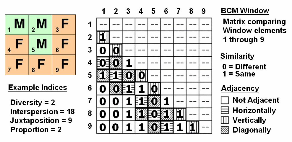
Figure 2. Binary Comparison Matrix
summarizes neighborhood variability by summing various groups of matrix
pairings identified in a roving window.
A computer simply summarizes the values in a Binary Comparison Matrix
to categorize all variability that you see.
First, "Binary" means it only uses 0's and 1's. "Comparison" says it will compare
each element in the window with every other element. If they are the same, a 1 is assigned; if
different, a 0 is assigned. "Matrix" dictates how the data the binary
data is organized and summarized.
In figure 2, the window elements are numbered from one through nine. I
n the window, is the class for cell 1 the same as for cell 2? Yes (both are M), so 1 is assigned at the 1,2 position in the table.
How about elements 1 and 3? No,
so assign a 0 in the second position of column one. How about 1 and 4? No, then assign another 0. Repeat until all of the combinations in the
matrix contain a 0 or a 1 as depicted in the figure.
While you are bored already, the computer enjoys completing the table
for every grid location… thousands and thousands of
Within the table there are 36 possible comparisons. I n our example,
eighteen of these are similar by summing the entire matrix— Interspersion=
18. Orthogonal adjacency (side-by-side
and top-bottom) is computed by summing the vertical/horizontal cross-hatched
elements in the table— Juxtaposition= 9.
Comparison of the center to its neighbors computes the sum for all pairs
involving element 5 having the same condition (5,1 and
5,2 only)— Proportion= 2.
You can easily ignore the mechanics of the computations and still be a
good user of
While BPW’s neighborhood connectivity and
(Micro-Terrain Analysis)
Use
Data to Characterize Micro-Terrain Features
(GeoWorld, January
2000)
Several past columns (September through December 1999 BM columns)
investigated surface modeling and analysis.
The data surfaces derived in these instances weren't the familiar
terrain surfaces you walk the dog, bike and hike on. None-the-less they form surfaces that contain
all of the recognizable gullies, hummocks, peaks and depressions we see on most
hillsides. The
"wrinkled-carpet" look in the real world is directly transferable to
the cognitive realm of the data world.
However, at least for the moment, let's return to terra firma to investigate
how micro-terrain features can be characterized. As you look at a landscape you easily see the
changes in terrain with some areas bumped up (termed convex) and others pushed
down (termed concave). But how can a
computer "see" the same thing? Since its world is digital, how can
the lay of the landscape be transferred into a set of drab numbers?
One of the most frequently used procedures involves comparing the trend
of the surface to the actual elevation values.
Figure 1 shows a terrain profile extending across a small gully. The dotted line identifies a smoothed curve
fitted to the data, similar to a draftsman's alignment of a French curve. It "splits-the-difference" in the
succession of elevation values—half above and half below. Locations above the trend line identify
convex features while locations below identify the concave ones. The further above or below determines how
pronounced the feature is.
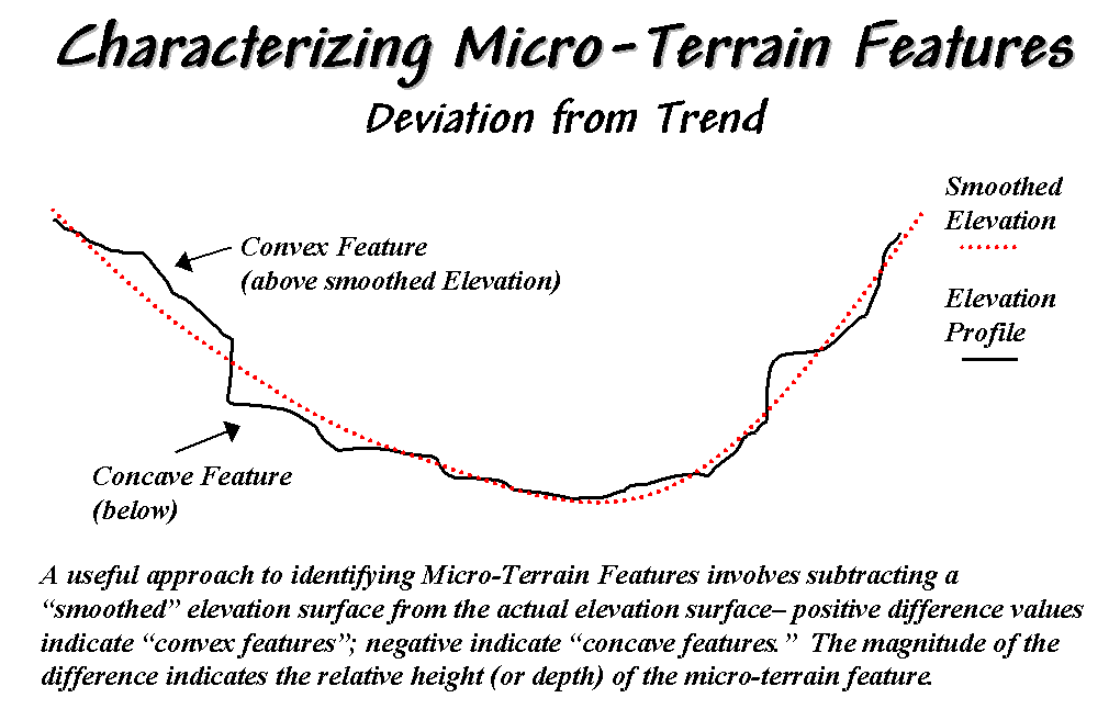
Figure 1. Identifying Convex and Concave
features by deviation from the trend of the terrain.
In a
In generating the smoothed surface, elevation values were averaged for a 4-by-4
window moved throughout the area. Note
the subtle differences between the surfaces—the tendency to pull-down the
hilltops and push-up the gullies.
While you see (imagine?) these differences in the surfaces, the computer
quantifies them by subtracting. The
difference surface on the right contains values from -84 (prominent concave
feature) to +94 (prominent convex feature).
The big bump on the difference surface corresponds to the smaller
hilltop on elevation surface. Its actual
elevation is 2016 while the smoothed elevation is 1922 resulting in 2016 - 1922
= +94 difference. In micro-terrain
terms, these areas are likely drier than their surroundings as water flows
away.
The other arrows on the surface indicate other interesting locations. The "pockmark" in the foreground is
a small depression (764 - 796 = -32 difference) that is likely wetter as water
flows into it. The "deep cut"
at the opposite end of the difference surface (539 - 623 = -84) suggests a
prominent concavity. However
representing the water body as fixed elevation isn't a true account of terra
firma configuration and misrepresents the true micro-terrain pattern.
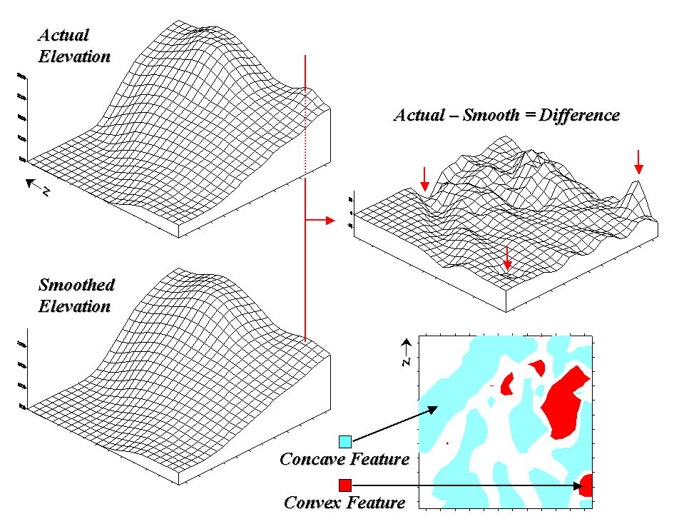
Figure 2. Example of a
micro-terrain deviation surface.
In fact the entire concave feature in the upper left portion of 2-D
representation of the difference surface is suspect due to its treatment of the
water body as a constant elevation value.
While a fixed value for water on a topographic map works in traditional
mapping contexts it's insufficient in most analytical applications. Advanced
The 2-D map of differences identifies areas that are concave (dark red), convex
(light blue) and transition (white portion having only -20 to +20 feet
difference between actual and smoothed elevation values). If it were a map of a farmer's field, the
groupings would likely match a lot of the farmer's recollection of crop
production—more water in the concave areas, less in the convex areas.
A
The idea of variable rate response to spatial conditions has been around for
thousands of years as indigenous peoples adjusted the spacing of holes they
poked in the ground to drop in a seed and a piece of fish. While the mechanical and green revolutions
enable farmers to cultivate much larger areas they do so in part by applying
broad generalizations of micro-terrain and other spatial variables over large
areas. The ability to continuously
adjust management actions to unique spatial conditions on expansive tracks of
land foretells the next revolution.
Investigation of the effects of micro-terrain conditions goes well beyond the
farm. For example, the Universal Soil
Loss Equation uses "average" conditions, such as stream channel
length and slope, dominant soil types and existing land use classes, to predict
water runoff and sediment transport from entire watersheds. These non-spatial models are routinely used
to determine the feasibility of spatial activities, such as logging, mining,
road building and housing development.
While the procedures might be applicable to typical conditions, they less
accurately track unusual conditions clumped throughout an area and provide no
spatial guidance within the boundaries of the modeled area.
Characterizing Local Terrain Conditions
(GeoWorld,
February 2000)
The previous section described a technique for characterizing
micro-terrain features involving the difference between the actual elevation
values and those on a smoothed elevation surface (trend). Positive values on the difference map
indicate areas that "bump-up" while negative values indicate areas
that "dip-down" from the general trend in the data.
A related technique to identify the bumps and dips of the terrain
involves moving a "roving window" (termed a spatial filter)
throughout an elevation surface. The
profile of a gully can have micro-features that dip below its surroundings
(termed concave) as shown on the right side of figure 1.
The localized deviation within a roving window is calculated by subtracting the
average of the surrounding elevations from the center location's
elevation. As depicted in the example
calculations for the concave feature, the average elevation of the surroundings
is 106, that computes to a -6.00 deviation when
subtracted from the center's value of 100.
The negative sign denotes a concavity while the magnitude of 6 indicates
it's fairly significant dip (a 6/100= .06).
The protrusion above its surroundings (termed a convex feature) shown on
the right of the figure has a localized deviation of +4.25 indicating a
somewhat pronounced bump (4.25/114= .04).
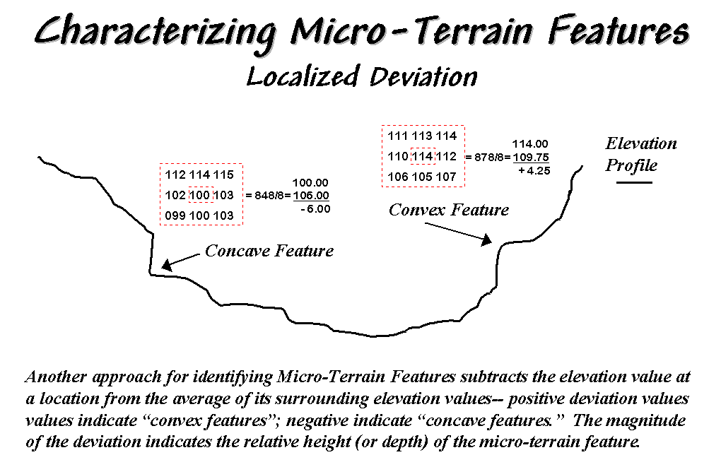
Figure 1. Localized deviation uses a
spatial filter to compare a location to its surroundings.
The result of moving a deviation filter throughout an elevation surface
is shown in the top right inset in figure 2.
Its effect is nearly identical to the trend analysis described in the
previous section—
comparison of each location's actual elevation to the typical
elevation (trend) in its vicinity.
Interpretation of a Deviation Surface is the same as that for the difference
surface previously discussed—
protrusions (large positive values) locate drier convex areas;
depressions (large negative values) locate wetter concave areas.
The implication of the "Localized Deviation" approach goes far beyond
simply an alternative procedure for calculating terrain irregularities. The use of "roving windows"
provides a host of new metrics and map surfaces for assessing micro-terrain
characteristics. For example, consider
the Coefficient of Variation (Coffvar) Surface shown
in the bottom-right portion of figure 2.
In this instance, the standard deviation of the window is compared to
its average elevation— small "coffvar"
values indicate areas with minimal differences in elevation; large values
indicate areas with lots of different elevations. The large ridge in the coffvar
surface in the figure occurs along the shoreline of a lake. Note that the ridge is largest for the
steeply-rising terrain with big changes in elevation. The other bumps of surface variability noted
in the figure indicate areas of less terrain variation.
While a statistical summary of elevation values is useful as a general
indicator of surface variation or "roughness," it doesn't consider
the pattern of the differences. A
checkerboard pattern of alternating higher and lower values (very rough) cannot
be distinguished from one in which all of the higher values are in one portion
of the window and lower values in another.
Figure 2. Applying Deviation and
Coefficient of Variation filters to an elevation surface.
There are several roving window operations that track the spatial
arrangement of the elevation values as well as aggregate statistics. A frequently used one is terrain slope that
calculates the "slant" of a surface.
In mathematical terms, slope equals the difference in elevation (termed
the "rise") divided by the horizontal distance (termed the
"run").
As shown in figure 3, there are eight surrounding elevation values in a 3x3
roving window. An individual slope from
the center cell can be calculated for each one.
For example, the percent slope to the north (top of the window) is
((2332 - 2262) / 328) * 100 = 21.3%. T he numerator computes the rise while the
denominator of 328 feet is the distance between the centers of the two
cells. The calculations for the
northeast slope is ((2420 - 2262) / 464) * 100 = 34.1%, where the run is
increased to account for the diagonal distance (328 * 1.414 = 464).
The eight slope values can be used to identify the Maximum, the Minimum and the
Average slope as reported in the figure.
Note that the large difference between the maximum and minimum slope (53
- 7 = 46) suggests that the overall slope is fairly variable. Also note that the sign of the slope value
indicates the direction of surface flow— positive slopes indicate flows into
the center cell while negative ones indicate flows out. While the flow into the center cell depends
on the uphill conditions (we'll worry about that in a subsequent column), the
flow away from the cell will take the steepest downhill slope (southwest flow
in the example… you do the math).
In practice, the Average slope can be misleading. It is supposed to indicate the overall slope
within the window but fails to account for the spatial arrangement of the slope
values. An alternative technique fits a
“plane” to the nine individual elevation values. The procedure determines the best fitting
plane by minimizing the deviations from the plane to the elevation values. In the example, the Fitted
slope is 65%… more than the maximum individual slope.
Figure 3. Calculation of slope considers
the arrangement and magnitude of elevation differences within a roving window.
At first this might seem a bit fishy—overall slope more than the maximum
slope—but believe me, determination of fitted slope is a different kettle of
fish than simply scrutinizing the individual slopes. The next section looks a bit deeper into this
“fitted slope thing” and its applications in micro-terrain analysis.
_______________________
Author's Note: An Excel worksheet investigating
Maximum, Minimum, and Average slope calculations is available online at the
"Column Supplements" page at http://www.innovativegis.com/basis.
Characterizing Terrain Slope and Roughness
(GeoWorld, March
2000)
The past few sections discussed several techniques for generating maps
that identify the bumps (convex features), the dips (concave features) and the
tilt (slope) of a terrain surface.
Although the procedures have a wealth of practical applications, the
hidden agenda of the discussions was to get you to think of geographic space in
a less traditional way— as an organized set of numbers (numerical data),
instead of points, lines and areas represented by various colors and patterns
(graphic map features).
A terrain surface is organized as a rectangular "analysis grid" with
each cell containing an elevation value.
Grid-based processing involves retrieving values from one or more of
these "input data layers" and performing a mathematical or
statistical operation on the subset of data to produce a new set numbers. While computer mapping or spatial database
management often operates with the numbers defining a map, these types of
processing simply repackage the existing information. A spatial query to "identify all the
locations above 8000' elevation in El Dorado County" is a good example of
a repackaging interrogation.
Map analysis operations, on the other hand, create entirely new spatial
information. For example, a map of
terrain slope can be derived from an elevation surface and then used to expand
the geo-query to "identify all the locations above 8000' elevation in El
Dorado County (existing data) that exceed 30% slope (derived data)." While the discussion in this series of
columns focuses on applications in terrain analysis, the subliminal message is
much broader— map analysis procedures derive new spatial information from
existing information.
Now back to business. The previous
section described several approaches for calculating terrain slope from an
elevation surface. Each of the
approaches used a "3x3 roving window" to retrieve a subset of data,
yet applied a different analysis function (maximum, minimum, average or
"fitted" summary of the data).
Figure 1. 2-D, 3-D and draped displays of
terrain slope.
Figure 1 shows the slope map derived by "fitting a plane" to
the nine elevation values surrounding each map location. The inset in the upper left corner of the
figure shows a 2-D display of the slope map.
Note that steeper locations primarily occur in the upper central portion
of the area, while gentle slopes are concentrated along the left side.
The inset on the right shows the elevation data as a wire-frame plot with the
slope map draped over the surface. Note
the alignment of the slope classes with the surface configuration— flat slopes
where it looks flat; steep slopes where it looks steep. So far, so good.
The 3-D view of slope in the lower left, however, looks a bit strange. The big bumps on this surface identify steep
areas with large slope values. The
ups-and-downs (undulations) are particularly interesting. If the area was perfectly flat, the slope
value would be zero everywhere and the 3-D view would be flat as well. But what do you think the 3-D view would look
like if the surface formed a steeply sloping plane?
Are you sure? The slope values at each
location would be the same, say 65% slope, therefore the 3-D view would be a
flat plane "floating" at a height of 65. That suggests a useful principle— as a slope
map progresses from a constant plane (single value everywhere) to more
ups-and-downs (bunches of different values), an increase in terrain roughness
is indicated.
Figure 2. Assessing
terrain roughness through the 2nd derivative of an elevation
surface.
Figure 2 outlines this concept by diagramming the profiles of three
different terrain cross-sections. An
elevation surface's 2nd derivative (slope of a slope map) quantifies
the amount of ups-and-downs of the terrain.
For the straight line on the left, the "rate of change in elevation
per unit distance" is constant with the same difference in elevation
everywhere along the line— slope = 65% everywhere. The resultant slope map would have the value
65 stored at each grid cell, therefore the "rate of change in slope"
is zero everywhere along the line (no change in slope)—slope2 = 0% everywhere.
A slope2 value of zero is interpreted as a perfectly smooth condition,
which in this case happens to be steep.
The other profiles on the right have varying slopes along the line, therefore the "rate of change in slope" will
produce increasing larger slope2 values as the differences in slope become
increasingly larger.
So who cares? Water drops for one, as
steep smooth areas are ideal for downhill racing, while "steep 'n rough
terrain" encourages more infiltration, with "gentle yet rough
terrain" the most.
Figure 3 shows a roughness map based on the 2nd derivative
for the same terrain as depicted in Figure 1.
Note the relationships between the two figures. The areas with the most
"ups-and-downs" on the slope map in figure 1 correspond to the areas
of highest values on the roughness map in figure 3. Now focus your attention on the large steep
area in the upper central portion of the map.
Note the roughness differences for the same area as indicated in figure
3— the favorite raindrop racing areas are the smooth portions of the steep
terrain.
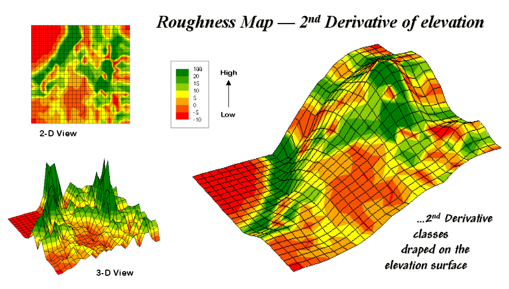
Figure 31-8. 2-D, 3-D and draped displays of
terrain roughness.
Whew! That's a lot of map-ematical explanation for a couple of pretty simple
concepts— steepness and roughness. But
just for fun, in the next section we'll continue the trek on steep part of the
map analysis learning curve.
Beware
of Slope’s Slippery Slope
(GeoWorld, January
2003)
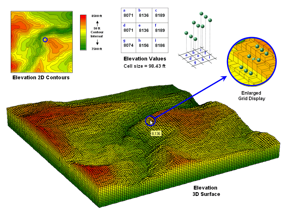
Figure 1. A terrain surface is stored as a grid of elevation
values.
Digital
Elevation Model (DEM) data is readily available at several spatial resolutions. Figure 1 shows a portion of a standard
elevation map with a cell size of 30 meters (98.43 feet). While your eye easily detects locations of
steep and gentle slopes in the 3D display, the computer doesn‘t have the
advantage of a visual representation. All
it “sees” is an organized set of elevation values— 10,000 numbers organized as
100 columns by 100 rows in this case.
The enlarged portion of figure 1 illustrates the relative positioning of nine
elevation values and their corresponding grid storage locations. Your eye detects slope as relative vertical
alignment of the cells. However, the
computer calculates slope as the relative differences in elevation values.
The simplest approach to calculating slope focuses on the eight surrounding
elevations of the grid cell in the center of a 3-by-3 window. In the example, the individual percent slope
for d-e is change in elevation (vertical rise) divided by change
in position (horizontal run) equals [((8071 ft – 8136 ft) / 98.43 ft) *
100] = -66%. For diagonal positions,
such as a-e, the calculation changes to [((8071 ft – 8136 ft) / 139.02
ft) * 100] = -47% using an adjusted horizontal run of SQRT(98.43**2
+ 98.43**2) = 139.02 ft.
Applying the calculations to all of the neighboring slopes results in eight
individual slope values yields (clockwise from a-e) 47, 0, 38, 54, 36,
20, 45 and 66 percent slope. The minimum
slope of 0% would be the choice the timid skier while the boomer would go for
the maximum slope of 66% provided they stuck to one of the eight
directions. The simplest calculation for
an overall slope is an arithmetic average slope of 38% based on
the eight individual slopes.
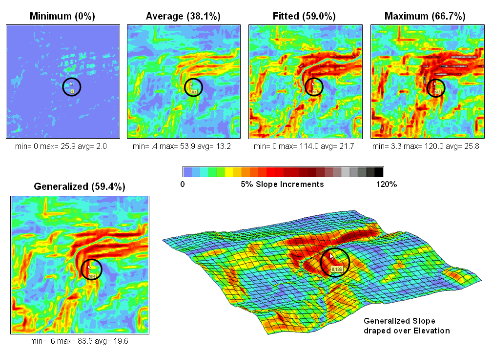
Figure 2. Visual comparison of different
slope maps.
Most
The equations and example calculations for the advanced techniques are beyond
the scope of this column but are available online (see author’s note). The bottom line is that grid-based slope
calculators use a roving window to collect neighboring elevations and relate
changes in the values to their relative positions. The result is a slope value assigned to each
grid cell.
Figure 2 shows several slope maps derived from the elevation data shown in
figure 1 and organized by increasing overall slope estimates. The techniques show somewhat similar spatial
patterns with the steepest slopes in the northeast quadrant. Their derived values, however, vary
widely. For example, the average
slope estimates range from .4 to 53.9% whereas the maximum slope
estimates are from 3.3 to 120%. Slope
values for a selected grid location in the central portion are identified on
each map and vary from 0 to 59.4%.
So
what’s the take-home on slope calculations?
Different algorithms produce different results and a conscientious user
should be aware of the differences. A
corollary is that you should be hesitant to download a derived map of slope
without knowing its heritage. The chance
of edge-matching slope maps from a variety of systems is unlikely. Even more insidious is the questionable
accuracy of utilizing a map-ematical equation
calibrated using one slope technique then evaluated using another.
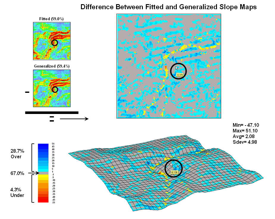
Figure 3. Comparison of Fitted versus
Generalized slope maps.
The two
advanced techniques result in very similar slope estimates. Figure 3 “map-ematically” compares the two
maps by simply subtracting them. Note
that the slope estimates for about two-thirds of the project area is within one
percent agreement (grey). Disagreement
between the two maps is predominantly where the fitted technique
estimates a steeper slope than the generalized technique
(blue-tones). The locations where generalized
slopes exceed the fitted slopes (red-tones) are primarily isolated along
the river valley.
Use Surface Area for Realistic Calculations
(GeoWorld,
December 2002)
The earth is flat …or so most
Common sense suggests that if you walk up and down in steep terrain you will
walk a lot farther than the planimetric length of your path. While we have known this fact for thousands
of years, surface area and length calculations were practically impossible to
apply to paper maps. However, map-ematical processing in a
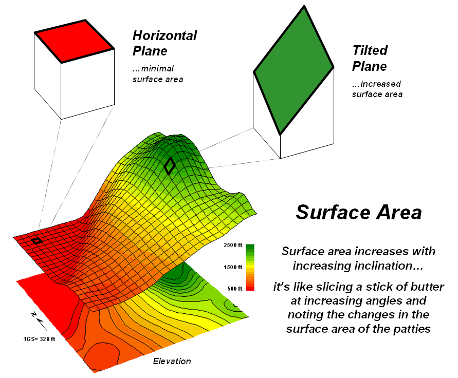
Figure 1. Surface area increases with
increasing terrain slope.
In a vector-based system, area calculations use plane geometry
equations. In a grid-based system, planimetric
area is calculated by multiplying the number of cells defining a map
feature times the area of an individual cell.
For example, if a forest cover type occupies 500 cells with a spatial
resolution of 1 hectare each, then the total planimetric area for the cover
type is 500 cells * 1ha/cell = 500ha.
However, the actual surface area of each grid cell is dependent on its
inclination (slope). Surface area
increases as a grid cell is tilted from a horizontal reference plane
(planimetric) to its three-dimensional position in a digital elevation surface
(see figure 1).
Surface area can be calculated by dividing the planimetric area by the
cosine of the slope angle (see Author’s Note).
For example, a grid location with a 20 percent slope has a surface area
of 1.019803903 hectares based on solving the following sequence of equations:
Tan_Slope_Angle = 20 %_ slope / 100 = .20 slope_ratio
Slope_Angle = arctan (.20 slope_ratio) = 11.30993247 degrees
Surface_Area_Factor = cos (11.30993247
degrees) = .980580676
Surface_Area = 1 ha / .980580676 = 1.019803903 ha
The table in figure 2 identifies the surface area calculations for a
1-hectare gridding resolution under several terrain slope conditions. Note that the column Surface_Area_Factor
is independent of the gridding resolution.
Deriving the surface area for a cell on a 5-hectare resolution map,
simply changes the last step in the 20% slope example (above) to 5 ha /
.9806 = 5.0989 ha Surface_Area.
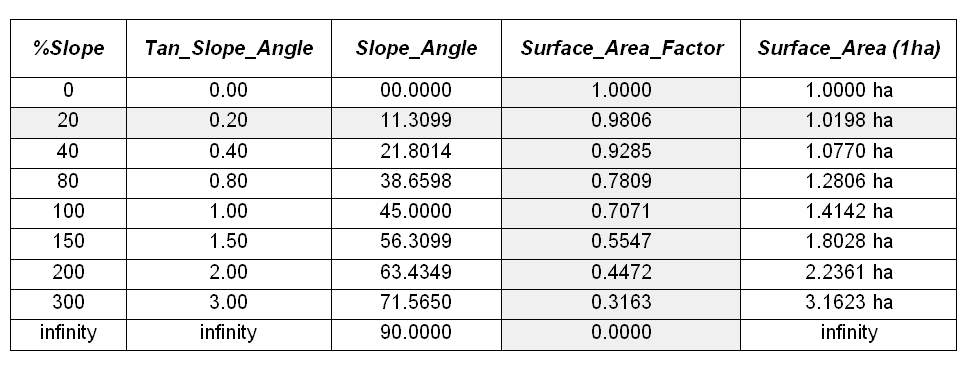
Figure 2. Surface areas
for selected terrain slopes.
For an empirical test of the surface area conversion procedure, I have
students cut a stick of butter at two angles— one at 0 degrees (perpendicular)
and the other at 45 degrees. They then
stamp an imprint of each patty on a piece of graph paper and count the number
of grid spaces covered by the grease spots to determine their areas. Comparing the results to the calculations in
the table above confirms that the 45-degree patty is about 1.414 larger. What do you think the area difference would
be for a 60-degree patty?
In a grid-based
Step 1) SLOPE ELEVATION FOR SLOPE_
Step 2) CALCULATE ( COS ( (
ARCTAN ( SLOPE_
Step 3) CALCULATE 1.0 / SURFACE_
Step 4) COMPOSITE HABITAT_DISTRICT_
FOR HABITAT_SURFACE_
The command macro is scaled to a 1-hectare gridding resolution project area by
assigning the value 1.0 (ha) in the third step.
If a standard DEM (Digital Elevation Model with 30m resolution) surface
is used, the GRID_
A region-wide, or zonal overlay procedure (Composite), is used to sum
the surface areas for the cells defining any map feature— habitat districts in
this case. Figure 2 shows the
planimetric and surface area results for the districts considering the terrain
surface. Note that District 2 (light
green) aligns with most of the steep slopes on the elevation surface. As a result, the surface area is considerably
greater (9.62%) than its simple planimetric area.
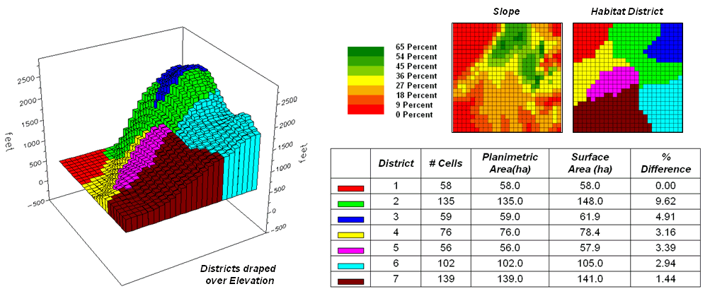
Figure 3. Planimetric vs.
surface area differences for habitat districts.
Surface length of a line also is affected by terrain. In this instance, azimuth as well as slope of
the tilted plane needs to be considered as it relates to the direction of the
line. If the grid cell is flat or the
line is perpendicular to the slope of a tilted plane, there is no correction to
the planimetric length of a line— from orthogonal (1.0 grid space to diagonal
(1.414 grid space) length. If the line
is parallel to the slope (same direction as the azimuth of the cell) the full
cosine correction to its planimetric projection takes hold. The geometric calculations are a bit more
complex and reserved for online discussion (see Author’s Note below).
So who cares about surface area and length?
Suppose you needed to determine the amount of pesticide needed for weed
spraying along an up-down power-line route or estimating the amount of seeds
for reforestation or are attempting to calculate surface infiltration in rough
terrain. Keep in mind that “simple
area/length calculations can significantly under-estimate real world
conditions.” Just ask a pooped hiker
that walked five planimetric-miles in the Colorado Rockies.
_________________
Author's Note: For background theory and equations for
calculating surface area and length… see www.innovativegis.com/basis,
select “Column Supplements.”
(Landscape Analysis Techniques)
Use GIS to Calculate Nearby Neighbor Statistics
(GeoWorld, May
1999)
As
It’s windshield common sense that natural and human induced events are
continuously altering the makeup of our landscapes. Most natural resource applications of
Landscape structure analysis provides insight into the spatial context
of parcels— the “pieces” to the landscape “jig-saw puzzle.” Most
The spacing between neighboring parcels of the same type is an
important thread in landscape analysis.
Early vector-based solutions for determining the “nearest neighbor” of a
parcel used the Pythagorean Theorem to calculate centroid-to-centroid distances
to all of its neighbors, then selected the smallest
distance. More realistic approaches use
a raster-based “proximity” algorithm for considering edge-to-edge distances.
Both approaches reflect traditional map processing and can be manually
implemented with a ruler. Figure 1, on
the other hand, depicts an eight-step spatial analysis procedure without a
paper map legacy. The approach uses proximity
surface analysis to identify equidistant “ridges” bisecting a set of
forest parcels (steps 1-5), then evaluates the inter-parcel distances along the
ridges to determine its nearest neighbor and a host of other “nearby neighbor”
statistics (steps 6-8).
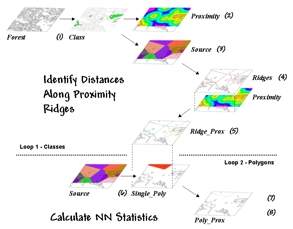
Figure 1. Processing
steps for calculating Nearby Neighbor metrics.
The process begins by identifying the set of polygons defining a class
of interest, such as all the white birch stands in this example (Step 1). A proximity map (Step 2) is generated
that identifies the distances from all locations in the study area to the
nearest polygon. This raster-based
operation is analogous to tossing a handful of rocks into a pond— splash,
splash, splash …followed by series of emanating ripples that continue to expand
until they collide with each other.
The area surrounding each polygon before the “distance-waves” collide
identifies a catchment area that is analogous to a watershed’s
region of influence. All map locations
within a catchment area are closer to its source polygon than any of the others
(Step 3).
At this point, we know how far away every location is to its nearest
polygon and which polygon that is. Step
4 isolates the ridges that bisect each of the neighboring
polygons. It is determined by passing a
spatial filter over the source map and noting the number of different
catchments within a 3x3 window— one identifies interior locations, two
identifies locations along the bordering ridge, and three identifies
ridge intersections. Once the bisecting
ridges have been identified the proximity values for the grid cells comprising
the borders are “masked” (Step 5).
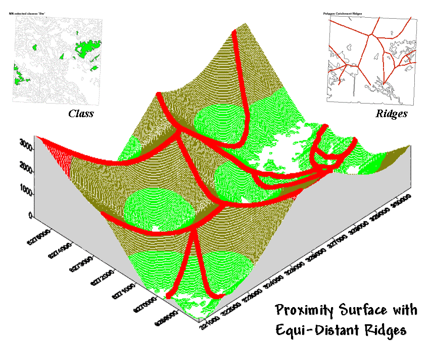
Figure 2. Proximity Surface with draped
bisecting ridges.
The 3-D plot of the proximity surface for white birch in figure 2 might
help to conceptualize the process. Note
that the polygons in the Class inset align with the lowest points
(basins) on the surface— zero away from the nearest polygon. As distance increases the surface rises like
the seats in a football stadium.
The Ridges inset aligns with the inflection points where
increasing distance values from one polygon start a downhill slide into
another. A pair of distance values
anywhere along a ridge identifies how far it is to both of the neighboring
polygons. The smallest pair (deepest dip
in a ridge) identifies the closest point between two neighboring polygons; the
largest pair (highest sweep along a ridge) identifies the most distant point.
Step 6 in the
process identifies an individual polygon, then “masks” the set of ridge
proximity values surrounding that polygon (Step 7). The smallest value along the ridge represents
the polygon’s traditional Nearest Neighbor Distance— [[2 * Min_Value] + .5 * CellWidth]. Step 8 finalizes the process by
summarizing the values along the proximity ridge and stores the resulting
indices in a database table that is inherently in the
There are a couple of things to note about this somewhat unfamiliar
approach to deriving the very familiar metric of NN distance. First, it’s a whole lot faster (not to
mention more “elegant”) than the common brute force technique of calculating
distances from each polygon and checking who’s closest— bunches of separate
polygon distance calculations versus just one per class.
More importantly, NN distance is only a small part of the information
contained in the proximity ridges. The
proximity values along the ridges characterize all of the distances to the
surrounding polygons—Nearby Neighbors instead of just the nearest
neighbor. The largest value identifies
how far it is to the most distant surrounding neighbor. The average indicates the typical distance to
a neighbor. The standard deviation and
coefficient of variation provide information on how variable the connectivity
is.
If animals want to “jump ship” and move from one polygon to another,
they rarely know at the onset the closest edge cell for departure and the
distance/bearing to the nearest neighbor.
Characterization of the set of linkages to all surrounding neighbors
provides a more realistic glimpse of the relative isolation of individual
polygons.
It also provides a better handle for assessing changes in landscape
structure. If one of the polygons is
removed (e.g., by timber harvesting or wild fire), the nearest neighbor
approach only tracks one of the myriad effects induced on the matrix of
interconnected neighbors. The nearby
neighbors approach not only contains information on traditional NN_distance but a wealth of extended metrics summarizing
the connectivity among sets of interacting polygons.
By thinking spatially, instead of simply automating an existing
paper-map paradigm, an approach that is both efficient (much faster) and
effective (more comprehensive information) is “rediscovered” by implementing
general
_____________________________
Author’s Note: A PowerPoint presentation describing this approach
in more detail is available. Nearby Neighbor metrics plus numerous other
indices of landscape structure are contained in FRAGSTATS*ARC software used in
preparing this column. Both the presentation and a description of the software
can be reached via links posted at www.innovativegis.com/basis, select “Column
Supplements.”
Use
GIS to Analyze Landscape Structure
(GeoWorld, June
1999)
The previous section described an interesting processing approach for
calculating statistics about neighboring polygons. T he technique used proximity
ridges to identify all of the surrounding polygons of the same type as a
given polygon, then summarize the minimum, maximum, average and variation of
the distances. The result was a set of
metrics that described the “isolation” of every polygon to its nearby
neighbors. Further summary provides
insight into the relative isolation of each polygon to others in its class and,
at another level, the isolation occurring within one vegetation type compared
to that of other types.
In practice, this information can help resource professionals better
understand the complex ecological interactions among the puzzle pieces (forest
polygons) comprising a forested landscape.
There is growing evidence that habitat fragmentation is detrimental to
many species and may contribute substantially to the loss of regional and
global biodiversity. How to track and
analyze landscape patterns, however, has been an ecological problem—but an
ideal opportunity for
Although the “nearby neighbors” technique is interesting in its own
right (techy-types revel in the elegance of the bazaar logic), it serves as a
good introduction to an entire class of map analysis operations—landscape
structure metrics. Many of the
structural relationships can be expressed by indices characterizing the shape,
pattern and arrangement of landscape elements, spatially depicted as individual
patches (e.g., individual vegetation polygon), classes
of related patches (e.g., polygons of the same type/condition), and entire landscape
sets (e.g., all polygons within an area).
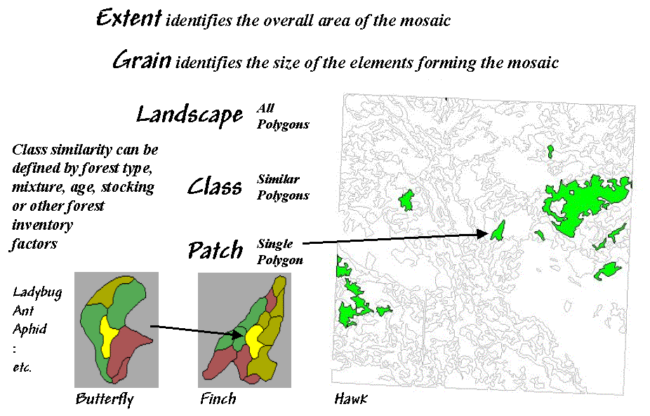
Figure 1. Elements and concepts in
landscape structure analysis.
Two additional concepts relating to map scale complete the systematic
view of landscape elements—extent and grain (see figure 1). Extent refers to the overall
area used in an analysis. Grain
refers to the size of the individual patches.
It is important to note that these criteria define the resolution and
scale-dependency of a study.
For example, both the grain would be coarser and the extent larger for
studying a hawk’s territory than that for a finch. A single mixed-woods patch of 25 hectares as
viewed by the hawk might comprise the entire extent for the finch with smaller
parcels of wetland, birch and spruce forming its perceived patches. In turn, the extent for a butterfly might be
defined by the wetland alone with its grain identified by patches of open
water, reeds and grasses of a fraction of a hectare each. The “parceling of an area” for a ladybug, ant
and aphid would result in even finer-grained maps.
Well so much for the underlying theory; now for the practical
considerations. While the procedures for
calculating landscape metrics have been around for years, direct integration
with
Eight fundamental classes of landscape metrics are generally recognized— Area, Density,
Edge, Shape, Core-Area, Neighbors, Diversity
and Arrangement. At the heart of
many of the metrics is the characterization of the interior and edge of a
patch. For example, Area
metrics simply calculate the area of each patch, the area for each class and
the total area of the entire landscape.
These measures can be normalized to identify the percent of the
landscape occupied by each class and a similarity measure that indicates for
each patch how much of the landscape is similarly classified.
While area metrics indicate overall dominance, Density
measures consider the frequency of occurrence.
For example, patch density is computed by dividing the number of
patches in a class by the total area of the class (#patches per square kilometer
or mile). Similarly, the average patch
size can be calculated for a class, as well as the variation in patch size
(standard deviation). Density metrics
serve as first-order indicators of the overall spatial heterogeneity in a
landscape— greater patch density and smaller average patch size indicate
greater heterogeneity.
Edge
metrics, on the other hand, quantify patch boundaries by calculating the
perimeter of each patch, then summing for the total edge in each class and for
the entire landscape. As with the
previous metrics, the relative amount of edge per class and edge density can be
computed. This information can be
critical to “edge-loving” species such as elk and grouse.
However the nature of the edge might be important. An edge contrast index considers the
degree of contrast for each segment of the perimeter defining a patch. For example, an aspen patch that is
surrounded by other hardwood species has a much lower contrast to its adjacent
polygons than a similar aspen patch surrounded by conifer polygons or bordering
on a lake. In a sense, edge contrast
tracks “patch permeability” by indicating how different a patch is from its
immediate surroundings— higher index values approaching 100 indicate more
anomalous patches.
Shape
metrics summarize boundary configuration. A simple shape index measures
the complexity of a patch’s boundary by calculating a normalized ratio of its
perimeter to its area— [P / (2 * (pi * A).5)]. As the shape
index gets bigger it indicates increasingly irregular patches that look less
like a circle and more like an ameba. More complicated shape measures calculate
the fractal dimension for an entire landscape or the mean fractal
dimension of individual vegetation classes. These indices range from 1
(indicating very simple shapes such as a circle or rectangle) to 2 (indicating
highly irregular, convoluted shapes).
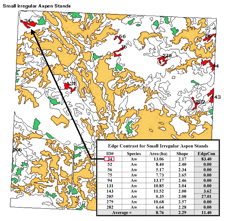
Figure 2. Results of a
geo-query to identify the edge contrast of the small, irregular aspen stands
within a landscape.
Now let’s put some of the landscape metrics to use. Figure 2 shows a predominately hardwood
landscape comprising nearly a township in northern Alberta, Canada. The map was created by the query 1) select
forest type aspen (gold), SP1=Aw, 2) reselect small aspen stands (green),
Area<15ha, and 3) reselect small aspen stands that are irregular (red),
Shape>2.0. The table identifies
the selection criteria for each of the patches, as well as their edge contrast
indices.
Several things can be noted.
First, most of the small, irregular forest parcels are in the northern
portion of the landscape (9 out of 10).
Most of the patches exhibit minimal contrast with their immediate
surroundings (7 out of 10). Patch #34,
however, is very unusual as its high edge contrast index (83 out of 100)
indicates that it is very different from its surroundings. While all of the patches are irregular
(shape>2.0), patches #75 and #279 have the most complex boundary
configurations (2.65 and 2.57, respectively).
Also, note that several of the patches aren’t “wholly contained” within
the landscape (4 out of 10). The
introduction of the map border spawns artificial edges that can bias the
statistics. For example, Patch #205 with
an area of .35 hectare is likely just a tip of a much larger aspen stand and
shouldn’t be used in the analysis.
Although landscape metrics might be interesting, the real issue is “so
what.” Do we want more or less small
irregular aspen stands? Do we like them
“contrasty?”
What about the large aspen stands?
What about the other vegetation types?
In the case of landscape structure analysis we have the technological
cart ahead of the scientific horse— we can calculate the metrics, but haven’t
completed the research to translate them into management action. At a minimum, we have a new tool that can
assess the changes in landscape diversity and fragmentation for alternative
scenarios… we “simply” need to understand their impacts on ecosystem
function. In the next section we will
tackle the other metric classes. I n the interim, see if you can think up some applications
for structural analysis in what you do.
______________________________
Author’s Note: A good reference on landscape analysis is
USDA-Forest Service Technical report
Get to the Core of Landscape Analysis
(GeoWorld, July
1999)
0
The past couple of sections identified the fundamental classes of landscape
structure metrics— Area,
Density, Edge, Shape, Core-Area, Neighbors, Diversity
and Arrangement. As noted, the
first couple of classes (Area and Density) contain several
indices that characterize the relative dominance and frequency of occurrence of
the puzzle pieces (forest polygons) comprising a landscape mosaic. Changes in these indices indicate broad
modifications in the overall balance of landscape elements. The next couple classes (Edge and Shape)
focused on the boundary configuration and adjacency of the polygons. Changes in these metrics indicate alterations
in a polygon’s complexity and its contrast to its surroundings.
Also recall that the metrics can be summarized for three perspectives
of landscape elements— patches (individual polygons), classes
(sets of similar polygons) and landscape (all polygons within an
area). At the class level, individual
patch indices are aggregated to identify differences and similarities among the
various vegetation types. Landscape
indices further summarize structural characteristics for an entire project
area, such as a watershed or eco-region.
Now the stage is set to discuss some of the advanced stuff— assessing
landscape edge characteristics. Core-Area
metrics begin to blur the sharp edge of the puzzle-pieces by making a
distinction between the edge-influenced area and the interior of a
polygon. In figure 1 the dark green
lines identify a buffer of 20 meters around the forest patches. The light red portions identify the core
areas of each patch.
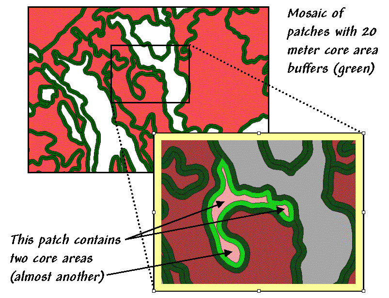
Figure 1. Core-Area metrics summarize the
interior portions of landscape patches.
Many ecosystem processes respond differently to exterior and interior
locations. In fact with the advent of
modern
Information about core areas provides a new perspective of a landscape
mosaic. Many species of flora and fauna
(humans included) react differently to the interior and exterior of a forest
parcel. Simple statistics about core
area can adjust for effective habitat area.
The inset in figure 1 focuses on a single parcel of 4.5 hectares of
excellent habitat type. But for an
interior-loving animal the total geometric area is reduced dramatically to just
1.6 hectares (light red), barely a third of the original polygon’s area.
That’s important information if you’re a wildlife biologist trying to
set aside sufficient habitat to sustain a population of interior-loving
things. Just as important is the
knowledge that the interior area is divided into two distinct cores (and almost
three). If individual core areas are so
small that no self-respecting organism would occupy such small islands, then
the polygon actually contributes nothing to the habitat pool (from 4.5 to 0
hectares). A simple
The character of the edge can make a difference as well. Similar to the edge contrast metrics
discussed last time, the nature of the edge changes as you move along it. If an edge location is mostly surrounded by
another type, it is more “edgy” than one that is sounded by similar edge type,
or even better, interior locations.
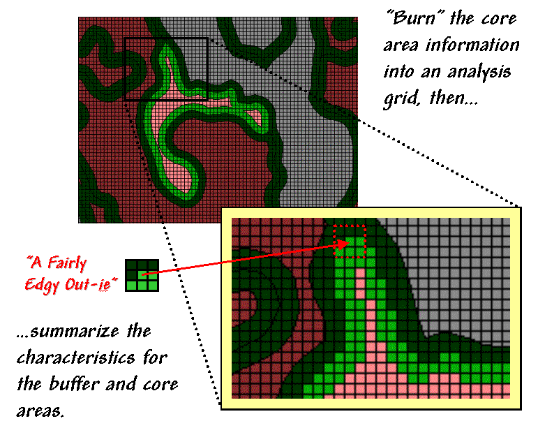
Figure 2. Analyzing
polygon edge characteristics.
Like belly-buttons, the curves along an edge can be categorized as “in-ies” (concave indentation) or “out-ies”
(convex protrusion). The nature of the
edge transition is best analyzed in an analysis grid. As depicted in figure 2, the first step is to
“burn” the boundary lines into the grid and assign each cell the condition that
dominates it— interior core (light red) or boundary edge (dark green).
Depending on cell-size, the edge locations have three possible
conditions in terms of the surrounding cells—s ome
interior, some edge and some other type.
One summary procedure moves a 3x3 window around the edge cells and
counts the number of “other cells.” A
large edgy index means things around it are fairly different; a
small one means it has a bunch of very similar things.
The inset in figure 2 shows “a fairly edgy out-ie”
as half of its surroundings is something else.
However, the edge cell directly below it isn’t very edgy as just 1 of
its 8 neighbors is something else. The
edge cell below that is even less edgy as its neighborhood doesn’t have any
“something else” and even has 1 interior cell.
Now imagine moving the 3x3 window around all of the light green
cells. Combinations range from nearly
all interior cells (very amiable in-ies) to nearly
all something else (very edgy out-ies)— that’s the stuff indices are made of. At this point the spatial distribution of edgyness is mapped and areas of high or low transition can
be identified.
This information can be summarized by edge-type, individual patches,
and at the class and landscape levels.
An extension takes a cue from edge contrast and extends the edgy
index to a weighted edgy index by applying weighting factors
to each of the vegetation type combinations— “…a little edgy around that type,
but really edgy around that other type.”
All this might run contrary to conventional cartography and ecological
precedent, but heck, that’s the way it is in the reality of the wilderness far
from human engineering and surveying.
The discrete lines just aren’t there (reports of foresters tripping over
them have been greatly exaggerated).
Transitional gradients (patch edge) with undulating shapes that
continuously change relationships are the norm.
Instead of “force-fitting” metrics to past simplifying theories we need
to use spatial reasoning and
Use Metrics to Assess Forest Fragmentation
(GeoWorld, August
1999)
The past few sections have investigated several metrics used to
characterize landscape structure. The
first section in the series looked at Nearby Neighbor indices that
describe the relative isolation of vegetation parcels. The next investigated the basic metrics of Area,
Density, Edge and Shape that are conceptually simple, but
a bit of a struggle as a bunch of equations.
The last section focused on Core-area measures that introduced
"buffered edges" around each polygon as a new map feature. This time we'll flounder in more advanced
stuff— metrics assessing Diversity and Arrangement.
Recall that there are three levels of landscape metrics (patch, class
and landscape) depending on whether the focus is on a single vegetation
parcel, a set of similar parcels or all of the parcels within an area. Traditionally, diversity metrics
are only calculated at the landscape level, since by definition more than one
class is needed.
The indices are influenced by two components— evenness and
richness. Richness
identifies the number of classes or patch types. A landscape composed of twelve cover types is
considered much "richer" than one containing only three. Evenness, on the other hand,
refers to the distribution of the area among the different vegetation
types. A landscape where the classes are
fairly equally distributed is considered much more "even" than
another that has just a couple of types dominating the area. Note that richness and evenness are not
directly related. Landscapes that are "rich" but "uneven"
often contain rare types (infrequently occurring) that are ecologically
important.
So how does the computer reduce diversity to a bunch of numbers? The simplest is a direct measure of richness
that just counts the number of patch types in a landscape. Relative patch richness translates the
count to a percent by considering the maximum number of classes as specified by
the user— [((#Patch Types / Max #Patch Types) * 100)]. This enables users to easily compare the
richness among different landscapes in a region. Patch richness density standardizes
the count to an intuitive per area basis— [(#Patch Types / Area)]. An area with 4.25 types per square mile is
considered richer than one with only 1.73 types.
A somewhat more sophisticated and frequently used measure is Shannon's
diversity index that considers the proportional abundance of each
vegetation type— [-SUM((Pi) * ln(Pi)), where Pi= Areai / Total Area]. The index is zero if the landscape has only
one type and increases as richness increases or the proportional distribution
of the area among patch types becomes more even. Since it considers both richness and evenness
it is a popular metric and is frequently used as a relative measure for
comparing different landscapes.
Simpson's
diversity index is another popular measure based on proportional abundance— [1 - (SUM( (Pi)2 )]. Simpson's index is less sensitive to the
presence of rare types and represents the probability that any two patches
selected at random will be different types.
The index ranges from 0 to 1 with higher values indicating greater
diversity.
Another class of metrics focuses on the "evenness" aspect of
diversity. Both Shannon's evenness
index—
[( (-SUM((Pi) * ln(Pi))
) / (ln(Max #Patch Types)) )]
and Simpson's evenness
index—
[( (1 -
(SUM( (Pi)2 ) ) / ( 1- ( 1 / ln(Max
#Patch Types)) )]
…isolate the effect of the distribution of the total area among
vegetation types. Both measures range from 0 (very uneven distribution) to 1
(perfectly even distribution).
In addition to the diversity measures, arrangement metrics
provide insight into landscape configuration and fragmentation. While the measures are far too complex for
detailed discussion in this column (see author's note), they are fairly easy to
conceptualize. They involve some fairly
unfamiliar terms— contagion, interspersion and juxtaposition— that might need
explanation. "Contagion," like
its more familiar usage as contagious, implies contact. The contagion index is based on raster
cell adjacencies and reports the probability that two randomly chosen adjacent
cells belong to a particular pair of vegetation types. The index ranges from 0 to 100, where 100 indicates that all vegetation types are equally adjacent to
all other types (even distribution of adjacencies). Lower values indicate landscapes with uneven
adjacencies indicating a clumping bias in the distribution of vegetation types.
"Interspersion" means scattering and
"juxtaposition" means side-by-side positioning. The interspersion and juxtaposition index
is similar to the contagion index except it measures entire "patch"
adjacency (vector) and not individual "cell" adjacency (raster). It evaluates each patch for the vegetation
types surrounding it then summarizes the data at the class and landscape
levels. Higher values indicate
well-interspersed landscapes (types are equally adjacent to each other),
whereas lower values characterize landscapes clumping (disproportionate patch
type adjacencies).
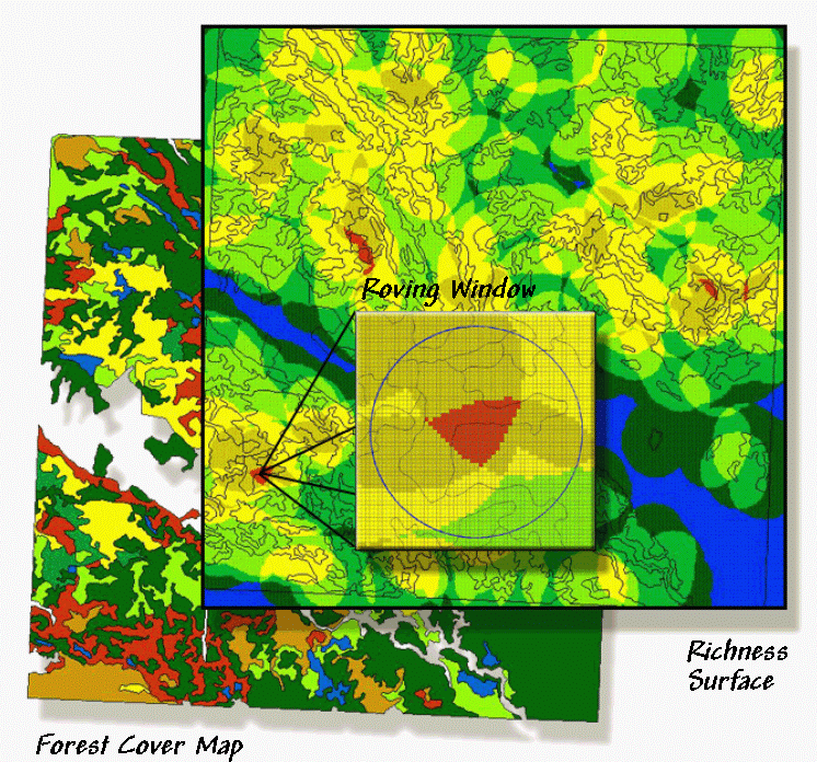
Figure 1. A "richness" surface
identifies the number of different vegetation types within the vicinity of each
grid cell (brighter tones indicate more diverse areas).
Whew!!! That's a lot of theory
and a wrath of intimidating equations presented in this and the past few
sections. The bottom line is that
linking
However, the contribution of
For example, consider figure 1.
The bottom layer is a typical forest map locating the various vegetation
types in the area. The richness
surface is derived by first rasterizing the type map, then moving a
window over the grid that counts the number of different vegetation types. The red clumps on the richness surface locate
highly diverse areas with seven vegetation types within the half-kilometer
radius of the window.
In effect, the roving window serves as a temporary
"mini-landscape" definition and can be summarized for most of the
existing landscape metrics— the concept of the grid "cell" being
substituted for the polygonal "patch." As with traditional measures, the
"extent" (window size) and "grain" (cell size) are
important considerations in mapping the indices as surfaces.
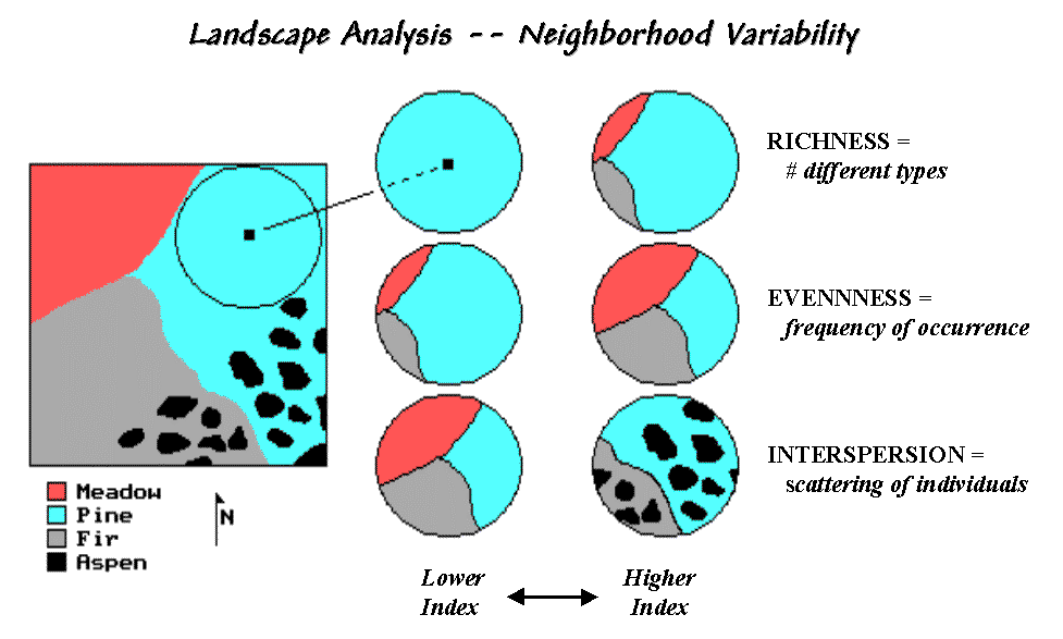
Figure 2. Roving window
configurations for various landscape richness, evenness and interspersion
conditions.
The top pair of circles in Figure 2 shows local conditions for a
"richness" index of 1 on the left and 3 on the right. The next pair of windows has the same
richness value of 3, but show alignments with different "evenness"
measures. The bottom pair has the same
richness (number of different types) and evenness (same proportional areas),
but the one on the right is more "interspersed."
The surface maps of the indices show the actual spatial distribution of
landscape structure concepts— e.g., "more diverse over here, but a real
mono-culture over there, though it's just moderately diverse
overall." The cell values occurring
within each patch can be summarized then aggregated at the class and landscape
levels. The extended procedures provide
new insight into the localized effect of management alternatives.
Also they demonstrate the potential for applying
______________________________
Author’s Note: An extended discussion of Diversity and
Interspersion/Juxtaposition metrics and an online copy of Topic 5,
"Assessing Variability, Shape and Pattern of Map Features," from Beyond
Mapping by Joseph K. Berry are available via the Internet at
www.innovativegis.com/basis, select “Column Supplements.”
(Back to the Table of Contents)